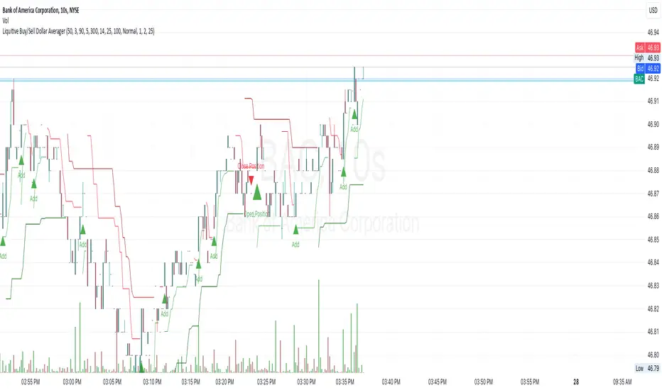
Liquitive Buy/Sell Dollar AveragerLiquitive Buy/Sell Dollar Averager Indicator
The "Liquitive Buy/Sell Dollar Averager" is a versatile trading tool designed for intraday and multi-timeframe analysis, combining advanced range-bound calculations, RSI normalization, volume spikes, and candle pattern recognition to identify optimal buy and sell conditions. This indicator is particularly suitable for traders employing strategies that focus on dollar-cost averaging, position scaling, and systematic buy/sell decision-making.
Key Features:
Adaptive RSI-Based Levels:
Dynamically calculates inner bounds (IB) and outer bounds (OB) using RSI and price ranges, helping to identify overbought and oversold conditions relative to the price action.
Normalizes RSI values to the price range for seamless visualization overlaid on the chart.
Volume and Candle Analysis:
Detects significant volume spikes relative to a moving average, signaling increased market activity.
Identifies spiking green/red candles to capture momentum-driven price movements.
Dynamic Support and Resistance:
Calculates and plots support and resistance levels based on recent swing highs and lows.
Median and boundary lines help visualize key price levels for decision-making.
Profitability Check:
Buy and Sell Signals:
Checks profitability thresholds based on percentage gains/losses.
Incorporates logic for "time to buy" and "time to sell" using target profit margins.
Implements average move percentage to define realistic thresholds for buy/sell actions.
Time-Based Trading Restrictions:
Configures trading logic to disallow trades after a specific time (e.g., 3:40 PM for intraday sessions).
Ensures logical entry and exit decisions are only made within active trading hours.
Color-Coded Visualization:
Background colors dynamically shift between green (bullish), red (bearish), and neutral, depending on RSI and price position relative to the inner bounds.
Opacity of the background adjusts based on normalized RSI differences to provide a visual cue of market strength.
Customizable Parameters:
Allows user input for key settings like lookback periods, RSI length, percent ranges, volume thresholds, and transparency levels, enabling flexible configuration tailored to individual strategies.
Actionable Alerts and Signals:
Plots "Open Position", "Add to Position", and "Close Position" markers directly on the chart, making it easy to follow systematic trading rules.
How It Works:
Buy Signals:
Triggered when price conditions, volume spikes, and RSI-based thresholds align with profitability metrics.
Designed for dollar-cost averaging, identifying opportunities to add to long positions or open new positions.
Sell Signals:
Evaluates profitability conditions to identify when to close or scale out of positions.
Incorporates real-time evaluation of market momentum and profitability.
X-volume
Order Blocks - VK TradingOrder Blocks - VK Trading
This script in Pine Script identifies and highlights Order Blocks, key tools in institutional trading. Designed for traders of all levels, it provides clear and customizable visualization, helping you anticipate market movements with greater accuracy.
Key Features:
Order Block Visualization: Highlights relevant bullish and bearish zones directly on the chart.
Customizable Settings: Adjust sensitivity, colors, and other parameters to suit your analysis needs.
Dual Block Detection: Uses two independent settings to cover different market perspectives.
Visual Alerts: Automatic line drawing for key levels.
Automatic Clearing: Dynamic clearing of already invalidated blocks.
User Benefits:
Clear Visual Analysis: Identifies key supply and demand points used by institutions.
Improved Trading Decisions: Anticipate entry and exit zones more accurately.
Time Saver: Automates level plotting, allowing you to focus on strategy and execution.
Strategy Adaptability: Compatible with Smart Money, Wyckoff, and Price Action approaches.
Disclaimer:
This script is an educational and analytical tool. It does not guarantee specific results or eliminate trading risk. Trading in the financial markets involves significant risks; use this script at your own risk.

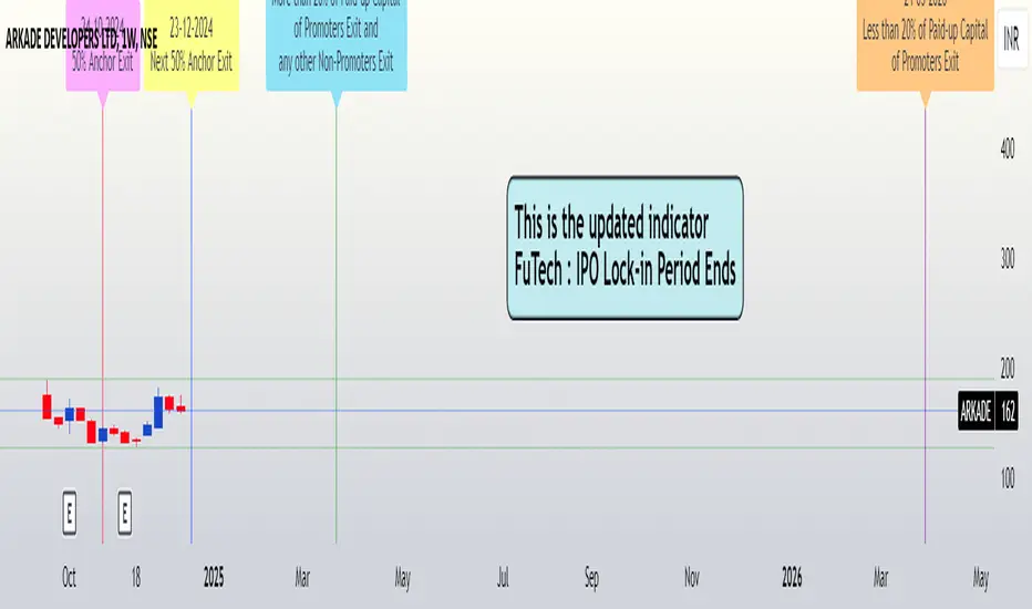
FuTech : IPO Lock-in Ends FuTech: Lock-in Ends - First ever unique Indicator on the TradingView platform
Hello Everyone !
Introducing the first-ever unique indicator on the TradingView platform to track the lock-in period expiry dates for IPOs.
The FuTech Lock-in Ends Indicator is specifically designed to assist traders and investors in identifying the key dates when lock-in periods for IPO shares come to an end.
This provides an edge in preparing for potential market movements driven by buying or selling pressures associated with significant share volumes.
=============================================================
Key Features:
1. Tracks Multiple Lock-in Periods:
- Identifies dates when the 30 days, 90 days, 6 months, and 18 months lock-in periods for IPO shares expire.
- Helps traders anticipate potential market action driven by share releases.
2. IPO Lock-in Ends dates as per Compliance with SEBI Guidelines:
- SEBI (Securities and Exchange Board of India) mandates lock-in periods for IPO shares based on investor categories:
- A) Promoters:
- Lock-in period reduced to 18 months for up to 20% of post-issue paid-up capital (previously 3 years).
- For shareholding exceeding 20%, the lock-in period is further reduced to 6 months (previously 1 year).
- B) Anchor Investors:
- 50% of allotted shares: Lock-in period of 90 days from the date of allotment.
- Remaining 50% of shares: Lock-in period of 30 days from the date of allotment.
- C) Non-promoters:
- Lock-in period reduced to 6 months (previously 1 year).
After these lock-in periods end, investors may buy / sell their shares, which can result in significant market activity.
3. Visual Indicator on Charts:
- The indicator draws vertical lines on the TradingView chart at the respective lock-in expiry dates.
- Alerts users in advance about potential market activity due to the release of locked shares.
- Traders can use these alerts to prepare for positions or adjust their existing holdings accordingly.
4. Customizable Settings:
- Users can modify the color of the labels and width of the lines to suit their preferences and enhance chart visibility.
5. User-defined Allotment Dates:
- If the allotment date is known, users can input this information directly. The indicator will then calculate the lock-in period dates based on the provided allotment date, ensuring precise results.
- If no allotment date is entered, the default calculation assumes the allotment date to be three trading days prior to the listing date .
=============================================================
Important Notes:
- Allotment Date Calculation:
- In the absence of user-defined allotment dates, the indicator estimates the allotment date as three trading days prior to the listing date .
- This approximation may deviate by one to two days from the actual event for certain IPOs.
- Proactive Alerts:
- Most dates are intentionally marked 1-2 days in advance to give traders sufficient time to act, whether for taking new positions or squaring off existing ones to avoid unfavorable losses.
=============================================================
The FuTech Lock-in Ends Indicator is a must-have tool for IPO traders and investors looking to stay ahead of market movements. Use it to track key dates and plan your trading strategy effectively with FuTech : Chart is Art.
=============================================================
Thank you !
Jai Swaminarayan Dasna Das !
He Hari ! Bas Ek Tu Raji Tha !
Holding Volume StrengthHolding Volume Strength Indicator
1. Overview :
The Holding Volume Strength indicator is designed to measure the buying and selling volume based on price action (bullish vs. bearish candles) over a user-defined lookback period. This indicator helps traders gauge the strength of market participants' involvement (buyers vs. sellers) during a specific time frame.
2. Key Inputs :
- Lookback Period : The period over which you want to calculate the Buy and Sell volumes. For example, a lookback of 5 will calculate the volume for the current candle and the previous candle , while a lookback of 10 will consider the current candle and the 9 preceding candles.
- Text Color : This allows customization of the label's text color for better visibility and style.
3. Volume Calculation :
- Buy Volume : If the close price of a candle is greater than its open price (bullish candle), the body size (difference between open and close) is multiplied by the volume for that candle to calculate the buy volume. This represents the market's buying strength.
- Sell Volume : If the close price of a candle is less than its open price (bearish candle), the body size is multiplied by the volume for that candle to calculate the sell volume. This represents the market's selling strength.
4. Volume Display :
The Buy and Sell Volumes are displayed in a readable format, such as:
- Buy Volume: "1.5M" (1.5 million)
- Sell Volume: "500K" (500 thousand)
These values can help identify whether buying or selling is more dominant over a specified period.
5. Label Display :
The calculated Buy and Sell volumes are shown as labels on the main price chart (overlay). These labels dynamically update with each new candle and show the values for the current candle and the previous `n` candles (based on the lookback period).
---
How This Indicator Helps in Making Buy/Sell Decisions :
1. Volume Analysis :
- High Buy Volume : A significant amount of buying volume can indicate strong market interest in the asset, suggesting potential upward momentum. If the market is in a bullish trend (e.g., after a series of green candles), and you see increasing buy volume, this might indicate that buyers are in control , making it a potential signal to buy .
- High Sell Volume : On the other hand, a significant amount of selling volume, particularly after a series of bullish candles, can signal that sellers are taking control of the market, which could indicate bearish pressure . If you observe increasing sell volume, it might be a potential signal to sell or to short the asset.
2. Volume Confirmation :
- Volume is often used to confirm price movements . For example, if the price breaks above a resistance level with strong buy volume , it suggests that the breakout is likely genuine and not a false move. Similarly, if the price drops below a support level with strong sell volume , it could signal that the breakout is real and the downtrend is continuing.
3. Divergence Analysis :
- Volume divergence occurs when price makes a new high or low but volume doesn't confirm it. For instance:
- If price makes a new high but the buy volume does not increase (or even decreases), it could signal a weak trend or potential reversal.
- Similarly, if price makes a new low but sell volume is weak, it might suggest the downtrend is losing steam and could reverse.
4. Buy/Sell Signal Strategy :
- Buy Signal : A potential buy signal might occur when you see a bullish candle with increased buy volume (especially if the buy volume is higher than the sell volume) during an uptrend or near a support level.
- Sell Signal : A potential sell signal might occur when you see a bearish candle with increased sell volume (especially if the sell volume is higher than the buy volume) during a downtrend or near a resistance level.
You could also combine this with other technical indicators (like Moving Averages, RSI, etc.) to form a more robust trading strategy.
---
Example of How It Works in Practice :
- Scenario 1 (Bullish) :
- You're trading a stock or cryptocurrency, and you have the Holding Volume Strength indicator plotted.
- Over the past 10 candles, you notice a bullish trend where the price is rising.
- On the current candle, you see a strong buy volume value, indicating that buyers are in control .
- Given that the buy volume is higher than the sell volume , this might reinforce the bullish trend , and you could consider buying or entering a long position .
- Scenario 2 (Bearish) :
- You're analyzing the same asset, but this time, the price is in a downtrend .
- You notice that a recent bearish candle has a strong sell volume , suggesting sellers are dominating .
- If this sell volume is higher than the buy volume, it could indicate that the downtrend is likely to continue , and you might consider selling or entering a short position .
---
Why Volume Matters :
- Volume precedes price : Volume is often considered a leading indicator, as changes in volume can signal future price movements . For example, a sudden increase in buy volume often precedes upward price movement, while a sudden increase in sell volume often precedes downward price movement.
- Volume confirms trends : Volume helps confirm trends. A price move accompanied by high volume is typically more reliable , while a price move with low volume might be a false signal or less likely to sustain itself.
---
Conclusion :
The Holding Volume Strength indicator helps traders understand the market sentiment (buyers vs. sellers) by showing the cumulative buying and selling volume over a specified period. By examining the buy and sell volumes, traders can make more informed decisions about when to buy, sell, or hold based on market strength.
This volume analysis is essential because it allows traders to understand how strong the price movement is and whether it is likely to continue or reverse. By incorporating volume analysis with other indicators or chart patterns, traders can improve the accuracy of their trading signals and reduce risk.

Bondar Drive v2.1Title: Bondar Drive v2.1 — Real-time print and delta tick volume visualization
Description:
Bondar Drive v2.1 is a tool for visualizing real-time order flow data. It highlights price movements and volume deltas in an intuitive, easy-to-read format. Indicator can be used in conjunction with the Anchored Volume Profile and Volume Footprint (Type: Total).
Features:
Real-Time Print Visualization:
Displays order flow prints with delta colors for buy/sell dominance.
Adjustable size and transparency for varying order thresholds.
Volume Delta Analysis:
Categorizes orders into Tiny, Small, Session, Large, and Huge based on user-defined thresholds.
Provides a tooltip showing order time and price.
Customizable Time Range:
Keeps prints visible for a specified duration (in seconds).
Flexible User Inputs:
Adjustable time zones, print sizes, starting bar index, and volume thresholds.
Visual Enhancements:
Line connections between prints show progression of orders and market direction.
How It Works:
The indicator gathers volume delta and price data in real time.
It dynamically displays circular labels with varying sizes and colors, reflecting the size and type of orders. Labels and lines are automatically removed after the specified time range, ensuring a clean and uncluttered chart.
Customization Options:
Number of Prints: Control how many prints are displayed.
Order Size Filters: Exclude small trades to highlight significant orders.
Color Options: Customize print colors, text, and connecting lines.
Time Offset: Adjust for your local time zone.
Use Cases:
Identify order flow imbalances and price levels dominated by buyers or sellers.
Track the progression of large orders for better trade execution.
Spot market reversals and momentum shifts using real-time prints and delta.

5x Volume indicator - Day Trading5x Volume Screener - Day Trading
Version: 6.0
Description:
This indicator is designed to identify significant volume spikes in crypto and stock markets,
specifically targeting instances where volume exceeds 5x the average of a 10-period Simple Moving Average (SMA) as the baseline.
Perfect for day traders and momentum traders looking for high-volume breakout opportunities.
Key Features:
Tracks real-time volume compared to 5-period moving average
Visual alerts through green histogram bars for 5x volume spikes
Dynamic volume ratio display showing exact multiple of average volume
Clear threshold line for quick reference
Optional labels showing precise volume ratios
Benefits:
Instantly spot unusual volume activity
Identify potential breakout opportunities
Validate price movements with volume confirmation
Perfect for day trading and scalping
Works across multiple timeframes
Best Used For:
Day trading setups
Breakout trading
Volume confirmation
Momentum trading
Market reversal identification
Created by: CigarSavant
Last Updated: December 2024

Numerical Volume with Bullish/Bearish Color CodingDescription: This indicator visually represents trading volume with color-coded lines to distinguish between bullish and bearish market conditions. The volume line is colored green for bullish periods (when the closing price is higher than the opening price), red for bearish periods (when the closing price is lower than the opening price), and gray for neutral periods (when the open and close prices are equal). The volume can be displayed with labels at specified intervals, offering a quick reference to the exact volume for each period. This tool helps to analyze volume trends in relation to price action, providing an easy-to-read overview of market sentiment.

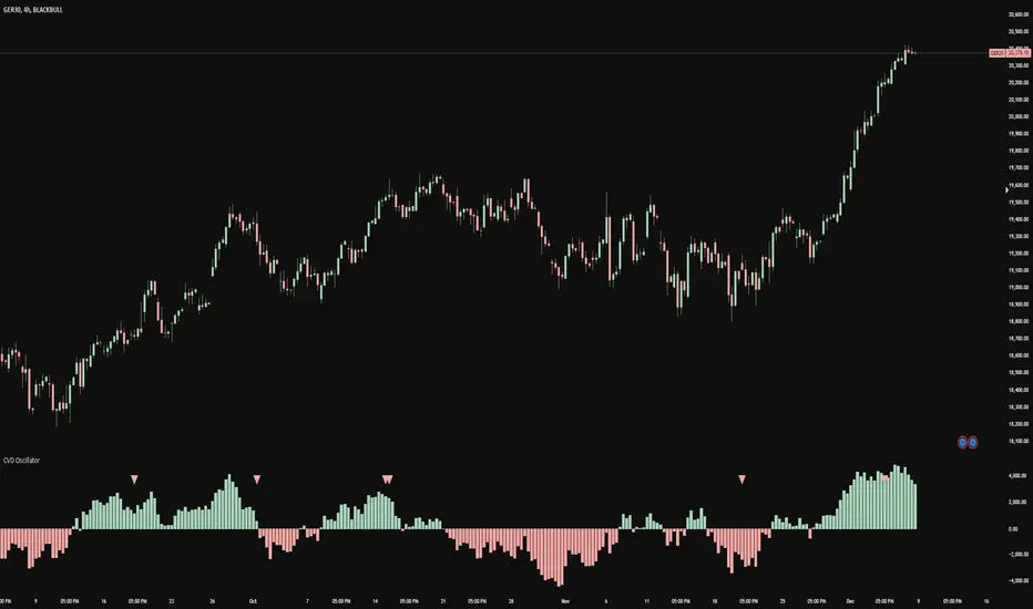
CVD OscillatorCVD Delta Oscillator
A momentum oscillator that measures buying and selling pressure through volume analysis, based on the principle that volume precedes price (cause and effect).
How It Works
Volume Analysis
Measures the force of buying and selling by analyzing how volume interacts with price movement within each bar
When price closes higher in a bar's range with strong volume, this indicates stronger buying pressure
When price closes lower in a bar's range with strong volume, this indicates stronger selling pressure
Momentum Measurement
Uses two EMAs (fast and slow) to smooth the volume delta
The difference between these EMAs creates an oscillator that shows:
Rising values = Buying pressure increasing
Falling values = Selling pressure increasing
Zero line crossovers = Potential shift in control between buyers and sellers
Signal Generation
Divergences
Bullish: Price falls to new lows while buying pressure increases (potential reversal up)
Bearish: Price rises to new highs while selling pressure increases (potential reversal down)
Zero-Line Crossovers
Bullish: Buying pressure overtakes selling pressure
Bearish: Selling pressure overtakes buying pressure
Practical Application
Reading the Indicator
Green columns above zero = Net buying pressure
Red columns below zero = Net selling pressure
Larger columns = Stronger pressure
Divergences and crossovers = Potential turning points
Trading Context
Helps identify when price movement has strong or weak volume support
Shows potential exhaustion points through divergences
Confirms trend changes through zero-line crossovers
Customization
Adjustable EMA periods for different trading styles
Toggle-able visual signals
Automatic alerts for all signals
BuySell%_ImtiazH_v2BuySell%_ImtiazH
This indicator includes two powerful volume metrics to complement your trading analysis:
30-Day Avg Vol (Blue Line): Tracks the average volume over the past 30 days, providing a baseline for typical trading activity.
Breakout Vol (White Line): Highlights the volume threshold needed for a potential breakout, calculated as a user-defined percentage above the 30-day average volume (default: 40%).
In addition to these enhancements, the indicator breaks down total trading volume into buying and selling components and calculates the percentage of buy volume for each bar.
🟥 Red Bars: Represent total volume.
🟩 Teal Bars: Show the buying volume within each candle.
🟨 Buy %: Displays the percentage of buy volume dynamically in the indicator panel, highlighted in yellow for quick visibility.
Use this tool to easily spot accumulation (buying pressure) or distribution (selling pressure) trends, customize breakout thresholds, and identify key breakout opportunities. Simple, clear, and effective for volume-based analysis!
How Are Buy Volume and Sell Volume Calculated?
This indicator uses a proportional approach to estimate buy and sell volumes based on price action:
Buy Volume: The portion of total volume where the price is moving upward, representing trades executed at the ask price.
Formula:
Buy Volume = (close - low) / (high - low) * volume
Sell Volume: The portion of total volume where the price is moving downward, representing trades executed at the bid price.
Formula:
Sell Volume = (high - close) / (high - low) * volume
If the high and low prices are the same (flat bar), both buy and sell volumes are set to 0.
Why This Matters
This calculation assumes the close price’s position within the high-to-low range reflects the balance of buying and selling activity:
Close near the high: Most volume is buy volume.
Close near the low: Most volume is sell volume.
Close in the middle: Volume is split between buying and selling.
By breaking down volume in this way, the indicator helps traders identify key trends like accumulation (buying pressure) and distribution (selling pressure), making it a powerful tool for volume-based analysis.

Volume Rate of Change (VROC)Volume Rate of Change (VROC) is an indicator that calculates the percentage change in trading volume over a specific period, helping analyze market momentum and activity. It is calculated as:
VROC = ((Current Volume - Past Volume) ÷ Past Volume) × 100
This indicator shows changes in market interest. Positive values indicate increasing volume, while negative values signal a decrease. High VROC values often suggest potential trend reversals or breakouts.
Applications:
Breakout Validation: VROC > 200% confirms strong breakouts; below this may signal false moves.
Market Stagnation: VROC < 0% suggests shrinking volume and range-bound markets.
Trend End Alert: A drop below 0% during trends may indicate weakening momentum.
Adjusting for Timeframes: Tailor VROC to timeframes.
Examples:
Daily: VROC(5) compares with last week's same day; VROC(20) with 1 month ago.
Monthly: VROC(12) compares with the same month last year; VROC(1) with last month.
Intraday: VROC(24) (hourly) and VROC(288) (5 minutes) for the same time yesterday.

Volume Distribution Before/After Top
Description
This script visualizes the distribution of volume before and after a price peak within a specified time interval. The green area represents the volume accumulated before the peak, and the red area represents the volume accumulated after the peak. The script also calculates and displays the volume-weighted average price (VWAP) on each side of the peak with a dotted line and a label.
The key features include:
Volume Visualization: Transparent green and red bars indicate volume fractions before and after the peak.
VWAP Markers: Centered labels with VWAP values are plotted above the corresponding levels.
Interactive Inputs: Define the start and end points of the analysis interval using customizable anchor times.
This tool is ideal for traders who want to analyze how volume dynamics are distributed around key price levels. It can help identify potential zones of support and resistance and improve the understanding of market behavior in response to volume accumulation.
Instructions
Select the start and end anchor times using the input fields.
Observe the volume distribution and VWAP levels on the chart.
Use the visual data to make more informed trading decisions.

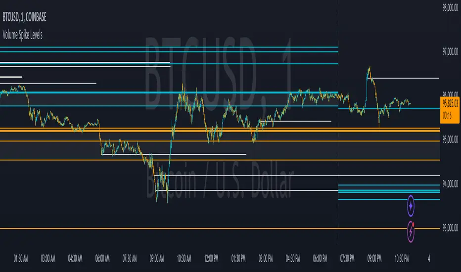
Volume Spike LevelsThis trading indicator finds specific high volume patterns that we have found to be the most likely to act as strong support and resistance levels and plots them on the chart. Using those high probability levels, the indicator will show lines in real time, as well as lines and important zones at the beginning of higher time frames to give you specific levels and areas where price is likely to react.
The most important volume zone for each time frame will have a color fill between the top and bottom lines of that high probability zone so you know to pay extra close attention to that area and look for price reactions there. If you can be patient enough to wait for price to hit these important areas and start to reverse, you will get great entries and help keep yourself from overtrading.
The levels shown can be adjusted to suit your preference, allowing you to get the right amount of levels for your trading strategy, whether that be scalping the 1 minute chart or long term investing via the daily chart.
HOW TO USE
For best results with this indicator, look for 2 types of setups. The first setup is a continuation bounce. You should be looking for these when price has broken out of its recent trading range either to the upside or the downside. When price is extending like this, look to take entries once a volume spike level shows up on the chart and price retraces back to that level. Then take your entry in the same direction as the trend. You can scalp quick wins this way, or you can wait for the next volume spike level to show up and price can’t hold that level any more, then get out. Place your stop loss just beyond the pivot that bounced off of the volume level.
The second type of setup you should look for is a reversal setup. This setup should be used when the market is ranging. Look for the top and bottom of the recent range and find the volume spike levels near the top or bottom of that range and wait for price to reach those levels. Once price hits that level and starts to show a reversal in price, take your entry. You can take quick scalps from those reversals for quick wins, or you can wait for price to reach the next major volume spike level and get out there or just before it. Place your stop loss just beyond the pivot that price made at the volume spike level where you entered your trade.
No matter which setup you are trading, it is never a bad idea to trail your stop loss as price moves towards your take profit level. Whatever volume spike timeframes you are using for your overall trend, you can use a lower time frame volume spike level to give you price points to trail your stop loss to there once price gets supportive at those levels and moves past them.
You should also pay close attention to how price reacts to the important volume zones shown. Many times, price will range inside or near these zones for a while and then form an accumulation just above or below that zone. When this happens, it is likely that price will start to move quickly in the direction that price moved away from that important zone. So when you see the price range inside of these zones and then go just beyond the zone on either side and accumulate, look to trade that breakout of the zone in the same direction that it moved away from the zone.
Note that on lower time frame charts, you will not be able to get some higher time frame levels because Tradingview limits the number of historical bars it can calculate on. So if you are on the 1-5 minute chart, you won’t be able to get yearly or quarterly levels late in the year/quarter due to the number of bars it has to calculate for those levels to populate is beyond the number of allowed bars. You can work around this by manually going to the daily chart and getting the yearly levels and drawing a horizontal line on your chart at the levels shown so that you still have those levels on your lower time frame charts. Unfortunately there is no way for us to work around this with code.
Each setting in the settings panel has a tooltip that will explain that specific setting so you understand how to use it. Just hover your mouse over the “i” icon and it will show a popup with the info. For the non-real time levels, the daily level settings will have the tooltips explaining everything and that info applies to all of the non-real time levels.
MODES
The indicator has two different modes you can use that will affect how the real time levels show up on your chart but will not affect the higher time frame levels. The default mode will give you static horizontal lines only. This means that when a high probability volume spike level comes in, a horizontal line will be drawn and will extend as long as the timeframe that the level is set to. For example a 60 minute volume spike time frame will extend the line for 60 minutes on the chart and then end. These lines will be drawn individually and will not update.
The second mode will give you variable lines and will show a color fill based on where price is in relation to all of the real time levels that are turned on. So if the price is above a level, it will color the background green and if the price is below a level, it will color the background red. This helps identify the trend of price compared to where the high probability volume spike levels came in so you can trade in the direction of the trend. With this mode, the lines for each time frame will update to the new level when a new volume spike for that time frame happens.
ALERTS
The indicator has alerts programmed for each different type of volume spike level that is available to add to your chart. So you can set an alert for when a new volume spike happens on any of the real time volume spike time frames, when price crosses the most recent real time volume spike level for each time frame, alert when any real time volume spike happens, alert when price crosses any of the higher time frame volume levels and also when price has crossed the upper or lower level of any of the important volume zones. Each alert is labeled the same as in the indicator settings so you can easily select which one you want.
For alerts to work properly, you have to have the levels turned on for whatever alerts you use. For example if you want an alert for Realtime 2 Volume Spikes, the Realtime 2 Volume Spike Levels must be turned on and shown on your chart.
Note that when using the alerts for price crossing a level, it will only alert when price crosses the most recent volume spike level. It will not alert when price crosses a previous level of the same time frame.
CUSTOMIZATION
You can customize nearly every feature of this indicator to tailor it to your specific trading style. Some of the customizable features are as follows: turn on or off labels for each time frame, turn on or off the color fills for important volume zones for each time frame, turn on or off the levels for each time frame, adjust the number of previous levels shown for each time frame, change the length of the lines for each time frame, extend the lines right for each time frame, change the color of the lines for each time frame, adjust the color fill colors for important volume zones, adjust the label colors and adjust the label offset length.
We also included some master settings to allow you to control various settings across all time frames with one click. These settings are as follows: turn on or off all labels, turn on or off all realtime levels, remove all lines except the most important volume zone on every time frame, turn on or off all color fills of important zones, adjust the background color fill of the trend coloring when set to variable lines and adjust the background color of all important zones.
There is also a feature that may need to be adjusted when you are looking at charts that do not have a lot of historical data. It will say the index is out of bounds, so look at the index number that the error shows by hovering over the red exclamation point next to the indicator name and adjust the setting labeled “Bar Index Threshold To Fix Errors” to a number that is slightly higher than the index number in the error message. This will fix the error by changing the calculations slightly to adjust for the bar indexes of that specific chart.
MARKETS IT CAN BE USED ON
This indicator can be used on any market that has volume data, including stocks, crypto, futures, forex and more.
TIME FRAMES IT CAN BE USED ON
This indicator has been programmed to work on the following time frames: 15 seconds, 30 seconds, 1 minute, 2 minute, 3 minute, 4 minute, 5 minute, 10 minute, 15 minute, 30 minute, 45 minute, 1 hour, 2 hour, 3 hour, 4 hour, 6 hour, 8 hour, 12 hour, 1 day, 2 day, 3 day, 1 week, 2 week, 1 month, 3 month and 1 year.
If you use a different time frame than shown above, you may get errors or irregular results, so please stick to the time frames that the trading indicator has been programmed to work correctly with.
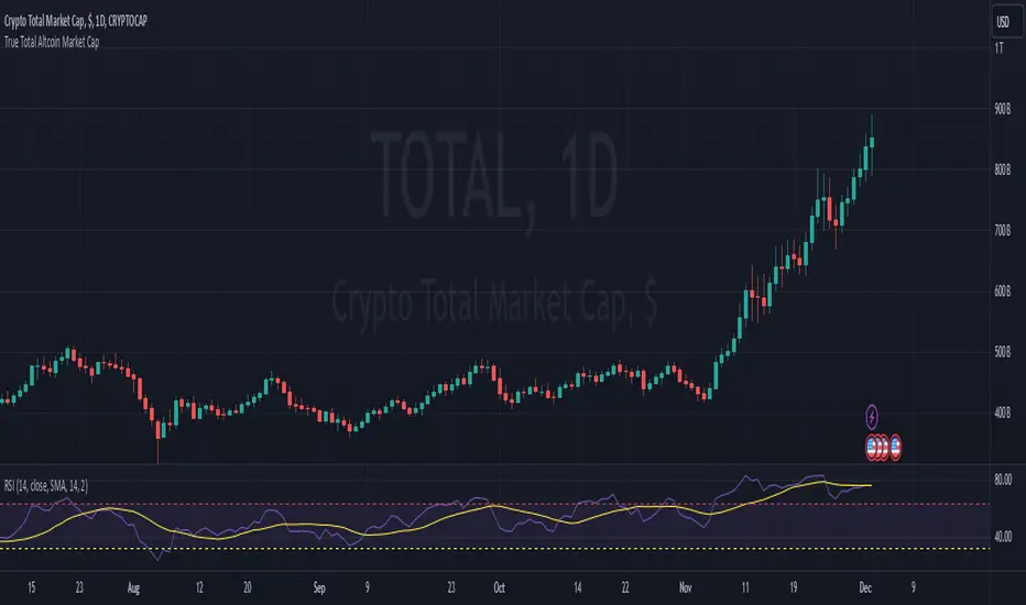
True Total Altcoin Market CapThis indicator calculates the real total altcoin market capitalization by removing Bitcoin, Ethereum, and major stablecoins (USDT, USDC, BUSD, DAI) from the total cryptocurrency market cap. It replaces the standard price bars with custom-colored candlesticks showing the true altcoin market movements.
Features:
Excludes BTC, ETH, and major stablecoins for accurate altcoin market analysis
Custom color scheme: Green (#26a79b) for bullish and Red (#ef5351) for bearish candles
Based on CRYPTOCAP:TOTAL data
Helps traders focus on pure altcoin market trends
Non-repainting, using standard OHLC data
This tool provides a clearer view of altcoin market strength by filtering out the influence of major cryptocurrencies and stablecoins.
Dix$on's Weighted Volume FlowDixson's Weighted Volume Flow
Dixson's Weighted Volume Flow is a technical indicator designed to analyze and visualize the distribution of buy and sell volume within a given timeframe. It dynamically calculates the proportional allocation of volume based on price action within each bar, providing insights into market sentiment and activity. This indicator displays horizontal volume bars in a separate pane and annotates them with precise volume values.
How It Works
1. Volume Allocation:
- The indicator calculates buy and sell volume using the following formulas:
- Buy Volume = (Close - Low) / (High - Low) Total Volume
- Sell Volume = (High - Close) / (High - Low) Total Volume
- These formulas allocate volume proportionally based on the bar's price range, attributing more volume to buying or selling depending on the relationship between the close, high, and low prices.
2. Dynamic Scaling:
- The buy and sell volumes are scaled relative to their combined total for the period.
- The resulting values determine the length of the horizontal bars, providing a comparative view of buy and sell activity.
3. Bar Visualization:
- Buy Volume Bars: Displayed as green horizontal bars.
- Sell Volume Bars: Displayed as red horizontal bars.
- The lengths of the bars represent the dominance of buy or sell volume, scaled dynamically within the pane.
4. Labels:
- Each bar is annotated with a label showing its calculated buy or sell volume value.
5. Timeframe Adjustment:
- The indicator uses the request.security() function to fetch data from the selected timeframe, allowing users to customize their analysis for intraday, daily, or longer-term trends.
6. Customization Options:
- Enable or disable the indicator using a toggle.
- Adjust colors for the buy/sell bars and text labels to suit your chart theme.
How to Use It
1. Enable the Indicator:
- Activate the indicator using the "Enable/Disable" toggle in the settings.
2. Select a Timeframe:
- Choose the timeframe for analysis (e.g., 1-minute, 1-hour, daily). The indicator fetches volume data specific to the selected timeframe.
3. Interpret the Visualization:
- Compare Bar Lengths:
- Longer buy volume bars (green) indicate stronger buying activity.
- Longer sell volume bars (red) suggest dominant selling pressure.
- Labels:
- Use the labels to view the exact buy and sell volume values for precise analysis.
4. Combine with Other Tools:
- Use the indicator alongside price action analysis, support/resistance levels, or trend indicators to confirm market sentiment and detect potential reversals.
5. Monitor Imbalances:
- Significant disparities between buy and sell volume can signal shifts in market sentiment, such as the end of a trend or the start of a breakout.
Practical Applications
- Trend Confirmation:
- Align the dominance of buy or sell volume with price trends to confirm market direction.
- Reversal Signals:
- Watch for volume imbalances or a sudden shift in the dominance of buy or sell volume to identify potential reversals.
- High-Activity Zones:
- Identify areas with increased volume to anticipate significant price movements or key support/resistance interactions.
Dixson's Weighted Volume Flow provides a clear and systematic way to analyze market activity by visualizing the dynamics of buy and sell volume. It is particularly useful for traders looking to enhance their understanding of volume-based sentiment and its impact on price movements.

Market GhostGhost Candles: Volume-Based Transparency Indicator
Before adding the indicator to the chart, hide the chart candles (the chart would get blank) otherwise no changes will be visible on your chart due to the display of the original candles (transparencies won't be visible because the full-opaque candles cover them)
This unique indicator dynamically adjusts the transparency of candles based on their volume relative to the past X candles. Candles with low volume become more transparent, while those with higher volume appear more opaque, creating a smooth gradient effect. This allows for a visual representation of market activity where low-volume candles "fade" into the background, making high-volume candles stand out more clearly.
Customizable Lookback Period: Adjust the lookback period (X candles) to suit your analysis.
Volume-Based Visualization: A smooth gradient of transparency helps to visualize volume strength relative to recent market activity.
Unique Aesthetic: Adds a unique, "ghostly" aesthetic to the chart, ideal for identifying volume trends without the clutter of traditional indicators.
This script is perfect for traders who want to visually highlight volume strength while maintaining a clean, easy-to-read chart.

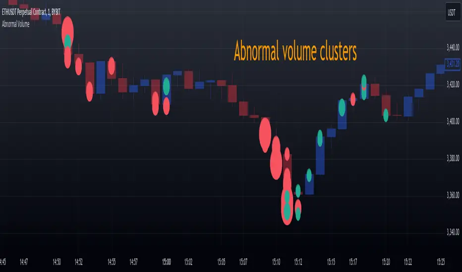
Abnormal volume [VG]🪙 INTRODUCTION
This technical indicator helps identify and highlight large volume clusters on the chart.
Abnormal volume refers to unusually large accumulations of volume over short time intervals. Such clusters appear when the amount of assets bought or sold significantly exceeds typical volumes for a specific asset over a given period. These patterns can indicate significant events or intentions of market participants.
Reasons for abnormal volume clusters:
Institutional investments :
Large investment funds and banks may buy or sell significant volumes of assets to rebalance their portfolios.
Impact of news and events :
Important news (e.g., mergers, bankruptcies, management changes) can trigger large-scale buying or selling of assets.
Market manipulation :
Big players may execute large trades to artificially create demand or supply for an asset, affecting its price in the short term.
Insider trading :
Abnormal volumes may signal that someone with insider information has started buying or selling assets in anticipation of future events that could impact the price.
What do abnormal volume clusters mean for traders?
A signal of potential price changes :
High trading volumes are often accompanied by sharp price movements. An increase in volume during price growth might indicate rising interest in the asset, while an increase during a decline could signal a sell-off.
Potential entry or exit points :
For short-term traders, abnormal trades can serve as signals to enter or exit positions. For example, a large volume growth accompanied by a breakout of a key level might be seen as a buy signal.
Caution due to potential manipulation :
Abnormal trades don’t always lead to expected outcomes. Sometimes, they are part of a price manipulation strategy, so it’s essential to consider the broader context and confirm with other signals.
🪙 USAGE
This indicator doesn’t provide trading signals, entry points, or actionable recommendations.
Instead, it simplifies tracking market dynamics and highlights unusual activity worth considering during analysis.
After adding the indicator to the chart, you only need to configure two parameters: the threshold value that determines what constitutes a significant volume cluster and the period over which volumes are aggregated for comparison against the threshold.
It’s recommended to use the shortest available period, as this helps more precisely identify the prevailing volume direction (since this depends on price changes, not trade direction).
The threshold value can be fine-tuned by switching the chart’s timeframe to match the selected period, observing of the significant volume increase on the classic volume histogram, and noting the corresponding market reactions. This allows for selecting a threshold that highlights early signs of impactful trading events on higher timeframes.
Let’s look at an example in the screenshot:
Once the parameters are set, you can also enable an alert to trigger whenever a new volume cluster appears, simplifying event tracking.
Note: in the current version of the indicator, the alert will be triggered only once per bar on the chart at the first detected cluster of abnormal volume.
🪙 IMPLEMENTATION
Technically, the script retrieves volume data from a lower timeframe and estimates whether the volume was primarily generated by buyers or sellers based on price movements.
The lower resolution timeframe is determined as follows:
if the settings base period is less than 1 minute, then the data timeframe will be equal to 1 second
if the settings base period is equals 1 minute or more, then the data timeframe will be equal to 1 minute
The algorithm checks whether the price increased or decreased at each point. If the price rose, the volume is presumed to be driven by buyers and marked as buy volume; otherwise, it’s marked as sell volume.
The total volume at each point is then checked against the user-defined threshold. If the volume exceeds the threshold, a corresponding circle is drawn on the chart, and an alert is generated if created.
The size of the visual representation is proportional to the most recent maximum volume and follows the rules below:
Percentage of max volume -> Volume cluster size
less than 25% -> Tiny
25% to 50% -> Small
50% to 75% -> Normal
75% to 100% -> Large
100% or more -> Huge
🪙 SETTINGS
The indicator is designed to be as simple and minimalist as possible, making configuration effortless. There are only two core parameters, with additional options to customize the colors of volume clusters based on their type.
Trade volume threshold
Defines the volume level above which a cluster is considered significant and displayed on the chart as a circle. The size of the circle depends on the proportion of the current volume relative to the most recent maximum over the chosen period.
Trades base period
Specifies the period for aggregating trade volumes to determine whether they qualify as abnormal. The significance level is set using the Trade volume threshold parameter.
Buy/Sell trades
Allows you to set the colors for abnormal volume circles based on the price direction during cluster formation.
🪙 CONCLUSION
Abnormal volume clusters are always a critical indicator requiring attention and analysis, but they are not a guaranteed predictor of trend changes.
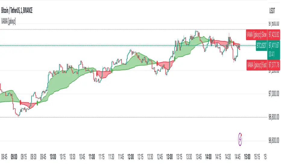
VAMA - Volume Adjusted Moving Average [jpkxyz]VAMA is a moving average that adapts to volume, giving more weight to price movements backed by higher relative volume. This VAMA (Volume Adjusted Moving Average) indicator implementation emphasizes visual clarity. It is based on the VAMA script by @allanster
Dual VAMA lines (Fast/Slow) with dynamic coloring:
Single-color scheme switches between green (bullish) and red (bearish)
Color changes on crossovers rather than relative position
Configurable line widths (set to 1 for clean appearance)
Visual enhancements:
Optional fill between VAMA lines (50% transparency)
Crossover dots can be toggled
Fills and dots match the current trend color
Customization parameters:
Independent source inputs for Fast/Slow lines
Adjustable VI Factor (volume influence)
Sample size control
Strict/non-strict calculation toggle
The code maintains efficient computation while prioritizing visual feedback for trend changes. It's designed for clear signal identification without visual clutter.
Notable style choices:
Consistent color theming throughout all visual elements
Simplified color transitions (only at crossovers)
Subtle transparency for fill areas
Minimal dot size for crossover markers
VAMA (Volume Adjusted Moving Average) Technical Analysis:
Core Calculation:
1. Volume Influence (v2i):
v2i = volume / ((total_volume/total_periods) * volume_factor)
- total_volume: Sum of volume over sample period
- total_periods: Either full history (nvb=0) or specified sample size
- volume_factor: Controls sensitivity to volume deviation
2. Price Weighting:
weighted_price = source_price * v2i
3. Accumulation Process:
- Iterates through length*10 periods
- Accumulates weighted prices and volume influence values
- Continues until volume influence sum >= specified length or strict rule triggers
4. Final VAMA Value:
vama = (weighted_sum - (volume_sum - length) * last_price) / length
Parameters:
- SampleN: Historical reference length (0=full history)
- Length: Base period for calculation
- VI Factor: Volume influence multiplier (>0.01)
- Strict: Forces exact length period completion when true
- Source: Input price data
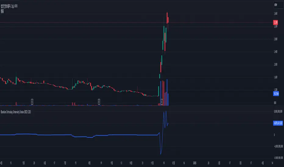
Bostian Intraday Intensity Index (BII)The Bostian Intraday Intensity Index (BII) is a metric used to analyze the trading volume and price movements of a specific stock or asset, measuring the strength and pressure of the market. BII captures buy and sell signals by examining the relationship between trading volume and price fluctuations. Below is an explanation of the key components and calculation method for BII:
○ BII Formula:
sum(V*((C-L)^2-(H-C)^2))/(H-L)))
V (Volume): Trading volume
C (Close): Closing price
L (Low): Lowest price
H (High): Highest price
○ Meaning of the Indicator:
Positive Values: When BII is positive, it indicates strong buying pressure. The closer the closing price is to the high, the stronger the buying pressure.
Negative Values: When BII is negative, it indicates strong selling pressure. The closer the closing price is to the low, the stronger the selling pressure.
○ How to Use:
Buy Signal: When the BII value is positive and trending upwards, it may be considered a buying opportunity.
Sell Signal: When the BII value is negative and trending downwards, it may be considered a selling opportunity.
The BII indicator is useful for analyzing the strength and pressure of the market through the correlation of price movements and trading volume. It helps investors capture buy and sell signals to make better investment decisions.
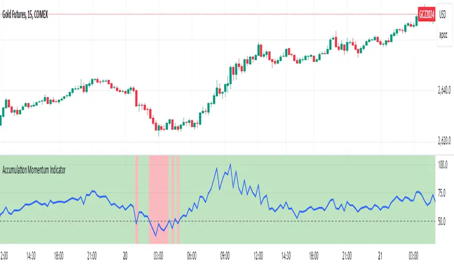
Accumulation Momentum IndicatorEveryone wants to be in a trend, I think this indicator does a great job at showing that key momentum that traders try and capitalize on everyday. I used a Stochastic Momentum Indicator (SMI) indicator. It's a lot like a slower MACD which allows me to capitalize on changing momentum. My goal was to make an indicator that was able to use a weighted mean of many accumulation/momentum indicators. This would give me a well rounded look to really see what direction the momentum and volume is heading.
I did some research on some of the best Accumulation and Momentum Indicators. I landed on 4.
The Accumulation Distribution line which measures the cumulative flow of money in or out of a security. It helps show how quickly money is going in and out of a commodity. The line moving up quickly indicates fast Accumulation while the A/C line is moving down quickly is shows falling Distribution. This can show the momentum and accumulation of a commodity in short and long term based off of Volume.
The On Balance Volume, OBV is a combination of Price Movement and Volume. If price closes higher then the previous bar volume is added while if the price closes lower volume is subtracted. This gives us an overall tally of whether volume is increasing with price or slowing down the momentum in the direction of the current trend. This gives us the ability to see if volume is supporting the price increasing (beginning/middle of a trend) or price is slowing down even though it is still heading in the direction of the current trend (signaling the end of the current trend).
The Force Index, this indicator measures the overall strength of the price movements. It does this by a calculation of price and volume. The close of the current bar subtracted by the previous multiplied by the volume. The result gives us either strong upward or downward motion. This adds magnitude to the overall movement/momentum of the indicator.
Lastly but most certainly not least is the Momentum indicator, (Price Momentum) a simple indicator that shows you the difference between the current close price and the close price from a specified period ago (Most commonly 14 periods/bars ago). Having this indicator is a must because it shows the speed at which price is accelerating or decelerating.
These 4 indicators together help round out the current volume, price movements, accumulation, and momentum of the current market. Since these indicators all have different scales and calculations I had to Normalize the Values to a 0-100 scale. This gives us 1 line and a much more readable easy to understand indicator. After they were normalized I gave them a weighted average that you can control. So lets say you cared more about the Force Index and the OBV rather then the Momentum and the Accumulation Distribution indicators, you would be able to give them more weight in the overall calculation as well as 0 out those you don't even want involved.
I hope the flexibility and the combination of 4 strong Accumulation Momentum indicators helps you better gauge the direction a commodity might head. The way it's used is when the Accumulation Momentum line is Above 50 buying pressure is stronger then selling pressure. An Accumulation Momentum line Below 50 suggests that distribution is more dominant in the current market. This indicator combines four different methods of analyzing price and volume to give you a single composite momentum score, making it easier to visualize when a commodity is being accumulated or distributed and how quickly this process is happening. It helps you track market sentiment based on both price movement and volume, with a clear, visual representation of buying and selling pressure.
Please let me know what you think and how you think I might be able to improve the script. Enjoy!
Volume Volatility and Delta Indicator (HN)This Volume Volatility Indicator with Overall Average from Hossein.N helps you visualize the volatility of volume on different timeframes and compares it to the average volume over a given period. It includes several components:
Volume Volatility Indicator (Blue Line): This shows the volatility of volume relative to its moving average over a specified period. Higher values indicate more volatile trading conditions.
Long-Term Volatility Average (Orange Line): This line shows the moving average of the volume volatility indicator over a longer period. It acts as a benchmark for comparing the current volume volatility with historical trends.
Average Volume on Up Days (Green Line): Displays the average volume on days when the price is going up (green).
Average Volume on Down Days (Red Line): Displays the average volume on days when the price is going down (red).
Delta in Percentage (Blue Line): This shows the difference between the average volume of up days and down days, expressed as a percentage of the overall moving average of volume. It can be used to identify bullish or bearish volume imbalances. For example:
Positive values indicate that the volume on up days is stronger than on down days, which could suggest a bullish trend.
Negative values suggest that volume on down days is stronger than on up days, potentially indicating a bearish trend.
Zero Line (Gray Dotted Line): A reference line at 0 that helps you identify when the delta is positive or negative, and visualize the neutral point where volume is balanced between up and down days.
How to Use This Indicator:
Add to Your Chart: Copy the script above and paste it into TradingView's Pine Script editor. Click "Add to Chart" to visualize the indicator.
Interpret the Indicator:
Volume Volatility: A higher value suggests high market volatility. When volume is highly volatile, it may indicate more significant price movements or market uncertainty.
Long-Term Average of Volatility: Use this line as a reference to see whether current volatility is above or below average over a longer period.
Delta in Percentage: This is particularly useful to compare the strength of buying and selling volume. A positive delta percentage suggests strong buying pressure, while a negative delta suggests strong selling pressure. The closer the delta is to zero, the more balanced the volume between up and down days.
Use for Trend Confirmation: The indicator can help confirm trends. If the delta percentage is positive and increasing, and the volume volatility is above average, it could signal strong bullish momentum. Conversely, if the delta is negative and the volume volatility is rising, it may suggest bearish sentiment.
Risk Disclaimer:
Important: This indicator is a tool designed to help analyze market conditions. It does not guarantee success in trading and should not be used as the sole basis for making trading decisions. Always do your own research, consider other factors (e.g., price action, market news, fundamentals), and manage your risk appropriately. Trading involves significant risk, and you should only trade with money you can afford to lose. Always ensure you understand the risks involved in trading and use risk management strategies.
By using this tool, you accept full responsibility for any trading decisions and the outcomes thereof. The information presented is for educational and informational purposes only.

Wick Highlight IndicatorDescription:
This script is designed to help traders quickly spot significant wicks, which indicate areas of strong market rejection. By focusing on longer wicks, it identifies potential turning points where there was a strong buying or selling reaction.
Features:
Adjustable Minimum Wick Length: Users can set the minimum length of wicks to be highlighted, helping filter out less significant wicks. Default is set at 50 points.
Seller and Buyer Wick Analysis: Highlights both the top (seller pressure) and bottom (buyer pressure) wicks separately, giving a clearer view of market strength and rejection.
Non-Intrusive Display: Wicks are highlighted in black at 10% opacity, providing clear visual markers while keeping the chart clean and readable.
How to Use It: This indicator is open-source and free for all users. It aims to identify wicks that are larger than the average noise, which often indicates strong price rejections or future targets. You can adjust the minimum length to tailor the indicator to different market conditions and trading styles.
Why It Matters: Wicks often signify moments when price levels were rejected strongly, pointing to areas of potential support or resistance. By focusing only on significant wicks, this indicator helps you hone in on potential key levels of interest without overwhelming the chart with less important data. This can be particularly useful in spotting reversals or market exhaustion.
No other indicators are required, and the chart is kept clean for clarity and ease of understanding.
Notes:
This is an open-source script, and no solicitations or ads are included.
The indicator is intended to highlight significant wicks only and does not issue any buy/sell signals.
It is compliant with TradingView's publishing rules, focusing on transparency, clarity, and adding value to the community.

Volume Trend Oscillator v1indicator stands out from traditional oscillators due to its focus on volume dynamics as a driver of market trends. while many oscillators are price-based, this one integrates volume activity directly into its calculations, which provides unique insights into the strength and direction of trends influenced by buying and selling pressure.
unique features
focus on volume trends
the oscillator emphasizes the distinction between bullish (upward) and bearish (downward) volume. it calculates moving averages of up and down volumes, allowing for a clear view of the net volume influence in the market.
net volume normalization
the oscillator derives its value by comparing up and down volume relative to the total net volume. this normalization ensures that the indicator adapts to varying market conditions, highlighting meaningful trends rather than absolute volume changes.
trend-sensitive background highlights
the indicator uses customizable thresholds for bullish and bearish zones. when both the oscillator and its moving average cross the thresholds, the background color changes, offering a visual cue for trend identification. this makes it easy to spot potential trend shifts.
smoothing with moving averages
the inclusion of a moving average line of the oscillator provides additional smoothing, helping to filter out noise and offering a clearer signal.
neutrality awareness
the neutral line (set at 0) and visual thresholds give traders a balanced view of market indecision or consolidation, further differentiating it from traditional oscillators that may lack a well-defined neutral state.
non-overlay and clarity
the oscillator is plotted in a separate pane, keeping the chart clean and focused. its simplicity ensures that users can quickly interpret signals without being overwhelmed.
benefits of this approach
volume-driven trend detection: it allows traders to understand whether market trends are backed by actual trading volume, making signals more reliable.
customizable thresholds: users can fine-tune the bullish and bearish levels to suit different trading strategies or timeframes.
effective in volatile markets: by focusing on volume, the oscillator adapts well to volatile markets where price action alone may be misleading.
this indicator is particularly useful for traders who want to incorporate volume dynamics into their analysis to identify potential reversals or trend continuations that might not be apparent with price-focused tools.

Key Historical Volume Bar on Price ChartThis is a unique indicator of volumne bar of price charts.
1. Show Highest Volume Ever(E)
2. Show Rolling Highest Volume Yearly(Y)
3. Show Rolling Highest Volume Quarterly(Q)
4. Show Lowest Volume Ever(e)
5. Show Rolling Lowest Volume Yearly(y)
6. Show Rolling Lowest Volume Quarterly(q)
You can toggle each of the 6 indicator on bar.
This indicator will only work on daily and weekly timeframe.
Also you can configure few settings like
Highlight Price bar only when stock is rising
No. of trading days In a Year
No. of trading days in a Quarter
No of trading days vary country to country, please set them up as per your country.
