OPEN-SOURCE SCRIPT
Telah dikemas kini Greer Value Yields Dashboard
🧾 Greer Value Yields Dashboard – v1.0
Author: Sean Lee Greer
Release Date: June 22, 2025
🧠 Overview
The Greer Value Yields Dashboard visualizes and evaluates four powerful valuation metrics for any publicly traded company:
📘 Earnings per Share Yield
💵 Free Cash Flow Yield
💰 Revenue Yield
🏦 Book Value Yield
Each yield is measured as a percentage of current stock price and compared against its historical average. The script assigns 1 point per metric when the current yield exceeds its long-term average. The total score (0 to 4) is displayed as a color-coded column chart, helping long-term investors quickly assess fundamental valuation strength.
✅ Key Features
📊 Real-time calculation of 4 yield-based valuation metrics
⚖ Historical average tracking for each yield
🎯 Visual scoring system:
🟥 0–1 = Weak
🟨 2 = Neutral
🟩 4 = Strong (all metrics above average)
🎛️ Toggle visibility of each yield independently
🧮 Fully compatible with other Greer Financial Toolkit indicators
🛠 Ideal For
Long-term value investors
Dividend and cash-flow-focused investors
Analysts seeking clean yield visualizations
Greer Toolkit users combining with Greer Value and BuyZone
Nota Keluaran
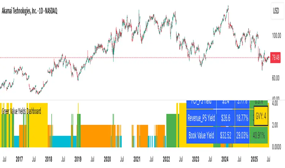
🆕 New Features📊 Yield Table Display: Added an optional, toggleable table that summarizes all four valuation-based yield metrics:
EPS Yield
Free Cash Flow Yield
Revenue Yield
Book Value Yield
📋 Table Layout:
Columns: Metric | Raw Value ($) | Avg % | Current %
Current % column is color-coded:
🟩 Green – Current yield is above average
🟥 Red – Current yield is below average
All other cells use a blue background with white text for visual clarity
💵 Improved Value Formatting:
Raw financial stats (EPS, FCF, etc.) are shown in dollars (e.g., $3.25)
All yields are formatted as percentages (e.g., 4.15%)
✅ Enhancements
🧼 Removed the redundant Above Avg? column for a cleaner layout
🎯 Table only appears on the latest candle (final bar on chart)
⚙️ New Setting: Show Yield Table toggle (default = off) so users can enable it only when needed
📌 Usage Notes
The table is optimized for readability during manual analysis
It will not appear during backtesting or across multiple bars unless manually toggled on
🔗 Part of the Greer Financial Toolkit:
📘 Greer Value – Measures year-over-year growth consistency across key financial metrics
🟢 Greer BuyZone – Identifies cyclical long-term buy conditions using technical + Fibonacci models
💵 Greer FCF Yield – Tracks free cash flow efficiency relative to price
📈 Greer Revenue Yield – Evaluates how much revenue per share is generated relative to stock price
Nota Keluaran
🔄 Greer Value Yields Dashboard – v2.1 (06/26/2025)🆕 New Features
📊 Yield Table Display
Added an optional table summarizing all four valuation-based yield metrics:
EPS Yield
Free Cash Flow Yield
Revenue Yield
Book Value Yield
📋 Table Layout
Columns: Metric | Raw Value ($) | Avg % | Current %
Current % column is dynamically color-coded:
🟥 Red – Current yield is below average
🟩 Green – Current yield is above average
All other cells use a blue background with white text for clean readability
💵 Value Formatting
Raw values are shown in dollar format (e.g., $3.25)
Yields are shown as percentages with two decimal places (e.g., 4.15%)
🧮 GVY Score Color Coding (0–4)
Each of the four yield metrics earns a point when above its historical average. The total score is displayed using color-coded tiers:
⬜ 0 = None (White)
🟦 1 = Weak (Aqua)
🟧 2 = Neutral (Orange)
🟩 3 = Strong (Green)
🟨 4 = Gold Exceptional (All metrics above average)
📦 GVY Score Badge
A compact Greer Value Yields Score (GVY) label appears in the top-right corner of the chart:
Example: GVY: 3
Background color matches score tier (as shown above)
✅ Enhancements
🧼 Removed the “Above Avg?” column for a cleaner table
🎯 Yield Table and Score only render on the last bar
⚙️ Added new settings:
Show Yield Table toggle (default = off)
Show Greer Value Yields Score toggle (default = on)
🔗 Part of the Greer Financial Toolkit
📘 Greer Value – Measures YoY consistency across key fundamental metrics
🟢 Greer BuyZone – Identifies long-term buy conditions using Fibonacci + trend logic
💵 Greer FCF Yield – Measures free cash flow efficiency relative to price
📈 Greer Revenue Yield – Evaluates revenue per share vs. price for yield-like value
Nota Keluaran
📊 Greer Value Yields Dashboard — v2.2🔄 Updated: July 3, 2025
This update focuses on usability and clarity with status-line-only plotting and improved color logic.
✅ What’s New in v2.2:
📈 Status Line Integration:
Key yield metrics (EPS %, FCF %, Revenue %, Book %, and GVY Score) now appear in the TradingView Data Window without cluttering the chart.
🎨 Dynamic Color Feedback:
Red/Green logic now applies consistently across the yield table and status lines for fast visual scoring.
🧼 Cleaner Charting Experience:
Removed all standard plots in favor of a fully table-driven display. Perfect for lower pane overlays or minimalist dashboards.
💡 Highlights:
0–4 GVY Score: Evaluates a company’s valuation strength based on yield metrics vs historical averages
Table + Badge (Optional): Only shown on the latest bar
Pure Data View: Use in the status pane without cluttering your chart
Skrip sumber terbuka
Dalam semangat TradingView sebenar, pencipta skrip ini telah menjadikannya sumber terbuka, jadi pedagang boleh menilai dan mengesahkan kefungsiannya. Terima kasih kepada penulis! Walaupuan anda boleh menggunakan secara percuma, ingat bahawa penerbitan semula kod ini tertakluk kepada Peraturan Dalaman.
Penafian
Maklumat dan penerbitan adalah tidak bertujuan, dan tidak membentuk, nasihat atau cadangan kewangan, pelaburan, dagangan atau jenis lain yang diberikan atau disahkan oleh TradingView. Baca lebih dalam Terma Penggunaan.