PROTECTED SOURCE SCRIPT
Candle Body Table
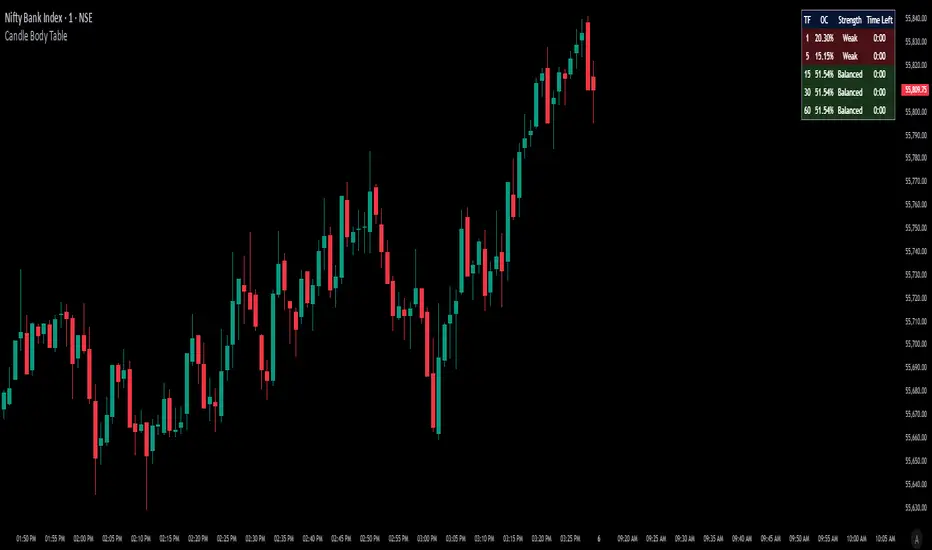
Candle Body Table is a lightweight, easy-to-use indicator that displays a live summary of candle “body strength” across multiple timeframes, along with how much time is left on each candle. Simply choose up to five timeframes (1, 5, 15, 30, and 60 minutes by default), adjust the table’s corner and font size, and you’ll always have a quick, at-a-glance view of:
The table updates in real time (using lookahead), coloring each row background green if that timeframe’s current candle is bullish, or red if it’s bearish. That way, you can instantly see which timeframes have strong momentum, which are balanced or weak, and exactly when each candle will finish.
Use Cases
Multi-Timeframe Momentum Check:
If you want to confirm that both your 1m and 5m candles have “Strong” bodies before entering a trade, Candle Body Table shows you that instantly. No more switching back and forth between charts—just glance at the table.
Time-Sensitive Entries/Exits:
Suppose you trade breakouts only at the close of a 5-minute candle. The “Time Left” column counts down so you know exactly when that candle is about to close—down to the second—letting you prepare your order.
Quick Visual Scan:
When markets are choppy, you may want to see which timeframes are weak or balanced rather than diving into each timeframe separately. If the 15m row says “Weak” (small body %), you might avoid taking a trend-following position at that moment.
Session Overlaps & Volatility Windows:
During London/N.Y. overlap or U.S. cash close, traders often check for stronger bodies on higher timeframes (e.g., 30m or 60m). The table immediately highlights if that timeframe’s candle body heats up, indicating increased volatility.
Swing-to-Scalp Transition:
If you typically scalp on 1m but only when the 15m candle is “Strong,” this table gives a green/red cue and a strength label. That makes it easier to wait patiently until multiple timeframes align.
FAQ
Q1. What does “OC” mean, and why is it shown as a percentage?
A1. “OC” stands for Open/Close difference. So it reflects how much of the candle’s total range (high–low) is taken up by its body(open-close). A high OC% means the candle body is large relative to its wick. In other words a strong Bullish/Bearish candle.
Q2. How is “Strength” determined?
A2. The script uses three buckets:
Weak if OC% ≤ 30%
Balanced if 30% < OC% ≤ 55%
Strong if OC% > 55%
This gives you a quick label instead of having to interpret raw percentages every time.
Q3. Why do some rows have a green background and others red?
A3. If close > open (bullish candle), that entire row’s background is shaded green(70%). If close < open (bearish candle), it’s shaded red(70%). If open = close (doji), there’s no background shade. This lets you instantly spot bullish vs. bearish candles across your chosen timeframes.
Q4. Will this repaint?
A4. No. Because each OHLC value is requested with lookahead_on, you see the live developing OHLC. However, once a candle closes, those values are final. The “Time Left” column dynamically changes throughout the bar but does not redraw past values.
- OC (Body %): The percentage of the candle that’s composed of its body (|open – close| divided by high–low).
- Strength: A label (Weak, Balanced, or Strong) based on the body percentage.
- Time Left: How many minutes and seconds remain before the current candle closes.
The table updates in real time (using lookahead), coloring each row background green if that timeframe’s current candle is bullish, or red if it’s bearish. That way, you can instantly see which timeframes have strong momentum, which are balanced or weak, and exactly when each candle will finish.
Use Cases
Multi-Timeframe Momentum Check:
If you want to confirm that both your 1m and 5m candles have “Strong” bodies before entering a trade, Candle Body Table shows you that instantly. No more switching back and forth between charts—just glance at the table.
Time-Sensitive Entries/Exits:
Suppose you trade breakouts only at the close of a 5-minute candle. The “Time Left” column counts down so you know exactly when that candle is about to close—down to the second—letting you prepare your order.
Quick Visual Scan:
When markets are choppy, you may want to see which timeframes are weak or balanced rather than diving into each timeframe separately. If the 15m row says “Weak” (small body %), you might avoid taking a trend-following position at that moment.
Session Overlaps & Volatility Windows:
During London/N.Y. overlap or U.S. cash close, traders often check for stronger bodies on higher timeframes (e.g., 30m or 60m). The table immediately highlights if that timeframe’s candle body heats up, indicating increased volatility.
Swing-to-Scalp Transition:
If you typically scalp on 1m but only when the 15m candle is “Strong,” this table gives a green/red cue and a strength label. That makes it easier to wait patiently until multiple timeframes align.
FAQ
Q1. What does “OC” mean, and why is it shown as a percentage?
A1. “OC” stands for Open/Close difference. So it reflects how much of the candle’s total range (high–low) is taken up by its body(open-close). A high OC% means the candle body is large relative to its wick. In other words a strong Bullish/Bearish candle.
Q2. How is “Strength” determined?
A2. The script uses three buckets:
Weak if OC% ≤ 30%
Balanced if 30% < OC% ≤ 55%
Strong if OC% > 55%
This gives you a quick label instead of having to interpret raw percentages every time.
Q3. Why do some rows have a green background and others red?
A3. If close > open (bullish candle), that entire row’s background is shaded green(70%). If close < open (bearish candle), it’s shaded red(70%). If open = close (doji), there’s no background shade. This lets you instantly spot bullish vs. bearish candles across your chosen timeframes.
Q4. Will this repaint?
A4. No. Because each OHLC value is requested with lookahead_on, you see the live developing OHLC. However, once a candle closes, those values are final. The “Time Left” column dynamically changes throughout the bar but does not redraw past values.
Skrip dilindungi
Skrip ini diterbitkan sebagai sumber tertutup. Akan tetapi, anda boleh menggunakannya secara bebas dan tanpa apa-apa had – ketahui lebih di sini.
Penafian
Maklumat dan penerbitan adalah tidak bertujuan, dan tidak membentuk, nasihat atau cadangan kewangan, pelaburan, dagangan atau jenis lain yang diberikan atau disahkan oleh TradingView. Baca lebih dalam Terma Penggunaan.