Pixel Art CloudPixel Art Cloud ☁️ (Super Mario Bros. 2 NES Style)
This Pine Script (v6) script generates a Pixel Art Cloud, inspired by the classic clouds from Super Mario Bros. 2 (NES).
📌 Features:
Displays a pixelated cloud in 8-bit retro style.
Overlays the chart at user-defined intervals.
Uses a color combination to simulate the classic cloud:
⚫ Black for the outline (classic pixelated border).
🔵 Light blue (#3CBCFC) for internal details, matching the clouds in the game.
Automatic repetition on the chart based on the separation parameter.
Does not affect market data, purely a visual decorative element.
🎨 Main Use:
This script is perfect for adding a nostalgic and creative touch to TradingView charts, bringing back the Super Mario Bros. 2 (NES) vibe.
🔧 Optional:
You can modify the cloud's appearance frequency by adjusting the separation parameter.
💡 Note:
This script is not a technical indicator and does not influence market analysis.
🚀 Add a retro touch to your charts with this pixelated cloud! ☁️🎮
ART

Pixel Art ChickenPixel Art Chicken 🐔
This Pine Script (v6) script generates a Pixel Art of a Chicken on the TradingView chart.
📌 Features:
Draws a pixelated chicken using vibrant colors:
🔴 Red (comb)
🟡 Yellow (beak and legs)
⚪ Light gray (body)
⚫ Black (eyes and outline)
Overlays the chart at user-defined intervals.
Functions as a visual design without affecting market data.
Customizable in terms of location and spacing between images.
🎨 Main Use:
This script is perfect for adding a fun and creative touch to your TradingView charts.
🔧 Optional:
If you want to modify the repetition frequency of the pixel art, adjust the separation parameter.
💡 Note:
This script is not a technical indicator and does not influence market analysis.
🚀 Enjoy this Pixel Art on your charts! 🎮🐔🔥

Matrix Glitch | FractalystThe Matrix Glitch indicator is a visually engaging tool for traders, inspired by the iconic Matrix movie effects. It overlays price charts with dynamic, multi-colored glitches that sync with market data, creating a striking, almost surreal visual experience.
The indicator uses characters from various languages (e.g., Japanese, Chinese, Russian, English) to mimic the digital rain effect from the movies. Users can select a language, which activates a corresponding array of characters. These characters are randomly picked from the chosen array and displayed on the chart.
Underlying Calculations and Logic
Arrays in the Indicator
1- Character Management:
The script uses arrays to store sets of characters representing different symbols or alphabets. These arrays allow the indicator to dynamically select and update characters for display. Each element in these arrays corresponds to a specific character that will be used to populate the grid.
2- Current and Previous States:
Arrays are employed to keep track of the current state of characters that are displayed on the grid. Simultaneously, another set of arrays records the previous state of these characters. This dual-state management allows the script to smoothly transition between updates, handling changes in characters and visual effects like fading.
3- Transparency Control:
Transparency levels for each character in the grid are managed through arrays. These arrays store the opacity values, ensuring that each character has the appropriate level of transparency. By comparing the current and previous transparency states, the script can create effects like gradual fading or intensifying visibility.
4- Rain Effect Simulation:
To create the "rain" effect, the script maintains arrays that simulate the falling text by continuously updating the position and visibility of characters. As new characters enter the top of the grid, older ones are removed from the bottom, with their transparency levels adjusted to simulate movement.
5- Operational Flow:
Initialization : Arrays are initialized to manage both the characters and their transparency. This setup allows the script to handle the dynamic display efficiently.
Updates : During each cycle, new characters are selected and old characters are shifted accordingly. The arrays ensure that both the content and appearance of the grid are updated seamlessly.
Rendering : The arrays dictate how characters and their transparency are rendered on the grid, ensuring a cohesive and visually appealing effect.
Here's how to use the indicator step-by-step:
1- Apply the Indicator to Your Charts:
Begin by adding the indicator to your chart. This will activate the visual effect on your selected trading instrument or time frame.
Select Your Preferred Language of the Matrix Characters:
In the settings, choose the language or symbol set you want the matrix characters to display. This could be anything from traditional matrix-style characters to different alphabets or custom symbols.
2- Choose the Matrix Effect (Rain, Burst):
Decide on the type of visual effect you prefer. You can select from options like the classic "rain" effect, where characters fall from the top of the screen, or a "burst" effect, where characters explode outward or appear in a different dynamic pattern.
3- Adjust the Color According to Your Preference:
Customize the color of the matrix characters to suit your aesthetic or chart theme. You can select from a range of colors or even set up a gradient for more complex visual effects.
4- Adjust the Width and Height of the Matrix According to Your Screen:
Fine-tune the dimensions of the matrix display. Set the width and height so that the matrix fits perfectly on your screen, ensuring that it aligns well with other chart elements and doesn't obstruct your view.
------
What Makes the Matrix Glitch Indicator Unique?
Language Selection:
Customizable Language: Unlike many indicators that might offer static or limited visual elements, the Matrix Glitch Indicator allows users to choose from a variety of languages for the characters displayed. This feature not only personalizes the user experience but also adds a cultural or linguistic element to trading charts. Users can select languages like Japanese, Chinese, Russian, or English, and many more.
This flexibility ensures that traders from different backgrounds can feel a connection with their charts through familiar or exotic scripts.
Dynamic Effects:
Effect Modes: The indicator offers two distinct modes - Rain Mode and Burst Mode. In Rain Mode, characters fall from the top of the chart, mimicking the iconic digital rain from the Matrix films.
In Burst Mode, characters radiate outward from a central point, creating a unique visual effect that can be synchronized with market volatility.
This dual-mode functionality allows traders to choose how they want their data to be visually represented, providing both aesthetic variety and potentially different insights into market behavior.
Color Customization:
Full Color Control: The ability to fully customize the color of the characters is a standout feature. Traders can match the indicator's colors to their trading platform's theme, their mood, or even specific market conditions (e.g., red for downturns, green for upturns). This level of customization not only aids in creating a personalized trading environment but can also serve as a visual cue for different market states.
Universal Display Compatibility:
Adjustability for All Displays: The indicator is designed to be fully adjustable for various screen resolutions and sizes. This ensures that whether you're trading on a high-resolution monitor, a laptop, or even a mobile device, the Matrix Glitch effect remains clear and impactful without compromising on the functionality of the trading chart. This adaptability is crucial in an era where trading can happen anywhere, making the indicator a versatile tool for traders on the go or in a static setup.
------
Terms and Conditions | Disclaimer
Our charting tools are provided for informational and educational purposes only and should not be construed as financial, investment, or trading advice. They are not intended to forecast market movements or offer specific recommendations. Users should understand that past performance does not guarantee future results and should not base financial decisions solely on historical data.
Built-in components, features, and functionalities of our charting tools are the intellectual property of @Fractalyst use, reproduction, or distribution of these proprietary elements is prohibited.
By continuing to use our charting tools, the user acknowledges and accepts the Terms and Conditions outlined in this legal disclaimer and agrees to respect our intellectual property rights and comply with all applicable laws and regulations.

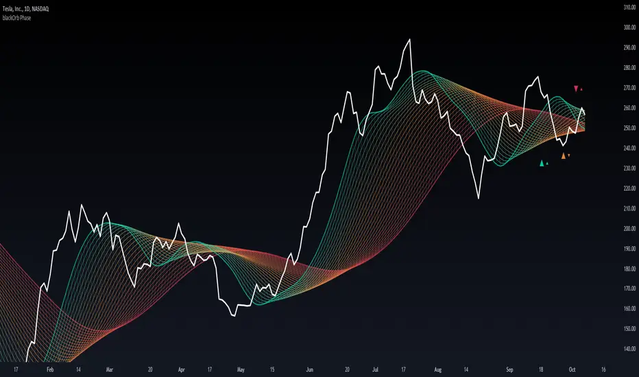
blackOrb PhaseMA matrix for identification of bullish/bearish macro phases and strategy implementation through the definition of effective MA lengths.
Moving Averages, when conventionally employed in either single-line or dual-line configurations, come with inherent limitations that hinder their effectiveness in capturing the complexities of varying market conditions.
In response to this challenge, blackOrb Phase utilizes a combination of quantitative and relational MA analysis techniques, providing users with a more comprehensive understanding of market trends and a granular derivation of price-dynamic phases by using the following features:
I. MA matrix to identify effective MA lengths for strategy implementation
II. Stochastic coloring for trend tracking and macro phase identification
III. Diverse MA options for enhanced analytical flexibility
Technical Methodology
I. MA Matrix to Identify Effective MA Lengths for Strategy Implementation
Central to the methodology is the ability to identify optimal MA lengths for effective strategy implementation. blackOrb Phase utilizes a matrix of multiple MAs, each characterized by unique parameters, to establish a relational grid structure. By systematically examining price data within predefined vertical segments, this matrix offers a linear multi-level modulation of historical price data, providing access to up to 500 prior data instances. This methodology enhances the analysis of both micro price dynamics shifts and bullish or bearish macro trend changes. It has been empirically validated that this approach can assist users to refine their analysis and adapt to varying market conditions*.
Crossings of MA lines with different colors signify potential shifts in price dynamic phases. When green MA lines intersect red MA lines, it suggests a higher likelihood of a macro trend change (bullish or bearish market environment). Conversely, when green MA lines cross over orange MA lines, it indicates a lower probability of a macro trend change but still suggests a potential micro trend shift. This micro trend shift can be viewed as a subordinate price dynamic change within the broader macro trend.
*Source: Prof. Pätäri, Eero. "Performance of moving average trading strategies over varying stock market conditions." Applied Economics, vol. 46, no. 24, 2014, pp. 2851-2872.
II. Stochastic Coloring for Trend Tracking and Macro Phase Identification
To provide a comprehensive view, this indicator includes a stochastic tracking feature, displayed through an intuitive single-color system across the entire matrix grid. The color scheme transitions from red lines, indicating the beginning of bearish trend phases, to green lines, indicating the initiation of bullish trend phases and vice versa. The greater the number of lines with the same color, the stronger the trend.
This tool enhances price trend monitoring, allowing traders not only to track their initiation and continuation but also to confirm trend culmination. By observing color shifts from red/green lines, traders can assess the sustainability and persistence of broader macro trends.
Note: Stochastic coloring aids in probability-based orientation and provides valuable insights for trading strategy implementation. It is most effective when used in conjunction with other analysis and risk management techniques.
III. Diverse MA Options for Enhanced Analytical Flexibility
Users have the flexibility to choose from 14 different MA types (e.g. including ALMA, KAMA, T3, VWMA, TriMA and ZLEMA). This versatility allows for precise configurations tailored to specific market conditions.
For example, among the array of these 14 MA alternatives, VWMA (Volume Weighted MA) stands out as a suitable implementation choice for integrating volume data. It goes beyond the scope of a simple moving average, considering both price and volume in its calculation, as shown in the following formula:
(C1 x V1 + C2 x V2 + ... + Cn x Vn) / (V1 + V2 + ... + Vn)
Alongside this variety of MA types, users can select from a range of OHLC combination options (open, high, low and close price data), further enhancing analytical flexibility.
Note: While these choices offer substantial flexibility, they also require a solid understanding of the various MA types and data combinations, making risk management essential.
Note on Usability
blackOrb Phase can have synergies with blackOrb Price and blackOrb Zone as all three indicators combined can give a bigger picture for supporting comprehensive and multifaceted data-driven trading analysis.
This tool was meticulously created to serve as an additional frame for the seamless integration of other more granular trading indicators. This indicator isn't intended for standalone trading application. Instead, it is serving as a supplementary tool for orientation within broader trading strategies.
Irrespective of market conditions, it can harmonize with a wider range of trading styles and instruments / trading pairs / indices like Stocks, Gold, FX, EURUSD, SPX500, GBPUSD, BTCUSD and Oil.
Inspiration and Publishing
Taking genesis from the inspirations amongst others provided by TradingView Pine Script Wizard Kodify, blackOrb Phase is a multi-encompassing script meticulously forged from scratch. It aspires to furnish a comprehensive approach, borne out of personal experiences and a strong dedication in supporting the trading community. We eagerly await valuable feedback to refine and further enhance this tool.
3D Sine WaveIt's a 3D sine wave! Cool!
I made a cube follow a sine wave, it doesn't reflect any data on the chart, it just looks pretty. There are some settings to play around with, too.
You could plug the cube into any input you like, just replace the 'wave' variable with whatever you want.
Watch it on the 1 second timeframe!

[LunaOwl] Rainbow Color Gradient作品: 色彩漸變-彩虹帶
This script is about rainbow color gradient, there are 35 colors from red to purple. The color changes with the time series, from light to dark, and then to light, repeat. Maybe it's visually beautiful. Compared to practicality, I prefer to use it as a color gradient reference. for the later works.
色彩漸變彩虹帶,從紅到紫有35種色調,隨著時間序列進行而變化,由淺到深再到淺,或許視覺上很美。
相比於實用性,我覺得應該當成色彩漸層的參考,對於以後作品可以使用上。
--------------------------*
The changing process of the rainbow (resolution = 63).
彩虹帶的時序變化過程,分辨度是63格,充滿 (✪ω✪) 圖表藝術!

Let it snow!Snowflakes slowly drop with each data tick.
Get ready for a miracle!
Merry Christmas and Happy New Year!
Look first. Then leap.

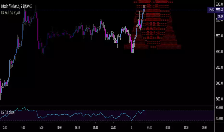
RSI Skull - Novelty Graphical Chart ArtGraphical RSI, just for fun.
RSI >= 60 = red
RSI < 60 and > 40 = blue
RSI <= 40 = green
Skull art by Alan De Smet
Bitcoin! RSI Chart Art - Color ChangingJust for fun:
Logo changes colors based on RSI level.
>=60 is one color, <=40 another color, or in the center it's gold by default.

JMA FishnetThis was originally an experiment to visualize support and resistance levels. It makes good chart art.
Original version by
Check out everget's scripts at www.tradingview.com
