VWAP SESSION BUY SELL STRATEGY (INDICATOR) (PDK1977)VWAP SESSION BUY SELL STRATEGY (INDICATOR) (PDK1977)
This indicator combines the proven UT Bot breakout engine but with VWAP directional filtering and ATR-based take profit levels.
It delivers clean, high-probability trend entries and automatic volatility-calibrated exits.
How it works:
Buy only when price is above VWAP
Sell only when price is below VWAP
UT Bot confirms momentum with ATR-based trailing logic
ATR Take Profit gives consistent exits based on volatility
Bars turn green/red only while in a trade, back to normal after TP
Best For:
Intraday and swing trading
Indices, FX, crypto, and high-volume stocks but also for Forex with right TF and settings
Traders who want clean signals and minimal noise
2. Trade Checklist:
Use this before every entry. Quick, simple, reliable.
BUY Checklist:
Price confirmed above VWAP
Label prints BUY
Enter on Buy label (on bar close)
→ Hold until ATR TP hits
SELL Checklist:
Price below VWAP
Label prints SELL
Enter on Sell label
→ Hold until ATR TP hits
Avoid Entries When:
Price is chopping tightly around VWAP
Major news events are about to release
Volume is extremely low
ATR is shrinking rapidly (market compression)
3. Risk-Management Guide
This is tailored to how your system actually behaves.
1. Use ATR TP as Primary Exit:
The system automatically calculates a TP based on volatility:
High volatility → larger TP
Low volatility → smaller TP
This keeps trades consistent and avoids lingering too long.
2. Stop-Loss Recommendation
This strategy is designed for TP-only exits, but if you want a SL:
Recommended Stop-Loss:
Use ATR’s opposite trail, OR
Use 1 × ATR behind your entry candle
This matches the system's internal logic.
3. Position Sizing
Since this system enters during momentum expansions, use:
1–2% max risk per trade
Reduce risk during high-impact news sessions
4. Understand VWAP Environment
Different VWAP conditions require different expectations:
Strong Trend (price far from VWAP)
Higher TP probability
Fewer whipsaws
Excellent continuation setups
Chop Zone (price flips above/below VWAP)
Do NOT trade
Signals lose edge
Wait for a clean break + UT confirmation
5. Choose Correct VWAP Reset for your trading and session
This dramatically improves results.
Market Recommended VWAP Reset
US Stocks New York Session
Indices Daily
Forex London or New York
Crypto Daily or None
4. Final Tips for Best Performance
✔ Enter only in the direction of VWAP
✔ Don’t chase signals far away from entry candle
✔ Avoid trading right into major support/resistance
✔ ATR TP will handle exits mostly
Disclaimer
This script is provided for educational and informational purposes only.
It does not constitute financial advice, investment advice, trading advice, or any form of recommendation to buy or sell any financial instrument. The auto take no responsibility for loss or error in the script.
Average True Range (ATR)

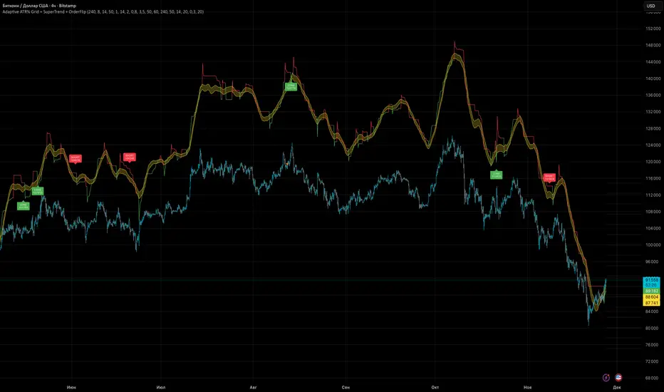
Adaptive ATR% Grid + SuperTrend + OrderFlipDescription:
This indicator combines multiple technical analysis tools to identify key price levels and trading signals:
ATR% Grid – automatic plotting of support and resistance levels based on current price and volatility (ATR). Useful for identifying potential targets and entry/exit zones.
SuperTrend – a classic trend indicator with an adaptive ATR multiplier that adjusts based on average volatility.
OrderFlip – identifies price reversal points relative to a moving average with ATR-based sensitivity, optionally filtered by OBV and DMI.
MTF Confirmation – multi-timeframe trend verification using EMA to reduce false signals.
Signal Labels – "LONG" and "SHORT" labels appear on the chart with an offset from the price for better visibility.
JSON Alerts – ready-to-use format for automated alerts, including price, SuperTrend direction, Fair Zone, and ATR%.
Features:
Fully compatible with Pine Script v6
Lines and signals are fixed on the chart, do not shift with new bars
Configurable grid, ATR, SuperTrend, and filter parameters
Works with MTF analysis and classic indicators (OBV/DMI)
Usage:
Best used with additional indicators and risk management strategies. ATR% Grid is ideal for both positional trading and intraday setups.
перевод на русский
Описание:
Этот индикатор объединяет несколько методов технического анализа для выявления ключевых уровней цены и сигналов на покупку/продажу:
Сетка ATR% (ATR% Grid) – автоматическое построение уровней поддержки и сопротивления на основе текущей цены и волатильности (ATR). Позволяет видеть потенциальные цели и зоны входа/выхода.
SuperTrend – классический трендовый индикатор с адаптивным множителем ATR, который корректируется на основе средней волатильности.
OrderFlip – определение моментов разворота цены относительно скользящей средней с учетом ATR, с возможностью фильтрации по OBV и DMI.
MTF-подтверждение – проверка направления тренда на нескольких таймфреймах с помощью EMA, чтобы снизить ложные сигналы.
Сигнальные метки – на графике появляются "LONG" и "SHORT" с отступом от цены для наглядности.
JSON Alerts – готовый формат для автоматических уведомлений, включающий цену, направление SuperTrend, Fair Zone и ATR%.
Особенности:
Поддержка Pine Script v6
Линии и сигналы закреплены на графике, не двигаются при обновлении свечей
Настраиваемые параметры сетки, ATR, SuperTrend и фильтров
Совместимость с MTF-анализом и классическими индикаторами OBV/DMI
Рекомендации:
Используйте в сочетании с другими индикаторами и стратегиями управления риском. Сетка ATR% отлично подходит для позиционной торговли и интрадей.
ATR% Grid – automatic plotting of support and resistance levels based on current price and volatility (ATR). Useful for identifying potential targets and entry/exit zones.
SuperTrend – a classic trend indicator with an adaptive ATR multiplier that adjusts based on average volatility.
[CT] ATR Chart Levels From Open ATR Chart Levels From Open is a volatility mapping tool that projects ATR based price levels directly from a user defined center price, most commonly the current session open, and displays them as clean horizontal levels across your chart. The script pulls an Average True Range from a higher timeframe, by default the daily, using a user selectable moving average type such as SMA, EMA, WMA, RMA or VWMA. That ATR value is then used as the unit of measure for all projected levels. You can choose the ATR length and timeframe so the bands can represent anything from a fast intraday volatility regime to a smoother multi week average range.
The core of the tool is the center line, which is treated as zero ATR. By default this center is the current session open, but you can instead anchor it to the previous close, previous open, previous high or low, or several blended prices such as HLC3, HL2, HLCC4 and OHLC4, including options that use the minimum or maximum of the previous close and current open. From this center, the indicator builds a symmetric grid of ATR based levels above and below the zero line. The grid size input controls the spacing in ATR units, for example a value of 0.25 produces levels at plus or minus 25, 50, 75, 100 percent of ATR and so on, while the number of grids each side determines how far out the bands extend. You can restrict levels to only the upper side, only the lower side, or draw both, which is useful when you want to focus on upside targets or downside expansion separately.
The levels themselves are drawn as horizontal lines on the main price chart, with configurable line style and width. Color handling is flexible. You can assign separate colors to the upper and lower levels, keep the center line in a neutral color, and choose how the colors are applied. The “Cool Towards Center” and “Cool Towards Outermost” modes apply smooth gradients that either intensify toward the middle or toward the outer bands, giving an immediate visual sense of how extended price is relative to its average range. Alternatively, the “Candle’s Close” mode dynamically colors levels based on whether the current close is above or below a given band, which can help highlight zones that are acting as resistance or support in real time.
Each level is optionally labeled at its right endpoint so you always know exactly what you are looking at. The center line label shows “Daily Open”, or more generally the chosen center, along with the exact price. All other bands show the percentage of ATR and the corresponding price, for example “+25% ATR 25999.90”. The label offset input lets you push those tags a user defined number of bars to the right of the current price action so the chart remains clean while still keeping the information visible. As new bars print, both the lines and their labels automatically extend and slide to maintain that fixed offset into the future.
To give additional context about current volatility, the script includes an optional table in the upper right corner of the chart. This table shows the latest single period ATR value on the chosen higher timeframe alongside the smoothed ATR used for the bands, clearly labeled with the timeframe and ATR length. When enabled, a highlight color marks the table cells whenever the most recent ATR reading exceeds the average, making it easy to see when the market is operating in an elevated volatility environment compared to its recent history.
In practical trading terms, ATR Chart Levels From Open turns the abstract concept of “average daily range” into specific, actionable intraday structure. The bands can be used to frame opening range breakouts, define realistic intraday profit targets, establish volatility aware stop placement, or identify areas where price has moved an unusually high percentage of its average range and may be vulnerable to mean reversion or responsive flow. Because the ATR is computed on a higher timeframe yet projected on whatever chart you are trading, you can sit on a one minute or five minute chart and still see the full higher timeframe volatility envelope anchored from your chosen center price for the session.

Position Size Calculator - R & ATR v1# Position Size Calculator - R & ATR
Professional position sizing tool for crypto traders using risk management principles and ATR-based stop loss placement.
## Features
✅ **Automatic ATR Calculation** - Uses ATR(14) by default, customizable period
✅ **Risk Management** - Calculate position size based on portfolio % risk
✅ **Tranche Support** - Split positions into multiple entries
✅ **Visual Stop Loss** - Red line showing stop loss placement on chart
✅ **Real-time Results** - Table displays all calculations instantly
✅ **Clean Interface** - Professional table with all key metrics
## How It Works
The indicator calculates optimal position size using this formula:
1. **Risk Amount** = Portfolio Size × (Risk % / 100)
2. **Stop Distance** = ATR × Multiplier
3. **Stop Loss Price** = Entry Price - Stop Distance
4. **Position Size** = Risk Amount / Stop Distance
5. **Tranche Size** = Position Size / Number of Tranches
## Settings
**Portfolio & Risk**
- Portfolio Size (USD): Your total trading capital
- Risk per Trade (R in %): Percentage of portfolio to risk per trade
- Number of Tranches: Split position into multiple entries
**ATR Settings**
- ATR Length: Period for ATR calculation (default: 14)
- ATR Multiplier: Multiply ATR for stop loss distance (0.5x, 1x, 1.5x, etc.)
**Display**
- Show Stop Loss Line: Toggle red stop loss line on chart
- Show Calculation Table: Toggle results table
## Results Displayed
- Risk Amount (1R): Dollar amount risked on trade
- Stop Distance: Distance from entry to stop loss
- Stop Loss: Exact stop loss price
- Risk per Coin: Amount risked per unit
- Position Size (coins): Number of coins to buy

Orbital Barycenter Matrix @darshaksscThe Orbital Barycenter Matrix is a visual, informational-only tool that models how price behaves around a dynamically calculated barycenter —a type of moving equilibrium derived entirely from historical price data.
Instead of focusing on signals, this indicator focuses on market structure symmetry, distance, compression, expansion, and volatility-adjusted movement.
This script does not predict future price and does not provide buy/sell signals .
All values and visuals come solely from confirmed historical data , in full compliance with TradingView policy.
📘 How the Indicator Works
1. Dynamic Barycenter (Core Mean Line)
The barycenter is calculated from a smoothed blend of historical price components.
It represents the center of mass around which price tends to oscillate.
This is not a forecast line—only a representation of historical average behavior.
2. Orbital Rings (Distance Zones)
Around the barycenter, the indicator draws several “orbital rings.”
Each ring shows a volatility-scaled distance from the barycenter using ATR-based calculations.
These rings help visualize:
How far price has drifted from its historical center
Whether price is moving in an inner, mid, or outer region
How volatility influences the spacing of the rings
Rings do not imply future targets and are informational only.
3. Orbital Extension Range
Beyond the outermost ring, a wider band (extension range) shows a high-volatility reference distance.
It represents extended displacement relative to past price behavior—not a projected target.
4. Orbit Trail (Motion Trace)
The Orbit Trail plots small circles behind price, helping visualize how price has moved through the orbital regions over time.
Colors adjust with “pressure” (distance from center), making compression and expansion easy to observe.
5. Satellite Nodes (Swing Markers)
Confirmed swing highs and lows (using fixed pivots) are marked as small dots.
Their color reflects the orbital zone they formed in, giving context to how significant or extended each pivot was.
These swing markers do not repaint because they use confirmed pivots.
6. Pressure & Distance Calculations
The indicator converts price displacement away from the barycenter into a pressure metric, scaled between 0%–100%.
Higher pressure means price is further from its historical center relative to volatility.
The dashboard displays:
Zone classification
ATR-based distance
Pressure level
A small intensity gauge
All are informational readings—no direction or forecast.
📊 Key Features
✔ Dynamic barycenter core
✔ Up to four orbital rings
✔ Informational orbital extension band
✔ Visual orbit trail showing recent movement
✔ Non-repainting satellite swing nodes
✔ Distance & pressure analytics
✔ Fully adjustable HUD
✔ Always-visible floating dashboard (screen-anchored)
✔ Zero repainting on confirmed elements
✔ 100% sourced from historical data only
✔ Policy-safe: no predictions, no signals, no targets
🎯 What to Look For
1. How close price is to the barycenter
This can reveal whether price is in:
The inner region
The mid zone
The outer region
The extended field
2. Pressure level
Shows how “stretched” price is relative to its past behavior.
3. Satellite nodes
Indicate where confirmed pivots formed and in which orbital band.
4. Ring interactions
Observe how price moves between rings—inside, outside, or oscillating around them.
5. Color changes in the orbit trail
These show changes in market compression/expansion.
🧭 How to Read the Indicator
Inner Orbit
Price close to its historical equilibrium.
Mid Orbit
Moderate displacement from typical range.
Outer Orbit
Historically extended movement.
Beyond Extension Field
Price has moved further than usual relative to historical volatility.
These are descriptive conditions only , not trade recommendations.
🛠 How to Apply It on the Chart
Use the barycenter to understand where price has historically balanced.
Observe how volatility changes the spacing between rings.
Use pressure readings to identify when price is compressed, neutral, or extended.
Use swing nodes to contextualize historical pivot formation.
Watch how price interacts with rings to better understand rhythm, velocity, and structural behavior.
This tool is meant to enhance visual understanding—not to generate trade entries or exits.
⚠️ Important Disclosure
This indicator is strictly informational.
It does not predict or project future price movement.
It does not provide buy/sell/long/short signals.
All lines, zones, and values are derived solely from past market data.
Any interpretation is at the user’s discretion.

FBB Buy/Sell ProDisclaimer : This script is for educational purposes only and does not constitute financial advice. Use at your own risk.
FBB Buy/Sell Pro is a volatility based reversal tool that builds a dynamic channel around a volume weighted moving average and highlights potential turning points at the extremes. The indicator paints a smooth "funnel" of bands around price and generates Buy/Sell labels when candles reject the outer zones, helping you spot exhaustion and mean reversion opportunities in trending or ranging markets.
Signals are based on price interaction with the outer bands combined with candle direction, optionally filtered by RSI to reduce noise. When enabled, the built in TP/SL module projects an ATR based stop and target using a configurable risk to reward ratio and clearly draws entry, risk and reward zones directly on the chart.
For tracking performance, FBB Pro includes an on chart statistics table that simulates trades using your own base capital, leverage and fee settings. It displays net profit, number of trades and win rate so you can quickly evaluate how the logic behaves on different symbols and timeframes.
Key features
Dynamic FBB volatility channel around VWMA with smooth gradient visualization
Clear reversal Buy/Sell labels at outer band reactions with optional RSI filter
Automatic TP/SL projection based on ATR and custom risk to reward
Realistic stats module with leverage and fee simulation shown in a compact table
Works on most markets and timeframes. It is recommended to combine FBB Buy/Sell Pro with your own higher timeframe context and risk management.

Dynamic Fair-Value Ribbon Pro @darshakssc1. What This Indicator Is (In Simple Terms)
The Dynamic Fair-Value Ribbon Pro is a visual tool that helps you see how price behaves around a statistically derived “fair-value zone”:
A colored ribbon/cloud marks a central “fair” area.
Areas above the ribbon are labeled as “Unfair High Zone”.
Areas below the ribbon are labeled as “Unfair Low Zone”.
A small state panel tells you where price currently sits relative to this ribbon.
All calculations are based only on historical price, volume, and volatility.
It does not predict future price, does not give buy/sell signals, and is not financial advice.
2. Adding the Indicator
Open a chart on TradingView.
Click on Indicators .
Search for “Dynamic Fair-Value Ribbon Pro” .
Click to add it to your chart.
You will see:
A cloud/ribbon around price.
Colored bars when price is outside the ribbon.
A panel in the top right describing the current state.
3. Core Concept: Fair vs Unfair Zones (Analytical Only)
The indicator tries to answer a descriptive question:
“Where is price trading relative to a historically derived central area?”
It does this by:
Calculating a central value (“fair mid”).
Building a band around that mid.
Coloring the chart depending on whether price is inside or outside that band.
It is not claiming that:
Price “must” return to the band.
Price is “overvalued” or “undervalued”.
Any state is good or bad.
It is simply a visual classification tool .
4. Engine Modes — How the Ribbon Is Calculated
Under “Fair-Value Engine” you can choose:
4.1 Mode 1: Range
Looks back over a chosen number of bars (default: 100).
Finds the highest high and lowest low in that window.
Defines a central “slice” of that range as the fair-value ribbon :
Range Mode: Lower Percent → bottom boundary of the slice (e.g., 30%).
Range Mode: Upper Percent → top boundary of the slice (e.g., 70%).
Effect:
The ribbon represents a middle portion of the historical range .
Above the ribbon = “Unfair High Zone” (analytical label only).
Below the ribbon = “Unfair Low Zone”.
This is purely statistical — it does not mean price is wrong or will revert.
4.2 Mode 2: VWAP + Stdev
In this mode, the central value is based on VWAP :
VWAP (Volume-Weighted Average Price) is used as the midline.
A standard deviation envelope is built around VWAP:
VWAP Mode: Stdev Multiplier controls how wide that envelope is.
Effect:
The ribbon shows where price is trading relative to a volume-weighted average .
Again, areas above and below are just described as “unfair” zones in a visual, analytical sense , not a predictive one.
5. ATR Adaptive Width — Making the Ribbon React to Volatility
Under “ATR Adaptive Width” :
Use ATR Adaptive Width:
On: the band width scales with volatility.
Off: band width stays fixed based on Range or VWAP settings.
ATR Length: how many bars to use for ATR.
Reference ATR (% of price): a reference level for normal volatility.
Min Width Scale / Max Width Scale: clamps the scaling so that the band doesn’t get too narrow or too wide.
What this does (analytically):
When volatility (ATR) is higher than the reference, the band can become wider .
When volatility is lower , the band can become narrower .
This is a mathematical rescaling only and does not imply any optimal levels or performance.
6. Visual Elements — What You See on the Chart
6.1 Fair-Value Ribbon (Cloud)
The cloud between Fair Ribbon Low and Fair Ribbon High is the fair zone .
Color can be changed via “Fair Ribbon Color” .
6.2 Midline
If “Show Center Line” is enabled:
A line runs through the middle of the ribbon.
In Range mode, this is the average of the upper and lower band.
In VWAP mode, it’s essentially the VWAP-based mid.
This line is for visual reference only and makes no claims about support, resistance, or reversion.
6.3 Bar Colors
Unfair High Zone: bars are colored with Unfair High Bar Color.
Unfair Low Zone: bars are colored with Unfair Low Bar Color.
Inside the ribbon:
If “Fade Bars Inside Fair Zone” is ON, bars may be more faded/neutral.
These colors are simply classification highlights ; they do not tell you what to do.
6.4 State Panel (Top Right)
If “Show State Panel” is enabled, you’ll see a small box that displays:
Current engine:
Range or VWAP+Stdev.
Current price state:
Inside Ribbon (Fair Zone)
Above Ribbon (Unfair High Zone)
Below Ribbon (Unfair Low Zone)
This is a quick summary of where price sits relative to the computed ribbon.
7. Typical Ways to Use It (Informational Only)
The indicator can help you visually:
See when price is spending time inside a historically defined central zone.
Notice when price is frequently trading outside that zone.
Compare different timeframes (e.g., 5m vs 1h vs 4h) to see how the fair zone shifts.
Experiment with:
Range length (shorter vs longer lookback).
VWAP vs Range mode.
ATR adaptation on/off.
Important:
Any interpretation of these visuals is entirely up to the user.
The script does not tell you to buy, sell, hold, or do anything specific.
8. Limitations and Important Notes
All calculations use past data only (price, volume, volatility).
The ribbon does not guarantee:
that price will revert,
that zones will hold,
or that any outcome will occur.
There are no built-in signals such as “long/short” or automatic entries/exits.
The script is best used as a supporting, visual layer alongside other tools or methods you choose.
9. Disclaimer
This indicator is:
Strictly informational and educational.
Not a trading system or strategy.
Not financial advice or a recommendation.
Not guaranteed to be accurate, complete, or suitable for any specific purpose.
Users should always perform their own research and due diligence.
Past behavior of any visual pattern or zone does not guarantee future behavior.

Average True Range % infoATR% is a modified version of the classic Average True Range indicator that displays price volatility as a percentage of the instrument's value, rather than in absolute values. This allows you to easily compare the volatility of different assets (e.g., Bitcoin vs Tesla stock) regardless of their price.
Main Features
1. ATR% Chart
The red line shows the average volatility from the last N candles (default 14), expressed as a percentage. For example:
ATR% = 2.5% means that the average daily move is approximately 2.5% of the asset's value
Higher values = greater volatility (higher profit potential, but also greater risk)
Lower values = lower volatility (calmer market)
2. Volatility Trend Analysis
The indicator automatically detects whether volatility is rising, falling, or stable:
Up arrow (↑) - volatility is rising (price becomes more "nervous")
Down arrow (↓) - volatility is falling (market is calming down)
Horizontal arrow (⮆) - volatility is stable (within ±3% of the moving average)
3. Information Table
In the upper right corner of the chart you will see Current ATR% value and Trend arrow with color coding:
- Green = rising volatility
- Red = falling volatility
- Gray = stable volatility
Parameters to Configure
Indicator Length (default: 14) - How many candles back to include in calculations:
Lower values (5-10): more sensitive to sudden changes, reacts faster
Higher values (20-30): more smoothed, shows long-term volatility picture
Trend Length (default: 10) - Period to analyze whether volatility is rising/falling:
Lower values: faster trend change signals
Higher values: more reliable, but slower signals
Sample Interpretations
ATR% Volatility Asset Type/Situation
< 1% Very low Stable blue-chip stocks, calm market
1-3% Low-medium Typical stocks, normal conditions
3-5% Medium-high Volatile stocks, cryptocurrencies at rest
5-10% High Cryptocurrencies, penny stocks
> 10% Extremely high Market panic, crash, pump & dump

ATR multiple from High & LowA simple numerical indicator measuring ATR multiple from recent 252 days high and low.
ATR multiples from high (and low) are used as a base in many systematic trading and trend following systems. As an example many systems buy after a 2.5–4 ATR multiple pullback in a strong stock if the regime allows it. This would then be paired with an entry tactic, for example buy as it recaptures the a pivot within the upper range, a MA or breaks out again after this mid term pullback/shakeout.
This indicator uses a function which captures the recent high and low no matter if we have 252 bars or not, which is not how standard high/low works in Tradingview. This means it also works with recent IPO:s.
I prefer to overlay the indicator in one of the lower panes, for example the volume pane and then right click on the indicator and select Pin to scale > No scale (fullscreen).

Reward-Risk Visual Zones (RRZ)Reward–Risk Visual Zones (RRZ) – Structure-Driven Risk Mapping Engine
Most indicators tell you when to trade.
RRZ is designed to answer a different question:
“Is this setup worth the risk before I take the trade?”
RRZ is not a mashup of unrelated indicators.
It is a 3-stage risk engine that builds a complete trade “story” around each swing:
1. Market structure pivot → defines the trade idea
2. ATR volatility unit → defines the risk size
3. Projected reward → compares reward vs that risk and filters bad setups
The output is a visual trade map : entry, target, stop, and R:R, printed directly on chart at each qualified swing.
1. Market Structure Layer – Where trades are anchored
RRZ doesn’t fire signals from MA/RSI crossovers.
It begins with s wing structure :
• Uses ta.pivotlow() and ta.pivothigh() with user-controlled left/right sensitivity:
• Pivot Sensitivity (L) controls how wide a swing must be to qualify as a structural pivot.
• Pivot Confirmation (R) controls how fast/slow a pivot is confirmed (1 = almost real-time, larger values = safer but later).
• A confirmed swing low becomes the candidate anchor for a long R:R zone.
• A confirmed swing high becomes the candidate anchor for a short R:R zone.
Each pivot is stored with its exact price and bar index , so the rest of the logic is always anchored to a real swing instead of a random candle.
2. Volatility Layer – Turning ATR into a “risk unit”
Once a pivot is confirmed, RRZ measures local volatility using ATR:
• ATR length is configurable via ATR Length.
• ATR is not used as a trailing stop or overlay.
In RRZ it plays one specific role:
“One ATR = one unit of structural risk from this swing.”
From that:
Long scenario:
• Entry = pivot low
• Stop = Entry − 1 × ATR
Short scenario:
• Entry = pivot high
• Stop = Entry + 1 × ATR
This standardizes risk across different volatility regimes:
a 2R move in a quiet market and a 2R move in a volatile market are both “2 × ATR” from the structure.
3. Reward Projection Layer – Evaluating if the trade is worth it
RRZ then estimates how far price can realistically travel away from the pivot, given recent behaviour:
For longs (from swing low):
• Projects reward using the highest high in a rolling lookahead window (e.g., last 20 bars).
• Reward = HighestHigh – PivotLow
• Risk = ATR
• R:R = Reward / ATR
For shorts (from swing high):
• Projects reward using the lowest low in the window.
• Reward = PivotHigh – LowestLow
• Risk = ATR
• R:R = Reward / ATR
The user can set a minimum R:R filter via Min R:R Threshold.
• If R:R ≥ threshold → zone is tagged as “ GOOD R:R ” and highlighted in green (long) or red (short).
• If R:R < threshold → optionally still shown as “ LOW R:R ” in orange (so you can visually see “tempting but not worth it” trades).
This transforms a raw pivot + ATR into a quantified decision:
“From this swing, volatility says my stop is 1× ATR. Do I even have 2× ATR of room in my favour?”
4. Execution Map – How components work together on chart
Instead of just printing numbers, RRZ builds a full execution template for every qualifying swing:
• Entry line at the pivot price
• Target line at the reward projection price
• Stop line at pivot ± ATR
• A structured label including:
• LONG / SHORT direction
• “GOOD R:R” or “LOW R:R”
• Numerical R:R (e.g., 2.3 : 1)
• Entry, Target, Stop, current Close
A Cooldown Bars parameter prevents overlapping spam:
• After an R:R zone is created (long or short), the script waits X bars before considering another zone in the same direction.
• This keeps charts readable and focuses attention on the most recent high-quality swings.
RRZ also includes line style controls (solid/dashed/dotted) and separate colours for entry, target, and stop, so traders can quickly read the chart even without opening settings.
5. How to Use RRZ in a Trading Plan
RRZ is not a magic “buy/sell” button.
It is designed to sit on top of your existing strategy as a risk filter.
Typical workflows:
SMC / price-action traders:
• Use your own logic for BOS/CHoCH, order blocks, or liquidity sweeps.
• Use RRZ only where structure aligns and the zone shows GOOD R:R ≥ 2.0.
• Avoid setups where RRZ marks LOW R:R even if the pattern looks good.
System traders / swing traders:
• Use RRZ to standardize risk across assets and timeframes.
• Filter out trades where potential reward does not justify the stop, based on current ATR.
Beginners:
• Learn to stop taking trades where the target is too close and the stop is too wide.
• Visually understand how structural swings and volatility interact.
RRZ works across Forex, Crypto, Indices, and Stocks on intraday and higher timeframes.
Once a pivot is confirmed and a zone is plotted, its lines and labels do not repaint.
⸻
6. Why this invite-only script is more than a basic mashup
RRZ does use classic building blocks (pivots, ATR), but the value is in the way they are stitched into a single risk framework:
• It doesn’t run multiple separate indicators on chart.
Everything is computed inside one engine with a single purpose: structure-based R:R evaluation.
• ATR is not just “slapped on” as a stop line; it is treated as the core risk unit in the R:R calculation pipeline.
• Every zone is a coherent trade idea: from swing, to risk unit, to projected reward, to filtered label, to execution lines.
• The script is designed specifically to help traders do the one thing that almost no free indicator prioritizes:
“Say NO to low R:R trades automatically.”
This is what distinguishes RRZ from generic ATR-stop scripts or simple pivot overlays.
⸻
Important
• No performance promises.
• No marketing claims (“guaranteed”, “high win rate”, etc.).
• Purely a risk mapping & visualization tool.

MTRA Pro+ ScreenerMTRA Pro+ Screener an analysis tool that provides traders with critical market structure information on up to 10 instruments simultaneously. This indicator consolidates momentum direction, trend analysis, range relationships, and volatility metrics into a single dashboard.
## Key Features
- Customizable display with adjustable positioning, colors, and sizing
**Momentum & Trend Tracking**
- Real-time momentum direction via 5-period SMA slope analysis
- Short-term trend direction using 10-period SMA slope analysis
- Color-coded visual representation for quick interpretation
**Range Relationship Analysis**
- Current bar analysis relative to previous period (Inside, Outside, 2Up, 2Dn)
- Three-period historical view of recent price action patterns
- Immediate identification of breakout and consolidation scenarios
**ATR-Based Volatility Analysis**
- Real-time ATR percentage calculations showing current range vs. average
- Visual distinction between normal (<100% ATR) and extended (>100% ATR) conditions
- Identification of potential exhaustion zones for risk management
**Intraday ATR Levels**
- Dynamic support/resistance levels based on current timeframe ATR
- Real-time upper and lower boundaries for precise entries/exits
- Customizable line styles integrated with price scale
## Practical Applications
- **Context Assessment**: Quickly gauge market conditions across multiple intraday timeframes
- **Exhaustion Detection**: Identify overextended moves when ATR exceeds 100%
- **Confluence Analysis**: Spot potential setups when timeframes align
- **Risk Management**: Some traders will use ATR levels for dynamic stops and position sizing
- **Breakout Confirmation**: Distinguish false breakouts from genuine momentum shifts
## Configuration Options
- Full dashboard positioning and color customization
- Individual timeframe toggles
- Adjustable ATR periods and sensitivity thresholds
- Multiple line styles for level visualization

MTRA Intraday Pro+MTRA Pro Intraday is a multi-timeframe analysis tool that provides traders with critical market structure information across five intraday timeframes: 5m, 15m, 30m, 1h, and 4h. This indicator consolidates momentum direction, trend analysis, range relationships, and volatility metrics into a single dashboard.
***Dashboard Timeframes that are low than chart timeframes can be inaccurate - Because of this always focus attention on the details on higher timeframes for accurate data****
## Key Features
**Multi-Timeframe Analysis**
- Simultaneous analysis across 5m, 15m, 30m, 1h, and 4h timeframes
- Customizable display with adjustable positioning, colors, and sizing
**Momentum & Trend Tracking**
- Real-time momentum direction via 5-period SMA slope analysis
- Short-term trend direction using 10-period SMA slope analysis
- Color-coded visual representation for quick interpretation
**Range Relationship Analysis**
- Current bar analysis relative to previous period (Inside, Outside, 2Up, 2Dn)
- Three-period historical view of recent price action patterns
- Immediate identification of breakout and consolidation scenarios
**ATR-Based Volatility Analysis**
- Real-time ATR percentage calculations showing current range vs. average
- Visual distinction between normal (<100% ATR) and extended (>100% ATR) conditions
- Identification of potential exhaustion zones for risk management
**Intraday ATR Levels**
- Dynamic support/resistance levels based on current timeframe ATR
- Real-time upper and lower boundaries for precise entries/exits
- Customizable line styles integrated with price scale
## Practical Applications
- **Context Assessment**: Quickly gauge market conditions across multiple intraday timeframes
- **Exhaustion Detection**: Identify overextended moves when ATR exceeds 100%
- **Confluence Analysis**: Spot high-probability setups when timeframes align
- **Risk Management**: Use ATR levels for dynamic stops and position sizing
- **Breakout Confirmation**: Distinguish false breakouts from genuine momentum shifts
## Configuration Options
- Full dashboard positioning and color customization
- Individual timeframe toggles
- Adjustable ATR periods and sensitivity thresholds
- Multiple line styles for level visualization
## Who Benefits
- **Scalpers**: 5m/15m alignment for quick entries
- **Day Traders**: Multi-timeframe confluence for swing entries within the day
- **Intraday Swing Traders**: 1h/4h context for position holds
MTRA Pro Intraday transforms complex multi-timeframe analysis into clear, actionable market structure data without switching charts. This tool enhances decision-making by providing objective context across all relevant intraday timeframes in one view.

Pele CandlesPele Candles Indicator
Named after Pele, the Hawaiian goddess of volcanoes, this indicator identifies "explosive" candles with unusually large ranges that exceed a customizable ATR (Average True Range) threshold. These volcanic-like price movements often signal significant market activity where liquidity may have been swept from one side.
Pele candles appear as colored bars (blue for bullish, purple for bearish) when candle ranges surpass the ATR multiplier. While a single Pele candle doesn't guarantee direction, consecutive Pele candles in opposite directions can indicate potential trend reversals - much like volcanic eruptions that reshape the landscape.
The indicator helps traders spot moments of intense market activity and potential turning points, but should be used alongside other analysis tools for confirmation.
Features:
Customizable ATR period and multiplier
Visual highlighting of explosive price moves
Alert notifications for significant candles
No repainting - signals appear in real-time
******Make sure you go to visual order settings and bring to front******

Pua CandlesPua Candles Indicator
Named after "Pua," the Hawaiian word for flower, this indicator identifies small, delicate price movements that often precede significant market expansion. Like tiny flowers that can bloom into something magnificent, Pua candles represent seemingly insignificant moments that frequently mark exhaustion areas in the market.
Pua candles are both inside bars (contained within the previous bar's range) and small relative to the ATR threshold. These quiet, compressed price actions often signal consolidation before major moves. When price eventually expands beyond these delicate formations, it can lead to substantial directional movement.
The indicator highlights bullish Pua candles in teal and bearish ones in pink, making these critical junctures easy to spot. Pay special attention to follow-through action after Pua candles - they often mark the calm before the storm.
Features:
Identifies inside bars with small ATR-relative ranges
Customizable ATR period and smallness threshold
Visual highlighting with Hawaiian-inspired colors
Alert notifications for Pua formations and follow-through
No repainting - confirmed signals only
Perfect for spotting potential breakout setups and market turning points.
******Make sure you go to visual order settings and bring to front******

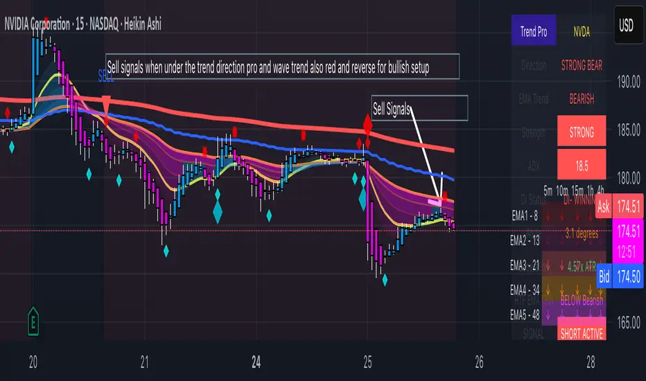
Trinity Trend Direction ProThe Trinity Trend Pro is a no-nonsense trend filter indicator built around the classic 13 / 48 / 200 EMA stack, but massively upgraded with real intelligence. Instead of just drawing three lines and spamming crossovers like every other EMA script, it only speaks when a genuine, high-reward trend is actually happening. It combines three strict conditions that must all be true at the same time: perfect bullish or bearish EMA alignment, steep slope on all three EMAs (measured in degrees), and wide enough separation between the fast and slow EMA (normalized by ATR). If any of those fail, it stays silent. This eliminates almost all the fakeouts and chop that destroy most traders using regular EMA crossovers.
What makes it truly different is the built-in “trend exhaustion” logic: when the EMAs compress and start braiding (common after a big move), the indicator automatically switches to a neutral “FLAT” state and clears the previous signal instead of stubbornly staying green or red. It also supports an optional higher-timeframe EMA filter (you choose the timeframe and length) so you never fight the bigger trend. One clean arrow appears only when a brand-new strong trend begins, and it stays off the chart until the next real move — no arrow spam.
The background colors the entire chart lightly green or red while the trend is alive, and a compact dashboard in the corner tells you in plain English whether to be long, short, or flat.
How to use it is dead simple: add it to any chart (SPX, BTC, ES, Nasdaq, stocks, anything), look at the dashboard or background color, and only trade when it says “LONG ACTIVE” or “SHORT ACTIVE”. Green arrow + green background = go long (calls, futures, shares). Red arrow + red background = go short (puts or short). Anything else = stay out. Set the two built-in alerts (“NEW BULL TREND” and “NEW BEAR TREND”) and you’ll get notified the exact moment a fresh high-probability move starts. That’s literally all you need to do. No second-guessing, no overthinking, no getting chopped up in sideways markets. In our humble opinion it is one of the cleanest, smartest, most disciplined EMA-based tool on TradingView — designed for traders who are tired of noise and only want the real moves.

MTRA Pro+Momentum - Trend - Range - ATR Dashboard!
MTRA Pro+ is a comprehensive multi-timeframe analysis tool designed to provide traders with critical market structure information across six different timeframes. This indicator consolidates momentum direction, trend analysis, range relationships, and volatility metrics into a single, customizable dashboard.
Core Features:
Multi-Timeframe Dashboard
Simultaneous analysis across Daily, 24H, Weekly, Monthly, Quarterly, and Yearly timeframes
Customizable display options to focus on relevant timeframes for your trading style
Professional dashboard with adjustable positioning, colors, and sizing
Momentum & Trend Analysis
Real-time momentum direction based on 5-period SMA slope analysis
Short-term trend direction using 10-period SMA slope analysis
Configurable sensitivity settings to filter out market noise
Color-coded visual representation for quick interpretation
Range Relationship Analysis
Current bar analysis relative to previous period (Inside, Outside, 2Up, 2Dn)
Three-period historical view showing recent price action patterns
Immediate identification of breakout and consolidation scenarios
Context for potential continuation or reversal setups
ATR-Based Volatility Analysis
Real-time ATR percentage calculations showing current range relative to average
Visual distinction between normal (<100% ATR) and extended (>100% ATR) conditions
Identification of potential exhaustion zones when price extends beyond typical volatility
Context for position sizing and risk management decisions
Daily ATR Level Visualization
Dynamic support and resistance levels based on current daily ATR
Real-time upper and lower boundaries for intraday trading
Customizable line styles and positioning options
Price scale integration for easy reference
Comprehensive Alert System
Momentum direction changes across all timeframes
Trend direction changes for longer-term position management
Range relationship status changes for breakout/breakdown alerts
ATR percentage threshold crossings for volatility-based signals
Practical Applications:
Market Context Assessment Quickly assess whether the market is trending, consolidating, or experiencing unusual volatility across multiple timeframes. This context helps inform position sizing, entry timing, and exit strategies.
Exhaustion Detection When ATR percentages exceed 100%, price may be overextended relative to typical volatility, potentially signaling pullback opportunities or areas to reduce position size.
Confluence Analysis Identify high-probability setups when multiple timeframes align in momentum and trend direction, or spot potential reversal zones when shorter timeframes diverge from longer-term trends.
Risk Management Enhancement Use ATR-based levels for dynamic stop placement and the dashboard's range analysis to understand current market structure before entering positions.
Breakout Confirmation Range relationship analysis helps distinguish between false breakouts and genuine momentum shifts by providing context about recent price action patterns.
Configuration Options:
Visual Customization
Full dashboard positioning control (9 positions available)
Customizable colors for all elements
Adjustable text size and border styling
Toggle individual timeframes on/off
Technical Parameters
Adjustable ATR periods for each timeframe
Configurable momentum sensitivity thresholds
ATR level display options with margin controls
Multiple line style choices for level visualization
Who Benefits from MTRA Pro+:
Swing Traders: Multi-timeframe trend and momentum alignment for position entries
Day Traders: Real-time ATR levels and range analysis for intraday decision-making
Position Traders: Longer timeframe context for strategic position management
Risk Managers: Volatility-based metrics for dynamic position sizing
Important Notes:
This indicator provides market structure analysis and context - it does not generate specific buy/sell signals. Success depends on combining this information with your trading methodology, proper risk management, and market experience. The tool is designed to enhance decision-making by providing objective market structure data across multiple timeframes.
MTRA Pro+ transforms complex multi-timeframe analysis into an accessible, visual format that helps traders stay informed about market conditions without the need to manually switch between charts and timeframes.

Tripwire Pro+Tripwire – Trail-Based Trend Direction Indicator
OVERVIEW
Tripwire is a powerful, volatility-adaptive trailing indicator designed to keep traders on the right side of momentum while offering signals and alerts based on the users settings and filters.
CONCEPT & INSPIRATION
This indicator is directly inspired from the Zombie9Trail by Frosty (creator of the Zombie Pack and TickHunter for NinjaTrader).
When all filters are turned off, Tripwire replicates the core behavior of Zombie9Trail — delivering the same razor-sharp trailing logic.
Most of Frosty's testing has been done from the 1 minute time frame, while I have personally found for my style of trading the 5 minute time frame works better for me.
WHAT THIS VERSION ADDS — TradingView Enhancements
• Optional multi-layer trend filters (21, 34, 170 EMA) to separate high-probability pullbacks from actual trend changes
• Clean Buy/Sell/Pullback signal labels with alert conditions
• Real-time dashboard showing current trail value, trend state, and filter status
• Fully customizable ATR length, multiplier, source, and visual styling
• All values exported as plots — perfect for CSV download and strategy development
HOW TO USE
Filters ON (recommended for trend-following) → Take signals in the direction of the higher-timeframe trend. Great for staying in strong moves and avoiding fake outs.
Filters OFF (pure Zombie9Trail mode) → Possibly catch early reversals and ride new trends
CREDIT & RESPECT
Core trailing methodology and original genius: Frosty — creator of Zombie9Trail / Zombie Pack / TickHunter (NinjaTrader).
This TradingView adaptation was built in direct homage to his NinjaTrader work and with his encouragement. Everything beyond the base trailing logic (filters, dashboard, alerts, exportable plots, visual polish) is original.
DISCLAIMER
For educational and informational purposes only. Not financial advice. Past performance is no guarantee of future results. Test thoroughly.

WeeklyDealingRange Pro+ (Fib Edition)Weekly Dealing Range Indicator
Overview
The Weekly Dealing Range indicator identifies range + volatility based pivot levels that form at the close of the first trading session and extend for the entire week. This tool provides key reference points for both trending and range-bound market conditions.
What It Provides
Range High & Low: Weekly session extremes
Median Level: Mid-point of the weekly range
Weekly Open: First session opening price
Fibonacci Extensions: Calculated levels above the high and below the low
Practical Application
These levels serve as:
Reversal zones for mean reversion setups
Support/resistance reference points
Target levels for existing positions
Framework for building trade ideas around high-probability pivot areas
Key Features
Optional function based alerts
Traditional price crosses level alerts
Automatically updates each week
Clean, uncluttered chart display
Works across all timeframes
Suitable for all markets and instruments

Session Ranges Pro+Session Range Zones – Professional Edition
OVERVIEW
Professional visualization of the classic opening-range / Initial Balance concept across Asian, London, and Regular (US) sessions.
Displays the high/low of the user-defined opening window as thick, hierarchical filled zones with optional Fibonacci and standard-deviation extensions plus full alerting.
CONCEPT BACKGROUND
Using the high and low of the first 30–60 minutes of a session as key support/resistance is public-domain knowledge that has been standard in institutional trading for decades (Initial Balance, Opening Range, Session Range, etc.).
On TradingView the same principle was popularized under the name “Defining / DealingRange / DR/IDR” by TheMas7er and others.
IMPLEMENTATION & VALUE ADDED
This indicator follows the established, public-domain range-calculation methodology but has been completely rewritten with the following original enhancements:
• Clean, filled High / Mid / Low zones for instant visual hierarchy
• Intuitive Asian / London / Regular session labelling and fully custom timing
• Comprehensive dynamic & static Fibonacci and 50%/100% standard-deviation extensions
• Alert conditions on every zone, midline, opening level, and extension line
• Modern, modular code architecture using arrays and custom drawing functions
• No repainting, lightweight performance on any intraday timeframe
HOW TO USE
Apply to 1–15 min charts. Select desired sessions and formation period (30 or 60 min typical).
Shaded zones serve as primary support/resistance; extensions provide measured-move targets.
CREDIT & TRANSPARENCY
Core methodology: public domain (Initial Balance / Opening Range / Session Range).
Early TradingView popularization of the DR/IDR naming and feature set: TheMas7er **(with thanks to community contributors like bmsitiaan and trading-guide for refinements)**.
**Utilizes PineCoders' VisibleChart library for optimized chart rendering.**
This script uses the same foundational principle and logical input options but is an independent implementation. All visual presentation, zone system, multi-session handling, extension systems, alerting framework, and underlying code structure are original.
DISCLAIMER
For educational and informational purposes only. Not financial advice. Past performance is no guarantee of future results. Test thoroughly on your instruments and timeframes.

PonoTrading WDRWeekly Dealing Range Indicator
Overview
The Weekly Dealing Range indicator identifies range + volatility based pivot levels that form at the close of the first trading session and extend for the entire week. This tool provides key reference points for both trending and range-bound market conditions.
What It Provides
Range High & Low: Weekly session extremes
Median Level: Mid-point of the weekly range
Weekly Open: First session opening price
Standard Deviation Extensions: Calculated levels above the high and below the low
Practical Application
These levels serve as:
Reversal zones for mean reversion setups
Support/resistance reference points
Target levels for existing positions
Framework for building trade ideas around high-probability pivot areas
Key Features
Traditional price crosses level alerts
Automatically updates each week
Clean, uncluttered chart display
Works across all timeframes
Suitable for all markets and instruments

NeuraEdge ORB Professional Opening Range Breakout Indicator-15m🚀 NeuraEdge ORB - Professional Opening Range Breakout Indicator
We're excited to release this clean, effective Opening Range Breakout (ORB) indicator for the trading community. The 15-minute ORB is one of the most time-tested intraday strategies, and we've built this tool to make it simple and actionable.
━━━━━━━━━━━━━━━━━━━━━━━━━━━━━━━━━━━━━━━━━━━━━━━━━━━━
📖 WHAT IS THE 15-MINUTE ORB STRATEGY?
The Opening Range Breakout strategy captures the initial price range established in the first 15 minutes of market open (9:30-9:45 AM ET). This range often sets the tone for the trading day, as institutional order flow and overnight gap reactions play out during this window.
The concept is simple:
- Mark the HIGH and LOW of the first 15 minutes
- Trade the breakout when price breaks above or below this range
- Use the opposite side of the range as your stop loss
━━━━━━━━━━━━━━━━━━━━━━━━━━━━━━━━━━━━━━━━━━━━━━━━━━━━
⚙️ HOW TO USE THIS INDICATOR
1️⃣ SETUP
• Apply to SPY, QQQ, IWM, or any liquid stock/ETF
• Recommended timeframes: 1-minute or 5-minute charts
• The indicator automatically detects the 9:30-9:45 AM ET session
2️⃣ WAIT FOR THE RANGE
• A blue box will form showing the Opening Range
• Wait for the 15-minute period to complete (marked "✅ COMPLETE" in dashboard)
• Note the range size - larger ranges often mean stronger moves
3️⃣ TRADE THE BREAKOUT
• 🟢 LONG: When price closes above the Opening Range High
• 🔴 SHORT: When price closes below the Opening Range Low
• Signals appear automatically with entry, stop loss (SL), and take profit (TP) levels
4️⃣ MANAGE YOUR TRADE
• Stop Loss: Placed at opposite side of range (default) or midpoint
• Take Profit: Based on your selected Risk:Reward ratio
• The indicator tracks win rate automatically
━━━━━━━━━━━━━━━━━━━━━━━━━━━━━━━━━━━━━━━━━━━━━━━━━━━━
🎯 ENTRY TYPES
BREAKOUT MODE (Default)
- Enters immediately when price breaks the range
- More signals, catches the initial move
- Best for: Trending days, high momentum
RETEST MODE
- Waits for price to break out, then pull back to the range
- Fewer signals, better entry price
- Best for: Choppy days, tighter stops
━━━━━━━━━━━━━━━━━━━━━━━━━━━━━━━━━━━━━━━━━━━━━━━━━━━━
📊 SETTINGS EXPLAINED
Display Settings:
- Show Signals - Toggle buy/sell signals
- Show Opening Range Box - Visual box around the 15-min range
- Show Dashboard - Information panel with status and stats
Opening Range Settings:
- Opening Range Minutes - Default 15, adjustable 5-60
- Stop Trading After - Prevents late-day trades (default 3PM ET)
Entry Settings:
- Entry Type - Breakout or Retest
- Require Volume Confirmation - Only signals on above-average volume
- Require FVG Confluence - Adds Fair Value Gap filter for extra confirmation
Risk Management:
- Stop Loss Placement - Opposite Side / Midpoint / ATR Based
- Risk:Reward Ratio - Set your target (1.5 recommended)
━━━━━━━━━━━━━━━━━━━━━━━━━━━━━━━━━━━━━━━━━━━━━━━━━━━━
💡 TIPS FOR BEST RESULTS
✅ DO:
- Trade liquid instruments (SPY, QQQ, major stocks)
- Use 1-5 minute charts for better entry precision
- Respect the stop loss - the range defines your risk
- Pay attention to range size (0.5-1.5x ATR is ideal)
- Be patient - only 1-2 setups per day
❌ AVOID:
- Trading both directions on the same day
- Taking trades after 2-3 PM ET
- Very small ranges (likely to get chopped out)
- Low volume breakouts (often fail)
━━━━━━━━━━━━━━━━━━━━━━━━━━━━━━━━━━━━━━━━━━━━━━━━━━━━
📈 DASHBOARD INFORMATION
The dashboard shows:
- OR Status - Forming / Complete / Waiting
- OR High/Low - The range levels
- Range Size - In points and ATR multiples
- Breakout Direction - Long / Short / None
- Volume Status - High or Normal
- Win Rate - Tracked automatically
- W/L Record - Wins and losses count
━━━━━━━━━━━━━━━━━━━━━━━━━━━━━━━━━━━━━━━━━━━━━━━━━━━━
🔔 ALERTS INCLUDED
- Opening Range Complete - Notifies when the 15-min range is set
- ORB Long Signal - Buy signal triggered
- ORB Short Signal - Sell signal triggered
- Breakout Up/Down - Range broken (even without signal)
━━━━━━━━━━━━━━━━━━━━━━━━━━━━━━━━━━━━━━━━━━━━━━━━━━━━
⚠️ DISCLAIMER
This indicator is for educational and informational purposes only. Past performance does not guarantee future results. Always use proper risk management and never risk more than you can afford to lose. This is not financial advice.
━━━━━━━━━━━━━━━━━━━━━━━━━━━━━━━━━━━━━━━━━━━━━━━━━━━━
━━━━━━━━━━━━━━━━━━━━━━━━━━━━━━━━━━━━━━━━━━━━━━━━━━━━
We hope you find this indicator valuable in your trading journey!
💬 Questions or feedback? Leave a comment below.
🌐 Check out our full Indicator Suite: www.neura-edge.com
📧 Support: support@neura-edge.com
Happy Trading!

WeeklyDealingRange Pro+Weekly Dealing Range Indicator
Overview
The Weekly Dealing Range indicator identifies range + volatility based pivot levels that form at the close of the first trading session and extend for the entire week. This tool provides key reference points for both trending and range-bound market conditions.
What It Provides
Range High & Low: Weekly session extremes
Median Level: Mid-point of the weekly range
Weekly Open: First session opening price
Standard Deviation Extensions: Calculated levels above the high and below the low
Practical Application
These levels serve as:
Reversal zones for mean reversion setups
Support/resistance reference points
Target levels for existing positions
Framework for building trade ideas around high-probability pivot areas
Key Features
Optional function based alerts
Traditional price crosses level alerts
Automatically updates each week
Clean, uncluttered chart display
Works across all timeframes
Suitable for all markets and instruments
