Adaptive Dual MA Trend Ribbon Community “Larsson-Style” PresetsMany traders enjoy experimenting with dual-moving-average “trend ribbon” structures that resemble the visual style of popular tools such as the Larsson Line. While the internal logic of closed-source indicators is not publicly available, the trading community often explores MA combinations like SMMA 15/29 or EMA 30/60 with ATR filters to study trend transitions and visualize momentum shifts.
This script does not replicate, reverse-engineer, or replace any closed-source indicator. Instead, it provides a flexible, open-source framework that lets traders build their own trend-ribbon configuration inspired by similar visual concepts while maintaining full transparency. Because the calculations rely only on standard, well-known moving-average and ATR methods, traders can experiment freely with community-discussed presets without relying on proprietary tools.
What the Script Does
• Plots Fast and Slow moving averages using the method of your choice: SMMA (RMA), EMA, SMA, or WMA
• Colors the ribbon to show directional bias:
• Bullish when Fast MA > Slow MA
• Bearish when Fast MA < Slow MA
• Neutral when the difference is small (optional ATR filter)
• Supports ATR-based neutral zone filtering
• Supports optional bar coloring
• Works on all markets and timeframes
• Fully open-source and customizable
Why This Script Is Useful
Traditional moving averages identify trend direction but lack context during uncertain or low-momentum conditions. This script adds value by:
1. Allowing multiple smoothing techniques (SMMA/EMA/SMA/WMA)
2. Highlighting clearer trend transitions
3. Identifying low-confidence periods using ATR
4. Providing a visually intuitive ribbon instead of single-line signals
Suitable for swing traders, trend followers, breakout traders, and anyone who wants cleaner structure-based contextualization.
Popular Community MA Combinations
Many traders experiment with specific MA pairs to understand trend-ribbon behavior:
• SMMA 15/29 → smoother structural trend flow
• EMA 30/60 → more responsive momentum shifts
• EMA 10/21 → intraday rhythm
• EMA 50/100 → higher-timeframe structure
These examples are commonly used by the community—but this script does not recreate or imitate any closed-source or commercial indicator.
How to Use
1. Choose your preferred MA type
2. Adjust Fast/Slow lengths to match your timeframe
3. Enable ATR Neutral Zone to reduce false flips
4. Optionally enable bar coloring
5. Combine with structure, volume, or price action for decision-making
Important Notes
• This script is original, open-source, and not affiliated with any commercial indicator or author.
• It does not reproduce, imitate, or reverse-engineer any closed-source logic.
• All computations are standard MA/ATR methods for clarity and transparency.
Disclaimer
This tool is for educational and analytical purposes only.
Always test parameters and use proper risk management before applying to live trading.
Jalur dan Saluran

London First 15m Candle (Real-Time NY)London First 15-Minute Candle (Real-Time New York Time)
This custom TradingView indicator identifies and tracks the first 15-minute candle of the London session, but calculated in real-time according to New York time (EST/EDT).
🔹 What the Indicator Does
1. Detects the London Session Open (Real NY Time)
You define the London session start time in New York hours (default: 3:00 AM NY Time).
The indicator monitors the first 15 minutes from the defined start time (3:00–3:15 NY time).
Only today’s candle is tracked — historical London ranges are not shown.
2. Builds the London Opening Range Candle (15m)
While the 15-minute window is still open, it continuously tracks:
Highest price reached (London High)
Lowest price reached (London Low)
The values update in real time only within the 3:00–3:15 window.
At 3:15 NY time, the candle is locked in and no longer changes.
3. Draws Three Persistent Levels on the Chart
Once the London candle closes, the indicator plots:
🔴 Top Line (London High)
Extended to the right across the chart.
🟢 Bottom Line (London Low)
Extended to the right across the chart.
⚪ Mid Line (Middle of the Range)
Computed as:
(londonHigh + londonLow) / 2
Also extended to the right.
All lines:
Are only drawn for today.
Auto-delete and refresh when a new trading day begins.
4. Works on ANY Timeframe
Even if the indicator runs on:
1m
2m
5m
1h
etc.
…it still uses a real 15-minute aggregation, ensuring the London candle is accurate.
5. Clean Chart — No Historical London Levels
The script:
Removes old lines at the start of each new day.
Keeps only today’s active London range.
This prevents clutter and ensures clarity.
6. Optional Alerts (if enabled)
The indicator can generate alerts when the market crosses:
The top of the London range
The bottom of the London range
The midline
For example:
Price breaks above London High
Price breaks below London Low
Price crosses the Midline up or down
These can be used for:
Breakout strategies
Liquidity grabs
Range-trading confirmations
7. Fully Customizable
User inputs allow you to modify:
London session start hour (NY Time)
Candle duration (fixed at 15 minutes)
Line colors:
High line color
Low line color
Midline color
Line widths
Summary
This indicator gives you a clean and accurate view of the first 15-minute candle of the London session — critical for many ICT/SMS/prop firm strategies — with:
Real-time NY-based calculation
Automatic cleanup
Clear range lines
Custom colors
Alerts for breakouts

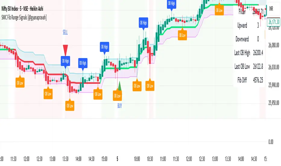
SMC Fib Range Signals [@gyanapravah]SMC Fib Range Signals
This indicator blends Smart Money Concepts (SMC) with a Range Filter Trend System and Fibonacci Retracement & Extensions to generate high-probability automated Buy/Sell signals.
Designed to avoid noise and focus on market structure + trend + price confluence, this tool is ideal for:
1. Intraday traders
2. Swing traders
3. Index & stock traders
4. Crypto & Forex traders
CORE FEATURES
Range Filter Trend Detection
Smooth adaptive filter identifies true trend direction
Visual confirmation:
🟢 Green filter = bullish pressure
🔴 Red filter = bearish pressure
🟡 Yellow filter = neutral
Upper & Lower Bands act as dynamic support/resistance zones
Smart Money Order Blocks (SMC)
Automatically detects important pivot highs & lows
Marks:
OB High → supply / resistance zone
OB Low → demand / support zone
Continuously tracks latest OB levels for live price interaction
Fibonacci Engine
Detects the current swing zone and plots:
Retracement levels
0.236 – 0.382 – 0.500 – 0.618 – 0.786 (editable)
Extension targets
1.272 – 1.618
All levels update dynamically on new market structure and pivots.
SIGNAL ENGINE
This indicator generates signals from three independent confirmation systems:
BUY SIGNALS trigger when:
1. Trend flips bullish (price crosses above the Filter)
2.Bullish trend + price reacts near:
Order Block support
Fibonacci 0.382 / 0.618 levels
Bounce from the Lower Band with trend support
All setups require volume confirmation to filter fake breakouts.
SELL SIGNALS trigger when:
1. Trend flips bearish (price crosses below the Filter)
2. Bearish trend + price reacts near:
Order Block resistance
Fibonacci 0.382 / 0.618 levels
Rejection from the Upper Band with trend support
ALERTS READY
Two built-in alerts:
BUY Alert — fires on bullish signal
SELL Alert — fires on bearish signal
INPUT SETTINGS
Trend Engine
1.Source
2.Sampling Period
3.Range Multiplier
Smart Money
Pivot detection sensitivity (Left / Right bars)
Fibonacci
1.Swing lookback length
2.Editable Fib retracement and extension values
3.Toggle show/hide Fib levels
BEST USE CASE
Works extremely well on:
⏱️ 3M – 15M Intraday scalping
⏱️ 30M – 1H positional entries
⏱️ 4H – D1 swing trading
Tested on:
NIFTY / BANKNIFTY / FINNIFTY
Stocks
Crypto
Forex
DISCLAIMER
This indicator is for educational purposes only.
It does NOT guarantee profits.
Always use:
Proper risk management
Stop-loss rules
Your own confirmation before entering trades.
AUTHOR
Built & shared by @gyanapravah (Odisha, India)
Open-source for learning and community improvement.
RoseTree Golden BandsRoseTree Golden Bands
Overview
RoseTree Golden Bands is a volatility-based support indicator that uses Fibonacci ratios combined with Average True Range (ATR) to identify potential buy zones below price action.
How It Works
The indicator calculates a simple moving average (SMA) of the closing price, then subtracts ATR-based offsets using two key Fibonacci extensions (2.618 and 4.236) to create dynamic support bands that expand and contract with market volatility.
Components
Orange Line (Level 2) — SMA minus ATR × 2.618. Acts as the first support level and early warning zone.
Green Line (Buy Zone) — SMA minus ATR × 4.236. Represents deeper support where price has historically found strong buying interest.
BUY Signal — Triggers when the candle's low comes within 2% of the green line, alerting you to potential accumulation opportunities.
Settings
Length: Period for both SMA and ATR calculations (default: 20)
Fibonacci Ratio 2: Multiplier for the orange band (default: 2.618)
Fibonacci Ratio 3: Multiplier for the green buy zone (default: 4.236)
Usage
Look for BUY signals during pullbacks in an uptrend. The bands adapt to volatility, widening during turbulent markets and narrowing during consolidation. Best used alongside trend confirmation and volume analysis rather than as a standalone signal.

20 SMA Break FLOWThis script is a full 20-SMA breakout + R-multiple playbook with context:
20 SMA Channel: Plots a 20-period SMA High and Low, fills the channel between them for a clear visual “belt” around price.
Breakout Entries:
Long: waits for a bar to close above the 20 SMA High, then arms that bar’s high as the trigger.
A long entry signal prints when a later bar’s close is above that trigger high.
Short: mirror logic using the 20 SMA Low and trigger low.
Stops & R-Multiples: On entry it auto-sets stop at the opposite end of the trigger bar, calculates 1R/2R/3R price levels, and plots those lines on the chart.
R Labels & Info Panel: Draws “SL / 1R / 2R / 3R” labels at entry, and a top-right panel showing:
Current R (live P&L in R)
Entry & SL prices
Max R reached
Drawdown from peak R
ONH/ONL: Tracks and plots the overnight high and low from 18:00–09:29 as horizontal reference lines into RTH.
SHA Trend Filter: Adds smoothed Heikin-Ashi background coloring and optional SHA candles as a directional/volatility filter.
Alerts:
Long/short entry alerts when the close breaks the trigger bar high/low
Target alerts when 1R, 2R, or 3R are hit for either direction.

SIGMA 0.44📌 الشرح بالعربي:
اسم المؤشر: SIGMA 0.44
الوظيفة: يساعد المتداول على تحديد اتجاه السوق، مناطق الدخول والخروج، وأهداف السعر اليومية.
✅ المميزات:
تحديد جلسات السوق (افتتاح، أوروبا، أمريكا) مع مستويات دعم ومقاومة ديناميكية.
إشارات دخول مؤكدة.
رسم أهداف اليوم من نطاق الساعة الأولى.
رسم المتوسط 200 EMA لتحديد الاتجاه العام.
رسم خطوط افتتاح اليوم، وبعد ساعة، وبعد 4 ساعات لمراقبة حركة السعر.
🎯 الفائدة:
مؤشر متكامل يساعدك على تحليل السوق بدقة واتخاذ قرارات مدروسة باستخدام أدوات احترافية.
📌 English Summary:
Indicator Name: SIGMA 0.44
Purpose: Helps traders identify market direction, entry/exit zones, and daily price targets.
✅ Features:
Detects market sessions (Open, Europe, US) with dynamic support/resistance levels.
Provides confirmed entry signals.
Draws daily targets based on the first hour range.
Includes 200 EMA to define the overall trend.
Plots daily open line, +1 hour, and +4 hours to track price behavior.
🎯 Benefit:
A complete indicator that helps you analyze the market accurately and make informed trading decisions using professional tools.
⚠️ إخلاء المسؤولية:
هذا المؤشر لا يُعد توصية مباشرة للبيع أو الشراء، ولا يضمن الأرباح أو نتائج محددة.
الأداء السابق لا يعني بالضرورة أداءً مستقبليًا مماثلًا.
المستخدم هو المسؤول الوحيد عن قراراته الاستثمارية، وينبغي عليه دراسة السوق وتحليل المخاطر قبل الدخول في أي صفقة.
💰 إدارة رأس المال:
من الضروري الالتزام بإستراتيجية واضحة لإدارة رأس المال.
لا تخاطر بأكثر من 1-2٪ من رأس مالك في الصفقة الواحدة، واستخدم وقف الخسارة دائمًا.
التداول بدون خطة مالية مدروسة قد يؤدي إلى خسائر كبيرة، لذلك اجعل حماية رأس المال أولوية قبل البحث عن الأرباح.
⚠️ Disclaimer:
This indicator is not a direct buy or sell recommendation and does not guarantee profits or specific outcomes.
Past performance is not indicative of future results.
The user is solely responsible for their trading decisions and should perform their own market analysis and risk assessment before entering any trade.
💰 Capital Management:
It is essential to follow a clear risk management strategy.
Do not risk more than 1–2% of your total capital per trade, and always use a stop-loss.
Trading without a solid financial plan may lead to significant losses, so prioritize capital protection before seeking profits.

Prime Market Profile [xontrades1uae]
Automatic or custom tick calibration for gold, indices, or forex.
Highlighted POC, Value Area, and Initial Balance Range.
Smart visual clustering to detect congestion, breakout zones, and key volume nodes.
Compatible with short timeframes (1m–15m) for scalpers and day traders.

Auto Trend Channels OXEThis indicator automatically detects and draws trend channels based on swing highs and lows.
How it works:
It identifies pivot points (swing highs/lows) using your chosen lookback period, then connects consecutive pivots to form channels:
Descending channels connect lower highs (resistance line), with a parallel support line projected from the lowest low between those highs
Ascending channels connect higher lows (support line), with a parallel resistance line projected from the highest high between those lows
Key features:
Channels extend forward so you can see where price might interact with them
Broken channels automatically switch to dashed lines and show "✗" labels
Fill shading helps visualize the channel zone
Info table shows current pivot counts
Trading application:
You'd use this for identifying trend direction and potential reversal zones. Price bouncing off channel boundaries = continuation. Price breaking through = potential trend change or acceleration. The "break detection" highlighting makes it easy to spot when a channel has been invalidated.
The pivot length setting is your main control - higher values find longer-term, more significant channels; lower values catch shorter-term moves.

10% and 23.6% support bandsWhen a share is in momentum and showing lot of strength that relative strength it takes breather at 10% band from new 52 week high and and tends to consolidate at 23.6% from new 52 week high. This forms a higher low and gives opportunity to get in the rally. The volume bars should be taken into consideration as low volume and dry up at the bottom indicate reversal is coming. The stoploss for all entry is 1% below recent base low and entry pont is crossing of weekly high with greater than 20 days volume average.


20-Day VW Initial Balance (Simple) – Fixed & ProThis Pine Script calculates and displays a Volume-Weighted Initial Balance (VW-IB) for the New York trading session, and also computes a 20-day average Initial Balance range. It then plots both the current IB and the historical average IB band on the chart.
The script adapts the Initial Balance window using volume, rather than a fixed time, to better reflect true market participation.

⚔️ The Scalpel⚔️ THE SCALPEL v2.0
━━━━━━━━━━━━━━━━━━━━━━━━━━━━━━━━━━━━━━━━━━━━━━━━━━━━━━━━
Surgical-Grade Market Structure Detection System
🔬 WHAT IS THE SCALPEL?
The Scalpel is a precision-engineered market structure analyzer that identifies and tracks critical support and resistance zones with surgical accuracy. Unlike conventional S&R tools that flood your chart with noise, The Scalpel cuts through the clutter to reveal only the most significant price structures.
━━━━━━━━━━━━━━━━━━━━━━━━━━━━━━━━━━━━━━━━━━━━━━━━━━━━━━━━
⚙️ CORE TECHNOLOGY
▸ Pivot-Based Detection Engine
Advanced pivot analysis calibrated by user-defined precision settings
▸ Tissue Integrity Validation
Filters structures based on candle body-to-range ratios
▸ Dynamic Stress Analysis
Tracks zone interactions and removes exhausted levels automatically
▸ Volatility-Adaptive Zones
Zone width scales with ATR for consistent performance across all markets
━━━━━━━━━━━━━━━━━━━━━━━━━━━━━━━━━━━━━━━━━━━━━━━━━━━━━━━━
🎨 VISUAL SPECTRUM
💜 STERILE ZONES (Electric Violet)
Fresh, untested structures with maximum potential
🔴 COMPRESSION ZONES (Magenta Fire)
Tested resistance ceilings under selling pressure
🩵 FOUNDATION ZONES (Neon Teal)
Tested support floors with proven buyer interest
✨ PLASMA AURA EFFECT
Multi-layered glow effect for enhanced visibility
━━━━━━━━━━━━━━━━━━━━━━━━━━━━━━━━━━━━━━━━━━━━━━━━━━━━━━━━
📐 PARAMETERS
🔪 Blade Precision (1-10)
Higher = fewer but sharper pivots detected
🩺 Tissue Integrity % (30-90)
Minimum candle body percentage required
📏 Incision Depth (0.1-2.0 ATR)
Controls zone thickness based on volatility
💉 Stress Threshold (1-10)
Maximum touches before zone invalidation
📐 Projection Range (10-200)
How far zones extend into the future
━━━━━━━━━━━━━━━━━━━━━━━━━━━━━━━━━━━━━━━━━━━━━━━━━━━━━━━━
💡 HOW TO USE
1. Fresh sterile zones (violet) are your highest-probability setups
2. Watch for price reaction at zone boundaries
3. Tested zones confirm structure but may have diminished strength
4. Zones auto-remove after stress threshold is reached
5. Use projection range to anticipate future tests
━━━━━━━━━━━━━━━━━━━━━━━━━━━━━━━━━━━━━━━━━━━━━━━━━━━━━━━━
🎯 BEST FOR
✓ Scalping & Day Trading
✓ Swing Trade Entries
✓ Stop Loss Placement
✓ Take Profit Targeting
✓ Multi-Timeframe Analysis
━━━━━━━━━━━━━━━━━━━━━━━━━━━━━━━━━━━━━━━━━━━━━━━━━━━━━━━━
⚠️ DISCLAIMER
This indicator is for educational purposes only. Always conduct your own analysis and use proper risk management. Past performance does not guarantee future results.
━━━━━━━━━━━━━━━━━━━━━━━━━━━━━━━━━━━━━━━━━━━━━━━━━━━━━━━━
🏷️ TAGS
support resistance zones SNR pivot points market structure scalping day trading swing trading price action order blocks smart money supply demand technical analysis

Simulated Liquidation Heatmap [QuantAlgo]🟢 Overview
This indicator visualizes where clusters of stop-loss orders and liquidation levels are likely located, displayed as a 'heatmap'. It's based on the concept of market structure liquidity: large groups of stop orders tend to gather around obvious technical levels (like swing highs and lows), and these pools of orders often attract price movement from institutional traders. The indicator uses a fractal-based algorithm to identify these high-probability liquidation zones and displays them as dynamic, color-coded boxes.
The key feature is the thermal color gradient, which indicates the freshness (age) and therefore the relative relevance of the liquidity zone. Hot colors (e.g., Red/Yellow) represent fresh clusters that have just formed, suggesting strong and immediate liquidity interest. Cold colors (e.g., Blue/Purple) represent aged or decaying clusters that are becoming less relevant over time. This visualization allows traders to anticipate potential liquidity sweeps (stop hunts) and understand areas of significant retail and institutional positioning.
🟢 Key Features
1. Liquidity Zone Heatmap
The core function is the identification of swing high and swing low price points using a user-defined Lookback period. These points are where retail traders are statistically most likely to place their stop-loss orders. The indicator simulates the clustering of these orders by drawing a zone (box) around the detected swing point, with the vertical size controlled by the Stop/Liquidation Zone Width (%) setting.
▶ Cluster Lookback: Defines the sensitivity of swing point detection. Lower values detect frequent, minor zones (scalping/intraday); higher values detect major, stronger swing points (swing trading).
▶ Zone Width (%): Sets the percentage range above and below the swing point where stops are simulated to cluster, accounting for slippage and typical stop placement spread.
▶ Liquidity Decay: Zones gradually fade in color intensity and are eventually removed after the user-defined Liquidity Decay Period (Bars), ensuring the heatmap only displays relevant, current liquidity areas.
▶ Round Number Filter: An optional filter that limits the display to liquidity zones occurring only at psychologically significant round numbers (e.g., $100, $1,500.00), which typically attract higher concentrations of orders.
2. Thermal Color Gradient
The heatmap's color is a direct function of the zone's age, providing a visual proxy for immediate relevance.
▶ Freshness: Newly created zones are displayed in the Hot Color (high relevance).
▶ Decay: As bars pass, the zone color transitions along the gradient toward the Cold Color and increased transparency (lower relevance), until it is removed entirely.
▶ Color Schemes: Multiple pre-configured and custom color schemes are available to optimize the visualization for different chart themes and color preferences.
3. Liquidity Heat Thermometer
An optional visual thermometer is displayed on the chart to provide an instant, overall assessment of the current liquidation heat level in the immediate vicinity of the price.
▶ Calculation: The thermometer calculates an aggregate heat score based on the age and proximity of all liquidity zones within a user-defined Zone Detection Range (%) of the current price.
▶ Visual Feedback: A marker (triangle) points to the corresponding level on the thermometer's color gradient (Hot to Cold). A high reading indicates price is close to fresh, dense stop clusters, suggesting high volatility or an imminent liquidity sweep is probable. A low reading indicates price is in a low-density or aged liquidity area.
▶ Customization: The thermometer's resolution, position, and text size are fully customizable for optimal chart placement and readability.
🟢 Practical Applications
▶ Anticipate Sweeps: Prioritize trading in the direction of Hot (fresh) liquidity zones. For example, a hot low-side zone suggests strong sell-side liquidity (stop-losses) is available for large buyers to sweep.
▶ Filter Noise: Use the Round Number Filter to focus only on the highest probability liquidation zones, which are often at clean, psychological price levels.
▶ Validate Entries: Combine the Heat Thermometer with price action analysis. A rising heat level indicates increasing proximity to a major stop cluster, signaling a potential turn or an aggressive market move to sweep those stops.
▶ Risk Management: Understand that price often acts dynamically around these zones. High heat levels imply high risk/reward setups; stops should be placed strategically beyond the defined Liquidation Zone Width.
▶ Multi-Timeframe Context: Higher timeframes (e.g., Daily, 4-Hour) often reveal more significant, major liquidity zones. Use this indicator on lower timeframes (e.g., 5-min, 15-min) for execution, but prioritize zones that align with higher-timeframe structures.

Bravfaux 9 Kit ProBravfaux 9 Kit Pro — The Cleanest, Meanest, Purple-Drenched Trend & Reversal System on Trading View
Built from the ground up for traders who want zero lag, crystal-clear signals, and that signature purple aesthetic.
What’s inside & what each piece actually does:
1. Bravfaux 9 Ribbon (the glowing magenta line that hugs the 9 SMA)
• Ultra-responsive 3rd-generation TEMA-style calculation (the real “secret sauce” Bravo 9)
• Acts as dynamic micro-support/resistance and early warning for momentum shifts
• When price rides the ribbon → trend is strong. When it diverges → exhaustion coming.
2. 9 SMA & 200 SMA (aqua + white)
• Your classic trend filters. Price above both = bullish bias, below both = bearish bias.
3. Fauxrple Nurple Clouds (those huge purple/blue clouds)
• Visual exaggeration of 20-period Bollinger Bands using an auto-adjusting Fibonacci multiplier (1.9× on 1–3 min charts up to 3.0× on daily+)
• Price kissing the very tip of the cloud = “Nurple Zone” → highest-probability reversal area
• Actual entry triggers fire only when price closes outside the hidden fib bands (not the visible clouds).
4. Bravfaux 9 Counter (7-8-9 labels)
• Counts consecutive bars price stays on the correct side of the 9 SMA after a cross
• 7–8–9 sequence = institutional momentum confirmed
• The legendary “9” label is the single highest win-rate signal in the entire kit.
5. Whale Alerts (green/red “W”)
• Fires only when price has already done 7–9 Bravfaux count + a massive volume spike + candle body > 1.8× ATR
• These are the real “smart money” absorption candles everyone tries to catch.
6. Fauxrple Nurple Triangles (big purple arrows)
• The money printer: triggers only on a completed Bravfaux 9 count + close outside the hidden fib band
• LONG = purple triangle below bar (short-term reversal to upside)
• SHORT = purple triangle above bar (short-term reversal to downside)
• Historically 75–85 % win rate on 5-min and higher timeframes when used with confluence.
7. Purple Trend / Reversal Candles
• Triple-smoothed T3-based coloring (closest public version of the original purple candle logic)
• Bars turn bright magenta when extreme momentum meets hidden mean-reversion → very high-probability reversal or continuation candle.
8. Auto Fib Multiplier
• Automatically scales the hidden fib-band distance based on time frame so the Nurple signals stay perfectly calibrated from 1-minute scalping to daily swings. You can also override manually.
All alerts included:
• Fauxrple Nurple LONG / SHORT
• Whale Buy / Sell
• Purple Reversal Candle
Zero repainting. Zero lag on the signals that matter. Pure price + volume + momentum.
If it’s glowing purple and throwing 9s and triangles — you already know what time it is.
Welcome to the Bravfaux 9 Kit Pro.

SDFADE nuvolébasic script to signal mean reversions and alert fades when stretched to +/-2.5VWAP Standard Deviation

QUANTLABS Fisher Stream: 5-TF Consensus RibbonMarkets are noisy. A single timeframe often lies. The Fisher Stream cuts through the noise by inspecting 5 sequential timeframes (Default: 5m, 6m, 7m, 8m, 9m) simultaneously to find the "Perfect Flow."
Unlike standard indicators that repaint or lag, this tool looks for Consensus. When the fast, medium, and slow timeframes within the stream all agree, the ribbon glows, and the background flashes, indicating a high-probability "Full Flow" state.
The Ribbon: Plots 5 distinct Fisher Transforms.
Blue Lines: Faster timeframes (leading indicators).
Orange Lines: Slower timeframes (trend confirmation).
Consensus Check:
FULL FLOW (Bull): When all 5 lines are > 0. The background flashes Green.
FULL FLOW (Bear): When all 5 lines are < 0. The background flashes Red.
MIXED (Chop): When the lines disagree. The background remains dark, warning you to stay out.
Dashboard: A heads-up display showing the exact Fisher value for every timeframe in the cluster.
Scalpers: Use the default settings (5m-9m). Enter only when the dashboard says "FULL FLOW" and the candles turn solid Green/Red.
Trend Traders: Change the inputs to higher timeframes (e.g., 15m, 30m, 45m, 1H, 4H) to catch major swing moves.

USD Liquidity / FX Swap + Money Market StressThis indicator shows, in a simple way, how tight or loose USD liquidity is. It combines two things: signs of stress in the FX market (Fed swap lines + dollar strength) and signs from the money market (the difference between repo rates like SOFR/TGCR and the Fed’s IORB rate). All of this is merged into a single blue line: when it rises, liquidity tends to be more abundant; when it falls, there is more stress and the dollar becomes “expensive” to obtain.
You read it like a traffic light:
If the background is red, the indicator is below the lower threshold → liquidity stress, an environment that is more prone to sell-offs and violent moves in risk assets (including crypto).
If the background is green, the indicator is above the upper threshold → more relaxed liquidity, a backdrop that is more favorable for risk rallies to be sustained.
No background color → neutral zone, neither very good nor very bad: you trade according to your usual system.
It is designed as a macro context filter, not as a buy/sell signal. In red, it makes sense to be more defensive with risk and leverage; in green, if your technical system gives a long signal, you have a somewhat more favorable tailwind. It should always be used together with other tools and strict risk management.

Lines Blue OrangeTry this without candles. Can be used with other indicators to help determine the direction.

Multi-MA Flow [longshorti]Multi-MA Flow
A versatile Moving Average indicator designed to visualize Trend Flow and identify key dynamic support/resistance levels. It features up to five customizable MAs and highlights the zone between the fast and slow MAs for a clear display of trend strength and direction.
🌟 Key Features
Dynamic Trend Flow (MA Flow Zone): The indicator colors the zone between the Fast MA (MA 2) and the Slow MA (MA 5). The fill visually represents trend direction and its Momentum (Divergence/Convergence) .
Trend Momentum Visualization: The fill color intensity and contrast signal trend strength. For example, Vibrant Fill indicates MA divergence, while Muted Fill signals convergence.
Flexible Moving Average System: Supports up to five (5) customizable MA lines (MA 1 through MA 5), each with independent period and visibility settings.
Supported MA Types: The indicator allows changing the type for all MAs to: EMA, SMA, WMA, or RMA .
Visual Notifications: Includes optional 'R' Retest Labels for finding potential entries on MA 2 and MA Value Labels showing current MA prices on the last bar.
Full Customizability: The entire color scheme, periods, and visibility of all elements are fully adjustable to suit any chart theme.
⚙️ Detailed Customization & Control
General Settings: Selects the Moving Average Type ( EMA, SMA, WMA, RMA ) for all MA lines.
MA Lines (5x): You can independently control Show/Hide , Period , Color , and Width for each of the five MA lines.
Flow Zone Fill:
The Enable MA2/MA5 Fill option allows you to toggle the flow zone visualization on or off.
You also define the Bullish/Bearish Fill Colors .
Labels & Retest: Control the visibility of MA Value Labels and the unique 'R' Retest Markers on MA 2.
Global Color: An option to override all line colors with a single selected Global Color .
💡 How to Use
Trend Direction: Observe the placement of MA 2 relative to MA 5.
Momentum: Watch the color and width of the fill. Widening lines with bright fill color indicates strong momentum.
Entry/Exit Points: Use the 'R' labels to locate potential retests of the fast MA in the direction of the dominant Flow Zone.

Quantum Ribbon Lite📊 WHAT IS IT?
Quantum Ribbon Lite is a trend trading indicator built on a 5-layer exponential moving average ribbon system. It analyzes price momentum, volume, and ribbon alignment to generate entry signals with pre-calculated stop loss and take profit levels.
The indicator is designed for traders who want a straightforward approach to trend trading without managing complex configurations.
🔧 HOW IT WORKS
The Ribbon System
The indicator uses 5 pairs of EMAs (10 moving averages total) that create colored "clouds" on your chart:
Blue/Teal ribbons indicate bullish alignment
Red/Pink ribbons indicate bearish alignment
Mixed colors indicate neutral or transitional periods
The ribbon spacing automatically adjusts from a fast EMA (21) to a slow EMA (60), creating layers that show trend strength and direction.
Signal Generation
Signals appear when multiple conditions align:
For LONG signals:
Fast EMAs are above slow EMAs
Price momentum is positive and strong (> 0.5 ATR)
Volume is above average (> 1.1x average)
Ribbon confirms bullish state
Minimum confidence threshold met (filters weak setups)
For SHORT signals:
Fast EMAs are below slow EMAs
Price momentum is negative and strong
Volume is above average
Ribbon confirms bearish state
Minimum confidence threshold met
📈 VISUAL COMPONENTS
Entry Signals
Green "BUY" label = Long entry signal at candle close
Red "SELL" label = Short entry signal at candle close
Signals only trigger on confirmed candle closes (no repainting).
Risk Management Lines
Three lines appear when you have an active position:
White dotted line = Entry price
Red dotted line = Stop loss level
Green dotted line = Take profit target
Performance Dashboard
The stats table shows:
Current position status (In Long/Short or Waiting for signal)
Entry, stop, and target prices when in a trade
Win/loss record
Win rate percentage with color coding
⚙️ SETTINGS
1. Signal Sensitivity (1-10)
Controls the minimum time between signals (cooldown period):
1 = 2 bars between signals (most frequent)
5 = 10 bars between signals (balanced)
10 = 20 bars between signals (most selective)
Lower values generate more signals, higher values filter for better setups.
2. Stop Loss Distance
Determines how stops are calculated using ATR (Average True Range):
Tight = 1.5x ATR from entry
Normal = 2.0x ATR from entry
Wide = 2.5x ATR from entry
ATR adapts to market volatility, so stops are tighter in calm markets and wider in volatile markets.
3. Take Profit Target
Sets your risk-to-reward ratio:
1.5R = Target is 1.5 times your risk
2R = Target is 2 times your risk
3R = Target is 3 times your risk
Example: With a $100 stop distance and 2R setting, your take profit will be $200 away from entry.
4. Show Stats Table
Toggle to show/hide the performance dashboard in the top-right corner.
5. Show Risk Lines
Toggle to show/hide the entry/stop/target lines on the chart.
📋 HOW TO USE
Step 1: Apply to Chart
Add the indicator to your preferred instrument and timeframe (daily recommended).
Step 2: Wait for Signal
A BUY or SELL label will appear on the chart when conditions align.
Step 3: Enter Position
Enter at the close of the signal candle in the indicated direction.
Step 4: Set Risk Parameters Use the displayed lines:
Red line = Your stop loss
Green line = Your take profit
Step 5: Hold Position
Wait for the position to hit either the stop or target. No new signals will appear while you're in a position.
Step 6: Review Results
Check the stats table to track your win rate and adjust settings if needed.
🎯 RISK MANAGEMENT
Stop Loss Calculation
Stops are based on ATR (Average True Range) which measures recent price volatility:
In quiet markets: Stops are placed closer to entry
In volatile markets: Stops are placed further away
This adaptive approach helps prevent stop-hunting while maintaining appropriate risk levels.
Take Profit Calculation
Targets are calculated as a multiple of your stop distance:
If stop is 50 points away and you use 2R, target is 100 points away
Maintains consistent risk-reward ratios across all trades
Required Win Rates To break even after fees:
1.5R requires ~40% win rate
2R requires ~34% win rate
3R requires ~25% win rate
📊 RECOMMENDED USAGE
Timeframes:
Daily charts show strongest performance in testing
4H and 1H timeframes work but may have lower win rates
Lower timeframes generate more signals but reduced quality
Markets:
Works on all instruments: Stocks, Forex, Crypto, Futures, Indices
Best suited for trending markets
May generate false signals in tight ranges or choppy conditions
