[blackcat] L1 Guppy Multiple Moving Average (GMMA)Guppy Multiple Moving Average (GMMA) is a widely used technical analysis tool that can help traders identify price trends, determine entry and exit points, and identify signals of price reversal. The inventor of GMMA is Daryl Guppy, an Australian trader and technical analyst who developed this technical analysis tool in the late 1980s and early 1990s. GMMA is based on multiple moving averages (MA), including short-term and long-term moving averages (EMA). The short-term MA group consists of 6 MAs, and the long-term MA group also consists of 6 MAs. These MAs are grouped by color to make them easy to identify.
The basic principle of GMMA is that when prices are in an uptrend, the short-term MA group will be above the long-term MA group, and when prices are in a downtrend, the short-term MA group will be below the long-term MA group. The cross of the short-term MA group and the long-term MA group can help traders determine the direction and strength of the price trend. When the short-term MA group crosses and rises, traders can choose to enter the market, and when the short-term MA group crosses and falls, they can choose to exit the market. In addition, GMMA can also help traders identify signals of price reversal. When prices are in an uptrend, if the short-term MA group starts to cross down, this may be a signal of price reversal. Conversely, when prices are in a downtrend, if the short-term MA group starts to cross up, it may be a signal of price reversal.
The advantages of GMMA are that it can help traders identify price trends and signals of price reversal, thereby determining entry and exit points. In addition, the way GMMA is plotted makes the difference between the short-term and long-term MA groups more obvious, making it easy to identify. However, GMMA also has some disadvantages. For example, it can only provide limited information and cannot predict future price trends. In addition, GMMA needs to be combined with other technical indicators and fundamental analysis for trading decisions.
Overall, Guppy Multiple Moving Average (GMMA) is a powerful technical analysis tool that can help traders identify price trends, determine entry and exit points, and identify signals of price reversal. If traders can use GMMA correctly and combine it with other technical indicators and fundamental analysis, they can achieve better trading results.
Blackcat1402

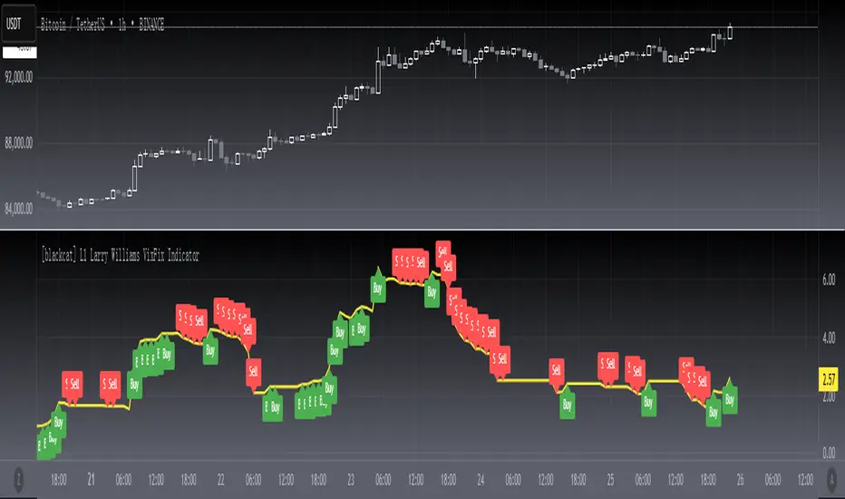
[blackcat] L1 Larry Williams VixFix IndicatorLevel : L1
Larry Williams, had this idea to create a synthetic VIX for more than just the main stock indices. Check out the formula for Williams VixFix:
```
VIX Fix Formula = (Highest(Close, 22) – Low) / (Highest(Close, 22)) * 100
```
What does this even mean? In normal person terms, here's what it's all about:
1. Find the highest close over the last 22 days and subtract today's low (or the current bar).
2. Divide that by the highest close of the past 22 days.
3. Multiply the result by 100 to "normalize" the indicator.
Why 22 days, you ask? That's how long the normal month of trading days is.
So, you see, the formula is pretty chill. It's just a way to measure the price volatility of the last 22 trading days. It's a bit of a lagging indicator, but it gets the job done.
Here my version of this scriptcreates a custom technical indicator called "L1 Larry Williams VixFix" that measures the distance between the highest high and the lowest low of a security's price over a specified period.
The user can adjust the period length and source price used in the VixFix calculation. The period length is set to 22 by default, but can be modified by the user with the "Length" input parameter. The source price is set to "close" by default, meaning it will use the closing price of each bar to calculate the VixFix. However, the user can also choose a different type of price data, such as open, high, or low.
The VixFix is calculated as a percentage of the difference between the highest close and the lowest low over the specified period. This percentage is then multiplied by 100 to create a more readable value.
Finally, the code plots the VixFix line on the chart with a yellow color and a thickness of 2. This allows the user to easily visualize the VixFix value and incorporate it into their trading decisions.
Overall, this script provides a powerful tool for technical analysis that can help traders identify potential trend changes and market reversals.
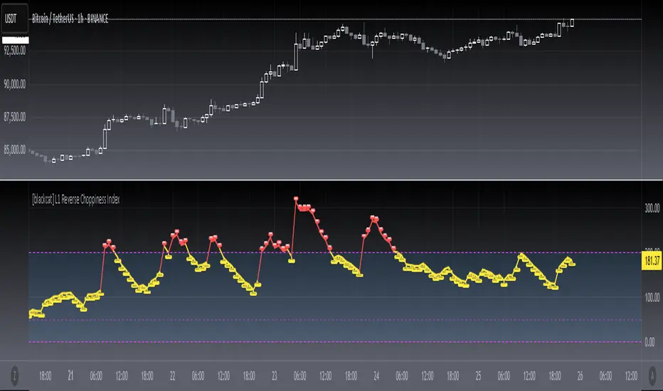
[blackcat] L1 Reverse Choppiness IndexThe Choppiness Index is a technical indicator that is used to measure market volatility and trendiness. It is designed to help traders identify when the market is trending and when it is choppy, meaning that it is moving sideways with no clear direction. The Choppiness Index was first introduced by Australian commodity trader E.W. Dreiss in the late 1990s, and it has since become a popular tool among traders.
Today, I created a reverse version of choppiness index indicator, which uses upward direction as indicating strong trend rather than a traditional downward direction. Also, it max values are exceeding 100 compared to a traditional one. I use red color to indicate a strong trend, while yellow as sideways. Fuchsia zone are also incorporated as an indicator of sideways. One thing that you need to know: different time frames may need optimize parameters of this indicator. Finally, I'd be happy to explain more about this piece of code.
The code begins by defining two input variables: `len` and `atrLen`. `len` sets the length of the lookback period for the highest high and lowest low, while `atrLen` sets the length of the lookback period for the ATR calculation.
The `atr()` function is then used to calculate the ATR, which is a measure of volatility based on the range of price movement over a certain period of time. The `highest()` and `lowest()` functions are used to calculate the highest high and lowest low over the lookback period specified by `len`.
The `range`, `up`, and `down` variables are then calculated based on the highest high, lowest low, and closing price. The `sum()` function is used to calculate the sum of ranges over the lookback period.
Finally, the Choppiness Index is calculated using the ATR and the sum of ranges over the lookback period. The `log10()` function is used to take the logarithm of the sum divided by the lookback period, and the result is multiplied by 100 to get a percentage. The Choppiness Index is then plotted on the chart using the `plot()` function.
This code can be used directly in TradingView to plot the Choppiness Index on a chart. It can also be incorporated into custom trading strategies to help traders make more informed decisions based on market volatility and trendiness.
I hope this explanation helps! Let me know if you have any further questions.
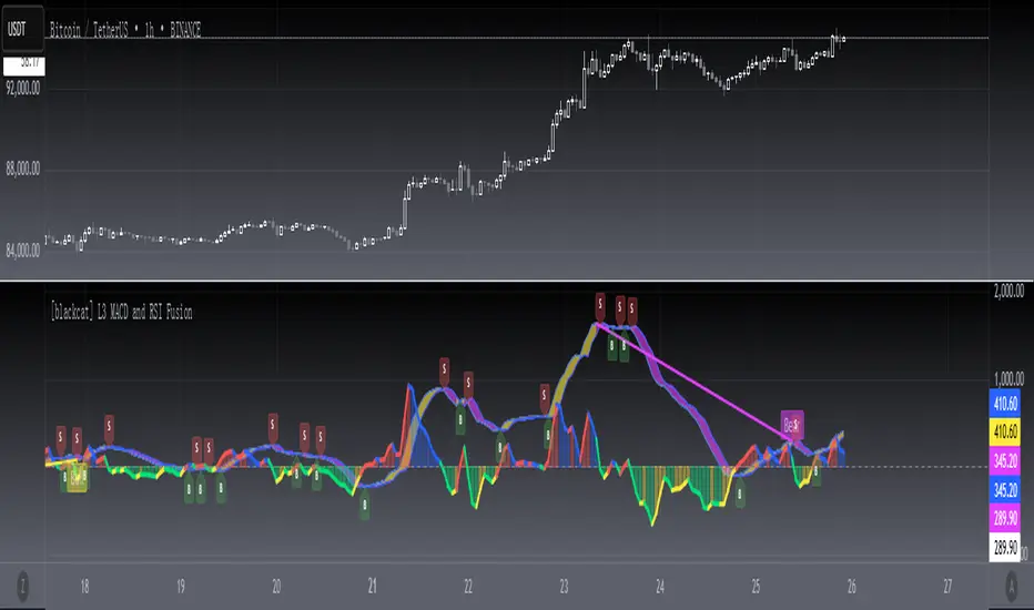
[blackcat] L3 MACD and RSI Fusion The MACD and RSI fusion is a popular technical analysis strategy used by traders to identify buy and sell signals in the market. The strategy makes use of two popular technical indicators, the Moving Average Convergence Divergence (MACD) and the Relative Strength Index (RSI), and combines them to create a powerful trading signal.
The MACD and RSI fusion was originally developed for the Chinese stock market and is commonly used by traders all over the world. The strategy is based on the idea that the MACD and RSI indicators can be used together to provide a more accurate and reliable signal.
To use the MACD and RSI fusion , traders need to follow a few simple steps. The following code is the TradingView Pine script v4 indicator equivalent of the original MACD and RSI fusion code:
```
//@version=4
study(" MACD and RSI fusion ", overlay=false)
// Define the simple fusion indicator
simple_fusion = (ema(close, 12) - ema(close, 26)) * 1.2 + rsi(close, 14) / 50
// Define the simple fusion lag indicator
simple_fusion_lag = nz(simple_fusion )
// Plot the simple fusion and simple fusion lag indicators
plot(simple_fusion, color=color.blue, title="simple fusion")
plot(simple_fusion_lag, color=color.red, title="simple fusion Lag")
```
This code defines the simple fusion and simple fusion Lag indicators and plots them on the chart. The simple fusion indicator is the sum of the 12- and 26-period exponential moving averages of the closing price, multiplied by 1.2, and added to the 14-period relative strength index of the closing price, divided by 50. The simple fusion Lag indicator is the value of the simple fusion indicator from the previous period.
Traders can use the simple fusion and simple fusion Lag indicators to identify buy and sell signals. When the simple fusion indicator crosses above the simple fusion Lag indicator, it is a buy signal, and when the simple fusion indicator crosses below the simple fusion Lag indicator, it is a sell signal.
In conclusion, the MACD and RSI fusion is a simple but powerful technical analysis strategy that combines two popular technical indicators to identify buy and sell signals in the market.
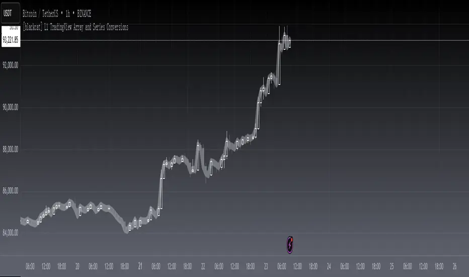
[blackcat] L1 TradingView Array and Series ConversionsLevel 1
Background
It just so happens that I need some functions that can convert between the Series data type and the Array data type.
Function
Series is a unique data type of TradingView. By operating Series data, the algorithm can be simplified, which is very convenient. However, in high-level languages, Array is a basic data type that provides great flexibility and can be used to develop advanced algorithms. This is why TradingView introduces the Array data type. This script simply demonstrates how to convert between these two data types.
s2a function: Convert a TV series into an array.
a2s function: Convert an array into a TV series
Finally, Courtesy of Electrified for his "Average Lib":
Remarks
Feedbacks are appreciated.
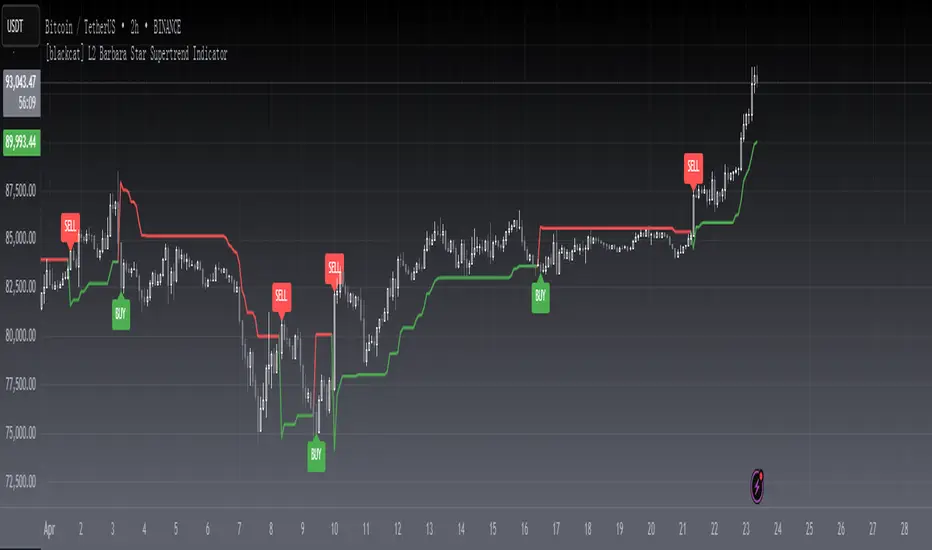
[blackcat] L2 Barbara Star Supertrend IndicatorLevel 2
Background
Barbara Star’s article on July 2023, “Stay On Track With The Supertrend Indicator”, I rewrote it as pine script for your information.
Function
A supertrend indicator is displayed either above or below the closing price to signal a buy or sell. The indicator changes color depending on whether you should buy or not. When the Supertrend indicator falls below the closing price, the indicator turns green, signaling one or more entry points to buy.
Author Barbara Star describes the Supertrend indicator and how it can be used as a means for traders to stay in sync with the larger trend. She explains how J. Welles Wilder's Average True Range (ATR) forms a basis for supertrend calculations. ATR does not measure price direction, but rather provides a measure of volatility over a period of time. The Supertrend indicator, on the other hand, provides a more comprehensive view of trend direction. In addition, the indicator provides price levels at which a trend reversal would occur.
Green color stands for up trend;
Red color stands for down trend.
Remarks
Feedbacks are appreciated.
[blackcat] L1 Vitali Apirine Stochastic Distance OscillatorLevel 1
Background
Vitali Apirine published an article of “The Stochastic Distance Oscillator” on June 2023. I rewrite it for pine script.
Function
Vitali Apirine offers a new twist on the classic stochastic oscillator, which he calls "Stochastic Distance Oscillator" (SDO). The SDO is an impulse study that shows the size of the current range versus the maximum/minimum range range over a period of time. The study can be used for stocks or indices that are trending, but is also useful for trading ranges. Overbought and oversold levels can help spot upside and downside trend changes.
Remarks
Feedbacks are appreciated.

[blackcat] L1 An Adaptive Moving Average For Swing TradingLevel 1
Background
Scott Cong published an article of “An Adaptive Moving Average For Swing Trading” on April 2023. I rewrite it for pine script.
Function
In "An Adaptive Moving Average For Swing Trading," author Scott Cong introduces a new adaptive moving average that is designed to be responsive, smooth, and robust. He begins with a discussion of Perry Kaufman's adaptive moving average and explains how an adaptive moving average (AMA) can adapt to different market environments. Later he explains his methods of adjusting and changing the smoothing factor, which has better response than traditional EMA and SMA. I rewrited this new kind of moving average in pine script and use yellow color for its fast line while fuchsia color for its trigger signal as a slow line. By the way, divergence detector is also added for divergence notification. You can change period or length, and signal source parameters in setting dialog.
Remarks
Feedbacks are appreciated.

[blackcat] L3 Banker Fund SwingLevel 3
Background
The large funds or banker fund are often referred to as Whale. Whale can have a significant impact on the price movements in various markets, especially in cryptocurrency . Therefore, how to monitor Whale trends is of great significance both in terms of fundamentals and technical aspects.
Function
To understand banker fund more directly, a banker fund model is applied for main chart as different candles with colors, as well as short, middle, long term moving averages in yellow, fuchsia, aqua colors, respectively. The banker fund model is made of a fast line of EMA2, and a slow line of EMA42 of a artifical curve fitting line with xsl(close,21))*(20)+close, where xsl is used to calculate the slope of a data series. And then, with definition of the golden cross and dead cross status, banker fund behavior can be extracted as green candle color for bullish an red color candle for bearish. At the mean time, a new type of candle with yellow color is defined as well standing for a bullish swing start.
Remarks
Feedbacks are appreciated.

[blackcat] L2 Super OscillatorLevel2
Background
A super oscillator with overbought and oversold detections.
Function
Represented by a white line, this Super Oscillator indicator identifies instruments that are overbought or oversold, which can be an important part of determining buy and sell points. An oversold market is a market that has fallen sharply and is expected to recover. In this indicator, gray candlesticks are used at the bottom to show that an oversold zone is near and a red candlestick shows that the overbought zone is ending. On the other hand, an overbought market has risen sharply and could be ripe for a decline. Yellow line dips are used to indicate overbought zones.
Remarks
Feedbacks are appreciated.

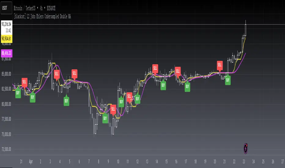
[blackcat] L2 John Ehlers Undersampled Double MALevel2
Background
This is a novel "undersampling data" processing trick proposed by John F. Ehlers in his April 2023 article "Just Ignore Them".
Function
In signal processing, undersampling, or bandpass sampling, is a technique whereby a bandpass-filtered signal is sampled at a sample rate below its Nyquist rate (twice the upper cut-off frequency), but the signal can still be reconstructed. When undersampling a bandpass signal, the samples are indistinguishable from samples of a low-frequency alias of the high-frequency signal.
John Ehlers notes that data smoothing is often used to avoid trading spikes. While this can result in fewer trading signals, it can also result in a delay in those trading signals. He describes how undersampling can be used in conjunction with Hann window finite impulse response (FIR) filters to remove high-frequency components in price data, resulting in less delay than traditional smoothing filters.
In this indicator, Hann windowing is applied a a pair of fast/slow moving averages which is used to improve their response perfomrnace. Yellow line is the fast line while fuchsia line is the slow line. You can judge bull bear stattus by checking the status it is in golden cross or in dead cross status.
Remarks
Feedbacks are appreciated.
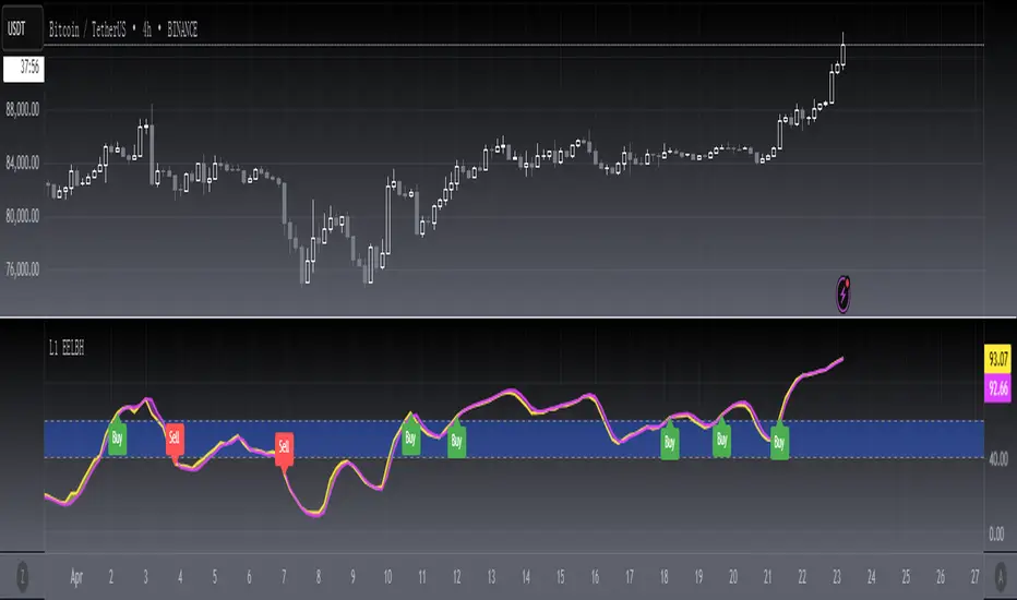
[blackcat] L1 Ehlers Every Little Bit HelpsLevel 1
Background
Inspired by "Averaging The Open And Close To Reduce Noise" on March 2023 by John F. Ehlers’ article in the March issue, “Every Little Bit Helps”, I further smooth it because noise was still large and “Every Little Bit Does Not Helps Much”.
Function
In John F. Ehlers' 03/2023 article, "Every Little Bit Helps," he suggests that noise can be reduced by simply averaging the open and close prices of a bar, rather than just using the close price. The data sampling example presented in this article compares the traditional RSI using close data to an RSI calculated using the average of the open and close.
Compared to RSI, I used my customized RMI version which is more suitable for moment smoothing. For example, the price entry of the 1st RMI can be changed from Close to (Close + Open) / 2. In fact, the RMI indicator itself has a price input that can be changed in a similar way. You can change the input parameter "m" to "More Help", which is 5 by default.
Remarks
Feedbacks are appreciated.
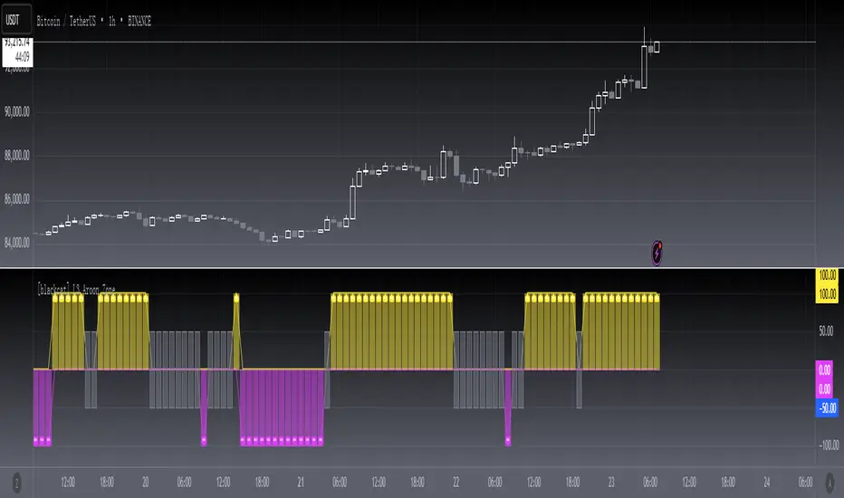
[blackcat] L3 Aroon ZoneLevel 3
Background
The Aroon indicator developed by Tushar Chanand indicates whether there is a trend price or is located in a trading area.
Function
Classical Aroon can also show the beginning of a new trend, its strength and expectation of changes from trade areas to trends. However, it produces too much noise when is bull or bear during sideways. In this improved version, I use bars without "blur cross" to classify bull, bear and sideways, which could look better to know the status of current market.
Since Chinese uses red for bull, green for bear, while others use green for bull and red for bear, i try to avoid to use red or green, which may be confusing. I use my style of color for bull and bear:
Yellow --> Bull
Fuchsia --> Bear
Gray --> Sideways
Remarks
Feedbacks are appreciated.
[blackcat] L2 Aroon13Level 2
Background
The Aroon indicator developed by Tushar Chanand indicates whether there is a trend price or is located in a trading area.
Function
Classical Aroon can also show the beginning of a new trend, its strength and expectation of changes from trade areas to trends. This is a traditional aroon indicator with length == 13, which exhibit good performance.
Remarks
Feedbacks are appreciated.

[blackcat] L1 Adaptive Choppiness IndexLevel: 1
Background
I have been working with choppiness index type indicator for long. However, there are several problems in tradintional one.
Function
One of the issue of conventional choppiness index is the noise or ripple is too obvious. I was wondering several ways to smooth it. As you may know, choppiness index is "one line" indicator. There is little room of freedom to change it too much. Then, I introduced adaptation algorithm to make "length" parameter adaptive, which can smooth choppiness index indicator to some degree. Meanwhile, I use ALMA to smooth the output again.
Remarks
I used my published dc_ta lib, which collects several dominant cycle algorithm from Elhers to make many indicator adaptive possible.
Feedbacks are appreciated.

[blackcat] L3 Banker Fund SentimentLevel: 3
Background
If you like my banker fund series indicators, this may be another helpful one which describe banker fund sentiment with price and volume infomation.
c.
Function
Use price (major EMAs and SMAs) and volume infomation to model banker fund in a sensitive way which can be called banker fund sentiment. This was realized by a form of oscillator and 0 axis is an important boundary to define bull and bear senmtiments. I use different kind colors of columns to distinguish them.
I summarize how to use it in 1D timeframe:
1. When a fuchsia column appears below the 0 axis, start paying attention and watch for a bullish reversval around.
2. When a red column appears on the first day above the 0 axis, it is a signal of confirmed bullish trend.
3. There is a retraced in the middle and start doing T+0 trading to reduce costs.
4. When the pile of columns ( banker fund energy) breaks through the previous high in the late stage of the retracement, start to increase the bullish position, and be a short-term bullish relay, this is the best buying point!
5. Wait for 3-4 days to start reducing or flatting positions, and make your own decisions according to your personal risk preferences!
Remarks
When the pile of column breaks through the previous high point in the late stage of the retracement, and if the stock is a recent hot sector or concept stock,
Then increase your position and wait for the main force to pump! This indicator may not work alone, you should consider to combine your knowledge of other skills, e.g. candle pattern, news analysis etc.
B: long entry, green
S: short entry, red
column color
bullish trend: red color
confirmed bullish trend: maroon color
bullish retracement: blue color
bearish trend: green color
bearish retracement: fuchsia color
Feedbacks are appreciated.

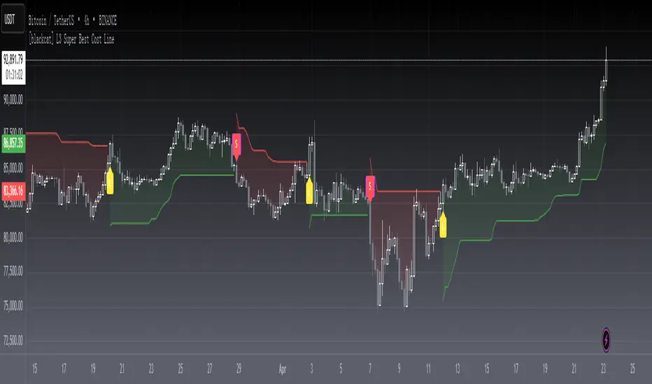
[blackcat] L3 Super Best Cost LineLevel: 3
Background
As suggested by @hedan1, he made a suggestion: this indicator can be further optimized to develop a dull line to filter the overall direction, and then use the sensitive line as a confirmation signal to enter.
One of my favourite tool to see fast trends which is simple but powerful. It runs under below market logic.
Function
With @hedan1's idea, the 1st thing i come up with is a two-layer structure: the inner sensitive part is the best cost line indicator, the outer layer is a supertrend indicator to control the overall trend direction.
Best cost line is a tool to model the people's mood and preference in the market. I define a typical price as wcx, when wcx is above the best cost line, which means traders are willing to use higher price to buy, then if you long, you are following the trend and make profit. On the other hand, if wcx is below the best cost line, which means traders are NOT willing to pursue higher price (maybe due to continous stop loss or sth other), then you should at least not long or if you are agressive in style, you may consider short.
That is it. Do you think it is simple and powerful enough?
Remarks
L: long entry, yellow
XL: close long, fuchsia
S: short entry, green
XS: close short, red
inner bullish: yellow color
inner bearish: fuchsia color
outer bullish: green color
outer bearish: red color
inner indicator : the best cost line
outer indicator : supertrend
also, i improved the display fucntinon remove some blur lines with linebr feature.
Feedbacks are appreciated.
[blackcat] L1 Chop ZonesLevel: 1
Background
I was inspired by NILX's "Tool: Chop & Trade Zones". This can used as an element for trading system control.
Function
I use my own customized algorithm to replace that core of NILX one, which is targetting to provide smoother and trend for chop and trend judgement.
Since it is quite differnt now but an oscillator within range of 0~100. The pro is it can use the contstant threshold values for all time frames and all trading pairs now.
Remarks
Feedbacks are appreciated.
[blackcat] L1 Volume DynamicsLevel: 1
Background
Use the difference of Jurik MA and SMA equivalent (ALMA) to observe something new for volume.
Function
Trading volume is an important technical indicator that is not easy to see the law. I try to match the trading volume with the deduction theory, and the deduction double-average theory is matched with the measurement capacity. I will compare the two moving averages of ultra-short-term, short-term, medium-term and long-term. The faster moving average I choose is Jurik MA (JMA), because it is faster than EMA under the same parameters, and the smoothing effect is very good. In addition to the slow moving average, I use ALMA to benchmark SMA. Because the smoothing properties of ALMA are better. A law is used here, that is, the equivalent relationship between ALMA and SMA is approximately a Fibonacci sequence. I can dynamically apply this amount to the Bitcoin market and see some interesting phenomena.
What is double average volume? According to normal circumstances, JMA will follow the transaction volume faster than SMA. The transaction volume is normally rising above the double average volume, and the transaction volume is normally falling below the double average volume. When the SMA follows the trading volume faster than the JMA, it is abnormal (usually occurs in the divergence segment), that is, the JMA is above the SMA, but the trading volume is below the SMA (the bottom divergence volume pile), the top divergence volume pile is the opposite process. The trading volume is between the double average volume, which is the finishing volume energy. It can be used in the breakthrough of the box and the bottom of the pot. By comparing the strength of the current trading volume with the strength of the trading volume on the upper edge of the box or bottom structure, it can improve the success rate of predicting the breakthrough, especially for the observation effect of large funds latent.
Remarks
Feedbacks are appreciated.
[blackcat] L3 Jurik MACDLevel: 3
Background
Use Jurik MA to build MACD and many people need to judge the market trend against the main candlestick chart when using MACD .
Function
First of all, the MACD function is built with Jurik MA and ALMA for better performance.
Second, the principle of MACD is the difference between EMA's long-term and short-term values. So, I wonder if it is possible to use EMA to construct a set of candle charts that are similar in proportion to MACD values for overlapping comparisons? Because this can greatly facilitate traders to make quick trend judgments. So I used the 3-8 lines of EMA to simulate the KD of KDJ, constructed a set of candle charts, and generated buying and selling points through conditional constraints. Do you like this MACD + Candlestick chart?
Key Signal
Traditional Jurik MACD output signal
Candlesticks
Near Top --> Top is reached and reversal may happen soon. (fuchsia labels)
Near Bottom --> Bottom is reached and reversal may happen soon. (yellow labels)
Remarks
Feedbacks are appreciated.

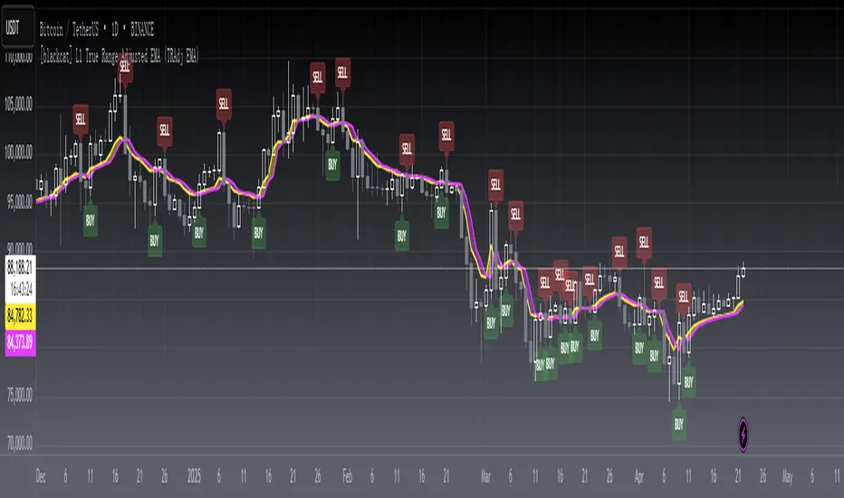
[blackcat] L1 True Range Adjusted EMA (TRAdj EMA) Level: 1
Background
In Traders’ Tips in January 2023, Vitali Apirine published an article in the January 2023 issue, “True Range Adjusted Exponential Moving Average (TRAdj EMA)”.
I use pine v4 to script it.
Function
Vitali Apirine's article True Range Adjusted Exponential Moving Average (TRAdj EMA) presents how a security's True Range, which measures volatility, can be integrated into a traditional exponential moving average. The trend following indicator called True Range Adjusted Exponential Moving Average (TRAdj EMA) applied with different lengths can help define turning points and filter price movements. By comparing the indicator to an exponential moving average of the same length, the trader can gain insight into the overall trend.
Remarks
Feedbacks are appreciated.
[blackcat] L3 Best Cost LineLevel: 3
Background
One of my favourite tool to see fast trends which is simple but powerful. It runs under below market logic.
Function
Best cose line is a tool to model the people's mood and preference in the market. I define a typical price as wcx, when wcx is above the best cost line, which means traders are willing to use higher price to buy, then if you long, you are following the trend and make profit. On the other hand, if wcx is below the best cost line, which means traders are NOT willing to pursue higher price (maybe due to continous stop loss or sth other), then you should at least not long or if you are agressive in style, you may consider short.
That is it. Do you think it is simple and powerful enough?
Remarks
Feedbacks are appreciated.

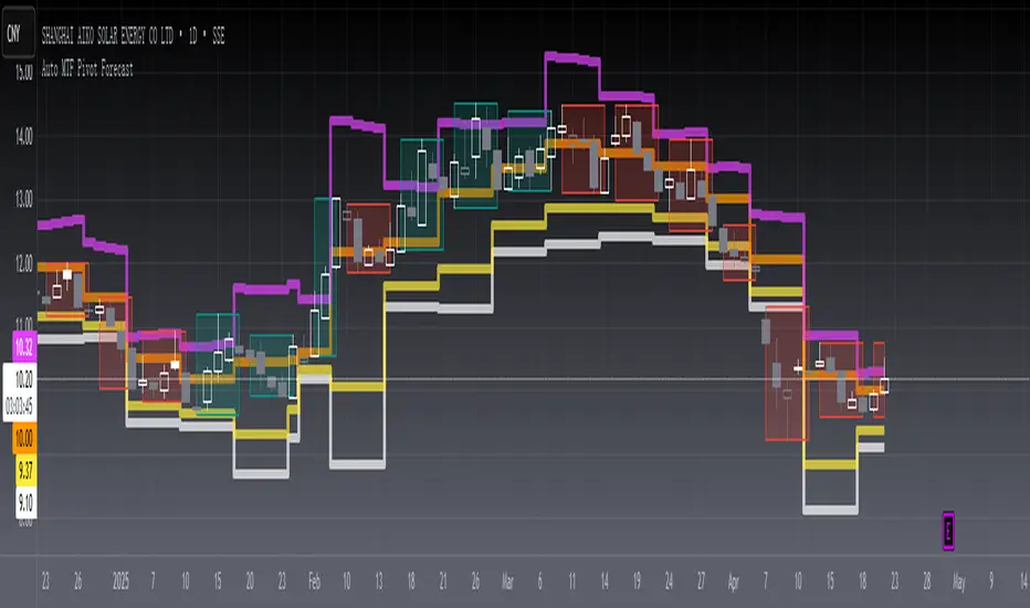
[blackcat] L2 Auto MTF Pivot Forecast Level 2
Background
A algo for pivot points forecast for each bar of automatic multiple timeframe (MTF) data.
Function
In financial markets, a pivot point is a price level that is used by traders as an indicator of market movement. Pivot points are averaged from important prices (highest, lowest, closing) based on the market performance of the previous time period. There are many ways to calculate the pivot point. The pivot point is calculated using the highest price (H), the lowest price (L) and the closing price (C) of the previous time period, and sometimes the opening price of the current time period Valence (O) was added to it.
S1 yellow
S2 white
R1 Orange
R2 fuchsia
The smoothing parameter default to 55
The pivot point indicator can be used in two ways. First, the pivot point can be used as a price trend confirmation. It is generally believed that if the price is above the pivot point in the latter period of time, the market is considered to be in a bull market sentiment, otherwise it is considered to be in a bear market sentiment. Second, support and resistance levels are mainly used as exit positions. For example, R1 and R2 can be used as trade targets if the market price breaks above a pivot point. If the market effectively breaks R1 and R2, traders may consider adding to their long positions.
Remarks
Feedbacks are appreciated.