Combi RSICombi RSI (CRSI): A Comprehensive Multi-Timeframe Indicator
Combi RSI (CRSI) is a powerful indicator that combines the Relative Strength Index (RSI) across multiple timeframes. The purpose of CRSI is to provide a holistic view of the RSI, as it often happens that the RSI reaches its minimum or maximum value while the price continues to move in the same direction.
Seamless Integration of Timeframes for Enhanced Analysis
By incorporating RSI readings from different timeframes, CRSI eliminates the need for constantly switching between charts. You can keep a lower timeframe chart open while simultaneously benefiting from the insights provided by CRSI based on a higher timeframe.
Flexible Settings to Tailor the Indicator
CRSI offers customizable settings to suit your trading preferences. You can choose three timeframes of your choice and assign weights to each timeframe. If you prefer to work with only two timeframes, you have the option to assign a weight of 0 to the third timeframe.
Weighting Factor: Determining Importance
The assigned weight for each timeframe is crucial in determining its significance in the CRSI calculation. While the weight can be any non-negative number, it is the relative weights that matter the most. A higher weight value indicates a greater importance placed on that specific timeframe in the CRSI analysis.
Utilizing CRSI as an Effective Tool
While CRSI can be used as a regular RSI indicator, such as identifying buying opportunities in the oversold range or selling opportunities in the overbought range, it is essential to note that CRSI is not intended to be used as a standalone indicator. To make informed trading decisions, it is highly recommended to seek confluence with other indicators and analyze the overall market context.
Crsi

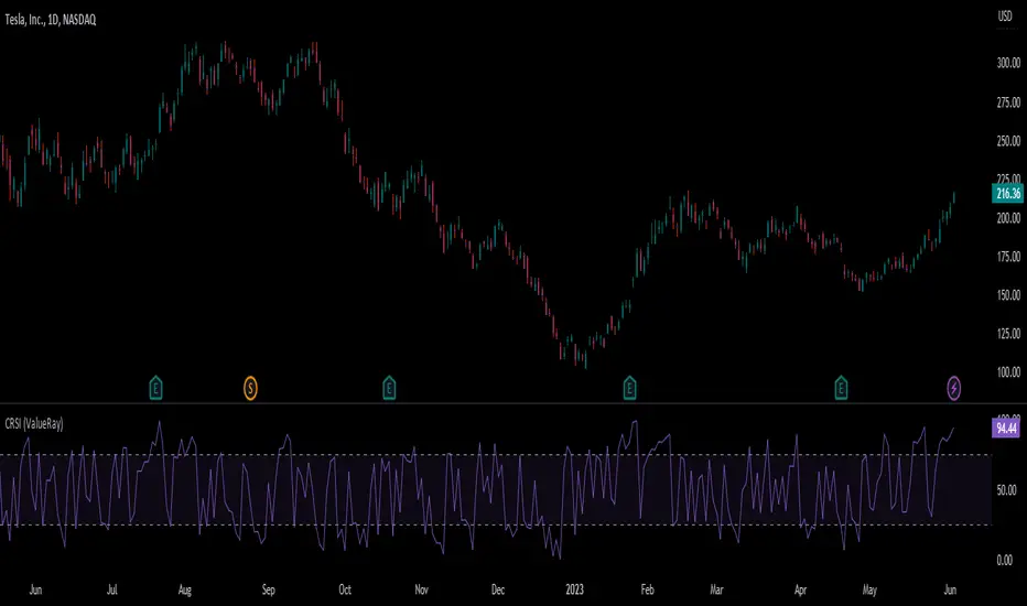
Connors RSI (ValueRay)In compare to Tradingview Connors RSI, in this one you can choose which of the parts of the CRSI you want see:
RSI
Connors RSI
Up/Down RSI
Percent Rank
The Connors RSI is a technical indicator developed by Larry Connors. It combines three different elements - price momentum, relative strength, and mean reversion - to identify potential buy and sell signals. The indicator measures the level of overbought or oversold conditions in a security, aiming to generate signals for short-term trading opportunities. It is widely used by traders to assess the strength and direction of price movements and to identify potential entry and exit points in the market.
Cutlers RSICutlers' RSI is a variation of the original RSI Developed by Welles Wilder.
This variation uses a simple moving average instead of an exponetial.
Since a simple moving average is used by this variation, a longer length tends to give better results compared to a shorter length.
CALCULATION
Step1: Calculating the Gains and Losses within the chosen period.
Step2: Calculating the simple moving averages of gains and losses.
Step3: Calculating Cutler’s Relative Strength (RS). Calculated using the following:
-> Cutler’s RS = SMA(gains,length) / SMA(losses,length)
Step 4: Calculating the Cutler’s Relative Strength Index (RSI). Calculated used the following:
-> RSI = 100 —
I have added some signals and filtering options with moving averages:
Trend OB/OS: Uptrend after above Overbought Level. Downtrend after below Oversold Level.
OB/OS: When above Overbought, or below oversold
50-Cross: Above 50 line is uptrend, below is downtrend
Direction: Moving up or down
RSI vs MA: RSI above MA is an uptrend, RSI below MA is a downtrend
The signals I added are just some potential ideas, always backtest your own strategies.

[_ParkF]cRSIHi, it's been a while since I posted a script.
This script basically puts the principle of convergence and divergence first.
(The Bollinger Band on the main chart is for reference)
The cRSI will move within the range of 0-100 just like the normal RSI
Along with that, there is a Donchian channel that will be the main activity area of the cRSI
If you know the characteristics of the Bollinger Band, it might be easy to understand
Basically, it will have the Expansion - Bulge - Squeeze Cycle
I wanted to express the movement of the wave visually.
Donchian Channel can be viewed to check Expansion - Bulge - Squeeze.
The centerline of the Donchian Channel is important because it plays a key role in identifying trends, such as 50 of the cRSI.
Also, Bear and Bull Divergence has 3 different colors
The reason is that the Divergence measurement period values are different.
Bear Divergence will be marked with Yellow, Orange, Red Label, and Bull Divergence will be marked with Green, Blue and Purple Label Purple. There will be a longer period of diversity in the order listed order.
I hope it helps your trading.
--------------------------------------------------------------------------------------------------------------------------------------------------------------------------------------------------------------------------------------------------------------------
안녕하세요, 오랜만에 새로운 지표를 올립니다.
이 지표는 기본적으로 수렴과 발산을 가장 중요하게 생각한 것입니다.
(메인 차트에 있는 볼린저 밴드는 참고를 위한 것입니다.)
cRSI는 일반적 RSI와 마찬가지로 0-100의 범위 안에서 움직이겠지만
그와 함께 cRSI의 주 활도 범위가 될 돈치안 채널이 함께 존재해서
볼린저 밴드의 특성을 알고 있다면 이해하기 쉬울 수 있을 것 같은데
기본적으로 Expansion - Bulge - Squeeze의 사이클을 가질 것이고
그 파동에 따른 RSI의 움직을 시각적으로 표현해보고 싶어서 만들었습니다.
돈치안 채널은 Expansion - Bulge - Squeeze 를 확인하기 위해 존재한다고 보면 될 것이고
돈치안 채널의 중심선은 cRSI의 50의 위치와 같이 추세를 확인하는데 있어
중점적인 역할을 하기 때문에 유의깊게 보면 좋습니다.
또, 하락과 상승 다이버전스는 각각 3가지 종류이고 색이 다릅니다.
이뉴는 각각의 다이버전스의 측정 기간값을 다르게 했기 때문이며,
하락 다이버전스는 노랑, 주황, 빨강 라벨로 표시 될 것이고
상승 다이버전스는 초록, 파랑, 보라 라벨로 표시 되며,
나열한 순서대로 더 긴 기간값의 다이버전스가 라벨로 플롯됩니다.
트레이딩에 도움이 됐으면 좋겠습니다.

CRSI - EddyBased on Cyclic Smoothed Relative Strength Indicator v2 by WhenToTrade
The cyclic smoothed RSI indicator is an enhancement of the classic RSI , adding
- additional smoothing according to the market vibration,
- adaptive upper and lower bands according to the cyclic memory and
- using the current dominant cycle length as input for the indicator.
The cRSI is used like a standard indicator but I've added bar colors and reduced the period minimum to 1.
The default settings uses period of 4.
Bar colors explanation:
Yellow = Bullish cross up of crsi and ub
Lime = bullish continuation
Fuchsia = Cross down of crsi and ub
Red = Cross down of crsi and db
Black = Bearish continuation
ub = aqua line high
db = aqua line low
crsi = fuchsia line representing smoothed RSI
Enjoy!

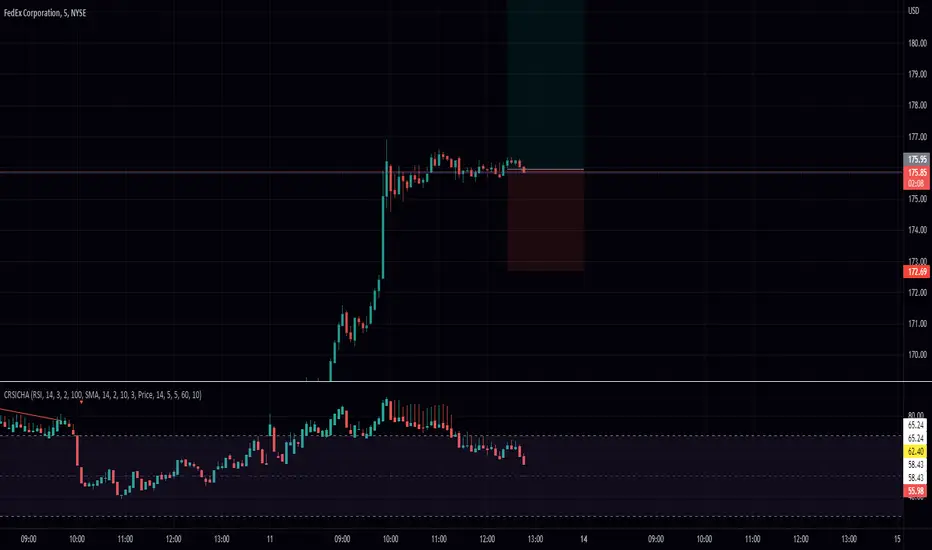
RSI Candle with Connors RSI and Heikin Ashi (CRSICHA)This script was designed to work and feel like the built in RSI script but with a lot of added feature that traders might enjoy. You get to see the RSI represented as candle sticks OR Heikin Ashi. I have added in Connors RSI as a bonus so you can see what this lesser used study looks like in candle form. Just like in the original script I have moving averages and Bollinger Bands. I must say, Heikin Ashi really excells in this situation because you don't need to know an exact price! As always I hope every one finds this useful! Enjoy!
Cyclic RSI High Low With Noise Filter█ OVERVIEW
This indicator displays Cyclic Relative Strength Index based on Decoding the Hidden Market Rhythm, Part 1 written by Lars von Thienen.
To determine true or false for Overbought / Oversold are unnecessary, therefore these should be either strong or weak.
Noise for weak Overbought / Oversold can be filtered, especially for smaller timeframe.
█ FEATURES
Display calculated Cyclic Relative Strength Index.
Zigzag high low based on Cyclic Relative Strength Index.
Able to filter noise for high low.
█ LEGENDS
◍ Weak Overbought / Oversold
OB ▼ = Strong Overbought
OS ▲ = Strong Oversold
█ USAGE / TIPS
Recommend to be used for Harmonic Patterns such as XABCD and ABCD.
Condition 1 (XABCD) : When ▼ and ▲ exist side by side, usually this outline XA, while the next two ◍ can be BC.
Condition 2 (ABCD) : When ▼ and ▲ exist side by side, usually this outline AB, while the next one ◍ can be BC, strong ABCD.
Condition 3 (ABCD) : When ▼ or ▲ exist at Point A, the next two ◍ can be Point B and Point C, medium ABCD.
Condition 4 (ABCD) : When ◍ exist at Point a, the next two ◍ can be Point b and Point c, weak ABCD usually used as lower case as abcd.
█ CREDITS
LoneSomeTheBlue
WhenToTrade

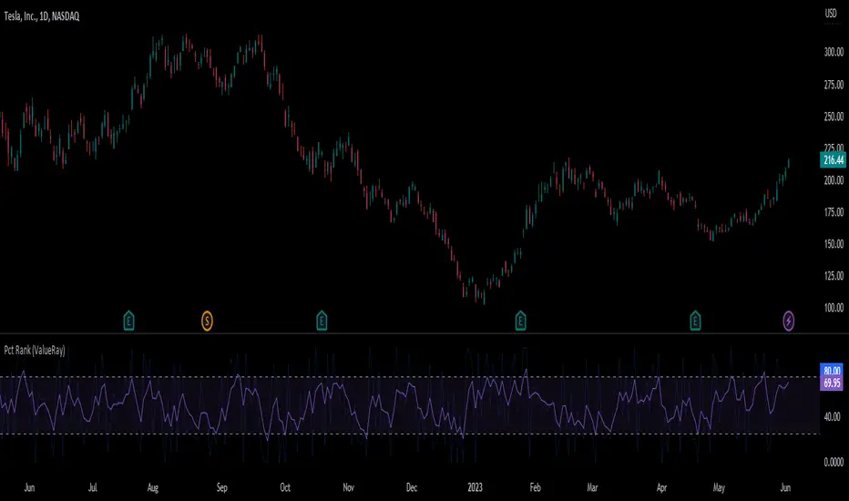
Percent Rank (ValueRay)The Percent Rank is naturally quite choppy. I therefor placed an EMA(3) over it and make the origin Percent Rank only slightly visible. I also add some boundaries.
Note that the EMA of the Percent Rank looks quite similiar to the Connors RSI.
Use it as the RSI.
cRSI + Waves Strategy with VWMA overlay + sessions and order qtyThis is a fork of the cRSI + Waves Strategy with VWMA overlay strategy by Dr_Roboto , which adds two additional features, namely:
the ability to limit trade signals to certain defined periods of time ("Sessions") during the trading day and, optionally, to close any open position at the end of either or both "Sessions"
the ability to control the maximum order size suggested by the strategy on the "Inputs" tab of the strategy's "Settings" window
If you are trading on a daily chart (or longer) you must disable the Limit Signals to Trading Sessions? option in order for the strategy to produce signals.
All other features are identical to the original strategy (revision 2.0).
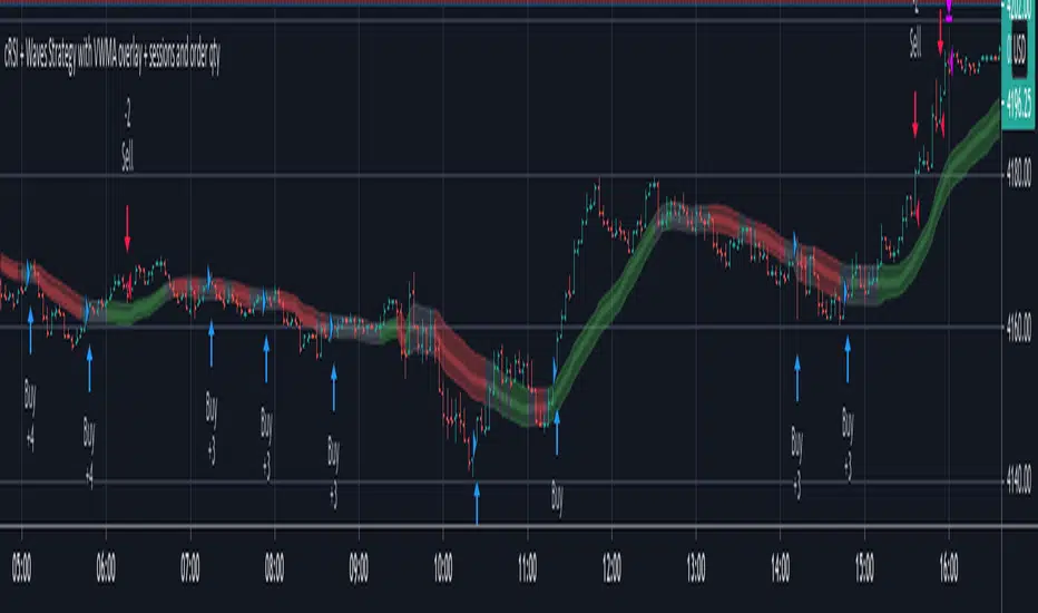
cRSI + Waves Strategy with VWMA overlayStrategy based on my cRSI with motive/corrective wave indicator. Please note that it is far from perfect. I use it mostly to help me identify good entry and exit points when combined with my other technical analysis. It misses some obvious points, but on average it does pretty well. The challenge often is indicating when you have sufficient change in the cRSI to know that the trend has changed, that means sometimes it can be a little early or late. It definitely helps take a lot of the guess work out of things. It works better on some equities than others and better on some time frames than others. You just have to play with it. At the minimum, it is a good template to learn how to write your own.

Cyclic Smoothed RSI with Motive-Corrective Wave Indicator
This indicator uses the cyclic smoothed Relative Strength Index (cRSI) instead of the traditional Relative Strength Index (RSI). See below for more info on the benefits to the cRSI.
My key contributions
1) A Weighted Moving Average (WMA) to track the general trend of the cRSI signal. This is very helpful in determining when the equity switches from bullish to bearish, which can be used to determine buy/sell points. This is then is used to color the region between the upper and lower cRSI bands (green above, red below).
2) An attempt to detect the motive (impulse) and corrective and waves. Corrective waves are indicated A, B, C, D, E, F, G. F and G waves are not technically Elliot Waves, but the way I detect waves it is really hard to always get it right. Once and a while you could actually see G and F a second time. Motive waves are identified as s (strong) and w (weak). Strong waves have a peak above the cRSI upper band and weak waves have a peak below the upper band.
3) My own divergence indicator for bull, hidden bull, bear, and hidden bear. I was not able to replicate the TradingView style of drawing a line from peak to peak, but for this indicator I think in the end it makes the chart cleaner.
There is a latency issue with an indicator that is based on moving averages. That means they tend to trigger right after key events. Perfect timing is not possible strictly with these indicators, but they do work very well "on average." However, my implementation has minimal latency as peaks (tops/bottoms) only require one bar to detect.
As a bit of an Easter Egg, this code can be tweaked and run as a strategy to get buy/sell signals. I use this code for both my indicator and for trading strategy. Just copy and past it into a new strategy script and just change it from study to a strategy, something like this:
strategy("cRSI + Waves Strategy with VWMA overlay", overlay=overlay)
The buy/sell code is at the end and just needs to be uncommented. I make no promises or guarantees about how good it is as a strategy, but it gives you some code and ideas to work with.
Tuning
1) Volume Weighted Moving Average (VWMA): This is a “hidden strategy” feature implemented that will display the high-low bands of the VWMA on the price chart if run the code using “overlay = true”.
- If the equity does not have volume, then the VWMA will not show up. Uncheck this box and it will use the regular WMA (no volume).
- defines how far back the WMA averages price.
2) cRSI (Black line in the indicator)
- Increase to length that amount of time a band (upper/lower) stays high/low after a peak. Reduce the value to shorten the time. Just increment it up/down to see the effect.
- defines how far back the SMA averages the cRSI. This affects the purple line in the indicator.
- defines how many bars back the peak detector looks to determine if a peak has occurred. For example, a top is detected like this: current-bar down relative to the 1-bar-back, 1-bar-back up relative to 2-bars-back (look back = 1), c) 2-bars-back up relative to 3-bars-back (lookback = 2), and d) 3-bars-back up relative to 4-bars-back (lookback = 3). I hope that makes sense. There are only 2 options for this setting: 2 or 3 bars. 2 bars will be able to detect small peaks but create more “false” peaks that may not be meaningful. 3 bars will be more robust but can miss short duration peaks.
3) Waves
- The check boxes are self explanatory for which labels they turn on and off on the plot.
4) Divergence Indicators
- The check boxes are self explanatory for which labels they turn on and off on the plot.
Hints
- The most common parameter to change is the . Different stocks will have different levels of strength in their peaks. A setting of 2 may generate too many corrective waves.
- Different times scales will give you different wave counts. This is to be expected. A counter impulse wave inside a corrective wave may actually go above the cRSI WMA on a smaller time frame. You may need to increase it one or two levels to see large waves.
- Just because you see divergence (bear or hidden bear) does not mean a price is going to go down. Often price continues to rise through bears, so take note and that is normal. Bulls are usually pretty good indicators especially if you see them on C,E,G waves.
----------------------------------------------------------------------------------------------------------------------------
cyclic smoothed RSI (cRSI) indicator
----------------------------------------------------------------------------------------------------------------------------
The “core” code for the cyclic smoothed RSI (cRSI) indicator was written by Lars von Theinen and is subject to the terms of the Mozilla Public License 2.0 at mozilla.org Copyright (C) 2017 CC BY, whentotrade / Lars von Thienen. For more details on the cRSI Indicator:
The cyclic smoothed RSI indicator is an enhancement of the classic RSI, adding
1) additional smoothing according to the market vibration,
2) adaptive upper and lower bands according to the cyclic memory and
3) using the current dominant cycle length as input for the indicator.
It is much more responsive to market moves than the basic RSI. The indicator uses the dominant cycle as input to optimize signal, smoothing, and cyclic memory. To get more in-depth information on the cyclic-smoothed RSI indicator, please read Decoding The Hidden Market Rhythm - Part 1: Dynamic Cycles (2017), Chapter 4: "Fine-tuning technical indicators." You need to derive the dominant cycle as input parameter for the cycle length as described in chapter 4.
Hope this helps and good luck.

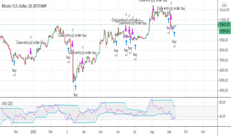
RSI cyclic smoothed strategy backtestI added a few lines of code to "when to trade"'s code to see that backtest result of "RSI cyclic smoothed v2".
VI BB RSI CRSI MFI - All In OneThis script simply creates a combo of some indicators I have found to be useful to visualize together.
Its fairly simple to use... buy the red and sell the green. The red and green 'zones' are VI indicator plus and minus using color to identify instead of plotting the lines and creating more mess for us.
The blue line is our BB B%... and the solid lines are the buy and sell thresholds.
The yellow line is our RSI, and the dotted lines are the thresholds.
The orange CRSI line is for intrazone (red or green VI zone) trades.. for instance, buying in the sell zone and then selling again (dead cats) and vice versa.
Lastly the purple MFI plot can be useful in identifying trend reversals.
This is not secret code, its free for everyone to use. If you find that it is too cluttered, you can simply comment out the plot function for that indicator to disable the ones that you find most cluttering.
Feedback is appreciated, along with ideas or suggestions.. cheers and happy trading!

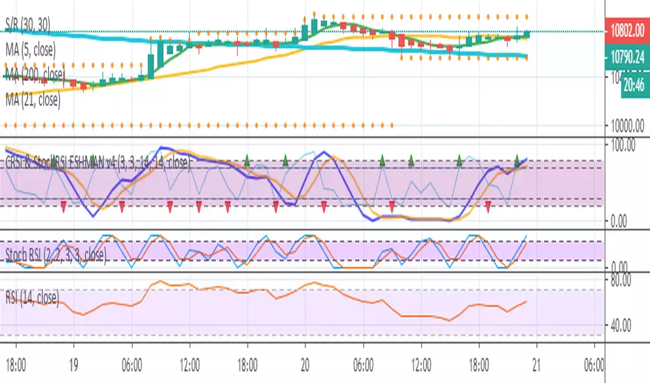
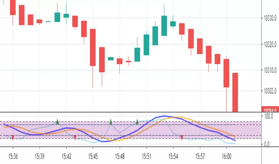
CRSI & StochRSI ESHMAN v4Indicator based on CRSI & StochRSI. This indicator is created to back a strategy, may not be useful without underlying strategy.
Publisher take no responsibility for your loss. Use at your own risk.
CRSI & StochRSI ESHMAN v3This indicator was created to back a strategy. uses CRSI and StochRSI. Indicator may not be useful without the underlying strategy.
Publisher take no responsibility for your loss. Use at your own risk.
Added crossover and crossunder.
CRSI & StochRSI ESHMAN v2V2, this indicator was created to back a strategy. uses CRSI and StochRSI. Indicator may not be useful without the underlying strategy.
Publisher take no responsibility for your loss. Use at your own risk.

CRSI & Stoch RSI EshmanThis indicator is combination of CRSI and Stoch RSI. This indicator is created to back a strategy to catch all Long and Short rallies. There are additional confirmations required for trade which are only mentioned in the underlying strategy.
The publisher take no responsibility of your loss. Use at your own risk.

Kal’s MTF ADX Rangoli RollerKaly MTF ADX Rangoli Roller is a method/study for finding trending stocks, indexes and cryptocurrencies using two different data periods (10, 5) of ADX Overlap over different time-frames (10m, 1H, 4H, 1D, 1W, 1M). In the study, I used 5-Period ADX for all mentioned time-frames. You may use 10-Period ADX for lower time-frames especially 10m and 1H.
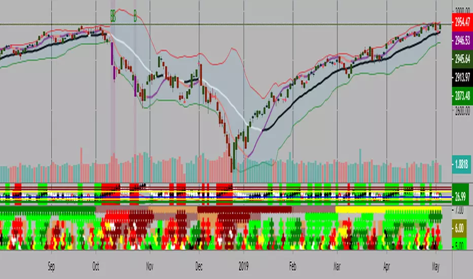
Sample Image of the pinescript code(at the end of this post) in Tradingview looks as follows:
Note: Kal's MTF ADX Rangoli Roller is the lower Plot. The upper plot is KAL’s ADX Overlap Technical Study with MACD Filter( )
Description:
----------------
In the study plot, the lowest row is 10m, row above is 1H, row above is 4H, then 1D, then 1W and highest row is 1M
Lime(Bright Green) dot implies Trending Uptrend for that time-frame (first phase)
Green dot implies Trending Uptrend for that time-frame (second phase near exhaustion)
Red dot implies Trending Downward for that time-frame (first phase)
Maroon dot implies Trending Downward for that time-frame (second phase near exhaustion)
Lime cross implies Strong Trending Uptrend for that time-frame (first phase)
Green cross implies Strong Trending Uptrend for that time-frame (second phase near exhaustion)
Red cross implies Trending Strong Downward for that time-frame (first phase)
Maroon cross implies Trending Strong Downward for that time-frame (second phase near exhaustion)
Yellow is ‘Squeeze On’ setting. During the squeeze period, the ADX signals are almost always ineffective. One may wait and watch over during this time. Once the Squeeze is released (i.e. no longer yellow), the trend corresponds to the color of the dots and crosses.
Black is CRSI Overbought condition for that time-frame. It’s best to wait and research for possibility of trend reversal because
1. Profit-booking/trimming happens after CRSI Overbought condition.
2. Large Short-sellers may take huge positions during this time pushing the stock prices up.
White is CRSI Oversold condition for that time-frame. It’s best to wait and research for possibility of trend reversal because
1. Profit-booking/trimming happens after CRSI Oversold conditions.
2. Large buyers may take huge positions during this time pushing the stock prices down.
I am a disabled man. Therefore, I am not able to write in detail here today. More Details will follow as time permits. Please let me know if I am missing anything…
Legal Disclaimer: I published here so I get replies from fellow viewers to educate myself and for my daily expenses. Hence, if anyone uses this script for making their decisions, I am not responsible for any failures incurred.
Safe Trading!
Kal Gandikota
PS: If you found this script interesting and edifying please follow and upvote.
PS2: Please kindly donate for my daily expenses (atleast as you would on streets) at the following addresses:
BTC Wallet: 1NeDC1GvpFa49DFLuT1v28ohFjqtoWXNQ5
ETH Wallet: 0x35e557F39A998e7d35dD27c6720C3553e1c65053
NEO Wallet: AUdiNJDW7boeUyYYNhX86p2T8eWwuELSGr
PS3: For more information on ADX and CRSI, please 'Google' or search here yourself.
PS4: This study is intended for research in creating automated Python Trading Systems using Pandas( steemit.com ).
Screenshots of the pinescript code looks as follows:
10minute Screenshot of Kal's MTF ADX Rangoli Roller (Above)
1 Hour Screenshot of Kal's MTF ADX Rangoli Roller (Above)
4 Hour Screenshot of Kal's MTF ADX Rangoli Roller (Above)
1 Day Screenshot of Kal's MTF ADX Rangoli Roller (Above)
1 Week Screenshot of Kal's MTF ADX Rangoli Roller (Above)
1 Month Screenshot of Kal's MTF ADX Rangoli Roller (Above)
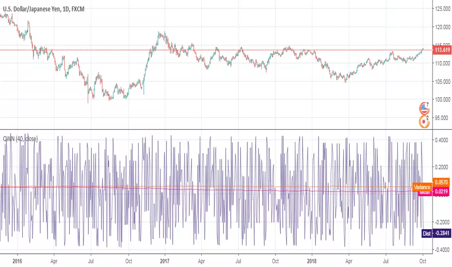
[RESEARCH] Quasi White NoiseQuasi White Noise script.
An experimental approach to implement a white noise using Pine Script. Uses Connors RSI under the hood.
en.wikipedia.org