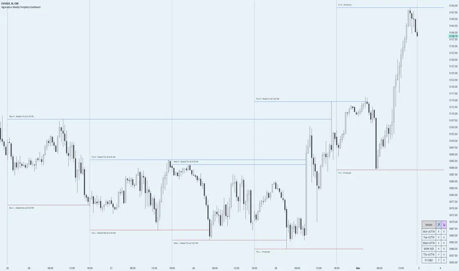
ICT Weekly Profile Templates Dashboard by AlgoCadosThe ICT Weekly Profile Templates Dashboard is a tool meticulously crafted to integrate ICT Weekly Profiles and enrich your trading approach with profound insights. It provides a real-time analysis of market sessions, Daily Session Opens openings, and potential Points of Interest (POI) within the week, It outlines 12 profiles, serving as a roadmap with enhanced precision. By breaking down the trading week into specific profiles, it provides a clear framework to navigate market fluctuations.
# Key Features
Weekly Templates Dashboard : An advanced feature supported by an easy-to-understand table that lists all 12 profiles, simplifying the process of identifying current market scenarios and potential future movements.
Intraweek POI : Identifies key intraweek levels of interest (Daily Highs / Daily Lows) with configurable visual styles. Distinguish between buyside and sellside POIs with solid, dotted, or dashed lines in colors that stand out or blend in, according to your preference.
POI Raids Insights : Automatically updates the lines and label of a key level once it gets broken, highlighting the time when the high or low was taken out,.to provide a comprehensive overview of weekly market dynamics.
Customization at its Core : With inputs for line styles, colors, and even font specifications for text and labels, the dashboard is fully customizable to fit your charting needs. Whether you prefer solid lines for emphasis or dotted lines for a more subdued look, the choice is yours.
Utility and Style : The script doesn't just offer functional benefits; it also considers aesthetics. Choose from Monospace or Sans Serif fonts and adjust the size to ensure that your dashboard is not only informative but also visually pleasing.
# ICT Weekly Pattern
"xOTW" serves as placeholder for "LOTW" (Low of the Week) and "HOTW" (High of the Week). This visual shorthand allows traders to quickly interpret market conditions, with a combination of "xOTW" alongside directional arrows "↗" (Bullish) and "↘" (Bearish).
Bullish Patterns Analyzed
Mon LOTW: Monday Low Of The Week / Classic Buy Week;
Tue LOTW: Tuesday Low Of The Week / Classic Buy Week;
Wed LOTW: Wednesday Low of the Week;
MWK R: Consolidation Midweek Rally;
Thu LOTW: Thursday Low Of The Week / Consolidation Thursday Reversal (Bullish);
Fri S&D: Seek and Destroy Bullish Friday;
Bearish Patterns Analyzed
Mon HOTW: Monday High Of The Week / Classic Sell Week;
Tue HOTW: Tuesday High Of The Week / Classic Sell Week;
Wed HOTW: Wednesday High of the Week;
MWK D: Consolidation Midweek Decline;
Thu HOTW: Thursday High Of The Week / Consolidation Thursday Reversal (Bearish);
Fri S&D: Seek and Destroy Bearish Friday;
# Inputs
Offset: Adjusts the offset for the daily open marker, allowing users to shift the position of the session start visual cue on the chart.
Show Historic Data: Toggles the display of historical session data, enabling traders to either keep a continuous record of sessions throughout the chart or reset data at the start of each new week.
CME_MINI:ESH2024
Show Session Start: Activates vertical dividers at the start of each trading session, providing a clear demarcation of session boundaries.
Show Session Open: Displays the opening price for each session, offering immediate visual cues to the session's starting strength or weakness.
Extend Session Open: Extends the session's opening price line to the current bar, giving a persistent reference point throughout the trading session.
CME_MINI:ESH2024
Intraweek POI Styles and Colors
Start Line Style: Customizes the style of session start lines with options for solid, dotted, or dashed appearances.
Start Line Color: Chooses the color for session start lines, enhancing chart readability.
Daily Open Style and Color: Sets the style and color for the daily open lines, distinguishing them from other chart elements.
Buyside Line Style and Color: Adjusts the visualization of potential buyside areas of interest with customizable line styles and colors.
Sellside Line Style and Color: Configures the display for potential sellside points of interest, allowing for distinct visual differentiation.
Utils for Aesthetics and Clarity
Font Family and Size: Selects the font family and size for text elements within the indicator, ensuring clarity and consistency with your chart's aesthetic.
Text and Background Colors: Defines the color for text and background elements, facilitating a harmonious integration with the chart's overall color scheme.
CME_MINI:ESH2024
Embrace the essence of smarter trading where every insight is "Healthy For Your Trading."
Dashboard
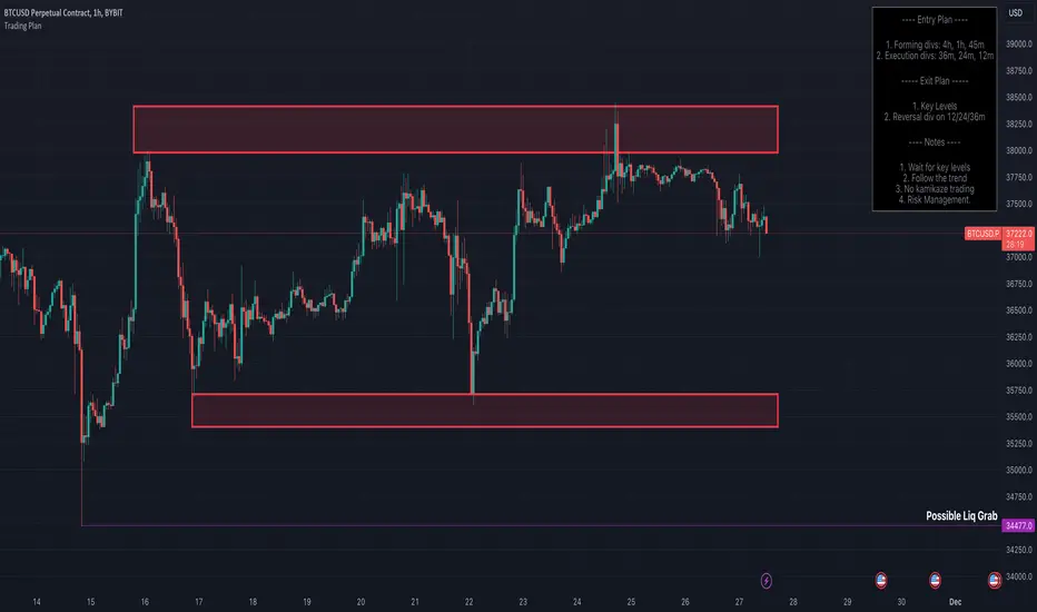
Trading Strategy - Follow The Plan"Trading Strategy - Follow The Plan" is a TradingView indicator specifically crafted for traders dedicated to adhering to a structured approach. It emphasizes the elimination of emotional decision-making by providing clear, actionable steps. This tool allows you to articulate and visually embed your trading strategy directly onto your charts, encompassing your entry plan, exit plan, and any additional notes crucial for maintaining focus and discipline. It's designed to aid in sustaining consistency in your trading executions, ensuring that you remain steadfastly aligned with your predetermined trading methodology.
Features
1. Entry Plan: Allows traders to outline specific criteria for market entry. This could include conditions like divergences on multiple timeframes, specific pattern recognitions, or other entry triggers. The flexibility of this section caters to various trading styles and strategies.
2. Exit Plan: Dedicated to defining exit strategies, this section can include details on profit targets, stop-loss levels, or conditions for position reversal. It serves as a constant reminder of exit strategies during active trades.
3. Notes: A customizable space for traders to jot down essential rules, observations, or reminders. This section is particularly useful for reinforcing risk management practices and maintaining focus on broader trading goals.
4. Visibility Controls: Each section of the trading plan (Entry Plan, Exit Plan, Notes) can be toggled on or off, allowing traders to manage on-screen information and reduce chart clutter.
5. Layout Customization: Users can choose the placement of the trading plan on their chart, with options including Top Right, Top Left, Bottom Right, and Bottom Left. This caters to individual preferences and screen setups.
6. Appearance Customization: The indicator allows for adjustments in text and background colors, and text sizes for titles and content, enhancing readability and personal preference alignment.
StrategyDashboardLibrary ”StrategyDashboard”
Hey, everybody!
I haven’t done anything here for a long time, I need to get better ^^.
In my strategies, so far private, but not about that, I constantly use dashboards, which clearly show how my strategy is working out.
Of course, you can also find a number of these parameters in the standard strategy window, but I prefer to display everything on the screen, rather than digging through a bunch of boxes and dropdowns.
At the moment I am using 2 dashboards, which I would like to share with you.
1. monthly(isShow)
this is a dashboard with the breakdown of profit by month in per cent. That is, it displays how much percentage you made or lost in a particular month, as well as for the year as a whole.
Parameters:
isShow (bool) - determine allowance to display or not.
2. total(isShow)
The second dashboard displays more of the standard strategy information, but in a table format. Information from the series “number of consecutive losers, number of consecutive wins, amount of earnings per day, etc.”.
Parameters:
isShow (bool) - determine allowance to display or not.
Since I prefer the dark theme of the interface, now they are adapted to it, but in the near future for general convenience I will add the ability to adapt to light.
The same goes for the colour scheme, now it is adapted to the one I use in my strategies (because the library with more is made by cutting these dashboards from my strategies), but will also make customisable part.
If you have any wishes, feel free to write in the comments, maybe I can implement and add them in the next versions.
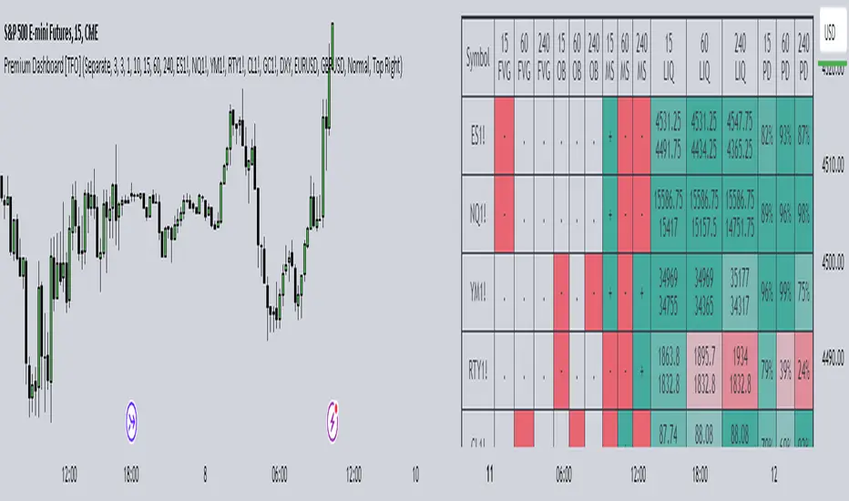
Premium Dashboard [TFO]The purpose of this indicator is to serve as a scanner/dashboard for several symbols across multiple timeframes. At the time of release, the scanner looks for the following criteria on all selected timeframes:
- Whether price is in a Fair Value Gap (FVG)
- Whether price is in an Order Block (OB)
- Current Market Structure
- Nearest Liquidity Pivots
- Proximity to said Liquidity Pivots
For FVGs, the user selects a Displacement Strength to validate FVGs from the selected timeframes; larger values require greater displacement. The table will indicate whether price is presently trading in a valid bullish FVG, bearish FVG, or none.
With OBs, the user selects a similar Displacement Strength to validate OBs from the selected timeframes. Again, larger values require greater displacement to validate an OB. The table will indicate whether price is presently trading in a bullish OB, bearish OB, or none.
For Market Structure, the table will indicate whether the current structure is bullish or bearish on each respective timeframe. A pivot strength parameter is used to determine which swing highs and swing lows warrant valid Market Structure Shifts (reversals) or Breaks of Structure (continuations).
The Liquidity section of the dashboard displays the nearest Buyside and Sellside Liquidity (major highs and lows) from each respective timeframe. A similar pivot strength parameter is used to determine how "strong" the highs and lows must be in order to be considered valid.
The Premium / Discount section offers an alternative view of the nearest Liquidity Pivots, where it will instead display a percent value to describe how close price is to Buyside or Sellside Liquidity. Values approaching 100% imply price is trading close to the nearest Buyside Liquidity, while values approaching 0% imply price is trading close to Sellside Liquidity.
Users can also choose to show any of the above features on their current chart: FVGs, OBs, cumulative Market Structure, and Liquidity, all from the various selected timeframes.
Traders Trend DashboardThe Traders Trend Dashboard (TTD) is a comprehensive trend analysis tool designed to assist traders in making informed trading decisions across various markets and timeframes. Unlike conventional trend-following scripts, TTD goes beyond simple trend detection by incorporating a unique combination of moving averages and a visual dashboard, providing traders with a clear and actionable overview of market trends. Here's how TTD stands out from the crowd:
Originality and Uniqueness:
TTD doesn't rely on just one moving average crossover to detect trends. Instead, it employs a dynamic approach by comparing two moving averages of distinct periods across multiple timeframes. This innovative methodology enhances trend detection accuracy and reduces false signals commonly associated with single moving average systems.
Market Applicability:
TTD is versatile and adaptable to various financial markets, including forex, stocks, cryptocurrencies, and commodities. Its flexibility ensures that traders can utilize it across different asset classes and capitalize on market opportunities.
Optimal Timeframe Utilization:
Unlike many trend indicators that work best on specific timeframes, TTD caters to traders with diverse trading preferences. It offers support for intraday trading (1m, 3m, 5m), short-term trading (15m, 30m, 1h), and swing trading (4h, D, W, M), making it suitable for a wide range of trading styles.
Underlying Conditions and Interpretation:
TTD is particularly effective during trending markets, where its multi-timeframe approach helps identify consistent trends across various time horizons. In ranging markets, TTD can indicate potential reversals or areas of uncertainty when moving averages converge or cross frequently.
How to Use TTD:
1. Timeframe Selection: Choose the relevant timeframes based on your trading style and preferences. Enable or disable timeframes in the settings to focus on the most relevant ones for your strategy.
2. Dashboard Interpretation: The TTD dashboard displays green (🟢) and red (🔴) symbols to indicate the relationship between two moving averages. A green symbol suggests that the shorter moving average is above the longer one, indicating a potential bullish trend. A red symbol suggests the opposite, indicating a potential bearish trend.
3. Confirmation and Strategy: Consider TTD signals as confirmation for your trading strategy. For instance, in an uptrend, look for long opportunities when the dashboard displays consistent green symbols. Conversely, in a downtrend, focus on short opportunities when red symbols dominate.
4. Risk Management: As with any indicator, use TTD in conjunction with proper risk management techniques. Avoid trading solely based on indicator signals; instead, integrate them into a comprehensive trading plan.
Conclusion:
The Traders Trend Dashboard (TTD) offers traders a powerful edge in trend analysis, combining innovation, versatility, and clarity. By understanding its unique methodology and integrating its signals with your trading strategy, you can make more informed trading decisions across various markets and timeframes. Elevate your trading with TTD and unlock a new level of trend analysis precision.
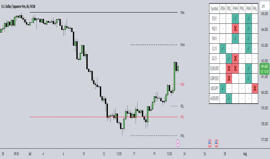
HTF Liquidity Dashboard [TFO]The purpose of this indicator is to server as a multi-symbol scanner that indicates when user-defined symbols have exceeded their previous Day/Week/Month highs and lows.
By default, the dashboard will use a compact view where the green ✔ means that price has swept and is currently exceeding the level of interest, the red ❌ implies that price swept the level but reversed back into the original range, and - indicates that the level hasn't been reached. However, the dashboard text can be toggled to show the numerical values of the highs and lows instead of these compact strings, as shown in the following image.
These levels may be shown and customized on the current chart as well via the Show Levels option. By default, levels from the selected timeframes will initially be plotted as black, and will change to red once traded through. Users can optionally increase the Session Limit parameter to show more than one previous high/low on their chart, for each selected timeframe.
Optionally, we can also plot labels to show when any of the user-defined symbols have exceeded their respective highs and lows, for any of the selected timeframes. Alerts can be created for these events as well; simply select the desired symbols and timeframes, create a new alert using this indicator, and you should be alerted when highs and lows are traded through. Note: if you encounter any issues with duplicate alerts, try deleting the alert, navigating to a lower timeframe such as the 1m, and making a new alert.
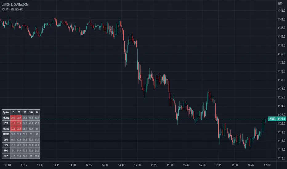
RSI MTF DashboardThis is an RSI dashboard, which allows you to see the current RSI value for five timeframes across up to 8 tickers of your choice. This is a useful tool to gauge momentum across multiple timeframes, where you would look to enter a buy with high RSI values across the timeframes (and vice versa for sell positions).
Conversely, some traders use RSI to identify potential areas for reversals, so you would look to buy with low RSI values (and vice versa for sell positions).
In the settings, please select which 5 timeframes you require. Then select which tickers you wish to see, and you will find a dashboard on your chart to show the RSI values. The dashboard can be highlighted when the RSI value shows bearish momentum (a value under 50, of your choice) and bullish momentum (a value over 50, again of your choice). These colours and values are fully customisable.
In the settings you can also select the location of the dashboard, as well as some colour and transparency settings to enable the best possible view on screen.
Financial Radar Chart by zdmreRadar chart is often used when you want to display data across several unique dimensions. Although there are exceptions, these dimensions are usually quantitative, and typically range from zero to a maximum value. Each dimension’s range is normalized to one another, so that when we draw our spider chart, the length of a line from zero to a dimension’s maximum value will be the similar for every dimension.
This Charts are useful for seeing which variables are scoring high or low within a dataset, making them ideal for displaying performance.
How is the score formed?
Debt Paying Ability
if Debt_to_Equity < %10 : 100
elif < 20% : 90
elif < 30% : 80
elif < 40% : 70
elif < 50% : 60
elif < 60% : 50
elif < 70% : 40
elif < 80% : 30
elif < 90% : 20
elif < 100% : 10
else: 0
ROIC
if Return_on_Invested_Capital > %50 : 100
elif > 40% : 90
elif > 30% : 80
elif > 20% : 70
elif > 10% : 50
elif > 5% : 20
else: 0
ROE
if Return_on_Equity > %50 : 100
elif > 40% : 90
elif > 30% : 80
elif > 20% : 70
elif > 10% : 50
elif > 5% : 20
else: 0
Operating Ability
if Operating_Margin > %50 : 100
elif > 30% : 90
elif > 20% : 80
elif > 15% : 60
elif > 10% : 40
elif > 0 : 20
else: 0
EV/EBITDA
if Enterprise_Value_to_EBITDA < 3 : 100
elif < 5 : 80
elif < 7 : 70
elif < 8 : 60
elif < 10 : 40
elif < 12 : 20
else: 0
FREE CASH Ability
if Price_to_Free_Cash_Flow < 5 : 100
elif < 7 : 90
elif < 10 : 80
elif < 16 : 60
elif < 18 : 50
elif < 20 : 40
elif < 22 : 30
elif < 30 : 20
elif < 40 : 15
elif < 50 : 10
elif < 60 : 5
else: 0
GROWTH Ability
if Revenue_One_Year_Growth > %20 : 100
elif > 16% : 90
elif > 14% : 80
elif > 12% : 70
elif > 10% : 50
elif > 7% : 40
elif > 4% : 30
elif > 2% : 20
elif > 0 : 10
else: 0

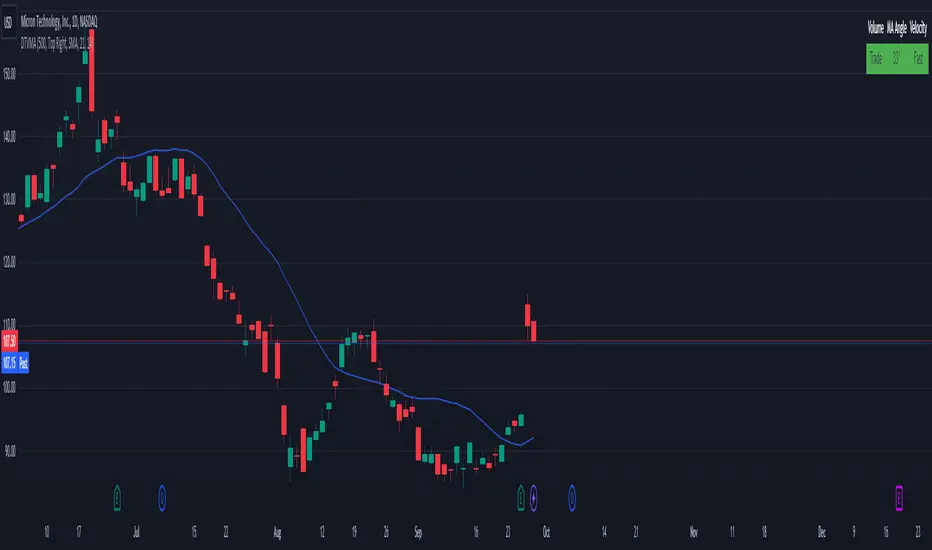
Display Trade Volume with MA Angle and Price VelocityThis Pine Script indicator is designed to provide traders with a visual representation of trade volume, moving average (MA) angle, and price velocity on a chart. The primary components of this indicator are:
Trade Volume: The indicator compares the current bar's trade volume with the average volume over a user-defined lookback period. The volume is displayed as either "Low" or "Trade" in a table, with red or green background color, respectively, to indicate whether it's below or above the average volume.
MA Angle: The indicator calculates the angle of the moving average (either Simple, Exponential, or Hull) over a user-defined length. A positive angle is shown in green, while a negative angle is shown in red. The angle is displayed in degrees in the table.
Price Velocity: This component calculates the velocity of price movement by comparing the difference between high and low prices over a user-defined lookback period. It then displays the velocity as either "Slow" or "Fast" in the table, with red or green background color, respectively, depending on whether it's below or above the average difference.
The indicator also includes alert conditions for high and low volume situations, notifying the trader when the current bar's volume is significantly higher or lower than the average volume.
Stock Dissect DashboardI developed this script, to help me in my analysis process of Stocks.
In it I have combined several things that I look at when evaluating a company.
First, there is the Macro part, where I have added the most important (at least for me) macro indicators, such as inflation, interest rates, initial jobless claims etc.
Under the last is the latest reported value, next we have the previous, and next to them is the change.
Underneath it is the technical part.
I have added the 1-Week, 1-Month, 3-Month, and 1-Year returns. This way I can easily see the performance of the stock over time.
We have a market regime indicator, which tells us whether the stock is Trending, Mean-Reverting, or Neutral.
Also, I've added the RSI and 50 and 200 Day Moving Averages for additional analysis
At the bottom, I've included some of the fundamentals that I look at in my analysis process. We have the PE and PB ratio, as well as the debt-to-equity and profit margins.
I hope you guys like it and saves you as much time and energy as it did for me.
Happy trading!

Artharjan - ATR DashboardArtharjan - ATR Dashboard indicator is designed to plot a dashboard of Average True Range for past 10 candles on the chart. It calculates and shows what percentage of the closing price the ATR is for the selected timeframe.
It also plots the volume of past 10 days and shows whether the volume has gone up (Green Color) or fallen (Red Color)
For daily timeframe since there are 22 active trading days per month a default 11 period is selected for the Daily timeframe however users may change according to their preference.
If the timeframe is in seconds - 75 period is used to calculate ATR
If the timeframe is in Intraday - 25 period is used to calculate ATR
If the timeframe is in Daily - 11 period is used to calculate ATR
If the timeframe is in Weekly - 4 period is used to calculate ATR
If the timeframe is in Monthly - 3 period is used to calculate ATR
The Default ATR period is 14. User has a choice to select the ATR period based on the timeframe or use Standard 14 period for all timeframes.
There is also a provision created to add a Buffer % to the ATR that is calculated. With this Buffer the Options Selling Prices (For Short Strangle Strategy) are calculated. If the Buffer is set to 0 then no Buffer is added to the ATR.
Strike Switch is provided to change the way the Call and Put Options Strike Prices are calculated.
There are two options provided to calculate short strike prices for Out of Money Call and Out of Money Put.
1] Strikes calculation based on H/L of previous candle
2] Strikes calculation based on the midpoint of previous candle (High + Low) /2
Short strikes for the OTM Call Option and OTM Put Options are calculated by adding the Buffered ATR either to the Previous Day High and subtracting Buffered ATR from Previous Day Low OR by adding the Buffered ATR either to the mid point of Previous Day and subtracting Buffered ATR from mid point of previous Day. If Buffer % is set to zero then no Buffer is added to the ATR.
Traders can decide whether they wish to enter the trade if the ATR is let's say at least 1.25% or higher of the Candles closing price that will ensure decent options premium to be collected by Options Writers.
The Dashboard plots following details for 10 period
1] Closing Price (LTP)
2] % Change of Closing Price
3] ATR for the selected Period
4] % Change in ATR
5] ATR as a Percentage of LTP
6] Buffered ATR
7] CE Strike
8] PE Strike
9] Volume (IN THOUSANDS)
Hope traders will find this dashboard very useful.
Regards
Rahul Desai
@Artharjan

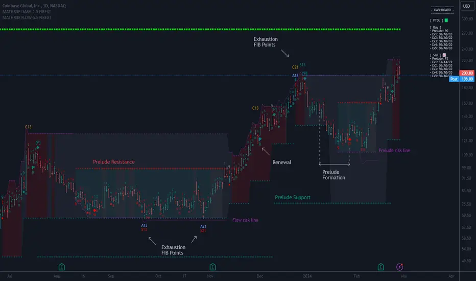
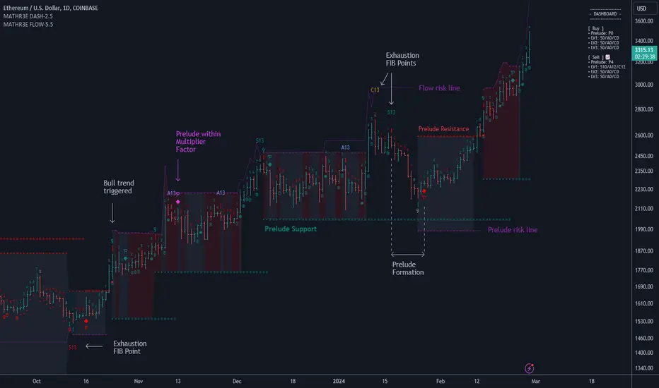
MATHR3E FLOW EXTENSION DASHBOARD█ OVERVIEW
MATHR3E Flow Extension Dashboard is a market timing tool which aims to anticipate trend reversals and highlight potential low risk entries.
█ CONCEPTS
Disclaimer:
MATHR3E Flow Extension Dashboard indicator is intended for advanced traders and may fit your profile, whether you are a day trader or a long-term investor.
It was originally developed by a renowned market analyst and documented in numerous books. Among them is the author Jason Perl.
It is recommended to have read the trading techniques mentioned in the books covering this indicator beforehand.
How to use:
Fibonacci Flow is a very complex tool, the purpose is not to detail it here but rather to introduce it briefly.
For a complete understanding, it is strongly recommended to read the books mentioned in the disclaimer section.
This indicator has two main components:
1 — The Prelude, which relies on momentum to define price ranges.
From a Price Reversal there must be nine consecutive closes;
Each one less/greater than the corresponding close four bars earlier.
Preludes are numbered from 1 to 9. A complete Prelude occurs on bar 9.
It can be: Sharpened / Flawed / Ignored / Extended / Over-Extended / Renewed
Cross over parameter can also evaluate the slowdown in a price trend's intensity and qualify the inception of Flow
2 — The Flow, which comes into play once the Prelude is complete.
They are trend based, and look for low-risk opportunities to fade established directional moves.
Flows are counts numbered from 1 to 13. There are 3 of them:
• SEQ: compares the current close with the low/high two bars earlier
• AGG: compares the current low/high with the low/high two bars earlier
• CMB: complex set of comparison with 2 available methods (not detailed here)
To handle the large amount of data to be displayed, they have been distributed over two indicators.
This indicator therefore works in pair with its companion: MATHR3E Flow Extension.
The distribution of the display is as follows:
Current indicator:
• Prelude points
• Markers for sharpened/flawed/valid/invalid completed preludes.
• Markers for Nested preludes (with brackets)
• Markers for Extension preludes (E)
• Markers for Over Extension preludes (O)
• Markers for Renewed preludes (R)
• Prelude Risk lines
• Flow Risk lines
• Prelude Trend Support and resistance
• Dashboard for supervision of ongoing counts
Companion indicator:
• Flow points
• Markers for Flows cancelation (X)
• Markers for Nested Exhaustion points (with brackets)
• Exhaustions points for:
• SEQ: 13 up to 55 (Identify trend fading)
• AGG: 13 up to 55 (For higher trading frequency)
• CMB: 13 up to 34 (Identify prospective turning points following an abrupt price movement)
█ FEATURES & BENEFITS
Fibonacci Sequence
The number 13 is part of the Fibonacci sequence which is nature’s numbering system.
Even if a Prelude Renewal is not triggered, a trend may extend beyond Fibonacci number 13.
MATHR3E Flow Extension can unveil the next exhaustion points based on this same Fibonacci sequence (21, 34, 55) while respecting the logic of the Flow.
Exhaustion points
Potential exhaustion points emerge whenever the individual flows reach Fibonacci numbers.
These points may help traders to identify low-risk buy or sell opportunities.
Risk Lines
Once the trader has selected an entry point, the displayed risk lines should encourage the trader to remain disciplined and apply proper money management.
Position sizing remains the responsibility of the trader.
Available risk lines:
• buy/sell Preludes
• buy/sell Flows
Nested Flows
The indicator can track up to five nested Flows.
Nested exhaustion points will have markups brackets.
Renewing
During the path to reach point number 13, it is very common to trigger other Prelude in the same direction as the previously initiated trend.
MATHR3E Flow Extension will address these potential market renewals with multiples options:
• Prelude range qualifiers
• Renewal Multiplier
• Renewal Method (Before/On/After, Before/On, Only Before, After/On, Only After, Ignore All)
Dashboard:
The dashboard makes it easier to monitor multiple buy and sell signals at the same time:
• Prelude: (P from 1 to 9) / Compares the current close with the corresponding close four bars earlier
• SEQ: (S from 1 to 55) / Compares the current close with the low/high two bars earlier
• AGG: (A from 1 to 55) / Compares the current low/high with the low/high two bars earlier
• CMB: (C from 1 to 34) / Requires four conditions to be satisfied simultaneously
Dashboard also provides the possibility to monitor up to 5 levels of flows
Alerts
The indicator also provides programmable alerts whose format can be adapted to be received on Discord servers
Configure your alerts and get notified on:
• Trend changes
• BUY or SELL P9
• BUY or SELL S13 to S55
• BUY or SELL A13 to A55
• BUY or SELL C13 to C34
Peer Performance - NIFTY36STOCKSI have created a peer performance dashboard for:
36 stocks from:
5 sectors of Nifty 100
This kind of dashboard is very useful for traders when they are planing to trade in a stocks and like to see how that is stocks is performing against other stocks in the same sector . Picking outperforming stocks will always give outstanding results when market starts moving. os having view on teh complete sector will always be good for traders before picking a specific stock.
Sectors covered in this indicators are:
Indian Auto Sector
Banking Sector
Oil, Gas and Energy Stocks
Cement Sector
Technology Sector
It will help traders reviewing performance ( stock return in last 1 year) of group of stocks from a particular sector .
Basically 5 functions are used to plot this dashboard
using "if " function to shortlist the stocks and the sector it belongs to.
tablo function to plot a table with specific parameters like number of row and columns, color of the frame of table
Getting yearly return into a series of variables using "request.security" function
str.tostring function is used to convert yearly return into a series of text so that it can inserted into the table cell.
finally plotting all the text and yearly return values using table.cell function

MATHR3E FLOW DASHBOARD█ OVERVIEW
MATHR3E Flow Dashboard is a market timing tool which aims to anticipate trend reversals and highlight potential low risk entries.
█ CONCEPTS
Disclaimer:
MATHR3E Flow Dashboard indicator is intended for advanced traders and may fit your profile, whether you are a day trader or a long-term investor.
It was originally developed by a renowned market analyst and documented in numerous books. Among them is the author Jason Perl.
It is recommended to have read the trading techniques mentioned in the books covering this indicator beforehand.
How to use:
Fibonacci Flow is a very complex tool, the purpose is not to detail it here but rather to introduce it briefly.
For a complete understanding, it is strongly recommended to read the books mentioned in the disclaimer section.
This indicator has two main components:
1 — The Prelude, which relies on momentum to define price ranges.
From a Price Reversal there must be nine consecutive closes;
each one less/greater than the corresponding close four bars earlier.
Preludes are numbered from 1 to 9. A complete Prelude occurs on bar 9.
It can be: Sharped / Flawed / Ignored / Extended
Cross over parameter can also evaluate the slowdown in a price trend's intensity and qualify the inception of Flow
2 — The Flow, which comes into play once the Prelude is complete.
They are trend based, and look for low-risk opportunities to fade established directional moves.
Flows are counts numbered from 1 to 13. There are 3 of them:
• SEQ: compares the current close with the low/high two bars earlier
• AGG: compares the current low/high with the low/high two bars earlier
• CMB: complex set of comparison with 2 available methods (not detailed here)
To handle the large amount of data to be displayed, they have been distributed over two indicators.
This indicator therefore works in pair with its companion: MATHR3E Flow Extension.
The distribution of the display is as follows:
Current indicator:
• Prelude points
• Markers for Extension preludes (E)
• Prelude Risk lines
• Flow Risk lines
• Prelude Trend Support and resistance
• Dashboard for supervision of ongoing counts
Companion indicator:
• Flow points
• Markers for Flows cancelation (X)
• Exhaustions points for:
• SEQ: up to 13 (Identify trend fading)
• AGG: up to 13 (For higher trading frequency)
• CMB: up to 13 (Identify prospective turning points following an abrupt price movement)
█ FEATURES & BENEFITS
Fibonacci Sequence
The number 13 is part of the Fibonacci sequence which is nature’s numbering system.
Exhaustion points
Potential exhaustion points emerge whenever the individual flows reach Fibonacci number 13.
These points may help traders to identify low-risk buy or sell opportunities.
Risk Lines
Once the trader has selected an entry point, the displayed risk lines should encourage the trader to remain disciplined and apply proper money management.
Position sizing remains the responsibility of the trader.
Available risk lines:
• buy/sell Preludes
• buy/sell Flows
Nested Flows
The indicator can track up to three nested Flows.
Renewing
During the path to reach point number 13, it is very common to trigger other Prelude in the same direction as the previously initiated trend.
MATHR3E Flow will address these potential market renewal with multiples options:
• Prelude range qualifiers
• Renewal Multiplier
Dashboard:
The dashboard makes it easier to monitor multiple buy and sell signals at the same time:
• Prelude: (P from 1 to 9) / Compares the current close with the corresponding close four bars earlier
• SEQ: (S from 1 to 13) / Compares the current close with the low/high two bars earlier
• AGG: (A from 1 to 13) / Compares the current low/high with the low/high two bars earlier
• CMB: (C from 1 to 13) / Requires four conditions to be satisfied simultaneously
Dashboard also provides the possibility to monitor up to 3 levels of flows
Alerts
The indicator also provides programmable alerts whose format can be adapted to be received on Discord servers
Configure your alerts and get notified on:
• Trend changes
• BUY or SELL P9
• BUY or SELL S13
• BUY or SELL A13
• BUY or SELL C13
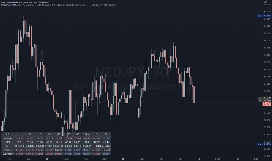
Multi IND Dashboard [Skiploss]Multi IND Dashboard is dashboard combine with price change, RSI, ATR, Alligator and Supertrend. With a maximum of 10 timeframes, I think it's going to make your life easier. In looking at the momentum of each chart.
How it work??
Change :
It is the distance from the close price of previous candlestick and shows the movement value of the candlestick in that timeframe.
RSI :
Default setting are 14 and source close
Value >= 75 : Fill text color maximum overbought
Value >= 65 : Fill text color medium overbought
Value >= 55 : Fill text color minimum overbought
Value >= 45 : Fill text color minimum overbought
Value >= 35 : Fill text color medium overbought
Value >= 25 : Fill text color maximum overbought
ATR :
Default setting are 14 length and RMA smoothing, It like the average swing of the candlesticks.
Alligator :
Default setting are 13, 8 and 5
Bullish status is value lips > teeth and teeth > jaw
Bearish status is value lips < teeth and teeth < jaw
Neutral status status is value lips > teeth and teeth < jaw or lips < teeth and teeth > jaw
Supertrend :
Default setting are 8 and 3.0
Bullish status is uptrend
Bearish status is downtrend
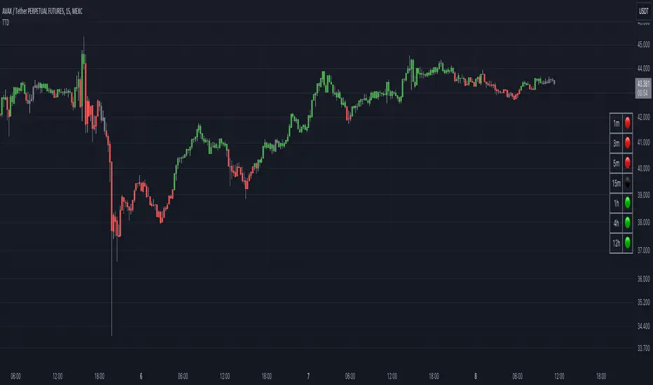
Trend and Momentum DashboardI created this indicator to tell me when it's time to trade (going long) and when it's time to wait (or going short).
You can enter up to 13 ticker (default is S&P500 and key market segments).
For each ticker, fibonacci levels are calculated and represented either in 5 color or 3 color mode as single lines.
(Thanks to eykpunter for the fibonacci level implementation. I'm using his code and modified it slightly).
Color coding (5 color mode) explanation:
blue = in uptrend area
light blue = in prudent buyers area
gray = in center area
light red = in prudent sellers area
red = in downtrend area
The topline is a combination of all ticker and shows if the market is either bullish or bearish (threshold adjustable in settings)
The bullish/bearish trend can also be used as background color. Alternatively the last bar in the selected time period is been highlighted.
How to use it:
The indicator works on all timeframes. Use the color coding explanation above to see the status of each asset.
a) You can evaluate "long" term trend using day or week timeframe. e.g. I'm usually trading only long and stay out of the market when it is not bullish (top line & background = blue). I'm also using it to know which segments/assets are currently "hot".
b) You can evaluate short term momentum (using 1h or lower timeframe) and see in which direction the market/assets are moving. e.g. I use this when the exchanges open to see how the day is going to move.
I've attached 3 examples in the screenshot - first is the default, in the second one I'm using different asset classes and the third one is for crypto.
Limitations:
There are security request limits as well as string limitations for the security calls in pine script, so I went to the maximum what is currently possible.
(No financial advise, for testing purposes only)
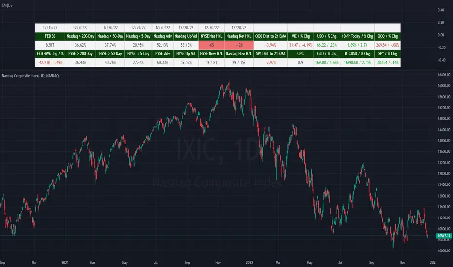
(CM|DB) Caruso Market DashboardThe Caruso Market Dashboard (CM|DB) provides a snapshot of key US market data, market internals (breadth), and economic statistics. It displays real-time prices of seven major markets along with daily updates of the put/call ratio and multiple breadth measurements. Lastly, it displays the Federal Reserve’s balance sheet and 4-week change of assets held to help investors keep abreast of important FED changes in policy.
Presented for both the Nasdaq and NYSE composites and updated at the end of each trading day, the market breadth section shows:
· the number of net 52-week highs and lows
· the actual number of new 52-week highs and 52-week lows.
· The percentage of volume traded on up stocks vs. total volume
· The percentage of stocks advancing vs. all stocks
· Percentage of stocks above their 5-day average
· Percentage of stocks above their 50-day average
· Percentage of stocks above their 200-day average
In addition to presenting all of this valuable information in a table, users can hide the table and plot each market and economic data point. This is very helpful when viewing trends as well as overbought and oversold levels for these data points.
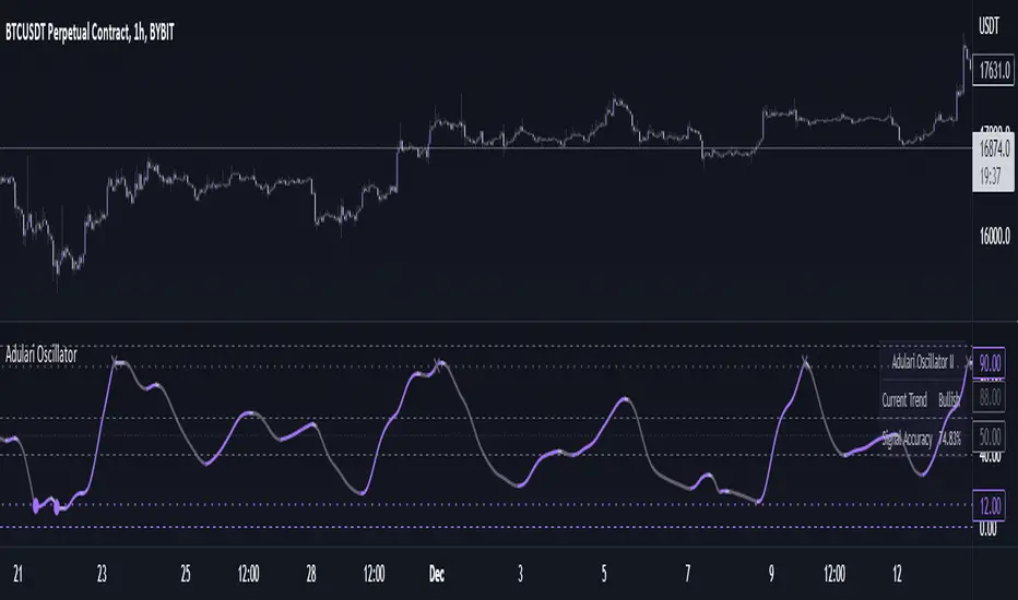
Adulari OscillatorThis indicator is included with Adulari Professional.
Adulari Oscillator is a trading tool that can be used on any asset, and any given timeframe. It is special because it self-optimizes, meaning no configuration is required before usage.
How do I use it?
Never use this indicator as standalone trading signal, it is meant to be used as confirmation.
Look for strong trends crossing on the middle line.
Combine the trend strength indications with the signals. For example: if a bullish signal was printed after a strong downtrend this may indicate a strong reversal.
The accuracy shown in the indicator is merely a tool. Past results do not indicate future results. Historical data will differ from future data.
Features:
Self-optimizing, no configuration required.
Purple dots for bullish trend reversals, gray crosses for bearish trend reversals.
Gradient histogram that shows the strength of a bullish or bearish trend with a stronger color.
White line that indicates clear bottoms or tops.
Automatically determined top and bottom borders that may show trend reversals.
Dashboard that shows the accuracy of the signals, total amount of signals, total amount won, and total amount lost.
Alert conditions that allow you to set alerts for bullish or bearish signals.
How does it work?
The oscillator line is calculated using our custom version of the very well-known and loved stochastic. The bullish signals are given when the oscillator value falls below the oversold line, and the bearish signals when the oscillator value exceeds the overbought line. These oversold and overbought lines are determined by our algorithm. The accuracy shown in the dashboard is calculated with the following methods: the highest or lowest price within the lookback range divided by the price at the moment of a signal multiplied by the minimum percentage change. When this condition is true it means a signal was valid and thus it will be added to the total wins, when the condition is false it will be added to the total losses. Accuracy is then determined by dividing the total wins by total signals. A win is when the minimum percentage move in the settings occurred within x amount of bars (settings) after a signal. When these conditions are not met, it will be considered a loss. Keep in mind that this is not a trading strategy, and these wins/losses do not represent actual trades. The accuracy also does not represent a winrate or anything of a sort while using the indicator.
This script is unique because it does a few things. It self-optimizes based on historical data, which I was not able to find in this specific stochastic like oscillator format. And it will show you the average accuracy of the signals based on all the signals given on the chart, which I was not able to find in this same exact format either.
Equity Bond Currency DashboardDepicts demand-flow between Equities, Bonds and Currencies of 6 countries. Useful in tracking the flow of smart money and checking the dynamics of inter-connected markets.
Principle:
DXY lies at the heart of the diagram with usd-currency pairs of 5 countries connected to it. When demand for a currency increases it strengthens against Dollar. This is depicted by a line from DXY to the currency indicating demand flow from Dollar to the currency (DXY is only an indicative symbol for Dollar, the currency may not be part of the dollar index). Similarly when Dollar strengthens against the currency, demand flow is depicted by a line from the currency to DXY. Currency blocks are connected to Equity and Bond Yields of the respective countries. Equities and Bonds, when bought, takes the demand from the respective currencies and vice versa.
Overall, the demand flows in the direction of arrows. The flow is incomplete without commodities, import/export, interest/inflation rates of countries, however, the diagram most of the times explains why an asset class is performing the way it is.
Left side bar of each block is very similar to OHLC candles except for the following -
Instead of wicks, top and bottom of the bar represents high and low for the selected time-frame
Open and close are normalised for high and low
Bar border is red if close < prev.close, green if close >= prev.close
Other notes:
The diagram requires at least 200 bars in the chart to render. Please select the symbol and time-frame that contain at least 200 bars.
The diagram requires a live market to render the flow. To check flows on historical bars, set the option from settings.
Desired indices could be selected for countries of choice. Default settings point to futures wherever possible to have the markets live simultaneously across the countries.

TrapFrames (Stocks)TrapFrames (Stocks) is the Stock version of Trapframes that is the table chart from Traplight that showed the current values for a symbol for Traplight and Kriss/Kross, but cranked up to 11! You can select from a large list of stocks to create a dashboard-like view of your favorite symbols. So that you can "Check the Weather" so to speak. This is mainly to be used as a companion indicator to Traplight. So, that you can find which of your symbols looks interesting, and delve more deeply into them on an individual basis from there.
TrapFramesTrapFrames is the table chart from Traplight that showed the current values for a symbol for Traplight and Kriss/Kross, but cranked up to 11! You can select from a large list of pairs/indexes to create a dashboard-like view of your favorite symbols. So that you can "Check the Weather" so to speak. This is mainly to be used as a companion indicator to Traplight. So, that you can find which of your symbols looks interesting, and delve more deeply into them on an individual basis from there.

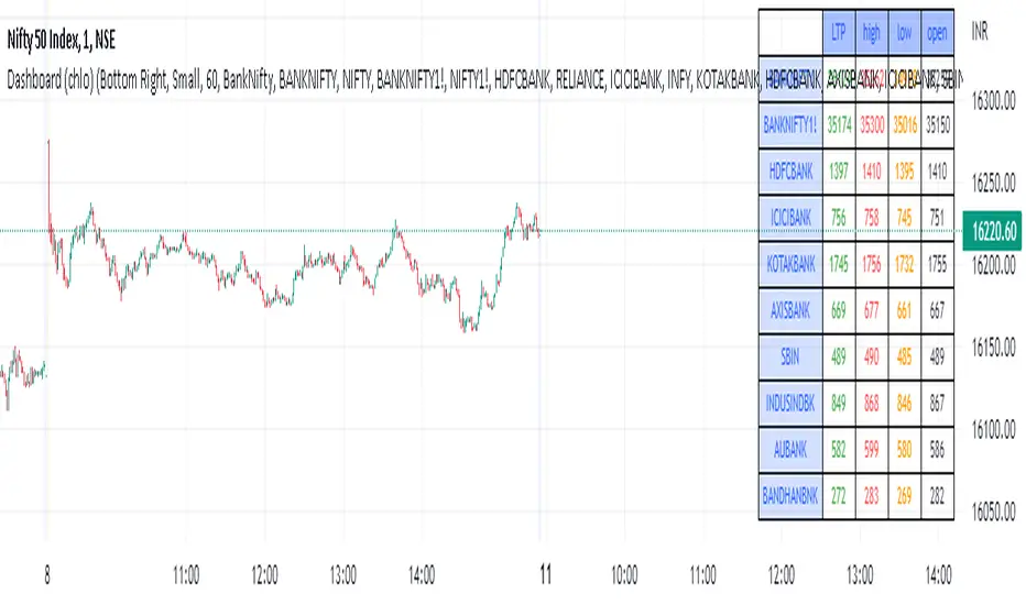
Dashboard (chlo) - v1I am an aircraft maintenance technician who is trying to get into software development in the financial sector.
This is a project in which a dashboard of other security(stocks) with open, close, high, and low will appear.
I could compile this after a detailed study of different dashboards and pine script for several hours
hope you like this.