Daytrading Suite v6.4: Neon TPO + FVG + IB Lines (Stable)Here is the complete **Trading Manual & Strategy Guide** for the **Master Daytrading Suite (Neon + IB Edition)**.
This guide explains exactly **when** to trade and **how** to execute trades using the tools in the script.
---
# 📘 MASTER TRADING MANUAL (Neon + IB)
### 1. THE BASICS
* **Best Assets:** BTCUSDT & ETHUSDT (Futures).
* **Best Timeframe:** 5 Minutes (Entry) / 15 Minutes (Trend).
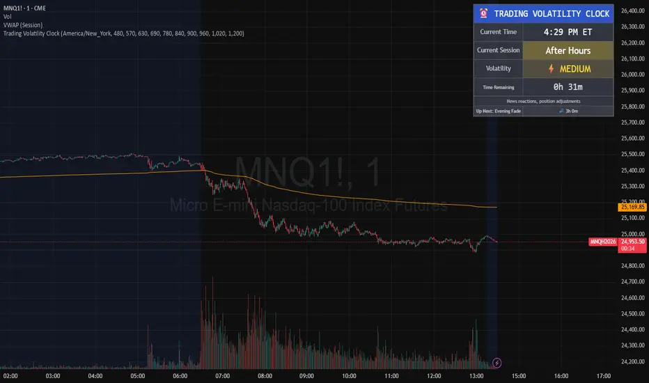
* **Key Session:** New York Session (High Volatility).
* **Golden Rule:** Never go **LONG** inside a Red Supply Zone. Never go **SHORT** inside a Green Demand Zone.
---
### 2. THE INDICATORS (Legend)
| Indicator | Color | Function | How to use |
| --- | --- | --- | --- |
| **Supply Zone** | 🟥 **Red Box** | Resistance | Look for Short setups here. |
| **Demand Zone** | 🟩 **Green Box** | Support | Look for Long setups here. |
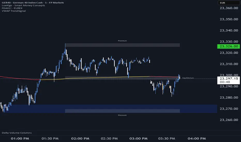
| **Golden Pocket** | 🟧 **Orange** | Retracement | The "Sweet Spot" for trend entries (Fib 0.618). |
| **VWAP** | 🔵 **Blue Line** | Trend Anchor | Price > VWAP = Bullish. Price < VWAP = Bearish. |
| **Initial Balance (IB)** | 🟨 **Yellow Box** | Opening Range | Breakout above = Bullish. Breakdown below = Bearish. |
| **FVG (Gap)** | 🟩/🟥 **Tiny Box** | Trigger | **Green FVG** = Entry Signal for Longs. **Red FVG** = Entry Signal for Shorts. |
---
### 3. STRATEGY A: The Trend Pullback (High Win Rate)
*Use this when the market is trending smoothly.*
#### ✅ HOW TO ENTER A LONG (BUY) POSITION
1. **Trend Check:** Price is trading **ABOVE** the VWAP (Blue Line) and EMA 9 (Yellow Line).
2. **The Wait:** Wait for the price to drop back down (pullback).
3. **The Zone:** Price touches the **Green Demand Zone** OR the **Orange Golden Pocket**.
4. **The Trigger:** A **Green FVG Box** appears on the 5-minute chart.
5. **Execution:** Enter Long. Stop Loss below the recent low. Take Profit at the next Red Zone.
#### 🔻 HOW TO ENTER A SHORT (SELL) POSITION
1. **Trend Check:** Price is trading **BELOW** the VWAP (Blue Line) and EMA 9 (Yellow Line).
2. **The Wait:** Wait for the price to rally up (pullback).
3. **The Zone:** Price touches the **Red Supply Zone** OR the **Orange Golden Pocket**.
4. **The Trigger:** A **Red FVG Box** appears on the 5-minute chart.
5. **Execution:** Enter Short. Stop Loss above the recent high. Take Profit at the next Green Zone.
---
### 4. STRATEGY B: The IB Breakout (Volatility)
*Use this specifically after the first hour of the New York Session (approx. 10:30 NY time).*
* **The Setup:** Look at the **Yellow Box (Initial Balance)** which marks the high/low of the first hour.
* **Bullish Breakout:** If a candle closes **above** the Yellow Box + Price is above VWAP → **Go Long**.
* **Bearish Breakdown:** If a candle closes **below** the Yellow Box + Price is below VWAP → **Go Short**.
* **The Trap (Fakeout):** If price breaks out but immediately falls back inside the Yellow Box, close the trade immediately.
---
### 5. DAILY ROUTINE (Checklist)
1. **Open TradingView:** Switch to the **15m Chart**.
2. **Check Context:** Where are we? Are we near a big Red Box (Supply) or Green Box (Demand)?
3. **Check Trend:** Is price above or below the Blue VWAP line?
4. **Wait for the Open:** Let the first hour of New York pass (to form the Yellow IB Box).
5. **Set Alerts:** Right-click the chart and set alerts for "IB Breakout" or "Golden Pocket".
6. **Execute:** Switch to the **5m Chart** to find your entry trigger (FVG).
---
### 6. RISK MANAGEMENT RULES
* **Stop Loss:** NEVER trade without one. Place it just outside the FVG box or the Zone.
* **Risk per Trade:** 1% to 2% of your account maximum.
* **No Trade Zone:** If the price is "chopping" (moving sideways) inside the Yellow IB Box, **do not trade**. Wait for a breakout.
Penunjuk Pine Script®