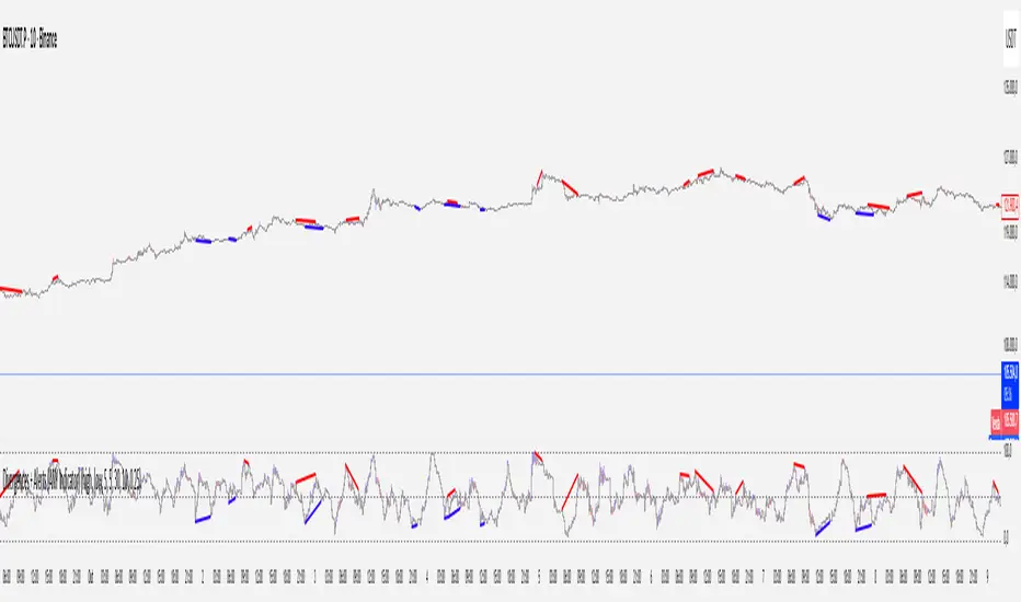
Divergences + Alerts (ANY Indicator)📊 Divergences + Alerts (ANY Indicator)
This versatile indicator detects four types of divergences between price action and an oscillator:
Buyer Exhaustion
Buyer Absorption
Seller Exhaustion
Seller Absorption
Each divergence type is automatically identified and visually marked on the chart with colored lines. The indicator also includes built-in alert conditions for all four divergence types, allowing traders to receive real-time notifications when potential reversal signals occur.
By default, the oscillator is a candle-style visualization of the Money Flow Index (MFI), enhanced with volatility filtering via a VWMA-based ATR. However, users can replace the default MFI oscillator with any external source using the “Plug External Source” input, enabling full customization and compatibility with other indicators.
Key features:
🔍 Detects both exhaustion and absorption divergences
🔔 Alerts for each divergence type
🕯️ Candle-style oscillator visualization
🔌 Optional input for external indicator sources
⚙️ ATR-based filtering for precision
Ideal for traders seeking to spot early signs of trend reversals or momentum shifts with customizable flexibility.
Divergences
VWAP Divergence LevelsThis is an indicator which paints levels on your chart based on degrees of historical divergence from VWAP. I conceived and designed it for my personal use trading index funds (QQQ, SPY) on the NYSE. It is one of the primary indicators I use on a daily basis, and may be of interest to traders with a focus on volume.
This indicator works by tracking, each session, the maximum amount that price diverges from VWAP that day. The lookback period is locked to 21 days, or about 1 month's worth of trading days. Bearish and bullish divergences are tracked separately.
From this data, we take the average of all maximum daily bullish divergences (the "Mean Bull" divergence amount), and paint that line relative to the current VWAP. In other words, if the VWAP for the current bar is at $2.50 and the Mean Bull divergence is $0.40, the line will be painted at $2.90. The largest value from the lookback period ("Max Bull") is also painted. The same is done for bearish divergences.
Finally, midpoints between the VWAP and the Mean and Max levels are drawn. Optionally, quarter-levels are drawn in the spaces between Mean and VWAP.
When I created this indicator, I found that price very often responds and retraces around these levels, allowing me to more easily visualize the relationship between price and volume. Personally, I have found it useful for finding entrance and exit points-- especially when the levels coincide with important previous daily levels, or other support/resistance points.
Good luck & happy trading.
Disclaimer : Use at your own risk. This indicator and the strategy described herein are not in any way financial advice, nor does the author of this script make any claims about the effectiveness of this indicator or of any related strategy, which may depend highly on the discretion and skill of the trader executing it, among many other factors outside of the author's control. The author of this script accepts no liability, and is not responsible for any trading decisions that you may or may not make as a result of this indicator. You should expect to lose money if using this indicator.

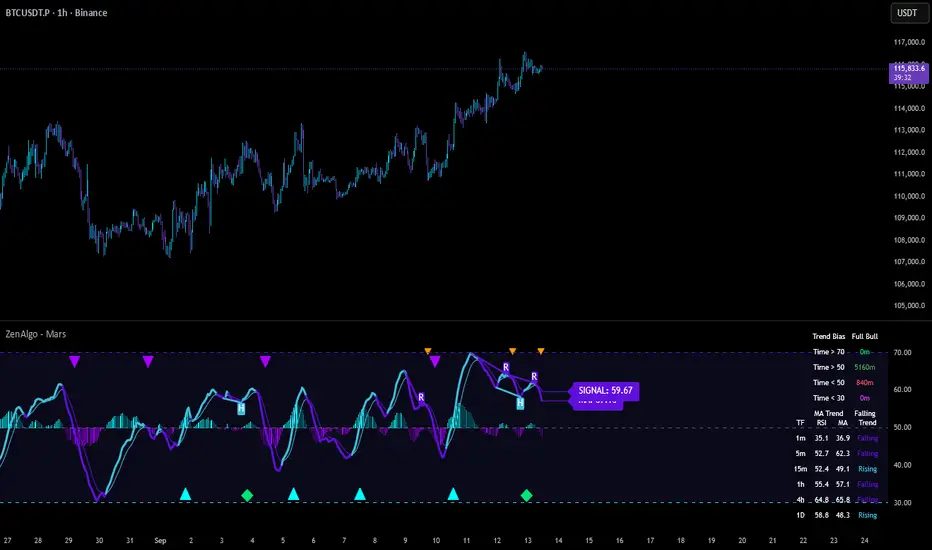
ZenAlgo - MarsThis indicator is a momentum-based oscillator built around a modified RSI calculation and subsequent smoothing with moving averages. It introduces a layered structure where divergences, signal crossovers, histogram dynamics, and multi-timeframe tables all combine into a comprehensive framework. The purpose is not to forecast markets with certainty but to provide structured context on momentum shifts, divergences, and trend bias.
Core Calculation
The base source is the closing price.
From it, relative upward and downward movements are measured over a chosen lookback length (by preset or manual input).
These values are normalized into an oscillator bounded between 0–100, equivalent to a traditional RSI structure.
This oscillator is smoothed by a moving average (SMA by default), producing the main line (MA).
A secondary smoothing (EMA by default) of the MA produces a signal line, against which crossovers are monitored.
Why this structure:
RSI captures momentum imbalance between gains and losses. Smoothing removes noise and makes divergences more stable to identify. Adding a signal line allows crossover events to highlight relative strengthening or weakening momentum phases.
Zones and Visual Guides
Static horizontal levels are placed at 70 (upper bound), 50 (mid-line), and 30 (lower bound).
The region between 30–70 is softly filled to emphasize the neutral zone.
Color changes on the MA line occur depending on whether it is above or below the signal line.
Why these levels:
Values above 70 or below 30 are commonly interpreted as overextended regions. A central 50 line separates positive from negative bias. These anchors allow consistent interpretation of oscillator movements.
Crossover Events
Alerts and conditions are defined for when the MA crosses above or below the signal line.
These are not entry signals by themselves but indicate shifts in relative momentum strength.
Divergence Detection
Divergences are calculated on the smoothed MA rather than raw RSI.
Four conditions are tracked:
Regular bullish (price makes a lower low while MA makes a higher low).
Hidden bullish (price higher low with MA lower low).
Regular bearish (price higher high with MA lower high).
Hidden bearish (price lower high with MA higher high).
Each detected divergence is marked with shapes and labeled "R" (regular) or "H" (hidden).
Why divergences are used:
They highlight when oscillator momentum disagrees with price structure. Regular divergences often suggest exhaustion, while hidden divergences may appear during continuation phases.
RSI & MA Multi-Timeframe Table
A table can be displayed showing RSI and MA values across multiple timeframes (1m, 5m, 15m, 1h, 4h, 1D).
For each, the relationship (Rising, Falling, Neutral) is determined by comparing RSI and MA.
Colors are adjusted depending on value ranges (extreme low, oversold, overbought, etc.).
Added value:
Instead of analyzing divergences or crossovers only on one chart, the table provides a compact overview of aligned or conflicting conditions across timeframes.
Strong and Warning Indications
"Strong" mark (Diamond) appear when the MA is firmly biased above or below 50 and hidden divergence supports the trend.
"Warning" mark (Triangle) appear when bias is strong but a regular divergence forms in the opposite direction.
Shapes mark these conditions, and alerts are available.
Why this distinction:
Hidden divergences often accompany continuation phases, while regular divergences may challenge the prevailing bias. Marking them separately allows the user to distinguish between potential trend reinforcement versus warning conditions.
Signal Table
A separate table summarizes:
Overall trend bias (Bull, Full Bull, Bear, Full Bear, Flat).
Time spent in each key zone.
Current MA trend (Rising, Falling, Flat).
Visual icons and color codes provide quick interpretation.
Time in Zones
The indicator measures how many bars (converted into minutes) the MA has spent:
above 70
above 50
below 50
below 30
These values appear in the signal table.
Why this matters:
Extended time in an extreme zone can show persistent momentum. Quick reversals versus sustained positioning give different context for bias strength.
MA vs Signal Histogram
A histogram plots the difference between MA and signal line, shifted around the 50 level.
Rising differences are shown with brighter coloring, falling differences with faded tones.
This emphasizes whether momentum is accelerating or decelerating.
Daily VWAP Integration
When the MA crosses the 50 level, additional conditions check whether the histogram is aligned and whether price is above or below the daily VWAP.
Only when both momentum bias and VWAP alignment agree are triangle markers shown.
Why VWAP is included:
VWAP serves as an intraday mean reference. Requiring alignment between oscillator momentum and price position relative to VWAP reduces random crossover noise.
Added Value Over Free Indicators
Divergences are calculated on smoothed momentum rather than raw RSI, reducing false positives.
Integration of multi-timeframe tables avoids the need to manually switch charts.
Bias measurement in terms of time spent in zones adds a temporal dimension often missing in basic oscillators.
Combining histogram dynamics with VWAP filtering provides context not present in typical RSI or MA overlays.
Limitations and Disclaimers
Divergences are not predictive on their own; price may continue without respecting them.
Extreme readings (e.g., above 70) can remain extended for long periods, especially in strong trends.
Multi-timeframe aggregation may introduce repainting effects when lower timeframes update faster than higher ones.
Signals must be interpreted in broader market context; the indicator does not provide trade entries or exits by itself.
How to Interpret Values
Above 70: momentum is strongly stretched upward.
Below 30: momentum is strongly stretched downward.
Crossing 50: often marks a structural change in directional bias.
MA rising vs. falling: tracks whether momentum pressure is increasing or decreasing.
Divergence labels: "R" = potential reversal, "H" = potential continuation.
Tables: confirm whether bias is consistent across multiple timeframes.
Best Use
Observe divergences in conjunction with bias tables to understand whether short-term moves align with higher-timeframe conditions.
Treat "Strong" and "Warning" markers as contextual alerts, not direct signals.
Use the histogram and VWAP alignment to filter out weaker crossovers.
Combine with price action and risk management rather than using in isolation.
Momentum Concepts [A1TradeHub]ℹ️ General Information — TSI + Stochastic Z-Score (Momentum Duo)
Purpose: A two-oscillator stack that blends trend strength (TSI) with extreme-move normalization (Stochastic Z-Score) to time entries with confirmation instead of guessing tops/bottoms.
Components
Stochastic Z-Score (SZ): Converts price stretch into a bounded curve.
Red zone ≈ overbought supply, Green zone ≈ oversold demand.
The hook out of a band often marks turning points.
True Strength Index (TSI): Measures momentum quality and direction.
Signal/line cross = timing, Zero-line = trend filter, slope = acceleration.
Core Read
Alignment = edge: SZ leaves a band and TSI agrees (cross/slope).
Divergences: Higher-low on SZ/TSI vs lower-low in price (bullish). Lower-high on SZ/TSI vs higher-high in price (bearish). Best when near bands.
Mid-range = chop: Avoid trades when SZ is centered and TSI is flat.
Best Practices
Use structure (PDH/PDL, EMAs 13/48/200, trendlines) as context.
Scale profits into opposing SZ band or on TSI flatten/cross-back.
Place stops beyond the last swing or key EMA; skip high-volatility news.
Timeframes
Works on intraday (e.g., 5–15m) and swings (1h/4h). Use higher TF for bias, lower TF for entries.
This combo is designed to keep you on the right side of momentum, act at band hooks with TSI confirmation, and stand down when conditions are indecisive.
I. 🔴🟢 TSI Oscillator — Quick Guide
What you’re seeing
Lines: Fast TSI + slow Signal (both EMA-smoothed momentum).
Zones: 🟢 Green = oversold, 🔴 Red = overbought, 0-line = trend regime.
Long: 🟢 hook up → fast crosses above slow → ideally reclaim 0.
Short: 🔴 roll down → fast crosses below slow → ideally lose 0.
Exits: Trim into the opposite zone or on a cross back.
Divergence: TSI ↑ vs price ↓ = bullish; TSI ↓ vs price ↑ = bearish.
Avoid: Both lines chopping around 0.
II. Stochastic Z-Score — Quick Guide
Zones: 🔴 Red = overbought/supply, 🟢 Green = oversold/demand.
Curve: Watch the hook out of a zone for the turn.
Signals
🟢 Green Arrow (from Green zone): Momentum turns up → call/long bias. Enter on first pullback; stop under last swing/13-EMA.
🔻 Red/Bearish Arrow (from Red zone): Momentum rolls down → put/short bias. Enter on first lower-high; stop above last swing/13-EMA.
⚪ Ball = Momentum Shift: Early heads-up (slope change). Use as confirmation/add-on, not a standalone entry.

Divergence & Volume ThrustThis document provides both user and technical information for the "Divergence & Volume Thrust" (DVT) Pine Script indicator.
Part 1: User Guide
1.1 Introduction
The DVT indicator is an advanced tool designed to automatically identify high-probability trading setups. It works by detecting divergences between price and key momentum oscillators (RSI and MACD).
A divergence is a powerful signal that a trend might be losing strength and a reversal is possible. To filter out weak signals, the DVT indicator includes a Volume Thrust component, which ensures that a divergence is backed by significant market interest before it alerts you.
🐂 Bullish Divergence: Price makes a new low, but the indicator makes a higher low. This suggests selling pressure is weakening.
🐻 Bearish Divergence: Price makes a new high, but the indicator makes a lower high. This suggests buying pressure is weakening.
1.2 Key Features on Your Chart
When you add the indicator to your chart, here's what you will see:
Divergence Lines:
Bullish Lines (Teal): A line will be drawn on your chart connecting two price lows that form a bullish divergence.
Bearish Lines (Red): A line will be drawn connecting two price highs that form a bearish divergence.
Solid lines represent RSI divergences, while dashed lines represent MACD divergences.
Confirmation Labels:
"Bull Div ▲" (Teal Label): This label appears below the candle when a bullish divergence is detected and confirmed by a recent volume spike. This is a high-probability buy signal.
"Bear Div ▼" (Red Label): This label appears above the candle when a bearish divergence is detected and confirmed by a recent volume spike. This is a high-probability sell signal.
Volume Spike Bars (Orange Background):
Any price candle with a faint orange background indicates that the volume during that period was unusually high (exceeding the average volume by a multiplier you can set).
1.3 Settings and Configuration
You can customize the indicator to fit your trading style. Here's what each setting does:
Divergence Pivot Lookback (Left/Right): Controls the sensitivity of swing point detection. Lower numbers find smaller, more frequent divergences. Higher numbers find larger, more significant ones. 5 is a good starting point.
Max Lookback Range for Divergence: How many bars back the script will look for the first part of a divergence pattern. Default is 60.
Indicator Settings (RSI & MACD):
You can toggle RSI and MACD divergences on or off.
Standard length settings for each indicator (e.g., RSI Length 14, MACD 12, 26, 9).
Volume Settings:
Use Volume Confirmation: The most important filter. When checked, labels will only appear if a volume spike occurs near the divergence.
Volume MA Length: The lookback period for calculating average volume.
Volume Spike Multiplier: The core of the "Thrust" filter. A value of 2.0 means volume must be 200% (or 2x) the average to be considered a spike.
Visuals: Customize colors and toggle the confirmation labels on or off.
1.4 Strategy & Best Practices
Confluence is Key: The DVT indicator is powerful, but it should not be used in isolation. Look for its signals at key support and resistance levels, trendlines, or major moving averages for the highest probability setups.
Wait for Confirmation: A confirmed signal (with a label) is much more reliable than an unconfirmed divergence line.
Context Matters: A bullish divergence in a strong downtrend might only lead to a small bounce, not a full reversal. Use the signals in the context of the overall market structure.
Set Alerts: Use the TradingView alert system with this script. Create alerts for "Confirmed Bullish Divergence" and "Confirmed Bearish Divergence" to be notified of setups automatically.

SMT DivergenceSMT Divergence Indicator
This powerful indicator identifies high-probability reversal points by detecting SMT (Smart Money Technique) divergences between two correlated assets. It spots subtle shifts in market momentum, revealing when one asset fails to confirm the price action of another—often signaling an impending trend change.
Key Features:
Inter-Market Divergence Detection: Automatically compares the price action of the main symbol with a second user-defined asset.
Identifies Key Reversals: Pinpoints both bullish and bearish SMT divergences, highlighting hidden strength in downtrends and underlying weakness in uptrends.
Customizable Pivot Detection: Allows fine-tuning of the pivot length to adjust sensitivity for different market conditions and timeframes.
Flexible Display Modes: Choose between clean 'Lines' connecting the diverging pivots or precise 'Labels' marking the exact high/low points.
Full Visual Customization: Complete control over the colors and line thickness for seamless integration with your existing chart layout.
Built-in Alerts: Stay notified of every potential opportunity with alerts for both bullish and bearish signals.
Settings:
Core Parameters:
Comparison Symbol: Select the second asset to compare against for divergence analysis (e.g., NQ1! if you are charting ES1!).
Pivot Length: Defines the number of bars to the left and right required to confirm a pivot high or low.
Visual Settings:
Display Style: Choose to visualize divergences as 'Lines' or 'Labels'.
Bearish/Bullish Color: Set custom colors for bearish and bullish divergence indicators.
Line Width: Adjust the thickness of the divergence lines for optimal visibility.
Perfect for traders who utilize inter-market analysis to confirm trade ideas. The SMT Divergence indicator provides a crucial edge by exposing non-confirmations between related assets, allowing for earlier and more confident entries into potential market reversals.

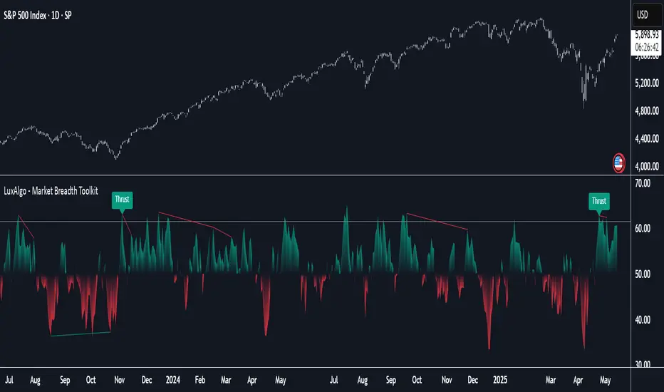
Market Breadth Toolkit [LuxAlgo]The Market Breadth Toolkit allows traders to use up to 6 different market breadth measures on two different exchanges, for a total of 12 different views of the market.
This toolkit includes divergence detection and allows setting custom fixed levels for traders who want to experiment with them.
🔶 USAGE
The main idea behind Breadth is to measure the number of advancing and declining issues and/or volume by exchange to have an idea of the underlying strength of the whole exchange.
On the other hand, thrusts represent big impulses in the breadth, as it is described by technicians to be the start of a new bullish trend.
By default, the Toolkit is set to "Breadth Thrust Zweig", with divergences enabled.
We will now explain all the different breadth measures available in the toolkit.
🔹 Deemer Breakaway Momentum
The "Breakaway Momentum" is a concept related to market breadth introduced by legendary technical analyst Walter Deemer.
As stated on his website:
We coined the term "breakaway momentum" in the 1970's to describe this REALLY powerful upward momentum
and:
We now know that the stock market generates breakaway momentum when the 10-day total advances on the NYSE are greater than 1.97 times the 10-day total NYSE declines OR the 20-day total advances on the NYSE are greater than 1.72 times the 20-day total NYSE declines.
As we can see in the chart above, which shows both methods, momentum is identified when the ratio of advancing issues to declining issues is greater than 1.97 for the 10-day average or 1.72 for the 20-day average.
🔹 Zweig Breadth Tools
Legendary trader and author Marting Zweig, best known as the author of "Winning on Wall Street" and the creator of the Put/Call Ratio.
In this toolkit, we feature two of his other tools:
Breadth Thrust: Number of Advancing / (Number of Advancing + Number of Declining Stocks)
Market Thrust: (Number of Advancing × Advancing Volume) — (Number of Declining Stocks × Declining Volume)
As we can see on the above chart, the Breadth Thrust printed a new signal on April 24, 2025, which is a bullish signal on the daily chart that can last several months, considering the previous signals.
On the right side, we have the Market Thrust as the delta between advancing minus declining volume weighted.
🔹 Whaley Measures
Wayne Whaley received the 2010 Charles Dow Award from the CMT Association, as stated on their website: "In 1994, the CMT Association established the Charles H. Dow Award to recognize outstanding research in technical analysis."
We include two of the tools from this paper:
Advance Decline Thrust: Number of Advancing / (Number of Advancing + Number of Declining Stocks)
Up/Down Volume Thrust Advancing Volume / (Advancing Volume + Declining Volume)
The chart above shows Thrust signals at extreme readings as described in the paper.
🔹 Divergences
The divergence detector is enabled by default, traders can disable it and fine-tune the detection length in the settings panel.
🔹 Fixed Levels
Traders can adjust the Thrust detection thresholds in the settings panel.
In the image above, we can see the Deemer Breakaway Momentum 10 with the original threshold (below) and with the 3.0 threshold (above).
🔶 SETTINGS
Breadth: Choose between 6 different breadth thrust measurement methods.
Data: Choose between NYSE or NASDAQ exchanges.
Divergences: Enable/Disable divergences and select the length detection.
🔹 Levels
Use Fixed Levels: Enable/Disable Fixed Levels.
Top Level: Select the top-level threshold.
Bottom Level: Select bottom level threshold.
Levels Style: Choose between dashed, dotted, or solid style.
🔹 Style
Breadth: Select breadth colors
Divergence: Select divergence colors
ZenAlgo - AvengerThe ZenAlgo - Avenger indicator provides a multi-layered view of market behavior by combining volume delta analytics, trend-following EMAs, average price comparison, and price-volume profiling into a unified overlay. It is designed to visually assist traders in identifying areas of interest, momentum shifts, and potential reversals using cumulative data from both spot and perpetual markets.
Volume Delta Calculation
This indicator computes delta as the difference between estimated buy and sell volumes using volume data from multiple centralized exchanges. It distinguishes between spot and perpetual volumes, combining them into total volume.
To estimate buying and selling volume from raw volume data, candle structure is broken down into body and wicks. The body is interpreted as the core directional movement (buy/sell), while the wicks are treated as uncertain or counteraction. This segmentation helps infer the likely share of buying and selling within each bar.
The delta is calculated per bar and then aggregated over a lookback period (default 14 bars) to generate a cumulative delta. This approach provides a smoothed value of volume pressure trends over time.
A moving average is applied to the delta values (using selectable MA types like EMA or SMA) to define signal crossovers and suppress noise.
Delta Visualization
To contextualize delta within price action, the delta is scaled dynamically (by ATR or user-defined value) and plotted as a band around the closing price. Positive delta expands upward from price, negative delta downward. This provides a visual overlay that reflects net market pressure in context with price movement.
In cases of extreme delta (threshold set at 80% of recent maximum), the indicator marks spike bars using symbols to indicate significant directional pressure.
Identification of Noteworthy Conditions
The indicator highlights points on the chart where specific conditions are met based on the interaction between volume delta and its moving average. These conditions may align with moments of market pressure imbalance and directional movement, but they are not to be interpreted as trade signals in isolation.
Instead, these chart markers serve as visual flags for potential interest. They are intended to draw the user’s attention to scenarios where:
The delta crosses above or below its moving average, suggesting a potential shift in volume pressure.
The cumulative delta supports the direction of this crossover.
Optional filters can further restrict these markings to periods where:
The short-term trend (as inferred from EMA slope) supports the direction.
Volume is elevated relative to a recent average.
A user-defined cooldown period prevents multiple markings within short succession to avoid clutter.
It is essential to underscore that these markers do not constitute buy or sell advice . Their role is diagnostic , helping the trader to identify potential moments of interest which should be analyzed in conjunction with broader context, such as trend structure, price action, support/resistance levels, or external market data.
EMA Structure
Six EMAs with fixed lengths (13 to 56) are plotted and colored dynamically based on the most recent crossover between the fastest and slowest (EMA1 and EMA6). These EMAs help visualize short- to mid-term trends. The crossover itself is marked with symbols, with vertical offset based on ATR to maintain chart readability.
Average Line (AVG)
The indicator also calculates an average price based on a fixed window (100 bars). This is not a standard moving average but rather a raw average of recent prices stored in a circular buffer. The average is plotted, and its relative distance to the current price is labeled as a percentage. This feature serves as a simplified representation of fair value or mean reversion anchor.
EMA6 vs AVG Cross
Another layer of point of interest detection involves EMA6 crossing the AVG line. This crossover is only considered valid if EMA6 shows slope consistency in the crossing direction. These events are marked using symbols and offset vertically to avoid overlapping price action.
Divergence Detection
The script detects both regular and hidden divergences between price and delta:
Regular divergences are defined when price makes a higher high or lower low, while delta fails to confirm (makes a lower high or higher low).
Hidden divergences occur when price retraces (lower high or higher low), but delta moves against this retracement, indicating underlying strength or weakness.
Divergence points are labeled with "R" (regular) or "H" (hidden) and appear at local pivot highs or lows. The number of visible divergence labels can be limited for chart clarity.
POC and nPOC Calculations
The script includes a simplified volume profile implementation, calculating:
POC (Point of Control): the price level with the highest volume for the given period.
nPOC (non-tested POC): historical POCs that have not yet been revisited by price.
Price levels are bucketed into rows (user-defined), and volume per bucket is tracked to identify the POC. Upon a new period (e.g., day, week), a horizontal POC line is drawn. Once tested by price, the line’s appearance changes (color fades, label shrinks), helping users distinguish between untouched and touched levels.
Limits are enforced on the number of retained POCs and their maximum distance from current bars to optimize performance and chart readability.
Exchange Aggregation
Volume data is aggregated across major exchanges. This ensures that the delta calculation captures a broader market picture beyond a single venue, reducing exchange-specific noise.
How to Interpret Values
Delta Band: Wide bands indicate strong directional imbalance. Narrow bands suggest indecision or low volume.
EMA Crossover Symbols: Appear on directional shifts in moving averages. Multiple EMAs reinforcing the same slope typically indicate stronger trend.
AVG Line: Represents average price over recent history. Large deviations can indicate overextension or potential mean reversion.
Divergences: Regular ones may point to weakening momentum; hidden ones can suggest continuation despite corrective price action.
POC / nPOC: Key volume-based support/resistance levels. Untested nPOCs can act as magnets for price retests.
How to Best Use This Indicator
Use in conjunction with trend context (e.g., higher timeframe EMAs) to avoid counter-trend indications.
Treat delta spikes as caution zones—especially if they occur at known support/resistance.
Watch for divergences as early warning signs before price reverses.
Use POC/nPOC as target levels, especially if aligned with delta signals.
Apply volume and trend filters to reduce noise on shorter timeframes.
Added Value
Multi-exchange volume aggregation makes the delta calculation more robust.
Real-time cumulative delta overlaid directly on the price chart provides immediate context.
Points of interest on chart are conservative and filterable, intended to reduce false positives.
The combination of delta, trend-following EMAs, fair value line, and volume profile data is rarely found in one overlay script.
POC/nPOC visualization based on real traded volume helps identify high-interest zones for future price interaction.
Why Is It Worth Paying For
While free alternatives may provide partial insights (e.g., basic delta or single EMA crossovers), this indicator integrates multiple domains—delta, divergence, average price, trend overlays, and profile levels—into a coherent, optimized chart tool. The value lies not just in having these tools, but in how they are synchronized and visualized.
Furthermore, sourcing and synchronizing volume data from multiple exchanges for delta estimation is not straightforward in Pine Script and adds to the indicator's complexity and utility.
Disclaimers and Limitations
Delta estimation is based on candle structure and assumes wick/body distribution reflects buyer/seller activity, which may not always be precise.
Multi-exchange volume data relies on availability via TradingView’s request.security() function; if exchange data is missing or delayed, results may be incomplete.
Divergences do not guarantee reversals—should be used as part of a broader analysis framework.
On illiquid instruments or exotic pairs, the value of delta and volume-based analytics may be reduced due to unreliable volume.

RSI Candlestick Oscillator [LuxAlgo]The RSI Candlestick Oscillator displays a traditional Relative Strength Index (RSI) as candlesticks. This indicator references OHLC data to locate each candlestick point relative to the current RSI Value, leading to a more accurate representation of the Open, High, Low, and Close price of each candlestick in the context of RSI.
In addition to the candlestick display, Divergences are detected from the RSI candlestick highs and lows and can be displayed over price on the chart.
🔶 USAGE
Translating candlesticks into the RSI oscillator is not a new concept and has been attempted many times before. This indicator stands out because of the specific method used to determine the candlestick OHLC values. When compared to other RSI Candlestick indicators, you will find that this indicator clearly and definitively correlates better to the on-chart price action.
Traditionally, the RSI indicator is simply one running value based on (typically) the close price of the chart. By introducing high, low, and open values into the oscillator, we can better gauge the specific price action throughout the intrabar movements.
Interactions with the RSI levels can now take multiple forms, whether it be a full-bodied breakthrough or simply a wick test. Both can provide a new analysis of price action alongside RSI.
An example of wick interactions and full-bodied interactions can be seen below.
As a result of the candlestick display, divergences become simpler to spot. Since the candlesticks on the RSI closely resemble the candlesticks on the chart, when looking for divergence between the chart and RSI, it is more obvious when the RSI and price are diverging.
The divergences in this indicator not only show on the RSI oscillator, but also overlay on the price chart for clearer understanding.
🔹 Filtering Divergence
With the candlesticks generating high and low RSI values, we can better sense divergences from price, since these points are generally going to be more dramatic than the (close) RSI value.
This indicator displays each type of divergence:
Bullish Divergence
Bearish Divergence
Hidden Bullish Divergence
Hidden Bearish Divergence
From these, we get many less-than-useful indications, since every single divergence from price is not necessarily of great importance.
The Divergence Filter disregards any divergence detected that does not extend outside the RSI upper or lower values.
This does not replace good judgment, but this filter can be helpful in focusing attention towards the extremes of RSI for potential reversal spotting from divergence.
🔶 DETAILS
In order to get the desired results for a display that resembles price action while following RSI, we must scale. The scaling is the most important part of this indicator.
To summarize the process:
Identify a range on Price and RSI
Consider them as equal to create a scaling factor
Use the scaling factor to locate RSI's "Price equivalent" Upper, Lower, & Mid on the Chart
Use those prices (specifically the RSI Mid) to check how far each OHLC value lies from it
Use those differences to translate the price back to the RSI Oscillator, pinning the OHLC values at their relative location to our anchor (RSI Mid)
🔹 RSI Channel
To better understand, and for your convenience, the indicator includes the option to display the RSI Channel on the chart. This channel helps to visualize where the scaled RSI values are relative to price.
If you analyze the RSI channel, you are likely to notice that the price movement throughout the channel matches the same movement witnessed in the RSI Oscillator below. This makes sense since they are the exact same thing displayed on different scales.
🔹 Scaling the Open
While the scaling method used is important, and provides a very close view of the real price bar's relative locations on the RSI oscillator… It is designed for a single purpose.
The scaling does NOT make the price candles display perfectly on the RSI oscillator.
The largest place where this is noticeable is with the opening of each candle.
For this reason, we have included a setting that modifies the opening of each RSI candle to be more accurate to the chart's price candles.
This setting positions the current bar's opening RSI candlestick value accurately relative to the price's open location to the previous closing price. As seen below.
🔶 SETTINGS
🔹 RSI Candles
RSI Length: Sets the Length for the RSI Oscillator.
Overbought/Oversold Levels: Sets the Overbought and Oversold levels for the RSI Oscillator.
Scale Open for Chart Accuracy: As described above, scales the open of each candlestick bar to more accurately portray the chart candlesticks.
🔹 Divergence
Show on Chart: Choose to display divergence line on the chart as well as on the Oscillator.
Divergence Length: Sets the pivot width for divergence detection. Normal Fractal Pivot Detection is used.
Divergence Style: Change color and line style for Regular and Hidden divergences, as well as toggle their display.
Divergence Filter: As described above, toggle on or off divergence filtering.
🔹 RSI Channel
Toggle: Display RSI Channel on Chart.
Color: Change RSI Channel Color

Quarterly Theory ICT 04 [TradingFinder] SSMT 4Quarter Divergence🔵 Introduction
Sequential SMT Divergence is an advanced price-action-based analytical technique rooted in the ICT (Inner Circle Trader) methodology. Its primary objective is to identify early-stage divergences between correlated assets within precise time structures. This tool not only breaks down market structure but also enables traders to detect engineered liquidity traps before the market reacts.
In simple terms, SMT (Smart Money Technique) occurs when two correlated assets—such as indices (ES and NQ), currency pairs (EURUSD and GBPUSD), or commodities (Gold and Silver)—exhibit different reactions at key price levels (swing highs or lows). This lack of alignment is often a sign of smart money manipulation and signals a lack of confirmation in the ongoing trend—hinting at an imminent reversal or at least a pause in momentum.
In its Sequential form, SMT divergences are examined through a more granular temporal lens—between intraday quarters (Q1 through Q4). When SMT appears at the transition from one quarter to another (e.g., Q1 to Q2 or Q3 to Q4), the signal becomes significantly more powerful, often aligning with a critical phase in the Quarterly Theory—a framework that segments market behavior into four distinct phases: Accumulation, Manipulation, Distribution, and Reversal/Continuation.
For instance, a Bullish SMT forms when one asset prints a new low while its correlated counterpart fails to break the corresponding low from the previous quarter. This usually indicates absorption of selling pressure and the beginning of accumulation by smart money. Conversely, a Bearish SMT arises when one asset makes a higher high, but the second asset fails to confirm, signaling distribution or a fake-out before a decline.
However, SMT alone is not enough. To confirm a true Market Structure Break (MSB), the appearance of a Precision Swing Point (PSP) is essential—a specific candlestick formation on a lower timeframe (typically 5 to 15 minutes) that reveals the entry of institutional participants. The combination of SMT and PSP provides a more accurate entry point and better understanding of premium and discount zones.
The Sequential SMT Indicator, introduced in this article, dynamically scans charts for such divergence patterns across multiple sessions. It is applicable to various markets including Forex, crypto, commodities, and indices, and shows particularly strong performance during mid-week sessions (Wednesdays and Thursdays)—when most weekly highs and lows tend to form.
Bullish Sequential SMT :
Bearish Sequential SMT :
🔵 How to Use
The Sequential SMT (SSMT) indicator is designed to detect time and structure-based divergences between two correlated assets. This divergence occurs when both assets print a similar swing (high or low) in the previous quarter (e.g., Q3), but in the current quarter (e.g., Q4), only one asset manages to break that swing level—while the other fails to reach it.
This temporal mismatch is precisely identified by the SSMT indicator and often signals smart money activity, a market phase transition, or even the presence of an engineered liquidity trap. The signal becomes especially powerful when paired with a Precision Swing Point (PSP)—a confirming candle on lower timeframes (5m–15m) that typically indicates a market structure break (MSB) and the entry of smart liquidity.
🟣 Bullish Sequential SMT
In the previous quarter, both assets form a similar swing low.
In the current quarter, one asset (e.g., EURUSD) breaks that low and trades below it.
The other asset (e.g., GBPUSD) fails to reach the same low, preserving the structure.
This time-based divergence reflects declining selling pressure, potential absorption, and often marks the end of a manipulation phase and the start of accumulation. If confirmed by a bullish PSP candle, it offers a strong long opportunity, with stop-losses defined just below the swing low.
🟣 Bearish Sequential SMT
In the previous quarter, both assets form a similar swing high.
In the current quarter, one asset (e.g., NQ) breaks above that high.
The other asset (e.g., ES) fails to reach that high, remaining below it.
This type of divergence signals weakening bullish momentum and the likelihood of distribution or a fake-out before a price drop. When followed by a bearish PSP candle, it sets up a strong shorting opportunity with targets in the discount zone and protective stops placed above the swing high.
🔵 Settings
⚙️ Logical Settings
Quarterly Cycles Type : Select the time segmentation method for SMT analysis.
Available modes include: Yearly, Monthly, Weekly, Daily, 90 Minute, and Micro.
These define how the indicator divides market time into Q1–Q4 cycles.
Symbol : Choose the secondary asset to compare with the main chart asset (e.g., XAUUSD, US100, GBPUSD).
Pivot Period : Sets the sensitivity of the pivot detection algorithm. A smaller value increases responsiveness to price swings.
Activate Max Pivot Back : When enabled, limits the maximum number of past pivots to be considered for divergence detection.
Max Pivot Back Length : Defines how many past pivots can be used (if the above toggle is active).
Pivot Sync Threshold : The maximum allowed difference (in bars) between pivots of the two assets for them to be compared.
Validity Pivot Length : Defines the time window (in bars) during which a divergence remains valid before it's considered outdated.
🎨 Display Settings
Show Cycle :Toggles the visual display of the current Quarter (Q1 to Q4) based on the selected time segmentation
Show Cycle Label : Shows the name (e.g., "Q2") of each detected Quarter on the chart.
Show Bullish SMT Line : Draws a line connecting the bullish divergence points.
Show Bullish SMT Label : Displays a label on the chart when a bullish divergence is detected.
Bullish Color : Sets the color for bullish SMT markers (label, shape, and line).
Show Bearish SMT Line : Draws a line for bearish divergence.
Show Bearish SMT Label : Displays a label when a bearish SMT divergence is found.
Bearish Color : Sets the color for bearish SMT visual elements.
🔔 Alert Settings
Alert Name : Custom name for the alert messages (used in TradingView’s alert system).
Message Frequency :
All: Every signal triggers an alert.
Once Per Bar: Alerts once per bar regardless of how many signals occur.
Per Bar Close: Only triggers when the bar closes and the signal still exists.
Time Zone Display : Choose the time zone in which alert timestamps are displayed (e.g., UTC).
Bullish SMT Divergence Alert : Enable/disable alerts specifically for bullish signals.
Bearish SMT Divergence Alert : Enable/disable alerts specifically for bearish signals
🔵 Conclusion
The Sequential SMT (SSMT) indicator is a powerful and precise tool for identifying structural divergences between correlated assets within a time-based framework. Unlike traditional divergence models that rely solely on sequential pivot comparisons, SSMT leverages Quarterly Theory, in combination with concepts like liquidity sweeps, market structure breaks (MSB) and precision swing points (PSP), to provide a deeper and more actionable view of market dynamics.
By using SSMT, traders gain not only the ability to identify where divergence occurs, but also when it matters most within the market cycle. This empowers them to anticipate major moves or traps before they fully materialize, and position themselves accordingly in high-probability trade zones.
Whether you're trading Forex, crypto, indices, or commodities, the true strength of this indicator is revealed when used in sync with the Accumulation, Manipulation, Distribution, and Reversal phases of the market. Integrated with other confluence tools and market models, SSMT can serve as a core component in a professional, rule-based, and highly personalized trading strategy.

SMT Divergence ICT 02 [TradingFinder] Smart Money Technique SMC🔵 Introduction
SMT Divergence (Smart Money Technique Divergence) is a price action-based trading concept that detects discrepancies in market behavior between two assets that are generally expected to move in the same direction. Rooted in ICT (Inner Circle Trader) methodology, this approach helps traders recognize subtle signs of market manipulation or imbalance, often ahead of traditional indicators.
The core idea behind SMT divergence is simple: when two correlated instruments—such as currency pairs, indices, or assets from the same sector—start forming different swing points (highs or lows), this can reveal a lack of confirmation in the trend. Such divergence is often a precursor to a price reversal or pause in momentum.
This technique works effectively across various markets including Forex, stocks, and cryptocurrencies. It’s particularly valuable when used alongside concepts like liquidity sweeps, market structure breaks (MSBs), or order block identification.
In advanced use cases, Sequential SMT helps uncover patterns of alternating divergences across sessions, often signaling engineered liquidity traps before price reacts.
When combined with the Quarterly Theory—which segments market behavior into Accumulation, Manipulation, Distribution, and Continuation/Reversal phases—traders gain insight not only into where divergence happens, but when it's most likely to be significant within the market cycle.
Bullish SMT :
Bullish SMT Divergence occurs when one asset prints a higher low while the correlated asset forms a lower low. This asymmetry often suggests that the downside move is losing strength, hinting at a potential bullish shift.
Bearish SMT :
Bearish SMT Divergence is formed when one asset creates a higher high, while the second asset fails to confirm by printing a lower high. This typically signals weakening bullish pressure and the possibility of a reversal to the downside.
🔵 How to Use
The SMT Divergence indicator is designed to detect imbalances between two positively correlated assets—such as major currency pairs, indices, or commodities. These divergences often indicate early signs of market inefficiency or smart money manipulation and can help traders anticipate trend shifts with higher precision.
Unlike traditional divergence indicators or earlier versions of this script, this upgraded version does not rely solely on consecutive pivot comparisons. Instead, it dynamically scans all available pivots within the chart to identify divergences at any structural level—major or minor—across the price action. This broader detection method increases the reliability and frequency of meaningful SMT signals.
Moreover, when integrated with Sequential SMT logic, the indicator is capable of identifying multiple divergence sequences across sessions. These sequences often signal engineered liquidity traps and can be mapped within the Quarterly Theory framework, allowing traders to pinpoint not just the presence of divergence but also the phase of the market cycle it appears in (Accumulation, Manipulation, Distribution, or Continuation).
🟣 Bullish SMT Divergence
This signal occurs when the primary asset forms a higher low, while the correlated asset forms a lower low. This pattern implies weakening bearish momentum and a potential shift to the upside.
If the correlated asset breaks its previous low but the primary asset does not, this divergence suggests absorption of selling pressure and possible accumulation by smart money—making it a strong bullish signal, especially when aligned with a favorable market phase (e.g., the end of a manipulation phase in Q2).
🟣 Bearish SMT Divergence
This signal occurs when the primary asset creates a higher high, while the correlated asset forms a lower high. This mismatch indicates fading bullish momentum and a potential reversal to the downside.
If the correlated asset fails to confirm a breakout made by the main asset, the divergence may point to distribution or exhaustion. When seen within Q3 or Q4 phases of the Quarterly Theory, this pattern often precedes sharp declines or fake-outs engineered by smart money
🔵 Settings
⚙️ Logical Settings
Symbol : Choose the secondary asset to compare with the main chart asset (e.g., XAUUSD, US100, GBPUSD).
Pivot Period : Sets the sensitivity of the pivot detection algorithm. A smaller value increases responsiveness to price swings.
Activate Max Pivot Back : When enabled, limits the maximum number of past pivots to be considered for divergence detection.
Max Pivot Back Length : Defines how many past pivots can be used (if the above toggle is active).
Pivot Sync Threshold : The maximum allowed difference (in bars) between pivots of the two assets for them to be compared.
Validity Pivot Length : Defines the time window (in bars) during which a divergence remains valid before it's considered outdated.
🎨 Display Settings
Show Bullish SMT Line : Draws a line connecting the bullish divergence points.
Show Bullish SMT Label : Displays a label on the chart when a bullish divergence is detected.
Bullish Color : Sets the color for bullish SMT markers (label, shape, and line).
Show Bearish SMT Line : Draws a line for bearish divergence.
Show Bearish SMT Label : Displays a label when a bearish SMT divergence is found.
Bearish Color : Sets the color for bearish SMT visual elements.
🔔 Alert Settings
Alert Name : Custom name for the alert messages (used in TradingView’s alert system).
Message Frequency :
All : Every signal triggers an alert.
Once Per Bar : Alerts once per bar regardless of how many signals occur.
Per Bar Close : Only triggers when the bar closes and the signal still exists.
Time Zone Display : Choose the time zone in which alert timestamps are displayed (e.g., UTC).
Bullish SMT Divergence Alert : Enable/disable alerts specifically for bullish signals.
Bearish SMT Divergence Alert : Enable/disable alerts specifically for bearish signals
🔵Conclusion
The SMT Plus indicator offers a refined and powerful approach to detecting smart money behavior through divergence analysis between correlated assets. By removing the limitations of consecutive pivot comparisons and allowing for broader structural detection, it captures more accurate and timely signals that often precede major market moves.
When paired with frameworks like Sequential SMT and the Quarterly Theory, the indicator not only highlights where divergence occurs, but also when in the market cycle it's most likely to matter. Its flexible settings, customizable visuals, and integrated alert system make it suitable for intraday scalpers, swing traders, and even long-term macro analysts.
Whether you're using it as a standalone decision-making tool or combining it with other ICT concepts, SMT Plus gives you an edge in recognizing manipulation, timing reversals, and staying in sync with the real market narrative—not just the chart.

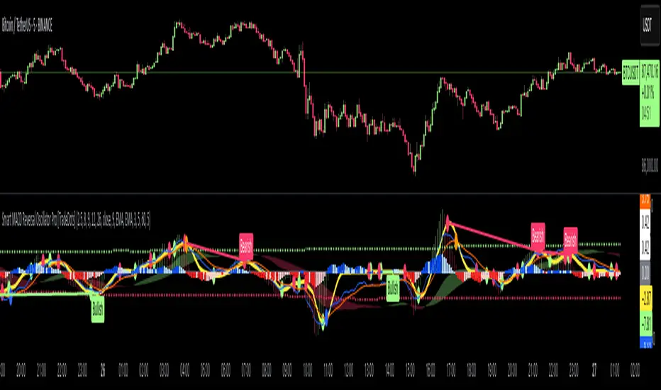
Smart MACD Reversal Oscillator Pro [TradeDots]The TradeDots Smart MACD Reversal Oscillator Pro is an advanced technical analysis tool that combines traditional MACD functionality with multi-layered signal detection and divergence identification systems. This comprehensive oscillator helps traders identify potential market reversals, trend continuations, and extremes with greater precision than conventional indicators.
📝 HOW IT WORKS
Accumulation & Distribution Detection System
The indicator begins with a proprietary calculation that identifies potential accumulation and distribution phases:
Calculation: Processes EMA differentials with specific time constants to detect underlying accumulation/distribution pressure
Visualization: Green-filled areas indicate accumulation phases (bullish pressure building) while red-filled areas show distribution phases (bearish pressure building)
Significance: This system often identifies trend reversals before traditional indicators by detecting institutional buying/selling activity
Multi-Timeframe MACD Implementation
Unlike traditional MACD indicators that use a single timeframe, this oscillator incorporates multiple calculation methods:
1. Primary Oscillator: Uses a proprietary calculation that combines price extremes with smoothed averages:
Implements specialized moving average types (SMMA and ZLEMA)
Generates a histogram that changes color based on price position relative to these averages
Produces a signal line that identifies crossover opportunities
2. Secondary MACD: Traditional MACD implementation with customizable parameters:
User-selectable MA types (SMA/EMA) for both oscillator and signal line
Color-coded histogram for momentum visualization
Separate crossover detection system
Dynamic Band System
The indicator implements an innovative dynamic band system to identify overbought and oversold conditions:
Band Calculation: Analyzes historical oscillator values to establish statistically significant extremes
Adaptive Scaling: Automatically adjusts to different market volatility regimes using a customizable Y-axis scale factor
Signal Integration: Incorporates band levels into signal generation for higher-probability trades
Signal Generation System
Four distinct signal types are generated to identify potential trading opportunities:
Green Dots: Bullish crossover signals (primary oscillator crosses above signal line)
Red Dots: Bearish crossover signals (primary oscillator crosses below signal line)
Blue Dots: Secondary MACD bullish crossovers in oversold territory
Orange Dots: Secondary MACD bearish crossovers in overbought territory
Advanced Divergence Detection
The oscillator incorporates a sophisticated divergence detection system:
Regular Divergences: Identifies when price makes lower lows while the oscillator makes higher lows (bullish) or price makes higher highs while the oscillator makes lower highs (bearish)
Hidden Divergences: Optional detection of continuation patterns (currently disabled by default)
Visual Markers: Clear labels identifying divergence formations directly on the chart
Zero-Line Filter: Optional filtering to only detect divergences that don't cross the zero line
🛠️ HOW TO USE
Signal Interpretation
Momentum Direction
Histogram Color: Green shades indicate bullish momentum, red shades indicate bearish momentum
Oscillator Position: Above zero indicates bullish momentum, below zero indicates bearish momentum
Filled Background: Green fill shows accumulation phases, red fill shows distribution phases
Buy Signals (In Order of Strength)
Bullish Divergence + Green Dot: Highest probability reversal signal (price making lower lows while oscillator makes higher lows, followed by crossover)
Green Dot Below Short Average Line: Strong oversold reversal signal
Green Dot + Blue Dot Alignment: Multiple indicator confirmation
Green Dot During Green Fill Expansion: Trend continuation signal
Sell Signals (In Order of Strength)
Bearish Divergence + Red Dot: Highest probability reversal signal (price making higher highs while oscillator makes lower highs, followed by crossover)
Red Dot Above Long Average Line: Strong overbought reversal signal
Red Dot + Orange Dot Alignment: Multiple indicator confirmation
Red Dot During Red Fill Expansion: Trend continuation signal
Trading Strategies
Divergence Trading Strategy
Identify "Bullish" or "Bearish" divergence labels on the chart
Wait for confirming dot signal in the same direction
Enter when both divergence and dot signal align
Set stops based on recent swing points
Target the opposite band or previous significant level
Overbought/Oversold Reversal Strategy
Wait for the oscillator to reach extreme bands (Long or Short Average lines)
Look for crossover signals at these extreme levels:
Bullish Crossover (Oversold): Green dots when oscillator is below Short Average
Bearish Crossover (Overbought): Red dots when oscillator is above Long Average
Enter when price confirms the reversal
Set stops beyond the recent extreme
Target the opposite band or at least the zero line
Multi-Confirmation Strategy
For highest probability trades, look for:
Multiple signal types aligning (e.g., Green + Blue dots or Red + Orange dots)
Signals occurring at band extremes
Divergence patterns reinforcing the signal direction
Background fill color supporting the signal (green fill for buys, red fill for sells)
⚙️ CUSTOMIZATION OPTIONS
The indicator offers extensive customization to adapt to different markets and trading styles:
Y-axis scale factor: Controls the band range multiplier (default 2.5)
Parameter 1: Controls the smoothing period for main calculations (default 8)
Parameter 2: Controls the signal line calculation period (default 9)
Fast/Slow Length: Controls traditional MACD calculation periods (12/26)
Oscillator MA Type: Selection between SMA and EMA for main oscillator
Signal Line MA Type: Selection between SMA and EMA for signal line
Divergence Settings: Customizable lookback parameters and display options
Don't touch the zero line?: Toggle option for divergence filtering
❗️LIMITATIONS
Signal Lag: The system identifies reversals after they have begun, potentially missing the absolute bottom or top
False Signals: Can occur during periods of high volatility or during ranging markets
Divergence Validation: Not all divergences lead to reversals; confirmation is essential
Timeframe Sensitivity: The indicator works best on intermediate timeframes (15m to 4h) for most markets
Bar Closing Requirement: All signals are based on closed candles and may be subject to change until the candle closes
RISK DISCLAIMER
Trading involves substantial risk, and most traders may incur losses. All content, tools, scripts, articles, and education provided by TradeDots are for informational and educational purposes only. Past performance is not indicative of future results.
This oscillator should be used as part of a complete trading approach that includes proper risk management, consideration of the broader market context, and confirmation from price action patterns. No trading system can guarantee profits, and users should always exercise caution and use appropriate position sizing.
ZenAlgo - BenderThis script combines several volume-based methodologies into a single chart overlay to help traders analyze market participation and volume distribution. It aggregates volume from multiple sources—spot and perpetual markets across different exchanges—and processes it to display various insights directly on the chart.
The script provides a detailed view of both individual-bar volume and broader aggregated trends. It calculates certain values, plots different shapes and overlays, and includes an optional informational table. However, it does not offer financial signals or predict future price movements. Instead, it presents multiple volume and range-related highlights for educational or analytical observations.
Below is a detailed breakdown of the core elements in this script:
Core Data Calculation and Aggregation
To build a comprehensive volume picture, the script retrieves volume data from multiple predefined exchanges for both Spot and Perpetual pairs. The volume for each bar is processed in Aggregated mode , meaning it combines data across selected sources to produce a single composite volume value.
The script applies average-based aggregation to calculate the final volume figures. The total volume is then used as the basis for further calculations, such as buy/sell volume decomposition and Delta analysis.
Buy/Sell Volume Decomposition
Each bar’s total volume is separated into an estimated buy portion and a sell portion. This decomposition uses logic that considers wick length, body size, and whether the bar closed higher or lower than it opened. The script assigns fractions of the total volume to the upper wick, lower wick, and body, then multiplies these by the total aggregated volume to estimate buy and sell volumes.
This breakdown is calculated separately for spot-only volume , perp-only volume , and their aggregated sums, allowing traders to analyze how much of each bar’s volume is estimated as "buy" or "sell."
Delta and Cumulative Delta
The script computes a Delta (buy volume minus sell volume) for each bar. A positive Delta suggests more buying during that bar, while a negative Delta suggests more selling.
It also computes Cumulative Delta , summing this Delta over 14 bars (a fixed period). This allows users to observe how short-term buy/sell imbalances accumulate over time.
Visual Bar Coloring (PVSRA Logic)
The script includes logic based on PVSRA (Price Volume Support Resistance Analysis) , which examines average volume over a recent lookback period to determine whether a bar meets certain "climax" or "above-average" thresholds.
Bars are categorized as:
Climax Up or Climax Down: If a bar meets strong volume and range conditions, it is identified as a high-activity bar.
Neutral Colors: Bars that do not meet the threshold are identified as standard volume bars.
Table Summaries
The script includes an optional Spot vs. Perpetual volume table that provides:
Aggregated Spot vs. Perpetual buy/sell volumes
The net difference between buying and selling
The total sum across all included sources
Percentage breakdown of buying vs. selling
A separate multi-timeframe table calculates volume-related metrics for fixed timeframes (15, 60, and 240 minutes), allowing traders to compare their current timeframe with broader trends.
Highlighted Shapes and Diamonds
The script places shape markers above or below bars when certain conditions are met, including:
Dots (circles): Representing a significant increase in net Delta compared to the previous bar.
Diamonds: Markers that appear when volume-based conditions align with predefined thresholds. These vary in size and include an optional "Hardcore Mode" , which applies stricter filtering.
Crossover Triangles: These appear when the internally computed Delta MA (a moving average of Delta) crosses above or below a predefined EMA.
These markers highlight notable changes in volume, Delta, or price action but do not constitute predictive trading signals.
Delta Averages and Overlaid EMAs
The script plots a histogram of the current net Delta (buy minus sell) . Additionally, a Delta Moving Average (Delta MA) is used for tracking trends. The Delta MA is plotted alongside predefined Exponential Moving Averages (EMAs) , such as:
A Delta MA calculated using an exponential moving average (EMA) over 21 bars.
A set of predefined EMAs (lengths such as 3, 5, 7, 10, 13, 16, 21, 25, etc.) plotted to visualize momentum changes.
Areas between these EMAs can be filled with translucent shading to highlight momentum shifts.
Comparing the Delta MA to the overlaid EMAs helps track changes in Delta momentum over time.
Interpreting the Elements
When using this script, consider the following:
Volume Aggregation: The script aggregates volume across multiple Spot and Perpetual sources to provide a broad market view.
Delta and Cumulative Delta: The Delta histogram may spike positively or negatively, highlighting areas of potential buying or selling pressure.
Table Data: If enabled, the tables display buy/sell volume splits for Spot and Perpetual markets, along with multi-timeframe comparisons.
EMA Overlays on Delta: The stacked EMAs help visualize short-term vs. longer-term Delta changes.
Shape Markers: Dots, diamonds, and triangles emphasize notable shifts in volume or Delta but do not imply recommendations for action.
Usage Tips
Toggle "Hardcore Mode" to apply stricter filtering to highlight conditions.
Enable or disable the Spot vs. Perpetual Table to see if the breakdown of volume sources is useful.
Use the multi-timeframe table to compare intraday data with broader trends.
If the chart appears too cluttered, toggle off features like PVSRA color tints or some EMAs to focus on specific elements.
Final Thoughts
This script integrates multiple volume-based calculations, range analysis, aggregated volume from predefined tickers, and various moving averages for Delta. Its visual layers—color-coded bars, histograms, shape markers, and tables—offer a rich perspective on market activity.
Users can analyze these elements across any timeframe or market combination they prefer. The script does not provide buy/sell signals or make predictions —it is purely an analytical tool for understanding volume-based market dynamics.
Traders should interpret these visual elements according to their own strategy and trading approach.

Divergence IQ [TradingIQ]Hello Traders!
Introducing "Divergence IQ"
Divergence IQ lets traders identify divergences between price action and almost ANY TradingView technical indicator. This tool is designed to help you spot potential trend reversals and continuation patterns with a range of configurable features.
Features
Divergence Detection
Detects both regular and hidden divergences for bullish and bearish setups by comparing price movements with changes in the indicator.
Offers two detection methods: one based on classic pivot point analysis and another that provides immediate divergence signals.
Option to use closing prices for divergence detection, allowing you to choose the data that best fits your strategy.
Normalization Options:
Includes multiple normalization techniques such as robust scaling, rolling Z-score, rolling min-max, or no normalization at all.
Adjustable normalization window lets you customize the indicator to suit various market conditions.
Option to display the normalized indicator on the chart for clearer visual comparison.
Allows traders to take indicators that aren't oscillators, and convert them into an oscillator - allowing for better divergence detection.
Simulated Trade Management:
Integrates simulated trade entries and exits based on divergence signals to demonstrate potential trading outcomes.
Customizable exit strategies with options for ATR-based or percentage-based stop loss and profit target settings.
Automatically calculates key trade metrics such as profit percentage, win rate, profit factor, and total trade count.
Visual Enhancements and On-Chart Displays:
Color-coded signals differentiate between bullish, bearish, hidden bullish, and hidden bearish divergence setups.
On-chart labels, lines, and gradient flow visualizations clearly mark divergence signals, entry points, and exit levels.
Configurable settings let you choose whether to display divergence signals on the price chart or in a separate pane.
Performance Metrics Table:
A performance table dynamically displays important statistics like profit, win rate, profit factor, and number of trades.
This feature offers an at-a-glance assessment of how the divergence-based strategy is performing.
The image above shows Divergence IQ successfully identifying and trading a bullish divergence between an indicator and price action!
The image above shows Divergence IQ successfully identifying and trading a bearish divergence between an indicator and price action!
The image above shows Divergence IQ successfully identifying and trading a hidden bullish divergence between an indicator and price action!
The image above shows Divergence IQ successfully identifying and trading a hidden bearish divergence between an indicator and price action!
The performance table is designed to provide a clear summary of simulated trade results based on divergence setups. You can easily review key metrics to assess the strategy’s effectiveness over different time periods.
Customization and Adaptability
Divergence IQ offers a wide range of configurable settings to tailor the indicator to your personal trading approach. You can adjust the lookback and lookahead periods for pivot detection, select your preferred method for normalization, and modify trade exit parameters to manage risk according to your strategy. The tool’s clear visual elements and comprehensive performance metrics make it a useful addition to your technical analysis toolbox.
The image above shows Divergence IQ identifying divergences between price action and OBV with no normalization technique applied.
While traders can look for divergences between OBV and price, OBV doesn't naturally behave like an oscillator, with no definable upper and lower threshold, OBV can infinitely increase or decrease.
With Divergence IQ's ability to normalize any indicator, traders can normalize non-oscillator technical indicators such as OBV, CVD, MACD, or even a moving average.
In the image above, the "Robust Scaling" normalization technique is selected. Consequently, the output of OBV has changed and is now behaving similar to an oscillator-like technical indicator. This makes spotting divergences between the indicator and price easier and more appropriate.
The three normalization techniques included will change the indicator's final output to be more compatible with divergence detection.
This feature can be used with almost any technical indicator.
Stop Type
Traders can select between ATR based profit targets and stop losses, or percentage based profit targets and stop losses.
The image above shows options for the feature.
Divergence Detection Method
A natural pitfall of divergence trading is that it generally takes several bars to "confirm" a divergence. This makes trading the divergence complicated, because the entry at time of the divergence might look great; however, the divergence wasn't actually signaled until several bars later.
To circumvent this issue, Divergence IQ offers two divergence detection mechanisms.
Pivot Detection
Pivot detection mode is the same as almost every divergence indicator on TradingView. The Pivots High Low indicator is used to detect market/indicator highs and lows and, consequently, divergences.
This method generally finds the "best looking" divergences, but will always take additional time to confirm the divergence.
Immediate Detection
Immediate detection mode attempts to reduce lag between the divergence and its confirmation to as little as possible while avoiding repainting.
Immediate detection mode still uses the Pivots Detection model to find the first high/low of a divergence. However, the most recent high/low does not utilize the Pivot Detection model, and instead immediately looks for a divergence between price and an indicator.
Immediate Detection Mode will always signal a divergence one bar after it's occurred, and traders can set alerts in this mode to be alerted as soon as the divergence occurs.
TradingView Backtester Integration
Divergence IQ is fully compatible with the TradingView backtester!
Divergence IQ isn’t designed to be a “profitable strategy” for users to trade. Instead, the intention of including the backtester is to let users backtest divergence-based trading strategies between the asset on their chart and almost any technical indicator, and to see if divergences have any predictive utility in that market.
So while the backtester is available in Divergence IQ, it’s for users to personally figure out if they should consider a divergence an actionable insight, and not a solicitation that Divergence IQ is a profitable trading strategy. Divergence IQ should be thought of as a Divergence backtesting toolkit, not a full-feature trading strategy.
Strategy Properties Used For Backtest
Initial Capital: $1000 - a realistic amount of starting capital that will resonate with many traders
Amount Per Trade: 5% of equity - a realistic amount of capital to invest relative to portfolio size
Commission: 0.02% - a conservative amount of commission to pay for trade that is standard in crypto trading, and very high for other markets.
Slippage: 1 tick - appropriate for liquid markets, but must be increased in markets with low activity.
Once more, the backtester is meant for traders to personally figure out if divergences are actionable trading signals on the market they wish to trade with the indicator they wish to use.
And that's all!
If you have any cool features you think can benefit Divergence IQ - please feel free to share them!
Thank you so much TradingView community!

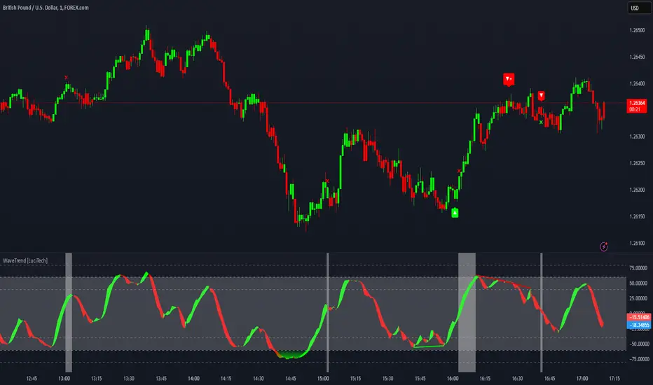
WaveTrend Divergences, Candle Colouring and TP Signal [LuciTech]WaveTrend is a momentum-based oscillator designed to track trend strength, detect divergences, and highlight potential take-profit zones using Bollinger Bands. It provides a clear visualization of market conditions to help traders identify trend shifts and exhaustion points.
The WaveTrend Oscillator consists of a smoothed momentum line (WT Line) and a signal line, which work together to indicate trend direction and possible reversals. When the WT Line crosses above the signal line, it suggests bullish momentum, while crossing below signals bearish momentum.
Candle colouring changes dynamically based on WaveTrend crossovers. If the WT Line crosses above the signal line, candles turn bullish. If the WT Line crosses below the signal line, candles turn bearish. This provides an immediate visual cue for trend direction.
Divergence Detection identifies when price action contradicts the WaveTrend movement.
Bullish Divergence appears when price makes a lower low, but the WT Line forms a higher low, suggesting weakening bearish pressure.
Bearish Divergence appears when price makes a higher high, but the WT Line forms a lower high, indicating weakening bullish pressure.
Plus (+) Divergences are stronger signals that occur when the first pivot of the divergence happens at an extreme level—above +60 for bearish divergence or below -60 for bullish divergence. These levels suggest the market is overbought or oversold, making the divergence more significant.
Bollinger Band Signals highlight potential take-profit zones by detecting when the WT Line moves beyond its upper or lower Bollinger Band.
If the WT Line crosses above the upper band, it signals stretched bullish momentum, suggesting a possible pullback or reversal.
If the WT Line crosses below the lower band, it indicates stretched bearish momentum, warning of a potential bounce.
How It Works
The WaveTrend momentum calculation is based on an EMA-smoothed moving average to filter out noise and provide a more reliable trend indication.
The WT Line (momentum line) fluctuates based on market momentum.
The signal line smooths out the WT Line to help identify trend shifts.
When the WT Line crosses above the signal line, it suggests buying pressure, and when it crosses below, it indicates selling pressure.
Divergences are detected by comparing pivot highs and lows in price with pivot highs and lows in the WT Line.
A pivot forms when a local high or low is confirmed after a certain number of bars.
The indicator tracks whether price action and the WT Line are making opposite movements.
If a divergence occurs and the first pivot was beyond ±60, it is marked as a Plus Divergence, making it a stronger reversal signal.
Bollinger Bands are applied directly to the WT Line instead of price, identifying when the WT Line moves outside its volatility range. This helps traders recognize when momentum is overstretched and a potential reversal or retracement is likely.
Settings
Channel Length (default: 8) controls the period used to calculate the WT Line.
Average Length (default: 16) smooths the WT Line for better trend detection.
Divergences (on/off) enables or disables divergence plotting.
Candle colouring (on/off) applies or removes trend-based candle colour changes.
Bollinger Band Signals (on/off) toggles take-profit signals when the WT Line crosses the bands.
Bullish/Bearish colours allow customization of divergence and signal colours.
Interpretation
The WaveTrend Oscillator helps traders assess market momentum and trend strength.
Crossovers between the WT Line and signal line indicate potential trend reversals.
Divergences warn of weakening momentum and possible reversals, with Plus Divergences acting as stronger signals.
Bollinger Band Crosses highlight areas where momentum is overstretched, signaling potential profit-taking opportunities.
ZenAlgo - QZenAlgo - Q
Description
ZenAlgo - Q is an oscillator based on the QQE (Quantitative Qualitative Estimation) method. This version incorporates refinements for additional visualization and interpretation options. It is designed to help traders observe momentum changes and divergence patterns in price movements.
Key Features
QQE-Based Calculation : Derived from the open-source QQE script by Glaz (Metastock Version of QQE), with modifications for alternative visualization.
Dual RSI-Based Analysis : Uses two RSI calculations to provide additional context on price movements.
Adaptive Trend Bands : Adjust dynamically based on the market conditions.
Divergence Identification : Highlights potential differences between price action and oscillator movement.
Dynamic Color Coding : Displays histogram bars to illustrate shifts in oscillator values.
Configurable Alerts : Enables notifications for specific oscillator conditions.
How It Works
The indicator calculates a smoothed RSI-based oscillator that tracks the relative strength of price movement. It applies an exponential moving average (EMA) smoothing to reduce noise while maintaining responsiveness.
Two adaptive bands are calculated using a variation of the QQE method, which helps define dynamic overbought and oversold conditions.
The histogram bars shift in color based on the position of the oscillator relative to the bands. Lighter shades indicate weaker momentum, while stronger momentum is represented by more saturated colors.
The script also includes a secondary RSI component, which provides an additional layer of analysis. This secondary RSI helps refine momentum trends by smoothing out short-term fluctuations.
Divergence identification is built-in, highlighting where price action deviates from oscillator readings. Bullish divergence occurs when price forms a lower low while the oscillator forms a higher low, and bearish divergence is identified when price forms a higher high while the oscillator forms a lower high.
The indicator does not generate buy or sell signals but instead provides contextual information that can be used alongside other trading strategies.
Use Cases
Trend Observation : Traders can use the histogram to observe whether momentum is strengthening or weakening over time. A shift in color can indicate a potential change in trend strength.
Divergence Analysis : By comparing oscillator divergence with price movement, traders can identify situations where price action may be losing momentum. Divergences do not guarantee reversals but can serve as an early warning to re-evaluate positions.
Momentum Tracking : The dual RSI structure allows users to monitor both short-term and long-term momentum. When both RSI components are aligned, it suggests a more stable trend, while divergence between them may indicate potential consolidation or trend shifts.
Supplementary Analysis : This indicator is best used as a supporting tool alongside volume-based or trend-following indicators. It helps visualize underlying price behavior but should not be used in isolation for decision-making.
Market Context Interpretation : The combination of adaptive bands and histogram visualization allows traders to assess how recent price action compares to historical movement, helping to place current conditions in a broader market context.
Attribution
This script is an adaptation of the open-source QQE script originally developed by Glaz. We acknowledge and appreciate the original author's work, which served as a foundation for our modifications.
Disclaimer
This indicator is intended for informational purposes only. It should not be interpreted as financial advice. Always conduct independent research and risk management before making trading decisions.

ZenAlgo - WavesZenAlgo - Waves is an advanced technical analysis indicator designed to refine trading decisions through a unique combination of multiple methodologies. By integrating Wave-like oscilator, RSI+MFI, and a dynamic Extra Moving Average (MA), it provides a structured approach to trend analysis and momentum detection. Unlike standalone indicators, this tool synchronizes multiple perspectives to provide holistic view and reduce noise.
Purpose and Justification for Integration
ZenAlgo - Waves strategically integrates multiple methodologies to provide trend validation. This indicator goes beyond standalone calculations by layering:
Original Wave Oscillator: Used to detect market momentum shifts and overbought/oversold conditions, further filtered by additional trend confirmation layers.
RSI + MFI Fusion: Introduces price-volume relationship validation, reducing misleading momentum reading.
Dynamic Extra Moving Average (MA): Acts as an adaptive trend filter, ensuring signals align with prevailing market direction rather than reacting to noise.
Divergence Detection: Contextualized divergence detection for both Wave and RSI+MFI.
Multi-Timeframe Trend Table: Facilitates confirmation across different timeframes, helping traders validate trade setups.
Attribution & Originality
ZenAlgo - Waves is an independently developed indicator that builds upon well-known technical analysis techniques while introducing significant enhancements. Unlike traditional WaveTrend indicator, it replaces the fixed constants of the original WaveTrend approach with a dynamic formula based on standard deviation , allowing for more adaptive and responsive calculations.
Additionally, this script integrates Ehlers' Super Smoother Filter , a highly regarded smoothing technique pioneered by John F. Ehlers and freely available for public use. Beyond these foundations, ZenAlgo - Waves incorporates proprietary logic and unique enhancements, setting it apart from conventional alternatives.
If you're seeking an exact replication of WaveTrend, please note that this indicator follows a distinct methodology, producing different calculations and outputs.
How to Use
Identify Key Zones: Observe Wave oscillator values to detect potential overbought and oversold conditions, which may vary based on settings.
Check RSI+MFI Histogram: Confirm momentum strength—bullish (increasing green bars) or bearish (increasing red bars).
Assess Trend via Extra MA: Use the Extra Moving Average to determine overall trend direction.
Look for Divergences: Identify divergences between price action and Wave/RSI+MFI for potential reversals.
Monitor Multi-Timeframe Trend Table: Check for alignment across timeframes for additional confirmation.
Set Alerts for Key Conditions: Configure alerts for Wave crossovers, divergences, and Extra MA state changes.
Analyze Conditions Before Making Decisions: The indicator does not execute trades. Traders should use it as a confirmation tool alongside a broader strategy.
Detailed Explanation of Calculation Logic
ZenAlgo - Waves builds on established wave-based oscillator principles, fine-tuning them for greater adaptability:
Baseline & Difference: Computes a smoothed average of the price source (e.g., HLC3) and measures the difference (or "deviation") between the current price and this baseline.
Volatility Scaling: Uses standard deviation to capture market volatility instead of relying on a static multiplier.
Normalization & Smoothing: Processes the resulting ratio into an oscillator, helping identify overbought and oversold zones. Optionally applies a secondary smoothing pass (including Ehlers' Super Smoother - SMMA) to reduce noise while preserving trend structure.
RSI + MFI Integration: Fuses RSI and MFI into a single composite metric, weighting RSI momentum with volume-adjusted MFI values for a clearer representation of momentum strength.
Extra Moving Average Filtering: A variety of moving average types (EMA, Hull, ZEMA, etc.) smooth the underlying trend, with sensitivity to trend changes customizable.
Divergence Detection: Identifies both regular and hidden divergences by comparing oscillator movements against price action, adjusting dynamically based on historical volatility.
Multi-Timeframe Trend Confirmation: Aggregates data across multiple timeframes (e.g., 1m, 5m, 15m, 1h) to provide a broader market context.
Alerts and Key Conditions: Alerts can be configured for specific conditions such as Wave crossovers, RSI+MFI confirmation, or Extra MA transitions. These alerts serve as notifications, not as automatic trading signals.
Why It’s Worth Paying For
ZenAlgo - Waves differentiates itself from free indicators by providing:
Contextual Signal Filtering: Integrates price-volume analysis and trend alignment checks.
Adaptive Trend Classification: Dynamically adjusts to market conditions.
Multi-Layer Confirmation: Requires momentum, volume, and trend agreement before providing insights.
Advanced Divergence Detection: Filters out noise-based divergences, highlighting only significant price-action-driven reversals.
Multi-Timeframe Validation: Helps ensure that observed trends are consistent across different timeframes.
Considerations for Use:
During periods of low trading volume, as price action lacks conviction.
In highly volatile market conditions, rapid price swings can introduce uncertainty.
Fundamental news events can override technical patterns.
If trends contradict across multiple timeframes, additional confirmation is recommended before making decisions.
Important Notes
This indicator is a tool for technical analysis and does not guarantee trading success.
Best Practices: Use ZenAlgo - Waves in conjunction with other indicators and fundamental analysis for a well-rounded approach.
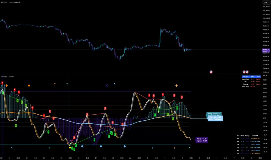
ZenAlgo - Aggregated DeltaZenAlgo - Aggregated Delta is an advanced market analysis tool designed to provide traders with a holistic view of market sentiment by leveraging multi-exchange volume aggregation, cumulative delta analysis, and divergence detection. Unlike traditional indicators that rely on a single data source, this tool aggregates order flow data from multiple exchanges, reducing the impact of exchange-specific anomalies and liquidity disparities.
This indicator is ideal for traders looking to enhance their understanding of market dynamics, trend confirmations, and order flow patterns. By intelligently combining multiple analytical components, it eliminates the need for manually interpreting separate indicators and offers traders a streamlined approach to market analysis.
This indicator was inspired by aggregated volume analysis techniques. Independently developed with a focus on cumulative delta and divergence detection.
Key Features & Their Interaction
Multi-Exchange Volume Aggregation: Aggregates buy and sell volumes from up to nine major exchanges, including Binance, Bybit, Coinbase, and Kraken. Unlike traditional single-source indicators, this ensures a robust, diversified measure of market sentiment and smooths out exchange-specific volume fluctuations.
Cumulative Delta Analysis: Tracks the net difference between buy and sell volumes across all aggregated exchanges, helping traders identify true buying/selling pressure rather than misleading short-term volume spikes.
Advanced Divergence Detection: Unlike basic divergence indicators, this tool detects divergences not only between price and cumulative delta but also across multiple analytical layers, including moving averages and temperature zones, offering deeper confirmation signals.
Dynamic Market Temperature Zones: Unlike fixed overbought/oversold indicators, this feature applies adaptive standard deviation-based filtering to classify market conditions dynamically as "Extreme Hot," "Hot," "Neutral," "Cold," and "Extreme Cold."
Intelligent Market State Classification: Determines whether the market is in a Full Bull, Bearish, or Neutral state by analyzing multi-exchange volume flow, cumulative delta positioning, and market-wide liquidity trends.
Real-Time Alerts & Adaptive Visualization: Provides fully configurable real-time alerts for trend shifts, divergences, and market conditions, allowing traders to act immediately on high-confidence signals.
What Makes ZenAlgo - Aggregated Delta Unique?
Unlike free or open-source alternatives, ZenAlgo - Aggregated Delta applies a multi-layered data processing approach to smooth inconsistencies and improve signal reliability. Instead of using raw exchange feeds, the system incorporates adaptive volume aggregation and standard deviation-based market classification to ensure accuracy and reduce noise. These enhancements lead to more precise trend signals and a clearer representation of market sentiment.
Multi-Exchange Order Flow Validation: Unlike single-source indicators that rely on individual exchange feeds, this tool ensures cross-market consistency by aggregating volume data dynamically.
Fractal-Based Divergence Detection: Detects divergences using fractal logic rather than contextual volume trends, reducing false-positive divergence signals while maintaining accuracy.
Automated Sentiment Analysis: Classifies market sentiment into structured phases (Full Bull, Bearish, etc.), reducing the manual effort needed to interpret order flow trends.
How It Works (Technical Breakdown)
Multi-Exchange Volume Aggregation: The system fetches and validates buy/sell volume data from multiple exchanges, applying volume aggregation techniques to smooth out inconsistencies. It ensures that data from low-liquidity exchanges does not disproportionately influence the analysis.
Cumulative Delta Computation: Cumulative delta is computed as the net difference between buy and sell volumes over a given period. By summing up these values across multiple exchanges, traders can identify real accumulation or distribution zones, reducing false signals from isolated exchange anomalies.
Divergence Detection Methodology: The tool uses a fractal-based logic approach to detect high-confidence divergences across price, volume, and delta trends. This allows for a more structured detection process compared to simple peak/trough analysis, reducing noise in the signals.
Temperature Zones Filtering: Market conditions are dynamically classified using a rolling standard deviation model, ensuring that hot/cold states adjust automatically based on recent volatility levels. This means that instead of using arbitrary fixed thresholds, the tool adapts based on historical data behavior.
Market Sentiment State Calculation: The tool evaluates liquidity conditions, volume trends, and cumulative delta flow, categorizing the market into predefined states (Bullish, Bearish, Neutral). This helps traders assess the broader context of price movements rather than reacting to isolated signals.
Real-Time Adaptive Alerts: The system provides fully configurable alerts that notify traders about key trend shifts, high-confidence divergences, and changes in market conditions as they occur. This ensures that traders can make timely and well-informed decisions.
Why This Approach Works
By aggregating data from multiple exchanges, it reduces the impact of exchange-specific liquidity disparities and anomalies, leading to a more holistic view of order flow.
The cumulative delta analysis ensures that price movements are validated by actual buying/selling pressure, filtering out misleading short-term spikes.
Dynamic market classification adapts to current conditions rather than using outdated fixed thresholds, making it more relevant in different market regimes.
Fractal-based divergence detection avoids common pitfalls of traditional divergence analysis, reducing false signals while maintaining accuracy.
Combining real-time adaptive alerts with well-structured classification improves traders’ ability to respond to market shifts efficiently.
Practical Use Cases
Identifying High-Probability Trend Reversals: If cumulative delta shows bullish divergence while the market is in an Extreme Cold zone, it signals a strong potential for reversal.
Confirming Trend Continuation: When bullish moving average crossovers align with a rising cumulative delta, traders can enter positions with higher confidence.
Detecting Exhaustion in Market Moves: If price enters an "Extreme Hot" zone but cumulative delta starts declining, this suggests trend exhaustion and a possible reversal.
Filtering False Breakouts: If price breaks a resistance level but aggregated buy volume fails to increase, this invalidates the breakout, helping traders avoid bad trades.
Cross-Exchange Sentiment Confirmation: If cumulative delta on aggregated exchanges contradicts price action on an individual exchange, traders can identify localized exchange-based distortions.
Customization & Settings Overview
Exchange Selection: Traders can fine-tune exchange sources for aggregation, allowing for custom market-specific insights.
Adaptive Divergence Settings: Configure detection thresholds, lookback periods, and divergence filtering options to reduce noise and focus on high-confidence signals.
Moving Average Adjustments: Select custom MA types, lengths, and visualization preferences to match different trading styles.
Market Temperature Thresholds: Adjust hot/cold sensitivity to align with preferred risk levels and volatility expectations.
Configurable Alerts & Theme Customization: Full control over notification triggers, color themes, and label formatting to enhance user experience.
Important Considerations
Market Context Dependency: This tool provides order flow analysis, which should be used in conjunction with broader market context and risk management.
Data Source Variability: While multi-exchange aggregation improves reliability, some exchanges may report inaccurate or delayed data.
Extreme Volatility Handling: Large price swings can temporarily distort delta readings, so traders should always validate with additional context.
Liquidity Limitations: In low-liquidity conditions, order flow signals may be less reliable due to fragmented market participation.

ZenAlgo - UltimateThe ZenAlgo - Ultimate Indicator is a premium trading tool that integrates advanced sub-indicators into a single framework, combining volume analysis, divergence detection, and market sentiment visualization. Designed for traders seeking deeper insights, it addresses the limitations of standalone free indicators by delivering a cohesive system that enhances accuracy, adaptability, and decision-making.
Why Multiple Sub-Indicators?
The integration of sub-indicators into one tool provides unique benefits not achievable with individual free indicators:
Improved Accuracy: Combining volume trends, delta volume, and divergence detection creates a multi-dimensional view of market behavior, reducing the chance of false signals.
Synergistic Insights: Free indicators like MAs or divergences work independently, while this tool integrates them into a unified framework that highlights actionable patterns, improving signal reliability.
Actionable Combinations: The tool visually aligns multi-timeframe trends, divergences, and volume states, enabling traders to confirm trades using multiple metrics in one glance, saving time and enhancing precision.
Features
This indicator introduces several customizations and integrations that distinguish it from free alternatives:
Dynamic Volume Classification: It calculates and categorizes volume states into clear signals like "Mega Buy" or "Big Sell," providing instant clarity about unusual activity levels.
Enhanced Delta Volume Analysis: Tracks delta volume trends with adjustable sensitivity, identifying subtle shifts in market pressure that standalone delta indicators might miss.
Customizable Multi-Timeframe Volume Tables: Displays volume and delta metrics across multiple timeframes, offering a holistic view of market activity that helps align short- and long-term strategies.
Real-Time Alerts: Provides instant notifications for confirmed and unconfirmed delta volume crosses, helping users stay ahead of market movements.
Divergence Detection Across Metrics: Identifies regular and hidden bullish or bearish divergences using up, down, and delta volumes, integrating price fractals for added precision.
How It Works
1. Volume and Delta Volume Integration
The indicator calculates and categorizes volume activity into specific states, such as "Mega Buy" or "Big Sell," by comparing the current volume with its 20-period average. For delta volume, it tracks the difference between buying and selling pressure, identifying shifts in market sentiment. These calculations are dynamically updated across multiple timeframes, with delta trends smoothed using user-selected moving averages (e.g., SMA, EMA, WMA, HMA) to highlight sustained market pressure changes.
2. Multi-Timeframe Volume Tables
The tool aggregates and displays volume and delta volume data across various timeframes in a visual table. Each timeframe's data includes total volume, categorized buying and selling volumes, and the net delta volume. Colors within the table provide immediate insights into the prevailing market sentiment for each timeframe, with bullish or bearish conditions emphasized using pre-defined thresholds.
3. Divergence Detection Across Metrics
Divergences are identified using fractal patterns in up volume, down volume, and delta volume. Regular and hidden bullish or bearish divergences are detected by comparing historical volume peaks and troughs with corresponding price movements. This allows the tool to highlight potential reversals or trend continuations before they are visually apparent on the chart.
4. Market State Labels
The indicator synthesizes multiple metrics, such as volume trends, delta volume movements, and histogram direction, to generate actionable market state labels. These labels, such as "Bullish," "Bearish," or "Reversal," offer a high-level summary of current market conditions, helping traders quickly adapt their strategies.
5. Real-Time Alerts
To ensure traders stay informed, the tool includes alerts for confirmed and unconfirmed delta volume crosses. These alerts consider not only the delta volume's movement relative to its average but also whether the broader buying or selling pressure supports the signal, enhancing the reliability of the alerts.
Specific Scenarios Where This Indicator Excels
Trend Confirmation: Align rising delta volume with bullish divergences across timeframes for high-confidence entries.
Reversal Identification: Use divergence labels to anticipate trend reversals before they occur.
Market Sentiment Analysis: Dynamic candle coloring helps visualize whether the market is dominated by bullish or bearish forces.
Volume Breakout Detection: Track spikes in cumulative volume and delta volume to identify breakouts with higher accuracy.
When to Be Cautious
Low-Volume Markets: In thinly traded markets, signals like divergences or delta volume shifts may produce noise due to insufficient data.
Highly Volatile Conditions: Sudden volume spikes can result in false positives for breakouts or reversals.
Session Overlaps or Data Misalignment: Variations in session timings or data discrepancies can temporarily impact cumulative volume metrics.
Overfitting Sensitivity Settings: Excessively high sensitivity settings may overfit the indicator to specific market conditions, leading to unreliable signals in broader contexts.
Why Pay for This Indicator?
This tool stands out because it doesn’t merely replicate free indicators; it integrates and enhances them into a uniquely actionable framework:
Tailored for Precision: Adjustable parameters for sensitivity, divergence detection, and timeframe analysis allow traders to adapt the indicator to their strategies.
Time-Saving Synergy: Combines the functionality of multiple tools into a single interface, eliminating the need to juggle multiple scripts.
Comprehensive Insights: Delivers a broader perspective by linking volume trends, delta volume, and divergences, ensuring more informed decisions.
Real-Time Notifications: Alerts for key events ensure you never miss a critical market movement.
Usage Examples
Volume State Monitoring: Instantly identify states like "Big Buy" or "Mega Sell" to act on significant volume surges.
Multi-Timeframe Alignment: Combine bullish divergences on a 15-minute chart with a rising daily delta volume trend for high-probability trades.
Scalping Opportunities: Use delta volume crosses and short-term trends for quick entries and exits.
Breakout Validation: Confirm volume breakouts with delta volume spikes to avoid false signals.
Settings
Volume MA Length: Adjusts the moving average period for volume trends.
Divergence Sensitivity: Fine-tunes the thresholds for divergence detection to suit different market conditions.
Multi-Timeframe Visibility: Customizes the number of timeframes displayed in the cumulative volume table.
Conclusion
The Ultimate Indicator is more than a collection of sub-indicators—it’s a fully integrated system designed to address the limitations of standalone tools. By offering deeper insights into volume trends, market sentiment, and divergence analysis, it empowers traders to make better-informed decisions with enhanced confidence.

Xmoon – 3 Push Divergence – V1Introducing the Xmoon – 3 Push Divergence RSI Indicator – Premium – V2
The Xmoon – 3 Push Divergence RSI Indicator is designed based on a logical and precise strategy to help you identify suitable entry and exit points by combining divergences and market reversal patterns. With this tool, you can effectively spot trading opportunities in all market conditions, including uptrends, downtrends, and even sideways markets.
Divergence: A Powerful Signal for Market Reversal
Divergence is one of the most important signals of market reversal, widely used by professional traders. This indicator accurately identifies 3 Push Divergence patterns for you and highlights these patterns by plotting lines between their pivots. Moreover, as soon as the pattern is detected, the indicator draws lines for stepwise entries, stepwise exits, and capital management.
Stepwise Entry: Flexibility in Trade Management
When a 3 Push Divergence pattern forms, there is a high likelihood that the market will react to it. However, since the exact reversal point cannot be predicted, stepwise entry allows you to better align with market fluctuations and adapt flexibly to market changes.
In each step, you can increase your entry capital incrementally by one unit, enabling you to manage risk and capital more effectively.
Exit Management: Choosing Between Risk-Free and Target
After every entry, the indicator plots two lines for you:
1. Target Line: When you see the market moving in line with your analysis and want to take advantage of the profits.
2. Risk-Free Line: If you find the market conditions unfavorable, you can exit your position at break-even (considering spread, commissions, etc.).
Why Use This Indicator?
• Multiple Signal Detection: Due to price movements and the frequent occurrence of 3 Push Divergence patterns in the market, you can benefit from the multiple signals generated by this indicator across various timeframes.
• Professional Capital Management: This tool allows you to manage the risk and profit of your trades in the best possible way with stepwise entries and multiple exit settings.
• Effective in All Market Conditions: You can take advantage of trading opportunities in all market conditions, whether trending or sideways.
• Alignment with Real Market Momentum: You can utilize optimized distances between entry and exit levels designed based on real market momentum.
How to Use This Indicator?
1. Detecting the 3 Push Divergence Pattern: When the indicator detects a 3 Push Divergence pattern, it plots entry levels for each step, allowing you to start and set your trade with the specified capital.
2. Managing Stepwise Trades: Upon detecting the pattern, you can open your first trade at Step 1. If the market does not move in line with your initial analysis and reaches the entry levels for subsequent steps, you can increase your position size accordingly.
3. Exit Management: At each entry step, you can decide based on market conditions whether to focus on the target level or exit the trade at the risk-free level. (To display the risk-free and target lines, simply go to the indicator settings window and enable the relevant options.)
Conclusion
The Xmoon – 3 Push Divergence RSI indicator is a powerful tool for identifying and capitalizing on market reversal opportunities. By combining stepwise entry, professional exit management, and the robust logic of divergence, you can make better decisions and optimize the risk of your trades.
Money Flow ExtendedMoney Flow Extended (MF)
Definition
The Money Flow Extended (MF) indicator brings together the functionality of the Money Flow Index indicator (MFI) , a tool created by Gene Quong and Avrum Soudack and used in technical analysis for measuring buying and selling pressure, and The Relative Strength Index (RSI) , a well versed momentum based oscillator created by J.Welles Wilder Jr., which is used to measure the speed (velocity) as well as the change (magnitude) of directional price movements.
History
As the Money Flow Index (MFI) is quite similar to The Relative Strength Index (RSI), essentially the RSI with the added aspect of volume, adding a Moving Average, divergence calculation, oversold and overbought gradients, facilitates the transition from RSI, making the use of MFI pretty similar.
What to look for
Overbought/Oversold
When momentum and price rise fast enough, at a high enough level, eventual the security will be considered overbought. The opposite is also true. When price and momentum fall far enough, they can be considered oversold. Traditional overbought territory starts above 80 and oversold territory starts below 20. These values are subjective however, and a technical analyst can set whichever thresholds they choose.
Divergence
MF Divergence occurs when there is a difference between what the price action is indicating and what MF is indicating. These differences can be interpreted as an impending reversal. Specifically, there are two types of divergences, bearish and bullish.
Bullish MFI Divergence – When price makes a new low but MF makes a higher low.
Bearish MFI Divergence – When price makes a new high but MF makes a lower high.
Failure Swings
Failure swings are another occurrence which can lead to a price reversal. One thing to keep in mind about failure swings is that they are completely independent of price and rely solely on MF. Failure swings consist of four steps and are considered to be either Bullish (buying opportunity) or Bearish (selling opportunity).
Bullish Failure Swing
MF drops below 20 (considered oversold).
MF bounces back above 20.
MF pulls back but remains above 20 (remains above oversold)
MF breaks out above its previous high.
Bearish Failure Swing
MF rises above 80 (considered overbought)
MF drops back below 80
MF rises slightly but remains below 80 (remains below overbought)
MF drops lower than its previous low.
Summary
The Money Flow Extended (MF) can be a very valuable technical analysis tool. Of course, MF should not be used alone as the sole source for a trader’s signals or setups. MF can be combined with additional indicators or chart pattern analysis to increase its effectiveness.
Inputs
Length
The time period to be used in calculating the MF. 14 is the default.
Pivot Loopback
After how many bars you want the divergence to show, on the scale of 1-5. 5 is the default.
Calculate Divergence
Calculating divergences is needed in order for divergence alerts to fire.
Moving Average section
You can learn more about the inputs in the "Moving Average" section in this Help Center article .
Style
MF
Can toggle the visibility of the MF as well as the visibility of a price line showing the actual current value of the MF. Can also select the MF Line's color, line thickness and visual style.
MF-based MA
Can toggle the visibility of the MF-based MA as well as the visibility of a price line showing the actual current MA value. Can also select its color, line thickness and line style.
MF Upper Band
Can toggle the visibility of the Upper Band as well as sets the boundary, on the scale of 1-100, for the Upper Band (80 is the default). The color, line thickness and line style can also be determined.
MF Middle Band
Can toggle the visibility of the Middle Band as well as sets the boundary, on the scale of 1-100, for the Middle Band (50 is the default). The color, line thickness and line style can also be determined.
MF Lower Band
Can toggle the visibility of the Lower Band as well as sets the boundary, on the scale of 1-100, for the Lower Band (20 is the default). The color, line thickness and line style can also be determined.
MF Background Fill
Toggles the visibility of a Background color within the MF's boundaries. Can also change the Color itself as well as the opacity.
Overbought Gradient Fill
Can toggle the visibility of the Overbought Gradient Fill. Can also select its colors combination.
Oversold Gradient Fill
Can toggle the visibility of the Oversold Gradient Fill. Can also select its colors combination.
Precision
Sets the number of decimal places to be left on the indicator's value before rounding up. The higher this number, the more decimal points will be on the indicator's value.

OBV Divergence Indicator [TradingFinder] On-Balance Vol Reversal🔵 Introduction
The On-Balance Volume (OBV) indicator, introduced by Joe Granville in 1963, is a powerful technical analysis tool used to measure buying and selling pressure based on trading volume and price.
By aggregating trading volume—adding it on positive days and subtracting it on negative days—OBV creates a cumulative line that reflects market volume pressure, making it valuable for confirming trends, identifying entry and exit points, and forecasting potential price movements.
Divergences between price and OBV often provide significant signals. A bearish divergence occurs when the price forms higher highs while the OBV line forms lower highs. This discrepancy indicates that upward momentum is weakening, increasing the likelihood of a downward trend.
In contrast, a bullish divergence happens when the price makes lower lows, but the OBV line forms higher lows. This suggests increasing buying pressure and the potential for an upward trend reversal.
For instance, if the price is rising but the OBV trendline is falling, it may signal a bearish divergence, warning of a possible price decline. Conversely, if the price is falling while the OBV line is rising, this could signal a bullish divergence, indicating a possible price recovery. These signals are particularly useful for identifying market turning points.
OBV often acts as a leading indicator, moving ahead of price changes. For example, a rising OBV alongside stable or declining prices can signal an impending upward breakout.
Conversely, a declining OBV with rising prices may indicate that the current uptrend is losing strength. Traders using this strategy often consider entering positions at breakout levels while setting stop losses near recent swing highs or lows to manage risk effectively.
This integration highlights how OBV divergences can provide actionable insights for predicting price movements and managing trades efficiently.
Bullish Divergence :
Bearish Divergence :
🔵 How to Use
The OBV indicator, as a cumulative tool, assists analysts in comparing volume and price changes to identify new trends and key levels for entering or exiting trades. Beyond confirming existing trends, it is particularly effective in analyzing positive and negative divergences between price and volume, providing valuable signals for trading decisions.
🟣 Bullish Divergence
A bullish divergence occurs when the price continues its downward or stable trend, but the OBV line starts rising, forming a higher low compared to its previous low. This suggests increasing volume on up days relative to down days and often signals a reversal to the upside.
For instance, if an asset's price stabilizes near a support level but the OBV line shows an upward trend, this divergence could present an opportunity to enter a long position.
🟣 Bearish Divergence
A bearish divergence occurs when the price forms higher highs, but the OBV line declines, creating lower highs compared to previous peaks. This indicates decreasing volume on up days relative to down days and often acts as a warning for a reversal to the downside.
For example, if an asset’s price approaches a resistance level while OBV starts declining, this divergence may signal the beginning of a downtrend and could indicate a good time to exit long trades or enter short positions.
🔵 Setting
Period : The "Period" setting allows you to define the number of bars or intervals for "Periodic" and "EMA" modes. A shorter period captures more short-term movements, while a longer period smooths out the fluctuations and provides a broader view of market trends.
You can enable or disable labels to highlight key levels or divergences and tables to show numerical details like values and divergence types. These options allow for a customized chart display.
🔵 Table
The following table breaks down the main features of the oscillator. It covers four critical categories: Exist, Consecutive, Divergence Quality, and Change Phase Indicator.
Exist : If divergence is detected, a "+" will appear in this row.
Consecutive: Shows the number of consecutive divergences that have formed in a short period.
Divergence Quality : Evaluates the quality of the divergence based on the number of occurrences. One is labeled "Normal," two are "Good," and three or more are considered "Strong."
Change Phase Indicator : If a phase change is detected between two oscillation peaks, this is marked in the table.
🔵 Conclusion
The OBV (On Balance Volume) indicator is a simple yet effective tool in technical analysis that combines volume and price changes to provide a comprehensive view of market buying and selling pressure. By identifying positive and negative divergences, OBV enables analysts to detect early signs of trend reversals and refine their trading strategies.
Divergences in OBV often precede price changes, making it a leading indicator for predicting market movements. Using OBV alongside other technical tools can enhance decision-making accuracy and help traders identify better entry and exit points. However, it is essential to consider the limitations of OBV, such as the potential for signal errors and the impact of sudden news events.
Ultimately, OBV serves as a complementary tool in technical analysis, aiding in trend identification, signal confirmation, and risk management. A thoughtful application of this indicator, in combination with other analytical tools, can create valuable opportunities for profiting in financial markets.

Strength of Divergence Across Multiple Indicators (+CMF&VWMACD)Modified Version of Strength of Divergence Across Multiple Indicators by reees
Purpose:
This Pine Script indicator is designed to identify and evaluate the strength of bullish and bearish divergences across multiple technical indicators. Divergences occur when the price of an asset is moving in one direction while a technical indicator is moving in the opposite direction, potentially signaling a trend reversal.
Key Features:
1. Multiple Indicator Support: The script now analyzes divergences for the following indicators:
* RSI (Relative Strength Index)
* OBV (On-Balance Volume)
* MACD (Moving Average Convergence/Divergence)
* STOCH (Stochastic Oscillator)
* CCI (Commodity Channel Index)
* MFI (Money Flow Index)
* AO (Awesome Oscillator)
* CMF (Chaikin Money Flow) - Newly added
* VWMACD (Volume-Weighted MACD) - Newly added
2. Customizable Divergence Parameters:
* Bullish/Bearish: Enable or disable the detection of bullish and bearish divergences independently.
* Regular/Hidden: Detect both regular and hidden divergences (hidden divergences can indicate trend continuation).
* Broken Trendline Exclusion: Optionally ignore divergences where the trendline connecting price pivots is broken by an intermediate pivot.
* Pivot Lookback Periods: Adjust the number of bars used to identify valid pivot highs and lows for divergence calculations.
* Weighting: Assign different weights to regular vs. hidden divergences and to the relative change in price vs. the indicator.
3. Indicator-Specific Settings:
* Weight: Each indicator can be assigned a weight, influencing its contribution to the overall divergence strength calculation.
* Extreme Value: Define a threshold above which an indicator's divergence is considered "extreme," giving it a higher strength rating.
4. Divergence Strength Calculation:
* For each indicator, the script calculates a divergence "degree" based on the magnitude of the divergence and the user-defined weightings.
* The total divergence strength is the sum of the individual indicator divergence degrees.
* Strength is categorized as "Extreme," "Very strong," "Strong," "Moderate," "Weak," or "Very weak."
5. Visualization:
* Divergence Lines: The script draws lines on the chart connecting the price and indicator pivots that form a divergence (optional, with customizable transparency).
* Labels: Labels display the total divergence strength and a breakdown of each indicator's contribution. The size and visibility of labels are based on the strength.
6. Alerts:
* The script can generate alerts when the total divergence strength exceeds a user-defined threshold.
New Indicators (CMF and VWMACD):
* Chaikin Money Flow (CMF):
* Purpose: Measures the buying and selling pressure by analyzing the relationship between price, volume, and the accumulation/distribution line.
* Divergence: A bullish CMF divergence occurs when the price makes a lower low, but the CMF makes a higher low (suggesting increasing buying pressure). A bearish divergence is the opposite.
* Volume-Weighted MACD (VWMACD):
* Purpose: Similar to the standard MACD but uses volume-weighted moving averages instead of simple moving averages, giving more weight to periods with higher volume.
* Divergence: Divergences are interpreted similarly to the standard MACD, but the VWMACD can be more sensitive to volume changes.
How It Works (Simplified):
1. Pivot Detection: The script identifies pivot highs and lows in both price and the selected indicators using the specified lookback periods.
2. Divergence Check: For each indicator:
* It checks if a series of pivots in price and the indicator are diverging (e.g., price makes a lower low, but the indicator makes a higher low for a bullish divergence).
* It calculates the divergence degree based on the difference in price and indicator values, weightings, and whether it's a regular or hidden divergence.
3. Strength Aggregation: The script sums up the divergence degrees of all enabled indicators to get the total divergence strength.
4. Visualization and Alerts: It draws lines and labels on the chart to visualize the divergences and generates alerts if the total strength exceeds the set threshold.
Benefits:
* Comprehensive Divergence Analysis: By considering multiple indicators, the script provides a more robust assessment of potential trend reversals.
* Customization: The many adjustable parameters allow traders to fine-tune the script to their specific trading style and preferences.
* Objective Strength Evaluation: The divergence strength calculation and categorization offer a more objective way to evaluate the significance of divergences.
* Early Warning System: Divergences can often precede significant price movements, making this script a valuable tool for anticipating potential trend changes.
* Volume Confirmation: The inclusion of CMF and VWMACD add volume-based confirmation to the divergence signals, potentially increasing their reliability.
Limitations:
* Lagging Indicators: Most of the indicators used are lagging, meaning they are based on past price data. Divergences may sometimes occur after a significant price move has already begun.
* False Signals: No indicator is perfect, and divergences can sometimes produce false signals, especially in choppy or ranging markets.
* Subjectivity: While the script aims for objectivity, some settings (like weightings and extreme values) still involve a degree of subjective judgment.
