Cumulative Delta_Effort vs Result_immy**Cumulative Delta Oscillator\_effort**
This script creates a “Cumulative Delta Effort vs Result” oscillator, a custom indicator designed to measure the balance between buying and selling pressure (Effort) versus actual price movement (Result).
**How It Works**
Delta Volume: Measures aggressive buying vs selling per candle.
Cumulative Delta: Tracks net buying/selling pressure over time.
Effort vs Result: Compares volume delta (effort) to price movement (result).
Oscillator: Highlights divergence between effort and result, useful for spotting absorption (high effort, low result) and exhaustion (low effort, high result).
Histogram: Visual cue for accumulation/distribution zones.
----------------------------
This indicator combines volume delta (effort) and price movement (result), so it tells you how efficiently volume is moving price — a concept sometimes called effort vs. result analysis in Wyckoff or volume–spread analysis (VSA).
🔍 Concept Summary
Effort (delta volume) = how much buying/selling pressure is there (volume side).
Result (price change) = how much that effort moves price (price side).
Oscillator (Effort − Result) = how much “extra” effort is not producing movement — often showing absorption or exhaustion.
📈 How to Interpret the Signals
1\. Oscillator above Signal line → Bullish Momentum
When osc > signal, histogram turns green.
Means buying effort is stronger than price reaction — often early sign of accumulation or rising demand.
This can signal:
Possible bullish continuation if confirmed by rising prices.
Or early absorption if prices aren’t yet breaking out (smart money absorbing supply).
✅ Bullish Entry Signal:
When the oscillator crosses above the signal line (green cross) and price is near support or consolidating → potential long setup.
2\. Oscillator below Signal line → Bearish Momentum
When osc < signal, histogram turns red.
Selling effort dominates; can mean increasing supply or price exhaustion.
This often appears before:
Bearish continuation (trend strengthening)
Or upthrust/exhaustion (price rising on weak volume)
❌ Bearish Entry Signal:
When the oscillator crosses below the signal line (red cross), especially if near resistance → potential short setup.
3\. Crossovers
The alert is triggered when: ta.cross(osc, signal)
That means:
Bullish crossover: oscillator line crosses above signal → potential buy momentum shift.
Bearish crossover: oscillator line crosses below signal → potential sell momentum shift.
These work like MACD crossovers, but volume-adjusted.
4\. Zero Line
The zero line is the neutral point.
When osc crosses above zero, overall buying effort exceeds price change — market gaining strength.
When osc crosses below zero, selling pressure increases — market weakening.
→ Combining signal line crosses with zero-line crosses gives stronger confirmation.
5\. Histogram Analysis (Absorption \& Exhaustion)**
Tall green bars: rising momentum (buyers dominate)
Tall red bars: falling momentum (sellers dominate)
Shrinking bars: momentum fading — possible reversal zone.
If volume increases but price stalls, oscillator may spike while price stays flat — absorption (big players taking the opposite side).
If price surges but oscillator weakens, exhaustion — move running out of volume support.
------------------------------------------------------------------------
🧠 Practical Strategy Example
Situation What It Might Mean Possible Action
Oscillator crosses above signal near support Buyer effort increasing, price may rise Go long / close shorts
Oscillator crosses below signal near resistance Seller effort rising, price may drop Go short / take profits
Oscillator high but price flat Absorption (big players absorbing supply) Wait for breakout confirmation
Oscillator low but price flat Absorption (demand absorbing supply) Look for bullish reversal
Oscillator diverges from price Volume–price divergence Early warning of reversal
⚙️ Best Practice
Works best on volume-sensitive assets (futures, crypto, forex tick data).
**Combine with:**
Price structure (support/resistance)
Volume profile / delta footprint
Candle confirmation
We’ll go through both bullish and bearish examples so you can see how to trade with it in real market context.
---------------------------------------------------------------------------------
🟩 Example 1 — Bullish Setup (Long Trade)
Step 1. Context: Identify Potential Support Zone
Before relying on any indicator, find support using:
Previous swing low
Demand zone
VWAP / volume profile node
Trendline or moving average
👉 You’re looking for a place where buyers might step in.
Step 2. Wait for Oscillator Signal
Watch the oscillator panel:
The oscillator (green line) has been below the signal line (orange) → bearish phase.
Then it crosses above the signal line and the histogram turns green.
This means:
➡️ Buying “effort” is increasing faster than price reaction — momentum shift upward.
Step 3. Confirm with Price
On your chart:
Candle closes above short-term resistance or above previous candle high
Ideally volume confirms (green candle with increasing volume)
✅ Bullish Entry Condition
osc crosses above signal
price closes above local resistance
Step 4. Entry \& Stop
Entry: Next candle open after confirmation cross
Stop-loss: Below recent swing low or support zone
Take profit:
2R or 3R target
or near next resistance level
🧠 Optional filter: Only take the trade if oscillator is rising from below zero (coming out of weakness).
Step 5. Manage Trade
If oscillator flattens or starts curling down → tighten stop
If it crosses below the signal again → consider exit
Example Interpretation:
Oscillator crosses above signal from -200 to +100, histogram turns green, price breaks a resistance line → strong bullish reversal → enter long.
🟥 Example 2 — Bearish Setup (Short Trade)
Step 1. Context: Find Resistance
Look for: Prior swing high
Supply zone
Major moving average
Trendline top
Step 2. Wait for Oscillator Cross Down
The oscillator (green) crosses below the signal line (orange).
Histogram turns red.
This means:
➡️ Selling effort is rising relative to price movement — bearish pressure.
Step 3. Confirm with Price
Price fails to make higher highs, or
Forms a bearish engulfing candle near resistance.
✅ Bearish Entry Condition
osc crosses below signal
price confirms with bearish candle
Step 4. Entry \& Stop
Entry: On next candle open
Stop-loss: Above resistance or recent swing high
Take profit: 2R or more or at next major support
Step 5. Exit on Opposite Signal
If oscillator crosses back above signal → momentum shift → exit short.
⚙️ Pro Tips
Tip Why It Matters
Use on 15m–4H+ charts More reliable delta signal
Combine with volume or OBV Confirms “effort” strength
Watch divergences Early reversals
Align with higher timeframe trend Avoid countertrend traps
-------------------------------------------------------------------------------------------------
🧩 Quick Checklist
Step Condition Action
1 Identify zone (support/resistance) Mark area
2 Oscillator crossover Prepare order
3 Candle confirmation Enter
4 Stop-loss \& target Manage risk
5 Opposite cross Exit
Please follow and like if you appreciate my work. thank you.
Effortvsresult

RedK EVEREX - Effort Versus Results ExplorerRedK EVEREX is an experimental indicator that explores "Volume Price Analysis" basic concepts and Wyckoff law "Effort versus Result" - by inspecting the relative volume (effort) and the associated (relative) price action (result) for each bar - showing the analysis as an easy to read "stacked bands" visual. From that analysis, we calculate a "Relative Rate of Flow" - an easy to use +100/-100 oscilator that can be used to trigger a signal when a bullish or bearish mode is detected for a certain user-selected length of bars.
Basic Concepts of VPA
-------------------------------
(The topics of VPA & Wyckoff Effort vs Results law are too comprehensive to cover here - So here's just a very basic summary - please review these topics in detail in various sources available here in TradingView or on the web)
* Volume Price Analysis (VPA) is the examination of the number of shares or contracts of a security that have been traded in a given period, and the associated price movement. By analyzing trends in volume in conjunction with price movements, traders can determine the significance of changes in price and what may unfold in the near future.
* Oftentimes, high volumes of trading can infer a lot about investors’ outlook on a market or security. A significant price increase along with a significant volume increase, for example, could be a credible sign of a continued bullish trend or a bullish reversal. Adversely, a significant price decrease with a significant volume increase can point to a continued bearish trend or a bearish trend reversal.
* Incorporating volume into a trading decision can help an investor to have a more balanced view of all the broad market factors that could be influencing a security’s price, which helps an investor to make a more informed decision.
* Wyckoff's law "Effort versus results" dictates that large effort is expected to be accompanied with big results - which means that we should expect to see a big price move (result) associated with a large relative volume (effort) for a certain trading period (bar).
* The way traders use this concept in chart analysis is to mainly look for imbalances or invalidation. for example, when we observe a large relative volume that is associated with very limited price change - that should trigger an early flag/warning sign that the current price trend is facing challenges and may be an early sign of "reversal" - this applies in both bearish and bullish conditions. on the other hand, when price starts to trend in a certain direction and that's associated with increasing volume, that can act as kind of validation, or a confirmation that the market supports that move.
How does EVEREX work
---------------------------------
* EVEREX inspects each bar and calculates a relative value for volume (effort) and "strength of price movement" (result) compared to a specified lookback period. The results are then visualized as stacked bands - the lower band represents the relative volume, the upper band represents the relative price strength - with clear color coding for easier analysis.
* The scale of the band is initially set to 100 (each band can occupy up to 50) - and that can be changed in the settings to 200 or 400 - mainly to allow a "zoom in" on the bands.
* Reading the resulting stacked bands makes it easier to see "balanced" volume/price action (where both bands are either equally strong, or equally weak), or when there's imbalance between volume and price (for example, a compression bar will show with high volume band and very small/tiny price action band) - another favorite pattern in VPA is the "Ease of Move", which will show as a relatively small volume band associated with a large "price action band" (either bullish or bearish) .. and so on.
* a bit of a techie piece: why the use of a custom "Normalize()" function to calculate "relative" values in EVEREX?
When we evaluate a certain value against an average (for example, volume) we need a mechanism to deal with "super high" values that largely exceed that average - I also needed a mechanism that mimics how a trader looks at a volume bar and decides that this volume value is super low, low, average, above average, high or super high -- the issue with using a stoch() function, which is the usual technique for comparing a data point against a lookback average, is that this function will produce a "zero" for low values, and cause a large distortion of the next few "ratios" when super large values occur in the data series - i researched multiple techniques here and decided to use the custom Normalize() function - and what i found is, as long as we're applying the same formula consistently to the data series, since it's all relative to itself, we can confidently use the result. Please feel free to play around with this part further if you like - the code is commented for those who would like to research this further.
* Overall, the hope is to make the bar-by-bar analysis easier and faster for traders who apply VPA concepts in their trading
What is RROF?
--------------------------
* Once we have the values of relative volume and relative price strength, it's easy from there to combine these values into a moving index that can be used to track overall strength and detect reversals in market direction - if you think about it this a very similar concept to a volume-weighted RSI. I call that index the "Relative Rate of Flow" - or RROF (cause we're not using the direct volume and price values in the calculation, but rather relative values that we calculated with the proprietary "Normalize" function in the script.
* You can show RROF as a single or double-period - and you can customize it in terms of smoothing, and signal line - and also utilize the basic alerts to get notified when a change in strength from one side to the other (bullish vs bearish) is detected
* In the chart above, you can see how the RROF was able to detect change in market condition from Bearsh to Bullish - then from Bullish to Bearish for TSLA with good accuracy.
Other Usage Options in EVEREX
------------------------------------
* I wrote EVEREX with a lot of flexibility and utilization in mind, while focusing on a clean and easy to use visual - EVEREX should work with any time frame and any instrument - in instruments with no volume data, only price data will be used.
* You can completely hide the "EVEREX bands" and use EVEREX as a single or dual period strength indicator (by exposing the Bias/Sentiment plot which is hidden by default) -
here's how this setup would look like - in this mode, you will basically be using EVEREX the same way you're using a volume-weighted RSI
* or you can hide the bias/sentiment, and expose the Bulls & Bears plots (using the indicator's "Style" tab), and trade it like a Bull/Bear Pressure Index like this
* you can choose Moving Average type for most plot elements in EVEREX, including how to deal with the Lookback averaging
* you can set EVEREX to a different time frame than the chart
* did i mention basic alerts in this v1.0 ?? There's room to add more VPA-specific alerts in future version (for example, when Ease-of-Move or Compression bars are detected...etc) - let me know if the comments what you want to see
Final Thoughts
--------------------
* EVEREX can be used for bar-by-bar VPA analysis - There are so much literature out there about VPA and it's highly recommended that traders read more about what VPA is and how it works - as it adds an interesting (and critical) dimension to technical analysis and will improve decision making
* RROF is a "strength indicator" - it does not track price values (levels) or momentum - as you will see when you use it, the price can be moving up, while the RROF signal line starts moving down, reflecting decreasing strength (or otherwise, increasing bear strength) - So if you incorporate EVEREX in your trading you will need to use it alongside other momentum and price value indicators (like MACD, MA's, Trend Channels, Support & Resistance Lines, Fib / Donchian..etc) - to use for trade confirmation

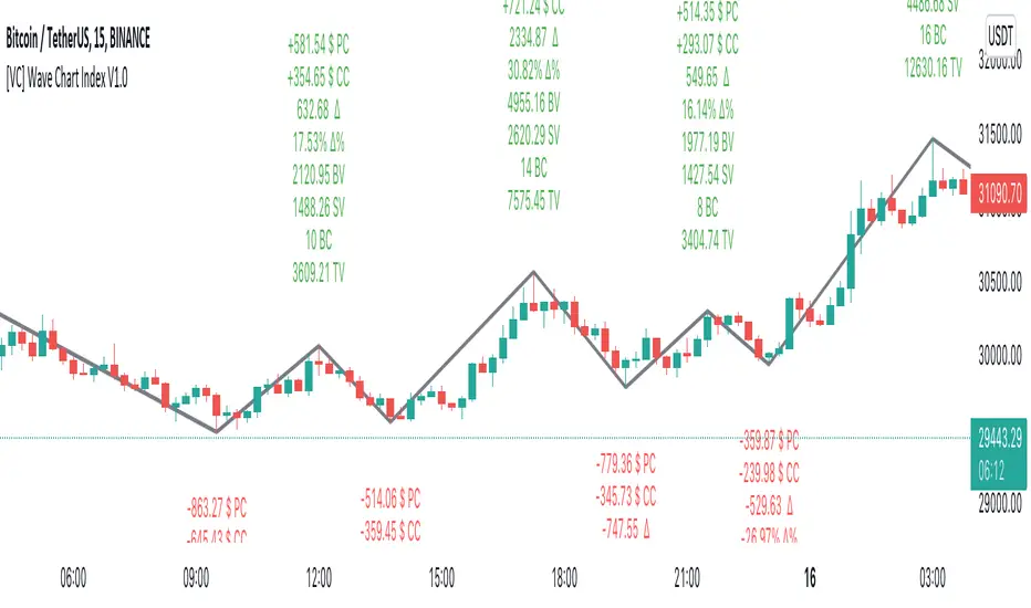
[VC] Wave Chart Index V1.0V.C Wave Chart Index
Richard D. Wyckoff created the first wave chart, and he instructed students to think in waves. He was an early 20th-century pioneer in the technical approach to studying the stock market and is considered one of the five "titans" of technical analysis, along with Dow, Gann, Elliott and Merrill.
V.C Wave Chart Index is the most comprehensive version of Wyckoff's theory. It is used to measure the strength & weakness of each market move by comparative data analysis. It draws waves on the chart based on Gann Swing theory. At the end of each wave, a label shows all the cumulative data & information of the wave.
With the help of this indicator, You can measure each swing or high/low movement of the market by comparing it with previous high/low price movements. The comparison can be made by using the following data of each wave.
Price Change
Volume Change
Delta Change
Delta % Change
Buy Volume
Sell Volume
Time Spent (Bar Counter)
V.C Wave Chart Index is not only an indicator but itself a unique & comprehensive tool kit to measure & compare each move of the market. This tool enables you to see deep inside each movement of the market. It allows you to observe the nitty-gritty data of each wave at the micro-level with your nacked eyes. With the help of Delta & (C.C) Close to Close Price Change, it is now easy to apply effort & result and cause & effect theory to your analysis. (total volume, buy volume, sell volume & delta % can also be used for comparative analysis)
V.C Wave Chart Index Properties
Price Change or (P.C): Shows the price Change of the Wave
Buy Volume (B.V): Shows the Cumulative Buy Volume of the Wave
Sell Volume (S.V): Shows the Cumulative Sell Volume of the Wave
Delta Volume (∆): Shows the Cumulative Buy - Sell Volume of the Wave
Delta % ∆ : Shows the Cumulative Delta % of the wave
Total Volume (T.V): Shows the Cumulative Total Volume of the Wave
Bar Count (B.C): Shows how much time it took to Complete the Wave
Swing Price: Shows the Reversal Price of the Wave
V.C Wave Chart Index Settings & Inputs Explained
Sensitivity (%): This input helps you adjust to the wave's steepness. 0.001 is my recommended value for all time frames.
Cumulation: This input helps you to control the length & formation of the wave: ( the fewer values = more wave formations & vice versa)
Wave Color: Allow you to change the color of the wave
Draw to Latest Candle: Allow you to show/hide the latest or real-time wave & data.
Divisor: Allow you to divide extensive numeric data into small numbers to read it easily.
Align Text: Allow you to align the text.
Size Text: Allow you to change the size of the text.
Display Toal Delta: Allow you to show or hide total Delta (∆).
Display Percentage Delta (%): Allow you to show or hide Delta (∆) %.
Color Wave Buy: Allow you to change the color.
Color Wave Sell: Allow you to change the color.
Display Total Volume (T.V): Allow you to show/hide total volume
Display Buy Volume (B.V): Allow you to show/hide buy volume
Display Sell Volume (S.V): Allow you to show/hide sell volume
Display Swing Price: Allow you to show/hide swing price
Display Swing Price Change (P.C): Allow you to show/hide price change
Display Close to Close Price Change (C.C): Allow you to show/hide close to close price changes. (previous wave close to current wave close) (recommended for comparative analysis)
P.C Format: Allow you to select the price formate
C.C Format: Allow you to select the price formate
Display Bar Counter (B.C): Allow you to show/hide the bar counter
Comparative Data Analysis Example in the light of Effort & Result Theory
A short explanation of the above analysis
On Wave A , the close to close price change (C.C) is $354 . (its the distance of price that price travelled from the low of the previous wave)
and price travelled this distance with 632 Delta (Delta is an effort which is used to travel the price)
On Wave B , close to close price change (C.C) is -$359 , almost the same distance as the previous wave. But for this distance price used 47% more Delta than the last wave. ( previous Delta is 632 , but current Delta is 931 that is 47% extra)
It indicates that sellers have put more effort in Wave B than Wave A . However, they got similar results as the previous wave. In other words
More Effort & Less Result = Reversal Sign
(that's why in the above example price reversed from a support level)
* Notice that Wave B is also on a key support area/level. And on key support or resistance area, this kind of comparative analysis can give an extra edge in your analysis.
Disclaimer Note:
V.C Wave Chart Index is not a BUY/SELL signal based indicator or a holy grail trading system.
It is purely Volume, Delta and comparative analysis based indicator. Before applying this indicator to your analysis, you should know about V.S.A, Volume, Delta & Spread.
Some basic understanding of Sir Richerd Wyckoff's Theory can also be helpful.