[DEM] Correlation Dashboard Correlation Dashboard is designed to display real-time correlation analysis between the current chart's asset and five major market instruments (Bitcoin, Dow Jones 30, Dollar Index, Nasdaq 100, and S&P 500) in an easy-to-read table format overlaid on the price chart. The indicator calculates correlation coefficients over a configurable period (default 20 bars) and applies additional smoothing using a 200-period RMA to filter out noise and identify persistent correlation trends. The dashboard categorizes correlations into five levels ranging from "Very Strong Positive/Negative Correlation" (above ±0.5) to "No Strong Correlation" (between ±0.3), with color-coded text displaying green for positive correlations, red for negative correlations, and white for neutral relationships, enabling traders to quickly assess how their asset moves relative to major market benchmarks and identify potential diversification opportunities or risk concentrations.
Analisis Fundamental

[DEM] Correlation Coefficient Correlation Coefficient is designed to calculate and visualize the statistical correlation between the current chart's price movement and another selected symbol (defaulting to SPX) over a specified period. The indicator displays the correlation coefficient as both a colored area chart and line plot in a separate pane below the main chart, with colors dynamically changing from red (negative correlation) through purple (no correlation) to green (positive correlation) based on the strength and direction of the relationship. The correlation values range from -1 (perfect negative correlation) to +1 (perfect positive correlation), with horizontal reference lines at these extremes and zero, helping traders understand how closely their asset moves in relation to the selected benchmark symbol and identify periods of divergence or convergence in market behavior.

Stockraft Trade Checklist📌 Stockraft Checklist — TradingView Indicator
The Stockraft Checklist is a simple but powerful trading companion designed to keep your trading process disciplined and consistent.
✅ Key Features:
Create up to 5 custom trading rules (editable text).
Mark each rule with a checkbox (✅ or ❌) before taking a trade.
If a rule name is left empty, it is automatically hidden from the checklist.
Displays an easy-to-read Trade Score (%) at the bottom, based on how many rules are met.
Clean and minimal table-style layout on the chart.
Customizable appearance: background color, text color, border color, and table position (top-right, top-left, bottom-right, bottom-left).
🎯 Use Case:
This indicator doesn’t provide signals — instead, it acts as a visual trading journal on your chart. By ticking off your checklist before each trade, you ensure that you follow your rules consistently and only take high-probability setups.

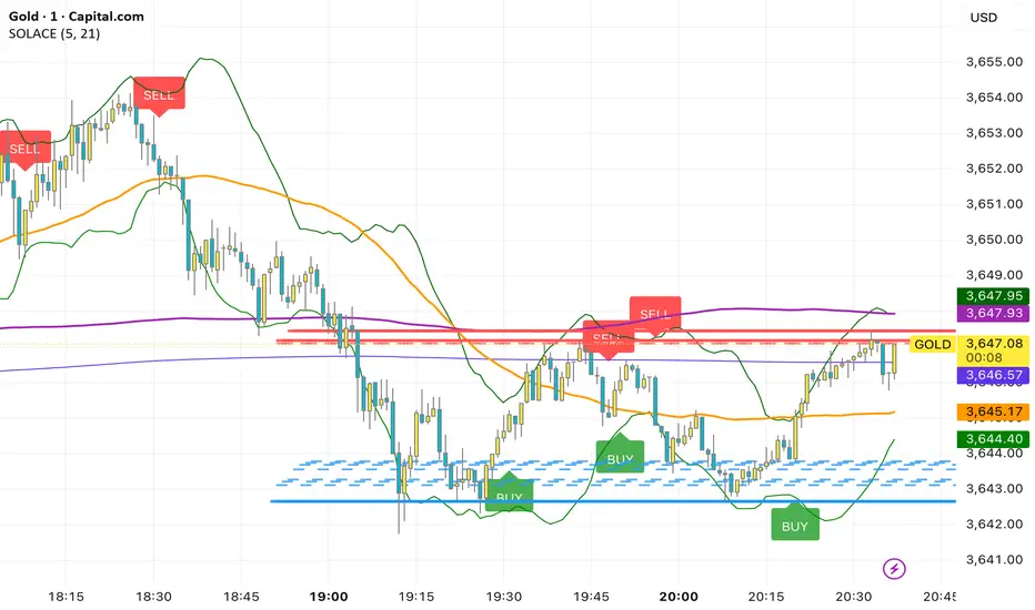
SOLACEThis overlay combines a fast/slow EMA price-action system with rich context tools. Buy prints on the current bar when both EMAs (5 & 21) are below the OHLC average and the 21 EMA crosses below the 5 EMA; Sell prints when both EMAs are above the average and the 21 EMA crosses above the 5 EMA. It also plots MACD, VWAP, Bollinger Bands (20,2), SMA50/200, plus dynamic support/resistance lines from recent swing highs/lows (20/40/60 bars) for confluence. Labels fire same-bar for early entries, and alerts are included for both signals; fractal logic is prepared for future use.
JST & MT5 hourly + Sessions shade (subpanel, v6)このインジケーターは、TradingViewのタイムゾーンをNY時間に設定している際に、日本国内居住者が東京時間(JST)とMetaTraderのサーバー時間(MSK/MT5)を把握しやすくするためのツールです。
チャート下部にJSTとMT5の時間メモリを表示し、取引時間の対応関係を直感的に確認できます。
セッションごとの背景シェード(東京・ロンドン・NY)にも対応しており、時間認識を補助します。
This indicator helps traders based in Japan easily keep track of Tokyo time (JST) and MetaTrader server time (MSK/MT5) when using TradingView with the timezone set to New York (a common choice worldwide).
It displays JST and MT5 time markers along the bottom of the chart, making the relation between trading sessions more intuitive.
Background shading for Tokyo, London, and New York sessions is also included to assist time awareness.

PE Rating by The Noiseless TraderPE Rating by The Noiseless Trader
This script analyzes a symbol’s Price-to-Earnings (P/E) ratio, using Diluted EPS (TTM) fundamentals directly from TradingView.
The script calculates the Price-to-Earnings ratio (P/E) using Diluted EPS (TTM) fundamentals. It then identifies:
PE High → the highest valuation point over a 3-year historical range.
PE Low → the lowest valuation point over a 3-year historical range.
PE Median → the midpoint between the two extremes, offering a fair-value benchmark.
PE (Int) → an additional intermediate low to track more recent undervaluation points. This is calculated based on lowest valuation point over a 1-year historical range
These levels are plotted directly on the chart as horizontal references, with markers showing the exact bars/dates when the extremes occurred. Candles corresponding to those days are also highlighted for context.
Bars corresponding to these extremes are highlighted (red = PE High, green = PE Low).
How it helps
Provides a historical valuation framework that complements technical analysis. We look for long opportunity or base formation near the PE Low and be cautious when stocks tends to trade near High PE.
We do not short the stock at High PE infact be cautious with long trades.
Helps identify whether current price action is happening near overvalued or undervalued zones.
Adds a long-term perspective to support swing trading and investing decisions. If a stock is coming from Low PE to Median PE and along with that if we get entry based on Classical strategies like Darvas Box, or HH-HL based on Dow Theory.
Offers a simple visual map of how far the market has moved from “cheap” to “expensive.”
This tool is best suited for long-term investors and swing traders who want to merge fundamentals with technical setups.
This indicator is designed as an educational tool to illustrate how valuation metrics (like earnings multiples) can be viewed alongside price action, helping traders connect fundamental context with technical execution in real market conditions.


ATR Future Movement Range Projection
The "ATR Future Movement Range Projection" is a custom TradingView Pine Script indicator designed to forecast potential price ranges for a stock (or any asset) over short-term (1-month) and medium-term (3-month) horizons. It leverages the Average True Range (ATR) as a measure of volatility to estimate how far the price might move, while incorporating recent momentum bias based on the proportion of bullish (green) vs. bearish (red) candles. This creates asymmetric projections: in bullish periods, the upside range is larger than the downside, and vice versa.
The indicator is overlaid on the chart, plotting horizontal lines for the projected high and low prices for both timeframes. Additionally, it displays a small table in the top-right corner summarizing the projected prices and the percentage change required from the current close to reach them. This makes it useful for traders assessing potential targets, risk-reward ratios, or option strategies, as it combines volatility forecasting with directional sentiment.
Key features:
- **Volatility Basis**: Uses weekly ATR to derive a stable daily volatility estimate, avoiding noise from shorter timeframes.
- **Momentum Adjustment**: Analyzes recent candle colors to tilt projections toward the prevailing trend (e.g., more upside if more green candles).
- **Time Horizons**: Fixed at 1 month (21 trading days) and 3 months (63 trading days), assuming ~21 trading days per month (excluding weekends/holidays).
- **User Adjustable**: The ATR length/lookback (default 50) can be tweaked via inputs.
- **Visuals**: Green/lime lines for highs, red/orange for lows; a semi-transparent table for quick reference.
- **Limitations**: This is a probabilistic projection based on historical volatility and momentum—it doesn't predict direction with certainty and assumes volatility persists. It ignores external factors like news, earnings, or market regimes. Best used on daily charts for stocks/ETFs.
The indicator doesn't generate buy/sell signals but helps visualize "expected" ranges, similar to how implied volatility informs option pricing.
### How It Works Step-by-Step
The script executes on each bar update (typically daily timeframe) and follows this logic:
1. **Input Configuration**:
- ATR Length (Lookback): Default 50 bars. This controls both the ATR calculation period and the candle count window. You can adjust it in the indicator settings.
2. **Calculate Weekly ATR**:
- Fetches the ATR from the weekly timeframe using `request.security` with a length of 50 weeks.
- ATR measures average price range (high-low, adjusted for gaps), representing volatility.
3. **Derive Daily ATR**:
- Divides the weekly ATR by 5 (approximating 5 trading days per week) to get an equivalent daily volatility estimate.
- Example: If weekly ATR is $5, daily ATR ≈ $1.
4. **Define Projection Periods**:
- 1 Month: 21 trading days.
- 3 Months: 63 trading days (21 × 3).
- These are hardcoded but based on standard trading calendar assumptions.
5. **Compute Base Projections**:
- Base projection = Daily ATR × Days in period.
- This gives the total expected movement (range) without direction: e.g., for 3 months, $1 daily ATR × 63 = $63 total range.
6. **Analyze Candle Momentum (Win Rate)**:
- Counts green candles (close > open) and red candles (close < open) over the last 50 bars (ignores dojis where close == open).
- Total colored candles = green + red.
- Win rate = green / total colored (as a fraction, e.g., 0.7 for 70%). Defaults to 0.5 if no colored candles.
- This acts as a simple momentum proxy: higher win rate implies bullish bias.
7. **Adjust Projections Asymmetrically**:
- Upside projection = Base projection × Win rate.
- Downside projection = Base projection × (1 - Win rate).
- This skews the range: e.g., 70% win rate means 70% of the total range allocated to upside, 30% to downside.
8. **Calculate Projected Prices**:
- High = Current close + Upside projection.
- Low = Current close - Downside projection.
- Done separately for 1M and 3M.
9. **Plot Lines**:
- 3M High: Solid green line.
- 3M Low: Solid red line.
- 1M High: Dashed lime line.
- 1M Low: Dashed orange line.
- Lines extend horizontally from the current bar onward.
10. **Display Table**:
- A 3-column table (Projection, Price, % Change) in the top-right.
- Rows for 1M High/Low and 3M High/Low, color-coded.
- % Change = ((Projected price - Close) / Close) × 100.
- Updates dynamically with new data.
The entire process repeats on each new bar, so projections evolve as volatility and momentum change.
### Examples
Here are two hypothetical examples using the indicator on a daily chart. Assume it's applied to a stock like AAPL, but with made-up data for illustration. (In TradingView, you'd add the script to see real outputs.)
#### Example 1: Bullish Scenario (High Win Rate)
- Current Close: $150.
- Weekly ATR (50 periods): $10 → Daily ATR: $10 / 5 = $2.
- Last 50 Candles: 35 green, 15 red → Total colored: 50 → Win Rate: 35/50 = 0.7 (70%).
- Base Projections:
- 1M: $2 × 21 = $42.
- 3M: $2 × 63 = $126.
- Adjusted Projections:
- 1M Upside: $42 × 0.7 = $29.4 → High: $150 + $29.4 = $179.4 (+19.6%).
- 1M Downside: $42 × 0.3 = $12.6 → Low: $150 - $12.6 = $137.4 (-8.4%).
- 3M Upside: $126 × 0.7 = $88.2 → High: $150 + $88.2 = $238.2 (+58.8%).
- 3M Downside: $126 × 0.3 = $37.8 → Low: $150 - $37.8 = $112.2 (-25.2%).
- On the Chart: Green/lime lines skewed higher; table shows bullish % changes (e.g., +58.8% for 3M high).
- Interpretation: Suggests stronger potential upside due to recent bullish momentum; useful for call options or long positions.
#### Example 2: Bearish Scenario (Low Win Rate)
- Current Close: $50.
- Weekly ATR (50 periods): $3 → Daily ATR: $3 / 5 = $0.6.
- Last 50 Candles: 20 green, 30 red → Total colored: 50 → Win Rate: 20/50 = 0.4 (40%).
- Base Projections:
- 1M: $0.6 × 21 = $12.6.
- 3M: $0.6 × 63 = $37.8.
- Adjusted Projections:
- 1M Upside: $12.6 × 0.4 = $5.04 → High: $50 + $5.04 = $55.04 (+10.1%).
- 1M Downside: $12.6 × 0.6 = $7.56 → Low: $50 - $7.56 = $42.44 (-15.1%).
- 3M Upside: $37.8 × 0.4 = $15.12 → High: $50 + $15.12 = $65.12 (+30.2%).
- 3M Downside: $37.8 × 0.6 = $22.68 → Low: $50 - $22.68 = $27.32 (-45.4%).
- On the Chart: Red/orange lines skewed lower; table highlights larger downside % (e.g., -45.4% for 3M low).
- Interpretation: Indicates bearish risk; might prompt protective puts or short strategies.
#### Example 3: Neutral Scenario (Balanced Win Rate)
- Current Close: $100.
- Weekly ATR: $5 → Daily ATR: $1.
- Last 50 Candles: 25 green, 25 red → Win Rate: 0.5 (50%).
- Projections become symmetric:
- 1M: Base $21 → Upside/Downside $10.5 each → High $110.5 (+10.5%), Low $89.5 (-10.5%).
- 3M: Base $63 → Upside/Downside $31.5 each → High $131.5 (+31.5%), Low $68.5 (-31.5%).
- Interpretation: Pure volatility-based range, no directional bias—ideal for straddle options or range trading.
In real use, test on historical data: e.g., if past projections captured actual moves ~68% of the time (1 standard deviation for ATR), it validates the volatility assumption. Adjust the lookback for different assets (shorter for volatile cryptos, longer for stable blue-chips).

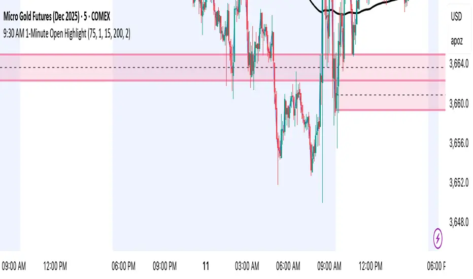
9:30 AM 1-Minute Open HighlightThis script highlights the 1st 1 min candle of the NY session (9:30 AM candle). This area can be used for retests, entries, targets, etc. I will continue making updates to this. This script allows you to highlight the shaded box to the color of your choosing, choose how many days the first 1 minute candle will be highlighted, as well as other customizable features. Please let me know if you have any suggestions. Thanks.
KT_Global Bond Yields by CountryGlobal Bond Yields Indicator Summary
The Global Bond Yields by Country indicator, developed for Trading View (Pine Script v5), provides a comprehensive tool for visualizing and analyzing government bond yields across multiple countries and maturities. Below are its key features:
Features
Country Selection: Choose from 20 countries, including the United States, China, Japan, Germany, United Kingdom, and more, to display their respective bond yields.
Multiple Maturities: Supports 18 bond maturities ranging from 1 month to 40 years, allowing users to analyze short-term to long-term yield trends.
Customizable Display:
Toggle visibility for each maturity (1M, 3M, 6M, 1Y, 2Y, 3Y, 4Y, 5Y, 6Y, 7Y, 8Y, 9Y, 10Y, 15Y, 20Y, 25Y, 30Y, 40Y) individually.
Option to show or hide all maturities with a single toggle for streamlined analysis.
10Y-2Y Yield Spread: Plots the difference between 10-year and 2-year bond yields, a key indicator of yield curve dynamics, with an option to enable/disable.
Zero Line Reference: Displays a dashed grey horizontal line at zero for clear visual reference.
Color-Coded Plots: Each maturity is plotted with a distinct color, ranging from lighter shades (short-term) to darker shades (long-term), for easy differentiation.
Country Label: Displays the selected country's name as a large, prominent label on the chart for quick identification.
Error Handling: Alerts users if an invalid country is selected, ensuring robust operation.
Data Integration: Fetches bond yield data from Trading View's database (e.g., TVC:US10Y) with support for ignoring invalid symbols to prevent errors.
This indicator is ideal for traders and analysts monitoring global fixed-income markets, yield curve shapes, and cross-country comparisons.

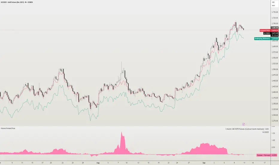
Futures Forward Price [NeoButane]In futures markets, the theoretical value of a futures contract can be derived from its underlying price and cost of carry. By baking in the costs and potential yields, the theoretical forward price then be used in basis against futures prices in place of the underlying spot price.
Usage
The script creates plots on the main chart and a separate window pane. Both are meant to be used to visualize dislocations in the market.
By using a futures vs. forward basis instead of futures vs. spot basis, discounts in the market are clearer.
Last month, the gold futures market GCZ2025 traded >1% above forward price when tariffs were announced and fell back in line once the tariffs were verbally retracted.
View roll spreads over a back-adjusted continuous chart. I guess. I don't think spread traders only look at one chart. This is as educational for me as it is you.
Configuration
The underlying reference needs to be changed to match the futures contract you are using.
The Risk-Free Rate defaults to FRED:SOFR. I found the contract month matched 3-Month SOFR Futures to be the closest for forward price.
Risk-Free Rate: The interest rate source for forward price.
Constant Risk-Free Rate: a static interest rate that can be used in advance of future changes in risk-free rate.
Underlying Reference: spot or index price. Some examples include TVC:SPX, TVC:GOLD, CRYPTO:BTCUSD, TVC:USOIL.
Forward Price Compounding: determines which formula to use. They're similar and become closer as the contract matures.
Alternative Contract: enable and select a futures contract to use it on a chart different than the main.
Storage Cost and Yield: for use with commodities. I haven't found a proper use for them yet but enabling is simple if you are able to.
The following are meant to be used with the continuous formula as they are compounded. However the rate sources don't differ much for the purpose of futures prices.
3-Month CME SOFR Futures
3-Month ICEEUR SONIA Futures
3-Month Osaka TONA Futures
The other rate sources are either meant for futures contracts shorter than quarterly such as monthly crypto futures or were meant to help myself understand how different rates would align with futures prices, like inflation.
What this script does
It uses the cost of carry formula to output the forward price (red line). The underlying reference (green line) is plotted alongside and a futures-derived reference (blue line) can be displayed to see how it looks next to the real reference price.
The data pane displays either the nominal difference or percentage difference between the real futures price and the calculated forward price.
Further reading
www.investopedia.com
www.cmegroup.com
www.oxfordenergy.org
www-2.rotman.utoronto.ca
www.cmegroup.com
3-month rate futures
www.cmegroup.com
www.ice.com
www.bankofengland.co.uk
www.jpx.co.jp
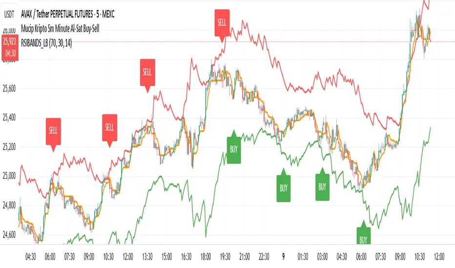
Mucip Kripto 5m Minute Al-Sat Buy-Sell
“This is the technique I use on major cryptocurrencies in the 5-minute timeframe. I combine it with RSI Bands. It can be improved further, and I’m open to ideas.”
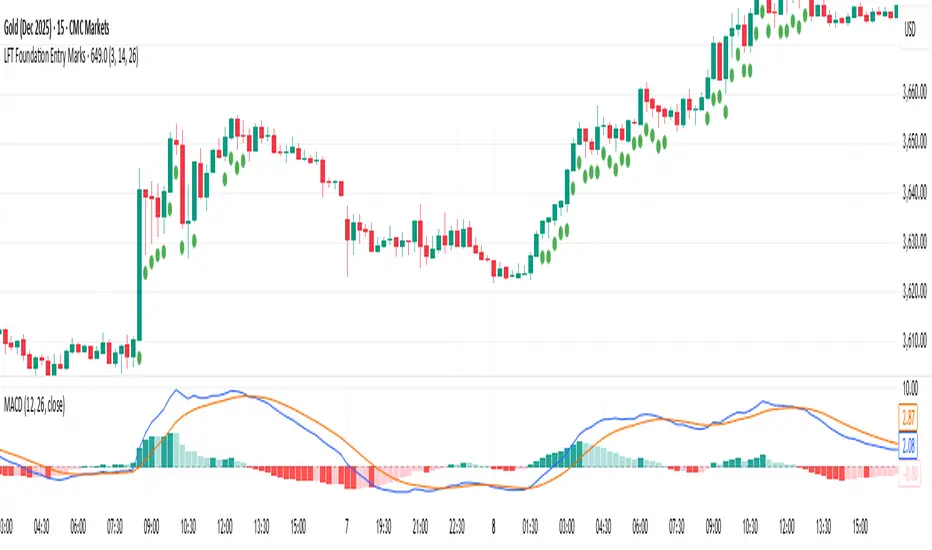
LFT Foundation Entry MarksThis algorithm highlights optimal long entry points. Once the entry conditions break down—indicating the price is likely to decline—the signals stop, allowing the user to exit before the drop
3X Sniper BotThe 3X Sniper Bot is built for traders who demand clarity, precision, and confidence in their decision-making. This tool isn’t just another crossover script—it’s a full multi-confirmation system that helps you spot momentum shifts, identify high-probability entries, and filter out the noise.
🔥 Why traders love it:
Triple confirmation engine: Only fires when multiple conditions align, reducing false signals.
Strong vs. Regular vs. Possible setups: Get nuanced alerts that distinguish between high-conviction moves and early opportunities.
Both Buy & Sell coverage: Stay prepared in any market environment.
Smart flexibility: Works across strict or sequenced signal modes, giving you control over how conservative or aggressive you want to trade.
Visual clarity: Clean chart markers and optional regime shading keep your screen easy to read at a glance.
Alert-ready: Set and forget—never miss a move with real-time TradingView alerts.
This indicator was designed to make complex multi-factor analysis simple, giving traders a clear visual edge without clutter or guesswork. Whether you scalp intraday or swing multi-day, the 3X Sniper Bot adapts to your style.

Trend FriendTrend Friend — What it is and how to use it
I built Trend Friend to stop redrawing the same trendlines all day. It automatically connects confirmed swing points (fractals) and keeps the most relevant lines in front of you. The goal: give you clean, actionable structure without the guesswork.
What it does (in plain English)
Finds swing highs/lows using a Fractal Period you choose.
Draws auto-trendlines between the two most recent confirmed highs and the two most recent confirmed lows.
Colours by intent:
Lines drawn from highs (potential resistance / bearish) = Red
Lines drawn from lows (potential support / bullish) = Green
Keeps the chart tidy: The newest lines are styled as “recent,” older lines are dimmed as “historical,” and it prunes anything beyond your chosen limit.
Optional crosses & alerts: You can highlight when price closes across the most recent line and set alerts for new lines formed and upper/lower line crosses.
Structure labels: It tags HH, LH, HL, LL at the swing points, so you can quickly read trend/rotation.
How it works (under the hood)
A “fractal” here is a confirmed pivot: the highest high (or lowest low) with n bars on each side. That means pivots only confirm after n bars, so signals are cleaner and less noisy.
When a new pivot prints, the script connects it to the prior pivot of the same type (high→high, low→low). That gives you one “bearish” line from highs and one “bullish” line from lows.
The newest line is marked as recent (brighter), and the previous recent line becomes historical (dimmed). You can keep as many pairs as you want, but I usually keep it tight.
Inputs you’ll actually use
Fractal Period (n): this is the big one. It controls how swingy/strict the pivots are.
Lower n → more swings, more lines (faster, noisier)
Higher n → fewer swings, cleaner lines (slower, swing-trade friendly)
Max pair of lines: how many pairs (up+down) to keep on the chart. 1–3 is a sweet spot.
Extend: extend lines Right (my default) or Both ways if you like the context.
Line widths & colours: recent vs. historical are separate so you can make the active lines pop.
Show crosses: toggle the X markers when price crosses a line. I turn this on when I’m actively hunting breakouts/retests.
Reading the chart
Red lines (from highs): I treat these as potential resistance. A clean break + hold above a red line often flips me from “fade” to “follow.”
Green lines (from lows): Potential support. Same idea in reverse: break + hold below and I stop buying dips until I see structure reclaim.
HH / LH / HL / LL dots: quick read on structure.
HH/HL bias = uptrend continuation potential
LH/LL bias = downtrend continuation potential
Mixed prints = rotation/chop—tighten risk or wait for clarity.
My H1 guidance (fine-tuning Fractal Period)
If you’re mainly on H1 (my use case), tune like this:
Fast / aggressive: n = 6–8 (lots of signals, good for momentum days; more chop risk)
Balanced (recommended): n = 9–12 (keeps lines meaningful but responsive)
Slow / swing focus: n = 13–21 (filters noise; better for trend days and higher-TF confluence)
Rule of thumb: if you’re getting too many touches and whipsaws, increase n. If you’re late to obvious breaks, decrease n.
How I trade it (example workflow)
Pick your n for the session (H1: start at 9–12).
Mark the recent red & green lines. That’s your immediate structure.
Look for interaction:
Rejections from a line = fade potential back into the range.
Break + close across a line = watch the retest for continuation.
Confirm with context: session bias, HTF structure, and your own tools (VWAP, RSI, volume, FVG/OB, etc.).
Plan the trade: enter on retest or reclaim, stop beyond the line/last swing, target the opposite side or next structure.
Alerts (set and forget)
“New trendline formed” — fires when a new high/low pivot confirms and a fresh line is drawn.
“Upper/lower trendline crossed” — fires when price crosses the most recent red/green line.
Use these to track structure shifts without staring at the screen.
Good to know (honest limitations)
Confirmation lag: pivots need n bars on both sides, so signals arrive after the swing confirms. That’s by design—less noise, fewer fake lines.
Lines update as structure evolves: when a new pivot forms, the previous “recent” line becomes “historical,” and older ones can be removed based on your max setting.
Not an auto trendline crystal ball: it won’t predict which line holds or breaks—it just keeps the most relevant structure clean and up to date.
Final notes
Works on any timeframe; I built it with H1 in mind and scale to H4/D1 by increasing n.
Pairs nicely with session tools and VWAP for intraday, or with supply/demand / FVGs for swing planning.
Risk first: lines are structure, not guarantees. Manage position size and stops as usual.
Not financial advice. Trade your plan. Stay nimble.

Volumatic Fair Value Gaps [BigBeluga]🔵 OVERVIEW
The Volumatic Fair Value Gaps indicator detects and plots size-filtered Fair Value Gaps (FVGs) and immediately analyzes the bullish vs. bearish volume composition inside each gap. When an FVG forms, the tool samples volume from a 10× lower timeframe , splits it into Buy and Sell components, and overlays two compact bars whose percentages always sum to 100%. Each gap also shows its total traded volume . A live dashboard (top-right) summarizes how many bullish and bearish FVGs are currently active and their cumulative volumes—offering a quick read on directional participation and trend pressure.
🔵 CONCEPTS
FVGs (Fair Value Gaps) : Imbalance zones between three consecutive candles where price “skips” trading. The script plots bullish and bearish gaps and extends them until mitigated.
Size Filtering : Only significant gaps (by relative size percentile) are drawn, reducing noise and emphasizing meaningful imbalances.
// Gap Filters
float diff = close > open ? (low - high ) / low * 100 : (low - high) / high *100
float sizeFVG = diff / ta.percentile_nearest_rank(diff, 1000, 100) * 100
bool filterFVG = sizeFVG > 15
Volume Decomposition : For each FVG, the indicator inspects a 10× lower timeframe and aggregates volume of bullish vs. bearish candles inside the gap’s span.
100% Split Bars : Two inline bars per FVG display the % Bull and % Bear shares; their total is always 100%.
Total Gap Volume : A numeric label at the right edge of the FVG shows the total traded volume associated with that gap.
Mitigation Logic : Gaps are removed when price closes through (or touches via high/low—user-selectable) the opposite boundary.
Dashboard Summary : Counts and sums the active bullish/bearish FVGs and their total volumes to gauge directional dominance.
🔵 FEATURES
Bullish & Bearish FVG plotting with independent color controls and visibility toggles.
Adaptive size filter (percentile-based) to keep only impactful gaps.
Lower-TF volume sampling at 10× faster resolution for more granular Buy/Sell breakdown.
Per-FVG volume bars : two horizontal bars showing Bull % and Bear % (sum = 100%).
Per-FVG total volume label displayed at the right end of the gap’s body.
Mitigation source option : choose close or high/low for removing/invalidating gaps.
Overlap control : older overlapped gaps are cleaned to avoid clutter.
Auto-extension : active gaps extend right until mitigated.
Dashboard : shows count of bullish/bearish gaps on chart and cumulative volume totals for each side.
Performance safeguards : caps the number of active FVG boxes to maintain responsiveness.
🔵 HOW TO USE
Turn on/off FVG types : Enable Bullish FVG and/or Bearish FVG depending on your focus.
Tune the filter : The script already filters by relative size; if you need fewer (stronger) signals, increase the percentile threshold in code or reduce the number of displayed boxes.
Choose mitigation source :
close — stricter; gap is removed when a closing price crosses the boundary.
high/low — more sensitive; a wick through the boundary mitigates the gap.
Read the per-FVG bars :
A higher Bull % inside a bullish gap suggests constructive demand backing the imbalance.
A higher Bear % inside a bearish gap suggests supply is enforcing the imbalance.
Use total gap volume : Larger totals imply more meaningful interest at that imbalance; confluence with structure/HTF levels increases relevance.
Watch the dashboard : If bullish counts and cumulative volume exceed bearish, market pressure is likely skewed upward (and vice versa). Combine with trend tools or market structure for entries/exits.
Optional: hide volume bars : Disable Volume Bars when you want a cleaner FVG map while keeping total volume labels and the dashboard.
🔵 CONCLUSION
Volumatic Fair Value Gaps blends precise FVG detection with lower-timeframe volume analytics to show not only where imbalances exist but also who powers them. The per-gap Bull/Bear % bars, total volume labels, and the cumulative dashboard together provide a fast, high-signal read on directional participation. Use the tool to prioritize higher-quality gaps, align with trend bias, and time mitigations or continuations with greater confidence.

Bias Money PrinterThe MSB indicator is a price-action tool designed to automatically map out swing highs, swing lows, and structural breaks on any chart. It highlights when the market transitions between bullish and bearish phases by plotting zigzag structures and labeling key break points.
✅ Key Features
Identifies swing highs and lows in real time
Marks Market Structure Breaks (MSBs) for clearer trend shifts
Helps traders define bullish vs. bearish bias based on structure
Works across all timeframes and markets (forex, futures, crypto, stocks)
Simple visual cues for trend continuation vs. reversal
🎯 Purpose
This indicator removes guesswork from market structure analysis by visually mapping breakpoints where price confirms a new direction. Traders can combine it with volume, supply/demand, or order blocks for high-confidence setups.

Trajectory Channel (VWAP Highs/Lows) [Euler-Inspired]VPWA higha nd low Euler trajectory inspired script

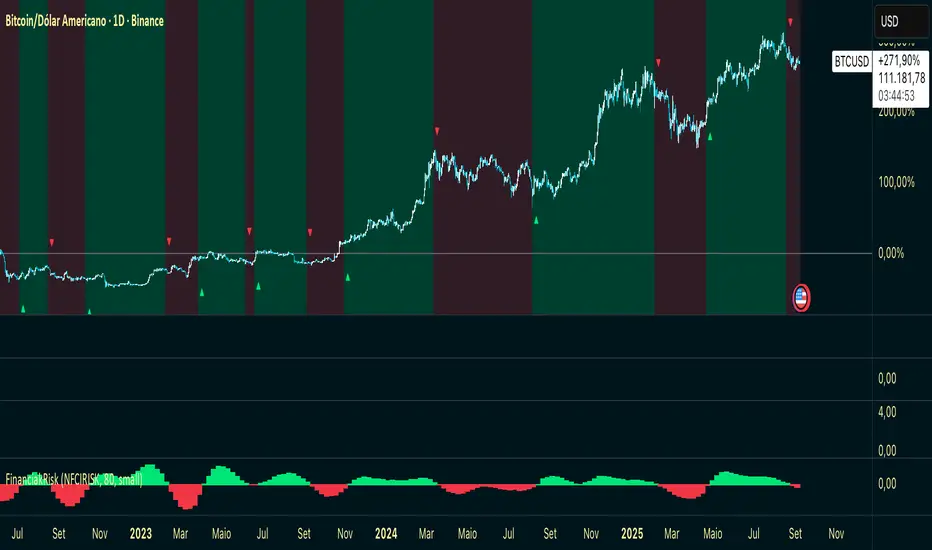
Financial Risk AlphaHere’s the description in English, formatted with ` ` for TradingView:
---
\ Financial Risk Alpha\ is a macroeconomic indicator that tracks weekly changes in the \ NFCI Risk Index\ (Federal Reserve).
It translates shifts in financial conditions into an easy-to-read histogram:
* \ Green bars\ → Loosening of financial conditions (risk-on environment).
* \ Red bars\ → Tightening of financial conditions (increased systemic risk).
* \ Background shading\ in translucent green/red (CS Alpha style), highlighting the prevailing liquidity regime.
* \ Visual signals\ : \ green arrows below\ the price when conditions flip to risk-on, and \ red arrows above\ the price when conditions flip to risk-off.
\ Usage\ :
Financial Risk Alpha is designed for traders and analysts seeking to align their strategies with global financial risk dynamics. It serves as an \ early warning tool\ for shifts in risk appetite, helping anticipate potential turning points in the market.
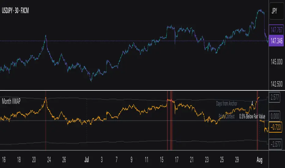
Monthly VWAPDescription
This indicator identifies potential mean reversion opportunities by tracking price deviations from monthly VWAP with dynamic volatility-adjusted thresholds.
Core Logic:
The indicator monitors when price moves significantly away from monthly VWAP and looks for potential reversal opportunities. It uses ATR-based dynamic thresholds that adapt to current market volatility, combined with volume confirmation to filter out weak signals.
Key Features:
Adaptive Thresholds: ATR-based bands that adjust to market volatility
Volume Confirmation: Requires average volume spike to validate signals
Monthly Reset: VWAP anchors reset each month for fresh reference levels
Visual Clarity: Color-coded deviation line with background highlights for active signals
Info Panel: Shows days from anchor and current price context vs fair value
Signal Generation:
Buy Signal: Price below monthly VWAP by threshold amount with elevated volume
Sell Signal: Price above monthly VWAP by threshold amount with elevated volume
Neutral: Price within threshold range or insufficient volume
Best Used For:
Mean reversion strategies in ranging markets
Identifying potential oversold/overbought conditions
Understanding price position relative to monthly fair value
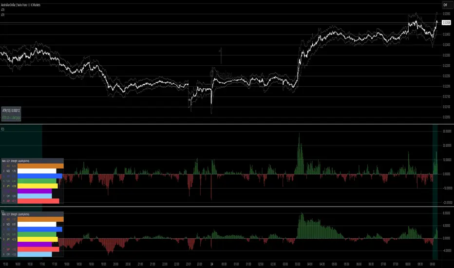
Forex Currency Strength What this indicator does
It compares the relative strength of the 8 major currencies (USD, EUR, GBP, JPY, AUD, CAD, NZD, CHF) by looking at all 28 currency pairs. Each currency is smoothed (averaged) with a moving average to reduce noise.
From this it shows:
• Currency strength lines → how each major currency is performing over time (optional view).
• Pair divergence histogram → the difference in strength between the two currencies of the chart pair (e.g. EUR vs USD on an EURUSD chart). Green means the base currency is stronger, red means the quote currency is stronger.
• Ranking table → shows the strongest to weakest currency at the current moment. The strongest is highlighted green, the weakest red.
• Session highlighting → shows your chosen trading session on the chart (background shading, optional vertical line at the session start).
• Alerts → you can set TradingView alerts when:
• the pair divergence crosses above or below zero
• the divergence strength gets big enough (above your threshold)
• the difference between the strongest and weakest currency becomes large
⸻
👉 In plain words:
This indicator helps you quickly see which currencies are strong, which are weak, and whether the pair you are trading has a clear directional bias. It also highlights trading sessions and can notify you when strong moves or imbalances appear.
// ─────────────────────────────────────────────────────────────
// Forex Currency Strength (8 Majors, %R) + Divergence + Ranking
// ─────────────────────────────────────────────────────────────
//
// === Inputs ===
//
// exchPrefix → Broker/feed prefix (e.g. "OANDA:", "FX:", or "" for ICMarkets)
// tf → Data timeframe (empty = chart timeframe)
// smoothLen → Smoothing length (MA) for currency strength (default = 14)
// smoothMethod → MA method (SMA, EMA, WMA, DEMA)
// viewMode → Display mode: "Strength Lines", "Pair Divergence", "Both"
// (Tip: set to "Pair Divergence" to hide lines by default)
// barsLimit → Number of bars to display
//
// sessionStr → Trading session time (e.g. "0800-1700"); session is highlighted on chart
//
// alertDivAbs → Threshold for alerts on |divergence|
// alertGapTF → Threshold for alerts on Top–Flop ranking gap
//
// scaleK → Scaling factor (here ×1000)
//
// rankPos → Position of the ranking table (top/bottom left/right)
// rankTextSize → Font size for the ranking table (tiny, small, normal, large, huge)
//
// === Outputs ===
//
// • 8 currency strength lines (optionally visible)
// • Divergence (current pair) as histogram
// • Ranking table (top & flop highlighted)
// • Session highlighting (background color + optional vertical line)
// • Alerts on divergence crosses, |divergence| thresholds & top–flop gaps
//
// === Alert Conditions ===
//
// longDivCross → Divergence (current pair) crosses above 0
// shortDivCross → Divergence (current pair) crosses below 0
// divAbsUp → |Divergence| exceeds alertDivAbs threshold
// gapUp → Top–Flop ranking gap exceeds alertGapTF threshold
//
// ─────────────────────────────────────────────────────────────
Swing Guardrail — 30-sec Midterm Check (EBITDA Margin & EV/EBITDWhat it does
Before a short-term swing entry, this indicator right-sizes positions by a quick midterm (3–12m) durability screen using two fundamentals:
EBITDA Margin (TTM) → earning power / operational resilience
EV/EBITDA (TTM) → price tag vs earning capacity (payback feel)
A high-contrast table (top-right) shows both metrics and a verdict:
PASS — both meet thresholds → normal size
HALF — only one meets → reduce size
FAIL — neither meets → avoid
Why check “midterm” for a short-term trade?
Short swings still face earnings/news gaps, failed breakouts, and regime shifts. Names with weak margins or stretched valuation tend to break faster and deeper. A 30-sec durability check helps you:
Filter fragile setups (avoid expensive + weakening names)
Stabilize drawdowns (size down when quality/price don’t align)
Keep timing unchanged while improving risk-adjusted returns
Inputs (defaults)
Min EBITDA Margin % (TTM): 8%
Max EV/EBITDA (TTM): 12
Dark chart? High-contrast colors
How to use with a swing system
Get your entry from price/volume (e.g., Ichimoku cloud break, Kijun reclaim, Tenkan>Kijun; or your A/B/C rules).
Run this check only to set size (not timing).
Optional alerts: Once per bar close for PASS / HALF / FAIL.
Size mapping & event guard
PASS → 100% of your planned size
HALF → ~50% size / tighter stops
FAIL → watchlist only
If earnings < ~10 JP business days, drop one tier; ≤3 days → avoid.
Sector guides (tweak as needed)
Software/Internet: Margin ≥ 15%, EV/EBITDA ≤ 18
Industrials/Consumer: Margin ≥ 8%, EV/EBITDA ≤ 12
Retail: Margin ≥ 5–7%, EV/EBITDA ≤ 10–12
Edge cases / substitutions
Banks/Insurers/REITs or net-cash/negative EBITDA: EV/EBITDA may mislead → consider Net Debt/EBITDA or sector metrics (CET1/LTV/DSCR).
Sparse data / fresh listings: numbers may be NA until updates.
Notes & limitations
Data via request.financial() (TTM/most-recent). Some tickers/regions can show NA until fundamentals refresh.
This is a risk-screen / sizing tool, not a buy/sell signal.
Disclaimer
Educational use only. Not investment advice.
日本語
タイトル
スイング用ガードレール―中期“壊れにくさ”30秒チェック(EBITDAマージン & EV/EBITDA, TTM)
概要
短期スイングのエントリー前に、中期(3〜12か月)の耐久性を2指標で素早く確認し、ポジションサイズを決めるためのツールです。
EBITDAマージン(TTM):事業の稼ぐ力・体力
EV/EBITDA(TTM):その体力に対する“値札”(回収年数の感覚)
右上の高コントラスト表に数値と判定を表示:
PASS:両方クリア → 通常サイズ
HALF:片方のみ → サイズ半分
FAIL:両方NG → 見送り
なぜ短期でも“中期”を確認?
短期でも決算・ニュースのギャップ、ブレイク失敗、地合い転換は起きます。マージンが弱い/割高すぎる銘柄は崩れやすく、戻りも鈍い傾向。30秒の耐久性チェックで
脆いセットアップを回避
ドローダウンを平準化(サイズで吸収)
タイミングは変えずに、リスク調整後リターンの改善を狙えます。
入力(既定)
最低EBITDAマージン:8%
最大EV/EBITDA:12
黒背景向け:高コントラスト表示
使い方(スイング手法と併用)
まずは価格シグナル(一目の雲上抜け/基準線回復/転換線>基準線、またはA/B/Cルール)。
本インジの判定でサイズのみ決定(エントリーのタイミングは出しません)。
任意でバー確定アラート(PASS/HALF/FAIL)を設定。
サイズ目安 & イベント抑制
PASS:計画サイズ100%
HALF:約50%(ストップもタイトに)
FAIL:見送り
決算まで≦10営業日なら1段階サイズダウン、≦3営業日は原則見送り。
セクター目安(調整推奨)
ソフト/ネット:マージン 15%以上、EV/EBITDA 18以下
工業/一般消費:マージン 8%以上、EV/EBITDA 12以下
小売:マージン 5〜7%以上、EV/EBITDA 10〜12以下
例外・代替
銀行・保険・REIT/ネットキャッシュ・EBITDAマイナス:EV/EBITDAは適さない場合 → Net Debt/EBITDAやCET1/LTV/DSCR等で補助。
新規上場・データ薄:更新までNAのことあり。
注意
データは request.financial() を使用。更新前はNAの可能性。
本ツールはリスク確認/サイズ調整用で、売買シグナルではありません。
免責
情報提供のみ。投資判断は自己責任で。
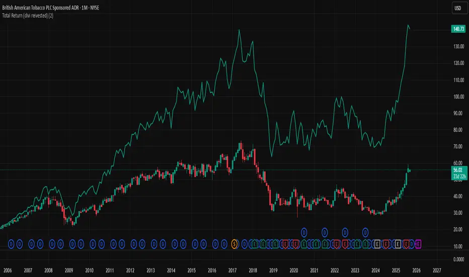
Total Return (divi reivested)Total Return (Dividends Reinvested) — Price Scale
This indicator overlays a Total Return price line on the chart. It shows how the stock would have performed if all dividends had been reinvested back into the stock (buying fractional shares) rather than taken as cash.
The line starts exactly at the price level of the first visible bar on your chart and moves in the same price units as the chart (not indexed to 100).
Until the first dividend inside the visible window, the Total Return line is identical to the price. From the first dividend onward, it gradually diverges upwards, reflecting the effect of reinvested payouts.
Settings:
Reinvest at Open / Close — Choose whether reinvestment uses the bar’s open or close price.
Apply effect on the next bar — If enabled, reinvestment shows up from the bar after the dividend date (common in practice).
Show dividend markers — Optionally plots labels where dividend events occur.
Line width — Adjusts the thickness of the plotted Total Return line.
Use case:
This tool is useful if you want to compare plain price performance with true shareholder returns including dividends. It helps evaluate dividend stocks (like BTI, T, XOM, etc.) more realistically.