BADSHAHI TRADINGTradingView indicator that posts buy and sell signals along with support and resistance levels, you need to develop a Pine Script that identifies key support and resistance levels and then displays buy and sell signals based on certain conditions. Here's a breakdown of how to approach this:
1. Support and Resistance Basics
Support and resistance are critical concepts in technical analysis:
Support: This is a price level where an asset tends to find buying interest, preventing the price from dropping further.
Resistance: This is a price level where selling pressure tends to increase, preventing the price from rising further.
To detect support and resistance, we typically use methods like pivot points, recent swing highs/lows, or price levels that have repeatedly reversed direction in the past.
2. Buy and Sell Signals
Buy and sell signals are often generated based on certain criteria like:
Price crossing above or below a moving average
Candlestick patterns (like Doji, engulfing)
Breakouts from support/resistance levels
In this example, we’ll consider a simple strategy where:
Buy signal is generated when the price breaks above resistance.
Sell signal is generated when the price breaks below support.
________________________________________
Warning:
• While this indicator aids in decision-making and risk management, no indicator is 100% accurate.
• Always consider broader market conditions and apply sound risk management techniques.
Moving Averages


EMA Smoothed Standard Error Bands-zrbb-EMA Smoothed Standard Error Bands-zrbb-
The Standard Error Bands (SEM) indicator is primarily used in market analysis to measure price volatility, assess trend strength, and identify potential market reversals or consolidation zones. Similar to Bollinger Bands, it is typically based on linear regression lines rather than simple moving averages, providing traders with a visual range of price fluctuations around its average trend.
Specific functions include:
* Measuring Volatility: The width of the SEM directly reflects market volatility. When price trends are stable, the bandwidth typically contracts, indicating that data points are clustered around the mean; conversely, when market volatility increases, the bandwidth expands, indicating greater price dispersion.
* Assessing Trend Strength and Direction: This indicator can show the direction of the current trend and assess its strength by observing the price's position within the bands. If the price consistently touches or trades near the boundary on one side of the band, it usually indicates a strong trend in that direction.
* Identifying Overbought/Oversold Signals: While not a strictly overbought/oversold indicator, when the price touches or breaks through the upper or lower band, it may indicate that the market is in a state of extreme volatility in the short term, potentially leading to a price pullback or reversal.
Predicting Potential Trend Ends or Consolidation: When the standard error band begins to expand significantly, it can be a signal that the momentum of the current trend is weakening, and the market may be about to enter a consolidation phase or the trend may be about to reverse.
Assisting Decision Making and Risk Management: Traders use the boundary lines as potential support and resistance levels to help determine entry and exit points or set stop-loss levels, thereby managing trading risk.
In summary, the standard error band is a dynamic volatility tool that helps traders better understand market behavior by quantifying the degree to which prices deviate from their predicted trend, providing an important reference, especially in judging the continuation of trends and potential turning points.
标准误差带(Standard Error Bands)指标在市场分析中主要用于衡量价格波动性、判断趋势强度以及识别潜在的市场反转或盘整区域。它类似于布林带(Bollinger Bands),但通常基于线性回归线而不是简单的移动平均线,为交易者提供了价格围绕其平均趋势波动的视觉范围。
具体作用包括:
衡量波动性:标准误差带的宽度直接反映了市场的波动性。当价格趋势稳定时,带宽通常会收缩,表明数据点聚集在均值附近;相反,当市场波动加剧时,带宽会扩张,表明价格离散程度增大。
判断趋势强度和方向:该指标可以显示当前趋势的方向,并通过观察价格在带内的位置来评估趋势的强度。如果价格持续触及或运行在某一侧的边界附近,通常意味着该方向的趋势强劲。
识别超买/超卖信号:虽然不是严格意义上的超买/超卖指标,但当价格触及或突破上轨或下轨时,可能预示着市场短期内处于极端的波动状态,可能会出现价格回调或反转。
预测潜在的趋势结束或盘整:当标准误差带开始显著扩张时,这可能是一个信号,表明当前趋势的动能正在减弱,市场可能即将进入盘整期或趋势即将反转。
辅助决策和风险管理:交易者利用边界线作为潜在的支撑位和阻力位,帮助确定进场、出场点位或设置止损水平,从而管理交易风险。
总之,标准误差带是一个动态的波动率工具,它通过量化价格偏离其预测趋势的程度,帮助交易者更清晰地理解市场行为,尤其是在判断趋势的持续性和潜在转折点方面提供了重要参考。
Trend Exhaustion Engine UnMatrixThis indicator combines classic exhaustion engines to detect market trend exhaustion, generate directional setup signals, and plot intelligent ATR-based entry/SL/TP levels.

Camarilla Pivots with Pre-Market (Labeled)This Script for day trading , including pre market level
Enjoy
Charbillionaire

Bitcoin Buy Signal D/WThis is a Bitcoin buy-signal indicator, very simple to use:
It only works on daily and weekly timeframes.
When the Tulu line is above the Hani line, and the price moves back into the Tulu–Hani range, it’s a good buying opportunity.
When the Tulu line is below the Hani line, it’s better to wait for the price to return to Tromsø before buying.
Whenever the price is below Tromsø , it’s always a good time to buy.
Candles that meet these conditions are highlighted in bright yellow to make them easy to spot.
To the moon! 🚀

Nova Trades | Opening Range IndicatorNova Trades | Opening Range With Confluences
Overview
The Nova Trades ORB Simple indicator is a clean, educational implementation of Opening Range Breakout (ORB) methodology combined with Exponential Moving Average (EMA) trend filtering. This script is designed to help traders visualize market structure during the critical opening session and identify high-probability breakout opportunities.
What Makes This Implementation Unique
1. Real-Time Dynamic ORB Tracking
Unlike static ORB indicators that plot fixed levels, this script:
Updates ORB high/low levels in real-time during the opening range period
Dynamically adjusts line positions as new highs/lows form within the ORB window
Uses line.set_y1() and line.set_y2() to provide smooth, live updates without cluttering the chart
Automatically extends ORB levels into the future for easy visual reference
2. Integrated Status Dashboard
The script includes a comprehensive real-time status table that shows:
Current ORB period status (ACTIVE vs COMPLETE)
Calculated ORB range size (useful for volatility assessment)
Current price position relative to ORB levels (ABOVE/BELOW/INSIDE)
Price position relative to EMA (trend context)
First breakout direction detection (BULLISH/BEARISH/PENDING)
This dashboard eliminates the need to manually assess market conditions and provides instant decision-making information.
3. Breakout Detection Logic
The script employs a first-breakout-only tracking system that:
Waits for the ORB period to complete before flagging breakouts
Records only the first directional break after ORB completion
Prevents false signals from intraday price whipsaws
Maintains breakout status throughout the trading session for consistency
4. EMA Confluence Filter
While many ORB scripts exist and EMA is a standard indicator, this script's value lies in how they work together:
Trading Edge: The combination provides a two-factor confirmation system:
ORB Breakout = Short-term momentum shift (microstructure)
EMA Position = Intermediate trend alignment (macrostructure)
Why This Matters:
ORB breakouts above ORB high + price above EMA = Aligned bullish momentum (highest probability long setups)
ORB breakouts below ORB low + price below EMA = Aligned bearish momentum (highest probability short setups)
Conflicting signals (e.g., ORB breakout up but price below EMA) = Lower probability, potential reversal zones
5. Customizable Time Periods
Supports multiple ORB timeframes (5m, 15m, 30m, 45m, 60m) because:
Different securities have different volatility profiles
Intraday traders may prefer shorter ORB periods (5-15m)
Position traders may prefer longer ORB periods (45-60m)
Allows optimization for specific trading styles and instruments
6. Clean Visual Design
Market open line clearly marks session start
Color-coded ORB levels (customizable) for instant visual recognition
Minimal chart clutter with toggle options for each component
Data window plots for programmatic strategy access
How It Works
Opening Range Breakout (ORB) Calculation
Initialization: At 9:30 AM NY time (market open), the script begins tracking
Range Formation: During the selected timeframe (default 30 minutes):
Continuously updates the highest high → ORB High
Continuously updates the lowest low → ORB Low
Range Completion: After the ORB period ends, levels are locked
Breakout Detection: Price breaking above ORB High (bullish) or below ORB Low (bearish) triggers the breakout flag
EMA Trend Filter
Calculates exponential moving average (default 50-period, customizable 1-500)
Provides trend context: Price > EMA = uptrend, Price < EMA = downtrend
Acts as dynamic support/resistance level
Combined Strategy Logic
Why Open Source?
This script is published as open source to:
Provide educational value to the trading community
Demonstrate clean coding practices for ORB implementations
Allow traders to customize and adapt to their specific needs
Serve as a foundation for more complex strategy development
The code uses standard Pine Script functions (ta.ema(), line.new(), table.new()) intentionally to maintain transparency and educational value.
Disclaimer
This indicator is for educational and informational purposes. It does not constitute financial advice. Past performance does not guarantee future results. Always practice proper risk management.

MA Groups with ShiftsThis indicator plots up to five groups of moving averages of user-selectable types. Each group consists of a base moving average and its 5- and 10-period shifted values.
The purpose of this indicator is to gauge the strength of the trend.

My Multiple MA-BandsRelease Notes
MY-BAND – Adaptive Moving Average Channel Indicator
MY-BAND is a customizable Moving Average Band / Channel indicator designed to help traders clearly visualize trend direction, dynamic support & resistance, and market structure on any timeframe.
This indicator builds adaptive price bands around Moving Averages, making it easier to identify:
Trend continuation
Trend reversal
Volatility expansion and contraction
Key breakout and pullback zones
It works perfectly for crypto, forex, and stock markets.
🔧 Key Features
Multi-Timeframe MA Bands
HiLo & LLMA Moving Average Types
Dynamic Channel Width
ZigZag Structure Detection
Average Center Line
Trend Bending Option
Support & Resistance Layer
Fully Adjustable Inputs
Works on All Timeframes
📊 How to Use
Trend Trading
Price above upper band → Strong bullish trend
Price below lower band → Strong bearish trend
Pullback Entries
Enter on pullback to middle MA in trend direction
Breakout Trading
Strong breakout outside the band signals continuation
Market Structure
ZigZag feature helps identify swing highs & lows
⚙️ Inputs Explanation
MA Timeframe (MA TF) – Select the timeframe for MA calculation
Length 1 & Length 2 – Fine-tune band sensitivity
MA Type – Choose between HiLo or LLMA
Width – Controls band distance
AVG Line – Show central average line
Zigzag – Display market structure swings
Extend – Extend channel into the future
Bending – Smooth adaptive band behavior
✅ Best For
Trend Followers
Scalpers
Swing Traders
Crypto Futures Traders
Breakout & Pullback Strategies
⚠️ Disclaimer
This indicator is for educational and analytical purposes only. It does not provide financial advice. Always use proper risk management and confirm signals with other indicators.

MA Strength Indicator EnhancedThe "MA Strength" is an indicator that measures market trend strength or (in the case of forex pairs) the relative strength of individual currencies based on up to five different moving averages (MA). It offers multiple calculation methods, such as simple summation, normalized value, or measuring ATR/percentage distance from the price. The results are summarized in a clear table, and it provides customizable alerts for trend changes or shifts in currency strength. The high level of configurability (e.g., MA weighting, "all MA alignment" requirement) allows for fine-tuning the strategy.
💬 Interpreting the Table (Top Rows)
The top row of the table shows the final output of the indicator. This changes according to the set "Table Mode".
Trend Mode: The top row shows the final, aggregated trend status (e.g., "BULLISH", "NEUTRAL") and the corresponding "Trend Value". This is the value the indicator compares to its thresholds.
Forex Mode: (Only on 6-character pairs): The top two rows show the strength of the Base currency and the Quote currency separately.
Calculation of the top rows:
The indicator calculates the individual score of all active MAs (according to the chosen method).
Trend Value: This is the final value calculated from the scores.
If "Enable Averaging" is ON, this will be the average of the scores (e.g., MA1 score is 5.0, MA2 score is 7.0 -> Trend Value is 6.0).
If averaging is OFF, this will be the sum of the scores (e.g., 5.0 + 7.0 = 12.0).
Forex Calculation: "Forex Mode" uses this "Trend Value". If the Trend Value is +6.0 (on an EURUSD pair):
The Base currency (EUR) value will be +6.0.
The Quote currency (USD) value will be -6.0.
The indicator compares these values to the thresholds to determine the "STRONG" status for EUR and "WEAK" status for USD.
📊 Calculation Methods
The indicator can calculate trend strength using 5 methods. The final "Trend Value" is derived from the results of these calculations.
Sum:
Description: Simply adds up the individual scores of all enabled moving averages (MA).
Formula: If the price is above an MA, it gets the "Score Above" value (e.g., +2.0); if below, it gets the "Score Below" value (e.g., -2.0).
Example: Result = (MA1 score) + (MA2 score) + ...
Normalized:
Description: Takes the sum obtained by the "Sum" method and converts it to a scale between -100% (maximally bearish) and +100% (maximally bullish). It takes into account the maximum possible positive and negative scores.
Formula: Result = (Total Score / Max Possible Score) * 100
Percentage Distance:
Description: This method also considers distance. The further the price is from the MA in percentage terms, the higher the score.
Formula: MA Score = (|Close Price - MA| / MA * 100) * Weight (The "Weight" is the "Score Above/Below" value set in settings).
ATR Distance:
Description: Similar to percentage distance, but normalizes the distance using volatility via ATR (Average True Range).
Formula: MA Score = (|Close Price - MA| / ATR) * Weight
Candle Count:
Description: Counts how many consecutive candles have been above or below the MA. It multiplies this number by the set weight.
Formula: MA Score = (Number of consecutive candles) * Weight
⚙️ Settings Options
Moving Averages (MA 1-5)
For each moving average, you can set:
Enable MA: Turn the specific MA on or off.
Type: The type of moving average (SMA, EMA, WMA, etc.).
Period: The period of the MA (e.g., 50, 200).
Score Above / Below: The most important setting. This defines the "weight" of the MA in the calculation. In "Sum" mode, this is a fixed score; in distance-based modes, this is a multiplier (weight). It is advisable to write a positive number for "Score Above" and a negative number for "Score Below".
Calculation Settings
Enable Averaging: If this is on, the indicator shows the average of the active MA scores, not the total score.
Exception: This function is not available in "Normalized" mode.
Require All MA Alignment: This is a strict filter. If enabled, the indicator only gives a "BULLISH" (or "STRONG") signal if the price is above all enabled moving averages. Similarly, a "BEARISH" signal only occurs if the price is below all moving averages. If the price is on the opposite side of even just one MA (e.g., above 4, below 1), the status becomes "NEUTRAL", regardless of the scores.
Strength / Trend Thresholds
Enable Extra Levels: If active, statuses are expanded: "EXT. BULLISH" / "EXT. BEARISH" (Trend mode) or "EXT. STRONG" / "EXT. WEAK" (Forex mode). This indicates stronger, overbought/oversold conditions.
Threshold setting: The thresholds (e.g., "Strong Above - ATR") determine when the calculated value counts as a "STRONG" or "WEAK" status.
🔢 Setting Thresholds via Calculation
If "Enable Averaging" is OFF, the "Trend Value" shown in the table will be the sum of the individual MA scores. Therefore, we must define the threshold by adding up the minimum expected performance from each moving average. This allows us to set different expectations for short, medium, and long-term averages.
Step 1: Determine MA weights
In our example, we use 3 active MAs with the following weights (Score Above values):
MA1 (Short): Weight = +2
MA2 (Medium): Weight = +3
MA3 (Long): Weight = +4
Step 2: Determine the minimum expected distance
Define a minimum distance expected from each MA to trigger a "Strong" signal.
Step 3: Calculate target scores and the final threshold
Note: If "Enable Averaging" is ON, the resulting value (sum of target scores) must be
averaged to get the final threshold.
Example 1: ATR Distance
-Goal: I want a "Strong" signal if the price is...
...at least 1.0 ATR above MA1 (Short),
...at least 1.5 ATR above MA2 (Medium),
...and at least 2.0 ATR above MA3 (Long).
-Calculation (Expected Distance * Weight):
MA1 Target Score: 1.0 * 2 = 2.0
MA2 Target Score: 1.5 * 3 = 4.5
MA3 Target Score: 2.0 * 4 = 8.0
-Final Threshold (Sum of Target Scores): 2.0 + 4.5 + 8.0 = 14.5
-Setting: Set "Strong Above - ATR" threshold to 14.5.
If "Enable Averaging" is ON, the obtained value must be averaged, and the result will be the
threshold: 4.8 (14.5 / 3 = 4.83).
Example 2: Percentage Distance
-Goal: I want a "Strong" signal if the price is...
...at least 0.5% above MA1,
...at least 1.0% above MA2,
...and at least 1.5% above MA3.
-Calculation (Expected Distance * Weight):
MA1 Target Score: 0.5 * 2.0 = 1.0
MA2 Target Score: 1.0 * 3.0 = 3.0
MA3 Target Score: 1.5 * 4.0 = 6.0
-Final Threshold (Sum): 1.0 + 3.0 + 6.0 = 10.0
-Setting: Set "Strong Above - Percentage" threshold to 10.0.
If "Enable Averaging" is ON, the obtained value must be averaged, and the result will be the
threshold.
Example 3: Candle Count
-Goal: I want a "Strong" signal if...
...at least 3 consecutive candles are above MA1,
...at least 5 consecutive candles are above MA2,
...and at least 10 consecutive candles are above MA3.
-Calculation (Expected Candle Count * Weight):
MA1 Target Score: 3 * 2.0 = 6.0
MA2 Target Score: 5 * 3.0 = 15.0
MA3 Target Score: 10 * 4.0 = 40.0
-Final Threshold (Sum): 6.0 + 15.0 + 40.0 = 61.0
-Setting: Set "Strong Above - Candle" threshold to 61.0.
If "Enable Averaging" is ON, the obtained value must be averaged, and the result will be the
threshold.
Example 4: Sum
In this mode, distance does not matter, only whether the price is above or below the MA.
-Goal: "Strong" signal if the price is above the long-term averages, but can be below the short-term (MA1).
MA1 (Short): Can be below (Weight: -2.0)
MA2 (Medium): Must be above (Weight: +3.0)
MA3 (Long): Must be above (Weight: +4.0)
-Calculation: -2.0 + 3.0 + 4.0 = 5.0
-Setting: Set "Strong Above - Sum" threshold to 5.0.
If it must be above all three moving averages, the threshold would be 2.0 + 3.0 + 4.0 = 9.0.
If "Enable Averaging" is ON, the obtained value must be averaged, and the result will be the
threshold.
Example 5: Normalized
The basic logic is similar to the "Sum" method.
-Goal: "Strong" signal if price is above MA2 and MA3, but potentially below MA1.
-Calculation: Target Sum: 5.0. Max Possible Score (above all): 9.0.
-Threshold: (5.0 / 9.0) * 100 = 55.5
In this calculation method, averaging cannot be set.
The Usage of the "ATR %" Row
The "ATR %" row shows the percentage movement of an average candle.
How to use this with "Percentage Distance" mode:
This number gives a baseline. It helps decide if the "Percentage Distance" threshold is realistic.
Example: You see the "ATR %" value is hovering around 1.2%. This means a "normal" candle moves about 1.2%.
If you set the Percentage threshold to 0.5%, it is too low. The indicator will constantly give a "Strong" signal because even average movement (noise) exceeds the threshold.
Correct Usage: If "normal" movement is 1.2%, then a "strong" movement (trend) needs to be significantly larger. For example, set the threshold to double the ATR %: 2.4 (2 * 1.2). Thus, you only get a "Strong" signal if the movement is twice the average volatility.
Supplementary Information
Rounding Differences:
The numbers displayed in the table and the precision of calculations in the background differ.
Table Display: The indicator rounds numbers to two decimal places in the table. So, if the value is 0.996, the table shows 1.00 (rounded up).
Internal Calculation: The background calculation uses much higher precision. When determining status (STRONG vs NEUTRAL), the program compares the precise, unrounded value to the threshold.
Result: Due to rounding, it may happen that if the threshold is 1.00 and the table shows 1.00, the status flickers between Strong and Neutral. If this is bothersome, it is advisable to set a slightly lower threshold (e.g., 0.98).
🔔 Alert Settings
The indicator can send alerts when the status changes.
Alert Method:
Trend: Alerts when the main trend status changes (e.g., from "NEUTRAL" to "BULLISH"). You can specify which direction to alert for (e.g., only "BULLISH").
Forex: Works only on 6-character forex pairs. You can set separate alerts for the Base or Quote currency.
Forex Strength Level: You can specify at which status level to alert (e.g., "WEAK" or "EXT. STRONG").
📈 Trading Tips
Trend Confirmation: Use the "BULLISH" / "BEARISH" status to confirm your existing strategy (e.g., breakouts, bounces off support).
Forex Pairing: In Forex mode, look for pairs where the Base currency is "STRONG" and the Quote currency is "WEAK" (or "EXT. STRONG" / "EXT. WEAK") for a long position.
Short Position: Reverse the above (Base: WEAK, Quote: STRONG).

V-CORE SMA Matrix LiteV-CORE SMA Matrix Lite
A clean, lightweight 5-SMA structure tool built using Pine Script v6.
This open-source Lite edition provides a simple visual framework for identifying market structure using the most commonly used moving averages:
21 SMA
50 SMA
80 SMA
100 SMA
200 SMA
Each line is individually adjustable and colour-coded for easy trend reading.
No signals, no alerts, no automation — purely a visual tool for traders who prefer clarity over complexity.
This Lite version exposes only basic, non-proprietary logic.
Advanced regime systems, multi-stage confirmation models, and automation features are available only in the full V-CORE Engine suite.
Part of the V-CORE Lite Series
Free open-source tools designed for education, research, and clean charting.
Follow our work:
TradingView: VectorCoresAI
X (Twitter): vectorcoresai
Telegram: vectorcoresai

Aarika MultiTimeFrame (AMTF)Hello Traders,
In this indicator, we're using MTF concept. I have kept the same MA type (you have option to choose type like EMA, SMA, HMA, etc from dropdown list) for both the MA length (choose your both lengths wisely to get the maximum output).
You must backtest different lengths, timeframe and MA type that suits your trading style. Given here is the default settings which i think works excellent on BTC. But again i'm not a financial advisor so please check-back and look for this indicator as a trend finder. Trade only if you have sufficiently backtested, watched their live moves and if suits your trading style!
✅ Pros of MTF (Why Traders Use It)
1. Trend clarity: The higher timeframe filters out noise and shows the real direction of the market.
2. Reduced false signals: Lower timeframe indicators often give too many signals.
MTF keeps you trading only in the higher timeframe direction.
3. Better entries: You can align HTF trend, LTF trigger, This results in higher-quality trades.
4. Helps avoid chop: Markets are usually messy on lower charts. HTF trends cut through the noise.
5. Works across all markets: Crypto, forex, stocks — MTF improves signal reliability everywhere.
❌ Cons of MTF (What You Must Be Aware of)
1. Signals come late: Since HTF candles take longer to form, signals may lag.
2. Fewer trade opportunities: Filtering signals reduces frequency. High accuracy but lower quantity.
3. Beginners may find multi-timeframe correlation harder to learn.
4. Wrong TF combinations may give bad results: Not all timeframe pairs work well.
Example: 1D + 5m is too far apart; the trend becomes irrelevant.
Happy trading!
#ShareMarketSaga


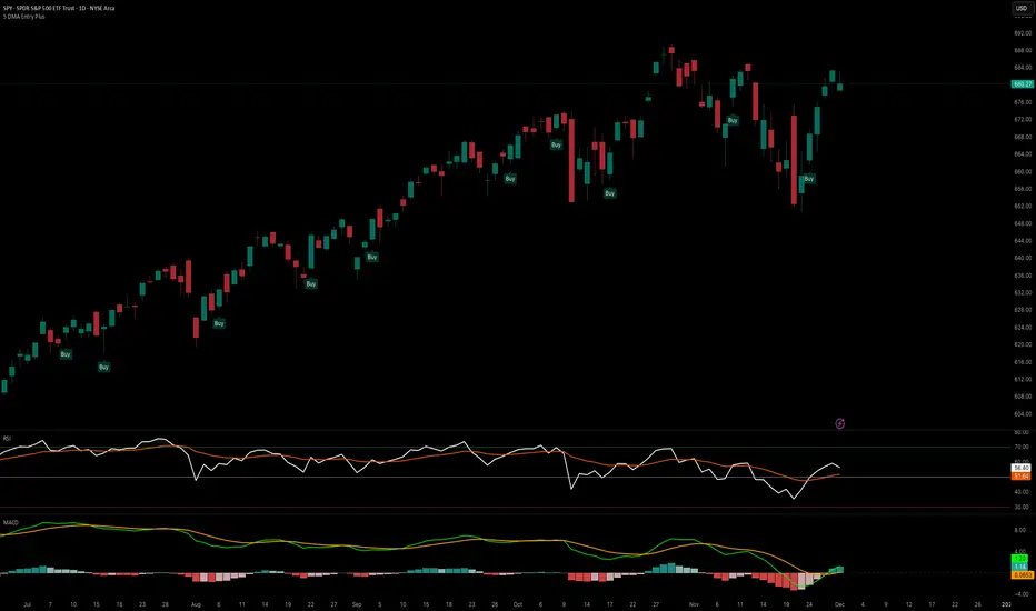
5 DMA Entry Plus5 DMA Entry Plus - Multi-Strategy Entry Signal Indicator
Overview:
The 5 DMA Entry Plus is a versatile entry signal indicator that combines multiple proven technical analysis methods to identify potential buy opportunities. This indicator is designed to be highly customizable, allowing traders to toggle between different entry strategies or combine them for confluence-based entries.
Key Features:
1. Multiple Entry Strategy Options:
Default Close Above Entry: Triggers when price closes above the 5-day moving average (with optional HMA filter)
Green Wick Candle Signal: Identifies bullish candles where the wick pierces above key moving averages, indicating rejection of lower prices
5DMA Zero/Upslope Entry: Generates signals when the 5DMA is flat or sloping upward, confirming momentum
HMA Cross Entry: Triggers when price crosses above the Hull Moving Average, a responsive momentum indicator
2. Adaptive HMA Filter:
Toggle the HMA (Hull Moving Average) filter on or off to adjust signal sensitivity. When enabled, price must be above both the 5DMA and 20 HMA for confirmation. When disabled, only the 5DMA is required, generating more frequent signals.
3. Smart Reset Logic:
The indicator includes intelligent reset functionality that prevents signal spam. Once an entry signal is generated, no new signals appear until price closes below the moving average(s), ensuring clean, actionable entries without clutter.
4. Visual Components:
5-Day Moving Average (Blue Line): The primary trend reference
20-Period Hull Moving Average (Orange Line): Fast-responding momentum filter
Buy Signals (Green Labels): Clear "Buy" labels appear below candles when entry conditions are met
Built-in Alerts: Set up custom alerts to be notified when entry signals trigger
Customizable Inputs:
Use HMA Filter: Enable/disable the 20 HMA confirmation requirement
Include Green Wick Candle Signal: Toggle wick-based entry detection
Use 5DMA Zero/Upslope Entry: Enable slope-based entry logic
Use HMA Cross Entry: Enable HMA crossover signals
HMA Length: Adjust the Hull Moving Average period (default: 20)
Best Use Cases:
Swing trading on daily and 4-hour timeframes
Identifying pullback entries in uptrends
Combining multiple confirmation signals for high-probability setups
Filtering entries in momentum-based strategies
Strategy Flexibility:
This indicator allows you to use each entry method independently or combine multiple methods for confluence. Test different combinations to find what works best for your trading style and the instruments you trade.
Risk Management Note:
This indicator identifies potential entry points but does not provide exit signals or stop-loss levels. Always use proper risk management and combine with your own exit strategy.
Gold AI RSI Monitor [Stacked + KNN]Here is a comprehensive description and user guide for the Gold AI RSI Monitor. You can copy and paste this into the "Description" field if you publish the script on TradingView, or save it for your own reference.
Gold AI RSI Monitor
🚀 Overview
The Gold AI RSI Monitor is a next-generation dashboard designed specifically for trading volatile assets like Gold (XAUUSD). It completely reimagines the traditional RSI by "stacking" 10 different timeframes (from 1-minute to Monthly) into a single, vertical view.
Integrated into this dashboard is a K-Nearest Neighbors (KNN) Machine Learning algorithm. This AI analyzes historical price action to find patterns similar to the current market and predicts the next likely move with a confidence score.
📊 Visual Guide: How to Read the Chart
1. The "Stacked" Lanes Instead of switching timeframes constantly, this indicator displays them all at once using vertical offsets.
Bottom Lane (0-100): 1-Minute RSI
Middle Lanes: 5m, 15m, 30m, 1H, 2H, 4H, Daily
Top Lane (900-1000): Monthly RSI
2. Gradient Color System The RSI lines change color based on momentum strength:
🔴 Red: Oversold / Bearish (Approaching 30 or lower)
🟡 Yellow: Neutral (Around 50)
🟢 Green: Overbought / Bullish (Approaching 70 or higher)
3. Tracker Lines Each timeframe has a dotted horizontal line extending to the right. This allows you to instantly see the exact RSI value for every timeframe without squinting.
🤖 The AI Engine (KNN)
The "AI" component uses a K-Nearest Neighbors algorithm.
Learning: It scans the last 1,000 bars of history.
Matching: It finds the 5 historical moments that look mathematically identical to the current market conditions (based on RSI and Volatility).
Predicting: It checks if price went UP or DOWN after those historical matches.
The Signals:
Buying Signal: If the majority of historical matches resulted in a price increase, the AI triggers a BUY.
Selling Signal: If the majority resulted in a drop, the AI triggers a SELL.
🎯 How to Trade with This Indicator
1. The "Crosshair" Signal
When the AI detects a high-probability setup, a massive Crosshair appears on your chart:
Green Crosshair: Strong BUY signal.
Red Crosshair: Strong SELL signal.
Note: The crosshair consists of a thick vertical line and a dashed horizontal line intersecting at the signal candle.
2. Timeframe Alignment (Confluence)
Do not rely on the AI alone. Look at the stacked RSIs:
Strong Long: The AI shows a Green Crosshair AND the lower timeframes (1m, 5m, 15m) are all turning Green/upward.
Strong Short: The AI shows a Red Crosshair AND the lower timeframes are turning Red/downward.
3. Support & Resistance Zones
Bottom Dotted Line (30): Support. If RSI hits this and turns up, it's a buying opportunity.
Top Dotted Line (70): Resistance. If RSI hits this and turns down, it's a selling opportunity.
⚙️ Settings Guide
RSI Length: Default is 14. Lower (e.g., 7) makes it faster/choppier; higher (e.g., 21) makes it smoother.
Enable AI Signals: Toggles the KNN calculation on/off.
Neighbors (K): How many historical matches to check. Default is 5.
Increase to 9-10 for fewer, more conservative signals.
Decrease to 3 for faster, more aggressive signals.
AI Timeframe: CRITICAL SETTING.
If left empty, the AI calculates based on your current chart.
Recommendation: For Gold scalping, set this to 15m or 1h. This ensures the AI looks at the bigger trend even if you are zooming in on the 1-minute chart.
⚠️ Disclaimer
This tool is for educational and analytical purposes. The "AI" is a statistical probability algorithm based on past performance, which is not indicative of future results. Always manage your risk.
My Band by MAMY-BAND – Adaptive Moving Average Channel Indicator
MY-BAND is a customizable Moving Average Band / Channel indicator designed to help traders clearly visualize trend direction, dynamic support & resistance, and market structure on any timeframe.
This indicator builds adaptive price bands around Moving Averages, making it easier to identify:
- Trend continuation
- Trend reversal
- Volatility expansion and contraction
- Key breakout and pullback zones
It works perfectly for crypto, forex, and stock markets.
🔧 Key Features
✅ Multi-Timeframe MA Bands
✅ HiLo & LLMA Moving Average Types
✅ Dynamic Channel Width
✅ ZigZag Structure Detection
✅ Average Center Line
✅ Trend Bending Option
✅ Support & Resistance Layer
✅ Fully Adjustable Inputs
✅ Works on All Timeframes
📊 How to Use
Trend Trading
Price above upper band → Strong bullish trend
Price below lower band → Strong bearish trend
Pullback Entries
Enter on pullback to middle MA in trend direction
Breakout Trading
Strong breakout outside the band signals continuation
Market Structure
ZigZag feature helps identify swing highs & lows
⚙️ Inputs Explanation
MA Timeframe (MA TF) – Select the timeframe for MA calculation
Length 1 & Length 2 – Fine-tune band sensitivity
MA Type – Choose between HiLo or LLMA
Width – Controls band distance
AVG Line – Show central average line
Zigzag – Display market structure swings
Extend – Extend channel into the future
Bending – Smooth adaptive band behavior
✅ Best For
Trend Followers
Scalpers
Swing Traders
Crypto Futures Traders
Breakout & Pullback Strategies
⚠️ Disclaimer
This indicator is for educational and analytical purposes only. It does not provide financial advice. Always use proper risk management and confirm signals with other indicators.

MTF RSI Stacked + AI + Gradient MTF RSI Stacked + AI + Gradient
Quick-start guide & best-practice rules
What the indicator does
Multi-Time-Frame RSI in one pane
• 10 time-frames (1 m → 1 M) are stacked 100 points apart (0, 100, 200 … 900).
• Each RSI is plotted with a smooth red-yellow-green gradient:
– Red = RSI below 30 (oversold)
– Yellow = RSI near 50
– Green = RSI above 70 (overbought)
• Grey 30-70 bands are drawn for every TF so you can see extremities at a glance.
Built-in AI (KNN) signal
• On every close of the chosen AI-time-frame the script:
– Takes the last 14-period RSI + normalised ATR as “features”
– Compares them to the last N bars (default 1 000)
– Votes of the k = 5 closest neighbours → BUY / SELL / NEUTRAL
• Confidence % is shown in the badge (top-right).
• A thick vertical line (green/red) is printed once when the signal flips.
How to read it
• Gradient colour tells you instantly which TFs are overbought/obove sold.
• When all or most gradients are green → broad momentum up; look for shorts only on lower-TF pullbacks.
• When most are red → broad momentum down; favour longs only on lower-TF bounces.
• Use the AI signal as a confluence filter, not a stand-alone entry:
– If AI = BUY and 3+ higher-TF RSIs just crossed > 50 → consider long.
– If AI = SELL and 3+ higher-TF RSIs just crossed < 50 → consider short.
• Divergences: price makes a higher high but 1 h/4 h RSI (gradient) makes a lower high → possible reversal.
Settings you can tweak
AI timeframe – leave empty = same as chart, or pick a higher TF (e.g. “15” or “60”) to slow the signal down.
Training bars – 500-2 000 is the sweet spot; bigger = slower but more stable.
K neighbours – 3-7; lower = more signals, higher = smoother.
RSI length – 14 is standard; 9 gives earlier turns, 21 gives fewer false swings.
Practical trading workflow
Open the symbol on your execution TF (e.g. 5 m).
Set AI timeframe to 3-5× execution TF (e.g. 15 m or 30 m) so the signal survives market noise.
Wait for AI signal to align with gradient extremes on at least one higher TF.
Enter on the first gradient reversal inside the 30-70 band on the execution TF.
Place stop beyond the swing that caused the gradient flip; target next opposing 70/30 level on the same TF or trail with structure.
Colour cheat-sheet
Bright green → RSI ≥ 70 (overbought)
Bright red → RSI ≤ 30 (oversold)
Muted colours → RSI near 50 (neutral, momentum pause)
That’s it—one pane, ten time-frames, colour-coded extremes and an AI confluence layer.
Keep the chart clean, use price action for precise entries, and let the gradient tell you when the wind is at your back.

Brahmastra PremiumBrahmastra Trade System is a complete institutional trading engine designed for traders who want precision entries, clean trends, and automated risk management.
It combines multi-timeframe confirmation, ATR-based volatility logic, trend structure, and angle analytics—giving you a highly reliable and visually clean trading framework.
🔥 Key Features
✅ 1. Institutional Trend Engine (Triple Confirmation):
The trend is detected using:
Fast MA (5)
Slow SMA/EMA (51)
Custom ATR Trend (SuperTrend-like algorithm)
This three-layer confirmation ensures you only trade when the trend is solid, real, and clean.
✅ 2. Multi-Timeframe Breakout Confirmation (1-Minute)
Most retail breakouts are fake.
This indicator validates entries using lower timeframe 5-minute candle closes.
✔ Helps avoid traps
✔ Ensures genuine breakout momentum
✔ Great for intraday & swing traders
✅ 3. Smart Entry & Exit Signals
Clear on-chart signals:
Bullish Entry (Triangle Up)
Bearish Entry (Triangle Down)
Buy Exit
Sell Exit
Exit logic uses:
Fast MA breakdown
ATR trend reversal
This catches trend reversals early and protects profits.
✅ 4. Automatic SL + TP1/TP2/TP3 Projection (ATR-Based)
On every entry, Brahmastra automatically plots:
Stop Loss (SL),Target 1,Target 2,Target 3
Targets are based on volatility (ATR), not random lines. This gives:
✔ Stable stops
✔ Dynamic targets
✔ Accurate risk–reward mapping
✅ 5. Smart Trailing Stop Loss (TSL)
TSL activates only after TP1 hits.
Buy trades → TSL moves upward
Sell trades → TSL moves downward
The trailing SL never moves backward → flawless institutional money management.
✅ 6. Volume-Powered Candle Coloring
Candles change color based on:
Trend direction
Volume intensity
Makes momentum extremely easy to read:
High volume bull → Neon green
High volume bear → Neon red
✅ 7. Multi-Angle Trendline System (3 Layers)
Brahmastra auto-draws support/resistance trendlines for:
L1 (Scalp) – Short trend
L2 (Swing) – Medium trend
L3 (Macro) – Larger trend
Each trendline is analyzed for angle strength:
🚀 Parabolic (Dangerous / Vertical)
💪 Strong Trend (Ideal)
😴 Weak / Accumulation (Sideways)
This helps you see whether the market is:
About to explode
Losing strength
Moving sideways
⚠️ Disclaimer
This indicator is an advanced trading tool, NOT financial advice.
Always backtest, understand the logic, and trade responsibly.

Day traderWorks in the equities market, good for the lower TF (2-3-5 min) can be used side by side with simplex lucrum. best suited for day traders.

The Alchemist's Trend [wjdtks255]📊 The Alchemist's Trend - Filtered Trading Guide
This indicator, named The Alchemist's Trend, is a High-Confidence Trend-Following Strategy designed to maximize reliability. It generates a final entry signal only when the QQE (Quantitative Qualitative Estimation) momentum signal is validated by four robust filters: Long-Term Trend (MA200), Mid-Term Trend (HMA), Momentum Strength (CCI), and Higher Timeframe (HTF) Trend.
1. Indicator Mechanism and Core Components
A. Chart Visualization and Trend Identification
Trend Line (HMA): Appears as a Yellow or Purple Thick Line. It represents the direction of the current short/mid-term market trend. Candle colors follow this line.
MA 200: Appears as a Dotted Line (color configurable in settings). It is the Long-Term Trend Line. Price above it suggests a long-term bullish view; below it, a long-term bearish view.
Candle Background: Appears as Light Yellow or Purple. It matches the Trend Line direction, providing a visual cue of the trend's strength.
B. The Four-Filter System
For a confirmed entry signal ('L' or 'S') to fire, the following four conditions must all align in the same direction:
QQE (Momentum Base): Generates the primary Long/Short crossover signal.
MA & HMA (Trend Alignment):
For Long Entries: Price must be above both the MA200 and the HMA Trend Line.
For Short Entries: Price must be below both the MA200 and the HMA Trend Line.
CCI (Momentum Strengthening):
For Long Entries: CCI value must be above +50. (Confirms strong buying momentum)
For Short Entries: CCI value must be below -50. (Confirms strong selling momentum)
HTF (Higher Timeframe Trend): Checks if the price on the set higher timeframe (default 4H) is above its own Trend Line, confirming alignment with the broader market direction.
2. Trading Strategy and Usage Rules
This indicator aims to maximize signal reliability over frequency.
🔔 Entry Rule
Enter a trade only when the 'L' or 'S' label appears on the chart AND the Action panel on the dashboard displays LONG SIGNAL or SHORT SIGNAL.
Long Entry (L):
Condition: 'L' label appears (All Long conditions met).
Verification: Confirm the Trend Line and candle color are in the yellow range.
Short Entry (S):
Condition: 'S' label appears (All Short conditions met).
Verification: Confirm the Trend Line and candle color are in the purple range.
🛡️ Risk and Position Management
Stop-Loss (SL): A common practice is to place the Stop-Loss below the low of the signal candle (for Long) or above the high of the signal candle (for Short), or beyond a recent significant support/resistance level.
Exit Strategy (Three Options):
Opposite Signal: Close the position immediately if the opposite signal ('S' during a Long, or 'L' during a Short) occurs.
RSI Extremes: Consider taking partial profits if the RSI reaches 70 (for Long) or 30 (for Short), indicating potential exhaustion.
Trend Line Crossover: Exit the position if the price breaks or crosses the Trend Line, causing the candle color to change.
🖥️ Dashboard Utilization Tips
The dashboard provides contextual information to validate the signal:
RSI: Signals occurring within the neutral 30-70 zone suggest a stronger developing trend. If near 70/30, consider the risk of reversal.
Vol Status ('High'): If the volume status is 'High' when the signal fires, the signal's power is likely high, indicating a higher probability of significant movement.
Day High/Low: Use these values as a secondary reference for setting initial Stop-Loss or Take-Profit targets.

Dynamic `request` demoPublish a new script-This should help people to make better analysis of the market
