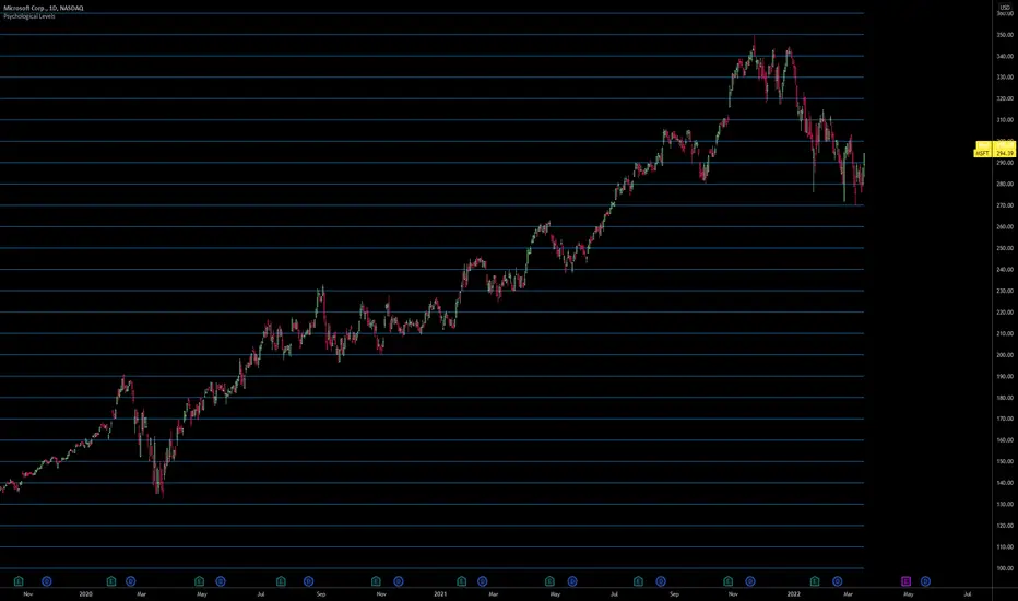
Advanced Psychological Level-J-Algo📊 Advanced Psychological Level - Universal Market Support
📝 TradingView Publication Write-up
Title:
Advanced Psychological Level
Short Description:
Professional-grade psychological levels indicator with smart detection for ALL cryptocurrencies, dynamic ATR-based spacing, real-time distance calculations, and intelligent visibility management. Works seamlessly across Forex, Indices, and Crypto markets.
🎯 OVERVIEW
Advanced Psychological Level is a sophisticated trading indicator that automatically identifies and displays critical psychological price levels where institutional orders cluster and market reversals occur.
This advanced system goes beyond basic round number indicators by incorporating intelligent adaptive technology that automatically calibrates to any market and price range - from micro-cap cryptocurrencies to major indices, delivering institutional-grade analysis for retail traders.
✨ KEY FEATURES
🧠 Advanced Intelligence Engine
The core of this indicator uses an advanced methodology combining:
Smart market type detection
Automatic level calibration
Dynamic range optimization
Real-time distance calculations
🌍 Universal Market Intelligence
Forex: Pip-based levels (100, 250) with intraday precision (0.2, 0.5, 0.8)
Indices/CFDs: Optimized whole number intervals with intelligent spacing
Crypto: Revolutionary auto-detection that scales from $0.001 to $100,000+
Proprietary scaling for any cryptocurrency
Intelligent level spacing based on logarithmic price magnitude
Zero manual configuration needed
📈 Dynamic ATR-Based Levels (Optional)
Levels that adapt to market volatility in real-time
Advanced ATR calculations with customizable parameters
Self-adjusting to market conditions
Professional-grade volatility analysis
📊 Real-Time Distance Analytics
Instant calculation of distance to key levels
Percentage-based risk/reward computations
Dual-directional target analysis
Customizable display with professional formatting
🎨 Smart Visibility Management
Intelligent Range Filtering: Shows only statistically relevant levels
Performance Optimized: Advanced rendering prevents lag
Dynamic Clutter Reduction: 70% cleaner charts with 100% effectiveness
Configurable visibility parameters
🏷️ Intelligent Price Labels
Smart label placement system
Hierarchical level classification (Major/Standard/Mid)
Professional typography and spacing
Adaptive positioning based on chart scale
🔔 Advanced Alert System
Multi-tier alerts for different level types
Smart alert filtering to prevent spam
Customizable alert conditions
Real-time level breach detection
⚙️ CONFIGURATION GUIDE
Core Settings
Dynamic ATR Mode: Toggle adaptive volatility-based calculations
ATR Parameters: Fine-tune sensitivity (Period & Multiplier)
Visibility Range: Control smart display range (default 10%)
Price Labels: Configure intelligent price display
Level Controls
Major Levels: Primary psychological barriers (250 pip/point)
Standard Levels: Secondary levels (100 pip/point)
Mid Levels: 50% calculations between majors (crypto-optimized)
Intraday Levels: Micro-structure levels (Forex/Crypto only)
Analytics Display
Distance Table: Real-time calculation display
Position Options: Four-corner placement
Visual Parameters: Full color customization
📖 TRADING METHODOLOGY
For Scalpers
Activate intraday levels for micro-structure analysis
Use distance table for precision entries
Configure alerts for quick level breaks
Optimize visibility to 5% for focused trading
For Day Traders
Focus on Major and Standard levels
Enable smart labels for quick analysis
Use distance calculations for targets
Set visibility range to 10-15%
For Swing Traders
Enable ATR-based dynamic levels
Use Major levels as primary targets
Expand visibility range to 20%
Add mid-levels for additional confluence
For Crypto Traders
Let auto-detection handle any coin automatically
Enable mid-levels for volatile markets
Use distance analytics for position sizing
Monitor cluster zones for high-probability setups
💡 ADVANCED TECHNIQUES
Confluence Trading: Combine with volume profile for high-probability zones
Multi-Timeframe Analysis: Apply daily levels to intraday charts
Risk Management: Use distance percentages for position sizing
Smart Confluence: Identify where multiple levels align
Adaptive Display: Automatically adjusts to your zoom level
🚀 THE ADVANCED ADVANTAGE
vs. Basic Round Number Indicators
✅ Universal crypto support (not just BTC/ETH)
✅ Integrated distance calculations
✅ Smart visibility management
✅ ATR-based adaptive levels
✅ Professional framework
vs. Other Psychological Level Tools
✅ Auto-calibration for any asset
✅ Real-time analytical display
✅ Optimized performance
✅ Complete customization
✅ Clean, uniform appearance
📊 MARKET APPLICATIONS
Forex Trading
Major pairs: 100/250 pip detection
Intraday: Precision 20/50/80 pip levels
Session-optimized performance
Institutional-grade analysis
Index Trading
S&P 500: Smart 100/250 point levels
NASDAQ: Thousand-level detection
DAX: Optimized intervals
Futures-ready calculations
Crypto Trading
Bitcoin: Auto-scaling to $1000/5000 levels
Ethereum: Intelligent $100/250 detection
Altcoins: Perfect scaling for any price
Micro-caps: Works on $0.00001 tokens
🔬 TECHNICAL SPECIFICATIONS
Version: v2.0 (Pine Script v6)
Calculation Method: Real-time, non-repainting
Performance: Optimized for all timeframes
Memory Management: Advanced array handling
Compatibility: All TradingView plans
Support: Open-source with detailed comments
⚠️ KEY BENEFITS
Zero Configuration: Works instantly on any chart
Universal Coverage: One indicator for all markets
Professional Display: Clean, institutional-quality visuals
Real-Time Analytics: Instant risk/reward calculations
Performance Optimized: No lag even on complex charts
🎯 IDEAL FOR
✅ Price action traders
✅ Institutional level analysis
✅ Smart money concepts
✅ Multi-timeframe strategies
✅ Risk management focused trading
✅ Any trader seeking reliable S/R levels
💬 FINAL NOTES
This advanced indicator represents extensive development and real-world testing. It solves critical trading challenges:
Automatic Calibration: No manual adjustment across markets
Intelligent Filtering: Shows only relevant levels
Real-Time Analytics: Instant distance and risk calculations
Universal Compatibility: One solution for all markets
The distance table alone transforms trading by providing instant context for risk/reward decisions. The smart crypto detection means you'll never need another psychological level indicator.
Professional-grade tool, available free and open-source because quality trading tools should be accessible to everyone.
Psychological

Whole number highlightsThis very simple indicator provides what should be a built-in TradingView feature: it highlights the whole number currency amounts (dollar, pound, euro, etc.) on your chart with a simple and unobtrusive dotted line. By default, a slightly thicker dotted line is used on whole number multiples of ten.
These are important to highlight because they often act as "psychological levels" in the marketplace, especially when they coincide with more significant levels of support or resistance. They can also help provide a sense of scale to the chart, which is useful when switching between various zoom levels.
It's open-source, so it can be easily combined into other indicators, which should especially be useful for those with limited plans who are allowed a limited number of indicators.
Disclaimer : Use at your own risk. This indicator and the strategy described herein are not in any way financial advice, nor does the author of this script make any claims about the effectiveness of this indicator or of any related strategy, which may depend highly on the discretion and skill of the trader executing it, among many other factors outside of the author's control. The author of this script accepts no liability, and is not responsible for any trading decisions that you may or may not make as a result of this indicator. You should expect to lose money if using this indicator.

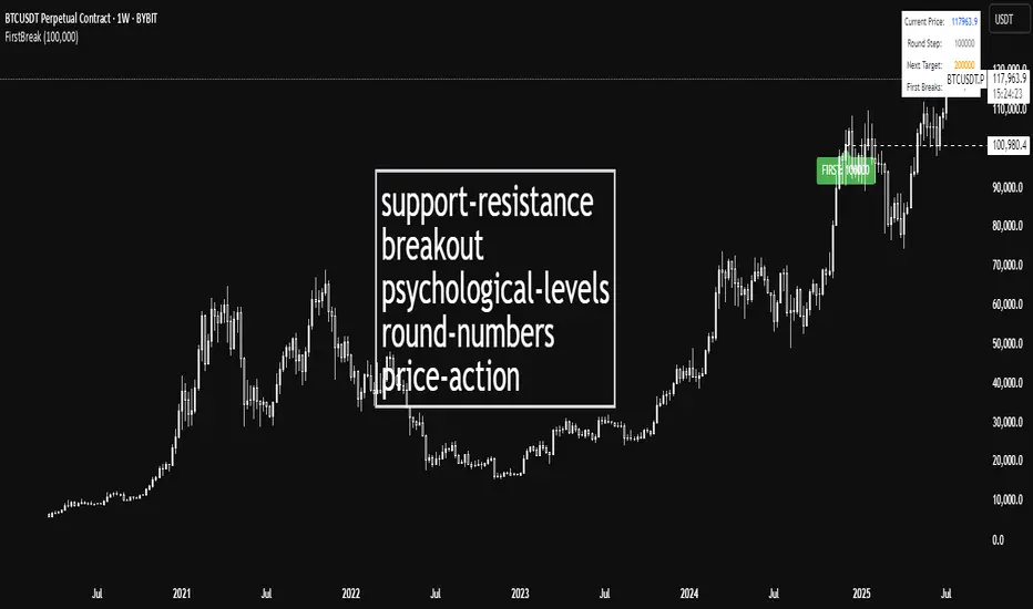
First Round Break TrackerA simple indicator that tracks the first-time breakouts of round number levels (psychological levels) on any chart. Clean interface with minimal configuration needed
First Breakout Only : Marks each round level only once when broken for the first time
Customizable Step Size : Adjustable round number intervals (e.g., 100, 1000, 10000 etc.)
Clean Visual Alerts : Green labels with "FIRST:" prefix appear exactly at breakout moments
Real-time Info Panel : Shows current price, next target level, and total breakouts count
Advanced Liquidations Heatmap v4 [HG]Description:
This indicator examines price movements, volume, support, and resistance levels to pinpoint potential trading opportunities. It identifies large, volatile moves with substantial activity in specific zones on the chart, which the market tends to revisit due to the high transaction volume in these areas. The primary purpose of this indicator is to highlight these high-probability areas where the market is likely to return.
Leverage Liquidations Feature:
This indicator incorporates a feature that displays arbitrary liquidation levels, corresponding to various leverage settings common among market participants. Users need to analyze the market and select appropriate leverage settings based on their insights.
Transparency Feature:
The indicator also includes a feature that modulates the transparency of the displayed areas according to their significance, enhancing the visual representation of market activity.
Color Modulation Feature:
This feature modifies the color of the displayed areas depending on their importance.
Using the indicator:
We recommend using this indicator to trade towards and away from significant areas, and to look for reversals when these zones are revisited. Although trading offers no certainties, only probabilities, the significant candles on the chart denote high-probability areas the market frequently revisits. Additionally, zones recovered between 50% - 100% indicate high-probability points where the market might reverse its direction. The probability of a market direction change escalates as more significant areas are recovered sequentially. While there's no strict rule for when these areas are recovered, observing candle colors (green, blue, red, purple) can assist in assessing the velocity of a move to or from a zone. For more effective use of this indicator, determine a trend using other preferred indicators or even a basic EMA. Dedicate time to understanding how these zones are revisited for each specific asset.
Strong Move Up:
Strong Move Down:
Area Recovered Partially:
Significant Areas Are Recovered Sequentially:
Here's how to use the "Leverage Liquidations Feature":
Analyze market leverage tendencies: It's essential for users to undertake their own research into the common leverage settings utilized by market participants for a specific asset. By doing this, they can input these settings into the indicator to gain a better comprehension of potential price movements. Some sensible defaults are included in the default settings.
Visualize the liquidation levels on the chart: After the user has identified the prevalent leverage settings, the indicator will project the corresponding liquidation levels on the chart. These levels signify the points at which numerous leveraged positions would face liquidation, considering the current market price. This data can be instrumental in setting stop losses, establishing profit targets, and predicting potential market movements due to mass liquidations.
Liquidations Levels On BTC 25x + 50x + 100x + 125x:
Here's how to use the Modulation Features:
Areas more likely to be revisited are rendered more opaque, thereby increasing their visibility on the chart. In contrast, areas less likely to be revisited are shown more transparently. This delivers a straightforward visualization of where the bulk of trading activity is occurring. There's also a Dynamic Theme mode that utilizes color, not just transparency, to emphasize important areas.
Main Features:
Significant candles are identified and marked with colors, indicating high-probability areas the market may revisit.
The indicator facilitates the display of arbitrary liquidation levels based on user-defined leverage settings.
Features modulation options that adjust the transparency and color of the areas shown, based on their importance, offering an intuitive grasp of the market. The Dynamic Theme mode greatly enhances market readability.
The indicator can exhibit what we term ghosts, or dead/recovered areas, enabling users to visually identify which areas were recovered.
Fair Value Gaps can be presented alongside significant candles as both denote imbalances in the chart. Nonetheless, we recommend deactivating the Fair Value Gaps feature when showing numerous liquidation levels, allowing for the representation of data across a broader price range. Moreover, it's crucial to recognize that enabling Fair Value Gaps can influence calculations.
Documentation:
The indicator is accompanied by comprehensive documentation detailing all its options for user reference. Additionally, we provide a comprehensive instructional video.
Limitations:
A. The indicator can only showcase a limited amount of areas, so if many liquidation levels are displayed, the price range that can be shown becomes more narrow.
B. Analogous to point (A), activating the Fair Value Gaps Feature also constricts the price range of identified areas.
Recommendation:
If you wish to display more data, employ the indicator multiple times with varying settings. Also, use the 'Hide Normal Vectors' option on all but one indicator so the 'Normal' areas don't overlap.
If you experience frequent timeouts, reduce the 'Maximum Vector Zones' setting (We've found that 350 works adequately).

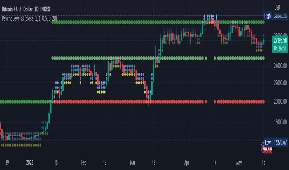
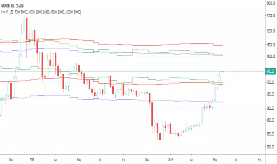
Psychological levels (Bank levels) PsychoLevels v3 - TartigradiaPsychological levels (Bank levels) plots the closest "round" price levels above and below current price, based on neuroscience research of how humans intuitively calculate in logarithms.
Psychological levels, also called bank levels, are "round" price numbers, by truncating after the nth leftmost digits, around which price often experience resistance or support, because traders and investors tend to set orders around these round numbers.
The calculation done here is fully automatic and dynamic, contrary to other similar scripts, this one uses a mathematical calculation that extracts the 1, 2 or 3 leftmost digits and calculate the previous and next level by incrementing/decrementing these digits. This means it works for any symbol under any price range.
This approach is based on neuroscience research, which found that human brains intuitively approximate numbers on a logarithmic scale, adults and children alike, and similarly to macaques, for more info see Numerical Cognition , Weber-Fechner Law , Zipf law .
For example, if price is at 0.0421, the next major price level is 0.05 and medium one is 0.043. For another asset currently priced at 19354, the next and previous major price levels are 20000 and 10000 respectively, and the next/previous medium levels are 20000 and 19000, and the next/previous weak levels are 19400 and 19300.
IMPORTANT: Please enable "Scale price chart only" in the chart's scale's options, as otherwise major levels may make the chart's scale very small and hard to read.
How it works
At any time, there are 3 levels of strength (1 leftmost digit, 2 leftmost digits, 3 leftmost digits) represented by different sizes, and 3 directional levels for each of these strengths (level above, level below, and half-level) represented by different colors and positions, around current price.
Indeed, contrary to other similar price levels scripts, we do not plot ALL price levels at all times, because otherwise the chart becomes wayyy too cluttered, and also it's highly processing intensive to plot so many lines. So we here use a dynamical approach: we plot only the relevant levels, the closest ones according to current price.
Hence, when a level disappears, it does not mean that it does not exist anymore, but simply that we are not drawing it right now because it is not pertinent for the current price movement (ie, too far away).
Breakouts can be detected in two different ways depending on if SMA is set to a value higher than 1 or not: if SMA == 1, then there is no smoothing, so the levels adapt instantaneously to the current price, so to detect breakout, you should refer to the levels at the previous tick and whether they were broken by current tick's price; if SMA > 1, then there is some smoothing, and so the levels will stay in-place even if there is a breakout, so it's easier to spot breakouts without having to look at the previous ticks, but on the other hand you won't see the new levels for the new price range until after a few more ticks for the smoothing window to adapt. Hence, by default, smoothing is disabled, so that you can see the currently pertinent levels at all time, even right after or during a breakout.
By default, the strong above level is in green, strong below level is in red, medium above level is in blue, medium below level is in yellow, and weak levels aren't displayed but can be. Half levels are also displayed, in a darker color. Strong levels are increments of the first leftmost digit (eg, 10000 to 20000), medium levels are increments of the second leftmost digit (eg, 19000 to 20000), and weak levels of the third leftmost digit (eg, 19100 to 19200). Instead of plotting all the psychological levels all at once as a grid, which makes the chart unintelligible, here the levels adapt dynamically around the current price, so that they show the above/below/half levels relatively to the current price.
Indeed, "half-levels" are also displayed (eg, medium level can also display 19500 instead of only 19000 or 20000). This was made because otherwise the gap between two levels was too big, especially for the strongest levels (eg, there was no major level between 20000 and 30000, but with a half-step we also get a half-level at 25000, and empirically price tends to respect these half levels - I also tried quarter levels but empirically the results were not good). In addition to this hard-coded half-level, you can also create more subdivisions (eg, quarter levels) by setting the simple moving average to a value higher than 1.
The script can be made to run on the daily timeframe whatever the current chart's timeframe is, to reduce the variability in levels, to make it less noisy than intraday price movement. But by default, the chart resolution is used, because I empirically found that the levels found with this indicator work on all time resolutions quite well.
The step can be adjusted to increase the gap between levels, eg, if you want to display one every 2 levels then input step = 2 (eg, 22000, 24000, 26000, etc), or if you want to display quarter levels, input 0.25 (eg, 22000, 22250, 22500, etc). The default values should fit most use cases and cover most psychological levels.
How to read
Focust first on bigger dotted levels, they are stronger and more likely to cause a rebound or a major event or price to stay at this level.
Remember that it's not enough to just look at levels, the context is important, because levels have various effects depending on current price movement: if price is above a level, the level is a support on which price can rebound; if price is below a level, the level is a resistance on which price can rebound (or break); and finally sometimes price also stays hovering around a level for some time.
Levels closer to 9 are less weaker, and levels closer to 0 are stronger, according to Zipf law. This is now reflected since v3 in the transparency, levels that are closer to 9 will be more transparent.
The switch in color for the same level illustrates how a level switches from being a support to a resistance and inversely. Eg, if a major level turns from green to red, then it changed from being a resistance (above) to a support (below).
As is well known in trading, longer standing levels are stronger. This indicator provides a direct illustration: in practice, the number of consecutive dots on the same line influences the strength of the level: the longer the chain of dots, the more you can expect this price level to be significant. The length does not mean the level will necessarily hold, but that other traders are likely to monitor if it holds, and if not then price will break down. Hence, longer levels are good spots to place stop losses, or to enter trades depending on your strategy. In general, a single dot is not enough to consider a level significant, but 2 or more is a good enough level, and 10+ is a strong level. Intuitively, this makes sense, and is what pro traders do: the longer a level is tested, the stronger it is. This indicator can visually represent this intuition and allows to use it as a more systematic trading signal.
Motivation
I initially made the first version of the PsychoLevels indicator mainly to train with PineScript, but I found it surprisingly accurate to define levels that are respected by price movements. So I guess it can be useful for new traders and experienced traders alike, as it's easy to forget that psychological levels can often be as strong if not stronger than technical levels. It can also be used to quickly screen other minor assets for trading opportunities. For example, a hybrid strategy would be to manually define levels on BTCUSD but using this script to automatically define levels in crypto altcoins and quickly screen them for a trade opportunity that can be greater than with BTCUSD but with the same trend.
Personally, although initially I did not believe an automated tool would work well for this purpose, I could now empirically verify that it is quite reliable for the purpose of detecting levels, and so I use it all the time to find the levels automatically and help me monitor them like a hawk, so that I only have to draw uber major levels, the ones that last between cycles and that are hard to autodetect, but otherwise all daily/weekly levels are usually covered. However, trendlines must still be drawn manually or with another indicator (but note that up to now I have found none that worked well enough), as PsychoLevels only draws levels (ie, horizontal lines, not oblique ones!).
Differences with the previous version PsychoLevels v2
price levels now have a transparency according to their importance for the human brain: numbers closer to 9 are weaker, and numbers closer to 0 are stronger and represent a major psychological threshold (eg, that's why prices marked as $9.99 sell better than $10.00). This option can be disabled to get the exact same behavior as v2.
modularized and typed code
PsychoLevels v2 can be found here:
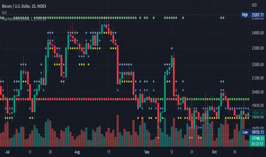
Psychological levels (Bank levels) PsychoLevels v2 - TartigradiaPsychological levels (Bank levels) plots "round" price levels above and below current price, by truncating after the nth leftmost digits, based on neuroscience research of how humans intuitively calculate in logarithms.
Psychological levels, also called bank levels, are "round" price numbers around which price often experience resistance or support, because traders and investors tend to set orders around these round numbers.
Calculation here is fully automatic and dynamic, contrary to other similar scripts, this one uses a mathematical calculation that extracts the 1, 2 or 3 leftmost digits and calculate the previous and next level by incrementing/decrementing these digits. This means it works for any symbol under any price range.
This approach is based on neuroscience research, which found that human brains intuitively approximate numbers on a logarithmic scale, adults and children alike, and similarly to macaques, for more info see Numerical Cognition , Weber-Fechner Law , Zipf law.
For example, if price is at 0.0421, the next major price level is 0.05 and medium one is 0.043. For another asset currently priced at 19354, the next and previous major price levels are 20000 and 10000 respectively, and the next/previous medium levels are 20000 and 19000, and the next/previous weak levels are 19400 and 19300.
Usage:
* By default, strong upper level is in green, strong lower level is in red, medium upper level is in blue, medium lower level is in yellow, and weak levels aren't displayed but can be. Half levels are also displayed, in a darker color. Strong levels are increments of the first leftmost digit (eg, 10000 to 20000), medium levels are increments of the second leftmost digit (eg, 19000 to 20000), and weak levels of the third leftmost digit (eg, 19100 to 19200). Instead of plotting all the psychological levels all at once as a grid, which makes the chart unintelligible, here the levels adapt dynamically around the current price, so that they show the upper/lower levels relatively to the current price.
* A simple moving average is implemented, so that "half-levels" are also displayed when relevant (eg, medium level can also display 19500 instead of only 19000 or 20000). This can be disabled by setting smoothing to 1.
* By default, the script runs on the daily timeframe, whatever the current chart's timeframe is. This is to reduce the variability in levels, to make it less noisy than intraday price movement, but this can be changed in the settings.
* The step can be adjusted to increase the gap between levels, eg, if you want to display one every 2 levels then input step = 2 (eg, 22000, 24000, 26000, etc), or if you want to display quarter levels, input 0.25 (eg, 22000, 22250, 22500, etc). The default values should fit most use cases and cover most psychological levels.
I made this script mainly to train with PineScript, but I found it surprisingly accurate to define levels that are respected by price movements. So I guess it can be useful for new traders and experienced traders alike, as it's easy to forget that psychological levels can often be as strong if not stronger than technical levels. It can also be used to quickly screen other minor assets for trading opportunities. For example, a hybrid strategy would be to manually define levels on BTCUSD but using this script to automatically define levels in crypto altcoins and quickly screen them for a trade opportunity that can be greater than with BTCUSD but with the same trend.
Changes compared to v1:
* Deduplicated redundant calculations and hence faster script.
* Added half-step levels, which allows to more easily see breakouts (because the levels are still on-screen).
* All steps are now configuration on the GUI.
* Revamped color scheme.
* And major reasons to post as a separate v2 script rather than updating: because we can't update the original description nor screenshot. I have now read more about the House Rules and saw other scriptmakers, so I am trying to write better descriptions like wizards do, by explaining not only how the script works but what the underlying financial concept is to a neophyte audience.
Psychological LevelsThis script automatically plots psychological levels based upon the price and features four settings for adjusting line quantity.
This could be improved by using lines instead of plots.
[DisDev] Level by LevelThis indicator's main objective is to provide you with the ability to chose the levels you are interested in , with the added functions of:
Level-by-Level Chart Reducer – This allows you to choose how many levels are above and below the current closing price to display.
Level-by-Level Table – This allows you to display all the levels within a table onto the chart.
The basis of this indicator is to provide you with a toolbox of levels that you can add to your trading plans.
Psychological Levels
A weekly range established each Saturday evening that can be thought of as a weekly "IB" or initial balance.
Average Daily Range ("ADR") & Average Weekly Range ("AWR")
In Forex, the International Monetary Fund ("IMF") controls the allowable weekly swings of a currency's price. The "AWR" and "ADR" perform calculations and dynamically adjust until the range is exceeded, at which time the levels will lock into place for the remainder of the day or week. The accepted theory is that price (even in Stocks and Crypto) will adhere to and remain within these levels, and, if exceeded, will revert back to them.
Initial Balance ("IB")
In Crypto trading, it is generally accepted that the High and Low of the first hour of each day (00:00 - 01:00 UTC) is the Initial Balance . The IB generally thought of as a zone that sets the tone for the rest of the trading session. It is often a time of high volume and volatility, with Stop Hunts at the highs and lows of a range before price moves in one direction or the other. The IB is a Market Profile concept introduced by Peter Steidlmayer. There is plenty of information on the Internet to learn more about IB's and how to implement them -- please do your own research.
Daily Open
Since Crypto is traded 24 hours per day, the generally accepted open is 00:00 UTC, the Tokyo open. Please refer to Part 1 for more details on sessions, starting times, conversions, and Daylight Savings Time.
Volume Weighted Average Price (VWAP's)
VWAPs are important areas on a chart. Institutional traders generally do not want to move price too far as they enter large buy or sell orders. So they wait for price to reach a tight zone around the VWAP where the majority of transactions occur on the Daily, Weekly, or Monthly timeframes. In these areas, there will be plenty of supply and demand for the institutional trader to execute their trades.
Weekly Open
The weekly open is Monday at 00:00 UTC.
Pivot Points (Support & Resistance)
This indicator calculates pivot levels based on a tested formula that calculates past and subsequent bars or candles. It displays the two closest to price pivot levels. The pivot formula takes a window of left bars and right bars, and then finds the highest or lowest value in that window. The window marches across the bar-set to discover the pivots.
We coded the script to label the levels and colors dynamically, either Support (Green) or Resistance (Red), depending on whether they are above or below price. The primary level line stays with the same color scheme:
Blue = Daily / Yellow = Weekly / Violet = Monthly
As price crosses the level:
1 - The label will switch from Support to Resistance and Resistance to Support
2 - The extender line will switch from Green to Red and Red to Green
3 - The same changes will take place in the Level-by-Level Coordinates Table
A Note on Levels and Data
Understanding How Data is Calculated and Presented
Calculating levels requires going back in time through a symbol or asset’s historical data. Time is measured by bars (candles), so depending on the chart's resolution (timeframe or TF) you are viewing, a different number of bars would be required to measure the same level.
For example, if we want to mark the Daily High and Low on the daily TF, we would be measuring 1 bar or candle. If we drop down to the 1-hour TF, we would need to measure 24 bars. For the 15-Minute TF it would be 96 bars (1hr/15min=4 bars per/hour and 4 x 24 = 96), and on the 1-Min TF, it requires 1,440 bars (1hr=60 Min and 6 x 24 = 1,440).
Hopefully, you get the idea and can see that the number of bars required increases exponentially as we move to weekly, monthly, and yearly levels.
TradingView Data
Please note this statement from TradingView's website:
"The length of historical data for any intraday interval (i.e. chart timeframe) is 5,000 bars/candles (for Pro and Pro+ account holders it is doubled to 10,000 bars/candles and for Premium holders it's quadrupled to 20,000) + additionally several bars/candles back to the beginning of the week, month or year (depending on the resolution). Unfortunately, this limit cannot be extended for now due to technical reasons. At lower resolutions (<30Min) Yearly and Monthly VWAPs may not show, but to overcome this issue the “Plot Save” function has been added to the settings to allow the user to manually input these levels. This concept is the same for Daily, Weekly, and Monthly pivots.
If you change the chart interval to daily or daily-based, you will see a longer date range. We display all available data for daily-based intervals."
How we Handled Data Limitations
The Plot Level Feature in the Level by Level Indicator
We have written this script to always show levels at the lowest time frame allowable by TradingView.
If you do not see specific Support or Resistance levels, switch to a higher time frame, enter the corresponding values in the provided fields on the input panel, and check the Plot box. This will hard code the level in and will print on any TF. Additionally, we coded it so that when the Plot feature is enacted, the calculated level will be disabled so that there are no overlaps of two levels being printed.
Legend
The logic behind the line styles:
Solid = Static or established
Dashed = Static but previous week or day
Dotted = Dynamic or still developing -- will turn solid once the values are locked in
*VWAPs would technically be a dotted line since they are fluid, however, TV does not handle the dots or dashes of a curved line well so we chose to keep this solid
Level-by-Level Table
We designed this table to provide the user with a view of the levels in the correct price sequence on the chart at all times since, depending on the resolution and zoom levels, it would typically not be possible. The levels are equidistant and do not align with the actual price.
The current price will move vertically through the table according to the actual price and its relative position to the other various levels. The levels will change price and line styles dynamically as well.
The current price rectangle and the border can be in sync with High Volume Candle colors to draw more attention to the chart during climatic volume events.
Settings & Options - Levels & Labels
Levels will show a faint line through price to the point of origin.
Labels will show a brighter line extended to the right of price.
The values (10, 20, 30) are the length of the extensions; they are staggered to avoid overlaps.
Settings & Options - Level Reducer
The Level Reducer gives you the ability to declutter your chart, but still have the indicator track all the selected levels.
With four Lines selected, for example, the indicator will give you the nearest four lines above price and the nearest four below price. The Table runs independently of the chart, so if you want to see eight levels as an example, the Table will show eight above and eight below price.
As the current price changes, the lines will dynamically change accordingly.

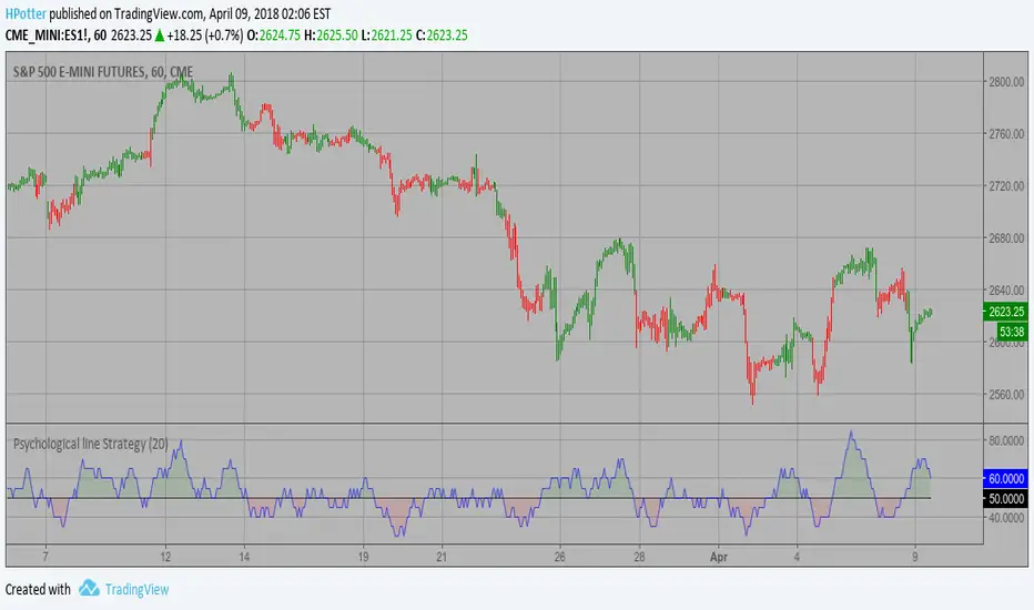
Psychological LineThis indicator can be shown by the number of bars with consecutive higher closing prices over a period of time. The maximum value is equal to the period.
The default period value is 12.
Thresholds used with this period are 3, 6, and 9.
A drop below 3 suggests an approaching low, and a crossover above 9 warns about an upcoming top.
In this period, 6 is a neutral value and represents the borderline separating uptrends and downtrends.

Yen PPLUse this Indicator to plot Psychological Price Levels on Yen Pairs, Set an alert to notify you when Price Action breaks a Psychological Price Level
This Indicator plots a 700 pip range.
When you first apply the Indicator a "Confirm Inputs" box will appear. Set the "Initial Value" box to a Flat .00 price about 350 pips below current Price Action.
This will set Current Price Action in about the middle of the range.
The PPL 1,2 and 3 "top" and "bot" settings represent the tops and bottoms of your Psychological Price Levels and allow you to adjust their location and width.
They are currently set to "Quarter Point Theory" and 2 pips wide.
You will probably want to leave PPL4 alone as it represents your Flat .00 numbers unless you want to adjust its width.
The Brightness and color can also be adjusted in "Bgcolor"
Set your alerts and enjoy.
Comments, Suggestions and Feedback are appreciated, Thanks for checking out the Indicator.

Combo Backtest 123 Reversal & Psychological line This is combo strategies for get a cumulative signal.
First strategy
This System was created from the Book "How I Tripled My Money In The
Futures Market" by Ulf Jensen, Page 183. This is reverse type of strategies.
The strategy buys at market, if close price is higher than the previous close
during 2 days and the meaning of 9-days Stochastic Slow Oscillator is lower than 50.
The strategy sells at market, if close price is lower than the previous close price
during 2 days and the meaning of 9-days Stochastic Fast Oscillator is higher than 50.
Second strategy
Psychological line (PSY), as an indicator, is the ratio of the number of
rising periods over the total number of periods. It reflects the buying
power in relation to the selling power.
If PSY is above 50%, it indicates that buyers are in control. Likewise,
if it is below 50%, it indicates the sellers are in control. If the PSY
moves along the 50% area, it indicates balance between the buyers and
sellers and therefore there is no direction movement for the market.
WARNING:
- For purpose educate only
Efficient Support & Resistance LevelsThis script is a mixture of my two previous scripts "True Strong Classical Support/Resistance Levels" and "Hidden Supports & Resistances + Round Levels". This combination brings on better identification of the most efficient support/resistance levels.
Note that "Hidden SnR Levels" part of the code is only expected to work on Forex charts, but apart from that, the other parts could be applied to any chart.
The script may:
- Draw classical support/resistance levels which retraced the price previously, aided by multi-timeframe analysis
- Draw hidden support/resistance levels based on psychological patterns of the price
- Adjust to wicks better than Pine Script built-in pivot functions
- Differ the levels color based on chart reactions
- Merge nearby classical levels to avoid congestion on the chart
Feel free to use it and send me your thoughts.
Psychological for Strategy testingHello everyone
I've made Psychological to be able to adjust some variables for strategy.
When you adjust each parameter of the settings, the strategy tester also comes to work in conjunction with.
so please find your best parameter! ^^
I'm not very good at English, so i really want to write how to use Pychological's entry and exit too ,but please look up psychological entries as they are well known.
Notice:
There may be some programming mistakes, so please take your own responsibility when actually investing.

Foreign Currency Psychological ResistanceThought it would be interesting to look into psychological barriers (round numbers) denominated in foreign currencies and see where those barriers show up on a USD chart.
I did a couple of quick and superficial Internet searches to get an idea of which USD pairs are being used the most to trade Bitcoin. My conclusion is that the most relevant currencies are the Chinese Renminbi and the Brazilian Real.
Based on that, I wrote this little indicator that uses the exchange rate from the USD pairs (USDCNY, USDBLR) and the round number targets to come up with the corresponding USD price levels.
Psychological line Strategy Psychological line (PSY), as an indicator, is the ratio of the number of
rising periods over the total number of periods. It reflects the buying
power in relation to the selling power.
If PSY is above 50%, it indicates that buyers are in control. Likewise,
if it is below 50%, it indicates the sellers are in control. If the PSY
moves along the 50% area, it indicates balance between the buyers and
sellers and therefore there is no direction movement for the market.
WARNING:
- This script to change bars colors.
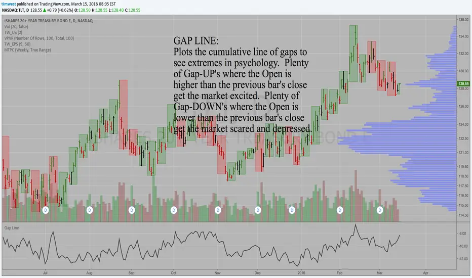
Gap LineGAP LINE:
Plots the cumulative line of gaps to see extremes in psychology.
Plenty of Gap-UP's where the Open is higher than the previous bar's close get the market excited.
Plenty of Gap-DOWN's where the Open is lower than the previous bar's close get the market scared and depressed.
Look for the Gap Line to peak prior to an important peak in the market and vice versa. Look for a low in the Gap Line prior to an important low in the market.
Simple, but effective.
Tim