Yen Carry Composite Index + Macro Flow GaugeWhat This Indicator Does
This chart visualizes the strength, trend, and macro conditions supporting or weakening the yen carry trade a strategy where investors borrow in low yielding yen to invest in higher yielding assets
How It Works: Core Components
Composite Index (Blue Line):
A weighted blend of z-scores from:
USD/JPY (strength of USD vs JPY)
10Y yield spread (US – Japan)
AUD/JPY (risk proxy for carry appetite)
VIX (global risk sentiment, inverted)
Z-scores normalize each input to show how far it deviates from recent history (not raw values).
Positive composite trend ⬅️ strong carry environment
Negative composite trend ➡️ signs of unwind or stress
Individual Z-Score Lines:
🟥 USD/JPY
🟩 Yield Spread (US10Y − JP10Y)
🟪 FX Proxy (AUD/JPY)
🟦 VIX (risk sentiment)
Threshold Lines & Signal Markers:
Green 🟢⬅️🟢🟢 “carry active” threshold (+1.5 std dev)
Red dashed line 🔴➡️🔴🔴→ “carry unwind risk” (−1.5 std dev)
Carry Trade Strength Gauge (Horizontal Bar, Bottom-Right) www.tradingview.com
Slots:
🟢 = strong carry inflow conditions
⚪ = neutral midpoint
🔴 = outflow / unwind pressure
A directional arrow (⬅️ or ➡️) shows momentum:
➡️ = composite rising → improving carry environment
⬅️ = composite falling → deteriorating carry conditions
Arrow is placed at the current strength level, visually combining position + momentum
Labels “Inflows” and “Outflows” flank the bar for clarity
Use Case Summary
Macro risk overlay for JPY pairs, EM FX, bond carry strategies
Detect early unwind phases (e.g. if arrow ⬅️ appears in red zone)
Confirm entry/exit in directional JPY trades or expected liquidity to enter the markets
Rally

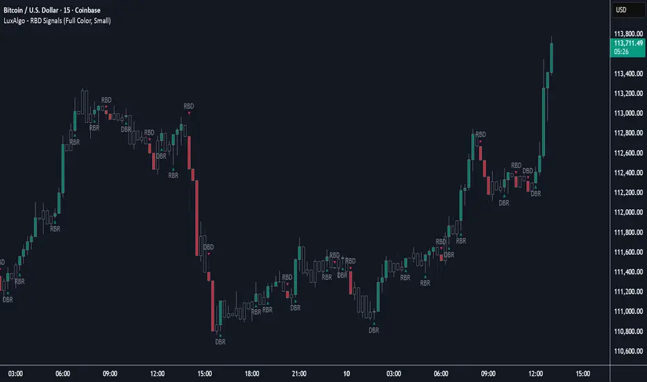
Rally Base Drop Signals [LuxAlgo]The Rally Base Drop indicator is built around the Supply and Demand (SND) concept known as "Rally, Base & Drop" Candles. These candle types are commonly used in this trading approach to identify price structure.
This indicator highlights bars by labeling them as "Rally," "Drop," or "Base" candles. It also identifies specific sequence patterns formed by these candles.
🔶 USAGE
The Rally, Base, Drop candlestick approach is a straightforward method for identifying price action structure.
Candles are categorized into three types, which are then analyzed to understand market structure and Supply/Demand levels.
Rally: Two or more consecutive bullish candles.
Drop: Two or more consecutive bearish candles.
Base: A single bullish or bearish candle that breaks the previous trend.
🔹 Rally & Drop Candles
These candles show clear directional momentum and signal whether demand or supply is dominating. They are helpful when identifying trends, as they highlight strong price movement.
🔹 Base Candles
In most SND strategies, "Base" can have several interpretations.
Typically, base candles represent short periods of consolidation that test the trend before continuation. They can also be found at turning points (tops or bottoms).
For this indicator, a base candle is simply one that does not follow the direction of nearby candles or is where a Drop and Rally meet. Multiple base candles often reflect indecision in the market, suggesting a temporary balance between buyers and sellers.
🔹 Reversal Sequences
Rally-Base-Drop (RBD)
Drop-Base-Rally (DBR)
In Supply and Demand analysis, these sequences are considered reversals. They mark zones where buyer and seller activity has shifted, which can lead to future price reactions. These areas are known as "Supply or Demand Zones" and are often revisited by price, making them useful for trade setups.
🔹 Continuation Sequences
Rally-Base-Rally (RBR)
Drop-Base-Drop (DBD)
Continuation sequences show a brief pause in the trend, followed by further movement in the same direction. In SND terms, they represent zones where orders accumulate before a continuation move. These are typically used to join ongoing trends, as they indicate sustained interest from buyers or sellers.
🔶 DETAILS
🔹 Color Modes
The script includes three color modes. "No Color" is self-explanatory, while the other two options relate to how candles are detected.
A Rally or Drop requires at least two candles to be successfully identified. As a result, detection occurs on the second candle. However, the full Rally or Drop includes both candles.
Two coloring methods are available:
Full Color: Once a Rally or Drop is detected (on the second bar), both candles are colored, starting from the first. This reflects the full pattern.
Color on Detection: Only the second candle (where detection occurs) is colored. This avoids changing past bars and may be useful for live analysis.
🔶 SETTINGS
Sequences: Select which sequences to display on the chart.
Bar Color Logic: Choose the preferred bar coloring method.
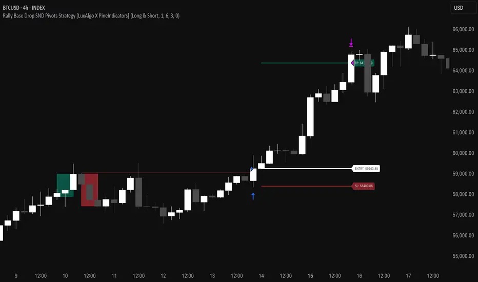
Rally Base Drop SND Pivots Strategy [LuxAlgo X PineIndicators]This strategy is based on the Rally Base Drop (RBD) SND Pivots indicator developed by LuxAlgo. Full credit for the concept and original indicator goes to LuxAlgo.
The Rally Base Drop SND Pivots Strategy is a non-repainting supply and demand trading system that detects pivot points based on Rally, Base, and Drop (RBD) candles. This strategy automatically identifies key market structure levels, allowing traders to:
Identify pivot-based supply and demand (SND) zones.
Use fixed criteria for trend continuation or reversals.
Filter out market noise by requiring structured price formations.
Enter trades based on breakouts of key SND pivot levels.
How the Rally Base Drop SND Pivots Strategy Works
1. Pivot Point Detection Using RBD Candles
The strategy follows a rigid market structure methodology, where pivots are detected only when:
A Rally (R) consists of multiple consecutive bullish candles.
A Drop (D) consists of multiple consecutive bearish candles.
A Base (B) is identified as a transition between Rallies and Drops, acting as a pivot point.
The pivot level is confirmed when the formation is complete.
Unlike traditional fractal-based pivots, RBD Pivots enforce stricter structural rules, ensuring that each pivot:
Has a well-defined bullish or bearish price movement.
Reduces false signals caused by single-bar fluctuations.
Provides clear supply and demand levels based on structured price movements.
These pivot levels are drawn on the chart using color-coded boxes:
Green zones represent bullish pivot levels (Rally Base formations).
Red zones represent bearish pivot levels (Drop Base formations).
Once a pivot is confirmed, the high or low of the base candle is used as the reference level for future trades.
2. Trade Entry Conditions
The strategy allows traders to select from three trading modes:
Long Only – Only takes long trades when bullish pivot breakouts occur.
Short Only – Only takes short trades when bearish pivot breakouts occur.
Long & Short – Trades in both directions based on pivot breakouts.
Trade entry signals are triggered when price breaks through a confirmed pivot level:
Long Entry:
A bullish pivot level is formed.
Price breaks above the bullish pivot level.
The strategy enters a long position.
Short Entry:
A bearish pivot level is formed.
Price breaks below the bearish pivot level.
The strategy enters a short position.
The strategy includes an optional mode to reverse long and short conditions, allowing traders to experiment with contrarian entries.
3. Exit Conditions Using ATR-Based Risk Management
This strategy uses the Average True Range (ATR) to calculate dynamic stop-loss and take-profit levels:
Stop-Loss (SL): Placed 1 ATR below entry for long trades and 1 ATR above entry for short trades.
Take-Profit (TP): Set using a Risk-Reward Ratio (RR) multiplier (default = 6x ATR).
When a trade is opened:
The entry price is recorded.
ATR is calculated at the time of entry to determine stop-loss and take-profit levels.
Trades exit automatically when either SL or TP is reached.
If reverse conditions mode is enabled, stop-loss and take-profit placements are flipped.
Visualization & Dynamic Support/Resistance Levels
1. Pivot Boxes for Market Structure
Each pivot is marked with a colored box:
Green boxes indicate bullish demand zones.
Red boxes indicate bearish supply zones.
These boxes remain on the chart to act as dynamic support and resistance levels, helping traders identify key price reaction zones.
2. Horizontal Entry, Stop-Loss, and Take-Profit Lines
When a trade is active, the strategy plots:
White line → Entry price.
Red line → Stop-loss level.
Green line → Take-profit level.
Labels display the exact entry, SL, and TP values, updating dynamically as price moves.
Customization Options
This strategy offers multiple adjustable settings to optimize performance for different market conditions:
Trade Mode Selection → Choose between Long Only, Short Only, or Long & Short.
Pivot Length → Defines the number of required Rally & Drop candles for a pivot.
ATR Exit Multiplier → Adjusts stop-loss distance based on ATR.
Risk-Reward Ratio (RR) → Modifies take-profit level relative to risk.
Historical Lookback → Limits how far back pivot zones are displayed.
Color Settings → Customize pivot box colors for bullish and bearish setups.
Considerations & Limitations
Pivot Breakouts Do Not Guarantee Reversals. Some pivot breaks may lead to continuation moves instead of trend reversals.
Not Optimized for Low Volatility Conditions. This strategy works best in trending markets with strong momentum.
ATR-Based Stop-Loss & Take-Profit May Require Optimization. Different assets may require different ATR multipliers and RR settings.
Market Noise May Still Influence Pivots. While this method filters some noise, fake breakouts can still occur.
Conclusion
The Rally Base Drop SND Pivots Strategy is a non-repainting supply and demand system that combines:
Pivot-based market structure analysis (using Rally, Base, and Drop candles).
Breakout-based trade entries at confirmed SND levels.
ATR-based dynamic risk management for stop-loss and take-profit calculation.
This strategy helps traders:
Identify high-probability supply and demand levels.
Trade based on structured market pivots.
Use a systematic approach to price action analysis.
Automatically manage risk with ATR-based exits.
The strict pivot detection rules and built-in breakout validation make this strategy ideal for traders looking to:
Trade based on market structure.
Use defined support & resistance levels.
Reduce noise compared to traditional fractals.
Implement a structured supply & demand trading model.
This strategy is fully customizable, allowing traders to adjust parameters to fit their market and trading style.
Full credit for the original concept and indicator goes to LuxAlgo.
Rally Base Drop SND Pivots [LuxAlgo]The Rally Base Drop SND Pivots indicator uses "Rally", "Base", and "Drop" Candles to determine pivot points at which supply and demand (SND) levels are drawn.
🔶 USAGE
Rally, Base, and Drop (RBD) candles create a formula for seeing market structure through a fixed methodology. We are able to use this concept to point out pivot areas where Rallies and Drops directly meet.
The RBD SND Pivots are similar to traditionally identified "fractal" pivot points, with one key difference.
RBD SND Pivots detect a specific number of Rally and Drop candles directly back-to-back, requiring one side of the pivot to contain entirely green candles and the other to be entirely red candles or vice versa.
Since these pivot levels are based on Rally, Base, and Drop candles, the method directly implements rigid logic to further structure a trading system when utilizing these pivot levels with traditional SND concepts.
Furthermore, by implementing this logic when looking for pivots, a significant portion of potential noise is naturally filtered out.
🔶 DETAILS
In typical SND systems, the term "Base" is used for multiple meanings.
In this indicator, the base is a product of a pivot being formed. Once a Pivot is identified, the "Base" is marked as the first Rally or Drop of the second half of the pivot formation.
Once the pivot is identified, the high or low of the base candle is used to measure the pivot level.
🔶 SETTINGS
Length: Sets the number of Rally and Drop Candles that the script will require to identify pivots.
Ex. "3" = 3 Rally followed by 3 Drop
Historical Lookback: Hides historic levels based on a bar # Lookback from the current bar.
When set to 0, all Levels will display. (0 by default)

Identify Rally, Base & Drop CandleThis Pine Script indicator identifies and labels rally, base, and drop candles on your chart, aiding traders in recognizing key price action phases. Rally candles represent periods of upward price momentum, typically characterized by strong bullish movement. Base candles indicate consolidation or sideways movement, suggesting a temporary pause in the trend. Drop candles signify downward price momentum, often accompanied by strong bearish movement. By identifying these distinct candle types, traders can gain insights into the market's current phase and potential future price movements.
Key Features:
Identifies rally, base, and drop candles based on customizable criteria such as body percentage.
Labels each candle type for easy visualization and interpretation.
Helps traders identify trend continuation or potential reversal points.
Compatible with various timeframes and trading instruments.
Customizable parameters allow traders to adjust the sensitivity of the identification process to suit their trading strategies.
Usage Instructions:
Apply the indicator to your chart.
Configure the settings according to your preferences
Observe the labeled candles on the chart to identify rally, base, and drop phases.
Consider additional analysis and risk management strategies to confirm trading decisions and manage risk effectively.
Disclaimer: This indicator is provided for informational and educational purposes only. It is not intended as financial advice or trading recommendations. Trading involves risks, and it's essential to conduct thorough research and practice proper risk management techniques.

Pump and Dump CandlesDescription:
The Pump and Dump Candles indicator is a robust tool designed to assist traders in identifying potential pump and dump scenarios within the financial markets. This innovative indicator combines key elements of price action and volatility to provide valuable insights into market manipulations and potential risks. This indicator uses ATR to standardize candle sizes as they vary across different assets and timeframes; by using a percentage of the ATR, you can adjust the threshold dynamically based on the volatility of each asset.
Features:
- Pump/dump candles: Candle bars are colored green when it is pumping and red when it is dumping.
- Pump/dump rallies: The background turns green during sequences of consecutive pumping candles and red in the presence of sustained dumping.
- Candle Size Percentage: Users have the flexibility to define a personalized percentage for calculating candle size.
- Wick Exclusion: This option factors in pump and dump candles with substantial body sizes, mitigating the impact of bars with large wicks and smaller candle bodies.
( These inputs can all be modified within the indicator settings )
Utility:
Understanding pump and dump candles and rallies can be a valuable asset for traders seeking to navigate volatile markets effectively. By closely monitoring the color-coded indicators that highlight pumping and dumping phases, traders gain insights into abrupt and often exaggerated price movements. This information aids in identifying potential short-term trends and anticipating market reversals. Pump and dump rallies, signaled by consecutive pumping or dumping candles, provide a visual representation of sustained buying or selling pressure, allowing traders to assess the strength and duration of market sentiment. Armed with this knowledge, traders can make informed decisions, implement risk management strategies, and capitalize on short-term opportunities, thereby enhancing their overall trading proficiency in dynamic market conditions.

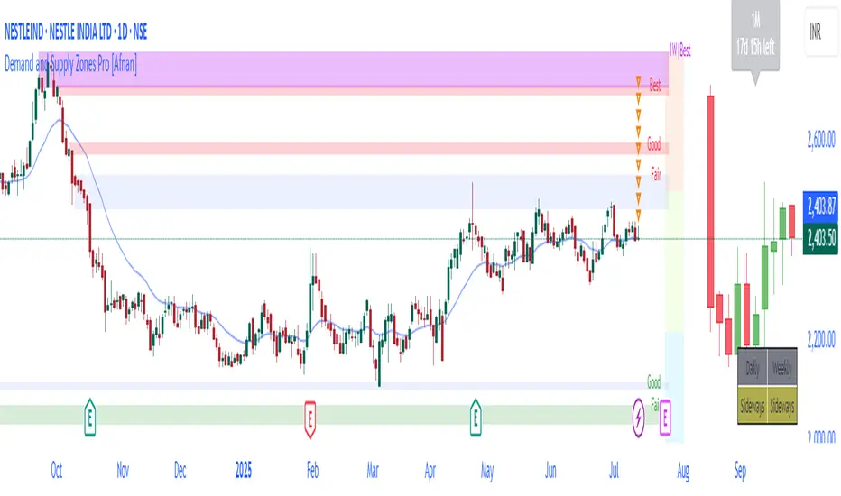
Demand and Supply Zones Lite [Afnan]Are you looking to level up your trading game and spot potential turning points in the stock market? Introducing the Smart Money Demand and Supply Zones indicator, a powerful tool designed to identify opportunities created by the Smart money.
The Smart Money Demand and Supply Zones indicator is built upon the principles of Rally Base Rally (RBR), Rally Base Drop (RBD), Drop Base Rally (DBR), Drop Base Drop (DBD).
🔍 Key Details 🔍
The "Smart Money" concept refers to large institutional investors and professional traders who possess significant financial resources and expertise. The importance of smart money lies in their influence on market trends and price movements. Their actions and positions often serve as signals for retail traders and investors to make informed decisions.
Formation of Smart Money: Smart money is attracted to areas in the market where they can find favourable risk-to-reward opportunities.
1. Rally Base Rally (RBR) Zones: These zones occur after a rally (upward price movement), followed by a period of consolidation (base formation), and then another rally. Smart money often forms positions here as it suggests a strong uptrend continuation.
2. Rally Base Drop (RBD) Zones: In this case, there is a rally, followed by a base formation, but instead of another rally, the price drops. Smart money may position themselves here in anticipation of a potential trend reversal.
3. Drop Base Rally (DBR) Zones: These zones form when there is a drop in price, followed by a base formation, and then a rally. Smart money may take positions here, expecting a trend reversal to the upside.
4. Drop Base Drop (DBD) Zones: In this scenario, the price drops, then forms a base, but subsequently continues to drop. Smart money might take bearish positions here, anticipating further downward movement.
🚀 Pending Orders from Smart Money Zones: 🚀
When the price approaches these smart money zones, institutional investors often place remaining pending orders to enter the market.
By identifying RBR/DBR zones as potential buying opportunities and RBD/DBD zones as potential selling opportunities on price charts, retail traders can align their trades with smart money activities. Implementing proper risk management and confirming signals enhances the likelihood of successful trades by following the footsteps of institutional investors.
💡 Key Features of the Indicator 💡
This indicator includes the following features:
Customizable Zone Length: Adjust the number of base candles in a zone to suit your preferences and strategy.
Candle Body Size Customization: Personalize the body size of candles for fine-tuning visual representation.
Base Candle Selection: Choose between the body of the candle or narrow range candles as the base candle for zone plotting.
Colour Customization For Candles: Customize Drop, Base, Rally, and Zone colours to match your visual preferences.
Number of Zones: This feature is flexible, allowing you to customize the quantity of zones displayed on the chart for improved visibility.
Zone Colours: You have the option to personalize the colours for both fresh and tested zones based on your preferences.
Zone Strength Customization: Adjust candle sensitivity for better control.
Swing High and Swing Low: Enable or disable support and demand lines based on Swing High and Swing Low.
Wick of Candle: Customize zone plotting using the body or wicks of candles for flexible analysis.
Previous Zones: You can choose to display or disable previous zones on the chart that have been deleted and utilized before. This option helps you maintain a clutter-free chart while retaining valuable historical information.
Moving Averages: Utilize four (4) customizable Moving Averages to enhance analysis from any time frame.
💎 Employing a Top-Down Approach and Multiple Time Frame Analysis: 💎
Let's delve into the concept of adopting a top-down approach combined with multiple time frame analysis in trading scenarios. It is consistently recommended to trade with the trend because, as the saying goes, "the trend is your friend." If you identify a demand zone on the chart but the overall trend is downward, it's crucial to confirm the stock's trend in higher timeframes. Avoid purchasing from the demand zone in such a scenario as you would be going against the trend. To consider buying from the demand zone, ensure that the overall trend is upward by checking the higher timeframe.
Similarly, if the higher timeframe trend is upward but the price is approaching a higher timeframe supply zone, refrain from buying in the lower timeframe. If the price reaches a higher timeframe supply zone, there is a likelihood that the price will face rejection from this zone.
If the price is significantly extended from the EMA 20 on a higher timeframe, for instance, if you plan to trade on a 30-minute timeframe and the price is considerably extended from the daily EMA 20, consider trading from zones that are closer to the daily EMA 20. When the price is extended from the higher timeframe EMA 20, it implies that the price is expensive, and there may be a tendency for it to return to the EMA 20. Therefore, it is advisable to trade from zones that are closer to the higher timeframe EMA 20 and avoid zones that are extended from the higher timeframe EMA 20.
For instance, imagine you're considering purchasing a stock that has reached a demand zone known as Rally Base Rally (RBR). If you identify a corresponding demand zone in a higher time frame located at the same position, and concurrently observe that the intermediate time frame indicates an upward trend, your potential for a successful trade is enhanced.
Conversely, if you spot a buying zone in a lower time frame, but notice a supply zone in the higher time frame at that exact position, the likelihood of a profitable trade decreases significantly. In such cases, it's prudent to steer clear of the lower time frame zone. This emphasizes the critical significance of employing a top-down approach or conducting a multiple time frame analysis.
Note: By Doing top down approach you can easily follow the footprints of smart money in the stock market or any other market by using this indicator and make well-informed trading decisions.
Remember, don't make decisions based only on one time frame. Check the overall trend of the stock and look at buying and selling points on bigger time scales. If you only use one time scale, your chances of making successful trades will be lower.
💎 To execute these comprehensive analyses and optimize your trading outcomes, you can make use of my indicator called "Demand & Supply Zone Scoring: Rally Base & Drop Concept."💎
This indicator is thoughtfully crafted to assess the strength of trade setups based on demand and supply zones through a scoring mechanism. It serves as your guide for correct top-down and multiple time frame analysis, eliminating the possibility of overlooking any strategic parameters. To gain deeper insights, you can learn more about how to use this indicator in its description.
Lastly, Thank you for your support, your likes & comments." Feel free to ask if you have questions.
Let's conquer the markets together! 🚀

Demand and Supply Zones Pro [Afnan]Are you looking to level up your trading game and spot potential turning points in the stock market? Introducing the Smart Money Demand and Supply Zones indicator, a powerful tool designed to identify opportunities created by the Smart money.
The Smart Money Demand and Supply Zones indicator is built upon the principles of Rally Base Rally (RBR), Rally Base Drop (RBD), Drop Base Rally (DBR), Drop Base Drop (DBD).
🔍 Key Details 🔍
The "Smart Money" concept refers to large institutional investors and professional traders who possess significant financial resources and expertise. The importance of smart money lies in their influence on market trends and price movements. Their actions and positions often serve as signals for retail traders and investors to make informed decisions.
Formation of Smart Money: Smart money is attracted to areas in the market where they can find favourable risk-to-reward opportunities.
1. Rally Base Rally (RBR) Zones: These zones occur after a rally (upward price movement), followed by a period of consolidation (base formation), and then another rally. Smart money often forms positions here as it suggests a strong uptrend continuation.
2. Rally Base Drop (RBD) Zones: In this case, there is a rally, followed by a base formation, but instead of another rally, the price drops. Smart money may position themselves here in anticipation of a potential trend reversal.
3. Drop Base Rally (DBR) Zones: These zones form when there is a drop in price, followed by a base formation, and then a rally. Smart money may take positions here, expecting a trend reversal to the upside.
4. Drop Base Drop (DBD) Zones: In this scenario, the price drops, then forms a base, but subsequently continues to drop. Smart money might take bearish positions here, anticipating further downward movement.
🚀 Pending Orders from Smart Money Zones: 🚀
When the price approaches these smart money zones, institutional investors often place remaining pending orders to enter the market.
By identifying RBR/DBR zones as potential buying opportunities and RBD/DBD zones as potential selling opportunities on price charts, retail traders can align their trades with smart money activities. Implementing proper risk management and confirming signals enhances the likelihood of successful trades by following the footsteps of institutional investors.
💡 Key Features of the Indicator 💡
This indicator includes the following features:
Customizable Zone Length: Adjust the number of base candles in a zone to suit your preferences and strategy.
Candle Body Size Customization: Personalize the body size of candles for fine-tuning visual representation.
Alert Feature: The alert feature can notify you when the price reaches a demand or supply zone, with the ability to customize the risk-to-reward parameters.
Base Candle Selection: Choose between the body of the candle or narrow range candles as the base candle for zone plotting.
Colour Customization For Candles: Customize Drop, Base, Rally, and Zone colours to match your visual preferences.
Number of Zones: This feature is flexible, allowing you to customize the quantity of zones displayed on the chart for improved visibility.
Zone Colours: You have the option to personalize the colours for both fresh and tested zones based on your preferences.
Zone Strength Customization: Adjust candle sensitivity for better control.
Swing High and Swing Low: Enable or disable support and demand lines based on Swing High and Swing Low.
Wick of Candle: Customize zone plotting using the body or wicks of candles for flexible analysis.
Previous Zones: You can choose to display or disable previous zones on the chart that have been deleted and utilized before. This option helps you maintain a clutter-free chart while retaining valuable historical information.
Moving Averages: Utilize four (4) customizable Moving Averages to enhance analysis from any time frame.
💎 Employing a Top-Down Approach and Multiple Time Frame Analysis: 💎
Let's delve into the concept of adopting a top-down approach combined with multiple time frame analysis in trading scenarios. It is consistently recommended to trade with the trend because, as the saying goes, "the trend is your friend." If you identify a demand zone on the chart but the overall trend is downward, it's crucial to confirm the stock's trend in higher timeframes. Avoid purchasing from the demand zone in such a scenario as you would be going against the trend. To consider buying from the demand zone, ensure that the overall trend is upward by checking the higher timeframe.
Similarly, if the higher timeframe trend is upward but the price is approaching a higher timeframe supply zone, refrain from buying in the lower timeframe. If the price reaches a higher timeframe supply zone, there is a likelihood that the price will face rejection from this zone.
If the price is significantly extended from the EMA 20 on a higher timeframe, for instance, if you plan to trade on a 30-minute timeframe and the price is considerably extended from the daily EMA 20, consider trading from zones that are closer to the daily EMA 20. When the price is extended from the higher timeframe EMA 20, it implies that the price is expensive, and there may be a tendency for it to return to the EMA 20. Therefore, it is advisable to trade from zones that are closer to the higher timeframe EMA 20 and avoid zones that are extended from the higher timeframe EMA 20.
For instance, imagine you're considering purchasing a stock that has reached a demand zone known as Rally Base Rally (RBR). If you identify a corresponding demand zone in a higher time frame located at the same position, and concurrently observe that the intermediate time frame indicates an upward trend, your potential for a successful trade is enhanced.
Conversely, if you spot a buying zone in a lower time frame, but notice a supply zone in the higher time frame at that exact position, the likelihood of a profitable trade decreases significantly. In such cases, it's prudent to steer clear of the lower time frame zone. This emphasizes the critical significance of employing a top-down approach or conducting a multiple time frame analysis.
Note: By Doing top down approach you can easily follow the footprints of smart money in the stock market or any other market by using this indicator and make well-informed trading decisions.
Remember, don't make decisions based only on one time frame. Check the overall trend of the stock and look at buying and selling points on bigger time scales. If you only use one time scale, your chances of making successful trades will be lower.
💎 To execute these comprehensive analyses and optimize your trading outcomes, you can make use of my indicator called "Demand & Supply Zone Scoring: Rally Base & Drop Concept."💎
This indicator is thoughtfully crafted to assess the strength of trade setups based on demand and supply zones through a scoring mechanism. It serves as your guide for correct top-down and multiple time frame analysis, eliminating the possibility of overlooking any strategic parameters. To gain deeper insights, you can learn more about how to use this indicator in its description.
Lastly, Thank you for your support, your likes & comments." Feel free to ask if you have questions.
Let's conquer the markets together! 🚀
Incomplete Session Candle - Incomplete Timeframe Candle Marker The "Incomplete Session Candle - Incomplete Timeframe Candle Marker" is an advanced tool tailored for technical analysts who understand the importance of accurate timeframes in their charting. While the indicator is not limited to the Indian market, its genesis is rooted in the nuances of trading sessions like those in India, which span 375 minutes from 9:15 AM to 3:30 PM.
Key Features:
Detects if the current timeframe is intraday (minutes or hours).
Calculates the expected duration of the candle for the chosen timeframe.
Highlights candles that don't achieve their expected session duration by placing a cross shape above the bar.
Compatible across various intraday timeframes, aiding traders in spotting discrepancies promptly.
Why We Made This: Not Just for India:
While we looked at the Indian market, this indicator works everywhere. Regular timeframes like 30 minutes, 1 hour, and 2 hours often end with incomplete candles, especially at the end of the trading day. For example:
A 30-minute timeframe makes 13 candles, but the last one is only 15 minutes long.
A 1-hour timeframe shows 7 candles, but the last one is just the last 15 minutes.
By switching to different timeframes like 25 minutes, 75 minutes, and 125 minutes, you get more complete information for better trading decisions. Learn more about this in our article: "Power of 25, 75, and 125-Minute Timeframes in the Indian Market", recognized by Trading View's Editors' Pick.
Benefits:
The indicator extends its benefits even to users without access to certain timeframes. It accommodates traders using a 1-hour timeframe (pertaining to Indian traders). By employing this indicator, traders consistently remain mindful of incomplete candles within their chosen timeframe
For those who utilize concepts like RBR, RBD, DBR, and DBD, this indicator is paramount. An incomplete candle can skew analysis, leading to potential misinterpretations of base or leg candles.
Final thoughts:
In markets like the Indian stock market, adopting such a tool is not just beneficial, but necessary. Whether you have access to unconventional timeframes or are using traditional ones, recognizing and accounting for the limitations of incomplete candles is critical & it's important to know if your candles fit the timeframe properly. This indicator gives you a better view of the market, which helps you make smarter trades.
Lastly, Thank you for your support! Your likes & comments. If you want to give any feedback then you can give in comment section.
Let's conquer the markets together!

Demand & Supply Zone Scoring: Rally Base & Drop ConceptDemand & Supply Zone Scoring Indicator
The Demand & Supply Zone Scoring indicator is designed to calculate the Trade Strength Score based on the concepts of demand and supply zones, specifically RBR (Rally Base Rally), RBD (Rally Base Drop), DBD (Drop Base Drop), and DBR (Drop Base Rally).
The Demand & Supply Zone Scoring indicator is specifically designed to facilitate a top-down approach with multiple timeframe analysis. It considers the higher timeframe (HTF) for curve analysis, intermediate timeframes (ITF) for trend analysis, and lower timeframes (LTF) for zone-specific analysis.
The indicator provides a table displayed on the chart, offering valuable information for analysis. Let's go through each row of the table:
1. Location:
This row represents the analysis of the curve on the higher time frame (HTF) to identify key levels. It determines whether the price is in a retail area (high on the curve) or a wholesale area (low on the curve). Trading within the wholesale area is considered a strong sign.
2. Trend:
This row focuses on the intermediate time frame (ITF) trend. It indicates whether the trend is upward or downward. If the ITF trend is up and you intend to buy, it suggests a strong point.
3. Achievement:
This row analyzes the achievement of the zone on the lower time frame (LTF). It considers whether the leg-out candle or follow-through candles of the zone have broken any opposite side zone or pivot level. A breakout in the opposite direction is seen as an excellent point.
4. Strength:
This row assesses the strength of the zone on the lower time frame (LTF) where the trade is planned. It looks at the strength of the leg-out candle, such as whether it's a gap candle, an exciting candle, or a candle with follow-through. A strong leg-out candle indicates an excellent point.
5. Time:
This row evaluates the time spent by base candles inside the zone on the lower time frame (LTF). It considers the number of base candles and the duration spent in the zone. Typically, 1 to 3 base candles are seen as strong, while more than 6 base candles receive 0 points.
6. Reward-to-Risk Ratio (RR):
This row focuses on the Risk-to-Reward (RR) ratio of the zone on the lower time frame (LTF) where the trade is planned. It compares the potential reward to the risk. A higher RR ratio, such as 1:3 or greater, is considered excellent.
7. Freshness:
This row analyzes the freshness of the zone on the lower time frame (LTF). It indicates whether the zone is new or has been tested multiple times. A fresh zone or one that has been tested only once is preferable.
Furthermore, it's important to mention that you have the flexibility to customize the text for each parameter according to your specific requirements. The table is designed to be fully customizable, allowing you to adapt the wording to your preferences and trading strategy.
This customization feature ensures that the indicator aligns with your personal trading approach and makes it easier for you to interpret and analyze the information provided in the table.
Additionally, please note that only the total score is displayed in the table on the chart by default. This is to avoid any visibility issues caused by displaying all the parameters. However, if you wish to see all the parameters in the table on the chart, you can easily enable them through the settings.
By enabling the parameters, you will have a comprehensive view of each factor's contribution to the Trade Strength Score directly on the chart.
By utilizing this indicator, calculating the Trade Strength Score becomes easier, providing a comprehensive analysis of various factors that influence trading decisions.
This indicator is developed by Afnan Tajuddin to assist fellow traders in conducting a top-down approach in an effective and efficient manner.
For more educational articles and trade setup ideas, feel free to follow me on TradingView and join me on the journey towards financial freedom through trading.

Carrey's Structure Supply and DemandThis script uses basic Rally Base Rally, Rally Base Drop, Drop Base Drop, and Drop Base Rally concepts to draw supply and demand zones. While the script is designed to account for multiple (up to 5) candles in the "base" phase, the box it will draw will only be the high and low of the last candle before the final Rally/Drop candle.

JPMorgan VIX Buy SignalJPMorgan Chase & Co. strategists have identified what they say is a near bulletproof indicator to strengthen their argument that stock markets are poised to rally.
The buy signal is triggered when the Cboe Volatility Index (VIX) rises by more than 50% of its 1-month (30 day) moving average, which it last did on January 25th 2022, according to the strategists led by Mislav Matejka. The indicator has proven 100% accurate outside of recessions over the last three decades.
Instructions:
Symbol - VIX
Timeframe - Daily
Red Triangle - Close / 30 Day SMA >= 1.5

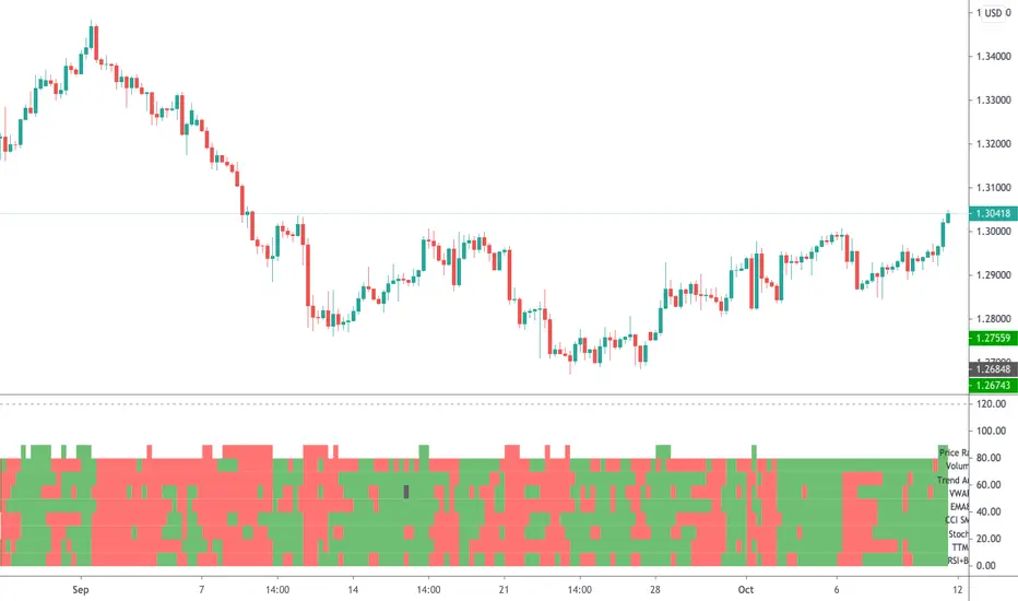
Radar Screen v3This is a combination of various indicators that very rarely conflict, thus giving us a good understanding:
- "Price Rally" detecting whether price is rallying, giving us confidence it will continue.
- Volume - knowing volume is going with the trend is a good confidence check.
- Trend Angle - This will go red or green depending on whether the price angle is going up or down, taken over three bars.
- VWAP for all of these stock traders.
- EMA8 is a very sensitive moving average, good for short term trades.
- CCI SMA is a strategy I commonly use, please check out my other indicators for a functional description.
- Stochastics is used throughout many systems.
- RSI BB shows where price is rebounding of the bollinger band and then moving up or down.
As per all of my indicators, the system is simple - The more green lines you see, the stronger the buy signal. The more red lines you see, the stronger the sell. If its a 50/50 mix of red and green, then don't trade.
I can customise this further or add other strategies, please message me.
Guerrilla AdvancedThis indicator was designed with people without Pro License in mind (Including many of my close friends).
Basically, you will get a combo of few different tools in one box, with ability to turn them on and off with a single check mark, also, you have total control over the input numbers that was used in calculations if you so want to, for example, sometimes when i see a massive bullish up trend, i reduce the short rally from 12 to 8 even 6 to get faster signal for selling the trend.
So, what will you get in this pack?
1- Ichimoko. Yes, you heard it right, although we have it in the default tools but hey, it will use one indicator slot and if you don't have a pro license, you will use that slot
2- Rally. This is an old yet very powerful system for getting buy or sell signals, basically, you get two lines and for making the life easier i draw a cloud between them. when the trend passes above the cloud and it was bellow it in past, right after the very first candle that gets above the cloud you can put the buy order, and vice versa, the moment a candle body enters the cloud, if you want an aggressive signal, you can sell, if not, you may want to wait to see if the candles drop bellow the cloud or not then decide.
3- Resistance Support Cloud. Most of us always heard about resistance and support "lines" but many of us don't know that, in each trend, the trend line itself is a resistance or support line, and when you are going in a bullish or bearish tunnel, the floor and roof of tunnels are again resistance and supports, using this part of the tool, just like rally, you get a cloud that shows you the resistance / support "zone"
4- William Fractals. To be honest, I got this part of the code from another source available around. Why? looking at those fractal indicators, you can easily eyeball the trend line or existence of a tunnel.
5- Different EMA lines. If you are one of those people that use EMA lines for their trading, have fun with them, there are few different standard ones and even a custom one that you can put your desired number for it.