SuperTrend Heikin AshiSupertrend Heikin Ashi is an indicator based on the standard calculation of the Supertrend with the difference of using the Open and Close value of the Heikin Ashi candles instead of the normal Candle Sticks.
In this way the main characteristic of the HA candles is exploited, thus filtering movements that could generate false signals.
I recommend using SPY, SPX, QQQ to be aware of the market situation, not operating (or paying great attention) long on stocks when the indicator is red and the price is below the drawn line.
Cari dalam skrip untuk "国泰黄金ETF联接C相关行业指数的最新政策"

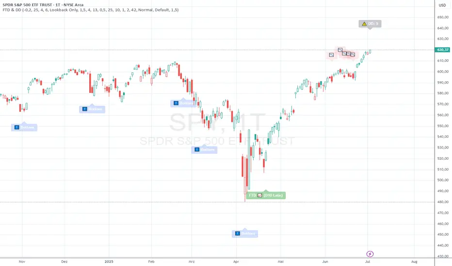
FTD & DD AnalyzerFTD & DD Analyzer
A comprehensive tool for identifying Follow-Through Days (FTDs) and Distribution Days (DDs) to analyze market conditions and potential trend changes, based on William J. O'Neil's proven methodology.
About the Methodology
This indicator implements the market analysis techniques developed by William J. O'Neil, founder of Investor's Business Daily and author of "How to Make Money in Stocks." O'Neil's research, spanning market data back to the 1880s, has successfully identified major market turns throughout history. His FTD and DD concepts remain crucial tools for institutional investors and serious traders.
Overview
This indicator helps traders identify two critical market conditions:
Distribution Days (DDs) - days of institutional selling pressure
Follow-Through Days (FTDs) - confirmation of potential market bottoms and new uptrends
The combination of these signals provides valuable insight into market health and potential trend changes.
Key Features
Distribution Day detection with customizable criteria
Follow-Through Day identification based on classical methodology
Market bottom detection using EMA analysis
Dynamic warning system for accumulated Distribution Days
Visual alerts with customizable labels
Advanced debug mode for detailed analysis
Flexible display options for different trading styles
Distribution Days Analysis
What is a Distribution Day?
A Distribution Day occurs when:
The price closes lower by a specified percentage (default -0.2%)
Volume is higher than the previous day
DD Settings
Price Threshold: Minimum price decline to qualify (default -0.2%)
Lookback Period: Number of days to analyze for DD accumulation (default 25)
Warning Levels:
First warning at 4 DDs
Severe warning (SOS - Sign of Strength) at 6 DDs
Display Options:
Show/hide DD count
Show/hide DD labels
Choose between showing all DDs or only within lookback period
Follow-Through Day Detection
What is a Follow-Through Day?
Following O'Neil's research, a Follow-Through Day confirms a potential market bottom when:
Occurs between day 4 and 13 after a bottom formation (optimal: days 4-7)
Shows significant price gain (default 1.5%)
Accompanied by higher volume than the previous day
Key Statistics:
FTDs followed by distribution on days 1-2 fail 95% of the time
Distribution on day 3 leads to 70% failure rate
Later distribution (days 4-5) shows only 30% failure rate
FTD Settings
Minimum Price Gain: Required percentage gain (default 1.5%)
Valid Window: Day 4 to Day 13 after bottom
Quality Rating:
🚀 for FTDs occurring within 7 days (historically most reliable)
⭐ for later FTDs
Market Bottom Detection
The indicator uses a sophisticated approach to identify potential market bottoms:
EMA Analysis:
Tracks 8 and 21-period EMAs
Monitors EMA alignment and momentum
Customizable tolerance levels
Price Action:
Looks for lower lows within specified lookback period
Confirms bottom with subsequent price action
Reset mechanism to prevent false signals
Visual Indicators
Label Types
📉 Distribution Days
⬇️ Market Bottoms
🚀/⭐ Follow-Through Days
⚠️ DD Warning Levels
Customization Options
Label size: Tiny, Small, Normal, Large
Label style: Default, Arrows, Triangles
Background colors for different signals
Dynamic positioning using ATR multiplier
Practical Usage
1. Monitor DD Accumulation:
Watch for increasing number of Distribution Days
Pay attention to warning levels (4 and 6 DDs)
Consider reducing exposure when warnings appear
2. Bottom Recognition:
Look for potential bottom formations
Monitor EMA alignment and price action
Wait for confirmation signals
3. FTD Confirmation:
Track days after potential bottom
Watch for strong price/volume action in valid window
Note FTD quality rating for additional context
Alert System
Built-in alerts for:
New Distribution Days
Follow-Through Day signals
High DD accumulation warnings
Tips for Best Results
Use multiple timeframes for confirmation
Combine with other market health indicators
Pay attention to sector rotation and market leadership
Monitor volume patterns for confirmation
Consider market context and external factors
Technical Notes
The indicator uses advanced array handling for DD tracking
Dynamic calculations ensure accurate signal generation
Debug mode available for detailed analysis
Optimized for real-time and historical analysis
Additional Information
Compatible with all markets and timeframes
Best suited for daily charts
Regular updates and maintenance
Based on O'Neil's time-tested market analysis principles
Conclusion
The FTD & DD Analyzer provides a systematic approach to market analysis, combining O'Neil's proven methodologies with modern technical analysis. It helps traders identify potential market turns while monitoring institutional participation through volume analysis.
Remember that no indicator is perfect - always use in conjunction with other analysis tools and proper risk management.
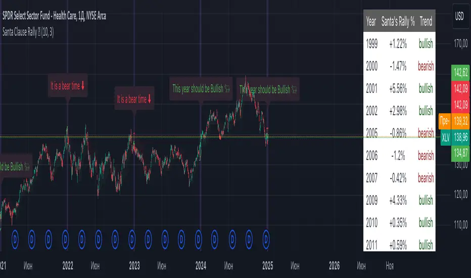
Santa Clause RallyA Santa Claus rally is a calendar effect that involves a rise in stock prices during the last 5 trading days in December and the first 2 trading days in the following January.
The Santa Claus rally can potentially predict the future trend of stocks in the coming year.
Merry Christmas and Happy New Year 🎄🎄🎄
OBV TSI IndicatorThe OBV TSI Indicator combines two powerful technical analysis tools: the On-Balance Volume (OBV) and the True Strength Index (TSI). This hybrid approach provides insights into both volume dynamics and momentum, helping traders identify potential trend reversals, breakouts, or continuations with greater accuracy.
The OBV TSI Indicator tracks cumulative volume shifts via OBV and integrates the TSI for momentum analysis. It offers customizable moving average options for further smoothing. Visual trendlines, pivot points, and signal markers enhance clarity.
The OBV tracks volume flow by summing volumes based on price changes. Positive volume is added when prices rise, and negative volume is subtracted when prices fall. The result is smoothed to detect meaningful trends in volume. A volume spread is derived from the difference between the smoothed OBV and cumulative volume. This is then adjusted by the price deviation to generate the shadow spread, which highlights critical volume-driven price levels.
The shadow spread is added to either the high or low price, depending on its sign, producing a refined OBV output. This serves as the main source for the subsequent TSI calculation. The TSI is a momentum oscillator calculated using double-smoothed price changes. It provides an accurate measure of trend strength and direction.
Various moving average options, such as EMA, DEMA, or TEMA, are applied to the smoothed OBV for additional trend filtering. Users can select their preferred type and length to suit their trading strategy. Trendlines are plotted to visualize the overall direction. When a significant change in trend is detected, up or down arrows indicate potential buy or sell signals. The script identifies key pivot points based on the highest and lowest levels within a defined period. These pivots help pinpoint reversal zones.
The indicator offers customization options, allowing users to adjust the OBV length for smoothing, choose from various moving average types, and fine-tune the short, long, and signal periods for TSI. Additionally, users can toggle visibility for trendlines, signals, and pivots to suit their preferences.
This indicator is ideal for practical use cases such as spotting potential trend reversals by observing TSI crossovers and pivot levels, anticipating breakouts from key price levels using the shadow spread, and validating trends by aligning TSI signals with OBV and moving averages.
The OBV TSI Indicator is a versatile tool designed to enhance decision-making in trading by combining volume and momentum analysis. Its flexibility and visual aids make it suitable for traders of all experience levels. By leveraging its insights, you can confidently navigate market trends and improve your trading outcomes.

Economic RegimeThis indicator, "Economic Regime" , provides a comprehensive analysis of market conditions by combining multiple asset classes and financial metrics. It uses normalized scores and trend analysis to classify the current economic regime into one of four categories: Goldilocks, Reflation, Inflation, or Deflation. The classification is based on inputs like S&P 500 performance, bond yields, commodity prices, volatility indices, and sector ETFs. Additionally, it plots key financial spreads, including the yield spread (10Y-2Y) and credit spread (HYG-LQD), to offer deeper insights into liquidity and market sentiment. The background color dynamically reflects the identified economic regime, facilitating quick visual interpretation.

Money Flow ExtendedMoney Flow Extended (MF)
Definition
The Money Flow Extended (MF) indicator brings together the functionality of the Money Flow Index indicator (MFI) , a tool created by Gene Quong and Avrum Soudack and used in technical analysis for measuring buying and selling pressure, and The Relative Strength Index (RSI) , a well versed momentum based oscillator created by J.Welles Wilder Jr., which is used to measure the speed (velocity) as well as the change (magnitude) of directional price movements.
History
As the Money Flow Index (MFI) is quite similar to The Relative Strength Index (RSI), essentially the RSI with the added aspect of volume, adding a Moving Average, divergence calculation, oversold and overbought gradients, facilitates the transition from RSI, making the use of MFI pretty similar.
What to look for
Overbought/Oversold
When momentum and price rise fast enough, at a high enough level, eventual the security will be considered overbought. The opposite is also true. When price and momentum fall far enough, they can be considered oversold. Traditional overbought territory starts above 80 and oversold territory starts below 20. These values are subjective however, and a technical analyst can set whichever thresholds they choose.
Divergence
MF Divergence occurs when there is a difference between what the price action is indicating and what MF is indicating. These differences can be interpreted as an impending reversal. Specifically, there are two types of divergences, bearish and bullish.
Bullish MFI Divergence – When price makes a new low but MF makes a higher low.
Bearish MFI Divergence – When price makes a new high but MF makes a lower high.
Failure Swings
Failure swings are another occurrence which can lead to a price reversal. One thing to keep in mind about failure swings is that they are completely independent of price and rely solely on MF. Failure swings consist of four steps and are considered to be either Bullish (buying opportunity) or Bearish (selling opportunity).
Bullish Failure Swing
MF drops below 20 (considered oversold).
MF bounces back above 20.
MF pulls back but remains above 20 (remains above oversold)
MF breaks out above its previous high.
Bearish Failure Swing
MF rises above 80 (considered overbought)
MF drops back below 80
MF rises slightly but remains below 80 (remains below overbought)
MF drops lower than its previous low.
Summary
The Money Flow Extended (MF) can be a very valuable technical analysis tool. Of course, MF should not be used alone as the sole source for a trader’s signals or setups. MF can be combined with additional indicators or chart pattern analysis to increase its effectiveness.
Inputs
Length
The time period to be used in calculating the MF. 14 is the default.
Pivot Loopback
After how many bars you want the divergence to show, on the scale of 1-5. 5 is the default.
Calculate Divergence
Calculating divergences is needed in order for divergence alerts to fire.
Moving Average section
You can learn more about the inputs in the "Moving Average" section in this Help Center article .
Style
MF
Can toggle the visibility of the MF as well as the visibility of a price line showing the actual current value of the MF. Can also select the MF Line's color, line thickness and visual style.
MF-based MA
Can toggle the visibility of the MF-based MA as well as the visibility of a price line showing the actual current MA value. Can also select its color, line thickness and line style.
MF Upper Band
Can toggle the visibility of the Upper Band as well as sets the boundary, on the scale of 1-100, for the Upper Band (80 is the default). The color, line thickness and line style can also be determined.
MF Middle Band
Can toggle the visibility of the Middle Band as well as sets the boundary, on the scale of 1-100, for the Middle Band (50 is the default). The color, line thickness and line style can also be determined.
MF Lower Band
Can toggle the visibility of the Lower Band as well as sets the boundary, on the scale of 1-100, for the Lower Band (20 is the default). The color, line thickness and line style can also be determined.
MF Background Fill
Toggles the visibility of a Background color within the MF's boundaries. Can also change the Color itself as well as the opacity.
Overbought Gradient Fill
Can toggle the visibility of the Overbought Gradient Fill. Can also select its colors combination.
Oversold Gradient Fill
Can toggle the visibility of the Oversold Gradient Fill. Can also select its colors combination.
Precision
Sets the number of decimal places to be left on the indicator's value before rounding up. The higher this number, the more decimal points will be on the indicator's value.

Sum Trend OscillatorPublishing my first indicator.
This one accumulates bars over two short period and divide that by the difference between a long term mean value of high-low
Buy/Sell signal is when both line cross at close below or above the center line.

Premarket and Opening Range (First 30 minutes) LevelsThis indicator is for people who like to utilize the pre-market highs and pre-market Low's as well as the first 30 minutes high and low, or some people like to call the opening range. I hope you find value in this. Note, the levels will only appear after tracking. Premarket levels will happen after pre-market closes. Opening Range levels will show right after the first 30 minutes.
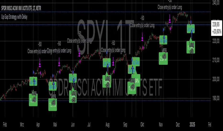
Up Gap Strategy with DelayThis strategy, titled “Up Gap Strategy with Delay,” is based on identifying up gaps in the price action of an asset. A gap is defined as the percentage difference between the current bar’s open price and the previous bar’s close price. The strategy triggers a long position if the gap exceeds a user-defined threshold and includes a delay period before entering the position. After entering, the position is held for a set number of periods before being closed.
Key Features:
1. Gap Threshold: The strategy defines an up gap when the gap size exceeds a specified threshold (in percentage terms). The gap threshold is an input parameter that allows customization based on the user’s preference.
2. Delay Period: After the gap occurs, the strategy waits for a delay period before initiating a long position. This delay can help mitigate any short-term volatility that might occur immediately after the gap.
3. Holding Period: Once the position is entered, it is held for a user-defined number of periods (holdingPeriods). This is to capture the potential post-gap trend continuation, as gaps often indicate strong directional momentum.
4. Gap Plotting: The strategy visually plots up gaps on the chart by placing a green label beneath the bar where the gap condition is met. Additionally, the background color turns green to highlight up-gap occurrences.
5. Exit Condition: The position is exited after the defined holding period. The strategy ensures that the position is closed after this time, regardless of whether the price is in profit or loss.
Scientific Background:
The gap theory has been widely studied in financial literature and is based on the premise that gaps in price often represent areas of significant support or resistance. According to research by Kaufman (2002), gaps in price action can be indicators of future price direction, particularly when they occur after a period of consolidation or a trend reversal. Moreover, Gaps and their Implications in Technical Analysis (Murphy, 1999) highlights that gaps can reflect imbalances between supply and demand, leading to high momentum and potential price continuation or reversal.
In trading strategies, utilizing gaps with specific conditions, such as delay and holding periods, can enhance the ability to capture significant price moves. The strategy’s delay period helps avoid potential market noise immediately after the gap, while the holding period seeks to capitalize on the price continuation that often follows gap formation.
This methodology aligns with momentum-based strategies, which rely on the persistence of trends in financial markets. Several studies, including Jegadeesh & Titman (1993), have documented the existence of momentum effects in stock prices, where past price movements can be predictive of future returns.
Conclusion:
This strategy incorporates gap detection and momentum principles, supported by empirical research in technical analysis, to attempt to capitalize on price movements following significant gaps. By waiting for a delay period and holding the position for a specified time, it aims to mitigate the risk associated with early volatility while maximizing the potential for sustained price moves.
ATR ReadoutDisplays a readout on the bottom right corner of the screen displaying ATR average (not of the individual candlestick, but of the current rolling period, including the candlestick in question).
Due to restrictions with Pine Script (or my knowledge thereof) only the current and previous candlestick data is shown, rather than the one currently hovered over.
The data is derived via the standard calculation for ATR.
Using this, one can quickly and easily get the proper data needed to calculate one's stop loss, rather than having to analyze the line graph of the basic ATR indicator.
Settings are implemented to change certain variables to your liking.

Range PolarityDescription:
This indicator is a "Rate of Change" style oscillator designed to measure market dynamics through the lens of price ranges. By utilizing the true range in conjunction with high and low separation, this script produces two distinct oscillators: one for positive price shifts and one for negative price shifts.
Key Features:
High/Low Isolation:
The script calculates the relative movement of upwards and downwards price movements over a user-defined period. This separation provides a nuanced view of market behavior, offering two separate signals for comparison.
Dynamic Transform Smoothing:
A smoothing transform is applied to the signals, ensuring better outlier handling while maintaining sensitivity to price extremes. This makes the oscillator especially suited for identifying overbought and oversold conditions.
Zero-Centered:
The zero line acts as a "gravity point," where shifts away or toward zero indicate market momentum. Signal crosses or reversals from extreme zones can signal potential entry or exit points.
Outlier Identification:
Unlike traditional ATR based strategies (e.g., Keltner Channels ), this indicator isolates high and low ranges, creating a more granular view of market extremes. These measurements can help identify shifts from the outlying positions and reversal opportunities.
Visual Enhancements:
Multiple layers enhance the visual distinction of the positive and negative transformations. Horizontal lines at key thresholds provide visual reference for overbought, oversold, and equilibrium zones.
How to Use:
Primary signals are shifts from outlying positions or a positive/negative cross. An extreme reading itself can reveal an incoming reversal when calibrated with other indicators or compared with higher timeframes. Pairing "Range Polarity" with volume and momentum can create a comprehensive strategy.
In conclusion, be aware the base length controls the window for high/low contributions while the transform smoothing enhances the raw data through normalization within a tempered range to filter out insignificant fluctuations.
Merry Christmas to all and have a Happy New Year!

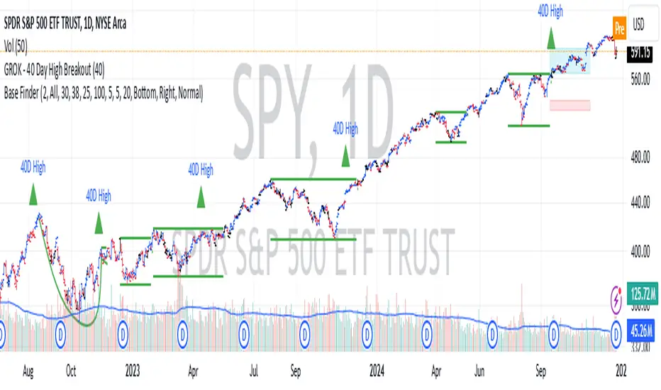
GROK - 40 Day High BreakoutTitle: GROK - Customizable High Breakout Detector
To scan base breakout with Pine Screener
Description:
This Pine Script indicator identifies high breakout patterns based on a user-defined lookback period. By default, it checks for a breakout of the 40-day high, but the period can be adjusted to suit your trading strategy. Key features include:
Custom Lookback Period: Easily modify the number of days for high breakout detection. Lookback period is length of base you want to scan using pine screener.
Visual Alerts: Displays a green triangle above the price bar when a breakout is detected.
Alert Conditions: Built-in alert notifications for automated breakout detection.
Screener Compatibility: Plots breakout signals as a histogram for screener use.
This script is ideal for traders looking to identify strong breakout patterns and incorporate them into their strategies.
How to Use:
Adjust the lookback period in the settings to match your desired breakout criteria.
Add alerts for automated notifications when a breakout is detected.
Use the visual markers and histogram to analyze breakout patterns on your chart.
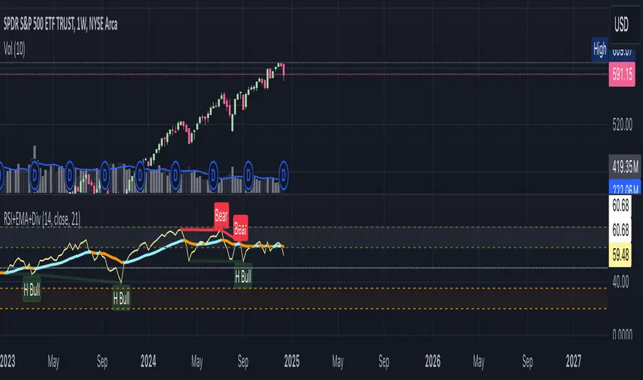
RSI+EMA+MZONES with DivergencesFeatures:
1. RSI Calculation:
Uses user-defined periods to calculate the RSI and visualize momentum shifts.
Plots key RSI zones, including upper (overbought), lower (oversold), and middle levels.
2. EMA of RSI:
Includes an Exponential Moving Average (EMA) of the RSI for trend smoothing and confirmation.
3. Bullish and Bearish Divergences:
Detects Regular divergences (labeled as “Bull” and “Bear”) for classic signals.
Identifies Hidden divergences (labeled as “H Bull” and “H Bear”) for potential trend continuation opportunities.
4. Customizable Labels:
Displays divergence labels directly on the chart.
Labels can be toggled on or off for better chart visibility.
5. Alerts:
Predefined alerts for both regular and hidden divergences to notify users in real time.
6. Fully Customizable:
Adjust RSI period, lookback settings, divergence ranges, and visibility preferences.
Colors and styles are easily configurable to match your trading style.
How to Use:
RSI Zones: Use RSI and its zones to identify overbought/oversold conditions.
EMA: Look for crossovers or confluence with divergences for confirmation.
Divergences: Monitor for “Bull,” “Bear,” “H Bull,” or “H Bear” labels to spot key reversal or continuation signals.
Alerts: Set alerts to be notified of divergence opportunities without constant chart monitoring.
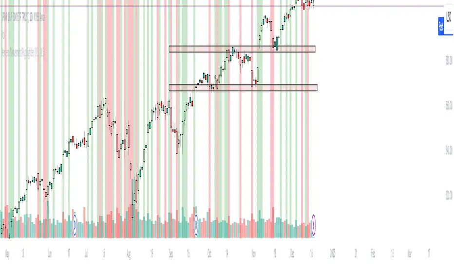
Percent Movement HighlighterThe Percent Movement Highlighter is a custom TradingView indicator that visually highlights candles based on their percentage movement relative to the previous day's close. The indicator uses two user-defined thresholds:
Positive Threshold: Marks candles that move up by a specified percentage or more.
Negative Threshold: Marks candles that move down by a specified percentage or more.
Features:
Visual Highlights:
Green candles for upward moves exceeding the positive threshold.
Red candles for downward moves exceeding the negative threshold.
Dynamic Counters:
Displays a summary label that counts the number of positive, negative, and neutral candles dynamically as the chart progresses.
User Inputs:
Customizable positive and negative percentage thresholds to suit different trading strategies.
This tool is useful for traders seeking to identify significant price movements and analyze market volatility efficiently.
0dte Anchored Expected Move by SyntaxGeekHere is a script that's making use of TradingView's new option data feed, without the OPRA data feed I'm unsure this script will be useful as the data will be delayed and I've not tested it without the data subscription.
The script is meant to demonstrate use of options data to generate ideas in the community and perhaps be a useful tool for 0dte traders.
For securities that have 0dte I like to calculate what I call the "opening expected move", it's just like expected move (EM) but it's a snapshot of the EM value at open and remains static throughout the day.
Expected move is the value of an "at the money" (ATM) call and put combined and then added t the price of the underlying.
For example if SPY opens at 600 and the ATM call + put premium (debit) is 3 dollars, then the EM high is 603 and the EM low is 597.
These levels are often areas where the market will react as any breaches of these prices could potentially be something that market participants will have to respond to being that something has hit the market unexpectedly.
Additionally, I've added calculations for half EM plots and live premium calculations for the ATM call and put from the open.
It's a fascinating script and it's fun to watch the premiums during periods of market volatility or a chop range day.
I make no guarantees for any of the data presented and there could be bugs as options data is still quite new in TradingView and I've not spent a long time coding this or testing.
Enjoy!

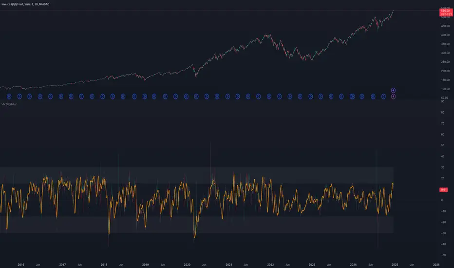
VIX OscillatorOVERVIEW
Plots an oscillating value as a percentage, derived from the VIX and VIX3M . This can help identify broader market trends and pivots on higher time frames (ie. 1D), useful when making swing trades.
DATA & MATH
The VIX is a real-time index of expected S&P 500 volatility over the next 30 days, derived from option prices with near-term expirations. Similarly, the VIX3M measures expected volatility over the next 90 days.
Dividing one by the other yields an oscillating value, normalizing the relative strength of the expected volatility. Most commonly the VIX is divided by the VIX3M. However, because the VIX is inversely correlated to market sentiment (typically), this indicator divides the VIX3M by the VIX to visually correlate the plot direction with the anticipated market direction. Further, it subtracts 1.1 from the quotient to visually center the plot, and multiplies that difference by 100 to amplify the value as a percentage:
( VIX3M / VIX - 1.1 ) * 100
This variation makes identifying sentiment extremes easier within a buy-low-sell-high paradigm, where values below zero are bearish and values above zero are bullish.
PLOTS
Two plots are used, maximizing data fidelity and convenience. Candles are used to accurately reflect the quantized math and a Linear Regression is used to simplify contextualization. If you're not familiar with what a Linear Regression is, you can think of it like a better moving average. High / Low zones are also plotted to help identify sentiment extremes.
This combination allows you to quickly identify the expected sentiment (bullish / bearish) and its relative value (normal / extreme), which you can then use to anticipate if a trend continuation or pivot is more likely.
INPUTS
Candle colors (rise and fall)
Linear regression colors and length
Zone thresholds and zero line
1-3-1 Strat Combo with 50% Level (12h)Logic Explanation
1-3-1 Combo Detection:
The script detects the 1-3-1 pattern using the previous 3 candles:
Candle 4: Inside Bar (Type 1).
Candle 3: Outside Bar (Type 3).
Candle 2: Inside Bar (Type 1).
4th Candle Behavior:
If the 4th candle (current bar):
Stays an inside bar (Type 1) → isFourthInsideBar is true.
Becomes a directional bar (Type 2) → isFourthDirectional is true.
If either of these conditions is true, the script stops calculating and waits for the next valid 1-3-1 setup.
50% Level Calculation:
If the conditions are not met (e.g., the 4th candle doesn’t stop the pattern), the script:
Plots a dotted line at the 50% level of the 3rd candle.
Adds a label showing the 50% level.
Stop Calculations:
No line, box, or label is drawn if the 4th candle is a Type 1 (inside bar) or Type 2 (directional bar).
Visual Outputs:
Dotted Box: Marks the 1-3-1 combo setup.
50% Line: Drawn only if the 4th candle does not invalidate the pattern.
Label: Displays the 50% level of the 3rd candle.
How to Use:
Apply this script on the 12-hour chart.
The script will:
Detect valid 1-3-1 patterns.
Stop drawing any calculations if the 4th candle is an inside bar (1) or a directional bar (2).
Wait for the next valid 1-3-1 combo.

Hourly 20 EMA on 5m ChartThis indicator shows the hourly 20ema on any current time frame that is open on your charts

DAILY Supertrend + EMA Crossover with RSI FilterThis strategy is a technical trading approach that combines multiple indicators—Supertrend, Exponential Moving Averages (EMAs), and the Relative Strength Index (RSI)—to identify and manage trades.
Core Components:
1. Exponential Moving Averages (EMAs):
Two EMAs, one with a shorter period (fast) and one with a longer period (slow), are calculated. The idea is to spot when the faster EMA crosses above or below the slower EMA. A fast EMA crossing above the slow EMA often suggests upward momentum, while crossing below suggests downward momentum.
2. Supertrend Indicator:
The Supertrend uses Average True Range (ATR) to establish dynamic support and resistance lines. These lines shift above or below price depending on the prevailing trend. When price is above the Supertrend line, the trend is considered bullish; when below, it’s considered bearish. This helps ensure that the strategy trades only in the direction of the overall trend rather than against it.
3. RSI Filter:
The RSI measures momentum. It helps avoid buying into markets that are already overbought or selling into markets that are oversold. For example, when going long (buying), the strategy only proceeds if the RSI is not too high, and when going short (selling), it only proceeds if the RSI is not too low. This filter is meant to improve the quality of the trades by reducing the chance of entering right before a reversal.
4. Time Filters:
The strategy only triggers entries during user-specified date and time ranges. This is useful if one wants to limit trading activity to certain trading sessions or periods with higher market liquidity.
5. Risk Management via ATR-based Stops and Targets:
Both stop loss and take profit levels are set as multiples of the ATR. ATR measures volatility, so when volatility is higher, both stops and profit targets adjust to give the trade more breathing room. Conversely, when volatility is low, stops and targets tighten. This dynamic approach helps maintain consistent risk management regardless of market conditions.
Overall Logic Flow:
- First, the market conditions are analyzed through EMAs, Supertrend, and RSI.
- When a buy (long) condition is met—meaning the fast EMA crosses above the slow EMA, the trend is bullish according to Supertrend, and RSI is below the specified “overbought” threshold—the strategy initiates or adds to a long position.
- Similarly, when a sell (short) condition is met—meaning the fast EMA crosses below the slow EMA, the trend is bearish, and RSI is above the specified “oversold” threshold—it initiates or adds to a short position.
- Each position is protected by an automatically calculated stop loss and a take profit level based on ATR multiples.
Intended Result:
By blending trend detection, momentum filtering, and volatility-adjusted risk management, the strategy aims to capture moves in the primary trend direction while avoiding entries at excessively stretched prices. Allowing multiple entries can potentially amplify gains in strong trends but also increases exposure, which traders should consider in their risk management approach.
In essence, this strategy tries to ride established trends as indicated by the Supertrend and EMAs, filter out poor-quality entries using RSI, and dynamically manage trade risk through ATR-based stops and targets.

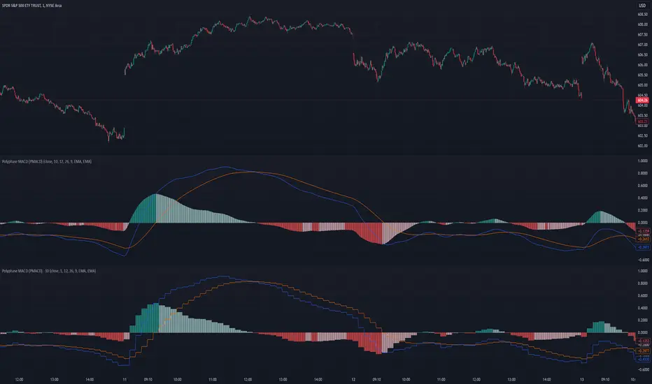
Polyphase MACD (PMACD)The Polyphase MACD (PMACD) uses polyphase decimation to create a continuous estimate of higher timeframe MACD behavior. The number of phases represents the timeframe multiplier - for example, 3 phases approximates a 3x higher timeframe.
Traditional higher timeframe MACD indicators update only when each higher timeframe bar completes, creating stepped signals that can miss intermediate price action. The PMACD addresses this by maintaining multiple phase-shifted MACD calculations and combining them with appropriate anti-aliasing filters. This approach eliminates the discrete jumps typically seen in higher timeframe indicators, though the resulting signal may sometimes deviate from the true higher timeframe values due to its estimative nature.
The indicator processes price data through parallel phase calculations, each analyzing a different time-offset subset of the data. These phases are filtered and combined to prevent aliasing artifacts that occur in simple timeframe conversions. The result is a smooth, continuous signal that begins providing meaningful values immediately, without requiring a warm-up period of higher timeframe bars.
The PMACD maintains the standard MACD components - the MACD line (fast MA - slow MA), signal line, and histogram - while providing a more continuous view of higher timeframe momentum. Users can select between EMA and SMA calculations for both the oscillator and signal components, with all calculations benefiting from the same polyphase processing technique.
Polyphase Stochastic RSI (PSRSI)The Polyphase Stochastic RSI (PSRSI) provides a continuous estimate of higher timeframe Stochastic RSI behavior by using polyphase decimation. The number of phases represents the timeframe multiplier - for example, 3 phases approximates a 3x higher timeframe.
While traditional higher timeframe indicators only update at the completion of each higher timeframe bar, the PSRSI creates a continuous signal by maintaining multiple phase-shifted calculations and combining them with appropriate anti-aliasing filters. This approach eliminates the gaps and discontinuities typically seen in higher timeframe indicators, though the resulting signal may sometimes deviate from the true higher timeframe values due to its estimative nature.
The indicator processes data through parallel phase calculations, each handling a different subset of price data offset in time. These phases are then filtered and combined to prevent aliasing artifacts that occur in simple timeframe conversions. The result is a smooth, continuous signal that starts providing meaningful values immediately, without requiring a warm-up period of higher timeframe bars.
Users can choose between RSI and Stochastic RSI modes, with both benefiting from the same polyphase processing technique. The indicator maintains the standard interpretation of overbought and oversold conditions while providing a more continuous view of higher timeframe momentum.

ATR/DTR with Custom Percentage DisplayThis Pine Script indicator provides a detailed view of the Average True Range (ATR) and Daily True Range (DTR), along with additional calculated metrics to assist in analyzing price volatility. The key features of the indicator include:
ATR Calculation:
The ATR is calculated over a user-defined timeframe, allowing traders to assess average market volatility over a specific period.
DTR Calculation:
The DTR represents the absolute range (high - low) of the current or chosen timeframe, providing insights into the day's price movement.
ATR/DTR Percentage:
This metric calculates the DTR as a percentage of the ATR, showing how the daily range compares to the average range, with dynamic coloring to highlight when it exceeds a user-defined threshold.
Custom Percentage of ATR:
Users can input a custom percentage to calculate and display a corresponding value of the ATR. For example, entering 15% will compute and display 15% of the ATR in the indicator’s table.
Dynamic Table Display:
The indicator outputs all these metrics in a well-organized table that is overlaid on the chart. The table includes:
ATR
DTR
ATR/DTR percentage
The user-defined percentage of ATR
Customizable Features:
Color Coding: The table dynamically changes its background color when the ATR/DTR percentage exceeds a user-defined threshold.
Placement Options: The table's position on the chart can be adjusted (e.g., bottom-right, top-center) for optimal visibility.
Use Case:
This indicator is ideal for traders who want a deeper understanding of market volatility and prefer visual representation of how current price movements compare to historical averages. It is especially useful for:
Setting volatility-based stop-loss levels.
Identifying high-volatility trading opportunities.
Tailoring strategies around price movement patterns.

Employee Portfolio Generator [By MUQWISHI]▋ INTRODUCTION :
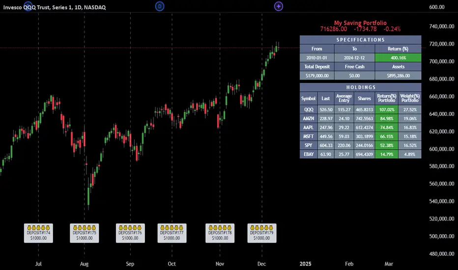
The “Employee Portfolio Generator” simplifies the process of building a long-term investment portfolio tailored for employees seeking to build wealth through investments rather than traditional bank savings. The tool empowers employees to set up recurring deposits at customizable intervals, enabling to make additional purchases in a list of preferred holdings, with the ability to define the purchasing investment weight for each security. The tool serves as a comprehensive solution for tracking portfolio performance, conducting research, and analyzing specific aspects of portfolio investments. The output includes an index value, a table of holdings, and chart plots, providing a deeper understanding of the portfolio's historical movements.
_______________________
▋ OVERVIEW:
● Scenario (The chart above can be taken as an example) :
Let say, in 2010, a newly employed individual committed to saving $1,000 each month. Rather than relying on a traditional savings account, chose to invest the majority of monthly savings in stable well-established stocks. Allocating 30% of monthly saving to AMEX:SPY and another 30% to NASDAQ:QQQ , recognizing these as reliable options for steady growth. Additionally, there was an admired toward innovative business models of NASDAQ:AAPL , NASDAQ:MSFT , NASDAQ:AMZN , and NASDAQ:EBAY , leading to invest 10% in each of those companies. By the end of 2024, after 15 years, the total monthly deposits amounted to $179,000, which would have been the result of traditional saving alone. However, by sticking into long term invest, the value of the portfolio assets grew, reaching nearly $900,000.
_______________________
▋ OUTPUTS:
The table can be displayed in three formats:
1. Portfolio Index Title: displays the index name at the top, and at the bottom, it shows the index value, along with the chart timeframe, e.g., daily change in points and percentage.
2. Specifications: displays the essential information on portfolio performance, including the investment date range, total deposits, free cash, returns, and assets.
3. Holdings: a list of the holding securities inside a table that contains the ticker, last price, entry price, return percentage of the portfolio's total deposits, and latest weighted percentage of the portfolio. Additionally, a tooltip appears when the user passes the cursor over a ticker's cell, showing brief information about the company, such as the company's name, exchange market, country, sector, and industry.
4. Indication of New Deposit: An indication of a new deposit added to the portfolio for additional purchasing.
5. Chart: The portfolio's historical movements can be visualized in a plot, displayed as a bar chart, candlestick chart, or line chart, depending on the preferred format, as shown below.
_______________________
▋ INDICATOR SETTINGS:
Section(1): Table Settings
(1) Naming the index.
(2) Table location on the chart and cell size.
(3) Sorting Holdings Table. By securities’ {Return(%) Portfolio, Weight(%) Portfolio, or Ticker Alphabetical} order.
(4) Choose the type of index: {Assets, Return, or Return (%)}, and the plot type for the portfolio index: {Candle, Bar, or Line}.
(5) Positive/Negative colors.
(6) Table Colors (Title, Cell, and Text).
(7) To show/hide any of selected indicator’s components.
Section(2): Recurring Deposit Settings
(1) From DateTime of starting the investment.
(2) To DateTime of ending the investment
(3) The amount of recurring deposit into portfolio and currency.
(4) The frequency of recurring deposits into the portfolio {Weekly, 2-Weeks, Monthly, Quarterly, Yearly}
(5) The Depositing Model:
● Fixed: The amount for recurring deposits remains constant throughout the entire investment period.
● Increased %: The recurring deposit amount increases at the selected frequency and percentage throughout the entire investment period.
(5B) If the user selects “ Depositing Model: Increased % ”, specify the growth model (linear or exponential) and define the rate of increase.
Section(3): Portfolio Holdings
(1) Enable a ticker in the investment portfolio.
(2) The selected deposit frequency weight for a ticker. For example, if the monthly deposit is $1,000 and the selected weight for XYZ stock is 30%, $300 will be used to purchase shares of XYZ stock.
(3) Select up to 6 tickers that the investor is interested in for long-term investment.
Please let me know if you have any questions