IBD PowerTrendThis IBD PowerTrend indicator is designed to help traders identify strong market uptrends based on the IBD Market School's Power Trend methodology. It is intended to be added to daily charts on major indexes.
Concept and Methodology
The IBD PowerTrend helps traders identify strong market uptrends. Markets generally exist in three states: uptrends, downtrends, and rangebound motion. This methodology focuses on:
Downtrends: Stay out of the market.
Rangebound markets: Often frustrating, best avoided.
Uptrends: Identify the strongest uptrends early.
This indicator uses IBD's research on historical uptrends to help traders get in and stay in during robust market phases.
How It Works
A PowerTrend starts when the following four conditions are met simultaneously on a major index:
10-Day Low Above 21-Day EMA : The market's low must be above the 21-day exponential moving average (EMA) for at least 10 consecutive days.
21-Day EMA Above 50-Day SMA : The 21-day EMA must be above the 50-day simple moving average (SMA) for at least five consecutive days.
50-Day SMA Uptrend : The 50-day SMA must be in an uptrend (one day is sufficient).
Market Closes Up : The market must close higher than the previous day's close.
A PowerTrend typically ends when the 21-day EMA crosses back below the 50-day SMA. However, there are rare cases where a PowerTrend can end early due to a circuit breaker or a follow-through day failure. In this script, a circuit breaker is defined as a break of the 50-day line and being more than 10% below recent highs (interpreted as three months).
How to Use
When the PowerTrend is active, the indicator will plot green circles, signaling a strong market uptrend. During these periods, traders might observe opportunities in growth stocks breaking out of sound bases and consider the use of margin. Conversely, during downtrends, the indicator suggests a more defensive approach.
It is recommended to use on daily timeframe.
Chart Description
Main Chart:
- EMA 21 (blue): The 21-day exponential moving average.
- SMA 50 (red): The 50-day simple moving average.
First Panel:
- IBD PowerTrend Indicator: Plots the PowerTrend status with green circles indicating an active PowerTrend.
Second Panel:
- Volume Bars
Cari dalam skrip untuk "国泰黄金ETF联接C相关行业指数的最新政策"

RSI ATR Range [SS]Hey everyone,
Over the course of the last year I had a bunch of requests to do something with RSI. I did do an RSI expected move plotter, but the requests were to overhaul RSI and make it better I guess.
So here is my attempt!
This is the RSI ATR plotter. Its similar to my RSI expected move plotter, however, it gives you the ATR ranges associated with the current RSI value. This allows you to conceptualize RSI in a different way. Instead of looking for "oversold" over "overbought", you can actually just see the expected high to open range and the expected open to low range based on the current RSI.
This will allow you to determine such things as:
a) Is it likely to be bullish?
b) Is it likely to be bearish?
c) The average move, in a dollar amount, associated with this RSI.
In addition to presenting RSI in terms of ranges as opposed to the actual RSI value, the indicator will also signal likely reversal areas. Whenever there is a huge spike in RSI and range, whether it be up or down, this generally corresponds to an imminent reversal. The indicator is programmed to recognize this and plot little grey circles to notify you of an impending reversal.
Let's take a look at some reversal examples using NVDA:
In the chart above, we can see that the RSI signaled a reversal. As it was part of a downtrend, the reversal was bullish.
Let's look at a top reversal:
The chart above shows a likely downside reversal.
And some little bounce reversals here and there:
In addition to showing you the ATR range and reversals, the indicator will show you the RSI in a bar graph format:
You won't be able to look for RSI divergences, if you are a believer of those. However, you can definitely visualize them in the ATR ranges which are directly affected by the RSI readings.
Aspects of the indicator:
Bull ranges are displayed in green.
Bear ranges are displayed in red.
When green is present we know its entering or currently in a bullish RSI range:
Inversely, when it starts to shift red, we know we are entering a bearish RSI range:
There is a border that circles the range. It will be green when we are in a bullish range and red when we are in a bearish range. In addition to these 2 signals, the RSI bar chart itself will turn green in bullish ranges, and red in bearish ranges.
Here is bullish:
Here is bearish:
Customizability
You can customize the Source input for the RSI (default is close). As well as the length (default is 14).
The ATR length is defaulted to 500. My suggestion is to leave this be. You can increase it but I would not suggest decreasing it as it may omit some of the RSI ranges from its history.
And that is the indicator my friends! Hope you enjoy!
As always, safe trades!

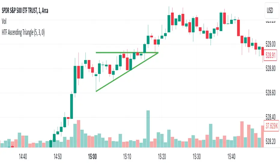
HTF Ascending TriangleHTF Ascending Triangle aims at detecting ascending triangles using higher time frame data, without repainting nor misalignment issues.
Ascending triangles are defined by an horizontal upper trend line and a rising lower trend line. It is a chart pattern used in technical analysis to predict the continuation of an uptrend.
This indicator can be useful if you, like me, believe that higher time frames can offer a broader perspective and provide clearer signals, smoothing out market noise and showing longer-term trends.
You can change the indicator settings as you see fit to tighten or loosen the detection, and achieve the best results for your use case.
Features
It draws the detected ascending triangle on the chart.
It supports alerting when a detection occurs.
It allows for setting the higher time frame to run the detection on.
It allows for setting the minimum number of consecutive valid higher time frame bars to fit the pattern criteria.
It allows for setting a high factor detection criteria to apply on higher time frame bars high as a proportion of the distance between the reference bar high and open/close.
It allows for turning on an adjustment of the triangle using highest/lowest values within valid higher time frame bars.
Settings
Higher Time Frame dropdown: Selects higher time frame to run the detection on. It must be higher than, and a multiple of, the chart's timeframe.
Valid Bars Minimum field: Sets minimum number of consecutive valid higher time frame bars to fit the pattern criteria.
High Factor checkbox: Turns on/off high factor detection criteria.
High Factor field: Sets high factor to apply on higher time frame bars high as a proportion of the distance between the reference bar high and close/open.
Adjust Triangle checkbox: Turns on/off triangle adjustment using highest/lowest values within valid higher time frame bars.
Detection Algorithm Notes
The detection algorithm recursively selects a higher time frame bar as reference. Then it looks at the consecutive higher time frame bars (as per the requested number of minimum valid bars) as follows:
Low must be higher than previous bar.
Open/close max value must be lower than reference bar high.
When high factor criteria is turned on, high must be higher than reference bar open/close max value plus high factor proportion of the distance between reference bar high and open/close max value.
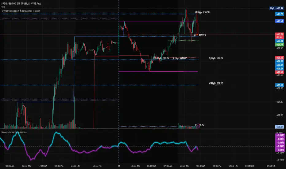
Dynamic Support & Resistance TrackerThe "Dynamic Support & Resistance Tracker" is a powerful Pine Script study designed to identify and visualize key support and resistance levels on a trading chart. This study dynamically adjusts to market conditions, providing traders with valuable insights for making informed trading decisions.
Key Features:
Dynamic Support & Resistance Lines:
The script identifies and plots support and resistance levels using pivot points based on a user-defined number of left and right bars.
Resistance lines are plotted in red, while support lines are plotted in blue, making it easy to distinguish between the two.
Toggle Breaks:
Users can choose to display or hide break signals for support and resistance levels using a simple toggle input.
Volume Threshold:
The study includes daily and weekly high and low calculations to provide a comprehensive view of market ranges.
Previous high and low lines are plotted for both daily and weekly timeframes, aiding in identifying potential breakout or breakdown levels.
Regular Market Hours:
The script defines regular market hours and tracks sessions, ensuring that support and resistance levels are relevant to active trading periods.
Midline and Extension Lines:
The study calculates and plots a midline between the previous high and low, along with extension lines above and below the range. These lines help identify potential target levels and extensions beyond the current range.
Real-time Updates:
The script ensures that all lines are updated in real-time, adjusting to new bars as they form. This dynamic feature keeps the levels relevant and accurate throughout the trading session.
Usage Instructions:
Adjust the number of left and right bars to define the sensitivity of the support and resistance levels.
Toggle the display of break signals to highlight significant breaks in support or resistance.
Monitor the daily and weekly high and low lines to understand the broader market context.
Utilize the midline and extension lines to set potential price targets and manage risk effectively.
This study provides traders with a robust tool for identifying and reacting to key market levels, enhancing their trading strategies with dynamic and real-time insights.
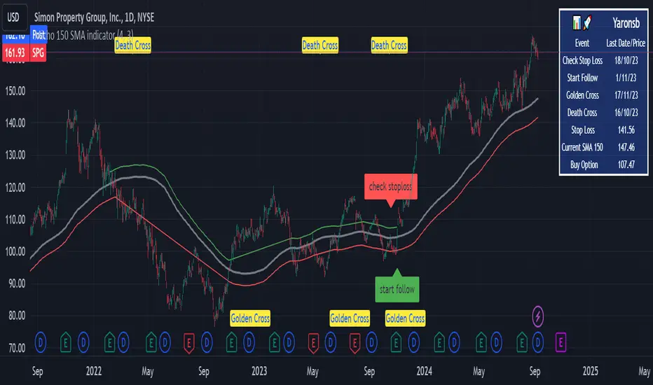
Micho 150 SMA indicatorAMEX:SPY NASDAQ:MSFT This Pine Script indicator is designed to assist traders by displaying a 150-day Simple Moving Average (SMA) and a stop loss level based on a user-defined percentage below the 150-day SMA. It also marks significant crossover events with labels and highlights potential trend changes using Golden Cross and Death Cross indicators.
Features:
150-Day Simple Moving Average (SMA):
The script calculates and plots the 150-day SMA of the closing prices. This is a common technical indicator used to determine the overall trend of a security. The 150-day SMA is plotted in gray on the chart.
Stop Loss Price:
Users can define a stop loss percentage through an input field. This percentage is used to calculate a stop loss price that is plotted 1% (or user-defined percentage) below the 150-day SMA. The stop loss line is plotted in red on the chart. This helps traders manage risk by indicating a price level where they might consider exiting a trade to prevent further losses.
Buy and Sell Signals:
The script identifies potential buy and sell signals based on crossovers of the closing price with the 150-day SMA:
Buy Signal: When the closing price crosses above the 150-day SMA.
Sell Signal: When the closing price crosses below the 150-day SMA.
Labels are plotted at the crossover points to indicate "start follow" for buy signals (in green) and "check stoploss" for sell signals (in red).
Golden Cross and Death Cross:
The script also identifies Golden Cross and Death Cross events:
Golden Cross: Occurs when the 50-day SMA crosses above the 200-day SMA. This is generally considered a bullish signal indicating a potential upward trend.
Death Cross: Occurs when the 50-day SMA crosses below the 200-day SMA. This is generally considered a bearish signal indicating a potential downward trend.
These crossover events are marked with labels on the chart: "Golden Cross" (in yellow) and "Death Cross" (in yellow)
Exponential Moving Average with ADR bandIndicator: Exponential Moving Average with ADR Band
This TradingView script calculates and displays an Exponential Moving Average (EMA) along with an Average Daily Range (ADR) band around it. The indicator helps traders identify potential dynamic support and resistance levels adjusted for market volatility. Especially significant moves that originate from the ZONE and reach outside should be taken seriously.
Key Features:
EMA Calculation: The script computes the Exponential Moving Average (EMA) of the closing prices over a user-defined period.
ADR Band: It calculates the Average Daily Range (ADR) using a Simple Moving Average (SMA) of the daily high-low range over the same period.
Adjustable Parameters:
Length: The period for both the EMA and the ADR calculation, which can be set by the user (default is 20).
Multiple: A multiplier for the ADR to adjust the width of the bands around the EMA (default is 1).
Plotting: The EMA is plotted as an orange line. The upper and lower ADR bands are plotted around the EMA, and the area between these bands is filled with a translucent orange color to highlight the channel.
How It Works:
EMA Calculation: The script computes the EMA of the closing prices using the specified length.
ADR Calculation: The daily range (high-low) is averaged over the same length to get the ADR.
Band Creation: The upper band is created by adding the ADR (multiplied by the user-defined multiple) to the EMA. The lower band is created by subtracting the ADR (multiplied by the user-defined multiple) from the EMA.
Visualization: The EMA and ADR bands are plotted, and the area between the bands is filled to create a clear visual representation of the ADR channel.
Usage:
This indicator can be used to gauge market volatility and potential support/resistance zones.
The ADR band provides a dynamic range that adjusts with market conditions, helping traders identify potential breakout and reversal points.
To customize the indicator, adjust the 'Length' and 'ADR multiple' parameters to suit your trading style and the specific characteristics of the asset you are analyzing.

Trend Angle IndicatorTrend Angle Indicator
Description
The Trend Angle Indicator is designed to measure the strength of a trend by calculating the angle of the trend.
Specifically, it computes the angle of a Simple Moving Average (SMA) over a specified length and then applies
an Exponential Moving Average (EMA) to the angle for smoothing.
This approach provides a clear indication of the trend's direction and intensity.
It also includes customizable alerts for significant changes in the trend angle and zero-line crossings,
making it a robust tool for traders seeking to gauge market momentum.
Key Features
- **Trend Angle Calculation**: Measures the trend's angle, providing insights into trend direction and strength.
- **SMA and EMA**: Uses SMA for the base calculation and EMA for smoothening the angle values.
- **Visual Trend Indication**: Visually indicates uptrends and downtrends with customizable colors - red and green.
- **Alerts**: Configurable alerts for significant changes in trend angle and zero-line crossings.
Calculation Methodology
1. **Simple Moving Average (SMA):**
- The script calculates the SMA of the close price over a user-defined `input_length`.
2. **Angle Calculation:**
- The height of the trend is calculated by subtracting the SMA value from the SMA value `input_length` bars ago. A higher angle value indicates a stronger trend.
- The angle in degrees is obtained using the arctangent function: \
3. **Exponential Moving Average (EMA):**
- Applies an EMA to the calculated angle to smooth out the values based on a user-defined `input_ma_length`.
4. **Trend Detection:**
The color of the angle plot and filled area provide a quick visual representation of the current trend direction
- The trend angle changes are monitored and visualized with color-coded plots.
- Uptrend: Angle >= 0 uses `upColor` (green).
- Downtrend: Angle < 0 uses `downColor` (red).
#### Using the Indicator
1. **Adding the Indicator:**
- Add the indicator to your TradingView chart by selecting it from the Pine Script library or by pasting the script into the Pine Script editor.
2. **Inputs:**
- **Length**: Defines the period for the SMA calculation.
- **MA Length**: Sets the period for the EMA smoothing.
- **Angle Change Threshold (degrees)**: Defines the threshold for significant angle change alerts.
- **Color Candles**: Optionally colorizes the price candles based on the angle's trend direction.
3. **Customizing Plots:**
- **Angle Plot**: Displays the EMA of the trend angle. The color changes based on whether the trend is up or down.
- **Zero Line**: A horizontal line at zero to easily visualize crossings that signify a change in trend direction.
- **Fill Color**: Fills the area above/below the zero line with colors representing the direction of the trend.
4. **Setting Alerts:**
- **Cross Above Zero**: Triggers an alert when the trend angle crosses above zero, indicating a potential start of an uptrend.
- **Cross Below Zero**: Triggers an alert when the trend angle crosses below zero, indicating a potential start of a downtrend.
- **Significant Angle Change**: Alerts when the angle change exceeds the user-defined threshold, highlighting significant trend changes.
#### Example Usage
To use and customize the Trend Angle Indicator on your chart:
1. **Add to Chart**: Apply the indicator from the TradingView library or by pasting the script into the Pine Script editor.
2. **Configure Inputs**:
- Adjust the `Length` to set the period for the SMA.
- Set the `MA Length` for the EMA smoothing.
- Define the `Angle Change Threshold` for receiving alerts on significant changes.
3. **Display Customization**:
- Enable `Color Candles` to have the price candles reflect the trend direction.
4. **Set Alerts**:
- Use the alert conditions provided to get notified about critical events like zero line crossings or significant angle changes.
colorLabLibrary "colorLab"
The ColorLab library presents an essential solution for color optimization, leveraging color terms and philosophy. Through its capabilities, it furnishes the necessary versatility to attain optimal color representation and coherence by integrating functions.
tint_level(colour, level)
Determines a Tinted color
Parameters:
colour (color) : (series color) Pure color.
level (float) : (series float) Optional argument, default = 50. A level of tent color. 0 is entered color and 100 is white color.
Returns: (series color) A color Computed from a linear "Tint" gradient.
shade_level(colour, level)
Determines a Shaded color.
Parameters:
colour (color) : (series color) Pure color.
level (float) : (series float) Optional argument, default = 50. A level of tent color. 0 is entered color and 100 is Black color.
Returns: (series color) A color Computed from a linear "Shade" gradient.
tone_level(colour, level)
Determines a Tone color.
Parameters:
colour (color) : (series color) Pure color.
level (float) : (series float) Optional argument, default = 50. A level of tent color. 0 is entered color and 100 is Gray color.
Returns: (series color) A color Computed from a linear "Tone" gradient.
lightness_gradient(colour, value, bottom_value, top_value, bottom_lightness, top_lightness)
Determines a color from a "Lightness" gradient, based on the position of an entered value within a defined range.
Parameters:
colour (color) : (series color) Pure color.
value (float) : (series float) Value.
bottom_value (float) : (series float) Bottom Value.
top_value (float) : (series float) Top Value.
bottom_lightness (simple float) : (simple float) Optional argument, default = 70. Lightness Percentage. 100% is lightest and 0% is darkest
top_lightness (simple float) : (simple float) Optional argument, default = 30. Lightness Percentage. 100% is lightest and 0% is darkest
Returns: (series color) A color Computed a the linear "Lightness" gradient.
saturation_gradient(colour, value, bottom_value, top_value, bottom_saturated, top_saturated)
Determines a color from a "Saturation" gradient, based on the position of an entered value within a defined range.
Parameters:
colour (color) : (series color) Pure color.
value (float) : (series float) Value.
bottom_value (float) : (series float) Bottom Value.
top_value (float) : (series float) Top Value.
bottom_saturated (simple float) : (simple float) Optional argument, default = 15. Low Saturated Percentage.
top_saturated (simple float) : (simple float) Optional argument, default = 80. High Saturated Percentage.
Returns: (series color) A color Computed from a linear "Saturation" gradient.
hue_gradient(colour, value, bottom_value, top_value, bottom_hue, top_hue)
Determines a color from a "Hue" gradient, based on the position of an entered value within a defined range.
Parameters:
colour (color) : (series color) Pure color.
value (float) : (series float) Value.
bottom_value (float) : (series float) Bottom Value.
top_value (float) : (series float) Top Value.
bottom_hue (simple float) : (simple float) Optional argument, Default = 0. Low Hue is a degree where value in range 0 to 360 degrees.
top_hue (simple float) : (simple float) Optional argument, default = 300. High Hue is a degree where value in range 0 to 360 degrees.
Returns: (series color) A color Computed from a linear "Saturation" gradient.
opposColor(colour)
Generates the opposite color of inputted color.
Parameters:
colour (color) : (series color) Pure color.
Returns: (series color) An opposite color.
randColor(seed)
Generates a random color.
Parameters:
seed (simple int) : (simple int) Optional argument. With identifying seed, it will generate similar color sequence.
Returns: (series color) A random color.
bk_or_wh(colour, lightness)
Determines a white or back fits with an inputted color.
Parameters:
colour (color) : (series color) Pure color.
lightness (float) : (series float) Optional argument, default = 50. If the lightness percentage of inputted color is higher, the output is white; otherwise, it's black.
Returns: (series color) white or back color.
monochrome(colour, lightness, saturation)
Generates a monochromatic color scheme.
Parameters:
colour (color) : (series color) Pure color.
lightness (float) : (series float) Optional argument, default = NA. To custom Lightness percentage manually, 100% is lightest and 0% is darkest.
saturation (float) : (series float) Optional argument, default = NA. To custom Saturation percentage manually, 100% is highest and 0% is lowest saturated.
Returns: (tuple of two color series) .
complementary(colour)
Generates a complementary color scheme.
Parameters:
colour (color) : (series color) Pure color.
Returns: (tuple of two color series) .
analogous(colour)
Generates an analogous color scheme.
Parameters:
colour (color) : (series color) Pure color.
Returns: (tuple of three color series) .
triadic(colour)
Generates an Triadic color scheme.
Parameters:
colour (color) : (series color) Pure color.
Returns: (tuple of three color series) .
tetradic(colour)
Generates an Tetradic color scheme.
Parameters:
colour (color) : (series color) Main color.
Returns: (tuple of four color series) .
tst_scheme(colour, size, _type)
Generates an array of requested type (tint, shade, or tone) scheme colors.
Parameters:
colour (simple color) : (simple color) Pure color.
size (simple int) : (simple input) Number of elements in color array.
_type (simple string) : (simple string) Type of color scheme, possible input "tint", "shade", and "tone".
Returns: (simple array) An array contains elements of the requested type scheme colors.
lsh_scheme(colour, size, _type, topLevel, botLevel)
Generates an array of requested type (lightness, saturation or hue) scheme colors.
Parameters:
colour (simple color) : (simple color) Pure color.
size (simple int) : (simple input) Number of elements in color array.
_type (simple string) : (simple string) Type of color scheme, possible input "lightness", "saturation" and "hue".
topLevel (simple float) : (simple float) Optional argument, default = NA.
1. if "lightness", in a percentage where value in range 0 to 100, 100% lightest.
2. if "saturation", in a percentage where value in range 0 to 100, 100% highest saturated.
3. if "hue", in a degree where value in range 0 to 360 degrees.
botLevel (simple float) : (simple float) Optional argument, default = NA.
1. if "lightness", in a percentage where value in range 0 to 100, 0% darkest.
2. if "saturation", in a percentage where value in range 0 to 100, 0% lowest saturated.
3. if "hue", in a degree where value in range 0 to 360 degrees.
Returns: (simple array) An array contains elements of the requested type scheme colors.
display_color(colour, location)
Displays color including RGB and HSL.
Parameters:
colour (simple color) : (simple color) Pure color.
location (simple string) : (simple string) Optional argument, default = "top_right". cell location.
Returns: (simple table) A table cell contains RGB and HSL of entered color.
display_scheme(arrayColour, location)
Displays Scheme colors including RGB and HSL.
Parameters:
arrayColour (array)
location (simple string) : (simple string) Optional argument, default = "top_right". cell location.
Returns: (simple table) A table cells contain RGB and HSL of entered color.

Noise Area Indicator with Gap AdjustmentsThis version of the Noise Area Pine Script, developed with the assistance of ChatGPT, includes adjustments for opening gaps to better account for overnight price changes that affect the market open. This Pine Script is designed to provide traders with a dynamic visualization of the Noise Area based on the volatility of the last 14 trading days. It calculates the upper and lower boundaries using the daily opening price, representing typical price movements relative to the open. This helps identify significant deviations, potentially indicating the start of a trend.
Features:
Captures and adjusts for gaps between the previous day's close and the current day's open, allowing for more precise trend analysis.
Sets the Noise Area boundaries using both the daily opening price and the previous day's closing price, ensuring that sudden market moves are adequately considered.
Measures deviations in price from the opening, averaged over the last 14 days to calculate absolute movements.
Plots upper and lower boundaries on the chart, providing a visual guide for traders to assess market volatility.
Includes a dynamically plotted daily opening price, serving as a consistent reference point for market open conditions.
Usage:
This indicator is particularly useful for day traders and short-term traders who need to understand intraday volatility and pinpoint potential breakout points, aiding in the strategic planning of entry and exit points based on historical volatility patterns relative to the daily open (with gap adjustments).

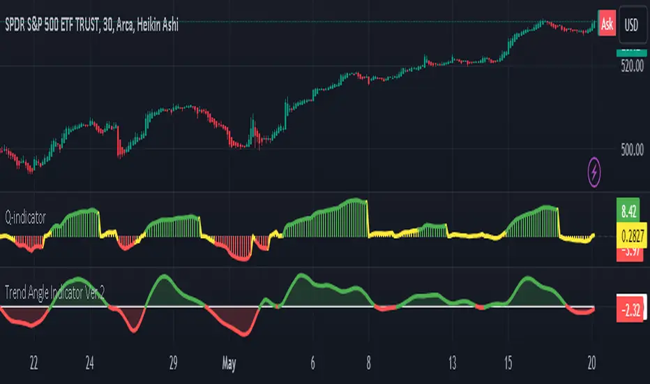
Trend Quality IndicatorDescription
This indicator is my interpretation in Pinescript of the "Trend-Quality Indicator" by David Sepiashvili.
The Trend Quality indicator (Q-indicator) is an attempt to estimate trend in relation to noise. It answers the long-standing question of whether a trend change qualifies as significant and promising, or insignificant and better ignored. In terms of noise, trend estimation not only determines whether the trend is reliable, but also allows you to measure its strength gradually. Thus, regardless of their prices, trends of various securities can easily be compared to each other or against any index.
The Trend Quality indicator (or Q-indicator) is a trend detection and estimation tool that is based on a two-step filtering technique. It measures cumulative price changes over term-oriented semi-cycles and relates them to “noise.” The approach reveals congestion and trending periods of the price movement and focuses on the most important trends, evaluating their strength in the process. The indicator is presented in a centered oscillator and banded oscillator format.
Calculation and Logic
To estimate the price dynamics, the cumulative price change (CPC) indicator is used, which measures the amount that the price has changed from a fixed starting point within a given semi-cycle. The CPC indicator is calculated as a cumulative sum of differences between the current and previous prices over the period from the fixed starting point t0. The trend within the given semi cycle can be found by calculating the moving average of the cumulative price change:
Trend = MA (CPC, m, t => t0)
Segmenting the price time series and constructing trends within the extracted semi-cycles offers the smallest average gap between actual and averaged data points. This results in a better fit of the real price dynamics.
Estimating Trend Performance
A basic criterion for estimating trend performance is the amount the trend changes over up or down semi-cycles. If there is little or no visible progress in the trend, it may be considered as nonefficient. Further, significant changes in trend may be considered as promising trading opportunities, but the term “significant” is relative and subject to interpretation.
The Q-indicator is calculated by dividing trend by noise with an appropriate correction factor.
The denominator of the Q-indicator — noise — can be defined as the average deviation of the cumulative price change from the trend. To determine linear noise, first we calculate
the absolute value of the difference between CPC and trend, and then smooth it over the n-point period:
Noise1 = MA(I CPC Trend I,n)
High positive values suggest strong uptrend, low negative values signify strong downtrend, and values fluctuating around the zero level indicate that trend and noise are in equilibrium, i.e., non-trending conditions might be present.
The root mean square noise, similar to the conventional standard deviation, can be derived by summing the squares of the difference between CPC and trend over each of the preceding n-point periods, dividing the sum by n, and calculating the square root of the result.
The Q-indicator is intended to measure trend activity. Some benchmarks can be used to determine the strength of a trend. In the range of Q-indicator values from -1 to +1, the trend is buried beneath noise. It is preferable to stay out of this zone. The greater the Q, the less the risk of trading exceeds this level (absolute value of Q>2), it can be qualified as promising.
Readings in the range from +2 to +5, or from -2 to -5, can indicate moderate trending, and readings above Q=+5 or below Q=-5 indicate strong trending. Strong upward trending often leads to the security’s overvaluing, and strong downward trending often results in the security’s undervaluing. Readings exceeding strong trending benchmarks can indicate overbought or oversold conditions and signal that price action should be monitored closely.
Input Parameters’ Description
Fast Length - the number of bars used in calculation of fast SMA of Trending Periods.
Slow Length - the number of bars used in calculation of slow SMA of Trending Periods.
Trend Length - the number of bars upon which the trend is defined.
Noise Type - defines mechanism of defining noise: linear or root mean square.
Noise Length - the number of bars upon which noise is determined.
Correction Factor - multiplier used in noise calculation.
Threshold Value - In the range of Q-indicator values from -1 to +1, the trend is buried beneath noise. It is preferable to stay out of this zone. The greater the threshold Value of Q-Indicator, the less the risk of trading exceeds this level, it can be qualified as promising. Readings in the range from +2 to +5, or from -2 to -5, can indicate moderate trending, and readings above Q=+5 or below Q=-5 indicate strong trending.
Plots
• Green = buying pressure
• Red = selling pressure
• Yellow = sideways
• ZeroLine = the zero level
In the provided script, multi-timeframe analysis is achieved using the request.security function, which retrieves data from a different timeframe than the one on which the script is running.
Explanation of Multi-Timeframe Logic in Multi-Timeframe selection
• This option retrieves the Trend Quality (TQ) from a higher timeframe if the current chart is intraday.
• The higher timeframe is specified in minutes by the user and converted to a Pine Script timeframe string.
• If the current chart is not intraday or no higher timeframe is specified, the TQ is taken from the current timeframe
Summary:
• Trend Quality Indicator measures established TREND,
• can be used on different timeframes,
• works well on different timeframes,
• the threshold of 2 to 5 should be appropriate for most instruments. It can be modified in chart settings to adapt to your strategy.
The Trend Quality Indicator doesn't predict the future. It is intended to help traders assess the strength of the current trend, giving them a better understanding of the market conditions to make more informed trading choices.
Further Reading
1. "Trend-Quality Indicator" by David Sepiashvili. Technical Analysis of Stocks & Commodities, April 2004.

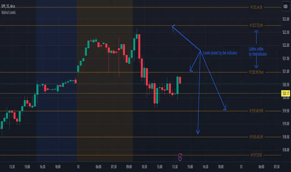
Walnut LevelsThis indicator was specifically designed to plot levels published by Walnut on SPY and ES charts. In the indicator's configuration settings, you are required to input the desired levels in the following format: (Description), (Description), (Description), .... Additionally, you have the option to configure whether to display labels and if those labels should include the numeric value of the level or just the description.
Moreover, the indicator allows customization of both color and line style via configuration settings. This flexibility enables users to tailor the appearance of the plotted levels according to their preferences. If there are no levels to plot, a message will be displayed indicating so.
Overall, the indicator streamlines the process of incorporating Walnut's published levels into trading analysis on SPY and ES charts, offering enhanced visualization and customization options to suit individual trading strategies.
PML (Extended hours)This indicator provides basic pre-market level information. You have the flexibility to select your preferred time range for the lines and labels.
For the #90amestbox group, set the time between 8:57 am and 9:03 am (EST). Ensure to draw the box using these lines, as the indicator is designed for extended hours only and won't function during regular trading hours.
What it does:
1) makes lines for the high and the low of the time slot you pick,
2) makes a label for the price,
3) you can also set alerts for when the price breaks the upside or downside.

Moving Average Crossover MonitorMoving Average Crossover Monitor: Gain Insight into Market Trends
The Moving Average Crossover Monitor is a specialized tool crafted for traders seeking to understand and predict market trends more effectively. This indicator's primary focus lies in analyzing consecutive candle movements above or below specified moving averages and providing predictive estimates based on historical data.
Key Features:
1. Consecutive Candle Tracking: The indicator meticulously counts and tracks the number of consecutive candles that close above or below a selected moving average (MA1). This tracking offers a tangible measure of trend persistence over time.
2. Historical Analysis for Future Prediction: By analyzing past trends, the indicator provides insights into potential future movements. It estimates the likelihood of upcoming candles continuing above or below the moving average based on historical patterns.
3. Dynamic Visualization: Moving averages (SMA, WMA, EMA) are dynamically plotted on the chart, clearly displaying crossover points and trend transitions.
How It Works:
1. Moving Average Calculation: Select your preferred moving average type (SMA, WMA, EMA) and define short and long periods. The indicator computes two moving averages (MA1 and MA2) based on these parameters.
2. Consecutive Candle Analysis:
- Above MA1: Tracks and counts consecutive candles closing above MA1, indicating potential bullish momentum.
- Below MA1: Tracks and counts consecutive candles closing below MA1, suggesting potential bearish sentiment.
3. Future Trend Prediction: Based on historical data of consecutive candle movements, the indicator estimates the likelihood of the next candle continuing in the same direction (above or below MA1).
Advantages for Traders:
1. Quantitative Insights: Use numerical data on consecutive candles to gauge trend strength and durability.
2. Predictive Analytics: Leverage historical patterns to anticipate future market movements and adjust trading strategies accordingly.
3. Decision Support Tool: Gain clarity on trend transitions, empowering timely and informed trading decisions.
Disclaimer:
This indicator is provided for educational purposes only and should not be considered as financial advice. Trading involves risks, and past performance is not indicative of future results. Traders should conduct their own analysis and exercise caution when making trading decisions based on any indicator or tool. Always consider risk management strategies and consult with a qualified financial advisor if needed.

Exponential SAR based MA**Description:**
The "Exponential SAR" (ESAR) indicator is a modified version of the classic Parabolic SAR (Stop and Reverse) indicator, incorporating an exponential moving average (EMA) smoothing technique. It aims to provide traders with a smoother representation of trend changes in the price action of a financial instrument.
**Functionality:**
The indicator calculates the Parabolic SAR values using specified parameters for start, increment, and maximum values. These parameters control the acceleration factor of the SAR. The calculated SAR values are then smoothed using an exponential moving average with a user-defined length, providing a more refined interpretation of trend dynamics.
**Inputs:**
- **Length:** Specifies the length of the exponential moving average used to smooth the Parabolic SAR values.
- **Alpha:** Defines the smoothing factor for the exponential moving average, allowing users to adjust the level of smoothing applied to the SAR.
- **Start, Increment, Maximum:** Parameters controlling the acceleration factor of the Parabolic SAR.
**Usage:**
- **Trend Identification:** Traders can use the Exponential SAR to identify trend reversals and continuations in the price action of a security. Bullish signals occur when the price moves above the ESAR, indicating an upward trend, while bearish signals occur when the price moves below the ESAR, signaling a downtrend.
- **Trend Confirmation:** The smoothed nature of the ESAR helps traders confirm trend changes more reliably, reducing the impact of false signals commonly associated with the standard Parabolic SAR.
- **Risk Management:** By incorporating a smoothed SAR, traders can make more informed decisions regarding entry and exit points, improving risk management strategies.
**Customization:**
Users can customize the indicator by adjusting the input parameters according to their trading preferences and market conditions. Experimenting with different lengths and alpha values can provide insights into the effectiveness of the ESAR in various trading scenarios.
**Note:**
As with any technical indicator, the Exponential SAR should be used in conjunction with other analytical tools and risk management techniques to validate signals and mitigate potential losses. Additionally, traders should consider market conditions and adapt their strategies accordingly.

Exponential Directional Index (DI)Exponential Directional Index (DI)
This indicator calculates the Exponential Directional Index (DI) using the Exponential Moving Average (EMA) of true range and directional movement. The DI is a widely used technical analysis tool that measures the strength of a trend by comparing positive and negative directional movements.
How it Works:
- **EMA Length:** Traders can adjust the length of the EMA calculation according to their trading preferences. A longer EMA length will result in a smoother DI line, while a shorter length will be more responsive to recent price action.
- **True Range (TR):** The true range is the greatest of the following: current high minus the current low, absolute value of the current high minus the previous close, and the absolute value of the current low minus the previous close.
- **Positive Directional Movement (+DM):** Calculates the difference between the current high and the previous high if positive, otherwise, it assigns a value of zero.
- **Negative Directional Movement (-DM):** Calculates the difference between the previous low and the current low if positive, otherwise, it assigns a value of zero.
- **Smoothed True Range (ATR):** Calculates the Exponential Moving Average (EMA) of the true range over the specified EMA length.
- **Smoothed Positive Directional Movement (+DI):** Calculates the Exponential Moving Average (EMA) of the positive directional movement over the specified EMA length.
- **Smoothed Negative Directional Movement (-DI):** Calculates the Exponential Moving Average (EMA) of the negative directional movement over the specified EMA length.
- **Directional Movement Index (DMI):** Calculates the DI values by dividing the smoothed positive and negative directional movements by the smoothed true range and multiplying by 100.
- **Bar Color:** The bar color changes based on whether the +DI is greater than, less than, or equal to the -DI. Green bars indicate that +DI is greater than -DI, red bars indicate that -DI is greater than +DI, and blue bars indicate that +DI is equal to -DI.
- **Background Highlight:** A background highlight is applied when the +DI crosses over the -DI or vice versa, providing a visual indication of potential trend changes.
Ideal Usage:
- **Trend Strength:** Traders can use the DI to gauge the strength of a trend. A rising +DI indicates bullish strength, while a rising -DI indicates bearish strength.
- **Trend Reversals:** Changes in the relationship between +DI and -DI, along with crossover signals, can indicate potential trend reversals.
- **Customization:** The indicator offers flexibility through customizable parameters, allowing traders to adapt it to various market conditions and trading strategies.
Warnings:
- **False Signals:** Like any technical indicator, false signals may occur, especially during periods of low volume or choppy market conditions. It's essential to use additional analysis and risk management techniques to avoid potential losses.
- **Parameter Sensitivity:** Adjusting the EMA length can affect the indicator's sensitivity to price movements. Traders should test different parameter settings and consider market conditions when using the indicator.

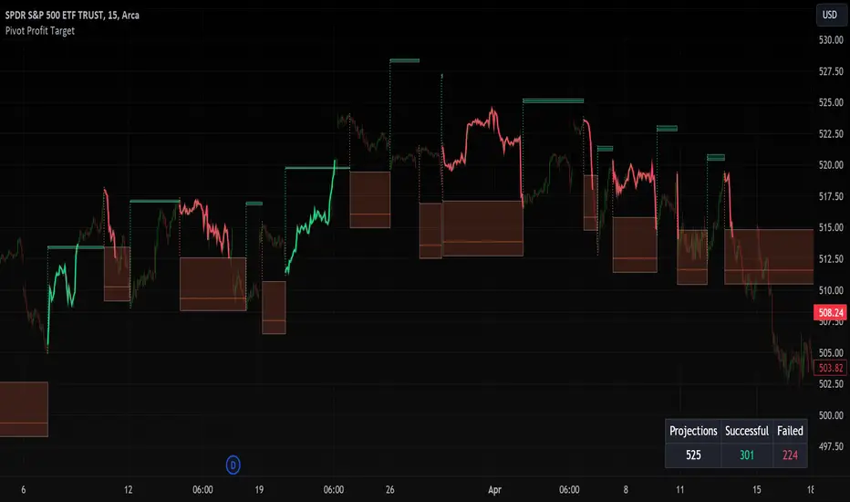
Pivot Profit Target [Mxwll]Introducing the Pivot Profit Target!
This script identifies recent pivot highs/lows and calculates the expected minimum distance for the next pivot, which acts as an approximate profit target.
The image above details the indicator's output.
The image above shows a table consisting of projection statistics.
How to use
The Pivot Profit Targets can be used to approximate a profit target for your trade.
Identify where your entry is relative to the most recent pivot, and assess whether the minimum expected distance for the most recent pivot has been exceeded. Treat the zones as an approximation.
If your trade aligns with the most recent pivot - treat the minimum expected distance zone as a potential profit target area. Of course, price might stop short or continue beyond the projection area!
That's it! Just a short and sweet script; thank you!
VWAP DivergenceThe "VWAP Divergence" indicator leverages the VWAP Rolling indicator available in TradingView's library to analyze price and volume dynamics. This custom indicator calculates a rolling VWAP (Volume Weighted Average Price) and compares it with a Simple Moving Average (SMA) over a specified historical period.
Advantages:
1. Accurate VWAP Calculation: The VWAP Rolling indicator computes a VWAP that dynamically adjusts based on recent price and volume data. VWAP is a vital metric used by traders to understand the average price at which a security has traded, factoring in volume.
2. SMA Comparison: By contrasting the rolling VWAP from the VWAP Rolling indicator with an SMA of the same length, the indicator highlights potential divergences. This comparison can reveal shifts in market sentiment.
3. Divergence Identification: The primary purpose of this indicator is to detect divergences between the rolling VWAP from VWAP Rolling and the SMA. Divergence occurs when the rolling VWAP significantly differs from the SMA, indicating potential changes in market dynamics.
Interpretation:
1. Positive Oscillator Values: A positive oscillator (difference between rolling VWAP and SMA) suggests that the rolling VWAP, derived from the VWAP Rolling indicator, is above the SMA. This could indicate strong buying interest or accumulation.
2. Negative Oscillator Values: Conversely, a negative oscillator value indicates that the rolling VWAP is below the SMA. This might signal selling pressure or distribution.
3. Divergence Signals: Significant divergences between the rolling VWAP (from VWAP Rolling) and SMA can indicate shifts in market sentiment. For instance, a rising rolling VWAP diverging upwards from the SMA might suggest increasing bullish sentiment.
4. Confirmation with Price Movements: Traders often use these divergences alongside price action to confirm potential trend reversals or continuations.
Implementation:
1. Length Parameter: Adjust the Length input to modify the lookback period for computing both the rolling VWAP from VWAP Rolling and the SMA. A longer period provides a broader view of market sentiment, while a shorter period is more sensitive to recent price movements.
2. Visualization: The indicator plots the VWAP SMA Oscillator, which visually represents the difference (oscillator) between the rolling VWAP (from VWAP Rolling) and SMA over time.
3. Zero Line: The zero line (gray line) serves as a reference point. Oscillator values crossing above or below this line can be interpreted as bullish or bearish signals, respectively.
4. Contextual Analysis: Interpret signals from this indicator in conjunction with broader market conditions and other technical indicators to make informed trading decisions.
This indicator, utilizing the VWAP Rolling component, is valuable for traders seeking insights into the relationship between volume-weighted price levels and traditional moving averages, aiding in the identification of potential trading opportunities based on market dynamics.

Marubozu SignalsThis Pine Script code is designed to identify and plot Marubozu candlestick patterns on a trading chart. Marubozu candles are characterized by having very small or non-existent wicks (shadows) and a large body, indicating strong buying or selling pressure.
The script first calculates the body size and wick size for both red (bearish) and green (bullish) Marubozu candles. It then defines thresholds for both body and wick sizes based on a percentage of the body size. For example, a red Marubozu candle is identified if its body size is at least 90% of the calculated threshold, and both upper and lower wick sizes are smaller than 5% of the body size.
Similarly, green Marubozu candles are identified using the same logic. If a Marubozu candle of either color is detected, a corresponding label is plotted on the chart indicating the occurrence of the pattern. A "Sell" label is placed above the candle for red Marubozu patterns, while a "Buy" label is placed below the candle for green Marubozu patterns.
This script provides visual cues to traders, helping them quickly identify potential buying or selling opportunities based on Marubozu candlestick patterns. Traders can use these signals as part of their technical analysis to make informed trading decisions.
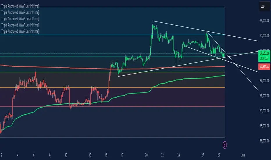
Triple Anchored Volume Weighted Average Price [JustinPrime]This indicator provides three separate Volume Weighted Average Price (VWAP) calculations, each anchored from different key points on the chart:
High Anchored VWAP: Resets from the highest price reached since the start date.
Low Anchored VWAP: Resets from the lowest price since the start date.
Start Date VWAP: Calculated from the trading data beginning at the user-defined start date.
Features:
Selectable Timeframe: Choose from timeframes like 1 minute, 5 minutes, 15 minutes, 1 hour, daily, and weekly.
Custom Start Date: Set a specific start date for the VWAP calculations.
Source Data: Uses high, low, and close prices (HLC3) for calculations.
How to Use:
Adjust the start date to focus on significant market periods or events.
Differentiate each VWAP with unique colors for clarity.
UM-MA-Directional-Colors
UM-MA-DIRECTION Indicator
Indicator Description
The UM-MA-Direction indicator adds a few more features to a traditional Moving Average indicator. The primary difference is color change upon MA direction. The indicator is green when trending higher and red when trending lower. Additionally, a MA of the MA can be configured. This gives a smoothing effect of the indicator. The indicator also includes a fill between the configured moving average and the moving average of the moving average.
User Configuration
All parameters and colors are user-configurable. While the default is an EMA (Exponential Moving Average), of 8 with a EMA of the EMA set to 5, both can be configured or disabled to the user's liking. The default trending and fill colors are red for trending lower and green for trending higher. The type of MA used is also user configurable with EMA - Exponential Moving Average set as the default.
Alerts
Alerts can be set for Bullish (red to green) color changes or Bearish (green to red) color changes by right-clicking the indicator and selecting "Add Alert."
Recommended Usage
Use this indicator to better determine trend direction over traditional Moving Averages. If you use several MAs, add this indicator to the chart as many times as you like with different settings and configurations.
Author Recommended Settings
I use an 8 period EMA with a 5 period EMA of the EMA on daily and hourly charts. I also use the 233 EMA with no fill and no EMA of EMA on the 3 minute chart. Both 8 and 233 are Fibonacci numbers in case you are wondering. I have also observed there is a fractal nature (recurring pattern within a recurring pattern) to the EMAs. An 8 period EMA color transition on the 1 hour chart is close to a 233 period color transition on the 3 minute chart as far as direction changes. The 233 EMA on the 3 minute chart was borrowed from the "Perfect Storm Trading" book by Wendy and Kim Kirkland which I highly recommend.
UM-Relative Strength Index with Trending EMA and Fill
Description
This is a different take on the traditional RSI - Relative Strength Index. This indicator turns the RSI line green when above 50 and red when below 50 making directional changes highly visual. Additionally, an exponential Moving Average is drawn of the RSI. The EMA is green when trending higher and red when trending lower. The area between the RSI and EMA lines are green when the RSI is above the RSI EMA and red when the RSI is below the EMA.
About
The RSI by itself is a good tool to determine trend with the colors. It can also be used to determined overbought and oversold extremes. The EMA of the RSI is a smoothing technique. The indicator can also be used to determine trend with the directional color changes.
Recommended Usage
I look for crossovers; bullish crossovers when the RSI crosses above the EMA AND the RSI crosses above 50. A bearish crossover is when the RSI crosses down through the EMA AND crosses below 50. It can also be used for trade confirmation; for example if the RSI EMA is green consider staying long. The indicator works on any timeframe and any security. I use it on smaller timeframes, 3 minute, 1 hour, and 3 hour, to better time entries/exits.
Default settings
The defaults are the author's preferred settings:
- RSI period is 10 using the open, high, low, and close for calculation. The additional data points using the OHLC give smoother effect.
- The EMA used by default is 34.
All parameters and colors are user-configurable.
Alerts
Alerts can be set on the indicator itself and/or alert on color changes of the EMA.
Helpful Hints:
Look for positive or negative crossovers.
Look for crosses above or below 50
Look for RSI divergences, for example if a security hits a new high, the RSI does not, this a sign of subtle weakness.
Draw trend lines on the RSI line. A violation of a recent trend line may indicate a change of trend for the security.
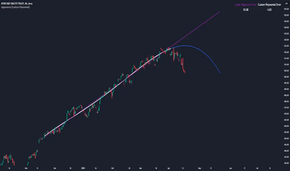
regressionsLibrary "regressions"
This library computes least square regression models for polynomials of any form for a given data set of x and y values.
fit(X, y, reg_type, degrees)
Takes a list of X and y values and the degrees of the polynomial and returns a least square regression for the given polynomial on the dataset.
Parameters:
X (array) : (float ) X inputs for regression fit.
y (array) : (float ) y outputs for regression fit.
reg_type (string) : (string) The type of regression. If passing value for degrees use reg.type_custom
degrees (array) : (int ) The degrees of the polynomial which will be fit to the data. ex: passing array.from(0, 3) would be a polynomial of form c1x^0 + c2x^3 where c2 and c1 will be coefficients of the best fitting polynomial.
Returns: (regression) returns a regression with the best fitting coefficients for the selecected polynomial
regress(reg, x)
Regress one x input.
Parameters:
reg (regression) : (regression) The fitted regression which the y_pred will be calulated with.
x (float) : (float) The input value cooresponding to the y_pred.
Returns: (float) The best fit y value for the given x input and regression.
predict(reg, X)
Predict a new set of X values with a fitted regression. -1 is one bar ahead of the realtime
Parameters:
reg (regression) : (regression) The fitted regression which the y_pred will be calulated with.
X (array)
Returns: (float ) The best fit y values for the given x input and regression.
generate_points(reg, x, y, left_index, right_index)
Takes a regression object and creates chart points which can be used for plotting visuals like lines and labels.
Parameters:
reg (regression) : (regression) Regression which has been fitted to a data set.
x (array) : (float ) x values which coorispond to passed y values
y (array) : (float ) y values which coorispond to passed x values
left_index (int) : (int) The offset of the bar farthest to the realtime bar should be larger than left_index value.
right_index (int) : (int) The offset of the bar closest to the realtime bar should be less than right_index value.
Returns: (chart.point ) Returns an array of chart points
plot_reg(reg, x, y, left_index, right_index, curved, close, line_color, line_width)
Simple plotting function for regression for more custom plotting use generate_points() to create points then create your own plotting function.
Parameters:
reg (regression) : (regression) Regression which has been fitted to a data set.
x (array)
y (array)
left_index (int) : (int) The offset of the bar farthest to the realtime bar should be larger than left_index value.
right_index (int) : (int) The offset of the bar closest to the realtime bar should be less than right_index value.
curved (bool) : (bool) If the polyline is curved or not.
close (bool) : (bool) If true the polyline will be closed.
line_color (color) : (color) The color of the line.
line_width (int) : (int) The width of the line.
Returns: (polyline) The polyline for the regression.
series_to_list(src, left_index, right_index)
Convert a series to a list. Creates a list of all the cooresponding source values
from left_index to right_index. This should be called at the highest scope for consistency.
Parameters:
src (float) : (float ) The source the list will be comprised of.
left_index (int) : (float ) The left most bar (farthest back historical bar) which the cooresponding source value will be taken for.
right_index (int) : (float ) The right most bar closest to the realtime bar which the cooresponding source value will be taken for.
Returns: (float ) An array of size left_index-right_index
range_list(start, stop, step)
Creates an from the start value to the stop value.
Parameters:
start (int) : (float ) The true y values.
stop (int) : (float ) The predicted y values.
step (int) : (int) Positive integer. The spacing between the values. ex: start=1, stop=6, step=2:
Returns: (float ) An array of size stop-start
regression
Fields:
coeffs (array__float)
degrees (array__float)
type_linear (series__string)
type_quadratic (series__string)
type_cubic (series__string)
type_custom (series__string)
_squared_error (series__float)
X (array__float)
ORB Heikin Ashi SPY 5min Correlation StrategyOverview:
The ORB (Opening Range Breakout) strategy combined with Heikin Ashi candles and Relative Volume (RVOL) indicator aims to capitalize on significant price movements that occur shortly after the market opens. This strategy identifies breakouts above or below the opening range, using Heikin Ashi candles for smoother price visualization and RVOL to gauge the strength of the breakout.
Components:
Opening Range Breakout (ORB): The strategy starts by defining the opening range, typically the first few minutes of the trading session. It then identifies breakouts above the high or below the low of this range as potential entry points.
Heikin Ashi Candles: Heikin Ashi candles are used to provide a smoother representation of price movements compared to traditional candlesticks. By averaging open, close, high, and low prices of the previous candle, Heikin Ashi candles reduce noise and highlight trends more effectively.
Relative Volume (RVOL): RVOL compares the current volume of a stock to its average volume over a specified period. It helps traders identify abnormal trading activity, which can signal potential price movements.
Candle for correlation : In this case we are using SPY candles. It can also use different asset
Strategy Execution:
Initialization: The strategy initializes by setting up variables and parameters, including the ORB period, session timings, and Heikin Ashi candle settings.
ORB Calculation: It calculates the opening range by identifying the high and low prices during the specified session time. These values serve as the initial reference points for potential breakouts. For this we are looking for the first 30 min of the US opening session.
After that we are going to use the next 2 hours to check for breakout opportunities.
Heikin Ashi Transformation: Optionally, the strategy transforms traditional candlestick data into Heikin Ashi format for smoother visualization and trend identification.
Breakout Identification: It continuously monitors price movements within the session and checks if the current high breaches the ORB high or if the current low breaches the ORB low. These events trigger potential long or short entry signals, respectively.
RVOL Analysis: Simultaneously, the strategy evaluates the relative volume of the asset to gauge the strength of the breakout. A surge in volume accompanying the breakout confirms the validity of the signal. In this case we are looking for at least a 1 value of the division between currentVolume and pastVolume
Entry and Exit Conditions: When a breakout occurs and is confirmed by RVOL and is within our session time, the strategy enters a long or short position accordingly. It does not have a stop loss or a takie profit level, instead it will always exit at the end of the trading session, 5 minutes before
Position Sizing and Commissions: For the purpose of this backtest, the strategy allocated 10% of the capital for each trade and assumes a trading commission of 0.01$ per share ( twice the IBKR broker values)
Session End: At the end of the trading session, the strategy closes all open positions to avoid overnight exposure.
Conclusion:
The combination of ORB breakout strategy, Heikin Ashi candles, and RVOL provides traders with a robust framework for identifying and capitalizing on early trends in the market. By leveraging these technical indicators together, traders can make more informed decisions and improve the overall performance of their trading strategies. However, like any trading strategy, it's essential to backtest thoroughly and adapt the strategy to different market conditions to ensure its effectiveness over time.
