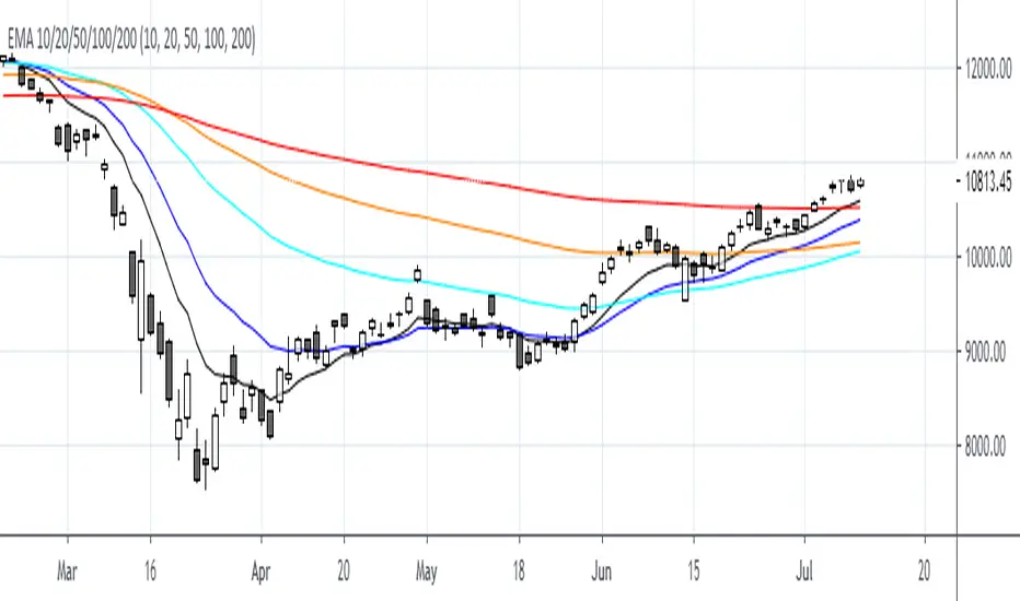
EMA 5/10/150/200This is a simple script with EMA 5/10/150/200. You can also change the source code and set the desired values of the EMA indicator.
Cari dalam skrip untuk "美元未来10天走势预测"
Moving_average-10/5This moving average contain three moving averages , where two moving average corssover work and 1 moving average corssover on candle
when candle cross above or below moving average 10 or 5 its gives signals buy or sell ....
not work in ranging market .
backtest first before use in real trading for study how its work on chart.
thank you

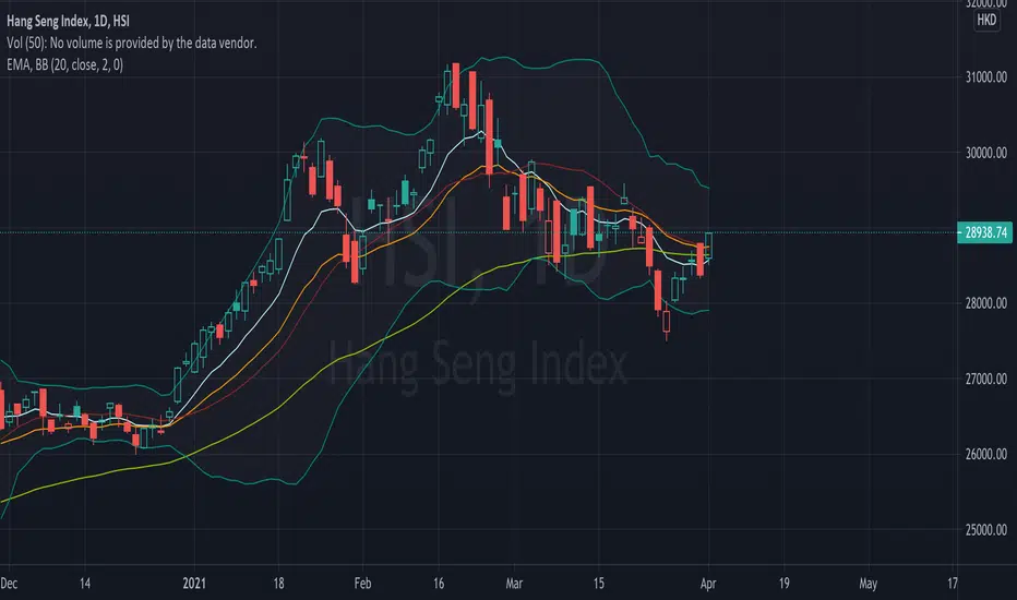
EMA (10,20,60) + Bollinger BandsCombination of bollinger bands and exponential moving averages (10, 20, 60)
The coloring is optimized for dark background, and it is editable
This indicator combined 3 exponential moving average lines and bollinger bands . The EMA lines can be add or deleted in pine editor, and its parameters can be changed too. Same to the bollinger bands . Defaulted value for BB is 20SMA with 2 standard deviations.
Useful as a supplmentary indicators
Simple Moving Average (5,10,20,30,50,100,150,200,250)Simple Moving Average (5, 10, 20, 30, 50, 100, 150, 200, 250)
For those who want a combo of simple moving average
You can edit the color of each line when in use


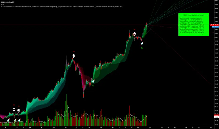
RK's 10 ∴ MA Types Ribbons (Fibonacci, Guppy and others)After some tips in my indicator
RK's 04 - Lots of MA Types Ribbon I Put some time and effort to make it better.
So, I'm sharing with you the results.
This is an up to 10 lines Moving Average Ribbon with an Auto Evaluate Length and a lots of options!!!
Type of Moving Average you can use:
SMA - Simple Moving Average
SMMA - Smoothed Moving Average
EMA - Exponential Moving Average
DEMA - Double Exponential Moving Average
TEMA - Triple Exponential Moving Average
WMA - Weighted Moving Average
HMA - Hull Moving Average
EHMA - Exponential Hull Moving Average
RMA - RSI Moving average
2PSS - Ehlers 2 Pole Super Smoother
3PSS - Ehlers 3 Pole Super Smoother
VWMA - Volume-Weighted Moving Average
ALMA - Arnaud Legoux Moving Average
STMA - Simple Triangular Moving Average
ETMA - Exponential Triangular Moving Average
LSMA - Least Squares Moving Average
ZSMA - Zero-Lag Simple Moving Average
ZEMA - Zero-Lag Exponential Moving Average
COVWMA - Coefficient of Variation Weighted Moving Average
COVWEMA - Coefficient of Variation Weighted Exponential Moving Average
FRAMA - Fractal Adaptive Moving Average
KAMA - Kaufman's Adaptive Moving Average
VIDYA - Variable Index Dynamic Average
If you want to change faster the MA type, in "Moving Average Setup:", Select "🤖 Use numbers to change MA Type", click inside the box in "🤖 Moving Average Type per Number:" and just scroll your mouse wheel. You can check what MA type you are using looking in the info panel label.
There is 4 automatic evaluate length:
Fibonacci Sequence
Arithmetic Progression
Geometric Progression
Guppy Multiple Moving Average (GMMA) without Lengths 03 and 05
And I already put a Manual Length, but I keep it inside the code, so if you want to use different lengths, just change the code, or ask me and I will put as an input.
And attending a request, this indicator can creates alerts when all the colors of the ribbons changes.
Hope you like it!
Any other good idea, just send me.
EMA 10/20/50/100/200First Thank you very much "TradingView" for providing such a Wonderful plateform.
Also very thankful to all TradingView's known & unknown authors who provides superb learnings.
EMA 10/20/50/100/200
Bollinger Bands Width 10標準偏差Standard Deviation(bolliger bands width)を10本重ねたものになります。お好みのスパン、色、σでお使いください。

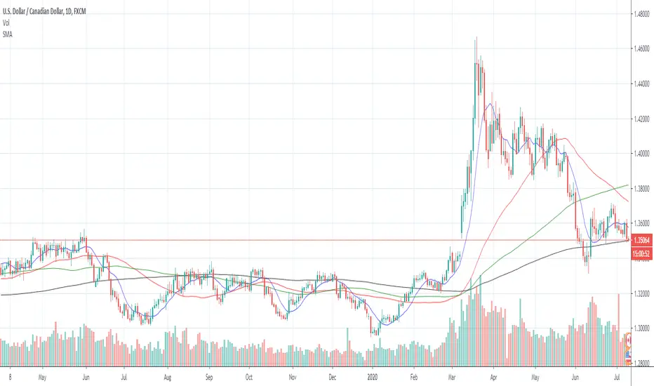
Moving Averages (2, 10, 20, 50, 55, and 200)This allows you to plot multiple moving averages under one indicator. This plots the 2, 10, 50, 55, and 200 moving average. You can turn each one off or on as needed through the settings gear icon.


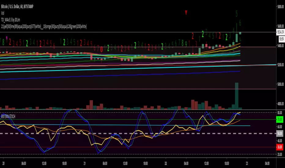
Krowns 10 PACK Combo (5 EMAs, 5 SMAs) - v2Version 2 - Krowns Crypto 10 pack moving average set - written by "Kick Back Time" also known as Mr.Scrogers Neighborhood
...after receiving a lot of likes from the first version I thought I would go ahead and put out the updated version that I've been using
There's a few things I've changed to make it easier to adapt to.
This set is very similar to what Krown uses - I rarely look at the 100 SMA, but I do like the 128 SMA, so I made it default over the 100...
It's all adjustable in values, colors, line thicknesses, etc... it's all good
Tweeks/Improvements:
1) now has a shorter overlay title so it takes up less space on the chart and is less distractive
2) the 30, 50 and 128 SMA's are now default pink which stand out well and are easier to associate as SMA's


QEMA - 9 EMAs (10, 20, 50 - 400) / CryptoprospaBy adding this one indicator to your chart, you save time and effort for the EMAs you want.
You can add this and then modify which ones you want visible in the settings.
It covers the 10, 20, 50, 100, 150, 200, 250, 300, 400 EMAs
Enjoy.
Cryptoprospa.

Krowns 10 PACK Combo (5 EMAs,5 SMAs) by Mr.Scrogers'NeighborhoodI wanted to have the full option of 10 MAs like you see Krown use in his recent videos...
This gives you 5 EMAs that are adjustable in value and color...
...As well as 5 SMAs that are also adjustable in value and color
*If you'd like to see the values in color at the top left like you see in Krown's videos here's what you do:
1) click on the settings gear icon in the upper right
2) next click on the 'background' tab
3) next check the 'indicator value' box off/on
*This will take up quite a bit of space so that's why I altered the code to give you a readout of what color each value is already...your choice though
If you find this to be useful please stop by my youtube channel 'Mr.Scrogers'Neighborhood' and give me a sub...as well as Krown's Crypto Cave youtube channel
I plan to post videos soon on TA, just for fun because I have no biases and will trade up and down regardless
Enjoy!