Cari dalam skrip untuk "采列VS新圣徒"
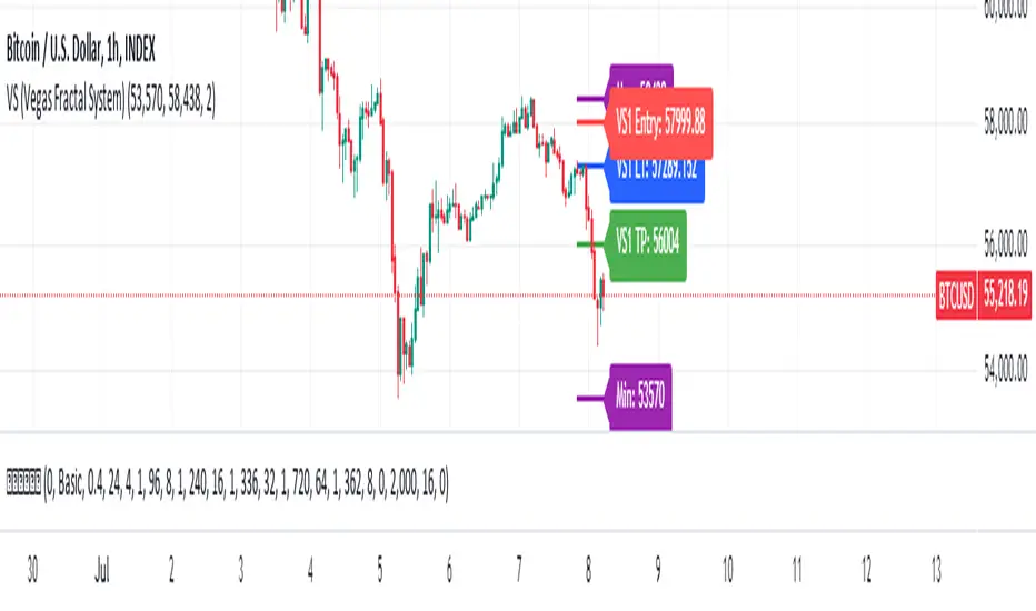
VS (Vegas Fractal System)VS is a trading system based on the identification of fractal reaction zones within a larger, carefully identified movement. It is internally made up of 4 sub-systems.
The indicator is composed of the following parameters: Max and Min, are the largest area identified and will act as the STOPLOSS point. L1, is the price reaction level. Entry, is where to place a pending market entry order. TP, is the place to place a 100% sell order.
A valid area must be identified through the Fibonacci levels that join Highs and Lows or vice versa depending on the bullish or bearish movement. To be usable, this movement must not have a sub-movement that has already hit the 0.618 level.
Always manage Risk and Money Management in an adequate, technical and sustainable manner in relation to your capital. A fair exposure per transaction is between 1% and 2% of the capital.
Asset vs Total Market Cap & Relative Strength Purpose
This indicator allows traders to compare a selected asset to the major market benchmarks:
BTC – primary crypto market leader
ETH – secondary crypto market leader
USDT.D – shows market risk-on vs risk-off sentiment
TOTAL – total crypto market capitalization, useful for overall market trends
It also provides relative strength calculations:
Rel. Strength = Asset % change - USDT.D % change
Rel. Strength vs Total = Asset % change - Total % change
This allows you to see if your asset is outperforming or underperforming broader benchmarks.
The table covers multiple timeframes, making it easy to scan both short-term and longer-term trends:
Row Timeframe
0 Current
1 15m
2 1H
3 4H
4 1D
Selected Asset / BTC / ETH:
Green for positive % change
Red for negative % change
Gradient intensity proportional to magnitude (maxAbsChange input)
USDT.D:
Orange if rising (risk-off)
Teal if falling (risk-on)
Total Market Cap / Rel. Strength:
Gradient reflects asset performance relative to total market, independent of USDT.D.
Positives
Compact dashboard: Everything is in one table for quick scanning.
Multi-timeframe comparison: Traders can instantly see short-term vs long-term strength.
Relative performance visualization: Gradients immediately highlight outperformers and underperformers.
Benchmark comparisons: Asset vs BTC, ETH, USDT.D, and Total Market Cap.
Independent Rel. Strength: Highlights whether the asset is outperforming even if the total market moves.
Customizable gradient sensitivity: maxAbsChange and maxRelChange allow tuning how “strong” the colors appear.
Chart plotting: Rel. Strength vs total market is plotted for further visual reference.
How to Use
Green table cells → strong positive movement
Red table cells → negative movement
Rel. Strength > 0 → asset outperforming
Rel. Strength < 0 → asset underperforming
Use table to compare relative performance vs BTC, ETH, and total market for informed trading decisions.

Buyer vs Seller Control CompanionBuyer vs Seller Control Companion (Overlay)
Crossover signal overlay based on candlestick wick analysis moving averages
Overview:
This companion indicator displays crossover signals directly on the price chart based on the same buyer vs seller control calculations. It identifies moments when the relationship between buying and selling pressure shifts by analyzing where prices close relative to their intraday ranges.
Calculation Method:
The indicator uses identical calculations to the main Buyer vs Seller Control indicator:
Visual Components:
Lime Triangle Up: Appears below price bars when buyer control SMA crosses above seller control SMA
Fuchsia Triangle Down: Appears above price bars when seller control SMA crosses above buyer control SMA
Signal Logic:
Crossover events are detected when one moving average crosses above or below the other. These crossovers indicate potential shifts in the balance between buying and selling pressure as measured by candlestick closing positions relative to their wicks.
Arrow Placement:
Upward Triangle: Positioned below the bar when buyer control moving average exceeds seller control moving average
Downward Triangle: Positioned above the bar when seller control moving average exceeds buyer control moving average
Size: Small triangular shapes to avoid cluttering the price chart
Timing: Arrows appear only on bars where actual crossovers occur
Settings:
Moving Average Period: Adjustable from 1-200 periods (default: 20)
Technical Notes:
This overlay version works on any timeframe
Arrows only appear when crossovers actually occur, not on every bar
The indicator uses the same mathematical foundation as the main oscillator version
Signal frequency depends on the chosen moving average period
Shorter periods generate more frequent crossovers, longer periods generate fewer
Relationship to Main Indicator:
This companion overlay displays the exact crossover points that can be observed in the main Buyer vs Seller Control indicator. It provides the same information but presents it directly on the price chart for convenient reference without switching between indicator panes.
This overlay serves as a visual reference tool for crossover events detected in the underlying buyer vs seller control analysis.

Weekday Close vs Open — Last N (per weekday)# Weekday Close vs Open - Last N Occurrences
This indicator distills every weekday's historical open-to-close behavior into a compact table so you can see how "typical" the current session is before the day even closes. It runs independently of your chart timeframe by pulling daily OHLCV data under the hood, tracking the last **N** completed occurrences for each weekday, and refreshing only when a daily bar closes. On daily charts you can also shade every past bar that matches today's weekday (excluding the in-progress session) to reinforce the pattern visually while the table remains non-repainting.
## What It Shows
- **Win/Loss/Tie counts** - how many of the last `N` occurrences closed above the open (wins), below (losses), or inside the tie threshold you define as "flat".
- **Win % heatmap** - the win column is color-coded (deep green > deep red) so you immediately recognize strong or weak weekdays.
- **Advanced metrics (optional)** - average daily volume plus the average percentage excursion above/below the open (`AvgUp%`, `AvgDn%`) for that weekday.
- **Totals row** - aggregates every weekday into one row to estimate overall hit rate and average stats across the entire data set.
- **Weekday shading (optional)** - on daily charts you can tint every bar that matches today's weekday (all Mondays, all Fridays, etc.) for instant pattern recognition.
## How It Works
1. The script requests daily OHLCV data (non-repainting) regardless of the chart timeframe.
2. When a new daily bar confirms, it packs that day's data into one of seven arrays (one per weekday). Each day contributes five floats (O/H/L/C/V) so trimming and statistics stay in lockstep.
3. A helper function (`f_dayMetrics`) scans daily history to compute average volume, average excursion above/below the open, and win/loss/tie counts for the requested weekday.
4. The table populates on the last bar of the chart session, respecting your advanced/totals toggles and keeping text at `size.normal`.
## Reading the Table
- **Win/Loss/Tie columns**: raw counts taken from your chosen `N`.
- **Win %***: excludes ties from the denominator so it reflects only decisive closes.
- **AvgUp% / AvgDn%**: typical intraday extension (high vs open, open vs low) in percent.
- **Avg Vol**: arithmetic mean of daily volume for that weekday.
- **TOTAL row**: provides a global win rate plus volume/up/down averages weighted by how many samples each weekday contributed.
## Practical Uses
- Spot weekdays that historically trend higher or lower before entering a trade.
- Compare current price action against the typical intraday range (`AvgUp%` vs today's move).
- Filter mean-reversion vs breakout setups based on the most reliable weekday patterns.
- Quickly gauge whether today is behaving "in character" by referencing the highlighted row or the optional whole-chart weekday shading.
> **Tip:** Use smaller `N` values (e.g., 10-20) for adaptive, recent behavior and larger values (50+) to capture longer-term seasonality. Tighten the tie threshold if you want almost every candle to register as win/loss, or widen it to focus only on meaningful moves.

Rolling Correlation BTC vs Hedge AssetsRolling Correlation BTC vs Hedge Assets
Overview
This indicator calculates and plots the rolling correlation between Bitcoin (BTC) returns and several key hedge assets:
• XAUUSD (Gold)
• EURUSD (proxy for DXY, U.S. Dollar Index)
• VIX (Volatility Index)
• TLT (20y U.S. Treasury Bonds ETF)
By monitoring these dynamic correlations, traders can identify whether BTC is moving in sync with risk assets or decoupling as a hedge, and adjust their trading strategy accordingly.
How it works
1. Computes returns for BTC and each asset using percentage change.
2. Uses the rolling correlation function (ta.correlation) over a configurable window length (default = 12 bars).
3. Plots each correlation as a separate colored line (Gold = Yellow, EURUSD = Blue, VIX = Red, TLT = Green).
4. Adds threshold levels at +0.3 and -0.3 to help classify correlation regimes.
How to use it
• High positive correlation (> +0.3): BTC is moving together with the asset (risk-on behavior).
• Near zero (-0.3 to +0.3): BTC is showing little to no correlation — neutral/independent moves.
• Negative correlation (< -0.3): BTC is moving in the opposite direction — potential hedge opportunity.
Practical strategies:
• Watch BTC vs VIX: a spike in volatility (VIX ↑) usually coincides with BTC selling pressure.
• Track BTC vs EURUSD: stronger USD often puts downside pressure on BTC.
• Observe BTC vs Gold: during “flight to safety” events, gold rises while BTC weakens.
• Monitor BTC vs TLT: rising yields (falling TLT) often align with BTC weakness.
Inputs
• Window Length (bars): Number of bars used to calculate rolling correlations (default = 12).
• Comparison Timeframe: Default = 5m. Can be changed to align with your intraday or swing trading style.
Notes
• Works best on intraday charts (1m, 5m, 15m) for scalping and short-term setups.
• Use correlations as context, not standalone signals — combine with volume, VWAP, and price action.
• Correlations are dynamic; they can switch regimes quickly during macro events (CPI, NFP, FOMC).
This tool is designed for traders who want to manage risk exposure by monitoring whether BTC is behaving as a risk-on asset or hedge, and to exploit opportunities during decoupling phases.

NeuroSwarm ETH — Crowd vs Experts Forecast TrackerEnglish:
NeuroSwarm — Crowd vs Experts Forecast Tracker (ETH)
This indicator visualizes monthly forecast data collected from two independent groups:
Crowd – a large sample of retail participants
Experts – a curated group of analysts and experienced market participants
For each month, the indicator plots the following values as horizontal levels on the price chart:
Median forecast (Crowd)
Average forecast (Crowd)
Median forecast (Experts)
Average forecast (Experts)
Shaded zones highlighting the difference between median and mean
All values are fixed for each month and stay unchanged historically.
This allows traders to analyze sentiment dynamics and compare how expectations from both groups align or diverge from actual price action.
Purpose:
This tool is intended for sentiment visualization and analytical insight — it does not generate trading signals.
Its main goal is to compare collective expectations of retail traders vs experts across time.
Data source:
All forecasts come from monthly surveys conducted within the NeuroSwarm project between the 1st and 5th day of each month.
Interface notice:
The script's UI may contain non-English labels for convenience, but a full English documentation is provided here in compliance with TradingView rules.
Русская версия:
NeuroSwarm — Мудрость Толпы vs Эксперты (ETH)
Индикатор отображает ежемесячные прогнозы двух групп:
Толпа: медиана и средняя прогнозов
Эксперты: медиана и средняя прогнозов
Значения фиксируются для каждого месяца и показываются горизонтальными уровнями.
Заливка отображает диапазон между медианой и средней, что упрощает визуальное сравнение настроений.
Это аналитический инструмент для визуализации настроений — не торговая стратегия.
Все данные берутся из ежемесячных опросов проекта NeuroSwarm.

SMT + CVD (NQ vs ES) w/ AlertsSMT + CVD (NQ vs ES) w/ Alerts
This tool combines Smart Money Technique (SMT) and Cumulative Volume Delta (CVD) to highlight high-probability inflection points on NQ (primary) versus ES (secondary).
How it works
SMT condition: the primary breaks its most recent swing (High for bearish / Low for bullish) while the secondary does not break the corresponding swing within a small retest window.
CVD confirmation: at the same time, the primary’s CVD shows divergence (higher price but lower/equal CVD for shorts, lower price but higher/equal CVD for longs).
When both align, the script plots a marker/label and draws a line from the primary swing to the signal bar. Alerts are fired.
Signals & Alerts
Labels: “SMT+CVD DOWN/UP” on the signal bar.
Lines: connects the primary swing → signal bar so you can see the structure that produced the signal.
Alert names: “SMT+CVD Bearish” and “SMT+CVD Bullish.”
Inputs
Primary / Secondary symbols: defaults NQ & ES (you can change them).
Resolution: use chart timeframe or specify one.
Swing Left/Right Bars: pivot detection depth (higher = larger swings).
Break Window Bars: how many bars the secondary has to not break for SMT to be valid.
CVD Up/Down By: Close vs Previous Close (default) or Close vs Open.
Anchor CVD Daily: resets CVD at session/day start.
CVD Smoothing (EMA): smooths the CVD line (optional show).
FAST Pivots (no future bars): left-only swing detection so signals appear sooner and behave well in Replay/live.
Require Secondary Pivot: if ON, SMT checks wait for a confirmed secondary swing; if OFF, signals can appear while the secondary swing is still forming (useful for Replay/testing).
Show CVD line: optional, may compress price scale.
Non-repaint notes
With FAST Pivots ON, swings are detected with no future bars (minimal latency = leftBars).
With FAST Pivots OFF, standard pivots require rightBars future bars to confirm the swing (classic, but naturally delayed).
Tips
For intraday futures, keep leftBars/rightBars small (e.g., 3/3) and Break Window 1–3.
In Replay, enable FAST Pivots and consider disabling Require Secondary Pivot if you want signals to appear as soon as the primary breaks.
Combine with session filters, execution rules, or liquidity zones for context.

Smart Money vs Retail (COT Flow) 0213Smart Money vs Retail (COT Flow) 0213
Smart Money vs Retail (COT Flow) 0213
Smart Money vs Retail (COT Flow) 0213
Smart Money vs Retail (COT Flow) 0213Smart Money vs Retail (COT Flow) 0213
Smart Money vs Retail (COT Flow) 0213
Smart Money vs Retail (COT Flow) 0213

Egg vs Tennis Ball — Drop/Rebound StrengthEgg vs Tennis Ball — Drop/Rebound Meter
What it does
Classifies selloffs as either:
Eggs — dead‑cat, no bounce
Tennis Balls — fast, decisive rebound
Core features
Detects swing drops from a Pivot High (PH) to a Pivot Low (PL)
Requires drops to be meaningful (volatility‑aware, ATR‑scaled)
Draws a bounce threshold line and a deadline
Decides outcome based on speed and extent of rebound
Tracks scores and win rates across multiple lookback windows
Includes a color‑coded meter and current streak display
Visuals at a glance
Gray diagonal — drop from PH to PL
Teal dotted horizontal — bounce threshold, from PH to the deadline
Solid green — Tennis Ball (bounce line broken before the deadline)
Solid red — Egg (deadline expired before the bounce)
Optional PH / PL labels for clarity
How the decision is made
1) Find pivots — symmetric pivots using Pivot Left / Right; PL confirms after Right bars.
2) Qualify the drop — Drop Size = PH − PL; must be ≥ (Drop Threshold × ATR at PL).
3) Define the bounce line — PL + (Bounce Multiple × Drop Size). 1.00× = full retrace to PH; up to 2.00× for overshoot.
4) Set the deadline — Drop Bars = PL index − PH index; Deadline = Drop Bars × Recovery Factor; timer starts from PH or PL.
5) Resolve — Tennis Ball if price hits the bounce line before the deadline; Egg if the deadline passes first.
Scoring system (−100 to +100)
+100 = perfect Tennis Ball (fastest possible + full overshoot)
−100 = perfect Egg (no recovery)
In between: scored by rebound speed and extent, shaped by your weight settings
Meter Table
Columns (toggle on/off)
All (off by default)
Last N1 (default 5)
Last N2 (default 10)
Last N3 (default 20)
Rows
Tennis / Eggs — counts
% Tennis — win rate
Avg Score — normalized quality from −100 to +100
Streak — overall (not windowed), e.g., +3 = 3 Tennis Balls in a row, −4 = 4 Eggs in a row
Alerts
Tennis Ball – Fast Rebound — triggers when the bounce line is broken in time
Egg – Window Expired — triggers when the deadline passes without a bounce
Inputs
① Drop Detection
Pivot Left / Right
ATR Length
Drop Threshold × ATR
② Bounce Requirement
Bounce Multiple × Drop Size (0.10–2.00×)
③ Timing
Timer Start — PH or PL
Recovery Factor × Drop Bars
Break Trigger — Close or High
④ Display
Show Pivot/Outcome Labels
Line Width
Table Position (corner)
⑤ Meter Columns
Show All (off by default)
Show N1 / N2 / N3 (5, 10, 20 by default)
⑥ Scoring Weights
Tennis — Base, Speed, Extent
Egg — Base, Strength
How to use it
Pick strictness — start with Drop Threshold = 2.0 ATR, Bounce Multiple = 1.0×, Recovery Factor = 3.0×; adjust to timeframe and volatility.
Watch the dotted line — it ends at the deadline; turns solid green (Tennis) if broken in time, solid red (Egg) if it expires.
Read the meter — short windows (5–10) show current behavior; Avg Score captures quality; Streak shows momentum.
Blend with your system — combine with trend filters, volume, or regime detection.
Tips
Close vs High trigger: Close is stricter; High is more responsive.
PH vs PL timer start: PH measures round‑trip; PL measures recovery only.
Increase pivot strength for fewer, more reliable signals.
Higher timeframes generally produce cleaner patterns.
Defaults
Pivot L/R: 5 / 5
ATR Length: 14
Drop Threshold: 2.0× ATR
Bounce Multiple: 1.00×
Recovery Factor: 3.0×
Break Trigger: Close
Windows: Last 5, 10, 20 (All off)
Interpreting results
Tennis‑y: Avg Score +30 to +70, %Tennis > 55%
Mixed: Avg Score near 0
Egg‑y: Avg Score −30 to −80, %Tennis < 45%
VN30 Effort-vs-Result Multi-Scanner — LinhVN30 Effort-vs-Result Multi-Scanner (Pine v5)
Cross-section scanner for Vietnam’s VN30 stocks that surfaces Effort vs Result footprints and related accumulation/distribution and volatility tells. It renders a ranked table (Top-N) with per-ticker signals and key metrics.
What it does
Scans up to 30 tickers (editable input.symbol slots) using one security() call per symbol → stays under Pine’s 40-call limit and runs reliably on any chart.
Scores each ticker by counting active signals, then ranks and lists the top names.
Optional metrics columns: zVol(60), zTR(60), ATR(20), HL/ATR(20).
Signals (toggleable)
Price/Volume – Effort vs Result
EVR Squeeze (stealth): z(Vol,60) > 4 & z(TR,60) < −0.5
5σ Vol, ≤1σ Ret: z(Vol,60) > 5 & |z(Return,60)| < 1
Wide Effort, Opposite Result: z(Vol,60) > 3 & close < open & z(CLV×Vol,60) > 1
Spread Compression, Heavy Tape: (H−L)/ATR(20) < 0.6 & z(Vol,60) > 3
No-Supply / No-Demand: close < close & range < 0.6×ATR(20) & vol < 0.5×SMA(20)
Momentum & Volatility
Vol-of-Vol Kink: z(ATR20,200) rising & z(ATR5,60) falling
BB Squeeze → Expansion: BBWidth(20) in low regime (z<−1.3) then close > upper band & z(Vol,60) > 2
RSI Non-Confirmation: Price LL/HH with RSI HL/LH & z(Vol,60) > 1
Accumulation/Distribution
OBV Divergence w/ Flat Price: OBV slope > 0 & |z(ret20,260)| < 0.3
Accumulation Days Cluster: ≥3/5 bars: up close, higher vol, close near high
Effort-Result Inversion (Down): big vol on down day then next day close > prior high
How to use
Set the timeframe (works best on 1D for EOD scans).
Edit the 30 symbol slots to your VN30 constituents.
Choose Top N, toggle Show metrics/Only matches and enable/disable scenarios.
Read the table: Rank, Ticker, (metrics), Score, and comma-separated Signals fired.
Method notes
Z-scores use a population-std estimate; CLV×Vol is used for effort/location.
Rolling counts avoid ta.sum; OBV is computed manually; all logic is Pine v5-safe.
Intraday-only ideas (true VWAP magnets, auction volume, flows, futures/options) are not included—Pine can’t cross-scan those datasets.
Disclaimer: Educational tool, not financial advice. Always confirm signals on the chart and with your process.

Puts vs Longs vs Price Oscillator SwiftEdgeWhat is this Indicator?
The "Low-Latency Puts vs Longs vs Price Oscillator" is a custom technical indicator built for TradingView to help traders visualize buying and selling activity in a market without access to order book data. It displays three lines in an oscillator below the price chart:
Green Line (Longs): Represents the strength of buying activity (bullish pressure).
Red Line (Puts): Represents the strength of selling activity (bearish pressure).
Yellow Line (Price): Shows the asset’s price in a scaled format for direct comparison.
The indicator uses price movements, volume, and momentum to estimate when buyers or sellers are active, providing a quick snapshot of market dynamics. It’s optimized for fast response to price changes (low latency), making it useful for both short-term and longer-term trading strategies.
How Does it Work?
Since TradingView doesn’t provide direct access to order book data (which shows real-time buy and sell orders), this indicator approximates buying and selling pressure using commonly available data: price, volume, and a momentum measure called Rate of Change (ROC). Here’s how it combines these elements:
Price Movement: The indicator checks if the price is rising or falling compared to the previous candlestick. A rising price suggests buying (longs), while a falling price suggests selling (puts).
Volume: Volume acts as a "weight" to measure the strength of these price moves. Higher volume during a price increase boosts the green line, while higher volume during a price decrease boosts the red line. This mimics how large orders in an order book would influence the market.
Rate of Change (ROC): ROC measures how fast the price is changing over a set period (e.g., 5 candlesticks). It adds a momentum filter—strong upward momentum reinforces buying signals, while strong downward momentum reinforces selling signals.
These components are calculated for each candlestick and summed over a short lookback period (e.g., 5 candlesticks) to create the green and red lines. The yellow line is simply the asset’s closing price scaled down to fit the oscillator’s range, allowing you to compare buying/selling strength directly with price action.
Why Combine These Elements?
The combination of price, volume, and ROC is intentional and synergistic:
Price alone isn’t enough—it tells you what happened but not how strong the move was.
Volume adds context by showing the intensity behind price changes, much like how order book volume indicates real buying or selling interest.
ROC ensures the indicator captures momentum, filtering out weak or random price moves and focusing on significant trends, similar to how aggressive order execution might appear in an order book.
Together, they create a balanced picture of market activity that’s more reliable than any single factor alone. The goal is to simulate the insights you’d get from an order book—where you’d see buy/sell imbalances—using data available in TradingView.
How to Use It
Setup:
Add the indicator to your chart via TradingView’s Pine Editor by copying and pasting the script.
Adjust the inputs to suit your trading style:
Lookback Period: Number of candlesticks (default 5) to sum buying/selling activity. Shorter = more responsive; longer = smoother.
Price Scale Factor: Scales the yellow price line (default 0.001). Increase for high-priced assets (e.g., 0.01 for indices like DAX) or decrease for low-priced ones (e.g., 0.0001 for crypto).
ROC Period: Candlesticks for momentum calculation (default 5). Shorter = faster response.
ROC Weight: How much momentum affects the signal (default 0.5). Higher = stronger momentum influence.
Volume Threshold: Minimum volume multiplier (default 1.5) to boost signals during high activity.
Reading the Oscillator:
Green Line Above Yellow: Strong buying pressure—price is rising with volume and momentum support. Consider this a bullish signal.
Red Line Above Yellow: Strong selling pressure—price is falling with volume and momentum support. Consider this a bearish signal.
Green/Red Crossovers: When the green line crosses above the red, it suggests buyers are taking control. When the red crosses above the green, sellers may be dominating.
Yellow Line Context: Compare green/red lines to the yellow price line to see if buying/selling strength aligns with price trends.
Trading Examples:
Bullish Setup: Green line spikes above yellow after a price breakout with high volume (e.g., DAX opening jump). Enter a long position if confirmed by other indicators.
Bearish Setup: Red line rises above yellow during a price drop with increasing volume. Look for a short opportunity.
Reversal Warning: If the green line stays high while price (yellow) flattens or drops, it could signal overbought conditions—be cautious.
What Makes It Unique?
Unlike traditional oscillators like RSI or MACD, which focus solely on price momentum or trends, this indicator blends price, volume, and momentum into a three-line system that mimics order book dynamics. Its low-latency design (short lookback and no heavy smoothing) makes it react quickly to market shifts, ideal for volatile markets like DAX or forex. The visual separation of buying (green) and selling (red) against price (yellow) offers a clear, intuitive way to spot imbalances without needing complex data.
Tips and Customization
Volatile Markets: Use a shorter lookback (e.g., 3) and ROC period (e.g., 3) for faster signals.
Stable Markets: Increase lookback (e.g., 10) for smoother, less noisy lines.
Scaling: If the green/red lines dwarf the yellow, adjust Price Scale Factor up (e.g., 0.01) to balance them.
Experiment: Test on your asset (stocks, crypto, indices) and tweak inputs to match its behavior.

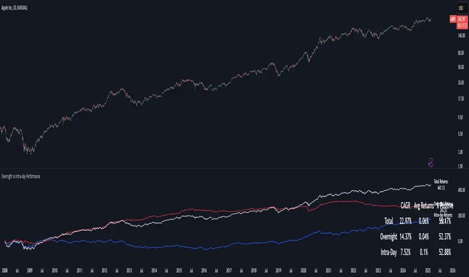
Overnight vs Intra-day Performance█ STRATEGY OVERVIEW
The "Overnight vs Intra-day Performance" indicator quantifies price behaviour differences between trading hours and overnight periods. It calculates cumulative returns, compound growth rates, and visualizes performance components across user-defined time windows. Designed for analytical use, it helps identify whether returns are primarily generated during market hours or overnight sessions.
█ USAGE
Use this indicator on Stocks and ETFs to visualise and compare intra-day vs overnight performance
█ KEY FEATURES
Return Segmentation : Separates total returns into overnight (close-to-open) and intraday (open-to-close) components
Growth Tracking : Shows simple cumulative returns and compound annual growth rates (CAGR)
█ VISUALIZATION SYSTEM
1. Time-Series
Overnight Returns (Red)
Intraday Returns (Blue)
Total Returns (White)
2. Summary Table
Displays CAGR
3. Price Chart Labels
Floating annotations showing absolute returns and CAGR
Color-coded to match plot series
█ PURPOSE
Quantify market behaviour disparities between active trading sessions and overnight positioning
Provide institutional-grade attribution analysis for returns generation
Enable tactical adjustment of trading schedules based on historical performance patterns
Serve as foundational research for session-specific trading strategies
█ IDEAL USERS
1. Portfolio Managers
Analyse overnight risk exposure across holdings
Optimize execution timing based on return distributions
2. Quantitative Researchers
Study market microstructure through time-segmented returns
Develop alpha models leveraging session-specific anomalies
3. Market Microstructure Analysts
Identify liquidity patterns in overnight vs daytime sessions
Research ETF premium/discount mechanics
4. Day Traders
Align trading hours with highest probability return windows
Avoid overnight gaps through informed position sizing
OHLC/4 Daily vs Quarterly CrossOHLC/4 Daily vs Quarterly Cross
The "OHLC/4 Daily vs Quarterly Cross" indicator is a powerful tool designed to provide traders with insights into trend alignment and potential market turning points. By calculating the average of the open, high, low, and close prices (OHLC/4), this script compares the daily average price action with the quarterly average to identify significant crossover events.
This indicator features two distinct lines: the Daily OHLC/4 and the Quarterly OHLC/4, each plotted in different colors for easy differentiation. A crossover occurs when the daily OHLC/4 moves above the quarterly average, potentially signaling bullish momentum or a shift in market direction. Conversely, a crossunder marks the daily OHLC/4 moving below the quarterly level, indicating potential bearish sentiment or a reversal.
With real-time plotting and built-in alert conditions, this script enables traders to stay ahead of critical market movements by setting automated notifications for crossover events. Whether you're seeking to confirm trends or identify new opportunities, the "OHLC/4 Daily vs Quarterly Cross" delivers clarity and actionable insights for more informed decision-making.

Enhanced Retail vs Institutional ActivityThis script highlights market activity in real-time, making it easier to infer the type of market participants driving price and volume changes.
Here’s a list of what the script analyzes:
Volume:
Current volume of the candle.
Moving average of volume over a specified number of periods.
Volume spikes: Current volume compared to a threshold multiple of the moving average.
Price Movement:
Percentage change in price between the current and previous candle.
Identifies significant price changes based on a user-defined threshold.
Institutional Activity:
High volume spikes combined with significant price movements.
Retail Activity:
Periods without volume spikes or significant price changes.
VWAP (Volume-Weighted Average Price):
The average traded price over a specified lookback period, weighted by volume, used as a benchmark.
Market Context Visualization:
Background colors to differentiate institutional (red) and retail (green) activity.
Overlays for:
-Volume bars.
-Average volume line.
-VWAP line.
In summary:
Red = Institutional activity: High volume + significant price change.
Green = Retail activity: Low volume or insignificant price change.
---------------------------------------------------------------------------------------------------------------------
Analysis Explanation:
I’m forecasting that Bitcoin will retest its November 12th low (~$85,098.75) around January 20th, 2025, where the horizontal support line intersects with the downtrend line. This conclusion is based on the following:
Trend Analysis:
The chart shows a clear downtrend with price respecting the descending trendline.
The intersection of the horizontal support and the downtrend line on January 20th indicates a confluence point where price action may gravitate.
Volume and Activity Insights:
Using the Retail vs Institutional Activity indicator, the chart highlights periods dominated by institutional (red background) or retail (green background) activity.
Current price action is in a green zone, suggesting predominantly retail participation with lower volume and insignificant price movements.
Retail vs Institutional Dynamics:
Institutional activity (red zones) aligns with significant price movements and volume spikes, often marking key turning points or trends.
The recent green retail-dominated periods suggest a lack of strong momentum, which may lead to continued price decline until institutions re-enter around the confluence area.
Volume Observations:
Volume remains relatively low during the current retail phase, indicating weak buying pressure.
A potential surge in institutional activity (red zones) near the support level could trigger a rebound or breakdown.
I expect Bitcoin’s price to drop further and test the November 12th low near $85,098.75 on January 20th, 2025. This projection is supported by the convergence of the downtrend line and horizontal support, low retail-driven volume, and historical institutional activity patterns observed using the "Retail vs Institutional Activity" indicator.

Volume Bulls vs Bears (Improved)The "Volume Bulls vs Bears (Improved)" is a raw and powerful volume-based indicator for TradingView that visualizes market participation by separating volume into "bullish" and "bearish" components. It provides a clear and visually appealing stacked histogram alongside a moving average of total volume, helping traders identify trends in market participation.
Key Features
Bullish vs Bearish Volume Separation:
Bullish Volume: Represents the portion of volume contributed by buyers (when prices move up).
Bearish Volume: Represents the portion of volume contributed by sellers (when prices move down).
Volume is calculated based on price action within the range of the candle:
Bulls = ((Close - Low) / (High - Low)) * Total Volume
Bears = ((High - Close) / (High - Low)) * Total Volume
Stacked Histogram:
Bullish and bearish volumes are plotted as a stacked histogram.
Bull Color: Green (default).
Bear Color: Red (default).
This makes it easy to spot shifts in volume dominance between bulls and bears.
Volume SMA:
A Simple Moving Average (SMA) of total volume over a user-defined period helps smooth out fluctuations and shows overall volume trends.
Default period is 20 bars.
SMA Line: Yellow (default), adjustable in width.
User-Customizable Inputs:
Volume SMA Period: Adjust the lookback period for the moving average.
Bull/Bear Colors: Customizable histogram colors.
SMA Line Color and Width: Allows flexibility for better chart aesthetics.
Non-Overlapping Visuals:
The histogram avoids overlap, ensuring clarity by visually stacking bullish and bearish volumes.
How to Use the Indicator
Identify Bullish Volume Dominance:
If the green (bullish) volume bars are larger, it indicates stronger buying pressure within the candle range.
Identify Bearish Volume Dominance:
If the red (bearish) volume bars are larger, it signals stronger selling pressure.
Volume Trend:
Use the Volume SMA line to identify whether overall volume is increasing, decreasing, or staying stable. Rising volume typically strengthens trends, while declining volume can indicate weakness.
Use Cases
Spotting volume trends that confirm price movements (e.g., rising prices with rising bullish volume).
Recognizing potential reversals when bearish volume starts dominating previously bullish candles.
Identifying accumulation or distribution phases by analyzing volume behavior.
Conclusion
This "Volume Bulls vs Bears (Improved)" indicator provides traders with deeper insights into market participation. Its raw, no-frills design offers clear visuals to help assess bullish and bearish volume dynamics with an additional smoothing component through the SMA. It’s an essential tool for volume-focused traders looking to confirm trends or anticipate reversals.

Volatility vs ATRVolatility vs ATR Indicator Description for TradingView
Volatility vs ATR is a powerful custom indicator designed to help traders analyze and compare market volatility with the Average True Range (ATR). This indicator provides valuable insights into the dynamic behavior of asset prices, enabling traders to make informed decisions about market trends, potential reversals, and risk management.
What Does It Measure?
Volatility: Represents the degree of price variation over a given period. Calculated using standard deviation or other measures, it highlights periods of heightened or reduced market activity.
Average True Range (ATR): Measures the average range of price movement over a specific period, providing a sense of the asset's price fluctuations and market activity.
How It Works
The indicator plots both Volatility and ATR on the same chart, making it easy to visualize how these metrics interact.
Rising Volatility often signals increased market uncertainty or the beginning of strong trends.
ATR Spikes typically accompany high volatility, helping identify potential breakout or breakdown scenarios.
By tracking the interplay between these metrics, traders can anticipate shifts in momentum, recognize consolidation phases, and plan trades more effectively.
Key Features
Dual-Line Display: Clearly plots both Volatility (red) and ATR (blue) for easy comparison.
Customizable Periods: Allows you to adjust the lookback period for both metrics to match your trading style.
Versatile Application: Works across all asset classes, including stocks, forex, crypto, and commodities.
Why Use Volatility vs ATR?
Trend Analysis: Identify trending vs. ranging markets by observing the relationship between Volatility and ATR.
Breakout Confirmation: Use Volatility and ATR spikes as confirmation signals for potential breakouts.
Risk Management: Plan stop-loss levels and position sizing based on ATR values.
How to Use It
Add the indicator to your chart.
Look for periods where Volatility diverges from ATR to spot potential market shifts.
Use the indicator in conjunction with price action and other technical tools for a comprehensive analysis.
This indicator is ideal for traders looking to enhance their strategies by understanding market dynamics through the lens of volatility and average price movement.
Let me know if you’d like further refinement!

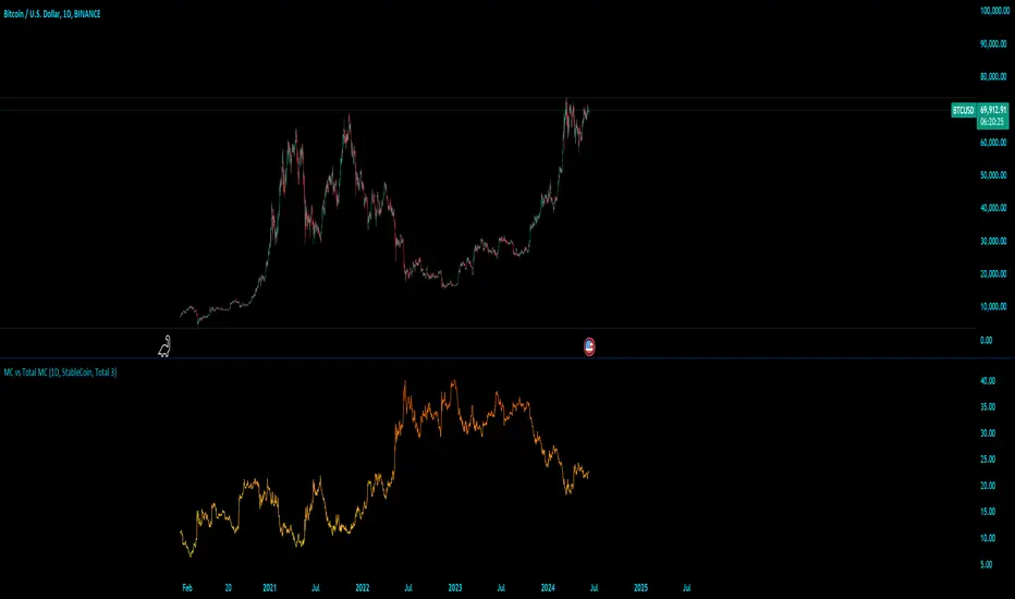
MC vs Total MCMC vs Total MC
this is an edit of StableCoin MC vs Total MC by Crypto5Max supporting muti timeframes and addition dominances
is a powerful and versatile TradingView indicator designed to help traders and analysts visualize the dominance of different types of cryptocurrencies (StableCoin, AltCoin, BTC, ETH) relative to the total market capitalization. This indicator provides a clear and concise way to monitor market trends and make informed decisions based on the dominance of specific cryptocurrency segments.
Key Features:
Customizable Time Frames: Select from a variety of time frames including 5 Min, 15 Min, 30 Min, 1HR, 2HR, 4HR, 8HR, and Daily to tailor the analysis to your needs.
Dominance Type Selection: Choose the type of market capitalization dominance you want to track - StableCoins, AltCoins, Bitcoin, or Ethereum.
Total Market Capitalization Options: Analyze the market with different total market capitalization metrics - total crypto market cap, total market cap excluding BTC, or total market cap excluding BTC and ETH.
Dynamic Label Display: A label that follows the plotted dominance line and dynamically displays the dominance percentage, providing a clear visual representation.
Invisible Background Option: Choose to have an invisible background for a cleaner chart presentation.
How It Works:
Time Frame Selection: Use the time_frame input to choose the desired time frame for your analysis.
Dominance Type Selection: Select the type of dominance to display using the mcap_type input.
Total Market Capitalization Selection: Choose the total market capitalization metric with the total_sym input.
Dominance Calculation: The indicator calculates the dominance of the selected cryptocurrency type as a percentage of the total market capitalization.
Visual Display: The chosen dominance is plotted on the chart, and a label displaying the dominance percentage is dynamically updated to follow the plotted line.
Use Cases:
Market Trend Analysis: Identify trends in the dominance of StableCoins, AltCoins, BTC, or ETH to gauge market sentiment.
Portfolio Allocation: Make informed decisions about portfolio allocation by understanding the market share of different cryptocurrency types.
Technical Analysis: Combine with other technical indicators to enhance your trading strategy and gain deeper market insights.
This indicator is essential for traders, analysts, and investors who want to stay ahead of market movements and make data-driven decisions based on the dominance of various cryptocurrency segments.
Example:
If you select "AltCoin" as the dominance type and "Total 3" as the total market capitalization, the indicator will plot the dominance of AltCoins (excluding BTC and ETH) as a percentage of the total crypto market capitalization (excluding BTC and ETH) on the selected time frame. The dynamic label will display this percentage, updating as the market evolves.
Elevate your market analysis with the MC vs Total MC indicator and gain a comprehensive view of cryptocurrency dominance trends.
Bull Vs Bear Visible Range VP [Kioseff Trading]Hello!
This Script “Bull vs Bear Visible Range VP” Calculates Bull & Bear Volume Profiles for the Visible Range Alongside a Delta Ladder for the Visible Period!
Features
Volume Profile Anchored to Visible Range
Delta Ladder Anchored to Visible Range
Bull vs Bear Profiles!
Standard Poc and Value Area Lines, in Addition to Separated POCs and Value Area Lines for Bull Profiles and Bear Profiles
Configurable Value Area Target
Curved Profiles
Up to 9999 Profile Rows per Visible Range
Stylistic Options for Profiles
This Script Generates Bull vs. Bear Volume Profiles for the Visible Range!
Up to 9999 Volume Profile Levels (Price Levels) Can Be Calculated for Each Profile, Thanks to the New Polyline Feature, Allowing For Less Aggregation / More Precision of Volume at Price and Volume Delta.
Bull vs Bear Profiles
The Image Above Shows Primary Functionality!
Green Profiles = Buying Volume
Red Profiles = Selling Volume
Bullish & Bearish Pocs for the Visible Range Are Displayable!
Profiles Can Be Anchored on the Left Side for a More Traditional Look.
The indicator is robust enough to calculate on "small price periods", or for a price period spanning your entire chart fully zoomed out!
That’s About It :D
This Indicator Is Part of a Series Titled “Bull vs. Bear” - A Suite of Profile-Like Indicators I Will Be Releasing Over Coming Days. Thanks for Checking This Out!
If You Have Any Suggestions Please Feel Free to Share!

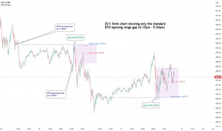
Regular vs Electronic Trading hours Gap (RTH vs ETH); 4pm-9:30am-Shows the gap between 4pm close and 9:30am open; the Regular trading hours Vs Electronic trading hours Gap (RTH vs ETH).
-Displays this as a box starting at 9:30am, whose bottom is the 9:30am open; top is previous day's 4pm close.
-Displays when chart is toggled to either of ETH or RTH.
-Useful reminder of area above/below opening bell price that price often has a tendency to want to fill in, partially or fully
--(all times here refer to America/New_York timezone)
//Options:
~Number of past boxes to show
~Extend boxes fully to the right
~Box background color, border color, and opacities
//Limitations:
-works only on timeframes 30mins or lower (works on 1,2,5,10,15,30minutes)
-will not work on non-typical low timeframes (like 4min or 7min) since they are not divisible into 30
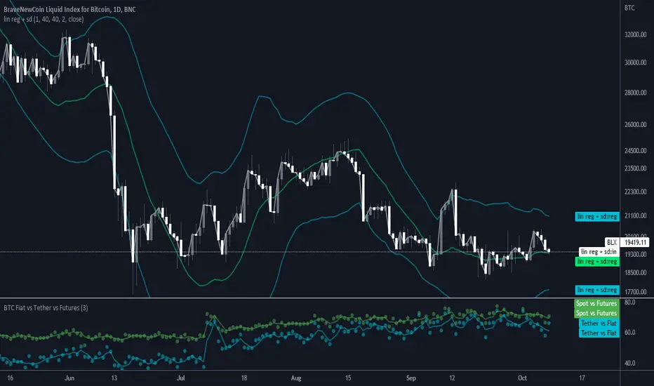
BTC Volume Fiat vs Tether vs FuturesFutures = BYBIT+ BITMEX
Fiat = KRAKEN + BITSTAMP + BITFLYER + COINBASE
Tether = HITBTC + HUOBI + BINANCE + BITFINEX
Spot = Fiat + Tether
Tether vs Fiat = 100 * Tether / (Tether + Fiat)
Spot vs Futures = 100 * Spot / (Spot + Futures)
BTC vs Russell2000Description
The BTC vs Russell2000 – Weekly Cycle Map compares Bitcoin’s performance against the Russell 2000 (IWM) to identify long-term risk-on and risk-off market regimes.
The indicator calculates the BTC/RUT ratio on a weekly timeframe and applies a moving average filter to highlight macro momentum shifts.
White line: BTC/RUT ratio (Bitcoin relative strength vs small-cap equities)
Yellow line: Weekly SMA of the ratio (trend filter)
Green background: BTC outperforming → macro bull regime
Red background: Russell 2000 outperforming → macro bear regime
Halving markers: Visual reference points for Bitcoin market cycles
This tool is designed to help traders understand capital rotation between crypto and traditional markets, improve timing of macro entries, and visualize where Bitcoin stands within its broader cycle.
