Market Cycle Master The Market Cycle Master (MCM) by © DarkPoolCrypto is a sophisticated trading system designed to bridge the gap between standard retail trend indicators and institutional-grade risk management. Unlike traditional indicators that simply provide entry signals based on a single timeframe, this system employs a "Confluence Engine" that requires multi-timeframe (MTF) alignment before generating a signal.
Crucially, this script integrates a live Risk Management Calculator directly into the chart overlay. This feature allows traders to stop guessing position sizes and instead execute trades based on a fixed percentage of account equity at risk, calculating the exact lot size relative to the dynamic stop-loss level.
Core Concept and Logic
This system operates on three distinct layers of logic to filter out noise and identifying high-probability trend continuations:
1. The Trend Architecture (Layer 1) At its core, the script utilizes an adaptive ATR-based SuperTrend calculation. This allows the system to adjust to market volatility dynamically. When volatility expands, the trend bands widen to prevent premature stop-outs. When volatility contracts, the bands tighten to capture early reversals.
2. Institutional Context / Multi-Timeframe Filter (Layer 2) This is the primary filter of the Pro system. The script monitors a higher timeframe (default: 4-Hour) in the background.
Bullish Context: If the Higher Timeframe (HTF) is in an uptrend, the script will only permit LONG signals on your current chart.
Bearish Context: If the HTF is in a downtrend, the script will only permit SHORT signals.
Grayscale Filters: If the current chart's trend opposes the Higher Timeframe trend (e.g., a 5-minute uptrend during a 4-hour downtrend), the candles will be painted GRAY. This indicates a low-probability "Counter-Trend" environment, and no signals will be generated.
3. Money Flow Filtering (Layer 3) To prevent buying tops or selling bottoms, the system utilizes the Money Flow Index (MFI). Long signals are filtered if volume-weighted momentum is already overbought, and Short signals are filtered if oversold.
The Risk Management HUD
The Heads-Up Display (HUD) is the distinguishing feature of this tool. It transforms the indicator from a visual aid into a trading terminal.
Trend Direction: Displays the current verified trend.
MTF Status: Shows the state of the Higher Timeframe trend.
Volatility: Displays the current ATR value.
Stop Loss: Displays the exact price level of the trend line.
Risk Calculator:
Risk ($): Shows the total dollar amount you will lose if the stop loss is hit (based on your settings).
Units: Calculates exactly how much Crypto, Stock, or FX lots to purchase to match your risk parameters.
Guide: How to Use
Configuration
Trend Architecture: Adjust the "Volatility Factor" (Default: 3.0). Higher values reduce noise but delay entries. Lower values are faster but riskier.
Institutional Context: Select the "Higher Timeframe."
If trading 1m to 15m charts: Set HTF to 4 Hours (240).
If trading 1H to 4H charts: Set HTF to Daily (1D).
Risk Calculator:
Account Size: Enter your total trading capital.
Risk Per Trade: Enter the percentage of your account you are willing to lose on a single trade (e.g., 1.0%).
Trading Strategy
The Signal: Wait for a "Sniper Long" or "Sniper Short" label. This appears only when price action, volatility, and the higher timeframe consensus all align.
The Execution: Look at the HUD under "Units." Open a position for that specific amount.
The Stop Loss: Place your hard Stop Loss at the price shown in the HUD ("Stop Loss" row). This corresponds to the trend line.
The Exit: Close the position if the candle color turns Gray (loss of momentum/consensus) or if an opposing signal appears.
Disclaimer
This script and the information provided herein are for educational and entertainment purposes only. They do not constitute financial advice, investment advice, trading advice, or any other advice. Trading in financial markets involves a high degree of risk and may result in the loss of your entire capital.
The "Risk Calculator" included in this script provides theoretical values based on mathematical formulas relative to the price data provided by TradingView. It does not account for slippage, spread, exchange fees, or liquidity gaps. Always verify calculations manually before executing live trades. Past performance of any trading system is not indicative of future results. The author assumes no responsibility for any losses incurred while using this script.
Cari dalam skrip untuk "Cycle"

Pi Cycle Top & Bottom OscillatorThis TradingView script implements the Pi Cycle Top & Bottom Oscillator, a technical indicator designed to identify potential market tops and bottoms using moving average relationships. Here's a detailed breakdown:
Indicator Overview
Purpose: The indicator calculates an oscillator based on the ratio of a 111-day simple moving average (SMA) to double the 350-day SMA. It identifies potential overbought (market tops) and oversold (market bottoms) conditions.
Visualization: The oscillator is displayed in a standalone pane with dynamic color coding to represent different market conditions.
Inputs
111-Day Moving Average Length (length_111): Adjustable parameter for the short-term moving average. Default is 111 days.
350-Day Moving Average Length (length_350): Adjustable parameter for the long-term moving average. Default is 350 days.
Overheat Threshold (upper_threshold): Percentage level above which the market is considered overheated. Default is 100%.
Cooling Down Threshold (lower_threshold): Percentage level below which the market is cooling down. Default is 75%.
Calculation
Moving Averages:
111-day SMA of the closing price.
350-day SMA of the closing price.
Double the 350-day SMA (
𝑚
𝑎
_
2
_
350
=
𝑚
𝑎
_
350
×
2
ma_2_350=ma_350×2).
Oscillator:
Ratio of the 111-day SMA to double the 350-day SMA, expressed as a percentage:
oscillator
=
𝑚
𝑎
_
111
𝑚
𝑎
_
2
_
350
×
100
oscillator=
ma_2_350
ma_111
×100
Market Conditions
Overheated Market (Potential Top): Oscillator >= Overheat Threshold (100% by default). Highlighted in red.
Cooling Down Market (Potential Bottom): Oscillator <= Cooling Down Threshold (75% by default). Highlighted in green.
Normal Market Condition: Oscillator is between these thresholds. Highlighted in blue.
Visual Features
Dynamic Oscillator Plot:
Color-coded to indicate market conditions:
Red: Overheated.
Green: Cooling down.
Blue: Normal condition.
Threshold Lines:
Red Dashed Line: Overheat Threshold.
Green Dashed Line: Cooling Down Threshold.
White Dashed Line: Additional high-value marker at 30 for reference.
Alerts
Overheat Alert: Triggers when the oscillator crosses the overheat threshold, signaling a potential market top.
Cooling Down Alert: Triggers when the oscillator crosses the cooling down threshold, signaling a potential market bottom.
Use Case
This script is particularly useful for traders seeking early signals of market reversals. The thresholds and dynamic color coding provide visual cues and alerts to aid decision-making in identifying overbought or oversold conditions.

Cosmic Cycle Trader -AYNETThe "Cosmic Cycle Trader 🌌"
Here's a summarized breakdown of the code:
Inputs
Orbital Periods (Moving Averages):
User specifies moving average (MA) periods as a comma-separated string (e.g., "10,20,50,100").
Predefined colors for each MA are used.
Fibonacci Sphere Levels:
User specifies Fibonacci retracement levels as a string (e.g., "0.236,0.382,0.618,1.0").
Color customization for Fibonacci levels is included.
Gravitational Pull (Signal Thresholds):
Configurable thresholds (buy_pull and sell_pull) to define signal triggers.
Alerts can be toggled on or off.
Core Features
Helper Functions:
parse_floats: Converts a comma-separated string into an array of floating-point numbers.
parse_ints: Converts a comma-separated string into an array of integers.
Orbital Periods (Moving Averages):
Moving averages are calculated for the given periods using the ta.sma function.
Each MA is stored in an array and plotted on the chart with a unique color.
Fibonacci Spheres:
Fibonacci levels are calculated based on the high and low of the current bar.
These levels are plotted as circles, visually indicating key price zones.
Signals:
Buy Signal: Triggered when:
The price closes above the highest MA.
The price is between specific Fibonacci levels.
Sell Signal: Triggered when:
The price closes below the lowest MA.
The price is below specific Fibonacci levels.
Alerts:
Alerts are created for buy and sell signals.
Signals are also annotated on the chart with labels and shapes.
Visual Elements
Plots:
Moving averages are plotted with distinct colors and line widths.
Fibonacci spheres are plotted as circles with customizable transparency.
Shapes:
Triangles indicate buy (green) and sell (red) signals on the chart.
Labels:
Buy signals display a "🌕 Buy" label.
Sell signals display a "🌑 Sell" label.
Purpose
This indicator helps traders identify potential buy and sell zones based on:
Moving average trends (orbital periods).
Key Fibonacci retracement levels.
Configurable thresholds (gravitational pull).
This combination of technical analysis tools makes it a visually appealing and functional indicator for traders.

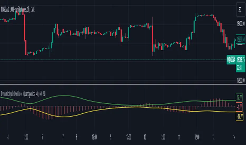
Dynamic Cycle Oscillator [Quantigenics]This script is designed to navigate through the ebbs and flows of financial markets. At its core, this script is a sophisticated yet user-friendly tool that helps you identify potential market turning points and trend continuations.
How It Works:
The script operates by plotting two distinct lines and a central histogram that collectively form a band structure: a center line and two outer boundaries, indicating overbought and oversold conditions. The lines are calculated based on a blend of exponential moving averages, which are then refined by a root mean square (RMS) over a specified number of bars to establish the cyclic envelope.
The input parameters:
Fast and Slow Periods:
These determine the sensitivity of the script. Shorter periods react quicker to price changes, while longer periods offer a smoother view.
RMS Length:
This parameter controls the range of the cyclic envelope, influencing the trigger levels for trading signals.
Using the Script:
On your chart, you’ll notice how the Dynamic Cycle Oscillator’s lines and histogram weave through the price action. Here’s how to interpret the movements.
Breakouts and Continuations:
Buy Signal: Consider a long position when the histogram crosses above the upper boundary. This suggests a possible strong bullish run.
Sell Signal: Consider a short position when the histogram crosses below the lower boundary. This suggests a possible strong bearish run.
Reversals:
Buy Signal: Consider a long position when the histogram crosses above the lower boundary. This suggests an oversold market turning bullish.
Sell Signal: Consider a short position when the histogram crosses below the upper boundary. This implies an overbought market turning bearish.
The script’s real-time analysis can serve as a robust addition to your trading strategy, offering clarity in choppy markets and an edge in trend-following systems.
Thanks! Hope you enjoy!
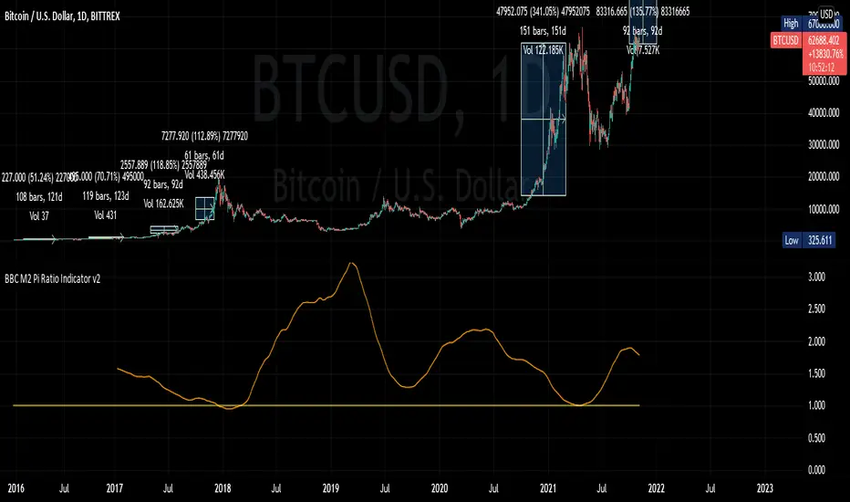
BBC M2 Pi Ratio Indicator v2Pi Cycle indicator expressed as a ratio such that when the indicator triggers (350DMA *2 = 111DMA) the ratio will be 1. This allows you to place an alert on the ratio line for crossing certain thresholds such as 1.1.
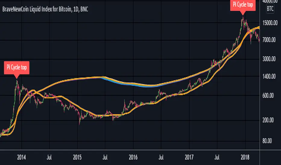
Pi Cycle Top Ribbon [Mamo]This is a modification on the original Pi Cycle Top Indicator by Philip Swift.
It consists of 2 moving averages with one of them being multiplied by a chosen number. When the lower moving average crosses the higher (with multiple) moving average, the bull market top is indicated.
The original indicator showed bull market tops within a 3 day accuracy. This version shows the exact tops on the exact day for 2013 and 2017.
There are 7 different perfect solution shown as a band in this modified indicator. Each solution is a color pair and can be viewed separately by turning each combination off or on in the settings.
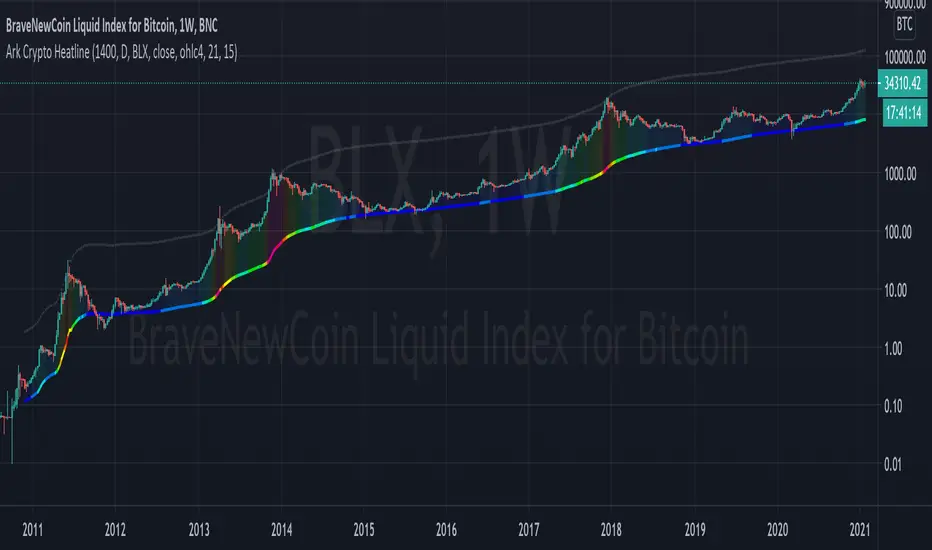
Ark Crypto HeatlineThis is the 'on chart' indicator. See also "Ark Crypto Heatband" indicator for a side-by-side BTC view, without a re-scaled line.
The crypto landscape is largely dominated by BTC and characterised by cyclical stages with varying degrees of mean reversion.
To understand what stage of the cycle we are currently experiencing, it is useful to examine to what degree the current price has extended beyond the long term average that BTC has established. This is true even when analysing other crypto assets as BTC is the dominant force in the crypto asset class.
This indicator uses the 1400 period daily SMA , which is broadly the 200 period weekly SMA. This can be configured, but historically has represented a baseline to which BTC commonly returns.
The graph plots current price in terms of multiples of this long term average. Traditionally, at multiples beyond 10, BTC is considered overextended with a higher likelihood of trending towards the mean thereafter. Colors indicate the extent of price extension.
Where the indicator is applied to non BTCUSD pairs, a smoothed conversion is applied, seeking to superimpose the BTC long period SMA onto the current chart.
The indicator specifically references BTC by default on all charts, as it is designed to use BTC as general purpose indication of where crypto as a whole currently sits. Accordingly the indicator is only to be used on crypto charts.
For best results on BTC, using BNC:BLX will give the longest historical view.
Ark Crypto HeatbandThe crypto landscape is largely dominated by BTC and characterised by cyclical stages with varying degrees of mean reversion.
To understand what stage of the cycle we are currently experiencing, it is useful to examine to what degree the current BTC price has extended beyond a long term average. This is true even when analysing other crypto assets and helpful to view side by side.
This indicator uses the 1400 period daily SMA, which is broadly the 200 period weekly SMA. This can be configured, but historically has represented a baseline to which BTC commonly returns.
The graph plots current price in terms of multiples of this long term average. Traditionally, at multiples beyond 10, BTC is considered overextended with a higher likelihood of trending towards the mean thereafter. Colors indicate the extend of price extension.
The indicator specifically references BTC by default on all charts as it is designed to use BTC as general purpose indication of where crypto as a whole currently sits. Accordingly the indicator is only to be used on crypto charts.

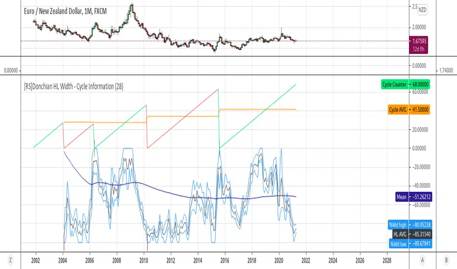
[RS]Donchian HL Width - Cycle InformationExperimental:
some information on cyclical new peaks using Donchian Channel % Widths.
Reflex Oscillator - Dr. John EhlersHot off the press, I present this NEW "Reflex Oscillator" employing PSv4.0, originally formulated by Dr. John Ehlers for TASC - February 2020 Traders Tips. John Ehlers might describe it's novel characteristics as being a reversal sensitive near zero-lag averaging indicator retaining the CYCLE component. Also, I would add that irregardless of the sampling interval, this indicator has a bound range between +/-2.0 on "1 second" candles all the way up to "1 month" candle durations. This indicator also has a companion indicator entitled "TrendFlex Oscillator". I have published it in tandem with this one in my scripts profile.
One notable difference between this and the original formulation is that I have added an independent control for the Super Smoother. This "tweak" is enabled by applying the override and adjusting it's period. There is a "Post Smooth" input() that "tweaks" the internal Reflex EMA too. Keep in mind that my intention of adding tweaks is solely for experimentation with the original formulation.
I also added adjustable levels for those of you that may wish to employ alertcondition()s to this indicator somehow. Providing a more utilitarian approach, I created this with an easy to use reusable function named reflex(). As always, I have included advanced Pine programming techniques that conform to proper "Pine Etiquette". Being this is one of John Ehlers' first two simultaneously released indicators for 2020, I felt a few more bells and whistles were appropriate as a proper contribution to the Tradingview community.
Features List Includes:
Dark Background - Easily disabled in indicator Settings->Style for "Light" charts or with Pine commenting
AND much, much more... You have the source!
The comments section below is solely just for commenting and other remarks, ideas, compliments, etc... regarding only this indicator, not others. When available time provides itself, I will consider your inquiries, thoughts, and concepts presented below in the comments section, should you have any questions or comments regarding this indicator. When my indicators achieve more prevalent use by TV members, I may implement more ideas when they present themselves as worthy additions. As always, "Like" it if you simply just like it with a proper thumbs up, and also return to my scripts list occasionally for additional postings. Have a profitable future everyone!

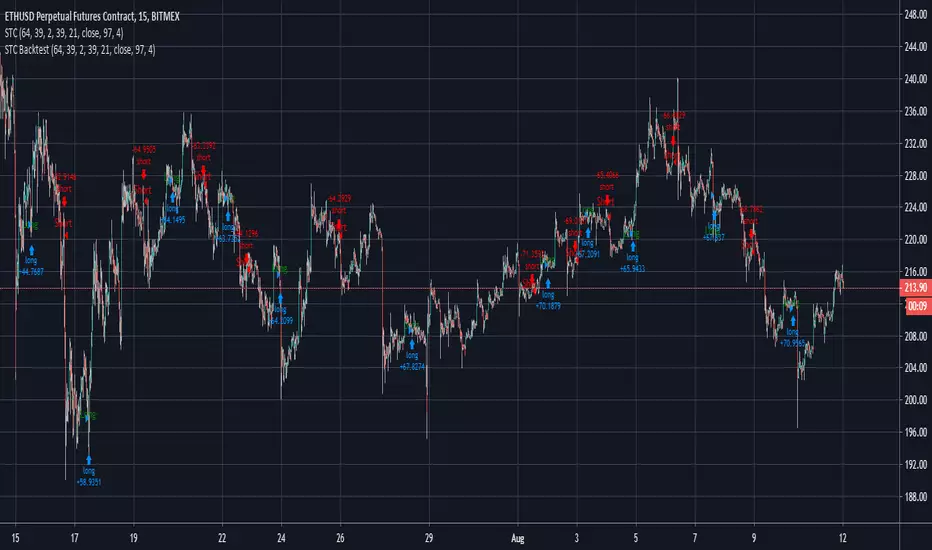
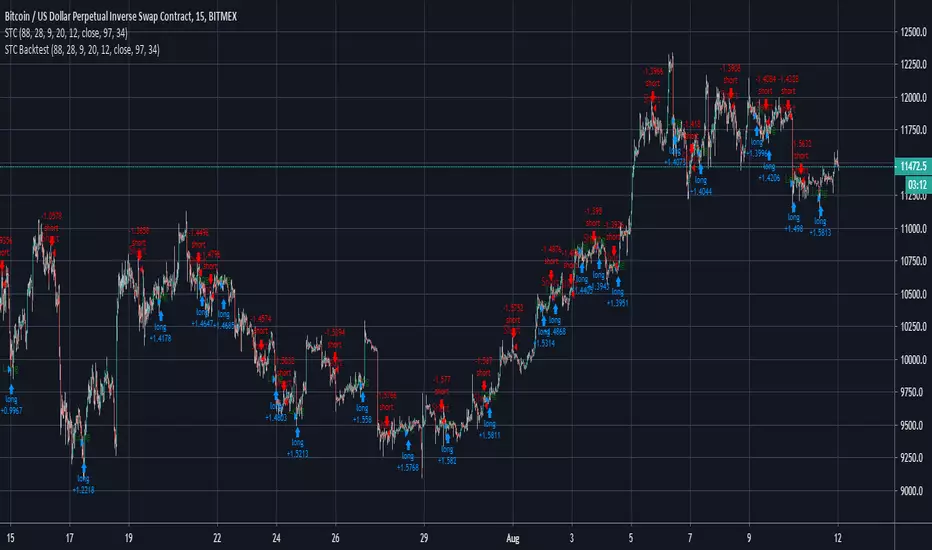
Schaff Trend Cycle Strategy for XBTUSD 15m BacktestSchaff Trend Cycle Strategy for XBTUSD 15m Backtest
Zero-Lag Smoothed CycleOld indicator ! But its a simple trick to have a zero-lag smoothing effect, i think i did it because the smoothing was kinda asymmetrical with the detrended line. So even if the result appear quite good take into account that the detrended line isn't always correlated with the price.

Robust Cycle Measurement [Ehlers]The last of Ehlers Instantaneous Frequency Measurement methods.
This is a more robust version of this script.
I wrote it as a function, so you can simply copy and paste it into any script to add an adaptive period setting capability.
Cheers,
DasanC
Cosine, In-Phase & Quadrature IFM [Ehlers]Yet another method for determining the cycle of a market: this time, you have access to the two fastest and most accurate methods
as well as the option to average these methods together.
The controls are pretty straight forward:
Source lets you select the price data to perform calculations on (close, open, etc..)
Max Period is simply the cap for the algorithm when it's checking the validity of Periods.
-> If you notice your plots have a flat top, then increase this value to accept a wider range of Periods.
-> This setting has a min. value of 8 to reduce noise and a max of 100 to ignore waves from higher time frames.
Average? simply averages the two methods of calculation.
-> You may want to do this if you notice the two plots diverging a lot.
-> Cosine IFM tends to favor shorter periods; I-Q IFM tends to favor longer.
Cheers,
- DasanC

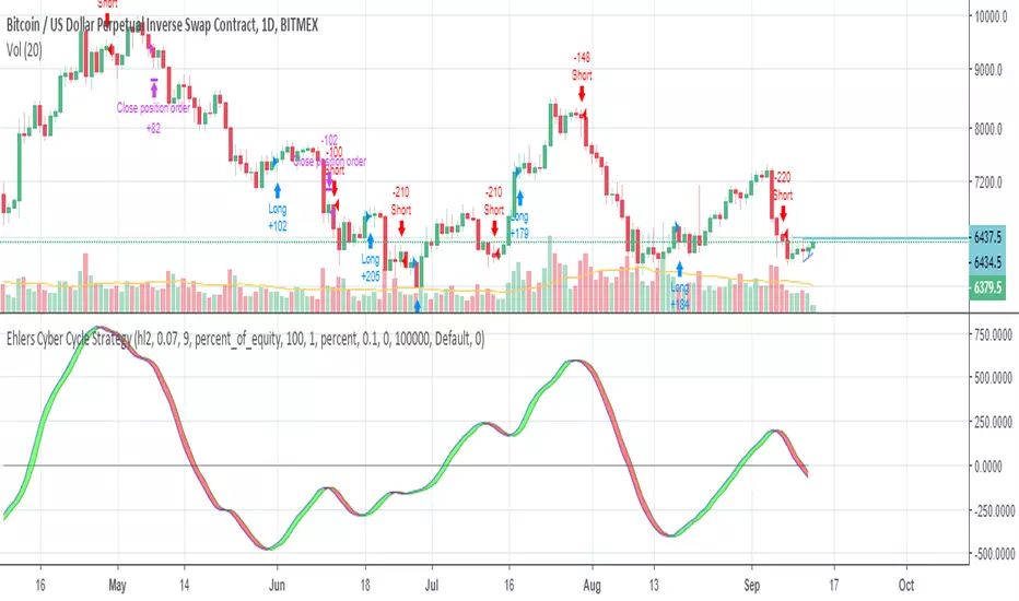
Ehlers Cyber Cycle StrategyEhlers Cyber Cycle Strategy by John Ehlers from his book "Cybernetic Analysis for Stocks and Futures".


Day SeparatorTitle: Professional Day Separator & Custom Session Labels
Description: This indicator is a clean and essential tool for intraday traders (M1, M5, M15) who need a clear visual separation between trading days. Unlike the standard TradingView period breaks, this script allows full control over the appearance and the exact timing of the separators to match your broker's server time.
Key Features:
Deep Black Vertical Lines: High-contrast separators for better chart clarity.
Customizable Thickness: Adjust the line width to suit your visual preference and chart background.
Custom Session Start: Perfect for traders whose "day" starts at a specific time (e.g., 23:00) due to broker offsets or specific session focus.
Centered Day Labels: Day-of-the-week labels (M O N, T U E, etc.) are placed at the bottom of the chart and can be perfectly centered between the separators.
Stability: Built using Pine Script V5 with absolute vertical alignment logic to prevent "leaning" or horizontal line glitches.
How to use:
Line Thickness: Adjust the "Linien Dicke" in the settings to make separators more or less prominent.
Align to Broker Time: If your broker starts the new daily candle at 23:00, simply set the "Tagesbeginn" to 23. The separator will then snap to that exact candle.
Perfect Label Centering: Use the "Label Stunde" slider to move the day labels left or right until they are centered between your lines (usually around 11:00 or 12:00 depending on your offset).
Why use this? Standard session breaks often look cluttered or don't align with local time zones/broker sessions. This script keeps your chart professional and ensures you always know exactly which day of the week you are trading.

Ichimoku BoxIntroducing Ichimoku Box Indicator:
Key Features:
Customizable Box Periods: Adjustable box periods with default settings of 9, 26, and 52.
Shifted Span A and Span B Points: Easily adjustable shifts and colors.
Additional Box Option: Capability to add an extra box for more detailed analysis.
High and Low Markers: Identifies the highest and lowest candle within each box with distinct markers.
Candle Countdown Timer: Displays the remaining candles before a box loses its high or low.
Drag-and-Drop Functionality: Move boxes to any position on the chart with a vertical line.
Automatic Box Drawing: When the indicator is first applied, a vertical line appears on the mouse cursor, and clicking on any point automatically draws the boxes.
How It Works:
The indicator allows users to visualize Ichimoku periods as boxes, highlighting key price levels and shifts in market structure. It simplifies the analysis process by providing visual cues and customizable settings for enhanced flexibility.

MTT Liquidity Transmission Z-ScoreUnderstanding the Liquidity Transmission Indicator
This indicator is a multi-asset dashboard designed to reveal the "invisible" plumbing of the financial markets. By normalizing four distinct macro drivers into Z-scores, it allows you to compare disparate data points—interest rates, volatility, and equity ratios—on a single unified scale (typically ranging from -3 to +3).
How to Interpret the Data
Expansion (Positive Z-Scores): When the lines move above the zero median, it signals easing conditions. For example, a rising US Policy Impulse suggests falling yields and a more accommodative Fed, providing a "tailwind" for risk assets.
Contraction (Negative Z-Scores): When lines drop below zero, liquidity is tightening. A plummeting Credit Transmission line indicates widening corporate spreads, suggesting that banks are less willing to lend, which often precedes market corrections.
The "Confluence" Signal: The strongest trading environments occur when all four lines align. If Speculative Excess and International Impulse are both surging alongside US policy, you are witnessing a global "Risk-On" regime.
Trading Application
Watch for divergences. If the S&P 500 is making new highs but the Liquidity Transmission lines are trending lower (becoming "overbought" or exhausted), the market is likely running on fumes. Conversely, look for "oversold" bounces from the -2.0 level as potential entry points for a mean-reversion swing trade.
