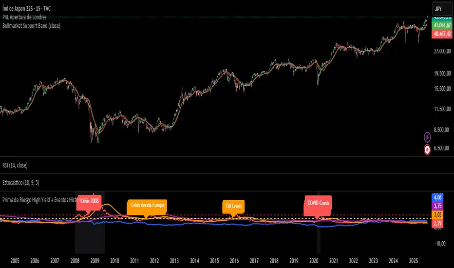
Prima de Riesgo High Yield + Eventos HistóricosPrima de risgo de los bonos basura. Muetra los periodos de recesión económica en las bolsas.
Cari dalam skrip untuk "Cycle"
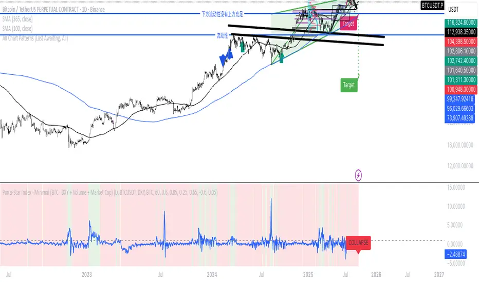
Ponzi-Star Index · Minimal (BTC · DXY + Volume + Market Cap)If we think of the U.S. Dollar Index as the speed of light,
market cap as the mass of a star,
and trading volume as the energy of cataclysmic change—
then can we imagine the market as a star:
entering during its expansion phase,
and exiting before its collapse?
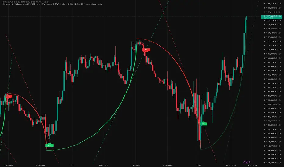
Smart Algogn2 [ChartPrime]Smart Algo indicator with buy/sell signals, optimized for crypto intraday trading.
Front Contract Roll Detector (TV-mapped 1!)This script looks at the security.instrument and finds the current best matching price for the current instrument on a front loaded contract.
This is very useful for detecting when TradingView rolls over contracts and an alert can be put in place for this.

Period Separator + Future LinesDescription
This indicator draws vertical separator lines for each selected timeframe (e.g., daily or hourly) and also projects additional separator lines into the future.
It helps traders visually divide the chart into consistent time periods and see upcoming period boundaries in advance.
Features
- Draws vertical lines at the start of each chosen period (daily by default).
- Extends several separator lines into the future so you can anticipate upcoming sessions.
- Fully customizable: color, style (solid/dashed/dotted), line width, and timeframe can be adjusted from the settings.
- Lines are plotted without distorting auto-scaling, so the chart view remains clean.
Use Case
Ideal for intraday and swing traders who want clear visual time markers and the ability to prepare for upcoming trading sessions.

SCTR - AbsoluteIndicator for showing Absolute Value of SCTR - StockCharts Technical Rank.
Uses the calculations from Stock Charts based on the following:
Long-Term Indicators (weighting)
--------------------------------
* Percent above/below 200-day EMA (30%)
* 125-Day Rate-of-Change (30%)
Medium-Term Indicators (weighting)
----------------------------------
* Percent above/below 50-day EMA (15%)
* 20-day Rate-of-Change (15%)
Short-Term Indicators (weighting)
---------------------------------
* 3-day slope of PPO(12,26,9) Histogram/3 (5%)
* 14-day RSI (5%)

Stock FundamentalsOverview
A comprehensive fundamental analysis tool for TradingView that displays key financial metrics from company financial statements in an easy-to-understand visual format.
Key Features
- Revenue & Earnings Analysis: Track company sales, gross profit, EBITDA, operating expenses, and free cash flow
- EPS & Dividend Metrics: Monitor earnings per share, dividend payments, and payout ratios
- Debt and Equity Structure: Analyze total debt, equity levels, and cash positions
- Profitability Ratios: Evaluate return on equity (ROE), return on assets (ROA), and return on invested capital (ROIC)
- Visual Color Coding: Each metric has a distinct color for easy identification
- Interactive Legend: Comprehensive reference table showing all acronyms and their corresponding colors
How to Use
1. Select Output Type:
- Per Share: Values normalized per share
- % of mcap: Values as percentage of market capitalization
- Actual: Raw financial values
2. Choose Period:
- FQ: Fiscal Quarter data
- FY: Fiscal Year data
3. Toggle Metric Groups:
- Use the input options to show/hide different categories:
- Revenue & Earnings
- EPS & DPS
- Debt metrics
- Return ratios
4. Read the Chart:
- Each colored line represents a different financial metric
- Hover over data points to see exact values
- Use the legend (top-right corner) to identify each metric
5. Interpret the Data:
- Look for consistent upward trends in revenue and earnings
- Monitor debt levels relative to equity and cash positions
- Compare profitability ratios (ROE, ROIC, ROA) over time
- The orange horizontal line indicates the 20% ROE target (excellent performance)
Color Guide
- Purple: Revenue
- Blue: Gross Profit, EPS, Total Equity, ROE
- Aqua: EBITDA
- Orange: Operating Expenses, DPS
- Lime: Free Cash Flow, Cash & Equivalents
- Teal: EPS Estimate, ROIC
- Red: Dividend Payout Ratio, Total Debt
- Green: R&D to Revenue Ratio
Tips
- Compare multiple quarters to identify trends
- Watch for improving profit margins over time
- Monitor cash flow generation relative to earnings
- Use the 20% ROE line as a benchmark for exceptional performance
- Combine with technical analysis for comprehensive investment decisions
Data Source: Company fundamental data from financial statements

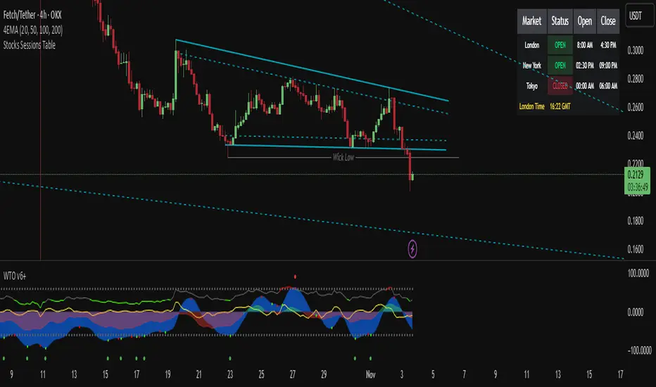
Stocks Sessions TableThe stock market open session table is a great way to keep an eye on the market's open and close. This is aimed at the UK traders working with the BST timezone
Forex Session HighlighterSet the session start and stop time for one single session. Allows a trader to easily see their preferred trading times at a glance. Especially helpful during bar replay.

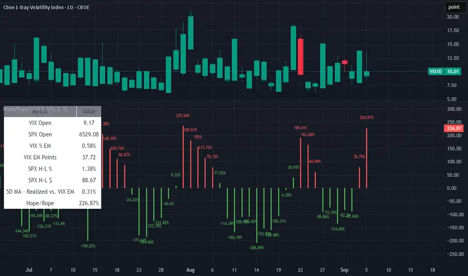
HOPE(EMA) ROPE(IC)Confucius say: Man at end of rope finds hope; man drunk on hope soon finds rope
-HaggisZero
Bot Analyzer📌 Script Name: Bot Analyzer
This TradingView Pine Script v5 indicator creates a dashboard table on the chart that helps you analyze any asset for running a martingale grid bot on futures.
🔧 User Inputs
TP % (tpPct): Take Profit percentage.
SO step % (soStepPct): Step size between safety orders.
SO n (soCount): Number of safety orders.
M mult (martMult): Martingale multiplier (how much each next order increases in size).
Lev (leverage): Leverage used in futures.
BB len / BB mult: Bollinger Bands settings for measuring channel width.
ATR len: ATR period for volatility.
HV days: Lookback window (days) for Historical Volatility calculation.
📐 Calculations
ATR % (atrPct): Normalized ATR relative to price.
Bollinger Band width % (bbPct): Market channel width as percentage of basis.
Historical Volatility (hvAnn): Annualized volatility, calculated from daily log returns.
Dynamic Step % (dynStepPct): Step size for safety orders, automatically adjusted from ATR and clamped between 0.3% and 5%.
Covered Move % (coveredPct): Total percentage move the bot can withstand before last safety order.
Martingale Size Factor (sizeFactor): Total position size multiplier after all safety orders, based on martingale multiplier.
Risk Score (riskLabel): Simple risk estimate:
Low if risk < 30
Mid if risk < 60
High if risk ≥ 60
📊 Output (Table on Chart)
At the top-right of the chart, the script draws a table with 9 rows:
Metric Value
BB % Bollinger Band width in %
HV % Historical Volatility (annualized %)
TP % Take profit setting
SO step % Safety order step size
SO n Number of safety orders
M mult Martingale multiplier
Dyn step % Dynamic step based on ATR
Size x Total position size factor (e.g., 4.5x)
Risk Risk label (Low / Mid / High)
⚙️ Use Case
Helps choose coins for a martingale bot:
If BB% is wide and HV% is high → the asset is volatile enough.
If Risk shows "High" → parameters are aggressive, you may need to adjust step size, SO count, or leverage.
The dashboard lets you compare assets quickly without switching between multiple indicators.

Niveles Anuales +-5% con PreciosNiveles calculados de % de precios según el precio de apertura anual

4H Candles High and Lows (#1-6) UTC - Last 32h - Colored BlocksThis script creates horizontal rays on the high and low in a 4 Hour period.

Shade 4H Blocks PSTShades a 4H timeframe intraday. The purpose is to remind me what 4H candle I am operating in without having to manually mark it on the lower-timeframe charts I am watching.

4H Weekly Candle Counter - Increments from Sunday until Friday This script will count the first 4H candle close on Sunday all the way until the final candle of the week on Friday.

4H Weekly Candle Counter (UTC - Dynamic)Counts the 4H Candles on a given trading day. Made specifically for the /ES. (The first 4H Candle opens at 15:00 Sunday-Thursday)

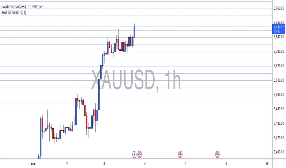
XAU 0/5 GridThis indicator draws horizontal price grids for XAUUSD. It anchors the grid to a base price that ends with 0 or 5, then plots equally spaced levels every 5 price units above and below that base. It’s a clean way to eyeball fixed-interval structure for rough support/resistance zones and simple TP/SL planning.
How it works
Base (0/5):
base = floor(close / 5) × 5 → forces the base to always end with 0/5.
Grid levels:
level_i = base + i × 5, where i is any integer (positive/negative).
The script updates positions only when the base changes to avoid flicker and reduce chart load.
It uses a persistent line array to manage the line objects efficiently.
Usage
Add the indicator to an XAUUSD chart on any timeframe.
Configure in the panel:
Show Lines – toggle visibility
Lines each side – number of lines above/below the base
Line Color / Line Width – appearance
Use the grid as fixed reference levels (e.g., 3490, 3495, 3500, 3505, …) for planning TP/SL or observing grid breaks.
Highlights
Strict 0/5 anchoring keeps levels evenly spaced and easy to read on gold.
Auto-reanchors when price moves to a new 0/5 zone, maintaining a steady view.
Lightweight design: lines are created once and then updated, minimizing overhead.
Limitations
Visualization only — not a buy/sell signal.
Spacing is fixed at 5 price units, optimized for XAUUSD. If used on other symbols/brokers with different tick scales, adjust the logic accordingly.
Grid lines do not guarantee support/resistance; always combine with broader market context.
RSI Cross Alerts with Vertical Lines (9:30 AM - 2:45 PM)RSI Cross Alerts - Indicates Vertical Lines on previous times the RSI Indicator Crosses Overbought or Oversold parameters set by user.

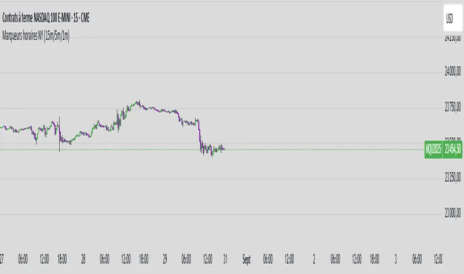
Jipi QT (15m/5m/1m)indicateur de jipi pour délimiter les trimestres sur les TF de 15min, 5 min et 1min
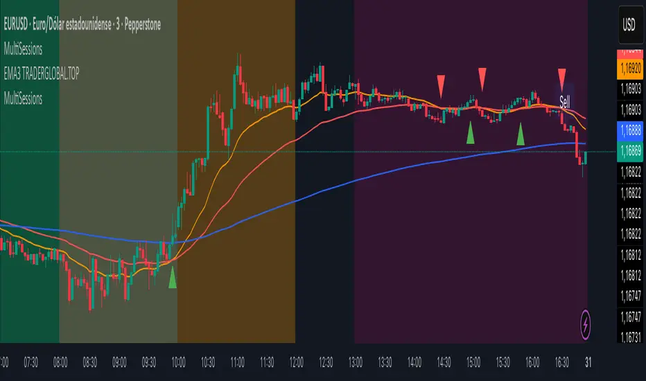
MultiSessions traderglobal.topEste indicador de sesiones está diseñado para traders intradía que desean visualizar con precisión la actividad y la volatilidad característica de cada mercado. Basado en Pine Script v5 y optimizado para la zona horaria “America/New_York”, divide el día en sub-sesiones configurables y resalta sus rangos de precio en tiempo real. En particular, incorpora tres bloques para New York (NY1, NY2, NY3), dos para Londres (LON1, LON2), dos para Tokio (TKO1, TKO2) y mantiene Sídney como sesión opcional. Cada bloque puede activarse o desactivarse de forma independiente y cuenta con su propio color ajustable, lo que permite construir mapas visuales claros para estrategias basadas en horario, solapamientos y micro-estructuras de mercado.
El panel de inputs incluye la opción “Activate High/Low View”. Cuando está activada, el indicador calcula de manera incremental el mínimo y máximo de cada sub-sesión y sombrea el área entre ambos con fill, proporcionando una referencia inmediata del rango intrasesión (útil para medir compresión/expansión y posibles rompimientos). Cuando está desactivada, emplea un simple bgcolor por bloque, ideal para traders que prefieren un gráfico más limpio y solo desean distinguir visualmente los tramos horarios.
La lógica central utiliza dos funciones auxiliares: is_session(sess), que detecta si la vela actual pertenece a un tramo horario concreto, e is_newbar(sess), que determina el inicio de una nueva barra de referencia según la resolución elegida (D, W o M). Gracias a esta combinación, en cada sub-sesión el indicador reinicia sus contadores de alto y bajo al comenzar el período y los actualiza vela a vela mientras el bloque siga activo. Este enfoque evita mezclas de datos entre sesiones y asegura que el rango que se muestra corresponda estrictamente al segmento horario configurado.
Los horarios por defecto están pensados para Forex y contemplan casos que cruzan medianoche (por ejemplo, Tokio 2 y Sídney). Pine Script admite rangos como 2200-0200; no obstante, si tu bróker o la zona horaria del gráfico generan un sombreado parcial, basta con dividir el tramo en dos: 2200-2359 y 0000-0200. Asimismo, cada input.session incluye el patrón :1234567 para habilitar los siete días; puedes restringir días según tu operativa.
En cuanto al uso práctico, el indicador facilita identificar: (1) la estructura del rango por sub-sesión (útil para estrategias de breakout/mean-reversion), (2) los solapamientos entre Londres y New York, donde suele concentrarse la liquidez, y (3) períodos de menor volatilidad (tramos tardíos de Asia o previos a noticias). El color independiente por bloque te permite codificar visualmente la importancia o tu plan de trading (por ejemplo, tonos más intensos en ventanas de alta probabilidad).
Finalmente, su diseño modular hace sencilla la personalización: puedes ajustar colores, activar/desactivar bloques, cambiar horarios y modificar la resolución de reseteo del rango. Como posible mejora, se pueden añadir alertas de ruptura de máximos/mínimos de sub-sesión o etiquetas con la altura del rango (pips) al cierre. Este indicador no sustituye el juicio del trader ni constituye recomendación financiera, pero ofrece una base visual robusta para integrar el factor tiempo en la toma de decisiones.
This sessions indicator is built for intraday traders who want a precise, time-aware view of market activity and typical volatility patterns across the day. Written in Pine Script v5 and optimized for the “America/New_York” timezone, it divides the trading day into configurable sub-sessions and highlights their price ranges in real time. Specifically, it provides three blocks for New York (NY1, NY2, NY3), two for London (LON1, LON2), two for Tokyo (TKO1, TKO2), and keeps Sydney as an optional session. Each block can be enabled or disabled independently and comes with its own adjustable color, letting you build clear visual maps for time-based strategies, overlaps, and microstructure nuances.
In the inputs panel you’ll find the “Activate High/Low View” option. When enabled, the indicator incrementally computes each sub-session’s low and high and shades the area between them with fill, giving you an immediate reference to the intra-session range (useful for gauging compression/expansion and potential breakouts). When disabled, it switches to a clean bgcolor background by block—ideal if you prefer a minimal chart and simply want to distinguish time windows at a glance.
The core logic relies on two helper functions: is_session(sess), which detects whether the current bar falls within a given time window, and is_newbar(sess), which identifies the start of a new reference bar according to your chosen reset resolution (D, W, or M). With this combination, each sub-session resets its high/low at the beginning of the period and updates them bar by bar while the block remains active. This prevents cross-contamination between sessions and ensures the range you see belongs strictly to the configured segment.
Default hours are suited to Forex and include segments that cross midnight (e.g., Tokyo 2 and Sydney). Pine Script supports ranges like 2200-0200; however, if your broker or chart timezone causes partial shading, simply split the segment into two: 2200-2359 and 0000-0200. Each input.session uses the :1234567 suffix to enable all seven days; you can easily restrict days to match your plan.
Practically speaking, the indicator helps you identify: (1) range structure by sub-session (great for breakout or mean-reversion frameworks), (2) overlaps between London and New York, where liquidity and directional moves often concentrate, and (3) lower-volatility windows (late Asia or pre-news lulls). Independent colors per block let you visually encode priority or your trading plan (for example, richer tones in high-probability windows).
Thanks to its modular design, customization is straightforward: adjust colors, toggle blocks, change hours, and tweak the range-reset resolution to suit your routine. As a natural extension, you can add alerts for sub-session high/low breakouts or labels that display the range height (in pips) at session close. While no indicator replaces trader judgment or constitutes financial advice, this tool offers a robust visual foundation for incorporating the time factor directly into your decision-making, helping you contextualize price action within the rhythm of global trading sessions.
Above/Below Open Background + Percentage ChangeAbove/Below Open Background
This indicator visually highlights whether the current price is trading above or below today’s session open.
It also displays a small table showing the current percentage change relative to today’s open.
Features
• 🟢 Full chart background coloring:
• Green → Price is above today’s open.
• 🔴 Red → Price is below today’s open.
• 📊 Percentage change table in the chart corner:
• Shows real-time % difference from today’s open.
• Automatically updates as price moves.
• 🎛 Clean & lightweight — minimal resource usage, smooth performance.
How to Use
1. Add the indicator to any stock, crypto, or futures chart.
2. The background immediately shows whether price is up or down relative to today’s open.
3. The table in the corner displays the percentage gain/loss.
Best For
• Day traders who want instant visual feedback.
• Scalpers tracking session trends.
• Anyone who wants a quick snapshot of intraday performance.