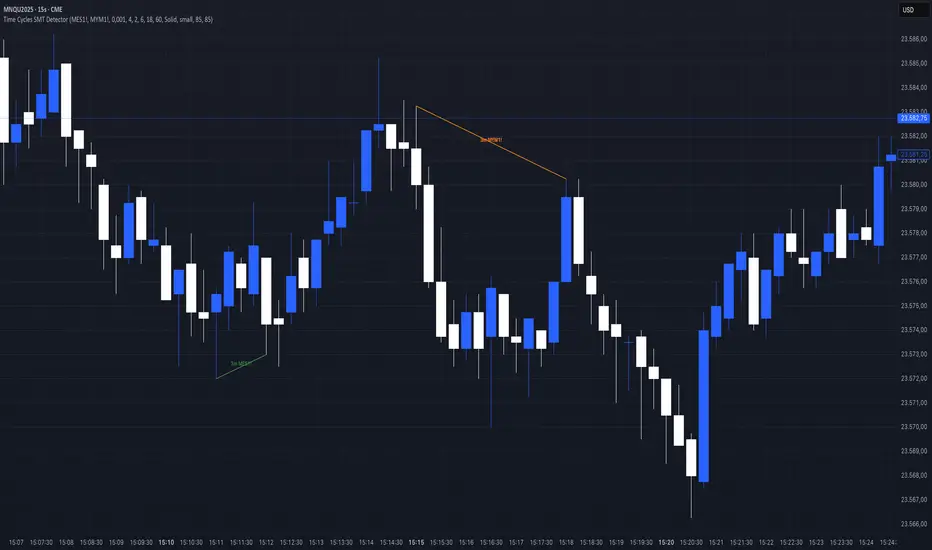
90M Time Cycle SMTOverview
This indicator identifies Smart Money Time (SMT) divergences between correlated assets, specifically optimized for the 90-minute intraday cycle. It automates the process of comparing price action between a primary asset (e.g., NQ) and a correlated asset (e.g., ES) to highlight moments where price symmetry breaks—often a precursor to a reversal or a liquidity run.
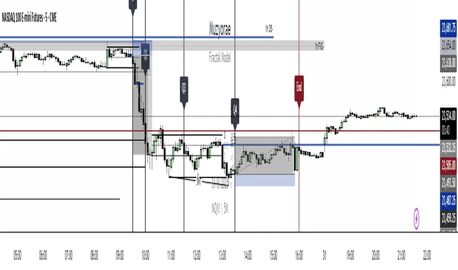
The 90-Minute Logic
Unlike standard indicators that use rolling timeframes, this script anchors its calculations to a fixed daily grid.
Session Start: The cycle calculation begins strictly at 02:30 New York time .
Session End: The cycles continue in 90-minute increments until the market close at 16:00 New York time .
The indicator analyzes price action within these specific 90-minute windows. If the primary asset makes a new high/low within the window, but the correlated asset fails to do so, an SMT divergence is flagged.
Key Features
Automated Asset Detection: The script automatically detects the asset you are trading and selects the most liquid correlated pair for comparison.
Smart Cleanup: To prevent chart clutter during volatile sessions, the script includes an intelligent cleanup system that limits overlapping lines, ensuring only the most relevant signals are shown.
Divergence Visualization: Automatically plots visual connectors (Green for Bullish, Red for Bearish) when a divergence is detected, removing the need to manually check two charts at once.
Settings Overview
Auto-Detect Correlated Asset: Enable this for automatic pairing (recommended).
SMT Direction: Choose to see Bullish, Bearish, or Both signals.
Cleanup SMT: Adjust the sensitivity of the line removal logic.
90M Cycle Visuals: Customize the color and width of the SMT lines.
Why is this script Protected?
This script is published as protected to safeguard the proprietary logic used to detect SMT divergences. The algorithm employs a unique method for comparing price action between correlated assets to identify valid divergences, and this specific calculation method is kept closed-source to preserve its originality.
Penunjuk Pine Script®