Pearson's R Convergence DivergenceThis script calculates the convergence divergence and breakouts from the deviations for a fast and slow linear regression slope.
This can be used to predict major market moves before they happen.
For users familiar with MacD, the blue line is similar to the MacD line and the orange line the signal.
The difference is this is not a moving average comparison but a comparison between Pearson's R values.
-0.1 (positive direction)
0.1 (negative direction)
This is why the colors look inverse for a typical MacD.
How to use this:
The idea is that when both trends converge in the 0.8 or -0.8 range and you see a breakout cross occur on either line then the price has a high likelihood of reversing its current trend.
If you see a green cross it means the top of the linear regression for the 'fast' or 'slow' linear regression deviation was broken by the current price. This can signify that upward movement is coming soon.
On the flip side a red cross means the bottom of the linear regression for the 'fast' or 'slow' linear regression deviation was broken by the current price. This can signify that downward movement is coming soon.
These crosses mean a lot more if the pearson's R value is already maxed out near 0.8 or -0.8.
This indicator works because the more sure a trend becomes the more likely it is to break as more traders see the pattern.
The histogram colors do not mean much being 'red' or 'green', what you want to look for is when the histogram starts to approach the 0 mark. This signifies that both linear regression trends are about to reach their peak before reversing trend. So don't confuse this with how you might read the MacD even though it looks very similar. The histogram sloping towards the 0 line will give you a clue how long it might take before the reversal occurs .
Please PM me if you have any questions, and enjoy!
Cari dalam skrip untuk "Divergence"
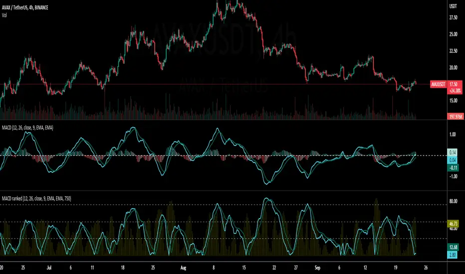
Vector MACDCalculates five vector moving averages of different periods and averages them.
Origin moving average is ALMA from the mid point of the candles (hl2.)
Vector moving averages are the difference between Hull Moving Averages and the Origin MA.
It is a momentum indicator that shows when long term and short term trends agree with the move. It moves stronger, when all the vectors point to the same direction.
Look for divergence to detect trend changes.

Adaptive Fisherized KSTIntroduction
Heyo guys, here is a new adaptive fisherized indicator of me.
I applied Inverse Fisher Transform, Ehlers dominant cycle analysis,
smoothing and divergence analysis on the Know Sure Thing (KST) indicator.
Moreover, the indicator doesn't repaint.
Usage
I didn't backtest the indicator, but I recommend the 5–15 min timeframe.
It can be also used on other timeframs, but I have no experience with that.
The indicator has no special filter system, so you need to find an own combo in order to build a trading system.
A trend filter like KAMA or my Adaptive Fisherized Trend Intensity Index could fit well.
If you find a good combo, let me know it in the comments pls.
Signals
Zero Line
KST crossover 0 => Enter Long
KST crossunder 0 => Enter Short
Cross
KST crossover KST MA => Enter Long
KST crossunder KST MA => Enter Short
Cross Filtered
KST crossover KST MA and KST above 0 => Enter Long
KST crossunder KST MA and KST under 0 => Enter Short
KST crossunder 0 => Exit Long
KST crossover 0 => Exit Short
More to read: KST Explanation
Enjoy and let me know your opinion!
--
Credits to
- @tista
- @blackcat1402
- @DasanC
- @cheatcountry

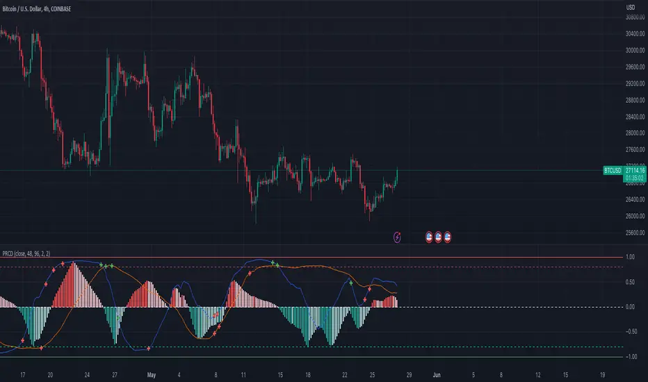
Percentile Rank of Moving Average Convergence DivergenceThis simple indicator provides you three useful information of the Moving Average Convergence Divergence (MACD) indicator:
The percentile rank of the current value of the MACD line, displayed by the bright blue line.
The percentile rank of the current value of the Signal line, displayed by the dark blue line.
The percentile rank of the current value of the Histogram line, displayed by the olive histogram.
This indicator can be useful to identify the strength of trend. This indicator makes the assumption that market tends to revert into the opposite direction. If the market has been trending a lot, it should consolidate for a while later. If the market has been consolidating for a long time, it would begin trending real soon.
When we see a low percentile rank, no matter which line it is, this tells that the market hasn't been moving much, or there is little momentum. If the percentile rank stays below the median or even below the first quartile for a long time, this could suggest that the market is ready for the next trend since it has stored quite some energy.
When we see a high percentile rank, no matter which line it is, this tells that the market has been trending a lot, or there is much momentum. If the percentile rank stays above the median or even above the third quartile for a long time, it is probable that the market has used up much of its energy and is going to take a rest (consolidate).
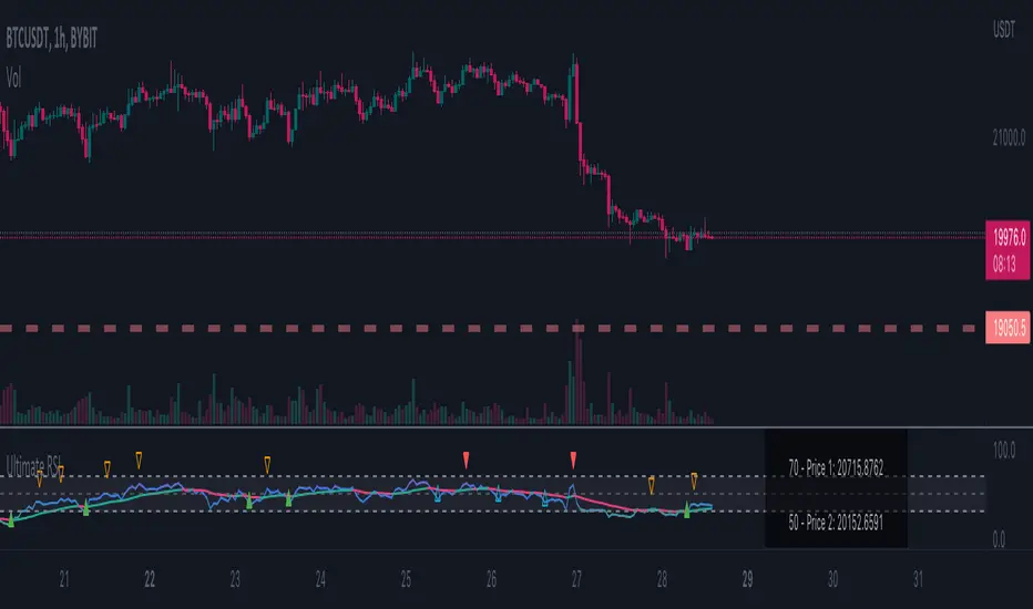
Ultimate RSI - Divergence + S/R + Reverse RSIThis is a modification of the TradingView RSI with some of my favourite RSI features added.
This includes Divergence indicators. EMA with colour change on cross, Support and resistance lines and reverse RSI.
A reverse calc has also been added. This will allow you to input 3 different RSI values for a price prediction. This is good to use with the support and resistance lines and can give you key areas on the chart where the price may bounce/reject.
All colours and modifications can be turned on/off.
Enjoy! :)
Neo's %KIn my opinion the %K is the only part of the stochastic that you actually need. It's the fast RSI, so it responds much better to large price movements and reveals divergence a lot sooner than %D. The %D has no real confluence with the rest of my strategy so, I only use %K.

[_ParkF]RSI (+ichimoku cloud)RSI
Typical RSI indicators were plotted with candles and expressed wick to resemble a candle chart,
and linear regression was added to predict changes in force intensity,
which allowed us to confirm support and resistance within linear regression .
In addition, divergence signal was marked as an additional basis for the price fluctuation point due to support and resistance .
In other words,
if the diversity signal appears together when the rsi candle is supported and resisted within linear regression ,
this is the basis for predicting that it is a point of change in the existing trend.
Finally, the period value and standard deviation of linear regression can be arbitrarily modified and used.
I hope it will help you with your trading.
--------------------------------------------------------------------------------------------------------------------------------------------------------------
(+ichimoku cloud)
Clouds made of the preceding span 1 and the preceding span 2 of the balance table can predict the trend by displaying the current price balance ahead of the future.
In addition to the role of clouds in the above-described balance sheet, this indicator also shows the cloud band support and resistance of the current RSI value.
일반적인 RSI 지표를 캔들화 하였고 꼬리까지 포함하여 캔들 차트와 유사하게 표현 하고,
캔들화한 RSI 지표에 선형회귀(채널)를 추가 하여 RSI 지표 특유의 힘의 강도의 변화를 지지와 저항으로 확인할 수 있게 해봤습니다.
또한 다이버전스 신호를 추가하여 선형회귀(채널)로 인한 지지와 저항에 따른 가격 변동의 근거로 삼을 수 있습니다.
즉, 선형회귀(채널) 안에서 RSI 캔들이 지지와 저항을 받을 때 다이버전스 신호가 함께 나타난다면 이는 기존 추세의 변화 지점임을
예측해 볼 수 있는 근거가 됩니다.
마지막으로 선형회귀(채널)의 기간값과 표준편차는 임의로 수정하여 사용할 수 있습니다.
당신의 트레이딩에 도움이 되었으면 합니다.
--------------------------------------------------------------------------------------------------------------------------------------------------------------
(+일목균형표의 구름)
일목균형표의 선행스팬1과 선행스팬2로 만들어진 구름은 현재 가격의 균형을 미래에 선행하여 표시하여 추세를 예측해볼 수 있습니다.
본 지표에서는 위에서 설명한 일목균형표의 구름의 역할과 더불어 현 RSI 값의 구름대 지지, 저항 또한 확인해볼 수 있습니다.
* I would like to express my gratitude to zdmre for revealing the linear regression source.

[_ParkF]RSIRSI
Typical RSI indicators were plotted with candles and expressed wick to resemble a candle chart,
and linear regression was added to predict changes in force intensity,
which allowed us to confirm support and resistance within linear regression.
In addition, divergence signal was marked as an additional basis for the price fluctuation point due to support and resistance.
In other words,
if the diversity signal appears together when the rsi candle is supported and resisted within linear regression,
this is the basis for predicting that it is a point of change in the existing trend.
Finally, the period value and standard deviation of linear regression can be arbitrarily modified and used.
I hope it will help you with your trading.
일반적인 RSI 지표를 캔들화 하였고 꼬리까지 포함하여 캔들 차트와 유사하게 표현 하고,
캔들화한 RSI 지표에 선형회귀(채널)를 추가 하여 RSI 지표 특유의 힘의 강도의 변화를 지지와 저항으로 확인할 수 있게 해봤습니다.
또한 다이버전스 신호를 추가하여 선형회귀(채널)로 인한 지지와 저항에 따른 가격 변동의 근거로 삼을 수 있습니다.
즉, 선형회귀(채널) 안에서 RSI 캔들이 지지와 저항을 받을 때 다이버전스 신호가 함께 나타난다면 이는 기존 추세의 변화 지점임을
예측해 볼 수 있는 근거가 됩니다.
마지막으로 선형회귀(채널)의 기간값과 표준편차는 임의로 수정하여 사용할 수 있습니다.
당신의 트레이딩에 도움이 되었으면 합니다.
* I would like to express my gratitude to zdmre for revealing the linear regression source.

volatility-weighted price change divergenceEMA of intrabar-volatility-weighted price change minus EMA of price change. It puts more weights on candles that have large volatility inside, and assumes that the direction of those high-volatility candles are more meaningful than low-volatility ones. Therefore, we take the difference between the volatility-weighted price change and the regular price change and plot the EMA. The indicator may be used as a tool to find divergence and potential reversal, or hints of continuation of a strong trend. Note that this indicator can change a lot with different time frames and settings, so take care to backtest before using. Recommended settings are 15m resolution for time frames longer than 4H and 1m resolution (with 200 EMA length) for time frames below 4H. The resolution is used to find the intrabar volatility.
Wave Trend OscillatorThis is a very standard version of the Wave Trend Oscillator.
The Channel and Average values are displayed as lines, most people display them as areas.
The Channel and Average difference is displayed as a histogram, most people display it as a tiny noisy area.
I was unable to find a standard version of the Wave Trend Oscillator.
The colorful hyped up versions of this indicator made me feel like a clown while using them.
I have essentially copied the style of the MACD with this indicator, to keep things professional.
With this WTO, you can change the timeframe and source.
You can also change the histogram average length and multiplier, making it usable.
The typical way that people display the histogram is completely unusable and just for appearance.
Now it does a decent job showing when the momentum of the WTO's downward movement is slowing down, just like how the MACD histogram works.
This indicator is essentially a normalized MACD, though they are calculated differently.
The Wave Trend Oscillator is useful for spotting/monitoring changed in mid-trend momentum.
In my experience, divergence in this indicator is a strong signal.
If the MACD is too slow for you, then this is a great alternative; without all the extra fluff people usually add to it.

ATR Volume DivergenceThe indicator measures ATR relative to VOLUME of each candle, marks the candles where there is more volume than in the previous one, but a lower ATR - signifying a compression in price movement - resistance. It also marks the candle where there is a greater ATR than in the previous candle, but lower volume - signifying an expansion in price movement - vacuum.
P.S. Bring indicator to FRONT to see the colored candles clearly

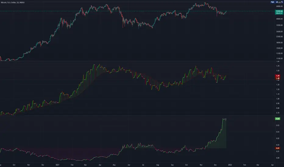
Abz Bonds/BTC divergenceDraft release: This indicator shows the comparative returns from US bonds vs BTC.
I was inspired by this Twitter thread: twitter.com
If you compare the price action of Bitcoin against bond returns over the last year, there's an extraordinary degree of correlation. This may give insights into what's coming next for BTC , but at some point the relationship will inevitably break down. In the meantime, there's much to gain.
DYOR.
Feedback welcome though it may take a while for me to respond.
[JL] TEMA Difference - Divergence and Double HH/LLI am playing Triple EMA and made this script.
Calculate TEMA difference and display Divergence and Double HH/LL when cross happened.
Add useATR option:
This means how many bars can be filled between the two lines. This can be compared with other symbols for "narrow" or "wide"

[LanZhu] - Bias With DivergenceDescription
Bias is also known as deviation rate which is a technical index derived from the moving average principle. Its function is to measure the deviation degree between the stock price and the moving average line in the process of fluctuation.
Usage
Generally ,
Moving averages of period 6,12,24 and 72 are used in the calculation. Of course, it is adjustable and result in different sensitivity of the deviation rate.
When the stock price is above the moving average, it is positive.
When the stock price is below the moving average, it is negative.
When the stock price is consistent with the moving average, it is zero.
Example,
1. During weak market, we may take when 6-day deviation rate cross both 5 and -5 level to indicate possible overbought and oversold respectively. Reversal or rebound might happen.
2. During strong market, we may take when 6-day deviation rate cross both 8 and -8 level to indicate possible overbought and oversold respectively. Reversal or rebound might happen.
3. When all the bias lines are moving upward and across 0 line, a strong bullish trend might formed and Vice Versa for strong bearish trend
4. Divergence also added to find possible bull or bear reversal on the default bias period which is configurable.

RSI Linear Regression with ZigZag by zdmreBoth the RSI (Relative Strength Index) and the Linear Regression ( LR ) rank among the most popular momentum indicators used in trading. When used in combination with other technical indicators (ZigZag), both RSI, LR and ZigZag can offer value in validating trade opportunities to optimize your risk management practices.
Here’s a look at how to use RSI, LR and ZigZag (Can be used for divergence patterns.) as part of your trade analysis.
If you have new ideas to improve this indicator then let me know please.
***Use it at your own risk

Volume price action and reaction index V1.0 (VPARI V1.0)Volume indicator adjusted according to price movement.
It is used to confirm entry into trades , Each candle represents a measure of the strength of the change in volume with the price calculated by more than one mathematical equation.
the best way to use :
Divergence, either positive or negative
It is used with Crypto currencies and stocks, not suitable for use with commodities .
The example is shown in the attached chart .
If you like it, don't forget to comment your experience using it.

Trend Momentum with Buyers / Sellers PowerHi there!
With this indicator, you can hunt big trends before they start.
This indicator is combined with RSI and Momentum indicators
It can show you the power of trend and which side it wants to go
It can help you to open a position at the first point of a new trend or at the safe and proven point of the trend, also it can help you to close your position before the trend change its direction (it's not recommended to use it to close your positon, but sometimes it can help you to find the ending point of big pumps)
Rules:
* Baseline is ZERO ( 0 ) line
* When gray line crossover red line, it shows us a powerful uptrend
* When the gray line crossunder the red line it shows us a powerful upward trend
Signals:
* Only use Buy signals(Long) when they are above or crossing-up baseline
* Only use Sell signals(Short) when they are under or crossing-down baseline
* If they both (red and gray lines) are too high and they suddenly starting to come back to baseline, it shows we have a range trend, the trend is weak or a reversal trend is coming!!
!! WARNING: DO NOT USE THIS INDICATOR ALONE !!
Suggestions :
-Use 1H, 4H, daily, or Weekly timeframes
-Use ADX and DI or three WMA's
-Use divergence
-You can use it for scalping but you need to change the inputs (not recommended)
If you have any idea about making new indicators(what information do you want from the chart?), comment please, then I can research and make it for all of us! =)

% DivergenceSimple script to plot the amount of divergence between a source signal and the price of the chart.
I have an RSI version uploaded but this one allows any input. Figured RSI would be most useful most likely but this could be useful to have access to as well.
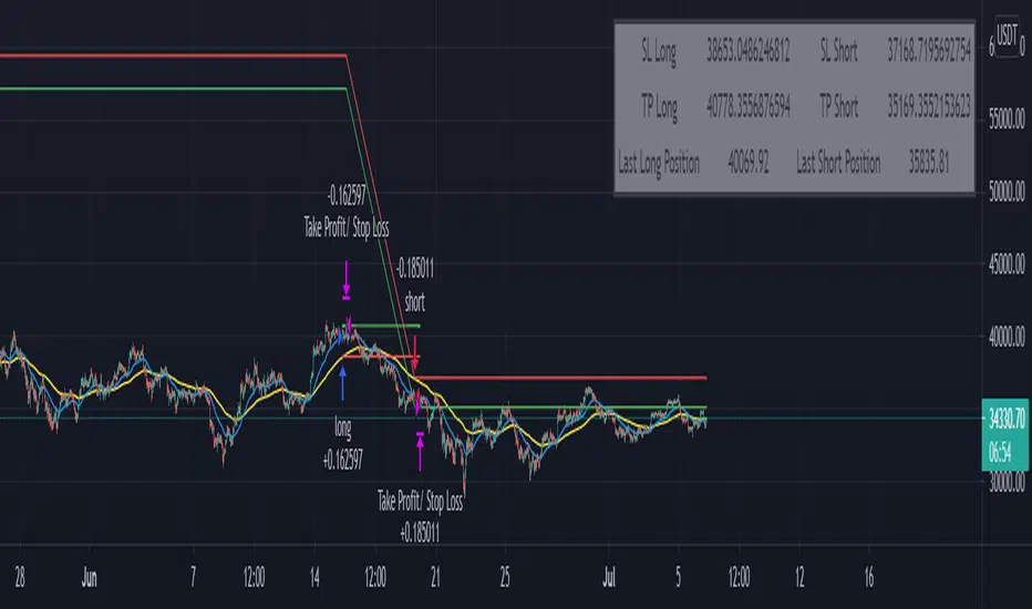
TradePro's Trading Idea Cipher Divergence EMA Pb StrategyHere I present you on of Trade Pro's Trading Idea: Cipher B+ Divergence EMA Pullback Strategy.
Optimized the crypto pairBTC/USDT in the 30 minute chart.
There is the possibility to switch between short and long positions.
You can choose between 2 different take profit/stop loss types: The Lowest Low/ Highest High Stop Loss/ Take Profit and the ATR Take Profit/ Stop Loss.
-----------------------------------------------------------------------------------
How does the strategy work?
ENTRY
Long
The price must be above the 200 EMA .
The price needs to make a pullback into the 50 EMA .
Right after that, the Cipher B indicator must give a buy signal, it must be below the zero line and the Money Flow cloud must be green.
Short
Contrary to the premise of long positions.
EXIT
Lowest Low/ Highest High Exit
The Lowest Low (long) / highest high (short) serves as the stop loss. The TP is formed on the basis of a factor.
(Long for example: *Lowest Low* multiplied by *Profitfactor* = TP).
ATR Exit
The value of ATR at the time of buying is multiplied by the value entered in "Profit factor ATR" and "Stop factor ATR". As soon as the price reaches this value, it is closed.
Important
The script must be optimized for each coin or currency pair. However, only the values for the profit factor, the stop loss and Lowest Low / Highest High are relevant.
Also, by changing the Chanel Length and the Chanel Average, you can create strong profit changes.
The results of the strategy are without commissions and leverage.
If you have any questions or feedback, please let me know in the comments.
If you need more information about the strategy and want to know exactly how to apply it, check out my profile. There I have created a tutorial for the function of the script.

Moving Average Periodical DivergenceUses the difference between two PMA (Moving Average Periodical) indicators to create an oscillator.
Useful for visualizing daily/weekly cycles, strength and potential momentum. The defaults are 2 days (fast) and 5 days (slow).
RSI Divergence 2.0RSI Divergence script will paint green or red lines depending on which way the asset is moving. The code is accessible and can be viewed. I have added alerts and the ability to change the source for slow and fast RSI values.
I have yielded better results using OHLC4 rather than the regular closing candles. As you can see it is working well with COINBASE:BTCUSD and works on all timeframes.
Best of luck!

Non-Rescaled RSI█ OVERVIEW
Relative Strength Index is a momentum oscillator developed by J. Wilder. The original version of RSI rescaled the relative strength measurement to range. While the rescaling is useful for readability, This non-rescaled version tells the exact average relative strength of the movement for the past period, and give another way to put the relative strength reading into context of current market condition.
█ Description & How To Use
1. The (+/-) in relative strength value indicates the direction
Example 1: Relative Strength of 2.33 means average gain is 2.33 bigger than average loss for the past period (Equivalent to RSI 70)
Example 2: Relative Strength of -2.33 means average loss is 2.33 bigger than average gain for the past period (Equivalent to RSI 30)
Example 3: Relative Strength of 0 means average gain is equal to average loss for the past period (Equivalent to RSI 50)
Look at comparison below:
2. You can use it exactly how you would use RSI: Overbought/Oversold state, Divergence, Trend identification, Failure Swings etc..
█ Features
- Overbought/Oversold line still maintainable as standard RSI level (70,30) in user input screen. The script will recalculate and plot the ob/os level accordingly
- Value Label to indicate the RSI and RS value
- Custom Gradient Color Scheme
█ Limitation
The Relative Strength absolute value is capped at 20 to avoid ratio value too big(or too small). This is enough to get accurate equivalent of RSI reading between 5-95
█ Disclaimer
Past performance is not an indicator of future results.
My opinions and research are my own and do not constitute financial advice in any way whatsoever.
Nothing published by me constitutes an investment/trading recommendation, nor should any data or Content published by me be relied upon for any investment/trading activities.
I strongly recommends that you perform your own independent research and/or speak with a qualified investment professional before making any financial decisions.
