Bollinger Band Strategy (Basic) Version 1 This strategy is for learning purposes only. Pay special attention to these strategies on longer aggregation periods (like 1 hr chart or more). Don't expect accurate results when you set a limit to 10 cents above your entry to be accurate. For example if you set the chart to 1 day, the price may move down and hit a stop 10 times then tag your limit. If this doesn't make sense, just don't use strategies here. Learn more first. That being said, I don't have specific recommendations for each aggregation period, backtesting isn't always perfect.
Now then, this strategy can be used as the traditional BB method by setting the "Stop" and "Limit Out" to like 10000, check "Reversal Entry" and uncheck "Limit Time of Day" This will keep the strategy running just reverse your position when price crosses outside each band.
INPUTS:
Length - length of WMA that I used for mean of Bollinger Band (this may suppose to be SMA, too bad)
Source - O-H-L-C basis for WMA
Deviation - normal Standard deviation that would be set when using Bollinger Band
Trailing stop check box - your stop value will be either a hard stop or trailing stop for an exit
Stop - the stop value - remember you can set this really high and it won't stop out
Limit Out - the limit value for exit
Reversal Entry check box - This changes each entry from a reversal (traditional idea of BB) to enter a trend trade - hopefully version 2 will have choice to trend one direction and reversal in the other.
Limit Time of Day - Especially when trading futures, you may want to only trade a specific time of day, when this box is checked, you can set the entry times below, exit will still only occur based on limit/stop or a flip entry order (the opposite entry condition is met)
Tips:
when I don't know a thing about a price range, like gold. I can set the limit out to 10000 and play with a trailing stop to get a better idea of what is even possible before tuning further.
Cari dalam skrip untuk "GOLD"


Kringold2[WOZDUX] gold equivalentThe indicator is a tool for global analysis. The default is the price of gold. The price of the instrument from the main window is divided by the price of gold. The result is the price of the instrument in units of gold. The screen uses the Dow Jones index as an example. In the indicator window, the price of the index in units of gold or the so-called gold Dow Jones. The use of the gold equivalent makes it possible to see more truthful trends. The Indicator has the ability to change gold to any other equivalent. It is enough to change the name of the exchange and the name of the instrument in the options tool and exchange. In addition, in the settings, the second box on top allows you to view the graph in a linear or logarithmic scale. The first box at the top switches the line chart or the CCI =WT indicator to this chart.
-------------------------------------------
Индикатор это инструмент для глобального анализа. По умолчанию используется цена золота. Цена инструмента из основного окна делится на цену золота. В результате получается цена инструмента в единицах золота. На экране для примера используется индекс Доу джонса. В окне индикатора цена индекса в единицах золота или так называемый золотой Доу Джонс. Использование золотого эквивалента дает возможность видеть более правдивые тенденции движения. В Индикаторе есть возможность поменять золото на любой другой эквивалент. Достаточно в опциях инструмент и биржа изменить название биржи и название инструмента. Кроме того, в настройках, второй бокс сверху дает возможность смотреть график в линейном или логарифмическом масштабе. Первый бокс сверу переключает линейный график или индикатор CCI =WT к данному графику.

Macd_Reader_Signal_Moriceau_Thesis_indicatorThe idea is to create a MACD "Reader" that can tell you when you should buy (yellow candle sticks) and when to Sell (black one) you have also strong signal of with B and S write on graphic automatically. This indicator is set and back tested with BTCUSD and Gold. I used also for french equities and it works really good.
Let me know if you want any change or have comments.
Hugo Moriceau
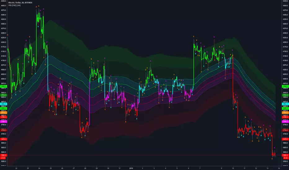
Fractal Regression Bands [DW]This study is an experimental regression curve built around fractal and ATR calculations.
First, Williams Fractals are calculated, and used as anchoring points.
Next, high anchor points are connected to negative sloping lines, and low anchor points to positive sloping lines. The slope is a specified percentage of the current ATR over the sampling period.
The median between the positive and negative sloping lines is then calculated, then the best fit line (linear regression) of the median is calculated to generate the basis line.
Lastly, a Golden Mean ATR is taken of price over the sampling period and multiplied by 1/2, 1, 2, and 3. The results are added and subtracted from the basis line to generate the bands.
Williams Fractals are included in the plots. The color scheme indicated whether each fractal is engulfing or non-engulfing.
Custom bar color scheme is included.

Growth Comparison (Gold, Silver, Copper, Platinum & Crypto)
Data Sources
The symbols configured this time point to globally trusted data sources (providers).
・OANDA (XAUUSD, XAGUSD, XCUUSD, XPTUSD):
Data from OANDA, one of the world's largest FX and commodity providers. It reflects the “spot prices” for gold, silver, copper, and platinum in near real-time.
・BINANCE (BTCUSDT, ETHUSDT, XRPUSDT):
Data from Binance, the world's largest cryptocurrency exchange. It has the highest trading volume and is used as the global standard price indicator. Retrieves BTC, ETH, and XRP.
How the Script Works (Technical Explanation)
・Fixed Starting Price:
The script internally stores the price on the set “comparison start date” (e.g., January 1, 2025).
・Real-Time Calculation:
It constantly retrieves the latest current price and continuously calculates the percentage using the following formula.
Formula: (Current Price - January 1, 2025 Price) ÷ January 1, 2025 Price × 100
*Since January 1 is a global market holiday (New Year's Day) with no prices available, the script automatically adopts the next market opening price (e.g., January 2 morning's open price) as the baseline.
・Automatic label tracking:
The program displays labels like “GOLD” at the right edge of the graph. This ensures you never lose track of which line corresponds to which asset, even when lines overlap.
Translated with DeepL.com (free version)

Rainbow Rider Pro | ProjectSyndicate________________________________________
📖 Rainbow Rider Pro PS — The Definitive Guide
________________________________________
✅ Executive Summary — 10 Unique Advantages
🌈The Rainbow Rider Pro PS isn’t a basic trend indicator — it’s a visual trading system built to show market momentum + volatility clearly and intuitively.
eur cad
1. ⚙️ Hybrid Momentum Engine
Combines EMA + WMA + VWMA into one triple-smoothed composite wave → responsive + smooth.
2. 🌈 Full-Spectrum Gradient
A 7-layer rainbow maps momentum strength across colors → more nuance than simple 2-color tools.
3. 📏 Adaptive Volatility Zones
Zones are ATR-driven, expanding/contracting with volatility → dynamic support/resistance behavior.
4. 👁️ Visual Momentum Mapping
Momentum shifts become color shifts → less reliance on separate oscillators.
5. ✨ Glow + Transparency (Dark Mode Optimized)
Transparency + glow improves clarity and reduces eye strain during long sessions.
6. 📈 Acceleration Detection
Tracks momentum direction + acceleration → early warning for strengthening/weakening trends 🚦.
7. 🎯 Clutter-Free Signals
💎 reversals + ⚡️ volatility spikes → clean, minimal overlays .
8. 🟣 Dynamic Background Ambiance
Background hue follows dominant momentum → helps you “feel” market mood instantly .
9. 🧵 Zero-Lag Smoothing Style
Triple-EMA smoothing hugs price action → smooth trend line without heavy lag .
10. 🌍🔁 Universal Applicability
Asset-agnostic logic works across FX 💱 / Crypto 🪙 / Commodities 🪙⛏️ / Equities 🏛️ on all timeframes ⏱️.
ltc usd
________________________________________
⚙️ Anatomy of the Indicator
1) Momentum Wave (Core Baseline)
The wave is the primary trend + momentum reference.
Color Meaning
• Warm (Yellow / Orange / Pink) → strong bullish momentum 📈
• Cool (Cyan / Blue / Indigo / Violet) → strong bearish momentum 📉
• Green → neutral / transition (indecision)
Position Meaning
• Price above wave → generally uptrend
• Price below wave → generally downtrend
________________________________________
2) Rainbow Volatility Zones (7 Bands)
Bands expand/contract around the wave and act like adaptive volatility envelopes.
• Expansion → rising volatility
• Contraction → falling volatility (often precedes breakout)
• Outer band touch (Pink / Indigo / Violet extremes) → move may be overextended → pullback/consolidation risk
________________________________________
s&p e-mini
🎯 Signals & Markers
• Reversal Diamonds (💎)
Appear when price crosses the Momentum Wave with confirming conditions.
o 💎 below price → bullish reversal signal
o 💎 above price → bearish reversal signal
Best used as entry/exit warnings, not standalone trades.
• Volatility Lightning (⚡️)
Appears when ATR spikes → warns of unusually high volatility (erratic moves + wider spreads possible).
________________________________________
📈 Sample Trade Setups (Hypothetical)
1) GBP/USD — H4 Swing (Trend Following)
• Trend: downtrend, wave blue, price below wave
• Setup: pullback to wave (dynamic resistance), wave shifts to cyan but fails to turn green, rejection + bearish 💎 above candle
• Entry: short at signal candle close
• SL: above swing high + upper zones
• TP: lower indigo/violet band, then historical support
• Exit early if: wave turns green OR bullish 💎 appears
________________________________________
2) XAU/USD (Gold) — H1 Day Trade (Breakout)
• Trend: tight consolidation, zones contracting
• Setup: wave flat + green → indecision; breakout candle closes above bands; wave turns green → yellow → orange
• Entry: long at close or pullback to first upper band
• SL: below consolidation midpoint or below wave
• TP: ride upper bands; exit when price closes back inside bands OR wave cools (pink→orange etc.)
________________________________________
3) BTC/USD — Daily (Reversal Trading)
• Trend: prolonged bullish, wave pink, price extended
• Setup: new high but momentum wanes; price closes below wave + bearish 💎
• Entry: short (smaller size; counter-trend risk)
• SL: above recent ATH
• TP: first major support; take profits aggressively
• Exit cue: support at lower bands + wave shifts toward neutral (blue→cyan/green)
________________________________________
🛠️ Setting Templates (Ready-to-Use)
Template 1 — Scalper (M1 / M5)
• Goal: small, rapid moves
• Wave Length: 13
• Wave Source: HL2
• Volatility Multiplier: 1.8
• ATR Period: 34
• Logic: very responsive wave + tighter bands
Template 2 — Day Trader (M15 / H1) (Default-Style Balance)
• Wave Length: 34
• Wave Source: HLC3
• Volatility Multiplier: 2.5
• ATR Period: 50
Template 3 — Swing Trader (H4 / Daily)
• Wave Length: 55
• Wave Source: Close
• Volatility Multiplier: 3.0
• ATR Period: 100
• Logic: smoother trend focus + wider bands to avoid premature exits
Template 4 — Position Trader (Daily / Weekly)
• Wave Length: 89
• Wave Source: OHLC4
• Volatility Multiplier: 3.5
• ATR Period: 144
• Logic: filters noise → only major shifts trigger signals
________________________________________
📊 Advanced Interpretation Guide
Reading the Rainbow (Color Psychology)
• Bearish (Cool): Violet → Indigo → Blue → Cyan
o Violet = most extreme bearish
o Cyan = bearish weakening → transition risk
• Neutral (Green): equilibrium / indecision → often ranges & consolidations
• Bullish (Warm): Yellow → Orange → Pink
o Yellow = early bullish
o Orange = strong established bullish
o Pink = extreme bullish (can be overextended)
________________________________________
📊 Advanced Interpretation Guide
🌈 Reading the Rainbow: Color Psychology in Trading
The gradient is designed to be intuitive — each color is a “momentum temperature” cue:
• Bearish Spectrum (Cool Colors) 🟣🔵🧊
🟣 Violet → 🟦 Indigo → 🔵 Blue → 🩵 Cyan = declining momentum
o 🟣 Violet = most extreme bearish conditions
o 🩵 Cyan = bearish momentum weakening → transition risk
• Neutral Zone (Green) 🟢⚖️
🟢 Green = equilibrium / indecision
Common during consolidations or ranges → usually best to wait for clearer bias.
• Bullish Spectrum (Warm Colors) 🟡🟠🩷
🟡 Yellow → 🟠 Orange → 🩷 Pink = rising momentum
o 🟡 Yellow = early bullish shift
o 🟠 Orange = strong, established uptrend
o 🩷 Pink = extreme bullish conditions (often overextended)
________________________________________
Volatility Band Dynamics
• Wide bands: high volatility (news / breakouts / acceleration) → consider wider stops
• Narrow bands: volatility squeeze → breakout risk rising
• Outer band breakout: momentum surge → often followed by reversion to inner bands/wave
________________________________________
🎯 Trading Strategies (Combining Signals)
Strategy 1 — Trend Continuation (High Win Rate)
Entry
• Price above (long) / below (short) wave
• Wave color aligns (warm for longs / cool for shorts)
• Wait pullback to wave or first inner band → enter on bounce
Exit
• Close on opposite side of wave
• Wave turns green
• Opposite 💎 appears
Risk
• SL just beyond wave on the invalidation side
________________________________________
Strategy 2 — Reversal Trading (High R:R)
Entry
• Strong trend extreme (pink or violet)
• 💎 appears + price closes opposite side of wave
• Wave shifts toward neutral (pink→orange, violet→indigo)
Exit
• Target opposite outer bands
• Or wave fully transitions to opposite spectrum
• Or counter-💎 prints
Risk
• Smaller sizing; SL beyond swing high/low
________________________________________
Strategy 3 — Volatility Breakout (High Momentum)
Entry
• Bands contracting (squeeze)
• Wave flat + green
• Large candle closes beyond outer bands
• Wave shifts quickly from green to strong warm/cool
Exit
• Price returns inside main bands
• Wave cools
• 💎 appears
Risk
• SL at consolidation midpoint; consider trailing stop on big winners
________________________________________
🧠 Best Practices & Pro Tips
• Timeframe Alignment: confirm higher TF trend before entries
• Avoid Neutral Zones: wave green + chop around wave = low probability
• Combine with Key Levels: horizontals / fibs / pivots improve confluence
• Respect ⚡️: volatility spike = spreads/slippage risk; tighten risk or wait
• Use Background Mood: warm = bullish bias, cool = bearish bias (avoid counter-trend)
• Adjust Gradient Intensity: reduce if distracting; increase if you want stronger visual pop
• Backtest First: learn behavior per asset/timeframe before going live
________________________________________
⚙️ Parameter Reference
| Parameter | Default | Range | Description
|----------------------|---------|--------------------------|----------------------------------------------|
| Wave Length | 34 | 8 - 200 | Wave responsiveness (lower = more sensitive) |
| Wave Source | HLC3 | Close/HLC3/OHLC4/HL2 | Price input used for wave |
| Volatility Multiplier| 2.5 | 0.5 - 10.0 | Band width (higher = wider) |
| ATR Period | 50 | 10 - 200 | ATR lookback (higher = smoother volatility) |
| Gradient Intensity | 75 | 0 - 100 | Band fill opacity (higher = more opaque) |
| Show Momentum Wave | True | True / False | Toggle main wave line |
| Show Rainbow Zones | True | True / False | Toggle volatility bands |
| Show Trend Signals | True | True / False | Toggle 💎 + ⚡️ markers |
| Dynamic Background | True | True / False | Toggle background hue shift |
| Rainbow Colors | Custom | Any Color | Customize each rainbow color |
________________________________________
🔔 Alert Configuration (TradingView Steps)
1) Click the indicator "More" (⋯) on the chart
2) Select "Add Alert on Rainbow Rider Pro PS"
3) Choose the condition in the dropdown
4) Set notifications (app/email/SMS/etc.)
5) Click "Create"
Available Alert Conditions
• Bullish Reversal → bullish 💎 appears
• Bearish Reversal → bearish 💎 appears
• High Volatility → ATR spike (⚡️)
• Extreme Bullish → momentum strength > 90
• Extreme Bearish → momentum strength < 10

BuyLow SellHigh Bands | ProjectSyndicate________________________________________
📊 BuyLow SellHigh (BLSH) Bands
Comprehensive Trading Guide – by ProjectSyndicate
________________________________________
🔰 1. Introduction
The BuyLow SellHigh (BLSH) Bands indicator is a powerful technical analysis tool designed for the TradingView platform. Works with any symbol. Gold/FX/indices/oil/crypto/stocks.
It provides traders with a clear, visual representation of:
• 📈 Overbought conditions
• 📉 Oversold conditions
This makes it easier to identify high-probability entry and exit points.
The indicator is built on:
• Dynamic price channels
• Fibonacci-based zones
• Color-coded market structure
💡 While the BLSH Bands can be used on Forex, Crypto, and Futures, this guide focuses on Gold (XAUUSD) using:
• M5
• M15
• M30 timeframes
________________________________________
🧠 2. Core Concepts
The BLSH Bands structure is created using two key components:
________________________________________
📐 Dynamic Price Bands
• Upper and lower bands are calculated using the highest high and lowest low
• Based on a user-defined lookback period (fiboPeriod)
• Reflects recent volatility and price range
This creates a self-adjusting channel that adapts to market conditions.
________________________________________
🧮 Fibonacci Zones
The space between the bands is divided into six Fibonacci-based zones:
• 0.786
• 0.618
• 0.500
• 0.382
• 0.214
⚠️ These are not traditional retracements — they are used to grade price extremity within the channel.
________________________________________
🎨 Color-Coded Zones Overview
Zone (Fib Level) Color Market Condition Interpretation
1.000 – 0.786 🔴 Red Extreme Overbought High reversal / pullback probability
0.786 – 0.618 🟠 Orange Overbought Selling pressure building
0.618 – 0.500 🟡 Yellow Mildly Overbought Bullish momentum weakening
0.500 – 0.382 🟢 Aqua Mildly Oversold Bearish momentum weakening
0.382 – 0.214 🔵 Deep Sky Blue Oversold Strong buying interest
0.214 – 0.000 🔷 Blue Extreme Oversold High bounce / reversal probability
🖤 Solid black separator lines ensure clean visual separation between zones for precise price location.
________________________________________
🪙 3. Trading Strategies for XAUUSD (Gold)
Gold’s volatility and respect for technical levels make it ideal for BLSH Bands strategies.
________________________________________
⚡ M5 Timeframe – Scalping Strategy
Designed for fast mean-reversion trades from extreme zones.
🟢 BUY Setup
• Price enters Extreme Oversold (Blue) zone
• Bullish confirmation candle appears:
o Hammer
o Bullish engulfing
• Enter BUY
🔴 SELL Setup
• Price enters Extreme Overbought (Red) zone
• Bearish confirmation candle appears:
o Shooting star
o Bearish engulfing
• Enter SELL
🎯 Take Profit:
• Median band (between Yellow & Aqua)
🛑 Stop Loss:
• Just outside the outer band
________________________________________
📆 M15 Timeframe – Day Trading Strategy
Balanced timeframe for higher-probability reversals.
🟢 BUY Setup
• Price enters Oversold (Blue / Deep Sky Blue)
• Strong bullish reversal candle closes back inside bands
• Enter BUY after close
🔴 SELL Setup
• Price enters Overbought (Red / Orange)
• Bearish reversal candle closes back inside bands
• Enter SELL after close
🎯 Take Profit (Multi-Target):
1. Median band
2. Opposite extreme band
🛑 Stop Loss:
• Beyond high/low of confirmation candle
________________________________________
🔄 M30 Timeframe – Swing Trading Strategy
Used for identifying major swing points.
🔍 Trend Filter
• Use 100 or 200 EMA
• Trade only in trend direction
🟢 Uptrend
• Buy pullbacks into Oversold zones
🔴 Downtrend
• Sell rallies into Overbought zones
📉 Confirmation:
• Band rejection
• RSI or MACD divergence
🎯 Take Profit:
• Previous structure levels
• Opposite band extreme
🛑 Stop Loss:
• Below / above recent swing high or low
________________________________________
🚨 4. Alerts System
Alerts are disabled by default to keep charts clean.
✅ How to Enable
• Open indicator settings
• Check “Enable Alerts”
________________________________________
🔔 Available Alerts
🔴 Overbought Alert
• Trigger: Price crosses above 0.786
• Message:
🔴 SELL SIGNAL: Price entered Overbought Zone – Consider selling or taking profits
🟢 Oversold Alert
• Trigger: Price crosses below 0.214
• Message:
🟢 BUY SIGNAL: Price entered Oversold Zone – Consider buying or entering long
________________________________________
⏱ Alert Spacing Logic
• Default: 20/50 bars
• Prevents repeated alerts in choppy markets
• Filters for higher-quality signals
________________________________________
⚙️ 5. Customization Settings
Adjust the indicator in the Settings panel:
🔧 Core Inputs
• fiboPeriod → Band sensitivity
• extremes → Price source (High/Low or Close)
🔔 Alert Controls
• Enable / disable alerts
• Separate control for overbought & oversold
• Alert spacing (bars)
________________________________________
⭐ How You Can Support ProjectSyndicate (3 Steps)
1. ✅ Click “Add to Favorites” to save this script to your TradingView Favorites
2. 🔎 Check out our other scripts to complete your SMC toolkit
3. 👤 Follow ProjectSyndicate for the latest updates, upgrades, and new releases
________________________________________
⚠️ 6. Disclaimer
Trading involves significant risk and may not be suitable for all traders.
This indicator is a decision-support tool, not a standalone trading system.
Always apply:
• Proper risk management
• Additional confirmations
• Sound trading discipline
📉 Past performance does not guarantee future results.

Chart This in GoldProduces a historical line chart in the bottom pane to reflect how many units of spot gold (XAU) could be exchanged for one unite of the underlying asset.

XAUUSD Lot Size Calculator1. What This Indicator Does
This tool is a Visual Risk Management System. Instead of using a calculator on your phone or switching tabs, it allows you to calculate the exact lot size for your trade directly on the TradingView chart by dragging lines.
It automates the math for:
Lot Size: How big your position should be to risk exactly X% of your account.
Take Profit: Where your target should be based on your Risk-to-Reward ratio.
Safety Checks: It warns you if your stop loss is too tight for the minimum lot size (0.01).
2. Visual Features
🔴 The Red Line (Stop Loss): This is your interactive line. You can grab it with your mouse and drag it to your desired invalidation point (e.g., below a support wick).
🟢 The Green Line (Take Profit): This line moves automatically. You cannot drag it. It calculates where your Take Profit must be to satisfy your Risk:Reward ratio (Default 1:1) based on where you placed the Red line.
⚫ The Info Table: A high-contrast black box in the corner that displays your calculated Lot Size, Risk amount, and Trade direction (Long/Short).
3. How to Use It (Step-by-Step)
Step 1: Initial Setup
When you first add the indicator to the chart, you need to tell it about your account:
Double-click the Black Table (or the Red Line) to open Settings.
Inputs Tab:
Account Balance: Enter your current trading balance (e.g., 10,000).
Risk %: Enter how much you want to lose per trade (e.g., 1.0%).
Contract Size: Keep this at 100 for Gold (XAUUSD) or standard Forex pairs.
Risk : Reward Ratio: Set your target (e.g., 1.0 for 1:1, or 2.0 for 1:2).
Step 2: Planning a Trade
Look at the chart and identify where you want to enter (current price) and where you want your Stop Loss.
Find the Red Line on your chart. (If you don't see it, go to Settings and change "Stop Loss Level" to a price near the current candle).
Click and Drag the Red Line to your specific Stop Loss price.
Step 3: Reading the Signals
Direction: If you drag the Red Line below the price, the table shows LONG. If you drag it above, it shows SHORT.
Lot Size: Read the big green number in the table (e.g., 0.55). This is the exact lot size you should enter in your broker.
TP Target: Look at the Green Line on the chart. That is your exit price.
Step 4: The "Orange Warning"
If you place your Stop Loss very close to the entry, or if your account is small, the math might suggest a lot size smaller than is possible (e.g., 0.004).
The table text will turn ORANGE.
The Lot Size will stick to 0.01 (the minimum).
The "Risk ($)" row will show you the actual risk. (Example: Instead of risking your desired $100, you might be forced to risk $105 because you can't trade smaller than 0.01 lots).

Obsidians Gold RevengeMany traders (including institutional desks) track lunar cycles on Gold (XAUUSD) because of the psychological impact on market sentiment. The common theory—often attributed to methods like Gann analysis—is:
🌑 New Moon: Often correlates with Market Bottoms (Buy Signals) or "New Beginnings."
🌕 Full Moon: Often correlates with Market Tops (Sell Signals) or "Exhaustion."
Here is a script that mathematically calculates the Moon Phase based on the lunar synodic month (approx. 29.53 days). It will plot these events on your chart so you can visually backtest if Gold respects these cycles.
How to use this for testing
Add it to your Chart: Apply it to the XAUUSD (Gold) chart.
Timeframe: This works best on 4-Hour (4H) or Daily (1D) charts. (On 15m charts, the moon phase covers many candles, so the label will appear on the specific candle where the phase officially "switched").
What to look for:
Look at the Dark Blue (New Moon) areas. Did price form a bottom or start a rally there?
Look at the Yellow (Full Moon) areas. Did price peak and reverse downward there?
Note: Lunar cycles are considered a "timing tool" rather than a directional indicator. They often indicate when a reversal might happen, but you should combine this with your Institutional Candle zones to confirm the direction!

Multi-Indicator Trend-Following Strategy 1-minute Gold strategyTrend following using many indicators to provide accurate buy and sell signals on the 1-minute gold chart

Monthly Chart Gold/Silver Strategy - NDAThis a strategy for the Monthly Chart
It indicates Buy & Sell points for trading Gold/Silver or other Precious Metals commodities or ETFs.
Its a simple strategy based on the MACD and RSI indicators.
I hope that you like it and find it useful

TQ Silver / Gold (Weekly Macro)This indicator tracks the Silver / Gold ratio on a weekly basis to determine whether silver is leading gold (risk appetite returning inside metals) or gold is leading silver (a more defensive precious-metals posture).
Within the TQ Weekly Macro Framework, this indicator is designed to be used after confirming the broader macro environment using TQ Gold Trend (Weekly Macro), TQ Gold / DXY (Weekly Macro), and TQ Gold / SPY (Weekly Macro).
Why Silver / Gold matters
>When Silver / Gold rises, silver is outperforming gold — often associated with reflation, growth expectations, or broad risk appetite within precious metals.
>When Silver / Gold falls, gold is outperforming silver — often associated with defense, uncertainty, or tighter financial conditions.
>This ratio is not a timing tool — it is a regime and leadership indicator within the metals complex.
How it works (regime rules)
Using weekly data:
Compute Silver ÷ Gold
Apply a 30-week SMA
Regime definitions:
Bull: Ratio above a rising 30-week SMA (silver leading)
Bear: Ratio below a falling 30-week SMA (gold leading)
Neutral: Transition / range
A clear label marks the current regime.
How to use it in your system
Use after confirming:
TQ Gold Trend (Weekly Macro)
TQ Gold / DXY (Weekly Macro)
TQ Gold / SPY (Weekly Macro)
> If Silver / Gold is Bull, metals participation is broadening and silver often has more upside torque.
> If Silver / Gold is Bear, gold leadership is defensive and silver exposure may underperform.
> Neutral often signals rotation or consolidation.
Best timeframe
Designed for weekly macro regime analysis.

TQ Gold / SPY (Weekly Macro)What this indicator does
This indicator tracks the Gold/SPY ratio on a weekly basis to show whether gold is outperforming U.S. equities (risk assets). It helps you determine if the market is favoring hard money / defensive leadership vs risk-on equity leadership.
Within the TQ Weekly Macro Framework, this indicator is intended to be used after confirming gold’s primary trend using TQ Gold Trend (Weekly Macro) and its monetary backdrop using TQ Gold / DXY (Weekly Macro).
Why Gold/SPY matters
Gold can rise during equity booms and during equity stress.
The Gold/SPY ratio tells you which asset class is winning in relative terms.
Rising Gold/SPY often signals defensive leadership, shifting macro preferences, or risk repricing, especially when aligned with TQ Gold Trend (Weekly Macro).
How it works (regime rules)
Using weekly data:
Compute Gold ÷ SPY
Apply a 30-week SMA
Regime definitions:
Bull: Ratio above a rising 30-week SMA (gold leading equities)
Bear: Ratio below a falling 30-week SMA (equities leading gold)
Neutral: Transition / range
A clear label marks the current regime.
How to use it in your system
Use after TQ Gold Trend (Weekly Macro) and TQ Gold / DXY (Weekly Macro).
> If Gold/SPY is Bull, gold is leading risk assets — metals tend to behave stronger and more “macro-relevant.”
> If Gold/SPY is Bear, equities are winning — gold moves may be less dominant.
> Neutral usually means rotation or consolidation.
Best timeframe
Designed for weekly macro regime analysis, not short-term trading.

TQ Gold / DXY (Weekly Macro)What this indicator does
This indicator tracks the relative performance of gold versus the U.S. dollar using the Gold/DXY ratio. It helps determine whether gold’s strength is real (monetary) or merely nominal.
Why Gold/DXY matters
Gold rising with a rising dollar is not a strong signal.
Gold rising against a weakening dollar signals monetary outperformance.
This ratio filters out dollar noise and focuses on true purchasing-power strength.
How it works
The indicator calculates Gold ÷ DXY using weekly data.
A 30-week SMA is applied to the ratio.
Regimes are defined as:
Bull: Ratio above a rising 30-week SMA (gold beating the dollar)
Bear: Ratio below a falling 30-week SMA
Neutral: Transition or range-bound periods
A clear on-chart label shows the current regime.
How to use it
Use after confirming Gold Trend is Bull.
When Gold/DXY is Bull, gold has a true monetary tailwind.
When Gold/DXY is Bear, gold rallies are often fragile or dollar-driven.
Neutral readings signal consolidation or regime change.
Best timeframe
Designed for weekly charts and macro analysis.
Not intended for short-term trading signals.

Weekly macro ratio indicator tracking Silver/Gold with a 30-weekWhat this indicator does
This indicator tracks the Silver/Gold ratio on a weekly basis to determine whether silver is leading gold (risk appetite returning inside metals) or gold is leading silver (more defensive precious-metals posture).
Why Silver/Gold matters
When Silver/Gold rises, silver is outperforming gold — often associated with reflation, growth expectations, or broad risk appetite.
When Silver/Gold falls, gold is outperforming silver — often associated with defense, uncertainty, or tighter financial conditions.
This ratio is not a timing tool — it’s a regime/leadership indicator.
How it works (regime rules)
Using weekly data:
Compute Silver ÷ Gold
Apply a 30-week SMA
Regime definitions:
Bull: Ratio above a rising 30-week SMA (silver leading)
Bear: Ratio below a falling 30-week SMA (gold leading)
Neutral: Transition/range
A clear label marks the current regime.
How to use it in your system - This indicator is designed to be used as part of the broader TQ Weekly Macro Framework, alongside other TQ indicators such as TQ Gold Trend (Weekly Macro), TQ Gold / DXY (Weekly Macro), and TQ Gold / SPY (Weekly Macro).
Each indicator can also be used independently.
Use after confirming:
Pane 1: Gold Trend
Pane 2: Gold/DXY
Pane 3: Gold/SPY
If Silver/Gold is Bull, metals participation is broadening and silver often has more upside torque.
If Silver/Gold is Bear, gold leadership is defensive; silver exposure may underperform.
Neutral often signals rotation or consolidation.
Best timeframe
Designed for weekly macro regime analysis.

Weekly macro ratio indicator comparing gold vs SPY 30 SMAWhat this indicator does
This indicator tracks the Gold/SPY ratio on a weekly basis to show whether gold is outperforming U.S. equities (risk assets). It helps you determine if the market is favoring hard money / defensive leadership vs risk-on equity leadership.
Why Gold/SPY matters
Gold can rise during equity booms and during equity stress.
The Gold/SPY ratio tells you which asset class is winning in relative terms.
Rising Gold/SPY often signals defensive leadership, shifting macro preferences, or risk repricing.
How it works (regime rules)
Using weekly data:
Compute Gold ÷ SPY
Apply a 30-week SMA
Regime definitions:
Bull: Ratio above a rising 30-week SMA (gold leading equities)
Bear: Ratio below a falling 30-week SMA (equities leading gold)
Neutral: Transition/range
A clear label marks the current regime.
How to use it in your system
Use after Pane 1 (Gold Trend) and Pane 2 (Gold/DXY).
If Gold/SPY is Bull, gold is leading risk assets — metals tend to behave stronger and more “macro-relevant.”
If Gold/SPY is Bear, equities are winning — gold moves may be less dominant.
Neutral usually means rotation or consolidation.
Best timeframe
Designed for weekly macro regime analysis, not short-term trading.

Weekly macro trend indicator for gold using a 30-week SMAWhat this indicator does
This indicator identifies the macro trend regime of gold using a simple, time-tested framework: the weekly price of gold relative to its 30-week simple moving average.
It is designed to answer one question only:
Is gold currently in a monetary uptrend?
How it works
The indicator uses weekly data and applies a 30-week SMA regime filter:
Bullish (Monetary Uptrend):
Gold price is above a rising 30-week SMA.
Bearish (Monetary Downtrend):
Gold price is below a falling 30-week SMA.
Neutral (Transition):
All other conditions (range-bound or early trend change).
A clear on-chart label displays the current regime.
How to use it
Use this as the first filter before analyzing silver, miners, or relative-strength ratios.
When gold is Bull, precious metals deserve attention.
When gold is Bear, most precious-metal trades lose their edge.
When gold is Neutral, patience is usually rewarded.
Best timeframe
This indicator is designed for weekly charts and macro-level decision-making.
It is not intended for day trading or short-term signals.
Who this is for:
Investors and traders focused on macro trends
Those treating gold as a monetary asset, not a short-term trade
Anyone looking for a clean, objective regime filter.

GSS: Gold Swing Sniper [DoNotFollowMeGod]"Inspired by Mean Reversion Theory and Dynamic Volatility Bands (similar to Keltner/Bollinger concepts).
Gold (XAUUSD) tends to respect volatility extremes. This script was designed to capture those extremes by combining a Volatility Channel with an ADX Strength Filter. It’s basically a mathematical approach to 'Buying Low and Selling High' in a ranging market."
Most traders lose money when the market stops trending. This indicator fixes that by identifying "Range-Bound" conditions using a smart ADX Filter.
How it works:
Market State Detection: It checks the ADX. If the market is trending strong, it stays quiet. If the market is chopping/ranging, it activates.
Sniper Entries:
SWING LONG: When price hits the lower band + RSI Oversold + Rejection Candle.
SWING SHORT: When price hits the upper band + RSI Overbought + Rejection Candle.
Dashboard: A clean Multi-Timeframe table to see if higher timeframes are Trending or Sideways.
Disclaimer:
This tool is a "Shield" against chop. Do not use it during high-impact news.
Based on volatility band logic.
