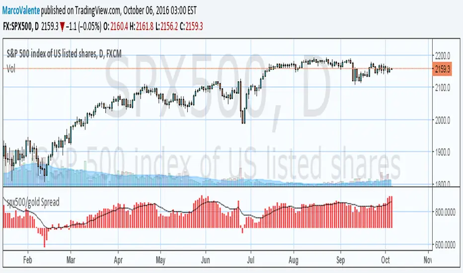
Cari dalam skrip untuk "GOLD"
Correlation of chart symbol to different Index-ETF-currencyScript plots correlation of chart symbol to a variety of indexes, symbols, equities. ** Original idea was to find Bitcoin correlation, which I did not. Built in correlations are: Nikie, DAX, SPY, AAPL, US Dollar, Gold, EURUSD, USDCNY, EEM, QQQ, XLK, XLF, USDJPY, EURGBP

[LAVA] Early Warning IndicatorCombined the RSI inverse of gold to USD with the Dollar index (or whatever stock symbol that may be inverted/complementary) with another asset/currency, like bitcoin, you can basically be well informed when a potential move is on the horizon. Settings allow for inverse settings and de-combining the two pairs as well as a nice cloud look if all the lines get annoying.
Cycle Phase & ETA Tracker [Robust v4]
Cycle Phase & ETA Tracker
Description
The Cycle Phase & ETA Tracker is a powerful tool for analyzing market cycles and predicting the completion of the current cycle (Estimated Time of Arrival, or ETA). It visualizes the cycle phase (0–100%) using a smoothed signal and displays the forecasted completion date with an optional confidence band based on cycle length variability. Ideal for traders looking to time their trades based on cyclical patterns, this indicator offers flexible settings for robust cycle analysis.
Key Features
Cycle Phase Visualization: Tracks the current cycle phase (0–100%) with color-coded zones: green (0–33%), blue (33–66%), orange (66–100%).
ETA Forecast: Shows a vertical line and label indicating the estimated date of cycle completion.
Confidence Band (±σ): Displays a band around the ETA to reflect uncertainty, calculated using the standard deviation of cycle lengths.
Multiple Averaging Methods: Choose from three methods to calculate average cycle length:
Median (Robust): Uses the median for resilience against outliers.
Weighted Mean: Prioritizes recent cycles with linear or quadratic weights.
Simple Mean: Applies equal weights to all cycles.
Adaptive Cycle Length: Automatically adjusts cycle length based on the timeframe or allows a fixed length.
Debug Histogram: Optionally displays the smoothed signal for diagnostic purposes.
Setup and Usage
Add the Indicator:
Search for "Cycle Phase & ETA Tracker " in TradingView’s indicator library and apply it to your chart.
Configure Parameters:
Core Settings:
Track Last N Cycles: Sets the number of recent cycles used to calculate the average cycle length (default: 20). Higher values provide stability but may lag market shifts.
Source: Selects the data source for analysis (e.g., close, open, high; default: close price).
Use Adaptive Cycle Length?: Enables automatic cycle length adjustment based on timeframe (e.g., shorter for intraday, longer for daily) or uses a fixed length if disabled.
Fixed Cycle Length: Defines the cycle length in bars when adaptive mode is off (default: 14). Smaller values increase sensitivity to short-term cycles.
Show Debug Histogram: Enables a histogram of the smoothed signal for debugging signal behavior.
Cycle Length Estimation:
Average Mode: Selects the method for calculating average cycle length: "Median (Robust)", "Weighted Mean", or "Simple Mean".
Weights (for Weighted Mean): For "Weighted Mean", chooses "linear" (moderate emphasis on recent cycles) or "quadratic" (strong emphasis on recent cycles).
ETA Visualization:
Show ETA Line & Label: Toggles the display of the ETA line and date label.
Show ETA Confidence Band (±σ): Toggles the confidence band around the ETA, showing the uncertainty range.
Band Transparency: Adjusts the transparency of the confidence band (0 = fully transparent, 100 = fully opaque; default: 85).
ETA Color: Sets the color for the ETA line, label, and confidence band (default: orange).
Interpretation:
The cycle phase (0–100%) indicates progress: green for the start, blue for the middle, and orange for the end of the cycle.
The ETA line and label show the predicted cycle completion date.
The confidence band reflects the uncertainty range (±1 standard deviation) of the ETA.
If a warning "Insufficient cycles for ETA" appears, wait for the indicator to collect at least 3 cycles.
Limitations
Requires at least 3 cycles for reliable ETA and confidence band calculations.
On low timeframes or low-volatility markets, zero-crossings may be infrequent, delaying ETA updates.
Accuracy depends on proper cycle length settings (adaptive or fixed).
Notes
Test the indicator across different assets and timeframes to optimize settings.
Use the debug histogram to troubleshoot if the ETA appears inaccurate.
For feedback or suggestions, contact the author via TradingView.
Cycle Phase & ETA Tracker
Описание
Индикатор Cycle Phase & ETA Tracker предназначен для анализа рыночных циклов и прогнозирования времени завершения текущего цикла (ETA — Estimated Time of Arrival). Он отслеживает фазы цикла (0–100%) на основе сглаженного сигнала и отображает предполагаемую дату завершения цикла с опциональной доверительной полосой, основанной на стандартном отклонении длин циклов. Индикатор идеально подходит для трейдеров, которые хотят выявлять циклические закономерности и планировать свои действия на основе прогнозируемого времени.
Ключевые особенности
Фазы цикла: Визуализирует текущую фазу цикла (0–100%) с цветовой кодировкой: зеленый (0–33%), синий (33–66%), оранжевый (66–100%).
Прогноз ETA: Показывает вертикальную линию и метку с предполагаемой датой завершения цикла.
Доверительная полоса (±σ): Отображает зону неопределенности вокруг ETA, основанную на стандартном отклонении длин циклов.
Гибкие методы усреднения: Поддерживает три метода расчета средней длины цикла:
Median (Robust): Медиана, устойчивая к выбросам.
Weighted Mean: Взвешенное среднее, где недавние циклы имеют больший вес (линейный или квадратичный).
Simple Mean: Простое среднее с равными весами.
Адаптивная длина цикла: Автоматически подстраивает длину цикла под таймфрейм или позволяет задать фиксированную длину.
Отладочная гистограмма: Опционально отображает сглаженный сигнал для анализа.
Настройка и использование
Добавьте индикатор:
Найдите "Cycle Phase & ETA Tracker " в библиотеке индикаторов TradingView и добавьте его на график.
Настройте параметры:
Core Settings:
Track Last N Cycles: Количество последних циклов для расчета средней длины (по умолчанию 20). Большие значения дают более стабильные результаты, но могут запаздывать.
Source: Источник данных (по умолчанию цена закрытия).
Use Adaptive Cycle Length?: Включите для автоматической настройки длины цикла по таймфрейму или отключите для использования фиксированной длины.
Fixed Cycle Length: Длина цикла в барах, если адаптивная длина отключена (по умолчанию 14).
Show Debug Histogram: Включите для отображения сглаженного сигнала (полезно для отладки).
Cycle Length Estimation:
Average Mode: Выберите метод усреднения: "Median (Robust)", "Weighted Mean" или "Simple Mean".
Weights (for Weighted Mean): Для режима "Weighted Mean" выберите "linear" (умеренный вес для новых циклов) или "quadratic" (сильный вес для новых циклов).
ETA Visualization:
Show ETA Line & Label: Включите для отображения линии и метки ETA.
Show ETA Confidence Band (±σ): Включите для отображения доверительной полосы.
Band Transparency: Прозрачность полосы (0 — полностью прозрачная, 100 — полностью непрозрачная, по умолчанию 85).
ETA Color: Цвет для линии, метки и полосы (по умолчанию оранжевый).
Интерпретация:
Фаза цикла (0–100%) показывает прогресс текущего цикла: зеленый — начало, синий — середина, оранжевый — конец.
Линия и метка ETA указывают предполагаемую дату завершения цикла.
Доверительная полоса показывает диапазон неопределенности (±1 стандартное отклонение).
Если отображается предупреждение "Insufficient cycles for ETA", дождитесь, пока индикатор соберет минимум 3 цикла.
Ограничения
Требуется минимум 3 цикла для надежного расчета ETA и доверительной полосы.
На низких таймфреймах или рынках с низкой волатильностью пересечения нуля могут быть редкими, что замедляет обновление ETA.
Эффективность зависит от правильной настройки длины цикла (fixedL или адаптивной).
Примечания
Протестируйте индикатор на разных таймфреймах и активах, чтобы подобрать оптимальные параметры.
Используйте отладочную гистограмму для анализа сигнала, если ETA кажется неточным.
Для вопросов или предложений по улучшению свяжитесь через TradingView.

Gann Fan Master – Selectable Base Angle & Fibonacci AnglesGann Fan Master – Selectable Base Angle & Fibonacci Angles
This indicator plots a Gann Fan from point A1 through point B1, with full customization over:
Base angle selection (8/1, 1/1, 1/8)
Main angle set
Fibonacci-based angles
Up to 10 custom user-defined angles
Logarithmic or linear slope calculation
Custom fan color and extended line length
Perfect for manual chart analysis — you select A1 and B1, the script calculates and draws the fan with labeled angles.
How It Works
-Select A1 (time & price) and B1 (time & price).
-The script calculates the base slope depending on the selected base angle:
Linear scale: slope = (B1 − A1) / Δt / base_angle_value
Logarithmic scale: slope = (ln(B1) − ln(A1)) / Δt / base_angle_value
-Each enabled angle is drawn from A1, extended by the chosen number of bars, and labeled with its value.
-Fan color is determined automatically by direction (green for upward, red for downward) or can be overridden.
Quick Start
-Add the indicator to your chart.
-In settings:
A1 Time/Price — starting point.
B1 Time/Price — second point (defines slope).
Base Angle — choose 8/1, 1/1, or 1/8.
Extend Fan (Bars) — number of bars to extend lines into the future.
Logarithmic Fan Calculation — toggle for log-scale mode.
Enable desired angle sets: Main, Fibonacci, or Custom.
-Optionally, enable Use Custom Fan Color and set your own color.
Settings
Enable Fan — master switch.
A1 Time/A1 Price, B1 Time/B1 Price — anchor points.
Base Angle — 8/1, 1/1, 1/8.
Extend Fan (Bars) — extension length.
Use Custom Fan Color / Fan Color — manual color override.
Main Angles — 1/8, 1/4, 1/3, 1/2, 1/1, 2/1, 3/1, 4/1, 6/1, 8/1.
Fibonacci Angles — 0.214, 0.35, 0.382, 0.618, 0.786, 0.886, 0.9335, 1.118, 1.236, 1.382, 1.618.
Custom Angles — up to 10 values (dotted lines), labels from the exact value.
Usage Tips
-Choosing A1 and B1:
A1 — significant starting swing high or low.
B1 — next key swing to define slope.
-Logarithmic scale:
Ideal for long-term exponential trends (crypto, growth stocks).
Prices must be > 0.
-Watch how price reacts to different angles:
1/1 as median trend, fractional for support/resistance, multiples for acceleration/slowdown.
Disclaimer
This is a technical analysis tool. It is not financial advice. Trading decisions are made at your own risk.
Gann Fan Master – Selectable Base Angle & Fibonacci Angles
Индикатор строит веер Ганна от точки A1 через точку B1 с полной кастомизацией:
Выбор базового угла (8/1, 1/1, 1/8)
Набор основных углов
Углы Фибоначчи
До 10 пользовательских углов
Расчёт в логарифмической или линейной шкале
Цвет веера по направлению или заданный вручную
Настройка длины продления линий
Идеально подходит для ручного анализа графика — вы задаёте A1 и B1, а скрипт рассчитывает и строит веер с подписями углов.
Как это работает
-Задайте A1 (время и цена) и B1 (время и цена).
-Скрипт рассчитывает базовый наклон в зависимости от выбранного базового угла:
Линейная шкала: наклон = (B1 − A1) / Δt / base_angle_value
Логарифмическая шкала: наклон = (ln(B1) − ln(A1)) / Δt / base_angle_value
-Каждый включённый угол рисуется из точки A1, продлевается на заданное число баров и подписывается.
-Цвет линий определяется автоматически по направлению (зелёный — вверх, красный — вниз) или задаётся вручную.
Быстрый старт
1)Добавьте индикатор на график.
2)В настройках:
A1 Time/Price — начальная точка.
B1 Time/Price — вторая точка (задаёт наклон).
Base Angle — выберите 8/1, 1/1 или 1/8.
Extend Fan (Bars) — длина продления линий в барах.
Logarithmic Fan Calculation — переключатель логарифмического режима.
Включите нужные блоки углов: Main, Fibonacci, Custom.
3)При желании активируйте Use Custom Fan Color и задайте цвет веера.
Настройки
Enable Fan — общий выключатель.
A1 Time/A1 Price, B1 Time/B1 Price — опорные точки.
Base Angle — 8/1, 1/1, 1/8.
Extend Fan (Bars) — продление линий.
Use Custom Fan Color / Fan Color — цвет вручную.
Main Angles — 1/8, 1/4, 1/3, 1/2, 1/1, 2/1, 3/1, 4/1, 6/1, 8/1.
Fibonacci Angles — 0.214, 0.35, 0.382, 0.618, 0.786, 0.886, 0.9335, 1.118, 1.236, 1.382, 1.618.
Custom Angles — до 10 значений (точечные линии) с подписями.
Советы по применению
Выбор A1 и B1:
A1 — значимый экстремум начала движения.
B1 — следующий важный экстремум для задания наклона.
Логарифмическая шкала:
Подходит для долгосрочных экспоненциальных трендов (крипто, акции роста).
Цена должна быть > 0.
Следите, как цена реагирует на разные углы:
1/1 — медианный тренд.
Дробные углы — потенциальная поддержка/сопротивление.
Кратные — ускорение/замедление движения.
Дисклеймер
Это инструмент технического анализа и не является инвестиционной рекомендацией. Торговые решения вы принимаете на свой страх и риск.
Williams FractalsBoaBias Fractals High & Lows is an indicator based on Bill Williams' fractals that helps identify key support and resistance levels on the chart. It displays horizontal lines at fractal highs (red) and lows (green), which extend to the current bar. Lines automatically disappear if the price breaks through them, leaving only the relevant levels. Additionally, the indicator shows the price values of active fractals on the price scale for convenient monitoring.
Key Features:
Customizable Fractals: Choose between 3-bar or 5-bar fractals (default: 3-bar).
Period: Adjust the number of periods for calculation
Visualization: Red lines for highs (resistance), green for lows (support). Lines are fixed on the chart and persist during scrolling or scaling changes.
Alert System: Notifications for the formation of a new fractal high/low and for level breaks (Fractal High Formed, Fractal Low Formed, Fractal High Broken, Fractal Low Broken).
How to Use:
Add the indicator to the chart.
Configure parameters: select the fractal type (3 or 5 bars) and period.
Set up alerts in TradingView to receive notifications about new fractals or breaks.
Use the lines as levels for entry/exit positions, stop-losses, or take-profits in fractal-based strategies.
Troubleshooting: If Levels Are Not Fixed on the Chart
If the levels (fractal lines) do not stay fixed on the chart and fail to move with it during scrolling or scaling (e.g., they remain stationary while the chart shifts), this is typically due to the indicator's scale settings in TradingView. The indicator may be set to "No scale," causing the lines to desynchronize from the chart's price scale.
What to Do:
Locate the Indicator Label: On the chart, find the indicator label in the top-left corner of the pane (or where "BoaBias Fractals High & Lows" is displayed).
Right-Click the Label: Click the right mouse button on this label.
Adjust the Scale:
In the context menu, look for the "Scale" or "Pin to scale" option.
If it shows "Pin to scale (now no scale)" or similar, select "Pin to right scale" (or "Pin to left scale," depending on your chart's main price scale—usually the right).
Refresh the Chart: After changing the setting, refresh the chart (press F5 or reload the page), or toggle the indicator off and on again to apply the changes.
After this, the lines should move and scale with the chart during scrolling (horizontal or vertical) or zooming. If the issue persists, check:
TradingView Limits: The indicator may draw too many lines (maximum ~500 per script). If there are many historical fractals, older lines might not display.
Chart Settings: Ensure the chart is not in logarithmic scale (if applicable) or that auto-scaling is enabled.
Indicator Version: Verify you are using the latest script version (Pine Script v6) and check for errors in the TradingView console.
This indicator is ideal for traders working with Bill Williams' chaos theory or those seeking dynamic support/resistance levels. It is based on standard fractals but with enhancements for convenience: automatic removal of broken levels and integration with the price scale.
Note: The indicator does not provide trading signals on its own — use it in combination with other tools. Test on historical data before real trading.
Code written in Pine Script v6. Original template: Mit Nayi.

SMA Trend Filter Oscillator (Adaptive)The "SMA Trend Filter Oscillator (Adaptive)" indicator is a technical analysis tool that helps traders determine the direction and strength of a trend based on an adaptive Simple Moving Average (SMA). The oscillator calculates the difference between the closing price and the SMA value, allowing for the visualization of price deviation from the average and the assessment of current market dynamics.
Key Features of the Indicator:
Adaptation to Time Frame: The indicator automatically adjusts the SMA length based on the current time frame, making it versatile for use across different time intervals. For example:
Monthly Time Frame: SMA with a length of 50.
Weekly Time Frame: SMA with a length of 40.
Daily Time Frame: SMA with a length of 20.
Hourly Time Frame: SMA with a length of 10.
Intraday Time Frames: SMA with a length of 5 (for time frames up to 15 minutes) or 7 (for others).
SMA-Based Oscillator: The oscillator is calculated as the difference between the closing price and the SMA value. This allows:
Bullish Trend Identification: When the oscillator is above zero (price is above SMA).
Bearish Trend Identification: When the oscillator is below zero (price is below SMA).
Visualization: The oscillator is displayed as a histogram, where:
Green Color indicates a bullish trend.
Red Color indicates a bearish trend.
The Zero Line (Gray) serves as a reference for trend reversal.
How to Use the Indicator:
Trend Identification: If the oscillator is above zero and colored green, it signals a bullish trend. If it is below zero and colored red, it indicates a bearish trend.
Trend Strength: The larger the oscillator value (in either direction), the stronger the trend. Small oscillator values (close to zero) may indicate sideways movement or weak trend.
Entry and Exit Points:
Buy: When the oscillator crosses the zero line from below to above (transition from red to green).
Sell: When the oscillator crosses the zero line from above to below (transition from green to red).
Signal Filtering: Use the indicator in combination with other technical analysis tools (e.g., RSI, MACD, or support/resistance levels) to confirm signals.
Advantages of the Indicator:
Adaptability: Automatic adjustment of SMA length to the current time frame makes it versatile.
Simplicity: Intuitive histogram visualization allows for quick assessment of market conditions.
Flexibility: Can be used on any market (stocks, forex, cryptocurrencies) and time frame.
Limitations:
Lag: Like any SMA-based indicator, it can lag due to the use of average values.
False Signals: In sideways markets (flat), the indicator may generate false signals.
Risk Management:
Always set stop-losses and take-profits to minimize losses.
Test the indicator on historical data before using it on a live account.
The "SMA Trend Filter Oscillator (Adaptive)" is a powerful tool for traders seeking to quickly evaluate trends and their strength. Its adaptability and simplicity make it suitable for both novice and experienced traders.
Индикатор "SMA Trend Filter Oscillator (Adaptive)" — это инструмент технического анализа, который помогает трейдерам определять направление тренда и его силу на основе адаптивной скользящей средней (SMA). Осциллятор рассчитывает разницу между ценой закрытия и значением SMA, что позволяет визуализировать отклонение цены от среднего значения и оценивать текущую рыночную динамику.
Основные особенности индикатора:
Адаптация к таймфрейму
Индикатор автоматически подстраивает длину SMA в зависимости от текущего таймфрейма, что делает его универсальным для использования на различных временных интервалах. Например:
Месячный таймфрейм (Monthly): SMA с длиной 50.
Недельный таймфрейм (Weekly): SMA с длиной 40.
Дневной таймфрейм (Daily): SMA с длиной 20.
Часовой таймфрейм (Hourly): SMA с длиной 10.
Внутридневные таймфреймы (Intraday): SMA с длиной 5 (для таймфреймов до 15 минут) или 7 (для остальных).
Осциллятор на основе SMA
Осциллятор рассчитывается как разница между ценой закрытия и значением SMA. Это позволяет:
Определять бычий тренд, когда осциллятор выше нуля (цена выше SMA).
Определять медвежий тренд, когда осциллятор ниже нуля (цена ниже SMA).
Визуализация
Осциллятор отображается в виде гистограммы, где:
Зелёный цвет указывает на бычий тренд.
Красный цвет указывает на медвежий тренд.
Линия нуля (серая) служит ориентиром для определения смены тренда.
Как использовать индикатор:
Определение тренда
Если осциллятор находится выше нуля и окрашен в зелёный цвет, это сигнализирует о бычьем тренде.
Если осциллятор находится ниже нуля и окрашен в красный цвет, это указывает на медвежий тренд.
Сила тренда
Чем больше значение осциллятора (в положительную или отрицательную сторону), тем сильнее тренд.
Небольшие значения осциллятора (близкие к нулю) могут указывать на боковое движение или слабость тренда.
Точки входа и выхода
Покупка (Buy): Когда осциллятор пересекает нулевую линию снизу вверх (переход из красной зоны в зелёную).
Продажа (Sell): Когда осциллятор пересекает нулевую линию сверху вниз (переход из зелёной зоны в красную).
Фильтрация сигналов
Используйте индикатор в сочетании с другими инструментами технического анализа (например, RSI, MACD или уровнями поддержки/сопротивления) для подтверждения сигналов.
Преимущества индикатора:
Адаптивность: Автоматическая настройка длины SMA под текущий таймфрейм делает индикатор универсальным.
Простота: Интуитивно понятная визуализация в виде гистограммы позволяет быстро оценить рыночную ситуацию.
Гибкость: Может использоваться на любых рынках (акции, форекс, криптовалюты) и таймфреймах.
Ограничения:
Запаздывание: Как и любой индикатор на основе SMA, он может запаздывать из-за использования средних значений.
Ложные сигналы: В условиях бокового движения (флэта) индикатор может генерировать ложные сигналы.
Управление рисками: Всегда устанавливайте стоп-лоссы и тейк-профиты, чтобы минимизировать потери.
Тестирование: Перед использованием на реальном счёте протестируйте индикатор на исторических данных.
Индикатор "SMA Trend Filter Oscillator (Adaptive)" — это мощный инструмент для трейдеров, которые хотят быстро оценить тренд и его силу. Его адаптивность и простота делают его подходящим как для начинающих, так и для опытных трейдеров

Ichimoku(TF)This Pine Script indicator is a comprehensive Ichimoku Cloud implementation designed for TradingView. Its uniqueness lies in the precisely calculated settings for each timeframe, offering a tailored Ichimoku experience across different chart resolutions.
Key Features:
Timeframe-Specific Presets: The indicator includes a wide range of pre-defined settings optimized for various timeframes (1m, 2m, 3m, 5m, 10m, 15m, 30m, 45m, 1H, 2H, 3H, 4H, 6H, 12H, 18H, 1D, 3D, 1W, 1M). This ensures accurate Ichimoku calculations and relevant signals for your chosen timeframe.
Ichimoku Cloud: Plots the standard Ichimoku Cloud components: Tenkan-sen (Conversion Line), Kijun-sen (Base Line), Senkou Span A & B (Leading Spans), and Chikou Span (Lagging Span).
Configurable Display: Allows toggling the Ichimoku Cloud display, coloring bars based on the trend (above or below the cloud), and customizing table visibility, style, font size and position.
Trend Analysis Table: A summary table provides a quick overview of the current trend based on Ichimoku components. It assesses the strength of the trend based on the price's relation to the Tenkan-sen, Kijun-sen, Kumo Cloud, Chikou Span and Kumo Twist. The table offers both detailed and short styles.
Buy/Sell Signals: Generates buy and sell signals based on Tenkan-sen/Kijun-sen crossovers.
Uniqueness:
The primary advantage of this indicator is its meticulous configuration for different timeframes. Instead of using a single set of parameters for all timeframes, it provides optimized values that are more suitable for specific chart resolutions. The summary table provides an easy and quick way to assess the trend.
Этот индикатор Pine Script представляет собой комплексную реализацию облака Ишимоку, разработанную для TradingView. Его уникальность заключается в точно рассчитанных настройках для каждого таймфрейма, предлагая индивидуальный опыт Ишимоку для различных разрешений графиков.
Ключевые особенности:
Предустановки для конкретных таймфреймов: Индикатор включает в себя широкий спектр предопределенных настроек, оптимизированных для различных таймфреймов (1m, 2m, 3m, 5m, 10m, 15m, 30m, 45m, 1H, 2H, 3H, 4H, 6H, 12H, 18H, 1D, 3D, 1W, 1M). Это обеспечивает точные вычисления Ишимоку и релевантные сигналы для выбранного вами таймфрейма.
Облако Ишимоку: Отображает стандартные компоненты облака Ишимоку: Tenkan-sen (линия конверсии), Kijun-sen (базовая линия), Senkou Span A & B (ведущие диапазоны) и Chikou Span (запаздывающий диапазон).
Настраиваемое отображение: Позволяет переключать отображение облака Ишимоку, окрашивать бары в зависимости от тренда (выше или ниже облака), а также настраивать видимость таблицы, стиль, размер шрифта и положение.
Таблица анализа тренда: Сводная таблица обеспечивает быстрый обзор текущего тренда на основе компонентов Ишимоку. Он оценивает силу тренда на основе отношения цены к Tenkan-sen, Kijun-sen, облаку Kumo, Chikou Span и Kumo Twist. Таблица предлагает как подробный, так и краткий стили.
Сигналы покупки/продажи: Генерирует сигналы покупки и продажи на основе пересечений Tenkan-sen/Kijun-sen.
Уникальность:
Основным преимуществом этого индикатора является его тщательная настройка для разных таймфреймов. Вместо использования единого набора параметров для всех таймфреймов он предоставляет оптимизированные значения, которые больше подходят для конкретных разрешений графиков. Сводная таблица обеспечивает простой и быстрый способ оценки тренда.
Smart Trend Tracker Name: Smart Trend Tracker
Description:
The Smart Trend Tracker indicator is designed to analyze market cycles and identify key trend reversal points. It automatically marks support and resistance levels based on price dynamics, helping traders better navigate market structure.
Application:
Trend Analysis: The indicator helps determine when a trend may be nearing a reversal, which is useful for making entry or exit decisions.
Support and Resistance Levels: Automatically marks key levels, simplifying chart analysis.
Reversal Signals: Provides visual signals for potential reversal points, which can be used for counter-trend trading strategies.
How It Works:
Candlestick Sequence Analysis: The indicator tracks the number of consecutive candles in one direction (up or down). If the price continues to move N bars in a row in one direction, the system records this as an impulse phase.
Trend Exhaustion Detection: After a series of directional bars, the market may reach an overbought or oversold point. If the price continues to move in the same direction but with weakening momentum, the indicator records a possible trend slowdown.
Chart Display: The indicator marks potential reversal points with numbers or special markers. It can also display support and resistance levels based on key cycle points.
Settings:
Cycle Length: The number of bars after which the possibility of a reversal is assessed.
Trend Sensitivity: A parameter that adjusts sensitivity to trend movements.
Dynamic Levels: Setting for displaying key levels.
Название: Smart Trend Tracker
Описание:
Индикатор Smart Trend Tracker предназначен для анализа рыночных циклов и выявления ключевых точек разворота тренда. Он автоматически размечает уровни поддержки и сопротивления, основываясь на динамике цены, что помогает трейдерам лучше ориентироваться в структуре рынка.
Применение:
Анализ трендов: Индикатор помогает определить моменты, когда тренд может быть близок к развороту, что полезно для принятия решений о входе или выходе из позиции.
Определение уровней поддержки и сопротивления: Автоматически размечает ключевые уровни, что упрощает анализ графика.
Сигналы разворота: Индикатор предоставляет визуальные сигналы о возможных точках разворота, что может быть использовано для стратегий, основанных на контртрендовой торговле.
Как работает:
Анализ последовательности свечей: Индикатор отслеживает количество последовательных свечей в одном направлении (вверх или вниз). Если цена продолжает движение N баров подряд в одном направлении, система фиксирует это как импульсную фазу.
Выявление истощения тренда: После серии направленных баров рынок может достичь точки перегрева. Если цена продолжает двигаться в том же направлении, но с ослаблением импульса, индикатор фиксирует возможное замедление тренда.
Отображение на графике: Индикатор отмечает точки потенциального разворота номерами или специальными маркерами. Также возможен вывод уровней поддержки и сопротивления, основанных на ключевых точках цикла.
Настройки:
Длина цикла (Cycle Length): Количество баров, после которых оценивается возможность разворота.
Фильтрация тренда (Trend Sensitivity): Параметр, регулирующий чувствительность к трендовым движениям.
Уровни поддержки/сопротивления (Dynamic Levels): Настройка для отображения ключевых уровней.

Golder/Silter SetupsGolden/Silver Strategy
Overview
The Tony Rago Golden/Silver Strategy is a high-precision mean-reversion system specifically engineered for the Nasdaq (NQ/MNQ). It leverages the psychological 100-point price blocks to identify institutional exhaustion and reversal points.
Unlike standard "grid" bots, this strategy uses a sophisticated "Arm & Fire" logic: it requires a specific price "touch" to arm the setup, followed by a retracement to a "Golden" entry level to execute.
Key Logic: The 100-Point Grid
The strategy divides price action into 100-point blocks (e.g., 19500 to 19600).
Golden Setup (Long): Triggered when price touches the 50 level (mid-point). The order is placed at the 26 level on the retracement.
Silver Setup (Short): Triggered when price touches the 00 or 100 levels (block boundaries). The order is placed at the 77 or 26 levels on the retracement.
Professional Risk Management
This edition features a Dual-Contract Management system designed for Prop Firm consistency:
Contract 1 (The Scalp): Aims for a quick 24-point target (TP1) to secure realized gains and cover costs.
Contract 2 (The Runner): Stays in the trade for an extended 51-point target (TP2).
Automated Break-Even (BE): The moment TP1 is hit, the Stop Loss for the Runner is automatically moved to the entry price (plus a small offset). This ensures a "risk-free" environment for the remainder of the trade.
Independent Stop Losses: The Scalp and the Runner use different SL distances to account for Nasdaq volatility, preventing a single "noise" wick from wiping out the entire position.
Intelligent Filters
ADX Range Filter: The strategy monitors market trend strength. It only allows trades when the ADX is below a user-defined threshold (default 25), ensuring you only play mean-reversion during ranging or "choppy" markets.
MA Visual Semaphor: The 50 EMA changes color dynamically based on ADX (Lime/Green for Range, Orange/Red for Trend), giving you an instant visual "Go/No-Go" signal.
Time-Session Filtering: Optimized for three custom sessions (NY Open, Mid-Day Reversal, and Late Night). Outside these sessions, the strategy can "Arm" setups in memory but will not "Fire" orders.
How to Use
Timeframe: Optimized for 1-Minute or 2-Minute charts for precision entry.
Asset: Nasdaq 100 (NQ, MNQ) or similar high-volatility indices.
Setup: * Enable Session Filters to avoid news volatility.
Adjust TP/SL in Points (1 Point = 4 Ticks) to suit your specific risk appetite.
Watch for the "Armados" labels—these indicate the system is ready and waiting for the Golden/Silver entry.
Visual Interface
Dynamic Boxes: Real-time visual representation of your TP1, TP2, and SL levels.
Activation Labels: Clear indications of when a Long or Short setup has been "Armed" in memory.
Status Dashboard: A clean top-right table showing current ADX values, Session status, and Risk settings.
Disclaimer
Trading involves significant risk. This strategy is a tool for decision support and backtesting. Past performance does not guarantee future results. Always test on a demo account before risking live capital.

Goldbach Timing Model This indicator is designed as a simple visual framework rather than a rigid signal system. It highlights time-based structure and key alignment zones to help identify when price behavior is more likely to be active or responsive. The logic is intentionally flexible, allowing the user to apply their own discretion instead of relying on strict conditions. Its primary value is visual clarity and context, not automatic entries or exits.

PriceLevels GBGoldbach Price Levels – Identify Algorithmic Key Zones
This open-source indicator is designed to help traders identify potential algorithmic key zones by highlighting price levels ending with specific numbers such as 03, 11, 29, 35, 65, and 71. These levels may act as inflection points or hesitation areas based on observed behavioral patterns in price movement.
What It Does:
📌 Scans and plots horizontal price levels where the price ends with one of the selected number combinations
🎯 Toggle on/off visibility for each number ending
🎨 Customize color and thickness for each level
🏷️ Shows price labels at the end of each line
🌗 Label styles (color/transparency) are adjustable for both dark and light chart themes
🧠 Why Use It:
This tool is ideal for discretionary traders who study market structure through static price anchors. It provides a visual reference for recurring numerical levels that may be used in algorithmic trading models or serve as psychological price zones.
⚠️ Disclaimer:
This script is open-source and intended for educational and analytical purposes only. No trading signals or performance guarantees are provided. Please use your own judgment when applying this tool in a trading context.
Gold 2-Week Futures LevelsYou may change the color at bottom of script and i used 1h to mark out my levels, you may change it to fit your time frame.

Gold Scalp//@version=5
indicator("scalp strategy (Boxed)", overlay=true)
// Ensure 5-minute chart
isFiveMin = timeframe.isminutes and timeframe.multiplier == 5
// New York time (EST/EDT auto)
nyHour = hour(time, "America/New_York")
nyMinute = minute(time, "America/New_York")
// Target times (exact candle close)
triggerTime =
(nyHour == 11 and nyMinute == 0) or
(nyHour == 19 and nyMinute == 0) or
(nyHour == 14 and nyMinute == 0) or
(nyHour == 6 and nyMinute == 0) or
(nyHour == 8 and nyMinute == 0) or
(nyHour == 21 and nyMinute == 0) or
(nyHour == 00 and nyMinute == 0)
// Final trigger
trigger = isFiveMin and triggerTime and barstate.isconfirmed
// Draw box + label
if trigger
box.new(bar_index - -5, high, bar_index, low, bgcolor=color.new(#0e06eb, 76), border_color=color.rgb(4, 252, 136))
label.new(bar_index, high, "", style=label.style_label_down, color=color.rgb(11, 48, 3), textcolor=color.white, size=size.small)
// Alert
alertcondition(trigger, title="LETS GO", message="5-minute candle CLOSED at key EST time")

GOLD TERTIUM estrategiaThis indicator is a visual tool for TradingView designed to help you read trend structure using EMAs and highlight potential long and short entries on the MGC 1‑minute chart, while filtering pullbacks and avoiding trades when the 200 EMA is flat.
It calculates five EMAs (32, 50, 110, 200, 250) and plots them in different colors so you can clearly see the moving‑average stack and overall direction. The main trend is defined by the 200 EMA: bullish when price and the fast EMAs (32 and 50) are above it with a positive slope, and bearish when they are below it with a negative slope; if the 200 EMA is almost flat, signals are blocked to reduce trading in choppy markets.

GOLD TERTIUM MGC 1mThis indicator is a visual tool for TradingView designed to help you read trend structure using EMAs and highlight potential long and short entries on the MGC 1‑minute chart, while filtering pullbacks and avoiding trades when the 200 EMA is flat.
It calculates five EMAs (32, 50, 110, 200, 250) and plots them in different colors so you can clearly see the moving‑average stack and overall direction. The main trend is defined by the 200 EMA: bullish when price and the fast EMAs (32 and 50) are above it with a positive slope, and bearish when they are below it with a negative slope; if the 200 EMA is almost flat, signals are blocked to reduce trading in choppy markets.
Entry logic looks for a pullback into the 32–50 EMA zone on the previous candle, then requires a trend‑aligned candle to trigger a signal: long when the trend is up, the previous bar retested the EMA zone, and the current bar closes above EMA 32 with a bullish body; short when the trend is down, there was a valid retest, the current bar closes below EMA 32 with a bearish body and EMA 32 is below EMA 50. On the chart, you will see colored EMAs plus green “L” triangles under bars for potential long entries and red “S” triangles above bars for potential short entries, which are meant as visual cues rather than automatic trade instructions

Gold Bullish Order Blocks - 3 Candle Confirmation after the OBBest Order blocks finder created by Marky using claude AI.

GOLDEN RSI (70-50-30)The fluctuation range has been expanded. Theoriginal author only set it between 40 and 60, but arange of 30 to 70 would be more reasonableAdditionally, a 50 median line has been added withinthe fluctuation range


GOLD EMA Crossover Strategy This EMA Crossover Strategy is designed for intraday trading on the 5-minute chart.
It uses three EMAs (fast, mid, slow) to identify momentum shifts and trigger long or short entries. Risk management is dollar-based, with default settings of $100 risk per trade and $300 profit target. Entries are taken when the fast EMA crosses above/below the mid or slow EMA, with stops and targets calculated dynamically. The strategy runs across all hours and uses fixed position sizing (default 3 contracts). It is intended as a framework for traders to adapt and optimize to their own instruments and risk preferences.

Gold Master: Swing + Daily Scalp (Fixed & Working)How to use it correctly
Daily chart → Focus only on big green/red triangles (Swing trades)
5m / 15m / 1H chart → Focus on small circles (Scalp trades)
You can turn each system on/off independently in the settings
Works perfectly on XAUUSD, GLD, GC futures, and even DXY (inverse signals).
