Golden Time ErfanThe "Golden Time" Indicator is a custom-built TradingView tool designed to assist traders by highlighting two critical trading time windows: the New York session open and a specific strategy-based time known as Golden Time.
Cari dalam skrip untuk "GOLD"

Auto Fib GOLDEN TARGET Golden Target Auto Fib Indicator
Unlock the power of automatic Fibonacci analysis with the Golden Target Auto Fib Indicator. Designed for traders who want to effortlessly incorporate Fibonacci retracement levels into their strategy, this indicator dynamically calculates and plots key Fibonacci levels based on recent price action.
Key Features:
Automatic Fibonacci Levels: Automatically determines the critical Fibonacci retracement levels using the most recent high and low over a user-defined period.
Customizable Length: Adjust the period over which the Fibonacci levels are calculated to match your trading style and market conditions.
Dynamic Plotting: Fibonacci levels are plotted in real-time, reflecting current market conditions and potential support and resistance areas.
Color-Coded Levels: Distinguishes between different Fibonacci levels with distinct colors, making it easy to identify significant price points at a glance.
Target Labels (Optional): Optionally display labels next to the Fibonacci levels to help identify potential target zones and better visualize the key levels.
How It Works:
The Golden Target Auto Fib Indicator calculates Fibonacci retracement levels based on the highest high and lowest low over a specified length. The levels plotted include key Fibonacci ratios: 23.6%, 38.2%, 61.8%, and the 100% extension, providing valuable insights into potential support and resistance areas as well as price targets.
Usage:
Adjust Settings: Set the Length parameter to define the period over which Fibonacci levels are calculated.
Analyze Levels: Observe the plotted Fibonacci levels and their color-coded lines to identify potential price retracement zones and target areas.
Incorporate Into Strategy: Use these levels in conjunction with your trading strategy to make more informed decisions on entry and exit points.
Whether you're a day trader or a swing trader, the Golden Target Auto Fib Indicator simplifies Fibonacci analysis and integrates seamlessly into your TradingView charts, helping you make more precise trading decisions.
Get started today and enhance your technical analysis with the Golden Target Auto Fib Indicator!
Feel free to adjust the description according to the specific features or customization options of your indicator.

Golden Swap (Zeiierman)█ Overview
The Golden Swap indicator, as designed by Zeiierman, focuses on identifying reversal points around the key levels indicated by the indicator. This pattern works by analyzing the relationship between current and past price movements, considering factors like price symmetry, baseline boundaries, and precision pin bar formations. It can offer insights into potential market reversals, allowing for more precise entries and exits.
█ How It Works
Golden Swap Long
In a market with bullish momentum, we expect the price to dip a bit before it continues to rise again. This dip is like a small retreat in an overall march upwards. So, the pattern aims to assess whether the current period's dip is relatively shallow, indicating that the overall bullish momentum remains robust despite temporary price fluctuations.
Golden Swap Short
In a market with bearish momentum (indicating selling pressure or bearish sentiment), we may still see the price rise a bit before continuing its drop. This temporary rise is like a slight bounce in an overall downward movement. In simpler terms, even when the price bounces up a bit, it's not strong enough to overcome the recent pressure of selling. The sellers are still dominating, and the price will likely continue to drop.
█ The signal is reinforced by symmetry, BaselineBound criteria, and a bearish Precision PinBar.
⚪ Symmetry in Price Movements: The pattern uses the Symmetry Precision filter to analyze the symmetry of recent price movements. This helps in determining the likelihood of a reversal. A high degree of symmetry suggests a more reliable reversal signal.
⚪ BaselineBound Criteria: This component involves the BaselineBound Threshold, which acts as a filter to validate the strength of the potential reversal. Bullish and bearish conditions are assessed based on how the current close price compares to a calculated range around the high and low of the previous period.
⚪ Precision PinBar Analysis: The pattern also incorporates the Precision PinBar filter, which evaluates the characteristics of the recent price bars. A Precision PinBar is a candlestick with a small body and a long tail, indicating a potential reversal.
⚪ Display of Key Levels: The indicator can show Open, High, and Low levels for selected timeframes, helping traders identify key price points.
█ How to Use
The Golden Swap pattern is a valuable confirmation tool, particularly around key levels or session highs and lows. It highlights instances where a previous high or low has been respected, followed by a price reversal—flipping back up in an upward trend (Golden Swap Long) or flipping back down in a downward trend (Golden Swap Short). When this pattern emerges near a key level, it strongly suggests that the price will continue moving in the direction indicated by the current trend.
Consider it akin to a minor liquidity hunt above the previous high or below the previous low. The presence of the Golden Swap pattern, especially when aligned with other indicators and filters, enhances its reliability as a signal for the continuation of the prevailing market trend.
█ Settings
Timeframe Selection: Choose from various timeframes for signal calculation.
Filter Adjustments: Fine-tune the Symmetry Precision, BaselineBound Threshold, and Precision PinBar settings to filter signals according to specific criteria.
Display Options for Key Levels: Enable or disable the display of key price levels and select timeframes for these levels.
█ Related script using the same pattern filtering techniques
-----------------
Disclaimer
The information contained in my Scripts/Indicators/Ideas/Algos/Systems does not constitute financial advice or a solicitation to buy or sell any securities of any type. I will not accept liability for any loss or damage, including without limitation any loss of profit, which may arise directly or indirectly from the use of or reliance on such information.
All investments involve risk, and the past performance of a security, industry, sector, market, financial product, trading strategy, backtest, or individual's trading does not guarantee future results or returns. Investors are fully responsible for any investment decisions they make. Such decisions should be based solely on an evaluation of their financial circumstances, investment objectives, risk tolerance, and liquidity needs.
My Scripts/Indicators/Ideas/Algos/Systems are only for educational purposes!

'Golden ratio' Cubes - 'GoRaC'The difference between 2 points is plotted here using 'Golden ratio' cubes
(working differently than my 'Golden ratio spiral - 'GoRaS')
The 2 points can be 'high/low' or 'max(open/close)/min(open/close)',
with the possibility of higher resolution, the following examples are with 1 week resolution
By extending the lines you can spot support/resistance area's
You can reverse:
or 'mirror':
The 'bars back' can be set to get a previous period
Important:
In the example of a week resolution on a daily chart:
if you set '0', and it is Friday, the week isn't finished yet!
Everything still can change (= repaint)
1 bar back (in this case 7 daily bars back since the res = week!):
2 bars back:
3 bars back:
Here using 'high/low' and lines extended to the left:
or 'max(open/close)/min(open/close)' and lines extended to the left:
Cheers!

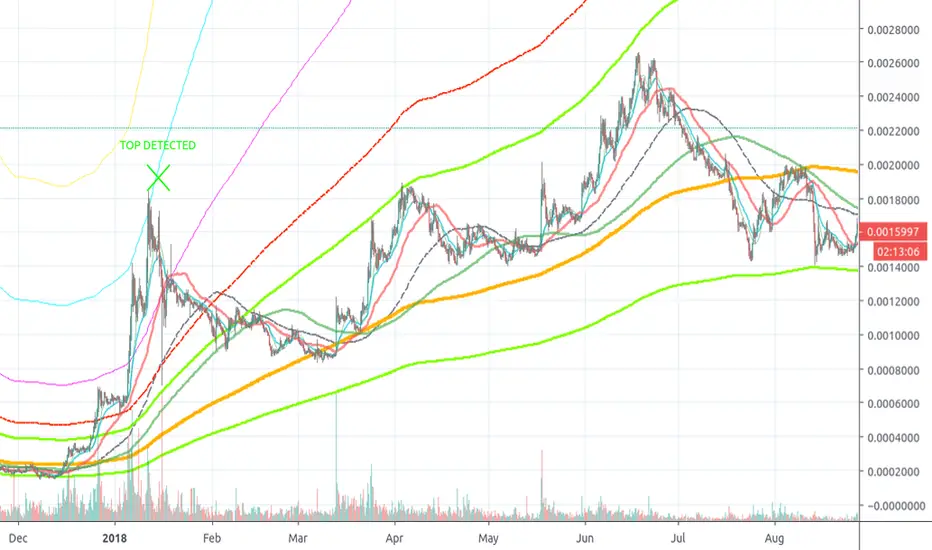
Golden Ratio Fibonacci Multipliers Top Detector [UO]Fibonacci levels that show the critical top and bottom levels. There is no way to miss the top and bottom. And a top detector.
Also the most important SMA lines (SMA 50, 200), EMA21. Those are the most frequently used lines by traders.
This indicator is based on the work of www.tradingview.com
His work set me thinking. Could I also see the bottom using Fibonacci numbers? Yes, of course.
My favorite timeframes with this indicator are 6H, 1D, 3D.
Intensively used for BTC and BNB. And useful for any other coin.
Gold trading strategy with trend follow and TDOW conceptMy strategy uses a combination of three indicators MACD Stochastic RSI.
The Idea is to buy when ( MACD > Signal and RSI > 50 and Stochastic > 50) occures at the same time
This strategy works well on stocks and cryptos especially during market breaking up after consolidation
The best results are on Daily charts , so its NOT a scalping strategy. But it can work also on 1H charts.
The strategy does not have any stops and profit targets, so we can take all the market can give us at the moment.
The exit point only when MACD goes under Signal
In addition I've decided to add a stop loss and "Trading day of week" concept
So the results are much more stable and we get more profit !
So, use it, trade it.
If it will help you to imprive your trading results, please donate me
BTC: 12kd1F8buWisUBdq27BBwRkUvzW7Ey3og5

Golden Fib WavesDynamic Fibonacci levels in pleasing gold shades. Smoothing (SMA) of swing lows and highs enabled by default. Boldly, this just looks good. I am not sure whether it is of any help for trading purposes. If you do in fact find it useful, feel free to drop me a line and to share your insights.

Gold Timing Composite (EURUSD + DXY + US02Y)Here's the publication-ready description for TradingView:
Gold Timing Composite Indicator - 3-Component Model
Overview
A precision-engineered multi-component oscillator designed specifically for intraday gold trading. This indicator synthesizes three critical market drivers—EUR/USD dynamics, broad US Dollar strength, and Treasury yield movements—to isolate genuine gold price catalysts from market noise, delivering high-probability timing signals through triple-layer confirmation.
Components & Methodology
The indicator employs z-score normalization (default 20-period lookback) to harmonize three distinct but correlated market signals into a unified composite reading:
Fast Price Discovery Signal (40%):
EURUSD (40%) - EUR/USD captures rapid USD repricing with the deepest FX liquidity globally
Broad USD Strength Confirmation (35%):
-DXY (35%) - Inverted US Dollar Index measures comprehensive USD strength across six major currencies (EUR 57%, JPY 14%, GBP 12%, CAD 9%, SEK 4%, CHF 4%)
Real Yield Proxy (25%):
-US02Y (25%) - Inverted 2-Year Treasury yield captures Fed policy expectations and real rate dynamics
Key Features
✅ Dual USD Validation - EURUSD (speed) + DXY (breadth) filter EUR-specific moves from true USD weakness
✅ Real Yield Sensitivity - US02Y isolates rate-driven gold moves from pure currency effects
✅ Triple Confirmation System - Visual alignment dots when all three components agree simultaneously
✅ Mean-Reversion Zones - Overbought/oversold thresholds at ±1.5 standard deviations
✅ Clean Visualization - Candle-based display (no wicks) for rapid pattern recognition
✅ EUR/USD Divergence Detection - Identifies when EURUSD moves are EUR-specific vs broad USD moves
How to Use
Basic Signals:
Green candles = Bullish gold pressure (USD weakening / yields falling)
Red candles = Bearish gold pressure (USD strengthening / yields rising)
Above +1.5 = Overbought zone → look for mean-reversion shorts
Below -1.5 = Oversold zone → look for mean-reversion longs
High-Confidence Setups (Alignment Dots):
Lime dot at top = All 3 components bullish → maximum gold long confidence
Magenta dot at bottom = All 3 components bearish → maximum gold short confidence
No dots = Components diverging → reduce position size or wait for clarity
Divergence Trading:
Gold makes new high but composite doesn't confirm → potential reversal down
Gold makes new low but composite doesn't confirm → potential reversal up
Understanding Component Interactions
Normal Correlation (High Confidence):
EURUSD ↑ + DXY ↓ + US02Y ↓ → Broad USD weakness + falling yields → Strong gold bull signal
EURUSD ↓ + DXY ↑ + US02Y ↑ → Broad USD strength + rising yields → Strong gold bear signal
EURUSD/DXY Divergence (Critical Filter):
EURUSD ↑ but DXY flat/up → EUR-specific strength (ECB, Eurozone news) → Weak gold signal
DXY flat = USD not actually weak, just EUR strong → Gold may not follow EURUSD
EURUSD flat but DXY ↓ → Broad USD weakness (JPY, GBP, CAD all strong) → Strong gold signal
True USD weakness beyond just EUR → High-probability gold long
FX vs Yields Divergence:
EURUSD ↑ + DXY ↓ but US02Y ↑ → USD weak in FX but yields rising → Mixed signal
Hawkish Fed repricing vs currency weakness → Medium confidence, smaller size
EURUSD ↓ + DXY ↑ but US02Y ↓ → USD strong but yields falling → Conflicting drivers
Could be risk-off (safe haven bid to Treasuries) → Analyze broader market context
Best Practices
Timeframes: 5-minute to 15-minute charts for intraday trading
Session Focus: London fix (10:30 AM GMT) and New York open (8:20 AM EST) for peak gold liquidity
Pair With:
Key gold technical levels (round numbers, previous highs/lows)
COMEX gold futures volume profile
Real yield charts (when available)
VIX for risk sentiment context
Risk Management:
Full position: When alignment dots appear (all 3 components agree)
Half position: When 2 of 3 components align
Wait/reduce: When all three components diverge
Weight Adjustments:
Fed announcement days (FOMC, CPI, NFP): Increase US02Y to 35%, reduce EURUSD to 35%
ECB policy days: Monitor EURUSD/DXY divergence closely (EUR-specific moves may not affect gold)
Geopolitical events: DXY and yields may diverge (safe-haven flows) → Focus on DXY + yields, reduce EURUSD weight
Asian session: EURUSD less reliable (lower liquidity), consider increasing DXY weight to 45%
Technical Details
Calculation Method: Z-score normalization with configurable lookback period
Default Weights: EURUSD 40% | -DXY 35% | -US02Y 25%
Extreme Threshold: ±1.5 standard deviations (adjustable)
Alignment Trigger: All 3 components in unanimous agreement
Customizable Parameters:
Z-score lookback period (default: 20)
15-20: Faster, more sensitive (intraday focus)
30-50: Slower, smoother (swing trade context)
Individual component weights
Extreme threshold levels (1.3 for more signals, 1.8 for extremes only)
Alignment indicator toggle
Advantages Over Simple Indicators
Unlike single-instrument or DXY-only indicators, this composite:
Filters EUR-specific noise - When EURUSD moves but DXY doesn't confirm, gold often doesn't follow
Combines speed + breadth - EURUSD for fast entries, DXY for broad confirmation
Isolates real yield drivers - US02Y separates rate-driven moves from pure FX effects
Identifies regime shifts - When FX and yields diverge, signals changing market dynamics
Adaptable weighting - Adjust for different sessions, events, or market regimes
Real-World Signal Examples
Example 1: High-Confidence Long (All Aligned)
Fed dovish surprise → US02Y falls sharply
USD sells off → EURUSD rises + DXY falls
Composite surges, lime dot appears
Action: Full position gold long
Example 2: False Signal (EUR-Specific)
ECB hawkish statement → EURUSD rallies
But DXY unchanged (JPY, GBP, CAD not moving)
US02Y also unchanged
Composite rises but no alignment dot
Action: Small/no gold position (move is EUR-specific, not USD weakness)
Example 3: Mixed Signal (FX vs Yields)
Strong US jobs data → US02Y spikes (bearish gold)
But USD sells off in FX → EURUSD up + DXY down (bullish gold)
Composite shows divergence, no dots
Action: Wait for clarity or trade with tight stops
Example 4: Divergence Entry
Gold makes new intraday high
But composite fails to confirm (makes lower high)
Bearish divergence forms
Action: Short gold on next pullback
Suggested Complementary Analysis
Fundamental:
Fed vs ECB policy divergence and forward guidance
Real yield trends (10Y TIPS when available)
Inflation expectations (breakevens)
Central bank balance sheet changes
Geopolitical risk premium
Technical:
Gold futures COT (Commitment of Traders) positioning
COMEX gold open interest
Gold/Silver ratio
Mining stock performance (GDX, GDXJ)
Intermarket:
US equity market performance (risk-on/risk-off context)
Crude oil (inflation proxy)
Copper (growth expectations)
Bitcoin correlation (alternative store of value narrative)
Limitations & Considerations
When the Indicator Struggles:
Flash crashes or circuit breakers - Extreme events can break normal correlations temporarily
Asian session gaps - Lower EURUSD liquidity can cause false signals
Central bank interventions - SNB or BOJ FX intervention distorts DXY temporarily
Geopolitical shocks - Gold can decouple from USD/yields during wars, crises (safe-haven bid)
Quarter-end flows - Rebalancing can create temporary USD moves unrelated to fundamentals
Best Used When:
Normal market conditions (liquid sessions, no major shocks)
Clear trending or mean-reverting environment
Components showing consistent correlations
Combined with price action and volume confirmation
Performance Optimization Tips
Backtest your timeframe - Test 15-25 lookback periods to find optimal sensitivity
Session-specific weights - Use different weight profiles for London vs New York vs Asia
Combine with price action - Don't trade composites alone; wait for gold to confirm with candle patterns
Monitor component correlations - If EURUSD/DXY correlation breaks down, reduce both weights temporarily
Use with stop-loss discipline - Composite extremes suggest mean-reversion, but trends can extend
Disclaimer
This indicator is a technical analysis tool and does not guarantee profitable trades. Gold markets are influenced by numerous factors including geopolitics, central bank policy, inflation, and market sentiment that cannot be fully captured by any indicator. Always employ proper risk management, position sizing, and stop-losses. Backtest thoroughly before live implementation. Past performance is not indicative of future results.
Credits
Developed for intraday precious metals traders seeking multi-factor confirmation for gold timing decisions. Built on intermarket analysis principles combining currency dynamics, interest rate differentials, and statistical normalization for robust signal generation. Designed to filter EUR-specific noise and isolate true USD weakness—the primary driver of gold price movements.
Version: 1.0
Pine Script Version: 6
Asset Class: Precious Metals (Gold, Silver)
Category: Oscillators, Multi-Timeframe Analysis, Intermarket Analysis
Use Case: Intraday mean-reversion and momentum timing for gold (XAUUSD, GC futures)
Trading gold with this indicator? Share your results, questions, or improvement suggestions in the comments!

Gold Intelligence - Final Sniper v12 by Herman Sangivera(Papua)🚀 Gold Intelligence - Final Sniper v12 by Herman Sangivera ( Papua )
Overview
Gold Intelligence - Final Sniper v12 is a cutting-edge technical indicator specifically engineered for high-volatility instruments like XAU/USD (Gold). This indicator merges advanced Price Action candlestick recognition algorithms with institutional volume analysis and real-time market sentiment to deliver precision entry signals.
The primary goal of this tool is to filter out market "noise" and highlight only High Probability Setups that meet strict technical criteria.
🛡️ Key Features
Smart Pattern Recognition: Automatically identifies high-impact patterns: Pin Bars (psychological rejection) and Engulfing Candles (institutional dominance).
Probability Scoring: Every signal is assigned a percentage (%) score based on volume confirmation and price intensity. Signals only trigger when they exceed the minimum threshold (default 75%).
Real-Time Sentiment Dashboard: An exclusive on-chart panel that monitors the balance of Buy/Sell pressure instantly.
Dynamic Risk Management: Automatically projects Take Profit (TP) and Stop Loss (SL) boxes using Average True Range (ATR) calculations, ensuring your targets stay adaptive to current market volatility.
Institutional Volume Check: Validates entries by cross-referencing significant volume spikes (Smart Money footprints) to help you avoid market traps and fakeouts.
📖 How to Use (Trading Guide)
Identify the Signal: Wait for the "SNAPSHOT GOLD" label to appear on the chart.
🟢 Green Label: Buy Signal (Bullish).
🔴 Red Label: Sell Signal (Bearish).
Check Probability Score: It is highly recommended to only take signals with a score of >75%. A higher score indicates stronger technical confluence.
Execution & Targets:
Enter the trade at the close of the signal candle.
Target the Green transparent box for profit and use the Red box for risk management.
Dashboard Confirmation: Ensure the Sentiment percentage aligns with your trade direction (e.g., Sentiment > 60% Buy for Long positions).
⚙️ Input Parameters
Min Probability: The minimum accuracy threshold for a signal to be displayed.
TP & SL Multiplier: Customize your reward-to-risk ratio based on ATR multiples.
Alerts: Fully compatible with real-time notifications for Mobile, Email, or Webhooks.
⚠️ Disclaimer
This indicator is an analytical tool and does not guarantee profits. Gold trading involves significant risk. Always use proper money management and backtest on a demo account before trading live funds.

Gold Pin Bar Pivot Alerts - FixedThis script is designed for the high volatility of Gold (XAU/USD). It identifies Pin Bars with body less than 30% of the candle's total range, and the candle occuring at a structural Pivot High or Pivot Low

Gold Futures Prop-Firm Strategy (GC) 1-18-2026Overview
This is a long-only, session-based, multi-regime trading strategy designed specifically for Gold futures (GC / GC1!) on intraday timeframes (typically 5–15 minutes).
The strategy aims to capture high-probability moves during the New York and Asian sessions while avoiding major economic news events and enforcing strict daily risk limits — making it suitable for prop firm challenges (e.g. FTMO, FundedNext, Apex, etc.) that require consistent profitability, limited drawdown, and disciplined risk management.
Core Philosophy
Trade longs only (shorts were removed after analysis showed they were consistently unprofitable)
Different logic depending on session and market regime (trending vs ranging)
Heavy filtering using trend strength (ADX), volume confirmation, EMA alignment, Bollinger Bands, and RSI
Strict position sizing, daily loss cap, per-session trade limits, and news blackout periods
Trailing stop mechanism to let winners run while protecting against reversals
Trading Sessions & Time Windows (Eastern Time)
NY Session: 08:30 – 15:00 ET
NY AM (trend/breakout zone): 08:30 – 11:30 ET
NY PM (mean-reversion zone): 11:30 – 15:00 ET
Asia Session (mean-reversion zone): 18:00 – 02:00 ET
News blackouts: short windows around high-impact releases (CPI/NFP, ISM/Fed, FOMC)
Entry Logic (Long Only)
NY AM – Trend Following & Breakouts (strongest trend filter)
ADX > 30 (strong trend)
Price above 200 EMA (bull regime)
Fast EMA (21) crosses above Slow EMA (55) or breakout above 20-bar high
Volume spike (> 1.4 × 20-period SMA)
Max 2 trades per NY session per day
NY PM & Asia – Mean Reversion
ADX ≤ 30 (ranging market)
Price below lower Bollinger Band (20, 2.0)
RSI < 25 (deep oversold)
No volume filter required here
Max 2 trades per Asia session per day
Risk Management Rules
Position size: Fixed 1–2 contracts (user selectable)
Initial stop: 1.7 × ATR(14) below entry (tightened from original)
Trailing stop:
Activates after price moves +1.0 × ATR in profit
Trails by 1.0 × ATR (locked-in profits aggressively)
Daily loss limit: -$600 (stops all trading for the day once hit)
No trading during defined news windows
Pyramiding disabled (only one position at a time)
No short entries (removed after backtest analysis)
Indicators Used
EMA 21 / 55 / 200 (trend direction & filter)
ATR(14) × 0.85 (volatility base)
ADX(14) threshold 30 (strong trend confirmation)
Bollinger Bands (20, 2.0) for mean-reversion entries
RSI(14) with oversold < 25
Volume spike filter (1.4× SMA) for trend/breakout entries
20-bar highest high / lowest low for breakout detection
Visual Elements on Chart
Fast (blue), Slow (orange), and Filter (red) EMAs
Bollinger Bands (gray, semi-transparent fill)
Background coloring:
Red tint during news blackout periods
Purple tint when daily loss limit is hit
Intended Use Case
Prop trading firm evaluation accounts
Conservative intraday gold trading
Focus on high-quality long setups in trending (NY AM) and mean-reverting (Asia/PM) environments
Goal: positive expectancy with controlled drawdown, suitable for passing drawdown and profit targets

Gold Premium Histogram
Compares Altins1 to gram gold in turkish lira to see the deviation and suggesting when to arbitrage

Gold Correlation Dashboard (Locked D1)** **
**Gold Intermarket Correlation Dashboard (Locked Timeframe Edition)**
This indicator is a specialized Intermarket Analysis tool designed specifically for XAUUSD (Gold) traders. It monitors 5 key assets that strongly influence Gold's price and provides a real-time bias (Bullish/Bearish) based on their correlation.
**Key Features:**
1. **Locked Timeframe Logic:**
* The dashboard allows you to "Lock" the analysis to a higher timeframe (Default: Daily/D1).
* This means you can trade on lower timeframes (e.g., 5m or 15m) while the dashboard keeps you aligned with the major Daily trend, preventing you from trading against the main flow.
2. **Intermarket Correlations:**
* **DXY (Dollar Index):** Negative Correlation (DXY Down = Gold Bullish).
* **US10Y (Yields):** Negative Correlation (Yields Down = Gold Bullish).
* **USDJPY & USDCHF:** Negative Correlation.
* **VIX:** Positive Correlation (VIX Up = Gold Bullish/Safe Haven).
3. **Smart Scoring System:**
* The script calculates a "Bullish Percentage" (e.g., 80% BUY or 100% BUY) based on how many of these 5 assets align with a Gold Long position.
4. **Strong Alerts:**
* Alerts are triggered only when the three core drivers (DXY, US10Y, USDJPY) align perfectly.
-------------------------------------------------------
** **
**黃金跨市場相關性儀表板 (鎖定週期版)**
這是一個專為黃金 (XAUUSD) 交易者設計的跨市場分析工具。它自動監控 5 個對黃金價格影響最大的資產,並根據相關性提供即時的多空傾向。
**核心功能:**
1. **鎖定時間級別 (Locked Timeframe):**
* 您可以將儀表板的分析數據鎖定在較大級別(預設:D1 日線)。
* 這意味著當您在 5 分鐘或 15 分鐘圖交易時,儀表板依然顯示日線級別的趨勢,幫助您「順大勢、逆小勢」,避免被短線雜訊誤導。
2. **跨市場相關性邏輯:**
* **DXY (美元指數)**:負相關 (美元跌 -> 黃金漲)。
* **US10Y (美債殖利率)**:負相關 (殖利率跌 -> 黃金漲)。
* **USDJPY & USDCHF**:負相關。
* **VIX (恐慌指數)**:正相關 (恐慌升 -> 黃金漲)。
3. **智能評分系統:**
* 系統會計算有多少資產支持黃金上漲,並給出百分比評分 (例如:80% BUY)。
4. **強力警報:**
* 只有當 DXY, US10Y, USDJPY 三大核心指標方向完全一致時,才會觸發強力買入/賣出警報。

GOLD Dashboard: Realzins + DXY Filter (US10Y/T10YIE)The dashboard isn't a "signal generator," but a macro regime filter. It answers a single, core question:
Which direction do I currently have a structural advantage in gold—long, short, or neither?
I'll explain it to you clearly, practically, and without any theoretical baggage.

Gold Asia Session Highlighter [IST]Here is a polished description and guide for your Gold Asia Session Highlighter. You can use this text for a YouTube description, a Telegram post, or a PDF guide to explain the tool to others.
Gold Asia Session Highlighter (IST) | Visual Indicator
This is a custom TradingView indicator designed to simplify the Gold Asia Strategy. Instead of automating trades, this tool purely handles the visuals. It automatically highlights the correct Asia Session time window (adjusting for Winter/Summer hours) and marks the exact points where you should draw your Fixed Range Volume Profile (FRVP) tool.
Perfect for: Traders who prefer to draw their own FRVP levels manually but want to ensure they are using the exact, error-free time range every single day.
Features
✅ Automatic Time Zone: Strictly calculated using IST (Indian Standard Time), so you don't need to convert time zones manually.
✅ Smart Season Detection: Automatically switches between Winter Session (04:30 – 06:25) and Summer Session (03:30 – 05:25) based on the current month.
✅ Visual Guidance: Highlights the session background and places "START" and "END" labels on the exact candles.
✅ Zero Clutter: Clean visuals with no moving averages or strategy lines—just the session box.
How to Use It
Add to Chart: Apply the script to your Gold (XAUUSD) 5-minute chart. You will see a blue highlighted box appear during the Asia session.
Locate the Labels:
Look for the blue START label (bottom of the candle).
Look for the red END label (top of the candle).
Draw Your FRVP:
Select the Fixed Range Volume Profile tool from your TradingView toolbar.
Click exactly on the START candle.
Drag and release exactly on the END candle.
Trade: You now have the exact Value Area High (VAH), Value Area Low (VAL), and Point of Control (POC) for the day. Use your breakout strategy as usual!

Golden hour 1130 1230 Session LinesGolden Hour 11:30–12:30 Session Lines
Overview :
Calculate the session high and low between 11:30 AM and 12:30 PM and mark the lines.
Trading Rule
Once the price breaks either side (high or low), it will continue to move further in that direction.
Session Time : 11:30 AM – 12:30 PM
Key Levels : Session High & Session Low
Strategy : Breakout continuation in the direction of the break

🟡 GOLD 4H HUD v8.9 — Loose ICT OB + Strong/Weak + FVG/HVN/LVNGOLD 4H HUD v8.9 is a clean, structured Smart Money Concepts (SMC)–based analysis tool designed exclusively for XAUUSD on the 4-hour timeframe.
It focuses on the three most important elements for institutional orderflow analysis:
✔ Loose ICT Order Blocks (Demand/Supply)
✔ Fair Value Gaps (FVG)
✔ Volume Profile Zones (HVN/LVN/POC)
The script builds a professional-style HUD that displays the key institutional regions and structural levels that matter most for gold traders.
📌 Key Features
1 — Market Structure Engine (HH/HL & BOS)
The indicator detects:
Minor swing Highs and Lows
Last confirmed HH / HL levels
Break of Structure (BOS) for directional bias
EMA-200 trend filter (UP / DOWN / NEUTRAL)
This gives traders a clean structural read without clutter or noise.
2 — Loose FVG Engine (Tolerance-Based ICT Gaps)
A soft-threshold FVG engine detects “loose” Fair Value Gaps using a 0.1% price tolerance.
This method ensures:
Fewer missed imbalances
Cleaner OB/FVG alignment
Higher accuracy on 4H gold displacement legs
FVGs automatically shift to the right side of the chart for clean visualization.
3 — Order Block Engine (Demand/Supply + Strong/Weak Classification)
A simplified ICT-style OB engine scans the past few candles whenever BOS is detected.
It identifies:
Demand OB during bullish BOS
Supply OB during bearish BOS
Strong OB if fully nested inside an active FVG
Weak OB otherwise
OB boxes include:
Clear color coding (strong vs. weak)
Price range labels inside each box
Automatic right-shift for visual clarity
4 — Volume Profile Engine (POC / HVN / LVN / VAH / VAL)
Based on a rolling window (default 120 bars), the script builds a lightweight volume distribution.
It displays:
POC (Point of Control)
HVN (High Volume Node)
LVN (Low Volume Node)
Value Area High / Low
HVN/LVN zones are shown as right-shifted colored boxes with price labels.
These zones help identify:
Institutional accumulation
Low-liquidity rejection points
Areas where price tends to react strongly
5 — Support / Resistance Mapping
The script automatically generates:
OB-based support/resistance
Swing-high/swing-low levels
HVN/LVN structural levels
These are displayed in the HUD for fast reference.
6 — Professional HUD Panel
A compact, easy-to-read HUD summarizes:
Trend direction
Latest HH/HL
OB ranges (Strong/Weak)
HVN/LVN price zones
POC
Multi-layer support & resistance
This turns the script into a fully functional analysis dashboard.
📌 What This Indicator Is NOT
To avoid misunderstanding:
It does not take entries or generate buy/sell signals
It does not auto-detect CHOCH, MSS, SMT, or sweeps
It is not a trading bot
This tool is designed as an institutional-style map and analysis HUD, not a strategy.
📌 Best Use Case
This indicator is ideal for traders who want to:
Read institutional structure on XAUUSD
Identify clean Demand/Supply zones
Visualize FVG/OB/HVN interactions
Track high-value liquidity levels
Build directional bias on 4H before dropping to execution timeframes
⚠ Important Note
This tool is designed exclusively for the 4H timeframe.
Using it on lower timeframes will display a warning.

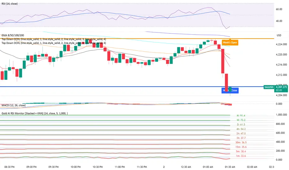
Gold AI RSI Monitor [Stacked + KNN]Here is a comprehensive description and user guide for the Gold AI RSI Monitor. You can copy and paste this into the "Description" field if you publish the script on TradingView, or save it for your own reference.
Gold AI RSI Monitor
🚀 Overview
The Gold AI RSI Monitor is a next-generation dashboard designed specifically for trading volatile assets like Gold (XAUUSD). It completely reimagines the traditional RSI by "stacking" 10 different timeframes (from 1-minute to Monthly) into a single, vertical view.
Integrated into this dashboard is a K-Nearest Neighbors (KNN) Machine Learning algorithm. This AI analyzes historical price action to find patterns similar to the current market and predicts the next likely move with a confidence score.
📊 Visual Guide: How to Read the Chart
1. The "Stacked" Lanes Instead of switching timeframes constantly, this indicator displays them all at once using vertical offsets.
Bottom Lane (0-100): 1-Minute RSI
Middle Lanes: 5m, 15m, 30m, 1H, 2H, 4H, Daily
Top Lane (900-1000): Monthly RSI
2. Gradient Color System The RSI lines change color based on momentum strength:
🔴 Red: Oversold / Bearish (Approaching 30 or lower)
🟡 Yellow: Neutral (Around 50)
🟢 Green: Overbought / Bullish (Approaching 70 or higher)
3. Tracker Lines Each timeframe has a dotted horizontal line extending to the right. This allows you to instantly see the exact RSI value for every timeframe without squinting.
🤖 The AI Engine (KNN)
The "AI" component uses a K-Nearest Neighbors algorithm.
Learning: It scans the last 1,000 bars of history.
Matching: It finds the 5 historical moments that look mathematically identical to the current market conditions (based on RSI and Volatility).
Predicting: It checks if price went UP or DOWN after those historical matches.
The Signals:
Buying Signal: If the majority of historical matches resulted in a price increase, the AI triggers a BUY.
Selling Signal: If the majority resulted in a drop, the AI triggers a SELL.
🎯 How to Trade with This Indicator
1. The "Crosshair" Signal
When the AI detects a high-probability setup, a massive Crosshair appears on your chart:
Green Crosshair: Strong BUY signal.
Red Crosshair: Strong SELL signal.
Note: The crosshair consists of a thick vertical line and a dashed horizontal line intersecting at the signal candle.
2. Timeframe Alignment (Confluence)
Do not rely on the AI alone. Look at the stacked RSIs:
Strong Long: The AI shows a Green Crosshair AND the lower timeframes (1m, 5m, 15m) are all turning Green/upward.
Strong Short: The AI shows a Red Crosshair AND the lower timeframes are turning Red/downward.
3. Support & Resistance Zones
Bottom Dotted Line (30): Support. If RSI hits this and turns up, it's a buying opportunity.
Top Dotted Line (70): Resistance. If RSI hits this and turns down, it's a selling opportunity.
⚙️ Settings Guide
RSI Length: Default is 14. Lower (e.g., 7) makes it faster/choppier; higher (e.g., 21) makes it smoother.
Enable AI Signals: Toggles the KNN calculation on/off.
Neighbors (K): How many historical matches to check. Default is 5.
Increase to 9-10 for fewer, more conservative signals.
Decrease to 3 for faster, more aggressive signals.
AI Timeframe: CRITICAL SETTING.
If left empty, the AI calculates based on your current chart.
Recommendation: For Gold scalping, set this to 15m or 1h. This ensures the AI looks at the bigger trend even if you are zooming in on the 1-minute chart.
⚠️ Disclaimer
This tool is for educational and analytical purposes. The "AI" is a statistical probability algorithm based on past performance, which is not indicative of future results. Always manage your risk.
Gold Key Level LinesOverview
Gold Horizontal Lines is a visual grid tool that draws automatic horizontal levels around the current price. It’s designed for symbols like Gold (XAUUSD), but works on any market and timeframe.
What It Does
Draws main, mid, and quarter price levels based on user-defined intervals (e.g. 100 / 50 / 25).
Centers the grid around the current close, above and below by a chosen number of levels.
Adds optional price labels to each line on the right side of the chart.
Deletes and redraws lines only on the last bar to keep the chart clean and efficient.
Inputs
Main Line Interval – distance between key levels (e.g. 100).
Mid / Quarter Intervals – optional extra levels between main lines (set to 0 to disable).
Colors, Styles, Widths – separate settings for main, mid, and quarter lines.
Show Price Labels – toggle labels on/off.
Number of Lines Above/Below Price – controls how far the grid extends.

Gold vs. Dollar Sentiment Map [SB1]🟡 Gold vs Dollar Sentiment Map
The Gold vs Dollar Sentiment Map reveals the direct inverse relationship between Gold Futures (GC) and the U.S. Dollar Index (DXY) — one of the most reliable global risk-sentiment gauges.
It helps traders instantly identify whether capital is flowing into safety (Gold) or into the Dollar (risk assets) during any session or timeframe.
🔍 Core Logic
Risk-Off (Bearish background = Red): DXY ↓ and Gold ↑ → investors seeking safety, rising fear or falling yields.
Risk-On (Bullish background = Green): DXY ↑ and Gold ↓ → investors rotating into risk assets, stronger USD demand.
Neutral (Gray): Mixed signals – no dominant macro driver.
📊 Dashboard
A compact on-chart table displays real-time trend bias for:
Gold (GC) – Bullish / Bearish / Neutral
U.S. Dollar Index (DXY) – Bullish / Bearish / Neutral
Color shading reflects each asset’s intrabar momentum.
⚙️ Visual Features
Adaptive background colors to show sentiment shifts.
Strong candle markers highlighting momentum bars near range extremes.
Alerts for clear Risk-On / Risk-Off alignment.
🧭 How to Use
Red background (Risk-Off): Gold strength + Dollar weakness → favorable environment for long gold setups.
Green background (Risk-On): Dollar strength + Gold weakness → bias toward short gold or avoid long exposure.
Gray background: Stay patient; look for confirmation or wait for alignment.
💡 Ideal For
Gold and Forex traders monitoring macro rotation.
Sentiment confirmation alongside order-flow, VWAP, or volume-delta tools.
Overlaying on intraday or higher-timeframe charts to frame trade bias.

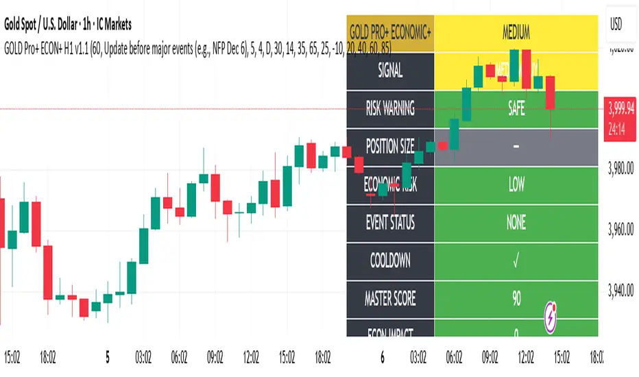
Gold Master Pro Plus ECONOMIC ENHANCED (H1 London v1.1)Overview
This indicator provides gold trading signals with integrated economic calendar awareness, specifically optimized for H1 timeframe and London session trading.
Methodology
The script analyzes multiple technical factors while monitoring economic event risks:
Technical Analysis Components:
RSI for momentum detection with configurable overbought/oversold levels
EMA crossovers (9, 21, 50 periods) for trend direction
MACD for momentum confirmation
ADX for trend strength measurement
Volume analysis for confirmation of price movements
Support/resistance detection using pivot points
Economic Calendar Integration:
Time-based detection of major economic releases (NFP, CPI, FOMC meetings)
Volatility assessment during event periods
USD stability monitoring through currency pair correlations
Automatic cooldown periods after high-impact events
Risk Management Features:
Multi-timeframe confirmation using daily trends
Session-aware scoring (London/NY overlap focus)
Quality-tiered signal classification
Position size recommendations based on signal strength and risk conditions
How to Use
Initial Setup:
Apply to XAUUSD on H1 timeframe
Configure economic settings in the inputs:
Enable economic event filter
Set ET offset (typically 5 hours for winter, 4 for summer)
Select relevant economic events to monitor
Signal Interpretation:
PLATINUM: All conditions aligned (active session, strong volume, low economic risk, trend confirmation)
HIGH: Most factors aligned with moderate risk
MEDIUM: Some factors aligned with acceptable risk
BLOCKED: High economic risk, cooldown period, or manual block active
Dashboard Metrics:
Economic risk level indicates current market safety
Event status shows timing of economic releases
Position size recommends appropriate trade sizing
Master score combines all technical and economic factors
Configuration Options
Economic Settings:
Economic impact threshold (30-80)
ET offset adjustment for timezone accuracy
Cooldown period configuration (2-24 bars)
Technical Settings:
RSI parameters (length, overbought/oversold levels)
Signal thresholds for different quality tiers
Session timing bonuses/penalties
Risk Management:
Multi-timeframe confirmation enable/disable
Higher timeframe selection (D, W, 4H, 12H)
MTF weight percentage (10-50%)
Important Notes
Economic event timing is approximate and should be verified with official economic calendars
Past performance does not guarantee future results
Trading involves substantial risk of loss
This tool is for educational purposes and should not be considered financial advice
The indicator is designed to assist in identifying potential trading opportunities while managing economic event risks through automated protection mechanisms.