Multi-Currency & Multi-Timeframe SMA Summary Table
This script displays a summary table of the direction of simple moving averages of all the currencies on all timeframes. The concept was that I wanted a summary page giving me a birds eye view of what is happening in the market. I plan to use it as a common sense check to confirm that I'm not trading against the flow. I'm not planning to use it to blindly enter (ah if only trading was that easy!!!).
The above example is showing the direction of the 100 SMA for 30S, 3min, 15min, 1h, 4h, D for all the currencies. The base currency is adjusted so that the colour coding is adjusted to express the strength of the specific currency. For example in the case of CAD it is showing the directions of SMAs for CADNZD, CADAUD, CADJPY, CADCHF, CADEUR, CADGBP, CADUSD - the base currency is flipped on some pairs so CAD is always the base currency.
An example of what it is showing - look at the 1h column on JPY. All rows are red except for the chf row. This means that the 100SMA is pointing down on all JPY crosses except for JPYCHF (remember, SMA is down assuming JPY is the base currency).
Unfortunately, I could not fit all the script into a single indicator so you have to load an instance of the indicator into the chart for each timeframe you want to see. So the above example has 6 instances of the indicator overlaid - 1 instance for: 30S, 3min, 15min, 1h, 4h and D. Just choose the timeframe and the script will automatically organise the table.
At the bottom (in blue) is a summary score: a score of 7 = the MA is up on that timeframe on all currency crosses; a score of -7 = the MA is down on that timeframe on all currency crosses. So if you look at the example above, the blue row is showing that USD is very strong against all other currencies and the AUD is generally weak against all other currencies (notice the light blue vs the dark blue).
-You can choose the length of the SMA.
-You can chose the 'lookback' period (the bars back the script looks to compare whether the MA is getting higher or lower)
-You can change the colours
-You can adjust the table size to fit your monitor size
I hope its useful - I tried it yesterday and it kept me focused on USD strength (and not get seduced by temporary USD weakness). So it is doing what I designed it to.
Hope its useful. Good luck!
John
Cari dalam skrip untuk "Table"

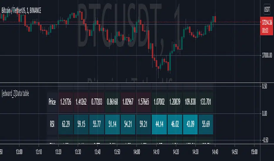
[edward_Z]Data tableThe purpose of this script is educational!
Create table with different inputs, various conditions, color changes, text format...
Dynamic Risk-Adjusted Performance Ratios with TableWith this indicator, you have everything you need to monitor and compare the Sharpe ratio, Sortino ratio, and Omega ratio across multiple assets—all in one place. This tool is designed to help save time and improve efficiency by letting you track up to 15 assets simultaneously in a fully customizable table. You can adjust the lookback period to fit your trading strategy and get a clearer picture of how your assets perform over time. Instead of switching between charts, this indicator puts all the critical information you need at your fingertips.
Sharpe Ratio -
Helps evaluate the overall efficiency of investments by comparing the average return to the total risk (measured by the standard deviation of all returns). Essentially, it tells you how much excess return you’re getting for each unit of risk you’re taking. A higher Sharpe ratio means you’re getting better risk-adjusted performance—something you’ll want to aim for in your portfolio.
Sortino Ratio -
Goes a step further by focusing only on downside risk—because let’s face it, no one worries about positive volatility. This ratio is calculated by dividing the average return by the standard deviation of only the negative returns. Perfect for those concerned about avoiding losses rather than chasing extreme gains. It gives you a sharper view of how well your assets are performing relative to the risks you’re trying to avoid.
Omega Ratio -
Offers a unique perspective by comparing the sum of positive returns to the absolute sum of negative returns. It’s a straightforward way to see if your wins outweigh your losses. A higher Omega ratio means your positive returns significantly exceed the downside, which is exactly what you want when building a strong, reliable portfolio.
This indicator is perfect for traders who want to streamline their decision-making process and gain an edge. Bringing together these three critical ratios into a single user-defined table makes it easy to compare and rank assets at a glance. Whether optimizing a portfolio or looking for the best opportunities, this tool helps you stay ahead by focusing on risk-adjusted returns. The customizable lookback period lets you tailor the analysis to fit your unique trading approach, giving you insights that align with your goals. If you’re serious about making data-driven decisions and improving your trading outcomes, this indicator is a game-changer for your toolkit.

Hybrid Super Trend & Trend Tablea combination of 3 supertrends into 1 trend line, plus 2 ema lines and a timeframe trend table.

Reshape Table Matrix█ OVERVIEW
Simple method to reshape matrix to table.
Credits to Tradingview for new matrix update.

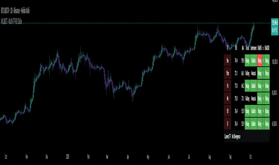
MUJBOT - Multi-TF RSI Table
The "Multi-TF RSI Table" indicator is a comprehensive tool designed to present traders with a quick visual summary of the Relative Strength Index (RSI) across multiple timeframes, all within a single glance. It is crafted for traders who incorporate multi-timeframe analysis into their trading strategy, aiming to enhance decision-making by identifying overall market sentiment and trend direction. Here's a rundown of its features:
User Inputs: The indicator includes customizable inputs for the RSI and Moving Average (MA) lengths, allowing users to tailor the calculations to their specific trading needs. Additionally, there is an option to display or hide the RSI & MA table as well as to position it in various places on the chart for optimal visibility.
Multi-Timeframe RSI & MA Calculations: It fetches RSI and MA values from different timeframes, such as 1 minute (1m), 5 minutes (5m), 15 minutes (15m), 1 hour (1h), 4 hours (4h), and 1 day (1D). This multi-timeframe approach provides a thorough perspective of the momentum and trend across different market phases.
Trend and Sentiment Analysis: For each timeframe, the script determines whether the average RSI is above or below the MA, categorizing the trend as "Rising", "Falling", or "Neutral". Moreover, it infers market sentiment as "Bullish" or "Bearish", based on the relationship between the RSI and its MA.
Dynamic Color-Coding: The indicator uses color-coding to convey information quickly. It highlights the trend and sentiment cells in the table with green for "Bullish" and red for "Bearish" conditions. It also shades the timeframe cells based on the RSI value, with varying intensities of green for "Oversold" conditions and red for "Overbought" conditions, providing an immediate visual cue of extreme market conditions.
Customization and Adaptability: The script is designed with customization in mind, enabling users to adjust the RSI and MA lengths according to their trading strategy. Its adaptable interface, which offers the option to display or hide the RSI & MA table, ensures that the tool fits into different trading setups without cluttering the chart.
Ease of Use: By consolidating critical information into a simple table, the "Multi-TF RSI Table" indicator saves time and simplifies the analysis process for traders. It eliminates the need to switch between multiple charts or timeframes, thus streamlining the trading workflow.
In essence, the "Multi-TF RSI Table" is a powerful indicator for Pine Script users on TradingView, offering a multi-dimensional view of market dynamics. It is ideal for both novice and experienced traders who seek to enhance their technical analysis with an at-a-glance summary of RSI trends and market sentiment across various timeframes.
Monthly Strategy Performance TableWhat Is This?
This script code adds a Monthly Strategy Performance Table to your Pine Script strategy scripts so you can see a month-by-month and year-by-year breakdown of your P&L as a percentage of your account balance.
The table is based on realized equity rather than open equity, so it only updates the metrics when a trade is closed.
That's why some numbers will not match the Strategy Tester metrics (such as max drawdown), as the Strategy Tester bases metrics like max drawdown on open trade equity and not realized equity (closed trades).
The script is still a work-in-progress, so make sure to read the disclaimer below. But I think it's ready to release the code for others to play around with.
How To Use It
The script code includes one of my strategies as an example strategy. You need to replace my strategy code with your own. To do that just copy the source code below into a blank script, delete lines 11 -> 60 and paste your strategy code in there instead of mine. The script should work with most systems, but make sure to read the disclaimer below.
It works best with a significant amount of historical data, so it may not work very effectively on intraday timeframes as there is a severe limitation of available bars on TradingView. I recommend using it on 4HR timeframes and above, as anything less will produce very little usable data. Having a premium TradingView plan will also help boost the number of available bars.
You can hover your mouse over a table cell to get more information in the form of tooltips (such as the Long and Short win rate if you hover over your total return cell).
Credit
The code in this script is based on open-source code originally written by QuantNomad, I've made significant changes and additions to the original script but all credit for the idea and especially the display table code goes to them - I just built on top of it:
Why Did I Make This?
None of this is trading or investment advice, just my personal opinion based on my experience as a trader and systems developer these past 6+ years:
The TradingView Strategy Tester is severely limited in some important ways. And unless you use complex Excel formulas on exported test data, you can't see a granular perspective of your system's historical performance.
There is much more to creating profitable and tradeable systems than developing a strategy with a good win rate and a good return with a reasonable drawdown.
Some additional questions we need to ask ourselves are:
What did the system's worst drawdown look like?
How long did it last?
How often do drawdowns occur, and how quickly are they typically recovered?
How often do we have a break-even or losing month or year?
What is our expected compounded annual growth rate, and how does that growth rate compare to our max drawdown?
And many more questions that are too long to list and take a lifetime of trading experience to answer.
Without answering these kinds of questions, we run the risk of developing systems that look good on paper, but when it comes to live trading, we are uncomfortable or incapable of enduring the system's granular characteristics.
This Monthly Performance Table script code is intended to help bridge some of that gap with the Strategy Tester's limited default performance data.
Disclaimer
I've done my best to ensure the numbers this code outputs are accurate, and according to my testing with my personal strategy scripts it appears to work fine. But there is always a good chance I've missed something, or that this code will not work with your particular system.
The majority of my TradingView systems are extremely simple single-target systems that operate on a closed-candle basis to minimize many of the data reliability issues with the Strategy Tester, so I was unable to do much testing with multiple targets and pyramiding etc.
I've included a Debug option in the script that will display important data and information on a label each time a trade is closed. I recommend using the Debug option to confirm that the numbers you see in the table are accurate and match what your strategy is actually doing.
Always do your own due diligence, verify all claims as best you can, and never take anyone's word for anything.
Take care, and best of luck with your trading :)
Kind regards,
Matt.
PS. If you're interested in learning how this script works, I have a free hour-long video lesson breaking down the source code - just check out the links below this script or in my profile.

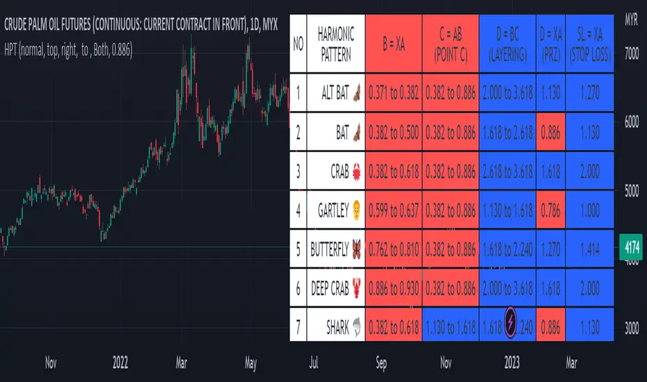
Harmonic Pattern Table UDT█ OVERVIEW
This table indicator was intended as helper / reference for using XABCD Pattern drawing tool.
The values shown in table was based on Harmonic Trading Volume 3: Reaction vs. Reversal written by Scott M Carney.
Code upgrade from Harmonic Pattern Table (Source Code) and based on latest User-Defined Type (UDT) .
As a result, code appeared more cleaner.
█ FEATURES
1. List Harmonic Patterns.
2. Font size small for mobile app and font size normal for desktop.
3. Options to show Animal name in text, emoji or both.
█ USAGE
Similar to Harmonic Pattern Table (Source Code).
█ CREDITS
Scott M Carney, Trading Volume 3: Reaction vs. Reversal
Trend Table by DNDFXTrend Table is the latest version released in 2026. Initially, this feature was integrated into the CTR indicator. However, due to technical issues that caused errors in the main indicator, Trend Table was separated and developed as a standalone indicator to ensure stability and allow it to operate without interfering with the main system.
The Trend Table indicator is designed to provide a clear overview of market trend direction across multiple timeframes in a single, concise display. The timeframes included are M1, M3, M5, M10, M15, M30, H1, H4, and Daily. With this separation, users can monitor trend conditions from lower to higher timeframes more efficiently, consistently, and reliably.

Daily ADR TableDaily ADR Table Indicator
The Daily Average Daily Range (ADR) Table displays real-time volatility statistics directly on your chart. It shows both the current day's range and the historical average daily range as percentages of the current price, providing essential volatility metrics for trading decisions.
The indicator tracks today's range in real-time throughout the trading session using session-based calculations to ensure accuracy. It compares this against a customizable historical average (default 20 days, adjustable from 1-500 days) to help traders assess whether current volatility is above or below normal levels.
All values are displayed as percentages for easy comparison across different price levels and formatted to two decimal places for precision. The table position, text size, alignment, and colors are fully customizable with nine position options and professional default styling optimized for readability.
This indicator is valuable for day traders, swing traders, and market analysts who need to quickly assess current market volatility relative to historical norms. It assists in position sizing decisions, setting stop losses, and identifying potential breakout or consolidation scenarios based on range expansion or contraction.

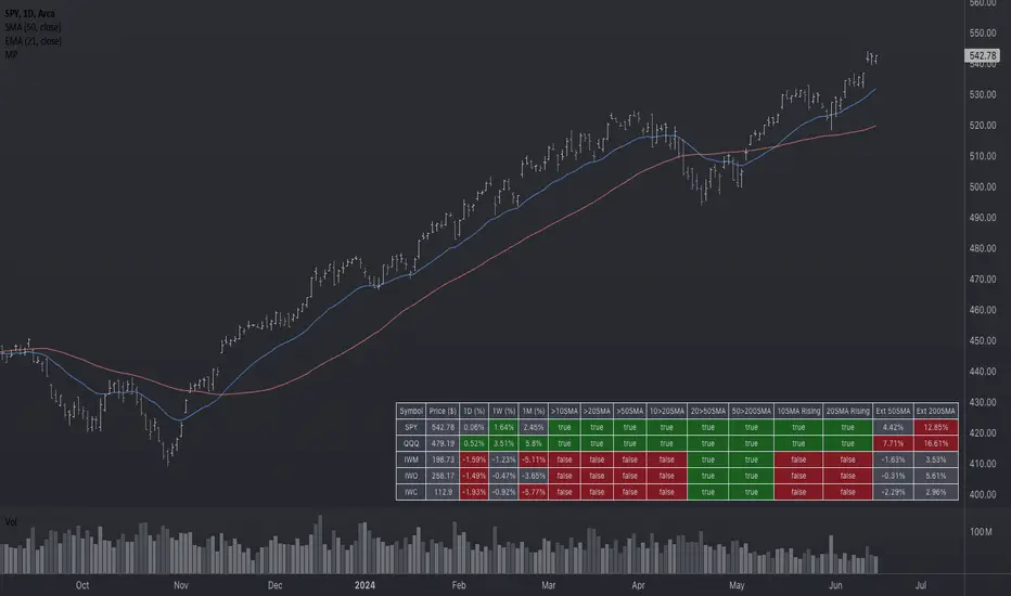
Market Performance TableThe Market Performance Table displays the performance of multiple tickers (up to 5) in a table format. The tickers can be customized by selecting them through the indicator settings.
The indicator calculates various metrics for each ticker, including the 1-day change percentage, whether the price is above the 50, 20, and 10-day simple moving averages (SMA), as well as the relative strength compared to the 10/20 SMA and 20/50 SMA crossovers. It also calculates the price deviation from the 50-day SMA.
The table is displayed on the chart and can be positioned in different locations.
Credits for the idea to @Alex_PrimeTrading ;)
Harmonic Table Combo Point B█ OVERVIEW
This indicator was intended as educational purpose only and alternative way to show value in table as shown in Harmonic Pattern Possibility Table .
█ CREDITS
Credit to Scott M Carney, Harmonic Trading Volume 3: Reaction vs. Reversal.
█ USAGE EXAMPLE

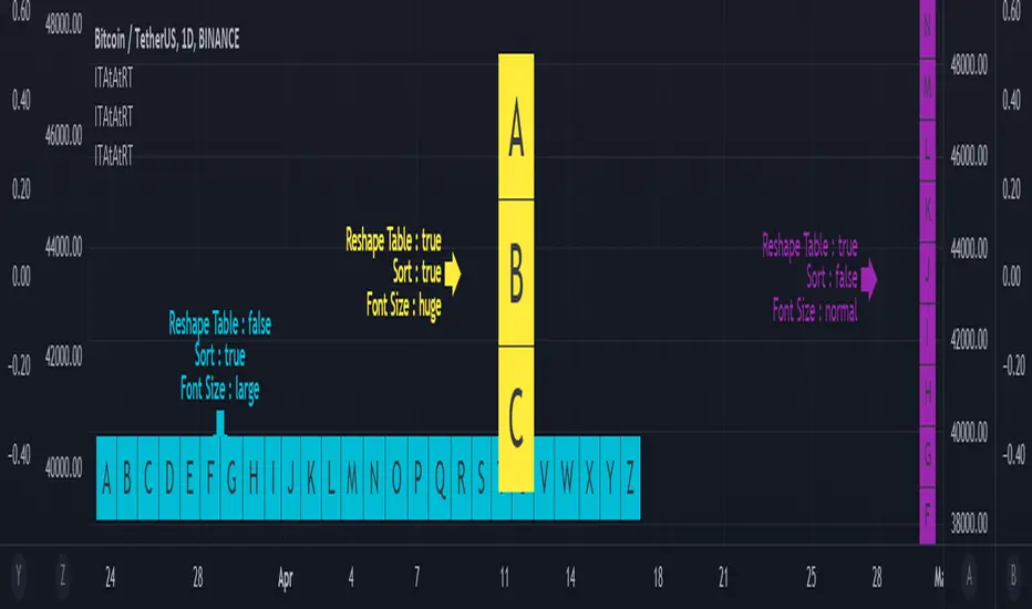
Input Text Area to Array then Reshape Table█ OVERVIEW
Simple method to convert from input.text_area to array using str.split.
Reshape table using switch, not necessary must use matrix.reshape.
Might be useful pine script to replace input.symbol.
█ FEATURES
Table can positioned by any position and font size can be resized.
Reshape table and sorting array if necessary.
█ CREDITS
Credits to TradingView for new update of input.text_area.
[HELPER] Table Color For Pairing Black And White█ OVERVIEW
This helper intend to simplify which color pair better with black or white color, may help some pine coders.
█ INSPIRATION
This color choice was inspired during plot especially user enable dark color theme.
Color displayed at table and label are based on Indicator name label and Indicator last value label displayed at Scales.
█ FEATURES
Color can be tick to be inverted color.
Display table by changing table position and font size.
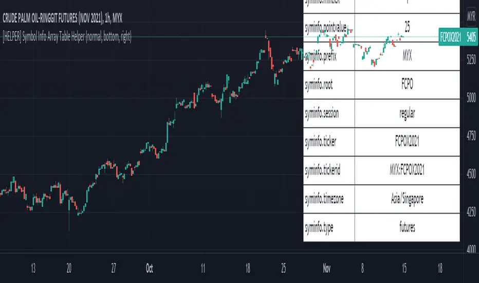
[HELPER] Symbol Info Array Table HelperThis indicator is to show symbol info in table using built-in syminfo name space, coded in latest Pine Script version 5.
Credits to PineCoders and Everget
Features :
- Display table by changing table position, font size and color.
- Show / Hide necessary symbol info.
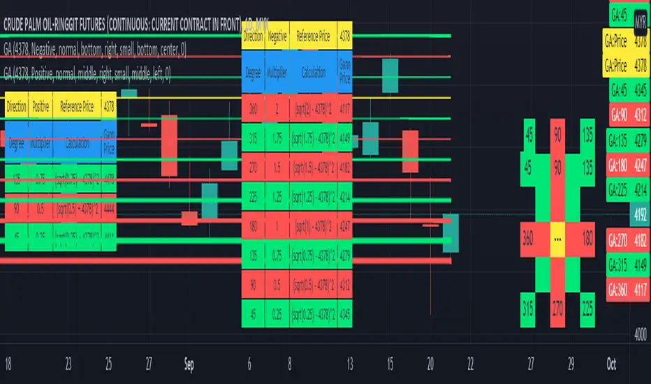
Gann Angle Table Calculator PlotterThis indicator was build upon based on Gann Angle and Gann Multiplier as refered of The Tunnel Thru The Air Or Looking Back From 1940, written by WD Gann .
Credits to FaizHebat for calculation.
Indicator features :
1. Font size from tiny to huge.
2. Table position.
3. Color for cell table and plot can be input or reversed.
4. Plot can be show or hide and also price can be track.
5. Able show currency and decimal price.
6. Gann table and Calculation table can show or hide.
7. Each Gann point can be hide including plot and calculation.
8. For desktop display only, not for mobile.
Pros :
1. Can be used as single or more indicator. (Chart show 2 same indicator with different setup)
Cons :
1. Price must be input before selecting any Gann Point.
FAQ
1. Credits
WD Gann , The Tunnel Thru The Air Or Looking Back From 1940
FaizHebat
2. Code Usage
Free to use for personal usage.
Positive direction with Currency and Decimal
Positive direction with Currency and Decimal
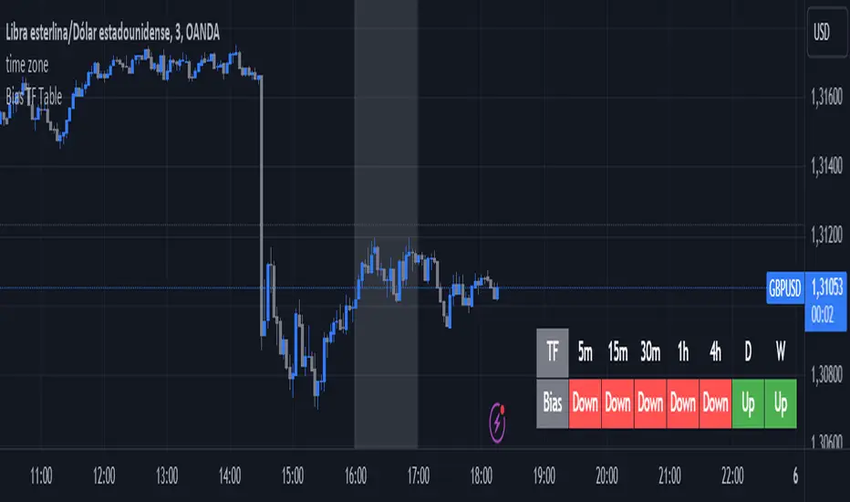
Bias TF TableThis indicator is a technical analysis tool designed to evaluate the price trend of an asset across multiple time frames (5 minutes, 15 minutes, 30 minutes, 1 hour, 4 hours, daily, and weekly).
Main Functions:
Directional Bias: Displays whether the trend is bullish (Up) or bearish (Down) for each time frame, using the closing price in comparison to a 50-period exponential moving average (EMA).
Table Visualization: Presents the results in a table located in the bottom right corner of the chart, making it easy to read and compare trends across different time intervals.
This indicator provides a quick and effective way to assess market direction and make informed trading decisions based on the trend in various time frames.
Harmonic Pattern Possibility Table█ OVERVIEW
This indicator was intended as educational purpose only based on Harmonic Pattern Table (Source Code) and Ratio For Harmonic Points to show Harmonic Pattern Possibility.
█ INSPIRATION
This indicator was build upon realizing there are some overlap for B = XA among Alternate Bat, Bat, Crab and Gartley.
Hence, the values split up to showcase the possibility of non overlap ratio.
█ USAGE
Possible pattern, priority pattern and selected pattern may differs based value input.
Therefore C = AB, D = BC, D = XA and Stop Loss will change based value input and also selected pattern.
█ CREDITS
Credit to Scott M Carney, Harmonic Trading Volume 3: Reaction vs. Reversal.

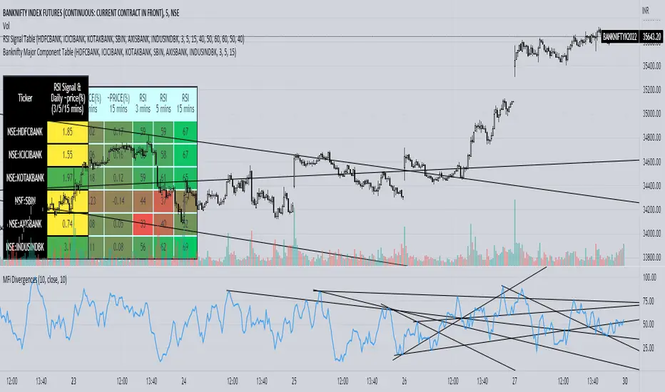
Banknifty Major Component TableThe table presented here is comprised of major Banknifty Index constituents showing price change in percentage terms and RSI value of three different timeframes to gauge overall Banknifty sentiment. This table is primarily created to cater scalpers and day traders. It helps traders to see market activity at a glance.
Position Sizing TableThe Position Sizing Table is a simple, clean table designed to calculate shares per trade based on total capital.

Harmonic Pattern Table (Source Code)This table indicator was intended as helper / reference for using XABCD Pattern.
Indikator berjadual bertujuan sebagai bantuan / rujukan untuk kegunaan XABCD Pattern.
The values shown in table was based on Harmonic Trading Volume 3: Reaction vs. Reversal written by Scott M Carney.
Nilai yang ditunjukkan dalam jadual adalah berdasarkan buku Harmonic Trading Volume 3: Reaction vs. Reversal ditulis oleh Scott M Carney.
Indicator features :
1. List Harmonic Patterns.
2. Font size small for mobile app and font size normal for desktop.
Kemampuan indikator :
1. Senarai Harmonic Pattern.
2. Saiz font kecil untuk mobile app dan saiz size normal untuk desktop.
FAQ
1. Credits / Kredit
Scott M Carney,
Scott M Carney, Trading Volume 3: Reaction vs. Reversal
2. Code Usage / Penggunaan Kod
Free to use for personal usage but credits are most welcomed especially for credits to Scott M Carney.
Bebas untuk kegunaan peribadi tetapi kredit adalah amat dialu-alukan terutamanya kredit kepada Scott M Carney.
Default Settings.
Setting asal.
Setting for selected Harmonic Pattern (Example : Bat)
Setting untuk pilihan Harmonic Pattern (Contoh : Bat)
Setting for show Harmonic Pattern only (Example : Bat)
Setting untuk nama Harmonic Pattern sahaja(Contoh : Bat)

MYX Bursa IPO Listing Table (Source Code)This indicator intended for Malaysia Market only for Initial Public Offering (IPO) refer to Bursa Malaysia
Indikator ini adalah untuk pasaran Malaysia sahaja untuk Tawaran Awam Permulaan (IPO) rujuk kepada Bursa Malaysia
Indicator features :
1. List similar symbol or counter based on year including total.
2. Font size small for mobile app and font size normal for desktop.
Kemampuan indikator :
1. Senarai simbol atau kaunter yang terlibat mengiku tahun termasuk jumlah.
2. Saiz font kecil untuk mobile app dan saiz size normal untuk desktop.
FAQ
1. Code Usage / Penggunaan Kod
Free to use for personal usage but credits are most welcomed.
Not for business / commercial usage, any damage or lialibity are not my resposibility.
Bebas untuk kegunaan peribadi tetapi kredit adalah amat dialu-alukan.
Bukan untuk kegunaan perniagaan / komersil, sebarang kerosakan atau liability adalah di luar tanggungjawab saya.
2. Update Frequency / Frekuensi
Anytime after official update by Bursa Malaysia.
Bila-bila masa selepas kemaskini rasmi oleh Bursa Malaysia
3. Symbol/Counter not showing / Simbol/kaunter tiada
Symbol/counter not longer exist or not yet updated.
Simbol/kaunter telah tersenarai keluar atau belum dikemaskini.
4. Why table overlap with chart ? To avoid this, click indicator > Visual Order > Send to Front.
Kenapa table bertindih dengan carta ? Untuk mengatasi ini, klik indikator > Visual Order > Send to Front.
All Setting enabled.
Semua seting diaktifkan.
Small Font setting enabled, suitable for mobile app.
Setting font kecil diaktifkan., sesuai untuk mobile app.
Setting by year.
Setting mengikut tahun.

Futures Margin Lookup TableThis script applies a table to your chart, which provides the intraday and overnight margin requirements of the currently selected symbol.
In this indicator the user must provide the broker data in the form of specifically formatted text blocks. The data for which should be found on the broker website under futures margin requirements.
The purpose for it's creation is due to the non-standard way each individual broker may price their margins and lack of information within TradingView when connected to some (maybe all) brokers, including during paper trading, as the flat percentage rule is not accurate.
An example of information could look like this
MES;Micro S&P;$50;$2406
ES;E-Mini S&P;$500;$24,053
GC;Gold;$500;$16500
NQ;E-Mini Nasdaq;$1,000;$34,810
FDAX;Dax Index;€2,000;€44,311
Each symbol begins a new line, and the values on that line are separated by semicolons (;)
Each line consists of the following...
SYMBOL : Search string used to match to the beginning of the current chart symbol.
NAME: Human readable name
INTRA: Intraday trading margin requirement per contract
OVERNIGHT: Overnight trading margin requirement per contract
The script simply finds a matching line within your provided information using the current chart symbol.
So for example the continuous chart for
NQ1!
would match to the user specified line starting with NQ... as would the individual contract dates such as NQM2025, NQK2025, etc.
NOTES:
There is a possibility that symbols with similar starting characters could match. If this is the case put the longer symbol higher in the list.
There is also a line / character limit to the text input fields within pinescript. Ensure the text you enter / paste into them is not truncated. If so there are 3 input fields for just this purpose. Find the last complete line and continue the remaining symbol lines on the subsequent inputs.
