VWAP & Band Cross Strategy v6 - AdvancedThese are a few updates made to the original script. The daily take profit and stop loss functions correctly for 1 contract but because of the pyramiding input even if not used you'll need to multiply the values by the number of contracts to keep consistent results. I have been unable to correct that function. Let me know if you test the script and have any recommendations for improvement. If trading an actual account I do recommend setting hard daily limits with your provider because there is still slippage from the original exit alerts even with the daily stop loss in place.
1. Real-Time Execution & Hard PnL Limits (The Focus)
The most critical changes were implemented to ensure the daily profit and loss limits act as hard, real-time barriers instead of waiting for the candle to close.
• Intrabar Tick Execution: The parameter calc_on_every_tick=true was added to the strategy() declaration. This forces the entire script to re-evaluate its logic on every single price update (tick), enabling immediate action.
• Real-Time PnL Tracking: The PnL calculation was updated to track the total_daily_pnl by summing the realized profit/loss (from closed trades) and the unrealized profit/loss (strategy.openprofit) on every tick.
• Immediate Closure: The script now checks the total_daily_pnl against the user-defined limits (daily_take_profit_value, daily_stop_loss_value) and immediately executes strategy.close_all() the moment the threshold is breached, preventing further trading.
• Combined Risk Enforcement: The user-defined "Max Intraday Risk ($)" and the "Daily Stop Loss (Value)" are compared, and the script enforces the tighter of the two limits.
2. Visibility and External Alerting
To address the unavoidable issue of slippage (which causes price overshoot in fast markets even with tick execution), dedicated alert mechanisms were added.
• Dedicated Alert Condition: An alertcondition named DAILY PNL LIMIT REACHED was added. This allows you to set up a TradingView alert that triggers the instant the daily_limit_reached variable turns true, giving you the fastest possible notification.
• Visual Marker: A large red triangle (\u25b2) is plotted on the chart using plotchar at the exact moment the daily limit condition is met, providing a clear visual confirmation of the trigger bar.
3. Strategy Features and Input Flexibility
Several user-requested features were integrated to make the strategy more robust and customizable.
• Trailing Stop / Breakeven (TSL/BE): A new exit option, Fixed Ticks + TSL, was added, allowing you to set a fixed profit target while also deploying a trailing stop or breakeven level based on points/ticks gained.
• Multiple Exit Types: The exit strategy was expanded to include logic for several types: Fixed Ticks, ATR-based, Capped ATR-based, VWAP Cross, and Price/Band Crosses.
• Pyramiding Control: An input Max Pyramiding Entries was introduced to control how many positions the strategy can have open at the same time.
• Confirmation Logic Toggle: Added an input to choose how multiple confirmation indicators (RSI, SMMA, MACD) are combined: "AND" (all must be true) or "OR" (at least one must be true).
• Indicator Confirmations: Logic for three external indicators—RSI, SMMA (EMA), and MACD—was fully integrated to act as optional filters for entry.
• VWAP Reset Anchors: Logic was corrected to properly reset the VWAP calculation based on the selected period ("Daily", "Weekly", or "Session") by using Pine Script v6's required anchor series.
Trading Day Filters: Inputs were added to select which specific days of the week the strategy is allowed to trade.
Cari dalam skrip untuk "VWAP"

VWAP + EMA shows the VWAP + EMA 9/20/50/100/200 all in one indicator... you can adjust VWAP's calculation method + color + the outer bands or remove them.. can remove fill as well.. personally i just keep the VWAP

VWAP MultiCombined IntradayIncluded all VWAP in One for intraday purpose.
User will get S W M Q Y Decade Century Vwap at Single Combined.
This will helps to find levels who uses vwap on routine basis.
VWAP & Breakout Volume ConfirmHow the TradingView Indicator Works (Explained Simply)
VWAP Line (Orange)
It plots the Volume Weighted Average Price for the day.
Price above VWAP = bullish zone
Price below VWAP = bearish zone
Volume Spike Detection (Red Triangle)
It calculates the average volume over the last 20 candles.
If the current volume is 1.5× that average, it plots a red triangle under the candle.
Helps confirm if a move has real momentum or not.
Breakout Confirmation (Green Label ‘BO’)
Checks if price breaks above the last 10-bar high (for upside breakout) or below the last 10-bar low (for downside breakout).
If a breakout happens and the volume spike is present, it plots a green “BO” label above the candle.
This tells you the breakout is strong and likely to follow through.
VWAP ROC Weighted AverageThe VWAP ROC Weighted Average indicator combines the concepts of Volume Weighted Average Price (VWAP) and Rate of Change (ROC) to create a unique and versatile tool for traders. The indicator calculates the average VWAP and average ROC over a specified period (default: 200 bars) and then creates a weighted average of these two values. This provides a single line that can help traders identify potential entry and exit points in a market.
How it can be used in trading:
Trend Confirmation: The VWAP_ROC_WA can be used to confirm the prevailing trend of an asset. If the weighted average line is moving upward, it indicates a bullish trend, while a downward-moving line suggests a bearish trend. Traders can use this information to enter trades in the direction of the trend to improve their odds of success.
Support and Resistance: The VWAP_ROC_WA line can act as dynamic support and resistance levels. When the price is above the weighted average line, it can act as a support level, and when the price is below the line, it can serve as a resistance level. Traders can use these levels to set stop-loss and take-profit orders or to identify potential entry and exit points.
Divergences: Traders can look for divergences between the price and the VWAP_ROC_WA line to identify potential reversals. For instance, if the price is making higher highs while the weighted average line is making lower highs, it may signal a bearish divergence, indicating a potential reversal to the downside. Conversely, if the price is making lower lows while the weighted average line is making higher lows, it may signal a bullish divergence, indicating a potential reversal to the upside.
Crossovers: Traders can monitor crossovers between the price and the VWAP_ROC_WA line. A bullish crossover occurs when the price crosses above the weighted average line, suggesting a potential long entry point. A bearish crossover occurs when the price crosses below the line, suggesting a potential short entry point.

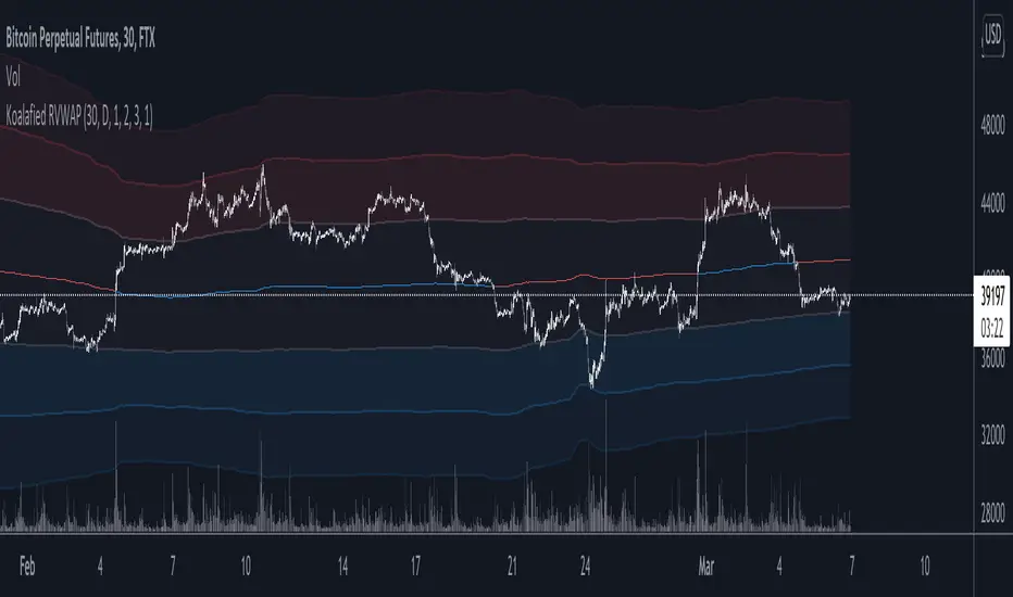
Koalafied RVWAPThis indicator shows both the Rolling VWAP and Standard Deviations as set by the user. The Rolling VWAP calculation is similar to the standard VWAP although it calculates the volume weighted average price over the specified period of time (lookback), resetting for each subsequent bar.
The unique aspect of this indicator is that instead of calculating the RVWAP over the current timeframes lookback period, the option is available to select a High-Time-Frame setting instead.
This has two different methods of calculation
1 - Based on HTF security requests (both repainting and non-repainting)
2 - Automatic calculation of number of current timeframe bars that make up the HTF lookback period (smoother and non-repainting plot)
Additionally a smooth function is included for the HTF input setting.
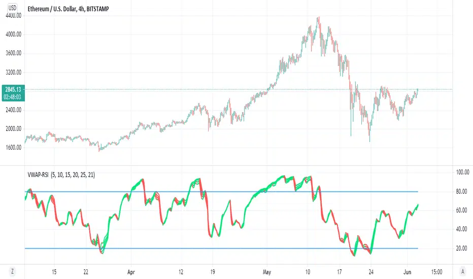
VWAP-RSI Using the script that i put here before
we can play with the Z function and make this nice indicator
which is hybrid of VWAP and RSI
it look cool
red is bearish
green is bullish
low points are bellow 20
high points above 80
you can change the length of different vwap or RSI for your purpose
the color changes are based on vwap
VWAP BANDSThis nice script combine VWAP band and trend/forecast system based on it
/ode for band take from linear regression script from pine script manual and adopted to VWAP
Trend lines based on VWAP and forecast using Alex grover method with his approval for script
Together it a great too for detection of trend and high and low
for forecast use the trend option
I set length to 100. in daily chart I use 20 . in lower TF I prefer longer 50 or above as it better fit this system

VWAP Stdev Bands v2 Mod UPDATE
Vwap + standard deviation bands. Good for reversal trading among other things. Used intraday.
Very useful when price is ranging.
I added:
- Option to fill the spaces between the deviation lines with color.
- Option to add some extra bands. Color/length/style etc is customizable.
Made a quick update to prev version:
- Added bar/candle coloring
- You can change the colors to whatever you want.
- Or turn them off completely.
Ex:
If the candle is above vwap and below standard deviation 1 its white
If the candle is below vwap and above standard deviation 1 its black
If the candle is below std 2and above std3 its green
And so on...
original script by /u/SandroTurriate/ - I just made the changes above.
VWAP Adapt ProDescription
VWAPADAPT provides institutional-grade VWAP (Volume Weighted Average Price) analysis with multiple standard deviation bands, session reset options, and slope analysis. VWAP represents the average price weighted by volume - where institutional traders have executed throughout the day.

VWAP Extreme Zones (Elite Style)Short Description
VWAP Extreme Zones (Elite Style) highlights statistically stretched price areas above and below VWAP, helping traders identify potential overextension, mean-reversion zones, and high-risk breakout areas during intraday sessions.
Disclaimer
This indicator is provided for educational and analytical purposes only.
It does not constitute financial advice or trade signals.
All trading involves risk. Always confirm with price action, market context, and proper risk management before taking any trade.

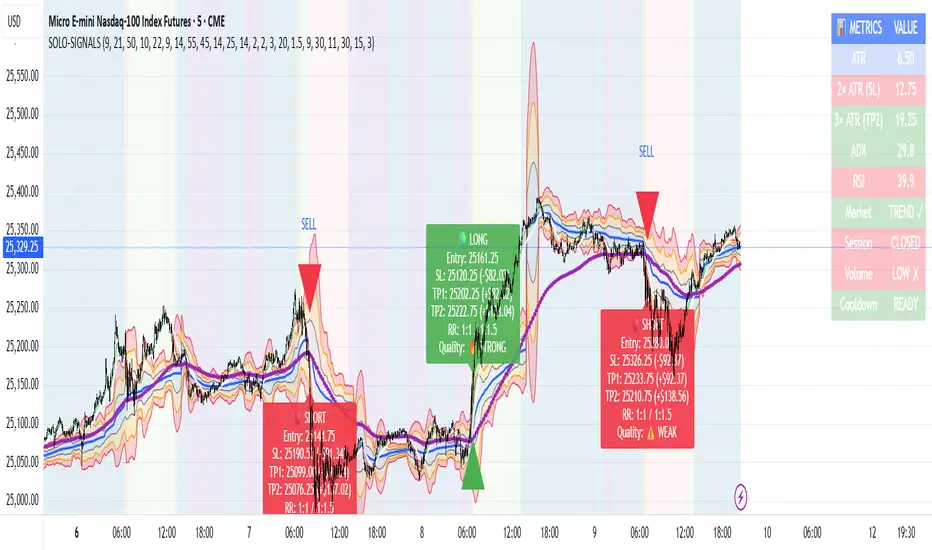
MNQ Morning Indicator | Clean SignalsMNQ Morning Trading Indicator Summary
What It Does
This is a TradingView indicator designed for day trading MNQ (Micro Nasdaq-100 futures) during morning sessions. It generates BUY and SELL signals only when multiple technical conditions align, helping traders identify high-probability trade setups.
Core Strategy
BUY Signal Requirements (All must be true):
✅ Price above VWAP (volume-weighted average price)
✅ Fast EMA (9) above Slow EMA (21) - uptrend confirmation
✅ Price above 15-minute 50 EMA - higher timeframe confirmation
✅ MACD histogram positive - momentum confirmation
✅ RSI above 55 - strength confirmation
✅ ADX above 25 - trending market (not choppy)
✅ Volume 1.5x above average - strong participation
SELL Signal (opposite conditions)
Key Features
🎯 Risk Management
Stop Loss: 2× ATR (Average True Range)
Take Profit 1: 2× ATR (1:2 risk-reward)
Take Profit 2: 3× ATR (1:3 risk-reward)
Dollar values: Calculates P&L based on MNQ's $2/point value
⏰ Session Filter
Default: 9:30 AM - 11:30 AM ET (customizable)
Safety feature: Avoids first 15 minutes (high volatility period)
Won't generate signals outside trading hours
🛡️ Signal Quality
Rates each signal: 🔥 STRONG, ⚡ MEDIUM, or ⚠️ WEAK
Requires minimum 15 bars between signals (prevents overtrading)
📊 Visual Dashboard
Shows real-time metrics:
ATR values
ADX (trend strength)
RSI (momentum)
Market condition (TREND/CHOP)
Session status
Volume status
Signal cooldown timer
Visual Elements
📈 VWAP with standard deviation bands (1σ, 2σ, 3σ)
📉 Multiple EMAs with trend-based coloring
🟢/🔴 Buy/Sell arrows on chart
📋 Detailed trade labels showing entry, SL, TPs, and risk-reward ratios
🎨 Background highlighting for market conditions
Safety Features
Cooldown period between signals
Session restrictions (no trading outside set hours)
First 15-minute avoidance (post-open volatility)
Multi-confirmation requirement (all 7 conditions must align)
Trend filter (ADX minimum to avoid choppy markets)
Best For
Day traders focused on morning sessions
MNQ futures traders
Traders who prefer systematic, rule-based entries
Those wanting pre-calculated risk management levels
Customization
All parameters are adjustable:
EMA periods
MACD settings
RSI thresholds
ADX minimum
ATR multipliers
Session times
Visual preferences
This indicator is designed to be conservative — it waits for strong confirmation before signaling, which means fewer but potentially higher-quality trades.
vwap inside bar jmrjm vwap inside bar which helps to take guage trend with vwap and and help to understand when market taking pause due to bulls and bears fight. Then we can take a trade in trend with winners.

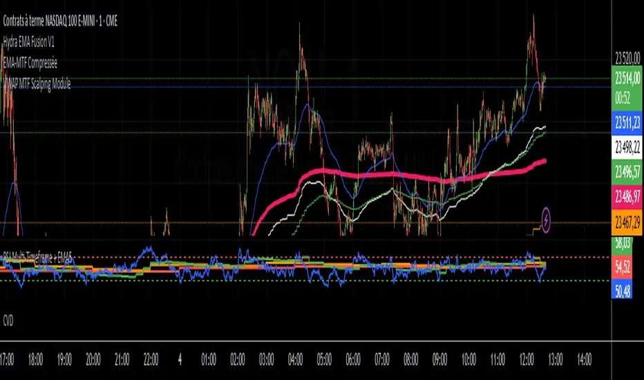
VWAP MTF Scalping ModuleThe VWAP MTF indicator allows you to visualize anchored VWAP across multiple timeframes, while maintaining a clean and responsive display.
Designed for intraday traders, scalpers, and swing traders, this module offers a clear view of volume-weighted average price zones across key timeframes (1m, 5m, 15m, 1h... customizable).
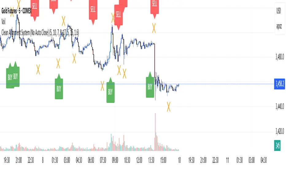
Clean Multi-Indicator Alignment System
Overview
A sophisticated multi-indicator alignment system designed for 24/7 trading across all markets, with pure signal-based exits and no time restrictions. Perfect for futures, forex, and crypto markets that operate around the clock.
Key Features
🎯 Multi-Indicator Confluence System
EMA Cross Strategy: Fast EMA (5) and Slow EMA (10) for precise trend direction
VWAP Integration: Institution-level price positioning analysis
RSI Momentum: 7-period RSI for momentum confirmation and reversal detection
MACD Signals: Optimized 8/17/5 configuration for scalping responsiveness
Volume Confirmation: Customizable volume multiplier (default 1.6x) for signal validation
🚀 Advanced Entry Logic
Initial Full Alignment: Requires all 5 indicators + volume confirmation
Smart Continuation Entries: EMA9 pullback entries when trend momentum remains intact
Flexible Time Controls: Optional session filtering or 24/7 operation
🎪 Pure Signal-Based Exits
No Forced Closes: Positions exit only on technical signal reversals
Dual Exit Conditions: EMA9 breakdown + RSI flip OR MACD cross + EMA20 breakdown
Trend Following: Allows profitable trends to run their full course
Perfect for Swing Scalping: Ideal for multi-session position holding
📊 Visual Interface
Real-Time Status Dashboard: Live alignment monitoring for all indicators
Color-Coded Candles: Instant visual confirmation of entry/exit signals
Clean Chart Display: Toggle-able EMAs and VWAP with professional styling
Signal Differentiation: Clear labels for entries, X-crosses for exits
🔔 Alert System
Entry Notifications: Separate alerts for buy/sell signals
Exit Warnings: Technical breakdown alerts for position management
Mobile Ready: Push notifications to TradingView mobile app
Market Applications
Perfect For:
Gold Futures (GC): 24-hour precious metals trading
NASDAQ Futures (NQ): High-volatility index scalping
Forex Markets: Currency pairs with continuous operation
Crypto Trading: 24/7 cryptocurrency momentum plays
Energy Futures: Oil, gas, and commodity swing trades
Optimal Timeframes:
1-5 Minutes: Ultra-fast scalping during high volatility
5-15 Minutes: Balanced approach for most markets
15-30 Minutes: Swing scalping for trend following
🧠 Smart Position Management
Tracks implied position direction
Prevents conflicting signals
Allows trend continuation entries
State-aware exit logic
⚡ Scalping Optimized
Fast-reacting indicators with shorter periods
Volume-based confirmation reduces false signals
Clean entry/exit visualization
Minimal lag for time-sensitive trades
Configuration Options
All parameters fully customizable:
EMA Lengths: Adjustable from 1-30 periods
RSI Period: 1-14 range for different market conditions
MACD Settings: Fast (1-15), Slow (1-30), Signal (1-10)
Volume Confirmation: 0.5-5.0x multiplier range
Visual Preferences: Colors, displays, and table options
Risk Management Features
Clear visual exit signals prevent emotion-based decisions
Volume confirmation reduces false breakouts
Multi-indicator confluence improves signal quality
Optional time filtering for session-specific strategies
Best Use Cases
Futures Scalping: NQ, ES, GC during active sessions
Forex Swing Trading: Major pairs during overlap periods
Crypto Momentum: Bitcoin, Ethereum trend following
24/7 Automated Systems: Algorithmic trading implementation
Multi-Market Scanning: Portfolio-wide signal monitoring
Fibo_Ma with Toggleable 200 EMA Filter Fibo_MA with Toggleable 200 EMA Filter
Description:
This multi-functional indicator blends Fibonacci-based moving averages with customizable filters and visual enhancements to support various trading strategies. It offers traders the flexibility to analyze trend dynamics and potential reversal zones using multiple tools in one script.
Key Features:
🔹 Fibonacci MA Framework
Leverage a range of Fibonacci numbers (from 1 to 233) to visualize trend-based EMA lines with optional smoothing. Users can choose the moving average method (SMA, EMA, RMA, WMA, VWMA, etc.) and adjust the smoothing length for fine-tuned analysis.
🔹 VWAP and Dynamic EMA Tools
Includes VWAP and a color-coded 200 EMA that updates based on trend slope. These help visualize key dynamic support and resistance levels.
🔹 Multi-Timeframe Support
Option to switch the data source to a higher timeframe for broader trend confirmation.
🔹 Signal Highlights
Bullish and bearish signal markers based on crossovers with optional filters.
Background highlights show whether the current price is above or below a smoothed EMA line.
🔹 Customizable Filters
Enable or disable filters like:
200 EMA Position Filter (only signal when price is above or below the 200 EMA)
ATR Filter (filter out low-volatility candles)
Volume Filter (signal only on sufficient volume)
🔹 Cross Alerts & Labels
Built-in alert conditions for crossovers and customizable signal display options—labels, shapes, and background highlights.
🔹 Advanced Options
Toggle forecast line visibility and offset
Fine-tune alerts using price action relative to the smooth trend line
Optional tail and cross label display for deeper chart customization
How to Use:
This tool can support trend-following, breakout, and pullback strategies. Customize the MA types, filters, and timeframe settings to match your trading style. The script is designed for visual clarity while offering rich configurability for discretionary and system-based traders.

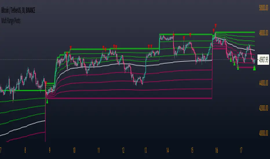
Multi Range Pivots
Multi Range Pivots works by recognizing the high and low of the timeframe selected and plotting range high to MEAN averages and range low to MEAN averages.
This is essentially the VWAP pivots updated to include not only VWAP as a MEAN, but also SMA, EMA, VWMA, DEMA, TEMA, TRIMA, KAMA, MAMA, T3, H/L basis and Donchian basis.
Also, with high and low no longer repainting, I was able to add true reliable signals.
Enjoy
VWAP Bands Team AustraliaThis indicator add 6 configurable vwap bands for each side of the vwap price.

VWAP ATRATR Trailing stoploss with VWAP for confirmation and entry/exit points
VWAP resets on ATR cross

VWAP Enhanced (Visual Feedback)This is the standard Volume-Weighted Average Price (VWAP) indicator, with the addition of an adjustable anchored time point. This modification aligns with the objective of analyzing price action relative to a specific subsequent event.

NY VWAP 2std to 3std Probabilities + Exit ZonesHow it works:
Time buckets
Early: 10:30 – 12:00
Mid: 12:00 – 14:00
Late: 14:00 – 16:00
Bands
2σ band (s2up / s2dn) → this is where the “potential breakout” starts.
3σ band (s3up / s3dn) → this is the “target” for the 2→3σ move.
Counting logic
If during a given bucket, the price touches the 2σ band, it counts as a 2σ hit.
If after that, in the same bucket, the price also touches the 3σ band, it counts as a 3σ hit.
Probability calculation
\text{Probability 2→3σ} = \frac{\text{# of 3σ hits}}{\text{# of 2σ hits}} \times 100
For example, if in the late session the lower 2σ band is hit 10 times, and of those 10 times, 6 eventually hit the lower 3σ band, the script will show 60%.
Labels / lines
On the chart, Upper/Lower 2→3σ probabilities are displayed per bucket.
So yes: “Late Lower 2σ → 3σ: 60%” means: if price touches the lower 2σ band in the late session, historically, 60% of those touches continued to the 3σ band.
⚠ Important caveats:
These are historical probabilities, not predictions.
Small sample sizes in a bucket can make percentages unstable early in the day.
The script only counts session NY bars (0930–1600) and ignores pre-10:30 hits to reduce opening volatility noise.

VWAP Histogram with EMAsBased on VWAP and Moving Averages.
Bias turns +ve if dynamic colour of the moving averages turns green. All moving avaerages are customisable.

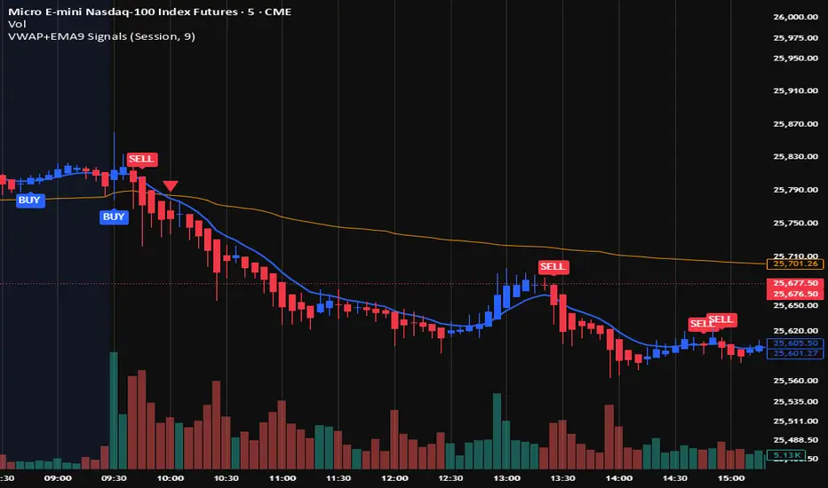
VWAP + EMA9 With SignalsThis script is for scalping on the 5 minute timeframe. It contains signals that indicate intersection of VWAP by the EMA9. It contains Buy signals when a candle closes above both lines indicating a quick continuation of a long position (quick scalp) as well as Sell signals when a candle closes below both lines indicating a quick continuation of a short position (quick scalp). Please note that i do not recommend entries at Buy and Sell signals during Accumulation/Consolidation. Positions should be taken with volume.