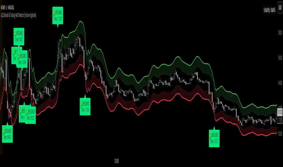
LULD Bands & Trading Halt Detector [Volume Vigilante]📖 LULD Bands & Trading Halt Detector
This advanced tool visualizes official Limit Up / Limit Down (LULD) price bands and detects regulatory trading halts and resumptions based on SEC and NASDAQ rules. It is engineered for high accuracy by anchoring all calculations to the 1-minute timeframe, ensuring reliable signals across any chart resolution.
📌 What Does This Script Do?
- Draws real-time LULD price band estimations and optional buffer (caution) zones directly on the chart.
- Detects trading halt resumptions by monitoring time gaps between candles and other regulatory criteria. (Note: Due to Pine Script limitations, halts cannot be detected in real-time, only resumptions after they occur.)
- Triggers real-time alerts for:
- Trading Resumptions (Limit Up & Limit Down)
- LULD Zone Entries (Caution Zone)
- Band Breaches (Limit Up and Limit Down)
- Plots historical halt resumption markers to analyse past events.
📐 How It Works:
- Implements official SEC/NASDAQ LULD rules for Tier 1 and Tier 2 securities.
- Applies special band adjustments for the final 25 minutes of trading (after 3:35 PM ET).
- Anchors all logic to the 1-minute timeframe for precise calculations, even on higher timeframe charts.
- Includes adjustable volume and volatility filters to eliminate false signals (ghost halts) on low-- liquidity assets, especially Tier 2 securities when TradingView fails to print candles.
⚙️ How to Use It:
1.) Apply the script to any asset or timeframe.
2.) Adjust Volume and Volatility Filters to reduce noise. (Recommended: 500,000+ volume, 10%+ volatility.)
3.) Enable or disable visual components like bands, buffer zones, and halt resumption labels.
4.) Configure alerts directly from the script settings panel.
5.) Apply alerts to individual assets via "Add Alert On..." or to entire watchlists using "Add Alert on the List."
🧩 What Makes This Script Unique?
- True 1-Minute Anchored Calculations: Ensures alerts and visuals match official trading halt criteria regardless of chart timeframe.
- Customisable Buffered Zones: Visualise proximity to regulatory price limits and avoid volatility traps.
- Combines halt resumption detection, limit up/down band visualisation, and real-time alerts into one clean, modular tool.
📚 Disclaimer:
This script is for educational purposes only and does not constitute financial advice. Use at your own discretion and consult a licensed financial advisor before making trading decisions based on it.
Official Resources:
- NASDAQ LULD Regulations (FAQ):
www.nasdaqtrader.com
Current Nasdaq Trading Halts:
www.nasdaqtrader.com
Cari dalam skrip untuk "Volatility"
Volatility Price FlowCapitalize on market volatility with our new volatility price flow indicator. We have designed this indicator to process historical price movements and indicate when price may have reached exhaustion in the context of current volatility.
This is achieved by taking the price deviation from a user defined moving average, and applying a weighting to the deviations from the candle body and candle wick on both buy side and sell side, over a user defined period. The period of the base moving average, type of moving average and the period of the historical price deviations can all be modified. This creates a typical 'band' style indicator, though with a unique characteristic that the buy and sell side vary independently as well as the band expansion being based on weighted variables tied to the actual price changes, rather than just a standard deviation the moves uniformly.
Additionally, these bands can be merged with an anchored vwap - we do this so that the deviations of price from the moving average can include a more volume based approach to identifying potential pivots.
The end result is an indicator that reflects the current market price movements, identifies and capitalizes on impulsive or beginning moves to indicate potential tops / bottoms / reversals.
The signals are simple - anytime price closes within a band, having been outside the band, a signal is displayed. As a basic guide to setting the indicator up for the first time, we suggest reducing all of the multipliers to a value less than 1. Then gradually increase each one, until the signals reduce in quantity and improve in quality, starting with the price deviation multiplier, then the volatility multiplier and finally the expansion multiplier.
Last of all, alerts can be created based on the current chart timeframe and indicator settings, simply by adding an alert that uses the built in buy or sell signal.
Note: We cannot guarantee the accuracy of the signals provided, since the user creates the signals by modifying the settings, and as such we can take no responsibility for any trading losses incurred using the indicator and highly encourage all users to manage their risk and only risk what you can afford to lose.

Trading Ranges + ZScoreOverview
The "Trading Ranges + ZScore" script is a versatile technical indicator developed for TradingView. This tool combines two powerful concepts—price ranges and Z-Score analysis—to help traders identify potential trend reversals, overbought/oversold conditions, and trend strength. The script dynamically calculates price ranges based on recent price action and utilizes Z-Score to detect deviations from a statistical norm, providing valuable insights for decision-making in both ranging and trending markets.
Features
Price Ranges: Calculates dynamic upper and lower price boundaries based on volatility and market structure.
Z-Score Oscillator: A statistical measure that highlights overbought/oversold conditions based on the deviation from a moving average.
Trend Detection: Identifies trend continuation or reversal points by comparing current price action against historical levels.
Customizable Alerts: Generates visual signals (diamonds and X crosses) for potential long/short entries and exits.
Visual Representation: Colors the bars based on Z-Score and trend direction, enhancing the chart’s readability and signal clarity.
Customizable Parameters: The script allows users to fine-tune perception length, analysis period, factor multiplier, and oscillator thresholds to fit different market conditions.
Key Input Parameters
Perception: The length used for calculating highest/lowest price points (default: 20).
Analysis: The length used for calculating the moving average and volatility (default: 100).
Factor: A multiplier to adjust the width of the price ranges (default: 2.0).
Oscillator Threshold: The overbought/oversold threshold for the Z-Score oscillator (default: 70).
Trend Filter: A boolean switch that filters signals based on trend direction.
Fill Zones: Option to color-fill between price levels when certain conditions are met.
Bullish/Bearish/Neutral Colors: Customizable colors for bullish, bearish, and neutral signals.
How It Works
Price Ranges Calculation:
The script calculates five levels: two upper boundaries, the average price level, and two lower boundaries. These levels are based on the highest/lowest prices over a user-defined period and adjusted by volatility (Average True Range).
When the price crosses either of these levels, it suggests a significant change in market direction, potentially indicating a trend reversal.
Z-Score Oscillator:
The Z-Score is a statistical measurement of a price's position relative to its moving average. The indicator calculates two variations:
Z-Score based on the absolute difference between the price and the moving average.
Z-Score based on standard deviation.
These oscillators help detect extreme conditions where the price is likely to revert (overbought/oversold zones).
Trend Detection and Signals:
The indicator generates potential buy/sell signals when the price crosses the predefined levels or based on the fast Z-Score crossing the overbought/oversold thresholds.
Weak long/short signals are shown when the faster Z-Score oscillator reaches extreme levels but trend filters are applied to avoid noise.
Bar Colors and Signal Shapes:
Bar colors change dynamically to reflect the trend direction and Z-Score conditions. Signals for potential trades are displayed using diamonds and X crosses, making it easy to spot opportunities visually.
Visuals and Plots
Bar Colors: Changes the bar color based on Z-Score and trend direction.
Z-Score Plot: Displays two Z-Score oscillators, the standard and a faster one for detecting quicker price deviations.
Overbought/Oversold Zones: Highlighted by upper and lower thresholds of the Z-Score.
Long/Short Signals: Uses diamond-shaped markers for strong long/short signals and X-shaped markers for weaker signals.
Dynamic Range Lines: Plots lines for key price levels (upper/lower boundaries, mid-range) based on the dynamic range calculations.
Usage Guide
Identify Overbought/Oversold Conditions: Look for the Z-Score reaching extreme positive or negative values. When combined with trend signals, these conditions often point to a potential reversal.
Follow the Trend: Use the trend filter option to focus only on trades in the direction of the prevailing trend, reducing false signals in ranging markets.
Watch for Range Breakouts: Pay attention to the upper and lower boundaries. Price crossing these levels often signals the start of a new trend or a major price movement.
Adjust Parameters: Tailor the perception length, analysis length, and multiplier to suit different asset classes or timeframes.
Customization
You can adjust the key parameters to adapt the indicator to different markets or personal trading preferences:
- Perception & Analysis Lengths: Control the sensitivity of the price range calculations.
- Factor Multiplier: Adjusts the width of the ranges, with higher values indicating larger zones.
- Oscillator Threshold: Modify the overbought/oversold levels to suit different market volatility.
- Trend Filter: Toggle on/off to focus on trend-following strategies or range-bound conditions.
- Visual Options: Customize colors for bullish, bearish, and neutral signals, as well as enable/disable the zone fills.

Hedge Coin M - Statistical Support and ResistanceHedge Coin M - Statistical Support and Resistance
Introduction
"Hedge Coin M - Statistical Support and Resistance" is a sophisticated, statistically-driven indicator designed specifically for traders in the COIN-M market on Binance. It offers a nuanced approach to identifying key market levels, focusing on the dynamics of support and resistance through advanced volatility analysis.
Foundation and Credits:
This script is an advanced adaptation of TradingView's standard code for the Bollinger Bands indicator. It extends the foundational concept of Bollinger Bands by integrating additional volatility metrics.
Calculation Method
This indicator employs Volume Weighted Moving Averages (VWMA) to create two distinct sets of Bollinger Bands, named BB-a and BB-b.
BB-a is derived from the VWMA of high prices, targeting potential resistance levels.
BB-b is based on the VWMA of low prices, aimed at identifying critical support levels.
Users can independently adjust the standard deviation (SD) multipliers for the upper and lower bands of both BB-a and BB-b, accommodating different market conditions.
Enhanced Volatility Analysis
The indicator calculates additional standard deviation lines for the upper band of BB-a and the lower band of BB-b. These lines provide deeper insights into market volatility.
Plotted Graphs
The primary plots include the upper and lower bands of BB-a and BB-b, marked in distinct colors for clarity.
Additional SD lines are plotted to indicate potential extended levels of support and resistance, offering traders a broader view of possible market movements.
Purpose and Usage
"Hedge Coin M - Statistical Support and Resistance" is designed to provide traders with a consistent, statistical method for identifying significant price levels.
It aids in scaling entry into positions, helping traders to navigate the COIN-M market with more informed decision-making.
This tool is especially useful for traders who combine long-term holding with swing trading strategies, offering a balanced approach to market engagement.
Integration and Adaptation
Easily integrate this indicator into your TradingView chart for the COIN-M market.
Use the insights provided to complement your overall trading strategy, particularly in identifying and reacting to significant market movements.
Disclaimer
Important Note: This indicator is provided for informational purposes only. It does not constitute financial advice, investment advice, trading advice, or any other sort of advice. Trading decisions should be made based on your own analysis, prudence, and judgment. Please be aware of the risks involved in trading and consult a financial advisor if necessary.

Pseudo-Entropy Oscillator with Standard Deviation (modified)Intuition: The Pseudo-Entropy Oscillator with Standard Deviation (PEO_SD) was created to provide traders with a way to analyze market momentum and potential reversals. It combines the concepts of entropy, standard deviation, and moving averages to offer insights into market behavior.The oscillator's core idea is to measure the pseudo-entropy of the market using standard deviation. Pseudo-entropy refers to the degree of disorder or randomness in the price data. By calculating the standard deviation of the closing prices over a specified period, the oscillator quantifies the market's volatility.To enhance the usefulness of the pseudo-entropy measurement, the oscillator incorporates moving averages. The entropy delta is calculated by applying momentum analysis to the pseudo-entropy values. This helps identify short-term changes in the entropy, indicating shifts in market sentiment or momentum.The oscillator further smoothes the pseudo-entropy values by calculating the simple moving average (SMA) over a specified length. This helps filter out noise and provides a clearer representation of the market's overall momentum.
------------------------------------------------------------------------------------------------------------------------------------------------------------------------------------------------------------------------------------------------
The "Pseudo-Entropy Oscillator with Standard Deviation" (PEO_SD) is a custom indicator designed to help traders analyze market momentum and potential reversal points. It can be applied to various markets like stocks, commodities, forex, or cryptocurrencies. By using this indicator, you can gain insights into the market's behavior and make more informed trading decisions.
The PEO_SD indicator plots three lines on your chart: the fast pseudo-entropy line, the medium pseudo-entropy line, and the slow pseudo-entropy line. Each line represents the combined pseudo-entropy values, which are calculated using standard deviation and moving averages.
The lines are color-coded for easy identification. The fast line is represented by blue, the medium line by yellow, and the slow line by red. Additionally, three horizontal reference lines are plotted: the mid line (at 50), the lower bound (at 20), and the upper bound (at 80).
To use this indicator effectively, you can observe the interactions of the lines with the reference lines. For example, when any of the lines cross above the mid line, it might indicate a bullish signal, suggesting an upward price movement. Conversely, a crossover below the mid line could be a bearish signal, indicating a potential downward price movement. If the lines reach the upper bound, it might suggest that the market is overbought, and a reversal could be imminent. Conversely, reaching the lower bound may indicate that the market is oversold, possibly leading to a price reversal.
By applying the PEO_SD indicator and studying the lines' movements, you can gain valuable insights into market momentum, identify potential reversal points, and make more informed trading decisions.

Fractal Dimension Index The Fractal Dimension Index is a technical indicator that gauges the amount of volatility currently present in the market.
The theory behind this indicator is that a value of 1.5 suggests the market is acting in a completely random fashion. As the market deviates from 1.5, the opportunity for earning profits is increased in proportion to the amount of deviation.
Keep in mind that the indicator does not show the direction of trends ! Although you can try to test it as a trend-following indicator that gives trend-following signals, that isn't the intended use of the indicator.
The Fractal Dimension Index is red when the market is in a trend. And it is blue when there is high volatility. When the Fractal Dimension Index changes its color from red to blue , it means that a trend is finishing. The market becomes erratic and high in volatility when the Fractal Dimension Index is blue . Usually, these "blue periods" do not go on for a long time, they come before a new trend.
So, look for trend-following signals while the Fractal Dimension Index is blue since this indicates high volatility before a potential trend, and avoid trend-following signals when the Fractal Dimension Index is red since this indicates a ranging/non-trending market or a trend that started long ago.

Volatility Funnel v2Using the contracting phase of what are basically bollinger bands and some fancy coloring, this indicator draws funnels to which show tightening ranges and doesn't take up too much screen space unless you want it to.
There is a smoothing option if you're into that.
Enjoy!!!

Hyper Frame Fibo MA RibbonsIntroduction
Moving averages are an integral part of the TA world. There are different types of moving averages and each person uses them depending on their strategy and market conditions.
Meanwhile, the main variable in calculating the averages is their LENGTH. This value is optional, but not every value is applicable.
After much experience in the world of financial markets, I came to the conclusion that although the most popular length values are 20, 50, 100, and 200, the Fibonacci number come with surprising results .
Description
The following script calculates seven averages with the length of Fibonacci numbers (34, 55, 89, 144, 233, 377 and 610) with the formula of your choice (SMA, EMA, WMA, HMA) and shows that we named it FiboMa .
You can also have Bollinger Bands with the desired frame at the same time.
This is not the whole story...
You can see the same values from smaller or larger frames at the same time!
We named this feature Hyper Frame Vision .
It is possible to display values for FiboMa up to three hyper frames (with the main frame a total of 4 levels) and in the Bollinger Bands one hyper frame (with the main frame a total of 2 levels).
By default, the display of FiboMa hyper frame values is limited to the last 10 bars, which you can change to an arbitrary value by changing the source code.
The display of hyper frame values is not limited for Bollinger Band.
What is its use? What is it good for?
Support and Resistance
Using dynamic support / resistance is much smarter than static! This protects you from the risk of many fake breaks, and your profit and loss limits will be more flexible and more efficient.
The intersection of FiboMa ribbons are potential points of support / resistance.
We use colors to easily identify supports / resistances.
Any average lower than the price is assumed as support and displayed in green, and any average above the price is assumed as resistance so displayed in red.
So the color of the averages is dynamic.
The color of FiboMa is a range from red to green. Whatever colors get saturated , the lenght is longer and the more power it has as support / resistance.
Volatility
With this script, you also have the ability to monitor the amount of market volatility ! The combination of Bollinger Bands and FiboMa provides a clear view of the market volatility.
The decrease and compression of the FiboMa width is a sign of a decrease in volatility and vice versa.
Trend
I don't see the need for additional explanation, only whenever the price is higher than the middle band , the BB cloud is green , and whenever it is lower , is red .
The wider FiboMa means the stronger trend.
How to use
In the script settings you have the ability to enable or disable anything except.
---------------------------------------------
Similar scripts have been published before and we were inspired by them and tried to improve idea and code uniqe one.
I hope it will be useful .. Support us with your likes and comments .. We have anothers great script .. Just started.

Average True Range % of PriceThis script easily shows in an indicator window the Average True Range % of Price, which helps people understand the volatility of an asset in % terms defined by custom MA periods for custom ATR periods.
The MA Period gives the average price.
The ATR Period gives the average range.
The Average Range / Average Price = Average Range % of Price.
Understanding the volatility of an asset can help people manage risk e.g. if an asset has a low entry cost, but very high volatility it may be more risky than another asset with a high entry cost, but much lower volatility.
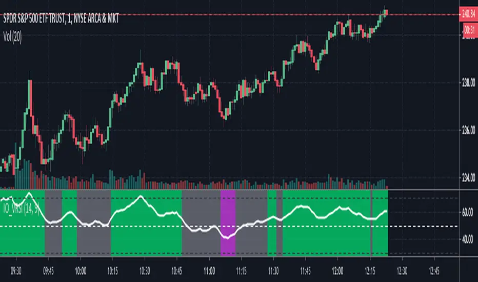
IO_VRSIOriginal Idea by Invsto
In this indicator, I explore the core concepts of RSI and extend it with smoothening to determine volatility.
Usage:
LIME/GREEN : High Volatility and BULLISH trend
RED/FUCHSIA : High Volatility and BEARISH trend
GRAY: Low volatility/Potential Chop Zone
VIX-VXV-Ratio-Buschi
English:
This script shows the ratio between the VIX (implied volatility of SPX options over the next month) and the VXV (implied volatility of SPX options over the next three months). Since in normal "Contango" mode, the VXV should be higher than the VIX, the crossing under 1.0 or maybe 0.95 after a volatility spike could be a sign for a calming market or at least a calming volatility.
Deutsch:
Dieses Skript zeigt das Verhältnis zwischen dem VIX (implizite Volatilität der SPX-Optionen über den nächsten Monat) und dem VXV (implizite Volatilität der SPX-Optionen über die nächsten drei Monate). Da im normalen "Contango"-Modus der VXV höher als der VIX liegen sollte, kann das Abfallen unter 1,0 oder 0,95 nach einer Volatilitätsspitze ein Anzeichen für einen ruhiger werdenden Markt oder zumindest eine ruhiger werdende Volatilität sein.

Percent Change Histogram + MACandle Percent Move Columns with Optional Moving Average
Description:
This indicator calculates the percentage move of each candle over a specified number of bars and displays it as upward-facing columns, regardless of the candle direction. Each column is color-coded based on the candle’s direction—green for bullish, red for bearish. An optional moving average can be overlaid on the percentage values to help visualize trends and smooth out volatility.
Features:
Shows each candle’s percentage move as a column facing upward.
Columns are colored according to candle direction.
Adjustable input for the number of bars used in calculation.
Optional moving average overlay that can be added or removed.
Helps quickly assess volatility and trend strength in percentage terms.
Use Case:
Ideal for traders who want a clear visual representation of individual candle movements in percentage terms, making it easier to spot trends, pullbacks, and volatility patterns across different timeframes.

Price Exhaustion Envelope [BackQuant]Price Exhaustion Envelope
Visual preview of the bands:
What it is
The Price Exhaustion Envelope (PEE) is a multi‑factor overextension detector wrapped inside a dynamic envelope framework. It measures how “tired” a move is by blending price stretch, volume surges, momentum and acceleration, plus optional RSI divergence. The result is a composite exhaustion score that drives both on‑chart signals and the adaptive width of three optional envelope bands around a smoothed baseline. When the score spikes above or below your chosen threshold, the script can flag exhaustion, paint candles, tint the background and fire alerts.
How it works under the hood
Exhaustion score
Price component: distance of close from its mean in standard deviation units.
Volume component: normalized volume pressure that highlights unusual participation.
Momentum component: rate of change and acceleration of price, scaled by their own volatility.
RSI divergence (optional): bullish and bearish divergences gently push the score lower or higher.
Mode control: choose Price, Volume, Momentum or Composite. Composite averages the main pieces for a balanced view.
Energy scale (0 to 100)
The composite score is pushed through a logistic transform to create an “energy” value. High energy (above 70 to 80) signals a move that may be running hot, while very low energy (below 20 to 30) points to exhaustion on the downside.
Envelope engine
Baseline: EMA of price over the main lookback length.
Width: base width is standard deviation times a multiplier.
Type selector:
• Static keeps the width fixed.
• Dynamic expands width in proportion to the absolute exhaustion score.
• Adaptive links width to the energy reading so bands breathe with market “heat.”
Smoothing: a short EMA on the width reduces jitter and keeps bands pleasant to trade around.
Band architecture
You can toggle up to three symmetric bands on each side of the baseline. They default to 1.0, 1.6 and 2.2 multiples of the smoothed width. Soft transparent fills create a layered thermograph of extension. The outermost band often maps to true blow‑off extremes.
On‑chart elements
Baseline line that flips color in real time depending on where price sits.
Up to three upper and lower bands with progressive opacity.
Triangle markers at fresh exhaustion triggers.
Tiny warning glyphs at extreme upper or lower breaches.
Optional bar coloring to visually tag exhausted candles.
Background halo when energy > 80 or < 20 for instant context.
A compact info table showing State, Score, Energy, Momentum score and where price sits inside the envelope (percent).
How to use it in trading
Mean reversion plays
When price pierces the outer band and an exhaustion marker prints, look for reversal candles or lower‑timeframe confirmation to fade the move back toward the baseline.
For conservative entries, wait for the composite score to roll back under the threshold or for energy to drop from extreme to neutral.
Set stops just beyond the extreme levels (use extreme_upper and extreme_lower as natural invalidation points). Targets can be the baseline or the opposite inner band.
Trend continuation with smart pullbacks
In strong trends, the first tag of Band 1 or Band 2 against the dominant direction often offers low‑risk continuation entries. Use energy readings: if energy is low on a pullback during an uptrend, a bounce is more likely.
Combine with RSI divergence: hidden bullish divergence near a lower band in an uptrend can be a powerful confirmation.
Breakout filtering
A breakout that occurs while the composite score is still moderate (not exhausted) has a higher chance of follow‑through. Skip signals when energy is already above 80 and price is punching the outer band, as the move may be late.
Watch env_position (Envelope %) in the table. Breakouts near 40 to 60 percent of the envelope are “healthy,” while those at 95 percent are stretched.
Scaling out and risk control
Use exhaustion alerts to trim positions into strength or weakness.
Trail stops just outside Band 2 or Band 3 to stay in trends while letting the envelope expand in volatile phases.
Multi‑timeframe confluence
Run the script on a higher timeframe to locate exhaustion context, then drill down to a lower timeframe for entries.
Opposite signals across timeframes (daily exhaustion vs. 5‑minute breakout) warn you to reduce size or tighten management.
Key inputs to experiment with
Lookback Period: larger values smooth the score and envelope, ideal for swing trading. Shorter values make it reactive for scalps.
Exhaustion Threshold: raise above 2.0 in choppy assets to cut noise, drop to 1.5 for smooth FX pairs.
Envelope Type: Dynamic is great for crypto spikes, Adaptive shines in stocks where volume and volatility wave together.
RSI Divergence: turn off if you prefer a pure price/volume model or if divergence floods the score in your asset.
Alert set included
Fresh upper exhaustion
Fresh lower exhaustion
Extreme upper breach
Extreme lower breach
RSI bearish divergence
RSI bullish divergence
Hook these to TradingView notifications so you get pinged the moment a move hits exhaustion.
Best practices
Always pair exhaustion signals with structure. Support and resistance, liquidity pools and session opens matter.
Avoid blindly shorting every upper signal in a roaring bull market. Let the envelope type help you filter.
Use the table to sanity‑check: a very high score but mid‑range env_position means the band may still be wide enough to absorb more movement.
Backtest threshold combinations on your instrument. Different tickers carry different volatility fingerprints.
Final note
Price Exhaustion Envelope is a flexible framework, not a turnkey system. It excels as a context layer that tells you when the crowd is pressing too hard or when a move still has fuel. Combine it with sound execution tactics, risk limits and market awareness. Trade safe and let the envelope breathe with the market.

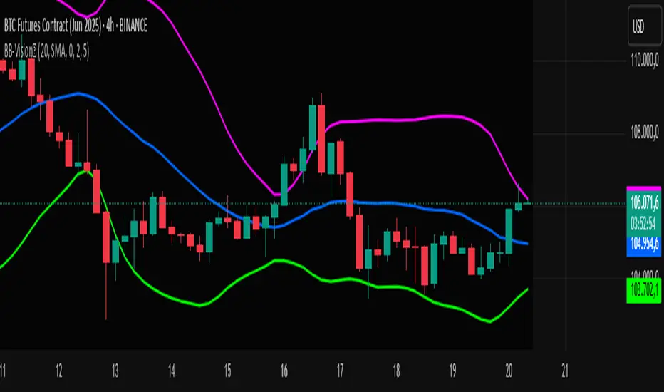
Bands Vision-XBands Vision-X (BB-Vision-X) – Full Description
Description:
Bands Vision-X is an indicator based on dynamic bands constructed from customizable moving averages and standard deviation, allowing you to visualize potential support and resistance zones, volatility, and market conditions. It uses an adjustable moving average (with multiple options such as SMA, EMA, WMA, JMA, LSMA, DEMA, and TEMA) to define the central line, and upper and lower bands calculated by standard deviation multiplied by an adjustable factor. The bands are smoothed by a Hull Moving Average (HMA) to reduce noise and improve clarity.
How to Use
The bands indicate potential support and resistance levels.
The central line serves as a dynamic price reference.
The distance between bands reflects market volatility.
Touches or breakouts of the bands may signal entry or exit opportunities.
Parameters
Parameter Description Default
Standard Error Band Period Period for moving average and standard deviation 20
Moving Average Type Type of moving average (SMA, EMA, etc.) SMA
Standard Deviation Multiplier Multiplier for standard deviation 2.0
Band Lines Smoothing Period Period for smoothing the bands (HMA) 5
Technical Notes
The JMA function used is not the original Jurik version but an approximate and open implementation based on publicly available TradingView community code.
Developed in Pine Script v6 with optimized and clean code.
Recommendations
Ideal for traders seeking a clear view of volatility and dynamic support/resistance levels.
Should not be used in isolation; it is recommended to combine with volume analysis, price action, or other technical indicators.
Adjust the period and multiplier according to the asset and timeframe for better effectiveness.
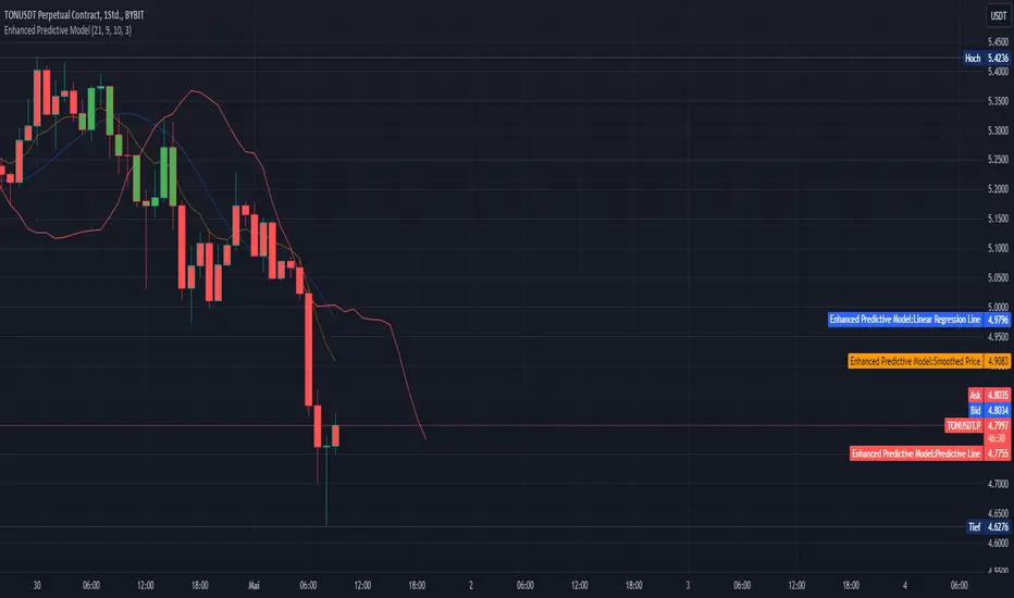
Enhanced Predictive ModelThe "Enhanced Predictive Model" is a sophisticated TradingView indicator designed for traders looking for advanced predictive insights into market trends. This model leverages smoothed price data through an Exponential Moving Average (EMA) to ensure a more stable trend analysis and mitigate the effects of price volatility.
**Features of the Enhanced Predictive Model:**
- **Linear Regression Analysis**: Calculates a regression line over the smoothed price data to determine the prevailing market trend.
- **Predictive Trend Line**: Projects future market behavior by extending the current trend line based on the linear regression analysis.
- **EMA Smoothing**: Utilizes a dynamic smoothing mechanism to provide a clear view of the trend without the noise typically associated with raw price data.
- **Visual Trend Indicators**: Offers immediate visual cues through bar coloring, which changes based on the trend direction detected by the regression slope. Green indicates an uptrend, while red suggests a downtrend.
**Key Inputs:**
- **Regression Length**: Determines the number of bars used for the regression analysis, allowing customization based on the user's trading strategy.
- **EMA Length**: Sets the smoothing parameter for the EMA, balancing responsiveness and stability.
- **Future Bars Prediction**: Defines how many bars into the future the predictive line should extend, providing foresight into potential price movements.
- **Smoothing Length**: Adjusts the sensitivity of the trend detection, ideal for different market conditions.
This tool is ideal for traders focusing on medium to long-term trends and can be used across various markets, including forex, stocks, and cryptocurrencies. Whether you are a day trader or a long-term investor, the "Enhanced Predictive Model" offers valuable insights to help anticipate market moves and enhance your trading decisions.
**Usage Tips:**
- Best used in markets with moderate volatility for clearer trend identification.
- Combine with volume indicators or oscillators for a comprehensive trading strategy.
**Recommended for:**
- Trend Following
- Market Prediction
- Volatility Assessment
By employing this indicator, traders can not only follow the market trend but also anticipate changes, giving them a strategic edge in their trading activities.
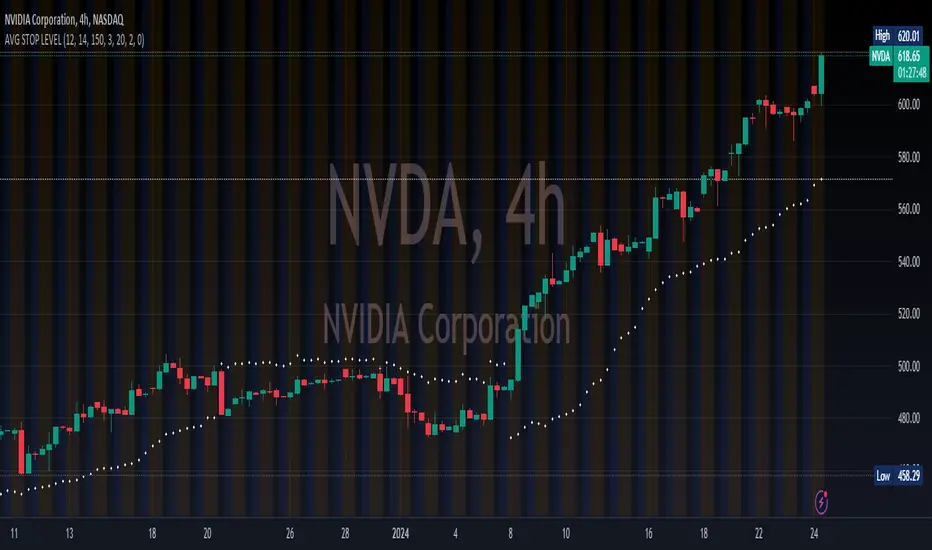
AUTO STOP LEVELThis is a simple yet highly efficient code that calculates stop levels, taking into account the market trend and its volatility.
This script calculates and displays (as a white point in the chart) a stop-loss by considering both volatility and the nearest support/resistance point.
The stop level is determined as the average of three specific values: firstly, two distinct volatility indicators - ATR and Bollinger Bands, and finally, the nearest support/resistance provided by the Supertrend indicator.
Moreover, it analyzes the trend to determine whether the stop should be set for long or short positions, providing insights into the most probable path of future prices. For instance, if the calculated stop level is below the current market prices, it suggests taking long positions, and vice versa.
Customization options include fine-tuning the standard parameters for the three indicators used in averaging and selecting multiple time frames.
MADALGO's Fear and Greed OscillatorThe Fear and Greed Oscillator is a dynamic tool designed to gauge market sentiment by analyzing various components such as volatility, momentum, and volume. This indicator synthesizes multiple metrics to provide a singular view of market emotion, oscillating between fear and greed.
🔷 Calculation -
The oscillator integrates the following components, each normalized and weighted to contribute equally:
ATR (Average True Range): Represents market volatility.
MACD (Moving Average Convergence Divergence): Captures market momentum.
RSI (Relative Strength Index): Provides insights into overbought or oversold conditions.
Volume: Reflects market participation levels.
Each component is first normalized to ensure a balanced impact and then averaged to create the final oscillator value.
🔷 Color Coding -
The oscillator's plot changes color based on its value, representing market sentiment:
Green: Indicates a leaning towards greed.
Red: Suggests a leaning towards fear.
The intensity of the color represents the strength of the sentiment.
🔷 Usage -
This indicator is valuable for traders looking to understand market sentiment. It works best when combined with other forms of analysis, such as fundamental or other technical indicators, to form a comprehensive trading strategy.
🔷 Signal Lines -
Two horizontal lines represent extreme conditions:
A line for Extreme Fear.
Another for Extreme Greed.
These lines help identify when the market sentiment is at potentially unsustainable levels.
🔷 Customization -
The Fear and Greed Oscillator is designed with flexibility in mind, allowing users to adjust several parameters to match their specific analysis requirements. Understanding and utilizing these customization options can significantly enhance the indicator's relevance and effectiveness in various market conditions.
1. Length Parameters:
ATR and RSI Length: This input determines the period over which the Average True Range (ATR) and the Relative Strength Index (RSI) are calculated. Adjusting this length can affect the sensitivity of the oscillator to recent market movements. A shorter length makes the oscillator more responsive to recent changes, while a longer length smoothens it, reducing sensitivity to short-term fluctuations.
MACD Parameters: These include the Fast Length, Slow Length, and Signal Smoothing. By adjusting these, users can control how the Moving Average Convergence Divergence (MACD) component reacts to price movements. This customization is crucial for aligning the oscillator with different trading strategies, whether short-term or long-term focused.
Volume Length: This parameter sets the period for the moving average and standard deviation calculations of the volume component. Altering this length allows the oscillator to either emphasize recent volume changes or consider a broader historical context.
2. Weight Adjustments:
Component Weights: Each component (ATR, MACD, RSI, Volume) has an associated weight factor. These weights determine the relative influence of each component on the final oscillator value. Users can increase the weight of a component to give it more influence or decrease it to lessen its impact. This feature is particularly beneficial for traders who have a preference or insight into which market aspects are more indicative of fear or greed at given times.
Balancing the Components: The key to effective customization lies in balancing these weights to reflect the user's market perspective and trading style. For instance, a trader focusing on volatility might increase the weight of the ATR, while one interested in momentum might prioritize the MACD and RSI weights.
3. Color and Signal Line Customization:
Color Intensity: The intensity of the color gradient of the oscillator line can be a visual aid in quickly identifying market sentiment. Users can experiment with the colorValue calculation within the script to adjust how rapidly the color changes with the oscillator values
Extreme Levels: The extreme fear and greed levels, represented by horizontal lines, are customizable. Users can set these levels based on historical data analysis or personal risk tolerance. These lines act as alerts for potentially overextended market conditions.
🔷 Limitations -
As with any technical tool, the Fear and Greed Oscillator should not be used in isolation. It does not predict market direction but rather gauges the prevailing market emotion. Its effectiveness may vary across different markets and timeframes.
🔷 Conclusion -
The Fear and Greed Oscillator offers a unique perspective on market sentiment, encapsulating various aspects of market behavior into a single indicator. It serves as a versatile tool for traders aiming to understand the emotional undercurrents of the market.
🔷 Risk Disclaimer -
Financial trading involves significant risk. The value of investments can fluctuate, and past performance is not indicative of future results. This indicator is for informational purposes and should not be construed as financial advice. Always consider your personal circumstances and seek independent advice before making financial decisions.

[blackcat] L2 Range Action Verification Index (RAVI) with 3 SMAThe Range Action Verification Index (RAVI) is a technical indicator used in trading to measure the strength of a trend. It compares two simple moving averages (SMAs) to determine the market's momentum.
To calculate RAVI, we subtract the shorter SMA from the longer SMA, and then divide the result by the longer SMA. This value is then multiplied by 100 to express it as a percentage.
The RAVI indicator helps traders identify whether the market is in a trending or range-bound phase. When the RAVI value is positive, it indicates a bullish trend, suggesting that the market is in an uptrend. Conversely, a negative RAVI value indicates a bearish trend or a downtrend.
Traders can use the RAVI indicator in several ways. Here are a few common strategies:
1. **Trend confirmation**: Traders can use RAVI to confirm the strength of a trend identified by other indicators or price patterns. If the RAVI value aligns with the direction of the trend, it provides additional confirmation.
2. **Overbought and oversold conditions**: Traders can use extreme RAVI values to identify overbought or oversold conditions in the market. When the RAVI value reaches high positive or negative levels, it suggests that the market may be due for a reversal or a retracement.
3. **Divergence**: Traders can look for divergences between the RAVI indicator and the price action. For example, if the price makes a higher high, but the RAVI value makes a lower high, it could indicate a weakening trend and a potential reversal.
As with any technical indicator, it is essential to use RAVI in conjunction with other tools and analysis techniques to make informed trading decisions. Traders should also consider factors such as market conditions, risk management, and other supporting indicators to validate their trading strategies.
In this indicator, an additional simple moving average (SMA) is introduced to consider long-term bias. This modification allows the Range Action Verification Index (RAVI) to be used as a volatility filter. By comparing the shorter SMA with this longer SMA, traders can gain insights into the market's volatility and adjust their trading strategies accordingly. This longer SMA helps provide a broader perspective on the market's trend and can be particularly useful for identifying and filtering out periods of high volatility. It is called "L2 Range Action Verification Index (RAVI) with 3 SMA". It calculates the RAVI value based on three simple moving averages (SMA). The code also includes calculations for the upper and lower bands, as well as color gradient settings. Finally, it plots the RAVI values and a midline.
It calculates the Range Action Verification Index (RAVI) using three Simple Moving Averages (SMA). The RAVI measures the difference between two SMAs divided by a third SMA, and then multiplied by 100.
The code starts with defining input parameters such as length, multiplier, and lengths for the three SMAs. Then it assigns the closing price to a variable called "price".
Next, it calculates the three SMAs using the "ta.sma" function from TradingView's built-in technical analysis library. The first SMA uses "sma1Length", the second SMA uses "sma2Length", and the third SMA uses "sma3Length".
After that, it calculates the RAVI by subtracting sma2 from sma1, dividing it by sma3, and multiplying it by 100.
Then it calculates additional values like basis (using another SMA), deviation (using standard deviation), upper band (basis + dev), and lower band (basis - dev).
Finally, it plots these values on a chart using different colors for each line. It also creates an array of gradient colors based on RSI values calculated from another indicator called ALMA. This gradient color is used to colorize the RAVI line.
Overall, this script helps visualize and analyze market trends based on moving averages and their relationship with price movements.

Average True Range PercentWhen writing the Quickfingers Luc base scanner (Marvin) script, I wanted a measure of volatility that would be comparable between charts. The traditional Average True Range (ATR) indicator calculates a discrete number providing the average true range of that chart for a specified number of periods. The ATR is not comparable across different price charts.
Average True Range Percent (ATRP) measures the true range for the period, converts it to a percentage using the average of the period's range ((high + low) / 2) and then smooths the percentage. The ATRP provides a measure of volatility that is comparable between charts showing their relative volatility.
Enjoy.
Moving Average Band Width [CC]The Moving Average Band Width was created by Vitali Apirine (Stocks and Commodities Aug 2021 pg 25) and this is of course an extension based on my previous Moving Average Bands script. For those of you that aren't aware, the Band Width indicator is an indicator that tells you how close the upper and lower bands are to each other which is a great determination of how volatility is increasing or decreasing. This acts as both a trend indicator and a volatility indicator. I have included strong buy and sell signals in addition to normal ones so stronger signals are darker in color and normal ones are lighter. A great buy signal is when you are in an uptrend (so the line is green already) and the indicator line is moving up which means strong underlying volatility.
Let me know if there are any other indicators or scripts you would like to see me publish!

72s Strat: Backtesting Adaptive HMA+ pt.1This is a follow up to my previous publication of Adaptive HMA+ few months ago, as a mean to provide some kind of initial backtesting tools. Which can be use to explore many possible strategies, optimise its settings to better conform user's pair/tf, and hopefully able to help tweaking your general strategy.
If you haven't read the study or use the indicator, kindly go here first to get the overall idea.
The first strategy introduce in this backtest is one most basic already described in the study; buy/sell is when movement is there and everything is on the right side; When RSI has turned to other side, we can use it as exit point (if in profit of course, else just let it hit our TP/SL, why would we exit before profit). Also, base on RSI when we make entry, we can further differentiate type of signals. --Please check all comments in code directly where the signals , entries , and exits section are.
Second additional strategy to check; is when we also use second faster Adaptive HMA+ for exit. So this is like a double orders on a signal but with different exit-rule (/more on this on snapshots below). Alternatively, you can also work the code so to only use this type of exit.
There's also an additional feature which you can enable its visuals, the Distance Zone , is to help measuring price distance to our xHMA+. It's just a simple atr based envelope really, I already put the sample code in study's comment section, but better gonna update it there directly for non-coder too, after this.
In this sample I use Lot for order quantity size just because that's what I use on my broker. Also what few friends use while we forward-testing it since the study is published, so we also checked/compared each profit/loss report by real number. To use default or other unit of measurement, change the entry code accordingly.
If you change your order size, you should also change the commission in Properties Tab. My broker commission is 5 USD per order/lot, so in there with example order size 0.1 lot I put commission 0.5$ per order (I'll put 2.5$ for 0.5 lot, 10$ for 2 lot, and so on). Crypto usually has higher charge. --It is important that you should fill it base on your broker.
SETTINGS
I'm trying to keep it short. Please explore it further again. (Beginner should also first get acquaintance with terms use here.)
ORDERS:
Base Minimum Profit Before Exit:
The number is multiplier of ongoing ATR. Means that when basic exit condition is met, algo will check whether you're already in minimum profit or not, if not, let it still run to TP or SL, or until it meets subsequent exit condition, then it will check again.
Default Target Profit:
Multiplier of ATR at signal. If reached before any eligible exit condition is met, exit TP.
Base StopLoss Point:
You can change directly in code to use other like ATR Trailing SL, fix percent SL, or whatever. In the sample, 4 options provided.
Maximum StopLoss:
This is like a safety-net, that if at some point your chosen SL point from input above happens to be exceeding this maximum input that you can tolerate, then this max point is the one will be use as SL.
Activate 2nd order...:
The additional doubling of certain buy/sell with different exits as described above. If enable, you should also set pyramiding to at least: 2. If not, it does nothing.
ADAPTIVE HMA+ PERIOD
Many users already have their own settings for these. So in here I only sample the default as first presented in the study. Make it to your adaptive.
MARKET MOVEMENT
(1) Now you can check in realtime how much slope degree is best to define your specific pair/tf is out of congestion (yellow) area. And (2) also able to check directly what ATR lengths are more suitable defining your pair's volatility.
DISTANCE ZONE
Distance Multiplier. Each pair/tf has its own best distance zone (in xHMA+ perspective). The zone also determine whether a signal should appear or not. (Or what type of signal, if you wanna go more detail in constructing your strategy)
USAGE
(Provided you already have your own comfortable settings for minimum-maximum period of Adaptive HMA+. Best if you already have backtested it manually too and/or apply as an add-on to your working strategy)
1. In our experiences, first most important to define is both elements in the Market Movement Settings . These also tend to be persistent for whole season since it's kinda describing that pair/tf overall behaviour. Don't worry if you still get a low Profit Factor here, but by tweaking you should start to see positive changes in one of Max Drawdown and Net Profit, or Percent Profitable.
2. Afterwards, find your pair/tf Distance Zone . When optimising this, what we seek is just a "not to bad" equity curves to start forming. At least Max Drawdown should lessen more. Doesn't have to be great already, but should be better, no red in Net Profit.
3. Then go manage the "Trailing Minimum Profit", TP, SL, and max SL.
4. Repeat 1,2,3. 👻
5. Manage order size, commission, and/or enable double-order (need pyramiding) if you like. Check if your equity can handle max drawdown before margin call.
6. After getting an acceptable backtest result, go to List of Trades tab and find the biggest loss or when many sequencing loss in a row happened. Click on it to go to exact point on chart, observe why the signal failed and get at least general idea how it can be prevented . The rest is yours, you should know your pair/tf more than other.
You can also re-explore your minimum-maximum period for both Major and minor xHMA+.
Keep in mind that all numbers in Setting are conceptually in a form of range . You don't want to get superb equity curves but actually a "fragile" , means one can easily turn it to disaster just by changing only a fraction in one/two of the setting.
---
If you just wanna test the strength of the indicator alone, you can disable "Use StopLoss" temporarily while optimising settings.
Using no SL might be tempting in overall result data in some cases, but NOTE: It is not recommended to not using SL, don't forget that we deliberately enter when it's in high volatility. If want to add flexibility or trading for long-term, just maximise your SL. ie.: chose SL Point>ATR only and set it maximum. (Check your max drawdown after this).
I think this is quite important specially for beginners, so here's an example; Hypothetically in below scenario, because of some settings, the buy order after the loss sell signal didn't appear. Let's say if our initial capital only 1000$ using leverage and order size 0,5 lot (risky position sizing already), moreover if this happens at the beginning of your trading season, that's half of account gone already in one trade . Your max SL should've made you exit after that pumping bar.
The Trailing Minimum Profit is actually look like this. Search in the code if you want to plot it. I just don't like too many lines on chart.
To maximise profit we can try enabling double-order. The only added rule coded is: RSI should rising when buy and falling when sell. 2nd signal will appears above or below default buy/sell signal. (Of course it's also prone to double-loss, re-check your max drawdown after. Profit factor play its part in here for a long run). Snapshot in comparison:
Two default sell signals on left closed at RSI exit, the additional sell signal closed later on when price crossover minor xHMA+. On buy side, price haven't met our minimum profit when first crossunder minor xHMA+. If later on we hit SL on this "+buy" signal, at least we already profited from default buy signal. You can also consider/treat this as multiple TP points.
For longer-term trading, what you need to maximise is the Minimum Profit , so it won't exit whenever an exit condition happened, it can happen several times before reaching minimum profit. Hopefully this snapshot can explain:
Notice in comparison default sell and buy signal now close in average after 3 days. What's best is when we also have confirmation from higher TF. It's like targeting higher TF by entering from smaller TF.
As also mention in the study, we can still experiment via original HMA by putting same value for minimum-maximum period setting. This is experimental EU 1H with Major xHMA+: 144-144, Flat market 13, Distance multiplier 3.6, with 2nd order activated.
Kiwi was a bit surprising for me. It's flat market is effectively below 6, with quite far distance zone of 3.5. Probably because I'm using big numbers in adaptive period.
---
The result you see in strategy tester report below for EURUSD 15m is using just default settings you see in code, as follow:
0,1 lot for each order (which is the smallest allowed by my broker).
No pyramiding. Commission: 0.5 usd per order. Slippage: 3
Opening position is only using basic strategy #1 (RSI exit). Additional exit not activated.
Minimum Profit: 1. TP: 3.
SL use: Half-distance zone. Max SL: 4.5.
Major xHMA+: 172-233. minor xHMA+: 89-121
Distance Zone Multiplier: 2.7
RSI: Standard 14.
(From our forward-testing, the difference we get from net profit is because of the spread, our entry isn't exactly at the close/open price. Not so much though, but not the same. If somebody can direct me to any example where we can code our entry via current bid/ask price, that would be awesome!)
It's already a long post (sorry), think I'm gonna pause here. Check out the code :)
---
DISCLAIMER: Past performance is no guarantee of future results , and so on.. you know the drill ;)
Please read whole description first before using, don't take 1-2 paragraph and claim it's the whole logic, you are responsible of your own actions and understanding.

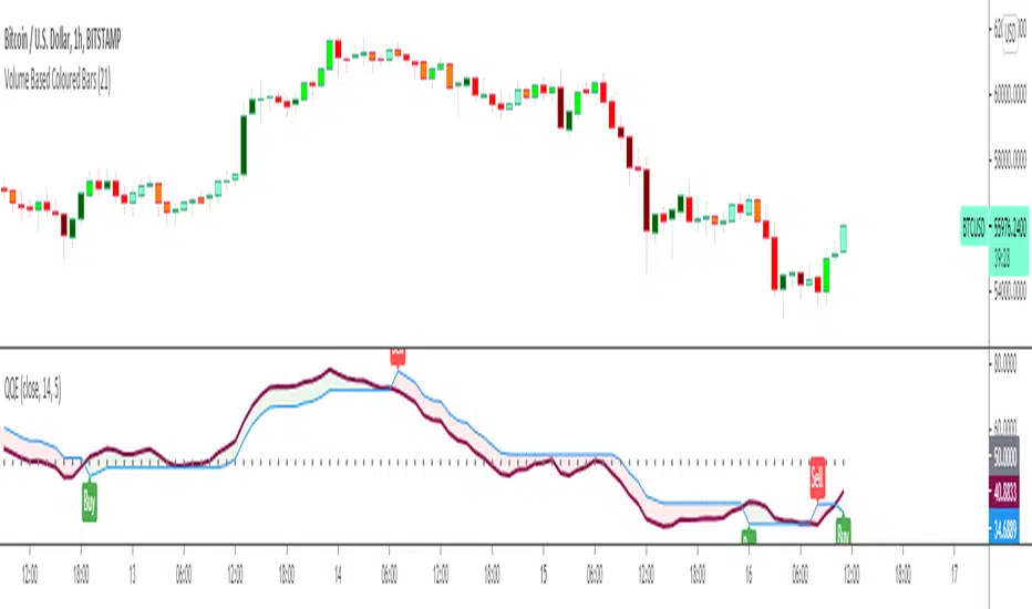
Quantitative Qualitative Estimation QQE
The QQE indicator is a momentum based indicator to determine trend and sideways.
The Qualitative Quantitative Estimation (QQE) indicator works like a smoother version of the popular Relative Strength Index (RSI) indicator. QQE expands on RSI by adding two volatility based trailing stop lines. These trailing stop lines are composed of a fast and a slow moving Average True Range (ATR). These ATR lines are smoothed making this indicator less susceptible to short term volatility.
The most common method of using QQE is to look for crosses of the fast and slow moving trailing stop lines during periods when the QQE line reflects overbought or oversold conditions
Qualitative Quantitative Estimation made up of a smoothed Relative Strength Index (RSI) indicator plus fast and slow volatility-based trailing levels.
Qualitative Quantitative Estimation can be used in two directions:
1.Determine the trend, i.e. if the line is above the 50 level, the trend is ascending, if below - descending;
2.Search for signals at the moment of crossing of the QQE FAST (maroon) and QQE SLOW (blue) lines.
The QQE itself is generally considered to indicate an up-trend ifQQE FAST is above QQE SLOW, and a down-trend if below QQE SLOW.
Often a middle-range between 40 and 60 is set and if the indicator is in that range, then the market is considered to be tracking sideways, or in no trend.
You will need to set only one parameter – “SF” "RSI SMoothing Factor", an analogue of the period in RSI.
By the way, judging from the open source information, the algorithm used the standard strength index with a period of 14 for calculations.
Various signals can be created from the indicator such as:
-Buy when QQE FAST crosses above QQE SLOW below 50 level or just buy when QQE lines crosses above 50 level.
-Sell when QQE FAST crosses below QQE SLOW above 50 level or just sell when QQE lines crosses below 50 level.
WARNING: QQE IS A RSI BASED INDICATOR SO THAT IT CAN TRIGGER FALSE SIGNALS DURING DIVERGENCES!
Kıvanç Özbilgiç
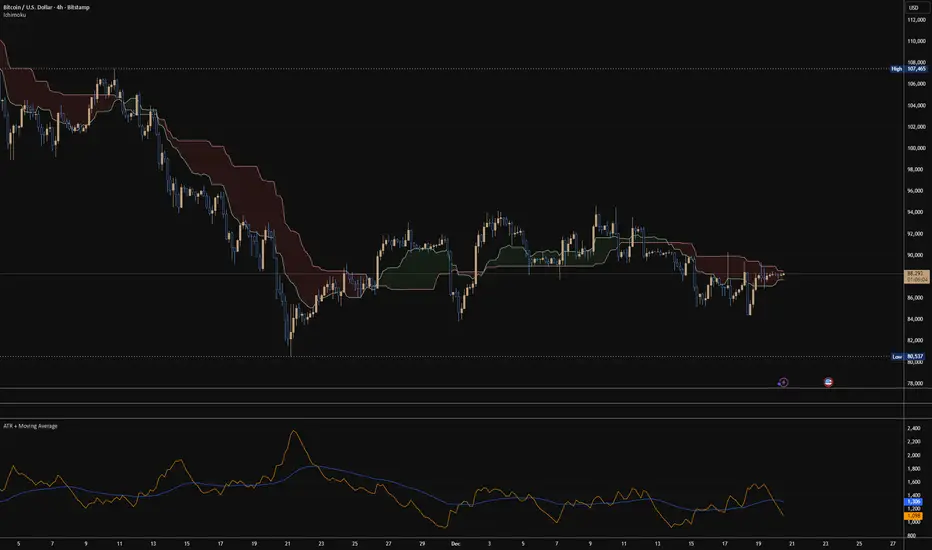
ATR + Moving AverageThis indicator shows a manually calculated Average True Range (ATR) along with a moving average of the ATR.
The ATR measures current candle volatility.
The ATR Moving Average shows the average candle size over the selected period.
Both can use different smoothing types (RMA, SMA, EMA, WMA) for flexibility.
It’s useful for seeing when price is stretched, volatility is expanding or contracting, and for higher-timeframe mean-reversion analysis.