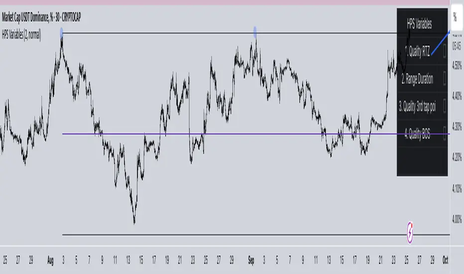
HPS VariablesThis script will provide a chart with a list of the 4 HPS variables for trading TCT models.
Cari dalam skrip untuk "Wyckoff"
Phoenix Ascending 2.201Hi Everyone!
It's time to make this indicator public to relieve myself of replying to requests for access. There has been an update to this indicator; in which a Stochastic RSI was added to this indicator. Please follow the directions to SETUP the indicator in the SETUP VIDEO provided below.
Phoenix Ascending 2.201 and Bollinger Bands Setup Video.
The following are BASIC rules for the Phoenix 2.201 Indicator. More advanced rules and the requirements for those rules can be found in my publications in my public profile. Unfortunately, I do not have organized videos created on how to use this indicator in full but will be available in the future.
IMPORTANT: The BASIC rules below are beneficial but these are NOT all the rules. More rules and requirements for those rules will be available in the future.
RULE NO. 1
We PREFER the Blue LSMA to be at 80% or higher for SAFE EXIT (SHORT) bets.
We PREFER the Blue LSMA to be at 20% or lower for SAFE ENTRY (LONG) bets.
Rule No. 2
ANY time the red line is approaching a green line that’s moving UPWARD,
Be prepared to make an ENTRY (LONG) when the red line is about to touch the green line that’s moving upward.
One can look at a lower time frame to get a better idea of how much longer you may have
To wait for the red line to touch the green line. In many cases, you may make ENTRY (LONG)
Just before the red line actually touches the green line that’s moving up in that higher time frame
You were initially using as your COMPASS. I currently have the 1-Month TF as a compass for EURUSD.
Rule No. 3
ANY time the red line is approaching a green line that’s moving DOWNWARD,
Be prepared to make an EXIT (SHORT) when the red line is about to touch the green line that’s moving downward.
One can look at a lower time frame to get a better idea of how much longer you may have
To wait for the red line to touch the green line. In many cases, you may make your EXIT (SHORT)
Just before the red line actually touches the green line that’s moving downward in that higher time frame
You were initially using as your COMPASS. I currently have the 1-Month TF as a compass for EURUSD.
Rule No. 4
The Green Line and/or Ghost Line can often help one determine when an upward or downward move in a particular time frame
Is nearly exhausted and about to reverse.
Example for Upside Exhaustion about to reverse to the Downside:
When the Green Line and/or Ghost line is at 80% level or higher, this is a good indicator to inform
Us the current upside move may be approaching exhaustion. You can look at a higher time frame to try to gain
More insight as to whether this will only be a brief dip down in the lower time frame IF the higher time frame you
Went to reveals there is a lot more room remaining for the Green and/or Ghost Lines to reach the 80% or higher level.
Example for Downside Exhaustion about to reverse to the Upside:
When the Green Line and/or Ghost line is at 20% level or lower, this is a good indicator to inform
Us the current downside move may be approaching exhaustion. You can look at a higher time frame to try to gain
More insight as to whether this will only be a brief dip up in the lower time frame IF the higher time frame you
Went to reveals there is a lot more room remaining for the Green and/or Ghost Lines to reach the 20% or lower level.
Rule No. 5
The same rules you see in Rule No. 4 also apply to the Stochastic RSI. Keep in mind I changed the colors of the
Stochastic RSI to the following: Red default changed to Purple and Blue changed changed to Black to avoid confusing
Them with the lines in Godmode.
When the Stochastic RSI is at 80% or higher level, we need to be on guard for a reversal to the downside.
When the Stochastic RSI is at 20% or lower level, we need to be on guard for a reversal to the upside.
EXTREMELY IMPORTANT to apply these rules in GROUPS OF TIME FRAMES.
"TYPES" OF TIME FRAME GROUP TRADING SIGNALS
Scalping Group Signals: Signals provided for this group involve analyzing the following two groups of time frames. Short Term Group as a compass and Scalping Group for confirmation and more precise entry/exit.
Scalping Group: 6min. 12min. 23min & 45min.
Short Term Group: 90min. 3hr. 6hr. & 12hr.
Short Term Group Signals: Signals provided for this group involve analyzing the following two groups of time frames. NearTerm Group as a compass and Short Term Group for confirmation and more precise entry/exit.
Short Term Group: 90min. 3hr. 6hr. & 12hr.
Near Term Group: 24hr. 2-Day, 3-Day & 4-Day
Near Term Group Signals: Signals provided for this group involve analyzing the following two groups of time frames. Mid Term Group as a compass and Near Term Group for confirmation and more precise entry/exit.
Near Term Group: 24hr. 2-Day, 3-Day & 4-Day
Mid Term Group: 3-Day, 6-Day, 9-Day & 12-Day
Mid Term Group Signals: Signals provided for this group involve analyzing the following two groups of time frames. Long Term Group as a compass and Mid Term Group for confirmation and more precise entry/exit.
Mid Term Group: 3-Day, 6-Day, 9-Day & 12-Day
Long Term Group: 1-Week, 2-Week, 3-Week & 4-Week
Long Term Group Signals: Signals provided for this group involve analyzing the following two groups of time frames. Macro Term Group as a compass and Long Term Group for confirmation and more precise entry/exit.
Long Term Group: 1-Week, 2-Week, 3-Week & 4-Week
Macro Term Group: 1-Month, 2-Month, 3-Month & 4-Month
Macro Term Group Signals: Signals provided for this group involve analyzing the following two groups of time frames. Macro Term Group as a compass and Long Term Group for confirmation and more precise entry/exit.
Macro Term Group: 1-Month, 2-Month, 3-Month & 4-Month
Super Macro Group: 3-Month , 6-Month, 12-Month & 24-Month

Bollinger BandsHi Everyone!
User @three333 took the time to create this script with the multiple Bollinger Bands all combined together while I've been busy with other projects. This will make it easier to apply all the bands much faster. If you need this script, you have a better chance of receiving an invite much faster by sending me a PM.
Remember, this Bad Ass BB is to be used with my Phoenix 1.119 indicator for best results.
NOTE: I do NOT give one-on-one education in PM's or in public rooms. Nor do I give trading advice in PM's. I'm often too busy to allow my time to be absorbed by multiple PM's from multiple people each day. No disrespect intended by this notification. You would understand if you were in my shoes.
Happy Trading and Stay Awesome!
David

Phoenix 1.118no-multiThere was a conflict with the older Phoenix 1.118 involving an update on TradingView platform with BTCE exchange being removed from their database. Since BTCE exchange was used in the old Phoenix 1.118 script, I had to edit the script. As most of you know, I recommend NOT using this indicator in Multi-Exchange Mode. So, to avoid any conflict in the future with this script in the future due to an exchange being removed from TradingView's database; I've eliminated the "Multi-Exchange" function entirely.
I still recommend using Phoenix 1.119 instead of Phoenix 1.118. However, if you still prefer to use Phoenix 1.118, you need to send me a PM (Personal Message) requesting an invite. If you request an invite in the comments section, it may take longer for me to reply to your request.
The main difference with Phoenix 1.118 and 1.119 is Phoenix 1.118 has Pressure Dots applied differently from Phoenix 1.119.
One can make a living working hard on their job. One can make a fortune working hard on themselves! So, keep LEARNING and Stay Awesome!
Happy Trading and Stay Awesome!
Phoenix 1.119 - BTCUSD WITH 44% AND 56% LEVELS ADDEDThe purpose of this script is to get the Caution Dots back to original Godmode with the Red RSI rather than Caution Dots oriented on the Green Line like it's done in Phoenix 1.118. I prefer the Caution Dots oriented with the Red RSI. You may have to REFRESH YOUR BROWSER after receiving an invite to this indicator.
I'm trying to provide every possible resource I have devoted to the Phoenix 1.119 indicator below...
You can follow this video below for a basic setup of the Phoenix 1.119 indicator:
"Setup Phoenix 1.119 Script With Phoenix Ari 1.07 & Stochastic RSI."
The Publications linked below are a few EDUCATIONAL VIDEOS on how to use the Phoenix 1.119 indicator:
"BTCUSD - EDUCATION for My Followers... IMPORTANT..."
"BTCUSD - IMPORTANT - "EDUCATION" ON THE 44 PERCENT (%) RULE!"
The follow CHART Publication has IMPORTANT "BASIC" RULES in comments section. Scroll down in comments section to see the FIVE BASIC RULES FOR GODMODE (Phoenix 1.119):
"Using Godmode 3.1 mod with LSMA "merged" with Stochastic RSI."
"How to Setup an Alarm for Indicators Inside Phoenix 1.119."
The following is a current STUDY that is on-going; titled, "STUDY" to See if "CAUTION DOTS" Can Be of Use in Phoenix 1.119."
If you request access and I do not give it, SEND ME A PM to request access. I'm taking my son outside now to help him with his new bike.

Phoenix 1.391This is a modified version of Phoneix 1.118 with different inputs and additional Relative Strength Index (RSX). It also measures pressure of different HOT (Red Dot - Upward Pressure) or COLD (Blue Dot - Downward Pressure) values. It may be better suited for higher time frames but we will see.
If you are new to trading and do not know how to even setup a chart, you may want to watch the following video in which I explained setting up with Phoneix 1.118 and Phoenix ARI 1.07 "merged" with Stochastic RSI. However, Phoneix 1.391 is not in the video but the video should be suitable enough for you to get an idea of what to do to get it on your chart if you are new to charting.
By the way, you may need to refresh your browser after an "invite" in order to see this indicator in your "Invite-Only Scripts."
Here's the video:
Phoenix 1.118Do not use the "Multi-Exchange" option in "Inputs." Leave it unchecked and NEVER use it.
Go to "Format" and "Style" tab then "un-check" "Buy" and "Sell." Leave them turned off. This was a failed experiment to TRY to create "Buy" and "Sell" signals with the indicator.
You will likely need to experiment with the COLORS you want for all the lines and levels. Especially, if you are using a background that's not white. You may also wish to consider making most of the lines THICKER. Once you have the colors and thickness of all the lines and caution dots to your liking, be sure to click the "default" tab in the bottom left corner of "Style" tab and select "Set As Default." This way, you will not have to set the colors, thickness of lines, etc... to your liking every single time you create a new chart.
As for learning how to use this indicator; it's not much different at all from Godmode 3.1 Mod with LSMA (LTCUSD). It can be used on most ANY crypto pair, stock, bond, commodity, futures and FOREX market. Be sure to study the publication (below) for Godmode 3.1 Mod with LSMA (LTCUSD). Once you've studied it, then it would not be a bad idea to watch as many of my VIDEO publications in an effort to pick up on how to understand this indicator even more. Don't forget to pay attention to the FIVE (5) BASIC RULES FOR GODMODE in the publication below.
I recommend getting a PRO account in order to use multiple charts on a single window in your browser. I also recommend getting a PRO account to be able to select many more time frames of your choosing in order to do a more thorough analysis. It's also recommended to use Stochastic RSI and Phoenix ARI in conjunction with this indicator. Phoenix ARI is NOT public. It is an invite only script under my control just as Phoenix 1.118. Simply ask for an invite. ; )
If you do use Phoenix 1.118 with Stochastic RSI and Phoenix ARI, they should all be configured in the following formation provided in the chart below.

Phoenix Ari 1.07Phoenix ARI 1.07:
This indicator works similar to Stochastic RSI. However, this indicator tends to reveal the sentiment/pressure of the market within a selected time frame without as much sensitivity to price action movement. Stochastic RSI is more sensitive to price action movement. Not this indicator.
I recommend MERGING this indicator with Stochastic RSI. Feel free to go to "format" and "style" to edit the colors, thickness of the lines, etc... All of these indicators may be useable in this publication without having to MERGE anything. I'm not sure...
The Phoenix ARI indicator in particular will be available only to paid subscribers with my future website affiliation to go along with educational materials on that website...

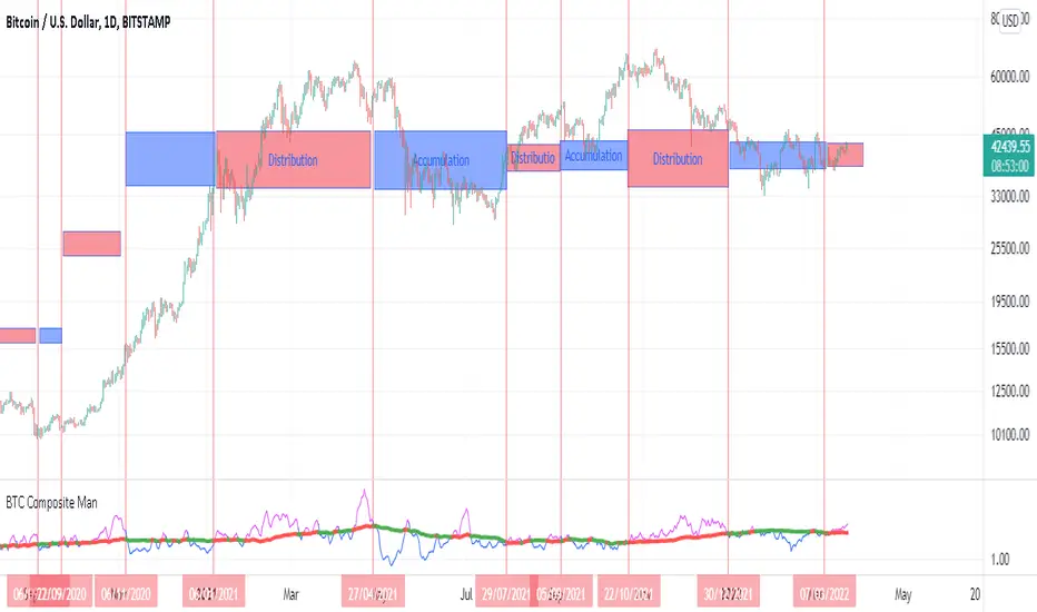
BTC Composite Man V.1Wyckoff's theory t is one of the most influential theories of market expression, and the most important components of which are lateral movement areas and trends. This theory turns the graph into something like Dots and lines (stations and paths).
After getting acquainted with Wyckoff's theory, I read several books on the subject, hoping that they could help me identify this area of lateral movement, the area of accumulation, or distribution. But there was a fundamental drawback. It is challenging to diagnose this issue. The rules discussed in these books are highly interpretive and subjective, and two different individual traders may come to exactly opposite conclusions based on their interpretation.
But as I became more familiar with the onchain analysis, an idea came to my mind that might be useful for more objectively recognizing charts based on Wyckoff's theory.
Composite Man: Wyckoff proposed a theory to help understand stock price movements. this is the “Composite Man” theory. (The same concept of whales or strong hands.)
he said: “…all the fluctuations in the market and all the various stocks should be studied as if they were the result of one man’s operations. Let us call him the Composite Man, who, in theory, sits behind the scenes and manipulates the stocks to your disadvantage if you do not understand the game as he plays it; and to your great profit if you do understand it.” (The Richard D. Wyckoff Course in Stock Market Science and Technique, section 9, p. 1-2)
Composite Man is a hypothetical man who has so much money and stocks that when he wants he can gradually increase the price by buying stocks and creating demand, and when the price goes high enough he sells his stock and lower the price. The composite man is the main player in the market. Wyckoff says that if you want to make a good profit from the market, figure out what a composite man game is.
Having a way of showing us where the Composite Man is in the market, can help us understand future trends
Who are the strong hands in the cryptocurrency market? (I use the strong hand word here instead of the composite man)
Some buy or sell more per capita than other market participants (retailers).
To understand this in the bitcoin market, I have used 3 charts and concepts:
1- Sending Addresses: The number of coins addresses making inflow transactions to the exchange.
Indicates the number of sellers' wallets (number of sellers)
2- buyers Addresses: The number of coins addresses making outflow transactions from the exchange.
Indicates the number of buyers' wallets (number of buyers)
3- Pay attention to this issue: the volume of transactions shows both the volume of sales and the buy ( Volume of buy and sale is equal in the market)
The Composite Man indicator is created by dividing the Receiving Addresses of bitcoin by the Sending Addresses. After dividing these addresses, the moving average of Alma was calculated for them and compared with the moving average of 100 days.
Considering the above 3 issues, it can be concluded:
- If the number of Receiving Addresses is higher than the Sending Addresses (the number of people who bought compared to the number of those who sold), it indicates that more people bought and fewer people sold (given that the volume of sales and buys are the same) So the sellers were stronger hands. In such a situation, the composite man is on the sales side.
- If the number of Sending Addresses is higher than the Receiving Addresses (number of people who have sold more than the number of people who have bought), it indicates that more people have been sellers and fewer people have been buyers (given that the volume of sales and buys are the same) so the buyers were stronger hands. In such a situation, the Composite man is on the buying side.
Accordingly, if the swing line is above the 100-day moving average line, it indicates that stronger addresses are being sold and retailers are buying, and vice versa.
Wyichi AI 4.0Wyckoff logic : " Charles H. Dow and his colleague Edward Jones (Dow Jones & Company since 1882). The Dow Theory's final tenet is, "Trend Remains In Effect Until Clear Reversal Occurs." Dow Theorists look for "failure swings" and confirmations to give unambiguous signals of trend fatigue or trend reversal, according to this concept. Any pattern, whether it's a continuation pattern like a Flag Formation or a reversal pattern like Head & Shoulders , is designed to repeat itself over and over again."
Ichimoku : " An Ichimoku practitioner should be able to get a quick sense of sentiment, momentum, and trend strength by looking at an Ichimoku chart , Hosada was a fervent belief that market dynamics or behavior reflected human group dynamics. He felt that human conduct in their lives and relationships might be defined as a continual cyclical movement away from and back toward balance. "
Wyckoff + Ichimoku = Institutional Footprints ( Trade with the banks)
Indicator use Wyckoff pattern ( APD ) and Ichimoku pattern ( Phase ).... or Bermuda Triangle Pattern
Wyckoff Order Block ScannerThis script scans for order blocks. An order block in the bullish case is a red candle that leads to two upward candles with a FVG inbetween, and in the bearish case, it's a bullish candle that leads to two downward candles with a FVG inbetween.
Wyckoff Entry Times @jqrmThis indicator visually marks two custom time zones on your TradingView chart by drawing vertical lines at the start and end of each zone. The first time zone spans from 9:27 AM to 9:33 AM, highlighted in red, and the second spans from 9:50 AM to 10:10 AM, highlighted in blue. You can enable or disable each zone's lines using the indicator inputs. This helps to quickly spot important intraday sessions or time ranges on your chart.

Wyckoff Trading Strategy for XAU/USD by KAIZVIETNAMXAU/USD TF M15 TP SL 20-30 pip
- Volume: Calculates the average volume based on the SMA to compare with the current trading volume.
- ATR (Average True Range): Calculated to determine price volatility.
- Support and Resistance Levels: Identifies support and resistance levels over the last 10 trading sessions.
Specific Point Identification
- A series of functions are defined to detect critical phases in the market structure, such as:
- Finding Preliminary Support: Recognizing signals of accumulation near support levels.
- Finding Selling Climax: Detecting signals of profit-taking near resistance levels.
- Finding Last Point of Support: Identifying points that provide stability for the price.
- Finding Preliminary Supply: Recognizing supply signals near resistance levels.
- Finding Buying Climax: Identifying strong buy signals accompanied by high trading volume.
- Finding Sign of Weakness: Determining instances of price adjustments that could lead to declines.
Market State Identification
- Accumulation: When the closing price is situated between the support and resistance levels.
- Distribution: When the closing price approaches the highest level of the previous few sessions.
- Sideways: When there is no clear bias toward either an upward or downward trend.
Buy and Sell Signals
- Buy Signals: Determined through finding preliminary support, selling climax, and last point of support.
- Sell Signals: Determined through finding preliminary supply, buying climax, and signs of weakness.

Wyckoff Selection Method SP500RSI(Asset) - RSI(Index)
Useful to know if Asset is outperforming market in relative strength


GKD-V Weis Wave [Loxx]Giga Kaleidoscope GKD-V Weis Wave is a Volatility/Volume module included in Loxx's "Giga Kaleidoscope Modularized Trading System".
█ Giga Kaleidoscope Modularized Trading System
What is Loxx's "Giga Kaleidoscope Modularized Trading System"?
The Giga Kaleidoscope Modularized Trading System is a trading system built on the philosophy of the NNFX (No Nonsense Forex) algorithmic trading.
What is the NNFX algorithmic trading strategy?
The NNFX (No-Nonsense Forex) trading system is a comprehensive approach to Forex trading that is designed to simplify the process and remove the confusion and complexity that often surrounds trading. The system was developed by a Forex trader who goes by the pseudonym "VP" and has gained a significant following in the Forex community.
The NNFX trading system is based on a set of rules and guidelines that help traders make objective and informed decisions. These rules cover all aspects of trading, including market analysis, trade entry, stop loss placement, and trade management.
Here are the main components of the NNFX trading system:
1. Trading Philosophy: The NNFX trading system is based on the idea that successful trading requires a comprehensive understanding of the market, objective analysis, and strict risk management. The system aims to remove subjective elements from trading and focuses on objective rules and guidelines.
2. Technical Analysis: The NNFX trading system relies heavily on technical analysis and uses a range of indicators to identify high-probability trading opportunities. The system uses a combination of trend-following and mean-reverting strategies to identify trades.
3. Market Structure: The NNFX trading system emphasizes the importance of understanding the market structure, including price action, support and resistance levels, and market cycles. The system uses a range of tools to identify the market structure, including trend lines , channels, and moving averages.
4. Trade Entry: The NNFX trading system has strict rules for trade entry. The system uses a combination of technical indicators to identify high-probability trades, and traders must meet specific criteria to enter a trade.
5. Stop Loss Placement: The NNFX trading system places a significant emphasis on risk management and requires traders to place a stop loss order on every trade. The system uses a combination of technical analysis and market structure to determine the appropriate stop loss level.
6. Trade Management: The NNFX trading system has specific rules for managing open trades. The system aims to minimize risk and maximize profit by using a combination of trailing stops, take profit levels, and position sizing.
Overall, the NNFX trading system is designed to be a straightforward and easy-to-follow approach to Forex trading that can be applied by traders of all skill levels.
Core components of an NNFX algorithmic trading strategy
The NNFX algorithm is built on the principles of trend, momentum, and volatility . There are six core components in the NNFX trading algorithm:
1. Volatility - price volatility ; e.g., Average True Range , True Range Double, Close-to-Close, etc.
2. Baseline - a moving average to identify price trend
3. Confirmation 1 - a technical indicator used to identify trends
4. Confirmation 2 - a technical indicator used to identify trends
5. Continuation - a technical indicator used to identify trends
6. Volatility / Volume - a technical indicator used to identify volatility / volume breakouts/breakdown
7. Exit - a technical indicator used to determine when a trend is exhausted
What is Volatility in the NNFX trading system?
In the NNFX (No Nonsense Forex) trading system, ATR ( Average True Range ) is typically used to measure the volatility of an asset. It is used as a part of the system to help determine the appropriate stop loss and take profit levels for a trade. ATR is calculated by taking the average of the true range values over a specified period.
True range is calculated as the maximum of the following values:
-Current high minus the current low
-Absolute value of the current high minus the previous close
-Absolute value of the current low minus the previous close
ATR is a dynamic indicator that changes with changes in volatility . As volatility increases, the value of ATR increases, and as volatility decreases, the value of ATR decreases. By using ATR in NNFX system, traders can adjust their stop loss and take profit levels according to the volatility of the asset being traded. This helps to ensure that the trade is given enough room to move, while also minimizing potential losses.
Other types of volatility include True Range Double ( TRD ), Close-to-Close, and Garman-Klass
What is a Baseline indicator?
The baseline is essentially a moving average, and is used to determine the overall direction of the market.
The baseline in the NNFX system is used to filter out trades that are not in line with the long-term trend of the market. The baseline is plotted on the chart along with other indicators, such as the Moving Average (MA), the Relative Strength Index ( RSI ), and the Average True Range (ATR).
Trades are only taken when the price is in the same direction as the baseline. For example, if the baseline is sloping upwards, only long trades are taken, and if the baseline is sloping downwards, only short trades are taken. This approach helps to ensure that trades are in line with the overall trend of the market, and reduces the risk of entering trades that are likely to fail.
By using a baseline in the NNFX system, traders can have a clear reference point for determining the overall trend of the market, and can make more informed trading decisions. The baseline helps to filter out noise and false signals, and ensures that trades are taken in the direction of the long-term trend.
What is a Confirmation indicator?
Confirmation indicators are technical indicators that are used to confirm the signals generated by primary indicators. Primary indicators are the core indicators used in the NNFX system, such as the Average True Range (ATR), the Moving Average (MA), and the Relative Strength Index ( RSI ).
The purpose of the confirmation indicators is to reduce false signals and improve the accuracy of the trading system. They are designed to confirm the signals generated by the primary indicators by providing additional information about the strength and direction of the trend.
Some examples of confirmation indicators that may be used in the NNFX system include the Bollinger Bands , the MACD (Moving Average Convergence Divergence), and the Stochastic Oscillator. These indicators can provide information about the volatility , momentum, and trend strength of the market, and can be used to confirm the signals generated by the primary indicators.
In the NNFX system, confirmation indicators are used in combination with primary indicators and other filters to create a trading system that is robust and reliable. By using multiple indicators to confirm trading signals, the system aims to reduce the risk of false signals and improve the overall profitability of the trades.
What is a Continuation indicator?
In the NNFX (No Nonsense Forex) trading system, a continuation indicator is a technical indicator that is used to confirm a current trend and predict that the trend is likely to continue in the same direction. A continuation indicator is typically used in conjunction with other indicators in the system, such as a baseline indicator, to provide a comprehensive trading strategy.
What is a Volatility / Volume indicator?
Volume indicators, such as the On Balance Volume (OBV), the Chaikin Money Flow ( CMF ), or the Volume Price Trend ( VPT ), are used to measure the amount of buying and selling activity in a market. They are based on the trading volume of the market, and can provide information about the strength of the trend. In the NNFX system, volume indicators are used to confirm trading signals generated by the Moving Average and the Relative Strength Index . Volatility indicators include Average Direction Index, Waddah Attar, and Volatility Ratio. In the NNFX trading system, volatility is a proxy for volume and vice versa.
By using volume indicators as confirmation tools, the NNFX trading system aims to reduce the risk of false signals and improve the overall profitability of trades. These indicators can provide additional information about the market that is not captured by the primary indicators, and can help traders to make more informed trading decisions. In addition, volume indicators can be used to identify potential changes in market trends and to confirm the strength of price movements.
What is an Exit indicator?
The exit indicator is used in conjunction with other indicators in the system, such as the Moving Average (MA), the Relative Strength Index ( RSI ), and the Average True Range (ATR), to provide a comprehensive trading strategy.
The exit indicator in the NNFX system can be any technical indicator that is deemed effective at identifying optimal exit points. Examples of exit indicators that are commonly used include the Parabolic SAR , the Average Directional Index ( ADX ), and the Chandelier Exit .
The purpose of the exit indicator is to identify when a trend is likely to reverse or when the market conditions have changed, signaling the need to exit a trade. By using an exit indicator, traders can manage their risk and prevent significant losses.
In the NNFX system, the exit indicator is used in conjunction with a stop loss and a take profit order to maximize profits and minimize losses. The stop loss order is used to limit the amount of loss that can be incurred if the trade goes against the trader, while the take profit order is used to lock in profits when the trade is moving in the trader's favor.
Overall, the use of an exit indicator in the NNFX trading system is an important component of a comprehensive trading strategy. It allows traders to manage their risk effectively and improve the profitability of their trades by exiting at the right time.
How does Loxx's GKD (Giga Kaleidoscope Modularized Trading System) implement the NNFX algorithm outlined above?
Loxx's GKD v1.0 system has five types of modules (indicators/strategies). These modules are:
1. GKD-BT - Backtesting module ( Volatility , Number 1 in the NNFX algorithm)
2. GKD-B - Baseline module (Baseline and Volatility / Volume , Numbers 1 and 2 in the NNFX algorithm)
3. GKD-C - Confirmation 1/2 and Continuation module (Confirmation 1/2 and Continuation, Numbers 3, 4, and 5 in the NNFX algorithm)
4. GKD-V - Volatility / Volume module (Confirmation 1/2, Number 6 in the NNFX algorithm)
5. GKD-E - Exit module (Exit, Number 7 in the NNFX algorithm)
(additional module types will added in future releases)
Each module interacts with every module by passing data between modules. Data is passed between each module as described below:
GKD-B => GKD-V => GKD-C(1) => GKD-C(2) => GKD-C(Continuation) => GKD-E => GKD-BT
That is, the Baseline indicator passes its data to Volatility / Volume . The Volatility / Volume indicator passes its values to the Confirmation 1 indicator. The Confirmation 1 indicator passes its values to the Confirmation 2 indicator. The Confirmation 2 indicator passes its values to the Continuation indicator. The Continuation indicator passes its values to the Exit indicator, and finally, the Exit indicator passes its values to the Backtest strategy.
This chaining of indicators requires that each module conform to Loxx's GKD protocol, therefore allowing for the testing of every possible combination of technical indicators that make up the six components of the NNFX algorithm.
What does the application of the GKD trading system look like?
Example trading system:
Backtest: Strategy with 1-3 take profits, trailing stop loss, multiple types of PnL volatility , and 2 backtesting styles
Baseline: Hull Moving Average
Volatility/Volume: Weis Wave as shown on the chart above
Confirmation 1: Vortex
Confirmation 2: Williams Percent Range
Continuation: Fisher Transform
Exit: Rex Oscillator
Each GKD indicator is denoted with a module identifier of either: GKD-BT, GKD-B, GKD-C, GKD-V, or GKD-E. This allows traders to understand to which module each indicator belongs and where each indicator fits into the GKD protocol chain.
Giga Kaleidoscope Modularized Trading System Signals (based on the NNFX algorithm)
Standard Entry
1. GKD-C Confirmation 1 Signal
2. GKD-B Baseline agrees
3. Price is within a range of 0.2x Volatility and 1.0x Volatility of the Goldie Locks Mean
4. GKD-C Confirmation 2 agrees
5. GKD-V Volatility / Volume agrees
Baseline Entry
1. GKD-B Baseline signal
2. GKD-C Confirmation 1 agrees
3. Price is within a range of 0.2x Volatility and 1.0x Volatility of the Goldie Locks Mean
4. GKD-C Confirmation 2 agrees
5. GKD-V Volatility / Volume agrees
6. GKD-C Confirmation 1 signal was less than 7 candles prior
Continuation Entry
1. Standard Entry, Baseline Entry, or Pullback; entry triggered previously
2. GKD-B Baseline hasn't crossed since entry signal trigger
3. GKD-C Confirmation Continuation Indicator signals
4. GKD-C Confirmation 1 agrees
5. GKD-B Baseline agrees
6. GKD-C Confirmation 2 agrees
1-Candle Rule Standard Entry
1. GKD-C Confirmation 1 signal
2. GKD-B Baseline agrees
3. Price is within a range of 0.2x Volatility and 1.0x Volatility of the Goldie Locks Mean
Next Candle:
1. Price retraced (Long: close < close or Short: close > close)
2. GKD-B Baseline agrees
3. GKD-C Confirmation 1 agrees
4. GKD-C Confirmation 2 agrees
5. GKD-V Volatility / Volume agrees
1-Candle Rule Baseline Entry
1. GKD-B Baseline signal
2. GKD-C Confirmation 1 agrees
3. Price is within a range of 0.2x Volatility and 1.0x Volatility of the Goldie Locks Mean
4. GKD-C Confirmation 1 signal was less than 7 candles prior
Next Candle:
1. Price retraced (Long: close < close or Short: close > close)
2. GKD-B Baseline agrees
3. GKD-C Confirmation 1 agrees
4. GKD-C Confirmation 2 agrees
5. GKD-V Volatility / Volume Agrees
PullBack Entry
1. GKD-B Baseline signal
2. GKD-C Confirmation 1 agrees
3. Price is beyond 1.0x Volatility of Baseline
Next Candle:
1. Price is within a range of 0.2x Volatility and 1.0x Volatility of the Goldie Locks Mean
3. GKD-C Confirmation 1 agrees
4. GKD-C Confirmation 2 agrees
5. GKD-V Volatility / Volume Agrees
█ GKD-C Weis Wave
What is Weis Wave?
The Weis Wave Indicator is a technical analysis tool used by traders to analyze market trends and identify potential turning points in financial markets. It was developed by David Weis, a trader and market analyst with over 45 years of experience.
The Weis Wave Indicator is based on the principles of market waves, which are the repetitive patterns of market behavior that occur in financial markets. These waves are characterized by price movements that occur in a series of up and down trends, and they are used by traders to identify potential market reversals or breakouts.
The Weis Wave Indicator is a histogram that represents the difference between the cumulative sum of the bullish and bearish waves. The indicator is plotted on a chart as a series of bars that change color depending on the direction of the market trend. If the market is trending up, the bars will be green, while if the market is trending down, the bars will be red.
The formula for the Weis Wave Indicator is based on the accumulation and distribution of volume over time. It uses a cumulative delta volume calculation to determine the strength of market trends and identify potential turning points. The formula is as follows:
Weis Wave Volume = Net Buying Volume - Net Selling Volume
The Weis Wave Indicator is used by traders to identify potential market trends and turning points. It is particularly useful in identifying market breakouts and reversals, as well as in detecting divergences between price and volume. The indicator is commonly used in conjunction with other technical analysis tools, such as moving averages, trend lines, and support and resistance levels, to confirm market trends and generate trading signals.
Specifically, the Weis Wave Volume Indicator is an oscillator that measures the volume of price changes. It combines both momentum and volume to indicate buying and selling pressure. The indicator is designed to show a bull market when the volume is increasing and the price is rising, and a bear market when the volume is decreasing and the price is falling ¹.
The Weis Wave Plugin creates wave charts along with their corresponding wave volume. Wave charts were first created by Richard D. Wyckoff. In his famous course on stock market technique, he instructed students to “think in waves.” Wave analysis was an integral part of his trading method. The Weis Wave is an adaptation of Wyckoff’s method that handles today’s volatile markets ².
This indicator has the option of either ATR, volume, or partial close for source input.
(1) Weis Wave Volume Indicator - Trend Following System. www.trendfollowingsystem.com Accessed 4/7/2023.
(2) Weis Wave Plugin: A Modern Adaptation of the Wyckoff Wave & Volume. weisonwyckoff.com Accessed 4/7/2023.
(3) Weis Wave Volume Indicator: Simple But Extremely Effective. howtotradeblog.com Accessed 4/7/2023.
(4) How to use the Weis Waves indicator in ATAS. atas.net Accessed 4/7/2023.
Requirements
Inputs
Chained: GKD-B Baseline
Solo: NA, no inputs
Baseline + Volatility/Volume: GKD-B Baseline
Outputs
Chained: GKD-C indicators Confirmation 1 or Solo Confirmation Complex
Solo: GKD-BT Backtest
Baseline + Volatility/Volume: GKD-BT Backtest
Additional features will be added in future releases.

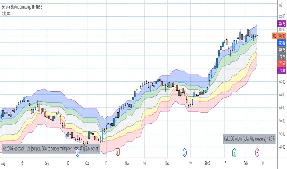
Keltner Center Of Gravity Channel ( KeltCOG )I have the ambition to create a ‘landscape’ which enables the user to see the ‘mood’ of the market about the price of an instrument, simply by looking where the candles go. Prices are a simple phenomenon , they go up or down or stay the same. This is represented quite well for the short term by a candle. I recommend to study candle patterns. Prices not only fluctuate but also trend up, down or go sideways. The user should analyze this by determining the COG (Center Of Gravity) and the ‘normal’ current range by using the historical data in a lookback period.
As a COG the center line of a Donchian Channel is often used. I.m.o. a COG should be a zone, in this channel I use the gray zone of my Donchian Fibonacci Channel, The ‘normal’ range is a multiple of Average True Range, as used in a Keltner Channel. Combining the two can give a cumbersome result, as one can see in my Keltner Fibonacci Channel. In this KeltCOG channel I solved this by not using all Fibonacci levels and by making the Keltner lines strictly parallel to the nearest COG line. To do this, I use the fact that the COG lines have horizontal stretches, there I make the Keltner lines horizontal too. Only where the COG lines change value, the Keltner lines are recalculated. This way the channel gets a very regular shape with three clear zones.
Interpretation of a chart by using the KeltCOG channel.
Overbought: If the candles go higher then the blue zone, the market is hyper enthusiast, creating an overbought situation. This is often followed by a reversion to the COG.
Uptrend: If the candles form in the blue zone, the market is enthusiast and willing to pay more.
Hopeful: If the candles form in or near the upper uncolored zone, the market is hopeful and is thinking about paying more. Sometimes prices go a little up.
Content: If the candles form in the gray zone, which represents COG, the market is happy with the current prices, so these move sideways
Disappointed: If the candles form in or near the lower uncolored zone, the market is disappointed and contemplates paying less, sometimes prices go a little down.
Downtrend: If the candles form in red zone, the market doesn’t like the instrument at all, rejects the current price and is only prepared to pay less.
Oversold: If the candles form below the red zone, the market overdoes its disgust, creating an oversold situation, often followed by a reversion to the COG.
Counters RatioCounters Ratio
This is an oscillator like indicator.
Bubbles are used to show the intensity with which buyers overtake sellers or vice-versa.
Bigger bubbles would indicate an oversold or overbought condition, when there is more imbalance between sell volume and buy volume .
They may appear sometimes on low volume - this may be a weak overbought or oversold indication.
The big bubbles that appear on significant volume could be used to find divergences with price.
Multiple instances of the indicator can be combined to get a bigger picture.
In the indicator's settings, a ratio limit can be set for the overbought or oversold condition.
Alerts for counters imbalance can be set to fire whenever the condition is satisfied.
Related tools:
• Volume Delta
• CVD

Volume Heatmap v7FTJR20This indicator is a heatmap of the financial volume used in the asset, I use three different means to define the heatmap separating it into 3 phases
Phase A: Low volume
Phase B: Medium volume
Phase C: High volume
don't worry about these data, the indicator is configured to auto-interpret the information.
The heatmap uses the following colors and specifications
Red = Ultra High Volume
Orange = High Volume
Yellow = Average Volume (balance)
Blue = Low volume
White = Volume below average
The heatmap compares the phases to identify if it finds a standard deviation over time, that is, you can see a smaller volume with the same red bar as a previous larger red bar, this is because the attacks are updated in real time.
Tutorial:
1 - In point 1 we have an aggression with yellow and orange bars, that is, a balance with aggressions. As we are coming from an uptrend, the probability is a reversal and the answer came in sequence with a red drop bar with ultra volume, so we have a seller in control.
2- after point 1, we see that we only have several blue and white bars, that is, possibly the red bar absorbed the seller and the seller flow was decreasing, notice that the prices held for 3x so the buyer attacks the seller with an orange bar.
3- at point 3, we have two yellow bars, a balance, notice that it is an aggression, any yellow, orange or red bar is an aggression, that is, there was a passive seller selling at higher values, taking advantage of the stops in a region where there was buying demand (people buying wrong!)
4- Before reaching point 4, notice that in general the price is moving practically sideways and the volume is decreasing (white and blue bars), exhaustion of the buyer volume (no demand) and the answer in point 4 came in aggression with yellow bars and oranges.
* the seller lets the market go up to make sure he is in control and when he tests the pivot zone he attacks with a red bar (notice that this red bar is smaller than the previous ones, this is the magic of the indicator divided into 3 phases).
5- After the market goes through the natural distribution phases, we see a red bar with a high spread, whenever you see a red bar with a 2 to 3x spreed, it is a region with potential for reversal.
6- Note that after the characteristics of point 5 the asset works in zig zag, volume decreasing and the reversal comes with little volume, it is natural to engulf without volume this is the reversal signal, notice that it touches the bottom several times and not loses the region after a red bar with very high spread.
*notice that the buyer let it form a giant (shoulder head shoulder) to make a trap and the price always respected the volume of the first red bar at point 1.
7- see that the asset entered an uptrend and the phase is repeating itself, asset rising in a wave A, made a corrective B wave in smaller ABC and is making a C wave, at this moment it is a probability to enter a red bar after test the resistance and have a significant increase in volume.
- I like your feedback and leave your settings and experiences in the comments.

efficiency of bulls and bears for VSA(Google translation from Russian.)
This indicator shows the effectiveness of selling or buying.
It is calculated as follows: using percentrank, the volume and the value of the spread are estimated (momentum = 1)
the resulting estimate of the volume value is divided by the estimate of the spread (momentum = 1) and thus we obtain the value. The larger it is, the more efficient and easier the price movement was.
If the indicator value is small, then this means that the movement was ineffective, because the volume (money) was invested. but no result.
The color of the volume bars is assigned as follows:
Buyers:
If the volume is large - Blue - green
If middle, then blue
Small - light blue
Sellers:
If the volume is large - Burgundy color
If middle, then purple
Small volume - light purple
Indicator parameters:
Comparison period - the period at which the volumes and spread are compared with each other - by default it is 50, selected as the most universal period suitable for different timeframes. But for daytime ones. Weekly and monthly timeframes may need to be shortened. This is true after significant spikes in volume that are exceptional over the long term.
Period spread - Bars from close to close - or in other words, it is momentum - defaults to 1
sensitivity of increased volumes - according to the percentrank indicator - the limit above which the volume will be considered large, the same as in the Volume on bar VSA - indicator V2 - for clarity, I recommend looking at it.
The default is 85, which means. that if the current value of the volume is greater than 85% of the remaining values in this period, then such a value of the volume will be considered high.
medium volume sensitivity - the same sensitivity of increased volumes but for medium volumes.
multiplier of increased volumes - this is an empirical factor to emphasize the importance of increased volumes - default = 20
multiplier of average volumes - the same. As above, but for medium volumes - the default is 10
reduced volume multiplier - Default is 1.
Knowledge of VSA is required to read this indicator
This indicator is recommended for use with indicators:
Volume on bar VSA - indicator V2
BAR for VSA
Russian language
Этот индикатор показывает эффективность продаж или покупок.
Рассчитывается следующим образом: с помощью percentrank оценивается величина объема и велечина спреда (momentum = 1)
полученная оценка велечины объема делится на оценку спреда (momentum = 1) и таким образом получаем значение. Чем оно больше, тем движение цены было эффективнее и легче.
Если значение индикатора маленькое, то это означает, что движение было неэффективным, поскольку объем (деньги) вложили. а результата нет.
Цвет барам объемов присваиваются следующим образом:
У покупателей:
Если объем большой - Сине – зелёный цвет
Если средний – то голубой
Маленький – свело-голубой
У продавцов:
Если объем большой - Бордовый цвет
Если средний – то пурпурный
Маленький объем – светло-пурпурный
Параметры индикатора:
Comparison period (период для сравнения) – период на котором между собой сравниваются объемы и спред – по умолчанию равно 50 , выбрано как наиболее универсальный период подходящий для различных таймфреймов. Но для дневных. Недельных и месячных таймфреймов может потребоваться уменьшить период. Это актуально после значительных всплесков объемов, которые являются исключительными на длительном периоде.
Period spread - Bars from close to close (Период спреда - Баров от закрытия до закрытия) – или другими словами это momentum – по умолчанию равно 1
sensitivity of increased volumes (чувствительность повышенных объемов) – согласно индикатору percentrank – граница выше которой объем будет считаться большим, то же самое, что в индикаторе Volume on bar VSA - indicator V2 – для наглядности как это работает рекомендую посмотреть его.
По умолчанию задано 85 – это означает. что если текущее значение объема больше, чем 85% остальных значений на этом периоде, то такое значение объема будет считаться высоким.
medium volume sensitivity (чувствительность средних объемов) – то же самое sensitivity of increased volumes но для средних объемов.
multiplier of increased volumes (множитель (вес) повышенных объемов) – это эмперический коэффициент для придания особой важности повышенным объемам- по умолчанию = 20
multiplier of average volumes (множитель (вес) средних объемов) – то же самое. Что и выше, но для средних объемов – по умолчанию равно 10
reduced volume multiplier (множитель (вес) пониженных объемов) – по умолчанию равно 1.
Для чтения данного индикатора необходимо знание VSA
Этот индикатор рекомендуется использовать с индикаторами:
Volume on bar VSA - indicator V2
BAR for VSA
VSA Trading Assistant DashboardThe VSA Trade Assistant is a fully featured data dashboard and information management tool that visually tracks, analyzes and displays key performance indicators in any BTC related market on Trading View
This indicator recognizes climatic up and down bars including when their vol is very high (at least 100 percent of the bar is above the average vol line) and when the subsequent bar is in the opposite direction of the climactic move.
The composite volume of 7 different exchanges is used by this indicator to determine when climactic volume has occurred.
Leave feedback, we'll be adding features to this indicator over time

On Balance Consolidated Volume 1min [BTC] CCI EMA OROn Balance Consolidated Volume var interval
38 Exchanges

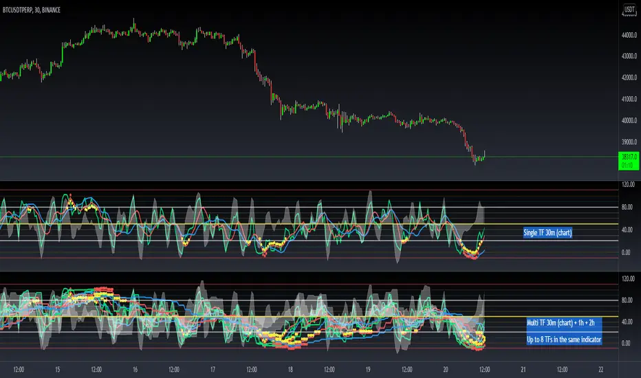
[Dipiers] Phoenix MTF v2.1This indicator is a modified (Multi Timeframe) version of the Phoenix Ascending that you can find between the @WyckoffMode scripts and it follows the same rules at the moment of the pubblication.
A special thanks to @Neuromantic that did a great part of the MTF coding and to @HedgeMode for the "real-time" idea to make the ongoing candle visibly different to always remember that it hasn't closed yet.
The chart TF must be the lowest between all the ones analysed.
The value of the higher TFs candles are the ones at the last close so to avoid repainting.
It is best used applying no more than a couple of TFs each chart so to have a better view of the races, you can apply the indicator multiple times to have a good view of the different TFs.
If you are using the code remember to give credit to the persons have worked on it.