FRAMA and Candlestick Patterns [CSM]FRAMA (Fractal Adaptive Moving Average) is a technical analysis indicator that adapts its smoothing period according to the market's volatility, allowing it to provide accurate signals in all market conditions. This indicator script plots the FRAMA on a chart and generates buy and sell signals based on the FRAMA and candlestick patterns. It also includes an option to filter signals based on bullish and bearish engulfing patterns.
To detect candlestick patterns, the script imports the "BankNifty_CSM" library from the creator's public library on TradingView. The FRAMA calculation is done using a loop that iterates over the last "length" number of bars, with the smoothing factor adjusted based on the "fracDim" parameter.
The buy and sell signals are generated based on the position of the current price relative to the FRAMA line. If the "engulfing" parameter is set to true, the signals are further filtered based on bullish and bearish engulfing patterns.
Overall, this script combines various technical indicators and candlestick pattern recognition to provide a complete trading strategy. However, as with any trading strategy, it should be thoroughly backtested and evaluated before using it in a live trading environment.
Cari dalam skrip untuk "backtest"

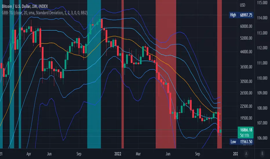
Generalized Bollinger Bands %B And Bandwidth (Tartigradia)Bollinger Band is simply a representation of the rolling average of price and its standard deviation around the average (called the "basis").
This indicator generalizes the Bollinger Band by implementing many different equations to calculate the Bollinger Bands beyond the standard deviation and sma, and then plot the %B (where the current price falls inside the Bollinger Band), Bandwidth (size of the Bollinger Band) as well as the Bollinger Band itself and a reproduction of the OHLC price candles in a separate pane.
Whereas other Bollinger Bands indicators often just change the basis but not the stdev calculation, the correct way to change the basis is to also change it inside the stdev calculation.
Advanced features such as temporal discounting (ie, newer bars can have more weights), median absolute deviation and multiple sigma bands (eg, 3-sigma) are available.
Up to 3 different Bollinger Bands can be displayed, and the background can be highlighted when price is overbought/oversold (beyond the Bollinger Band of choice). Tip: BB3, which is the bollinger band with standard deviation of 3, which represents 99% of observed values in the lookback period, is a good choice to highlight overbought/oversold conditions.
Three "Sentiment Bars" are provided to see at a glance the sentiments on the price action relative to the Bollinger Bands as reflected by the %B value.
Usage:
Use the %B as a measure of sentiment: bullish if > 0.5, bearish if < 0.5. You can use the Sentiment Bars at the bottom for a quick reference: aqua if bullish, red if bearish, gray if undefined (too close to the middle line).
Use the bandwidth as a measure of volatility: higher is more volatile, lower is less.
When overbought, it can be a good time to sell/short. Use a higher Bollinger Band Multiplier such as 3 or more to reduce false positives.
When oversold, it can be a good time to buy/long. Use a higher Bollinger Band Multiplier such as 3 or more to reduce false positives.
Consider setting a much tighter lookback period of 4 as recommended in backtested works (en.wikipedia.org), use zlma instead of sma, and finally set a higher timeframe for the Bollinger Bands than the one you are currently studying. Then, the Bollinger Bands can help in detecting overbought and oversold regions (price going "out of bands").
Note that I tried to automate the setting of a higher timeframe, but for some reason the output is different when I manually do it using request.security() than when it's in indicator(timeframe=""). If someone has any suggestion as to why it happens, please let me know! (You can try it for yourself by uncommenting the auto_timeframe parameter line).

Generalized Bollinger Bands (Tartigradia)Bollinger Band is simply a representation of the rolling average of price and its standard deviation around the average (called the "basis").
This indicator generalizes the Bollinger Band by implementing many different equations to calculate the Bollinger Bands beyond the standard deviation and sma.
Whereas other Bollinger Bands indicators often just change the basis but not the stdev calculation, the correct way to change the basis is to also change it inside the stdev calculation.
Advanced features such as temporal discounting (ie, newer bars can have more weights), median absolute deviation and multiple sigma bands (eg, 3-sigma) are available.
Up to 3 different Bollinger Bands can be displayed, and the background can be highlighted when price is overbought/oversold (beyond the Bollinger Band of choice).
Tip: BB3, which is the bollinger band with standard deviation of 3, which represents 99% of observed values in the lookback period, is a good choice to highlight overbought/oversold conditions.
Usage:
Use it as usual Bollinger Bands, as a measure of volatility, and to setup stop losses.
Use the bandwidth as a measure of volatility: higher is more volatile, lower is less.
When overbought, it can be a good time to sell/short. Use a higher Bollinger Band Multiplier such as 3 or more to reduce false positives.
When oversold, it can be a good time to buy/long. Use a higher Bollinger Band Multiplier such as 3 or more to reduce false positives.
Consider setting a much tighter lookback period of 4 as recommended in backtested works (en.wikipedia.org), use zlma instead of sma, and finally set a higher timeframe for the Bollinger Bands than the one you are currently studying. Then, the Bollinger Bands can help in detecting overbought and oversold regions (price going "out of bands").
Note that I tried to automate the setting of a higher timeframe, but for some reason the output is different when I manually do it using request.security() than when it's in indicator(timeframe=""). If someone has any suggestion as to why it happens, please let me know! (You can try it for yourself by uncommenting the auto_timeframe parameter line).
If you want to plot the indicator in a separate pane, and to also plot %B and bandwidth, I made another indicator "Generalized Bollinger Bands %B and Bandwidth by Tartigradia" that does that.
IS 200EMABB long buy and sellThis script backtested some stocks, it's giving soft buy and strong buy signals,
I am using Bollinger band and 200 EMA,
Strong Buy :- If price is above 200 ema and cross over 10d ema and sma setup with BB,
Buy :- If price is below 200 ema and cross over 10d ema and sma setup with BB,
Strong Sell :- If price is below 200 ema and cross over ema and sma with input setup for BB
Sell :- If price is above 200 ema and cross over ema and sma with input setup for BB
Don't consider it as buy and sell call, do your own research ,i did it according to my experience and learning.
Thank you

[SS]Multicolor BB with Squeez Moving Average & Colored BarsHello Followers,
Hope u guyz doing well in the market.
Came with a standalone Trading System which helps u with the trend & choppiness zone.
This system is combination of multiple stretagies which makes it better than single published indicators.
=========================================================================================================
We have used Variety-Filtered, Squeeze Moving Averages which is a chop zone indicator that identifies when price is below a specific volatility threshold calculated as the difference between a fast and slow moving average and filtered using ATR- or Pips-based threshold. This indicator can be use as both an entry and exit indicator. It identifies both chop zones and breakouts/breakdowns
Uses:-
When the candles turn white and the threshold bands appear on the chart, this is indicative of low volatility
When price exits the threshold bands, price will usually explode up or down giving a long or short signal. This acts as a sort of squeeze momentum.
Included:
Bar coloring
Signals
Alerts, 4 types of alerts: Squeeze started, Squeeze ended, long, and short
<<------------------------------------->>
Multicolour Bollinger Bands indicator that indicates market phases.
It plots on the price chart, thanks to different color zones between the bands, a breakdown of the different phases that the price operates during a trend.
The different zones are identified as follows:
- red color zone: trend is bearish , price is below the 200 periods moving average
--> orange color zone: price operate a technical rebound below the 200 periods moving average
- yellow color zone: (phase 1 which indicate a new bearish cycle)
- light green zone: (phase 2 which indicate a new bullish cycle)
--> dark green zone: trend is bullish , price is above the 200 periods moving average
- grey color zone: calm phase of price/low volatility
- dark blue color zone: price is consolidating in either bullish or bearish trend
- light blue zones: price will revert to a new opposite trend (either long or short new trend)
By identifying clearly the different market phases with the multicolor Bollinger bands , the market entries by either a the beginning of a new trend or just after a rebound or a consolidating phase is easier to spot on.
<<==========================>>
The credit of above indicator souce goes to loxx & Deveatt. I just backtested and modified it to increase accuracy of trade and clear visual representation for trades.
Modified the trend based SMA and BB period and entry criteria.
<<===========================>>
<>
1) Look for BB COLOR and SMA for trend either up or down.
2) Look Bar coloring, enter when price above sma and green for long else short.

LoTek - CT Moving Average Crossover Indicator - MTF [CT/LoTek]This is a shameless fork of Caretaker's excellent CT MAC indicator. This indicator has 2 new features. I've added the ability to select a different timeframe for each moving average. This way you can set a Daily 10, or a weekly 20 or any other of your favorite lines and it will always be there on your chart. The other new features is the ability to select VWMA as well as SMA and EMA for each moving average. VWMA is pretty nice to watch as well, and with 9 moving averages to mix and match, I'm sure you'll find something worth keeping.
To fork this, I created a new "resolution" variable for each MA. I also created a new function that uses the request.security call to get the specific timeframe resolution. I backtested this with CT's OG script and the numbers stay the same... but I have a sneaky suspicion that VWMAs are not showing proper crossover values. So keep that in mind. The drawn lines are fine, but the crossover data when using VWMA may be off. I wrote the new function to default to EMA, so if it fails at VWMA, it will just show you EMA data.
Let's see, what else... please tell me if you find any bugs or want any other features baked in.

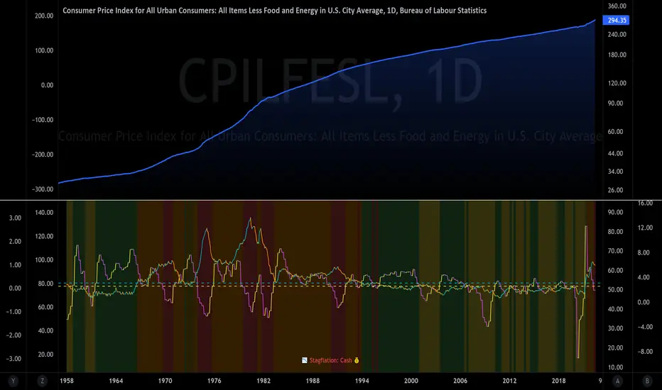
The Investment ClockThe Investment Clock was most likely introduced to the general public in a research paper distributed by Merrill Lynch. It’s a simple yet useful framework for understanding the various stages of the US economic cycle and which asset classes perform best in each stage.
The Investment Clock splits the business cycle into four phases, where each phase is comprised of the orientation of growth and inflation relative to their sustainable levels:
Reflation phase (6:01 to 8:59): Growth is sluggish and inflation is low. This phase occurs during the heart of a bear market. The economy is plagued by excess capacity and falling demand. This keeps commodity prices low and pulls down inflation. The yield curve steepens as the central bank lowers short-term rates in an attempt to stimulate growth and inflation. Bonds are the best asset class in this phase.
Recovery phase (9:01 to 11:59): The central bank’s easing takes effect and begins driving growth to above the trend rate. Though growth picks up, inflation remains low because there’s still excess capacity. Rising growth and low inflation are the Goldilocks phase of every cycle. Stocks are the best asset class in this phase.
Overheat phase(12:01 to 2:59): Productivity growth slows and the GDP gap closes causing the economy to bump up against supply constraints. This causes inflation to rise. Rising inflation spurs the central banks to hike rates. As a result, the yield curve begins flattening. With high growth and high inflation, stocks still perform but not as well as in recovery. Volatility returns as bond yields rise and stocks compete with higher yields for capital flows. In this phase, commodities are the best asset class.
Stagflation phase (3:01 to 5:59): GDP growth slows but inflation remains high (sidenote: most bear markets are preceded by a 100%+ increase in the price of oil which drives inflation up and causes central banks to tighten). Productivity dives and a wage-price spiral develops as companies raise prices to protect compressing margins. This goes on until there’s a steep rise in unemployment which breaks the cycle. Central banks keep rates high until they reign in inflation. This causes the yield curve to invert. During this phase, cash is the best asset.
Additional notes from Merrill Lynch:
Cyclicality: When growth is accelerating (12 o'clock), Stocks and Commodities do well. Cyclical sectors like Tech or Steel outperform. When growth is slowing (6 o'clock), Bonds, Cash, and defensives outperform.
Duration: When inflation is falling (9 o'clock), discount rates drop and financial assets do well. Investors pay up for long duration Growth stocks. When inflation is rising (3 o'clock), real assets like Commodities and Cash do best. Pricing power is plentiful and short-duration Value stocks outperform.
Interest Rate-Sensitives: Banks and Consumer Discretionary stocks are interest-rate sensitive “early cycle” performers, doing best in Reflation and Recovery when central banks are easing and growth is starting to recover.
Asset Plays: Some sectors are linked to the performance of an underlying asset. Insurance stocks and Investment Banks are often bond or equity price sensitive, doing well in the Reflation or Recovery phases. Mining stocks are metal price-sensitive, doing well during an Overheat.
About the indicator:
This indicator suggests iShares ETFs for sector rotation analysis. There are likely other ETFs to consider which have lower fees and are outperforming their sector peers.
You may get errors if your chart is set to a different timeframe & ticker other than 1d for symbol/tickers GDPC1 or CPILFESL.
Investment Clock settings are based on a "sustainable level" of growth and inflation, which are each slightly subjective depending on the economist and probably have changed since the last time this indicator was updated. Hence, the sustainable levels are customizable in the settings. When I was formally educated I was trained to use average CPI of 3.1% for financial planning purposes, the default for the indicator is 2.5%, and the Medium article backtested and optimized a 2% sustainable inflation rate. Again, user-defined sustainable growth and rates are slightly subjective and will affect results.
I have not been trained or even had much experience with MetaTrader code, which is how this indicator was originally coded. See the original Medium article that inspired this indicator if you want to audit & compare code.
Hover over info panel for detailed information.
Features: Advanced info panel that performs Investment Clock analysis and offers additional hover info such as sector rotation suggestions. Customizable sustainable levels, growth input, and inflation input. Phase background coloring.
⚠ DISCLAIMER: Not financial advice. Not a trading system. DYOR. I am not affiliated with Medium, Macro Ops, iShares, or Merrill Lynch.
About the Author: I am a patent-holding inventor, a futures trader, a hobby PineScripter, and a former FINRA Registered Representative.
Volatility indicator based on ATR Hello,
I'm sharing to you a volatility indicator I've done in the last few weeks based on ATR. There is multiple functionalities on this indicator, the first one is an overlay displaying when an asset is in an "overvolatily zone"
(displayed with red cross) and when we are in an "undervolatily zone" (displayed with green cross). You can change the sensibility of the signals in the parameters if you wish to have more or less greedy signals
(it will only modify the overvolatility signals). By the way those signals are not working for week-ends because volatility works differently on week-ends and it's not a good idea to count week-ends in the calculations, so do not worry if you see no signals on weekends.
Second part of the indicator is something I called "Atr bands" it's an equivalent to the famous Bollinger-Bands but based on ATR. I haven't backtested them yet but they seems really interesting in low ut
(15 mins seems to be the best ut for those) and they seems pretty bad in high ut so they can maybe be useful for low ut scalping.
Last thing, there is a parameter allowing you to display bands on the week-ends so you can easily see where the indicator won't give signals.
I would be really happy if I could have some feedsback if you try the indicator :)
Have a wonderful day

WMA Combo Crossover V2Before I begin I want to mention:
1. This is an upgrade of my indicator WMA Combo Crossover. (Link: www.tradingview.com)
2. The upgrade was inspired from the CCI and Bollinger Bands indicator by matsu_bitmex. (Link: www.tradingview.com)
3. I have combined the indictor with Bollinger Bands , coloring those sections as yellow, to increase winning trades as well as avoid losing trades by spotting potential reversals with the aid of news avoidance
4. This indicator is designed primarily for NNFX (No Nonsense Forex) though it can be used for any type of trading style
5. Also, I want to thank kurtisbu for helping me out. Thank you!
The indicator:
1. When WMA 25 is blue and is going upwards, it means there is an uptrend
2. When WMA 25 is red and is going down, it means there is a downtrend
3. During a trend, the color may switch to red and blue occasionally. When the color switches back to the direction of the trend, it can be used for re-entries
4. All trades based on the yellow color MUST be during a trend
5. When the color changes to yellow that means price is very volatile and only on the 1st candle is it advisable to enter a trade. (I have not backtested entering on the 2nd candle of a yellow color change)
6. During a trend, when the color changes to yellow and there is an incoming news event, then the chances of a reversal increase and I recommended avoid entering

Dual Mean Reversion Channel (adjusted lower band)This is a public and open-source lighter version compared to the "Overextended Price Channel" which is provided complimentaty to the Trend Insight System.
Introduction :
Channels are very useful tools to assess overextended price, volatility and upcoming retracement or impulsive moves (such as Bollinger Band squeezes). It is an indispensable addition to any trader using Mean Reversion theory for a scalp-trade or swing-trade.
This script contains :
- 2 channels Keltner-style, using the True Range for volatility
- customizable volatility (channel width) and smoothing period
- a standard selection of moving average ; SMA, EMA, VWMA
- an embedded readjustment of the lower bands to avoid the drop on a logarithmic scale (see explanation below)
Why another channel indicator ?
I have found most conventional channels to be either not based on "proper" volatility (e.g. standard deviation of price action for Bollinger Band), or the bottom channel to be ill adapted to the logarithmic scale and plunges to 0 on some high volatility periods, messing with readability on logarithmic auto-scaled chart.
Also, I find the channels to be most useful when superimposed with another one of longer length; especially a pair of channels with a 50 and 200 period moving average respectively. Mean Reversion traders that mostly trade the 50 and 200 SMA/EMA know what I am talking about as having a channel helps to have a better visual for a proper of entry and exit point.
Disclaimer :
This indicator was originally intended to be used along with the Trend Insight System to improve performance, and the default configuration mostly backtested on BTCUSD.
Please use with caution, proper risk management and along with your favorite oscillator, candlestick reading and signals system.
Some explanation :
Based on Mean Reversion paradigm, everything has a tendency to revert back to the mean :
- when the price enters the upper channel, it is supposed to be (or start getting) overbought as the market is getting overheated, thus prone to correction,
- on the other hand, when the price enters the lower channel, it is supposed to be (or getting) oversold and the market looks favorable for a buy-in.
Depending on the trading style used, a trader will usually either wait until the price leaves the channel towards the mean before taking action (conservative style) or you will set limit orders inside the channel as you expect a reversion to the mean (more agressive/risky style).
With two channels, more complex (and maybe precise) rules can be built to optimize one's trading strategy.
Important notes :
In the end, sticking with 50/200 length and a single setting on volatility might be wiser, be wary of overoptimization which is risky at best and counter productive at worst (according to legendary traders such as Mark Douglas). Even if, needless to say, the volatility needs to be adjusted between a nascent and volatile market (such as crypto) compared to standard call markets that are much less volatile.
End notes :
It will always be considered a work in progress to help bring out the best of trading with channels, any comment and suggestion are welcomed.
[KY]McClellan Summation Index RSIThis script contains McClellan Summation Index(MSI) and McClellan Oscillator(MO)
(1) What is McClellan Summation Index(MSI)
McClellan Summation Index(MSI) is a breadth indicator derived the McClellan Oscillator(MO),
which is a breadth indicator based on Net Advances (advancing issues less declining issues).
The Summation Index is simply a running total of the McClellan Oscillator values.
To identify the market direction, I prefer to use the relative strength(RSI) of MSI rather than MSI itself
because MSI is a summation so it's difficult to compare with previous market patterns. So I use RSI applied MSI.
Reference: Stockcharts.com has a nice set of detailed explanation about MSI.
school.stockcharts.com
(2) How to use this script
- Add this script to your chart.
- You can choose one of two options ("MSI RSI" or "MO").
- You can also choose the market from three options ("Nasdaq", "NYSE", "Nasdaq+NYSE")
(3) "MSI RSI" or "MO"
a) "MSI RSI"
For swing trade(sevelal weeks), MSI RSI is much better to identify the broad market direction.
I backtested last several years of S&P500. The result was not symmetrical between MT bear/bull market.
For bull side, when MSI RSI curls up from the bottom(e.g. RSI 30 level), 90% of times out of them the market rallied.
For bear side, when MSI RSI rolles over to downside from the top(e.g. RSI 70 level), only 60% of times out of them the market declined.
So the market tends to hit negatively diverrgent high from advancing/declining issues perspective. Be careful to use MSI oscilator.
b) "MO"
For short term trade(intraday, 2-3 days of holding), MO is better because MSI is a summation so lags several days. MO is quick.
MO is sometimes very noisy, so you need to draw trendlines or horizontal levels to compare with the previous cases.
For beginners, I recommend to use "MSI RSI".

Breakout Strategy IndicatorBreakout strategy indicator version.
Backtested strategy version can be found on my published scripts
FilthyIchiEMAXIchiEMAX has been backtested giving some great results, using Ichimoku and a mix of EMA'S/SMA .
I use this for both Cryptocurrency and Forex Trading.
Ema/SmaX system i have studied and have found it is giving me the results i want very similar to all the wave trend indicators being used currently. I have now adde buy/sell signals on crosses and williams fractal.

Alex's EMA MA Combo It's a combination of some backtested Ma's that I've seen statistically play out in traditional and crypto markets.

Adaptive 2 EMA Cloud (Trend-Aware)Adaptive 2 EMA Cloud (Trend-Aware)
This indicator combines a classic 2-EMA cloud and crossover with an adaptive Trend vs Chop filter designed to reduce whipsaws during sideways markets.
Instead of treating every EMA crossover equally, this script evaluates EMA separation and directional commitment (normalized by ATR) to determine whether price is trending or chopping. Signals can optionally be filtered so they only appear during qualified trend conditions.
What This Indicator Does
Plots two configurable EMAs with a filled EMA cloud
Marks bullish and bearish EMA crossovers
Classifies market state as BULLISH / BEARISH / CHOP
Optionally filters signals during chop
Highlights chop zones with a subtle background
Displays a movable Trend status label (Top / Bottom × Left / Middle / Right) with offset controls to avoid UI overlap
This makes the indicator useful both as:
A visual trend context tool
A signal filter to pair with discretionary or systematic entries
Quick Presets (Main Framework)
Scalp / Fast (1–2 min)
Built for speed and momentum bursts. Uses tighter EMAs and stricter filters to avoid chop on very fast charts.
EMA pairs (choose one):
5 / 9
8 / 13
slopeLen: 4–6
minDistATR: 0.25–0.40
minSlopeATR: 0.06–0.12
Balanced Intraday (3–5 min)
General-purpose intraday setup. Balances early trend participation with chop filtering. Recommended starting point if unsure.
EMA pairs (choose one):
8 / 13
9 / 21
slopeLen: 5–8
minDistATR: 0.18–0.30
minSlopeATR: 0.04–0.08
Slower / Swing (15–60 min)
Designed for higher timeframes and smoother trends. Allows longer trends to develop without requiring sharp acceleration.
EMA pairs (choose one):
13 / 21
21 / 34
slopeLen: 8–14
minDistATR: 0.10–0.22
minSlopeATR: 0.02–0.06
Input Guide (Streamlined)
minDistATR — EMA Separation
Sets the minimum EMA spacing (ATR-normalized) required for a trend.
Higher = stricter, fewer signals
Filters EMA compression / ranges
Too much chop → increase
Too few signals → decrease
Too low = congestion signals · Too high = late entries
minSlopeATR — EMA Slope / Commitment
Sets the minimum directional strength (ATR-normalized) of the EMAs.
Higher = stricter, fewer signals
Filters weak drift and slow grind
Signals stall → increase
Miss smooth trends → decrease
Too low = flat EMAs allowed · Too high = requires acceleration
slopeLen — Slope Lookback
Controls how quickly the filter reacts.
Lower = faster, noisier
Higher = smoother, fewer signals
3–5 responsive · 8–14 stable
atrLen — Normalization
Stabilizes distance and slope across symbols and timeframes.
Leave at 14 normally
Use 20–30 during extreme volatility shifts
Notes
This is an indicator, not a strategy. It does not backtest or predict outcomes.
No filter eliminates chop entirely—this tool is designed to reduce low-quality conditions, not remove them.
Best results come from matching presets to timeframe first, then making small adjustments only when behavior is clearly off.

Wickless Candle Revisit TrackerWickless Candle Revisit Tracker
Identifies wickless candles (strong momentum candles) and tracks whether price revisits their opening level, providing statistical insights into price behavior patterns.
WHAT ARE WICKLESS CANDLES?
• Green wickless: Open = Low (no lower wick) - opened at the low and moved only upward
• Red wickless: Open = High (no upper wick) - opened at the high and moved only downward
These candles represent strong directional momentum, and their opening levels often act as support/resistance zones that price may revisit.
KEY FEATURES:
• Automatic Detection: Identifies wickless candles with configurable tolerance for broker spread
• Real-time Tracking: Monitors each wickless candle until price revisits its opening level
• Visual Indicators:
- Labels show "WL↑" or "WL↓" with bars count when revisited (or "N/A" if pending)
- Horizontal lines mark price levels (gray dashed = pending, green solid = revisited)
• Comprehensive Statistics Table:
- Total wickless candles detected
- Revisit rate percentage
- Min/Max/Average bars until revisit
- Pending count
• History Limit: Configure how far back to analyze (default: 500 bars)
• Customizable: Adjust colors, toggle labels/lines/table, reposition statistics
USE CASES:
• Identify potential support/resistance levels from momentum candles
• Measure how often price fills "fair value gaps" or inefficiencies
• Track mean reversion patterns after strong momentum moves
• Backtest the reliability of wickless candle levels as trading zones
SETTINGS:
• Wick Tolerance: Allow small wicks due to broker spread (e.g., 0.0001 for forex)
• History Limit: Number of bars to analyze (older candles are hidden)
• Visual Controls: Toggle labels, lines, and statistics table
• Color Customization: Adjust line colors for pending/revisited states
ALERTS:
Built-in alerts for wickless candle detection (green, red, or both).
Perfect for traders analyzing price inefficiencies, fair value gaps, and momentum-based support/resistance levels.

SZS Slow StochasticThis indicator is designed to:
Identify momentum extremes using Slow Stochastic
Highlight duration of overbought/oversold conditions
Signal potential reversals when exiting extremes
Confirm conditions using RSI momentum coloring
Provide clear, low-noise visual cues without clutter
It is especially useful for:
Mean-reversion strategies
Timing entries after momentum exhaustion
Visual backtesting of stochastic behavior over time

Volatility Regimes | GainzAlgo📊 OVERVIEW
This is a comprehensive ATR-based trading system designed for professional traders who need advanced volatility analysis, precise trade management, and intelligent market-regime detection.
The indicator combines multiple proven volatility concepts into one powerful, highly customizable tool.
⚙️ CORE FEATURES
1️⃣ ATR BANDS (Dynamic Support & Resistance)
- Three levels of ATR-based bands plotted around price
- Band 1 (1× ATR): Closest support/resistance, primary TP target
- Band 2 (2× ATR): Secondary TP target, stronger S/R zone
- Band 3 (3× ATR): Extended TP target, major S/R level
- Bands adapt to volatility in real time
- Dotted lines mark TP points on the latest candle
2️⃣ VOLATILITY REGIME DETECTION (Market Phase Analysis)
Automatically classifies the market into four distinct volatility regimes:
🟢 COMPRESSION
ATR < 70% of baseline
Low-volatility consolidation, market is coiling
Best for: Preparing breakouts, tightening stops
🟠 EXPANSION
ATR 115–140% of baseline
Volatility breakout, early trend formation
Best for: Breakout entries, momentum trades
🔴 HIGH VOLATILITY
ATR > 140% of baseline
Strong sustained trend, maximum participation
Best for: Trend following, trailing stops
🟣 EXHAUSTION
Declining ATR after high volatility
Trend maturity, potential pause or reversal
Best for: Profit taking, reducing exposure
Additional details:
- Uses ATR Ratio (Current ATR / Long-term Baseline)
- Non-repainting logic with historical confirmation
- Background shading + regime labels for instant clarity
- Diamond markers highlight regime changes
3️⃣ DYNAMIC STOP-LOSS SYSTEM
- Automatically calculates optimal stop distance using ATR
- Adapts to current market volatility
- Separate logic for bullish and bearish trades
- Default 2× ATR multiplier (adjustable 0.5× – 5×)
- Visual cross markers display stop levels
- Tighter stops in low volatility, wider in high volatility
4️⃣ MULTIPLE TAKE-PROFIT LEVELS (TP1 / TP2 / TP3)
- Three progressive profit targets for scaling out
- TP1 (1.5× ATR): First partial profit
- TP2 (2.5× ATR): Secondary scale-out
- TP3 (4.0× ATR): Final target or runner
- Dashed lines with labels on the current bar
- Automatically aligns with trend direction
- Fully customizable multipliers
5️⃣ SUPPORT & RESISTANCE LEVELS
- Dynamic S/R detection using price extremes
- ATR-weighted significance filtering
- Adjustable lookback period (10–100 bars)
- Circle markers for visual clarity
- Updates in real time as new highs/lows form
6️⃣ RISK MANAGEMENT CALCULATOR
- Real-time position-size calculation
- Based on account size, risk percentage, and ATR stop distance
- Formula: Position Size = Risk Amount ÷ Stop Distance
- Example: $10,000 account, 1% risk, $50 stop = 200 shares
- Displays position size and dollar risk directly on chart
- Ensures consistent risk across all trades
7️⃣ ATR PERCENTILE RANKING
- Shows where current ATR ranks historically (0–100%)
- Above 80%: Extremely high volatility
- 20–80%: Normal volatility
- Below 20%: Extremely low volatility
- Adjustable lookback (50–500 bars)
- Alerts trigger at above 90% and below 10% extremes
- Adds context to all regime-based decisions
8️⃣ VOLATILITY CONTRACTION PATTERN
- Detects tight consolidation (volatility squeeze)
- Requires consecutive bars of low ATR
- Default: 7 bars below 50% of average ATR
- Yellow triangle alert when pattern completes
- Often precedes strong breakout moves
- Works on all timeframes
9️⃣ TREND DETECTION SIGNALS
- Up and down arrows on trend change with rising ATR
- Combines price direction with volatility confirmation
- Smoothing filters reduce false signals
- Green arrow for bullish, red arrow for bearish
🔟 VOLATILITY BREAKOUT SIGNALS
- Circle markers when ATR exceeds threshold
- Default threshold: 1.5× ATR average
- Indicates surge in market activity
- Can signal the start of new trends
🧠 RECOMMENDED SETTINGS BY TRADING STYLE
Day Trading (1m–15m)
ATR Length: 14
Regime Baseline: 30
SL Multiplier: 1.5–2.0
TP: 1.5 / 2.5 / 4.0
Risk: 0.5–1%
Swing Trading (1H–4H)
ATR Length: 14
Regime Baseline: 50
SL Multiplier: 2.0–2.5
TP: 2.0 / 3.5 / 6.0
Risk: 1–2%
Position Trading (Daily)
ATR Length: 14–21
Regime Baseline: 100
SL Multiplier: 2.5–3.0
TP: 3.0 / 5.0 / 8.0
Risk: 2–3%
Scalping (15s–5m)
ATR Length: 10
Regime Baseline: 20
SL Multiplier: 1.0–1.5
TP: 1.0 / 1.5 / 2.5
Risk: 0.5–1%
🧭 HOW TO USE
1. Identify the current volatility regime
2. Wait for entry confirmation (breakouts, trend arrows, contraction patterns)
3. Set stop loss using dynamic ATR-based levels
4. Scale out at TP1, TP2, TP3 or use ATR bands
5. Use the risk calculator for consistent position sizing
6. Monitor regime changes and manage exposure accordingly
🚨 ALERT SYSTEM
Alerts included for volatility breakouts, trend changes, regime transitions, ATR band crosses, contraction pattern completion, and ATR percentile extremes.
All alerts are fully configurable in TradingView.
🎨 VISUAL GUIDE
Background colors: Volatility regimes
Solid lines: ATR bands
Dotted lines: Latest TP points
Dashed lines: Take-profit levels
Cross markers: Stop-loss levels
Circles: Support, resistance, and breakouts
Arrows: Trend direction
Diamonds: Regime changes
Triangles: Contraction alerts
Labels: Regime info, ATR percentile, position size
🛠️ CUSTOMIZATION
- Toggle any feature on or off
- Adjust all thresholds and multipliers
- Customize colors
- Configure alerts
- Set account size and risk parameters
⚠️ IMPORTANT NOTES
- This indicator provides analytical tools, not trading signals
- Always apply proper risk management
- Backtest before live use
- ATR adapts to volatility, not direction
If you find this indicator useful, please leave a rating and comment ⭐

Kalman Hull Kijun [BackQuant]Kalman Hull Kijun
A trend baseline that merges three ideas into one clean overlay, Kalman filtering for noise control, Hull-style responsiveness, and a Kijun-like Donchian midline for structure and bias.
Context and lineage
This indicator sits in the same family as two related scripts:
Kalman Price Filter
This is the foundational building block. It introduces the Kalman filter concept, a state-estimation algorithm designed to infer an underlying “true” signal from noisy measurements, originally used in aerospace guidance and later adopted across robotics, economics, and markets.
Kalman Hull Supertrend
This is the original script made, which people loved. So it inspired me to create this one.
Kalman Hull Kijun uses the same core philosophy as the Supertrend variant, but instead of building a Supertrend band system, it produces a single structural baseline that behaves like a Kijun-style reference line.
What this indicator is trying to solve
Most trend baselines sit on a bad trade-off curve:
If you smooth hard, the line reacts late and misses turns.
If you react fast, the line whipsaws and tracks noise.
Kalman Hull Kijun is designed to land closer to the middle:
Cleaner than typical fast moving averages in chop.
More responsive than slow averages in directional phases.
More “structure aware” than pure averages because the baseline is range-derived (Kijun-like) after filtering.
Core idea in plain language
The plotted line is a Kijun-like baseline, but it is not built from raw candles directly.
High level flow:
Start with a chosen price stream (source input).
Reduce measurement noise using Kalman-style state estimation.
Add Hull-style responsiveness so the filtered stream stays usable for trend work.
Build a Kijun-like baseline by taking a Donchian midpoint of that filtered stream over the base period.
So the output is a single baseline that is intended to be:
Less jittery than a simple fast MA.
Less laggy than a slow MA.
More “range anchored” than standard smoothing lines.
How to read it
1) Trend and bias (the primary use)
Price above the baseline, bullish bias.
Price below the baseline, bearish bias.
Clean flips across the baseline are regime changes, especially when followed by a hold or retest.
2) Retests and dynamic structure
Treat the baseline like dynamic S/R rather than a signal generator:
In uptrends, pullbacks that respect the baseline can act as continuation context.
In downtrends, reclaim failures around the baseline can act as continuation context.
Repeated back-and-forth around the line usually means compression or chop, not clean trend.
3) Extension vs compression (using the fill)
The fill is meant to communicate “distance” and “pressure” visually:
Large separation between price and baseline suggests expansion.
Price compressing into the baseline suggests rebalancing and decision points.
Inputs and what they change
Kijun Base Period
Controls the structural memory of the baseline.
Higher values track broader swings and reduce flips.
Lower values track tighter swings and react faster.
Kalman Price Source
Defines what data the filter is estimating.
Close is usually the cleanest default.
HL2 often “feels” smoother as an average price.
High/Low sources can become more reactive and less stable depending on the market.
Measurement Noise
Think of this as the main smoothness knob:
Higher values generally produce a calmer filtered stream.
Lower values generally produce a faster, more reactive stream.
Process Noise
Think of this as adaptability:
Higher values adapt faster to changing conditions but can get twitchy.
Lower values adapt slower but stay stable.
Plotting and UI (what you see on chart)
1) Adaptive line coloring
Baseline turns bullish color when price is above it.
Baseline turns bearish color when price is below it.
This makes the state readable without extra panels.
2) Gradient “energy” fill
Bull fill appears between price and baseline when above.
Bear fill appears between price and baseline when below.
The goal is clarity on separation and control, not decoration.
3) Rim effect
A subtle band around price that only appears on the active side.
Helps highlight directional control without hiding candles.
4) Candle painting (optional)
Candles can be colored to match the current bias.
Useful for scanning many charts quickly.
Disable if you prefer raw candles.
Alerts
Long state alert when price is above the baseline.
Short state alert when price is below the baseline.
Best used as a bias or regime notification, not a standalone entry trigger.
Where it fits in a workflow
This is a context layer, it pairs well with:
Market structure tools, BOS/MSB, OBs, FVGs.
Momentum triggers that need a regime filter.
Mean reversion tools that need “do not fade trends” context.
Limitations
No baseline eliminates chop whipsaws, tuning only manages the trade-off.
Settings should not be copy pasted across assets without checking behavior.
This does not forecast, it estimates and smooths state, then expresses it as a structural baseline.
Disclaimer
Educational and informational only, not financial advice.
Not a complete trading system.
If you use it in any trading workflow, do proper backtesting, forward testing, and risk management before any live execution.

SMC Post-Analysis Lab [PhenLabs]📊 SMC Post-Analysis Lab
Version: PineScript™ v6
📌 Description
The SMC Post-Analysis Lab is a dedicated hindsight analysis tool built for traders who want to understand what really happened during any historical trading period. Unlike forward-looking indicators, this tool lets you scroll back through time and instantly receive algorithmic classification of market states using Smart Money Concepts methodology.
Whether you’re reviewing a losing trade, studying a successful session, or building your pattern recognition skills, this indicator provides immediate context. The expansion-aware algorithm processes price action within your selected window and outputs clear, actionable classifications ranging from Parabolic Expansion to Consolidation Inducements.
Stop relying on subjective post-trade analysis. Let the algorithm objectively tell you whether institutional players were accumulating, distributing, or running inducements during your trades.
🚀 Points of Innovation
First indicator specifically designed for SMC-based post-trade review rather than live signal generation
Dual-mode analysis system allowing both dynamic scrollback and precise date selection
Expansion-aware classification algorithm that weighs range position against net displacement
Real-time efficiency metrics calculating directional quality of price movement
Integrated visual FVG detection within the analysis window only
Interactive table with clickable date range adjustment via chart interface
🔧 Core Components
Pivot Detection Engine: Uses configurable pivot length to identify significant swing highs and lows for structure break detection
Window Calculator: Determines active analysis zone based on either bar offset or timestamp boundaries
Data Aggregator: Tracks window open, high, low, close and counts bullish/bearish structure break events
State Classification Algorithm: Applies hierarchical logic to determine market state from six possible classifications
Visual Renderer: Draws structure breaks, FVG boxes, and window highlighting within the active zone
🔥 Key Features
Sliding Window Mode: Use the Scroll Back slider to dynamically move your analysis zone backwards through history bar-by-bar
Date Range Mode: Select specific start and end timestamps for precise session or trade review
Six Market State Classifications: Parabolic Expansion (Bull/Bear), Bullish/Bearish Order Flow, Accumulation/Distribution Reversal, and Consolidation/Inducement
Range Position Percentile: See exactly where price closed relative to the window’s high-low range as a percentage
Bull/Bear Event Counter: Quantified count of structure breaks in each direction during the analysis period
Efficiency Calculation: Net move divided by total range reveals trending quality versus chop
🎨 Visualization
Blue Window Highlight: Active analysis zone is clearly marked with blue background shading on the chart
Structure Break Lines: Dashed lines appear at each bullish or bearish structure break within the window
FVG Boxes: Fair Value Gaps automatically render as semi-transparent boxes in bullish or bearish colors
Dashboard Table: Top-right positioned table displays State, Analysis description, and Metrics in real-time
Color-Coded States: Each classification uses distinct coloring for immediate visual recognition
Interactive Tip Row: Optional help text guides users on clicking the table to adjust date range
📖 Usage Guidelines
General Configuration
Analysis Mode: Default is Sliding Window. Choose Date Range for specific timestamp analysis.
Sliding Window Settings
Scroll Back (Bars): Default 0. Increase to move window backwards into history.
Window Width (Bars): Default 100. Range 20-50 for scalping, 100+ for swing analysis.
Date Range Settings
Start Date: Select the beginning timestamp for your analysis period.
End Date: Select the ending timestamp for your analysis period.
Visual Settings
Show Help Tip: Default true. Toggle to hide instructional row in dashboard.
Bullish Color: Default teal. Customize for bullish elements.
Bearish Color: Default red. Customize for bearish elements.
SMC Parameters
Pivot Length: Default 5. Lower values (3-5) catch minor breaks. Higher values (10+) focus on major swings.
✅ Best Use Cases
Post-trade review to understand why entries succeeded or failed
Session analysis to identify institutional activity patterns
Trade journaling with objective algorithmic classifications
Pattern recognition training through historical scrollback
Identifying whether stop hunts were inducements or legitimate breaks
Comparing your real-time read versus what the algorithm detected
⚠️ Limitations
Designed for historical analysis only, not live trade signals
Classification accuracy depends on appropriate pivot length for the timeframe
FVG detection uses simple gap logic without mitigation tracking
State classification is based on window data only, not broader context
Requires manual scrolling or date input to review different periods
💡 What Makes This Unique
Purpose-Built for Review: Unlike most indicators focused on live signals, this is designed specifically for post-trade analysis
Expansion-Aware Logic: Algorithm weighs both position in range AND directional efficiency for accurate state detection
Interactive Date Control: Click the dashboard table to reveal draggable anchors for window adjustment directly on chart
🔬 How It Works
1. Window Definition:
User selects either Sliding Window or Date Range mode
System calculates which bars fall within the active analysis zone
Active zone receives blue background highlighting
2. Data Collection:
Algorithm captures window open, running high, running low, and current close
Structure breaks are detected when price crosses above last pivot high or below last pivot low
Bullish and bearish events are counted separately
3. State Classification:
Range Position calculates where close sits as percentage of high-low range
Efficiency calculates net move divided by total range
Hierarchical logic applies priority rules from Parabolic states down to Consolidation
4. Output Rendering:
Dashboard table updates with State title, Analysis description, and Metrics
Visual elements render within window only to keep chart clean
Colors reflect bullish, bearish, or neutral classification
💡 Note:
This indicator is intended for educational and review purposes. Use it to develop your understanding of Smart Money Concepts by analyzing what institutional order flow looked like during historical periods. Combine insights with your own analysis methodology for best results.

Gold ORB Strategy (3/5/15/30 Min)It's a multi-mode Opening Range Breakout system for Gold futures that automates the detection of the 7:20-7:23 AM CT opening range and provides clear visual signals for four different trading styles.
In Plain English:
"It draws a box around gold's first 3 minutes of trading, then alerts you when price breaks out with confirmation from volume, VWAP, and moving averages. It automatically calculates your entry, stop, and target prices based on your chosen strategy style."
What Makes It Unique:
4 Trading Personalities in One Tool:
Aggressive = "I want every breakout, I'll manage the fakeouts"
Confirmed = "Show me only moves that close beyond the range"
Retest = "I want the pullback entry for better R:R"
Fibonacci = "Let me buy the dip after the initial move"
Smart Confluence Filtering:
Doesn't just show every breakout
Checks if VWAP agrees (trend filter)
Verifies EMA alignment (momentum filter)
Flags volume spikes (conviction filter)
Complete Trade Management:
Automatically calculates stops (3 different methods)
Shows profit targets based on your R:R preference
Labels stick to price levels as you scroll
Visual dashboard shows all key info at a glance
What It's NOT:
Not a "buy here, sell there" robot - you still need to read the market
Not foolproof - no strategy works every day
Not optimized yet - you'll need to backtest and adjust settings for your style
The Real Value:
It takes a proven strategy from your research and makes it systematic and repeatable. Instead of manually drawing boxes and calculating stops every morning, it does the math and shows you exactly where the setup is.

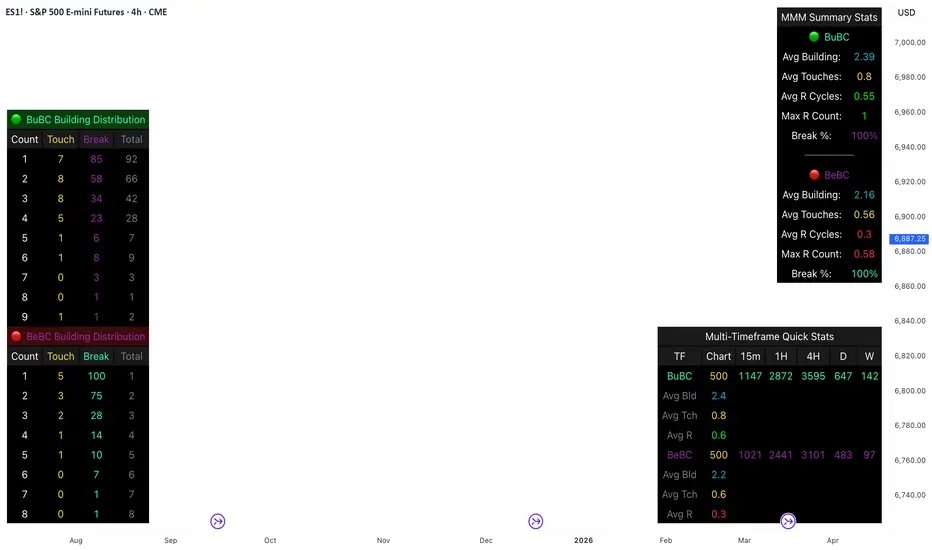
Body Close Continuity & failure Backtesting @MaxMaseratiThis indicator, is a highly advanced institutional-grade tool designed to track the "lifespan" of a trend based on Body Close (BC) sequences.
Unlike basic indicators that just show direction, this script analyzes the structural integrity of a trend by monitoring how many candles continue the move before a "Touch" (retest) or a "Break" (failure) occurs.
The Continuity & Failure Stats indicator tracks sequences of Bullish Body Closes (BuBC) and Bearish Body Closes (BeBC). It measures three critical phases: Building (pure momentum), Touching (price retesting the low/high of the sequence), and Resumption (price continuing the trend after a retest). It provides a statistical distribution of how long these "buildings" typically last before failing, allowing traders to know exactly when a trend is overextended.
This comprehensive analysis blends the statistical breakdown of the Continuity & Failure Stats indicator to provide a deep understanding of the structural momentum for the S&P 500 E-mini (ES1!) on a 4-hour timeframe.
1. Extensive Table Breakdown
A. Building Distribution (Left Table): The Fatigue Gauge
This table acts as a histogram of momentum, tracking the "Building Count"—the number of consecutive candles closing in a trend without price returning to its origin.
Count Column: Represents the streak length (e.g., 1, 2, or 3 candles).
Touch Column: Shows how many times a streak was interrupted by a retest ("touch") but remained structurally intact.
Break Column: Counts total structural failures where price closed beyond the sequence's anchor.
Data Insight: For BuBC, 92 sequences reached Count 1, but only 28 remained by Count 4. This reveals a steep momentum decay after the 3rd candle, establishing a "Statistical Wall" where only 2 sequences in history reached a count of 9.
B. MMM Summary Stats (Top Right): The Mathematical DNA
This table provides the "Expected Value" and behavior of a trend over the lookback period.
Avg Building (2.39 for BuBC): On average, a bullish move lasts ~2.4 candles of pure momentum before a retest or reversal occurs.
Avg Touches (0.8): This low number indicates "clean" trends that rarely wobble back to retest levels multiple times before reaching a conclusion.
Avg R Cycles (0.55): This suggests that once a bullish trend is interrupted, it only successfully resumes its momentum about half the time.
Max R Count (1): Typically, once a trend is "touched," it only manages one more push before failing.
C. Multi-Timeframe (MTF) Quick Stats (Bottom Right): Trend Weight
This compares the 4H chart against other layers of the market to identify "global" alignment.
Sample Comparison: There are 3,594 tracked BuBC sequences on the 4H compared to only 142 on the Weekly chart.
Fractal Law: The Avg Building (2.4) is consistent across several timeframes, implying that the "Rule of Three" (momentum fading after 3 candles) is a fractal characteristic of this asset.
2. Table Comparison: Synthesizing the Data
To trade effectively, you must compare Distribution (timing) against Summary Stats (averages):
Continuity vs. Failure: The Summary Stats show an average building of 2.39. When checking the Distribution table at Count 2, the "Break" count (58) is already high relative to the "Total". This confirms that the risk of failure increases exponentially the moment you exceed the average.
Momentum vs. Mean Reversion: Distribution tells you when a trend is "tired". If the 4H is at a "Building Count 4" (statistically overextended) while the Weekly chart is at "Building Count 1" (fresh momentum), you may choose to prioritize the higher timeframe's strength despite the local overextension.
3. Strategic Summary & Application
This indicator proves that market momentum follows a predictable "Building" cycle rather than an infinite streak.
The "Rule of Three" for ES1! 4H:
The Entry Zone (Momentum Start): The most profitable entries occur at Building Count 1. Statistically, you have a high probability of reaching a count of 2 or 3.
The Exit Zone (Momentum Limit): Take profits or tighten stops at Count 3. The data shows the sample size drops by nearly 50% between Count 3 and Count 4.
The "Touch" Rule (Retest Reliability): If price returns to the sequence low (a "Touch"), do not expect a massive continuation. The Max R Count of 1 tells us that resumptions are usually short-lived.
Danger Zone: Entering at Building Count 4 or higher is statistically dangerous, as the "Break" probability significantly outweighs the "Touch" or continuation probability.
SpectreSPECTRE - Precision Reversal Detection System
OVERVIEW
Spectre is a channel breakout indicator designed to identify high-probability reversal points by combining Donchian channel breaches with momentum confirmation. It generates BUY signals at oversold extremes and SELL signals at overbought extremes, filtered by trend strength to avoid low-conviction setups.
This indicator replaces the Regime Engine, which will continue to evolve independently as an experimental platform for testing new strategies and enhancements. Spectre was selected as the production replacement based on extensive backtesting across multiple assets and timeframes, which demonstrated superior win rates compared to alternative sell logic approaches (RSI-based exits outperformed CMO-based exits in 13 of 18 test configurations).
SIGNAL LOGIC
BUY CONDITIONS (all must be true):
Price touches or breaks below Donchian lower band
RSI is at or below oversold threshold (default: 35)
ADX confirms sufficient trend strength (default: ≥22)
BBWP confirms adequate volatility (default: ≥20%)
Cooldown period has elapsed since last buy
Cascade limit not reached
SELL CONDITIONS (all must be true):
Price touches or breaks above Donchian upper band
RSI is at or above overbought threshold (default: 70)
ADX confirms sufficient trend strength (default: ≥22)
BBWP confirms adequate volatility (default: ≥20%)
Cooldown period has elapsed since last sell
Cascade limit not reached
Price is not underwater (if protection enabled)
KEY FEATURES
NON-REPAINTING DONCHIAN CHANNELS
Uses previous bar's high/low extremes to prevent signal repainting. What you see in history is what you would have seen in real-time.
MULTI-FACTOR CONFIRMATION
Signals require agreement between price action (Donchian), momentum (RSI), and trend strength (ADX) to filter out low-quality setups.
VOLATILITY FILTER (BBWP)
Bollinger Band Width Percentile measures current volatility relative to historical norms. Low BBWP indicates compressed ranges where breakouts are less reliable - signals are blocked until volatility returns.
CASCADE PROTECTION
Limits consecutive signals in the same direction to prevent overexposure during extended trends. Resets when a signal fires in the opposite direction.
UNDERWATER PROTECTION (Unique to Spectre)
Tracks average entry price of recent buys and blocks sell signals when price has fallen significantly below this level. This prevents locking in large losses during drawdowns and allows positions to recover before exiting.
REGIME DETECTION
Visual background shading indicates current market regime based on Directional Indicator spread and On-Balance Volume trend. Green indicates bullish regime (+DI > -DI, OBV rising). Red indicates bearish regime (-DI > +DI, OBV falling). White/Gray indicates neutral or ranging conditions.
RECOMMENDED SETTINGS BY TIMEFRAME
For 5-minute charts, use RSI Buy 30-35, RSI Sell 70-75, ADX 20-24.
For 15-minute charts, use RSI Buy 30-35, RSI Sell 68-72, ADX 22-26.
For 30-minute charts (default), use RSI Buy 32-38, RSI Sell 68-72, ADX 22-26.
For 1-hour charts, use RSI Buy 35-40, RSI Sell 65-70, ADX 20-24.
For 4-hour charts, use RSI Buy 35-40, RSI Sell 65-70, ADX 18-22.
These are starting points - optimize for your specific assets.
INFO PANEL GUIDE
Regime shows current market bias (Bullish/Bearish/Neutral). RSI shows current value with buy/sell threshold status. ADX shows trend strength categorized as Weak (<15), Range (15-24), Trend (24-34), or Strong (>34). BBWP shows volatility percentile with a warning symbol when below minimum. Donchian shows price position relative to channel bands. Avg Buy shows average entry price and underwater status. Cascade shows current consecutive signal counts versus limits.
USAGE TIPS
Works best in ranging or mean-reverting markets
Reduce RSI thresholds in strong trends (tighter = fewer signals)
Increase ADX minimum in choppy markets to filter noise
Enable underwater protection for swing trading, disable for scalping
Use regime background to contextualize signals (buy in green, sell in red)
Combine with support/resistance levels for additional confirmation
