CryptoFlux Dynamo [JOAT]CryptoFlux Dynamo: Velocity Scalping Strategy
WHAT THIS STRATEGY IS
CryptoFlux Dynamo is an open-source Pine Script v6 strategy designed for momentum-based scalping on cryptocurrency perpetual futures. It combines multiple technical analysis methods into a unified system that adapts its behavior based on current market volatility conditions.
This script is published open-source so you can read, understand, and modify the complete logic. The description below explains everything the strategy does so that traders who cannot read Pine Script can fully understand how it works before using it.
HOW THIS STRATEGY IS ORIGINAL AND WHY THE INDICATORS ARE COMBINED
This strategy uses well-known indicators (MACD, EMA, RSI, MFI, Bollinger Bands, Keltner Channels, ATR). The originality is not in the individual indicators themselves, but in the specific way they are integrated into a regime-adaptive system. Here is the detailed justification for why these components are combined and how they work together:
The Problem Being Solved:
Standard indicator-based strategies use fixed thresholds. For example, a typical MACD strategy might enter when the histogram crosses above zero. However, in cryptocurrency markets, volatility changes dramatically throughout the day and week. A MACD crossover during a low-volatility consolidation period has very different implications than the same crossover during a high-volatility trending period. Using the same entry thresholds and stop distances in both conditions leads to either:
Too many false signals during consolidation (if thresholds are loose)
Missing valid opportunities during expansion (if thresholds are tight)
Stops that are too tight during volatility spikes (causing premature exits)
Stops that are too wide during compression (giving back profits)
The Solution Approach:
This strategy first classifies the current volatility regime using normalized ATR (ATR as a percentage of price), then dynamically adjusts ALL other parameters based on that classification. This creates a context-aware system rather than a static threshold comparison.
How Each Component Contributes to the System:
ATR-Based Regime Classification (The Foundation)
The strategy calculates ATR over 21 periods, smooths it with a 13-period EMA to reduce noise from wicks, then divides by price to get a normalized percentage. This ATR% is classified into three regimes:
- Compression (ATR% < 0.8%): Market is consolidating, breakouts are more likely but false signals are common
- Expansion (ATR% 0.8% - 1.6%): Normal trending conditions
- Velocity (ATR% > 1.6%): High volatility, larger moves but also larger adverse excursions
This regime classification then controls stop distances, profit targets, trailing stop offsets, and signal strength requirements. The regime acts as a "meta-parameter" that tunes the entire system.
EMA Ribbon (8/21/34) - Trend Structure Detection
The three EMAs establish trend direction and structure. When EMA 8 > EMA 21 > EMA 34, the trend structure is bullish. The slope of the middle EMA (21) is calculated over 8 bars and converted to degrees using arctangent. This slope measurement quantifies trend strength, not just direction.
Why these specific periods? The 8/21/34 sequence follows Fibonacci-like spacing and provides good separation on 5-minute cryptocurrency charts. The fast EMA (8) responds to immediate price action, the mid EMA (21) represents the short-term trend, and the slow EMA (34) acts as a trend filter.
The EMA ribbon works with the regime classification: during compression regimes, the strategy requires stronger ribbon alignment before entry because false breakouts are more common.
MACD (8/21/5) - Momentum Measurement
The MACD uses faster parameters (8/21/5) than the standard (12/26/9) because cryptocurrency markets move faster than traditional markets. The histogram is smoothed with a 5-period EMA to reduce noise.
The key innovation is the adaptive histogram baseline. Instead of using a fixed threshold, the strategy calculates a rolling baseline from the smoothed absolute histogram value, then multiplies by a sensitivity factor (1.15). This means the threshold for "significant momentum" automatically adjusts based on recent momentum levels.
The MACD works with the regime classification: during velocity regimes, the histogram baseline is effectively higher because recent momentum has been stronger, preventing entries on relatively weak momentum.
RSI (21 period) and MFI (21 period) - Independent Momentum Confirmation
RSI measures momentum using price changes only. MFI (Money Flow Index) measures momentum using price AND volume. By requiring both to confirm, the strategy filters out price moves that lack volume support.
The 21-period length is longer than typical (14) to reduce noise on 5-minute charts. The trigger threshold (55 for longs, 45 for shorts) is slightly offset from 50 to require momentum in the trade direction, not just neutral readings.
These indicators work together: a signal requires RSI > 55 AND MFI > 55 for longs. This dual confirmation reduces false signals from price manipulation or low-volume moves.
Bollinger Bands (1.5 mult) and Keltner Channels (1.8 mult) - Squeeze Detection
When Bollinger Bands contract inside Keltner Channels, volatility is compressing and a breakout is likely. This is the "squeeze" condition. When the bands expand back outside the channels, the squeeze "releases."
The strategy uses a 1.5 multiplier for Bollinger Bands (tighter than standard 2.0) and 1.8 for Keltner Channels. These values were chosen to identify meaningful squeezes on 5-minute cryptocurrency charts without triggering too frequently.
The squeeze detection works with the regime classification: squeeze releases during compression regimes receive additional signal strength points because breakouts from consolidation are more significant.
Volume Impulse Detection - Institutional Participation Filter
The strategy calculates a volume baseline (34-period SMA) and standard deviation. A "volume impulse" is detected when current volume exceeds the baseline by 1.15x OR when the volume z-score exceeds 0.5.
This filter ensures entries occur when there is meaningful market participation, not during low-volume periods where price moves are less reliable.
Volume impulse is required for all entries and adds points to the composite signal strength score.
Cycle Oscillator - Trend Alignment Filter
The strategy calculates a 55-period EMA as a cycle basis, then measures price deviation from this basis as a percentage. When price is more than 0.15% above the cycle basis, the cycle is bullish. When more than 0.15% below, the cycle is bearish.
This filter prevents counter-trend entries. Long signals require bullish cycle alignment; short signals require bearish cycle alignment.
BTC Dominance Filter (Optional) - Market Regime Filter
The strategy can optionally use BTC.D (Bitcoin Dominance) as a market regime filter. When BTC dominance is rising (slope > 0.12), the market is in "risk-off" mode and long entries on altcoins are filtered. When dominance is falling (slope < -0.12), short entries are filtered.
This filter is optional because the BTC.D data feed may lag during low-liquidity periods.
How The Components Work Together (The Mashup Justification):
The strategy uses a composite scoring system where each signal pathway contributes points:
Trend Break pathway (30 points): Requires EMA ribbon alignment + positive slope + price breaks above recent structure high
Momentum Surge pathway (30 points): Requires MACD histogram > adaptive baseline + MACD line > signal + RSI > 55 + MFI > 55 + volume impulse
Squeeze Release pathway (25 points): Requires BB inside KC (squeeze) then release + momentum bias + histogram confirmation
Micro Pullback pathway (15 points): Requires shallow retracement to fast EMA within established trend + histogram confirmation + volume impulse
Additional modifiers:
+5 points if volume impulse is present, -5 if absent
+5 points in velocity regime, -2 in compression regime
+5 points if cycle is aligned, -5 if counter-trend
A trade only executes when the composite score reaches the minimum threshold (default 55) AND all filters agree (session, cycle bias, BTC dominance if enabled).
This scoring system is the core innovation: instead of requiring ALL conditions to be true (which would generate very few signals) or ANY condition to be true (which would generate too many false signals), the strategy requires ENOUGH conditions to be true, with different conditions contributing different weights based on their reliability.
HOW THE STRATEGY CALCULATES ENTRIES AND EXITS
Entry Logic:
1. Calculate current volatility regime from ATR%
2. Calculate all indicator values (MACD, EMA, RSI, MFI, squeeze, volume)
3. Evaluate each signal pathway and sum points
4. Check all filters (session, cycle, dominance, kill switch)
5. If composite score >= 55 AND all filters pass, generate entry signal
6. Calculate position size based on risk per trade and regime-adjusted stop distance
7. Execute entry with regime name as comment
Position Sizing Formula:
RiskCapital = Equity * (0.65 / 100)
StopDistance = ATR * StopMultiplier(regime)
RawQuantity = RiskCapital / StopDistance
MaxQuantity = Equity * (12 / 100) / Price
Quantity = min(RawQuantity, MaxQuantity)
Quantity = round(Quantity / 0.001) * 0.001
This ensures each trade risks approximately 0.65% of equity regardless of volatility, while capping total exposure at 12% of equity.
Stop Loss Calculation:
Stop distance is ATR multiplied by a regime-specific multiplier:
Compression regime: 1.05x ATR (tighter stops because moves are smaller)
Expansion regime: 1.55x ATR (standard stops)
Velocity regime: 2.1x ATR (wider stops to avoid premature exits during volatility)
Take Profit Calculation:
Target distance is ATR multiplied by regime-specific multiplier and base risk/reward:
Compression regime: 1.6x ATR * 1.8 base R:R * 0.9 regime bonus = approximately 2.6x ATR
Expansion regime: 2.05x ATR * 1.8 base R:R * 1.0 regime bonus = approximately 3.7x ATR
Velocity regime: 2.8x ATR * 1.8 base R:R * 1.15 regime bonus = approximately 5.8x ATR
Trailing Stop Logic:
When adaptive trailing is enabled, the strategy calculates a trailing offset based on ATR and regime:
Compression regime: 1.1x base offset (looser trailing to avoid noise)
Expansion regime: 1.0x base offset (standard)
Velocity regime: 0.8x base offset (tighter trailing to lock in profits during fast moves)
The trailing stop only activates when it would be tighter than the initial stop.
Momentum Fail-Safe Exits:
The strategy closes positions early if momentum reverses:
Long positions close if MACD histogram turns negative OR EMA ribbon structure breaks (fast EMA crosses below mid EMA)
Short positions close if MACD histogram turns positive OR EMA ribbon structure breaks
This prevents holding through momentum reversals even if stop loss hasn't been hit.
Kill Switch:
If maximum drawdown exceeds 6.5%, the strategy disables new entries until manually reset. This prevents continued trading during adverse conditions.
HOW TO USE THIS STRATEGY
Step 1: Apply to Chart
Use a 5-minute chart of a high-liquidity cryptocurrency perpetual (BTC/USDT, ETH/USDT recommended)
Ensure at least 200 bars of history are loaded for indicator stabilization
Use standard candlestick charts only (not Heikin Ashi, Renko, or other non-standard types)
Step 2: Understand the Visual Elements
EMA Ribbon: Three lines (8/21/34 periods) showing trend structure. Bullish when stacked upward, bearish when stacked downward.
Background Color: Shows current volatility regime
- Indigo/dark blue = Compression (low volatility)
- Purple = Expansion (normal volatility)
- Magenta/pink = Velocity (high volatility)
Bar Colors: Reflect signal strength divergence. Brighter colors indicate stronger directional bias.
Triangle Markers: Entry signals. Up triangles below bars = long entry. Down triangles above bars = short entry.
Dashboard (top-right): Real-time display of regime, ATR%, signal strengths, position status, stops, targets, and risk metrics.
Step 3: Interpret the Dashboard
Regime: Current volatility classification (Compression/Expansion/Velocity)
ATR%: Normalized volatility as percentage of price
Long/Short Strength: Current composite signal scores (0-100)
Cycle Osc: Price deviation from 55-period EMA as percentage
Dominance: BTC.D slope and filter status
Position: Current position direction or "Flat"
Stop/Target: Current stop loss and take profit levels
Kill Switch: Status of drawdown protection
Volume Z: Current volume z-score
Impulse: Whether volume impulse condition is met
Step 4: Adjust Parameters for Your Needs
For more conservative trading: Increase "Minimum Composite Signal Strength" to 65 or higher
For more aggressive trading: Decrease to 50 (but expect more false signals)
For higher timeframes (15m+): Increase "Structure Break Window" to 12-15, increase "RSI Momentum Trigger" to 58
For lower liquidity pairs: Increase "Volume Impulse Multiplier" to 1.3, increase slippage in strategy properties
To disable short selling: Uncheck "Enable Short Structure"
To disable BTC dominance filter: Uncheck "BTC Dominance Confirmation"
STRATEGY PROPERTIES (BACKTEST SETTINGS)
These are the exact settings used in the strategy's Properties dialog box. You must use these same settings when evaluating the backtest results shown in the publication:
Initial Capital: $100,000
Justification: This amount is higher than typical retail accounts. I chose this value to demonstrate percentage-based returns that scale proportionally. The strategy uses percentage-based position sizing (0.65% risk per trade), so a $10,000 account would see the same percentage returns with 10x smaller position sizes. The absolute dollar amounts in the backtest should be interpreted as percentages of capital.
Commission: 0.04% (commission_value = 0.04)
Justification: This reflects typical perpetual futures exchange fees. Major exchanges charge between 0.02% (maker) and 0.075% (taker). The 0.04% value is a reasonable middle estimate. If your exchange charges different fees, adjust this value accordingly. Higher fees will reduce net profitability.
Slippage: 1 tick
Justification: This is conservative for liquid pairs like BTC/USDT on major exchanges during normal conditions. For less liquid altcoins or during high volatility, actual slippage may be higher. If you trade less liquid pairs, increase this value to 2-3 ticks for more realistic results.
Pyramiding: 1
Justification: No position stacking. The strategy holds only one position at a time. This simplifies risk management and prevents overexposure.
calc_on_every_tick: true
Justification: The strategy evaluates on every price update, not just bar close. This is necessary for scalping timeframes where waiting for bar close would miss opportunities. Note that this setting means backtest results may differ slightly from bar-close-only evaluation.
calc_on_order_fills: true
Justification: The strategy recalculates immediately after order fills for faster response to position changes.
RISK PER TRADE JUSTIFICATION
The default risk per trade is 0.65% of equity. This is well within the TradingView guideline that "risking more than 5-10% on a trade is not typically considered viable."
With the 12% maximum exposure cap, even if the strategy takes multiple consecutive losses, the total risk remains manageable. The kill switch at 6.5% drawdown provides additional protection by halting new entries during adverse conditions.
The position sizing formula ensures that stop distance (which varies by regime) is accounted for, so actual risk per trade remains approximately 0.65% regardless of volatility conditions.
SAMPLE SIZE CONSIDERATIONS
For statistically meaningful backtest results, you should select a dataset that generates at least 100 trades. On 5-minute BTC/USDT charts, this typically requires:
2-3 months of data during normal market conditions
1-2 months during high-volatility periods
3-4 months during low-volatility consolidation periods
The strategy's selectivity (requiring 55+ composite score plus all filters) means it generates fewer signals than less filtered approaches. If your backtest shows fewer than 100 trades, extend the date range or reduce the minimum signal strength threshold.
Fewer than 100 trades produces statistically unreliable results. Win rate, profit factor, and other metrics can vary significantly with small sample sizes.
STRATEGY DESIGN COMPROMISES AND LIMITATIONS
Every strategy involves trade-offs. Here are the compromises made in this design and the limitations you should understand:
Selectivity vs. Opportunity Trade-off
The 55-point minimum threshold filters many potential trades. This reduces false signals but also misses valid setups that don't meet all criteria. Lowering the threshold increases trade frequency but decreases win rate. There is no "correct" threshold; it depends on your preference for fewer higher-quality signals vs. more signals with lower individual quality.
Regime Classification Lag
The ATR-based regime detection uses historical data (21 periods + 13-period smoothing). It cannot predict sudden volatility spikes. During flash crashes or black swan events, the strategy may be classified in the wrong regime for several bars before the classification updates. This is an inherent limitation of any lagging indicator.
Indicator Parameter Sensitivity
The default parameters (MACD 8/21/5, EMA 8/21/34, RSI 21, etc.) are tuned for BTC/ETH perpetuals on 5-minute charts during 2024 market conditions. Different assets, timeframes, or market regimes may require different parameters. There is no guarantee that parameters optimized on historical data will perform similarly in the future.
BTC Dominance Filter Limitations
The CRYPTOCAP:BTC.D data feed may lag during low-liquidity periods or weekends. The dominance slope calculation uses a 5-bar SMA, adding additional delay. If you notice the filter behaving unexpectedly, consider disabling it.
Backtest vs. Live Execution Differences
TradingView backtesting does not replicate actual broker execution. Key differences:
Backtests assume perfect fills at calculated prices; real execution involves order book depth, latency, and partial fills
The calc_on_every_tick setting improves backtest realism but still cannot capture sub-bar price action or order book dynamics
Commission and slippage settings are estimates; actual costs vary by exchange, time of day, and market conditions
Funding rates on perpetual futures are not modeled in backtests and can significantly impact profitability over time
Exchange-specific limitations (position limits, liquidation mechanics, order types) are not modeled
Market Condition Dependencies
This strategy is designed for trending and breakout conditions. During extended sideways consolidation with no clear direction, the strategy may generate few signals or experience whipsaws. No strategy performs well in all market conditions.
Cryptocurrency-Specific Risks
Cryptocurrency markets operate 24/7 without session boundaries. This means:
No natural "overnight" risk reduction
Volatility can spike at any time
Liquidity varies significantly by time of day
Exchange outages or issues can occur at any time
WHAT THIS STRATEGY DOES NOT DO
To be straightforward about limitations:
This strategy does not guarantee profits. Past backtest performance does not indicate future results.
This strategy does not predict the future. It reacts to current conditions based on historical patterns.
This strategy does not account for funding rates, which can significantly impact perpetual futures profitability.
This strategy does not model exchange-specific execution issues (partial fills, requotes, outages).
This strategy does not adapt to fundamental news events or black swan scenarios.
This strategy is not optimized for all market conditions. It may underperform during extended consolidation.
IMPORTANT RISK WARNINGS
Past performance does not guarantee future results. The backtest results shown reflect specific historical market conditions and parameter settings. Markets change constantly, and strategies that performed well historically may underperform or lose money in the future. A single backtest run does not constitute proof of future profitability.
Trading involves substantial risk of loss. Cryptocurrency derivatives are highly volatile instruments. You can lose your entire investment. Only trade with capital you can afford to lose completely.
This is not financial advice. This strategy is provided for educational and informational purposes only. It does not constitute investment advice, trading recommendations, or any form of financial guidance. The author is not a licensed financial advisor.
You are responsible for your own decisions. Before using this strategy with real capital:
Thoroughly understand the code and logic by reading the open-source implementation
Forward test with paper trading or very small positions for an extended period
Verify that commission, slippage, and execution assumptions match your actual trading environment
Understand that live results will differ from backtest results
Consider consulting with a qualified financial advisor
No guarantees or warranties. This strategy is provided "as is" without any guarantees of profitability, accuracy, or suitability for any purpose. The author is not responsible for any losses incurred from using this strategy.
OPEN-SOURCE CODE STRUCTURE
The strategy code is organized into these sections for readability:
Configuration Architecture: Input parameters organized into logical groups (Core Controls, Optimization Constants, Regime Intelligence, Signal Pathways, Risk Architecture, Visualization)
Helper Functions: calcQty() for position sizing, clamp01() and normalize() for value normalization, calcMFI() for Money Flow Index calculation
Core Indicator Engine: EMA ribbon, ATR and regime classification, MACD with adaptive baseline, RSI, MFI, volume analytics, cycle oscillator, BTC dominance filter, squeeze detection
Signal Pathway Logic: Trend break, momentum surge, squeeze release, micro pullback pathways with composite scoring
Entry/Exit Orchestration: Signal filtering, position sizing, entry execution, stop/target calculation, trailing stop logic, momentum fail-safe exits
Visualization Layer: EMA plots, regime background, bar coloring, signal labels, dashboard table
You can read and modify any part of the code. Understanding the logic before deployment is strongly recommended.
- Made with passion by officialjackofalltrades
Cari dalam skrip untuk "bitcoin"

Master Strategy: BTC W1 Mean Reversion [Institutional SOP]Overview This is an institutional-grade Mean Reversion and Range Rotation strategy designed specifically for Bitcoin (BTC/USDT) Perpetual Futures. It operates on the philosophy that liquidity resides at the extremes of the previous week's range (Previous Week High/Low). The strategy looks for false breakouts (Sweeps) followed by a confirmed return to the range (Reclaim), targeting the weekly equilibrium (EQ).
Core Logic: The Deviation Play Unlike standard breakout strategies, this indicator hunts for trapped liquidity.
Weekly Levels (Fixed): It calculates PWH (Previous Week High) and PWL (Previous Week Low) based on confirmed, closed weekly data. These levels act as the "Box" for the current week.
The Sweep: We wait for price to pierce the PWH or PWL (taking liquidity/stops). The script uses a dynamic ATR-based threshold to filter out noise (micro-pokes).
The Reclaim (4H Close): A signal is generated ONLY if a 4H candle closes back inside the weekly range shortly after the sweep. This confirms rejection of higher/lower prices.
The Entry: The script suggests a Limit Order at the retested level (PWH/PWL) to maximize R:R.
Institutional Quality Filters ("Kill Switches") To prevent trading in unfavorable conditions, the script includes strict SOP (Standard Operating Procedure) filters:
Trend Filter (ADX): Blocks mean reversion signals if the daily trend is too strong (ADX > 25).
Expansion Filter: Blocks signals if price accepted levels outside the range for too long (prevents fighting a true breakout).
Weekly Range Filter: Filters out weeks that are statistically too tight (chop) or too wide (expansion).
Time Filter: A reclaim must happen within a set number of 4H bars after the sweep (default: 3).
Key Features
Zero Repainting: Logic is based strictly on closed candles ( , , ).
State Machine Logic: Uses internal memory to track sweeps regardless of chart timeframe glitches.
Operational Dashboard: Displays current status, countdown to next decision candle (4H close), and exact parameters for the last valid signal (Entry, SL, TP).
Unified Alerting: A single "Any function call" alert handles both Long and Short scenarios dynamically.
Clean Visuals: Levels are plotted with line breaks to avoid visual clutter between weeks.
How to Use
Timeframe: Set your chart to 4H. This is crucial as the logic relies on 4H closes.
Signals: Wait for the "4H RECLAIM" label.
Execution: Place a Limit Order at the suggested Level (PWH/PWL).
Stop Loss: Use the calculated SL provided by the indicator (Swing extreme + ATR buffer).
Target: TP1 is always the EQ (Equilibrium/Mid-range).

ETH Dynamic Risk Strategy# ETH Dynamic Risk Strategy - Publication Description
## Overview
The ETH Dynamic Risk Strategy is a systematic approach to accumulating Ethereum during bear markets and distributing during bull markets. It combines multiple risk indicators into a single composite metric (0-1 scale) that identifies optimal buying and selling zones based on market conditions.
## Key Features
• **Multi-Component Risk Metric**: Combines 4 weighted indicators to assess market conditions
• **Tiered Buy/Sell System**: 3 levels of buy signals (L1, L2, L3) and 3 levels of sell signals based on risk thresholds
• **Configurable Filters**: Optional buy filters to reduce signal frequency by 30-50%
• **Visual Risk Zones**: Color-coded risk metric plot with clear threshold lines
• **Comprehensive Dashboard**: Real-time statistics including position size, P/L, and component scores
## How It Works
### Risk Components (Configurable Weights)
1. **Log Return from ATH** (Default: 35%)
- Tracks drawdown from all-time high over lookback period
- Deep drawdowns (-70% to -90%) = low risk / buying opportunity
- Near ATH (0% to -20%) = high risk / selling opportunity
2. **ETH/BTC Ratio** (Default: 25%)
- Measures ETH strength relative to Bitcoin
- Below historical average = ETH undervalued = low risk
- Above historical average = ETH overvalued = high risk
3. **Volatility Regime** (Default: 20%)
- Compares current volatility to long-term average
- Compressed volatility at lows = opportunity
- Expanded volatility at highs = danger
4. **Trend Strength** (Default: 20%)
- Uses multiple EMA alignment and slope analysis
- Strong downtrends = low risk scores
- Strong uptrends = high risk scores
### Trading Logic
**Buy Signals:**
- L1: Risk ≤ 0.30 → Buy $100 (default)
- L2: Risk ≤ 0.20 → Buy $250 total
- L3: Risk ≤ 0.10 → Buy $450 total
**Sell Signals (Sequential):**
- L1: Risk ≥ 0.75 → Sell 25% of position
- L2: Risk ≥ 0.85 → Sell 35% of remaining
- L3: Risk ≥ 0.95 → Sell 40% of remaining
**Buy Filters (Optional):**
- Minimum days between buys (prevents clustering)
- Minimum risk drop required (ensures falling risk)
- Toggle on/off to compare performance
## Settings Guide
### Risk Components
Toggle individual components on/off and adjust their weights. Total weight is automatically normalized. Experiment with different combinations to match your market view.
### Advanced Settings
- ATH Lookback: How far back to look for all-time highs (500-2000 recommended)
- Volatility Period: Window for volatility calculations (40-100 recommended)
- ETH/BTC MA Period: Moving average for ratio comparison (100-300 recommended)
- Trend Period: Base period for trend calculations (50-150 recommended)
### Trading Thresholds
Customize buy/sell trigger points and position sizes. Lower buy thresholds = more aggressive accumulation. Higher sell thresholds = holding longer into bull markets.
### Buy Filters
- Enable/disable filtering system
- Min Days Between Buys: Spacing between purchases (1-3 recommended)
- Min Risk Drop: How much risk must fall (-0.001 to -0.01 range)
## Best Practices
• **Timeframe**: Works best on daily (1D) and 3-day (3D) charts
• **Initial Capital**: Set based on your DCA budget (default $10,000)
• **Backtest First**: Test different parameter combinations on historical data
• **Position Sizing**: Adjust buy amounts to match your risk tolerance
• **Monitor Filters**: Check "Filtered Buys" stat to ensure filter isn't too strict
## Use Cases
- Long-term ETH accumulation strategy
- Systematic DCA with market-adaptive buying
- Risk-based portfolio rebalancing
- Educational tool for understanding crypto market cycles
## Disclaimer
This strategy is for educational purposes only. Past performance does not guarantee future results. Cryptocurrency trading involves substantial risk. The strategy uses historical price action and technical indicators which may not predict future movements. Always do your own research and never invest more than you can afford to lose.
## Credits
Strategy concept and development by nakphanan with assistance from Claude AI (Anthropic). Built using Pine Script v5....Mostly from Claude AI!!!
## Version History
v7.0 - Initial release with 4-component risk metric, tiered trading system, and optional buy filters

Round Level Pro Stats
Here is a professional English description of your indicator, which you can use for your own records or if you ever want to share it on the TradingView Community Scripts:
Indicator Name: Dynamic Round Levels & Historical Strength Grid
Overview
This indicator is a sophisticated technical analysis tool designed to identify and evaluate "Round Number" psychological levels (e.g., 1.17100, 1.17200, 1.17300). Unlike a static grid, this tool actively scans historical data to provide a "Strength Score" for each level, helping traders distinguish between minor price points and significant historical reaction zones.
Key Features
Automated Price Grid: Generates a clean, horizontal grid based on user-defined price intervals (Steps). Perfect for Forex (0.001 pips), Stocks, or Crypto.
Historical Strength Engine: Analyzes up to 5,000 historical bars to calculate how "respected" a price level is.
The "3-Candle Confirmation" Logic: A level's strength is only increased if the price touches the line and successfully reverses/bounces, staying on the same side for at least 3 subsequent candles.
Smart Visual Coding:
Green (High Strength): Levels with >60% historical reversal success.
Orange (Medium Strength): Levels with 35%–60% success.
Red (Low Strength): Levels frequently breached without reaction.
Pro HUD Display: Bold percentage labels are positioned at the far right of the chart (near the price scale) to keep the main trading area clutter-free.
How to Use
Set your Step: For Forex, use 0.001 to see 10-pip increments. For Bitcoin or Gold, use 10 or 100.
Lookback Period: Adjust the history scan (up to 5,000 bars) to match your trading timeframe.
Identify Support/Resistance: Look for Green % STR labels. These represent "Round Numbers" that have acted as strong barriers in the past, offering higher-probability entry or exit points.
Technical Summary for Pine Script
Language: Pine Script v5
Max Lines/Labels: 500 (Optimized for performance)
Placement: Far-right margin alignment using bar_index offsets.

QuantLabs MASM Correlation TableThe Market is a graph. See the flows:
The QuantLabs MASM is not a standard correlation table. It is an Alpha-Grade Scanner architected to reveal the hidden "hydraulic" relationships between global macro assets in real-time.
Rebuilt from the ground up for Version 3, this engine pushes the absolute limits of the Pine Script™ runtime. It utilizes a proprietary Logarithmic Math Engine, Symmetric Compute Optimization, and a futuristic "Ghost Mode" interface to deliver a 15x15 real-time correlation matrix with zero lag.
Under the Hood: The Quant Architecture
We stripped away standard libraries to build a lean, high-performance engine designed for institutional-grade accuracy.
1. Alpha Math Engine (Logarithmic Returns) Most tools calculate correlation based on Price, which generates spurious signals (e.g., "Everything is correlated in a bull run").
The Solution: Our engine computes Logarithmic Returns (log(close/close )) by default. This measures the correlation of change (Velocity & Vector), not price levels.
The Result: A mathematically rigorous view of statistical relationships that filters out the noise of general market drift.
Dual-Core: Toggle seamlessly between "Alpha Mode" (Log Returns) for verified stats and "Visual Mode" (Price) for trend alignment.
Calculation Modes: Pearson (Standard), Euclidean (Distance), Cosine (Vector), Manhattan (Grid).
2. Symmetric Compute Optimization Calculating a 15x15 matrix requires evaluating 225 unique relationships per bar, which often crashes memory limits.
The Fix: The V3 Engine utilizes Symmetric Logic, recognizing that Correlation(A, B) == Correlation(B, A).
The Gain: By computing only the lower triangle of the matrix and mirroring pointers to the upper triangle, we reduced computational load by 50%, ensuring a lightning-fast data feed even on lower timeframes.
3. Context-Aware "Ghost Mode" The UI is designed for professional traders who need focus, not clutter.
Smart Detection: The matrix automatically detects your current chart's Ticker ID. If you are trading QQQ, the matrix will visually highlight the Nas100 row and column, making them opaque and bright while dimming the rest.
Dynamic Transparency: Irrelevant data ("Noise" < 0.3 correlation) fades into the background. Only significant "Alpha Signals" (> 0.7) glow with full Neon Saturation.
Key Features
Dominant Flow Scanner: The matrix scans all 105 unique pairs every tick and prints the #1 Strongest Correlation at the bottom of the pane (e.g., DOMINANT FLOW: Bitcoin ↔ Nas100 ).
Streak Counter: A "Stubbornness" metric that tracks how many consecutive days a strong correlation has persisted. Instantly identify if a move is a "flash event" or a "structural trend."
Neon Palette: Proprietary color mapping using Electric Blue (+1.0) for lockstep correlation and Deep Red (-1.0) for inverse hedging.
Usage Guide
Placement: Best viewed in a bottom pane (Footer).
Assets: Pre-loaded with the Essential 15 Macro Drivers (Indices, BTC, Gold, Oil, Rates, FX, Key Sectors). Fully editable via settings (Ticker|Name).
Reading the Grid:
🔵 Bright Blue: Assets moving in lockstep (Risk-On).
🔴 Bright Red: Assets moving perfectly opposite (Hedge/Risk-Off).
⚫ Faded/Black: No statistical relationship (Decoupled).
Key Improvements Made:
Formatting: Added clear bullet points and bolding to make it scannable.
Clarity: Clarified the "Logarithmic Returns" section to explain why it matters (Velocity vs. Price Levels).
Tone: Maintained the "high-tech/quant" vibe but removed slightly clunky phrases like "spurious signals" (unless you prefer that academic tone, in which case I left it in as it fits the persona).
Structure: Grouped the "Modes" under the Math Engine for better logic.
Created and designed by QuantLabs

Crypto Flow Index (CFI) - RS vs BTC/ETH ---
Crypto Flow Index, CFI
Crypto Flow Index, CFI, measures relative strength between an asset and Bitcoin or Ethereum.
You use CFI to judge whether capital favors your asset or the benchmark.
CFI does not give entry or exit signals.
You use CFI as a bias and context tool.
---
What CFI measures
Relative strength money flow on the BASE/BTC or BASE/ETH pair.
Volume weighted pressure, not price alone.
Momentum blended into flow to smooth rotations.
Optional USD trend filter using fast and slow EMAs.
---
How to read CFI
Above 50 means relative strength favors the asset.
Below 50 means relative strength favors BTC or ETH.
Rising CFI shows strengthening relative demand.
Falling CFI shows weakening relative demand.
---
Histogram
Green bars show positive relative flow.
Red bars show negative relative flow.
Larger bars signal stronger pressure.
---
Bias ribbon
Green ribbon shows bullish relative bias.
Red ribbon shows bearish relative bias.
Gray ribbon shows transition or balance.
---
How to use CFI
Favor long trades when CFI stays above 50.
Avoid longs when price rises but CFI falls.
Spot rotations before price reacts.
Combine with structure, entries, and risk rules.
---
Important limits
CFI compares assets only to BTC or ETH.
CFI does not represent the entire crypto market.
USD price and relative strength often diverge.
---
Core question CFI answers
Is your asset gaining or losing strength versus Bitcoin or Ethereum.
---

Quant VWAP System 3.8 This is the lower-indicator companion to the "Quant VWAP System." While the main chart tells you where the price is, this oscillator tells you how statistically significant the move is.
It uses a Z-Score algorithm to normalize price action. This means it ignores dollar amounts and instead measures how many Standard Deviations (SD) the price is away from its mean (VWAP). This allows you to instantly spot "Overbought" or "Oversold" conditions on any asset (Bitcoin, Forex, or Stocks) without needing to guess.
Key Features:
1. Normalized Extremes (The "Kill Zones")
±2.0 SD: These dotted lines represent statistical extremes. When the signal line crosses above +2.0, the asset is mathematically expensive (Overbought). When it crosses below -2.0, it is mathematically cheap (Oversold).
The Logic: Price rarely sustains movement beyond 2 Standard Deviations without a reversion or a pause.
2. The Squeeze Radar (Yellow Dots)
Volatility Detection: A row of Yellow Dots appearing on the center line indicates a "Squeeze."
What it means: The Standard Deviation bands are compressing. Energy is building.
Warning: DO NOT trade Mean Reversion when you see Yellow Dots. A squeeze often leads to a violent breakout. Wait for the dots to disappear to confirm the direction of the explosion.
3. Momentum Coloring
Green Line: Z-Score is rising (Bullish Momentum).
Red Line: Z-Score is falling (Bearish Momentum).
This helps you spot divergences (e.g., Price makes a Higher High, but the Oscillator makes a Lower High = Exhaustion).
How to Trade with It
Strategy A: The "Zero Bounce" (Trend Continuation)
Scenario: You are in a Bull Trend.
Signal: The Oscillator line pulls back to the Zero Line (White), turns Green, and curls upward.
Meaning: Price has tested the average (VWAP) and buyers have stepped in. This is a high-probability entry for trend continuation.
Strategy B: The "Extreme Fade" (Reversion)
Scenario: The Oscillator pushes deep into the Red Zone (+2.0 SD).
Signal: The line turns Red and crosses back down below the +2.0 dotted line. A small Red Triangle will appear.
Meaning: The statistical extension has failed, and price is likely snapping back to the mean.
Strategy C: Squeeze Breakout
Scenario: Yellow Dots appear on the center line.
Action: Stop trading. Wait.
Signal: The dots disappear, and the line shoots aggressively through +1.0 SD (Long) or -1.0 SD (Short). Ride the momentum.

Statistical Deviation per AssetINDICATOR: STATISTICAL DEVIATION PER ASSET (SDPA)
1. Overview
The Statistical Deviation per Asset (SDPA) is a quantitative analysis tool designed to measure the strength and exhaustion of price movements. Unlike standard oscillators (like RSI ), the SDPA calculates the actual percentage deviation from the most recent pivot point (High or Low) and compares it against historical performance averages specific to each asset.
---
2. Core Logic & Calculation
The script operates on a Mean Reversion principle. It assumes that every asset (Gold, Bitcoin, Ethereum, etc.) has a unique "volatility signature" depending on the timeframe.
* Dynamic Pivot Detection : The indicator identifies recent Swing Highs and Swing Lows using an adaptive lookback period.
* Real-Time Return Calculation : Once a pivot is confirmed, the script calculates the real-time percentage gain (from a Low) or loss (from a High).
* Zero-Indexed Histogram : This return is plotted as an oscillator centered around a Zero Line , representing the current trend's progress since the last reversal.
---
3. Adaptive Intelligence (Multi-Asset & Multi-TF)
The SDPA is pre-loaded with a statistical database. It automatically adjusts its sensitivity and thresholds based on:
1. The Selected Asset : Whether trading XAUUSD , Bitcoin , or Solana , the deviation thresholds adapt to the specific volatility of that instrument.
2. The Timeframe (TF) : The calculation period ( period ) and performance targets ( hausse_perf / baisse_perf ) change dynamically. For example, a 1-minute scalping setup uses a longer lookback (200) compared to a Daily swing setup (10).
---
4. Visual Anatomy
The interface is designed for instant "at-a-glance" interpretation:
* The Histogram :
* Green : Price is trending up since the last Swing Low .
* Red : Price is trending down since the last Swing High .
* Threshold Lines (The Statistical Averages) :
* Thick Line (60% Opacity) : Represents the Average Historical Deviation . When the histogram hits this line, the move is considered "statistically mature."
* Thin Line (70% Opacity) : Represents the Strong Deviation Zone (1.5x the average), indicating extreme momentum or potential exhaustion.
* Background Highlighting : The chart background colors automatically when the price exceeds historical averages, signaling a High-Probability Reversal Zone .
---
5. How to Trade with SDPA
* Trend Maturity : If the histogram exceeds the Bullish Average (Green line), the current move has reached its typical historical limit. Traders should look for take-profit opportunities or wait for a reversal.
* Impulse Strength : A rapid move from the Zero Line toward the thresholds confirms strong institutional interest.
* Mean Reversion : When the histogram reaches the Strong Zone (1.5x), the price is "overextended" statistically, offering a high reward-to-risk ratio for counter-trend setups.
---
6. Technical Parameters
* Asset Choice : Dropdown menu to select the specific asset.
* Colors : Customizable Bullish and Bearish colors to match any UI theme.
* Precision : Set to 4 decimal places to ensure accuracy across all asset types.

BTC - AXIS: Coppock + Williams %R CompositeTitle: BTC - AXIS: Coppock + Williams %R Composite | RM
Overview & Philosophy
AXIS (Advanced X-Momentum Intensity Score) is a specialized momentum composite designed to identify market structural shifts. In physics, an axis is the central line around which a body rotates; in this indicator, the Zero-Baseline acts as the AXIS for capital flow.
By fusing a slow-moving momentum engine ( Coppock Curve ) with a high-sensitivity tactical oscillator ( Williams %R ), this tool filters out the "market noise" that leads to overtrading and focuses on the high-conviction "Trend-Aligned Dips."
Methodology
Most indicators either suffer from too much lag (Moving Averages) or too much noise (Standard RSI). AXIS solves this through "Speed-Balanced Normalization."
1. Macro Engine (Coppock Curve): Named after Edwin Coppock, this component identifies major market bottoms by smoothing two separate Rates of Change (RoC). It is your structural compass.
2. Tactical Trigger (Williams %R): Created by Larry Williams, this measures the current close relative to the High-Low range.
• Re-centered Logic: Standard Williams %R oscillates between 0 and -100. Here, this is re-centered to oscillate around zero, ensuring it interacts mathematically correctly with the Coppock baseline.
3. The AXIS Score: The Composite line (Orange) is the weighted sum of these two engines. It provides a singular view of the market's "Net Momentum Intensity."
How to Read the Chart
🟧 The AXIS Composite (Orange Line): The primary signal line. It tracks the speed and exhaustion of the price by fusing macro and tactical data.
• Red Zone (> 150): Overheated. Short and long-term momentum are at extreme highs. Risk of a blow-off top or local reversal is high.
• Green Zone (< -150): Capitulation. The market is statistically exhausted. Historically, these zones represent high-conviction accumulation areas.
• Bullish Momentum (> 0): The market is rotating above the central Axis. Buyers are in control of the trend.
• Bearish Momentum (< 0): The market is rotating below the central Axis. Sellers are in control of the trend.
🟦 The Coppock Line (Blue): The macro filter. When Blue is above 0, the long-term trend is up.
🟥 The Williams %R Line (Red): The short-term cycles. Watch for divergences here to spot early trend fatigue.
Strategy: The "AXIS Alignment" Signal
The highest-conviction entry point—and the primary "Alpha" of this tool—occurs when:
The macro trend is Bullish ( Blue Line > 0 ).
The market experiences a correction, pushing the Orange (AXIS) Line into the Green Capitulation Zone.
The AXIS Score turns back upward.
This indicates that a short-term panic has been absorbed by a long-term bull trend—the ideal "Buy the Dip" scenario.
Settings
• Long/Short RoC: Standardized to 14/11 for cycle accuracy.
• Weighting: Allows you to prioritize trend (Coppock) or cycle sensitivity (%R).
• Visibility Toggles: Fully customizable display switches for each line.
Credits
• Edwin Coppock: For the foundation of long-term recovery momentum.
• Larry Williams: For the Percent Range methodology.
⚠️ Note: This indicator is optimized for the Daily (1D) Timeframe. Please switch your chart to 1D for accurate signal reading.
Disclaimer
This script is for research and educational purposes only. Past performance does not guarantee future results.
Tags
bitcoin, btc, axis, momentum, oscillator, coppock, williams r, on-chain, valuation, cycle, Rob Maths

Global Net Liquidity w/offsetShows the value of Global Net Liquidity.
Currently defined as:
Fed + Japan + China + HK + UK + ECB - RRP - TGA
where the first six components are central bank assets.
This script has been heavily inspired by dharmatech 's Global Net Liquidity
Original script can be viewed here:
Special for this script:
Hong Kong assets added
Offset mode
Smooth vs stepped line in lower than 1D time frame
Switch between trillion USD or full number
Defaults to overlay mode when added to chart
For Bitcoin, 90 days, is a fitting offset.
For SPX, around 60-70 days, is a fitting offset.

9 EMA Trend-Flow StrategyThis strategy avoids trading inside the noise and waits for Bitcoin to "coil up" before exploding.
1. Chart Setup
Timeframe: 5 Minutes
Bollinger Bands: Length 20, Standard Deviation 2 (Default).
RSI (Relative Strength Index): Length 14.
EMA (Exponential Moving Average): Length 200 (Trend Filter).
2. The Rules
Long Setup (Buy)
The Trend Filter: Price must be above the 200 EMA.
The Squeeze: The Bollinger Bands must visually contract (narrow), indicating volatility is dying down.
The Trigger: A 5m candle closes strongly above the Upper Bollinger Band.
Confirmation: RSI must be rising and above 50 (but ideally not yet "pegged" at 90+).
Short Setup (Sell)
The Trend Filter: Price must be below the 200 EMA.
The Squeeze: The Bollinger Bands contract.
The Trigger: A 5m candle closes strongly below the Lower Bollinger Band.
Confirmation: RSI must be falling and below 50.
Execution Guide
Entry Technique
Don't enter immediately when the candle touches the band. Wait for the candle close.
Why? Bitcoin frequently "wicks" through bands to trap traders (fakeouts) before reversing. A solid close outside the band confirms momentum.
Exit Strategy (Take Profit)
Target 1 (Conservative): Close 50% of the position when price expands to a fixed risk-reward ratio (e.g., 1.5R).
Target 2 (Runner): Keep the remaining position open as long as price "walks the band" (stays outside or touching the outer band). Close the rest when a candle finally closes back inside the Bollinger Bands.
Stop Loss
Placement: Place your Stop Loss (SL) slightly below the Middle Band (the 20 SMA) at the time of entry.
Trailing: As the price moves in your favor, move your SL to trail the Middle Band.

Arbitrage Detector [LuxAlgo]The Arbitrage Detector unveils hidden spreads in the crypto and forex markets. It compares the same asset on the main crypto exchanges and forex brokers and displays both prices and volumes on a dashboard, as well as the maximum spread detected on a histogram divided by four user-selected percentiles. This allows traders to detect unusual, high, typical, or low spreads.
This highly customizable tool features automatic source selection (crypto or forex) based on the asset in the chart, as well as current and historical spread detection. It also features a dashboard with sortable columns and a historical histogram with percentiles and different smoothing options.
🔶 USAGE
Arbitrage is the practice of taking advantage of price differences for the same asset across different markets. Arbitrage traders look for these discrepancies to profit from buying where it’s cheaper and selling where it’s more expensive to capture the spread.
For begginers this tool is an easy way to understand how prices can vary between markets, helping you avoid trading at a disadvantage.
For advanced traders it is a fast tool to spot arbitrage opportunities or inefficiencies that can be exploited for profit.
Arbitrage opportunities are often short‑lived, but they can be highly profitable. By showing you where spreads exist, this tool helps traders:
Understand market inefficiencies
Avoid trading at unfavorable prices
Identify potential profit opportunities across exchanges
As we can see in the image, the tool consists of two main graphics: a dashboard on the main chart and a histogram in the pane below.
Both are useful for understanding the behavior of the same asset on different crypto exchanges or forex brokers.
The tool's main goal is to detect and categorize spread activity across the major crypto and forex sources. The comparison uses data from up to 19 crypto exchanges and 13 forex brokers.
🔹 Forex or Crypto
The tool selects the appropriate sources (crypto exchanges or forex brokers) based on the asset in the chart. Traders can choose which one to use.
The image shows the prices and volumes for Bitcoin and the euro across the main sources, sorted by descending average price over the last 20 days.
🔹 Dashboard
The dashboard displays a list of all sources with four main columns: last price, average price, volume, and total volume.
All four columns can be sorted in ascending or descending order, or left unsorted. A background gradient color is displayed for the sorted column.
Price and volume delta information between the chart asset and each exchange can be enabled or disabled from the settings panel.
🔹 Histogram
The histogram is excellent for visualizing historical values and comparing them with the asset price.
In this case, we have the Euro/U.S. Dollar daily chart. As we can see, the unusual spread activity detected since 2016, with values at or above 98%, is usually a good indication of increased trader activity, which may result in a key price area where the market could turn around.
By default, the histogram has the gradient and smoothing auto features enabled.
The differences are visible in the chart above. On top is an adaptive moving average with higher values for unusual activity. At the bottom is an exponential moving average with a length of 9.
The differences between the gradient and solid colors are evident. In the first case, the colors are in sync with the data values, becoming more yellow with higher values and more green with lower values. In the second case, the colors are solid and only distinguish data above or below the defined percentiles.
🔶 SETTINGS
Sources: Choose between crypto exchanges, forex brokers, or automatic selection based on the asset in the chart.
Average Length: Select the length for the price and volume averages.
🔹 Percentiles
Percentile Length: Select the length for the percentile calculation, or enable the use of the full dataset. Enabling this option may result in runtime errors due to exceeding the allotted resources.
Unusual % >: Select the unusual percentile.
High % >: Select the high percentile.
Typical % >: Select the typical percentile.
🔹 Dashboard
Dashboard: Enable or disable the dashboard.
Sorting: Select the sorting column and direction.
Position: Select the dashboard location.
Size: Select the dashboard size.
Price Delta: Show the price difference between each exchange and the asset on the chart.
Volume Delta: Show the volume difference between each exchange and the asset on the chart.
🔹 Style
Unusual: Enable the plot of the unusual percentile and select its color.
High: Enable the plot of the high percentile and select its color.
Typical: Enable the plot of the typical percentile and select its color.
Low: Select the color for the low percentile.
Percentiles Auto Color: Enable auto color for all plotted percentiles.
Histogram Gradient: Enable the gradient color for the histogram.
Histogram Smoothing: Select the length of the EMA smoothing for the histogram or enable the Auto feature. The Auto feature uses an adaptive moving average with the data percent rank as the efficiency ratio.

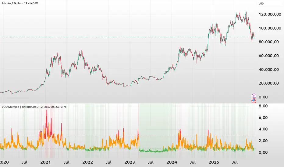
BTC - VDD Multiple (Approx)Overview & Philosophy
⚠️ Note: This indicator is optimized for the Daily (1D) Timeframe. Please switch your chart to 1D for accurate signal reading.
The BTC – VDD Multiple (Approx) is an advanced oscillator designed to identify market overheating and cycle tops by analyzing the velocity of value moving through the market.
In traditional On-Chain Analysis, Value Days Destroyed (VDD) is a premier metric for spotting macro tops. It multiplies the coin age (how long a coin was held) by the price at which it was moved. When old coins (HODLer money) move at high prices, VDD spikes, signaling massive profit-taking.
The Problem: Real "Coin Days Destroyed" (CDD) data is typically locked behind institutional paywalls or unavailable on standard TradingView plans.
The Solution: This script calculates a Deterministic Proxy. By analyzing the relationship between Exchange Volume, Price, and a Dormancy Constant, we can approximate the structure of the VDD Multiple without needing a premium data feed.
Methodology
The VDD Multiple works by comparing short-term market velocity against a long-term baseline.
1. The Proxy Calculation
Since we cannot directly access the age of coins on TradingView, we model the economic weight of the move:
Proxy Value = Exchange Volume * Price * Dormancy Factor
This creates a synthetic representation of "Value Throughput."
2. The Multiple
We compare the immediate heat of the market against the yearly trend:
• Short-Term MA (2 Days): Captures flash spikes and sudden liquidity exit events.
• Long-Term MA (365 Days): Represents the baseline "hum" of network activity.
VDD Multiple = Short Term MA / Long Term MA
How to Read the Chart
The indicator plots the Multiple as a line and uses background highlighting to signal extreme regimes.
🔴 The Red Zone (Overheated > 2.9)
Meaning: Current value transfer is ~3x higher than the yearly average.
Interpretation: Historically, sharp spikes into the Red Zone correlate with Local or Cycle Tops. This indicates that massive volume is changing hands at high prices—typically a sign of "Smart Money" distributing into "Dumb Money" FOMO.
Note: In strong bull runs, price can push higher even after a VDD spike, but the risk/reward ratio is extremely poor here.
🟢 The Green Zone (Undervalued < 0.75)
Meaning: Market activity is quiet and below the yearly baseline.
Interpretation: These are periods of apathy or accumulation. Historically, extended time spent in the Green Zone (the "flatline") has offered the best asymmetric buying opportunities.
🟠 The Orange Line (Neutral)
Meaning: The market is in transition or equilibrium.
Strategy & Context
This indicator is best used as a Macro Cycle Tool, not a day-trading signal.
• Exit Strategy: Look for "Clusters" of Red Spikes. A single spike often marks a local correction, but a cluster of intense spikes while price makes new highs (Divergence) is a strong Cycle Top warning.
• Entry Strategy: Historically the best entries occur when the indicator flattens out in the Green Zone for weeks or months. This suggests sellers are exhausted and the market has reached a floor.
Credits
This script is an approximation of the original VDD Multiple concept. Full credit for the underlying on-chain theory goes to the pioneers of this metric:
• Concept: The original Value Days Destroyed metric was popularized by Hans Hauge and Glassnode.
• The Multiple: The specific application of a Short/Long MA Multiple on VDD is widely attributed to analysts like TXMC and Bitbo.
This script adapts these concepts for the free TradingView environment using exchange volume proxies.
Settings
• Data Source: Defaults to BINANCE:BTCUSDT to capture high-volume liquidity.
• Short MA: Default is 2 Days to capture rapid velocity spikes.
• Long MA: Default is 365 Days to track the annual trend.
Disclaimer
This tool is an approximation based on exchange volume, not raw blockchain data. While exchange volume and on-chain volume are highly correlated during cycle extremes, they are not identical. This script is for educational and research purposes only. Past performance does not guarantee future results.
Tags
bitcoin, btc, onchain, vdd, cdd, valuation, cycle, top, bottom, Rob Maths
Tailwind.(BTC)Imagine the price of Bitcoin is like a person climbing a staircase.
The Steps (Grid): Instead of watching every single price movement, the strategy divides the market into fixed steps. In your configuration, each step measures **3,000 points**. (Examples: 60,000, 63,000, 66,000...).
The Signal: We buy only when the price climbs a full step decisively.
The "Expensive Price" Filter: If the price jumps the step but lands too far away (the candle closes too high), we do not buy. It is like trying to board a train that has already started moving too fast; the risk is too high.
Rigid Exits: The Take Profit (TP) and Stop Loss (SL) are calculated from the edge of the step, not from the specific price where you managed to buy. This preserves the geometric structure of the market.
The Code Logic (Step-by-Step)
A. The Math of the Grid (`math.floor`)
pinescript
level_base = math.floor(close / step_size) * step_size
This is the most important line.
What does it do? It rounds the price down to the nearest multiple of 3,000.
Example: If BTC is at 64,500 and the step size is 3,000:
1. Divide: $64,500 / 3,000 = 21.5$
2. `math.floor` (Floor): Removes the decimals $\rightarrow$ remains $21$.
3. Multiply: $21 * 3,000 = 63,000$.
Result: The code knows that the current "floor" is **63,000**, regardless of whether the price is at 63,001 or 65,999.
B. The Strict Breakout (`strict_cross`)
pinescript
strict_cross = (open < level_base) and (close > level_base)
Most strategies only check if `close > level`. We do things slightly differently:
`open < level_base`: Requires the candle to have "born" *below* the line (e.g., opened at 62,900).
`close > level_base`: Requires the candle to have *finished* above the line (e.g., closed at 63,200).
Why? This avoids entering on gaps (price jumps where the market opens already very high) and confirms that there was real buying power crossing the line.
C. The "Expensive Price" Filter (`max_dist_pct`)
pinescript
limit_price_entry = level_base + (step_size * (max_dist_pct / 100.0))
price_is_valid = close <= limit_price_entry
Here you apply the percentage rule:
-If the level is 63,000 and the next is 66,000 (a difference of 3,000).
-If `max_dist_pct` is **60%**, the limit is $63,000 + (60\% \text{ of } 3,000) = 64,800$.
-If the breakout candle closes at **65,000**, the variable `price_is_valid` will be **false** and it will not enter the trade. This avoids buying at the ceiling.
D. TP and SL Calculation (Anchored to the Level)
pinescript
take_profit = level_base + (step_size * tp_mult)
stop_loss = level_base - (step_size * sl_mult)
Note that we use `level_base` and not `close`.
-If you entered because the price broke 63,000, your SL is calculated starting from 63,000.
-If your SL is 1.0x, your stop will be exactly at 60,000.
This is crucial: If you bought "expensive" (e.g., at 63,500), your real stop is wider (3,500 points) than if you bought cheap (63,100). Because you filter out expensive entries, you protect your Risk/Reward ratio.
E. Visual Management (`var line`)
The code uses `var` variables to remember the TP and SL lines and the `line.set_x2` function to stretch them to the right while the operation remains open, providing that visual reference on the chart until the trade ends.
Workflow Summary
Strategy Parameters:
Total Capital: $20,000
We will use 10% of total capital per trade.
Commissions: 0.1% per trade.
TP: 1.4
SL: 1
Step Size (Grid): 3,000
We use the 200 EMA as a trend filter.
Feel free to experiment with the parameters to your liking. Cheers.

CT Market Fragility & Systemic Risk Monitor v1.0CT ⊕ Market Fragility & Systemic Risk Monitor v1.0
Systemic Stress & Market Regime Monitor
OVERVIEW
Wall Street-grade structural monitoring now open-source.
CT ⊕ Market Fragility & Systemic Risk Monitor v1.0 is a real-time systemic risk tool designed to detect fragility before it hits price. Built by former institutional traders, it delivers structural insight typically reserved for desks inside hedge funds and global macro desks.
This isn’t about finding entries or exits, it’s about understanding the environment you're trading in, and recognizing when it's shifting.
WHAT IT DOES
• Monitors six key market domains: Equities, Rates/Credit, FX (USD stress), Commodities, Crypto, and Macro
• Detects volatility stress, cross-domain coupling, and regime synchronization
• Classifies market structure into Normal → Fragile → Critical
• Shows a live dashboard with scores, coupling levels, and structural state
• Plots event markers (T1, T2, T3) for structural transitions
• Implements hysteresis logic to model post-stress 'memory
• Supports both single-domain ("Local Mode") and system-wide monitoring
HOW IT WORKS
This engine does not rely on traditional TA. No moving averages. No MACD. No patterns. No guesswork.
Instead, it measures how markets are behaving beneath price detecting when stress is:
• Building internally
• Spreading across domains
• Synchronizing into systemic fragility
T1 (🟠) — Early instability: acceleration in market coupling
T2 (🔵) — Fragile regime: multiple domains simultaneously stressed
T3 (🔴) — Critical regime: synchronized, system-wide stress
These are not buy/sell signals. They are structural regime alerts, the same kind used by institutions to cut risk before stress cascades.
WHY IT MATTERS
Most retail tools are reactive. They interpret surface-level patterns after the move.
This tool is different. It’s proactive – measuring pressure before it breaks structure.
Institutions have used structural fragility models like this for years. This script helps close that gap, giving everyday traders the same early warnings that pros use to reduce exposure and sidestep systemic blowups.
It’s not about finding the edge.
It’s about not getting crushed when the system breaks.
Whether you trade crypto, stocks, FX, or macro, this engine helps answer:
• Is the system stable right now?
• Are stress levels rising across markets?
• Is it time to tighten risk?
Institutions don’t wait for breakouts. They monitor structure.
Now, you can too.
KEY FEATURES
• Works on any asset class and any timeframe
• Fully customizable domain selection
• Three-tier structural alert system (T1–T3)
• Real-time dashboard: stress scores, states, and coupling levels
• Hysteresis modeling: post-stress “memory” detection
• Supports single-domain (local) or multi-domain (systemic) monitoring
• PineScript alerts built-in
RECOMMENDED USE
Active traders - all asset classes
Use the dashboard and T1–T3 alerts to stay aware of structural risk in real time.
Track multi-timeframe alignment to detect where risk originates and how it spreads across markets.
Crypto trader s
Monitor upstream domains (Equities, FX, Rates, Macro) to detect pressure before it reaches crypto.
Identify reflexive stress before Bitcoin reacts — and stay ahead of contagion events.
Macro & systematic traders
Use T1–T3 transitions as volatility filters, exposure governors, or dynamic risk overlays.
Build regime-aware models that adapt to shifting systemic conditions.
Examples & Visuals
Question: Would it have helped to know that at 9:30 on October 9th and again at 10:00 on October 10th that critical states were detected in the structural behavior of Bitcoin? Take a look:
30 min chart BTC shows two distinct T3 (critical) regime detections October 9th and 10:30 October 10th
5m BTC chart reveals high frequency instability for the same period, identifying instability, fragility, criticality
The 30minute BTC chart at 16:30 Friday October 10th,, a few hours after first detecting critical systemic risk
RISK DISCLAIMER
This is a structural analysis tool, not a predictive signal. It does not provide financial advice, trade entries, or forecasts. Use at your own risk. Full disclaimer embedded in the script.
Complexity Trading - From Wall St to Main St
No patterns. No repainting. No mysticism. Just logic, math, science and market structure - now made accessible to everyone.
Developer of LPPL Critical Pulse (LPPLCP), the Temporal Phase Model (TPM) and other
other advanced structural and attractor based systems inspired by Sornette’s LPPL framework and other differentiated thinkers.
Note on Methodology
This tool is not predictive, and not designed for academic publication.
It is a real-time structural monitoring system inspired by academically established concepts,
including LPPL attractor dynamics, cross-asset coupling, reflexivity, and phase regime transitions, implemented within the real-time constraints of PineScript, and intended for visual, exploratory, and diagnostic use.

Market + Direction + Entry + Hold + Exit v1.5 FINALOverview
This script is a complete trend-based trading framework designed to filter market conditions, determine directional bias, detect high-quality pullback entries, manage active trades, and identify trend-weakening exit points.
It is optimized for NQ futures, Gold (XAUUSD), and Bitcoin, with adaptive parameters for each asset.
The logic focuses on trading only when conditions are favorable, aligning entries with the primary trend, and avoiding low-probability setups.
1. Market Condition Filter
Before any signal appears, the script checks whether the market is active using three conditions:
ATR compared to ATR moving average (volatility condition)
Volume compared to average volume (liquidity condition)
Price distance from VWAP (suppression of mean-reversion environments)
A trade environment is considered active when at least two of these three conditions are positive.
2. Trend Direction Filter
Directional bias is defined by:
EMA21 relative to EMA55
Price relative to VWAP
Heikin-Ashi structure
When these conditions align, the script switches into long-only or short-only mode.
No counter-trend signals are displayed.
3. Entry Logic (L, L2, L3 and S, S2, S3)
The system identifies pullback entries within a confirmed trend.
Long entries require:
Uptrend confirmation
Price dipping toward EMA21 or EMA55
A constructive Heikin-Ashi candle
Market environment active
Short entries mirror the same structure in bearish conditions.
Re-entries (L2, L3, S2, S3) are given only if the trend remains intact after the first entry.
4. Hold Logic
A hold signal appears if momentum remains aligned with the trend.
Momentum is evaluated using the Stochastic indicator (K and D lines).
5. Exit Logic
An exit signal appears when:
The recent structural low (for longs) or high (for shorts) is broken, and
The EMA slope indicates weakening trend strength
This combination identifies high-probability trend exhaustion.
How to Use
Add the script to your chart.
Select an asset preset (NQ, GOLD, BTC).
Wait for the market to be active.
Follow the entry signals (L, L2, L3 or S, S2, S3).
Hold signals help confirm continuation.
Exit signals indicate potential trend reversal or weakness.
Feature Summary
Market environment filter
Trend direction filter
Pullback-based entry system
Multi-stage re-entry framework
Momentum-based hold signal
Structure-based exit
Asset-adaptive parameters
Clean chart visualization
Disclaimer
This script is for research and educational use.
It does not constitute financial advice.
Always backtest before using in live markets.
개요
이 스크립트는 시장 상태 필터링, 추세 방향 판단, 고품질 눌림목 진입, 보유 판단, 추세 약화 기반 청산까지 모두 포함하는 완전한 트레이딩 프레임워크입니다.
NQ, 골드(XAUUSD), 비트코인에 맞게 최적화되어 있습니다.
1. 시장 필터
다음 세 가지 중 두 가지 이상이 충족될 때만 매매 환경을 ‘활성’으로 판단합니다.
ATR 기준 변동성 체크
거래량 활성도 체크
가격의 VWAP 거리 체크
2. 방향(추세) 필터
다음 조건을 기반으로 상승·하락 추세를 결정합니다.
EMA21 vs EMA55
가격 vs VWAP
Heikin-Ashi 구조
이 조건이 일치할 때만 롱 전용 또는 숏 전용 모드로 진입합니다.
3. 진입 로직
추세가 유지되는 상태에서 EMA21 또는 EMA55까지 눌림이 나올 때
L 또는 S 신호를 제공합니다.
추세가 유지되면 L2/L3, S2/S3 재진입 신호가 추가로 발생합니다.
4. 보유(Hold)
모멘텀이 추세 방향과 일치할 때 보유 신호를 제공합니다.
5. 청산(Exit)
다음 두 조건이 동시에 나타날 때 청산 신호가 표시됩니다.
직전 구조(스윙)가 붕괴될 때
EMA 기울기가 약화될 때
사용 방법
차트에 스크립트를 추가합니다.
자산 프리셋(NQ, GOLD, BTC)을 선택합니다.
시장이 활성일 때만 신호를 참고합니다.
L/S 진입 신호와 보유/청산 신호를 활용해 매매 흐름을 관리합니다.

Crypto ATR Position Sizer + LeverageThis indicator is a "heads-up display" for crypto traders who need real time risk management without manually calculating position sizes. It uses Average True Range (ATR) to dynamically place Stop Losses based on current market volatility and automatically calculates the exact position size needed to respect your risk percentage.
Key Features:
Dynamic Risk Management: Stop Loss and Take Profit levels adjust automatically based on market volatility (ATR).
Auto-Position Sizing: Calculates the exact Quantity (in coins) and Position Value (in $) to ensure you never risk more than your defined percentage (e.g., 1% or 2%).
Leverage Calculator: Instantly sees the "Required Leverage" needed to execute the trade size relative to your account balance.
Crypto Precision: Displays up to 8 decimal places, making it compatible with both Bitcoin and low-sat altcoins.
Toggable Direction: Switch between Long and Short biases instantly via the settings menu.
How to Use:
Add the indicator to your chart.
Open Settings and input your Account Balance and Risk %.
Choose your direction (Long or Short) using the checkboxes.
The label will display your Entry, SL, TP, Coin Quantity, and Required Leverage in real-time.
Optimized BTC Mean Reversion (RSI 20/65)📈 Optimized BTC Mean Reversion (RSI 20/65)
Optimized BTC Mean Reversion (RSI 20/65) is a rule-based trading strategy designed to capture mean-reversion moves in strong market structures, primarily optimized for Bitcoin, but adaptable to other liquid cryptocurrencies.
The strategy combines RSI extremes, Stochastic momentum, and EMA trend filtering to identify high-probability reversal zones while maintaining strict risk management.
🔍 Strategy Logic
This system focuses on entering trades when price temporarily deviates from equilibrium, while still respecting the broader trend.
✅ Long Conditions
RSI below 20 (oversold)
Stochastic below 25
Price trading above the 200 EMA (or within a controlled deviation)
Designed to buy sharp pullbacks in bullish conditions
❌ Short Conditions
RSI above 65 (overbought)
Stochastic above 75
Price trading below the 200 EMA
Designed to sell relief rallies in bearish conditions
🛡 Risk Management
Fixed Stop Loss: 4%
Fixed Take Profit: 6%
Risk/Reward: 1 : 1.5
No pyramiding (single position at a time)
Full equity position sizing (adjustable)
All exits are predefined at entry, ensuring consistency and emotional discipline.
📊 Indicators Used
200 EMA – Trend direction filter
RSI (14) – Mean-reversion trigger (20 / 65 levels)
Stochastic Oscillator – Momentum confirmation
👁 Visual Features
EMA plotted directly on chart
Real-time Stop Loss, Take Profit, and Entry Price lines
Clear long/short entry markers
Works on all timeframes (optimized for intraday and swing trading)
🔔 Alerts
Long entry alerts
Short entry alerts
(Perfect for automation or discretionary execution)
⚠️ Disclaimer
This strategy is intended for educational and research purposes only. Past performance does not guarantee future results. Always test on a demo account and adjust risk parameters to your own trading plan.

CRUX-3 Macro Regime Index"CRUX-3 Macro Regime Index"
Description:
CRUX-3 Macro Regime Index is a higher-timeframe macro indicator designed to evaluate how crypto markets are performing relative to traditional equities. It compares Bitcoin, Ethereum, and the broader altcoin market (TOTAL3) against the S&P 500 using Z-score normalization to highlight periods of relative outperformance or underperformance.
The indicator incorporates liquidity-based regime detection using Bitcoin dominance and stablecoin dominance to classify market environments as Risk-On, BTC-Led, or Risk-Off. Background shading visually highlights these regimes, helping users identify broader macro conditions rather than short-term trade signals.
CRUX-3 is intended for macro context, regime awareness, and allocation bias decisions, not for precise trade entries or timing.
How to Use:
Weekly timeframe recommended for best results
Rising Z-scores indicate crypto outperforming equities
ETH/SPX typically acts as an early rotation signal
TOTAL3/SPX confirms broader altcoin participation
Regime shading reflects liquidity conditions, not price forecasts
Regime Definitions:
Risk-On: BTC dominance and stablecoin dominance declining
BTC-Led: BTC dominance strong while stablecoin dominance eases
Risk-Off: BTC dominance and stablecoin dominance rising
Notes:
Forward regime bands are statistical reference guides based on historical behavior
This indicator does not predict future prices or market direction
Best used alongside price charts and other macro tools
Disclaimer:
This indicator is for educational and informational purposes only. It does not constitute financial advice, investment advice, or trading recommendations.
Recommended Settings:
Timeframe: Weekly (1W)
Z-Score Lookback: 52
Forward Regime Bands: Enabled

Global M2 YoY % Change (USD) 10W-12W LEADthe base script is from @dylanleclair I modified it slightly according to the views on liquidity by professionals — average estimated lead time to price of btc, leading 10-12 weeks. liquidity and bitcoin’s price performance track pretty close and so it’s a cool tool for phase recognition, forward guidance and expectation management.

BTC Regime Oscillator (MC + Spread) [1D]ONLY SUPPOSED TO BE USED FOR BTC PERPS, AND SPOT LEVERAGING:
This is a risk oscillator that measures whether Bitcoin’s price is supported by real capital or is running ahead of it, and converts that into a simple risk-regime oscillator.
It's built with market cap, and FDV, and Z-scores compressed to -100 <-> 100
I created this indicator because I got tired of FOMO Twitter and Wall Street games.
DO NOT USE THIS AS A BEGIN-ALL-AND-END-ALL. YOU NEED TO USE THIS AS A CONFIRMATION INDICATOR, AND ON HTF ONLY (1D>) IF YOU USE THIS ON LOWER TIMEFRAMES, YOU ARE FEEDING YOUR MONEY TO A LOW-LIFE DING BAT ON WALL STREET. HERE IS HOW IT WORKS:
This indicator is Split up by
A) Market Cap
--> Represents real money in BTC
--> Ownership capital
--> If MC is rising, money is entering BTC
B) FDV (Fully Diluted Valuation)
--> For BTC: price(21M) (21,000,000)
--> Represents the theoretical valuation
--> Since BTC really has a fixed cap, FDV mostly tracks the price
C) Oscillators
Both MC and FDV are:
--> Logged (to handle scale)
--> Normalized (Z-score)
--> Compressed to -100 <-> 100
HERE ARE THREE THINGS YOU ARE GOING TO SEE ON THE CHART
A) The market cap oscillator (MC OSC)
--> Normalized trend of real capital
RISING: Indicates capital inflow
FALLING: Indicates capital outflow
B) FDV Oscillator
--> Normalized trend of valuation pressure
ABOVE MC: Price is ahead of capital
BELOW MC: Capital is keeping up
!!!! FDV IS CONTEXT NOT SIGNALS !!!!
C) Spread = (FDV - MC)
--> The difference between valuation and capital
(THIS IS THE CORE SIGNAL)
NEGATIVE: Capital is gonna lead price
NEAR 0: Balanced
POSITIVE: Price leads capital
(THIS MEANS STRESS FOR BTC, NOT DILLUTION!)
WHAT DOES -60, 0, 60 MEAN?:
--> These are meant to serve as risk zones, not buy/sell dynamics; this is not the same as an RSI oscillator.
A) 0 level
--> Price and capital are balanced
--> No structural stress
(TRADE WITH NORMAL POSITION SIZE, AND NORMAL EXPECTATIONS)
B) Below -60 (Supportive/Compressed)
--> BTC is relatively cheap to recent history
--> Capital supports price well
(ALWAYS REMEMBER TO CONFIRM THIS WITH WHAT THE CHART IS TELLING YOU)
--> Press trends
--> Use higher ATRs
--> Pullbacks are better here
C) Above 60 (Overextension, or fragile)
--> BTC is expensive relative to recent history
--> Price is ahead of capital
(ALWAYS REMEMBER TO CONFIRM THIS WITH WHAT THE CHART IS TELLING YOU)
--> Reduce leverage, use smaller ATR
--> Use lower ATRs, TP faster
--> Do not chase breakouts
--> Expect volatility and whipsaws
"Can I press trades right now? Or do I need to hog my capital?"
CONDITIONS:
Spread Less than 0 and below -60 = Press trades
Spread near 0 = Normal trading conditions
Spread is Greater than 0 or above 60+ = Capital protection

Intermarket Swing Projection [LuxAlgo]The Intermarket Swing Projection allows traders to plot price movement swings from any user-selected asset directly onto the chart in the form of zigzags and/or horizontal support and resistance levels.
This tool rescale the external asset price on the user chart, enabling traders to make direct comparisons.
It answers the question of how different the price behavior is between two assets, accounting for each asset's volatility.
🔶 USAGE
This tool is based on swing detection of two different assets: the chart and a user-selected asset. It allows traders to compare two assets on an equal footing while accounting for volatility and price behavior.
Traders can customize the detection by selecting a custom ticker, timeframe, the number of swings and length for swing detection. This makes the tool a Swiss army knife for asset comparison.
As we can see in the image below, the Show Last, Pivot Length, and Spread parameters are key to defining the final output of the tool.
"Show Last" defines how many pivots are displayed. "Pivot Length" is used for pivot detection; a larger value will detect larger market structures. "Spread" defines how far apart the horizontal levels will be from their original location in terms of volatility.
🔹 Comparing different assets
This image shows the Nasdaq 100 futures contract compared to four other futures contracts: S&P 500, gold, bitcoin, and euro/U.S. dollar.
Plotting all of these assets in Nasdaq 100 terms makes it easy to compare and analyze price behaviors and identify key levels.
In the top left chart, we have NQ vs. ES. It's no surprise that they are practically an exact match; a large portion of the S&P 500 is technology.
In the top right chart, NQ vs. GC, we see totally different behaviors. We can clearly see the summer consolidation in gold and the resumption of the uptrend, which took gold above 29,200 NQ points, up from 21,200.
In the bottom right chart, we see bitcoin making new highs, way above the Nasdaq in May, July, and October. However, the last high was way below the Nasdaq prices on October 27—the first lower high in a while. Sellers are pushing down.
Finally, the bottom left chart is NQ vs. 6E. We can see large volatility in the uptrend since February, with NQ unable to catch up until now. The last swing low was almost a match, and 6E is in a range.
As we can see, this tool allows us to perform intermarket analysis properly by accounting for each asset's volatility and price behavior. Then, we plot them on the same scale on equal terms, which makes performing this kind of analysis easy.
As we can see in the chart above, the assets are the same as in the previous image, but the timeframe is 1H with different settings.
Note the horizontal levels acting as support and resistance, as well as how NQ prices react to the zones marked with white circles. These levels are derived from custom assets selected by the user.
🔹 Displaying Elements
Zig-zag allows traders to clearly see the path that the selected asset's price took, as well as its turning points.
Horizontal levels are displayed from those turning points to the present and can be used as support or resistance. Traders can adjust the spread parameter in the settings panel to expand or contract those levels' volatility.
There are two color modes for the levels: average and pivots. In the first mode, green is used for levels below the average and red for levels above the average. The second uses green for swing lows and red for swing highs.
The backpaint feature is enabled by default and allows the swings to be displayed in the correct location. With this feature disabled, the swings will be displayed in the current location when a new swing is detected.
🔶 DETAILS
On a more technical note, the rescaling is formed by calculating three main elements from all the swings detected on the custom and chart assets:
The chart asset's average of all swing points
The chart asset's standard deviation of all swing points
The custom asset's z-score for each swing point
Then, the re-scaled swing point is calculated as the average plus the z-score multiplied by the standard deviation. This makes it possible to plot AAPL swings on an NQ chart, for example.
Thanks to re-scaling, we can directly compare the price behavior of two assets with different price ranges and volatility on the same chart.
🔶 SETTINGS
🔹 Trendlines
Ticker: Select the custom ticker.
Timeframe: Select a custom timeframe.
Show Last: Select how many swing points to display.
Pivot Length: Select the size for swing point detection.
Spread: Volatility multiplier for horizontal levels. Larger values mean the levels are farther apart.
Backpaint: Enable or disable the backpaint feature. When enabled, the drawings will be displayed where they were detected. When disabled, the drawings will be displayed at the moment of detection.
🔹 Style
Show ZigZag: Enable or disable the ZigZag display and choose a line style.
Show Levels: Enable or disable the levels display and choose a line style.
Color Mode: Choose between Average Mode, which colors all levels below the average bullish and all levels above bearish, and Pivot Mode, which colors swing highs bearish and swing lows bullish.
Bullish: Select a bullish color.
Bearish: Select a bearish color.
ZigZag: Select the ZigZag color.

BTC - FRIC: Friction & Realized Intensity CompositeTitle: BTC - FRIC: Friction & Realized Intensity Composite
Data: IntoTheBlock
Overview & Philosophy
FRIC (Friction & Realized Intensity Composite) is a specialized on-chain oscillator designed to visualize the "psychological battlegrounds" of the Bitcoin network.
Most indicators focus on Price or Momentum. FRIC focuses on Cost Basis. It operates on the thesis that the market experiences maximum "Friction" when the price revisits the cost basis of a large number of holders. These are the zones where investors are emotionally triggered to react—either to exit "at breakeven" after a loss (creating resistance) or to defend their entry (creating support).
This indicator answers two questions simultaneously:
Intensity: Is the market hitting a Wall (High Friction) or a Vacuum (Low Friction)?
Valuation: Is this happening at a market bottom or a top?
The "Alpha" (Wall vs. Vacuum)
Why we visualize both extremes: This indicator filters out the "Noise" (the middle range) to show you only the statistically significant anomalies.
1. The "Wall" (Positive Z-Score Bars)
What it is : A statistically high number of addresses are at breakeven.
The Implication : Expect a grind. Price action often slows down or reverses here because "Bag Holders" are selling into strength to get out flat, or new buyers are establishing a floor.
2. The "Vacuum" (Negative Z-Score Bars)
What it is : A statistically low number of addresses are at breakeven.
The Implication : Expect acceleration. The price is moving through a zone where very few people have a cost basis. With no natural "breakeven supply" to block the path, price often enters Price Discovery or Free Fall.
Methodology
The indicator constructs a composite view using two premium metrics from IntoTheBlock:
1. The "Activity" (Friction Z-Score): We utilize the Breakeven Addresses Percentage. This measures the % of all addresses where the current price equals the average cost basis.
- Normalization: We apply a rolling Z-Score (Standard Deviation) to this data.
- The Filter: We hide the "Noise" (e.g., Z-Scores between -2.0 and +2.0) to isolate only the events where market structure is truly stretched.
2. The "Context" (Valuation Heatmap): We utilize the MVRV Ratio to color-code the friction.
Deep Value (< 1.0): Price is below the average "Fair Value" of the network.
Overheated (> 3.0): Price is significantly extended above the "Fair Value."
Credit: The MVRV Ratio was originally conceptualized by Murad Mahmudov and David Puell. It remains one of the gold standards for detecting Bitcoin's fair value deviations.
How to Read the Indicator
The chart is visualized as a Noise-Filtered Heatmap.
1. The Bars (Intensity)
Bars Above Zero: High Friction (Congestion). The market is fighting through a supply wall.
Bars Below Zero: Low Friction (Vacuum). The market is accelerating through thin air.
Gray/Ghosted: Noise. Routine market activity; no significant signal.
2. The Colors (Valuation Context) The color tells you why the friction is happening:
🟦 Deep Blue (The "Capitulation Buy"):
Signal: High Friction + Low MVRV.
Meaning : Investors are panic-selling at breakeven/loss, but the asset is fundamentally undervalued. Historically, these are high-conviction cycle bottoms.
🟥 Dark Red (The "FOMO Sell"):
Signal: High Friction + High MVRV.
Meaning : Investors are churning at high valuations. Smart money is often distributing to late retail arrivers. Historically marks cycle tops.
🟨 Yellow/Orange (The "Trend Battle"):
Signal: High Friction + Neutral MVRV.
Meaning : The market is contesting a level within a trend (e.g., a mid-cycle correction).
Visual Guide & Features
10-Zone Heatmap: A granular color gradient that shifts from Dark Blue (Deep Value) → Sky Blue → Grey (Neutral) → Orange → Dark Red (Top).
Noise Filter
A unique feature that "ghosts out" insignificant data, leaving only the statistically relevant signals visible.
Data Check Monitor
A diagnostic table in the bottom-right corner that confirms the live connection to IntoTheBlock data streams and displays the current regime in real-time.
Settings
Lookback Period (Default: 90): The rolling window used for the Z-Score calculation. Shortening this (e.g., to 30) makes the indicator more sensitive to local volatility; lengthening it (e.g., to 365) aligns it with macro cycles.
Noise Threshold (Default: 2.0): The strictness of the filter. Only friction events exceeding this Z-Score will be highlighted in full color.
Show Status Table : Toggles the on-screen dashboard.
Disclaimer
This script is for research and educational purposes only. It relies on third-party on-chain data which may be subject to latency or revision. Past performance of on-chain metrics does not guarantee future price action.
Tags
bitcoin, btc, on-chain, mvrv, intotheblock, friction, z-score, fundamental, valuation, cycle
