Trend Follower With Help of Donchian Channels - TFWHDCThis is a simple Day Trade indicator, but can be used for swing and long term trades.
It is based on Donchian Channels to detect trend and point out resistance or support breakouts using arrows.
The bars ared colored when a breakout occurs. When a resistance breakout occurs the current and the next bars are colored green (default) and when a support breakout occurs the current and the next bars are colored red (default). This way this indicator can show if its an uptrend or a downtrend.
I hope this indicator will be useful for many traders!
Thank you!
Cari dalam skrip untuk "break"

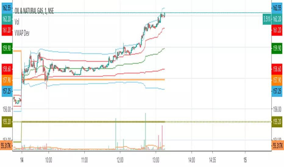
VWAP Stdev BandsCurrent price always obeys VWAP and is very useful for intraday traders. The Price will never go beyond the second deviation of VWAP at any point of time. The deviation bands are also very useful in predicting the volatility of the script.
Breakout trades can be taken based on the previous day's VWAP and it's deviations.
One can say that the stock has experienced breakout if current price crosses the fourth deviation of the previous day's VWAP or price bounces off that level, the price movement will be rapid if this occurs providing a good trading opportunity with low risk-reward ratio.
Two Bar Break Line Alerts R1.0 by JustUncleLThis indicator with default settings is designed for BINARY OPTIONS trading. The indicator can also be used for Forex trading with some setting changes. The script shows Two Bar Pullback Break lines and alerts when those Break lines are Touched (broken) creating a short term momentum entry condition.
For a Bullish Break (Green Up Arrow) to occur: first must have two (or three) consecutive bear (red) candles which is followed by a bull (green) candle creating a pivot point. The breakout occurs then the High of the current Bull (green) exceeds the highest point of the previous two (or three) pivotal bear candles. The green channel Line shows where the current Bullish BreakOut occurs.
For a Bearish Break (Red Down Arrow) to occur: first must have two (or three) consecutive bull (green) candles which is followed by a bear (red) candle creating a pivot point. The breakout occurs when the Low of the current Bear (red) drops below the lowest point of the previous two (or three) pivotal Bull candles. The red channel Line shows where the current Bearish BreakOut occurs.
The break Line Arrows can optionally be filtered by the Coloured MA (enabled by default), a longer term directional MA (disabled by default) and/or a MACD condition (enabled by default) as a momentum filter.
You can optionally select three Bar break lines instead of two. The three bar break lines are actually equivalent to Guppy's Three Bar Count Back Line method for trade entries (see Guppy's video reference below).
Included in this indicator is an ability to display some basic Binary Option statistics, when enabled (enabled by default) it shows Successful Bars in Yellow and failed Bars in Black and the last Nine numbers on the script title line represent the Binary option Statistics in order:
%ITM rate
Total orders
Successful Orders
Failed Orders
Total candles tested
Candles per Day
Trades per Day
Max Consecutive Wins
Max Consecutive Losses
You can start the Binary Option statistics from a specific Date, which is handy for checking more recent history.
HINTS:
BINARY OPTIONS trading: use 5min, 15m, 1hr or even Daily charts. Trade after the price touches one of the Breakout lines and the Arrow first appears. Wait for the price to come back from Break Line by 1 or 2 pips, the alert arrow must stay on and candle change to black, then take Binary trade expiry End of Candle. If price pull back and arrow turns off, don't trade this candle, move on you probably don't have momentum, there will be plenty of other trigger events. The backtesting results are good with ITM rates 65% to 72% on many currency pairs, commodities and indices. Realtime trading has confirmed the backtesting results and they could even be bettered, provided you are selective on which signals to trade (strong MACD support etc), that you are patient and disciplined to this trading method.
FOREX trading: the default settings should work with scalping. For longer term trades try with settings change to a more standard MACD filter or slower to catch the longer term momentum swings and the idea would be to trade the first Break Line alert that occurs after a decent Pullback in the direction of the trend. Setting the SL to just above/below the Pivot High/Low and set target to two or three times SL.
References:
"Fundamentals of Price Action Trading for Forex, Stocks, Options and Futures" video:
www.youtube.com
Other videos by "basecamptrading" on Naked Trading.
"Taking Profits in Today's Market by Daryl Guppy" video:
www.youtube.com

Systematic TF IndicatorThis is a simple trend following indicator which works off moving averages for trend bias and breakouts for entry.

Line Break StrategyLine Break Strategy
Entry rule:
Long on a bullish line and short on a bearish line.
Backtest:
Profit factors are shown below for three-line break.
Daily time frame, FXCM broker.
EURUSD: 1.267, USDJPY: 1.039, GBPUSD: -0.816, AUDUSD: -0.959
S&P500: -0.783, Nikkei225: 1.099
CrudeOil: 1.03, Gold: 1.196
BTCUSD: -0.883
Reference:
Steve Nison, Beyond Candlesticks - New Japanese Charting Techniques Revealed
Note:
This strategy doesn't work properly on the linebreak chart.
A good example is shown below. The entry prices are not always correct.
If you have signal, but the next candle moves in the opposite direction, the entry price is drawn at the Open of the new candle instead of the Close of the previous candle.
The results of backtest are unreliable due to this reason.

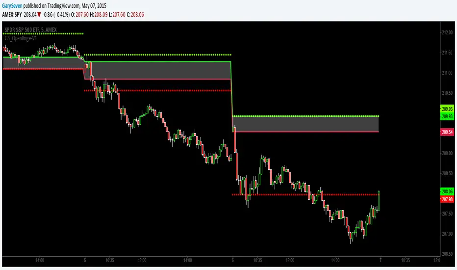
GS_Opening-Range-V1ORB Opening Range Breakout 5 and 3O Minute Indicator
Kudos to Chris Moody for the inspiration to create my first indicator.
The 5 and 30 run together at times but the scalp would be when the equity breaks the 5 go long or short for the scalp and when it breaks the 30 go for the swing trade.
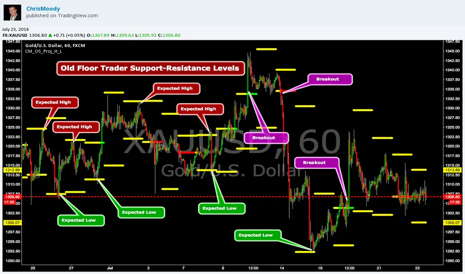
CM_OldSchool_Projected_high_LowHeard this story from Larry Williams…the trader who holds the record for winning the U.S. Trading Championship by turning $10K in to 2 Million.
A trader named Owen Taylor developed this formula as a Floor Trader before to calculate the Projected High and Low of the next day.
The formula worked so well…Owen charged other Traders 1K to get it.
I was pretty impressed with the results…so I coded it for the Weekly, Monthly, Quarterly, and Yearly Projected High Low.
While Owen considered these levels to be major support and resistance, Larry has developed many strategies based on the Breakout of the Projected High Low.
Therefore I coded it so the Levels would plot Yellow, and change to Green if the Projected High was taken out, and Red if the Projected Low was taken out.
***I’ve noticed on many instruments, Stocks, Index’s, Forex etc., depending on the instrument it works great as Support/Resistance or Breakouts.
***On a Daily Chart put the Quarterly and Yearly levels on SPY and EURUSD and go back about 10 years. Levels are pretty accurate.
BTC Volatility Pulse + Opening RangeBitcoin Volatility Pulse + Opening Range is a clean and visually engaging indicator designed to help traders see volatility before it explodes.
Bitcoin often moves in phases — first it compresses, then it expands aggressively. This indicator highlights those quiet zones and visually marks the moments when momentum wakes up.
No lagging indicators. No clutter. Just pure price behavior.
🔍 How This Indicator Works
🟣 Volatility Compression (Energy Build-Up)
When candle ranges become smaller than normal, the background softly turns purple, signaling:
Low volatility
Market compression
Potential energy building phase
These areas often precede strong directional moves.
🟢🔴 Volatility Pulse (Expansion)
When a candle suddenly expands beyond normal volatility:
🟢 Green pulse = bullish expansion
🔴 Red pulse = bearish expansion
This helps traders visually identify momentum ignition points, not late entries.
📦 Opening Range Structure
The indicator draws a dynamic opening range based on recent candles:
Price inside the range = balance
Price breaking above = bullish acceptance
Price breaking below = bearish acceptance
This range acts as a context tool, not a buy/sell signal.
✅ Why Traders Will Like This Indicator
✨ Clean & beautiful visual design
❌ No repainting
❌ No RSI, MACD, or lagging tools
✅ Designed for Bitcoin’s 24/7 behavior
✅ Beginner-friendly, pro-approved
🎯 Best Use Cases
BTC scalping & intraday trading
Spotting volatility expansion after consolidation
Identifying momentum shifts
Combining with price action & liquidity concepts
⚠️ Disclaimer
This indicator is a visual market structure and volatility tool, not a buy/sell system.
Always combine it with proper risk management and confirmation.

Weekly IR Breakout SignalsInspired by XO (@Trader_XO) on CT for his trading strategy
and special thanks to REBO (@@R3BOOO) for putting it together in a cheat sheet and sharing it
contact me on X: @neuromancer0x
-------------------------------------------
Timeframe Recommendations:
1H chart - Day trading (5-10 signals/month)
4H chart - Swing trading (2-5 signals/month) ⭐ Best
Daily chart - Position trading (1-2 signals/month)
-------------------------------------------
When Signals Appear:
Monday: No signals (just setting up IR)
Tuesday-Friday: Watch for breakouts
Max 1 LONG + 1 SHORT per week (indicator enforces this)
-------------------------------------------
Risk Management:
Risk 0.5-1% per trade
Never risk more than 2% in one day
If 2 losses in a row → reduce size or pause
-------------------------------------------
🔔 Setting Up Alerts
Click "Create Alert" (⏰ icon)
Condition: Select "🟢 LONG Entry" or "🔴 SHORT Entry"
Alert name: "Weekly IR Signal"
Set to: "Once Per Bar Close"
Send to: Phone/Email/App

Terilsss Second Same Color Candle Break AlertSecond Same Color Candle Break Alert
Second Same Color Candle Break AlertSecond Same Color Candle Break Alert
Second Same Color Candle Break Alert
Second Same Color Candle Break Alert
Second Same Color Candle Break Alert

Scalp Breakout Predictor Pro - by Herman Sangivera (Papua)Scalp Breakout Predictor Pro by Herman Sangivera ( Papuan Trader )
Overview
The Scalp Breakout Predictor Pro is a high-performance technical indicator designed for scalpers and day traders who thrive on market volatility. This tool specializes in identifying "Squeeze" phases—periods where the market is consolidating sideways—and predicts the likely direction of the upcoming breakout using underlying momentum accumulation.
How It Works
The indicator combines three core mathematical concepts to ensure "Safe but Fast" entries:
Squeeze Detection (BB vs. KC): It monitors the relationship between Bollinger Bands and Keltner Channels. When Bollinger Bands contract inside the Keltner Channels, the market is in a "Squeeze" (represented by the gray background). This indicates that energy is being coiled for a massive move.
Momentum Accumulation (Pre-Signal): While the price is still moving sideways, the script analyzes linear regression momentum.
PRE-BULL: Momentum is building upwards despite price being flat.
PRE-BEAR: Momentum is fading downwards despite price being flat.
Breakout Confirmation: An entry signal is only triggered when the Squeeze "fires" (the price breaks out of the bands), ensuring you don't get stuck in a dead market for too long.
Key Features
Real-time Prediction Labels: Get early warnings (PRE-BULL / PRE-BEAR) to prepare for the trade before it happens.
Dynamic TP/SL Lines: Automatically calculates Take Profit and Stop Loss levels based on the Average True Range (ATR), adapting to the current market's "breath."
On-Screen Dashboard: A sleek table in the top-right corner displays the current market phase (Squeeze vs. Volatile), the predicted next move, and the current ATR value.
Pine Script V6 Optimized: Built using the latest version of TradingView’s coding language for maximum speed and compatibility.
Trading Rules
Preparation: When you see a Gray Background, the market is sideways. Watch the Dashboard for the "Potential" direction.
Anticipation: If a PRE-BULL or PRE-BEAR label appears, get ready to enter.
Execution: Enter the trade when the ENTRY BUY (Lime Triangle) or ENTRY SELL (Red Triangle) signal appears.
Exit: Follow the Green Line for Take Profit and the Red Line for Stop Loss.
Technical Settings
HMA Length: Adjusts the sensitivity of the trend filter (Hull Moving Average).
TP/SL Multipliers: Allows you to customize your Risk:Reward ratio based on ATR volatility.
Squeeze Length: Determines the lookback period for consolidation detection.
Disclaimer: Scalping involves high risk. Always test this indicator on a demo account before using it with live capital.

Support and Resistance Levels with Breaks (MTF + Alerts FIXED) Support and Resistance Levels with Breaks
Added MTF and FIXED Alarm for Support and Resistance line

Unreached Highs/Lows Oscillator [LuxAlgo]The Unreached Highs/Lows Oscillator highlights the amount of unreached high/low prices as a percentage over time, helping visualize trend strength and momentum from bullish and bearish market participants.
🔶 USAGE
This indicator measures the strength of directional price movements, helping traders visualize the strength of both the bullish and bearish market participants.
When prices are moving up with strength, the price structure will not come back to retest previous lows. Therefore, unreached lows keep adding up.
When prices are moving down with strength, they will not retest previous highs; therefore, unreached highs keep adding up.
As we can see on the chart, high readings of unreached highs (red) and low readings of unreached lows (green) are considered bearish, and a downtrend in price confirms this bias. Conversely, high readings of unreached lows and low readings of unreached highs are considered bullish. On the chart, this is reflected as an uptrend.
Additionally, the oscillator can reveal significant breakouts on the chart, with unreached highs or lows decreasing rapidly indicating that a large number of highs/lows have been reached.
Due to the oscillator being normalized, overbought and oversold levels are included.
In this gold chart, we have different examples of how to use the tool in conjunction with price behavior to understand the market. Let's dissect it step by step:
1. Uptrend: Bullish readings are above 80, and bearish readings are below 20. The market is trending up.
2. Range: Mixed readings around 50 for both bullish and bearish; the market is ranging.
3. Uptrend: The same as before. Bullish above 80 and bearish below 20.
4. Pullback: A bullish dip below 80 to 50 and a bearish reading below 20 indicates a pullback.
5. Range: Mixed readings. In this case, it is bullish above and below 80 and bearish above and below 20. The market is ranging.
6. Uptrend: Bullish above 80 and bearish below 20; the market keeps moving up.
7. Pullback: Bullish dips below 80 and bearish rises to 50 indicate a pullback.
8. Uptrend: As before, bullish is above 80 and bearish is below 20; the market is trending up.
This Bitcoin chart shows how to use extreme readings of 0 and 100 to detect potential reversals. When both readings are at extreme opposites, we set the threshold level at 100 and 0 instead of the default levels of 80 and 20 to better identify these areas.
As we can see, extreme readings at points 1 and 5 identify major reversals that lead to a change in trend. Extreme readings at points 2, 3, 4, and 6 identify minor reversals that do not lead to a change in trend.
From the settings panel, traders can adjust the length parameter. A smaller value measures smaller price movements, while a larger value measures larger price movements. A length value of 20 is used by default.
The chart shows how different values affect bullish and bearish measures.
🔶 SETTINGS
Length: Select the maximum number of highs and lows to be used.
🔹 Style
Bullish: Select a color for unreached lows.
Bearish: Select a color for unreached highs.
Top Threshold: Select the top threshold level and color. Enable the Auto feature to choose the default color.
Bottom Threshold: Select the bottom threshold level and color. Enable the Auto feature to choose the default color.


Ichimoku Cloud Breakout [Full System + Black Labels]Ichimoku Cloud Breakout & Twist System This indicator implements a disciplined Ichimoku Cloud Breakout strategy designed to filter noise and capture high-probability trends. Unlike simple crossovers, it enforces a "Triple Confluence" setup: price must break the Cloud, the Future Cloud must match the trend direction, and the Chikou Span (Lagging Span) must be free of past price traffic to confirm momentum. To keep your charts clean, it features a State Filter that blocks repetitive alerts (alternating Buy/Sell signals only) and includes a predictive "Twist Ahead" warning system, which visually alerts you to future Cloud twists, often a precursor to reversals or volatility, 26 periods in advance.

Minervini TT RS Break (vs TOPIX)his script selects “buyable” stocks using Minervini’s Trend Template and filters for market leaders by relative strength versus TOPIX. A BUY signal appears when all TT conditions are met (price above 50/150/200-day MAs, 50>150>200 alignment, rising 200-day MA, +30% from 52-week low, within 25% of 52-week high) and RS is above the threshold, trending up, and making new highs. While BUY is active, an ENTRY signal is shown only when a pivot breakout (above the prior N-day high) occurs with a volume surge (multiple of average volume) and volatility contraction (lower ATR%). An RS BREAK is flagged when relative strength weakens (below its MA or MA turning down), indicating no-add and exit watch. Use BUY to build a watchlist, act only on ENTRY signals, and stop adding while prioritizing exit decisions when RS BREAK appears.

MAD Supertrend [Alpha Extract]A sophisticated SuperTrend implementation that replaces traditional ATR calculations with Mean Absolute Deviation methodology for adaptive volatility measurement and band construction. Utilizing SMA baseline with MAD-based deviation bands and optional adaptive factor adjustments, this indicator delivers institutional-grade trend detection with strength-based filtering and dynamic visual feedback. The system's MAD approach provides superior noise reduction compared to ATR while maintaining responsiveness to genuine volatility changes, combined with momentum-based strength calculations for high-conviction signal generation.
🔶 Advanced MAD-Based Band Construction
Implements Mean Absolute Deviation calculation as volatility proxy, measuring absolute price deviations from mean and smoothing for stable band generation without ATR dependency. The system calculates SMA baseline, computes MAD from configurable lookback period, applies factor multipliers to create upper and lower bands, then implements classic SuperTrend ratcheting logic where bands only adjust when price violates previous levels or calculations warrant updates.
// Core MAD SuperTrend Framework
SMA_Value = ta.sma(src, SMA_Length)
Mean = ta.sma(src, MAD_Length)
Abs_Deviation = abs(src - Mean)
MAD_Value = ta.sma(Abs_Deviation, MAD_Length)
// Band Construction with Ratcheting
Upper_Band = SMA_Value + MAD_Factor * MAD_Value
Lower_Band = SMA_Value - MAD_Factor * MAD_Value
// Ratcheting logic prevents premature band adjustments
🔶 Adaptive Factor Adjustment Engine
Features optional adaptive multiplier system that modulates MAD factor based on normalized MAD magnitude relative to recent extremes, creating bands that automatically expand during high-volatility regimes and contract during consolidation. The system applies min-max normalization to MAD values over configurable lookback, multiplies by adaptation parameter, and adds to base factor for dynamic volatility sensitivity without manual recalibration.
🔶 Momentum-Based Strength Filter
Implements sophisticated strength calculation measuring price momentum relative to baseline divided by volatility-adjusted MAD bands, producing normalized 0-1 strength scores with exponential smoothing. The system calculates distance from SMA baseline, normalizes by MAD-derived band width, and applies configurable minimum threshold requiring sufficient momentum before trend signals activate, filtering weak or choppy market conditions.
🔶 SuperTrend Direction Logic
Utilizes classic SuperTrend methodology adapted for MAD bands where trend direction flips on opposite band violations with state persistence until confirmation. The system tracks whether price closes above upper band (bearish flip to bullish) or below lower band (bullish flip to bearish), maintains directional state until opposing violation occurs, and generates binary +1/-1 trend signals suitable for systematic position management.
🔶 Intelligent Candle Sticking System
Provides advanced line positioning option that anchors SuperTrend line to candle wicks or bodies rather than pure calculation values for enhanced visual clarity. The system supports two modes: Wick (positions at high/low extremes based on trend direction) and Body (constrains line between calculation and candle extremes), creating cleaner chart presentation while maintaining mathematical integrity of underlying signals.
🔶 Dynamic Gradient Visualization Framework
Implements color intensity modulation based on smoothed strength calculations, transitioning from muted to vivid hues as momentum conviction increases. The system applies gradient interpolation using strength ratio, creating visual feedback where strong trending moves display intense colors while weak or consolidating conditions show faded tones across trend line, channel bands, and candle coloring for immediate regime assessment.
🔶 MAD Channel Architecture
Features volatility-adjusted channel bands centered on baseline or candle-stuck line with configurable multiplier for support/resistance visualization. The system calculates upper and lower bounds using MAD values scaled by adaptive factors and channel multipliers, applies dynamic transparency based on trend strength, and creates filled regions that intensify during strong trends and fade during weak conditions.
🔶 Multi-Layer Glow Effect System
Provides sophisticated line rendering with triple-layer plot system creating glow effect through progressively wider and more transparent outer layers. The system plots core trend line at specified width with full color intensity, adds inner glow layer at +2 width with moderate transparency, and outer glow at +4 width with higher transparency, creating visual depth and emphasis without cluttering chart space.
🔶 Strength-Based State Management
Implements intelligent trend state logic requiring both directional signal and minimum strength threshold breach before confirming trend transitions. The system calculates raw SuperTrend direction, evaluates smoothed strength against configurable minimum, generates filtered trend state that can be bullish (+1), bearish (-1), or neutral (0), and maintains state persistence using hold logic that prevents oscillation during ambiguous conditions.
🔶 Comprehensive Alert Integration
Generates trend flip alerts when filtered state transitions from bearish to bullish or bullish to bearish with full confirmation requirements satisfied. The system detects state changes through comparison with previous bar, triggers single alert per transition rather than continuous notifications, and provides customizable message templates for automated trading system integration or manual notification preferences.
🔶 Performance Optimization Architecture
Utilizes efficient calculation methods with null value handling, nz() functions preventing errors during initialization bars, and optimized gradient calculations. The system includes intelligent state persistence minimizing recalculation overhead, streamlined MAD computation avoiding redundant mean calculations, and smooth visual updates maintaining consistent performance across extended historical periods.
This indicator delivers sophisticated SuperTrend analysis through Mean Absolute Deviation methodology providing superior statistical properties compared to traditional ATR-based approaches. MAD calculations offer more robust volatility measurement resistant to extreme outliers while maintaining sensitivity to genuine market regime changes. The system's adaptive factor adjustment, momentum-based strength filtering, and dynamic visual feedback make it essential for traders seeking reliable trend-following signals with reduced false breakouts during choppy conditions. The combination of MAD bands, candle-sticking options, gradient strength visualization, and comprehensive filtering creates institutional-grade trend detection suitable for systematic approaches across cryptocurrency, forex, and equity markets with clear entry/exit signals and comprehensive alert capabilities.

FractalMod for TV with breakout alertsFractalsMod (MT4 → Pine) is a TradingView indicator converted from a custom MT4 (MQL4) fractal indicator.
This script replicates the behavior of the original MT4 version as closely as possible, including:
Confirmation-based fractals using left/right bar logic
Persistent horizontal levels derived from confirmed fractals
MT4-style “buffer-like” behavior using segmented horizontal lines
Key Features
MT4-compatible fractal logic
Uses leftbars and rightbars to confirm fractal highs/lows, equivalent to MT4 custom fractal indicators.
Segmented horizontal lines (MT4 buffer style)
Each confirmed fractal starts a new horizontal line segment from the original pivot bar.
When a new fractal is confirmed, the previous segment is stopped at the new pivot point, closely mimicking MT4 indicator buffers.
Latest fractal tracking
The most recently confirmed Up/Down fractal levels are tracked internally and used for breakout detection.
Breakout alerts (not confirmation alerts)
Alerts are triggered when the current price breaks above the latest Up fractal or below the latest Down fractal.
Breakout detection can be configured to use:
Close price only (confirmation-based), or
High/Low including wicks.
Clean visual control
Single arrow per confirmed fractal (no duplicate markers)
Optional display of fractal markers and horizontal lines
Custom colors and line width for Up/Down fractals
Typical Use Cases
Fractal-based support / resistance visualization
Breakout trading using the most recent confirmed fractal levels
MT4 → TradingView workflow migration while preserving indicator behavior
This script is designed for traders familiar with MT4 fractal indicators who want a faithful and practical TradingView equivalent without repainting on confirmed signals.
FractalsMod (MT4 → Pine) は、
MT4(MQL4)で使用されていた カスタム Fractal インジケーターを TradingView(Pine Script)へ移植したものです。
元の MT4 インジケーターの挙動を可能な限り忠実に再現することを目的としており、以下の特徴を持ちます。
主な特徴
MT4互換のフラクタル判定ロジック
leftbars / rightbars を用いたフラクタル確定方式で、
MT4 のカスタム Fractal インジケーターと同等の確定条件を再現しています。
MT4のバッファ挙動を再現した水平ライン
フラクタルが確定すると、その ピボット位置から水平ラインを開始します。
新しいフラクタルが確定した場合、それまでのラインは新しいピボット位置で停止し、
区間ごとのライン構造で MT4 のバッファ表示に近い見た目を実現しています。
最新フラクタル価格の内部保持
直近で確定した Up / Down フラクタル価格を保持し、
ブレイク判定やアラートに利用します。
ブレイク専用アラート(確定時アラートなし)
フラクタル確定時ではなく、
価格が最新の Up フラクタルを上抜けたとき
価格が最新の Down フラクタルを下抜けたとき
にアラートを出す設計です。
ブレイク判定は
終値ベース(ダマシを減らす)
ヒゲ込み(高値 / 安値)
を設定で切り替えられます。
視認性と制御性を重視した設計
フラクタル矢印は 確定時に1本のみ表示(重複なし)
Up / Down で色分けされたラインと矢印
ライン表示・矢印表示の ON / OFF 切り替え可能
想定される用途
フラクタルを用いた サポート / レジスタンスの可視化
直近フラクタルを基準とした ブレイクアウト戦略
MT4 から TradingView への移行時に、
ロジックと見た目をできるだけ変えずに使いたい場合
本スクリプトは、
MT4のフラクタル系インジケーターに慣れたトレーダーが、
TradingViewでも違和感なく使えることを重視して設計されています。

Bar-Close Confirmed SupertrendOverview
This indicator is a Supertrend-style trend follower that confirms direction changes only after a bar closes. Trend flips are determined using the previous bar’s close relative to the bands, which helps avoid intrabar changes during live candles.
How it works
Computes ATR (Average True Range)
Builds upper/lower bands using ATR and a multiplier
Updates trend direction only when a prior candle confirms a break of the band
Confirmation logic (bar-close based)
Trend direction is updated using conditions based on the previous candle, such as:
close > upper → confirm uptrend
close < lower → confirm downtrend
Because signals are confirmed on the prior bar, trend changes and markers are displayed only when confirmation exists.
Signals
Uptrend confirmation: prior candle closes above the upper band → bullish marker
Downtrend confirmation: prior candle closes below the lower band → bearish marker
Inputs
ATR Length (default 10)
ATR Multiplier (default 3.0)
Notes
This script is intended for bar-close workflows. Behavior and responsiveness may differ across markets and timeframes depending on volatility and chosen settings.

BINANCE 15m Alt Breakout Radar (TABLE)BINANCE 15m Alt Breakout Radar (TABLE)
"At the 15th installment of Binance Altcoin
Breaking High + Explosive Volume + Surging Stock
View at a glance with **indicator (table)**, not alarm"

1H Buy: Engulf @ 20EMA + Vol + HTF Bull + Break Highbuy signal on the one hour for bullish engulfing strategy. Forms at the 20EMA, volume expansion, higher timeframe (4h) is bullish, next candle breaks engulfing candle.

DTG Open Range Breakout
Description:
Overview The Open Range Breakout (ORB) is one of the most statistically significant strategies for day traders, particularly in Futures (ES/NQ) and Forex markets. This indicator automates the process of identifying the "Opening Range" (e.g., the first 30 minutes of the New York session) and visualizing the key High/Low levels that define the day's bias.
Unlike standard indicators that clutter the chart, this tool focuses on Price Action context. It highlights the critical volatility window and alerts you only when price makes a definitive move outside of this established range.
Key Features
Fully Customizable Session: Defaults to 09:30–10:00 (ET), but can be adjusted for any market (London Open, Tokyo Open, etc.).
Visual "No-Trade" Zone: Draws a shaded box representing the range formation period. This helps traders avoid "choppy" price action during the initial volatility.
Auto-Reset: The script automatically detects a new trading day and resets the range, keeping your chart clean without manual intervention.
Dynamic Support/Resistance: Once the range is closed, the High and Low lines extend forward, acting as key support or resistance levels for the rest of the session.
Smart Alerts: Alerts are programmed to trigger only after the range has fully formed, preventing false signals during the volatility establishment phase.
Reversals: If price breaks out but immediately fails and re-enters the box, consider this a "Fakeout" and look for a move to the opposite side.
Settings
Open Range Session: The specific time window to measure (Format: HHMM-HHMM).
Range Box Color: Visual preference for the shaded area.
Extend High/Low Lines: Toggle the dashed projection lines on/off.
DON.TRADES.GOLD@GMAIL.COM
Disclaimer This script is for educational and analytical purposes only. Past performance of a breakout strategy does not guarantee future results. Always manage risk.

Compression-to-Expansion Early Warning (CEEWS)The Compression → Expansion Early Warning System (CEEWS) is a volatility-structure and market-timing indicator designed to identify periods of statistical price compression and to signal when that compression transitions into directional expansion. Rather than predicting direction in advance, CEEWS focuses on detecting when price action becomes tightly constrained and then confirms when stored energy begins to release.
CEEWS quantifies compression using a composite of volatility contraction, range tightening, candle overlap, and reference-level convergence, producing a normalized Build score (0–100) that reflects the degree of latent price pressure. Elevated Build values indicate that the market is coiled and increasingly susceptible to movement, while expansion signals occur only when volatility begins to expand and price breaks from its recent range.
The indicator is intended as a timing and transition tool, not a standalone trend or directional system. CEEWS is most effective when paired with broader regime or trend-health indicators and is particularly well suited for index funds and highly liquid markets, where prolonged consolidation phases often precede sharp directional moves. Its primary purpose is to help traders identify when the market is likely to move, not to forecast where it will go.
