Stochastic candles "Stochastic Candles" is designed to provide higher timeframe stochastic calculations and enhance the chart with additional visual aids like colored candles and EMA plotting.
Features of the Script:
Higher Timeframe Stochastic Calculation:
This indicator computes the stochastic %K and %D values for a specified higher timeframe and ensures these values are fetched for the higher timeframe data.
Dynamic Label Placement:
The script places labels on the chart displaying the %K and %D values above and below the bars, respectively.
Labels are dynamically deleted after being updated, ensuring only the latest values are visible.
Candle Coloring:
Candles are colored blue if %K > %D, yellow if %D > %K, and retain the default color otherwise.
Exponential Moving Average (EMA):
This indicator work fine . Consolidate market put effects on its performance .
Cari dalam skrip untuk "candle"

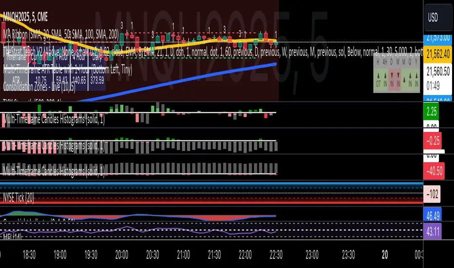
Multi-Timeframe Candles HistogramsAt some community members' requests, I have built on the original code to make it a single indicator with the option for users to check off which timeframes they want to be shown. Choices are 1-hour, daily, weekly, and monthly.
I couldn't figure out how to separate each timeframe into its own histogram, so this is the best I can offer at the moment. If any community member wants to take a crack at it, be my guest.
Colors are customizable.
If you have a paid TW account, you can lay it down twice and put the hour and daily on one and the weekly and monthly on the other.
That said, I hope you enjoy this version of this indicator.
R.I.P. Rob Smith, creator of TheStrat.
---
Key Features and Benefits
1. Custom Timeframe Selection:
- Choose from an array of timeframes ranging from minutes to months, giving you complete flexibility in your market analysis.
- Quickly switch between different timeframes (e.g., 1-hour, daily, or weekly) to track continuity across varying levels.
2. Visual Representation of High/Low Markers:
- Enable or disable the display of high and low points to better understand price ranges and reversals.
- These markers allow you to spot key turning points on different timeframes, facilitating better entry or exit decisions.
3. Enhanced Candle Visualization:
- Displays candles with precise price levels aligned to your chosen timeframe, giving a clearer view of price trends.
- Candles are color-coded to reflect price movement, which is customizable by the user.
---
How to Use This Indicator
Monitor Multiple Timeframes Simultaneously:
- Place the indicator on your chart and choose the timeframes you want to follow (e.g., hourly, daily, weekly, monthly).
- For each instance, checkmark the desired timeframes in the menu to ensure that you’re tracking the right period.
Achieve Timeframe Continuity:
- By aligning lower timeframes with higher ones, this tool helps you confirm trends, detect reversals, and avoid trades that go against the broader market movement.
---
Why This Indicator is Valuable for Traders
This tool simplifies a core principle of TheStrat—full timeframe continuity—by visually representing price action across multiple timeframes in a clear and actionable way. It removes the guesswork and helps traders stay in sync with market momentum, regardless of the timeframe they are analyzing.
This solution offers flexibility, clarity, and speed, enabling traders to quickly grasp critical movements and improve decision-making. Whether you are a scalper focusing on intraday moves or a swing trader watching weekly trends, this tool empowers you to maintain alignment with the overall market structure.
In essence, it brings the power of TheStrat to your fingertips by offering precise and easy-to-read visual aids, allowing you to seamlessly apply Rob Smith’s philosophy to your trading.
Brijesh TTrades candle plot"Brijesh TTrades candle plot" is a powerful and customizable indicator that allows you to overlay higher timeframe candles directly on your chart. Choose your desired timeframe (e.g., Daily, Hourly) and plot up to 10 recent candles with precise control over color, wick style, and width. The candles are offset by 40 bars to the right, providing a clear and unobstructed view of the current price action. Ideal for multi-timeframe analysis and gaining deeper insights into market trends.

Engulfing Candle IndicatorThis indicator helps identify Bullish and Bearish Engulfing candle patterns on your chart.
Bullish Engulfing: Occurs when a green candle completely engulfs the prior red candle, signaling potential upward momentum.
Bearish Engulfing: Occurs when a red candle completely engulfs the prior green candle, signaling potential downward momentum.
The script highlights these patterns with green triangles below the bars for Bullish Engulfing and red triangles above the bars for Bearish Engulfing.
This tool is helpful for traders who use candlestick patterns as part of their technical analysis strategy.

Large Candle Detector (6-Candle Comparison)This indicator identifies large price candles that are bigger than the previous six candles, helping traders spot potential breakout or reversal signals. By highlighting significant candles compared to recent price action, it provides insights into key moments of increased volatility or momentum shifts in the market.

Joesax Red to Green with Alert V2 Candle IndicatorThis indicator displays transitions of candles from red to green and from green to red on a chart, with the ability to set an adjustable percentage threshold. When a candle transitions from red to green and the percentage change exceeds the specified threshold, a red to green transition signal is issued. Similarly, when a candle transitions from green to red and the percentage change exceeds the specified threshold, a green to red transition signal is issued.
Parameters:
Percentage threshold %: Allows you to set the percentage threshold to determine when to consider the transition from one candle to another significant.
Description:
This indicator uses the absolute percentage change between the opening price and the closing price of a candle to determine whether the candle is red or green. When a candle transitions from red to green and the percentage change exceeds the set threshold, a red to green transition signal is issued. Similarly, when a candle transitions from green to red and the percentage change exceeds the set threshold, a green to red transition signal is issued. Alerts are triggered when such transitions occur.
This indicator helps traders identify significant directional changes on the chart, enabling them to make informed decisions during financial market analysis.

Candle Close TrendFirst of all, a huge credit to Wade for all the help with this indicator. An absolute Legend!
The idea behind this indicator is to identify a potential trend with simply the close of candles.
If a candle closes above the previous candle High, the trend would be "bullish" and remain bullish until there is a candle that closes below the previous candle Low. The opposite is true for a "bearish" trend.
As always, this is NOT intended to be used by itself, but with other TA.
For cleanest results, I find it best to use with the candle borders turned off in the chart settings but that is just my preference.
Works on all timeframes.

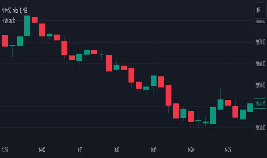
First CandleDay first candle breakout Indicator
In this indicator script, we search for the high and low of the first candle of the day. After the breakout of either the high or low, we initiate a trade. This indicator is based on the breakout of the opening range of the first candle.
Buy Breakout -
1. Identify the high and low of the first candle of the day.
2. If there is an upside breakout, or a downside breakout, stop extend the high and low accordingly.
Sell Breakout -
1. Identify the high and low of the first candle of the day.
2. If there is a downside breakout or an upside breakout, stop extend the high and low accordingly.
[F][IND] - Candle Range SizeDescription:
Understanding market volatility is paramount for making informed trading decisions, and the Candle Range Histogram Indicator is designed to provide traders with a visual representation of price volatility over time.
Key Features:
1. Histogram Display:
The indicator presents a histogram on your TradingView chart, offering a clear visualization of the range of each candle, calculated as the difference between the high and low prices.
2. Volatility Insight:
Easily identify periods of heightened or subdued volatility. Larger histograms indicate greater price ranges, suggesting increased volatility, while smaller histograms signify lower volatility.
3. Intraday Analysis:
Intraday traders can benefit from monitoring the Candle Range Histogram to gauge volatility patterns throughout the trading day. This information is valuable for setting realistic profit targets and adjusting risk management strategies.
4. Breakout Opportunities:
Recognize potential breakout opportunities by observing significant increases in candle range. Traders often associate expanded ranges with potential strong price movements.
5. Trend Confirmation:
Confirm the strength of trends by assessing consecutive candles with expanding or contracting ranges. This can aid trend-following traders in making more informed decisions.
It's important to note that while the histogram provides valuable information, it's usually more effective when used in conjunction with other technical indicators and analysis methods. Traders often combine multiple tools to gain a comprehensive understanding of the market and make well-informed trading decisions.
Alerts:
You can enable alerts on this indicator to receive timely notifications.
Disclaimer:
This indicator is provided for educational purposes only. Trading involves risk, and users should consult with a financial professional before making any trading decisions.
Your Feedback Matters!
Please feel free to comment or reach out if you have any improvement suggestions or if you would like to request the development of a specific indicator. Your feedback is invaluable!

Bar composition in 1minute | True candlestick colorThe indicator shows the true color of a bar based on the internal composition on 1 minute timeframe and the final outcome. It uses following parameters of 1minute and current timeframe inputs
relative bar close, average volume vs current volume and finally the volume of internal candles.
It follows following steps:
First, it defines the arrays of high, low, close, volume in one minute timeframe
Second, it identifies the negative and positive volume based on the bar closing at one minute timeframe
Third , it adds all the volume and find whether the overall volume is positive or negative for overall bar in higher timeframe (current timeframe)
Fourth, it compare the volume in current timeframe to average of volume in in current timeframe
Fifth, if relative closing, relative volume (current timeframe) and the combined volume (in 1 minute timeframe) gives same outcome then color of the bar is decided whether the bar is bullish, bearish or inconclusive/contnuation.
Through this you get to check price action in 1minute timeframe and the ultimate outcome in current timeframe. this helps in understanding whether the bar is truly bullish or bearish or continuation of the trend
Feel free to connect for any query.

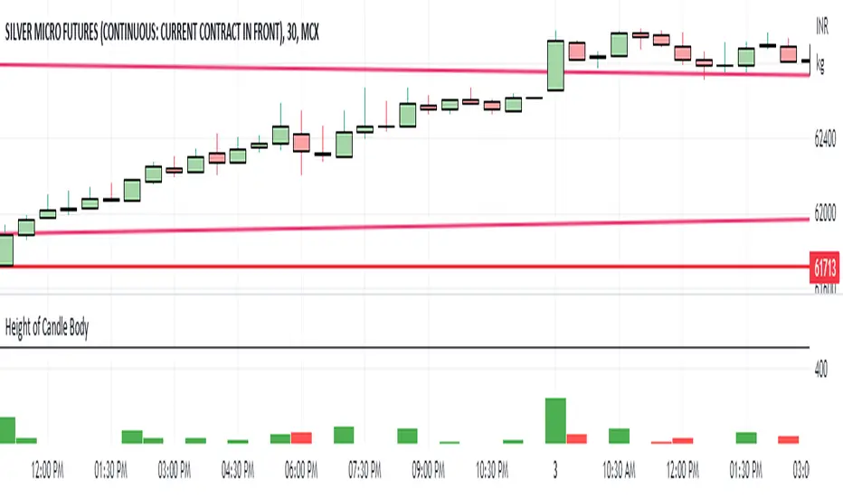
Height of Candle BodyUnderstanding the Height of Candlestick Body
Candlestick charts are a popular method of displaying price data in financial markets. They provide a visual representation of price movements and are used by traders to make informed decisions about buying and selling assets. Understanding the height of a candlestick body is an important aspect of technical analysis and can help traders identify trends and make profitable trades.
The height of a candlestick body is the distance between the opening and closing price of an asset over a given time period. When the closing price is higher than the opening price, the candlestick body is typically colored green or white and is considered bullish. Conversely, when the closing price is lower than the opening price, the candlestick body is typically colored red or black and is considered bearish.
The height of the candlestick body is important because it can provide valuable information about market sentiment. If the candlestick body is relatively small, it suggests that there is indecision in the market and that buyers and sellers are evenly matched. Conversely, if the candlestick body is relatively large, it suggests that there is a significant amount of buying or selling pressure in the market.
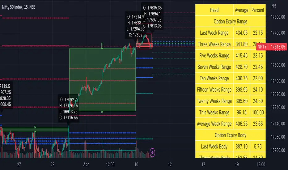
Weekly Options Expiry Candle V.2In India Weekly options expire on Thursday and that creates a different price action candle than the week timeframe.
My previous script Weekly Options Expiry Candle has some limitations. This script overcame those limitations and added some features.
You can use this in any intraday time frame candle.
It will show:
All expiry candle in box format
Expiry OHLC label
Pivot (Floor or Fibonacci) based on expiry OHLC data
Developing Expiry candle and Pivot
A table showing expiry range(high-low) and Expiry body abs(open-close) stats.
You can turn on or off any feature.
Please let me know if you found this script useful or have any questions or suggestions.
NSE:BANKNIFTY
NSE:NIFTY
NSDT Regular CandlesWhen using Range charts on TradingView, the only candle appearance option is "Range Bars", which are those little thin ones that can be hard to see.
So I made this candle indicator that can be used to plot Regular Candles over the Range Bars for a standard view.
Here is the same chart - only showing the original Range Bars

Open Interest with Heikin Ashi candlesA simple modification of the Tradingview free script of futures Open Interest to Heikin Ashi candles. It displays the volume of the Open Interest futures contracts by applying the HA formula.
I use it to clear out the "noise" of up's and down's especially in intraday small time frames when I am scalping in crypto.
Background color can be turned on/off.
Just to give back a little something to a community that gave me A LOT!
Let me know what you think and if you need anything to add.
Have fun :)
P.S. The way I use it is to try to find traps in the market and take (fast) advantage of them. When the OI are going up really fast in small time frames (which means either longs or shorts are going up) this creates a good opportunity for a squeeze (the trap).
Of course I use other indicators/oscillators to determine that but it gets me on my toes to look for... something ;)

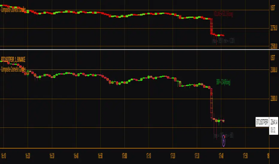
Composite Cosmetic CandlesThis is effectively version 2 of my script "Candle Fill % Meter", with a few different/more options available in a more compact form. Choose between multiple oscillator sources, # of dividing lines, and solid or gradient candle fill. Once again this script is intended for use with hollow candles! This script enables you to see more information with less screen space taken up, not to mention it looks nice. Labels by last bar also toggleable in the settings.
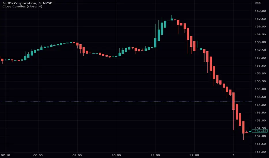
Close CandlesClosing candle takes any input and turs it into a candle stick chart. You can go from a regular candle chart by setting the length to 1, to heikin ashi by setting the length to 4. One of the features of this scripts is the ability to reuse the function. This function is a great addition to most scripts as it makes it really easy to give your script a candle view. As always I hope that you find this release useful. If you find any bugs please let me know. The same goes with any features you might want to request. This includes requesting custom indicators. Enjoy!
Turk Pivot Candle Order BlocksOrder Blocks based on pivot reversal candle
When a pivot High or Pivot Low is found and confirmed, a box will be plotted on the open and close values of that pivot candle
You also have the ability to change the amount of candles the box stretches over as well as the colors of the bullish and bearish boxes
How To Use:-
Pivot points often provide Support and Resistance points on their own,
one way of marking up order blocks is by taking the pivot candle and marking that up as a resistance area where you could be looking for price to reverse
Engulfing Candle Marker (Full Candle)A simple indicator that marks FULL CANDLE engulfing candles...
current high > previous high
current low < previous low
bullish: close > open (triangle below)
bearish: close < open (triangle above)
A lot of the engulfing indicators available are body only. I created a FULL CANDLE indicator because that's what I prefer using.
Can be useful for spotting both reversal and continuation price action. Always have a complete trading plan and backtest it for yourself, engulfing candles in themselves to not guarantee a profit.
You are more powerful than you know...keep expanding!

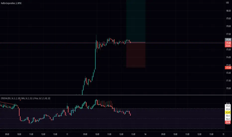
RSI Candle with Connors RSI and Heikin Ashi (CRSICHA)This script was designed to work and feel like the built in RSI script but with a lot of added feature that traders might enjoy. You get to see the RSI represented as candle sticks OR Heikin Ashi. I have added in Connors RSI as a bonus so you can see what this lesser used study looks like in candle form. Just like in the original script I have moving averages and Bollinger Bands. I must say, Heikin Ashi really excells in this situation because you don't need to know an exact price! As always I hope every one finds this useful! Enjoy!
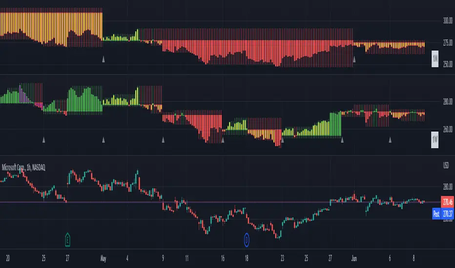
[BM] HTF Candle Evolution█ OVERVIEW
This script shows how a higher timeframe candle evolves over time.
It was created as a visual aid to #TheStrat and provides a new way of looking at Timeframe Continuity.
█ FEATURES
General
HTF: Higher Timeframe selection with dropdown and ability to manually input a timeframe that is not present in the dropdown.
Label: Show a label with the selected higher timeframe.
Marker: Shows a marker symbol at the start of each new higher timeframe.
Align: Aligns the candles around a selected center line.
The Strat
Multi-timeframe analysis is used extensively in #TheStrat (created by Rob Smith), so the ability to add #TheStrat coloring has been made available.
Scenario: Define the colors for the strat scenario's.
Coloring of: Choose which part of the candles you want the selected strat scenario colors to be applied to.
Band: Display a band that shows the active strat scenario color of the selected higher timeframe.
All features are completely customizable.
Volume Density CandleA candle chart that indicates congestion or resistance by the color of each candle.
The transparency of each candle is based on volume density.
Volume density is calculated as follows.
Volume density = Volume / Price range
Price range uses true range "max(high - low, abs(high - close ), abs(low - close ))".
Since volume density varies drastically by stock or time, the transparency is calculated based on the deviation rate from the average volume density.
If the candle is shorter and the color is brighter (less transparency), there is more transactions in the narrow price range than usual, and it could mean the candle's price range is congestion or resistance.
If the price breaks through that price range or rebounds from it, the price could move further in that direction.

Smarter Pullback + Candlestick Pattern (Steven Hart)Built with love "Smarter Pullback + Candlestick Pattern"
This indiator will help you to find a Pullback + Candlestick Pattern, inspirated by Steven Hart
You can combine with your own strategy, or use this purely
DISCLAIMER :
Measure the risk first before use it in real market
Backtest The Strategy was very important, so you know the probability
Fundamentally Logical :
Pullback (Some Previous candle is Red for Bull Pullback vice versa)
the Entry candle must be a Candlestick Pattern
Features :
1. Engulfing
2. Hammer & Shooting Star
3. Doji
How to use it :
1. Adjust the Pullback Period
2. Check and Uncheck the Pattern you want to see
3. Adjust the style to your favourite
Regards,
Hanabil

15m Candle ToolShows historical 15min candles for the 1m, 3m , and 5m time frames.
Counts down the time until the current 5m, 15m, and 1H candles close.
Recommended use on the 1m, 3m , and 5m TimeFrames!!!
Legend:
Vertical Lines (Left to Right)
-15m Candle wick (solid line) *
-Close of current 5m candle (red dotted)
-Close of current 15m candle (blue dashed)
- Close of current 1H candle (green solid)
Horizontal Lines (Top to Bottom)
- Previous 15m high (top of wick) *
- Subdivisions of the low to high of the previous 15m candle (.25, .50, .75) (WHITE LINES, .50 is extended)
- inter candle average of the highs within the previous 15m candle (solid green)
- average of the inter candle highs and lows (grey dashed)
- inter candle average of the lows within the previous 15m candle (solid red)
- Previous 15m low (bottom of wick) *
Previous Candle Body *
* = Changes color based on the bar color.
