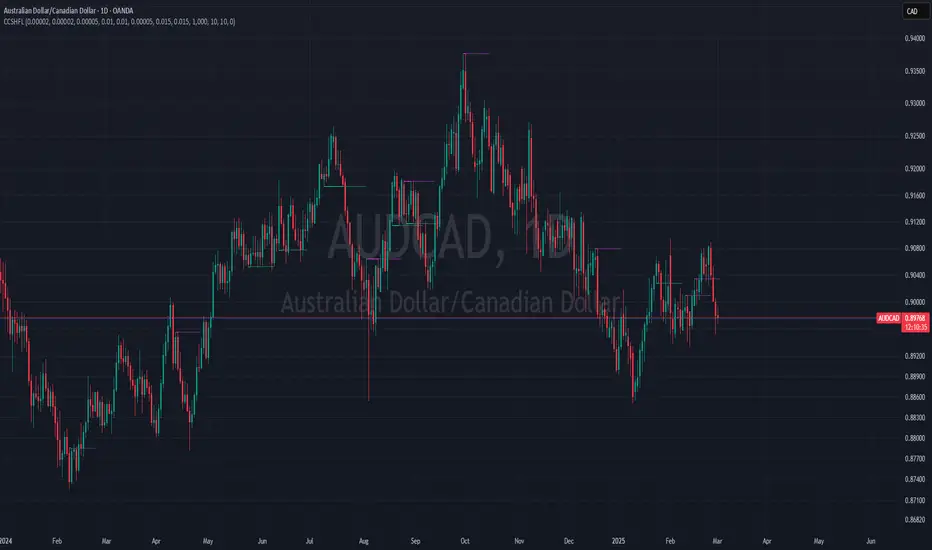
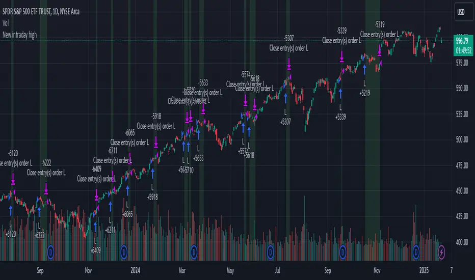
Holy MollySell when the last closed candle has the purpe marking.
Buy when the last candle gets a green marking.
TP is alawys the horizontal line.
Tweak the settings for your liking, the threshold should be set always to the actual pair, to be within a few pips or points, you can get references from the chart, where you have two loes or highs really close almost with zero difference, if those are shown only, your settings is ok.
Do a back test, you will see, price eventually always gets there. Mostly the very next candle but sometimes it takes a few candles.
Cari dalam skrip untuk "chart"
WalidTrader2025This is a Pine Script (version 5) code for a custom technical analysis indicator called "Market Structure Fibonacci Indicator" designed for use in TradingView. The indicator appears to combine market structure analysis with Fibonacci levels to help traders identify key price levels and market conditions.
Key features of the indicator include:
Fibonacci-based "breaker zones" that help identify potential support and resistance areas
A dynamic equilibrium price level that determines bullish/bearish market conditions
Buy-side and sell-side liquidity levels tracking
A status table displaying the current market trend (Bullish/Bearish) and market condition (Premium/Discount/Neutral)
Customizable visual elements including colors, line widths, and transparency levels
The indicator overlays on the price chart and uses the period's open, high, and low prices to calculate various Fibonacci projections at the 0.375 and 0.625 levels. It then creates zones ("breaker zones") that could indicate potential areas where price might react.

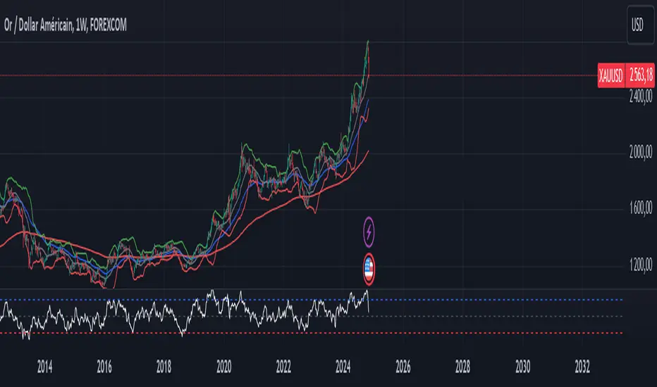
CMP vs ATH PercentageThis indicator helps traders and investors track how the current market price (CMP) compares to the all-time high (ATH) price of an asset. It calculates the percentage difference between the CMP and ATH and displays it visually on the chart. A label is placed on the latest bar, showing key information like:
ATH (All-Time High Price)
CMP (Current Market Price)
Percentage Comparison (CMP as a percentage of ATH)
Additionally, the indicator plots a horizontal line at the ATH level to provide a clear visual reference for the price history.
Use Cases:
Identify price levels relative to historical highs.
Gauge whether the price is nearing or far from its ATH.
Quickly assess how much the price has recovered or declined from the ATH.
Customization:
You can modify the label's style, color, or text formatting according to your preferences. This indicator is useful for long-term analysis, especially when tracking stocks, indices, or other financial instruments on a weekly timeframe.
Note:
This indicator is designed to work on higher timeframes (e.g., daily or weekly) where ATH levels are more meaningful.
Key Levels Theory with Boxes v3Key Levels Theory with Boxes
This script helps traders visualize important price levels and mark them with lines and boxes on a chart. The lines represent key whole number levels, and the boxes give you a visual reference to see how price interacts with these levels. This tool can be used to track support/resistance areas and anticipate price movement based on round numbers.
Key Functions:
Lines:
The script draws horizontal lines at key price levels (e.g., 2850, 2855, 2860, etc.) starting from a defined "start level."
The lines are dashed by default and their appearance can be customized (color, style, width).
Boxes:
For each level, a box is drawn above and below the line.
The size of the box is fixed (1.5 units above and below the level) and it can be customized to any other interval.
The box is filled with a green color by default, with 5% opacity, so it doesn’t overpower the chart but still provides a visual reference.
Customizable Inputs:
Start Level: The starting price level from which all other levels will be calculated (e.g., 2850).
Number of Levels: How many levels of lines and boxes you want to display (e.g., 6 levels).
Box Interval: The distance above and below each level to define the size of the boxes (default is 1.5).
Line Style: The appearance of the lines (solid, dotted, or dashed).
Line Color: The color of the lines (default is white).
Line Width: The width of the lines (default is set to 0 for a cleaner look).
Box Color: The color of the boxes (default is green with 5% opacity).
What Does It Do?
Visualizes price levels: The script plots key price levels and helps traders easily identify where price is currently at, relative to whole number levels.
Marks support/resistance: These levels often act as psychological price points, making them useful for spotting potential support or resistance.
Helps with trade decisions: By seeing how the price behaves around these key levels, traders can make more informed decisions about entering or exiting positions.

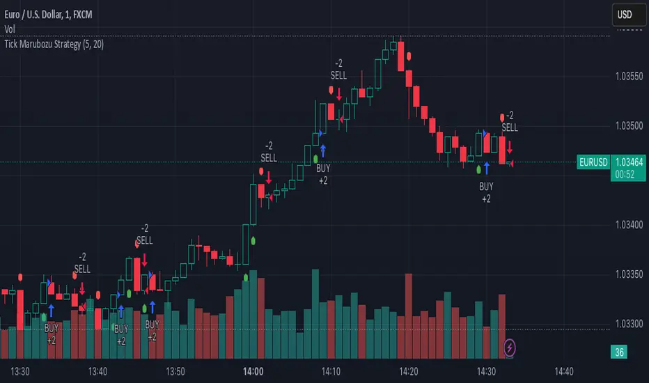
Tick Marubozu StrategyStrategy Concept:
This strategy identifies Marubozu candles on a tick chart (customizable pip size) with high volume to signal strong market momentum.
Bearish Marubozu → Strong selling pressure → Enter a SELL trade
Bullish Marubozu → Strong buying pressure → Enter a BUY trade
Entry Conditions:
Marubozu Definition:
Open price ≈ High for a bearish Marubozu (minimal wick at the top).
Open price ≈ Low for a bullish Marubozu (minimal wick at the bottom).
Customizable body size (in pips).
High Volume Confirmation:
The volume of the Marubozu candle must be above the moving average of volume (e.g., 20-period SMA).
Trade Direction:
Bearish Marubozu with High Volume → SELL
Bullish Marubozu with High Volume → BUY
Exit Conditions:
Time-Based Expiry: Since it's for binary options, the trade duration is pre-defined (e.g., 1-minute expiry).
Reversal Candle: If a strong opposite Marubozu appears, it may indicate a trend shift.
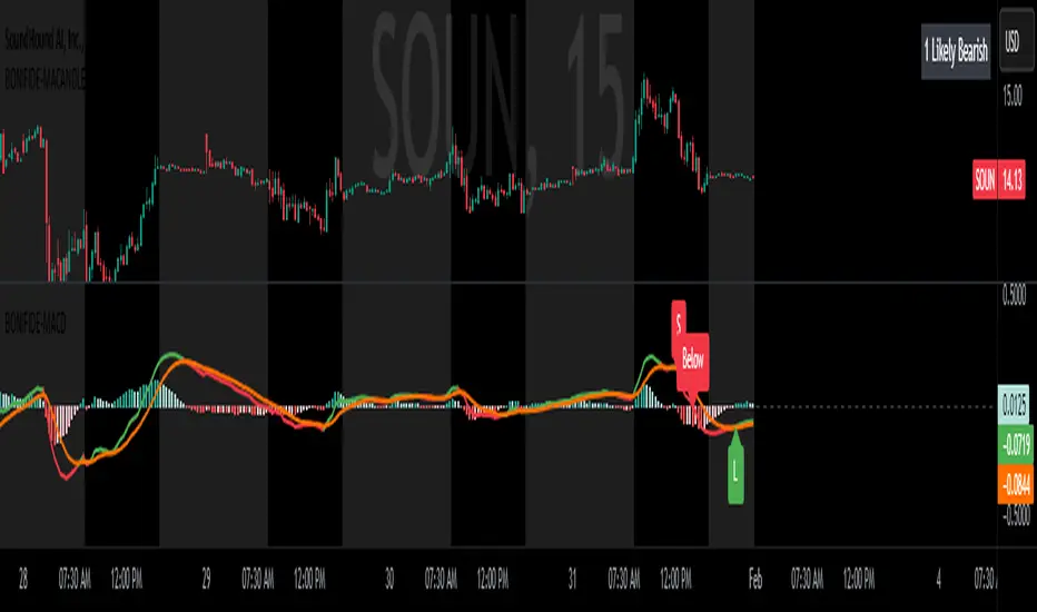
MACD with Candle DisplayMACD Calculation:
Uses user-defined Fast Length, Slow Length, and Signal Smoothing parameters to compute MACD.
Supports SMA (Simple Moving Average) or EMA (Exponential Moving Average) for the MACD line and signal line
Histogram-Based Candle Coloring:
The script categorizes histogram bars into four states:
0 (Very Bullish) → Green
1 (Likely Bearish) → Blue
2 (Likely Bullish) → Orange
3 (Very Bearish) → Red
Histogram Plot:
Displays histogram bars with distinct colors based on price momentum changes.
Market Sentiment Display in Status Line & Price Scale:
Instead of adding a label on the chart (which could obstruct candles), a text display is shown in the price scale and status line:
"0 Very Bullish"
"1 Likely Bearish"
"2 Likely Bullish"
"3 Very Bearish"
The text appears in the top-right corner with white font on a black background.
Purpose:
This indicator enhances the standard MACD by incorporating candle coloring and a cleaner sentiment display in the price scale, helping traders quickly interpret market momentum without cluttering the chart.
Last Candle OHLCThis simple yet powerful TradingView indicator displays the Open, High, Low, and Close (OHLC) values of the last completed candle directly on your chart. Whether you're trading stocks, forex, or crypto, having quick access to the most recent candle's price levels can be crucial for decision-making.
✨ Features:
✅ Shows the Open, High, Low, and Close of the last completed candle
✅ Works on any timeframe and asset
✅ Helps traders spot key price levels for entry, stop-loss, or take-profit decisions
Perfect for price action traders, scalpers, and swing traders! 🚀

New intraday high with weak barStrategy Logic:
The strategy checks if the current bar’s high is the highest high of the last 10 bar and if internal bar strength is less than 0.15.
Position is closed when close is greater than the previous bar’s high.
When a position is open, the script applies a light green background on the chart to signal that you are in a trade.
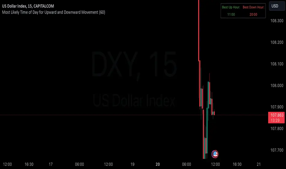
Hourly Market Movement Pattern Indicator# Hourly Market Movement Pattern Indicator
This versatile technical analysis tool identifies the most active hours for trading by analyzing historical price movements. While it can be viewed on any timeframe chart, the indicator specifically tracks and displays which hours of the day historically show the strongest upward or downward price movements, helping traders optimize their trading schedule around these recurring hourly patterns.
## Core Features
- Tracks the best performing hours for both upward and downward movements
- Viewable on any timeframe chart while maintaining hourly analysis
- Clear visual display through a color-coded table overlay
- Real-time updates with new market data
- Works with all trading instruments (stocks, crypto, forex, futures, etc.)
## Timeframe Applications
### Chart Viewing Options
- Can be viewed on any timeframe chart (1min to Monthly)
- Maintains hourly pattern analysis regardless of chart timeframe
- Helps correlate hourly patterns with your preferred trading timeframe
- Allows detailed visualization of hourly patterns within your analysis period
### Intraday Trading
- Identify the most profitable hours for trading
- Plan trading sessions around historically strong hours
- Optimize entry and exit timing based on hourly patterns
- Structure day trading schedules around peak movement hours
### Swing Trading
- Use hourly statistics to optimize entry/exit timing
- Plan trade executions during historically strong hours
- Time position entries based on hourly success rates
- Enhance swing trading decisions with hourly pattern data
## Practical Applications
### Pattern Recognition
- Track recurring hourly market movements
- Identify institutional trading hour patterns
- Detect regular market cycle hours
- Recognize changes in hourly market behavior
### Risk Management
- Adjust position sizing based on historical hourly patterns
- Plan entries during statistically favorable hours
- Time stop loss adjustments around known volatile hours
- Scale positions according to hourly success rates
### Trade Planning
- Schedule trading sessions during optimal hours
- Plan trade executions around strong movement periods
- Structure trading day around peak hours
- Time position adjustments to favorable hours
## Setup Options
- Timeframe: View on any chart timeframe while tracking hourly patterns
- Visual Display: Non-intrusive table overlay
- Color Coding: Green for upward movements, Red for downward movements
- Hour Display: 24-hour format for global market compatibility
## Trading Strategy Integration
The indicator enhances trading approaches through:
- Optimal hour identification for trade execution
- Historical hourly pattern analysis
- Day trading session optimization
- Position timing based on hourly statistics
## Notes
This indicator proves particularly valuable for:
- Traders seeking to optimize their daily trading schedule
- Day traders focusing on peak market hours
- Swing traders optimizing entry/exit timing
- Traders adapting strategies to specific market hours
- International traders tracking hour-specific patterns across sessions
The tool's hourly pattern analysis provides crucial timing information regardless of your preferred chart timeframe or trading style, helping optimize trade execution around the most statistically favorable hours of the day.
Advanced Divergence IndicatorAdvanced Divergence Indicator
Unlock the full potential of your trading strategy with the Advanced Divergence Indicator, a powerful tool designed to identify and analyze bullish and bearish divergences using multiple technical indicators. Whether you're a seasoned trader or just starting out, this indicator provides clear, actionable signals to help you make informed trading decisions.
What It Does
The Advanced Divergence Indicator detects divergences between price movements and key technical indicators, specifically the Relative Strength Index (RSI) and On-Balance Volume (OBV). Divergence occurs when the price trends in one direction while the indicator trends in the opposite direction, signaling potential reversals or continuations in the market.
Key Features
Multi-Indicator Analysis
RSI Divergence: Identifies bullish and bearish divergences using the RSI, helping you spot potential reversals based on momentum.
OBV Divergence: Utilizes OBV to detect divergences related to volume flow, providing insights into the strength behind price movements.
Bullish and Bearish Signals
Bullish Divergence: Signals when indicators show higher lows while the price forms lower lows, suggesting a potential upward reversal.
Bearish Divergence: Alerts when indicators display lower highs while the price creates higher highs, indicating a possible downward reversal.
Signal Strength Classification
Standard Signals: Represent typical divergence occurrences, marked with green (bullish) and red (bearish) labels.
Strong Signals: Highlighted with yellow (strong bullish) and blue (strong bearish) labels when divergences coincide with overbought or oversold conditions, enhancing signal reliability.
Customizable Settings
Indicator Selection: Choose to enable RSI, OBV, or both based on your trading preferences.
Pivot Points: Adjust the number of bars left and right to fine-tune pivot detection for more accurate divergence identification.
Range Configuration: Set minimum and maximum bar ranges to control the sensitivity of divergence detection, suitable for different timeframes and trading styles.
Noise Cancellation: Reduce false signals by enabling noise filtering, ensuring that only significant divergences are highlighted.
Visual Clarity
Color-Coded Labels: Easily distinguish between different types of divergences with intuitive color codes—green for bullish, red for bearish, yellow for strong bullish, and blue for strong bearish signals.
Clean Chart Display: The indicator overlays seamlessly on your chart without clutter, ensuring that signals are easily identifiable without distracting from price action.
Real-Time Alerts
Custom Alert Conditions: Receive instant notifications for bullish and bearish divergences, enabling you to act promptly on potential trading opportunities.
Combined Alerts: Get alerts for either bullish or bearish signals, or both, based on your selected criteria.
How to Use
Add the Indicator to Your Chart
Apply the Advanced Divergence Indicator to your desired chart and timeframe.
Configure Settings
Select Indicators: Choose to enable RSI, OBV, or both under the "Indicator Settings" group.
Adjust Parameters: Customize RSI length, pivot points, and divergence ranges to match your trading strategy and the specific asset you are analyzing.
Enable Noise Cancellation: Activate this feature to filter out minor divergences and focus on more significant signals.
Interpret the Signals
Bullish Signals: Look for green or yellow labels below the price bars indicating potential upward reversals.
Bearish Signals: Identify red or blue labels above the price bars signaling possible downward reversals.
Strong Signals: Pay special attention to yellow and blue labels as they denote stronger divergences with higher reliability.
Set Up Alerts
Configure alert conditions within the indicator to receive real-time notifications when bullish or bearish divergences are detected, ensuring you never miss a trading opportunity.
Why Choose Advanced Divergence Indicator
Comprehensive Analysis : By combining RSI and OBV, the indicator provides a more robust analysis compared to single-indicator tools, enhancing the accuracy of divergence detection.
Flexibility : Highly customizable settings allow traders to tailor the indicator to their unique strategies and market conditions.
User-Friendly : Clear labels and color codes make it easy for traders of all levels to understand and act on the signals.
Reliability : Strong signal classification and noise cancellation features help reduce false positives, providing more trustworthy trading signals.

Custom Price Red Line IndicatorCustom Price Red Line Indicator is a tool used in trading platforms to visually represent key price levels on a chart. This indicator typically draws a red line at a specific price, which can serve as a threshold or a level of interest, such as a resistance or support level. It is customizable to allow traders to set the price at which the red line will appear, making it useful for highlighting critical price points that may signal potential trade entries or exits.
Key Features:
• Customizable Price Level: Set the exact price where the red line will be drawn.
• Visual Signal: The red line acts as a visual aid to indicate important price levels.
• Alerts: Traders can set alerts when the price crosses the red line to track market movements.
• Trend Analysis: The red line can represent key support, resistance, or psychological price levels for trend analysis.
This indicator can be used in various timeframes and across different asset classes to assist traders in their technical analysis.

Inside/Outside Bar Direction Highlighter
Here’s a trading indicator in Pine Script (v6) that combines the essence of the Inside Bar, Outside Bar, and directional patterns inspired by TT3 Theory. This indicator highlights bars based on their classification as inside, outside, or directional and provides potential trade signals.
Inside Outside Indicator
Explanation:
Bar Classification:
Inside Bar: Current high is less than the previous high, and the low is greater than the previous low.
Outside Bar: Current high exceeds the previous high, and the low breaks below the previous low.
Up/Down Bars: Closing prices relative to the previous high/low.
Visual Highlights:
Bars are visually highlighted with colors for easy identification.
Trade Signals:
Long Signal: When the close crosses above the previous high and it's a directional up bar.
Short Signal: When the close crosses below the previous low and it's a directional down bar.
Customizable Inputs:
Colors for inside, outside, up, and down bars can be modified.
You can copy and paste this script into the Pine Editor on TradingView to see it in action. Adjust the logic to fit your trading strategy as needed.
You said:
summary of how to use this indicator without buy/sell signal
ChatGPT said:
ChatGPT
How to Use the Inside/Outside Bar Direction Highlighter Indicator (Without Buy/Sell Signals)
Understand the Bar Classifications:
Inside Bars: Highlighted in blue (default). These indicate periods of market consolidation. Look for potential breakouts in either direction.
Outside Bars: Highlighted in orange (default). These represent increased volatility, where both higher highs and lower lows are made. Watch for reversals or continuations based on broader trends.
Directional Up Bars: Highlighted in green (default). These occur when the current close is above the previous high, signaling bullish momentum.
Directional Down Bars: Highlighted in red (default). These occur when the current close is below the previous low, indicating bearish momentum.
Identify Key Patterns:
Use the highlighted bars to spot price action setups, such as:
Breakouts from inside bars.
Reversal signals following outside bars.
Continuation patterns when directional bars align with the trend.
Combine with Your Analysis:
Trend Analysis: Match bar classifications with trend direction on larger timeframes (e.g., daily, 4-hour).
Support/Resistance: Use inside and outside bars near key levels for confirmation or reversal signals.
Volume: Higher volume on directional bars strengthens the momentum signal.
Customize the Colors:
Adjust the bar highlight colors to fit your chart theme for better visibility.
No Automatic Signals:
This indicator doesn’t provide explicit buy/sell recommendations. Instead, use the visual highlights to make informed decisions based on your trading strategy.
By interpreting these bar patterns, you can better gauge market behavior and make more confident decisions without relying on preset signals.
Long Position with 1:3 Risk Reward and 20EMA CrossoverThe provided Pine Script code implements a strategy to identify long entry signals based on a 20-EMA crossover on a 5-minute timeframe. Once a buy signal is triggered, it calculates and plots the following:
Entry Price: The price at which the buy signal is generated.
Stop Loss: The low of the previous candle, acting as a risk management tool.
Take Profit: The price level calculated based on a 1:3 risk-reward ratio.
Key Points:
Buy Signal: A buy signal is generated when the current 5-minute candle closes above the 20-EMA.
Risk Management: The stop-loss is set below the entry candle to limit potential losses.
Profit Target: The take-profit is calculated based on a 1:3 risk-reward ratio, aiming for a potential profit three times the size of the risk.
Visualization: The script plots the entry price, stop-loss, and take-profit levels on the chart for visual clarity.
Remember:
Backtesting: It's crucial to backtest this strategy on historical data to evaluate its performance and optimize parameters.
Risk Management: Always use appropriate risk management techniques, such as stop-loss orders and position sizing, to protect your capital.
Market Conditions: Market conditions can change, and strategies that worked in the past may not perform as well in the future. Continuously monitor and adapt your strategy.
By understanding the core components of this script and applying sound risk management principles, you can effectively use it to identify potential long entry opportunities in the market.

Custom ChoCH Indicator (10m) - SayajeeCustom ChoCH Indicator (10m) - Sayajee
This custom Pine Script indicator identifies and marks Change of Character (ChoCH) events on a 10-minute chart. ChoCH is a price action concept that highlights potential market reversals. The indicator detects bullish and bearish Change of Character points and displays them as labels and background color highlights on the chart.
Features:
Bullish & Bearish ChoCH Signals: Detects price reversals and trends based on the relationship between recent highs and lows.
Bullish ChoCH: When the close price is greater than the previous swing high and the previous low is lower than the previous swing low.
Bearish ChoCH: When the close price is lower than the previous swing low and the previous high is greater than the previous swing high.
Visual Indicators:
Labels ("ChoCH↑" for bullish, "ChoCH↓" for bearish) are displayed at the high or low of the bar where the signal occurs.
Background highlights in green for bullish and red for bearish conditions to make the signals easily recognizable.
Customization:
Option to toggle the visibility of labels.
Option to customize the colors for bullish and bearish signals.
Alerts: Configured alert conditions to notify you when a Bullish ChoCH or Bearish ChoCH occurs.
Inputs:
Show Labels for ChoCH: Toggle to display ChoCH labels on the chart.
Bullish ChoCH Color: Choose the color for bullish signals.
Bearish ChoCH Color: Choose the color for bearish signals.
Usage:
This indicator is useful for detecting potential trend reversals and market shifts, especially when combined with other technical analysis tools. It's designed for traders who rely on price action and prefer visual cues to make informed decisions.

20 Pips Candle Finder for XAUUSD20 Pips Candle Finder for XAUUSD
This custom Pine Script indicator is specifically designed for XAUUSD (Gold) price action analysis. It identifies and visually marks candles with a body size of 20 pips or more, which can be important for traders focusing on strong momentum or significant price movement.
Key Features:
Dynamic Detection:
The script dynamically identifies candles whose body size exceeds 20 pips.
Calculations are based on XAUUSD's pip size of 0.1.
Visual Markers:
Candles meeting the 20-pip threshold are labeled with a green marker above the candle for quick identification.
Background Highlighting:
The candles meeting the condition are also visually highlighted with a transparent green background, making them easier to spot on the chart.
Debugging Tools:
The indicator plots:
A blue line showing the size of the candle bodies over time for better visibility.
A red dotted horizontal line showing the 20-pip threshold for quick reference.
Ideal Use Case:
This indicator is particularly useful for:
Traders focusing on momentum-based strategies.
Spotting candles with significant price movement.
Assessing market volatility during key trading hours or events.
By visually spotting these candles, traders can identify entry and exit opportunities, support/resistance breakouts, or potential reversals.
Inputs & Customization:
Currently, the indicator is set for XAUUSD's standard pip value (0.1) but can be adjusted if you plan to use it on other symbols. You can fine-tune the 20 pips threshold or other parameters to align with your trading strategy.

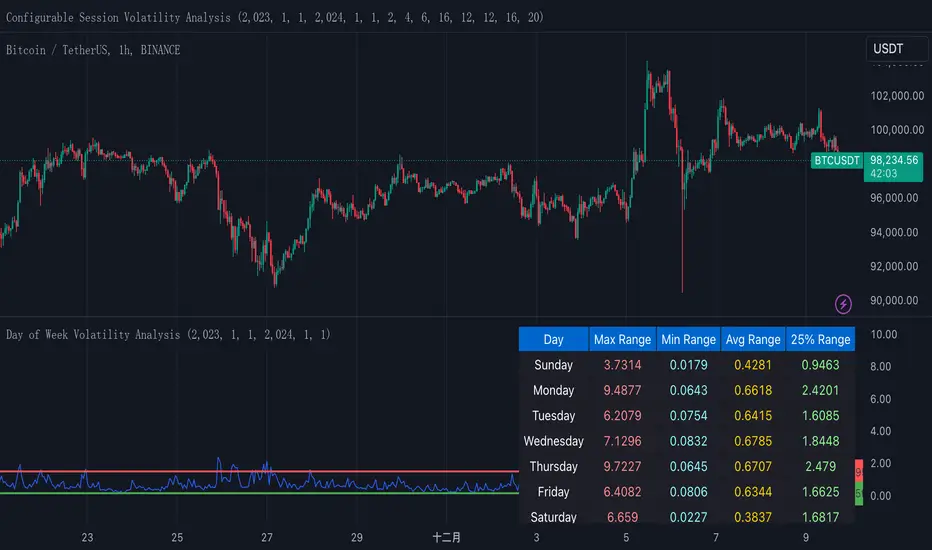
Normalized True Range - Grouped by WeekdaysThis indicator helps traders analyze daily volatility patterns across different days of the week by calculating normalized price ranges.
Unlike traditional volatility measures, it uses a normalized approach by dividing the daily range (high-low) by the midpoint price and multiplying by 100, providing a percentage-based measure that's comparable across different price levels. This normalization makes it particularly useful for comparing volatility patterns across different assets or time periods.
The indicator also includes a statistical overlay that highlights extreme volatility events. By calculating the 5th and 95th percentiles of the normalized ranges within your specified date range, it creates upper and lower bounds that help identify outlier days where volatility was exceptionally high or low.
These bounds appear as horizontal lines on the chart, making it easy to spot when current volatility breaks out of its historical norms.
The data is presented in both visual and tabular formats, with a comprehensive table showing the maximum, minimum, average, and 25th percentile ranges for each day of the week. This dual presentation allows traders to both quickly spot patterns visually and access detailed statistics for deeper analysis.
The user can customize the analysis period through simple date range inputs, making it flexible for different analytical timeframes.
XAUUSD Trend Strategy### Description of the XAUUSD Trading Strategy with Pine Script
This strategy is designed to trade gold (**XAUUSD**) using proven technical analysis principles. It combines key indicators such as **Exponential Moving Averages (EMA)**, the **Relative Strength Index (RSI)**, and **Bollinger Bands** to identify trading opportunities in trending market conditions.
---
#### Objective:
To maximize profits by identifying trend-aligned entry points while minimizing risks through well-defined Stop Loss and Take Profit levels.
---
### How It Works
1. **Indicators Used:**
- **Exponential Moving Averages (EMA):** Tracks short-term and long-term trends to confirm market direction.
- **Relative Strength Index (RSI):** Detects overbought or oversold conditions for potential reversals or trend continuation.
- **Bollinger Bands:** Measures volatility to identify breakout or reversion points.
2. **Entry Rules:**
- **Long (Buy):** Triggered when:
- The short-term EMA crosses above the long-term EMA (bullish trend confirmation).
- RSI exits oversold territory (<30), signaling buying momentum.
- The price breaks above the upper Bollinger Band, indicating a strong trend.
- **Short (Sell):** Triggered when:
- The short-term EMA crosses below the long-term EMA (bearish trend confirmation).
- RSI exits overbought territory (>70), signaling selling momentum.
- The price breaks below the lower Bollinger Band, indicating a strong downtrend.
3. **Risk Management:**
- **Stop Loss:** Automatically calculated based on a percentage of equity risk (customizable via inputs).
- **Take Profit:** Defined using a risk-to-reward ratio, ensuring consistent profitability when trades succeed.
4. **Visualization:**
- The chart displays the EMAs, Bollinger Bands, and entry/exit points for clear analysis.
---
### Key Features:
- **Customizable Parameters:** You can adjust EMAs, RSI thresholds, Bollinger Band settings, and risk levels to suit your trading style.
- **Alerts:** Automatic alerts for potential trade setups.
- **Backtesting-Ready:** Easily test historical performance on TradingView.
---
This strategy is ideal for gold traders looking for a systematic, rule-based approach to trading trends with minimal emotional interference.
HMM Regime IndicatorHMM Regime Indicator
Overview:
The HMM Regime Indicator is designed to help traders identify market regimes by analyzing trend strength, momentum, and price deviation. It uses a combination of the Average Directional Index (ADX), Relative Strength Index (RSI), and Commodity Channel Index (CCI) to classify market conditions into three distinct regimes: Bullish, Bearish, and Sideways.
Key Features:
ADX (Average Directional Index): Measures the strength of a trend. A high ADX value indicates a strong trend, while a low value suggests a weak or non-existent trend.
RSI (Relative Strength Index): Identifies overbought or oversold conditions. An RSI above 70 typically indicates overbought conditions, while an RSI below 30 suggests oversold conditions.
CCI (Commodity Channel Index): Evaluates the price deviation from its average. High CCI values indicate that prices are well above their average, while low values suggest prices are below their average.
Regime Detection:
Bullish Regime: Identified when the ADX indicates a strong trend, and both RSI and CCI suggest overbought conditions. This regime is marked with a green background on the chart.
Bearish Regime: Detected when the ADX shows a strong trend, and both RSI and CCI indicate oversold conditions. This regime is highlighted with a red background.
Sideways Regime: Occurs when neither bullish nor bearish conditions are met, suggesting a lack of strong directional movement. This regime is shown with a blue background.
Usage:
This indicator is useful for traders looking to understand the current market environment and adjust their strategies accordingly. By identifying the prevailing market regime, traders can make more informed decisions about entering or exiting trades.
Customization:
Users can adjust the input parameters for ADX, RSI, and CCI to better fit their trading style and the specific asset being analyzed. The default settings are optimized for general use but can be tailored to suit individual preferences.

Heikin Ashi Buy-Sell Signals [Non-Repainting] @TradingadeThis is a basic indicator that displays Heikin Ashi candles in a simple format. Key features include:
- Unlike most other Heikin Ashi indicators, this one does not repaint, which is crucial when building strategies based on indicators.
- It generates Buy & Sell signals based on consecutive candles of the same color:
BUY Signal: Triggered when there are at least x green candles in a row (adjustable in settings).
SELL Signal: Triggered when there are at least x red candles in a row (also adjustable in settings).
Multiple Signal Option: If activated, the indicator will continue generating signals after the buy or sell condition is met, until a candle of the opposite color appears.
The Buy & Sell signals are shown both in the indicator and on your chart. You can turn them on or off in the style section.
You can set alerts when buy or sell signals are generated.

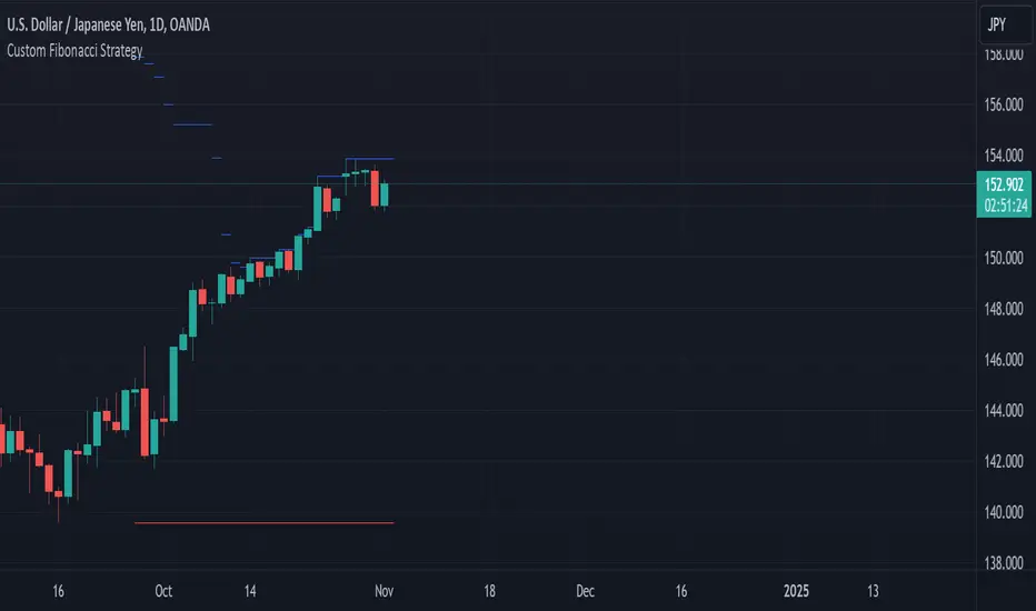
Custom Fibonacci StrategyCustom Fibonacci Strategy:
This strategy relies on analyzing Fibonacci levels to identify entry points for trades. It works by identifying peaks and troughs over a specified time period (50 bars in this code). Here are the steps of the strategy:
Identifying Peaks and Troughs:
The highest peak and lowest trough over the last 50 bars are identified.
If the price exceeds the previous peak, it is considered a break of the peak.
If the price falls below the previous trough after breaking the peak, it is considered a break of the trough.
Calculating Fibonacci Levels:
The 50% level (midway point) between the identified peak and trough is calculated.
Buy Signals:
When a trough is broken, and the price trades at or below the 50% level, the risk-to-reward ratio is evaluated.
If the risk-to-reward ratio is greater than or equal to 2, a buy signal is generated.
Displaying Levels:
Horizontal lines are displayed on the chart to illustrate the peak, trough, and Fibonacci level.
Summary
This strategy provides a systematic approach to trading based on Fibonacci retracement levels and price action, allowing traders to make informed decisions about entry points and manage risk effectively.
Vishnu's Magics**Vishnu's Magics** is a powerful RSI (Relative Strength Index) indicator designed to enhance trading strategies through effective divergence detection and alerting features. This indicator provides the following key functionalities:
1. **RSI Calculation**: Calculates the RSI over a customizable length, allowing traders to identify overbought and oversold conditions.
2. **Customizable Bands**: Users can set multiple upper and lower bands to define different overbought and oversold levels, facilitating precise trading decisions.
3. **Divergence Detection**: The indicator identifies both bullish and bearish divergences by comparing price action with RSI movements. It highlights these divergences on the chart, helping traders anticipate potential reversals.
4. **Visual Alerts**: When divergences are detected, the indicator visually marks the points on the chart with labeled shapes ("Bull" for bullish divergence and "Bear" for bearish divergence) and changes the background color to indicate the condition.
5. **Alert System**: Users can set alerts for significant events, such as crossing specified bands or detecting divergences, ensuring timely notifications for trading opportunities.
6. **Custom Line Values**: Traders can edit the values for the divergence lines, providing flexibility to tailor the indicator according to their trading strategies.
Overall, **Vishnu's Magics** serves as an intuitive tool for traders looking to leverage RSI analysis and divergence strategies for informed trading decisions.

Adjusted Average VolatilityThis Pine Script calculates the average volatility over the past 20 bars by taking the difference between the high and low prices. It then adjusts this volatility based on the previous closing price: if the price is below $20, the volatility is multiplied by 2, and if it’s above $20, the volatility is multiplied by 1.5. The adjusted volatility is then plotted on the chart, helping traders visualize how volatility changes relative to the asset's price level.
5-9-20-100 Day EMAIndicator Name: "5-9-20-100 Day EMA"
Purpose: This indicator plots four key EMAs (5, 9, 20, and 100-day) on a daily chart, providing a clear visualization of both short-term and long-term trends. The EMAs serve as critical triggers for identifying potential entry and exit points based on price interactions with these moving averages.
Technical Details:
Version: Pine Script v5
EMAs Used:
5-Day EMA (Lime): Captures the most recent price trends, useful for identifying short-term momentum.
9-Day EMA (Yellow): Offers a slightly broader view, often used to confirm the short-term trend.
20-Day EMA (Orange): Represents a medium-term trend, commonly used as a signal for trend reversals.
100-Day EMA (Red): Indicates the long-term trend, often serving as strong support or resistance levels.
Trigger Points:
Crossovers: Price crossing above or below these EMAs can trigger potential buy or sell signals.
Convergence/Divergence: The interaction between the EMAs, such as a faster EMA crossing a slower one, can signal trend reversals or continuations.
Utility: This indicator is ideal for traders who rely on EMA crossovers and the relationship between different EMAs to make informed trading decisions.
