Magnifying Glass (LTF Candles) by SiddWolf█ OVERVIEW
This indicator displays The Lower TimeFrame Candles in current chart, Like Zooming in on the Candle to see it's Lower TimeFrame Structure. It plots intrabar OHLC data inside a Label along with the volume structure of LTF candle in an eloquent format.
█ QUICK GUIDE
Just apply it to the chart, Hover the mouse on the Label and ta-da you have a Lower Timeframe OHLC candles on your screen. Move the indicator to the top and shrink it all the way up, because all the useful data is inside the label.
Inside the label: The OHLC ltf candles are pretty straightforward. Volume strength of ltf candles is shown at bottom and Volume Profile on the left. Read the Details below for more information.
In the settings, you will find the option to change the UI and can play around with Lower TimeFrame Settings.
█ DETAILS
First of all, I would like to thank the @TradingView team for providing the function to get access to the lower timeframe data. It is because of them that this magical indicator came into existence.
Magnifying Glass indicator displays a Candle's Lower TimeFrame data in Higher timeframe chart. It displays the LTF candles inside a label. It also shows the Volume structure of the lower timeframe candles. Range percentage shown at the bottom is the percentage change between high and low of the current timeframe candle. LTF candle's timeframe is also shown at the bottom on the label.
This indicator is gonna be most useful to the price action traders, which is like every profitable trader.
How this indicator works:
I didn't find any better way to display ltf candles other than labels. Labels are not build for such a complex behaviour, it's a workaround to display this important information.
It gets the lower timeframe information of the candle and uses emojis to display information. The area that is shown, is the range of the current timeframe candle. Range is a difference between high and low of the candle. Range percentage is also shown at the bottom in the label.
I've divided the range area into 20 parts because there are limitation to display data in the labels. Then the code checks out, in what area does the ltf candle body or wick lies, then displays the information using emojis.
The code uses matrix elements for each block and relies heavily on string manipulation. But what I've found most difficult, is managing to fit everything correctly and beautifully so that the view doesn't break.
Volume Structure:
Strength of the Lower TimeFrame Candles is shown at the bottom inside the label. The Higher Volume is shown with the dark shade color and Lower Volume is shown with the light shade. The volume of candles are also ranked, with 1 being the highest volume, so you can see which candle have the maximum to minimum volume. This is pretty important to make a price action analysis of the lower timeframe candles.
Inside the label on the left side you will see the volume profile. As the volume on the bottom shows the strength of each ltf candles, Volume profile on the left shows strength in a particular zone. The Darker the color, the higher the volume in the zone. The Highest volume on the left represents Point of Control (Volume Profile POC) of the candle.
Lower TimeFrame Settings:
There is a limitation for the lowest timeframe you can show for a chart, because there is only so much data you can fit inside a label. A label can show upto 20 blocks of emojis (candle blocks) per row. Magnifying Glass utilizes this behaviour of labels. 16 blocks are used to display ltf candles, 1 for volume profile and two for Open and Close Highlighter.
So for any chart timeframe, ltf candles can be 16th part of htf candle. So 4 hours chart can show as low as 15 minutes of ltf data. I didn't provide the open settings for changing the lower timeframe, as it would give errors in a lot of ways. You can change the timeframe for each chart time from the settings provided.
Limitations:
Like I mentioned earlier, this indicator is a workaround to display ltf candles inside a label. This indicator does not work well on smaller screens. So if you are not able to see the label, zoom out on your browser a bit. Move the indicator to either top or bottom of all indicators and shrink it's space because all details are inside the label.
█ How I use MAGNIFYING GLASS:
This indicator provides you an edge, on top of your existing trading strategy. How you use Magnifying Glass is entirely dependent on your strategy.
I use this indicator to get a broad picture, before getting into a trade. For example I see a Doji or Engulfing or any other famous candlestick pattern on important levels, I hover the mouse on Magnifying Glass, to look for the price action the ltf candles have been through, to make that pattern. I also use it with my "Wick Pressure" indicator, to check price action at wick zones. Whenever I see price touching important supply and demand zones, I check last few candles to read chart like a beautiful price action story.
Also volume is pretty important too. This is what makes Magnifying Glass even better than actual lower timeframe candles. The increasing volume along with up/down trend price shows upward/downward momentum. The sudden burst (peak) in the volume suggests volume climax.
Volume profile on the left can be interpreted as the strength/weakness zones inside a candle. The low volume in a price zone suggests weakness and High volume suggests strength. The Highest volume on the left act as POC for that candle.
Before making any trade, I read the structure of last three or four candles to get the complete price action picture.
█ Conclusion
Magnifying Glass is a well crafted indicator that can be used to track lower timeframe price action. This indicator gives you an edge with the Multi Timeframe Analysis, which I believe is the most important aspect of profitable trading.
~ @SiddWolf
Cari dalam skrip untuk "chart"

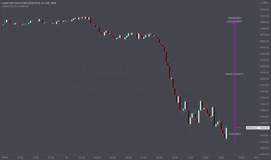
Intraday Power 3 VisualDescription
This indicator draws a dynamic "Open High Low Close" type visual on intraday charts so the trader can easily keep track of the daily/weekly movement. This indicator was inspired by the Inner Circle Trader’s (ICT) “Power 3” concept, which is Accumulation, Manipulation, and Distribution of price on a daily timeframe.
Visual
This indicator plots the chosen timeframes opening price along with a live line for the current price. This makes it very easy to identify the daily/weekly range along it’s open. And the user can combine this indicator with my other indicator “Futures Exchange Sessions” to plot the midnight EST & 8:30 AM EST lines to get a great summation of over night price action.
Inputs and Style
In the Input section the user can dynamically switch between Daily and Weekly timeframes. Built in ability to move the entire Visual to the right makes preventing indicator overlap a breeze. All of the lines can be configured: color, style, and width. Independently toggle ON/OFF the Power 3 labels (Accumulation, Manipulation, Range Extension, Distribution) and can change labels color. The labels dynamically move and switch positions based upon bear or bull daily/weekly range.
Special Notes
The Futures market is open 23/5. It is closed everyday for 1-hour at 5pm EST and closed over the weekends. Because this Intraday Power 3 Visual is drawing in the 'future' on the users TradingView chart, when the visual is close or in a time when the market is closed, the visual doesn't behave properly. This is because TradingView doesn't display times when the Market is closed, thus the drawings cannot be displayed during those times. There is nothing wrong with the script. Please wait until the Market is open and the visual will be drawn normally.
This indicator is intended for use in the Futures Market
Bart Pattern [LuxAlgo]As a sequel to our 'meme indicator' series... The Bart Pattern Detector identifies confirmed regular and inverted Bart patterns using edge detection.
Settings
Median Lookback: Lookback period of the median filter used for the edge detection, with a shorter period allowing to detect shorter-term and less spaced patterns.
Edge Detection Sensitivity: Sensitivity of the edge detection method, with higher values making the method less sensible to edges of low magnitude.
Range To Edges Threshold: Threshold for the range to edges ratio, with lower values detecting Bart patterns with flatter ranges between the edges.
Show Inverted Barts: Show inverted Bart patterns.
Mode: Determines how detected Bart patterns are displayed.
Usage
This indicator can be used to study past Bart patterns and how the market responded to them. Their detection is not done in real-time. Additionally detected edges are used to indicate the current market sentiment.
If you don't want a meme on your chart, you can also use the simple mode - but don't worry, we won't judge you if you don't...
Details
The origins of Bart patterns can be hard to pinpoint but most likely originate from social media around 2018. This pattern has been mostly covered in the cryptocurrency market similarly to how the McDonald's Pattern became a popular meme within the community. See our McDonald's Pattern Indicator that was created by us as our first 'meme indicator' in the series
The Bart pattern as its name suggests occurs when price forms a structure resembling the head of the Simpson character "Bart Simpson". This is characterized by a rectangular structure, which is a sideways market delimited by sharp volatile edges.
The Bart pattern is sometimes traded before completion, waiting for a breakout of a support/resistance located within the sideway part of the pattern.
The cause of this pattern is still discussed by traders, with some attributing it to over-leveraged market participants and while others attributing it to exchanges themselves through spoofing.
Notes
Barts patterns are very volatile structures, characterized by sudden price jumps, be careful when trading them.
Shout to the famous alien @lilmayo and our good pal @scheplick for the suggestion to create this work of art.
And don't forget to eat your shorts.

Charting the US02Y-US10YPutting together a script that charts the US02Y - US10Y in visual format. First script I've ever written and would like some feed back as to how I could improve. Also currently have to turn on "Indicator Last Value Label, and Indicator Name Label" if you would like data to appear on the chart. Works best when the US02Y-US10Y chart is being displayed!

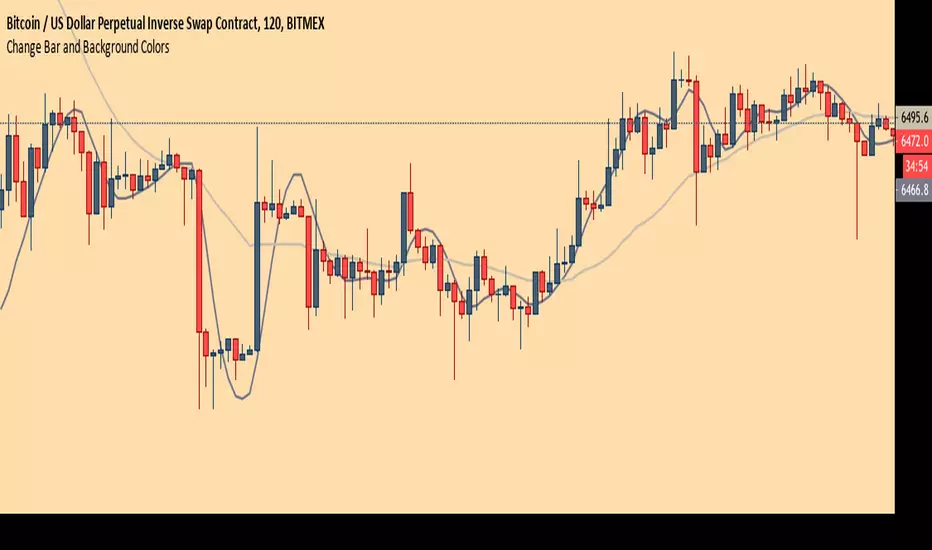
Chart Theme - Change Bar and Background Colors using HEX #sAdds aesthetic ability to charts by allowing the trader to change the color of the bars, background, and plots using HEX colors, rather than TradingView's limited color selector box. This makes for easy application of color palettes to charts. The color palettes can be saved as indicators and applied quickly, as desired.
[COG] Platypus Platypus
Overview
Platypus is a volume momentum indicator that combines price action, volume analysis, and multi-timeframe confirmation to generate trade signals. Unlike traditional volume indicators, Platypus reconstructs volume momentum by factoring in price velocity, volatility adjustment, and market structure to identify true institutional momentum shifts.
The indicator features a comprehensive filtering system including EMA alignment, background state confirmation, and optional multi-timeframe filters to eliminate false signals and ensure you only trade with the strongest momentum.
Key Features
✅ Volume Momentum Calculation
Volatility-Adjusted Volume: Normalizes volume relative to recent volatility periods
Quiet Market Filtering: Reduces noise during low-activity periods
Spike Detection: Identifies abnormal volume surges with boosted weighting
Momentum Smoothing: EMA-based smoothing prevents erratic signals
✅ Entry Pattern Detection
3-Bar Pattern Requirement: RED → GREEN → GREEN for buys (opposite for sells)
State Management: Prevents consecutive signals in same direction without reset
Background Confirmation: Must align with bullish/bearish market state
EMA Alignment Filter: Ensures trend structure supports the trade direction
✅ Multi-Timeframe Filtering System
HTF Closed Bar Filter: Confirms last closed higher timeframe bar matches direction (no repaint)
HTF Momentum Filter: Requires current HTF bar to match direction (live, prevents delayed entries)
Dual-Filter Capability: Use both filters for maximum precision
✅ Dashboard
Real-time Status Monitoring: Volume trend, background state, EMA order, trade state
Filter Status Display: Shows HTF filter conditions and signal permission
Pattern Detection: Indicates when 3-bar entry pattern is forming
✅ On-Chart Integration
50/100/200 EMAs: Automatically plotted on price chart with customizable colors
Visual Entry Markers: Triangle signals appear on price chart at entry points
Signal Alerts: Built-in alert conditions for all signal types
📚 Core Settings Explained
signalPeriod = input.int(8, "Signal Period", minval=1, group="Core Settings")
Signal Period (Default: 8): Controls the smoothing of the signal line (blue line). Lower values = more responsive, higher values = smoother but slower to react.
volatilityPeriod = input.int(20, "Volatility Period", minval=1, group="Core Settings")
Volatility Period (Default: 20): Lookback period for volume and price range calculations. This period is used to normalize volume relative to recent market conditions.
priceFilterLength = input.int(200, "Price Filter MA Length", minval=1, group="Core Settings")
Price Filter MA Length (Default: 200): The SMA period used for background state determination. Price must be above this MA for bullish background, below for bearish background.
Advanced Settings
momentumMultiplier = input.float(50.0, "Momentum Multiplier", minval=20.0, maxval=80.0, step=2.0, group="Advanced")
Momentum Multiplier (Default: 50.0): Scales the final momentum score. Higher values = larger histogram bars and more sensitivity. Adjust based on your instrument's volatility.
momentumSmoothing = input.int(4, "Momentum Smoothing", minval=1, maxval=15, group="Advanced")
Momentum Smoothing (Default: 4): EMA period applied to raw momentum before normalization. Higher values reduce noise but add lag.
quietThreshold = input.float(0.3, "Quiet Market Filter", minval=0.0, maxval=1.0, step=0.05, group="Advanced")
Quiet Market Filter (Default: 0.3): During low-volume periods, this applies exponential dampening to momentum. Higher values = more aggressive filtering of weak moves.
volStrengthFactor = volRatio < (1.0 + quietThreshold) ? math.pow(volRatio, 2) : volRatio
When volume is less than average + threshold, it squares the ratio (dampening), otherwise uses linear scaling.

Smart Money Sessions + Liquidity + FVGSmart Money Sessions + Liquidity + Fair Value Gap is a clean and professional price-action based indicator designed for Gold (XAUUSD) and Forex traders who follow Smart Money Concepts (SMC) and ICT methodology.
This indicator focuses on where liquidity is taken, when structure shifts, and where imbalance (FVG) is created, without cluttering the chart or repainting signals.
🔍 Key Features
🕒 Session High & Low (Killzones)
Automatically plots Asia, London, and New York session highs and lows
Helps identify:
Asia range manipulation
London fakeouts
New York continuations
💧 Liquidity Sweep Detection
Detects wick-based liquidity grabs
Highlights areas where stop-losses are likely taken
Ideal for spotting smart money entries
🔁 Market Structure Shift (MSS)
Simple and clean bullish & bearish structure shifts
Helps confirm trend continuation or reversal
Non-repainting logic
📦 Fair Value Gap (FVG)
Uses true 3-candle imbalance logic
Highlights bullish and bearish FVG zones
Clean visualization without over-plotting
✅ Why This Indicator?
❌ No repainting
❌ No lagging indicators
❌ No unnecessary colors
✅ Based purely on price action
✅ Beginner-friendly & professional-grade
✅ Optimized for Gold (XAUUSD)
🎯 Best Use Cases
Gold scalping & intraday trading
London & New York session trades
Liquidity-based entries
ICT / Smart Money strategies
⚠️ Disclaimer
This indicator is a visual analysis tool, not a buy/sell signal generator.
Always combine it with proper risk management and your own trading plan.

Celestial StateCelestial State (C1) – Market Bias & Candle Intent
Celestial State (C1) is a price-action indicator designed to clarify market bias, momentum, and risk conditions using nothing but candle structure.
No indicators.
No lag.
Just clean candle logic.
The tool separates state (what the market is) from intent (what the market is doing right now).
🔹 Core Concept
The indicator works on the chart timeframe and uses closed candles only to define market state.
It then monitors the current candle to identify:
momentum confirmation
early warnings
potential trap / reversal behaviour
🔹 Market State (Based on C1 – last closed candle)
State is derived from the relationship between the last two closed candles:
Bull Trend Start
Bearish candle → Bullish candle
Bull Continuation
Bullish candle → Bullish candle
Bear Trend Start
Bullish candle → Bearish candle
Bear Continuation
Bearish candle → Bearish candle
This defines the directional environment before any decision is made.
🔹 Bias & Momentum (Live Candle)
Once state is defined, the current candle is monitored relative to the previous candle’s high and low.
Strong Buy
Bullish state
Previous candle bullish
Current candle breaks previous high
Strong Sell
Bearish state
Previous candle bearish
Current candle breaks previous low
These represent momentum continuation with confirmation.
Buy / Sell (Normal Bias)
Price is in a bullish or bearish state
No momentum break yet
This is directional bias without confirmation.
Changing Bias
Bullish state + previous low broken
Bearish state + previous high broken
This warns that control is being challenged and conditions may be shifting.
🔹 Flip (Strict Order)
A Flip is a high-risk condition where expansion fails:
Bull Flip
Current candle breaks previous high first, then breaks previous low
Bear Flip
Current candle breaks previous low first, then breaks previous high
This often signals:
failed breakouts
stop hunts
transition zones
🔹 Visual Output
Top-right panel shows:
Current Celestial State (C1)
Current Bias (Strong Buy / Sell / Changing Bias)
Short explanation (e.g. High broken, Low broken)
On-chart markers are intentionally minimal and offset away from price to reduce clutter.
🔹 Who This Is For
This indicator is built for traders who:
trade price action
want context before execution
prefer clarity over complexity
understand that bias ≠ entry
⚠️ Disclaimer
This tool does not provide entries, exits, or risk management.
It is a context and intent framework, not a signal system.
Use it as a decision-support layer alongside your own execution rules.

ORB Algo | WolfOfFuturesThis Script is an updated version of the Flux Charts ORB Algo
15min ORB default
4EMA breakout Condition
Dynamic TP Default

Objective Daily Bias Seasonality
The Universal Daily Seasonality indicator is a statistical tool designed to analyze and visualize price performance patterns based on the day of the week. It helps traders identify historical tendencies (seasonal bias) for any given asset by processing daily data independently of the current chart timeframe.

TXG Wick DetectorOverview The TradeX Guru Wick Detector is a price action utility designed to automatically identify potential "Liquidity Grabs" and "Stop Hunts." It highlights candles where the market has aggressively rejected lower prices, signaling that Smart Money may be absorbing sell orders (the "Samosa Crust Break").
How It Works This script calculates the ratio of the lower wick relative to the total candle range.
If the lower wick represents more than 50% of the total candle size (customizable), a Teal Diamond (💎) is plotted below the bar.
This visual cue alerts you to a strong rejection of lower prices, often found at the end of a correction or during a "Stop Hunt" at key support levels.
Features
Automated Detection: Instantly spots high-rejection candles across any timeframe.
Customizable Sensitivity: Adjust the "Wick %" threshold in the settings to filter for stronger or weaker signals.
Visual Clarity: Non-intrusive diamond markers that do not clutter your chart.
Watermark: Includes the TradeX Guru brand mark for easy sharing.
🚀 How to Use This Tool for Analysis
Do not trade every diamond blindly. Use this 3-Step "Pro" Protocol to filter for high-probability setups:
1. Location (Context is King) Only consider signals that appear at Key Areas of Value:
Support Zones: Is price testing a historical support line?
Round Numbers: Is the signal near a psychological level (e.g., Nifty 25,000, BankNifty 50,000)?
High Volume Nodes (VPVR): Is price rejecting a high-volume cluster?
Rule: If a diamond appears in the middle of a random trend ("No Man's Land"), ignore it.
2. The Trap (The Hunt)
Watch for price to dip below your key level first.
The appearance of the Teal Diamond confirms that this dip was rejected. This suggests that "Stop Loss Liquidity" was hunted and absorbed by institutional buyers.
3. The Trigger (Entry & Risk)
Entry: Wait for the diamond candle to close. Enter on the next candle if bullish momentum continues.
Stop Loss: Place your SL strictly below the Low of the diamond candle.
Logic: If price breaks below the wick, the rejection has failed, and the setup is invalid.
Settings Guide
Wick Size % (Default 0.50): The wick must be 50% of the candle.
Increase to 0.60 for fewer, higher-quality signals.
Decrease to 0.40 for more frequent signals (scalping).
Disclaimer This tool is for educational purposes only. Price action patterns do not guarantee future performance. Always manage your risk.

Super Crooks - Breakers█ OVERVIEW
This indicator plots bullish and bearish breaker formations. When price is moving quickly, it can be difficult to mark out breaker formations across multiple timeframes. This indicator simplifies that process by marking these out automatically -- ultimately making the formations easily visible.
█ CONCEPTS
Adds L, H, LL, HH swing point labels to show bullish breaker formations
Adds H, L, HH, LL swing point labels to show bearish breaker formations
█ HOW TO USE
Add the Super Crooks Breakers indicator to your TradingView charts
Open the indicator's settings and select your preferred configurations
Watch your charts to see the indicator plot breaker formations
█ FEATURES
Visuals are drawn in real time (after candle closure) on your selected timeframe
Breaker formations can be configured to be plotted based on candle wick (high/low) price or candle close price
Configuration options (swing lengths, show/hide setups)

Aggressive Buyers & SellersShows indicators of aggressive sellers and buyers, so when you are looking at the chart closer then you will be able to make short time trade based off the indicators tell.

Superbank Grid The Superbank Grid automatically plots institutional-grade price zones across Forex, Indices, and Crypto, giving traders a consistent framework for identifying major liquidity areas, psychological levels, and high-probability reaction zones — on any timeframe.
This indicator is designed to eliminate guesswork by anchoring price to repeatable, whole-number structures used by professional traders.
What It Draws
Forex (All FX Pairs)
Major Zones: Every 1,000 pips
Median Levels: 500 pips
Quarter Levels: 250 & 750 pips
Minor Grid: 100-pip intervals
Examples:
EURUSD:
Major → 0.7000 · 0.8000 · 0.9000 · 1.0000 · 1.1000
Quarters → 0.7250 · 0.7500 · 0.7750
USDJPY:
Major → 60 · 70 · 80 · 90 · 100 · 110
Quarters → 62.5 · 65.0 · 67.5 · 122.5 · 125.0 · 127.5
Indices & Crypto
Major “Superbank” Zones: $10,000
Median Levels: $5,000
Minor Grid: $1,000
Ideal for:
NAS100
US30
SPX
BTC
ETH
Key Features
Works on all timeframes
Auto-adapts to Forex, JPY pairs, Indices, and Crypto
Prevents chart auto-scale distortion (“screen squish”)
Displays only relevant zones near current price
Adjustable colors, line weights, and label sizes
Optional visibility toggles for Major, Median, Quarter, and Minor levels
Best Use Cases
Identifying institutional liquidity pools
Marking reaction zones and decision points
Structuring entries, targets, and stop placement
Aligning price action with Big Money levels
Swing trading, position trading, and intraday execution
Important Notes
This indicator is a context and structure tool, not a signal generator.
Best used in combination with market structure, order flow, and risk management.
Designed to reflect how professional traders segment price, not retail indicators.
Who This Is For
Traders who think in zones, liquidity, and scale — not random indicators.
If you trade:
Forex
Indices
Crypto
and want a repeatable framework for understanding where price matters…
This tool belongs on your chart.

Heikin Ashi Trend Buy Sell
This indicator generates BUY and SELL signals based on Heikin Ashi trend direction and strong wickless candles. Use it **only on Heikin Ashi charts** for accurate signals. Buy when the first strong bullish Heikin Ashi candle appears and sell when the first strong bearish candle appears. Best used to catch trend starts and ride clean trends.

Trader HQ - Multi Time Frame EMA🔷 Indicator Title
MTF 200 EMA Pro — Triple Timeframe Trend Filter
🔷 Short Description (Tagline)
A professional multi-timeframe 200 EMA framework that overlays up to three higher and lower timeframe trend filters on a single chart for superior market alignment and trade confirmation.
🔷 Full Description (Paste This in TradingView)
📈 MTF 200 EMA Pro — Triple Timeframe Trend Filter
MTF 200 EMA Pro is a professional-grade multi-timeframe trend analysis tool designed to help traders identify high-probability directional bias across multiple timeframes.
This indicator allows you to overlay up to three independent 200-period Exponential Moving Averages from different timeframes onto one chart, providing instant insight into higher, medium, and lower timeframe trend alignment.
By stacking multiple 200 EMAs, traders can eliminate low-quality setups, avoid countertrend trades, and operate in harmony with dominant market structure.
🔧 Key Features
✅ Up to 3 independent 200 EMAs
✅ Individual timeframe selection per EMA
✅ Clean overlay on any chart
✅ Adjustable display per line
✅ Real-time multi-timeframe calculations
✅ Works on all markets and sessions
🎯 How to Use
This indicator is designed as a primary trend filter.
Example configuration:
• EMA 1 → Lower timeframe (Execution)
• EMA 2 → Medium timeframe (Momentum)
• EMA 3 → Higher timeframe (Structure)
Bullish Bias Example
Price above all 200 EMAs
Lower EMA above higher EMA
Pullbacks hold above structure
Bearish Bias Example
Price below all 200 EMAs
Lower EMA below higher EMA
Rejections at structure
When EMAs are aligned, trend probability increases.
📊 Best Use Cases
✔ Futures Trading
✔ Options & Equity Trading
✔ Forex & Crypto
✔ Prop Firm Evaluations
✔ Trend-Following Systems
✔ Momentum Strategies
⚠️ Risk Disclaimer
This indicator is a trend visualization and filtering tool only. It does not provide financial advice. Always apply proper risk management and confirm signals with your own strategy.

Daily Weekly Monthly ClosesFeatures:
Labels showing the close price for each period
Toggle visibility for day, week, and month closes
Customizable colors for each level
Adjustable line width and style (solid, dashed, dotted)
Labels appear on the right side of the chart

Multi-Layer Support Resistance & Auto TrendlineMulti-Layer Support Resistance & Auto Trendline (Multi-Timeframe Analysis)
Maximize your chart analysis with this advanced Support and Resistance (S/R) engine. This indicator automatically detects critical horizontal levels and diagonal trendlines across four different lookback periods, giving you a comprehensive view of market structure.
Why this indicator?
Universal Search Appeal: Ideal for traders looking for "Support and Resistance," "Auto Trendline," "Pivot Points," and "Gap Detection."
Multi-Layer Logic: Filters market noise by identifying levels from short-term scalping confirms to ultra-long-term historical walls.
Auto Trendlines: No more manual drawing. It automatically connects valid pivot highs and lows to visualize trend channels and breakouts.
Gap Analysis: Automatically marks "Windows" (Gaps) as high-priority zones, often acting as magnetic levels for future price action.
Cyberpunk Aesthetics: High visibility neon colors with customizable transparency to keep your chart professional yet intuitive.
How to trade: Focus on price action where multiple layers (e.g., a diagonal trendline and a long-term horizontal line) intersect. These "confluence zones" offer higher probability trade setups.
多層型サポート&レジスタンス+自動トレンドライン(マルチ分析エンジン)
「サポート・レジスタンス」「自動トレンドライン」「窓(ギャップ)検知」を一つに統合した、高度な相場分析ツールです。4つの期間(短期・中期・長期・超長期)から価格の壁と流れを自動的に抽出し、精度の高いトレード戦略をサポートします。
本インジケーターの強み:
高い検索親和性: 「サポレジ」「自動トレンドライン」「ピボット」「窓埋め」などの普遍的な要素を全て網羅しています。
4層の多角ロジック: ノイズの多い短期的な節目から、歴史的に意識される超長期の壁までを階層的に表示。
自動トレンドライン: 高値・安値の更新に合わせて斜めのラインを自動描画。トレンドの転換やブレイクアウトを瞬時に判断できます。
ギャップ(窓)検知: 窓が開いた重要価格帯を自動マーク。窓埋めや反発の根拠として利用できます。
洗練されたデザイン: 視認性の高いネオンカラーを採用しつつ、層ごとの透明度や太さを自由に調整可能。チャートの美しさと実用性を両立しました。
活用方法: 複数のライン(例:斜めのトレンドラインと長期水平線)が重なる「コンフルエンス(根拠の重なり)」に注目してください。そこが最も反発やブレイクが期待できる強力なエントリーポイントになります。

ICT Silver Only Toolkit (XAGUSD) No Baby ICTThis indicator is designed exclusively for Silver (XAGUSD) and applies core ICT concepts to help traders identify high-probability smart-money setups. It automatically plots the Asia session range, London and New York killzones, previous day high/low, equal highs and lows (liquidity pools), Asia liquidity sweeps, and ICT fair value gaps (FVGs).
The toolkit also includes “Do Nothing” warning labels to help traders avoid low-quality conditions such as trading outside killzones, extended pre-NY moves, or impulsive candles. Built for precision and patience, this indicator supports traders who wait for liquidity, displacement, and retracement rather than chasing price.
Best used on 1–15 minute charts during London and New York sessions.
No indicators for bias guessing. No scalping gimmicks. Just clean ICT structure for Silver.

Crypto Precision Signals "Crypto Precision Signals - Reliable" Script Comprehensive Documentation
This document aims to clearly and objectively explain the functional principles, design logic, and usage methods of the "Crypto Precision Signals - Reliable" Pine Script. We adhere to principles of transparency and pragmatism. All descriptions are based on publicly available technical analysis theories, and we make no promises regarding any definitive profit performance. Final trading decisions should be made independently by the user based on comprehensive market analysis.
I. Core Design Philosophy and Originality
The originality of this script lies not in creating new analytical indicators, but in constructing a decision-making framework based on multi-dimensional condition confluence and systematic risk control. Its core philosophy is: a signal from a single indicator has limited reliability, whereas signals from different analytical dimensions (trend, momentum, overbought/oversold levels, market participation) can, when converging under specific rules, potentially identify higher-probability trading environments. Furthermore, the script encourages more disciplined trading through mandatory cooldown mechanisms and visual state tracking.
II. Detailed Explanation of Integration Rationale and Synergistic Operation Mechanism
The script integrates four classic technical elements, and their selection and combination have clear logical justification:
1. Trend & Momentum Foundation Layer: MACD
Integration Rationale: MACD is a classic tool for identifying trend direction, momentum strength, and potential turning points. The crossover of its fast and slow lines is an intuitive representation of momentum change, providing the initial "action signal" for the system.
Synergistic Mechanism: In this script, a MACD golden cross or death cross is one of the primary conditions for triggering a potential buy or sell signal. It acts as the system's "engine," responsible for identifying the initiation of market momentum.
2. Overbought/Oversold & Auxiliary Trigger Layer: RSI
Integration Rationale: RSI measures the speed and magnitude of price changes to gauge overbought or oversold market conditions. It complements the trend-following MACD by providing reference points for market sentiment extremes.
Synergistic Mechanism: The script innovatively sets RSI extremes (<30 oversold, >70 overbought) as trigger conditions parallel to MACD crossovers. This means the system can capture not only trend initiation points but also potential reversal opportunities from extreme sentiment (e.g., a buy point after a pullback to key support within an uptrend due to short-term oversold conditions). MACD and RSI together form a dual-trigger engine of "trend momentum" and "market sentiment."
3. Trend Filter Layer: 50-Period Simple Moving Average (SMA)
Integration Rationale: "Trading with the trend" is a core tenet of technical analysis. The SMA-50 is widely used as a benchmark for medium-term trends.
Synergistic Mechanism: This layer acts as a strict "direction filter." All potential signals generated by MACD or RSI must pass the SMA-50 test:
Buy Signal: The current price must be above the SMA-50, ensuring the trade attempt aligns with the potential medium-term uptrend.
Sell Signal: The current price must be below the SMA-50, ensuring the trade attempt aligns with the potential medium-term downtrend.
This mechanism effectively filters out numerous counter-trend, high-risk reversal attempts, focusing the system on "trading with the major trend" opportunities.
4. Volume Confirmation Layer: Dynamic Volume Average
Integration Rationale: Volume is key to gauging market participation and the authenticity of price movements. Price breakouts or signals lacking volume support are often weak.
Synergistic Mechanism: This is the key validation layer of the script. The system calculates a 30-period average volume and allows users to set a multiplier (default 2.0). A signal is only finally confirmed when the trigger condition (from MACD or RSI) occurs simultaneously with the current bar's volume being significantly higher than the recent average (i.e., a "volume spike"). This validation ensures the signal is supported by broad market participation, aiming to increase the signal's credibility and reduce "false breakouts" or whipsaws caused by low liquidity.
Synergistic Operation Summary:
The script operates like a multi-stage screening funnel:
Signal Trigger: Initiated by a MACD crossover or RSI entering an extreme zone.
Preliminary Trend Screening: The price location of the trigger signal must pass the SMA-50 trend filter (buy above, sell below).
Energy Validation: Concurrently with the above conditions, a volume spike must provide confirmation.
Final Output: Only when all conditions are met simultaneously is a visual "BUY" or "SELL" label generated.
III. Control & Auxiliary Layers: Enhancing Disciplined Use
Beyond the signal generation logic, the script includes two original designs to enhance practicality:
Signal Frequency Controller (Cooldown Period):
Mechanism: After generating a valid signal, the system enters a user-adjustable "cooldown period" (default 5 bars). No new signals of the same type will be generated during this period.
Purpose: Forces a reduction in trading frequency, prevents signal overload during high volatility or ranging markets, encourages waiting for higher-quality, more spaced-out opportunities, and helps avoid emotional overtrading.
Visual State Tracker (Bar Coloring):
Mechanism: The system internally tracks the state of the last valid signal (buy or sell). After a buy signal, subsequent bars are tinted light blue; after a sell signal, subsequent bars are tinted light orange, until the next opposing signal appears.
Purpose: Provides the user with an intuitive visual reference for the "signal validity period" or "observation phase," helping to quickly identify which stage the market is in according to the system's logic and assisting in gauging market rhythm.
IV. Functional Purpose and Usage Method
Core Purpose: Serves as an auxiliary decision-making tool for swing trading or trend-pullback entries, suitable for timeframes of 1 hour and above. It filters for potential trade nodes that combine trend alignment, momentum, sentiment, and capital interest through multi-condition confluence.
Usage Process:
Loading: Add the script to a TradingView chart.
Observation: Watch for "BUY/SELL" labels confirmed by a "volume spike" and aligned with the trend direction.
Analysis: Never treat signals as direct trading orders. Always analyze the signal within the broader market context:
Check if the signal occurs near key support or resistance levels.
Observe the candlestick patterns (e.g., Pin Bar, Engulfing patterns) on the signal bar and its vicinity.
Assess the overall market structure on higher timeframes.
Decision & Risk Control: Only consider using the signal as an entry reference if it aligns with conclusions from your other analysis tools. Any trade must have a clearly defined stop-loss level set in advance and proper position sizing/risk management.
V. Important Disclaimer
This script is a technical analysis辅助 tool. Its signals are calculated based on historical data and mathematical formulas. Financial markets carry inherent risks, and past performance is in no way indicative of future results. Users must understand that all trading decisions carry the possibility of loss. The developer assumes no responsibility for any trading activities conducted by users based on this script or their outcomes. Please use it prudently under a full understanding of its logic and associated risks.

Stockbee Screener - Momentum Burst & Episodic Pivot ScannerPLEASE NOTE: This is a screening tool, not a chart indicator!
Overview
A multi-filter screening indicator based on Stockbee/Pradeep Bonde's momentum trading methodology. This screener combines his signature setups to identify stocks exhibiting the characteristics of momentum bursts and institutional accumulation.
You can ditch that extra TC2000 subscription now (you're welcome) - spend the money on some Sugar Babies instead.
The Stockbee Philosophy
Stocks move in momentum bursts of 3 to 5 days, during which they can gain 8-40%. The key to profiting from these moves is identifying range expansion at the beginning of the burst—not chasing after the move is already underway. This screener implements multiple Stockbee scans to catch these setups early.
---
Core Indicators
TI65 - Trend Intensity
Measures whether a stock is in a confirmed uptrend by comparing short-term to medium-term price action.
Formula: avgC7 / avgC65 >= 1.05
When the 7-day average close is 5% or more above the 65-day average close, the stock demonstrates trending momentum. This filters for stocks with established directional movement rather than choppy price action.
9M Volume Flag
Are you a lover of dogs, cats, sugar babies or...umm...lava?? If yes, this feature's for you: it identifies potential Episodic Pivots (EPs)—catalyst-driven moves with massive institutional participation.
When a stock trades 9 million+ shares in a single day, it signals serious accumulation that often precedes multi-day or multi-week runs. These volume surges typically coincide with earnings surprises, news catalysts, or sector rotations that cause the market to fundamentally re-evaluate a stock.
+4% Change Flag
Detects bullish range expansion—the signature of a momentum burst beginning.
A 4% single-day gain (especially when preceded by quiet, narrow-range days) indicates the start of potential explosive movement. This is Stockbee's primary scan for catching momentum bursts on day one.
---
Pattern Filters
Ants TTT (Tight-Tight-Tight - yeah, like that Backstreet Boys T-shirt you still wear)
Identifies tight consolidation patterns indicating controlled institutional accumulation.
Criteria:
- Minimum volume threshold met over recent days
- 3-bar price range extremely tight (≤1.5% change)
- Today's range even tighter (≤0.3% change)
- No disruptive gaps in lookback period
These "quiet before the storm" setups often precede explosive breakouts as institutions finish accumulating positions.
Ants Bullish (Momentum Without Gaps)
Finds stocks with controlled, sustainable momentum—steady accumulation without the volatility of gap moves.
Criteria:
- Momentum confirmed (20% above 30-day low, OR 7-day avg 5% above 65-day avg)
- Controlled daily moves (no wild single-day swings)
- No large gaps in lookback period
- Consistent volume
This filter favors "stair-step" advances that indicate methodical institutional buying.
Bullish Combo
Stockbee's combination scan for high-probability entries combining price action and volume.
Condition 1 - Bullish Candle:
- Close ≥ $0.90 above open
- Volume > 1M shares
- Today's range ≥ yesterday's range
- Prior day was stable (≤2% move)
Condition 2 - Breakout:
- Price up ≥4% from prior close
- Volume surge (today > yesterday)
- Close strength ≥70% (closing near highs)
---
Additional Metrics which may support decision-making
┌─────────────────┬──────────────────────────────────────────────────────────────────────────┐
│ Metric │ Description │
├─────────────────┼──────────────────────────────────────────────────────────────────────────┤
│ ADR% │ Average Daily Range as percentage — measures volatility │
├─────────────────┼──────────────────────────────────────────────────────────────────────────┤
│ ATR Extension │ Distance from 50d SMA in ATR units — identifies overextended stocks │
├─────────────────┼──────────────────────────────────────────────────────────────────────────┤
│ Below 10/21 EMA │ Pullback flags for timing entries in uptrends │
├─────────────────┼──────────────────────────────────────────────────────────────────────────┤
│ +DI/-DI Filter │ Directional indicator confirmation for trend direction │
└─────────────────┴──────────────────────────────────────────────────────────────────────────┘

Smart Trader, Episode 04, by Ata Sabanci, Candles and Z ScoresSmart Trader, Episode 04
Candles and Z-Scores: A Statistical Approach to Market Analysis
━━━━━━━━━━━━━━━━━━━━━━━━━━━━━━━━━━━━━━━━━━━
OVERVIEW
This indicator applies Z-Score statistical analysis to measure how unusual current market conditions are compared to historical norms. It simultaneously analyzes five key metrics: Price, Total Volume, Buy Volume, Sell Volume, and Delta (Buy minus Sell) . The system detects 60 academically-researched market scenarios and provides visual feedback through Z-Lines (support/resistance levels), Event Markers, Trend Channels, and a comprehensive Dashboard.
━━━━━━━━━━━━━━━━━━━━━━━━━━━━━━━━━━━━━━━━━━━
CORE CONCEPT: WHY Z-SCORE?
A Z-Score measures how many standard deviations a value is from its mean. In financial markets, extreme Z-Scores indicate statistically rare events that often precede significant price movements.
Mathematical Formula:
Z = (Current Value - Mean) / Standard Deviation
Interpretation:
• Z ≥ +2.0: Extremely high (occurs approximately 2.5% of the time)
• Z ≥ +1.0: Above average
• Z ≈ 0: Normal (near the mean)
• Z ≤ -1.0: Below average
• Z ≤ -2.0: Extremely low (occurs approximately 2.5% of the time)
━━━━━━━━━━━━━━━━━━━━━━━━━━━━━━━━━━━━━━━━━━━
ACADEMIC FOUNDATION
This indicator is inspired by / grounded in market microstructure literature (abbreviated citations in-script) from market microstructure literature:
• Price-Volume Relationship - Karpoff (1987), Journal of Financial and Quantitative Analysis, Cambridge
Volume is positively correlated with price change magnitude
• Order Flow Imbalance - Cont, Kukanov, Stoikov (2014), Journal of Financial Econometrics
Order imbalance drives price more reliably than raw volume
• Informed Trading (PIN Model) - Easley, Kiefer, O'Hara, Paperman (1996), Journal of Finance
Buy/Sell imbalance reveals informed trader activity
• Mixture of Distributions - Tauchen & Pitts (1983), Clark (1973)
Volume clusters with volatility regimes
• Volume Predictability - Gervais, Kaniel, Mingelgrin (2001)
Volume shocks predict future returns
• Liquidity & Order Imbalance - Chordia, Roll, Subrahmanyam (2002)
Order imbalance affects short-term returns
• Volume-Return Dynamics - Llorente, Michaely, Saar, Wang (2002)
Speculation vs. risk-sharing patterns
• Reversal vs. Continuation - Campbell, Grossman, Wang (MIT)
High volume predicts lower autocorrelation
━━━━━━━━━━━━━━━━━━━━━━━━━━━━━━━━━━━━━━━━━━━
VOLUME ENGINE
The indicator offers two methods for decomposing total volume into Buy and Sell components:
Method 1: Geometry (Approximation)
Uses candle structure to estimate buying and selling pressure:
Buy Volume = Total Volume × (Close - Low) / (High - Low)
Sell Volume = Total Volume × (High - Close) / (High - Low)
• Works on all instruments without additional data requirements
• Fast calculation
• Less precise than intrabar method
Method 2: Intrabar (Precise)
Uses Lower Timeframe (LTF) tick/second data to aggregate actual up-ticks versus down-ticks:
• More accurate volume decomposition
• Requires LTF data availability
• Configurable LTF: 1T (tick), 1S, 15S, 1M
Delta Calculation:
Delta = Buy Volume - Sell Volume
━━━━━━━━━━━━━━━━━━━━━━━━━━━━━━━━━━━━━━━━━━━
Z-SCORE SYSTEM
The system calculates Z-Scores for five metrics simultaneously, using a configurable lookback period (default: 20 bars):
• Zp (Price Z-Score): Measures price deviation from its mean
• Zv (Volume Z-Score): Measures total volume deviation
• Zbuy (Buy Volume Z-Score): Measures buying pressure deviation
• Zsell (Sell Volume Z-Score): Measures selling pressure deviation
• ZΔ (Delta Z-Score): Measures order flow imbalance deviation
Threshold Constants:
• ZH (Z High) = 2.0: Extreme threshold
• ZM (Z Medium) = 1.0: Moderate threshold
• Z0 (Z Zero) = 0.5: Near-zero threshold
Group System:
The analysis window is divided into groups (default: 5 groups × 20 bars = 100 bar total window). Group numbers (1, 2, 3...) are displayed above candles when enabled, helping identify the relative age of detected levels.
━━━━━━━━━━━━━━━━━━━━━━━━━━━━━━━━━━━━━━━━━━━
Z-LINES (SUPPORT/RESISTANCE LEVELS)
When any metric reaches an extreme Z-Score, the system marks that price level as a significant support or resistance zone.
Detection Logic:
• Upper Z-Line: Drawn from the HIGH when Z ≥ upper threshold (default +2.0)
• Lower Z-Line: Drawn from the LOW when Z ≤ lower threshold (default -2.0)
Multi-Metric Detection:
Z-Lines can be triggered by any of the five metrics (Price, Volume, Buy, Sell, Delta). When multiple metrics trigger at similar price levels, they are clustered together into a single combined label showing all contributing metrics.
Persistence:
Z-Lines persist for the entire analysis window (Period × Groups bars) and are NOT removed when price touches them. This allows traders to see historical support/resistance levels that may still be relevant.
Anti-Overlap System:
Labels are automatically repositioned to prevent overlap. The "Label Min Gap (%)" setting controls minimum vertical separation between ALL labels (both upper and lower), ensuring readability even when multiple levels cluster together.
━━━━━━━━━━━━━━━━━━━━━━━━━━━━━━━━━━━━━━━━━━━
EVENT DETECTION ENGINE (60 SCENARIOS)
The system analyzes 60 distinct market scenarios based on Z-Score combinations. Each scenario is derived from academic research and assigned a confidence score based on signal strength and alignment.
Notation:
• Zp = Price Z-Score
• Zv = Total Volume Z-Score
• Zbuy = Buy Volume Z-Score
• Zsell = Sell Volume Z-Score
• ZΔ = Delta Z-Score
• dirP = Price direction (+1 if Zp > 0.5, -1 if Zp < -0.5, else 0)
• = Previous bar value
• ZH = 2.0 (High threshold)
• ZM = 1.0 (Medium threshold)
• Z0 = 0.5 (Zero threshold)
─────────────────────────────────────────────────────────────
CATEGORY A: PRICE-VOLUME (Events 1-10)
Based on: Karpoff (1987), Tauchen-Pitts (1983), Clark (1973)
─────────────────────────────────────────────────────────────
Event 1: Breakout Confirmed
|Zp| ≥ ZH AND Zv ≥ ZH AND sign(ZΔ) = dirP AND dirP ≠ 0
Direction: Bullish/Bearish (follows price direction)
Event 2: Trend Strength Confirmed
|Zp| ≥ ZH AND Zv ≥ ZH
Direction: Follows price direction
Event 3: Fragile Move
|Zp| ≥ ZH AND Zv ≤ -ZM
Direction: Warning (price move without volume support)
Event 4: Weak Rally
Zp ≥ ZH AND Zv ≤ -ZH
Direction: Warning (price up without volume)
Event 5: Weak Selloff
Zp ≤ -ZH AND Zv ≤ -ZH
Direction: Warning (price down without volume)
Event 6: Momentum Build
ZM ≤ |Zp| < ZH AND Zv ≥ ZH
Direction: Follows price direction
Event 7: Churn
|Zp| ≤ Z0 AND Zv ≥ ZH
Direction: Neutral (high volume, low price movement)
Event 8: Quiet Compression
|Zp| ≤ Z0 AND Zv ≤ -ZH
Direction: Neutral (low volume, low price movement)
Event 9: High Volume Regime
Zv ≥ ZH
Direction: Neutral
Event 10: Low Volume Regime
Zv ≤ -ZH
Direction: Neutral
─────────────────────────────────────────────────────────────
CATEGORY B: ORDER-FLOW / DELTA (Events 11-16)
Based on: Cont, Kukanov, Stoikov (2014), Easley, Kiefer, O'Hara, Paperman (1996)
─────────────────────────────────────────────────────────────
Event 11: Imbalance Drives Price
|ZΔ| ≥ ZH AND sign(ZΔ) = dirP AND dirP ≠ 0
Direction: Follows price direction (dirP), with delta alignment required
Event 12: Divergence Top
Zp ≥ ZH AND ZΔ ≤ -ZH
Direction: Warning (distribution at top)
Event 13: Divergence Bottom
Zp ≤ -ZH AND ZΔ ≥ ZH
Direction: Warning (accumulation at bottom)
Event 14: Absorption Positive
|Zp| ≤ Z0 AND Zv ≥ ZH AND ZΔ ≥ ZH
Direction: Bullish (buy absorption, support forming)
Event 15: Absorption Negative
|Zp| ≤ Z0 AND Zv ≥ ZH AND ZΔ ≤ -ZH
Direction: Bearish (sell absorption, resistance forming)
Event 16: Depth Wall
Zv ≥ ZH AND |ZΔ| ≥ ZH AND |Zp| ≤ Z0
Direction: Neutral (market depth absorbing)
─────────────────────────────────────────────────────────────
CATEGORY C: BUY VS SELL (Events 17-23)
Based on: Easley, Kiefer, O'Hara, Paperman (1996), Chordia, Roll, Subrahmanyam (2002)
─────────────────────────────────────────────────────────────
Event 17: Aggressive Buy Dominance
Zbuy ≥ ZH AND ZΔ ≥ ZH AND Zsell ≤ -ZM
Direction: Bullish
Event 18: Aggressive Sell Dominance
Zsell ≥ ZH AND ZΔ ≤ -ZH AND Zbuy ≤ -ZM
Direction: Bearish
Event 19: Two-Sided Battle
Zbuy ≥ ZH AND Zsell ≥ ZH AND |ZΔ| ≤ Z0
Direction: Neutral (buyers and sellers equally strong)
Event 20: Battle with Buy Edge
Zbuy ≥ ZH AND Zsell ≥ ZH AND ZM ≤ ZΔ < ZH
Direction: Bullish
Event 21: Battle with Sell Edge
Zbuy ≥ ZH AND Zsell ≥ ZH AND -ZH < ZΔ ≤ -ZM
Direction: Bearish
Event 22: Hidden Accumulation
Zbuy ≥ ZH AND |Zp| ≤ Z0 AND Zv ≥ ZH
Direction: Bullish (buy shock without price movement)
Event 23: Hidden Distribution
Zsell ≥ ZH AND |Zp| ≤ Z0 AND Zv ≥ ZH
Direction: Bearish (sell shock without price movement)
─────────────────────────────────────────────────────────────
CATEGORY D: PREDICTABILITY (Events 24-26)
Based on: Gervais, Kaniel, Mingelgrin (2001), Karpoff (1987)
─────────────────────────────────────────────────────────────
Event 24: Volume Shock Positive Drift
Zv ≥ ZH AND |Zp| ≤ ZM
Direction: Follows price direction
Event 25: Volume Shock Negative Drift
Zv ≤ -ZH AND |Zp| ≤ ZM
Direction: Opposite to price direction
Event 26: Abnormal Volume Info Arrival
Zv ≥ ZH
Direction: Neutral
─────────────────────────────────────────────────────────────
CATEGORY E: REVERSAL VS CONTINUATION (Events 27-30)
Based on: Campbell, Grossman, Wang (MIT), Llorente, Michaely, Saar, Wang (2002)
─────────────────────────────────────────────────────────────
Event 27: High Vol Reversal Risk
Zv ≥ ZH
Direction: Warning (high volume implies lower positive autocorrelation)
Event 28: Low Vol Continuation Risk
Zv ≤ -ZH
Direction: Follows price direction (trend likely continues)
Event 29: Speculation Continuation
Zv ≥ ZH AND |ZΔ| ≥ ZM AND sign(ZΔ) = dirP AND dirP ≠ 0
Direction: Follows price direction
Event 30: Risk Sharing Reversal
Zv ≥ ZH AND |ZΔ| ≤ Z0
Direction: Warning (potential reversal)
─────────────────────────────────────────────────────────────
CATEGORY F: IMBALANCE LAG (Events 31-33)
Based on: Chordia, Roll, Subrahmanyam (2002)
─────────────────────────────────────────────────────────────
Event 31: Persistent Imbalance Push
|ZΔ| ≥ ZM AND |ZΔ | ≥ ZM AND sign(ZΔ) = sign(ZΔ )
Direction: Follows delta direction (persistent pressure)
Event 32: Imbalance Pressure Decay
(ZΔ ≥ ZM AND ZΔ ≤ -ZM) OR (ZΔ ≤ -ZM AND ZΔ ≥ ZM)
Direction: Warning (imbalance sign flip)
Event 33: Intraday Imbalance Predicts
|ZΔ| ≥ ZM
Direction: Follows delta direction
─────────────────────────────────────────────────────────────
CATEGORY G: SUPPORT/RESISTANCE (Events 34-36)
Based on: Peskir (Manchester)
─────────────────────────────────────────────────────────────
Event 34: SR Barrier Event
|Zp| ≤ Z0 AND Zv ≥ ZH
Direction: Neutral (price stalls with high volume)
Event 35: Volume Backed SR Level
|Zp| ≤ Z0 AND Zv ≥ ZH AND |ZΔ| ≥ ZM
Direction: Follows delta direction
Event 36: Volume Poor SR Level
|Zp| ≤ Z0 AND Zv ≤ -ZM
Direction: Warning (weak S/R without volume)
─────────────────────────────────────────────────────────────
CATEGORY H: EXTENDED ANALYSIS (Events 37-50)
Based on: Extended market microstructure analysis
─────────────────────────────────────────────────────────────
Event 37: Climax Buy
Zbuy ≥ ZH AND Zp ≥ ZH AND Zv ≥ ZH
Direction: Warning (extreme buying exhaustion, potential top)
Event 38: Climax Sell
Zsell ≥ ZH AND Zp ≤ -ZH AND Zv ≥ ZH
Direction: Warning (extreme selling exhaustion, potential bottom)
Event 39: Stealth Accumulation
Zbuy ≥ ZM AND |Zp| ≤ Z0 AND Zv ≤ Z0
Direction: Bullish (quiet buying)
Event 40: Stealth Distribution
Zsell ≥ ZM AND |Zp| ≤ Z0 AND Zv ≤ Z0
Direction: Bearish (quiet selling)
Event 41: Volume Divergence Bull
Zp ≤ -ZM AND Zv ≤ -ZM
Direction: Bullish (price down but volume declining)
Event 42: Volume Divergence Bear
Zp ≥ ZM AND Zv ≤ -ZM
Direction: Bearish (price up but volume declining)
Event 43: Delta Price Alignment
|Zp| ≥ ZM AND |ZΔ| ≥ ZM AND sign(Zp) = sign(ZΔ)
Direction: Follows price direction (strong trend confirmation)
Event 44: Extreme Compression
|Zp| ≤ Z0 AND Zv ≤ -ZH
Direction: Neutral (very low volatility)
Event 45: Volatility Expansion
|Zp| ≥ ZH AND Zv ≥ ZH
Direction: Follows price direction (breakout from compression)
Event 46: Buy Exhaustion
Zbuy ≥ ZH AND Zp ≤ Z0
Direction: Warning (high buy but price fails)
Event 47: Sell Exhaustion
Zsell ≥ ZH AND Zp ≥ -Z0
Direction: Warning (high sell but price holds)
Event 48: Trend Acceleration
|Zp| ≥ ZM AND |Zp| > |Zp | AND Zv ≥ ZM
Direction: Follows price direction (increasing momentum)
Event 49: Trend Deceleration
|Zp| ≥ ZM AND |Zp| < |Zp | AND sign(Zp) = sign(Zp )
Direction: Warning (decreasing momentum)
Event 50: Multi Divergence
(Zp ≥ ZM AND ZΔ ≤ -ZM) OR (Zp ≤ -ZM AND ZΔ ≥ ZM) + |Zp| ≥ ZM AND Zv ≤ -ZM
Direction: Warning (multiple divergence signals)
─────────────────────────────────────────────────────────────
CATEGORY I: TREND-INTEGRATED (Events 51-60)
Based on: Combined price-volume-delta trend analysis
─────────────────────────────────────────────────────────────
Event 51: Trend Breakout Confirmed
|Zp| ≥ ZH AND Zv ≥ ZH AND |ZΔ| ≥ ZM AND sign(ZΔ) = dirP AND dirP ≠ 0
Direction: Follows price direction
Event 52: Trend Support Test
Zp ≥ ZM AND Z0 ≤ Zp < ZM AND ZΔ ≥ Z0
Direction: Bullish (pullback in uptrend)
Event 53: Trend Resistance Test
Zp ≤ -ZM AND -ZM < Zp ≤ -Z0 AND ZΔ ≤ -Z0
Direction: Bearish (rally in downtrend)
Event 54: Trend Reversal Signal
sign(Zp) ≠ sign(Zp ) AND |Zp| ≥ ZM AND |Zp | ≥ ZM
Direction: Follows new price direction (momentum flip)
Event 55: Channel Absorption
|Zp| ≤ Z0 AND Zv ≥ ZH
Direction: Neutral (range-bound with volume)
Event 56: Trend Continuation Volume
|Zp| ≥ ZM AND Zv ≥ ZM AND sign(ZΔ) = dirP AND dirP ≠ 0
Direction: Follows price direction (healthy trend with volume)
Event 57: Trend Exhaustion
|Zp| ≥ ZM AND Zv ≤ -ZM AND |Zp| < |Zp |
Direction: Warning (trend losing steam)
Event 58: Range Breakout Pending
|Zp| ≤ Z0 AND Zv ≤ -ZH AND |ZΔ| ≥ ZM
Direction: Follows delta direction (compression with imbalance)
Event 59: Trend Quality High
|Zp| ≥ ZM AND sign(ZΔ) = dirP AND Zv ≥ Z0 AND dirP ≠ 0
Direction: Follows price direction (strong aligned signals)
Event 60: Trend Quality Low
|Zp| ≥ ZM AND sign(ZΔ) ≠ dirP AND dirP ≠ 0
Direction: Warning (conflicting signals)
━━━━━━━━━━━━━━━━━━━━━━━━━━━━━━━━━━━━━━━━━━━
TREND CHANNEL SYSTEM
The trend channel system is adapted from Smart Trader Episode 03 to provide consistent visual context for price action analysis.
How It Works:
• Divides the chart into blocks based on Z-Score groups
• Calculates OHLC (Open, High, Low, Close) for each block
• Detects Higher Highs/Higher Lows (uptrend) or Lower Highs/Lower Lows (downtrend) patterns
• Draws channel lines connecting block extremes
• Classifies by angle: steep angles indicate trends, flat angles indicate ranges
Channel Classifications:
• UPTREND: Higher highs and higher lows detected
• DOWNTREND: Lower highs and lower lows detected
• RANGE: Channel angle below threshold (default 10 degrees)
Label Information:
• Trend direction (UPTREND/DOWNTREND/RANGE)
• Channel boundary prices
• Distance from current price (absolute and percentage)
• Channel angle in degrees
━━━━━━━━━━━━━━━━━━━━━━━━━━━━━━━━━━━━━━━━━━━
DASHBOARD
The dashboard provides a comprehensive real-time view of all Z-Score metrics and detected events.
Dashboard Sections:
1. Header Row
Displays indicator name and current calculation mode (CLOSED or LIVE).
2. Metric Rows (Price, Total Volume, Buy Volume, Sell Volume, Delta)
Each row displays:
• Value: Current metric value
• Z: Calculated Z-Score
• Visual: Graphical Z-bar showing position relative to mean
• Status: Interpretation (Extreme High, Above Avg, Normal, Below Avg, Extreme Low)
• Upper: Oldest active upper Z-Line in window (Label Mirror)
• Lower: Oldest active lower Z-Line in window (Label Mirror)
3. Event Detection Section
• Count of triggered events out of 60 total scenarios
• Market Bias: Bull/Bear/Neutral percentage with visual bar
• Strongest Event: Highest confidence event currently triggered
• #2 Event: Second highest confidence event
4. Footer
Shows engine type (Geometry/Intrabar), Z-Score period, calculation basis, and number of valid bars.
━━━━━━━━━━━━━━━━━━━━━━━━━━━━━━━━━━━━━━━━━━━
ALERT SYSTEM
The indicator uses native alertcondition() functions, keeping the settings menu clean while providing comprehensive alert options in TradingView's alert dialog.
Available Alert Categories:
• Master Alerts: Any event, Any bullish, Any bearish, Any warning
• Single Event Alerts: Individual alerts for key events (Breakout, Climax, Divergence, etc.)
• Category Alerts: Alerts by event category (Price-Volume, Order-Flow, etc.)
• Confluence Alerts: 2+, 3+, 4+, or 5+ aligned events
• Bias Shift Alerts: 10%, 20%, or 30% shifts in market bias
• High Confidence Alerts: Events with 60%+, 70%+, 80%+, or 90%+ confidence
• Divergence Alerts: Price vs Volume or Price vs Delta divergences
━━━━━━━━━━━━━━━━━━━━━━━━━━━━━━━━━━━━━━━━━━━
DATA ACCURACY AND LIMITATIONS
This indicator is 100% VOLUME-BASED and requires Lower Timeframe (LTF) intrabar data for accurate calculations when using the Intrabar method.
Data Accuracy Levels:
• 1T (Tick): Most accurate, real volume distribution per tick
• 1S (1 Second): Reasonably accurate approximation
• 15S (15 Seconds): Good approximation, longer historical data available
• 1M (1 Minute): Rough approximation, maximum historical data range
Backtest and Replay Limitations:
• Replay mode results may differ from live trading due to data availability
• For longer backtest periods, use higher LTF settings (15S or 1M)
• Not all symbols/exchanges support tick-level data
• Crypto and Forex typically have better LTF data availability than stocks
A Note on Data Access:
Higher TradingView plans provide access to more historical intrabar data, which directly impacts the accuracy of volume-based calculations. More precise volume data leads to more reliable calculations.
━━━━━━━━━━━━━━━━━━━━━━━━━━━━━━━━━━━━━━━━━━━
LANGUAGE SUPPORT (TRI-LINGUAL UI)
This indicator includes a built-in language switch with three interface languages :
• English (EN)
• Türkçe (TR)
• 한국어 (KO)
The selected language updates key interface text such as the Dashboard headers/rows , tooltips , and the Event Engine outputs (event names, category names, and direction labels). Turkish diacritics and Korean Hangul are supported for clean, native readability.
Why only three languages?
Each additional language requires duplicating strings throughout the code, which increases script size/memory usage and compilation time. To keep the indicator optimized and responsive, language options are intentionally limited to three.
━━━━━━━━━━━━━━━━━━━━━━━━━━━━━━━━━━━━━━━━━━━
⚠️ DISCLAIMER
FOR EDUCATIONAL AND RESEARCH PURPOSES ONLY
This indicator is designed as an educational and research tool based on academic market microstructure literature. It is NOT financial advice and should NOT be used as the sole basis for trading decisions.
Important Notices:
• Past performance does not guarantee future results
• All trading involves risk of substantial loss
• The indicator's signals are statistical probabilities, not certainties
• Always conduct your own research and consult qualified financial advisors
• The creator assumes no responsibility for trading losses
Research Sources:
This indicator is built upon peer-reviewed academic research from:
• Journal of Financial and Quantitative Analysis (Cambridge University Press)
• Journal of Finance
• Journal of Financial Econometrics
• MIT Working Papers
• arXiv Financial Mathematics

Psico LevelsPsychological Levels - 000 / 250 / 500 / 750
This indicator automatically draws psychological price levels (.000, .250, .500, .750) directly on your chart.
Psychological levels are "round" prices that tend to attract traders' attention and often act as natural support/resistance zones. These levels are particularly relevant in forex, crypto, and indices.
FEATURES:
- Horizontal lines at .000, .250, .500, .750 levels
- Enable/disable each level individually
- Customizable colors for each level type
- Adjustable base step (default 1.0)
- Lines automatically extend to the right
SETTINGS:
- Base Step: sets the interval between main levels (1.0 = 1.000)
- Show .000/.250/.500/.750: toggle individual levels on/off
- Customizable colors for each level
HOW TO USE:
Ideal for identifying significant price zones where market reactions are likely to occur. The .000 and .500 levels are generally the most relevant, while .250 and .750 provide intermediate levels.
Perfect for scalping, day trading, and swing trading on any timeframe.
