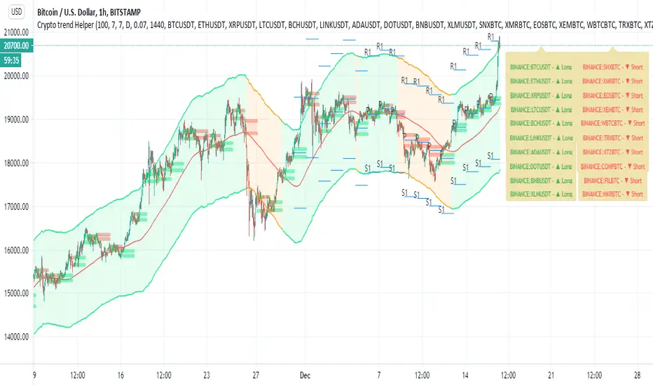
Crypto trend HelperThis is a good tool for chart 2 hours and bellow
the screener script taken from //script taken from with his consent.
long and short determine by my script Trend M version 1
it set up to daily MTF so if it above the mean it green or buy,bellow it it sell
R1 and S1 by percentage from mean set to 7 % or 0.07
the channel is percentage channel set to 7 % up or low
the color of this channel set by
it function to see long trends
you can modify the alts inside the script or in menu\
thanks for Zekis for it help in the screener
Cari dalam skrip untuk "crypto"
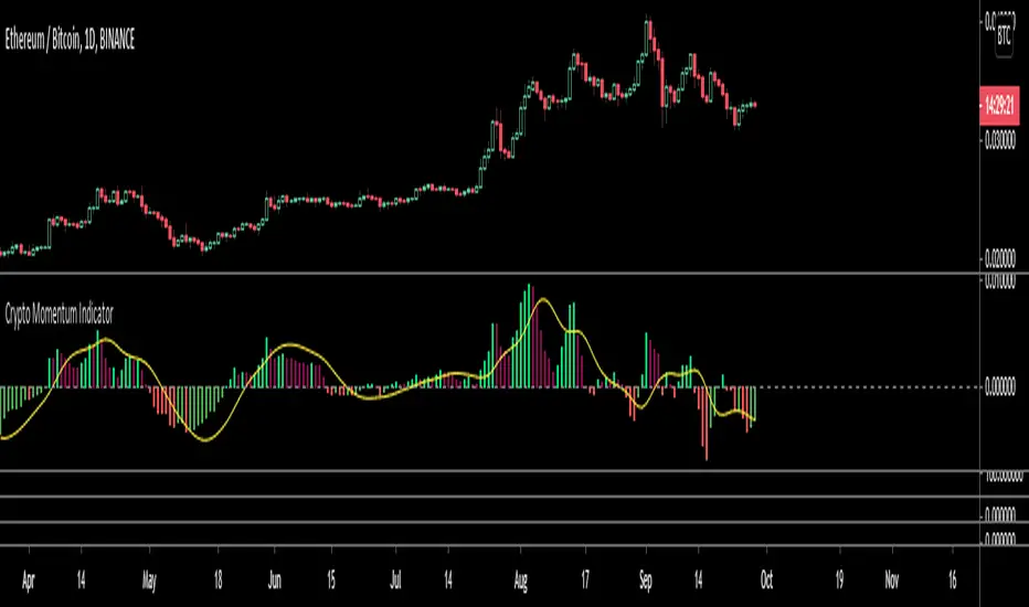
Crypto Momentum IndicatorThis oscillator uses a bitcoin weighted moving average as a reference point, its set up to be run on a day chart with weekly, monthly, three monthly and yearly inputs.
It is also has a volatility multiplier for the period chosen
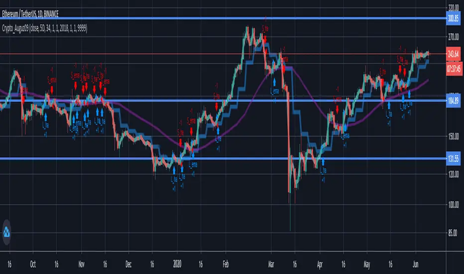
Tan_Aug09Crypto pairs: ETH/USDT
Time-frame: D1
Based on Heikin Ashi Candle and Exponential Moving Average Indicators
Crypto pick: 5D
Stock pick: 8D
Best work in strong trend.
Recommend using with trend line .
CryptOli 3 MAs long/short Backtest// this is an educational Script - basicly its very simple - you can see how minimal changes impact results, thats why i posted it
// Credits to Quantnomad to publish tons of free educational script
// this Script is based on Quantnomads Ultimate MA Indicator
// HA - Option for calcultion based on HA-Candles (very famous recently)
// Source Input - Option (Candletype for calculation, close, ohlc4 ect.) --- there are huge differences --- try it by your own

Golden Ratio Multiplier: Multiplied Moving AveragesThe script for plotting DMAs from the study made by @PositiveCrypto (twitter)

Golden Ratio Multiplier: Multiplied Moving AveragesMultiplied moving averages script visualizing the study made by @PositiveCrypto (twitter).

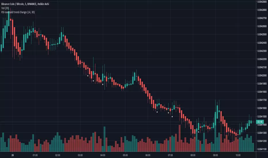
RSI oversold trend changeSimple script that will plot a circle indication on the chart when RSI returns above 30 from oversold position.
Also allows you to create a custom alert.
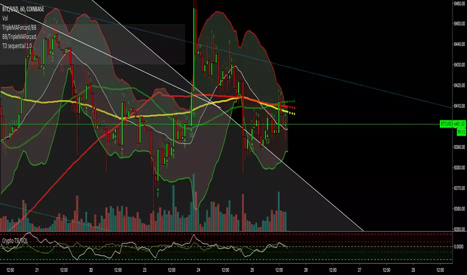
Crypto TSI/VOLSo guys i added the vol to this indicator and i have started to notice patterns in the two duing big moves check it out let me know your thoughts

wz_Kripto Index RSI[WOZDUX]Crypto RSI. On the basis of crypto-index is created, the indicator for the study of cryptocurrencies (KRIN). The wt indicator (this is a modified and improved CCI indicator) is superimposed on the crypto index. The indicator (SIN_WT) shows the speed of movement of the crypto index (blue line) and the speed of movement of the local cryptocurrency price (red line), which is loaded into the window. Thus, the local currency in relation to the crypto community is studied.


TrippleMACDCryptocurrency Scalping Strategy for 1m Timeframe
Introduction:
Welcome to our cutting-edge cryptocurrency scalping strategy tailored specifically for the 1-minute timeframe. By combining three MACD indicators with different parameters and averaging them, along with applying RSI, we've developed a highly effective strategy for maximizing profits in the cryptocurrency market. This strategy is designed for automated trading through our bot, which executes trades using hooks. All trades are calculated for long positions only, ensuring optimal performance in a fast-paced market.
Key Components:
MACD (Moving Average Convergence Divergence):
We've utilized three MACD indicators with varying parameters to capture different aspects of market momentum.
Averaging these MACD indicators helps smooth out noise and provides a more reliable signal for trading decisions.
RSI (Relative Strength Index):
RSI serves as a complementary indicator, providing insights into the strength of bullish trends.
By incorporating RSI, we enhance the accuracy of our entry and exit points, ensuring timely execution of trades.
Strategy Overview:
Long Position Entries:
Initiate long positions when all three MACD indicators signal bullish momentum and the RSI confirms bullish strength.
This combination of indicators increases the probability of successful trades, allowing us to capitalize on uptrends effectively.
Utilizing Linear Regression:
Linear regression is employed to identify consolidation phases in the market.
Recognizing consolidation periods helps us avoid trading during choppy price action, ensuring optimal performance.
Suitability for Grid Trading Bots:
Our strategy is well-suited for grid trading bots due to frequent price fluctuations and opportunities for grid activation.
The strategy's design accounts for price breakthroughs, which are advantageous for grid trading strategies.
Benefits of the Strategy:
Consistent Performance Across Cryptocurrencies:
Through rigorous testing on various cryptocurrency futures contracts, our strategy has demonstrated favorable results across different coins.
Its adaptability makes it a versatile tool for traders seeking consistent profits in the cryptocurrency market.
Integration of Advanced Techniques:
By integrating multiple indicators and employing linear regression, our strategy leverages advanced techniques to enhance trading performance.
This strategic approach ensures a comprehensive analysis of market conditions, leading to well-informed trading decisions.
Conclusion:
Our cryptocurrency scalping strategy offers a sophisticated yet user-friendly approach to trading in the fast-paced environment of the 1-minute timeframe. With its emphasis on automation, accuracy, and adaptability, our strategy empowers traders to navigate the complexities of the cryptocurrency market with confidence. Whether you're a seasoned trader or a novice investor, our strategy provides a reliable framework for achieving consistent profits and maximizing returns on your investment.

Smart Money Structure FilterEnglish Description
Overview
Smart Money Structure Analyzer is a professional trading tool that implements Smart Money Concepts (SMC) to identify key market structure shifts, Break of Structure (BOS), and Change of Character (CHoCH) patterns. This indicator helps traders follow the "smart money" flow by detecting institutional order flow patterns on any timeframe.
Key Features
Swing Point Detection - Identifies significant highs and lows using fractal-based logic
Market Structure Analysis - Classifies market conditions as Uptrend, Downtrend, or Consolidation
Break of Structure (BOS) - Detects when price breaks key structural levels
Change of Character (CHoCH) - Identifies potential trend reversals
Mitigation Levels - Shows potential retracement targets after structure breaks
How It Works
The indicator analyzes price action through several layers:
Swing Detection Algorithm
Uses a configurable swing period (3-21 bars)
Identifies valid swing highs and lows that are confirmed by surrounding price action
Stores the last 20 swings for structure analysis
Structure Determination
Uptrend: Higher Highs (HH) + Higher Lows (HL)
Downtrend: Lower Lows (LL) + Lower Highs (LH)
Consolidation: Mixed structure or ranging market
Break of Structure (BOS) Logic
Bearish BOS: Price closes below the last confirmed Higher Low (HL)
Bullish BOS: Price closes above the last confirmed Lower High (LH)
Change of Character (CHoCH) Logic
Bearish CHoCH: After a bearish BOS, price forms a Lower Low (confirms trend reversal)
Bullish CHoCH: After a bullish BOS, price forms a Higher High (confirms trend reversal)
Mitigation Levels
Calculates potential retracement levels after BOS (typically ±0.2% from broken structure)
Visual Elements
Fractals: Swing points (optional display)
Structure Lines: Last Higher Low (blue) and Last Lower High (purple)
BOS Signals: Triangles marking structure breaks
CHoCH Signals: Circles confirming trend changes
Mitigation Levels: Dotted orange lines for potential retracements
Info Label: Real-time structure status and key levels
Alerts
The indicator provides alerts for:
Break of Structure (BOS) events
Change of Character (CHoCH) confirmations
Settings
Swing Period: Sensitivity of swing detection (default: 3)
Show Fractals: Toggle swing point markers
Show Structure Lines: Display key structure levels
Show Break of Structure: Display BOS signals
Show Change of Character: Display CHoCH signals
Show Mitigation Levels: Display retracement levels
Best Practices
Use on higher timeframes (1H+) for more reliable signals
Combine with volume analysis for confirmation
Wait for CHoCH confirmation before entering trades
Use mitigation levels as potential entry zones
Русское описание
Обзор
Smart Money Structure Analyzer - профессиональный торговый инструмент, реализующий концепции Smart Money (SMC) для определения ключевых сдвигов рыночной структуры, Break of Structure (BOS) и Change of Character (CHoCH). Индикатор помогает отслеживать поток "умных денег", выявляя паттерны институционального ордерного потока на любом таймфрейме.
Ключевые возможности
Определение свингов - Выявляет значимые максимумы и минимумы с помощью фрактальной логики
Анализ структуры рынка - Классифицирует состояние рынка: Восходящий тренд, Нисходящий тренд или Консолидация
Break of Structure (BOS) - Обнаружение пробития ключевых уровней структуры
Change of Character (CHoCH) - Определение потенциальных разворотов тренда
Уровни митигации - Показывает потенциальные цели отката после пробоя структуры
Принцип работы
Индикатор анализирует ценовое действие через несколько уровней:
Алгоритм определения свингов
Использует настраиваемый период свинга (3-21 свечи)
Определяет валидные максимумы и минимумы, подтвержденные окружающим движением цены
Сохраняет последние 20 свингов для анализа структуры
Определение структуры
Восходящий тренд: Higher Highs (HH) + Higher Lows (HL)
Нисходящий тренд: Lower Lows (LL) + Lower Highs (LH)
Консолидация: Смешанная структура или флет
Логика Break of Structure (BOS)
Медвежий BOS: Цена закрывается ниже последнего Higher Low (HL)
Бычий BOS: Цена закрывается выше последнего Lower High (LH)
Логика Change of Character (CHoCH)
Медвежий CHoCH: После медвежьего BOS формируется Lower Low (подтверждает разворот)
Бычий CHoCH: После бычьего BOS формируется Higher High (подтверждает разворот)
Уровни митигации
Расчет потенциальных уровней отката после BOS (обычно ±0.2% от сломанной структуры)
Визуальные элементы
Фракталы: Точки свингов (опционально)
Линии структуры: Последний Higher Low (синий) и последний Lower High (фиолетовый)
Сигналы BOS: Треугольники, отмечающие пробой структуры
Сигналы CHoCH: Круги, подтверждающие изменение тренда
Уровни митигации: Пунктирные оранжевые линии для потенциальных откатов
Инфо-метка: Статус структуры и ключевые уровни в реальном времени
Оповещения
Индикатор предоставляет алерты для:
Событий Break of Structure (BOS)
Подтверждений Change of Character (CHoCH)
Настройки
Период свинга: Чувствительность определения свингов (по умолчанию: 3)
Показывать фракталы: Включение/выключение маркеров свингов
Показывать линии структуры: Отображение ключевых уровней структуры
Показывать Break of Structure: Отображение сигналов BOS
Показывать Change of Character: Отображение сигналов CHoCH
Показывать уровни митигации: Отображение уровней отката
Рекомендации по использованию
Используйте на старших таймфреймах (1H+) для более надежных сигналов
Комбинируйте с анализом объема для подтверждения
Ждите подтверждения CHoCH перед входом в сделку
Используйте уровни митигации как потенциальные зоны входа
Технические особенности
Максимальное количество меток: 500
Работает на любых таймфреймах
Не перерисовывает прошлые сигналы
Эффективно использует ресурсы благодаря ограничению хранения свингов
Индикатор предназначен для трейдеров, работающих с Price Action и концепциями Smart Money, и помогает систематизировать анализ рыночной структуры в соответствии с подходами институциональных трейдеров.

Mission Control Dashboard (AI, Crypto, Liquidity)Description: Mission Control Dashboard (AI, Liquidity) is a comprehensive macro-liquidity and cycle-analysis dashboard designed to track the "Flow of Funds" across traditional and crypto markets. Instead of looking at price action alone, this script monitors the fundamental "plumbing" of the global economy.
Key Metrics Tracked:
The Debt Wall: Monitors the US 10Y Yield and TLT price. It signals a "Critical" state if yields spike above 5% or TLT drops below $80, indicating high stress in the bond market.
Global Liquidity (MTF Stable): A proprietary calculation summing the balance sheets of the FED, ECB, BoJ, and PBoC, plus Stablecoin market cap. It calculates the Rate of Change (ROC) to see if the world is "printing" or "draining" money.
TGA Hidden Fuel: Tracks the Treasury General Account. A falling TGA is often bullish for risk assets as it injects liquidity into the banking system.
Universal Alt Season: Monitors TOTAL3 (Crypto market cap excluding BTC & ETH) for parabolic moves (>30% ROC).
AI Infra Capex: Real-time tracking of Capital Expenditures from MSFT, GOOG, AMZN, and META to gauge the health of the AI cycle.
How to use:
Green Status across the board: High probability for "Risk-On" environments (Alt season, Tech rallies).
Strategic Beta vs. Tactical Alpha: If Beta is draining but Alpha is accelerating, it suggests a "False Breakout" or a divergence in liquidity.
Uranium Trend: Used as a proxy for the energy transition and long-term industrial cycle strength.

Leswin Ribbon + Levels + Hybrid (Stocks/Crypto) v1Leswin Ribbon Signals
A trend-based momentum indicator built for day traders and scalpers. Uses an EMA ribbon, higher-timeframe trend filtering, and volatility conditions to highlight high-probability BUY and SELL zones while avoiding choppy markets.
Optimized for 5m & 15m entries, especially for SPY, QQQ, DIA, IWM, and large-cap stocks, but works on all markets including crypto and forex.
Non-repainting. Best used as a confirmation tool alongside your own levels and risk management.

Crypto Breadth - MAK% of top 100 Alts above 50 and 200 day moving averages, excluding BTC, ETH, Stables, LSTs
xrp, bnb, sol, doge, trx, ada, xlm, sui, bch, link, hbar, avax, uni, shib, ton, ltc, dot, pepe, aave, ondo, tao, wld, arb, near, icp, fil, etc, trump, op, pol, ena, render, bonk, xmr, zec, hype, mnt, sky, pump, ip

Crypto Accumulation Candle FinderThis indicator give you long entry signal to dectect MM's entry time.
it's recommended to use it in 5min. time frame.

Crypto 1H [Universal - Strict + R:R]Overview This indicator is a trend-following strategy designed specifically for the 1-hour timeframe (though it works universally). It focuses on high-probability "pullback" entries within an established trend.
What distinguishes this script from standard trend indicators is the integrated Risk:Reward (R:R) Pre-Filter. Before generating a signal, the script calculates the distance to the logical Stop Loss and the logical Take Profit (Resistance/Support). If the trade does not offer a minimum Risk-to-Reward ratio (default 1:2), the signal is suppressed.
How It Works
The strategy follows a strictly defined logical flow:
1. Trend Identification The script uses a Baseline EMA (Default: 50) to determine the trend.
Long: Price is above the 50 EMA, and the 50 EMA is sloping up.
Short: Price is below the 50 EMA, and the 50 EMA is sloping down.
2. The Pullback & Trigger Once a trend is identified, the script waits for price to pull back to the "Trigger" EMA (Default: 21).
The Wait Window: The script utilizes a "Max Wait Bars" logic. Once the price touches the Trigger EMA, it listens for an entry signal for exactly 3 bars. If price lingers too long without reacting, the setup is invalidated to avoid chopping markets.
3. The Risk:Reward Filter (Crucial) This is the final gatekeeper. Even if the trend and candle shape are perfect, the script performs a geometric check:
Stop Loss Calculation: Determined by the lowest low (for longs) or highest high (for shorts) of the last 5 bars, plus a small ATR buffer.
Target Calculation: Determined by the highest high or lowest low of the last 24 bars (local Support/Resistance).
The Math: If the distance to the Target is not at least 2.0x the distance to the Stop Loss, the trade is skipped. This prevents buying right into resistance or selling right into support.
Indicator Features & Settings
Session Filter: Defaults to London and NY sessions (UTC) to ensure volume is present.
Volatility Filter: Requires the signal candle to have a minimum body size (0.15% of price) to avoid "doji" or low-momentum entries.
Visuals:
White Line: 50 EMA (Trend)
Yellow Line: 21 EMA (Momentum Trigger)
Labels: Green (Long) and Red (Short) entry markers.
Red Crosses: These indicate exactly where the suggested Stop Loss was located at the moment of entry.
Risk Disclaimer This tool is designed for educational and analytical purposes. The "Strict R:R" filter does not guarantee profit; it simply filters out setups that mathematically do not fit the specified ratio based on historical price action. Always perform your own analysis.

Crypto Camp Day Key LevelsDaily key levels Daily key levels Daily key levels Daily key levels Daily key levels Daily key levels

Crypto 15M Volume + Supertrend + RSI StrategyThis is AI generated Signal Base on Supertrend, RSI, And Volume Base indicator to create code
