Full CRYPTO pack macd, rsi, obv, ema strategyThis is a simple, yet very efficient crypto strategy, adapted to 4h time frame, on big coins like ETH and BTC. However it can be adapted to other markets, timeframes etc
For this strategy I use a combination of a trend line, an oscillator, price action and volume.
This strategy has both the opportunity to go long and short.
As well, it has a leverage simulator .
The rules are the next ones:
Long : we check that current candle is ascending and above the moving average, the macd is in positive range, rsi is below overbought level and volume is bigger than the moving avg of volume.
For short, we have the opposite long rules.
If you have any questions, please let me know !
Cari dalam skrip untuk "crypto"

Ark Crypto HeatlineThis is the 'on chart' indicator. See also "Ark Crypto Heatband" indicator for a side-by-side BTC view, without a re-scaled line.
The crypto landscape is largely dominated by BTC and characterised by cyclical stages with varying degrees of mean reversion.
To understand what stage of the cycle we are currently experiencing, it is useful to examine to what degree the current price has extended beyond the long term average that BTC has established. This is true even when analysing other crypto assets as BTC is the dominant force in the crypto asset class.
This indicator uses the 1400 period daily SMA , which is broadly the 200 period weekly SMA. This can be configured, but historically has represented a baseline to which BTC commonly returns.
The graph plots current price in terms of multiples of this long term average. Traditionally, at multiples beyond 10, BTC is considered overextended with a higher likelihood of trending towards the mean thereafter. Colors indicate the extent of price extension.
Where the indicator is applied to non BTCUSD pairs, a smoothed conversion is applied, seeking to superimpose the BTC long period SMA onto the current chart.
The indicator specifically references BTC by default on all charts, as it is designed to use BTC as general purpose indication of where crypto as a whole currently sits. Accordingly the indicator is only to be used on crypto charts.
For best results on BTC, using BNC:BLX will give the longest historical view.
Ark Crypto HeatbandThe crypto landscape is largely dominated by BTC and characterised by cyclical stages with varying degrees of mean reversion.
To understand what stage of the cycle we are currently experiencing, it is useful to examine to what degree the current BTC price has extended beyond a long term average. This is true even when analysing other crypto assets and helpful to view side by side.
This indicator uses the 1400 period daily SMA, which is broadly the 200 period weekly SMA. This can be configured, but historically has represented a baseline to which BTC commonly returns.
The graph plots current price in terms of multiples of this long term average. Traditionally, at multiples beyond 10, BTC is considered overextended with a higher likelihood of trending towards the mean thereafter. Colors indicate the extend of price extension.
The indicator specifically references BTC by default on all charts as it is designed to use BTC as general purpose indication of where crypto as a whole currently sits. Accordingly the indicator is only to be used on crypto charts.

Ichimoku Crypto LONG 3h ANY CRYPTO PairThis is a strategy which works with most of the crypto pairs on the 3H time frames.
It beats easily on the long term buy and hold strategy.
This strategy is made from the baseline from ichimoku together with ema 200
This is a long only strategy.
THe condition is : our candle is above ema 200 and our ichimoku its telling we have a long trend. We exit on the opposite signal.
If you have any questions private message me !

Best Crypto DEMA Strategy Long onlyThis is a crypto strategy suited for big time frames like 3h+.
THIS IS A LONG ONLY STRATEGY , SUITED TO BEAT BUY AND HOLD !
It's a very risky strategy because it has no stop loss at all, so be extremely careful with it.
This strategy is made of 2 DEMA a fast and a slow one.
We have two rules : entry it's when we have a crossunder between the slow DEMA and the fast DEMA. We exit when the opposite happens, in this case, when the slow is above fast.
For this example I used an initial capital of 1000 eur, using 100% of it always, and a commission of 0.2% per each deal.
Simple and efficient MACD crypto strategy with risk managementToday I am glad to bring you another great creation suited for crypto markets.
MARKET
Its a simple and efficient strategy, designed for crypto markets( btcusd , btcusdt and so on), and suited for for higher time charts : like 1hour, 4hours, 1 day and so on.
Preferably to use 1h time charts.
COMPONENTS
MACD with simple moving average
ENTRY DESCRIPTION
For entries we have :
We check the direction with MACD . Depending if its an uptrend and positive level on histogram of MACD we go long, otherwise we go short.
RISK MANAGEMENT
In this strategy we use a stop loss based on our equity. For this example I choosed a 2% risk .That means if our account has 100.000 eur, it will automatically close the trade if we lose 2.000.
We dont use a take profit level.
In this example also we use a 100.000 capital account, risking 5% on each trade, but since its underleveraged, we only use 5000 of that ammount on every trade. With leveraged it can be achieved better profits and of course at the same time we will encounter bigger losses.
The comission applied is 5$ and a slippage of 5 points aswell added.
For any questions or suggestions regarding the script , please let me know.

High/low crypto strategy with MACD/PSAR/ATR/EWaveToday I am glad to bring you another great creation of mine, this time suited for crypto markets.
MARKET
Its a high and low strategy, designed for crypto markets( btcusd , btcusdt and so on), and suited for for higher time charts : like 1hour, 4hours, 1 day and so on.
Preferably to use 1h time charts.
COMPONENTS
Higher high and lower low between different candle points
MACD with simple moving average
PSAR for uptrend and downtrend
Trenddirection made of a modified moving average and ATR
And lastly elliot wave oscillator to have an even better precision for entries and exits.
ENTRY DESCRIPTION
For entries we have : when the first condition is meet(we have a succession on higher high or lower lows), then we check the macd histogram level, then we pair that with psar for the direction of the trend, then we check the trend direction based on atr levels with MA applied on it and lastly to confirm the direction we check the level of elliot wave oscillator. If they are all on the same page we have a short or a long entry.
STATS
Its a low win percentage , we usually have between 10-20% win rate, but at the same time we use a 1:30 risk reward ratio .
By this we achieve an avg profit factor between 1.5- 2.5 between different currencies.
RISK MANAGEMENT
In this example, the stop loss is 0.5% of the price fluctuation ( 10.000 -> 9950 our sl), and tp is 15% (10.000 - > 11500).
In this example also we use a 100.000 capital account, risking 5% on each trade, but since its underleveraged, we only use 5000 of that ammount on every trade. With leveraged it can be achieved better profits and of course at the same time we will encounter bigger losses.
The comission applied is 5$ and a slippage of 5 points aswell added.
For any questions or suggestions regarding the script , please let me know.
Long/Short Margin Ratio for cryptocurrenciesBTCUSDSHORTS and BTCUSDLONGS are like datasets provided by Bitfinex exchange. They record the number of margined for longs and shorts and they are measured in BTC (in case using BTCUSD ).
Margin is Like any loan, the borrower may pay interest while the loan is outstanding, and must eventually pay the loan back.
Red Area: More short margin than long margin.
Green Area: More long margin than short margin.
Note: Can only be used with cryptocurrencies that have such dataset within Bitfinex exchange like BTCUSD , ETHUSD , XRPUSD and a few more.
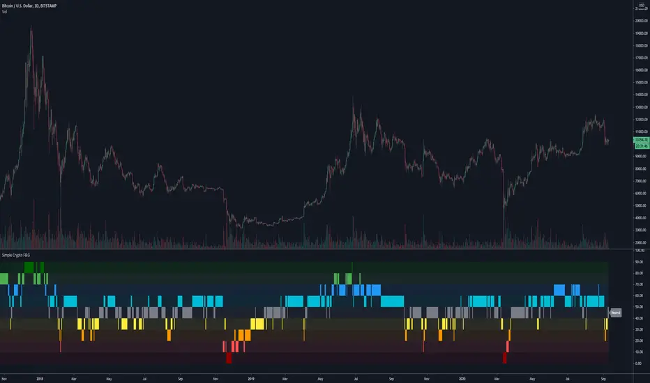
Simplified Crypto Fear & Greed DisplayA more simplified view of a Fear & Greed index.
This script has been made public because it uses Trading Psychology - Fear & Greed Index by DGT as the basis/inspiration for it.
I've re-imagined the visuals in order to display F&G data differently to the more traditional versions of the indicator floating around, as well as adapting it's calculations and reference assets for use with Crypto markets.
It's aim is to show the current status / mindset of market participants at a quick glance.
When there is a lot of fear in the market it is usually a good time to look for buying opportunities.
On the flip side you can use it to spot selling opportunities when there is too much greed / FOMO in the markets.
This indicator has the option for Traditional and Crypto markets.
The Traditional option uses the tickers VIX and GOLD as part of it's calculations, where as Crypto uses BVOL24H and BTC.D in order to base it's decisions off of more relevant data.
There are also 10 levels of smoothing so play around with that to get the desired result. Depending on the asset you are looking at, smoothing of 1 or 2 may work much better than 5+
Have a play around, customize it, use it and let me know what you think.
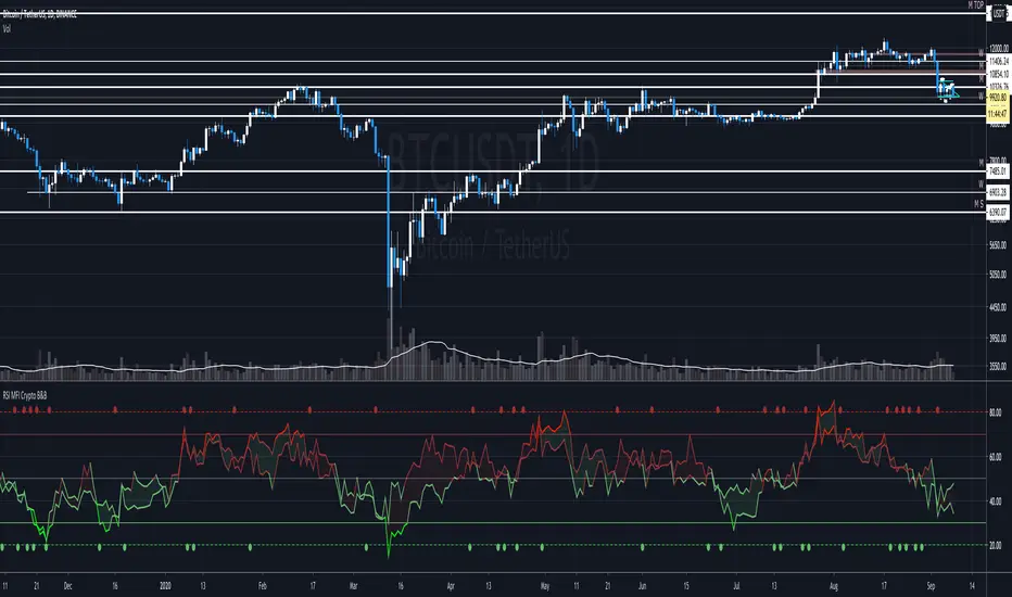
RSI + MFI - Crypto Bull and Bear market A fancy styled version of the RSI (Relative Stochastic Index) + MFI (Money Flow Index) oscillators in order to emphasize buy and sell opportunities.
The 80 and 20 Bands are meant to be used in Bull or Bear markets. Better performing in D timeframes.
The circles represent the cross between RSI and MFI .
Designed for Crypto Markets
Thanks @micheleprandina
Credits:
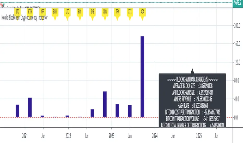
Noldo Blockchain Cryptocurrency Indicator
Hello, this script has the same logic as Noldo CFTC COT Forex Indicator :
And Noldo CFTC COT Commodities Indicator :
*
Script briefly calculates the period length between two signals of Pivot Reversal Strategy when new signal arrives and allows us to see relative Blockchain data and price changes of Major Cryptocurrencies over that automatic length.
This saves us from the hassle and time wasting of searching for a reference point.
Usage
This script works only on all Bitcoin / U.S Dollar pairs and futures.
It only works on 1W graphics.
ICOT data are pulled via Quandl
NOTE :
Since blockchain data is very votalile, 7-day ema values are adjusted to take into account.
Regards.
Crypto Trader X Candelstick PatternsCrypto Trader X Candelstick Patterns
this andicator contain all candelstick patterns
Bullish & Berash Engulf Candel, Doji & Dragonfly Doji Candel, Hammer Candel, Hanging Man Candel
inverted Hammer Candel, Shooting Star Candel, Marabuzo black & White Candel, Spinning top black & White candel
Abandoned Baby Bearish, Abandoned Baby Bullish, Gravestone Doji Candel, Harami Bearish Candel, Harami Bullish Candel
Kicking Bearish Candel, Kicking Bullish Candel, Long Lower Shadow Bullish Candel, Long Lower Shadow Bearish Candel
Morning Star, Three White Soldiers, Three Black Crows, Tri-Star Bearish & Bullish, Engulf bar color, Reversal bar , bar color
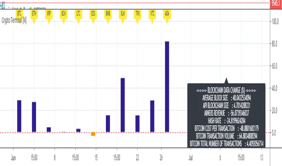
Basic Cryptocurrency TerminalHello,
This script is a simple Cryptocurrency Terminal.
It serves the same purpose as Heatmaps.
You can also set the period to look back manually in the menu.
Major Cryptocurrencies are taken into account.
And various Blockchain data are shown in the information panel.
In this way, an idea can be obtained about Cryptocurrency Market.
It is visually more convenient and clear to use in an indicator window under the chart, not on the chart, as follows:
Regards.
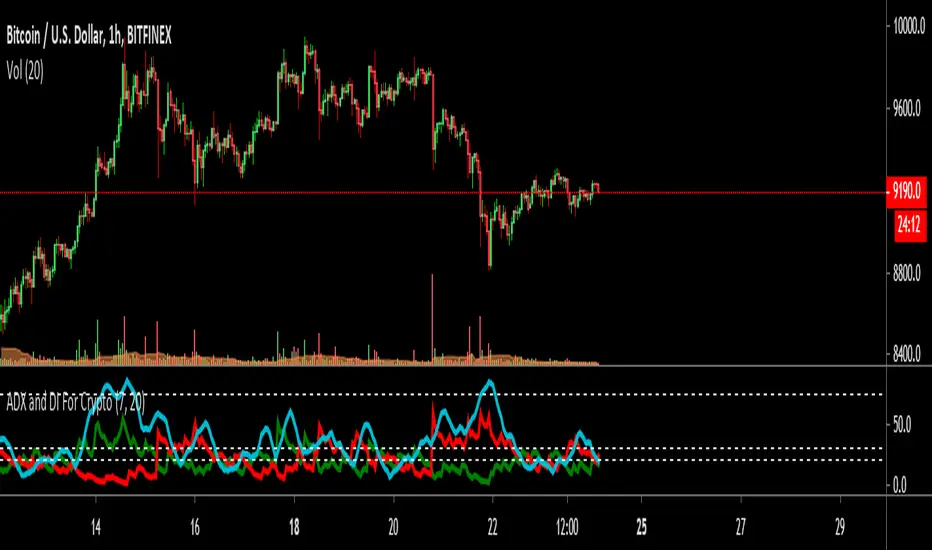
ADX and DI For Cryptocustomized version to add my favourite settings for crypto
Best time frame is daily followed by 4H
ADX Near 20 or less means trend is choppy and weak
ADX Cross over 30 means trend is starting to gain momentum
ADX Near 75 means momentum is near maximum, trend needs to rest for a while ( The area between 70~90 )
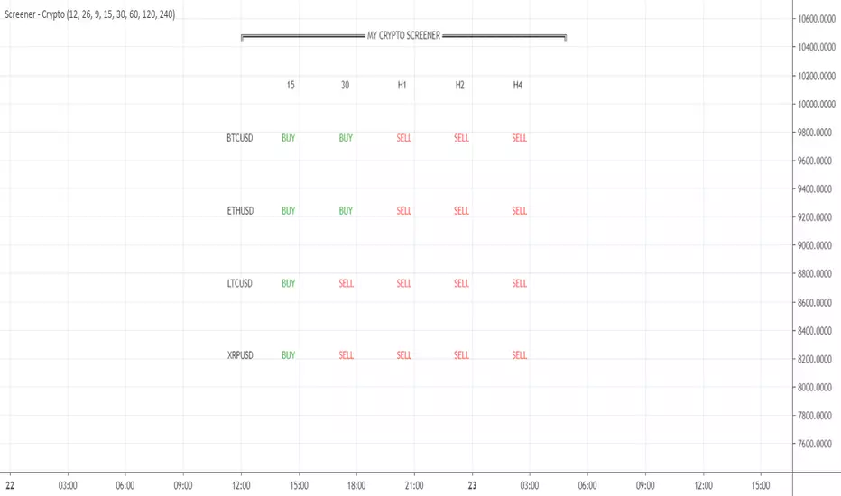
Your CRYPTO Screener - MACD 0 LAG editionHello traders
What's good?
1 - Quick introduction
This script is to demonstrate a proof-of-concept - showing you again what you thought wasn't possible might become (with some tricks) in the realm of possibles !!!.
I get requests for people who want a custom screener because the native TradingView Stocks/Forex/Crypto screeners don't allow to plug external indicators. (example: www.tradingview.com
This is entirely true and I have also good news for you, we can hack the system one more time. As Hackerman would say, "IT"S HACKING TIME !!!" (ref : KUNG FURY . (#geek #reference #done #for #today)
What if you could build your own personalized screener based on your custom indicator? "No Dave stop smoking, that's not possible, go back to eating your baguette". Say no more, let me present you my new script called YOUR CRYPTO Screener (MACD 0 LAG)
2 - What is a MACD ZERO LAG?
We'll all agree this indicator is NOT in the TradingView screeners so I'm not cheating here :)
A MACD ZERO LAG is a MACD that .... suspens.... wait for it.... DOES NOT lag.
The traditional MACD is based on exponential moving averages and as moving averages are lagging, then the MACD is lagging also. I'll spare you all the maths behind the MACD ZERO LAG but in short, this is a way more reactive indicator than the traditional MACD
I shared before the version that I personally use for my own trading : MACD 0 LAG nTREND coloring
3 - Crypto Screener specifications
If I could do a screener as complete as the native one, this would be wonderful but ... we cannot and this is due to technical reasons. To call indicators from different timeframes, I have to use the security function. And we're limited to 40 security calls per indicator.
That explains why I selected 4 crypto assets and 5 timeframes and the MACD zero lag output for each asset/timeframe - which gives a total of 4 * 5 * 2 = 40
You'll be able to select from the interface the 5 timeframes that you want for your screener
In this script, you'll get a :
- BUY whenever the MACD ZERO LAG for your asset/timeframe is green.
- SELL whenever the MACD ZERO LAG for your asset/timeframe is red.
4 - Can you hack it even more?
If you want to add other timeframes or assets, you can either, change the code or add the indicator on another chart.
I made the source code generic enough so that you can update it yourself easily
Example:
Chart 1 will list BTCUSD, ETHUSD, LTCUSD, and XRPUSD in m5/m15/m30/H1/H4 and Chart2 could list BTCUSD, ETHUSD, LTCUSD and XRPUSD in H6/H8/H12/Daily, etc...
Once again the sky (and your computer RAM capacity) is the limit
5 - Can you super hack it even more?
1/ This script is only a proof-of-concept that you can build your own custom screener. Imagine having the Algorithm Builder and being able to connect it in a single click to a custom screener using your own configuration :)
How coooooooooooooooool would that be!!!
This screener version will be available on my website in a few weeks along with all the tools I'm spamming you about since the beginning of July (#shameless #self-advertising)
2/ For a nicer scripter, let's keep in mind that TradingView just enabled Webhooks this week. This will allow my company to offer custom screeners design and hosted on your own website. Those screeners will be for sure nicer than the indicator version
That's it for today and for this week
I won't even touch the laptop this weekend and will enjoy life a bit
Love you all
Dave
____________________________________________________________
Be sure to hit the thumbs up. Building those indicators take a lot of time and likes are always rewarding for me :) (tips are accepted too)
- If you want to suggest some indicators that I can develop and share with the community, please use my personal TRELLO board
- I'm an officially approved PineEditor/LUA/MT4 approved mentor on codementor. You can request a coaching with me if you want and I'll teach you how to build kick-ass indicators and strategies
Jump on a 1 to 1 coaching with me
- You can also hire for a custom dev of your indicator/strategy/bot/chrome extension/python
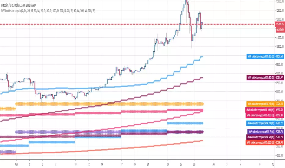
MVA collector cryptoHello Traders
This indicator draw multiple Simple Moving Averages multi-timeframes at once
I use it to define take profit zones for my crypto trading
Hope you'll like it
Enjoy
Dave
Ichimoku TK Cross > EMA200 Crypto StrategyIchimoku strategy for cryptocurrency trading.
Enters trades on bullish tenkan-kijun crosses when price is above 200 EMA which suggests a long-running bullish trend.
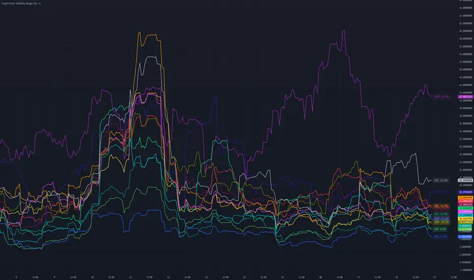
Crypto Price Volatility Range# Cryptocurrency Price Volatility Range Indicator
This TradingView indicator is a visualization tool for tracking historical volatility across multiple major cryptocurrencies.
## Features
- Real-time volatility tracking for 14 major cryptocurrencies
- Customizable period and standard deviation multiplier
- Individual color coding for each currency pair
- Optional labels showing current volatility values in percentage
## Supported Cryptocurrencies
- Bitcoin (BTC)
- Ethereum (ETH)
- Avalanche (AVAX)
- Dogecoin (DOGE)
- Hype (HYPE)
- Ripple (XRP)
- Binance Coin (BNB)
- Cardano (ADA)
- Tron (TRX)
- Chainlink (LINK)
- Shiba Inu (SHIB)
- Toncoin (TON)
- Sui (SUI)
- Stellar (XLM)
## Settings
- **Period**: Timeframe for volatility calculation (default: 20)
- **Standard Deviation Multiplier**: Multiplier for standard deviation (default: 1.0)
- **Show Labels**: Toggle label display on/off
## Calculation Method
The indicator calculates volatility using the following method:
1. Calculate daily logarithmic returns
2. Compute standard deviation over the specified period
3. Annualize (multiply by √252)
4. Convert to percentage (×100)
## Usage
1. Add the indicator to your TradingView chart
2. Adjust parameters as needed
3. Monitor volatility lines for each cryptocurrency
4. Enable labels to see precise current volatility values
## Notes
- This indicator displays in a separate window, not as an overlay
- Volatility values are annualized
- Data for each currency pair is sourced from USD pairs
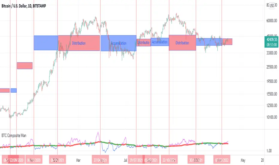
BTC Composite Man V.1Wyckoff's theory t is one of the most influential theories of market expression, and the most important components of which are lateral movement areas and trends. This theory turns the graph into something like Dots and lines (stations and paths).
After getting acquainted with Wyckoff's theory, I read several books on the subject, hoping that they could help me identify this area of lateral movement, the area of accumulation, or distribution. But there was a fundamental drawback. It is challenging to diagnose this issue. The rules discussed in these books are highly interpretive and subjective, and two different individual traders may come to exactly opposite conclusions based on their interpretation.
But as I became more familiar with the onchain analysis, an idea came to my mind that might be useful for more objectively recognizing charts based on Wyckoff's theory.
Composite Man: Wyckoff proposed a theory to help understand stock price movements. this is the “Composite Man” theory. (The same concept of whales or strong hands.)
he said: “…all the fluctuations in the market and all the various stocks should be studied as if they were the result of one man’s operations. Let us call him the Composite Man, who, in theory, sits behind the scenes and manipulates the stocks to your disadvantage if you do not understand the game as he plays it; and to your great profit if you do understand it.” (The Richard D. Wyckoff Course in Stock Market Science and Technique, section 9, p. 1-2)
Composite Man is a hypothetical man who has so much money and stocks that when he wants he can gradually increase the price by buying stocks and creating demand, and when the price goes high enough he sells his stock and lower the price. The composite man is the main player in the market. Wyckoff says that if you want to make a good profit from the market, figure out what a composite man game is.
Having a way of showing us where the Composite Man is in the market, can help us understand future trends
Who are the strong hands in the cryptocurrency market? (I use the strong hand word here instead of the composite man)
Some buy or sell more per capita than other market participants (retailers).
To understand this in the bitcoin market, I have used 3 charts and concepts:
1- Sending Addresses: The number of coins addresses making inflow transactions to the exchange.
Indicates the number of sellers' wallets (number of sellers)
2- buyers Addresses: The number of coins addresses making outflow transactions from the exchange.
Indicates the number of buyers' wallets (number of buyers)
3- Pay attention to this issue: the volume of transactions shows both the volume of sales and the buy ( Volume of buy and sale is equal in the market)
The Composite Man indicator is created by dividing the Receiving Addresses of bitcoin by the Sending Addresses. After dividing these addresses, the moving average of Alma was calculated for them and compared with the moving average of 100 days.
Considering the above 3 issues, it can be concluded:
- If the number of Receiving Addresses is higher than the Sending Addresses (the number of people who bought compared to the number of those who sold), it indicates that more people bought and fewer people sold (given that the volume of sales and buys are the same) So the sellers were stronger hands. In such a situation, the composite man is on the sales side.
- If the number of Sending Addresses is higher than the Receiving Addresses (number of people who have sold more than the number of people who have bought), it indicates that more people have been sellers and fewer people have been buyers (given that the volume of sales and buys are the same) so the buyers were stronger hands. In such a situation, the Composite man is on the buying side.
Accordingly, if the swing line is above the 100-day moving average line, it indicates that stronger addresses are being sold and retailers are buying, and vice versa.
Crypto Directional Movement Index DMI/ADXCrypto ADX + DMI
This indicator is a customised version of the ADX + DMI by J. Welles Wilder in 1978, with default settings optimal for cryptocurrencies.
What is the DMI (ADX) Indicator?
According to Investopedia:
DMI (ADX) consists of three indicators that measure a trend’s strength and direction. Three lines compose the Direction Movement Index (DMI): ADX (black line), DI+ (green line), and DI- (red line). The Average Directional Index (ADX) line shows the strength of the trend. The higher the ADX value, the stronger the trend. The color of the lines can be altered, but black, green, and red are the default in most software.
The Plus Direction Indicator (DI+) and Minus Direction Indicator (DI-) show the current price direction. When the DI+ is above DI-, the current price momentum is up. When the DI- is above DI+, the current price momentum is down.
This Version
The ADX default value has been changed to from 14 to 2 (optimal for cryptocurrencies). The background flashes red when the –DMI goes above the HZ1 threshold and green when the +DMI does the same. There is an option to change it so that it’ll only flash when the ADX and the DMI are both above the threshold. The ADX changes color when above HZ1.
Red and green plotshapes appear at DMI crossovers and three horizontal lines have also been added.
Any suggestions are most welcome

Crypto MMFCrypto MMF Indicator:
The Crypto Money Flow (MMF) indicator represents an advanced technical analysis tool specifically designed for cryptocurrency markets. This document outlines the logical foundation for its component integration, explains the synergistic mechanisms between its constituent elements, and provides practical implementation guidance without making unrealistic performance claims.
Integration Rationale
Volume-Weighted Momentum Analysis
The primary integration rationale combines price momentum with trading volume—two fundamental market dimensions frequently analyzed in isolation. Traditional momentum oscillators like RSI measure price velocity but ignore transaction volume, potentially misrepresenting conviction behind price movements. By multiplying price changes by corresponding volume, the indicator creates a conviction-weighted momentum measure that distinguishes between high-volume breakouts and low-volume price fluctuations.
The theoretical foundation for this integration stems from market microstructure theory, which posits that volume accompanies informed trading. In cryptocurrency markets—where volatility is pronounced and manipulation attempts occur—volume confirmation provides valuable filtering of meaningful price movements from noise.
Multi-Timeframe Momentum Convergence
The second integration layer incorporates higher timeframe analysis, acknowledging that markets function across temporal hierarchies. While shorter timeframes offer precision for entry and exit timing, longer timeframes establish directional bias and filter out insignificant counter-trend movements. This multi-timeframe approach follows established technical analysis principles that prioritize trend alignment across time horizons.
This integration is particularly relevant for cryptocurrency traders, as these markets exhibit strong momentum characteristics where higher timeframe trends often dominate shorter-term fluctuations. The higher timeframe component serves as both a trend filter and early warning system for momentum divergences.
Component Synergy Mechanism
Core Calculation Components
Price-Volume Integration Engine
The indicator begins by calculating the average of open, high, low, and close prices (OHLC4), providing a balanced price representation less susceptible to intra-period anomalies. This value undergoes differencing to establish direction, then multiplies by volume to create volume-weighted momentum values. This transformation produces two separate data streams: upward volume-weighted momentum and downward volume-weighted momentum.
Exponential Smoothing Application
Both momentum streams undergo exponential smoothing using Wilder's Relative Moving Average methodology. This approach applies greater weight to recent observations while maintaining memory of historical patterns, striking an optimal balance between responsiveness and noise reduction. The smoothed upward and downward momentum values create a ratio representing the relative strength between buying and selling pressure.
Normalization Process
The momentum ratio undergoes mathematical normalization to produce a bounded oscillator ranging from 0 to 100. This normalization enables consistent interpretation across different market conditions, timeframes, and cryptocurrency pairs, establishing standardized overbought and oversold thresholds.
Multi-Timeframe Synchronization System
Hierarchical Timeframe Calculation
The indicator dynamically determines appropriate higher timeframes based on user-defined multipliers and current chart intervals. This automated calculation eliminates manual timeframe selection errors while ensuring logical temporal relationships between analyzed periods.
Cross-Timeframe Data Retrieval
A secure data retrieval mechanism accesses higher timeframe momentum calculations without introducing future bias or repainting. This process maintains data integrity while enabling direct comparison between current and higher timeframe momentum conditions.
Higher Timeframe Smoothing Layer
An additional exponential moving average smooths the higher timeframe data, reducing noise and creating a stable reference signal for divergence analysis. This smoothing parameter is independently adjustable, allowing users to balance sensitivity and stability according to their trading style.
Signal Generation Framework
Threshold-Based Zone Analysis
The indicator establishes three operational zones based on statistical observations of momentum extremes:
Neutral zone (25-75): Represents balanced market conditions
Lower extreme zone (0-25): Indicates potential oversold conditions
Upper extreme zone (75-100): Indicates potential overbought conditions
These threshold levels derive from empirical observations of momentum oscillator behavior in trending and ranging cryptocurrency markets, though optimal values may vary across different market regimes.
Conditional Signal Categorization
The system monitors four distinct momentum conditions:
Initial extreme readings: Momentum enters extreme zones without confirmation
Confirmed extremes: Smoothed momentum follows into extreme zones
Multi-timeframe alignment: Current and higher timeframe momentum move in concert
Multi-timeframe divergence: Current and higher timeframe momentum diverge
Each condition category carries different interpretive implications, with stronger signals emerging when multiple conditions converge.
Practical Implementation Guidelines
Functional Applications
Trend Confirmation Protocol
When price trends directionally with momentum maintaining consistent readings above or below the midpoint (50), and higher timeframe momentum confirms the direction, this suggests sustainable trend conditions. The volume-weighting component further validates whether significant trading activity supports the price movement.
Divergence Detection Methodology
Three divergence types merit monitoring:
Classic divergence: Price reaches new extremes while momentum fails to confirm
Hidden divergence: Price retraces within a trend while momentum suggests trend continuation
Timeframe divergence: Momentum moves opposite directions across timeframes
Divergence analysis proves most reliable when occurring in conjunction with other technical factors such as support/resistance levels or chart patterns.
Zone-Based Risk Assessment
The oscillator's bounded nature facilitates structured risk assessment:
Extreme zone entries: Higher potential reward but require confirmation
Neutral zone movements: Lower signal clarity but potentially favorable risk-reward ratios
Zone transitions: Often precede accelerated price movements
Parameter Configuration Philosophy
Core Parameter Settings
The default parameters balance responsiveness and reliability across diverse cryptocurrency market conditions. The 14-period calculation length aligns with conventional momentum oscillator standards, providing sufficient data for meaningful smoothing while maintaining sensitivity to recent market developments.
Multi-Timeframe Multiplier Selection
The default 3x multiplier creates meaningful temporal separation without introducing excessive lag. This multiplier proves particularly effective for swing trading horizons, though position traders may benefit from larger multipliers while shorter-term traders might reduce this value.
Smoothing Parameter Considerations
Dual smoothing parameters (primary and higher timeframe) allow independent adjustment of sensitivity. More volatile cryptocurrency pairs typically benefit from increased smoothing, while less volatile conditions may permit reduced smoothing for earlier signal generation.
Interpretation Protocol
Step 1: Momentum Context Assessment
Begin analysis by determining the current momentum context:
Absolute level relative to threshold zones
Direction and velocity of recent momentum changes
Relationship to the midpoint (50) level
Step 2: Timeframe Alignment Evaluation
Compare current and higher timeframe momentum:
Confirm directional alignment for trend trading
Identify divergences for potential reversal scenarios
Assess convergence strength for position sizing decisions
Step 3: Volume Confirmation Analysis
Evaluate whether recent volume patterns support momentum readings:
Extreme momentum with declining volume: Caution warranted
Neutral momentum with increasing volume: Potential breakout precursor
Confirmed momentum with expanding volume: Higher conviction signal
Step 4: Market Context Integration
Correlate momentum readings with broader market context:
Correlated cryptocurrency movements
Overall market capitalization trends
Relevant news or fundamental developments
Originality and Differentiation
Innovative Design Elements
Volume-Integrated Momentum Calculation
Unlike conventional momentum oscillators that analyze price in isolation, this indicator integrates volume as a conviction multiplier. This integration follows logical market principles where volume validates price movements, creating a more robust momentum assessment particularly valuable in cryptocurrency markets where volume manipulation attempts occasionally occur.
Dynamic Timeframe Adaptation
The automated timeframe calculation system eliminates manual timeframe selection while ensuring logical temporal relationships. This approach reduces user error and maintains consistency across different charting intervals and trading instruments.
Multi-Layer Confirmation Framework
The indicator employs three analytical layers: raw momentum, smoothed momentum, and higher timeframe momentum. This layered approach provides graduated confirmation levels, allowing traders to distinguish between preliminary signals and confirmed conditions.
Theoretical Foundations
The indicator's design incorporates elements from multiple technical analysis disciplines:
Momentum analysis principles from oscillator theory
Volume-price relationships from market microstructure
Multi-timeframe analysis from hierarchical trend theory
Statistical normalization from quantitative analysis
This interdisciplinary approach creates a comprehensive tool addressing multiple dimensions of market analysis rather than focusing on isolated phenomena.
Risk Management Integration
Signal Quality Assessment
The indicator facilitates signal quality evaluation through multiple confirmation requirements:
Primary momentum extreme reading
Smoothed momentum confirmation
Higher timeframe alignment or constructive divergence
Supporting volume characteristics
Signal strength varies with the number of confirmed elements, enabling proportionate position sizing and risk allocation.
False Signal Mitigation
Several design elements reduce false signal susceptibility:
Volume-weighting filters low-conviction price movements
Exponential smoothing reduces noise-induced fluctuations
Multi-timeframe analysis filters counter-trend movements
Graduated confirmation requirements prevent premature action
These mechanisms collectively improve signal reliability while acknowledging that no technical indicator eliminates false signals entirely.
Implementation Considerations
Cryptocurrency Market Specificity
The indicator incorporates design elements particularly relevant to cryptocurrency markets:
24/7 market operation accommodation
High volatility regime compatibility
Volume data availability considerations
Cross-market correlation awareness
These adaptations enhance effectiveness in cryptocurrency trading environments while maintaining applicability to traditional financial markets.
Customization Guidelines
Users may adjust parameters based on:
Trading timeframe (scalping, day trading, swing trading)
Cryptocurrency pair characteristics (volatility, volume profile)
Risk tolerance and trading style
Market regime (trending, ranging, transitional)
Empirical testing across different parameter sets and market conditions provides the most reliable customization guidance.
Conclusion
The Crypto MMF indicator represents a logically integrated analytical tool combining volume-weighted momentum analysis with multi-timeframe perspective. Its component synergy creates a comprehensive market assessment framework while maintaining practical implementation feasibility. Users should integrate this tool within broader trading methodologies, combining its signals with additional technical, fundamental, and risk management considerations.
The indicator's value derives from its structured approach to market analysis rather than predictive capabilities. By providing organized information about momentum, volume relationships, and timeframe interactions, it supports informed trading decisions within appropriate risk parameters.

Crypto Dual MA Signal EditionCrypto Dual MA Signal Edition - Comprehensive Technical Analysis Indicator
Overview
The Crypto Dual MA Signal Edition is a sophisticated technical analysis indicator specifically designed for cryptocurrency markets, combining trend-following and momentum analysis systems into a unified framework. This indicator integrates multiple proven technical analysis concepts to provide comprehensive market insights while maintaining clear, actionable signals.
Integration Rationale & Component Synergy
1. Dual EMA Trend System + Stochastic RSI Convergence
Integration Basis: Trend-following indicators (EMA) work effectively when combined with momentum oscillators (Stochastic RSI) to filter false signals and confirm trend strength.
Synergy Mechanism:
The dual EMA system (12/25 periods) identifies primary trend direction
Stochastic RSI (14-period) provides overbought/oversold readings within that trend
Trend signals are only confirmed when both systems align, reducing whipsaws
EMA crossovers provide entry signals, while Stochastic RSI validates momentum
2. MA Filter Integration
Integration Basis: Longer-term moving averages act as trend filters to avoid trading against established market direction.
Synergy Mechanism:
200-period MA (configurable type: EMA/SMA/WMA) serves as trend benchmark
Long positions only triggered above 200-MA in bullish trends
Short positions only triggered below 200-MA in bearish trends
Provides multi-timeframe confirmation to intraday signals
3. Background Highlight System
Integration Basis: Visual cues enhance signal recognition and emphasize critical market conditions.
Synergy Mechanism:
Background colors highlight Stochastic RSI events without cluttering price chart
Different colors for different signal types (middle cross, overbought/oversold, level breaks)
Works in parallel with other systems, providing additional context without interference
Component Functions & Operational Principles
Core Components:
Dual EMA System
Fast EMA (12): Quick trend changes
Slow EMA (25): Confirmed trend direction
Mode: Switchable between dual EMA display and single EMA
Signal generation based on EMA positioning and consecutive bars
Stochastic RSI System
Combines RSI momentum with stochastic oscillator principles
Triple-smoothed (RSI → Stochastic → K/D smoothing)
Predefined levels: 80 (overbought), 50 (middle), 20 (oversold)
Multiple cross types for different market conditions
Signal Generation Logic
Consecutive count mechanism for trend persistence
"B" signals: Initial bullish EMA alignment
"S" signals: Initial bearish EMA alignment
Candlestick coloring for visual trend representation
Alert Systems
EMA cross alerts for major trend changes
Stochastic RSI cross alerts for momentum shifts
Separate alerts for different signal categories
Practical Usage Guidelines
For Trend Traders:
Primary Trend Identification: Use EMA positioning relative to 200-MA
Entry Timing: Wait for "B" or "S" signals confirmed by Stochastic RSI alignment
Trend Continuation: Monitor consecutive bar counts and candlestick colors
Exit Signals: Watch for opposing signals or Stochastic RSI divergence
For Range/Swing Traders:
Overbought/Oversold Levels: Stochastic RSI extremes (below 20/above 80)
Middle Crosses: Stochastic RSI crosses around 50 level
EMA Filter: Use 200-MA as support/resistance reference
Customization Options:
Adjust EMA periods for different trading styles
Modify Stochastic RSI parameters for sensitivity
Enable/disable background highlights based on preference
Select MA type and period for trend filtering
Originality & Unique Features
Distinctive Integration:
Consecutive Count System: Tracks trend persistence beyond simple crossovers
Unified Signal Display: Combines letters ("B"/"S"), candlestick colors, and background highlights
Flexible EMA Modes: Switch between dual and single EMA displays
Comprehensive Filtering: EMA alignment, MA position, and momentum confirmation
Practical Design Choices:
Color Scheme: Blue for bullish, orange for bearish (clear differentiation)
Signal Prioritization: Initial signals marked with letters, trends with colors
Multi-layer Validation: Three-tier confirmation system (EMA + Stochastic + MA filter)
Clean Visualization: Information-rich display without chart clutter
Important Disclaimers & Limitations
Realistic Expectations:
This indicator provides signals, not guarantees
All technical indicators have inherent lag
Market conditions change; no system works perfectly in all environments
Cryptocurrency markets exhibit high volatility and unpredictable behavior
Proper Usage:
Never rely solely on one indicator for trading decisions
Always use appropriate risk management and position sizing
Consider fundamental factors and market context
Test thoroughly on historical data before live implementation
Adjust parameters to match specific cryptocurrency pairs and timeframes
Development Philosophy
This indicator was developed with these principles:
Evidence-Based: Components based on widely researched technical concepts
Practical Focus: Designed for actual trading use, not theoretical perfection
User-Centric: Customizable to individual preferences and trading styles
Transparent: Clear logic without "black box" calculations
Final Recommendations
For optimal results:
Start with default parameters on major cryptocurrency pairs (BTC, ETH)
Adjust Stochastic RSI sensitivity for altcoins with different volatility profiles
Use higher timeframes (4H, Daily) for primary trend analysis
Combine with volume analysis and market structure for confirmation
Regularly review and adjust settings as market conditions evolve
The Crypto Dual MA Signal Edition provides a comprehensive toolkit for cryptocurrency analysis, but successful trading requires disciplined execution, continuous learning, and integrated risk management strategies.

Crypto Precision Signals "Crypto Precision Signals - Reliable" Script Comprehensive Documentation
This document aims to clearly and objectively explain the functional principles, design logic, and usage methods of the "Crypto Precision Signals - Reliable" Pine Script. We adhere to principles of transparency and pragmatism. All descriptions are based on publicly available technical analysis theories, and we make no promises regarding any definitive profit performance. Final trading decisions should be made independently by the user based on comprehensive market analysis.
I. Core Design Philosophy and Originality
The originality of this script lies not in creating new analytical indicators, but in constructing a decision-making framework based on multi-dimensional condition confluence and systematic risk control. Its core philosophy is: a signal from a single indicator has limited reliability, whereas signals from different analytical dimensions (trend, momentum, overbought/oversold levels, market participation) can, when converging under specific rules, potentially identify higher-probability trading environments. Furthermore, the script encourages more disciplined trading through mandatory cooldown mechanisms and visual state tracking.
II. Detailed Explanation of Integration Rationale and Synergistic Operation Mechanism
The script integrates four classic technical elements, and their selection and combination have clear logical justification:
1. Trend & Momentum Foundation Layer: MACD
Integration Rationale: MACD is a classic tool for identifying trend direction, momentum strength, and potential turning points. The crossover of its fast and slow lines is an intuitive representation of momentum change, providing the initial "action signal" for the system.
Synergistic Mechanism: In this script, a MACD golden cross or death cross is one of the primary conditions for triggering a potential buy or sell signal. It acts as the system's "engine," responsible for identifying the initiation of market momentum.
2. Overbought/Oversold & Auxiliary Trigger Layer: RSI
Integration Rationale: RSI measures the speed and magnitude of price changes to gauge overbought or oversold market conditions. It complements the trend-following MACD by providing reference points for market sentiment extremes.
Synergistic Mechanism: The script innovatively sets RSI extremes (<30 oversold, >70 overbought) as trigger conditions parallel to MACD crossovers. This means the system can capture not only trend initiation points but also potential reversal opportunities from extreme sentiment (e.g., a buy point after a pullback to key support within an uptrend due to short-term oversold conditions). MACD and RSI together form a dual-trigger engine of "trend momentum" and "market sentiment."
3. Trend Filter Layer: 50-Period Simple Moving Average (SMA)
Integration Rationale: "Trading with the trend" is a core tenet of technical analysis. The SMA-50 is widely used as a benchmark for medium-term trends.
Synergistic Mechanism: This layer acts as a strict "direction filter." All potential signals generated by MACD or RSI must pass the SMA-50 test:
Buy Signal: The current price must be above the SMA-50, ensuring the trade attempt aligns with the potential medium-term uptrend.
Sell Signal: The current price must be below the SMA-50, ensuring the trade attempt aligns with the potential medium-term downtrend.
This mechanism effectively filters out numerous counter-trend, high-risk reversal attempts, focusing the system on "trading with the major trend" opportunities.
4. Volume Confirmation Layer: Dynamic Volume Average
Integration Rationale: Volume is key to gauging market participation and the authenticity of price movements. Price breakouts or signals lacking volume support are often weak.
Synergistic Mechanism: This is the key validation layer of the script. The system calculates a 30-period average volume and allows users to set a multiplier (default 2.0). A signal is only finally confirmed when the trigger condition (from MACD or RSI) occurs simultaneously with the current bar's volume being significantly higher than the recent average (i.e., a "volume spike"). This validation ensures the signal is supported by broad market participation, aiming to increase the signal's credibility and reduce "false breakouts" or whipsaws caused by low liquidity.
Synergistic Operation Summary:
The script operates like a multi-stage screening funnel:
Signal Trigger: Initiated by a MACD crossover or RSI entering an extreme zone.
Preliminary Trend Screening: The price location of the trigger signal must pass the SMA-50 trend filter (buy above, sell below).
Energy Validation: Concurrently with the above conditions, a volume spike must provide confirmation.
Final Output: Only when all conditions are met simultaneously is a visual "BUY" or "SELL" label generated.
III. Control & Auxiliary Layers: Enhancing Disciplined Use
Beyond the signal generation logic, the script includes two original designs to enhance practicality:
Signal Frequency Controller (Cooldown Period):
Mechanism: After generating a valid signal, the system enters a user-adjustable "cooldown period" (default 5 bars). No new signals of the same type will be generated during this period.
Purpose: Forces a reduction in trading frequency, prevents signal overload during high volatility or ranging markets, encourages waiting for higher-quality, more spaced-out opportunities, and helps avoid emotional overtrading.
Visual State Tracker (Bar Coloring):
Mechanism: The system internally tracks the state of the last valid signal (buy or sell). After a buy signal, subsequent bars are tinted light blue; after a sell signal, subsequent bars are tinted light orange, until the next opposing signal appears.
Purpose: Provides the user with an intuitive visual reference for the "signal validity period" or "observation phase," helping to quickly identify which stage the market is in according to the system's logic and assisting in gauging market rhythm.
IV. Functional Purpose and Usage Method
Core Purpose: Serves as an auxiliary decision-making tool for swing trading or trend-pullback entries, suitable for timeframes of 1 hour and above. It filters for potential trade nodes that combine trend alignment, momentum, sentiment, and capital interest through multi-condition confluence.
Usage Process:
Loading: Add the script to a TradingView chart.
Observation: Watch for "BUY/SELL" labels confirmed by a "volume spike" and aligned with the trend direction.
Analysis: Never treat signals as direct trading orders. Always analyze the signal within the broader market context:
Check if the signal occurs near key support or resistance levels.
Observe the candlestick patterns (e.g., Pin Bar, Engulfing patterns) on the signal bar and its vicinity.
Assess the overall market structure on higher timeframes.
Decision & Risk Control: Only consider using the signal as an entry reference if it aligns with conclusions from your other analysis tools. Any trade must have a clearly defined stop-loss level set in advance and proper position sizing/risk management.
V. Important Disclaimer
This script is a technical analysis辅助 tool. Its signals are calculated based on historical data and mathematical formulas. Financial markets carry inherent risks, and past performance is in no way indicative of future results. Users must understand that all trading decisions carry the possibility of loss. The developer assumes no responsibility for any trading activities conducted by users based on this script or their outcomes. Please use it prudently under a full understanding of its logic and associated risks.
