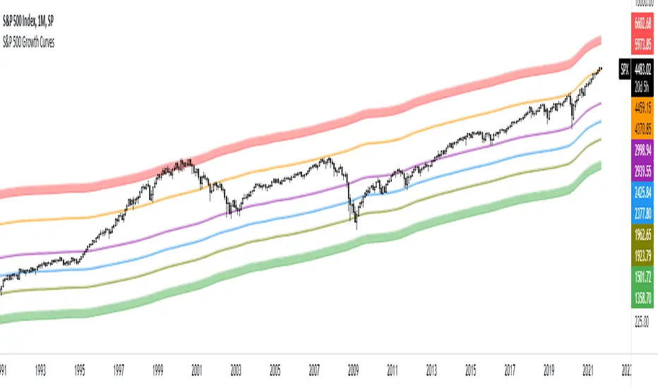
S&P 500 Growth CurvesThese curves are based on the growth of the money supply and the Fibonacci retracement levels. You can use this indicator to determine when the market is undervalued or overvalued. You can also see how often the price reacts to these curves.
Cari dalam skrip untuk "curve"
BTC & SPX vs Yield Curve: Recession Risk ZonesBTC & SPX vs Yield Curve – Recession Risk Zones
This tool helps you track Bitcoin (BTC) and the S&P 500 (SPX) against key macro signals from the U.S. yield curve to spot potential recession risks.
🟪 Color Legend:
🔴 Red = Yield curve is inverted (warning starts)
🟡 Yellow = Projected 6–18 month recession risk (if inversion still active)
🟠 Orange = Active 6–18 month risk window (after inversion ends)
💜 Fuchsia = Real historical U.S. recessions
📈 What’s Plotted:
🔵 BTCUSD (blue line) – Normalized price
🟢 S&P 500 (green line) – Normalized price
🟠 10Y–2Y Yield Spread – Macro signal for risk
✅ Use it to:
Spot macro pressure zones
See how BTC and SPX behave around economic stress
Stay cautious when red/orange/yellow areas appear
Let me know if you'd like to enable toggles to hide/show BTC or SPX independently!

Inverted Yield Curve (US01Y/US10Y Ratio)This indicator calculates and visualizes the ratio between the US 1-Year Treasury Yield (US01Y) and the US 10-Year Treasury Yield (US10Y). It provides a clear visual representation of the relationship between short-term and long-term interest rates, which can be a valuable tool for analyzing market conditions, potential recessions, or shifts in economic outlook.
Features:
US01Y/US10Y Ratio: The indicator plots the ratio between the 1-Year and 10-Year US Treasury Yields as a smooth curve.
Dynamic Highlighting: Portions of the curve where the ratio exceeds 1 are highlighted in red, making it easy to identify periods where short-term rates surpass long-term rates—a key signal often associated with economic shifts or inversions.
Customizable Appearance: The main curve is plotted in a light blue color for clear visibility against most chart backgrounds.
Use Cases:
Yield Curve Analysis: This indicator helps traders and analysts monitor the yield curve, specifically focusing on the relationship between short-term and long-term interest rates.
Recession Signals: An inverted yield curve, where the ratio exceeds 1, can be an early warning signal for potential economic downturns.
Market Sentiment: Use the indicator to gauge shifts in investor sentiment by tracking changes in the yield curve over time.
How to Use:
Add the script to your TradingView chart.
The light blue curve represents the ratio of US01Y/US10Y.
Red highlights indicate periods where the ratio exceeds 1, signaling potential yield curve inversion.
This indicator is ideal for traders, investors, and economists looking to incorporate yield curve analysis into their trading strategies or economic forecasts.

Yield Curve Approximation
A yield curve is a graph that plots the yields (interest rates) of bonds with the same credit quality but different maturity dates. It helps investors understand the relationship between short-term and long-term interest rates.
🔹 Types of Yield Curves
1️⃣ Normal Yield Curve – Upward-sloping, indicating economic expansion.
2️⃣ Inverted Yield Curve – Downward-sloping, often a recession warning.
3️⃣ Flat Yield Curve – Suggests economic uncertainty or transition.
The yield curve is widely used to predict economic conditions and interest rate movements. You can learn more about it here. Would you like insights on how traders use the yield curve for investment decisions?
How to Trade Using This?
✅ If the yield curve is steepening (green) → Favor growth stocks, commodities, and high-risk assets.
✅ If the yield curve is flattening or inverting (red) → Consider bonds, defensive sectors, or hedging strategies.
✅ Pair with economic news and interest rate decisions to refine predictions.

Yield Curve InversionThe Yield Curve Inversion indicator is a tool designed to help traders and analysts visualize and interpret the dynamics between the US 10-year and 2-year Treasury yields. This indicator is particularly useful for identifying yield curve inversions, often seen as a precursor to economic recessions.
Features and Interpretations
Display Modes: Choose between "Spread Mode" to visualize the yield spread indicating normal (green) or inverted (red) curves, or "Both Yields Mode" to view both yields.
Yield Spread: A plotted difference between 10-year and 2-year yields, with a zero line marking inversion. A negative spread suggests potential economic downturns.
Color Coding: Green for a normal yield curve (10Y > 2Y) and red for an inverted curve (2Y > 10Y).
Legend: Provides quick reference to yield curve states for easier interpretation.
This indicator is for educational and informational purposes only. It should not be considered financial advice or a recommendation to buy or sell any financial instruments. Users should conduct their own research and consult with a financial advisor before making investment decisions. The creator of this indicator is not responsible for any financial losses incurred through its use.

Bond Yeild CurveBond Yeild Curve
A bond yeild curve is a line that plot the interest rate of bonds of each maturity dates.
The slope of the curve give the future of economy cycle.
if the slope could be normal (positive), flat or even inverted.
This indicator aquired data of bond yeild provided by TradingView.
How to use it.
Select the country of the bond / another country to compare.
Select the maturity of bond (this indicator set 2Y, 5Y, 10Y and 20Y as default).
You can toggle to 3 different data set; Yeild, Spread (10Y-2Y) and Yeild Curve.
In case that you select the "Yeild Curve", you can customize the desired past period to compare.
How we can get the benefit.
- If the current spread is greater than 1.0, it suppose that the economy of that country probably is ok.
- if the current spread is between 0 - 1.0, it suppose to be flatted and probably turn to invert and the economy cound be in a recession soon.
- if the current spread is below 0, it suppose to be inverted and economy is in recession.
when knowing the state of economy, it would help us to manage our investment.
When you select "Yeild"
When you select "Spread"
When you select "Yeild Curve"
I'm new for this.
if any idea, correction and suggestion, i do appreciate it.
Yield CurveThanks to @gwaaf for his post on how to draw the curve!!
* Charts and displays the current Treasury Yield Curve and the Spread.
* Colors Lines and Labels based off price.
* Dynamically adjusts the position of the labels as prices change.
Top Labels:
Top labels display the Spread between listed bonds in regards to Longer term Bonds minus Shorter term Bonds. This label points to the mid point on the curve. If the Spread is greater than the previous Spread at the current resolution, the label and line color on the curve turn Green. If the Spread is less than the previous Spread at the current resolution, the line on the curve and label will turn Red.
Bottom Labels:
Bottom labels display the current for each bond listed. This label points to the (POINT) in the curve that corresponds with the current price of the Bond. The label will turn Green if the current price is higher than the previous price at the current resolution and vise versa!
Known issues:
There seems to be a color swapping issues when the changed is very small. I believe I can fix this with rounding the numbers and will leave that for another time.

Yield Curve RegimesOverview
The Yield Curve Regime Histogram transforms yield curve spread analysis into an intuitive visual framework by classifying rate movements into six distinct regimes. Rather than simply displaying the spread between two maturities, this indicator analyzes how that spread is changing relative to the underlying yields themselves, providing insight into market expectations for growth, inflation, and liquidity conditions.
How It Works
The indicator calculates the spread between two user-selected government bond yields (default: 2-year and 10-year US Treasuries) and compares both the spread and the individual yields to their values n periods ago (default lookback: 20 bars). Based on whether the spread is steepening or flattening, and whether the short-term and long-term yields are rising or falling, the algorithm classifies each bar into one of six regimes:
The Six Regimes
Steepening Regimes (spread increasing):
1. Bull Steepener (Cyan): Both yields falling, long-end falling slower
Market pricing: Growth concerns, but long-end supported
Typically risk-on if Fed not cutting due to severe economic weakness
2. Bear Steepener (Blue): Both yields rising, long-end rising faster
Market pricing: Growth acceleration, inflation pressures building
Typically risk-on regime
3. Steepener Twist (Yellow): Short-end falling, long-end rising
Market pricing: Liquidity injection, mixed growth signals
Neutral/transition regime
Flattening Regimes (spread decreasing):
4. Bull Flattener (Pink): Both yields falling, long-end falling faster
Market pricing: Growth slowdown, disinflation, potential inversion ahead
Typically risk-off regime
5. Bear Flattener (Purple): Both yields rising, short-end rising faster
Market pricing: Central bank tightening, growth concerns emerging
Typically risk-off regime, can lead to inversion
6. Flattener Twist (Orange): Short-end rising, long-end falling
Market pricing: Aggressive policy tightening, recession risk building
Typically risk-off regime, highest inversion risk
Practical Application
By visualizing which regime is active, traders can:
Anticipate risk appetite shifts: Steepening regimes generally coincide with risk-on sentiment, while flattening regimes (especially with falling long-end yields) often precede risk-off periods
Gauge growth and inflation expectations: The combination of spread direction and yield levels reveals what markets are pricing for economic trajectory
Identify liquidity conditions: Twist regimes highlight periods of central bank intervention or significant policy shifts
Time entries and exits: Regime transitions can signal turning points in equity, commodity, and currency markets before they fully materialize in price action
Customization
The indicator offers full flexibility for cross-market analysis:
Maturity selection: Choose any two yield curves (e.g., 2Y/10Y, 5Y/30Y, or international equivalents like German Bunds)
Lookback period: Adjust sensitivity by changing how far back the comparison is made
Color scheme: Customize each regime's color in the Style tab to match your chart preferences
Legend display: Toggle the regime legend table on/off for cleaner visuals
Timeframe: Apply the indicator to any timeframe, from intraday to monthly charts
Display
The spread is plotted as a histogram, with each bar colored according to its regime classification. A black line overlay (also customizable) traces the raw spread value, allowing you to see both the regime structure and the actual spread level simultaneously. An optional legend in the top-right corner provides a quick reference for regime identification.
This indicator is designed to function as a standalone "yield curve dashboard" that can be stacked beneath equity indices, commodities, or FX pairs, helping traders align their positioning with the underlying rates environment without needing to interpret complex macro data manually.
Note: This indicator analyzes government bond yields and is most effective when paired with liquid, benchmark instruments such as US Treasuries, German Bunds, or UK Gilts. Regime classifications reflect market expectations embedded in the yield curve, not guaranteed outcomes.

10Y–2Y Treasury Yield Curve Spread & MES % Change📝 Description:
This indicator tracks the U.S. 10-Year minus 2-Year Treasury yield spread — a powerful macroeconomic signal often used by professional traders to gauge market sentiment and recession risk — and overlays an optional MES % change line to help intraday futures traders spot macro–price divergences in real time.
Features:
🏦 Plots the 10Y–2Y spread, with optional EMA smoothing.
📉 Highlights yield curve inversion (background turns red when spread < 0).
📊 Optional MES % change line from daily or RTH open for directional bias.
🔔 Alert conditions for:
Yield curve inversion / un-inversion.
Sudden spread spikes in basis points (customizable).
🧮 Optional correlation plot to visualize relationship strength between MES and the yield curve.
🧭 Z-score normalization allows both series to be viewed in one pane without scaling issues.
Why it matters:
A falling or inverted 2s10s spread often signals risk-off behavior and pressure on equities.
A steepening curve tends to support risk-on rallies.
Divergences between MES price action and the spread can provide early warning signals of reversals or fakeouts.
Best used with:
MES (MES1!) or MYM charts for intraday & swing bias.
Fed event days, CPI/NFP, or any macro-sensitive sessions.
VWAP or structure-based intraday trading strategies.
⚠️ Note: This indicator is for informational purposes only and does not constitute financial advice. Always combine macro context with your own trade plan and risk management.

AVWAP CurvesThis indicator calculates and displays Anchored Volume-Weighted Average Price (AVWAP) for the 15-minute, 1-hour, and 4-hour timeframes. It helps identify volume-weighted support/resistance levels and trends based on volume and price data.
Multiple Timeframes: Displays AVWAP curves for 15m, 1h, and 4h. Users can toggle visibility for each timeframe.
Price Anchor Selection: Choose between Low, High, or HL2 as the price anchor for the AVWAP calculation.
Custom Date & Time Anchor: Set a specific start time for the AVWAP calculation.
Alerts: Alerts are triggered when the price crosses above or below any AVWAP curve.

Argentina Bonds TIR - Sovereign Bond Yield Curves Indicator# Argentina Bonds TIR
A comprehensive indicator that calculates the Internal Rate of Return (IRR/TIR) for Argentine sovereign bonds and projects future price curves at fixed yield levels.
## Features
**Real-time TIR Calculation**
- Calculates current yield based on market price and expected cashflows
- Uses Newton-Raphson iterative method for precise IRR calculation
- Day count convention: Actual/365 with T+1 settlement
**Automatic Currency Conversion**
- Works with any trading currency: ARS, USD MEP (D suffix), USD Cable (C suffix)
- Automatically converts prices using AL30/AL30D/AL30C ratios
- Bonares use MEP conversion, Globales use Cable conversion
**Yield Curve Projections**
- Projects price curves 150 bars into the future (configurable)
- Fixed TIR lines at 7%, 8%, 9%, 10%, 11%, 12% (each toggleable)
- Current TIR line showing price trajectory at current yield
- Custom TIR line with user-defined yield value
**Clear Labeling**
- Labels positioned near current date for easy reading (configurable offset)
- Color-coded lines for quick identification
- Info panel showing bond details, prices, TIR, and exchange rates
## Supported Bonds
**Bonares** (Argentina legislation, USD MEP): AE38, AL29, AL30, AL35, AL41, AN29
**Globales** (Foreign legislation, USD Cable): GD29, GD30, GD35, GD38, GD41, GD46
## How to Use
1. Apply indicator to any supported bond symbol (e.g., BCBA:AL30D, BCBA:GD35C)
2. The indicator auto-detects bond type and currency
3. View current TIR in the info panel
4. Use projected lines to visualize price targets at different yield levels
5. Toggle individual TIR lines on/off as needed
6. Add a custom TIR line for specific yield analysis
## Settings
**Display**: Show/hide current TIR line, projection bars (30-300), label offset in days
**Fixed TIR Lines**: Individual toggles for 7%, 8%, 9%, 10%, 11%, 12%
**Custom TIR**: Enable custom TIR line, set value (%), choose color
**Colors**: Customize colors for all lines
## Info Panel
Shows bond ticker, type (Bonar/Global), trading currency, current price, native price, current TIR percentage, MEP and CCL exchange rates.
---
## Español
Indicador que calcula la Tasa Interna de Retorno (TIR) para bonos soberanos argentinos y proyecta curvas de precios futuros a niveles fijos de rendimiento.
### Características
- Cálculo de TIR en tiempo real usando método Newton-Raphson
- Conversión automática de moneda (ARS, USD MEP, USD Cable)
- Líneas de TIR fijas al 7%, 8%, 9%, 10%, 11%, 12%
- Línea de TIR personalizada configurable
- Panel informativo con detalles del bono y tipos de cambio
### Bonos Soportados
- **Bonares** (USD MEP): AE38, AL29, AL30, AL35, AL41, AN29
- **Globales** (USD Cable): GD29, GD30, GD35, GD38, GD41, GD46
---
**DISCLAIMER**: This indicator is for informational and educational purposes only. Eco Valores S.A. does NOT provide investment advice or recommendations. Consult a qualified financial advisor before making investment decisions.
**AVISO LEGAL**: Este indicador es solo para fines informativos y educativos. Eco Valores S.A. NO brinda asesoramiento ni recomendaciones de inversión. Consulte con un asesor financiero calificado antes de invertir.

Litecoin LTC Logarithmic Fibonacci Growth CurvesHOW THIS SCRIPT IS ORIGINAL: there is no similar script dedicated to LTC, although there are similar ones dedicated to BTC. (This was created by modifying an old public and open source similar script dedicated to BTC.)
WHAT THIS SCRIPT DOES: draws a channel containing the price of LTC within which the Fibonacci extensions are highlighted. The reference chart to use is LTC/USD on Bitfinex (because it has the oldest data, given that Tradingview has not yet created an LTC index), suggested with weekly or monthly timeframe.
HOW IT DOES IT: starting from two basic curves that average the upper and lower peaks of the price, the relative Fibonacci extensions are then built on the basis of these: 0.9098, 0.8541, 0.7639, 0.618, 0.5, 0.382, 0.2361, 0.1459, 0.0902.
HOW TO USE IT: after activating the script you will notice the presence of two areas of particular interest, the upper area, delimited in red, which follows the upper peaks of the price, and the lower area, delimited in green, which follows the lower peaks of the price. Furthermore, the main curves, namely the two extremes and the median, are also projected into the future to predict an indicative trend. This script is therefore useful for understanding where the price will go in the future and can be useful for understanding when to buy (near the green lines) or when to sell (near the red lines). It is also possible to configure the script by choosing the colors and types of lines, as well as the main parameters to define the upper and lower curve, from which the script deduces all the other lines that are in the middle.
Very easy to read and interpret. I hope this description is sufficient, but it is certainly easier to use it than to describe it.

[dharmatech] Area Under Yield Curve : USThis indicator displays the area under the U.S. Treasury Securities yield curve.
If you compare this to SP:SPX , you'll see that there are large periods where they are inversely related. Other times, they track together. When the move together, watch out for the expected and eventual divergence.
By default, this indicator will show up in a separate pane. If you move it to an existing pane (e.g. along side SP:SPX ) you'll need to move it to a different price scale.
The area under the yield curve is a quick way to see if the overall yield curve moved up or down. Generally speaking, increasing yields isn't good for markets, unless there is some other stimulus going on simultaneously.
The following treasury securities are used in this calculation:
FRED:DGS1MO (1 month)
FRED:DGS3MO (3 month)
FRED:DGS6MO (6 month)
FRED:DGS1 (1 year)
FRED:DGS2 (2 year)
FRED:DGS3 (3 year)
FRED:DGS5 (5 year)
FRED:DGS7 (7 year)
FRED:DGS10 (10 year)
FRED:DGS20 (20 year)
FRED:DGS30 (30 year)

Birdies [LuxAlgo]The Birdies indicator uses a unique technique to provide support/resistance curves based on a circle connecting the last swing high/low.
A specific, customizable part of this circle acts as a curve of interest, which can trigger visual breakout signals.
🔶 USAGE
The script projects a bird-like pattern when a valid Swing point is found. Multiple customization options are included.
🔹 Trend & Support/Resistance Tool
The color fill patterns and the wing boundaries can give insights into the current trend direction as well as serve as potential support/resistance areas.
In the example above, "Birdies" coincide with pullback and support/resistance zones.
🔹 Swing Length & Buffer
Besides the "Swing Length", with higher values returning longer-term Swing Levels, the script's behavior can be fine-tuned with filters ("Settings" - "Validation").
🔹 Validation
To minimize clutter, three filters are included:
Minimum X-Distance: The minimum amount of bars between subsequent Swings
Minimum Y-Distance: The minimum amount of bars between subsequent Swings
Buffer (Multiple of ATR)
The "Minimum X/Y-Distance" creates a zone where a new Swing is considered invalid. Only when the Swing is out of the zone, can it be considered valid.
In other words, in the example above, a Swing High can only be valid when enough bars/time have passed, and the difference between the last Swing and the previous is more than the ATR multiplied by the "Minimum Y-Distance" factor.
The "Buffer" creates a line above/below the "Birdy", derived from the measured ATR at the conception of the "Birdy" multiplied with a factor ("Buffer").
When the closing price crosses the "Birdy", it must also surpass this buffer line to produce a valid signal, lowering the risk of clutter as a result.
🔶 DETAILS
Birdies are derived from a circle that connects two Swing points. The left-wing curve originates from the most recent "Swing point" to the last value on the circle before crossing its midline. The mirror image of the left wing creates the right wing.
Enabling "Origine" will draw a line from the last Swing to the first.
🔹 Style
The publication includes a style setting with four options.
The first, "Birdy," shows a bird-like shape derived from a circle connecting the last Swing High and Swing Low.
The second option holds everything from the first option but connects both wingtips, providing potential horizontal levels of interest.
When setting "Birdy" to "None", the visual breakout signals will not defer from previous settings, but the focus is shifted towards the fill color, which can help detect potential trend shift.
A fourth setting, "Left Wing", will only show the left part of the "Birdy" pattern, removing the right part from the equation. This will change the visual breakout signals, providing alternative signals.
🔶 SETTINGS
Swing Length: The period used for swing detection, with higher values returning longer-term Swing Levels.
🔹 Validation
Minimum X-Distance: The minimum amount of bars between subsequent Swings
Minimum Y-Distance: The minimum amount of bars between subsequent Swings
Buffer (Multiple of ATR)
🔹 Style
Bullish Patterns: Enable / color
Bearish Patterns: Enable / color
Buffer Zone: Show / Color
Color Fill: Show color fill between two Birdies (if available)
Origine: Show the line between both Swing Points
🔹 Calculation
Calculated Bars: Allows the usage of fewer bars for performance/speed improvement

USTS Yield Curve InversionsVisualization of the inverted portions of the USTS yield curve.
Red means that portion of the curve is inverted.
If 1M is red, it means it's less than RRP%.
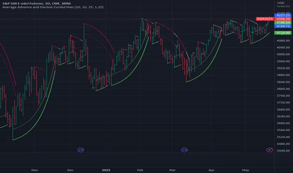
[RS]Average Advance and Decline Curved Lines V0exponential curve linear regression, use falloff multiplier to control curve falloff strength.
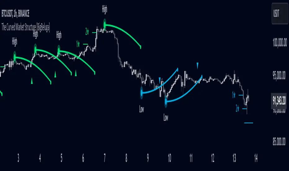
The Curved Market Structure [BigBeluga]Curved Market Structure
The Curved Market Structure indicator offers an innovative twist on traditional market structure tools by using curved lines instead of horizontal ones, enabling faster breakout detection for traders.
🔵Key Features:
Curved Market Structure Levels: The indicator identifies high and low pivots and plots curved lines connecting these points, adapting to market dynamics and providing a more intuitive view of potential breakout zones.
Breakout Detection: Breakouts above or below the curved levels are marked with triangle symbols (▲ or ▼), making it easy to spot critical price movements.
Dynamic Target Levels: After a breakout, the indicator plots three target levels, which serve as potential price objectives. Each target is marked with a number and a star (e.g., 1★) upon being reached.
Customizable Line Length and Angle: Users can adjust the length and angle of the curved lines to fit their trading style and timeframe, making the tool versatile and adaptable.
Market Structure Trend Filtering: To maintain a clean chart, the indicator plots curved levels only from high pivots during uptrends and low pivots during downtrends.
🔵How It Works:
The indicator identifies high and low pivots using user-defined parameters (left and right bars).
Curved lines are drawn from these pivot points, showing the structure of the market and potential breakout zones.
When a breakout occurs, the indicator highlights the direction with triangle symbols and dynamically plots three price targets.
Upon reaching these targets, the level is marked with its respective number and a star, helping traders track price progression effectively.
The lines and targets are adjusted based on market conditions, ensuring real-time relevance and accuracy.
🔵Use Cases:
Spotting key breakout zones to identify entry and exit points more effectively.
Setting dynamic target levels for take-profit or stop-loss planning.
Filtering market noise and maintaining a cleaner chart while analyzing trends.
Enhancing traditional market structure analysis with an intuitive curved visualization.
This indicator is ideal for traders who want a modern, dynamic, and visually appealing way to track market structure and breakouts while maintaining chart clarity.
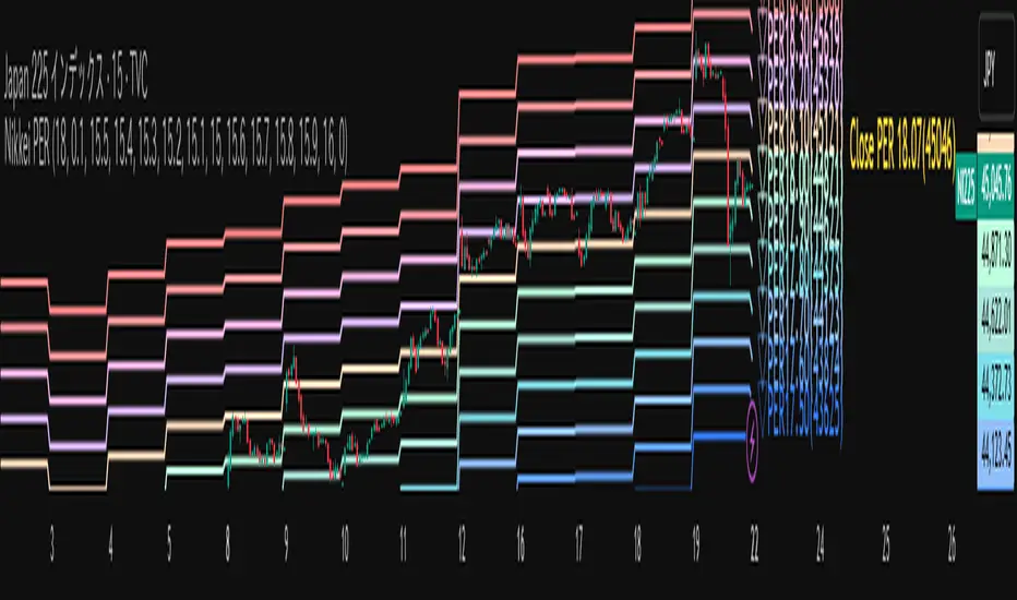
Nikkei PER Curve (EPS Text Area Input)
This indicator visualizes the PER levels of the Nikkei 225 based on the dates and EPS data entered in the text area.
By plotting multiple PER multiplier lines, it helps users to understand the following:
Potential support and resistance levels based on PER multipliers
Comparison between the current stock price and theoretical valuation levels
Observation of PER trends and detection of deviations from standard valuation levels
Trading Decisions:
When the stock price approaches a specific PER line, it can serve as a reference for support or resistance.
During intraday chart analysis, PER lines are drawn based on the most recent EPS, making them useful as reference levels even during market hours.
Valuation Analysis:
On daily charts, it helps to assess whether the Nikkei is overvalued or undervalued compared to historical levels, or to identify changes in valuation levels.
Risk Management:
The theoretical price lines based on PER can be used as reference points for stop-loss or profit-taking decisions.
Simple Data Input:
EPS data is entered in a text area, one line per date, in comma-separated format:
YYYY/MM/DD,EPS
YYYY/MM/DD,EPS
Multiple entries can be input by using line breaks between each date.
Note: Dates for which no candlestick exists in the chart will not be displayed.
This allows easy updating of PER lines without complex spreadsheets or external tools.
EPS Data Input: Manual input of date and EPS via the text area; supports multiple data entries.
PER Multiplier Lines:
For evenly spaced lines, simply set the central multiplier and the interval between lines. The indicator automatically generates 11 lines (center ±5 lines).
For non-even spacing or individual multiplier settings, you can choose to adjust each line.
Close PER Labels: Displays the PER of the close price relative to the current EPS.
Timeframe Limitation: Use on daily charts (1D) or lower. PER lines cannot be displayed on higher timeframes.
Label Customization: Allows adjustment of text size, color, and position.
EPS Parsing: The indicator reads the input text area line by line, splitting each line by a comma to obtain the date and EPS value.
Data Storage: The dates and EPS values are stored in arrays. These arrays allow the script to efficiently look up the latest EPS for any given date.
PER Calculation: For each chart bar, the indicator calculates the theoretical price for multiple PER multipliers using the formula:
Theoretical Price = EPS × PER multiplier
Line Plotting: PER lines are drawn at these calculated price levels. Labels are optionally displayed for the close price PER.
Date Matching: If a date from the EPS data does not exist as a candlestick on the chart, the corresponding PER line is not plotted.
PER lines are theoretical values: They serve as psychological reference points and do not always act as true support or resistance.
Market Conditions: Lines may be broken depending on market circumstances.
Accuracy of EPS Data: Be careful with EPS input errors, as incorrect data will result in incorrect PER curves.
Input Format: Dates and EPS must be correctly comma-separated and entered one per line. Dates with no corresponding candlestick on the chart will not be plotted. Incorrect formatting may prevent lines from displaying.
Reliability: No method guarantees success in trading; use in combination with backtesting and other technical analysis tools.
このインジケータは、入力した日付とEPSデータを基に日経225のPER水準を視覚化するものです
複数のPER倍率ラインを描画することで、以下を把握するのに役立ちます:
PER倍率に基づく潜在的なサポート・レジスタンス水準や目安
現在の株価と理論上の評価水準との比較
過去から現在までのPER推移の観察
トレード判断:
株価が特定の倍率のPERラインに近づいたとき、抵抗や支持の目安としての活用
日中足表示時は、前日(最新日)のEPSに基づいたPERラインを表示するように作成しているので、場中でも参考目安として使用可能
評価分析:
過去の推移と比較して日経が割高か割安か、またはPER評価水準が変化したかの確認
リスク管理:
PERに基づく理論価格ラインを、損切りや利確の目安としての利用
簡単なデータ入力:
EPSデータはテキストエリアに手動入力。1行につき1日付・EPSをカンマ区切りで記入します
例
2025/09/19,2492.85
2025/09/18,2497.43
行を改行することで複数データ入力が可能
注意: チャート上にローソク足が存在しない日付のデータは表示されません
表計算や外部ツールを使わずに倍率を掛けたPERラインの作成・更新が簡単に行える
PER倍率ライン:
等間隔ラインの場合、中心倍率と各ラインの間隔を設定するだけで、自動的に中心値±5本、計11本のラインを作成
等間隔以外や個別設定したい場合は で調整可能
終値PERラベル: 現在のEPSに対する終値PERを表示
時間足制限: 日足(1日足)以下で使用すること。高い時間足ではPERラインは表示できません
ラベルカスタマイズ: 文字サイズ、色、位置を調整可能
EPSデータの読み取り: 改行を検知し1日分のデータとして識別し、カンマで分割して日付とEPS値を取得
配列への格納: 日付とEPSを配列に格納し、各バーに対して最新のEPSを参照できるようにする
PER計算: 各バーに対して、以下の式で複数のPER倍率の理論価格を計算:
理論価格 = EPS × PER倍率
日付照合: EPSデータの日付がチャート上にローソク足として存在したら格納した配列からデータを取得。ローソク足が存在しない場合、そのPERラインは表示されない
ライン描画: 計算した価格にPERラインを描画。必要に応じて終値PERラベルも表示。
PERラインは理論値であり心理的目安として機能することがありますが、必ずしも機能する訳ではない
その為、過去の検証や他のテクニカル指標と併用推奨
市況によってはラインを無視するように突破する可能性ことがある
EPSデータの入力ミスに注意すること。誤入力するとPER曲線が誤表示される
日付とEPSの入力は1行ずつ、正しい位置でカンマ区切りをいれること
ローソク足が存在しない日付のデータは正しく表示されないことがあるので注意
誤った入力形式ではラインが表示されない場合がある
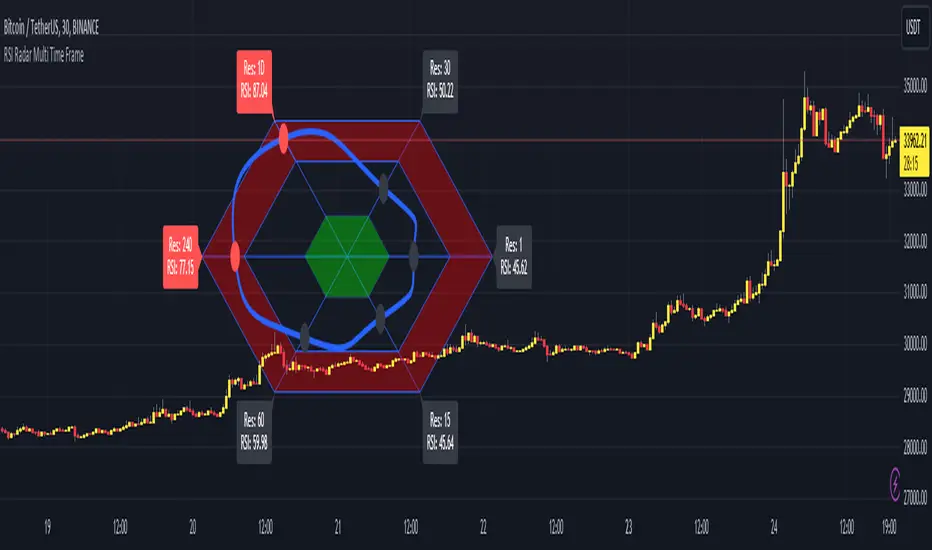
RSI Radar Multi Time FrameHello All!
First of all many Thanks to Tradingview and Pine Team for developing Pine Language all the time! Now we have a new feature and it's called Polylines and I developed RSI Radar Multi Time Frame . This script is an example and experimental work, you can use it as you wish.
The scripts gets RSI values from 6 different time frames, it doesn't matter the time frame you choose is higher/lower or chart time frame. it means that the script can get RSI values from higher or lower time frames than chart time frame.
It's designed to show RSI Radar all the time on the chart even if you zoom in/out or scroll left/right.
You can set OB/OS or RSI line colors. Also RSI polyline is shown as Curved/Hexagon optionally.
Some screenshots here:
Doesn't matter if you zoom out, it can show RSI radar in the visible area:
Another example:
You can change the colors, or see the RSI as Hexagon:
Time frames from seconds to 1Day in this example while chart time frame is any ( 30mins here )
Enjoy!
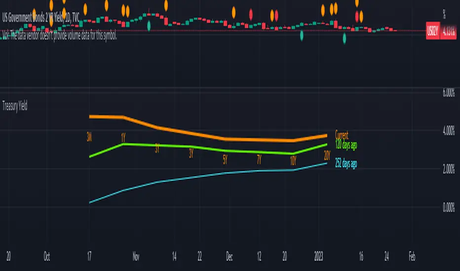
Yield CurveJust plotting the yield curve.
Read left to right:
US01M
US02M
US01Y
US02Y
US03Y
US05Y
US10Y
US30Y

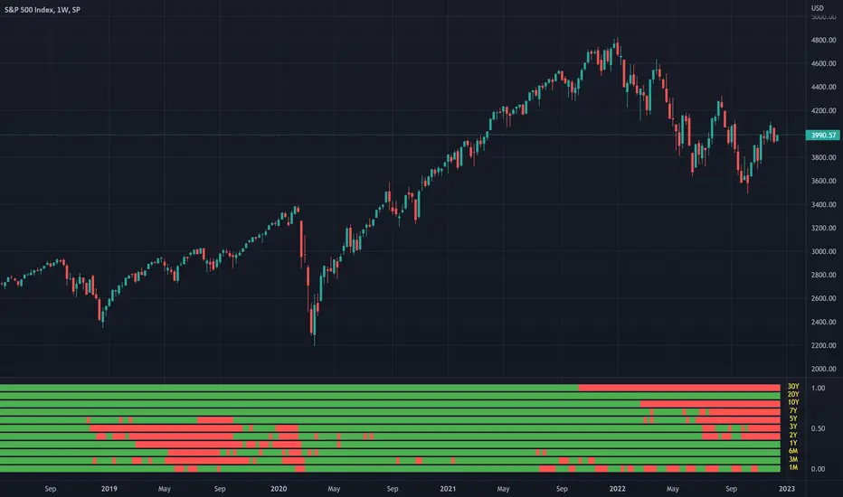
Inverted Yield Curve IndicatorThe last seven recessions were preceded by an inverted yield curve. This is preset to the 2 year and 10 year US bond, weekly, but you can set it to whatever you like.
Published with source code for anyone to modify. This is the first in a series of indicators I intend to publish as a package of economic recoverty/recession symptom indicators.

Converging Pullbacks and PeaksMulti Timeframe Converging Lines Indicator. Using the highest/lowest Values at 2 different lengths. Convergence created by taking the highest/lowest value and subtracting/adding the # of barssince the highest/lowest bar was set multiplied by the price multiplied by the float. Curves are created from averaging out the emas of the center lines of the extremeties.
Helps show trendlines automatically most of the time but can be tweaked by changing the floats or Fast/Slow lengths to you liking.
3 Linear Regression CurveThe original script was posted on ProRealCode by user Ruddy.
Long when all 3 linear regression curves color is bright and short when they are dark.
Close when 1 of 3 change its color.
