Daily Stop calculatorCalculates STOP LOSS points calculated by daily ATR. Red line is for short direction. Green line is for Long direction Penunjuk Pine Script®oleh vigasin6
Daily Moving Averages 20-50-100-200This script includes all the daily moving avg'sPenunjuk Pine Script®oleh darklothario85
Daily Auto Fibonacci ToolCalculates Fibonacci retracements based on daily highs/lows, and further beyond that if specified. The main difference between this and other auto Fibbing tools is ease of visibility. Options: Take highs/lows from a few days back or take highs/lows from each daily candle Hide retracements before today Show labels for each retracement level Hide/Show retracement levels Change colors quickly and uniformly (in script) Retracements used: -0.382 / 0 / 0.236 / 0.382 / 0.5 / 0.618 / 0.786 / 1 / 1.272Penunjuk Pine Script®oleh NeoButaneTelah dikemas kini 99 1 K
Daily Moving Averages (EMA)Adds Four configurable Daily Exponential Averages to a chart. Daily MA are generally good sources of support and resistance, and being able to see them in shorter timeframes can be usefulPenunjuk Pine Script®oleh mfsyd36
Daily Moving Averages20 Daily EMA and 50 MA on any timeframe you use.Penunjuk Pine Script®oleh sdjavadi28
Daily Close repainting resultsit's a repainting script cheating on tester, on backtesting %100 correct but on forward testing it will only work % 15 correct and %85 wrong. I did another script showing real forward testing results of this script.Strategi Pine Script®oleh lonyn33120
Daily Close correct resultsit's showing the correct results of a repainting cheating scriptStrategi Pine Script®oleh lonyn44102
Daily Deviations Version 3Version 3 of Daily Deviations Combines Lazy and Self Input version HOW TO USE: Select volatility index related to ticker. (Ex. Using SPY? Select VIX. Using QQQ? Select VXN. etc) OR Uncheck other volatility options and select "Use Custom Volatility" and input your own volatility. Default setting is to use the previous close price as the "0 Level". OR Uncheck "Use Close Price" to enable a synthetic settlement price that is made by using the average of the daily open and close. OR Uncheck "Use Close Price" and select "Use Custom Settlement" and input your own settlement price. Mess around and find the settings that you like the most. Credits to /u/Living_Granger and /u/UberBotMan for the formulas and idea. Penunjuk Pine Script®oleh edin22811208
Pivots Daily Weekly Monthly YearlyDaily, Weekly, Monthly and yearly pivot lines Just the pivot lines without the support and resistance linesPenunjuk Pine Script®oleh SteynTradeTelah dikemas kini 22420
Daily Close Comparison Strategy (by ChartArt via sirolf2009)Comparing daily close prices as a strategy. This strategy is equal to the very popular "ANN Strategy" coded by sirolf2009(1) which calculates the percentage difference of the daily close price, but this bar-bone version works completely without his Artificial Neural Network (ANN) part. Main difference besides stripping out the ANN is that my version uses close prices instead of OHLC4 prices, because they perform better in backtesting. And the default threshold is set to 0 to keep it simple instead of 0.0014 with a larger step value of 0.001 instead of 0.0001. Just like the ANN strategy this strategy goes long if the close of the current day is larger than the close price of the last day. If the inverse logic is true, the strategy goes short (last close larger current close). (2) This basic strategy does not have any stop loss or take profit money management logic. And I repeat, the credit for the fundamental code idea goes to sirolf2009. (2) Because the multi-time-frame close of the current day is future data, meaning not available in live-trading (also described as repainting), is the reason why this strategy and the original "ANN Strategy" coded by sirolf2009 perform so excellent in backtesting. All trading involves high risk; past performance is not necessarily indicative of future results. Hypothetical or simulated performance results have certain inherent limitations. Unlike an actual performance record, simulated results do not represent actual trading. Also, since the trades have not actually been executed, the results may have under- or over-compensated for the impact, if any, of certain market factors, such as lack of liquidity. Simulated trading programs in general are also subject to the fact that they are designed with the benefit of hindsight. No representation is being made that any account will or is likely to achieve profits or losses similar to those shown. (1) You can get the original code by sirolf2009 including the ANN as indicator here: (1) and this is sirolf2009's very popular strategy version of his ANN: Strategi Pine Script®oleh ChartArt8181 6 K
Daily ATR%If You are using a percentage of the Daily Average True Range in determining your stop placement, this quick indicator is for You. excerpt from investopedia.com/articles/trading/06/stopplacement.asp ATR % Stop Method The ATR% stop method can be used by any type of trader because the width of the stop is determined by the percentage of average true range (ATR). ATR is a measure of volatility over a specified period of time. The most common length is 14, which is also a common length for oscillators such as the relative strength index (RSI) and stochastics. A higher ATR indicates a more volatile market, while a lower ATR indicates a less volatile market. By using a certain percentage of ATR, you ensure that your stop is dynamic and changes appropriately with market conditions. For example, for the first four months of 2006, the GBP/USD average daily range was around 110 to 140 pips. A day trader may want to use a 10% ATR stop - meaning that the stop is placed 10% x ATR pips from the entry price.In this instance, the stop would be anywhere from 11 to 14 pips from your entry price. A swing trader might use 50% or 100% of ATR as a stop. In May and June of 2006, daily ATR was anywhere from 150 to 180 pips. As such, the day trader with the 10% stop would have stops from entry of 15 to 18 pips while the swing trader with 50% stops would have stops of 75 to 90 pips from entry.Penunjuk Pine Script®oleh netixen11758
Nick_OS RangesUNDERSTANDING THE SCRIPT: TIMEFRAME RESOLUTION: * You have the option to choose Daily , Weekly , or Monthly LOOKBACK WINDOW: * This number represents how far back you want the data to pull from - Example: "250" would represent the past 250 Days, Weeks, or Months depending on what is selected in the Timeframe Resolution RANGE 1 nth (Gray lines): * This number represents the range of the nth biggest day, week, or month in the Lookback Window - Example: "30" would represent the range of the 30th biggest day in the past 250 days. (If the Lookback Window is "250") RANGE 2 nth (Blue lines): * This number represents the range of the nth biggest day, week, or month in the Lookback Window - Example: "10" would represent the range of the 10th biggest day in the past 250 days. (If the Lookback Window is "250") RANGE 3 nth (Pink lines): * This number represents the range of the nth biggest day, week, or month in the Lookback Window - Example: "3" would represent the range of the 3rd biggest day in the past 250 days. (If the Lookback Window is "250") YELLOW LINES: * The yellow lines are the average percentage move of the inputted number in the Lookback Window SUGGESTED INPUTS: FOR DAILY: Lookback Window: 250 Range 1 nth: 30 Range 2 nth: 10 Range 3 nth: 3 FOR WEEKLY: Lookback Window: 50 Range 1 nth: 10 Range 2 nth: 5 Range 3 nth: 2 FOR MONTHLY: Lookback Window: 12 Range 1 nth: 3 Range 2 nth: 2 Range 3 nth: 1 TIMEFRAMES TO USE (If You Have TradingView Premium): Daily: 5 minute timeframe and higher (15 minute timeframe and higher for Futures) Weekly: 15 minute timeframe and higher Monthly: Daily timeframe and higher (Monthly still has issues) TIMEFRAMES TO USE (If You DO NOT Have TradingView Premium): Daily: 15 minute timeframe and higher Weekly: 30 minute timeframe and higher Monthly: Daily timeframe and higher (Monthly still has issues) IMPORTANT RELATED NOTE: If you decide to use a higher Lookback Window, the ranges might be off and the timeframes listed above might not apply ISSUES THAT MIGHT BE RESOLVED IN THE FUTURE 1. If it is a shortened week (No Monday or Friday), then the Weekly Ranges will show the same ranges as last week 2. Monthly ranges will change based on any timeframe usedPenunjuk Pine Script®oleh NickMaterazzoTelah dikemas kini 51
Lepelle's Key LevelsCredit to original code goes to paaax and NSDT. Modified to include premarket H/L levels and to show only daily levels. Indicator includes Close levels. -US Premarket High and Low Levels -Daily OHL Levels (No close included) -Yesterday and Previous day OHLC level -Labels and ability to modify user preferences (color, line) Penunjuk Pine Script®oleh LepelleTelah dikemas kini 3434216
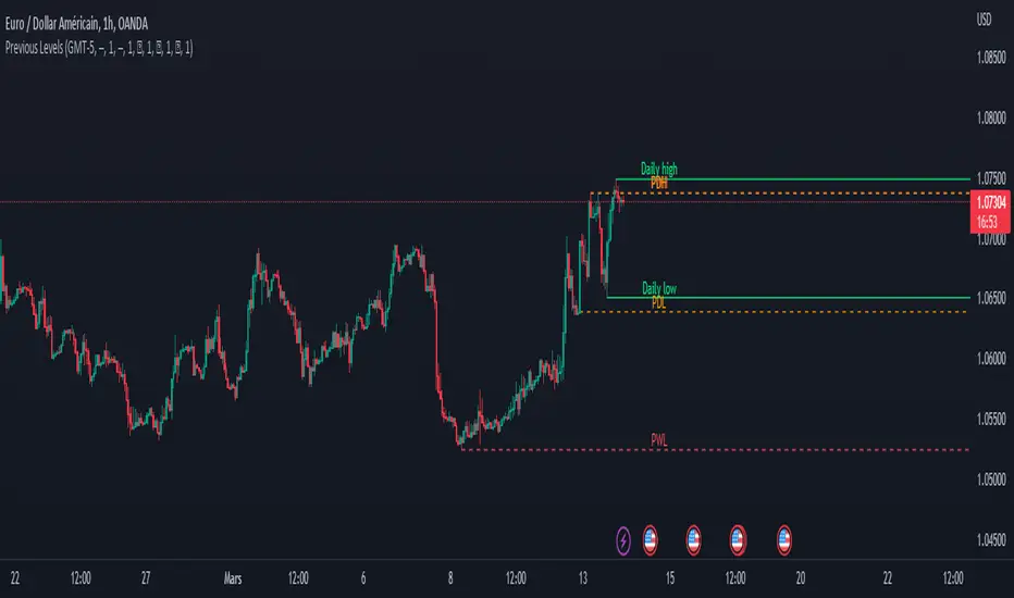
Previous Levels With Custom TimeZoneThe Previous Levels With Custom TimeZone indicator shows to users specifics price area which can be liquidity to take. Users can determine the desired time zone to retrieve the correct daily, weekly and monthly values. Several price area are shown with with indicator which are : Daily Open Price Daily Low Price Daily High Price Previous Daily Low Price Previous Daily High Price Previous Weekly Low Price Previous Weekly High Price Previous Monthly Low Price Previous Monthly High Price All price area are configurable to let user have specific color or line style for each area. Here's some example : Daily Open / High / Low Previous Daily High / Low Previous Weekly High / Low Previous Monthly High / Low Penunjuk Pine Script®oleh LudoGH681919883
MTF previous high and low quarter levelsDescription An experimental script that prints quarter levels of the previous timeframe's high and low to the current timeframe. The idea is quite simple and is basically the Fibonacci pivoted on the previous high and low with quarter level settings (0,0.25,0.5,0.75,1 etc). The default setting is the previous daily high and low but can be customized on user discretion. New quarter levels are printed after the close of the previous timeframe and open of the new timeframe (user's timeframe setting) How To Use Levels should not be used blindly. Levels can be used as confluence when aligned with high probability supply and demand zones, support, resistance, order blocks, and so on. Credit to @HeWhoMustNotBeNamed for the Previous High/Low MTF indicator code and @mrbirman for the idea to put this together.Penunjuk Pine Script®oleh geneclash11156
RVOL Relative Volume - IntradayHello All, Relative Volume is one of the most important indicators and Traders should check it while trading/analyzing. it is used to identify whether the volume flows are increasing or decreasing. Relative volume measures current volume in relation to the “usual” volume for this time of the day. What is considered “usual"? For that, we have to use a historical baseline known as the average daily volume. That means how much volume a security does on a daily basis over a defined period. (This scripts runs on the time frames greater or equal 1 minute and less than 1 day) The common definition for real-time relative volume is: Current volume for this time of day / Average volume for this time of day. It does not mean taking the volume (for example) from 10:30 am to 10:45 am and comparing it to what it does from 10:30 am to 10:45 am every day. What it truly means is to compare cumulative volumes. Therefore, this is the precise definition of real-time relative volume: Current cumulative volume up to this time of day / Average cumulative volume up to this time of day What should we understand while checking RVOL; - Relative volume tell us if volume flows are increasing or decreasing - A high relative volume tells us that there is increased trading activity in a security today - Increased volume flows often accompany higher volatility i.e. a significant price move Let see an example: P.S. if you want to get more info about RVOL/Relative Volume then you can search it on the net. While developing the script this was used as reference, you can also check it for more info. Enjoy!Penunjuk Pine Script®oleh LonesomeTheBlueTelah dikemas kini 6161 4.4 K
Historical & Periodic Key LevelsHistorical & Periodic Key Levels This indicator automatically plots historical key levels (ATH/ATL) and periodic closing levels (Daily, Weekly, Monthly, Yearly). It highlights major price zones frequently used in technical and institutional trading. Key Features: Dynamic ATH/ATL: tracks all-time high/low with date annotation. Periodic Closes: previous D/W/M/Y closes with directional coloring. Adaptive Colors: green/red based on bullish or bearish close. Full Customization: toggle visibility, colors, line width, text alignment, and label text. Smart Label Management: prevents overlap by cycling through label styles automatically. Usage: Identify strong support/resistance levels. Monitor key closing prices across multiple timeframes. Enhance swing trading and long-term analysis with institutional reference levels. Inputs: Levels Visibility: show/hide ATH, ATL, and periodic closes. ATH/ATL Style Settings: line colors, label prefix, width, and text alignment. Periodic Levels Style: label text (D/W/M/Y), line width, alignment, and bullish/bearish colors. Notes: Levels adjust automatically to the active chart timeframe. Lower timeframe levels are hidden when redundant (e.g., daily close on daily chart). Penunjuk Pine Script®oleh YouNesta18
High/Mid/Low of the Previous Month, Week and Day + MAIntroducing the Ultimate Price Action Indicator Take your trading to the next level with this feature-packed indicators. Designed to provide key price insights, this tool offers: - Monthly, Weekly, and Daily Levels : Displays the High, Midpoint, and Low of the previous month, week, and day. - Logarithmic Price Lines : Option to plot price levels logarithmically for enhanced accuracy. - Customizable Labels : Display labels on price lines for better clarity. (This feature is optional.) - Dual Moving Averages : Add two customizable Moving Averages (Simple, Exponential, or Weighted) directly on the price chart. (This feature is optional.) This code combines features from the Moving Average Exponential and Daily Weekly Monthly Highs & Lows (sbtnc) indicators, with custom modifications to implement unique personal ideas. Perfect for traders who want to combine precision with simplicity. Whether you're analyzing historical levels or integrating moving averages into your strategy, this indicator provides everything you need for informed decision-making. To prevent change chart scale, right click on Price Scale and enable "Scale price chart only"Penunjuk Pine Script®oleh soltanifx77551
Previous Day and Week RangesI've designed the "Previous Day and Week Ranges" indicator to enhance your trading strategy by clearly displaying daily and weekly price levels. This tool shows Open-Close and High-Low ranges for both daily and weekly timeframes directly on your trading chart. Key Features : Potential Support and Resistance: The indicator highlights previous day and week ranges that may serve as key support or resistance levels in subsequent trading sessions. Customizable Display Options: Offers the flexibility to show or hide daily and weekly ranges based on your trading needs. Color Customization: Adjust the color settings to differentiate between upward and downward movements, enhancing visual clarity and chart readability. This indicator is ideal for traders aiming to understand market dynamics better, offering insights into potential pivot points and zones of price stability or volatility. Penunjuk Pine Script®oleh tkarolakTelah dikemas kini 3636435
Day/Week/Month Metrics (Zeiierman)█ Overview The Day/Week/Month Metrics (Zeiierman) indicator is a powerful tool for traders looking to incorporate historical performance into their trading strategy. It computes statistical metrics related to the performance of a trading instrument on different time scales: daily, weekly, and monthly. Breaking down the performance into daily, weekly, and monthly metrics provides a granular view of the instrument's behavior. The indicator requires the chart to be set on a daily timeframe. █ Key Statistics ⚪ Day in month The performance of financial markets can show variability across different days within a month. This phenomenon, often referred to as the "monthly effect" or "turn-of-the-month effect," suggests that certain days of the month, especially the first and last days, tend to exhibit higher than average returns in many stock markets around the world. This effect is attributed to various factors including payroll contributions, investment of monthly dividends, and psychological factors among traders and investors. ⚪ Edge The Edge calculation identifies days within a month that consistently outperform the average monthly trading performance. It provides a statistical advantage by quantifying how often trading on these specific days yields better returns than the overall monthly average. This insight helps traders understand not just when returns might be higher, but also how reliable these patterns are over time. By focusing on days with a higher "Edge," traders can potentially increase their chances of success by aligning their strategies with historically more profitable days. ⚪ Month Historically, the stock market has exhibited seasonal trends, with certain months showing distinct patterns of performance. One of the most well-documented patterns is the "Sell in May and go away" phenomenon, suggesting that the period from November to April has historically brought significantly stronger gains in many major stock indices compared to the period from May to October. This pattern highlights the potential impact of seasonal investor sentiment and activities on market performance. ⚪ Day in week Various studies have identified the "day-of-the-week effect," where certain days of the week, particularly Monday and Friday, show different average returns compared to other weekdays. Historically, Mondays have been associated with lower or negative average returns in many markets, a phenomenon often linked to the settlement of trades from the previous week and negative news accumulation over the weekend. Fridays, on the other hand, might exhibit positive bias as investors adjust positions ahead of the weekend. ⚪ Week in month The performance of markets can also vary within different weeks of the month, with some studies suggesting a "week of the month effect." Typically, the first and the last week of the month may show stronger performance compared to the middle weeks. This pattern can be influenced by factors such as the timing of economic reports, monthly investment flows, and options and futures expiration dates which tend to cluster around these periods, affecting investor behavior and market liquidity. █ How It Works ⚪ Day in Month For each day of the month (1-31), the script calculates the average percentage change between the opening and closing prices of a trading instrument. This metric helps identify which days have historically been more volatile or profitable. It uses arrays to store the sum of percentage changes for each day and the total occurrences of each day to calculate the average percentage change. ⚪ Month The script calculates the overall gain for each month (January-December) by comparing the closing price at the start of a month to the closing price at the end, expressed as a percentage. This metric offers insights into which months might offer better trading opportunities based on historical performance. Monthly gains are tracked using arrays that store the sum of these gains for each month and the count of occurrences to calculate the average monthly gain. ⚪ Day in Week Similar to the day in the month analysis, the script evaluates the average percentage change between the opening and closing prices for each day of the week (Monday-Sunday). This information can be used to assess which days of the week are typically more favorable for trading. The script uses arrays to accumulate percentage changes and occurrences for each weekday, allowing for the calculation of average changes per day of the week. ⚪ Week in Month The script assesses the performance of each week within a month, identifying the gain from the start to the end of each week, expressed as a percentage. This can help traders understand which weeks within a month may have historically presented better trading conditions. It employs arrays to track the weekly gains and the number of weeks, using a counter to identify which week of the month it is (1-4), allowing for the calculation of average weekly gains. █ How to Use Traders can use this indicator to identify patterns or trends in the instrument's performance. For example, if a particular day of the week consistently shows a higher percentage of bullish closes, a trader might consider this in their strategy. Similarly, if certain months show stronger performance historically, this information could influence trading decisions. Identifying High-Performance Days and Periods Day in Month & Day in Week Analysis: By examining the average percentage change for each day of the month and week, traders can identify specific days that historically have shown higher volatility or profitability. This allows for targeted trading strategies, focusing on these high-performance days to maximize potential gains. Month Analysis: Understanding which months have historically provided better returns enables traders to adjust their trading intensity or capital allocation in anticipation of seasonally stronger or weaker periods. Week in Month Analysis: Identifying which weeks within a month have historically been more profitable can help traders plan their trades around these periods, potentially increasing their chances of success. █ Settings Enable or disable the types of statistics you want to display in the table. Table Size: Users can select the size of the table displayed on the chart, ranging from "Tiny" to "Auto," which adjusts based on screen size. Table Position: Users can choose the location of the table on the chart ----------------- Disclaimer The information contained in my Scripts/Indicators/Ideas/Algos/Systems does not constitute financial advice or a solicitation to buy or sell any securities of any type. I will not accept liability for any loss or damage, including without limitation any loss of profit, which may arise directly or indirectly from the use of or reliance on such information. All investments involve risk, and the past performance of a security, industry, sector, market, financial product, trading strategy, backtest, or individual's trading does not guarantee future results or returns. Investors are fully responsible for any investment decisions they make. Such decisions should be based solely on an evaluation of their financial circumstances, investment objectives, risk tolerance, and liquidity needs. My Scripts/Indicators/Ideas/Algos/Systems are only for educational purposes! Penunjuk Pine Script®oleh Zeiierman77533
Bollinger Band with Moving Average & Pin BarsThis indicator was specifically built to be used for trading the Scalpius Trading System promoted by @scottphillipstrading. Additionally I've added Daily and Weekly Highs, Lows and Central Pivot lines The central indicators used in the Scalpius trading system which are included here are: The Bollinger Band, chart plotting of Pin Bars (Hammers & Shooting Stars) and an Exponential Moving Average. In the settings the user has the option select EMA, SMA or WMA along with desired length, the default settings are 8EMA as per the Scalpius system rules. Also the Bollinger Band settings can be amended by the user and the Pin Bar chart plots and daily + weekly high and low plots can be removed by the user. Penunjuk Pine Script®oleh gary_trades133