Cari dalam skrip untuk "daily"
Three Bars Down and Inside Bar v2Updated Version of my Script. Script includes a Filter for stocks that are down three days in a row. Also it checks for oversold rsi and inside bars. Works best daily with stocks.

3Down and IB DAScript provides Multiple MAs and checks for 3 Bars down in a row. On top it displays inside Bars. Works best on a daily timeframe with stocks.
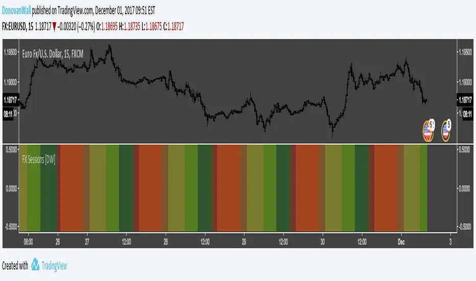
Forex Daily Trading Sessions [DW]This is a simple study designed to highlight the daily forex market sessions. Use it to identify the best sessions to trade your security in.
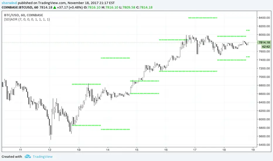
SD - Average Daily Range - Daily Weekly Monthly YearlyAverage Daily Range ('ADR') Indicator for TradingView
This script is based on the "Best 'ADR' Indicator for MT4" described at www.fxdayjob.com
Inputs:
Number of 'ADR' Back - Set the number of calendar days back to plot historical 'ADR'. The default value is 7.
Non-trading days are not taken into account.
A value of 7, for example, would display only 5 'ADR' for a 24x5 market.
Number of 'AWR' Back - Set the number of calendar weeks back to plot historical 'AWR'. The default value is 0.
Number of 'AMR' Back - Set the number of calendar months back to plot historical 'AMR'. The default value is 0.
Number of 'AYR' Back - Set the number of calendar years back to plot historical 'AYR'. The default value is 0.
'ADR' Length parameter - Set the length parameter of 'ADR'. The default value is 1.
'WDR' Length parameter - Set the length parameter of 'AWR'. The default value is 1.
'MDR' Length parameter - Set the length parameter of 'AMR'. The default value is 1.
'YDR' Length parameter - Set the length parameter of 'AYR'. The default value is 1.
See also:
- www.fxdayjob.com
- pivotboss.com
- www.jarrattdavis.com

Close of relevant previous periodThis indicator puts the previous close value of a higher relevant time frame on the chart, it adepts to the period of the chart. Relevant means that it puts:
Close of previous year in monthly chart
Close of previous month in weekly chart
Close of either previous month of week in daily chart, default setting is week
Close of previous week in 4hourly and 3hourly charts
Close of previous day in 30minute and higher intraday charts
Not bother the user below 30 minutes.

Weekly closeIt turned out not to be that easy to plot the close of the previous week in hourly or daily charts. In my first experiments things went wrong on Friday or intraday if you simply use the security function. So here is the thing with an algorithm that guaranties the correct value.

Short Interest - Daily VolumeShort interest and daily volume comparison. Originally "Nasdaq SI: Short Interest by Greeny"

HiLo Daily Fibonacci R1 by JustUncleLThis is another indicator in my Pivot level series. This one automatically draw Fibonacci levels based on the previous day's lowest (0%) and highest (100%) values, similar to a Fibonacci retracement.
Manual TimeFrames can be given, it is just a text string though and is not checked, so needs to be a valid resolution eg: 60, 120, 240, 360, 480, 720, 1D, 1W, 1M, 2D, 2W, 3M
LEVELS:
Green = 100% - 200% Levels
Blue = 0 - 100% Levels
Red = -100% - 0 Levels
Optionally can display historical Daily Fibonacci Levels.

Projected high moving stocks based on daily ATRMay be used to find out stocks that have a "relatively" high ATR thereby signifying that it is susceptible to similar moves in the future.

Moving Average Daily T/FrameSimple and useful tool, this is a MA but always in a Dayly time frame. You can chose the length and watch a "60" T/F with a MA200 on a daily resolution. Sometimes the MA is far away from current price and become difficult the see where is it, but always have the value show at side. Or can unlock the auto scale and scroll the chart until can find it.

Ichimoku + Daily-Candle_X + HULL-MA_X + MacDIchimoku_cloud + Daily-Candle_cross(DT) + HuLL-MovingAverage_cross + MacD
any timeframe, all indicators settings adjustable for fine tuning to pair/timeframe
Target Point and Stop Loss settings
set SL low to reduce repaint


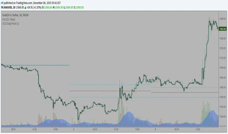
ACD Daily Pivot RangeThis indicator is to display the Daily Pivot Range for Mark Fishers "ACD" method.
If anyone knows how to offset it for different start times (LO, NYO) please let me know so I can update. Ideally the daily daily pivot calculation start should be from the same time as your opening range but i am not sure how to do this.
Column Up or DownThis is the same as my background up/down except it displays a column to show if the stock is above or below the previous day close.
When looking at numerous charts, you can instantly see if they are up or down for the day. For me, I like to be going long on the stocks that are already moving up and short on the ones that are moving down. When using lower time frames, you can lose perspective of where it is on the daily chart .

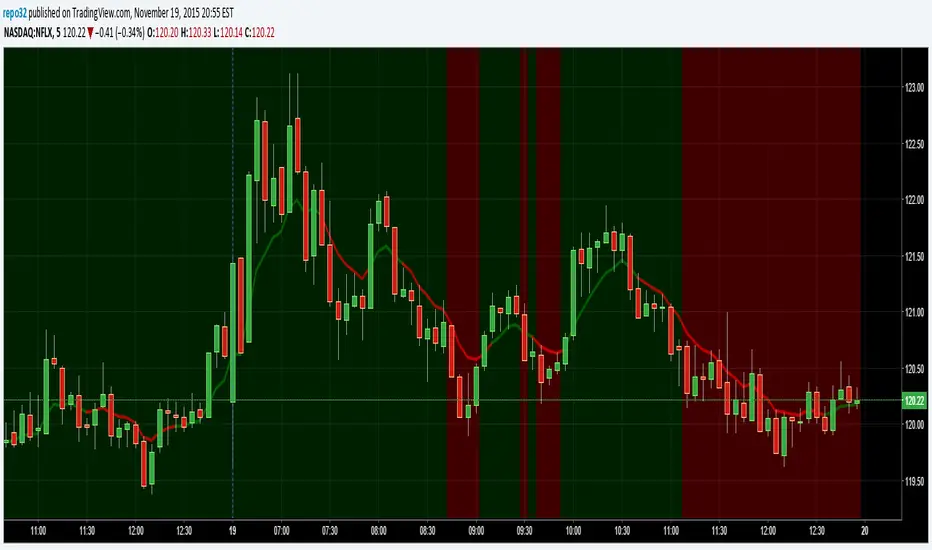
Background Up or DownThis script will color the background based upon whether it is positive or negative for the day. When looking at numerous charts, you can instantly see if they are up or down for the day. For me, I like to be going long on the stocks that are already moving up and short on the ones that are moving down. When using lower time frames, you can lose perspective of where it is on the daily chart.
On the example above, you can see a 5 minute chart of NFLX. It shows you when it dropped below the previous days close.
Eminaest Pivots V2Simple Pivot Points plotting script.
You can choose to plot Daily, Weekly and Monthly Pivot Points. Separate or two of them or all together.

Ichimoku V5 by ChrisMoody - Daily Kijun Mod by JDNIchimoku V5 by ChrisMoody with Daily Kijun-Sen Mod by JDN
This indicator has been modified to allow you to display the Daily Kijun-Sen on all time frames.