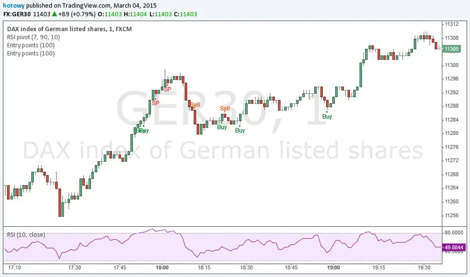
Entry pointsThis great and simple indicator based on EMA generates information about entry points at close of the candle. First signal is the best entry point but you can re-enter at the next. IMPORTANT: this script does not generate exit signals and those shoud be find using money management rules or else. Perfectly catches long runs in trends at all underlayings (forex, stocks, indexes, commodities) at all timeframes. Period=100 works best independently on timeframe but I encourage you to try other. Lower period gives more incorrect signals and shorter runs, higher period gives you late entry and less. Ofcourse it gives false signals from time to time but fortunately it makes a correction very fast. Try it! Good luck and good traiding!
Cari dalam skrip untuk "entry"
Entry FraggerEntry Fragger is a simple buy signal indicator.
It is most suitable for cryptocurrency, especially for altcoins on the 5 minute to daily timeframe and is based on simple volume calculations, in combination with EMA's.
Main Signal Logic explained:
A buy signal is generated by counting candles with an above average sell volume of 130% to 170%, taking into account the candles position below and above the 50 and 200 EMA.
If criteria meet, the first green candle above the 50 EMA's suggests upcoming higher prices.
The indicator has 2 input variables.
"Signal Confirmations (0 - 7):" Changes signal accuracy by a defining an ammount of high sell volume candles necessary below the 50 EMA.
"Volume Calculation Base (9 - 200):" Sets the exponential volume multiplier, this affects candle coloring and the volume calculation inside the candle.
"Style Settings": Turn ON/OFF Signals, Cloud, Bar Coloring, EMA's, etc...
There are no generally suitable default numbers for those 2 inputs, those have to be tested out, depending on cryptocurrency and timeframe.
The calculation is very basic, the underlying idea being, market maker initiating range breakouts through rapid increase of volume above or below the EMA's .
Example settings:
SOLUSDT: Signal Confirmations: 2, Volume Calculation Base 13.
SOLUSDT: Signal Confirmations: 0, Volume Calculation Base 20.
As you can see it affects signals quite a lot, but staying accurate.
Finetune the inputs to your preference.
Risk to Reward, Stoploss, Take Profit, position sizing, etc... is up to the user.
Recommended entry is to wait for following candle closes, entering half of the candle size and setting Stoploss outside the structure, like this:
Or right below the candles open, for safety.
Entry Point IndicatorIndicator detects entry point on differents markets and timeframes
Suggested timeframes: from 1 hour to 1-week chart

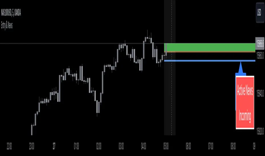
Entry Assistant & News AlertIntention Of This Indicator
This indicator is intended to be used as an assistant in combination with a technical strategy.
This indicator has several functions intended to assist you at entering positions.
This indicator is intended to be used with strategies that place Stop Losses above / below candles, and entries at the BOC ( Break Of The Previous Candle , For Longs it is when price goes above the previous candles high, For Shorts it is when price goes below the previous candles low)
This indicator allows you to enter daily news release times, and it will warn you before and after that news release time ( to help you stay out of trading news )
This indicator Draw / Displays the following
A line below ( for Longs ) / above ( for Shorts ) the current candle, with an additional pip value for extra space ( this displays where to place your Stop Loss )
A label displaying the price of the Stop Loss line, to assist in placing the Stop Loss
A line displaying where the BOC is ( based off of going Long or going Short )
A box that appears when the BOC has occurred ( entry signal )
A line displaying where the news release is going to happen ( only according to your time input settings )
A box that surrounds the news release ( only according to your time input settings )
A table in the bottom right corner that shows you when there is Active News ( only according to your time input settings )
Inputs
Inputs to change the aesthetics ( colours etc. )
Numeric inputs to modify the placement / spacing of the Stop Loss / Entry signal / News
Toggles to activate or deactivate features
Disclaimer
This indicator does not guaranteed to work for every instrument ( always test before use! )
It is not at all intended to be a signal indicator on its own, but rather only to give a signal when used with specific technical strategies that us BOC entries.
This indicator is not guaranteed to be accurate, or error free.
This indicator is not signalling winning entries or high probability entries.
You must manually enter the news time inputs, this indicator does not automatically show you when there is a news release
This is a combination indicator of my Entry Assistant and my News Alert indicator, both can be found and used separately.
[TT] Entry ProIndicators doesnt make money, it is the concept behind the indicator that makes money. Please read and understand before contact. This is not for beginners or people who are looking for Buy Sell signals. Purely for those who can understand the concept of confluence.
This indicator will help you identify the Entry candle with confluence of SMC or Pivots or any other analysis that you use.
Rules to follow :-
1. Identify Support Resistance (Smart Money Concept), Pivots, Trendlines (Choice is Yours)
2. Once Identified S&R Look for Bearish Candle at resistance or Bullish signal at Support, mark the areas
NSE:NIFTY
3. At Support as shown above in examples if the pink candle or the confirmation candle doesnt close break the support but closes above the support area, we do not consider it as break down. Some time breakdown happens and then at retest we get the bearish signal, that will be a good entry.
4. Like wise at resistance if you cant see a bullish signal breaking the resistance area, we do not consider break out. Same as above sometimes we get a signal after breakout and while retesting. Bullish SIgnal At support example is given below
NSE:BANKNIFTY
5. Enter in to a trade right when you get the signal use less lot size when you do and once you see price coming in to the range of the colored candle keep accumulating more at OHLC areas, first at high of colored candle and then close and then HL2 areas likewise, this helps to reduce your SL.
Note:
Areas to remember and not to get confused. At Important levels (Support or Resistance) once you get a relavent signal while retesting that signal you get a counter signal do not get confused by that and exit the trade. once you enter a trade you have to remain there as long as your SL is not hit. Remember that You have to use this retest candles to enter in to a trade, but not to get scared.
How to Use this in Swing or Long term trading? Futures or Stocks !!!
Look at the setup below Use weekly Chart to analyze for investment. In the below chart you can see there is a breakout of Swing high with candle and then a retest happened Twice but that area is intact. The best strategy to consider confluence is SMC. Thats what my perfect Setup is. You can use Orderblock to see if that orderblock is valid or not. Below you can see NSE:BANKNIFTY
Few more Stocks for Example. NSE:AXISBANK
BITSTAMP:BTCUSD
OANDA:EURUSD
Strictly Not assuring any 100% results. You need to least be confident on one concept of trading to aquire results.

RunRox - Entry Model🎯 RunRox Entry Model is an all-in-one reversal-pattern indicator engineered to help traders accurately identify key price-reversal points on their charts. It will be part of our premium indicator package and improve the effectiveness of your trading strategies.
The primary concept of this indicator is liquidity analysis, making it ideal for Smart Money traders and for trading within market structure. At the same time, the indicator is universal and can be integrated into any strategy. Below, I will outline the full concept of the indicator and its settings so you can better understand how it works.
🧬 CONCEPT
In the screenshot below, I’ll schematically illustrate the core idea of this indicator. It’s one of the patterns that the indicator automatically detects on the chart using a two-timeframe approach. We use the higher timeframe to identify liquidity zones, and the lower timeframe to capture liquidity removal and structure breaks. The schematic is shown in the screenshot below.
Our indicator includes three entry models in total , and I will discuss its functionality and features in more detail later in this post.
💡 FEATURES
Three entry models
PO3 HTF Bar
Entry Area
Optimization for each Entry Area
Filters
HTF FVG
Alert customization
Next, we will examine each entry model in detail.
🟠 ENTRY MODEL 1
The first model is the core one we’ll work with; all other models rely on its structure and construction. In the screenshot below, I’ll schematically show the complete model.
As shown in the screenshot above, we display higher-timeframe candles on the current chart to better visualize the entry model and keep the trader informed of what’s happening on the larger timeframe. The screenshot also highlights both the Long and Short models, as well as the Entry Area, which I will explain in more detail below.
The schematic model on the lower timeframe is shown in the screenshot above. It illustrates that after the Entry Model forms, we draw the Entry Area on the next candle and wait for a price pullback into this zone for the optimal trade entry. Statistically, before moving higher, the price typically revisits the Entry Area, covering the imbalances created by MSS; thus, the Entry Area represents the ideal entry point.
🟩 Entry Area
Once the Entry Model has formed, we focus on identifying the optimal pullback zone for taking a position. To determine which retracement area performs best, we conducted extensive historical backtesting on potential zones and selected those that consistently delivered the strongest results. This process yields Entry Areas with the highest probability of a successful reversal.
On the screenshot above, you can see an example of the Entry Area and which zones carry a higher versus lower probability of reversal. Zones rendered with greater transparency have historically delivered weaker results than the more opaque zones. The deeper-colored areas represent the optimal entry zones and can improve your risk-reward ratio by allowing you to enter at more favorable prices.
It’s important to remember that the entire Entry Area functions as a potential zone for scaling into a position. However, if your risk-to-reward ratio isn’t favorable, you can wait for the price to retrace to lower levels within the Entry Area and enter with a more attractive risk-to-reward.
🟢 Pattern Rating
Each entry model receives a rating in the form of green circles next to its name 🟢. The rating ranges from one to four circles, based on the historical performance of similar patterns. To calculate this rating, we backtest past data by analyzing candle behavior during the model’s formation and assign circles according to how similar patterns performed historically.
Example Ratings:
🟢 – One circle
🟢🟢 – Two circles
🟢🟢🟢 – Three circles
🟢🟢🟢🟢 – Four circles
The more green circles a model has, the more reliable it is—but it’s crucial to rely on your own analysis when identifying strong reversal points on the chart. This rating reflects the model’s historical performance and does not guarantee future results, so keep that in mind!
Below is a screenshot showing four model variations with different ratings on the chart.
⚠️ Unconfirmed Pattern
Entry Model 1 is designed so that, until the higher-timeframe candle closes, the pattern remains unconfirmed and is hidden on the chart. For traders who prefer to see setups as they form, there’s a dedicated feature that displays the unconfirmed pattern at the moment of its appearance - triggered by the Market Structure Shift - before the HTF candle closes. The screenshot below shows what the pattern looks like prior to confirmation.
‼️IMPORTANT: Until the pattern is confirmed and the higher-timeframe candle has closed, the model may disappear from the chart if price reverses and the HTF candle closes below the previous bar. Therefore, this mode is suitable only for experienced traders who want to see market moves in advance. Remember that the pattern can be removed from the chart, so we recommend waiting for the HTF candle to close before deciding to enter a trade.‼️
✂️ Filters
For the primary model, there are four filters designed to enhance entry points or exclude less-confirmed patterns. The filters available in the indicator are:
Bounce Filter
Market Shift Mode
Same Wave Filter
Only with Divergence
I will explain how each of these filters works below.
- Bounce Filter
The Bounce Filter identifies significant deviations of price from its mean and only displays the Entry Model once the asset’s price moves beyond the average level. The screenshot below illustrates how this appears on the chart.
The actual average-price calculation is more sophisticated than what’s shown in the screenshot, that image is just an illustrative example. When the price deviates significantly from the N-bar average, we start looking for the Entry Model. This approach works particularly well in range-bound markets without a clear trend, as it lets you trade strong deviations from the mean.
- Market Shift Mode
This filter works by detecting the initial impulse that triggered the liquidity sweep on the previous higher-timeframe candle, and then holding the Market Structure Shift level at that point after the sweep. If the filter is turned off, price may move higher following the liquidity removal, creating a new MSS level and potentially producing a false structure shift and entry signal on the formed model.
This filter helps you more accurately identify genuine shifts - but keep in mind that the model can still perform well without it, so choose the setting that best suits your trading style.
- Same Wave Filter
The Same Wave Filter removes entry models that form without a clear lower-timeframe structure when liquidity is swept from the previous higher-timeframe candle. In other words, if the prior HTF candle and the current one belong to the same impulse wave - without any retracements on the LTF - the model is filtered out.
Keep in mind that this filter may also exclude patterns that could have produced positive results, so whether to enable it depends on your trading system.
- Only with Divergence
The Only with Divergence filter detects divergence between the lows of successive candles and indicators like RSI. When the low that swept liquidity diverges from the previous candle’s low, the indicator displays a “DIV” label. Although RSI is cited as an example, our divergence calculation is more advanced. This filter highlights patterns where low divergence signals genuine liquidity manipulation and a likely aggressive price reversal.
🌀 Model Settings
Trade Direction: Choose whether to display models for Long or Short trades.
Fractal: Select between automatic fractal detection—which adapts the lower-timeframe (LTF) and higher-timeframe (HTF) candles—or Custom.
Custom Fractal: When Custom is selected, manually specify the LTF and HTF timeframes used to detect the patterns.
History Pattern Limit: Set the maximum number of patterns to display on the chart to keep it clean and uncluttered.
🎨 Model Style
You can flexibly customize the model’s appearance by choosing your preferred line thickness, color, and the other settings we discussed above.
🔵 ENTRY MODEL 2
This model appears under specific conditions when Model 1 cannot form. It’s a price-reversal model constructed according to different rules than the first model. The screenshot below shows how it looks on the chart.
This model forms less frequently than Model 1 but delivers equally strong performance and is displayed as a position-entry zone.
Like the Entry Area in Entry Model 1, this zone is calculated automatically and highlights the best entry levels: areas that showed the strongest historical results are rendered in a brighter shade.
🎨 Model Style
You can flexibly customize the style of Entry Model 2 - its color, opacity, visibility, and the average price of the previous candle.
🟢 ENTRY MODEL 3
Entry Model 3 is a continuation pattern that only forms after Entry Model 1 has completed and delivered the necessary price move to trigger Model 3.
Below is a schematic illustration of how Model 3 is intended to work.
🎨 Model Style
As with the previous models, you can flexibly customize the style of this zone.
⬆️ HTF CANDLES
One of the standout features of this indicator is the ability to plot higher-timeframe (HTF) candles directly on your lower-timeframe (LTF) chart, giving you clear visualization of the entry models and insight into what’s unfolding on the larger timeframe.
You can fully customize the HTF candles - select their style, the number of bars displayed, and tweak various settings to match your personal trading style.
HTF FVG
Fair Value Gaps (FVGs) can also be drawn on the HTF candles themselves, enabling you to spot key liquidity or interest zones at a glance, without switching between timeframes.
Additionally, you can view all significant historical HTF highs and lows, with demarcation lines showing where each HTF candle begins and ends.
All these options let you tailor the HTF candle display on your chart and monitor multiple timeframes’ trends in a single view.
📶 INFO PANEL
Instrument: the market symbol on which the model is detected
Fractal Timeframes: the LTF and HTF fractal periods used to locate the pattern
HTF Candle Countdown: the time remaining until the higher-timeframe candle closes
Trade Direction: the direction (Long or Short) in which the model is searched for entry
🔔 ALERT CUSTOMIZATION
And, of course, you can configure any alerts you need. There are seven alert types available:
Confirmed Entry Model 1
Unconfirmed Entry Model 1
Confirmed Entry Model 2
Confirmed Entry Model 3
Entry Area 1 Trigger
Entry Area 2 Trigger
Entry Area 3 Trigger
You also get a custom macro field where you can enter any placeholders to fully personalize your alerts. Below are example macros you can use in that field.
{{event}} - Event name ('New M1')
{{direction}} - Trade direction ('Long', 'Short')
{{area_beg}} - Entry Area Price
{{area_end}} - Entry Area Price
{{exchange}} - Exchange ('Binance')
{{ticker}} - Ticker ('BTCUSD')
{{interval}} - Timeframe ('1s', '1', 'D')
{{htf}} - High timeframe ('15', '60', 'D')
{{open}}-{{close}}-{{high}}-{{low}} - Candle price values
{{htf_open}}-{{htf_close}}-{{htf_high}}-{{htf_low}} - Last confirmed HTF candle's price
{{volume}} - Candle volume
{{time}} - Candle open time in UTC timezone
{{timenow}} - Signal time in UTC timezone
{{syminfo.currency}} - 'USD' for BTCUSD pair
{{syminfo.basecurrency}} - 'BTC' for BTCUSD pair
✅ USAGE EXAMPLES
Now I’ll demonstrate several ways to apply this indicator across different trading strategies.
Primarily, it’s most effective within the Smart Money framework - where liquidity and manipulation are the core focus - so it integrates seamlessly into your SMC-based approach.
However, it can also be employed in other strategies, such as classic technical analysis or Elliott Wave, to capitalize on reversal points on the chart.
Example 1
The first example illustrates forming a downtrend using a Smart Money strategy. After the market structure shifts and the first BOS is broken, we begin looking for a short entry.
Once Entry Model 1 is established, a Fair Value Gap appears, which we use as our position-entry zone. The nearest target becomes the newly formed BOS level.
In this trade, it was crucial to wait for a strong downtrend to develop before hunting for entries. Therefore, we waited for the first BOS to break and entered the trade to ride the continuation of the downtrend down to the next BOS level.
Example 2
The next example illustrates a downtrend developing with a Fair Value Gap on the 1-hour timeframe. The FVG is also displayed directly on the HTF candles in the chart.
The pattern forms within the HTF Fair Value Gap, indicating that we can balance this inefficiency and ride the continuation of the downtrend.
The target can simply be a 1:2 or 1:3 risk–reward ratio, as in our case.
📌 CONCLUSION
These two examples illustrate how this indicator can be used to identify reversals or trend continuations. In truth, there are countless ways to incorporate this tool, and each trader can adapt the model to fit their own strategy.
Always remember to rely on your own analysis and only enter trades when you feel confident in them.

Cracked Entry & ExitThis just helps give you a good signal that it could be a good place for an entry. Please note that this indicator is made for scalping. This means you need to be shaving/skimming/taking profits frequently. I have found that when this signal starts to appear that is when I zoom out on larger time frames to see if it is in fact a good time to go in. I typically set a very tight stoploss and/or move it up into the green quickly. Hope this helps.


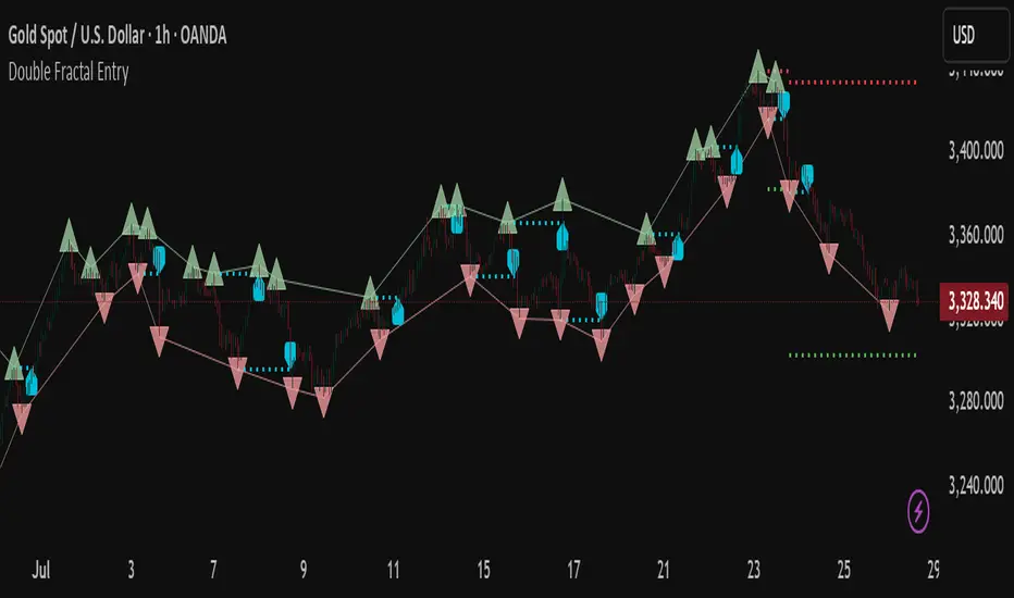
Double Fractal Entry📘 Double Fractal Entry – Original Structure-Based Entry System
Double Fractal Entry is a proprietary indicator that uses dynamic fractal structure to generate actionable buy/sell signals, with automatic Stop-Loss and Take-Profit placement. Unlike classic fractal tools or ZigZag-based visuals, this script constructs real-time structural channels from price extremes and offers precise entry points based on breakout or rejection behavior.
It is designed for traders who want a clear, structured approach to trading price action — without repainting, lagging indicators, or built-in oscillators.
🧠 Core Logic
This script combines three custom-built modules:
1. Fractal Detection and Channel Construction
- Fractals are detected using a configurable number of left/right bars (sensitivity).
- Confirmed upper/lower fractals are connected into two continuous channels.
- These channels represent real-time structure zones that evolve with price.
2. Entry Signal Logic
You can choose between two signal types:
- Breakout Mode – Triggers when price breaks above the upper fractal structure (for buys) or below the lower one (for sells).
- Rebound Mode – Triggers when price approaches a fractal channel and then rejects it (forms a reversal setup).
Each signal includes:
- Entry arrow on the chart
- Horizontal entry line
- Stop-Loss and Take-Profit lines
3. SL/TP Calculation
Unlike tools that use ATR or fixed values, SL and TP are dynamically set using the fractal range — the distance between the most recent upper and lower fractals. This makes the risk model adaptive to market volatility and structure.
📊 Visuals on the Chart
- 🔺 Green/Red triangle markers = confirmed fractals
- 📈 Lime/Red channel lines = evolving upper/lower structure
- 🔵 Blue arrow = signal direction (buy/sell)
- 📉 SL/TP lines = dynamically drawn based on fractal spacing
- 🔁 Signal history = optional, toggleable for backtesting
⚙️ Settings and Customization
- Fractal sensitivity (bars left/right)
- Entry mode: Breakout or Rebound
- SL and TP multiplier (based on fractal range)
- Visibility settings (signal history, lines, colors, etc.)
💡 What Makes It Unique
This is not just a variation of standard fractals or a ZigZag wrapper.
Double Fractal Entry was built entirely from scratch and includes:
- ✅ A dual-channel system that shows the live market structure
- ✅ Entry signals based on price behavior around key zones
- ✅ Volatility-adaptive SL/TP levels for realistic trade management
- ✅ Clean, non-repainting logic for both manual and automated use
The goal is to simplify structure trading and provide precise, repeatable entries in any market condition.
🧪 Use Cases
- Breakout mode – Ideal for trend continuation and momentum entries
- Rebound mode – Great for reversals, pullbacks, and range-bound markets
- Can be used standalone or combined with volume/trend filters
⚠️ Disclaimer
This tool is intended for technical analysis and educational use. It does not predict future market direction and should be used with proper risk management and strategy confirmation.

Double Fractal Entry📘 Double Fractal Entry – Original Structure-Based Entry System
Double Fractal Entry is a proprietary indicator that uses dynamic fractal structure to generate actionable buy/sell signals, with automatic Stop-Loss and Take-Profit placement. Unlike classic fractal tools or ZigZag-based visuals, this script constructs real-time structural channels from price extremes and offers precise entry points based on breakout or rejection behavior.
It is designed for traders who want a clear, structured approach to trading price action — without repainting, lagging indicators, or built-in oscillators.
🧠 Core Logic
This script combines three custom-built modules:
1. Fractal Detection and Channel Construction
- Fractals are detected using a configurable number of left/right bars (sensitivity).
- Confirmed upper/lower fractals are connected into two continuous channels.
- These channels represent real-time structure zones that evolve with price.
2. Entry Signal Logic
You can choose between two signal types:
- Breakout Mode – Triggers when price breaks above the upper fractal structure (for buys) or below the lower one (for sells).
- Rebound Mode – Triggers when price approaches a fractal channel and then rejects it (forms a reversal setup).
Each signal includes:
- Entry arrow on the chart
- Horizontal entry line
- Stop-Loss and Take-Profit lines
3. SL/TP Calculation
Unlike tools that use ATR or fixed values, SL and TP are dynamically set using the fractal range — the distance between the most recent upper and lower fractals. This makes the risk model adaptive to market volatility and structure.
📊 Visuals on the Chart
- 🔺 Green/Red triangle markers = confirmed fractals
- 📈 Lime/Red channel lines = evolving upper/lower structure
- 🔵 Blue arrow = signal direction (buy/sell)
- 📉 SL/TP lines = dynamically drawn based on fractal spacing
- 🔁 Signal history = optional, toggleable for backtesting
⚙️ Settings and Customization
- Fractal sensitivity (bars left/right)
- Entry mode: Breakout or Rebound
- SL and TP multiplier (based on fractal range)
- Visibility settings (signal history, lines, colors, etc.)
💡 What Makes It Unique
This is not just a variation of standard fractals or a ZigZag wrapper.
Double Fractal Entry was built entirely from scratch and includes:
- ✅ A dual-channel system that shows the live market structure
- ✅ Entry signals based on price behavior around key zones
- ✅ Volatility-adaptive SL/TP levels for realistic trade management
- ✅ Clean, non-repainting logic for both manual and automated use
The goal is to simplify structure trading and provide precise, repeatable entries in any market condition.
🧪 Use Cases
- Breakout mode – Ideal for trend continuation and momentum entries
- Rebound mode – Great for reversals, pullbacks, and range-bound markets
- Can be used standalone or combined with volume/trend filters
🔒 Invite-Only Notice
This is an invite-only script with a fully closed source.
All logic is original and developed by the author. It does not use or copy public open-source scripts, built-in indicators (RSI, MA, etc.), or repainting tricks. The entire entry and risk system is based on custom structural logic built from real-time price action.
⚠️ Disclaimer
This tool is intended for technical analysis and educational use. It does not predict future market direction and should be used with proper risk management and strategy confirmation.
Naleen's Entry IndicatorHi
This indicator uses a combination of moving averages and RSI to trigger entry and exit signals.
Use alongwith my VWAP Indicator to enter positions

™TradeChartist Entry/Exit Indicator™TradeChartist Entry/Exit Indicator is an easy to use indicator that plots very high probability BUY and SELL signals on the chart along with an optional dynamic trigger line for SELL and BUY which can be used as a reference for Stop Loss/ Trailing Stop Loss.
What does the ™TradeChartist Entry/Exit Indicator do?
Plots very high probability BUY and SELL signals on chart
Plots dynamic BUY or SELL trigger lines that can be used to
---------1. Set Stop Loss reference or Trailing Stop Loss.
---------2. Anticipate change in trend/momentum when price breaches the trigger line.
Plots BUY and SELL price lines which are Candle open prices when BUY/SELL signals are posted.
Alert traders when BUY/SELL signal is generated and Trigger for BUY/SELL is breached.
Plots Background vertical Signal break lines at BUYs in green and at SELLs in red.
Plots % Gains based on candle close in real-time and based on candle high for BUY/candle low for SELL on previous candles calculated from the candle open price at BUY/SELL.
Plots RSI colour candles based on user preferred Overbought and Oversold RSI levels from indicator settings.
Paints background colour for BUY and SELL zones which can be changed from indicator settings under Style tab to personalise the chart screen.
What markets can this indicator be used on?
Forex
Stocks
Commodities
Cryptocurrencies
and almost any asset on Trading View
Works really well when there is good volume, volatility or both in the asset observed/traded.
Does this indicator repaint?
No and Yes
Once the confirmed BUY (in green) and SELL (in red) signals are posted after a candle close, it doesn't repaint.
Repainting happens for real time BUY and SELL trigger plots on the current candle as price tries to breach the trigger line.
For confirmed BUY and SELL alerts, use alerts on candle close. Real-time BUY and SELL trigger alerts can also be set.
Does the indicator send alerts when a signal is generated?
Yes, traders can get alerts by setting Trading View alerts for BUY/SELL Signals and BUY/SELL Triggers. For confirmed BUY/SELL alerts, 'Once per bar close' must be used.
Why are there two Signal Generator types in the indicator settings?
The two types of signal generators cater to almost all types of traders and trade types. Some assets perform well with Type 1 and some assets with Type 2. Also some traders prefer Type 1 and some prefer Type 2 based on variation in frequency of signals on the asset observed. Both types can be used along with 'Use Heikin Ashi Candles' from the indicator settings to have more combinations to test on an asset for maximising gains.
Type 1 on GBPUSD 1hr chart
Type 2 on GBPUSD 1hr chart
Type 1 normally works well with most types of assets.
Should the indicator be used on normal candles or Heikin Ashi candles?
The indicator can be used on either of the candle types. If signals from Heikin Ashi chart needs to be plotted on normal chart, just check 'Use Heikin Ashi Candles' from indicator settings. It may not be exact, but very close as it mimics Heikin Ashi chart trend.
Heikin Ashi charts are recommended to spot trends and reversals but they don't reflect real OHLC values in the candles, so BUY/SELL entry price points may not be ideal using Heikin Ashi charts especially when there are gaps in price action (example Stocks, FOREX, Commodities). For real OHLC prices and to know exact price points for entering/exiting trade, use normal candlestick charts. It is purely for this reason Heikin Ashi chart signals can be mimicked on normal candles using 'Use Heikin Ashi Candles' option from settings without having to switch between the two.
It can be seen from the GOLD 1hr charts above (Heikin Ashi on left and normal candlestick chart on right), the indicator mimics signals sensibly (not copy) and doesn't use same entry values as Heikin Ashi chart to aid the trader with practical trade execution.
How do the Trigger Lines work and should they be used?
Trigger for BUY/SELL lines are coded to adapt to bull and bear power in the asset trading environment and helps the trader to anticipate change in trend based on direction of price momentum when enabled from indicator settings (On by default). Traders can use trigger lines as reference for Stop Loss points. For example, when a BUY signal is posted, the 'Trigger for SELL' can be used as initial Stop Loss reference and as price starts going up, the trigger line starts moving up enabling the trader to use it as a trailing stop loss point which helps secure or lock profits as they act as ideal support/resistance lines based on the type of trade too. BUY/SELL Trigger lines can be enabled or disabled from indicator settings 'Inputs' tab.
Also, the trigger lines can alert traders to anticipate change in trend/momentum when price hits them and it helps them take a position, either Long or Short when confirmed BUY/SELL signal is posted. As price tries to breach the trigger lines, they change from 'Trigger to BUY/SELL' to 'BUY/SELL Triggered' as shown below on 1hr Gold chart. This feature is coded purely to signal the trader a potential change in trend/momentum. The trigger lines also act as strong support/resistance so only a confirmed close above them will ensure a High Probability Trade.
It should also be noted that price tends to test the BUY/SELL trigger lines to see if a breach is possible. A rejection at trigger lines could mean trend continuation in the signal direction. Traders could use other trend indicators like Ichimoku cloud, stoch, TRIX etc. to make an informed trade decision here. In the chart below, the 'BUY triggered' label has changed back to 'Trigger for BUY' as price failed to close above it.
What is the use of 'Plot BUY/SELL Price Line'?
Enabling BUY/SELL price line from settings (On by default) plots the price line corresponding to candle open when BUY/SELL signals were posted on the chart by the indicator. Open price is used as it is close to the trigger lines and is a fair reference point for indicator to calculate the gains plot on chart since BUY/SELL signals.
Can trade gains be plotted on chart and how are they calculated?
To show percentage gains on chart, just enable 'Show % Gains on Chart' from indicator settings (Off by default). As explained above, % gains are calculated from BUY/SELL candle Open price to high (for Long trades) or low (for Short trades) and to current candle close (for both Long and Short trades) as it helps see real-time gains from BUY/SELL candle Open price. The % gains are plotted as below.
0 - 0.75% - ↑ in green
0.75-1.5% - 1% in green
1.51-2.5% - 2% in green
2.51-3.5% - 3% in green
3.51-4.5% - 4% in green
4.51-5.5% - 5% in green
5.51-10.5% - 5+% in green
10.51-20% - 10+% in green
20+% - 20+% in green
Down from Entry - ↓ in red
What are RSI Colour Candles?
RSI Colour Candles are visual candle plots in colour (Blue when RSI>60, Yellow when RSI<30 and On by default) that help trades spot RSI levels at a glance visually from the chart in real-time without the need for another indicator on screen. Traders can also choose the source to be used for plotting RSI colour candles from indicator settings input tab and change candle colours from indicator settings style tab. The length for RSI calculation is 14 and works well for almost any trading scenario and cannot be changed from indicator settings. The default overbought RSI is set at 60 as it helps spot momentum increase and big moves happen above 60 RSI. When deciding to sell or buy, RSI can be tuned from settings to spot decent entry or exit. For example, RSI>80 on a red Heikin Ashi candle (blue body and red border) after an uptrend could signal potential sell-off or RSI<30 on a green Heikin Ashi candle (yellow body and green border) after a down trend could signal a good move up. In the example daily chart of RVN-BTC below, RSI>75 on a red Heikin Ashi candle signalled a potential sell off way before the actual SELL signal plot on chart.
What is the use of Signal Break Line Plot and Paint Background options from indicator settings?
Signal break lines can be useful if traders prefer to switch off BUY/SELL signals from indicator settings to show where previous signals were generated. (On by default)
Paint Background is just a nice to have feature that paints the signal zones to personalise the chart screen. (Off by default). The background paint colours can be changed from indicator settings style tab.
4hr SPX chart below showcases the difference when the Signal Break Lines and Background Paint options are used with BUY/SELL signals switched off.
Important Note:
When using this indicator on a chart, check 'Scale Price Chart Only' and 'Auto (Fits Data to Screen)' by clicking on settings wheel on the bottom right under the chart screen as shown below. If not checked, the chart screen will look like one on the left as shown below.
-----------------------------------------------------------------------------------------
This is not a free to use indicator. Get in touch with me if you would like access to the indicator for a 1 day trial before deciding on a paid access for a period of your choice. Monthly, Quarterly, Half-Yearly and 1 Year access available.
-----------------------------------------------------------------------------------------

Position Tools [Lot,Profit,Loss,Entry,RR,Balance][Mir Nader]This indicator is the advanced version of the position tool in Trading View. When I opened a trade in Metatrader, I had to switch between the MetaTrader and Trading View programs for the amount of profit or loss, that's why I thought of writing an indicator that shows the exact amount of profit, loss, size and other values of the open trade. It came to my mind.
Also, when you use the reply section for backtesting, this indicator helps you to use all the necessary information in each Trade to accurately calculate Trades.
To enter, it is enough to specify the three entry points, target and stop loss according to the message that is displayed to you, so that all the necessary information will be displayed for you.
Well, let's get to the main explanation about how the indicator works :
The indicator consists of two parts :
1 - the calculation table
2 - trade on the chart
Calculation table
This table shows the exact calculations of your trade live.
As you can see, this table consists of 10 sections, which I will describe each.
1 - Your trade entry point on the chart
2 - Your Stop Loss point along with the loss Pip amount
3 - Your Take Profit point along with the Profit Pip amount
4- The fourth part of the table, which is the most important part in my view, shows your current profit amount according to the risk percentage and your Broker Commission per Lot you have defined for Trade, and according to the balance, risk, Tp and Sl value, just like a Risk Management. It suggests the volume of your input based on the lot.
5 - Show the percentage change of the main market according to your trade live
6 - Display the value of Risk to Reward both according to Target Profit and live
7 - This section and the next section of the table show the amount of profit live according to the amount of the lot determined by you and without the risk of the transaction.
8 - Display the current amount of your balance according to whether the trade is in profit or loss
trade on the chart
The second part of the indicator includes the events that are being displayed on your chart
This section supports three types of display modes for buying or selling trades.
The first condition of your trade is that the price has not yet reached the entry point.
The second state is your trade that has not yet hit your target or stop
And the third state of your trade is that your target or stop has been hit.
Further Details :
I am still working on many conditions to add to the indicator and this will take more time.
For example, showing RR live on the chart after each touch has been added for buying Trade but this part is still problematic for selling Trade In the picture below, you can see that your Trade has already passed 3R profit
I have placed three labels next to each Trade for you so that you can see the values of Tp, Stop and Live without needing a table. These values will soon be visible with more options.
All calculations with precise mathematical formulas for accurate performance have been done by myself.
I will be at your service soon with more updates, I will be happy if you send me your suggestions to improve the indicator.

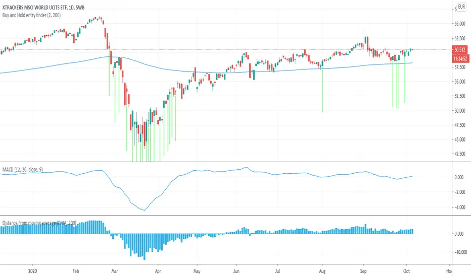
Buy and Hold entry finderHello everyone!
This is a indicator based on the MACD and the distance between the current price and the Exponential moving Average .
The signal gets triggered if the current MACD (with default settings) is under 0 and the Distance from the Ema gets smaller if under ema or gets bigger if over ema . In edition you can set a max distance from the ema .
This indicator was invented for buy and hold strategy s only.
I invented this indicator to find better entrys for my saving plans on the MSCI WORLD AND MSCI EMERGING MARKETS ETF on the 1 day timeframe.
Instead of investing every month, i only invest on the green Arrow Signal.
For example, lets say there is no buy signal for 3 months, then i invest the summary of the three months on the buy signal.

Buy Signal and Entry points (alpha)
Here is some study for my new bot project. 🤖
Indicator shows entry points (buy signals). Bets results on 15M TF and higher. (1H recommended)
Pay attention to how the script gives signals before the pumps. 📈📈📈
You can cut false signals by using stop-loss orders (recommended).
Use on you own risk.
This is alpha version of script. May be updated in the future.
=================================================================
Стратегия разработанная для нашего торгового бота. 🤖
Индикатор показывает точки входа на покупку. Показывает хорошие результаты на ТФ 15М и выше. (Рекомендую 1Ч)
Обратите внимание на то, как скрипт срабатывает перед пампами. 📈📈📈
Чтобы купировать ложные сигналы, рекомендую использовать стоп-лосс ордера.
Это альфа версия скрипта, возможно будет дорабатываться и обновляться. Но это не точно :)

Liq level to Entry CalculatorThis script calculates long and short entry levels with leverage and liquidation levels of your choosing. Suppose you are trading XBTUSD and believe the bottom is in. You're looking for a long entry using 10x leverage that will only get liquidated if we hit new lows. You choose "5698.9" USD.
By changing the leverage to "10" and the long liquidation price to "5698.9", the script will calculate the price point for your long entry.
I hope this helps inform your trades.
-Sim

MadLad v0.01 (Buy/Entry Signals)This script is a very rough, very early release of a project called madlad (www.twitter.com).
Currently being used on BITSTAMP:XRPUSD 5 Min Heiken Ashi.
It's a very early concept. It is also very aggressive , therefore it spams buy signals. The buy symbols do not mean enter, they are simply potential entry points.
You can see this especially during heavy drops, I would generally wait for the end of the shading to make an entry. Aqua shading is simply confluence with another indicator.
Feel free to mess around with some of the settings, however most are just placeholders and do little to nothing.
I will eventually update this to remove some of the spammy buy signals. If you use this with some other indicators, it will definitely help remove a bit of the spammy-ness.
In the meantime though, if anyone is able to come up with their own solutions on avoiding bad trades while using the "buy" signals, feel free to DM me and or post in the comments.
Follow www.twitter.com
There we will be posting updates and entry/exits in realtime! For free, no signal group BS or anything, this comes at the cost of signals not always being correct so always trade at your own risk!

Buy Sell Entry Filter SYS (SMC IDM LIT)BUY SELL Entry FILTER
An advanced market analysis tool. It provides visual Buy/Sell signals in the form of triangles (▲▼), as well as analytical elements such as Entry/Stop Loss lines, a delta table, overbought and oversold zones, structural market elements with breakouts, displays information from higher time frames, and most importantly, liquidity blocks that trigger reactions. The indicator has a number of built-in filters that help remove unnecessary Buy/Sell signals from the chart. This allows you to create several profitable strategies. You don't need to sit in front of the charts; the alert system (ALERTS) will tell you when to pay attention to the chart and quickly enter a trade.
There are many signals, and the ▲▼ lines themselves are not an entry point. You need to filter them using other tools, such as liquidity blocks (LB and HTF LB), trend, OS/OB, Delta, and Pullback breakout.
If the ▲▼ appears in the right place, for example, in the liquidity block with the correct trend and the correct delta, then you can enter a trade!
Ideally, take short trades of 1/3 – 1/5 RR on a 1-minute timeframe and be sure to set a stop loss.
Remember! You are solely responsible for your deposit!
Buy/Sell, Entry/SL, OS/OB, Filter, EMA, Delta
This main group of settings is responsible for generating buy and sell signals, setting filters, and displaying moving averages.
1. Buy/Sell Main: Enables/disables the display of the main Buy/Sell signal as a ▲▼. This is a specific pattern that identifies potential trend reversals or continuations.
Buy/Sell Simple: Toggles the display of a simplified Buy/Sell signal in the ▲▼ pattern.
This pattern is less powerful than the main one, but works well in certain contexts.
2. Trend Delta Table: Displays a table on the chart showing the cumulative volume delta for the current trend, as well as the percentage. Useful for assessing the strength of a trend.
3. Entry/SL: When enabled, draws horizontal lines on the chart for Entry and Stop Loss.
4. Filters (Delta, Trend, OS/OB, HTF OS/OB):
These filters help filter out false signals. A Buy/Sell signal is displayed only if it passes all enabled filters:
Delta Filter: A signal is generated if the volume percentage delta (set by the user) matches the signal direction (positive for Buy, negative for Sell).
Trend Filter (EMA): A signal is generated if it matches the trend direction.
OS/OB Filter (RSI): A signal is generated if the price where the signal formed is in the desired zone (below Oversold for Buy, above Overbought for Sell).
HTF OS/OB Filter (RSI): Same as OS/OB, but uses the RSI on a higher timeframe (HTF).
EMA 1 & EMA 2: Displays two exponential moving averages on the chart (default 50 and 100). The line color changes (e.g., green if EMA1 is above EMA2).
Overbought/oversold zone
This group configures overbought/oversold levels and zones, both on the current and higher timeframes.
1. OS/OB zone: Enables/disables the display of dynamic overbought (Oversold) and oversold (Overbought) levels. These levels "float," adapting to the current price. 2. Period: Period for calculating zones (default 50)
OS: Level below which the Oversold zone is defined (default 40).
OB: Level above which the Overbought zone is defined (default 60).
Labels: Toggles the display of text labels (--- OB, --- OS) next to the corresponding levels.
Mid: Toggles the display of the center level and its color.
HTF Zones & Labels: Same as for OS/OB, but for levels on a higher timeframe (HTF).
Smooth: Enables smoothing for calculated price levels of zones, making the lines less sharp.
Structure / Breakout line
This setting adds structural analysis elements and breakout lines to the chart. 1. BO Lines (Breakout Lines): Displays horizontal lines on the chart when the price breaks through the external pullback against the trend, thus showing ChoCh.
2. HH/LL: Displays markers (HH - LL - HL - LH) on the chart to indicate key market structural points.________________________________________
Pullbacks EXT/INT
This setting is responsible for the visualization of pullback lines (Pullback) at external (EXT) and internal (INT) levels.
1. Ext (External): Displays lines connecting external extremes (Pullback), showing potential pullback levels.
2. Int (Internal): Displays lines connecting internal extremes (Pullback).
3. Pending Ext/Int: Displays potential pullback lines that may form if the price reaches the next extreme.
Liquidity blocks
Adds visual rectangles (blocks) to the chart, representing potential liquidity zones (where large orders were placed).
1. LB tune: Parameter determining how many candles are used to determine the pattern for a block.
2. High zone: Color of the line inside the block, indicating the strongest part of the block.
3. Show deleted: Shows deleted (broken) blocks in a different color.
4. Volume LB: Enables/disables the display of the volume value in the block.
Quick liquidity blocks
Similar to main blocks, but creates quick blocks. If a quick block is confirmed, it becomes the main LB; if not, it disappears.
1. Quick LB: Enables/disables quick blocks.
2. QLB tune: Pattern length parameter for quick blocks.
HTF liquidity blocks
Displays LB from a higher timeframe (HTF), using the same principles as main blocks. 1. HTF: Enable/disable HTF blocks.
2. Select a timeframe for calculation.
Alerts
A system for alerting you to important indicator actions. Alerts are triggered by certain events.
1. Bull PB Breakout / Bear PB Breakout: Alert when the external pullback is broken and a ChoCh is formed.
2. Trend Change: Alert when a trend changes.
3. New Block: Alert when a new main liquidity block is formed.
4. New HTF Block: Alert when a new HTF liquidity block is formed.
5. Touch Block: Alert when the price of the main liquidity block is touched.
6. Touch HTF Block: Alert when the price of the HTF liquidity block is touched.
7. Touch mode / Touch mode HTF: Select the alert frequency (before or after the bar closes).
This indicator provides a powerful and flexible tool for market analysis, combining several approaches in a single interface.

SibayakNa - v16.1 Entry Setup Indicator to confirm Entry Setup with simple MA Crossing, RSI, Volume, ATR, OBV, ADX at MTF.


VWAP Entry Assistant (v1.0)Description:
Anchored VWAP with a lightweight assistant for VWAP reversion trades.
It shows the distance to VWAP, an estimated hit probability for the current bar, the expected number of bars to reach VWAP, and a recommended entry price.
If the chance of touching VWAP is low, the script suggests an adjusted limit using a fraction of ATR.
The VWAP line is white by default, and a compact summary table appears at the bottom-left.
Educational tool. Not financial advice. Not affiliated with TradingView or any exchange. Always backtest before use.

Entry HelperEntry Helper is a precision tool designed to enhance clarity and support decision-making in fast-paced trading environments.
It adapts intelligently to different timeframes, offering visual guidance based on your chosen context — without the need to manually adjust settings.
Specially optimized for scalping assets like XAUUSD, NASDAQ, and SP500, it delivers exactly what you need, when you need it.
⚡ Just switch the chart… and it adjusts itself.
Developed by WAKEUP | Maggifx
