Adaptive MA Crossover with ATR-Based Risk MarkersDescription:
The Cross MA Entry Indicator with ATR-Based Stop-Loss and Take-Profit Markers is a powerful tool designed to help traders identify trend-following opportunities while managing risk effectively. By combining customizable moving average (MA) crossovers with ATR-based stop-loss (SL) and take-profit (TP) markers, this indicator provides a complete entry and risk management framework in a single script.
Unique Features:
1. Versatile Moving Average Combinations: The indicator allows users to select from four types of moving averages—SMA, EMA, DEMA, and TEMA—for both fast and slow lines, enabling a variety of crossover configurations. This flexibility helps traders tailor entry signals to specific trading strategies, asset types, or market conditions, enhancing the adaptability of the indicator across different styles and preferences.
2. ATR-Based Dynamic Risk Management: Leveraging the Average True Range (ATR), the indicator dynamically calculates stop-loss and take-profit levels based on market volatility. This approach adjusts to changing market conditions, making it more responsive and reliable for setting realistic, volatility-based risk parameters.
3. Customizable Risk/Reward Ratio: Users can define their preferred risk/reward ratio (e.g., 2:1, 3:1) to tailor take-profit levels relative to stop-loss distances. This feature empowers traders to align trades with their individual risk management strategies and objectives, while maintaining consistency and discipline in execution.
4. Streamlined Visualization of Entry and Risk Levels: Upon a crossover, the indicator places discrete markers at the calculated SL and TP levels, avoiding clutter while providing traders with an immediate view of potential risk and reward. Small dots represent SL and TP levels, offering a clean, clear display of critical decision points.
How to Use:
1. Entry Signals from MA Crossovers: This indicator generates entry signals when the selected moving averages cross, with green markers indicating long entries and red markers indicating short entries. The customizable MA selection enables traders to optimize crossover signals for various timeframes and asset classes.
2. Integrated Risk Markers: SL and TP levels are shown as small dots at the crossover point, based on the ATR multiplier and risk/reward ratio settings. These markers allow traders to quickly visualize the defined risk and potential reward for each entry.
This indicator offers a comprehensive solution for trend-following strategies by combining entry signals with adaptive risk management. Suitable for multiple timeframes, it allows for backtesting and adjustments to ATR and risk/reward parameters for improved alignment with individual trading goals. As with all strategies, thorough testing is recommended to ensure compatibility with your trading approach.
Cari dalam skrip untuk "entry"

Stoch RSI and RSI Buy/Sell Signals with MACD Trend FilterDescription of the Indicator
This Pine Script is designed to provide traders with buy and sell signals based on the combination of Stochastic RSI, RSI, and MACD indicators, enhanced by the confirmation of candle colors. The primary goal is to facilitate informed trading decisions in various market conditions by utilizing different indicators and their interactions. The script allows customization of various parameters, providing flexibility for traders to adapt it to their specific trading styles.
Usefulness
This indicator is not just a mashup of existing indicators; it integrates the functionality of multiple momentum and trend-detection methods into a cohesive trading tool. The combination of Stochastic RSI, RSI, and MACD offers a well-rounded approach to analyzing market conditions, allowing traders to identify entry and exit points effectively. The inclusion of color-coded signals (strong vs. weak) further enhances its utility by providing visual cues about the strength of the signals.
How to Use This Indicator
Input Settings: Adjust the parameters for the Stochastic RSI, RSI, and MACD to fit your trading style. Set the overbought/oversold levels according to your risk tolerance.
Signal Colors:
Strong Buy Signal: Indicated by a green label and confirmed by a green candle (close > open).
Weak Buy Signal: Indicated by a blue label and confirmed by a green candle (close > open).
Strong Sell Signal: Indicated by a red label and confirmed by a red candle (close < open).
Weak Sell Signal: Indicated by an orange label and confirmed by a red candle (close < open).
Example Trading Strategy Using This Indicator
To effectively use this indicator as part of your trading strategy, follow these detailed steps:
Setup:
Timeframe : Select a timeframe that aligns with your trading style (e.g., 15-minute for intraday, 1-hour for swing trading, or daily for longer-term positions).
Indicator Settings : Customize the Stochastic RSI, RSI, and MACD parameters to suit your trading approach. Adjust overbought/oversold levels to match your risk tolerance.
Strategy:
1. Strong Buy Entry Criteria :
Wait for a strong buy signal (green label) when the RSI is at or below the oversold level (e.g., ≤ 35), indicating a deeply oversold market. Confirm that the MACD shows a decreasing trend (bearish momentum weakening) to validate a potential reversal. Ensure the current candle is green (close > open) if candle color confirmation is enabled.
Example Use : On a 1-hour chart, if the RSI drops below 35, MACD shows three consecutive bars of decreasing negative momentum, and a green candle forms, enter a buy position. This setup signals a robust entry with strong momentum backing it.
2. Weak Buy Entry Criteria :
Monitor for weak buy signals (blue label) when RSI is above the oversold level but still below the neutral (e.g., between 36 and 50). This indicates a market recovering from an oversold state but not fully reversing yet. These signals can be used for early entries with additional confirmations, such as support levels or higher timeframe trends.
Example Use : On the same 1-hour chart, if RSI is at 45, the MACD shows momentum stabilizing (not necessarily negative), and a green candle appears, consider a partial or cautious entry. Use this as an early warning for a potential bullish move, especially when higher timeframe indicators align.
3. Strong Sell Entry Criteria :
Look for a strong sell signal (red label) when RSI is at or above the overbought level (e.g., ≥ 65), signaling a strong overbought condition. The MACD should show three consecutive bars of increasing positive momentum to indicate that the bullish trend is weakening. Ensure the current candle is red (close < open) if candle color confirmation is enabled.
Example Use : If RSI reaches 70, MACD shows increasing momentum that starts to level off, and a red candle forms on a 1-hour chart, initiate a short position with a stop loss set above recent resistance. This is a high-confidence signal for potential price reversal or pullback.
4. Weak Sell Entry Criteria :
Use weak sell signals (orange label) when RSI is between the neutral and overbought levels (e.g., between 50 and 64). These can indicate potential short opportunities that might not yet be fully mature but are worth monitoring. Look for other confirmations like resistance levels or trendline touches to strengthen the signal.
Example Use : If RSI reads 60 on a 1-hour chart, and the MACD shows slight positive momentum with signs of slowing down, place a cautious sell position or scale out of existing long positions. This setup allows you to prepare for a possible downtrend.
Trade Management:
Stop Loss : For buy trades, place stop losses below recent swing lows. For sell trades, set stops above recent swing highs to manage risk effectively.
Take Profit : Target nearby resistance or support levels, apply risk-to-reward ratios (e.g., 1:2), or use trailing stops to lock in profits as price moves in your favor.
Confirmation : Align these signals with broader trends on higher timeframes. For example, if you receive a weak buy signal on a 15-minute chart, check the 1-hour or daily chart to ensure the overall trend is not bearish.
Real-World Example: Imagine trading on a 15-minute chart :
For a buy:
A strong buy signal (green) appears when the RSI dips to 32, MACD shows declining bearish momentum, and a green candle forms. Enter a buy position with a stop loss below the most recent support level.
Alternatively, a weak buy signal (blue) appears when RSI is at 47. Use this as a signal to start monitoring the market closely or enter a smaller position if other indicators (like support and volume analysis) align.
For a sell:
A strong sell signal (red) with RSI at 72 and a red candle signals to short with conviction. Place your stop loss just above the last peak.
A weak sell signal (orange) with RSI at 62 might prompt caution but can still be acted on if confirmed by declining volume or touching a resistance level.
These strategies show how to blend both strong and weak signals into your trading for more nuanced decision-making.
Technical Analysis of the Code
1. Stochastic RSI Calculation:
The script calculates the Stochastic RSI (stochRsiK) using the RSI as input and smooths it with a moving average (stochRsiD).
Code Explanation : ta.stoch(rsi, rsi, rsi, stochLength) computes the Stochastic RSI, and ta.sma(stochRsiK, stochSmoothing) applies smoothing.
2. RSI Calculation :
The RSI is computed over a user-defined period and checks for overbought or oversold conditions.
Code Explanation : rsi = ta.rsi(close, rsiLength) calculates RSI values.
3. MACD Trend Filter :
MACD is calculated with fast, slow, and signal lengths, identifying trends via three consecutive bars moving in the same direction.
Code Explanation : = ta.macd(close, macdLengthFast, macdLengthSlow, macdSignalLength) sets MACD values. Conditions like macdLine < macdLine confirm trends.
4. Buy and Sell Conditions :
The script checks Stochastic RSI, RSI, and MACD values to set buy/sell flags. Candle color filters further confirm valid entries.
Code Explanation : buyConditionMet and sellConditionMet logically check all conditions and toggles (enableStochCondition, enableRSICondition, etc.).
5. Signal Flags and Confirmation :
Flags track when conditions are met and ensure signals only appear on appropriate candle colors.
Code Explanation : Conditional blocks (if statements) update buyFlag and sellFlag.
6. Labels and Alerts :
The indicator plots "BUY" or "SELL" labels with the RSI value when signals trigger and sets alerts through alertcondition().
Code Explanation : label.new() displays the signal, color-coded for strength based on RSI.
NOTE : All strategies can be enabled or disabled in the settings, allowing traders to customize the indicator to their preferences and trading styles.

Candle Range Theory | Flux Charts💎 GENERAL OVERVIEW
Introducing our new Candle Range Theory Indicator! This powerful tool offers a strategy built around the Candle Range Theory, which analyzes market movements through the relative size and structure of price candles. For more information about the process, check the "HOW DOES IT WORK" section.
Features of the new Candle Range Theory Indicator :
Implementation of the Candle Range Theory
FVG & Order Block Entry Methods
2 Different TP / SL Methods
Customizable Execution Settings
Customizable Backtesting Dashboard
Alerts for Buy, Sell, TP & SL Signals
📌 HOW DOES IT WORK ?
The Candle Range Theory (CRT) indicator operates by identifying significant price movements through the relative size and structure of candlesticks. A key part of the strategy is determining large candles based on their range compared to the Average True Range (ATR) in a higher timeframe. Once identified, a breakout of either the high wick or the low wick of the large candle is required. This breakout is considered a liquidity grab. After that, the indicator waits for confirmation through Fair Value Gaps (FVGs) or Order Blocks (OBs). The confirmation structure must be the opposite direction of the breakout, for example if the high wick is broken, a bearish FVG is required for the short entry. After a confirmation signal is received, the indicator will trigger entry points based on your chosen entry method (FVG or OB), and exit points will be calculated using either a dynamic ATR-based TP/SL method or fixed percentages. Alerts for Buy, Sell, Take-Proft, and Stop-Loss are available.
🚩 UNIQUENESS
This indicator stands out because it combines two highly effective entry methods: Fair Value Gaps (FVGs) and Order Blocks (OBs). You can choose between these strategies depending on market conditions. Additionally, the dynamic TP/SL system uses the ticker's volatility to automatically calculate stop-loss and take-profit targets. The backtesting dashboard provides metrics about the performance of the indicator. You can use it to tune the settings for best use in the current tiker. The Candle Range Theory approach offers more flexibility compared to traditional indicators, allowing for better customization and control based on your risk tolerance.
⚙️ SETTINGS
1. General Configuration
Higher Timeframe: Customize the higher timeframe for analysis. Recommended combinations include M15 -> H4, H4 -> Daily, Daily -> Weekly, and Weekly -> Monthly.
HTF Candle Size: Define the size of the higher timeframe candles as Big, Normal, or Small to filter valid setups based on their range relative to ATR.
Entry Mode: Choose between FVGs and Order Blocks for your entry triggers.
Require Retracement: Enable this option if you want a retracement to the FVG or OB for entry confirmation.
Show HTF Candle Lines: Toggle to display the higher timeframe candle lines for better visual clarity.
2. Fair Value Gaps
FVG Sensitivity: You may select between Low, Normal, High or Extreme FVG detection sensitivity. This will essentially determine the size of the spotted FVGs, with lower sensitivities resulting in spotting bigger FVGs, and higher sensitivities resulting in spotting all sizes of FVGs.
3. Order Blocks
Swing Length: Swing length is used when finding order block formations. Smaller values will result in finding smaller order blocks.
4. TP / SL
TP / SL Method:
a) Dynamic: The TP / SL zones will be auto-determined by the algorithm based on the Average True Range (ATR) of the current ticker.
b) Fixed : You can adjust the exact TP / SL ratios from the settings below.
Dynamic Risk: The risk you're willing to take if "Dynamic" TP / SL Method is selected. Higher risk usually means a better winrate at the cost of losing more if the strategy fails. This setting is has a crucial effect on the performance of the indicator, as different tickers may have different volatility so the indicator may have increased performance when this setting is correctly adjusted.

LRS-Strategy: 200-EMA Buffer & Long/Short Signals LRS-Strategy: 200-EMA Buffer & Long/Short Signals
This indicator is designed to help traders implement the Leveraged Return Strategy (LRS) using the 200-day Exponential Moving Average (EMA) as a key trend-following signal. The indicator offers clear long and short signals by analyzing the price movements relative to the 200-day EMA, enhanced by customizable buffer zones for increased precision.
Key Features:
200-Day EMA: The main trend indicator. When the price is above the 200-day EMA, the market is considered in an uptrend, and when it is below, it indicates a downtrend.
Customizable Buffer Zones: Users can define a percentage buffer around the 200-day EMA (default is 3%). The upper and lower buffer zones help filter out noise and prevent premature signals.
Precise Long/Short Signals:
Long Signal: Triggered when the price moves from below the lower buffer zone, crosses the 200-day EMA, and then breaks above the upper buffer zone.
Short Signal: Triggered when the price moves from above the upper buffer zone, crosses the 200-day EMA, and then breaks below the lower buffer zone.
Alternating Signals: Ensures that a new signal (long or short) is only generated after the opposite signal has been triggered, preventing multiple signals of the same type without a reversal.
Clear Visual Aids: The indicator displays the 200-day EMA and buffer zones on the chart, along with buy (long) and sell (short) signals. This makes it easy to track trends and time entries/exits.
How to Use:
Long Entry: Look for the price to move below the lower buffer, cross the 200-day EMA from below, and then break out of the upper buffer to confirm a long signal.
Short Entry: Look for the price to move above the upper buffer, cross below the 200-day EMA, and then break below the lower buffer to confirm a short signal.
This indicator is perfect for traders who prefer a structured, trend-following approach, using clear rules to minimize noise and identify meaningful long or short opportunities.

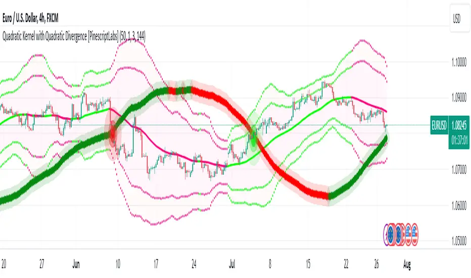
Quadratic Kernel with Quadratic Divergence [PinescriptLabs]This indicator combines a quadratic kernel regression with adaptive deviation bands to provide a unique view of market trends.
Key Features:
**Customizable Parameters:**
- Regression Period: Adjusts the sensitivity of the central line (default 50).
- Time Deformation: Modifies the weight of recent vs. older data (default 1.0). Increasing the "Time Deformation" makes more recent data more relevant, while decreasing it gives more weight to older data in the regression calculation.
- Confidence Band Width: Controls the width of the bands (default 3.0). Determines how many standard deviations are added to or subtracted from the central line to form the confidence bands. The standard deviations are calculated as the difference between the central line and the closing prices. A higher confidence value will result in wider bands, indicating a broader range of expected price variation, while a lower confidence value will result in narrower bands, indicating a narrower range of expected price variation.
**How to Use the Indicator Based on Price Crossings with the Kernel Divergence Line?**
Short: We need a candle to cross and close below the Kernel Divergence Line (bullish), and at the same time, the quadratic channels must be in a Bearish state for confirmation. Once the entry is executed, our exit will be when the Divergence Line changes its color by at least two confirmation points, or the price crosses above, which nullifies the entry.
Long: We need a candle to cross and close above the Kernel Divergence Line (bearish), and at the same time, the quadratic channels must be in a Bullish state for confirmation. Once the entry is executed, our exit will be when the Divergence Line changes its color by at least two confirmation points, or the price crosses below, which nullifies the entry.
**How to Use the Indicator Based Solely on Kernel Divergence??**
We observe the Kernel Divergence line, which indicates bullish momentum while the price is declining, and we are looking for the Reversal point.
**Confirmation of the Reversal Point:** When the Kernel Divergence changes from bullish (green color) to bearish (red color), we look for the price at its lowest point to be below the first lower Quadratic channel or even outside the Quadratic channel. This signals a potential strong reversal.
How to Use the Indicator Based Solely on Quadratic Channels?
Use only confirmations of changes from Bullish to Bearish or vice versa. It is recommended to have at least three confirmation points in the same direction.
Quadratic Kernel Regression: Provides a smoothed trend line that adapts to market movements.
Adaptive Deviation Bands: Dynamically calculated to show market volatility.
Buy/Sell Signals: Based on the price crossing the central line and the direction of the trend.
Quadratic Kernel Regression calculates a smoothed central line based on recent prices.
The deviation bands automatically adjust according to market volatility.
The trend is determined by comparing the current position of the central line with its previous position.
Buy signals are generated when the price crosses above the central line in an uptrend.
Sell signals are generated when the price crosses below the central line in a downtrend.
Español:
Este indicador combina una regresión de kernel cuadrático con bandas de desviación adaptativas para proporcionar una visión única de la tendencia del mercado.
Características principales:
**Parámetros personalizables:**
- Período de regresión: Ajusta la sensibilidad de la línea central (por defecto 50).
- Deformación del tiempo: Modifica el peso de los datos recientes vs. antiguos (por defecto 1.0). Aumentar la "Deformación del tiempo" hace que los datos más recientes sean más relevantes, mientras que disminuirla da más peso a los datos antiguos en el cálculo de la regresión.
- Ancho de bandas de confianza: Controla la amplitud de las bandas (por defecto 3.0). Determina cuántas desviaciones estándar se añaden o restan a la línea central para formar las bandas de confianza. Las desviaciones estándar se calculan como la diferencia entre la línea central y los precios de cierre. Un valor mayor de confianza resultará en bandas más anchas, indicando un rango más amplio de variación esperada en los precios, mientras que un valor menor de confianza resultará en bandas más estrechas, indicando un rango más estrecho de variación esperada.
* *Cómo usar el Indicador Basados en los Cruces de Precio con la Línea de Divergencia del Kernel?**
Short: Necesitamos que una vela cruce y cierre por debajo de la línea de Divergencia del Kernel (bullish) y al mismo tiempo los Canales cuadráticos deben estar en un momento Bearish para confirmación. Una vez ejecutada la entrada, nuestra salida será cuando la Línea de Divergencia haga su cambio de color al menos dos puntos de confirmación o el precio haga un cruce por arriba, lo que anula la entrada.
Long: Necesitamos que una vela cruce y cierre por Encima de la linea de Divergencia del Kernel( Bearish) y al mismo tiempo los Canales cuadráticos deben estar en un momento Bullish para confirmación, una vez ejecutada la entrada nuestra salida será cuando la Linea de Divergencia haga su cambio de color al menos dos puntos de confirmación o el precio haga un cruce por Debajo lo que anula la entrada:
Como usar el indicador Basado en solo en Divergencia del Kernel? : Observamos la linea de Divergencia del Kernel la cual nos indica un momentum bullish mientras que precio va a la baja y lo que buscamos es el punto de Reversion.
Confirmación de punto de reversion: cuando la Divergencia de Kernel pasa de bullish ( color verde) a bearish ( color rojo) buscamos que el precio en su punto mas bajo este por debajo del primer canal inferior Quadratico o fuera incluso del canal Quadratico lo que nos indica una posible reversion con fuerza.
Como usar el indicador basado solo en Canales Quadraticos?
Utilizar únicamente las confirmaciones de Cambio de Bullish a Bearish o visceversa, se recomienda al menos tres puntos de confirmación en la misma dirección.
Regresión de kernel cuadrático: Ofrece una línea de tendencia suavizada que se adapta a los movimientos del mercado.
Bandas de desviación adaptativas: Calculadas dinámicamente para mostrar la volatilidad del mercado.
Señales de compra/venta: Basadas en el cruce del precio con la línea central y la dirección de la tendencia.
La regresión de kernel cuadrático calcula una línea central suavizada basada en los precios recientes.
Las bandas de desviación se ajustan automáticamente según la volatilidad del mercado.
La tendencia se determina comparando la posición actual de la línea central con su posición anterior.
Las señales de compra se generan cuando el precio cruza por encima de la línea central en una tendencia alcista.
Las señales de venta se generan cuando el precio cruza por debajo de la línea central en una tendencia bajista.
The Magic LineThis script is based on the simple 2 or 3 candle entry model taught by Armando "The Professor".
This strategy will work best on the 1hr timeframe or higher and you can also add a MA on your chart to identify direction of trend and trade with the trend. For example, if price is above the 50 SMA, you can opt to only look for 'buy' signals. If price is below the 50 SMA, you can opt to only look for 'sell' signals.
The default setting is to wait for 3 consecutive candles of either bullish or bearish sentiment before printing a buy or sell signal. This can be changed to any number you would like but typically 3 works best, as long as you're using the 1hr timeframe or higher.
Ex: If there are 3 green (bullish) candles print in a row, a 'sell' signal will print, and the entry line will be one tick below the open of the previous green candle. You can use that line as your entry.
For your stop loss, you can try to use the most recent swing high (for sells) or swing low (for buys). You can also use nearby support/resistance levels, or even the PSAR as another way to determine your stop loss.
If there are more than 3 consecutive candles with the same sentiment, signals will continue to print until the streak ends at which point the counter will restart, and the idea is to take the most recent signal as your entry. Limit/Stop entries work best as you can just let price come down to the signal line that is drawn.
Comment below if you have any questions! Good luck!

RV - Relative Strength Index Buy/SellIntroduction
The RV - RSI B/S V1.2 indicator leverages the RSI to identify overbought and oversold conditions in the market. The RSI line color changes according to bullish, bearish, oversold, and overbought zones, helping users identify direction and avoid false trades. By plotting the RSI along with user-defined moving averages and Bollinger Bands, it offers a multi-faceted approach to analyzing market momentum.
Indicator Overview
The indicator RSI line color changes as per the bullish, bearish, oversold, and overbought zones. This helps users find out the direction and the zones. The oversold and overbought zones are colored to help users avoid false trades.
Trading Strategy
Long Trades (Bullish Setup):
Entry: A long trade is initiated when the RSI crosses from 60 up to 80.
Exit: Long trades are generally exited when the RSI is between 80 and 90.
Condition: No long trades are taken if the RSI exceeds 80.
Short Trades (Bearish Setup):
Entry: A short trade is initiated when the RSI crosses from 40 down to 20.
Exit: Short trades are generally exited when the RSI is between 20 and 10.
Condition: No short trades are taken if the RSI falls below 20.
RSI Color Coding and Interpretation
The RV - RSI B/S V1.2 indicator uses color coding to provide a visual representation of RSI values, making it easier to identify critical levels at a glance:
Green (RSI 60-80): Indicates a bullish zone where long trades can be considered.
Red (RSI > 80): Signals an overbought condition where long trades should be avoided.
Orange (RSI 20-40): Indicates a bearish zone where short trades can be considered.
Pink (RSI < 20): Signals an oversold condition where short trades should be avoided.
RSI Settings and Their Importance
RSI Length: The default length is set to 12, which is the standard period for RSI calculation. This setting can be adjusted to increase or decrease sensitivity.
Source: The source of the data for the RSI calculation is typically the closing price.
MA Type: Various moving averages can be applied to the RSI, including SMA, EMA, SMMA (RMA), WMA, and VWMA. Each type offers different smoothing properties and can be selected based on
trading preferences.
MA Length: The default length is set to 20, aligning with the RSI length for consistency.
Bollinger Bands: When using Bollinger Bands, the standard deviation multiplier is set to 2.0 by default, but it can be adjusted to suit different volatility conditions.
Disclaimer
This indicator provides valuable signals for potential trading opportunities based on RSI levels and moving averages. However, it is crucial to incorporate directional price action analysis to confirm signals and improve trading accuracy. The RV - RSI B/S V1.2 should be used as part of a broader trading strategy, considering other technical and fundamental factors.

OrderFlow [Probabilities] | FractalystWhat's the indicator's purpose and functionality?
The indicator is designed to incorporate probabilities with buyside and sellside liquidity, as well as premium and discount ranges within the market. It also provides traders with a multi-timeframe functionality for observing liquidity levels and probabilities across two timeframes without the need to manually switch between them.
These levels are often used in smart money trading concepts for identifying key areas of interest, such as potential reversal points, areas of accumulation or distribution, and zones of high liquidity.
----
What's the purpose of these levels? What are the underlying calculations?
1. Understanding Swing highs and Swing Lows
Swing High: A Swing High is formed when there is a high with 2 lower highs to the left and right.
Swing Low: A Swing Low is formed when there is a low with 2 higher lows to the left and right.
2. Understanding the purpose and the underlying calculations behind Buyside , Sellside and Equilibrium levels.
3. Identifying Discount and Premium Zones.
4. Importance of Risk-Reward in Premium and Discount Ranges
----
How does the script calculate probabilities?
The script calculates the probability of each liquidity level individually. Here's the breakdown:
1. Upon the formation of a new range, the script waits for the price to reach and tap into equilibrium or the 50% level. Status: "⏸" - Inactive
2. Once equilibrium is tapped into, the equilibrium status becomes activated and it waits for either liquidity side to be hit. Status: "▶" - Active
3. If the buyside liquidity is hit, the script adds to the count of successful buyside liquidity occurrences. Similarly, if the sellside is tapped, it records successful sellside liquidity occurrences.
5. Finally, the number of successful occurrences for each side is divided by the overall count individually to calculate the range probabilities.
Note: The calculations are performed independently for each directional range. A range is considered bearish if the previous breakout was through a sellside liquidity. Conversely, a range is considered bullish if the most recent breakout was through a buyside liquidity.
----
What does the multi-timeframe functionality offer?
Enabling and selecting a higher timeframe in the indicator's user-input settings allows you to access not only the current range information but also the liquidity sides, status, price levels, and probabilities of a higher timeframe without needing to switch between timeframes and mark up the levels manually.
----
What are the multi-timeframe underlying calculations?
The script uses the same calculations (mentioned above) and requests the data such as price levels, bar time, probabilities and booleans from the user-input timeframe.
Non-repainting Security Function with Lookahead ON
//Function to fetch data for a given timeframe
getHTFData(timeframe_,exp_) =>
request.security(syminfo.tickerid, timeframe_,exp_ ,lookahead = barmerge.lookahead_on)
----
How to use the indicator?
1. Add the indicator to your TradingView chart.
2. Choose the pair you want to analyze/trade.
3. Enable the HTF in user-input settings and choose a timeframe as for your higher timeframe bias.
4. (Important) : Ensure that the probabilities on both timeframes are aligned in one direction. If not, switch between timeframes until you find a pair of timeframes that are in line with each other and have higher probabilities on one liquidity side.
For Swing traders:
Use Hourly timeframes (1H/2H/4H/8H/12H) as your current timeframe and 1D/3D/1W/2W for your higher timeframe (HTF).
Entry: Hourly Equilibrium level. (Limit order)
Stoploss: Place it on the side where the probability is lower than 50%.
Break-even level/TP1: Hourly breakout of the liquidity.
TP2: Target the Higher Timeframe (HTF) liquidity level where the probability is higher than 50%.
2H/1D COINBASE:BTCUSD
For Day traders:
Use minutely timeframes (5m/15m/30m) as your current timeframe and 1H/2H/4H/8H/12H for your higher timeframe (HTF).
Entry: Minutely Equilibrium level. (Limit order)
Stoploss: Place it on the side where the probability is lower than 50%.
Break-even level/TP1: Minutely breakout of the liquidity.
TP2: Target the Higher Timeframe (HTF) liquidity level where the probability is higher than 50%.
1H/5m COINBASE:BTCUSD
----
User-input settings and customizations
----
What makes this indicator original?
1. Real-time calculation of probabilities directly on your charts.
2. Multi-timeframe functionality, enabling effortless observation of liquidity levels and probabilities across two timeframes.
3. Status label for clear identification of whether price has reached equilibrium.
4. All levels are updated only upon candle closure above or below liquidity levels, ensuring it remains a non-repainting indicator.
----
Terms and Conditions | Disclaimer
Our charting tools are provided for informational and educational purposes only and should not be construed as financial, investment, or trading advice. They are not intended to forecast market movements or offer specific recommendations. Users should understand that past performance does not guarantee future results and should not base financial decisions solely on historical data.
By continuing to use our charting tools, the user acknowledges and accepts the Terms and Conditions outlined in this legal disclaimer.

Diverging Chart Patterns - Ultimate [Trendoscope®]🎲 Presenting the Diverging Chart Patterns Ultimate Indicator
Much like its counterpart, the Converging Chart Patterns Ultimate indicator, this tool is an offshoot of our premium Auto Chart Patterns - Ultimate offering. However, it is exclusively designed to focus on diverging patterns.
🎲 Built on Extensive Research and Open-Source Foundations
Our journey toward creating this indicator has been guided by thorough research and insights gleaned from our previous works on Chart Patterns, which include:
Algorithmic Identification of Chart Patterns
Flag and Pennant Chart Patterns
Trading Diverging Chart Patterns
Drawing from the groundwork established by our publicly available indicators - Auto Chart Patterns and Flags and Pennants - this tool represents the culmination of our efforts to furnish traders with a refined approach to navigating diverging patterns. It not only facilitates the formulation of technical trading strategies but also aids in assessing their efficacy through historical performance analysis. The specific patterns addressed by this indicator encompass:
Rising Wedge (Diverging Type)
Falling Wedge (Diverging Type)
Diverging Triangle
Rising Triangle (Diverging Type)
Falling Triangle (Diverging Type)
🎲 Chart Pattern Scanning Methodology
Identifying diverging chart patterns follows a structured approach comprising several key steps:
Zigzag Examination : Start by analyzing each zigzag, focusing on the last 5 or 6 pivot points to pinpoint potential trend line pairs.
Divergence Verification : Project these trend lines backward and scrutinize for intersections within a specified number of bars prior. This step confirms the presence of divergence.
Pattern Categorization : Once divergence is confirmed, categorize each pattern based on the directional orientation of its trend lines. Refer to our article - Algorithmic Identification of Chart Patterns for detailed categorization guidelines.
🎲 Methodology or Trading for Chart Patterns
While traditional perspectives often prescribe specific trading biases to diverging patterns—for instance, labeling Rising Wedges as bearish and Falling Wedges as bullish, while acknowledging Triangles' versatility—there's limited empirical evidence to fully support these assumptions. Our indicator is crafted to empower users to explore and validate a wide range of trading hypotheses, including unconventional ones. This approach liberates trading strategies from being confined to historical market behaviors.
We offer extensive customization options to facilitate testing of diverse strategies. The initial setup accommodates both long and short trading scenarios for each identified pattern. Users retain the freedom to adjust trading directions and other parameters within the indicator's settings to align with their analytical preferences.
This open approach is grounded in the methodology detailed in - Trading Diverging Chart Patterns . It is exemplified by the following process, which users can customize and enhance using our indicator.
🎲 Insight into Indicator Components
The chart below provides an illustration of the components comprising our indicator:
Pattern Visualization : This functionality dynamically showcases patterns on the chart, emphasizing presently active ones. Historical patterns are omitted to uphold clarity and optimize performance, considering limitations in drawing object capacity.
Trading Annotations : The indicator conveniently denotes open trades directly on the chart, accommodating both long and short positions based on user preferences and the ongoing status of associated trades for each pattern.
Performance Metrics Table : A comprehensive table meticulously presents backtesting outcomes for individual patterns alongside aggregated results. It encompasses vital metrics such as win rates and the profit factor, calculated in alignment with the designated risk-reward ratio. These insights provide users with valuable assessments of potential profitability and trade strategy effectiveness.
🎲 Delving into the Indicator's Customization Features
Our indicator boasts a wealth of settings, empowering users to customize criteria and refine their trading strategies. Each setting comes with detailed tooltips, offering valuable insights into its functionality. Let's explore each category methodically.
🎯 Zigzag Configuration Options
These settings provide users with the flexibility to fine-tune their pattern analysis by adjusting the length and depth of the zigzag:
Length Adjustment : Altering this parameter modifies the scale of detected patterns. Higher values highlight larger formations, while lower ones focus on more compact patterns.
Depth Enhancement : This parameter adjusts the complexity of the recursive zigzag analysis, potentially revealing larger patterns across multiple levels. Users should exercise caution, as excessive depth may strain the indicator's processing capacity.
🎯 Pattern Scanning Settings
This collection of settings refines the pattern scanning process, typically adjusted to achieve precise geometric alignment of detected patterns. While many settings can be left at their default values for regular use, users are encouraged to customize them, particularly the "Last Pivot Direction," to explore different theoretical approaches to pattern trading.
🎯 Trade Configuration Settings
Arguably the most vital for users, these settings provide full control in shaping trading strategies based on diverging chart patterns. This encompasses the freedom to establish entry, stop, and target prices, fine-tune risk-reward ratios, choose historical depth for backtesting, and integrate filters to guide trade direction.
🎯 Pattern Specific Settings
Here, users have the flexibility to customize settings for individual patterns or groups, thereby refining the precision of their strategies. Alongside the option to enable/disable specific patterns and pattern groups, users can also choose pattern-specific settings such as Last Pivot Direction, Trade Direction Filter, and external filters.
🎯 Fully Customizable Alerts
Utilizing the alert() function, these notifications circumvent the usual template within the alert widget. To address this, we've integrated placeholders in the settings for creating comprehensive alert templates.
Available Categories Include
New - Alerts when a new pattern is identified
Entry - Alerts when an entry condition for a configured pattern based trade is met.
Stop - Alerts when a trade that has reached entry gets stopped out without reaching target
Target - Alerts when a trade reaches its target
Invalidation - Alerts when a trade reaches an invalidation point before reaching the entry.
Each alert type can possess its unique template. Tailorable templates are crucial for effectively utilizing alerts within broker or exchange integration.
Here are some of the placeholders that are defined in the indicator.
{type} - Alert type - new/entry/stop/target/invalid
{pid} - Pattern ID of the pattern belonging to trade. Multiple trades can have same pattern id since a pattern can be traded in both long and short directions.
{tid} - Unique Trade ID for the given trade.
{ticker} - Ticker ID on which the indicator is run
{timeframe} - Chart timeframe on which the indicator is run
{basecurrency} - Base currency of the symbol
{quotecurrency} - Quote currency of the symbol
{pivots} - Pivot values of the pattern
{price} - Current price when the alert is triggered.
{pattern} - Name of the pattern on which the alert is triggered.
{direction} - Direction of the trade.
{entrydirection} - Direction of the entry signal. Used for specific bot integration.
{exitdirection} - Direction of the exit signal. Used for specific bot integration.
{entry} - Entry price of the trade
{stop} - Stop price of the trade
{target} - Target price of the trade
{invalidation} - Invalidation price of the trade
🎯 Display and Stats
These settings regulate the display options on the chart. Closed trade statistics are showcased in a table and appear in the bottom-left corner of the chart. These can be tailored using the display settings.
Skrip berbayar

Harmonic Patterns SuiteHello Traders!
This indicator takes the time-consuming search for harmonic patterns completely off your hands. TRN Harmonics utilizes a unique swing-based pattern recognition to pinpoint 14 different harmonic patterns in real-time with unparalleled precision.
Pattern List (each pattern has a bullish and a bearish version)
Gartley
Bat
Butterfly
Crab
Cypher
Shark
5-0
Feature List
Real-time harmonic pattern detection
7 different built-in breakout conditions
Visualization of entry, stop-loss and take-profit levels
Pattern performance statistics
Calculation of risk-rewards ratio
Risk Management
Breakout alerts
Customizable pattern size and accuracy
Customizable look and feel
The value of this indicator is to support traders to easily identify harmonic patterns in an automated way. The special swing-based pattern recognition and the numerous built-in premium features make this indicator unique. The trader saves a lot of time scanning the markets for harmonic patterns, since everything is done automatically for the trader: Finding the pattern, looking and alerting for a breakout, computing the entry, stop loss and take profit levels as well as handling the risk management and computing the optimal order quantity.
How to Trade with the Harmonic Patterns Suite
Identify the Pattern
Add the Harmonic Patterns Suite to your chart and look for patterns on the asset and timeframe of your choice. The patterns are detected in real-time. If a pattern develops further in the next bars, then the indicator updates the pattern accordingly until a breakout is confirmed or the pattern becomes invalid.
You can also use the built-in alerts to easily get notified when a pattern occurs. In the indicator settings in the "Alerts" section you can choose whether you want to get notified when a pattern is
1. in the making (Pattern active),
2. confirms an up breakout (B/O Up Confirmed)
3. confirms a down breakout (B/O Down Confirmed)
4. (Unconfirmed) in case a pattern breakout occurs, even if the pattern is not yet confirmed
This allows you to stay informed about potential breakout opportunities that are still awaiting confirmation.
Check Pattern Statistics
The pattern statistics make it easy for you to see how successful a pattern is on the asset and timeframe you are watching. You should always check the statistics before entering a trade. The chart displays the statistics in the upper right corner. These statistics are categorized into two sections: "long" for patterns with an upward breakout and "short" for patterns with a downward breakout.
In the initial columns, labeled as "short" and "long", the identified breakouts are further divided based on the different harmonic patterns. The following columns represent the count of the events:
1. Occ. (Occurrence) categorized according to the values of R from the first column
2. TP1, TP2 (Take Profit) - targets 1 und 2
3. SL (Stop Loss)
4. T/O (Time Out) - neither stop loss or targets where hit in a certain amount of time
Breakout – Entry, Stop Loss and Targets
The indicator automatically displays the entry price line (EP) in grey at the point where the breakout got detected. Once a breakout has been confirmed, place a buy order near the EP level for a long position, or a sell order for a short position. Set your stop-loss at the price level of the red stop-loss line (SL) and set your take-profits at the price level of the green take-profit-lines (TP1, TP2).
Risk Management
The Harmonic Patterns Suite comes with a built-in risk management feature. Just go to the settings and scroll down to the section "Risk Management". Here you can enter your Account Size and the percentage you want to Risk when you enter a position after a pattern breakout.
In the "Trade Management" section, you have the option to define the minimum accepted risk-reward ratio for confirmed harmonic patterns. This means that breakouts of patterns failing to meet the minimum risk-reward ratio will not be considered as confirmed signals. If a breakout gets confirmed, the indicator automatically calculates the position size (Quantity). You can read the quantity from the gray entry point line (EP), which is located to the right of the risk-reward ratio (R). Note that your risk-reward ratio (R) is calculated based on TP1.
Customization and settings
The indicator can scan for smaller and larger patterns at the same time. Adjust the harmonics size in the indicator settings to align them with your preferences. A larger size results in larger consolidations. Depending on the asset class, the market or the market phase, different sizes can be used for pattern detection.
To detect more patterns, increase the tolerance level, even though it may result in lower accuracy. However, be mindful that a higher tolerance level may result in more patterns hitting their stop-loss. Look for a tolerance level that leads to favorable statistics and focus on trading patterns with a proven performance history.
Finally, you have the flexibility to customize various visual elements, such as the color of the pattern and whether to display values like price, target, or risk-reward ratio on your chart. You can also choose where these values appear.
Breakout Conditions
Identifying breakout conditions is paramount for successfully recognizing and capitalizing on chart patterns. Trading tools equipped with diverse breakout conditions offer traders a comprehensive approach to deciphering market trends and making informed decisions.
This section delves into the set of breakout conditions built within TRN Harmonics, exploring their functionalities, applications, and the benefits they provide in the realm of chart pattern recognition.
TRN Bars Signal + Trend
The Harmonics Pattern Suite includes also the TRN Bars algorithm. It is designed to spot bullish and bearish trends and reversals. The trend analysis is based on a new algorithm that weights several different inputs:
1. classical and advanced bar patterns and their statistical frequency
2. probability distributions of price expansions after certain bar patterns
3. bar information such as wick length in %, overlapping of the previous bar in % and many more
4. historical trend and consolidation analysis
If you use this breakout condition, the breakout is determined by the next signal (reversal, continuation, breakout) or trend change of the TRN bars after one of the harmonic patterns has been completed. These Breakout conditions give you the accurate trend recognition of the TRN Bars to find the perfect entry.
TRN Bars Signal
If a harmonic pattern gets completed and you use this breakout condition, the breakout will be determined by the next confirmed signal (reversal, continuation, breakout) of the TRN Bars. These Breakout Condition delivers signals with reenforced reliability, but they occur not as often as other breakout conditions.
RSI Crossing
With this breakout condition, a breakout for a long position gets determined, when the RSI line crosses above the RSI moving average (MA) after one of the harmonic patterns has been completed. A bearish breakout after a completed harmonic pattern gets determined, when the RSI line crosses below the RSI MA.
You can choose your preferred RSI and MA length in the indicator settings under the “Trade Management” section.
MACD Crossing
If a harmonic pattern gets completed and you use this breakout condition, the breakout gets determined, when the MACD line crosses above the signal line (bullish MACD crossover) for a bullish breakout. Conversely, when the MACD line crosses below the signal line (bearish MACD crossover), a bearish breakout gets determined after a harmonic pattern was completed.
You can choose your preferred MACD length in the indicator settings under the “Trade Management” section.
Swing Flip
Use this breakout condition, if you want a breakout to get determined when the next swing after point D gets detected by the build in swing detection algorithm of TRN Harmonics.
Close Below/Above Last 2 Lows/Highs
With this breakout condition, a breakout for a short position gets determined, if a close below the lows of the last 2 bars gets detected. For a long position, the breakout gets determined if a close above the highs of the last 2 bars gets detected.
Close Below/Above Last 3 Lows/Highs
In this scenario, a short position breakout is confirmed if the price closes below the lows of the previous 3 bars. Conversely, a long position breakout is confirmed if the price closes above the highs of the last 3 bars.
How To Setup Breakout Conditions
Go to indicator settings and choose one of our built-in breakout conditions under the section "Trade Management" of the menu item "Inputs", like for example TRN Bars Signal + Trend. A selection of 7 distinct breakout conditions is at your disposal.
If you use the default settings of the Harmonic Patterns Suite, TRN Bars Signal + Trend will be the breakout condition for the detected harmonic patterns.
Computation Details
The real-time detection of the harmonic patterns utilizes a unique swing-based pattern recognition. The difference to other swing-based computations is that the pivot points are identified without a look-ahead value. The result is a faster and better real-time detection. Furthermore, the detection of the ratios between the single swings is based on a dynamic volatility measurement similar to the ATR. The tolerance level unites several internal parameters into one and results in a user-friendly setting.
Risk Disclaimer
The content, tools, scripts, articles, and educational resources offered by TRN Trading are intended solely for informational and educational purposes. Remember, past performance does not ensure future outcomes.

STRATEGY 7 CERBERO STUDY [ SCRIPTS INVERSIONES ]USE:
ADXCONFIG:
Purpose: Select the range for the strength required in the ADX for our alert condition. This setting allows traders to define the threshold at which the ADX indicates sufficient market momentum for trading decisions.
USETRENDLOGIC:
Function: Utilizes the trend EMA to make long entries when the price is above and short entries when it is below the EMA. This provides a simple, clear rule based on the relative position of the price to the EMA, facilitating trend-following strategies.
SELECT A VALUE FOR EMA:
Description: Choose the range for the EMA, and the alert conditions will be applied depending on whether the price is above or below when USETRENDLOGIC is activated. This allows for flexibility in setting the sensitivity of the EMA to price movements.
ACTIVATE/DEACTIVATE EMA 35 AND EMA 50:
Usage: These EMAs are used to determine the trend in shorter periods of time, providing traders with quick insights into market dynamics and potential trend shifts.
LOGIC 1:
ENABLE/DEACTIVATE STRATEGY 1/1:
Conditions: If the 1/1 strategy is activated, it will use the following setup:
Volume entry + EMA condition + BREAK
ADX > ADXCONF
DMI+/DMI- higher depending on the trend
Explanation: This strategy combines volume analysis with EMA and trend indicators to identify strong, actionable trading signals.
This image shows its use.
LOGIC 2:
ENABLE/DEACTIVATE STRATEGY 1/2:
Conditions: If the 1/2 strategy is activated, it utilizes:
Volume entry + EMA condition + BREAK
Purpose: Focuses on significant breaks in EMA levels with accompanying high volume, suggesting a strong momentum-backed entry point.
This image shows its use.
LOGIC 3:
ENABLE/DEACTIVATE STRATEGY 1/3:
Conditions: If the 1/3 strategy is activated, it involves:
Volume entry + EMA condition
RSI
ADX > ADXCONF and DMI+/DMI- higher depending on the trend
Utility: Combines volume, EMA, and RSI indicators with ADX strength to filter entries during extreme market conditions, enhancing the probability of capturing significant moves.
This image shows its use.
LOGIC 4:
ENABLE/DEACTIVATE STRATEGY 1/4:
Conditions: If the 1/4 strategy is activated, it incorporates:
Volume entry + EMA condition
RSI ABOVE/BELOW your EMA
Application: This strategy uses RSI levels in relation to an EMA to fine-tune entry points, helping to confirm momentum before entering trades.
This image shows its use.
LOGIC 5:
ENABLE/DEACTIVATE STRATEGY 1/5:
Conditions: If the 1/5 strategy is activated, it utilizes:
Volume entry + EMA condition
Function: A straightforward strategy that uses volume and EMA conditions to identify primary entry points, focusing on the basic elements of trend and momentum.
This image shows its use.
POI LOGIC (Point of Interest)
Activate/Deactivate 2/1 POI Strategy
When the 2/1 POI strategy is activated, it employs the following conditions to determine market entries:
Volume Entry + EMA Condition + POI TOUCHED + ADX > ADXCONF and DMI+/DMI- higher depending on the trend:
Volume Entry: Looks for significant volume as confirmation that there is enough interest at the current price level.
EMA Condition: A specific condition regarding the Exponential Moving Average (EMA) must be met, such as the price being above or below the EMA, depending on the anticipated direction of price movement.
POI Touched: The price must have touched a previously identified Point of Interest, indicating a level where the price has reacted before.
ADX > ADXCONF: The Average Directional Movement Index (ADX) must be greater than a set value (ADXCONF), indicating sufficient trend strength.
DMI+/DMI- higher depending on the trend: The Directional Movement Indicator Plus (DMI+) or Minus (DMI-) needs to be higher, depending on whether the trend is bullish or bearish, respectively.
This strategy is designed to capitalize on price levels where the market has shown previous reactions, using a combination of technical analysis and volume to confirm entry signals.
This image shows its use.
DIVERGENCE LOGIC
Activate/Deactivate Divergence Strategy
When the divergence strategy is activated, it employs the following conditions for making trading decisions:
Volume Entry + Divergence: This condition indicates that a market entry should be considered when there is a divergence between the price and a technical indicator (such as RSI, MACD, etc.), accompanied by significant volume.
Divergence occurs when the price of an asset moves in the opposite direction of the technical indicator, which may suggest a potential reversal in market trends. Volume plays a crucial role here, as high volume during a divergence can confirm the strength of the potential trend reversal.
This strategy aims to capitalize on moments when the market shows signs of exhaustion in a trend and is potentially gearing up to reverse, making divergences a key component in anticipating significant movements.
This image shows its use.
FOREX LOGIC
Activate/Deactivate FOREX Strategy
When the Forex strategy is activated, it uses the following conditions to execute trades:
Volume Entry + DI+ > DI- for long entries: This condition means that to consider a long position (buy), the Positive Directional Indicator (DI+) must be greater than the Negative Directional Indicator (DI-). This suggests that the market trend is moving upward, supported by sufficient trading volume backing this direction.
DI- > DI+ for short entries: For short entries (sells), the required condition is that the DI- (Negative Directional Indicator) is greater than the DI+ (Positive Directional Indicator). This indicates that the market trend is downward and that there is adequate volume confirming this bearish trend.
These conditions ensure that market entries are made with a clear confirmation of market direction based on volume and directional movement, which is crucial for increasing the probabilities of successful Forex trades.
This image shows its use.
ICT STUDY
Activate/Deactivate Strategy ICT
USAGE:
We use all these components in our indicator to provide comprehensive and effective control when trading using the ICT (Inner Circle Trader) methodology. Each element aids in visualizing and anticipating market movements more accurately, facilitating informed and strategic decision-making.
POI (Point of Interest): Used to identify critical points where the market has shown significant past activity, offering clues on potential future price reactions.
Imbalances: Crucial for spotting areas where supply or demand has been lacking, suggesting potential entry or exit points based on trend reversal or continuation.
ZigZag: Helps to eliminate market noise, allowing for clear identification of significant highs and lows, vital for trend analysis and reversal.
Supports and Resistances: Fundamental in determining price levels at which the market might stop or reverse, essential for any trading strategy.
Fibonacci: Utilized to find support and resistance levels based on mathematical proportions that naturally occur in markets, informing potential areas of interest.
Inducement: We observe these patterns to identify moments when price manipulations might be occurring, helping to avoid traps and enhance entries.
Sweep: Analyzed to understand how and where major market players are clearing accumulated orders, which can indicate significant price movements.
CHOCH (Change of Character): Used to detect a shift in price behavior, which may signal a reversal or trend change.
BOS (Break of Structure): Key for detecting when the price breaks through significant structures, suggesting changes in market direction.
Forecasting Length: Determines how far the price may reach into the future based on current analysis, crucial for planning long-term trades.
This image shows its use.
IF USE TP AND SL
Multi-Pairs Stratrgy Backtesting ScreenerThis indicator is for viewing and checking the results of a specific strategy simultaneously on 25 currency pairs. Results such as number of trades, wins, losses, canceled trades and most importantly win rate.
Long condition is as follows:
Short condition is as follows:
An Alert Fibo Level is built in to indicate the buy or sell status.
Reset Deal Calculation Fibo Level , if the price hits it, the indicator resets all calculations and prepares for the next situation.
If Other situation appear after missed situation, indicator consider it:
All statistics collected in Screener Table :
Date Period:
Users can customize the date period during which the strategy is tested, allowing for a more granular analysis of performance over specific timeframes.
Entry:
Entry is based on Fibonacci level between the Lower Low and Higher High pivots for Long deals.
Entry is based on Fibonacci level between the Higher High and Lower Low pivots for Short deals.
Allowing a second entry
There is a feature that If the risk-to-reward ratio is below the specified input (rr), the trading deal wont initiate.
Stop Loss:
Adjustable based on Fibonacci levels , Base Pivot, Percent and ATR.
The Base Pivot is calculate from LL pivot point for Long and HH pivot point for short (not Entry price).
The Percent and ATR is calculate from Entry price.
Targets:
Adjustable based on Source, Fibonacci levels , Percent and ATR.
Source indicates the maximum (minimum) value between the open and close of the candle where the Higher High (Lower Low) pivot point was formed for Long (Short) deals.
Percent and ATR calculates from Entry 1 Price
Exit Methods :
The goal is to offer users a diverse set of exits before the price touches the target or stop loss.
1. Pending Entry Time-out
cancel pending entry based on candle counting since alert fired. (before deal started)
2. Active Deal Reverse
If a deal (long or short position) is currently open, and the reverse signal is emitted, the script will close the existing deal.
3. Reverse Deal Exit
If a deal (long or short position) is currently open, and the reverse signal is emitted, the script will automatically close the existing deal.
4. Move Exit
With this method, if Entry 2 is triggered, the deal will be closed when the price touches the Entry price.
5. Candle Counting Exit
This exit type is based on the number of candles since the deal started.

Pivot Length BandsPivot Length Bands Indicator
Description:
The Pivot Length Bands indicator is designed to visualize price volatility based on pivot points and ATR-adjusted pivot points. I. These bands can help traders identify potential support and resistance levels and assess the current volatility of the market.
Inputs:
Swing Length: The length of the swing used to calculate the pivot points and average true range.
Pivot Length Left Hand Side: The number of candles to the left of the current pivot point to consider when calculating the pivot high and low.
Pivot Length Right Hand Side: The number of candles to the right of the current pivot point to consider when calculating the pivot high and low.
Usage:
Traders can use the bands as potential levels for placing stop-loss orders or profit targets.
The width of the bands adjusts dynamically based on the current volatility of the market.
Note:
This indicator is best used in conjunction with other technical analysis tools and should not be relied upon as a standalone trading signal.
EXAMPLE 1:
Entry:
Exit:
EXAMPLE 2:
Entry:
Exit:

Smart Money Concept + Strategy Backtesting Toolkit [Shah]This indicator, primarily designed for strategy backtest. It’s important to emphasize that the orders generated by this indicator are in the form of stop-limit orders .
For Long setup , When lower lows and lower highs form, after price moving up from the last higher high, a “change of character” occurs. Entry will takes place in the golden zone.
This the Long setup:
And this is the Long setup Example on chart:
For Short setup , When higher lows and higher highs form after the price moves down from the last higher low, a “change of character” occurs. Entry will take place within the golden zone.
This the Short setup:
And this is the Short setup Example on chart:
Key Features:
Date Period:
Users can customize the date period during which the strategy is tested, allowing for a more granular analysis of performance over specific timeframes.
DCA Entry:
Entry is based on Fibonacci level between the Lower Low and Higher High pivots for Long deals .
Entry is based on Fibonacci level between the Higher High and Lower Low pivots for Short deals .
Allowing a second entry with a specified position size
Entering at a different price based on a Percent or ATR change.
There is a feature that If the risk-to-reward ratio is below the specified input (rr), the trading deal wont initiate, and the signal alert wont be triggered.
Stop Loss:
Adjustable based on Fibonacci levels , Percent and ATR.
The percent and ATR is calculate from LL pivot point for Long and HH pivot point for short (not Entry price)’
Targets:
Adjustable based on Source, Fibonacci levels , Percent and ATR.
Source indicates the maximum (minimum) value between the open and close of the candle where the Higher High (Lower Low) pivot point was formed for Long (Short) deals.
Percent and ATR calculates from Entry 1 Price
There is a feature that closes the part of the position size at Target 1 based on a percentage, leaving the rest to close at Target 2, entry, exit price, or stop loss.
Plots:
The visual representation of the indicator includes the key plots:
Reset Deal Calculation Fibonacci Level
Alert Fire Fibonacci Level
Entry 1
Entry 2
Entry Average
Stop Loss
Target 1
Target 2
Labels:
Displays informative labels upon trade open and close, providing details about each transaction like gain and equity and etc.
Risk Management:
Allows setting initial capital, risk per trade, and commission for each transaction.
Score Table:
Provides statistical information for Regular deals (refers to deals that closed in Target price or Stop loss price) and Exited deals (representing deals that didn’t touch the stop loss or targets.):
Number of trades
Win rate
Profit factor
Average Risk to Reward ratio
Total Profit and Loss (PnL)
Commission paid
Live equity
It should note that Winrate calculated based on closed deals at target or stop loss. (Exited trades doesn’t into account in calculation of Winrate)
Exit Methods :
The goal is to offer users a diverse set of exits before the price touches the target or stop loss.
1. Pending Entry Time-out
cancel pending entry based on candle counting since alert fired. (before deal started)
2. Break Even
If Target 2 is reached, the stop loss automatically adjusts to the entry price.
3. Active Deal Reverse
If a deal (long or short position) is currently open, and the reverse signal is emitted, the script will close the existing deal.
4. Reverse Deal Exit
If a deal (long or short position) is currently open, and the reverse signal is emitted, the script will automatically close the existing deal.
5. Move Exit
With this method, if Entry 2 is triggered, the deal will be closed when the price touches the Entry price.
6. Candle Counting Exit
This exit type is based on the number of candles since the deal started.
7. Profit Zone Shield Exit
Once a deal enters profit, the Exit level moves to the entry level after reaching a Fibonacci level between TP1 and Entry 1.
Deep Backtesting Table:
It includes:
Time period of the backtest
Pair name and timeframe
Count the long and short trades
Win streak and loss streak
Total deal chances and missed chances
Count the deals goes directly from entry 1 to tp1 and entry 2 to tp1
Count the deals that touched entry 2 and entry 2 filled percent
Count the number of each exit type
Other statistics such as CAGR, Sharpe, Kurtosis, Skewness, and Max Drawdown.

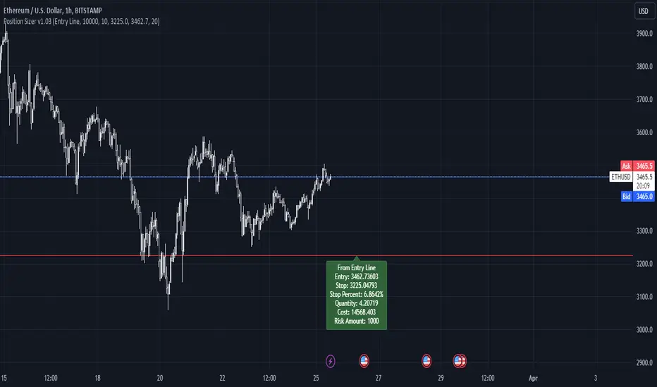
Simple Position SizerSimple Position Sizer is designed to calculate optimal position sizes based on a defined risk percentage and stop-loss level. It offers two modes for determining position size: using the current close price or a specified entry price. The script provides key trade details such as entry price, stop-loss level, quantity to trade, total cost, and risk amount in monetary terms, alongside visual indications of these parameters through colored lines and labels on the chart. Users can customize account size, risk per trade percentage, and entry and stop-loss levels directly within the settings.
Usage Scenario:
A trader looking to enter a position would first decide whether the entry is based on the current closing price or a predetermined level. After setting the stop-loss level and specifying the risk per trade as a percentage of the account size, the script calculates the number of shares or contracts to purchase. It also computes the total cost of the position and displays the potential loss if the stop-loss is triggered, allowing the trader to understand the risk involved before entering the trade.
Visual Indicators:
Green indicators suggest a long setup where the entry level is above the stop-loss, indicating bullish entry.
Red indicators signal a short setup where the entry level is below the stop-loss, reflecting bearish entry
Blue lines represent the entry level when specified by the trader, providing a visual cue for planned entries.
Altered Money Flow Index by CoffeeShopCrypto**Use the comments section below to request access to the script**
Market Trends need to be confirmed each and every time.
Over the years the Money Flow Index has been a tool to find where the money is flowing
either long or short in market movements.
Long confirmation and false short
Confirming a long entry:
1. Wait for price to close above a previous swing high.
2. Look to see if the MFI is in UPCOLOR and above ZERO.
Confriming a short entry:
1. Wait for price to close below a previous swing low.
2. Look to see if the MFI is in DOWNCOLOR and below ZERO.
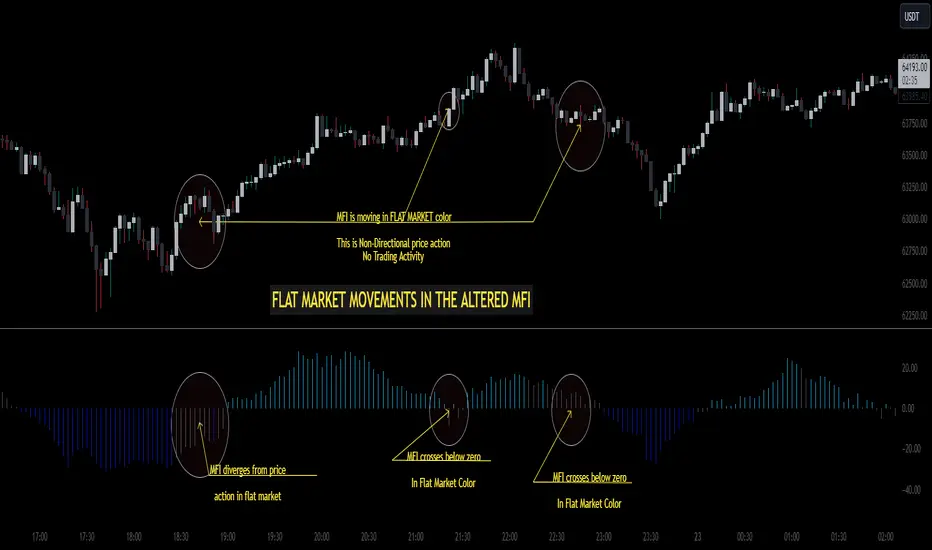
NON-Confirmed market: (Flat Market)
Anytime you believe you have a confirmation via price action, check the MFI to see if it is in FLAT MARKET color.
If this is true, do not enter until it is out of FLAT MARKET color.
Flat Market ALtered MFI
A Flat Market Altered MFI reading can do a few things for you.
It can help to confirm the following:
1. price action is moving sideways.
2. a pullback or market stall that was deep enough where dis-intrest in the market occured.
3. a sudden loss of momentum in the short term trend of closing prices.
Utilizing the Altered Money Flow Index indicator by CoffeeShopCrypto offers traders a nuanced approach to identifying market trends, including periods of flat market conditions. Alongside its directional bias indicating bullish or bearish activity based on whether values are above or below zero, respectively, the script incorporates a distinctive feature to recognize flat markets. When neither bullish nor bearish momentum dominates, the indicator designates a flat market, denoted by a distinct color. This feature enhances traders' ability to discern not only bullish and bearish phases but also periods of market consolidation or indecision.
In addition to its ability to recognize bullish and bearish trends, the Altered Money Flow Index indicator by CoffeeShopCrypto incorporates a unique feature to signify potential pullbacks or pauses in market momentum. This is particularly evident when the MFI crosses below zero while displaying a flat market color. Such occurrences suggest that although the short-term movement may appear bearish, it's likely a temporary pullback rather than a sustained trend reversal. Similarly, when the MFI crosses above zero amidst a flat market color, it indicates a potential pause in bullish momentum, urging traders to exercise caution and await confirmation of a sustained uptrend. By incorporating these nuanced observations, traders can effectively discern between short-term fluctuations and significant trend changes, enabling them to make more judicious trading decisions and avoid premature entries or exits.
Alongside its directional bias indicating bullish or bearish activity based on whether values are above or below zero, respectively, the script integrates the Relative Strength Index (RSI) to further refine market analysis. When the Altered MFI and RSI are both above zero, it suggests a strong bullish trend, indicating significant buying pressure. Conversely, when both indicators are below zero, it indicates a strong bearish trend, signifying heightened selling pressure. By observing the confluence between the Altered MFI and RSI, traders can gain valuable confirmation of bullish or bearish money flow in the market, enabling them to make more informed trading decisions.
Goldmine Wealth BuilderGoldmine Wealth Builder
Version 1.0
Discover the Goldmine Wealth Builder, your ultimate partner in long-term investing. With a comprehensive array of strategies meticulously tailored to suit the varied needs and preferences of investors, we empower you to achieve your financial goals with confidence and ease. Whether you're seeking stability or growth, our platform is designed to provide personalized solutions that align perfectly with your aspirations. Welcome to a world of opportunity and prosperity with Goldmine Wealth Builder.
Long-Term Investment Strategies: DKK, SKK and SKK2
In the dynamic realm of long-term investing, the DKK, SKK, and SKK2 strategies stand as valuable pillars. These strategies, meticulously designed to assist investors in building robust portfolios, combine the power of Super Trend, RSI (Relative Strength Index), Exponential Moving Averages (EMAs), and their crossovers. By providing clear alerts and buy signals on a daily time frame, they equip users with the tools needed to make well-informed investment decisions and navigate the complexities of the financial markets. These strategies offer a versatile and structured approach to both conservative and aggressive investment, catering to the diverse preferences and objectives of investors.
Each part of this strategy provides a unique perspective and approach to the accumulation of assets, making it a versatile and comprehensive method for investors seeking to optimize their portfolio performance. By diligently applying this multi-faceted approach, investors can make informed decisions and effectively capitalize on potential market opportunities.
DKK Strategy for ETFs:
The DKK system is a strategy designed for accumulating only ETFs as long-term investments in your portfolio. It simplifies the process of identifying trend reversals and opportune moments to invest in listed ETFs, particularly during bull markets. Here's a detailed explanation of the DKK system:
Objective: The primary aim of the DKK system is to build a long-term investment portfolio by focusing on only ETFs. It facilitates the identification of ETFs that are in the process of reversing their trends, allowing investors to benefit from upward price movements in these financial instruments.
ETFs Selection Criteria: The DKK system employs specific criteria for selecting ETFs:
• 200EMA (Exponential Moving Average): The system monitors whether the prices of ETFs are consistently below the 200-day Exponential Moving Average. This is considered an indicator of weakness, especially on a daily time frame.
• RSI (Relative Strength Index): The system looks for an RSI value of less than 40. An RSI below 40 is often seen as an indication of a weak or oversold condition in a financial instrument.
Alert Signal: Once the DKK system identifies ETFs meeting these criteria, it provides an alert signal:
• Red Upside Triangle Sign: This signal is automatically generated on the daily chart of only ETFs. It serves as a clear indicator to investors that it's an opportune time to accumulate these financial instruments for long-term investment.
It's important to note that the DKK system is specifically designed for ETFs only, so it should be applied to these types of investments. Additionally, it's recommended to track index ETFs, in line with the DKK system's approach. This strategy simplifies the process of identifying investment opportunities within this asset class, particularly during periods of market weakness.
SKK Strategy for Conservative Stock Investment:
The SKK system is a stock investment strategy tailored for conservative investors seeking long-term portfolio growth with a focus on stability and prudent decision-making. This strategy is meticulously designed to identify pivotal market trends and stock price movements, allowing investors to make informed choices and capitalize on upward market trends while minimizing risk. Here's a comprehensive overview of the SKK system, emphasizing its suitability for conservative investors:
Objective: The primary objective of the SKK system is to accumulate stocks as long-term investments in your portfolio while prioritizing capital preservation. It offers a disciplined approach to pinpointing potential entry points for stocks, particularly during market corrections and trend reversals, thereby enabling you to actively participate in bullish market phases while adopting a conservative risk management stance.
Stock Selection Criteria: The SKK system employs a stringent set of criteria to select stocks for investment:
• Correction Mode: It identifies stocks that have undergone a correction, signifying a decline in stock prices from their recent highs. This conservative approach emphasizes the importance of seeking stocks with a history of stability.
• 200EMA (Exponential Moving Average): The system diligently analyses daily stock price movements, specifically looking for stocks that have fallen to or below the 200-day Exponential Moving Average. This indicator suggests potential overselling and aligns with a conservative strategy of buying low.
Trend Reversal Confirmation: The SKK system doesn't merely pinpoint stocks in correction mode; it takes an extra step to confirm a trend reversal. It employs the following indicators:
• Short-term Downtrends Reversal: This aspect focuses on identifying the reversal of short-term downtrends in stock prices, observed through the transition of the super trend indicator from the red zone to the green zone. This cautious approach ensures that the trend is genuinely shifting.
• Super Trend Zones: These zones are crucial for assessing whether a stock is in a bullish or bearish trend. The system consistently monitors these zones to confirm a potential trend reversal.
Alert & Buy Signals: When the SKK system identifies stocks that have reached a potential bottom and are on the verge of a trend reversal, it issues vital alert signals, aiding conservative investors in prudent decision-making:
• Orange Upside Triangle Sign: This signal serves as a cautious heads-up, indicating that a stock may be poised for a trend reversal. It advises investors to prepare funds for potential investment without taking undue risks.
• Green Upside Triangle Sign: This is the confirmation of a trend reversal, signifying a robust buy signal. Conservative investors can confidently enter the market at this point, accumulating stocks for a long-term investment, secure in the knowledge that the trend is in their favour.
• Additionally, if the Supertrend transitions from green to red zone during the alert signal is active and before the buy signal, the SKK setup will be considered invalid. This adjustment ensures precise trend reversal identification during corrections. The conservative investors to confidently enter the market, accumulating discounted stocks primarily at the bottom while avoiding unnecessary signals.
In summary, the SKK system is a systematic and conservative approach to stock investing. It excels in identifying stocks experiencing corrections and ensures that investors act when there's a strong indication of a trend reversal, all while prioritizing capital preservation and risk management. This strategy empowers conservative investors to navigate the intricacies of the stock market with confidence, providing a calculated and stable path toward long-term portfolio growth.
Note: The SKK strategy, known for its conservative approach to stock investment, also provides an option to extend its methodology to REIT (Real Estate Investment Trusts) and INVIT (Infrastructure Investment Trusts) Funds for those investors who wish to accumulate assets more aggressively. You can harness the SKK strategy's careful criteria and signal indicators to accumulate aggressive investments in REIT and INVIT Funds.
This flexible approach acknowledges that even within a conservative strategy, there may be opportunities for more assertive investments in assets like REIT and INVIT Funds. By making use of this option, you can strike a balance between a conservative stance in your stock portfolio while exploring an aggressive approach in other asset classes. It offers the versatility to cater to a variety of investment preferences, ensuring that you can adapt your strategy to suit your financial goals and risk tolerance.
SKK 2 Strategy for Aggressive Stock Investment:
The SKK 2 strategy is designed for those who are determined not to miss significant opportunities within a continuous uptrend and seek a way to enter a trend that doesn't present entry signals through the SKK strategy. While it offers a more aggressive entry approach, it is ideal for individuals willing to take calculated risks to potentially reap substantial long-term rewards. This strategy is particularly suitable for accumulating stocks for aggressive long-term investment. Here's a detailed description of the SKK 2 strategy:
Objective: The primary aim of the SKK 2 strategy is to provide an avenue for investors to identify short-term trend reversals and seize the opportunity to enter stocks during an uptrend, thereby capitalizing on a sustained bull run. It acknowledges that there may not always be clear entry signals through the SKK strategy and offers a more aggressive alternative.
Stock Selection Criteria: The SKK 2 strategy utilizes a specific set of criteria for stock selection:
1. 50EMA (Exponential Moving Average): It targets stocks that are trading below the 50-day Exponential Moving Average. This signals a short-term reversal from the top and indicates that the stock is in a downtrend.
2. RSI (Relative Strength Index): The strategy considers stocks with an RSI of less than 40, which is an indicator of weakness in the stock.
Alert Signals: The SKK 2 strategy provides distinct alert signals that facilitate entry during an aggressive reversal:
• Orange Downside Triangle Sign: This signal is triggered when the stock is below the 50EMA and has an RSI of less than 40. It serves as a clear warning of a short-term reversal from the top and a downtrend, displayed on the daily chart.
• Purple Upside Triangle Sign: This sign is generated when a reversal occurs through a bullish candle, and the RSI is greater than 40. It signifies the stock has bottomed out from a short-term downtrend and is now reversing. This purple upside triangle serves as an entry signal on the chart, presenting an attractive opportunity to accumulate stocks during a strong bullish phase, offering a chance to seize a potentially favourable long-term investment.
In essence, the SKK 2 strategy caters to aggressive investors who are willing to take calculated risks to enter stocks during a continuous uptrend. It focuses on identifying short-term reversals and provides well-defined signals for entry. While this strategy is more aggressive in nature, it has the potential to yield substantial rewards for those who are comfortable with a higher level of risk and are looking for opportunities to build a strong long-term portfolio.
Introduction to Strategy Signal Information Chart
This chart provides essential information on strategy signals for DKK, SKK, and SKK2. By quickly identifying "Buy" and "Alert" signals for each strategy, investors can efficiently gauge market conditions and make informed decisions to optimize their investment portfolios.
RSI Feature:
The Relative Strength Index (RSI) value is displayed on the indicator status line, providing quick reference and analysis for more informed decision-making. Explore this update to enhance your strategy with RSI trends. Alternatively, leverage RSI as a reference, a feature extensively utilized in both DKK and SKK2 strategies.
In Conclusion
These investment strategies, whether conservative like DKK and SKK or more aggressive like SKK2, offer a range of options for investors to navigate the complex world of long-term investments. The combination of Super Trend, RSI, and EMAs with their crossovers provides clear signals on a daily time frame, empowering users to make well-informed decisions and potentially capitalize on market opportunities. Whether you're looking for stability or are ready to embrace more risk, these strategies have something to offer for building and growing your investment portfolio.
In essence, with the Goldmine Wealth Builder, investors alike can access a comprehensive toolkit designed to unlock their financial potential and achieve their investment goals.
We appreciate your understanding and remain committed to providing a clear and focused investment tool. For any inquiries or feedback, feel free to reach out.
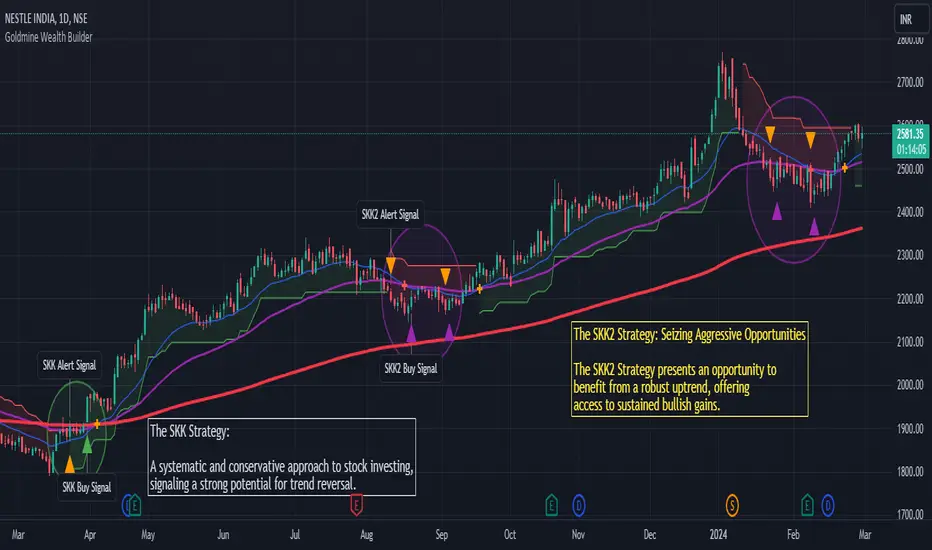
Liquidity Sweeps [LuxAlgo]The Liquidity Sweeps indicator detects the presence of liquidity sweeps on the user's chart, while also providing potential areas of support/resistance or entry when Liquidity levels are taken.
In the event of a Liquidity Sweep a Sweep Area is created which may provide further areas of interest.
🔶 USAGE
A Liquidity Sweep occurs when the price breaks through a liquidity level (further referred to as LqL ), after which the price returns below/above the liquidity level , forming a wick.
The script provides 2 options when this can happen:
A wick passes a LqL after which the price quickly returns.
First the closing price breaks through a LqL . After a while, the price retests the LqL and forms a wick in the opposite direction.
The examples above show a bullish and bearish scenario of "a wick passing through an LqL where the price quickly comes back". This type of Liquidity Sweep is represented by a dotted line.
The following example shows a broken LqL , where the price retests the Liquidity zone and bounces back.
Instead of a dotted line, this type of Liquidity Sweep is represented by a dashed line.
When a Liquidity Sweep takes place, this is indicated by highlighting the "wick- LqL " distance. This distance is also the basis for the Sweep Area (see next sub-section). A small 3-bar long dotted line starts from the opposite wick as an extra aid to determine potential support/resistance/entry, ...
Colors can be set in the settings (here yellow and aqua blue instead of default colors for clarity).
🔹 Sweep Areas
The distance between the LqL and the maximum limit of the wick forms a Sweep Area , which can provide a potential support/resistance or entry zone.
These examples show both types of Liquidity Sweeps , followed by a box indicating the Sweep Area .
When the Sweep Area is mitigated or a certain amount of bars has passed (Settings - 'Max bars'), the boxes will no longer be updated.
In this case, the 'Trigger' label shows the bar where the high crossed a LqL , after which a red box starts between LqL and high.
The low of the 'Trigger' bar is the starting point of a short dotted line. Next to the 'Trigger bar' the high touches the Sweep Area before returning, providing a potential short entry. One bar further, another entry opportunity presents itself when the price breaks the small dotted line.
In the following bullish example, not only do we see opportunities when the LqL has been swept, but the following Sweep Area provides some potential entries.
The small green dotted lines also act as a guide where the price breaks above, then forms a small range, after which the price continues in an upward direction.
Here, the initial trigger on the left forms a Sweep Area that is quickly broken. However, the small green line provides a potential entry area later on. The price moves in a short channel before breaking above the LqL (green dashed line), providing more potential entries. Price retests this LqL , and goes below this level. The price remained around the previously formed channel, after which the price resumed its upward trend.
🔶 SETTINGS
🔹 Liquidity Sweeps
Swings: Period used for the swing detection, with higher values returning longer term Liquidity Levels .
Options:
- Only Wicks: Only detects a Liquidity Sweep when a wick sweeps a previous wick
- Only Outbreaks & Retest: Only detects a Liquidity Sweep when the price breaks a Liquidity Level , returns & retests the Liquidity Level , and forms a wick in the opposite direction.
- Wicks + Outbreaks & Retest: Both options can be detected.
🔹 Sweep Area
Extend: Enables/Disables extension of the Sweep Area boxes.
Max Bars: Limit the extension to a certain number of bars.
Color Sweep Area box.
Converging Chart Patterns - Ultimate [Trendoscope®]🎲 Introducing the Converging Chart Patterns Ultimate Indicator
Derived from the comprehensive capabilities of our premium offering, the Auto Chart Patterns - Ultimate , this new indicator focuses exclusively on converging chart patterns. It marks the beginning of a series that, over time, will encompass the full spectrum of chart pattern analysis, ultimately enhancing and expanding beyond the scope of Auto Chart Patterns.
This strategic separation into more focused indicators is designed to cater to traders seeking precision in specific chart pattern categories.
🎲 Leveraging Research and Open-Source Foundations
Our journey to this indicator has been paved by extensive research and the insights gained from our prior works on Chart Patterns, including:
Algorithmic Identification of Chart Patterns
Flag and Pennant Chart Patterns
Trading Converging Chart Patterns
Drawing upon the foundation laid by our publicly shared indicators - Auto Chart Patterns and Flags and Pennants - this tool is the culmination of our efforts to provide traders with a refined method for strategizing around converging patterns. It not only facilitates the development of technical trading strategies but also aids in evaluating their effectiveness through historical performance analysis. The specific patterns addressed by this indicator include:
Rising Wedge (Converging Type)
Falling Wedge (Converging Type)
Converging Triangle
Rising Triangle (Converging Type)
Falling Triangle (Converging Type)
🎲 Chart Pattern Scanning Methodology
The process of identifying converging chart patterns involves several key steps:
Begin by examining each zigzag for the last 5 or 6 pivot points to identify potential trend line pairs.
Determine if these trend lines are converging by projecting them forwards and checking for an intersection within a specified number of bars ahead.
Upon confirming convergence, categorize each pattern based on the directional orientation of its trend lines, as detailed in our article - Algorithmic Identification of Chart Patterns
🎲 Methodology or Trading for Chart Patterns
While traditional views assign specific trading biases to converging patterns (e.g., Rising Wedges as bearish and Falling Wedges as bullish, with Triangles being more versatile), empirical support for these assumptions is limited. Our indicator is designed to empower users to explore and validate various trading hypotheses, including unconventional ones, thereby not confining trading strategies to past market behaviors.
We enable extensive customization for testing different strategies, with the initial setup allowing for both long and short trading scenarios for each identified pattern. Users have the liberty to adjust trading directions and other parameters within the indicator's settings to suit their analytical needs.
This open approach is rooted in the methodology outlined in - Trading Converging Chart Patterns , exemplified by the following process, which users can adapt and refine through our indicator.
🎲 Overview of Indicator Components
The components of our indicator are illustrated in the chart below
Pattern Visualization : This feature dynamically displays the patterns on the chart, focusing on currently active patterns. To maintain clarity and performance, historical patterns are not shown due to the constraints of drawing objects.
Trading Annotations : The indicator marks open trades directly on the chart, accommodating both long and short positions depending on the user's settings and the current status of trades associated with each pattern.
Performance Metrics Table : A comprehensive table presents the back testing results for individual patterns as well as aggregated outcomes. It includes crucial metrics such as win rates and the profit factor based on the set risk-reward ratio, offering users valuable insights into the potential profitability of their configurations and trade strategies.
🎲 Exploring the Indicator's Customization Options
This indicator is rich in settings, offering users the capability to tailor criteria and adapt their trading rules. Each setting is accompanied by detailed tooltips, providing insights into their use. Let's examine each category systematically.
🎯 Zigzag Configuration Options
These settings enable users to adjust the scope of their pattern analysis by varying the zigzag's length and depth.
Length Adjustment : Modifying this parameter changes the scale of detected patterns, with higher values spotting larger formations and lower ones focusing on more compact patterns.
Depth Enhancement : This alters the intricacy of the recursive zigzag analysis, potentially unveiling larger patterns across several levels. Caution is advised, as excessive depth may lead to the indicator exceeding its processing capacity.
🎯 Pattern Scanning Settings
This suite of settings fine-tunes the pattern scanning process, generally calibrated for precise geometric alignment of identified patterns. While most settings may remain as default for routine use, users are encouraged to tweak them, especially the "Last Pivot Direction," to explore various theoretical approaches to pattern trading.
🎯 Trade Configuration Settings
Arguably the most crucial for users, these settings offer complete autonomy in defining trading strategies around converging chart patterns. This includes the flexibility to set entry, stop, and target prices, adjust risk-reward ratios, select the historical depth for back testing, and incorporate filters to steer trade direction.
🎯 Pattern Specific Settings
Here, users can personalize settings for individual patterns or groups, enhancing the specificity of their strategy. Apart from enabling/disabling individual patterns and pattern groups, users can also select pattern specific Last Pivot Direction, Trade Direction Filter and external filters for each pattern.
🎯 Fully Customizable Alerts
Implemented through the alert() function, these alerts bypass the standard template in the alert widget. To counteract this, we've introduced placeholders within the settings to craft detailed alert templates.
Available Categories Include
New - Alerts when a new pattern is identified
Entry - Alerts when an entry condition for configured pattern based trade is met.
Stop - Alerts when a trade that has reached entry gets stopped out without reaching target
Target - Alerts when a trade reaches its target
Invalidation - Alerts when a trade reaches invalidation point before reaching the entry.
Each alert types can have its own template. Customizable templates are very important in using alerts for broker or exchange integration.
Here are some of the placeholders that are defined in the indicator.
{type} - Alert type - new/entry/stop/target/invalid
{pid} - Pattern ID of the pattern belonging to trade. Multiple trades can have same pattern id since a pattern can be traded in both long and short directions.
{tid} - Unique Trade ID for the given trade.
{ticker} - Ticker ID on which the indicator is run
{timeframe} - Chart timeframe on which the indicator is run
{basecurrency} - Base currency of the symbol
{quotecurrency} - Quote currency of the symbol
{pivots} - Pivot values of the pattern
{price} - Current price when the alert is triggered.
{pattern} - Name of the pattern on which the alert is triggered.
{direction} - Direction of the trade.
{entrydirection} - Direction of the entry signal. Used for specific bot integration.
{exitdirection} - Direction of the exit signal. Used for specific bot integration.
{entry} - Entry price of the trade
{stop} - Stop price of the trade
{target} - Target price of the trade
{invalidation} - Invalidation price of the trade
🎯 Display and Stats
These settings are used to control the display options on the chart. Closed trade stats is displayed in a table and printed in the bottom left corner of the chart. This can be customized by using display settings.
Skrip berbayar
Fibonacci internal Break of Range PinescriptlabsThe uniqueness of this script lies in the synergy and dynamic interaction resulting from the advanced combination of key elements of technical analysis in the way it strategically merges Fibonacci Levels with the Linear Regression Channel and the internal price structure, creating a highly synergistic market analysis system.
The Linear Regression Channel, drawn from price regression and its standard deviation over a defined number of bars, offers a graphical representation of the prevailing market trend. The combination of this channel with Fibonacci Levels is deliberate and critical: the levels serve as additional filters to validate range breakouts within the channel, and vice versa, channel breakouts enhance the importance of Fibonacci levels by adjusting to the market context, represented by the specific length and displacement within the chart.
Fibonacci levels are updated with each new bar, and the detection of Break of Range (BoR) is integrated with the Fibonacci level plot to highlight significant breakout points. A unique aspect of this script is the way breakouts are identified not only by the price crossing certain Fibonacci levels but also by volume context and candlestick patterns, such as Engulfing patterns, which signal potential changes in market trends.
This interaction between the Linear Regression Channel and Fibonacci Levels, for example, a bullish price breakout above the upper channel boundary simultaneously crossing a significant Fibonacci level, suggests not only a possible continuation of the uptrend but also a strong support level established. Similarly, a bearish price breakout below the lower channel boundary, coinciding with a Fibonacci level, may signal a trend reversal confirmation and a new resistance level.
This script delves further into signal convergence, where the interaction between Break of Range and Fibonacci levels marks bullish and bearish breakouts, respectively, and when these signals coincide with breakouts of any Fibonacci level, they provide cross-confirmation that increases confidence in the generated signal. "BoR+Fib🔼" and "BoR+Fib🔽."
Additionally, the script introduces an innovative implementation of the Linear Regression Channel, which uses a customizable period and standard deviation to plot upper and lower trendlines. This approach allows traders to anticipate potential re-entry points after a breakout, as prices often retest the channel edges, providing low and high entry confirmation opportunities.
A differentiating technical aspect is the conditional logic implemented for bullish and bearish trend signal confirmation. For example, the script calibrates signals based on the intersection of price action with critical Fibonacci levels and confirmed candlestick patterns, enhancing signal reliability compared to using these indicators in isolation.
Key Features:
1. Dynamic calculation of Fibonacci levels.
2. Detection of internal price range breakouts (Break of Range).
3. Linear Regression Channel.
4. Detection of candlestick patterns (Engulfing Patterns).
Dynamic Fibonacci Level Calculation and Internal Range Breakout Detection (Break of Range):
The fusion of Fibonacci levels with the detection of internal range breakouts is crucial because it allows for precise identification of market turning points. Fibonacci levels act as initial filters, indicating potential support and resistance zones. When the price crosses a key Fibonacci level, especially in conjunction with an internal range breakout, the resulting signal is stronger and more reliable. This confluence significantly increases the probability of sustainable price movement.
Broken:
Function: The code identifies breakouts when the price crosses a key Fibonacci level (0%, 100%). A breakout is significant if the price crosses and holds beyond these levels.
Interaction: Breakouts validate Fibonacci levels. For example, a breakout above the 0% Fibonacci level can confirm an uptrend.
Structure Change:
Function: In the code, Structure Change can be interpreted through the detection of pivot patterns and price structure change signals, which we identify as Break of Range.
Interaction: This component acts as confirmation for range breakouts and Fibonacci levels. For example, if a range breakout is followed by a change in price structure (such as the formation of a new higher high), it strengthens the validity of the range breakout signal.
"BoR+Fib🔽": Indicates a bearish range breakout that has also crossed a Fibonacci level downward. This can be interpreted as a sell signal or a bearish trend indication.
"BoR+Fib🔼": Represents a bullish range breakout that has also crossed a Fibonacci level upward. It can be interpreted as a buy signal or a bullish trend indication.
Linear Regression Channel:
Function: The Linear Regression Channel is calculated and drawn using a defined number of bars to establish the overall market trend. Calculations involve summing and averaging closing prices and their products with the time index to calculate the regression line and its standard deviation. The script uses this channel to contextualize Fibonacci signals and range breakouts, with breakouts occurring in the direction of the channel's trend.
Interaction: Provides context to Fibonacci signals and range breakouts. For example, if a range breakout occurs in the same direction as indicated by the Linear Regression Channel, this adds credibility to the signal.
Integration Benefit: The Linear Regression Channel provides an overall trend context. When a range breakout signal and a Fibonacci level coincide within the direction indicated by the channel, the signal's validity is strengthened.
Signal Convergence: An ideal scenario occurs when all elements converge. For example, a good entry point could be when the price experiences a range breakout from a significant Fibonacci level, there is a change in price structure in the same direction, and all of this aligns with the trend indicated by the Linear Regression Channel.
Dynamic Volatility Visualization: Adjusts the width of the Linear Regression Channel based on market volatility.
Validation and Entry Confirmation after Linear Regression Channel Breakout:
Breakout Validation: The Linear Regression Channel breakout is validated not only by price crossing but also by an increase in volume, suggesting a significant breakout rather than a temporary fluctuation.
Entry Confirmation ('Low and High Entry Confirmation'):
Confirmation Bars: A specific number of bars (configurable entry) closing outside the channel are required to confirm an entry. This reduces the risk of false signals.
Channel Re-Test: After the breakout, the price often retests the channel's edge. An entry is confirmed if the price bounces from this area, validating the initial breakout.
Auxiliary Indicators: Oscillators or momentum indicators are used to confirm trend strength after the breakout.
Candlestick Pattern Detection (Engulfing Patterns):
Engulfing Pattern Identification: bullishEngulfing is activated in a bullish pattern with a previous bearish trend and a specific bullish candle. bearishEngulfing is activated in a bearish pattern with a previous bullish trend and a specific bearish candle.
Special Trend Signals:
Bullish signals are displayed as blue circles with "⬆️," while bearish signals are displayed as red circles with "⬇️."
Bullish Signals: Indicate that the price has crossed above certain Fibonacci levels, and the current trend is considered bullish, as the most recent closing price is higher than the closing price of a specific bar in the past.
Bearish Signals: Indicate that the price has crossed below certain Fibonacci levels, and the current trend is considered bearish, as the most recent closing price is lower than the closing price of a specific bar in the past.
Integration with 3Commas for Automation:
Signal Automation: The ability to integrate with platforms like 3Commas allows for the automatic execution of
strategies based on the script's signals, where a bot could execute trades based on the chart-generated signals, facilitating more efficient trading, reducing reaction time, and as an automated script, we only need to input our short Bot Id or our Long Bot ID into the previously loaded message alert.
Español:
La singularidad de este script radica en la sinergia y la interacción dinámica que resulta de la combinación avanzada de elementos clave del análisis técnico en la forma en que fusiona estratégicamente los Niveles de Fibonacci con el Canal de Regresión Lineal y la estructura interna del precio creando un sistema de análisis de mercado altamente sinérgico.
El Canal de Regresión Lineal, dibujado a partir de la regresión de precios y su desviación estándar sobre un número definido de barras, ofrece una representación gráfica de la tendencia predominante del mercado. La combinación de este canal con los Niveles de Fibonacci es deliberada y crítica: los niveles sirven como filtros adicionales para validar las rupturas de rango dentro del canal, y viceversa, las rupturas del canal potencian la importancia de los niveles de Fibonacci ajustándose al contexto del mercado, representado por la longitud y desplazamiento específicos dentro del gráfico.
Los niveles de Fibonacci se actualizan con cada nueva barra, La detección de rupturas de rango (Break of Range) se integra con la trama de niveles de Fibonacci para destacar los puntos de ruptura significativos. Un enfoque único de este script es la manera en que las rupturas no solo se identifican por el cruce de precios de ciertos niveles de Fibonacci sino también por el contexto de volumen y patrones de velas, como los patrones Engulfing, que señalan cambios potenciales en la tendencia del mercado.
Esta interacción entre el Canal de Regresión Lineal y los Niveles de Fibonacci Por ejemplo: una ruptura alcista del precio a través del límite superior del canal al mismo tiempo que cruza un nivel de Fibonacci significativo sugiere no solo una posible continuación de la tendencia alcista sino también un fuerte nivel de soporte establecido. Similarmente, una ruptura bajista del precio a través del límite inferior del canal, coincidiendo con un nivel de Fibonacci, puede señalar una confirmación de cambio de tendencia y un nuevo nivel de resistencia.
Este script profundiza aún más en la confluencia de señales, donde la interacción entre Break of Range y los niveles de Fibonacci marcan rupturas alcistas y bajistas respectivamente, y cuando estas señales coinciden con rupturas del de cualquier nivel de Fibonacci, proporcionan una confirmación cruzada que aumenta la confianza en la señal generada. "BoR+Fib🔼" y "BoR+Fib🔽"
Además, el script presenta una innovadora implementación de Canal de Regresión Lineal, que utiliza un periodo personalizable y una desviación estándar para trazar las líneas de tendencia superior e inferior. Este enfoque permite a los traders anticipar posibles puntos de reentrada después de una ruptura, con el precio a menudo retestando los bordes del canal, proporcionando así oportunidades de confirmación de entrada baja y alta.
Un aspecto técnico diferenciador es la lógica condicional implementada para la confirmación de señales de tendencia alcista y bajista. Por ejemplo, el script calibra señales basadas en la intersección de la acción del precio con los niveles críticos de Fibonacci y los patrones de velas confirmados, mejorando la confiabilidad de las señales en comparación con el uso de estos indicadores de forma aislada.
Características Principales:
1. Cálculo dinámico de niveles de Fibonacci.
2. Detección de rupturas internas del rango de precios (Break of Range).
3. Canal de regresión lineal.
4. Detección de patrones de velas (Patrones Engulfing).
Cálculo Dinámico de Niveles de Fibonacci y Detección de Rupturas Internas (Break of Range):
La fusión de los niveles de Fibonacci con la detección de rupturas internas del rango es crucial porque permite identificar con precisión los puntos de inflexión del mercado. Los niveles de Fibonacci funcionan como filtros iniciales, indicando potenciales zonas de soporte y resistencia. Cuando el precio cruza un nivel clave de Fibonacci, especialmente en conjunto con una ruptura interna del rango, la señal resultante es más robusta y fiable. Esta confluencia incrementa significativamente la probabilidad de que el movimiento del precio sea sostenible
Broken:
Función: El código identifica las rupturas cuando el precio cruza un nivel de Fibonacci clave (0%, 100%). Una ruptura es significativa si el precio cruza y se mantiene más allá de estos niveles.
Interacción: Las rupturas validan los niveles de Fibonacci. Por ejemplo, una ruptura por encima del nivel de Fibonacci del 0% puede confirmar una tendencia alcista.
Cambio de Estructura:
Función: En el código, el Cambio de Estructura se puede interpretar a través de la detección de patrones de pivote y señales de cambio en la estructura de precios, que identificamos como Break of Range.
Interacción: Este componente actúa como una confirmación de las rupturas de rango y los niveles de Fibonacci. Por ejemplo, si una ruptura de rango es seguida por un cambio en la estructura de precios (como la formación de un nuevo máximo más alto), esto refuerza la validez de la señal de ruptura de rango.
"BoR+Fib🔽": Indica una ruptura bajista del rango que también ha cruzado un nivel de Fibonacci hacia abajo. Esto puede interpretarse como una señal de venta o una indicación de tendencia bajista.
"BoR+Fib🔼": Representa una ruptura alcista del rango que también ha cruzado un nivel de Fibonacci hacia arriba. Puede interpretarse como una señal de compra o una indicación de tendencia alcista.
Canal de Regresión Lineal:
Función: El Canal de Regresión Lineal se calcula y dibuja utilizando un número definido de barras para establecer la tendencia general del mercado. Los cálculos involucran la suma y el promedio de los precios de cierre y sus productos con el índice de tiempo, para calcular la línea de regresión y su desviación estándar, el script utiliza este canal para contextualizar las señales de Fibonacci y las rupturas de rango, con rupturas que ocurren en la dirección de la tendencia del canal.
Interacción: Proporciona contexto a las señales de Fibonacci y rupturas de rango. Por ejemplo, si una ruptura de rango ocurre en la misma dirección que la tendencia indicada por el Canal de Regresión Lineal, esto añade credibilidad a la señal.
Beneficio de la Integración:El Canal de Regresión Lineal proporciona un contexto de tendencia general. Cuando una señal de ruptura de rango y un nivel de Fibonacci coinciden dentro de la dirección de la tendencia indicada por el canal, se fortalece la validez de la señal.
Convergencia de Señales: Un escenario ideal ocurre cuando todos los elementos convergen. Por ejemplo, un buen punto de entrada podría ser cuando el precio experimenta una ruptura de rango desde un nivel de Fibonacci importante, hay un cambio de estructura en la misma dirección, y todo esto ocurre en línea con la tendencia indicada por el Canal de Regresión Lineal.
Visualización de Volatilidad Dinámica: Ajusta el ancho del canal de regresión lineal en función de la volatilidad del mercado.
Validación y Confirmación de la Entrada después de la Ruptura del Canal de Regresión:
Confirmación de Ruptura: La ruptura del canal de regresión se valida no solo por el cruce del precio, sino también por un aumento en el volumen, lo que sugiere una ruptura significativa en lugar de una fluctuación temporal.
Confirmación de Entrada ('Confirmación de Entrada Baja y Alta'):
Barras de Confirmación: Se requiere un número específico de barras (entrada configurable) que cierren fuera del canal para confirmar una entrada. Esto reduce el riesgo de señales falsas.
Re-Test del Canal: Después de la ruptura, el precio a menudo vuelve a probar el borde del canal. Una entrada se confirma si el precio rebota desde esta área, validando la ruptura inicial.
Indicadores Auxiliares: Se utilizan osciladores o indicadores de impulso para confirmar la fuerza de la tendencia después de la ruptura.
Detección de Patrones de Velas (Patrones Engulfing):
Identificación de Patrones Engulfing: bullishEngulfing se activa en un patrón alcista con una tendencia bajista previa y una vela alcista específica. bearishEngulfing se activa en un patrón bajista con una tendencia alcista previa y una vela bajista específica.
Señales Especiales de Tendencia:
Las señales alcistas se muestran como círculos azules con "⬆️", mientras que las señales bajistas se muestran como círculos rojos "⬇️".
Señales Alcistas: Indican que el precio ha cruzado por encima de ciertos niveles de Fibonacci y la tendencia actual se considera alcista, ya que el precio de cierre más reciente es mayor que el precio de cierre de una barra específica en el pasado.
Señales Bajistas: Indican que el precio ha cruzado por debajo de ciertos niveles de Fibonacci y la tendencia actual se considera bajista, ya que el precio de cierre más reciente es menor que el precio de cierre de una barra específica en el pasado.
Integración con 3Commas para Automatización:
Automatización de Señales: La capacidad de integrar con plataformas como 3Commas permite la ejecución automática de estrategias basadas en las señales del script donde un bot podría ejecutar operaciones basadas en las señales generadas por el gráfico., facilitando un trading más eficiente y reduciendo el tiempo de reacción y como un script automatizado solo necesitamos poner en la alerta del mensaje previamente cargado nuestro short Bot Id o nuestro Long Bot ID.

Goldmine Wealth Builder - DKK/SKKGoldmine Wealth Builder
Version 1.0
Introduction to Long-Term Investment Strategies: DKK, SKK1 and SKK2
In the dynamic realm of long-term investing, the DKK, SKK1, and SKK2 strategies stand as valuable pillars. These strategies, meticulously designed to assist investors in building robust portfolios, combine the power of Super Trend, RSI (Relative Strength Index), Exponential Moving Averages (EMAs), and their crossovers. By providing clear alerts and buy signals on a daily time frame, they equip users with the tools needed to make well-informed investment decisions and navigate the complexities of the financial markets. These strategies offer a versatile and structured approach to both conservative and aggressive investment, catering to the diverse preferences and objectives of investors.
Each part of this strategy provides a unique perspective and approach to the accumulation of assets, making it a versatile and comprehensive method for investors seeking to optimize their portfolio performance. By diligently applying this multi-faceted approach, investors can make informed decisions and effectively capitalize on potential market opportunities.
DKK Strategy for ETFs and Funds:
The DKK system is a strategy designed for accumulating ETFs and Funds as long-term investments in your portfolio. It simplifies the process of identifying trend reversals and opportune moments to invest in listed ETFs and Funds, particularly during bull markets. Here's a detailed explanation of the DKK system:
Objective: The primary aim of the DKK system is to build a long-term investment portfolio by focusing on ETFs and Funds. It facilitates the identification of stocks that are in the process of reversing their trends, allowing investors to benefit from upward price movements in these financial instruments.
Stock Selection Criteria: The DKK system employs specific criteria for selecting ETFs and Funds:
• 200EMA (Exponential Moving Average): The system monitors whether the prices of ETFs and Funds are consistently below the 200-day Exponential Moving Average. This is considered an indicator of weakness, especially on a daily time frame.
• RSI (Relative Strength Index): The system looks for an RSI value of less than 40. An RSI below 40 is often seen as an indication of a weak or oversold condition in a financial instrument.
Alert Signal: Once the DKK system identifies ETFs and Funds meeting these criteria, it provides an alert signal:
• Red Upside Triangle Sign: This signal is automatically generated on the daily chart of ETFs and Funds. It serves as a clear indicator to investors that it's an opportune time to accumulate these financial instruments for long-term investment.
It's important to note that the DKK system is specifically designed for ETFs and Funds, so it should be applied to these types of investments. Additionally, it's recommended to track index ETFs and specific types of funds, such as REITs (Real Estate Investment Trusts) and INVITs (Infrastructure Investment Trusts), in line with the DKK system's approach. This strategy simplifies the process of identifying investment opportunities within this asset class, particularly during periods of market weakness.
SKK1 Strategy for Conservative Stock Investment:
The SKK 1 system is a stock investment strategy tailored for conservative investors seeking long-term portfolio growth with a focus on stability and prudent decision-making. This strategy is meticulously designed to identify pivotal market trends and stock price movements, allowing investors to make informed choices and capitalize on upward market trends while minimizing risk. Here's a comprehensive overview of the SKK 1 system, emphasizing its suitability for conservative investors:
Objective: The primary objective of the SKK 1 system is to accumulate stocks as long-term investments in your portfolio while prioritizing capital preservation. It offers a disciplined approach to pinpointing potential entry points for stocks, particularly during market corrections and trend reversals, thereby enabling you to actively participate in bullish market phases while adopting a conservative risk management stance.
Stock Selection Criteria: The SKK 1 system employs a stringent set of criteria to select stocks for investment:
• Correction Mode: It identifies stocks that have undergone a correction, signifying a decline in stock prices from their recent highs. This conservative approach emphasizes the importance of seeking stocks with a history of stability.
• 200EMA (Exponential Moving Average): The system diligently analyses daily stock price movements, specifically looking for stocks that have fallen to or below the 200-day Exponential Moving Average. This indicator suggests potential overselling and aligns with a conservative strategy of buying low.
Trend Reversal Confirmation: The SKK 1 system doesn't merely pinpoint stocks in correction mode; it takes an extra step to confirm a trend reversal. It employs the following indicators:
• Short-term Downtrends Reversal: This aspect focuses on identifying the reversal of short-term downtrends in stock prices, observed through the transition of the super trend indicator from the red zone to the green zone. This cautious approach ensures that the trend is genuinely shifting.
• Super Trend Zones: These zones are crucial for assessing whether a stock is in a bullish or bearish trend. The system consistently monitors these zones to confirm a potential trend reversal.
Alert & Buy Signals: When the SKK 1 system identifies stocks that have reached a potential bottom and are on the verge of a trend reversal, it issues vital alert signals, aiding conservative investors in prudent decision-making:
• Orange Upside Triangle Sign: This signal serves as a cautious heads-up, indicating that a stock may be poised for a trend reversal. It advises investors to prepare funds for potential investment without taking undue risks.
• Green Upside Triangle Sign: This is the confirmation of a trend reversal, signifying a robust buy signal. Conservative investors can confidently enter the market at this point, accumulating stocks for a long-term investment, secure in the knowledge that the trend is in their favor.
In summary, the SKK 1 system is a systematic and conservative approach to stock investing. It excels in identifying stocks experiencing corrections and ensures that investors act when there's a strong indication of a trend reversal, all while prioritizing capital preservation and risk management. This strategy empowers conservative investors to navigate the intricacies of the stock market with confidence, providing a calculated and stable path toward long-term portfolio growth.
Note: The SKK1 strategy, known for its conservative approach to stock investment, also provides an option to extend its methodology to ETFs and Funds for those investors who wish to accumulate assets more aggressively. By enabling this feature in the settings, you can harness the SKK1 strategy's careful criteria and signal indicators to accumulate aggressive investments in ETFs and Funds.
This flexible approach acknowledges that even within a conservative strategy, there may be opportunities for more assertive investments in assets like ETFs and Funds. By making use of this option, you can strike a balance between a conservative stance in your stock portfolio while exploring an aggressive approach in other asset classes. It offers the versatility to cater to a variety of investment preferences, ensuring that you can adapt your strategy to suit your financial goals and risk tolerance.
SKK 2 Strategy for Aggressive Stock Investment:
The SKK 2 strategy is designed for those who are determined not to miss significant opportunities within a continuous uptrend and seek a way to enter a trend that doesn't present entry signals through the SKK 1 strategy. While it offers a more aggressive entry approach, it is ideal for individuals willing to take calculated risks to potentially reap substantial long-term rewards. This strategy is particularly suitable for accumulating stocks for aggressive long-term investment. Here's a detailed description of the SKK 2 strategy:
Objective: The primary aim of the SKK 2 strategy is to provide an avenue for investors to identify short-term trend reversals and seize the opportunity to enter stocks during an uptrend, thereby capitalizing on a sustained bull run. It acknowledges that there may not always be clear entry signals through the SKK 1 strategy and offers a more aggressive alternative.
Stock Selection Criteria: The SKK 2 strategy utilizes a specific set of criteria for stock selection:
1. 50EMA (Exponential Moving Average): It targets stocks that are trading below the 50-day Exponential Moving Average. This signals a short-term reversal from the top and indicates that the stock is in a downtrend.
2. RSI (Relative Strength Index): The strategy considers stocks with an RSI of less than 40, which is an indicator of weakness in the stock.
Alert Signals: The SKK 2 strategy provides distinct alert signals that facilitate entry during an aggressive reversal:
• Red Downside Triangle Sign: This signal is triggered when the stock is below the 50EMA and has an RSI of less than 40. It serves as a clear warning of a short-term reversal from the top and a downtrend, displayed on the daily chart.
• Purple Upside Triangle Sign: This sign is generated when a reversal occurs through a bullish candle, and the RSI is greater than 40. It signifies the stock has bottomed out from a short-term downtrend and is now reversing. This purple upside triangle serves as an entry signal on the chart, presenting an attractive opportunity to accumulate stocks during a strong bullish phase, offering a chance to seize a potentially favorable long-term investment.
In essence, the SKK 2 strategy caters to aggressive investors who are willing to take calculated risks to enter stocks during a continuous uptrend. It focuses on identifying short-term reversals and provides well-defined signals for entry. While this strategy is more aggressive in nature, it has the potential to yield substantial rewards for those who are comfortable with a higher level of risk and are looking for opportunities to build a strong long-term portfolio.
Introduction to Strategy Signal Information Chart
This chart provides essential information on strategy signals for DKK, SKK1, and SKK2. By quickly identifying "Buy" and "Alert" signals for each strategy, investors can efficiently gauge market conditions and make informed decisions to optimize their investment portfolios.
In Conclusion
These investment strategies, whether conservative like DKK and SKK1 or more aggressive like SKK2, offer a range of options for investors to navigate the complex world of long-term investments. The combination of Super Trend, RSI, and EMAs with their crossovers provides clear signals on a daily time frame, empowering users to make well-informed decisions and potentially capitalize on market opportunities. Whether you're looking for stability or are ready to embrace more risk, these strategies have something to offer for building and growing your investment portfolio.

World Class SMC [WinWorld]This indicator uses valid pullbacks in order to draw market structure with strict accordance to TradingHub strategy.
Features
Our indicator uses a number of price concepts, such as:
IDM
BoS & ChoCh ( also their sweeps )
Automatic resolving of ChoCh-IDM and IDM-BoS conflicts
Orderblocks (IDM, Extreme)
True Fair Value Gaps (FVG)
True PDH/PDL
SCOB pattern
One of the core features is the ability to choose a time point, from which the market structure will be drawn. This feature alone allows you to test your most desired hypotheses about the market movements within a few clicks, so no more guesses and "what if"s, because you get the opportunity to test everything yourself and right now.
Settings
Let's review the settings themselves:
Extended Structure: allows you to choose between drawing market structure for a whole timeline or from specific time point only;
Build OB by sweeps: allows you to only draw orderblocks from candle, which took liquidity from previous candle by sweep;
Structure colours & text: allows you to customise visuals representations of market structure elements on your chart;
Structure visuals: allows you to choose which elements of market structure you want / don't want to see on your chart;
Show trend: allows you to choose the way market structure trend will be displayed on your chart: divider or background colouring ;
Alerts for each and every event , whether it is a new BoS, ChoCh, orderblock and etc.
Usage Examples
IDM Orderblock ( OB-IDM )
Basic demonstration
When price reaches OB-IDM, you will be able to receive an alert. After that, check if the candle, that reached OB-IDM, closed inside or above ( bearish scenario )/ below ( bullish scenario ) OB-IDM's boundaries. If conditions above were met, go on LTF and look for an entry.
Extreme Orderblock ( OB-EXT )
Basic demonstration
Similar to OB-IDM situation: When price reaches OB-EXT, you will be able to receive an alert. After that, check if the candle, that reached OB-EXT, closed inside or above ( bearish scenario )/ below ( bullish scenario ) OB-EXT's boundaries. If conditions above were met, go on LTF and look for an entry.
Sweep PDH/PDL
Basic demonstration
* PDH — Previous Day High
* PDL — Previous Day Low
When you received PDH sweep alert and current trend is bearish, go on LTF to find entry point. ( bullish scenario: PDL sweep and current trend is bullish )
Sweep ChoCh
Basic demonstration
If you get alert of sweeped ChoCh, it usually means that price grabbed the liquidity from extremum points and is ready to continue going with the trend. Go on LTF to find an entry.

BE - Strategy Builder ToolkitIndicator vs Toolkit:
This is definitely not an indicator, hence this doesn't do any kind of analysis nor provide meaningful outputs where you can take trading decisions out of it.
This is a Strategy Builder Toolkit which works like any other broker/3P applications, which helps traders to build their own custom/ predefined strategies, save / deploy them at their wish.
Idea Behind Developing this Toolkit: I am sure many of traders have overcome scenarios where, on break of x level he wants to initiate straddle else he wants to initiate Iron Condor. Some of them wants to deploy custom strategies only at certain time or at certian price levels.
It becomes pretty difficult to track markets when you are away from desk and if you dont adjust the strategy legs, you are incurring big drawdowns. There are many if's and buts to deploy strategies.
To overcome such challenges, i have built this toolkit.
Note: As this is just a toolkit, you should conduct your analysis to gauge the market direction outside the perview of this. Once you know the view / direction of the script. you can use this toolkit in action to
1. Deploy Strategy at (Desired levels| Desired time|Confired Levels|Confirmed Volumes)
2. Strategy can be Prebuilt / Custom Built
3.1 Set SL, Target for Directional view (Trail SL aswell)
3.2 Set Upside or Downside Target for Non Directional view (Trail SL aswell)
3.3 let the strategy play with out SL|Targets for consolidation view.
4. Adjust Legs by closing existing position and opening fresh position or place fresh adjustments
5. Book partial Profits with in the zone.
How the Toolkit is buit: Script uses text related functions to understand the custom input given in the indicator and coverts into a strategy and deployes them as a algo trading (Next Level Bot) with the additional parameter set for SL|Target|Entry levels.
Understanding the settings:
1. Strike Difference: is basically a value between each strike. eg: Banknifty : 100, Nifty & Finnifty: 50
2. 1 Lot Qty: Qty per Lot accepted by exchange|Broker. eg: BNF: 15, Nifty: 50, Finnifty: 40
3. Lot Multiplier: If you build strategy with 1 lot and if you set the Lot multiplier as 2 then strategy gets deployed with 2 lots. for eg. If i have saved strategy to buy BNF 1 ITM with 1Lot and have set lot multipier to 3 then at the time of deploying the trade it pushes as 3 lots (3 * 15Qty per lot = 45Qty) of 1 ITM strike.
4. Symbol Name: Select the Symbol Name here.
5. Current & Next Week Expiry Date: Specify the expiry Dates in the format as supported by your broker.
6. Broker Name, Exchange & Product Type: hope it is self explanatory.
IMPORTANT settings to understand:
7. Triggere Entry Post (optional): You have to specify when you want to deploy the strategy. For instance, if i want to deploy my strategy at 30 min after market open which is 9:45 am, then i have specify as 0945. Another instance where i want to close my strategy at 3 PM then you have to specify as 1500. Uncheck this option if you are not worried about the time of entry.
My personal Used Case: On the Expiry -1 Day at 0916 (9:16AM) i will buy 6 lots of 8OTM PE & CE and Sell 2 lots 7OTM, 2 lots of 6OTM and 2 lots of 5OTM and close the trade by 1100 (11AM).
8. Price Levels (Confirmed vs UnConfirmed) (Optional): Confirmed is basically price is sustained at|around the specified price level, where in UnConfirmed is basically the touch of the specified level.
for instance if i want to deploy straddle only if price is sustained at 100. then, i would specify GE with 100 in price input settings, and check thee Confirmed price box. Assuming if LTP is running at 98 and with the above settings it will only deploy the trade upon price is sustained at 100 level for 3 to 5 candles not at the touch of 100.
Uncheck this option if you are not worried about the Entry Price.
9. Confirmed Volume (Optional) (Long or Short): Basis your view|direction of the strategy. you can get additional confirmation. At the time of entry you want volume to be present towards the direction of the strategy. Uncheck this option if you are not worried about the volume or Volume doesn't exist for the chart loaded.
10. Alert Types: It consists of 3 Long & 3 Short directional (prebuilt) strategy along with Close Strategy, Close Specified Symbols Only & Design Custom Strategy Option.
10.1 : Slow Upmove - If you are having bullish view and predict that prices shall go slow and steady. This strategy can be deployed where you get the benifit of time decay as well while the delta play in favor of you. (viseversa for Slow DownMove)
10.2 : Fast Upmove - If you are having bullish view and predict that prices shall go fast. This strategy can be deployed where you get the smaller benifit of time decay as well while the delta play in favor of you. (viseversa for Fast DownMove)
10.3 : Vol Upmove (Volatality)- If you are having bullish view and predict market is tend to be volatile. This strategy can be deployed where you get the benifit of volatility as well while the delta play in favor of you. (viseversa for VolDownMove)
10.4 : Close Trade - You can use this option close the deployed strategy completely.
10.5 : Close Symbols - You can use this option close few of the symbols for the strategy deployed.
10.6 : Custom: Use this option to design you own custom strayegy with the syntax below:
Sample 1:
N|B|C2|3
N refers to Nextweek Expiry (if C is used then Current week expiry)
B refers to Buy (if S is used then Sell)
C refers to Call | CE (if P is used then PE or Put)
2 refers to 2OTM (for CE any Postitive number refers to as OTM and for PE it will be treated as ITM strikes & 0 refers to as ATM - viseversa for Negative Numbers)
3 refers to as 3 Lot
With the syntax of N|B|C2|3 - strategy will be deployed as "Buy 3 lots of 2 OTM Call of Next expiry"
Sample 2:
C|S|P-3|3|10|30
Above syntax means: SELL Current Expiry 3 Lots of 3 OTM Put Strike with 10 SL and 30 TGT
Sample 3:
C|S|C10|3|Default
Above syntax means: SELL Current Expiry 3 Lots of 10 OTM CALL Strike with 50% SL and 95% TGT
Sample 4:
C|B|C-2|3|40%|50%
Above syntax means: BUY Current Expiry 3 Lots of 2 ITM CALL Strike with 40% SL and 50% TGT
Sample 5: Long Straddle
C|B|C0|3
C|B|P0|3
Above syntax means: BUY Current Expiry 3 Lots of ATM CALL & PUT Strike
Sample 6: Iron Butterfly
C|B|C1|1
C|S|C0|1
C|S|P0|1
C|B|P-1|1
Above syntax means: Sell Current Expiry 1 Lots of ATM CALL & PUT Strike and BUY 1OTM Call & Put Strike
Sample 7: Diagonal Spread
C|S|C2|1
C|S|P-2|1
N|B|C3|1
N|B|P-3|1
Above syntax means: Sell Current Expiry 1 Lots of 2OTM CALL & PUT Strike and BUY 3OTM Call & Put Strike of Next Expiry.
To Understand how to deploy Strategy with defined Adjustments. For instance i want to deploy Iron Condor with Adjustments for BNF when the price is currently running at 45000.
C|B-|C3|1
C|S*|C2|1
C|B--|P-3|1
C|S**|P-2|1
At:2|C|S|C2|1
At:2|C|B|C3|1
At:-2|C|S|P-2|1
At:-2|C|B|P-3|1
On:2|*
On:-2|**
On:2|-
On:-2|--
With the above syntax: Intial trades are placed with
BUY BANKNIFTY45300CALL(Current Expiry) 1 Lot
BUY BANKNIFTY44700PUT(Current Expiry) 1 Lot
SELL BANKNIFTY45200CALL(Current Expiry) 1 Lot
SELL BANKNIFTY44800PUT(Current Expiry) 1 Lot
Toolkit tracks the price and holds the adjustments.
We may start to bleed on the sold leg (45200CALL) once the price crosses 45200. Hence if the price crosses 2 strike upside as specified with syntax " On:2|* " where * is a character tagged to Sold Call Leg. it closes the 45200 Call.
Similarly, " On:2|- " where - is character tagged to Brought Call Leg. it closes the 45300 Call, as soon as prices reaches 2 strike upside.
At:2|C|S|C2|1
At:2|C|B|C3|1
With the At Statements you can place the fresh adjustments legs. Above syntax refers to Once the price reaches 45200 it places below adjustment legs.
BUY BANKNIFTY45500CALL(Current Expiry) 1 Lot
SELL BANKNIFTY45400CALL(Current Expiry) 1 Lot
Note: Similarly If prices reaches downside with the On and At Sytax it places the necessary adjustment legs accordingly.
11. SL & TGT - You can specify SL, TGT or Upside & Dowside TGT during the entry conditions and Stratey shall be closed upon hitting either the SL or TGT accordingly.
12. On % Tgt & Lock % SL: This option is used for Prebuilt strategy where you can lock the Profit | Set Revised SL upon hitting specified TGT percentage.
13. Close Symbols: This option is used if you select Alert type as Close Symbols (Ref - 10.5 : Close Symbols) for specified list of symbols Alert shall be pushed to close the open positions of those symbols.
DISCLAIMER: No sharing, copying, reselling, modifying, or any other forms of use are authorized for our documents, script / strategy, and the information published with them. This informational planning script / strategy is strictly for individual use and educational purposes only. This is not financial or investment advice. Investments are always made at your own risk and are based on your personal judgement. I am not responsible for any losses you may incur. Please invest wisely.
Happy to receive suggestions and feedback in order to improve the performance of the indicator better.
