Swing PVT ForecastИндикатор Swing PVT Forecast предназначен для построения целевых и коррекционных зон к выбранному свингу. Пользователь вручную указывает свинг — High (точка A) и Low (точка B). На основе разницы цены и времени между ними - строятся зоны продолжения (Target Levels) и зоны коррекции (Correction Levels), рассчитанные на основании синтеза методик Ганна, Коуэна и Хержика.
----------------------------------------------------------------------------------------------------------------------
The Swing PVT Forecast indicator is designed to plot target and correction zones for a selected swing. The user manually specifies the swing — High (point A) and Low (point B). Based on the price&time difference between them, the indicator builds continuation zones (Target Levels) and correction zones (Correction Levels), calculated using a synthesis of the methods of Gann, Cowan, and Herzik.
Cari dalam skrip untuk "gann"

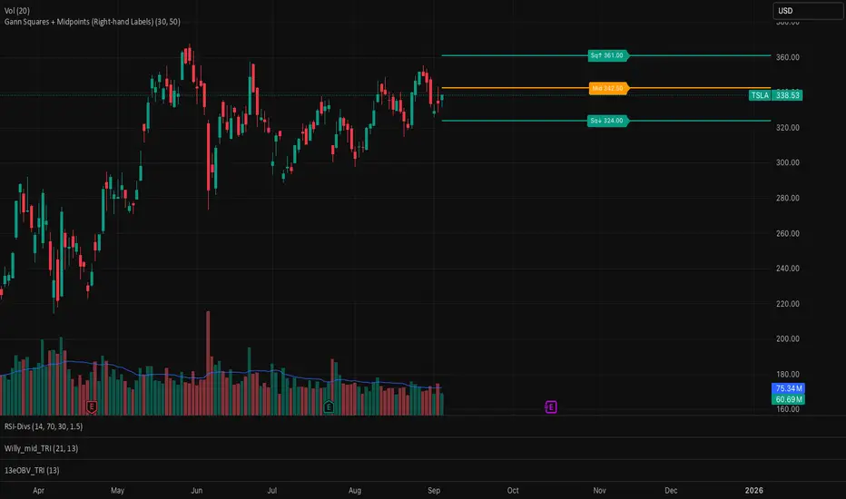
Gann Squares + Midpoints It gives Gann Square and a midpoint closest to the price which act as support and resistance
THOT_GANNThis indicator is based on wd Gann square of 9 levels
i added 3 ema 50 100 and 200 to follow a right trend
also i added VWAP to understand buyer is aggressive or seller.
now study all together we can trade on breakout and reversal.

gann fib levelsDescription of gann fib Levels
Input Value Level:
Purpose: This level is the starting point for calculating support and resistance. Users can input a specific high or low price value that serves as the foundation for subsequent calculations.
Visual Representation: A bold blue line indicates this level prominently on the chart, making it easy to identify. Additionally, a horizontal magenta line provides a reference to this initial price level.
Support Levels:
Definition: Support levels are price points where a downtrend can be expected to pause due to buying interest. They act as a floor that prevents the price from falling further.
Calculation: Support levels are derived by calculating the square root of the input value, adjusting it downward by a defined step (0.25), and squaring the result to find potential support points.
Visual Representation: Each support level is plotted with a red line when the current price is below the support level and changes to green when the price is above it. Every fourth support level is depicted with a bolder line for emphasis.
Resistance Levels:
Definition: Resistance levels are price points where an uptrend can be expected to pause due to selling interest. They serve as a ceiling that prevents the price from rising further.
Calculation: Resistance levels are calculated similarly to support levels, using the square root of the input value but adjusting it upward by the defined step (0.25) before squaring the result.
Visual Representation: Each resistance level is plotted with a green line when the current price is below the resistance level and turns red when the price is above it. Like support levels, every fourth resistance line is bolded for easier identification.
Dynamic Behavior:
Crossing Logic: When the current market price crosses above a resistance level, that level transforms into a support level, effectively changing its role. Conversely, if the price crosses below a support level, it transforms into a resistance level. This dynamic behavior reflects real-time market sentiment and helps traders identify potential reversal points.
Summary
This Pine Script provides a visual representation of dynamic support and resistance levels based on a user-defined input price. With distinct color coding and bold lines for significant levels, traders can quickly assess market conditions, identify potential buy or sell signals, and make informed trading decisions. The system's adaptability allows it to reflect the latest market movements, enhancing its utility as a trading tool.


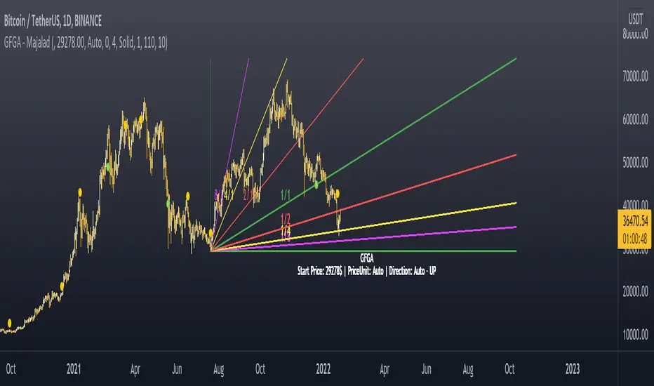
Gann Fan Geometric Angles - majalad
Market geometry is one of the very interesting topics that was talked about by W.D. Gann and many others. The problem with today's charting software is that they lack the concept of scaling and geometry drawing. This fan is different from other fanns as it accounts for that missing peice and really uses the 1 price point per 1 time point concept.
Once this script is added to your chart, it will try to calculate a price per point value and draw your fann geometrically using this price per point value. You will also have the option to defin the proper price per point value for your instrument, if you want to.
How to use
Once you add the script, you will need to select a starting point for your fann
The script will calculate the price per point and the trend direction for you automatically.
If needed, you can change the price per point and the direction from the settings.
Please PM me for access or for any question.
Gann Square Top Bottom - majalad
Price and Time squaring is one of the main concepts that W.D. Gann introduced and talked about in his books. This script uses those techniques to Square a Top or Bottom that you specify on the chart.
You can also choose to square based on the price, price squared or square root of the price with a lot of customization and coloring options. You have the overall control to change any part of the script including lines colors, style, thickness, fill colors and so on.
Please note that although the script tries to set the direction and the price per point automatically for you, sometimes for very fast or very slow instruments you will need to define the price per point for the instrument that you are dealing with.
How to use
Once you add the script, you will need to select the top or bottom that you want to square
The script will calculate the price per point and the trend direction for you automatically.
If needed, you can change the price per point and the direction from the settings.
You can also select to add multiple boxes for the same squared range
Please PM me for access or for any question.

Gann Square of 9 LevelsThis indicator is designed based on Mr. WD Gann's square of nine methods.
Using this indicator, we can enter the desired pivot price and, based on the coefficient we assign to it, extract 8 support and resistance numbers with 8 angles of 45, 90, 135, 180, 225, 270, 315, and 360.
Calculates 8 support and resistance points and draws support and resistance lines.
The coefficient is to triple the number of executions.
To select pivot points in which a price is a large number, by selecting coefficients of 0.1, 0.01, 0.001, and 0.0001, we can have support and resistance points appropriate to the time frame.
For example, the price of Bitcoin, which was 64,854 on April 14, 2021, can be used to perform three-digit calculations by selecting a coefficient of 0.0001.
To select pivot points whose price is a small number, by selecting coefficients higher than 10, 100, 1000, and 10000, we can have support and resistance points appropriate to the time frame.
For example, the price of Dodge coin, which was 0.7399 on May 8, 2021, we can perform three-digit calculations by selecting a coefficient of 100 indicators.
Gann HiLo Activator [CC]The HiLo Activator was created by W.D. Gann and I was surprised to not see more of his technical indicators on here. I will start adding more of his indicators on here if I get more interest. This is the original version of the indicator that performs like a trailing stop that also works well as a trend line. Buy when the line turns green and sell when it turns red.
Let me know if there are any other indicators you want me to publish!

Gann By Day Trader AHTHIS INDICATOR IS ONLY FOR EDUCATIONAL PURPOSE AND THE ORIGINAL CONTENT IS THE PROPERTY OF DAY TRADER AH AND MR. SAVAN AGRAVAT {THE CREATOR}. AND THE CREATOR OF THE INDICATOR IS DATA TRADER.
THIS IS ONLY APPLICABLE TO THE STOCKS OF HIGHER VALUES AND IN INDICES.
How to use the indicator.
In the input option, check in the large stocks section, if the stock price is more than 1500.
In the input option, check in the small stocks section, if the stock price is less than 1500.
NO CHANGES TO BE MADE WITH THE PERIOD.
While making the position please do refer to Gann Levels as well.
the levels labelled as AB, CB , EB... stands for breakout levels (these are dynamic support and resistance levels)
the levels labelled as BR, DR, FR... stands for reversal levels.
rest how to use the levels and how to trade based on them will be soon explained with a video.
Thank You and Happy Trading.
All the best.
DAY TRADER AH

Gann AnglesThis script help you to draw, from the most important Low or High, 4 Gann angles.
The angles are based on the following time factors:
- Daily
- Calendar
- Weekly
- Monthly
What you have to do it is only insert :
- Start date: you must identify the Low/High. Remember to insert date -1 and 00:00 as time
- End date: I suggest you to insert a very far date in the future
- Start Price: High price or Low price
- ANGLES
1X1:
2X1:
4X1.
In the attached example you can see the daily time factor worked pretty well
17x1
34x1
68x1
angles. The next one 17x2 ?

Gann Intraday 5 min hello traders,
this is a script or indicator to use for intraday Trading time frame 5 min ,(less than 15 Min) else it may give wrong signal
i made this using gann ,ema & sma
i am hiding script codes as some may copy to sell it ,
back test it and then use
Note :- rules for trading
1 - price need to come from black background and close above both the lines
2 - to buy price need to close above small line and place above that canndle
3- to sell do invert for 2nd point
to filter it out can use vwap
any suggestion welcome i will update if i found your suggestion worthy
thanks happy trading
vikhyat

Gann Angles With VolatilityThis script will calculate the intraday levels using Gann angles and volatility principle.


Gann Trend OscillatorDeveloped by Robert Krausz, the Gann Trend Oscillator is a trend-following indicator used to determine the financial instruments long-term price direction.

Gann Lines2.14Plots gann sq9, sq12, and fiblines on the chart. only plots those lines immediately above and below current price.
Input high or low pivot and indicate if you want to plot upwards or downwards from that pivot...

Gann GridA script to draw Gann Grid given Cycle start point, Cycle space (size), Cycle type ( Bullish / Bearish ), Cycle shape, Time levels space and Grid size
The lines are customizable you can change their style and color
When you increase the size you may see that the Grids at the beginning are getting removed, that's pretty normal because TradingView has a limit of 55 line per indicator you won't need the old grids anyway but if you want you can decrease the size and they will show again
My Telegram :- @Kirolos_T


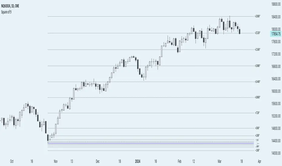
Anchored Square of 9 by AlgoCadosThe 'Anchored Square of 9 by AlgoCados' pine script indicator, leverages the non-discretionary, mathematical principles of W.D. Gann's Square of 9 for predicting vital support and resistance levels across all financial assets. Its mathematical precision and versatility make it a universally applicable tool, suitable for analysis of any financial asset without bias. Characterized by its adaptability to both high and low time frame analyses (HTF and LTF), this sophisticated indicator provides a structured, reliable method for market analysis, making it an essential asset for traders looking to apply a consistent and comprehensive approach across various market conditions and asset classes.
CME_MINI:NQH2024
Core Functionality
Anchored Price Point: The script allows users to define an anchor time and anchor point type (High, Low, Open, Close), serving as the basis for subsequent calculations. This flexibility enables precise adaptation to varying market conditions and analysis needs.
Angular Shifts and Projection: The indicator implements a range of angular shifts for LTF and HTF analyses, allowing for detailed and customizable projection of support and resistance levels. Angular shifts can range from 11.25° for finer intraday nuances up to 7200° for broader, long-term trend insights.
Mathematical Implementation
Anchor Point Selection: The script selects an anchor point based on user inputs for the anchor type and anchor time. This point serves as the basis for calculating deviations.
Angular Shift Calculation: The indicator calculates deviations by applying angular shifts to the square root of the anchor price. These deviations are used to project potential support and resistance levels.
Projection Lines and Labels: For each angular shift, the script generates projection lines and labels, which are dynamically adjusted as new data becomes available. This visual representation aids in identifying significant price levels.
CME_MINI:NQH2024
Key Features and Customization Options
Customizable Angular Shifts: Traders can enable or disable specific angular shifts to tailor the analysis to their trading strategy.
Projection Styles and Labels: Offers various styles (Solid, Dotted, Dashed) for equilibrium, upper shifts, and lower shifts lines, along with customizable label options (Levels, Prices, Levels + Prices) for enhanced clarity and information density.
Dynamic Labeling: Utilizes dynamic labeling for each projection line, indicating the angular degree and price level, facilitating a comprehensive understanding of potential market movements.
User-Friendly Inputs: Features user-defined inputs for anchor time and type, angular shifts, line styles, and labeling options, making the tool highly adaptable and intuitive.
Pine Script Technical Insight
Input Handling: The script incorporates a series of input controls to allow users to specify the anchor time, anchor type, and which angular shifts to display.
Line and Label Generation: Utilizes Pine Script's capabilities to dynamically generate and adjust projection lines and labels based on the calculated support and resistance levels.
Efficiency and Adaptability: Efficiently loops through a predefined set of angles, applying them to the anchored price point to calculate and project support and resistance levels, demonstrating the script's adaptability to both intraday and longer-term analysis.
Mathematical Formulation and Indicator Logic
Initial Setup and Inputs
The indicator starts by capturing user inputs for the anchor point—this can be a High, Low, Open, or Close price at a specified anchor time. These inputs determine the base price (P-base) from which all calculations are derived.
High if Anchor Type = "High"
Low if Anchor Type = "Low"
Open if Anchor Type = "Open"
Close if Anchor Type = "Close"
Angular Shifts and Projection Basis
The core of the "Anchored Square of 9" methodology involves calculating support and resistance levels through angular shifts applied to the Price-base (P-base).
The indicator enables a series of angular shifts, specified by the user, to project these levels dynamically.
Angular shifts are interpreted through the lens of Gann's theory, with each degree corresponding to a potential market turn or equilibrium point.
The script translates these angles into actionable projections using the square root of the anchor price, then applies the angular coefficients to find deviation points.
Angular Coefficients and Pi
In the context of the "Anchored Square of 9" indicator, angular shifts are crucial for projecting potential support and resistance levels. These shifts are quantified by angular coefficients derived from geometric principles, specifically leveraging the relationship between angles in degrees and their radian counterparts using π (Pi). Here's how angular coefficients are integrated:
Pi Reference for Angular Shifts: Given that 360° equates to 2π radians, angular coefficients (θ) for the indicator are calculated by translating degrees into a radian measure and then applying this measure to modify the square root of the base price (P-base).
Example of Angular Coefficients Shift:
A 180° shift corresponds to π radians. In the indicator's formula, this would translate to an angular coefficient of 1, since 180° = π in terms of π. Thus, applying this angular shift involves adding or subtracting 1 from the square root of P-base and then squaring the result to project a new price level.
Similarly, a 90° shift, equating to π/2, would have an angular coefficient equivalent to 0.5, reflecting its proportion of the circle (or square, in the context of Gann's geometry).
Implementation in Calculation of Deviations
Incorporating π into the formula for calculating deviations enriches the indicator's mathematical foundation, providing a direct link to geometric principles:
For each selected angular shift (θ), the script calculates positive and negative deviations from the square root of the anchor price. These deviations represent potential support and resistance levels.
P± = round (( sqrt root (P-base) ± θ)²)
Where:
P ± represents the calculated price levels for support (-) and resistance levels (+);
θ is the angular coefficient derived from the user-selected angular shifts;
sqrt root (P-base) is the square root of the base price;
round (⋅) ensures that the calculated levels are adjusted to the nearest tick size, maintaining relevance to actual trading scenarios.
Dynamic Projections and Visualization
The script generates lines and labels for these calculated levels, dynamically extending them as new market data becomes available. This feature ensures that traders have the most current and relevant information for decision-making.
For visualization:
Equilibrium Lines: Drawn at P-base to indicate the anchor or equilibrium point.
Support and Resistance Lines: Drawn at P- and P+, respectively, showing potential levels of market reaction
CME_MINI:NQH2024
Labeling and Style Customization
The indicator provides extensive customization for the appearance of projection lines and labels. Traders can select the line style, color, and text information (levels, prices, or both) to be displayed, tailoring the visual output to their preferences and trading strategy.
Implementation Details
This detailed approach to calculating support and resistance levels showcases the indicator's adherence to Gann's principles while leveraging modern computational methods to enhance trading analysis. By translating angular shifts into quantifiable projections, the "AlgoCados x Anchored Square of 9" indicator offers a powerful tool for identifying potential market movements with high precision.
The Pine Script implementation encapsulates this complex logic within a user-friendly interface, allowing traders to harness advanced analytical techniques within the TradingView platform. Through dynamic calculation and visualization, the indicator equips users with a deep understanding of market structures, enabling informed trading decisions based on mathematical projections.
Conclusion
The 'Anchored Square of 9 by AlgoCados' indicator merges mathematical precision with trading intuition, offering an advanced tool for traders seeking to leverage the time-tested principles of W.D. Gann's Square of 9. With its comprehensive set of features and customization options, it stands as a powerful addition to the TradingView platform, designed to enhance market analysis and decision-making for traders at all levels.
Embrace the essence of smarter trading where every insight is "Healthy For Your Trading."
Magic levelsIt is by far the simplest on chart presentation of Gann square of 9. It calculates the levels based on previous day closing. These levels usually acts as support and resistance.

Square of Nine Levels [RC] Basic📐 Square of Nine Levels Basic— Precision Market Geometry for Dynamic Price Targets
The Square of Nine Levels Basic indicator is a powerful price-projection and level-mapping tool based on W.D. Gann’s legendary Square of Nine mathematical system. This indicator transforms market prices into geometric rotations and harmonic levels—revealing price zones where markets historically accelerate, pause, or reverse with uncanny accuracy.
Unlike static Fibonacci tools, Square of Nine levels expand radially around a chosen base price, creating concentric price cycles that align with vibrational mathematics and cyclical market resonance. When price interacts with these rotational degrees, traders often witness structural reactions that are invisible to standard indicators.
🧭 What This Indicator Does
Once a trader inputs (or clicks) a Base Price, the indicator automatically:
✔️ Computes Square of Nine projections in upward and downward directions
✔️ Plots concentric price circles (levels of expansion) (Basic Version 1 Level Only)
✔️ Highlights rotational harmonics and midpoint attractors
✔️ Shows Golden Ratio (0.786 / 0.618 / 0.382 / 0.236) cyclic divisions
✔️ Provides clear visual level markers & labels for analysis
✔️ Adjusts dynamically as price trends evolve
These levels act as mathematical magnets, where price frequently:
Finds hidden support or resistance
Creates fair value rejection zones
Forms breakout thresholds
Completes wave and time cycles
Resonates with prior swing pivots
🔍 Key Features
Feature Benefit
_________________________________________________________________________
Auto Square-of-Nine Level Calculation Zero manual computation—instant geometry
Adjustable Circles & Points Model Gann expansions as per your theory
Golden Ratio & Midpoint Zones Adds confluence for precision entries
Multi-color Cycle Layers Instantly differentiate price cycles
Minimal UI Designed for professional clean charts
🧠 Why the Square of Nine Matters
Gann believed that price does not move randomly—it rotates through degrees, harmonics, and vibrational frequencies. The Square of Nine captures this rotation mathematically:
Price in time equals price in space.
This tool reveals those rotational levels, allowing traders to anticipate when price is likely to pivot or continue—with mathematically predictable targets.
🎯 Best Use-Cases
Identifying major support/resistance levels
Timing cycle inflection points
Swing, positional, and index-level forecasting
If you trade using Gann methods, cycles, harmonics, Square of 9, or astro-geometry, this indicator becomes a foundational levels and projection engine.
🚀 Take Your Charting to the Next Dimension
The Square of Nine Levels Basic is not just a level plotter—it is a market resonance system. Once you understand how price vibrates around these circles, you gain a structural edge that most traders never discover.
