ICT Suspension BlocksICT Suspension Block (SB) Indicator
The ICT Suspension Block (SB) is a three-candle price action pattern that often act as support or resistance zones. A Suspension Block is a three-candle pattern showing a brief pause in price efficiency before continuation. These zones frequently serve as areas where price may later return, offering traders potential trading opportunities.
Pattern Definition
A Suspension Block forms when three consecutive candles move in the same direction but leave behind a specific body-to-body imbalance. (a gap between the bodies of consecutive candles).
Bullish Suspension Block (+SB):
All three candles are bullish (close > open).
Candle 1 close < Candle 2 open.
Candle 2 close < Candle 3 open.
Zone = from Candle 1 close to Candle 3 open.
Bearish Suspension Block (-SB):
All three candles are bearish (close < open).
Candle 1 close > Candle 2 open.
Candle 2 close > Candle 3 open.
Zone = from Candle 1 close to Candle 3 open.
These zones mark areas where price was temporarily imbalanced. Price often “respects” these levels later, either bouncing from them or breaking through them, which can provide valuable trade context.
Application
Suspension Blocks are used to mark areas where price may later react:
A Bullish SB can act as potential support.
A Bearish SB can act as potential resistance.
The significance of a block depends on market context. Blocks formed during strong, impulsive moves tend to be more meaningful than those in consolidation.
How the Indicator Works
Identifies bullish and bearish suspension blocks using body gap imbalances.
Draws colored zones (green = bullish, red = bearish) directly on the chart.
Extends zones forward until they are inversed by price action.
Once inversed, zones switch to a neutral color, allowing traders to annotate/extend them manually if desired.
Includes Consequent Encroachment (CE) lines (the 50% equilibrium of the block), which many traders use as reaction levels.
Features
Customizable colors for bullish, bearish, and inversed zones
Extend blocks indefinitely forward or limit them to a set number of bars
Adjustable maximum number of displayed blocks for performance control
Consequent Encroachment (CE) (Middle Point, 50%, Equilibrium) line feature
Configurable CE line style, color, and width
How to Use It
Trend Following: Blocks forming in the direction of trend can act as continuation zones.
Reversals: Opposite-direction blocks may signal exhaustion and potential turning points.
Liquidity Levels: CE lines (50% of block) often serve as reaction levels for entries, partials, or stop placement.
Context is Key: Suspension Blocks should not be used in isolation. Combine them with market structure, liquidity pools, or other confluence factors for best results.
Notes
This indicator is intended for technical analysis and research.
It should always be combined with proper risk management and a complete trading plan.
Past market behavior does not guarantee future results.
Cari dalam skrip untuk "imbalance"

Trademania - PVSRA IndicatorTrademania - PVSRA Indicator
The Trademania - PVSRA Indicator is based on a proven MT4 indicator suite that has been in use since 2013. Over time, it has been expanded with additional features and tools. Originally developed for the Forex market, it also works well for cryptocurrencies, stocks, and other assets. The goal of this indicator is to combine classic chart analysis with PVSRA analysis, allowing for a clean mixed chart analysis. Traders gain access to a wide range of important information and can use it to form their trading assumptions. The indicator is designed to make it as simple as possible: identifying price levels at the breakout of key support/resistance, for confirmations above/below an imbalance, or recognizing and validating standard structures.
Important: This indicator is designed to be used across all timeframes. It works equally well for scalping on lower timeframes and for larger timeframes, such as spot trading on the 4H or daily chart.
The following core features are available:
- PVSRA Candles
- Dynamic Zones for PVSRA Candles (Imbalance)
- Market sessions with high/low points
- Integrated EMAs (daily, weekly, higher time frames)
- Fully customizable EMAs
- Pivot points with mid/50% level
- Price ranges from yesterday and last week
- Average daily range (also available for weekly and monthly)
- Psychological levels (for Forex)
- Daily open
- High/Low Point of Control (POC) indicators for wicks and candle bodies
- WIL (Weekly Interest Level) - High/Low of the Asian session
- On-chart labels for nearly all elements
Key Features:
- PVSRA, integrated POC levels, and WIL levels distinguish this indicator.
- Integrated EMAs and the daily, weekly, high time frame EMAs can be supplemented or replaced by custom EMAs for maximum flexibility.
Special Feature:
- Lite Mode for better visibility and simplified chart analysis.
Instructions and Notes
PVSRA Candles
Display volume or tick volume on the chart.
- Candles with more than 200% average volume of the last 10 candles, where the product of candle spread and volume is greater than the last 10 candles/timeframes, are shown in green (bullish) and red (bearish).
- Blue and purple candles show the same with 150% average volume of the last 10 candles.
**Note:** To obtain valid information, the trading volume should be as large as possible. If you're viewing the chart of an exchange with low trading volume, you can use the PVSRA override to display the volume from another exchange. For example, you can view the Phemex chart but display the tick/volume of the Binance chart as PVSRA/Vector candles.
Dynamic Zones for PVSRA Candles (Imbalance)
Zones that match the color of the respective vector candle display imbalance on the chart.
- In PVSRA analysis, it is assumed that such imbalances will be revisited and corrected. It can be customized whether this should happen with candle wicks or just the candle bodies.
Market Sessions with High/Low Points (DST)
Relevant market sessions: Sydney/NZX, Tokyo, Hong Kong, EU, New York, as well as the Brinks sessions pre EU/NY, are marked with high/low points and labeled on the chart.
- In PVSRA/Mixed analysis, these represent important liquidity zones of the individual trading sessions, often serving as key support/resistance levels.
WIL (Weekly Interest Level) - High/Low of the Asian Session
The new WIL levels represent the market open/Asian session of the new trading week: Sydney open to Hong Kong close.
- This forms an important price range for the trading week and is always a key breakout zone or rejection area in mixed analysis. Additional liquidity is needed to break through these levels.
- Higher effort against the start of the week – an imbalance (above/below).
High/Low Point of Control (POC) Indicators for Wicks and Candle Bodies
Additionally, the indicator includes pivot-based POC markers at key highs/lows on the chart.
- A POC is generated from the candle footprint (1000 resolution) and displayed on the chart.
- **Note:** If the POC is in a wick, it is shown as a line; if the POC is only in the candle body, it is displayed in small text.
- In mixed analysis, POCs in volume-heavy wicks are always a key indication of price levels that will be revisited and a potential enhancer for a wick-fill upwards or downwards.
EMA/Pivot Points/Psychological Levels Classic/Average Ranges:
Daily/ADR - Weekly/AWR / High/Low values for day/week, as well as the daily open of the current trading day, form the foundation of the indicator.
- Base structures that account for imbalance must break certain price levels to confirm or invalidate a previous movement (bullish or bearish).
- 13/50/200/800 EMA retrace: Breaking these in either direction without addressing an imbalance on the opposite side requires confirmation after the break.
- Pivot-level trading operates on the same principle.
- **Note:** Pivot levels in this indicator have additional M-levels, which represent 50% markers to provide better insights into potential retraces or upward moves.
- For example: Breaking M1, retracing, and confirming at M1 with a target at M2.
To recognize a standard 3-level rise or retrace scenario in mixed analysis, as well as a potential extended chart progression, these levels are essential.
**Note:** Average ranges such as High/Low ADR are particularly important levels where interruptions are expected. Profit-taking, long/short, is common at these points, independent of standard structures. This also applies to the high/low levels of the last trading day and the weekly versions of these levels.
The daily open helps identify possible SPOT/Futures gaps (depending on the asset, such as a missing futures market over the weekend: NAS/DAX).
Important:
The Lite Mode is designed to help traders reduce the chart to essential core functions (PVSRA/EMA/WIL/Psy/Daily Open/Hi-Lo) to apply classic TA effectively and strengthen a mixed analysis or challenge certain assumptions regarding confirmation and imbalance.
**Note:** It is recommended to additionally use a MACD indicator to identify potential trends and momentum.
- For example, a positive MACD trend supporting a 50 EMA breakout with a target of the 200 EMA under positive imbalance (standard mixed pattern).
To cater to personal preferences or trading strategies, it is possible to add custom EMA values to the indicator without the need for a second or third separate indicator.
All functions are fully customizable within the indicator settings.

Smart Money Concepts [Kodexius]Smart Money Concepts is a price action framework designed to integrate market structure, liquidity behavior, and inefficiencies into a single, readable view. Rather than acting as a signal generator, it serves as a live market map highlighting where price has displaced, where liquidity may be resting, which zones remain valid, and how that context updates as new candles print.
What separates this script from typical “SMC bundles” is not the presence of familiar concepts like swings, order blocks, FVGs or liquidity sweeps. The value is in the engine design and how the components are maintained together as a consistent state, with automatic pruning and prioritization so the chart stays usable over time. Many tools can draw boxes, but fewer tools manage the lifecycle of those zones, reduce overlap, rank relevance, and keep the display focused on what still matters near current price.
At the core is a structure model that tracks directional state and labels structural transitions as they happen. CHoCH and BoS are not just printed whenever price crosses a line. Each event is anchored to a swing reference and handled in a way that reduces repeated triggers from the same context, helping you see genuine transitions versus minor noise. This gives structure a “narrative” across time instead of a cluttered sequence of identical labels.
Order blocks are built from the most relevant candle within the post break window and displayed as true zones that extend forward while they remain valid. Beyond the zone itself, the script adds context that is usually missing in basic OB implementations: a volumetric pressure visualization and a displacement strength score that is normalized and ranked over a rolling window. In practice, this creates an information hierarchy. You can quickly see which zones carried more participation, whether the internal push was dominated by buying or selling pressure, and whether the move that created the zone had meaningful displacement relative to recent history. This is designed to help prioritization, not to claim prediction.
Imbalances are handled as a dedicated module with multiple detection modes (FVG, VI, OG, IFVG) and optional MTF logic so you can map inefficiencies from a higher timeframe while executing on a lower timeframe. Each imbalance is displayed as a zone with a midline reference, and mitigation behavior can be tuned (wick or close). IFVG adds lifecycle depth by tracking inversion behavior rather than simply deleting the zone, which can be useful for monitoring how price rebalances and flips inefficiencies over time. An optional sentiment style internal fill is available for visual context, but it is intentionally framed as informational rather than a “buy/sell meter.”
Liquidity is treated as an event driven layer. Pivot highs and lows are tracked as potential liquidity pools, then monitored for sweeps and rejection behavior. If you enable EQH/EQL logic, the script can label equal highs and lows during the sweep process to highlight common resting liquidity formations. A volume filter is available to reduce low quality levels, aiming to keep the liquidity map focused on swings that occurred with meaningful participation rather than every small fluctuation.
Swing Failure Patterns (SFP) are included as a separate confirmation style tool that focuses on rejection after liquidity is taken. The module supports optional volume validation using lower timeframe volume distribution outside the swing level, which helps filter some low quality SFPs on noisy instruments. The output is a cleaner set of events intended to complement structure, liquidity and zones, not replace discretionary decision making.
For higher timeframe context, the HTF candle projection panel can display a compact set of higher timeframe candles to the right of current price, with classic or Heikin Ashi style and configurable sizing, spacing and labels. This allows you to maintain HTF awareness without switching charts, which is especially helpful when structure and zones are being interpreted across multiple timeframes.
Finally, the alert framework is designed around well defined structural and zone states. Alerts cover structural shifts (CHoCH, BoS), liquidity sweeps, new and broken order blocks, breaker behavior (if enabled), new and approached imbalances, premium and discount entries, trendline events, and SFP detection. These alerts are intended as monitoring prompts so you can review context, not as automated trade execution signals.
Every major component is modular and configurable. You can run a minimal structure only layout or enable a full framework with zones, imbalances, liquidity, SFP and HTF projection. The guiding principle is chart clarity and relevance: keep the most important information visible, reduce overlap and stale objects, and maintain a consistent view of how price is interacting with liquidity and value over time.
🔹 Features
🔸 Market Structure Engine (CHoCH and BoS)
This script automatically tracks zigzag based market structure and differentiates between:
CHoCH (Change of Character) : the first meaningful structural shift that suggests the prior directional leg is weakening.
BoS (Break of Structure) : continuation breaks that confirm structure extension in the active direction.
Instead of relying on plain pivot dots, our market structure swings are built with a lightweight zigzag style engine that tracks direction and “locks in” the true leg extreme only when the leg flips. This produces cleaner, more consistent swing highs/lows for BOS/CHoCH than simple left/right pivot checks.
Bullish CHoCH:
Bearish CHoCH:
Bullish BoS:
Bearish BoS:
🔸 Order Blocks with Volumetric and Displacement Insight
The script identifies recent bullish and bearish order block zones around meaningful structural reactions and keeps the display focused on the most relevant areas. Instead of drawing a static rectangle and leaving it there forever, each zone is maintained as an active region on the chart and can be limited by a user defined visibility depth to avoid clutter. When enabled, the overlay also adds compact volume based context inside the block so you can quickly compare relative participation between recent zones and see whether the origin move showed strong follow through versus a softer transition. The intention is to provide structured context and cleaner prioritization on the chart, not to present a trade call or a guaranteed reaction level.
Bullish Order Block:
Bearish Order Block:
Order blocks are derived from the structure shifts, marking the institutional “origin zone” behind a decisive move and projecting it forward as a live area of interest. In practice, it highlights the candle cluster where price last rebalanced before expanding away, so you can track potential retests with context instead of guessing.
Inside each order block, the internal bars act as a compact strength meter green vs red summarizes the relative bullish vs bearish participation, while the blue segment reflects the “departure force” (displacement/momentum) away from the zone. It’s meant to help you scan which blocks left clean and strong versus those that moved out more slowly or with mixed pressure.
🔸 Breaker Blocks & Mitigation Tracking
Tracks when previously identified order blocks fail and converts them into breaker blocks, visually marking a change in how price is interacting with that zone.
Bullish Breaker Block :
Bearish Breaker Block :
Separate handling of bullish and bearish breakers with clear color differentiation.
Includes optional “mitigation” logic using either wick or close to determine when a block is considered broken or mitigated.
Breaker blocks are updated and removed dynamically as price trades through them, keeping the chart focused on current, active zones.
🔸 Imbalances
The imbalance module maps common price inefficiencies as zones, with support for multiple detection styles such as Fair Value Gaps, volume style imbalances, opening gaps, and an inverted gap mode. Each imbalance is drawn as a practical area on the chart with a midpoint reference, so you can quickly see where price may be revisiting unbalanced movement. You can also choose how mitigation is evaluated (wick or close) and optionally run imbalance detection on a separate timeframe for cleaner higher timeframe context while staying on your execution chart.
Fair Value Gaps:
Inverse Fair Value Gaps:
Opening Gaps:
🔸 Liquidity Sweeps, EQH/EQL, and Optional Volume Filter
Liquidity levels are derived from swing highs and lows and then monitored for sweep behavior, where price trades beyond a prior level and rejects back. If you enable EQH/EQL marking, the script can highlight equal highs and equal lows behavior around those liquidity areas to make common pool formations easier to spot. An optional volume filter can be used to reduce tracking of low participation swings, helping keep the liquidity layer focused and less noisy on instruments that produce frequent small pivots.
Sellside Liquidity Sweep Definition:
Buyside Liquidity Sweep Definition:
Highlights equal highs (EQH) and equal lows (EQL) when sweeps occur, marking where price probed above/below prior liquidity and then rejected.
Optional volume filter to ignore low volume swings and focus on more meaningful liquidity zones.
🔸 Premium, Discount, and Equilibrium
The premium and discount view provides a simple contextual map of where price is trading within a measured range, alongside an optional equilibrium line as a midpoint reference. This is intended as a higher level framing tool to help you avoid treating every price location the same, especially when combining structure with reaction zones. Price labels can be enabled for quick orientation, and the display updates as the underlying range evolves.
Projects premium and discount bands based on a dynamically measured range, offering a simple view of where price is trading relative to that range.
Draws separate Premium and Discount boxes with optional price labels for quick orientation.
Optional mid line (equilibrium) to visualize the “50%” of the current range, often used as a reference for balanced versus extended price.
Zones auto update as the underlying range evolves, with logic to prevent stale levels from cluttering the chart.
🔸 Trend Channels
When enabled, the trend module draws swing based diagonal structure using trendlines and a channel style visualization. You can tune sensitivity and choose whether the source should be depending on how you prefer to read trend behavior. The channel is maintained dynamically so you can keep directional context without manually drawing and constantly adjusting diagonal lines, and the script can highlight basic break behavior when price pushes beyond the active diagonal reference.
🔸 Swing Failure Pattern (SFP) Detector
The SFP module highlights common swing failure behavior, where price briefly trades beyond a swing level and then reclaims it, often reflecting a liquidity grab followed by rejection. Bullish and bearish SFPs can be enabled independently, and the display is designed to keep the key level and the rejection visible without excessive clutter. Optional volume validation can be used as a filter, so you can choose whether you want the detector to be more permissive or more selective based on participation characteristics.
🔸 HTF Candle Projection Panel
The HTF panel projects a compact set of higher timeframe candles to the right of price, giving you higher timeframe context without switching charts. You can select classic candles or Heikin Ashi style, adjust the scale and spacing, and optionally display reference lines and labels for OHLC values. This is a visual context tool intended to support multi timeframe reading, not a replacement for your own higher timeframe analysis.
In addition to projecting higher timeframe candles, the HTF panel can also detect and visualize higher timeframe liquidity sweeps directly within the projected candle set. The script monitors each completed HTF candle’s high and low and evaluates subsequent HTF candles for sweep behavior i.e., when price briefly trades beyond a prior HTF extreme but fails to hold acceptance beyond it (filtered using the later candle’s body positioning). When a sweep is detected, the panel draws a dotted sweep line and marks the event, allowing you to spot HTF stop runs and failed breaks without switching timeframes. Sweeps are dynamically invalidated if a later HTF candle shows genuine acceptance beyond that level, ensuring the display stays context relevant and avoids stale markings. This turns the HTF projection from a passive visualization into an actionable context layer for identifying HTF liquidity events while executing on lower timeframes.
🔸 Alerts
Alerts are included for the most practical events produced by the overlay, such as structure shifts (CHoCH and BoS), liquidity sweeps, new and invalidated zones, price approaching recent zones, imbalance creation and mitigation, premium or discount entries, trendline events, and SFP detections. The alerts are designed to function as a monitoring layer so you can be notified when something changes in your mapped context, rather than acting as standalone trade instructions.
🔸 Originality & Usefulness
This script is not a collection of separate SMC drawings layered on top of price. It is built as a unified price action engine where market structure, order blocks, inefficiencies, and liquidity are produced from the same evolving state. That matters because most SMC indicators treat these concepts as independent overlays, which often leads to contradictory markings and excessive clutter. Here, the design priority is consistency and readability: modules update in sync, older elements are managed, and the chart stays usable during live conditions.
A key differentiator is the internal swing logic, which functions like a compact zigzag style structure engine. Instead of reacting to every minor fluctuation, it aims to focus on meaningful swing decisions and treat structure as a sequence. This reduces repetitive labeling and makes structural transitions easier to follow. Structure events are anchored to the swing that defined them and are designed to trigger in a clean, non spammy way, which is critical for anyone who uses structure as a workflow backbone.
The structure layer is intentionally narrative oriented. It separates a transition event from continuation events, so CHoCH is used to highlight the first meaningful shift after an established leg, while BoS is used to mark follow through in the same direction. This is not a prediction claim. It is a clarity feature that helps users read “phase changes” versus “continuation” without constantly second guessing whether the script is just printing noise.
Order blocks are where this script becomes especially distinctive compared to typical SMC tools. Instead of drawing identical rectangles, each block is rendered with an internal gauge that communicates participation and directional dominance at a glance. The zone is visually segmented to reflect bullish and bearish pressure components, and it also carries a volume readout plus a relative weight compared to other recent blocks. This creates a ranked view of blocks rather than an unfiltered pile. In practice, you can prioritize zones faster because the script surfaces which blocks had more meaningful participation and whether the internal push looked one sided or mixed. The result is less subjective filtering and a cleaner chart.
Imbalances are handled as structured inefficiency zones with clear references and optional context. Beyond drawing the zone and midpoint, the script can overlay a sentiment style gauge that divides the imbalance into bullish and bearish portions and updates as new data comes in. The practical value is that you can see whether an inefficiency remains strongly one sided or is gradually being balanced. This turns imbalances from static boxes into a living context layer, which is particularly useful when you monitor reactions over time instead of treating every touch the same.
Liquidity is treated as an event driven tracking system rather than simple pivot plotting. Liquidity pools are identified from swing behavior and can be gated through a participation filter so the script focuses on levels that formed with meaningful activity rather than low quality noise. Once tracked, levels are monitored for outcomes like sweeps and equal high/low behavior, and then updated or retired when they are decisively resolved. This prevents the display from accumulating stale levels and keeps the liquidity layer focused on what is still relevant now.
Swing failure patterns are integrated as selective events rather than continuous spam. The intent is to produce fewer but more structurally meaningful SFPs, aligned with the liquidity narrative, instead of printing clusters around the same price area. This keeps the pattern readable and reinforces the “event based” design philosophy across the script.
Higher timeframe context is supported through a compact HTF projection panel that provides quick orientation without forcing constant timeframe switching. It lets you see where current price action sits inside a larger timeframe candle and range, which helps maintain consistency when you are executing on a lower timeframe but respecting higher timeframe structure.
Disclaimer: This indicator is for educational and analytical purposes only. It does not provide financial advice, and it does not guarantee results.
🔹 How to Use
This tool is designed to support multiple trading styles, but it is most effective when you treat it as a top down mapping and decision support tool. A practical workflow looks like this.
1) Establish higher timeframe bias and context
Start on your reference timeframe such as H4 or Daily and read the market’s dominant story first. Use the Market Structure Engine to identify whether the market is in continuation mode or transition mode. The goal is to avoid executing lower timeframe ideas that conflict with the larger structure narrative.
Use the HTF Candle Projection Panel as a fast orientation aid. It helps you judge whether current price is building acceptance near the highs of the larger candle, rotating back toward its open, or rejecting from its extremes. This is especially useful when you execute on lower timeframes but want to stay aligned with higher timeframe positioning.
Add Premium and Discount framing to understand location. When price is trading in premium, continuation longs are often more selective and require stronger confirmation, while shorts may have better location if structure supports it. When price is in discount, the opposite applies. Treat this as location context, not a rule.
2) Map your key reaction zones with prioritization
Next, build your map of where reactions are most likely to occur. Enable Order Blocks with Volumetric Insight to highlight the most relevant origin zones that form after important structure events. Keep your focus on the most recent blocks and adjust the visible depth so the chart stays clean.
Use the internal gauge and participation readouts to prioritize. Instead of treating every zone as equal, treat higher participation blocks as primary candidates and lower participation blocks as secondary. The bullish and bearish split inside the gauge helps you quickly judge whether the zone formed from a clearly one sided push or a more mixed move, which can inform how strict you want to be with confirmation on a retest.
If you use Breaker Blocks, treat them as role shift zones. They are especially useful when the market has clearly transitioned and you want to track where a previously defended origin area may become a meaningful retest level later.
3) Layer in inefficiencies only where they add clarity
If your workflow includes imbalances, add them selectively to avoid visual overload. Use Fair Value Gaps, Volume Imbalances, or Opening Gaps as secondary reaction areas that often sit inside, near, or between larger zones.
If you enable the internal sentiment gauge, read it as context rather than a signal. It is meant to help you see whether the imbalance remains one sided or has started to balance out as price develops. A strongly one sided presentation can support the idea of continuation through the zone, while a more balanced presentation can support the idea of deeper mitigation or chop. Use it to refine expectations, not to force entries.
4) Track liquidity as events, not as static levels
Enable Liquidity Sweeps and EQH/EQL tagging to highlight where resting liquidity is likely concentrated and when it gets taken. The main value here is narrative: you can see when price runs obvious highs or lows and whether it immediately rejects back into structure or accepts beyond the level.
If you use the volume filter, treat it as a quality gate. The point is to ignore small, low participation swings and keep the liquidity layer focused on levels that formed with meaningful activity. This tends to reduce noise and makes sweeps and equal level behavior more relevant.
Combine the liquidity layer with the Swing Failure Pattern detector to isolate moments where liquidity is taken and then rejected. The cleanest use is when SFPs occur at or near your pre mapped reaction zones, after a sweep, and in alignment with your higher timeframe bias.
5) Refine execution timing on your entry timeframe
Drop to your execution timeframe and use local structure shifts as timing tools. CHoCH and BoS on the lower timeframe can help you see when micro structure is flipping in your intended direction after price interacts with your mapped zone.
If you use the Trend Channel framework, treat it as diagonal context rather than strict support and resistance. A channel helps you see where price is riding the trend and where it is deviating. This can help you time entries by waiting for price to re enter the corridor, show rejection near a boundary, or confirm a shift by building structure outside the channel.
A common practical sequence is: price reaches a mapped OB or imbalance area, liquidity gets taken, price rejects, micro structure begins to flip, and then you execute with your own confirmation and risk rules. The tool helps you see each step clearly, but your plan determines what is sufficient confirmation.
6) Use alerts as monitoring, not as standalone signals
Set alerts only for events that are meaningful to your workflow, such as:
-fresh CHoCH or BoS in your preferred direction
-new or invalidated order blocks and breaker blocks
-price approaching the most recent priority zones
-liquidity sweeps and EQH/EQL interactions
-new SFP events
-entry into premium or discount and interaction with HTF projection levels
-imbalance creation, mitigation, or approach
Treat alerts as prompts to check the chart, not as automatic entries or exits. This script is designed as a mapping and decision support tool. Trade execution, confirmation, and risk management remain entirely dependent on your own strategy and discretion.
🔴 Price Action Practical Notes
💠 Market structure
Market structure is the framework used to describe how price organizes itself into swings. It is built from successive swing highs and swing lows, and it is used to decide whether the market is expanding upward, expanding downward, or transitioning. A practical structure model focuses on “meaningful” turning points rather than every minor fluctuation, because the goal is to capture intent and flow, not noise.
💠 Swing highs and swing lows
A swing high is a local peak where price stops advancing and begins to rotate lower, while a swing low is a local trough where selling pressure pauses and price rotates higher. Swings matter because many traders anchor risk, liquidity, and entries around them. The stronger the reaction away from a swing, the more likely it is to be referenced again as a decision point.
💠 Break of structure
A break of structure is the event where price decisively exceeds a prior swing in the direction of the prevailing move. In practice, it is used as confirmation that a directional leg is still active and that liquidity resting beyond the swing has been taken. This concept is less about predicting and more about validating continuation.
💠 Change of character
A change of character is a structural break that signals transition rather than continuation. Instead of breaking a swing in the same direction as the recent trend, price breaks a key swing in the opposite direction, suggesting that control may be shifting. It is often treated as an early warning that the market may be moving from continuation into reversal or deeper pullback conditions.
💠 Order blocks
An order block is commonly described as the last opposing candle or consolidation zone that precedes a strong directional expansion. The idea is that this area represents a footprint of aggressive execution and unfilled interest. When price revisits it later, it can act as a reaction zone because participants who missed the move may defend it, or because remaining orders may still exist there.
💠 Mitigation and invalidation of a zone
Mitigation describes the process of price returning to a zone and “consuming” the remaining interest there. A zone is typically considered invalidated when price trades through it in a way that implies the resting orders were absorbed and the area no longer has protective value. Some approaches treat a wick through the boundary as enough to invalidate, while others require a candle close beyond the boundary to confirm that the level has truly failed.
💠 Breaker blocks
A breaker block is an order block concept that changes role after being invalidated. When a previously respected zone fails, it can later become a reaction area in the opposite direction because trapped participants may use the retest to exit, or because the market may recognize it as a new supply or demand reference. Breakers are often treated as “failed zones that become liquidity magnets” and are closely watched on retests.
💠 Liquidity and liquidity pools
Liquidity is the availability of resting orders that allow large transactions to execute with minimal slippage. In chart terms, liquidity pools often form around obvious swing highs and lows, equal highs and lows, and clear ranges. These areas attract price because they contain clustered stops and entries that can be used to fuel continuation or trigger reversals through rapid order flow shifts.
💠 Liquidity sweeps
A liquidity sweep is a move where price briefly trades beyond a known liquidity pool and then returns back inside, often closing back within the prior range. The concept implies that stops were triggered and liquidity was captured, but that continuation beyond the swept level did not sustain. Sweeps are frequently used as context for reversals or for confirming that a “cleanout” occurred before a directional move.
💠 Equal highs and equal lows
Equal highs and equal lows describe repeated swing levels that form a flat or nearly flat top or bottom. They matter because they concentrate liquidity. Many traders place stops just beyond these repeated levels, and many breakout traders place entries around them. The result is a dense cluster of orders that can be targeted efficiently by price.
💠Imbalances and inefficiencies
Imbalances represent zones where price moved so quickly that it left behind inefficient trading, meaning fewer transactions occurred in that region compared to surrounding areas. The underlying idea is that markets often revisit these areas to rebalance, fill gaps, or complete unfinished business. Imbalances are treated as areas of interest for pullback entries, targets, or reaction zones.
💠 Fair value gap
A fair value gap is a specific form of imbalance commonly framed as a three candle displacement that leaves a gap between candles, indicating rapid repricing. Traders use it as a proxy for inefficiency: if price returns, it may partially or fully fill the gap before continuing. The midpoint of the gap is often treated as a particularly relevant reference, but whether price respects it depends on context.
💠 Inverted fair value gap
An inverted fair value gap is the idea that once an imbalance is “broken” in a meaningful way, the zone can flip its behavior. Instead of acting like a supportive zone, it may become resistive (or vice versa) on a later retest. Conceptually, this is similar to role reversal: what once behaved as a continuation aid can become a rejection zone after failure.
💠 Premium, discount, and equilibrium
Premium and discount describe where price sits relative to a defined recent range. Premium is the upper portion of that range and discount is the lower portion. Equilibrium is the midpoint. The concept is mainly used to align trade direction with location: buying is generally more attractive in discount and selling is generally more attractive in premium, assuming you are trading mean reversion within a range or seeking favorable risk placement within a broader trend.
💠 Swing failure pattern
A swing failure pattern is a reversal archetype where price breaks a known swing level, fails to hold beyond it, and returns back through the level. The logic is that the breakout attempt attracted orders and triggered stops, but the market rejected the extension. SFPs are often considered higher quality when the failure is followed by a decisive move away and when it aligns with a broader liquidity narrative.
💠 Higher timeframe context
Higher timeframe context means framing intraday or lower timeframe signals within the structure of a larger timeframe. This can include aligning trades with higher timeframe swings, using higher timeframe candles as reference for open/high/low behavior, and avoiding taking counter trend signals when the larger timeframe is strongly directional. The purpose is to improve signal quality by ensuring the smaller timeframe idea is not fighting a dominant larger flow.
💠 Trend channels
A trend channel is a structured way to visualize a market’s directional “lane” by framing price between two roughly parallel boundaries. The central idea is that trending price action often oscillates in a repeatable corridor: pullbacks tend to stall around one side of the lane, while impulses tend to extend toward the opposite side. Instead of treating trend as a single line, a channel treats trend as an area, which better reflects real market behavior where reactions occur in zones rather than at perfect prices.
A channel typically has three functional references: a guiding line that represents the prevailing slope, an upper boundary that approximates where bullish expansions tend to stretch before mean reversion, and a lower boundary that approximates where bearish pullbacks tend to terminate before continuation. The space between boundaries represents the market’s accepted path. When price stays inside this corridor, the trend is considered healthy. When price repeatedly fails to progress within it, the trend is weakening.
Channels are commonly used for timing and location. In an uptrend channel, pullbacks into the lower portion of the corridor are often treated as higher quality “location” for continuation attempts, while pushes into the upper portion are treated as extension territory where risk of a pause or retracement increases. In a downtrend channel, the logic is mirrored: rallies into the upper portion are often treated as sell side location, and moves into the lower portion are treated as extension territory. The channel does not predict direction by itself; it provides a disciplined map for where continuation is more likely versus where momentum is more likely to cool.
A key concept is acceptance versus deviation. If price briefly pierces a boundary and snaps back inside, that is often interpreted as a deviation, meaning the market tested outside the lane but did not accept it. If price holds outside the corridor and begins to build new swings there, that suggests acceptance and a potential regime change: either a new channel with a different slope, a shift into range, or a broader reversal context. This is why channels are most useful when you treat them as a framework for evaluating behavior, not as rigid support and resistance.

Nexural Flow Pro
NEXURAL FLOW PRO
Pure Order Flow Visualization for TradingView
WHAT THIS INDICATOR ACTUALLY IS
Nexural Flow Pro is a buy and sell volume separation tool that visualizes the ongoing battle between buyers and sellers on every bar. It uses TradingViews most accurate native function for approximating order flow by pulling tick direction data from lower timeframes and aggregating it into clean visual columns.
This indicator shows you who is in control right now. Not who was in control yesterday. Not what some lagging moving average thinks. It answers the most fundamental question in trading which is are buyers or sellers more aggressive at this moment.
The core premise is simple. When buyers are hitting the ask aggressively the price tends to go up. When sellers are hitting the bid aggressively the price tends to go down. This indicator attempts to measure that aggression using the best data TradingView provides.
WHAT THIS INDICATOR IS NOT
I need to be completely transparent with you because I believe education matters more than anything else
This is not true order flow. Real order flow requires access to the raw tape which shows every single trade as it happens along with whether it hit the bid or ask. It requires Level 2 depth of market data showing resting limit orders. It requires footprint charts that break down volume at each price level within a candle.
TradingView does not provide any of this data.
What TradingView does provide is tick direction data from lower timeframes which can be aggregated to approximate buy versus sell volume. This approximation is useful but it is not the same as reading the actual tape.
If you are a professional scalper or a futures day trader who needs precision order flow you should be using Sierra Chart or a similar platform with real market depth access. I use Sierra Chart myself for serious order flow work. This indicator exists for traders who either cannot access those platforms or who want supplementary confluence on TradingView.
HOW THE DATA WORKS
The indicator uses a Pine Script function called requestUpAndDownVolume which pulls volume data from a lower timeframe and categorizes it based on tick direction. When price ticks up on that lower timeframe the volume is counted as buying. When price ticks down the volume is counted as selling.
You have four timeframe modes to choose from.
Auto mode selects a sensible lower timeframe based on your current chart. On intraday charts it pulls from the one minute. On daily charts it pulls from the five minute.
Aggressive mode uses the smallest possible timeframe for maximum granularity. On intraday charts this means one second data when available.
Conservative mode uses slightly larger lower timeframes which can reduce noise but also reduces precision.
Custom mode lets you specify exactly which timeframe to pull data from.
When real tick data is not available such as on some symbols or during certain conditions the indicator falls back to a synthetic calculation based on where price closed within the candle range. This fallback is clearly labeled in the info panel so you always know what type of data you are seeing.
THE VISUAL SYSTEM
You have two display modes.
Stacked mode shows buy volume sitting on top of sell volume in a single column. This makes it easy to see total volume at a glance while still understanding the composition. The dividing line between green and red tells you instantly who dominated that bar.
Side by Side mode shows buy volume as an upward histogram and sell volume as a downward histogram. This creates a cleaner separation and makes it easier to compare the raw sizes of each.
Column colors shift based on context. High volume bars get more saturated colors. Low volume bars fade toward gray because they carry less significance. Strong imbalances get even more vivid coloring to draw your attention.
The imbalance glow feature adds a white border around columns where the buy to sell ratio exceeds three to one or vice versa. These moments represent potential exhaustion or continuation signals depending on context.
THE INFO PANEL
The panel in the corner gives you a real time dashboard of the current bar.
Bias tells you whether buyers or sellers are dominant and whether that dominance is mild or strong.
Delta shows the net difference between buy and sell volume. Positive delta means more buying. Negative delta means more selling.
Imbalance displays the ratio between the dominant and passive side. A three to one ratio means the dominant side has three times the volume of the other.
Buy and Sell rows show the actual volume numbers along with their percentage of total volume.
Volume Status tells you whether current volume is high normal or low compared to the fifty bar average. This matters because a strong imbalance on low volume means much less than the same imbalance on high volume.
Session Delta tracks the cumulative delta for the entire trading day. This helps you understand the overall flow bias since the session opened.
The data type indicator in the header shows REAL when you have actual tick data and SYNTH when the indicator is using the fallback calculation.
HOW TO ACTUALLY USE THIS
Here is my honest guidance on extracting value from this tool.
Use it for confluence not as a primary signal. If you see a support level on your chart and Flow Pro shows aggressive buying with a strong imbalance that is meaningful confluence. If you are about to short a resistance level and Flow Pro shows zero selling interest you might reconsider.
Pay attention to volume context. A ninety percent buy bar means nothing if total volume is a fraction of average. Always check the volume status before getting excited about an imbalance.
Watch for divergences between price and delta. If price is making new highs but delta is getting weaker that suggests buying pressure is fading. The opposite is also true. Price making new lows with weakening negative delta can signal seller exhaustion.
Use session delta for intraday bias. If session delta is deeply positive all day and you are looking to short you are fighting the flow. That does not mean you cannot short but you should demand a better setup.
The imbalance glow is a flag not a signal. When you see that white border it means something notable is happening. Whether that something leads to continuation or reversal depends on the context around it. Learn to read what happens after these moments.
Do not use this on low liquidity symbols. The tick direction approximation works best on liquid markets like ES SPY QQQ NQ and major forex pairs. On illiquid small caps the data becomes much less reliable.
STRENGTHS OF THIS APPROACH
This uses the absolute best data source TradingView offers for order flow approximation. There is no secret function or hidden data that would make this more accurate on this platform.
The visualization is clean and immediately readable. You do not need to interpret complex footprints or read raw tape. The information is distilled into an intuitive format.
Session tracking gives you cumulative context that single bar analysis cannot provide.
The honest data labeling tells you exactly what you are looking at. No pretending synthetic data is real.
It works on any symbol and any timeframe with appropriate data source adjustment.
LIMITATIONS YOU NEED TO UNDERSTAND
The tick direction method is an approximation. A large institutional order might execute across multiple price levels and get miscategorized. The indicator cannot know the true intent behind the volume.
There is no price level breakdown. Real footprint charts show you exactly how much volume traded at each price within a bar. This indicator aggregates everything into a single bar level summary.
You cannot see resting orders. The depth of market showing limit orders waiting to be filled is invisible on TradingView. You only see what already traded not what is waiting to trade.
Absorption detection is heuristic based. The indicator can flag high volume bars with small price movement but it cannot confirm whether that volume was actually absorbed by passive limit orders or simply mixed aggressive flow.
The one second data has gaps. Not all symbols support one second resolution and even when they do the data can be incomplete during fast markets.
WHO THIS IS FOR
Swing traders who want to add volume flow context to their technical analysis without switching platforms.
TradingView users who cannot access or afford professional order flow software but want something better than basic volume bars.
Traders learning about order flow concepts who want a visual introduction before moving to more complex tools.
Anyone who uses TradingView as their primary platform and wants the best possible volume analysis within that ecosystem.
WHO THIS IS NOT FOR
Professional scalpers who need millisecond precision and true tape reading. You need Sierra Chart Bookmap or a similar platform.
Traders who expect this to generate automatic buy and sell signals. This is an analysis tool not a signal generator.
Anyone trading illiquid instruments where volume data is sparse or unreliable.
FINAL THOUGHTS
I built this indicator because I wanted the best possible order flow visualization within TradingViews constraints. That meant being honest about what those constraints are rather than pretending they do not exist.
Order flow analysis is genuinely valuable. Understanding whether buyers or sellers are in control gives you an edge that pure price action analysis does not provide. But the quality of that understanding depends entirely on the quality of the underlying data.
On TradingView this indicator represents the ceiling of what is possible. It is not perfect but it is honest and it is useful when applied correctly with realistic expectations.
If this helps you make better trading decisions even occasionally it has done its job.
Trade well.
Nexural Trading

Inversion Fair Value Gap Model [PJ Trades]GENERAL OVERVIEW:
The Inversion Fair Value Gap Model indicator is a complete rule-based system designed to identify trade setups using the Inversion Fair Value Gap strategy taught by PJ Trades. It automates the strategy’s workflow by detecting liquidity sweeps, confirming V-shape recoveries, identifying valid Inversion Fair Value Gaps, validating higher-timeframe Fair Value Gap taps, and checking for a clear opposite Draw On Liquidity. These factors are evaluated together to produce a signal rating of A, A+, or A++, based on how many of these criteria the setup satisfies. When a long or short setup is confirmed, the indicator automatically plots an entry, stop-loss, break-even, and two take-profit levels.
A dashboard that updates in real-time displays the current directional bias, liquidity sweep activity, Inversion Fair Value Gap confirmation state, V Shape Recovery state, higher-timeframe Fair Value Gap context, opposite Draw on Liquidity, SMT divergence, and other key information relevant to the trading model. The indicator also includes optional trade statistics on the dashboard that tracks the recent win rates for A, A+, and A++ setups, as well as separate long and short win rates.
This indicator was developed by Flux Charts, in collaboration with PJ Trades.
What is the theory behind the indicator?:
The Inversion Fair Value Gap model is built on the idea that when the market pushes above a high or below a low, it often does so to sweep liquidity. If that move quickly fails and price reverses, it shows the sweep was a grab for orders and not a continuation. That quick rejection is the V Shape Recovery behavior. An Inversion Fair Value Gap forms when a Fair Value Gap that once supported the original move gets invalidated afterward. That invalidation confirms the shift in direction and becomes the new reference point for trades. The Inversion Fair Value Gap model uses this sequence because it highlights when the market has taken liquidity, rejected continuation, and started delivering in the opposite direction.
INVERSION FAIR VALUE GAP MODEL FEATURES:
The Inversion Fair Value Gap Model indicator includes 15 main features:
Sessions
Key Levels & Swing Levels
Liquidity Levels
Liquidity Sweeps
V Shape Recoveries
Higher-Timeframe Fair Value Gaps
Inversion Fair Value Gaps
Macros
Bias
Signals
New Day Opening Gap
New Week Opening Gap
SMT Divergences
Dashboard
Alerts
SESSIONS:
The Inversion Fair Value Gap Model indicator includes five trading sessions (times in EST):
Asia: 20:00 - 00:00
London: 02:00 - 05:00
NY AM: 09:30 - 12:15
NY Lunch: 12:15 - 13:30
NY PM: 13:30 - 16:00
Session highs and lows are automatically tracked and used within the indicator’s signal logic.
🔹Session Zones:
Each session has a zone that outlines its active time window. These zones can be toggled on or off independently. When active, they visually separate each part of the trading day. Users can adjust the color and opacity of each session box. Users can also enable session labels, which place a label above each session zone showing its corresponding session name.
🔹Session Time:
Users can toggle on ‘Time’ which will display each session’s time window next to its session title.
🔹Session Highs/Lows:
Every session can display its own high and low as horizontal lines. Users can customize the line style for session highs/lows, choosing between solid, dashed, or dotted. The color of the lines will match the same color used for the session box. Users can adjust the color of the labels as well, which is applied to all session high/low labels.
When price has moved above a session high, or below a session low, the label will not be displayed anymore.
🔹Extend Levels:
When enabled, each session’s high and low levels can be extended forward by a set number of bars.
Please Note: Disabling a session under the main Sessions section only hides its visuals (boxes, lines, or labels). It does not impact signal detection or logic.
KEY LEVELS:
The Inversion Fair Value Gap Model indicator includes 11 key market levels that outline important structural price areas across daily, weekly, and monthly timeframes. These levels include the Daily Open, Previous Day High/Low, Weekly Open, Previous Week High/Low, Monthly Open, Previous Month High/Low, Midnight Open, and 08:30 Open. The levels can be enabled or disabled and customized in color and line style. All of the levels except the Midnight Open and 08:30 Open are used for the indicator’s signal logic.
🔹Daily Open
The Daily Open marks where the current trading day began.
🔹Previous Day High/Low
The Previous Day High (PDH) marks the highest price reached during the previous regular trading session. It shows where buyers pushed price to its highest point before the market closed.
The Previous Day Low (PDL) marks the lowest price reached during the previous regular trading session. It shows where selling pressure reached its lowest point before buyers stepped in.
When price pushes above the PDH or below the PDL, the level is removed from the chart.
🔹Weekly Open
The Weekly Open marks the first price of the current trading week.
🔹Previous Week High/Low
The Previous Week High (PWH) marks the highest price reached during the previous trading week. It shows where buying pressure reached its peak before the weekly close.
The Previous Week Low (PWL) marks the lowest price reached during the previous trading week. It shows where sellers pushed price to its lowest point before buyers regained control.
When price pushes above the PWH or below the PWL, the level is removed from the chart.
🔹Monthly Open
The Monthly Open marks the opening price of the current month.
🔹Previous Month High/Low
The Previous Month High (PMH) marks the highest price reached during the previous calendar month. It represents the point at which buyers achieved the strongest push before the monthly close.
The Previous Month Low (PML) marks the lowest price reached during the previous calendar month. It shows where selling pressure was strongest before buyers stepped back in.
When price pushes above the PMH or below the PML, the level is removed from the chart.
🔹Midnight Open
The Midnight Open marks the first price of the trading day at 00:00 EST.
🔹08:30 Open
The 08:30 Open marks the opening price at 08:30 EST.
🔹Customization Options:
Users can fully customize the appearance of all key levels, including the following:
Labels
Label Size
Line Style
Line Colors
Labels:
Users can toggle on ‘Show Labels’ to display labels for each toggled-on level that price hasn’t pushed above/below. Users can also adjust the size of labels, choosing between auto, tiny, small, normal, large, or huge.
Line Style:
Users can select a line style, choosing between solid, dashed, or dotted, which is applied to all toggled-on key levels.
Line Color:
Users can choose different colors for each of the following key levels:
Daily Open, Previous Day High, Previous Day Low
Weekly Open, Previous Week High, Previous Week Low,
Monthly Open, Previous Month High, Previous Month Low
Midnight Open
08:30 Open
🔹Extend Levels:
When enabled, each key level is extended forward by a set number of bars.
Please Note: Disabling a level in the “Key Levels” section only hides its visuals and does not affect the indicator’s signals.
🔹Swing Levels
The indicator automatically plots Swing Highs and Swing Lows which are used in the indicator’s signal generation logic.
A swing high forms when a candle’s high is greater than the highs of the bars immediately before and after it.
A swing low forms when a candle’s low is lower than the lows of the bars immediately before and after it.
🔹Swing Level Colors
Users can customize the color of Active Levels and Swept Levels.
Active Levels are levels that price has not pushed above or below
Swept Levels are levels that price pushed above or below.
🔹Swing Levels – Show Nearest
This setting determines how many swing highs/lows are displayed on the chart. The indicator will display the nearest X highs to price and the nearest X lows to price.
For example, if ‘Show Nearest’ is set to 2, the nearest 2 swing highs and nearest 2 swing lows to price will be plotted on the chart.
LIQUIDITY LEVELS:
The Inversion Fair Value Gap Model indicator automatically identifies and plots liquidity at key structural points in the market. These include swing highs and swing lows, session highs and lows, and major higher timeframe reference points as explained in the SESSIONS and KEY LEVELS sections above. All of these areas are treated as potential pools of resting orders and are used throughout the indicator’s signal logic.
🔹What is Buyside Liquidity?:
Buyside Liquidity (BSL) represents price levels where many buy stop orders are sitting, usually from traders holding short positions. When price moves into these areas, those stop-loss orders get triggered and short sellers are forced to buy back their positions. These zones often form above key highs such as the previous day, week, or month. Understanding BSL is important because when price reaches these levels, the sudden wave of buy orders can create sharp reactions or reversals as liquidity is taken from the market.
🔹What is Sellside Liquidity?:
Sellside Liquidity (SSL) represents price levels where many sell stop orders are waiting, usually from traders holding long positions. When price drops into these areas, those stop-loss orders are triggered and long traders are forced to sell their positions. These zones often form below key lows such as the previous day, week, or month. Understanding SSL is important because when price reaches these levels, the surge of sell orders can cause sharp reactions or reversals as liquidity is taken from the market.
🔹 Which Liquidity Levels Are Used
The indicator tracks liquidity at the following areas:
Asia Session High/Low
London High/Low
NY AM High/Low
NY Lunch High/Low
NY PM High/Low
Previous Day High and Low
Previous Week High and Low
Previous Month High and Low
Daily Open
Weekly Open
Monthly Open
Swing Highs/Lows
🔹 How Liquidity Levels Are Used
All tracked levels across sessions, swing points, and higher timeframes serve as potential liquidity targets. When price trades above one of these highs, the indicator looks for short setups if other confluences align. When price trades below lows, the indicator looks for long setups if other confluences align.
LIQUIDITY SWEEPS:
The indicator automatically detects Buyside Liquidity and Sellside Liquidity sweeps using the liquidity levels mentioned in the previous section.
🔹What is a Liquidity Sweep?
Liquidity sweeps occur when price trades beyond a key high or low and activates resting buy-stop or sell-stop orders in that area. It’s how the market gathers the liquidity needed for larger participants to enter positions.
Traders often place stop-loss orders around obvious highs and lows, such as the previous day’s, week’s, or month’s levels. When price pushes through one of these areas, it triggers the stops placed there and generates a burst of volume. This can lead to quick movements in price as those orders are executed.
🔹Sellside Liquidity Sweep
These occur when price dips below a Sellside Liquidity (SSL) level, taking out the stop-loss orders placed by long traders below that low. When this happens, the indicator records the sweep and begins monitoring for potential long setups as the next step in the IFVG trading strategy. Long trades are only eligible after a SSL sweep.
🔹Buyside Liquidity Sweep
These occur when price dips above a Buyside Liquidity (BSL) level, taking out the stop-loss orders placed by short seller traders above that high. When this happens, the indicator records the sweep and begins monitoring for potential short setups as the next step in the trading strategy. Short trades are only eligible after a BSL sweep.
🔹How to Use Liquidity Sweeps
Liquidity sweeps are not direct trade signals. They are best used as context when forming a directional bias. A sweep shows that the market has removed liquidity from one side, which can hint at where the next move may develop.
For example:
When BSL is swept, it often signals that buy stops have been triggered and the market may be preparing to move lower. Traders may then begin looking for short opportunities.
When SSL is swept, it often signals that sell stops have been triggered and the market may be preparing to move higher. Traders may then begin looking for long opportunities.
V SHAPE RECOVERIES:
🔹 What Is a V Shape Recovery?
A V shape recovery is a sharp, immediate reversal that happens right after price sweeps BSL or SSL. It indicates that price quickly moved back in the opposite direction after trading through the level. This behavior signals a shift in momentum and is a required confirmation in the indicator for signal generation. The indicator will not look for long trades after a SSL sweep unless a V shape recovery occurs. It will not look for short trades after a BSL sweep unless a V shape recovery occurs. Without this behavior, the indicator assumes that price may still be delivering in the direction of the sweep, so no valid setups can form.
🔹 Why V Shape Recoveries Matter
V shape recoveries help confirm that the liquidity the sweep did not immediately continue in the same direction. They separate false breaks from true continuation. A sweep without recovery often means price may keep trending, so the indicator does not generate signals in those cases. A sweep with a V shape recovery confirms rejection and sets the foundation for valid Inversion Fair Value Gap formation. This makes the V shape recovery one of the most important sequence steps in the Inversion Fair Value Gap Model.
🔹 How the Indicator Detects V Shape Recoveries
V shape recoveries can be visually intuitive when looking at a chart, but they are difficult to define consistently programmatically. To ensure reliable and repeatable detection, the indicator uses a rules-based method that evaluates candle size, candle direction, and the strength of the move immediately following the liquidity sweep. This approach removes subjectivity and allows the indicator to confirm V shape behavior the same way every time.
The indicator does not plot any visual elements specifically for V shape recoveries. Instead, the presence of a V shape recovery is implied through the signals themselves. Every valid long or short signal that appears after a liquidity sweep requires a confirmed V shape recovery. This means that if a signal is generated following a sweep, a V shape recovery has occurred.
🔹 V Shape Recovery After a Sellside Sweep (SSL Sweep)
After price trades below a sellside liquidity level, long positions are liquidated. If buyers quickly step in and force price upward with strong momentum, this forms a V shape recovery. This signals that the sweep below the low was rejected and that buyers have reclaimed control. When this occurs, the indicator begins monitoring for long setups.
🔹 V Shape Recovery After a Buyside Sweep (BSL Sweep)
After price pushes above a buyside liquidity level, many short positions are stopped out. If sellers immediately step in and drive price back down with strong movement, this forms a V shape recovery. This behavior reflects a quick change in candle direction immediately following the sweep. When this occurs, the indicator begins monitoring for short setups.
🔹Failed V Shape Recoveries
These examples show failed V shape recoveries, where price did not reverse decisively after the BSL or SSL sweep. The lack of strong response from buyers or sellers indicates that momentum did not shift. Thus, the indicator will not detect valid long/short setups using these liquidity sweeps.
HIGHER-TIMEFRAME FAIR VALUE GAPS:
Higher-timeframe Fair Value Gaps (HTF FVGs) provide important context in the Inversion Fair Value Gap Model because they show where significant imbalance occurred on larger market structures. The indicator automatically detects HTF FVGs and uses them as part of the signal rating system.
🔹 What Is a Fair Value Gap?
A Fair Value Gap (FVG) is an area where the market’s perception of fair value suddenly changes. On your chart, it appears as a three-candle pattern: a large candle in the middle, with smaller candles on each side that don’t fully overlap it.
A bullish FVG forms when a bullish candle is between two smaller bullish/bearish candles, where the first and third candles’ wicks don’t overlap each other at all.
A bearish FVG forms when a bearish candle is between two smaller bullish/bearish candles, where the first and third candles’ wicks don’t overlap each other at all.
This creates an imbalance because price moved so quickly that one side of the auction did not trade.
Examples:
🔹 What Makes an FVG “Higher-Timeframe”?
In this indicator, HTF FVGs are Fair Value Gaps detected on timeframes higher than the chart’s current timeframe. For example, on a 5-minute chart, a 1-hour FVG would be considered a HTF FVG. The indicator automatically plots and checks whether price interacts with these HTF FVGs during a liquidity sweep and incorporates this into the signal rating (A, A+, A++).
🔹 How the Indicator Uses Higher-Timeframe FVGs
The indicator automatically scans up to three user-selected higher timeframes for valid bullish and bearish FVGs and tracks price’s behavior around them in the background. When any of these higher timeframes are enabled, their FVGs are used directly within the signal logic.
During a liquidity sweep, the indicator checks whether price taps into any enabled HTF FVG. A tap occurs when price trades inside the boundaries of a higher-timeframe FVG during or immediately after the sweep.
A bullish HTF FVG tap during a sellside sweep supports a long setup.
A bearish HTF FVG tap during a buyside sweep supports a short setup.
When an HTF FVG tap aligns with the direction of the setup, the signal’s rating is increased. This can increase a setup’s rating from A to A+ or from A+ to A++.
🔹 Higher-Timeframe FVG Customization
Users can select up to three higher timeframes for HTF FVG detection. When a higher timeframe is enabled, its FVGs are used in the model’s signal logic. Users can also choose whether to display these HTF FVGs visually on the chart, by enabling the ‘Plot HTF FVGs’ setting.
Each enabled HTF FVG can be customized with the following options:
Bullish and Bearish Colors: Users can set different fill colors for bullish and bearish HTF FVGs for each selected timeframe.
Midline: When enabled, a midline is drawn through the center of each HTF FVG. Users can customize the midline’s line style, choosing between solid, dashed, or dotted and also customize the midline’s color.
Labels: When enabled, each plotted HTF FVG displays a label that shows its originating timeframe (for example, 1H, 4H).
Plot HTF FVGs: When disabled, the HTF FVG zones are hidden from the chart while the logic remains active in the background for signals.
Show Nearest:
This setting controls how many HTF FVGs are displayed based on proximity to current price. Users can choose to show the nearest X bullish HTF FVGs and the nearest X bearish HTF FVGs. This filter is applied across all enabled higher timeframes and does not limit by timeframe individually.
🔹When are Higher Timeframe Fair Value Gaps mitigated?
A Higher Timeframe Fair Value Gap is considered mitigated when a candle from the chart’s timeframe closes above the gap for a bearish FVG or below the gap for a bullish FVG.
INVERSION FAIR VALUE GAPS:
Inversion Fair Value Gaps (IFVGs) are a core requirement of the Inversion Fair Value Gap Model. Every long and short signal generated by the indicator requires a valid IFVG, just like liquidity sweeps and V shape recoveries. Without a confirmed IFVG, the model will not produce a setup.
🔹 What Is an Inversion Fair Value Gap?
An Inversion Fair Value Gap is a Fair Value Gap that becomes invalidated by a candle close in the opposite direction. This “flip” confirms that the original imbalance failed and that the market has shifted.
A bullish IFVG forms when a bearish FVG is invalidated by a candle closing above it.
A bearish IFVG forms when a bullish FVG is invalidated by a candle closing below it.
In the indicator, IFVGs are not used as retracement areas. Signals are generated immediately when a valid IFVG forms, not after price returns to the gap. The IFVG itself is the confirmation event that finalizes a setup sequence after a liquidity sweep and V shape recovery.
🔹 How the Indicator Plots IFVGs
The indicator only plots IFVGs that are used in long or short setups. Not every possible IFVG is shown on the chart. Only the IFVG involved in a confirmed signal is displayed. Users can disable IFVG plots entirely if they prefer a minimal view. This hides the visual gaps but does not affect the signal logic.
🔹 Customization Options
Users can customize how IFVGs appear on the chart:
Color Settings: Choose separate fill colors for bullish IFVGs and bearish IFVGs.
Midline: Toggle an optional midline inside the IFVG and choose between a solid, dashed, or dotted line.
Midline Color: Adjust the color of the IFVG Midline.
MACROS:
Macros are short, predefined time windows, where price is more likely to seek liquidity or rebalance imbalances. These periods often create sharp movements or shifts in delivery, giving additional context to setups. In the Inversion Fair Value Gap Model, macros are used as a confluence factor. When a long or short signal forms during a macro time window, the setup’s rating can increase from A to A+ or from A+ to A++.
Macros are not required for a signal to form, but they increase the signal’s rating when the setup aligns with macro timing.
🔹 How the Indicator Uses Macros
The indicator allows users to enable up to five macros. Each macro has its own start and end time, which the user can customize. These time windows are used directly in the signal logic. If a valid IFVG setup forms while price is inside any of the enabled macro windows, the indicator increases the signal’s rating.
Users may visually disable macros on the chart without affecting signal logic. Disabling visuals hides the macro zones, labels, and lines, but the underlying macro logic continues to function in the background for signals.
The indicator’s default macros use the following time periods (in EST):
09:50 - 10:10
10:50 - 11:10
11:50 - 12:10
12:50 - 13:10
13:50 - 14:10
🔹 Macro Settings
Each macro displays a shaded zone representing the active time window. This zone can be toggled on or off. Users can customize:
The color of each macro zone
The opacity of each zone
Whether the zones display at all (‘Show Zones’)
These visuals help identify whether price is currently inside a macro window.
🔹 Macro Labels:
Users can enable macro labels, which place a text label showing the macro’s title and its time window. The label color is global (applies to all macros), and the label size can be adjusted. Individual macros cannot have unique label colors.
🔹 Macro Start/End Lines
For additional clarity, the indicator draws two vertical markers for each macro:
One at the start of the macro
One at the end of the macro
A horizontal macro line is then drawn between the highs of these two candles to highlight the full duration of the macro window. Users can customize:
The line styles (solid, dashed, dotted) of the Macro Line and Start/End Lines
BIAS:
Bias determines which direction the indicator is allowed to generate signals. A bullish bias means only long setups can be confirmed. A bearish bias means only short setups can be confirmed. The bias acts as the final directional filter after a liquidity sweep, V shape recovery, and IFVG have all been validated. Even if all model conditions are met, the indicator will only confirm the setup if the direction aligns with the active bias.
Users are able to manually set a bias or use an automatic bias filter, which is explained below.
🔹 Manual Bias
Users can manually choose the directional bias at any time and choose between Bullish, Bearish, or Both.
When set to Bullish, the indicator will only confirm long setups, regardless of market structure.
When set to Bearish, only short setups are allowed.
When set to Both, the indicator can confirm both long and short setups if all requirements are met.
🔹 Automatic Bias
Automatic bias is fully rules-based and determined by how the previous session interacted with major draw-on-liquidity (DOL) levels. These levels include 1-hour highs and lows, 4-hour highs and lows, previous session highs and lows (such as Asia or London), and the previous day’s high and low. The indicator evaluates whether the previous session consolidated, manipulated liquidity, or manipulated and reversed before closing. Based on this behavior, the indicator establishes a directional bias for the current session.
◇ Previous Session Consolidation:
If the previous session did not sweep any major liquidity levels and price remained inside its range, the session is classified as consolidation.
After the current session sweeps a key low, the bias becomes bullish.
After the current session sweeps a key high, the bias becomes bearish.
The bias is determined live based on which side the current session manipulates first.
◇ Previous Session Manipulation (No Reversal):
If the previous session swept a major high-timeframe level but did not reverse before the session closed, the model assigns a reversal-based bias at the start of the current session.
If the previous session swept a low, the current session bias is bullish.
If the previous session swept a high, the current session bias is bearish.
Here, bias is determined immediately because the previous session’s manipulation defines the directional framework for the current session.
◇ Previous Session Manipulation + Reversal:
If the previous session swept a DOL level and also reversed away from it within the same session, the model assigns a continuation-based bias at the start of the current session.
If the previous session swept a low and reversed upward, the bias for the current session is bullish.
If the previous session swept a high and reversed downward, the bias is bearish.
🔹 How the Indicator Uses Bias in Practice
After the indicator validates the liquidity sweep, V shape recovery, and IFVG, it checks the active bias before confirming a signal.
If bias is bullish, only long setups are allowed.
If bias is bearish, only short setups are allowed.
If bias is Both, setups of either direction may form.
The bias does not influence the detection of liquidity sweeps, V shape recoveries, or IFVGs. It only determines whether those validated components are allowed to produce a final signal. Automatic bias updates based on session behavior, while manual bias remains fixed until the user changes it.
SIGNALS:
Signals are the final output of the Inversion Fair Value Gap Model indicator. A signal is only generated when all model conditions are satisfied in a clear, rules-based sequence.
A signal consists of:
An Entry
A Stop-Loss (SL)
A Breakeven (BE) level
Two Take-Profit levels (TP1 and TP2)
These components are plotted immediately once the final requirement (the IFVG confirmation) is met and the directional filter (bias) allows the setup.
Signals can be rated A, A+, or A++, based on whether certain confluences were present during the setup’s formation.
🔹 What All Signals Have in Common
Each signal type (A, A+, A++) requires the same four mandatory conditions. If any of these four are missing, the indicator will not print a signal.
◇ Required Component #1 – Valid Directional Bias
The bias determines whether the indicator can confirm a long or short setup.
Bullish bias → only long setups allowed
Bearish bias → only short setups allowed
Both → long or short setups allowed
Automatic bias → bias determined by session-based liquidity logic explained above
◇ Required Component #2 – Liquidity Sweep
The indicator must detect one of the following:
Sellside Liquidity Sweep (SSL Sweep) for potential long setups
Buyside Liquidity Sweep (BSL Sweep) for potential short setups
◇ Required Component #3 – V Shape Recovery
After a liquidity sweep, the indicator evaluates whether price produced a valid V shape recovery.
◇ Required Component #4 – Inversion Fair Value Gap (IFVG)
An IFVG must form in the direction of the potential setup.
A bullish IFVG forms when a bearish FVG is invalidated by a candle closing above that gap
A bearish IFVG forms when a bullish FVG is invalidated by a candle closing below that gap
The IFVG must occur after the V Shape Recovery and Liquidity Sweep. The IFVG confirmation is the final structural requirement. Once it forms, the setup is considered structurally complete.
🔹 A Signals
An A-rated signal contains exactly the four required components:
Valid Bias
Liquidity Sweep
V Shape Recovery
IFVG
An A signals represent the foundational implementation of the IFVG Model.
🔹 A+ Signals
An A+ signal includes the full A-signal structure plus ONE of the following:
Higher-Timeframe FVG Tap
Multi-Liquidity Sweep
Inside a Macro Window
◇ Higher-Timeframe FVG Tap
During a liquidity sweep, the indicator checks whether price taps into any enabled HTF FVG. A tap occurs when price trades inside the boundaries of a higher-timeframe FVG during or immediately after the sweep.
A bullish HTF FVG tap during a sellside sweep supports a long setup.
A bearish HTF FVG tap during a buyside sweep supports a short setup.
◇ Multi-Liquidity Sweep
A Multi-Liquidity Sweep occurs when price sweeps two liquidity levels of the same type in the same directional push.
Sweeping two lows in one move: Multi-Sellside Liquidity Sweep (long setups).
Sweeping two highs in one move → Multi-Buyside Liquidity Sweep (short setups).
◇ Inside a Macro Window
The final IFVG confirmation must occur inside a macro time window defined by the user.
If exactly one of these additional confluences is present, the signal rating is A+.
🔹 A++ Signals (Two Additional Confluences)
An A++ signal contains the full A signal structure plus TWO of the three confluences listed above.
HTF FVG tap + Multi-Liquidity Sweep
HTF FVG tap + Inside a Macro Window
Multi-Liquidity Sweep + Inside a Macro Window
If two confluences are present, the rating becomes A++. If all three are present, the setup is still rated a A++ (there is no A+++).
🔹 Signal Plots
When a valid long/short setup is detected, a signal with its rating appears with the following:
Entry: At the close of the candle that inverted a FVG
Stop-Loss: At the nearest swing high for short setups or nearest swing low for long setups
Breakeven Level: At the nearest swing high for long setups or the nearest swing low for short setups
Take-Profit 1: At the second nearest swing high for long setups or the second nearest swing low for short setups.
Take-Profit 2: At the third nearest swing high for long setups or the third nearest swing low for short setups.
After a signal reaches either TP2 or SL, the levels for Entry, SL, BE, TP1, and TP2 are removed from the chart. If another signal appears before the prior signal reaches either TP2 or SL, the levels are also removed.
Users can hover over any signal label to view a short summary of the exact criteria that were met for that setup. This includes whether a HTF FVG tap occurred, whether a multi-liquidity sweep was detected, whether the setup formed inside a macro window, and which liquidity level was swept prior to the V shape recovery.
🔹 Long Setup – A Rating
A long A-rated setup forms when all four core requirements of the IFVG Model occur without any additional confluences. First, price must sweep a Sellside Liquidity level. Immediately after the sweep, price must form a valid V shape recovery. Once the recovery completes, a bullish IFVG must form by invalidating a bearish Fair Value Gap with a candle close above it.
For a confirmed long signal, the indicator marks:
Entry: At the candle close that invalidates the bearish FVG and creates the IFVG
Stop Loss: At the nearest swing low
Breakeven: Midpoint between entry and stop-loss
Take Profit 1: At the second nearest swing high
Take Profit 2: At the third nearest swing high
In this example, price sweeps a swing low, has a V Shape recovery, and forms a bullish IFVG:
🔹 Short Setup – A Rating
A short A-rated setup forms when all four core requirements of the IFVG Model occur without any additional confluences. Price must first sweep a Buyside Liquidity level. Immediately after the sweep, price must form a valid V shape recovery. Once the recovery completes, a bearish IFVG must form by invalidating a bullish Fair Value Gap with a candle close below it.
For a confirmed short signal, the indicator marks:
Entry: At the candle close that invalidates the bullish FVG and creates the IFVG
Stop Loss: At the nearest swing high
Breakeven: Midpoint between entry and stop-loss
Take Profit 1: At the second nearest swing low
Take Profit 2: At the third nearest swing low
In this example, price sweeps a swing high, has a V shape recovery, and forms a bearish IFVG:
🔹 Long Setup – A+ Rating
A long A+ setup forms when the four core requirements of the IFVG Model occur and exactly one additional confluence is present. Price must sweep a Sellside Liquidity level, form a valid V shape recovery, and create a bullish IFVG by invalidating a bearish FVG. One of the following must also occur: a bullish HTF FVG tap during the liquidity sweep, a multi-sellside liquidity sweep, or the IFVG confirmation forms inside a macro window.
For a confirmed long A+ signal, the indicator marks:
Entry: At the candle close that creates the bullish IFVG
Stop Loss: At the nearest swing low
Breakeven: Midpoint between entry and stop-loss
Take Profit 1: At the second nearest swing high
Take Profit 2: At the third nearest swing high
In this example, price sweeps the NY AM Session Low, taps a 30-minute HTF FVG during the sweep, has a V shape recovery, and forms a bullish IFVG:
🔹 Short Setup – A+ Rating
A short A+ setup forms when the four core requirements of the IFVG Model occur and exactly one additional confluence is present. Price must sweep a Buyside Liquidity level, form a valid V shape recovery, and create a bearish IFVG by invalidating a bullish FVG. One of the following must also occur: a bearish HTF FVG tap, a multi-buyside liquidity sweep, or the IFVG confirmation forms inside a macro window.
For a confirmed short A+ signal, the indicator marks:
Entry: At the candle close that creates the bearish IFVG
Stop Loss: At the nearest swing high
Breakeven: Midpoint between entry and stop-loss
Take Profit 1: At the second nearest swing low
Take Profit 2: At the third nearest swing low
In this example, price sweeps a swing high, has a V shape recovery, and forms a bearish IFVG inside of the 13:50-14:10 macro:
🔹 Long Setup – A++ Rating
A long A++ setup forms when the four core requirements of the IFVG Model occur and at least two additional confluences are present. Price must sweep a Sellside Liquidity level, form a valid V shape recovery, and create a bullish IFVG. The setup must also include any two or three of the following: a bullish HTF FVG tap, a multi-sellside liquidity sweep, or the IFVG confirmation forming inside a macro window.
For a confirmed long A++ signal, the indicator marks:
Entry: At the candle close that creates the bullish IFVG
Stop Loss: At the nearest swing low
Breakeven: Midpoint between entry and stop-loss
Take Profit 1: At the second nearest swing high
Take Profit 2: At the third nearest swing high
In this example, price sweeps two swing lows, has a V shape recovery, taps a bullish 30-minute HTF FVG during the liquidity sweep, and forms a bullish IFVG inside of the 10:50-11:10 macro:
🔹 Short Setup – A++ Rating
A short A++ setup forms when the four core requirements of the IFVG Model occur and at least two additional confluences are present. Price must sweep a Buyside Liquidity level, form a valid V shape recovery, and create a bearish IFVG. The setup must also include any two or three of the following: a bearish HTF FVG tap, a multi-buyside liquidity sweep, or the IFVG confirmation forming inside a macro window.
For a confirmed short A++ signal, the indicator marks:
Entry: At the candle close that creates the bearish IFVG
Stop Loss: At the nearest swing high
Breakeven: Midpoint between entry and stop-loss
Take Profit 1: At the second nearest swing low
Take Profit 2: At the third nearest swing low
In this example, price sweeps a swing high, has a V shape recovery, taps a bearish 30-minute HTF FVG during the liquidity sweep, and forms a bearish IFVG inside of the 09:50-10:10 macro:
🔹Signal Settings
◇ Liquidity Levels Used:
Users can select which type of liquidity levels the indicator uses for identifying liquidity sweeps:
Swing Points: Only uses Swing Highs/Lows
Session Highs/Lows: Only uses Session Highs/Lows
Both: Uses both Swing Highs/Lows and Session Highs/Lows
◇ Bias:
This setting determines which signal directions are allowed.
Manual Bias: Users can manually choose the directional bias, picking between Bullish, Bearish, or Both.
Automatic Bias: The indicator automatically determines a directional bias based on the criteria mentioned in the previous Bias section.
◇ IFVG Sensitivity:
This setting determines the minimum gap size required for an FVG to qualify as an Inversion FVG.
Higher values: only larger FVGs become IFVGs
Lower values: smaller gaps are allowed
◇ Use First Presented IFVG:
This setting determines whether the indicator limits signals to only the first IFVG created within the manipulation leg.
What Is the First Presented IFVG?
It is the earliest FVG formed inside the displacement that causes the liquidity sweep.
For a bearish manipulation leg (price moving downward into the sweep), the first presented IFVG is the first FVG created at the start of that downward move:
For a bullish manipulation leg (price moving upward into the sweep), the first presented IFVG is the first FVG created at the start of that upward move:
When this setting is enabled, the indicator will only confirm signals when the IFVG used is derived from this first presented FVG. IFVGs that form later in the manipulation leg are not used for signal generation.
◇ Only Take Trades:
This setting allows users to restrict signals to a defined time window.
If a complete setup occurs inside the time window, it is allowed and plotted
If it occurs outside the window, the signal will not appear
For example, if you only wanted to see long/short signals between 9:30 AM and 12:00 PM, you would enable this setting and set the time window from 09:30 - 12:00.
◇ Minimum R:R
This setting allows users to require a minimum risk-to-reward ratio before a signal is confirmed and plotted on the chart. The risk-to-reward ratio is calculated using the distance from the Entry to the Stop-Loss (risk) and the distance from the Entry to TP2 (reward). The indicator compares these distances and determines whether the setup meets or exceeds the minimum R:R value selected by the user.
If the calculated R:R is equal to or greater than the chosen threshold, the signal will be displayed.
If the calculated R:R is lower than the threshold, the signal will not appear on the chart.
🔹 Signal Rating Minimum
Users can restrict which signal ratings appear:
A: shows all signals
A+: shows only A+ and A++
A++: shows only A++ setups
🔹 Signal Styling and Customization
The indicator provides full control over how signal labels and levels appear on your chart. Users can customize long signals, short signals, all plotted lines, and the visibility of every individual element.
◇ Long Signal Styling
Users can customize:
Long Signal Label Color
Long Signal Text Color
Long Signal Label Size
◇ Short Signal Styling
Users can customize:
Short Signal Label Color
Short Signal Text Color
Short Signal Label Size
◇ Entry, Stop Loss, Breakeven, and Take Profit Lines
Each line type can be enabled or disabled individually:
Entry Line
Stop Loss Line
Breakeven Line
Take Profit 1 & 2 Lines
Users can also set custom colors for each line so every level is easy to track during live price movement.
◇ Show Price Labels
Price labels can be toggled on or off individually for each level. Users can choose whether to show or hide the price for:
Entry
Stop loss
Breakeven
Take Profit 1 & 2
NEW DAY OPENING GAP:
The New Day Opening Gap (NDOG) highlights the price difference between the previous day’s closing candle and the first candle of the new trading day. The indicator tracks this gap automatically each day and makes it available as optional context for users.
🔹 What Is the New Day Opening Gap?
A New Day Opening Gap forms when the trading day opens at a price different from the previous day’s final closing price.
If the new day opens above the prior day’s close → Bullish NDOG
If the new day opens below the prior day’s close → Bearish NDOG
This gap acts as a short-term draw on liquidity because the market may revisit the gap to rebalance price delivery. While the NDOG is not a required component for IFVG signals.
🔹 How the Indicator Uses the New Day Opening Gap
When enabled, the indicator plots the gap as a rectangular zone spanning from the previous day’s close to the new day’s open. The zone remains active until it is fully filled by price or until the next day’s opening gap forms. Once price trades through the entire gap, or once a new NDOG replaces it the following day, the zone becomes inactive and is removed from the chart. The indicator does not use the NDOG for signal generation. It is strictly a visual tool that helps traders identify areas where price may retrace or seek liquidity during the session.
🔹 Customization Options
Users have full control over how the New Day Opening Gap displays on the chart:
Show New Day Opening Gap: Toggle the NDOG zone on or off
Bullish NDOG Color: Customize the fill color for gaps formed above the prior close
Bearish NDOG Color: Customize the fill color for gaps formed below the prior close
NEW WEEK OPENING GAP:
The New Week Opening Gap (NWOG) highlights the price difference between the previous week’s final closing candle and the first candle of the new trading week. The indicator tracks this gap automatically each week and provides it as optional context for users.
🔹 What Is the New Week Opening Gap?
A New Week Opening Gap forms when the new trading week opens at a price different from the previous week’s closing price.
If the new week opens above the prior week’s close → Bullish NWOG
If the new week opens below the prior week’s close → Bearish NWOG
This gap often serves as a medium-term draw on liquidity because price may return to rebalance the weekly displacement. The NWOG is not a required component for IFVG signals.
🔹 How the Indicator Uses the New Week Opening Gap
When enabled, the indicator plots the gap as a rectangular zone spanning from the previous week’s close to the new week’s open. The zone remains active until it is fully filled by price or until the next week’s opening gap forms. Once price trades through the entire gap, or once a new NWOG replaces it the following week, the zone becomes inactive and is removed from the chart. The indicator does not use the NWOG for signal generation. It is purely a visual reference to help traders identify areas where price may rebalance or seek liquidity during the week.
🔹 Customization Options
Users have full control over how the New Week Opening Gap displays on the chart:
Show New Week Opening Gap: Toggle the NWOG zone on or off
Bullish NWOG Color: Set the fill color for gaps formed above the prior weekly close
Bearish NWOG Color: Set the fill color for gaps formed below the prior weekly close
SMT DIVERGENCES:
The indicator automatically marks SMT Divergences that occur between the current selected chart ticker and a second user-selected ticker.
A SMT Divergence forms when the prices of the currently selected chart ticker and the user-selected ticker don’t follow each other. For example, if the current chart’s ticker symbol is SEED_ALEXDRAYM_SHORTINTEREST2:NQ and the user-selected ticker is $ES. If SEED_ALEXDRAYM_SHORTINTEREST2:NQ does not sweep the low of the NY AM Session, but NYSE:ES sweeps that same exact session’s low during the same candle, then a SMT Divergence is detected.
In the images below, SEED_ALEXDRAYM_SHORTINTEREST2:NQ and NYSE:ES form a low at 12:20 AM on November 12th. At 12:35 AM, the 12:20 AM low is taken out on $NQ. However, on NYSE:ES , price failed to take out this exact low at 12:35 AM. Thus, an SMT Divergence is detected, and a line is drawn between the two lows on $NQ.
NYSE:ES Chart:
SEED_ALEXDRAYM_SHORTINTEREST2:NQ Chart:
🔹 SMT Divergence Settings
The indicator includes settings that allow users to control how SMT Divergences are detected and displayed.
◇ Length
Length controls how sensitive the pivot detection is when finding highs and lows for SMT.
Lower Length: confirms swings with fewer bars, so more swings qualify.
Higher Length: requires more bars to confirm a swing, so fewer swings qualify.
◇ Divergence Length
The Divergence Length setting defines how many bars apart the two swing points may be for them to count as part of the same SMT Divergence.
Higher Values: The two instruments can form their swing highs or lows farther apart in time. As long as both swings occur within this wider bar window, the indicator compares them for divergence.
Lower Values: The two swing points must occur very close to each other.
◇ Show Last
This setting limits how many recent SMT Divergences are displayed on the chart. For example, setting Show Last to 1 will only show the most recent SMT Divergence, while higher values allow more historical SMT Divergences to remain visible on the chart.
◇ Divergence Ticker
Users can change the ticker used for detections. Since SMT Divergences occur by comparing two tickers, the inputted ticker within the settings will always be compared to the current selected ticker on your chart.
DASHBOARD:
The dashboard provides a live summary of all major components of the Inversion Fair Value Gap Model. It updates every candle and displays the current state of each requirement used in the setup logic.
🔹 Real-Time Model Components
The state of each component is displayed with the following:
✔️ = condition is satisfied
❌ = condition is not satisfied
🐂 / 🐻 = current directional bias (bullish or bearish)
The dashboard actively tracks the following:
◇ Bias (🐂 Bullish, 🐻 Bearish, or Both)
Shows the current bias with a bull or bear emoji. If using automatic bias, the dashboard updates as soon as the session logic determines a direction.
◇ Liquidity Sweep
Displays ✔️ once a valid BSL Sweep (for shorts) or SSL Sweep (for longs) is detected.
Shows ❌ when no sweep is present.
◇ V Shape Recovery
Displays ✔️ when a confirmed V shape recovery forms after the sweep.
Shows ❌ until a valid V shape appears.
◇ Inversion Fair Value Gap (IFVG)
Shows ✔️ once a bullish or bearish IFVG forms in the correct direction.
Shows ❌ when no IFVG has yet confirmed.
◇ Higher-Timeframe FVG Interaction
Displays ✔️ when price is currently inside any enabled HTF FVG or taps a HTF FVG during a liquidity sweep.
Displays ❌ when price is not inside a HTF imbalance.
◇ Clear Opposite Draw on Liquidity (DOL)
Shows ✔️ when a clear opposite-side draw is present in the model logic.
Shows ❌ if no clear opposite draw is detected.
◇ SMT Divergence
Shows ✔️ for 20 candles immediately after an SMT Divergence forms.
After 20 candles, it returns to ❌ unless a new SMT Divergence is detected.
🔹 Signal Information Display
When a valid long or short signal appears, the dashboard expands to show the full details of the setup, including:
Signal Rating
Entry Price
Stop-Loss Price
Breakeven Price
Take Profit 1 Price
Take Profit 2 Price
🔹 Trade Statistics Module
Users can enable a built-in statistics panel to view historical performance of signals across all ratings. The trade stats include:
A Signal Win Rate
A+ Signal Win Rate
A++ Signal Win Rate
Long Signal Win Rate
Short Signal Win Rate
Total Number of Trades Used in the Calculations
A trade is counted as a win if price reaches breakeven before stop-loss. A trade is counted as a loss if price hits stop-loss before breakeven.
🔹 Dashboard Customization
The dashboard includes several options to control its appearance and position:
Show Dashboard: Toggle the entire dashboard on or off
Dashboard Size: Choose the size of the dashboard
Dashboard Position: Choose the location of the dashboard on the chart
Trade Stats Text Color: Customize the color of the 2nd column outputs under the Trade Stats section in the dashboard
◇ Component Toggles
Users can enable or disable the display of any model component based on preference. Each of these items can be shown or hidden independently:
Setup Rating
Entry
Stop-Loss
Breakeven
Take Profit 1
Take Profit 2
Bias
Liquidity Sweep
Higher-Timeframe FVG Interaction
V Shape Recovery
Inversion FVG
Clear Opposite Draw on Liquidity
Trade Stats
These toggles only affect visual display. Disabling any of them does not affect the underlying indicator’s logic.
ALERTS:
The Inversion Fair Value Gap Model includes full alert functionality using AnyAlert(), allowing users to receive notifications in real time for all major model components and signal events.
Users can enable or disable each alert type in the “Alerts” section of the settings. After selecting which alerts they want active, they can create a single TradingView alert using the AnyAlert() condition. This will automatically trigger alerts for all enabled events as soon as they occur on the chart.
Available Alerts:
Long Signal
Short Signal
Breakeven Hit (BE)
Take Profit 1 Hit (TP1)
Take Profit 2 Hit (TP2)
Stop-Loss Hit (SL)
Liquidity Sweep Detected
SMT Divergence Detected
How to Receive Alerts:
Open the TradingView alert creation window.
Select the IFVG Model indicator as the alert condition.
Choose AnyAlert() from the condition dropdown.
Create the alert.
IMPORTANT NOTES:
TradingView has limitations when running features on multiple timeframes such as the HTF FVGs, which can result in the following restriction:
Computation Error:
The computation of using MTF features is very intensive on TradingView. This can sometimes cause calculation timeouts. When this occurs, simply force the recalculation by modifying one indicator’s settings or by removing the indicator and adding it to your chart again.
UNIQUENESS:
This indicator is unique because it organizes every part of the Inversion Fair Value Gap Model into one structured, rules based system. It detects liquidity sweeps, confirms V shape recoveries, identifies valid IFVGs, checks higher timeframe FVG taps, reads macro timing, and applies a session based directional bias. All of these components are evaluated in a fixed sequence so users always know exactly why a signal appears. Every part of the logic is customizable, including which liquidity types are used, which IFVGs qualify for signals, which time windows allow trades, the minimum risk to reward for a setup, and all visual elements on the chart. The tool also includes optional SMT Divergence detection, daily and weekly opening gaps, a live dashboard that shows the state of each model requirement, and optional signal performance statistics.

Holographic Market Microstructure | AlphaNattHolographic Market Microstructure | AlphaNatt
A multidimensional, holographically-rendered framework designed to expose the invisible forces shaping every candle — liquidity voids, smart money footprints, order flow imbalances, and structural evolution — in real time.
---
📘 Overview
The Holographic Market Microstructure (HMS) is not a traditional indicator. It’s a visual architecture built to interpret the true anatomy of the market — a living data structure that fuses price, volume, and liquidity into one coherent holographic layer.
Instead of reacting to candles, HMS visualizes the market’s underlying micro-dynamics : where liquidity hides, where volume flows, and how structure morphs as smart money accumulates or distributes.
Designed for system-based traders, volume analysts, and liquidity theorists who demand to see the unseen — the invisible grid driving every price movement.
---
🔬 Core Analytical Modules
Microstructure Analysis
Deconstructs each bar’s internal composition to identify imbalance between aggressive buying and selling. Using a configurable Imbalance Ratio and Liquidity Threshold , the algorithm marks low-liquidity zones and price inefficiencies as “liquidity voids.”
• Detects hidden supply/demand gaps.
• Quantifies micro-level absorption and exhaustion.
• Reveals flow compression and expansion phases.
Smart Money Tracking
Applies advanced volume-rate-of-change and price momentum relationships to map institutional activity.
• Accumulation Zones – Where price rises on expanding volume.
• Distribution Zones – Where price declines on rising volume.
• Automatically visualized as glowing boxes, layered through time to simulate footprint persistence.
Fractal Structure Mapping
Reveals the recursive nature of price formation. HMS detects fractal highs/lows, then connects them into an evolving structure.
• Defines nested market structure across multiple scales.
• Maps trend progression and transition points.
• Renders with adaptive glow lines to reflect depth and strength.
Volume Heat Map
Transforms historical volume data into a 3D holographic heat projection.
• Each band represents a volume-weighted price level.
• Gradient brightness = relative participation intensity.
• Helps identify volume nodes, voids, and liquidity corridors.
HUD Display System
Real-time analytical dashboard summarizing the system’s internal metrics directly on the chart.
• Flow, Structure, Smart$, Liquidity, and Divergence — all live.
• Designed for both scalpers and swing traders to assess micro-context instantly.
---
🧠 Smart Money Intelligence Layer
The Smart Money Index dynamically evaluates the harmony (or conflict) between price momentum and volume acceleration. When institutions accumulate or distribute discreetly, volume surges ahead of price. HMS detects this divergence and overlays it as glowing smart money zones.
◈ ACCUM → Institutional absorption, early uptrend formation.
◈ DISTRIB → Distribution and top-heavy conditions.
○ IDLE → Neutral flow equilibrium.
Divergences between price and volume are signaled using holographic alerts ( ⚠ ALERT ) to highlight exhaustion or trap conditions — often precursors to structural reversals.
---
🌀 Fractal Market Structure Engine
The fractal subsystem recursively identifies local pivot symmetry, connecting micro-structural highs and lows into a holographic skeleton.
• Bullish Structure — Higher highs & higher lows align (▲ BULLISH).
• Bearish Structure — Lower highs & lower lows dominate (▼ BEARISH).
• Ranging — Fractal symmetry balance (◆ RANGING).
Each transition is visually represented through adaptive glow intensity, producing a living contour of market evolution .
---
🔥 Volume Heat Map Projection
The heatmap acts as a volumetric X-ray of the recent 100–300 bars. Each horizontal segment reflects liquidity density, rendered with gradient opacity from cold (inactive) to hot (highly active).
• Detects hidden accumulation shelves and distribution ridges.
• Identifies imbalanced liquidity corridors (voids).
• Reveals the invisible scaffolding of the order book.
When combined with smart money zones and structure lines, it creates a multi-layered holographic perspective — allowing traders to see liquidity clusters and their interaction with evolving structure in real time.
---
💎 Holographic Visual Engine
Every element of HMS is dynamically color-mapped to its visual theme . Each theme carries a distinct personality:
Aeon — Neon blue plasma aesthetic; futuristic and fluid.
Cyber — High-contrast digital energy; circuit-like clarity.
Quantum — Deep space gradients; reflective of non-linear flow.
Neural — Organic transitions; biological intelligence simulation.
Plasma — Vapor-bright gradients; high-energy reactive feedback.
Crystal — Minimalist, transparent geometry; pristine data visibility.
Optional Glow Effects and Pulse Animations create a living hologram that responds to real-time market conditions.
---
🧭 HUD Analytics Table
A live data matrix placed anywhere on-screen (top, middle, or side). It summarizes five critical systems:
Flow: Order flow bias — ▲ BUYING / ▼ SELLING / ◆ NEUTRAL.
Struct: Microstructure direction — ▲ BULLISH / ▼ BEARISH / ◆ RANGING.
Smart$: Institutional behavior — ◈ ACCUM / ◈ DISTRIB / ○ IDLE.
Liquid: Market efficiency — ⚡ VOID / ● NORMAL.
Diverg: Price/Volume correlation — ⚠ ALERT / ✓ CLEAR.
Each metric’s color dynamically adjusts according to live readings, effectively serving as a neural HUD layer for rapid interpretation.
---
🚨 Alert Conditions
Stay informed in real time with built-in alerts that trigger under specific structural or liquidity conditions.
Liquidity Void Detected — Market inefficiency or thin volume region identified.
Strong Order Flow Detected — Aggressive buying or selling momentum shift.
Smart Money Activity — Institutional accumulation or distribution underway.
Price/Volume Divergence — Volume fails to confirm price trend.
Market Structure Shift — Fractal structure flips directional bias.
---
⚙️ Customization Parameters
Adjustable Microstructure Depth (20–200 bars).
Configurable Imbalance Ratio and Liquidity Threshold .
Adaptive Smart Money Sensitivity via Accumulation Threshold (%).
Multiple Fractal Depth Layers for precise structural analysis.
Scalable Heatmap Resolution (5–20 levels) and opacity control.
Selectable HUD Position to suit personal layout preferences.
Each parameter adjusts the balance between visual clarity and data density , ensuring optimal performance across intraday and macro timeframes alike.
---
🧩 Trading Application
Identify early signs of institutional activity before breakouts.
Track structure transitions with fractal precision.
Locate hidden liquidity voids and high-value areas.
Confirm strength of trends using order-flow bias.
Detect volume-based divergences that often precede reversals.
HMS is designed not just for observation — but for contextual understanding . Its purpose is to help traders anchor strategies in liquidity and flow dynamics rather than surface-level price action.
---
🪞 Philosophy
Markets are holographic. Each candle contains a reflection of every other candle — a fractal within a fractal, a structure within a structure. The HMS is built to reveal that reflection, allowing traders to see through the market’s multidimensional fabric.
---
Developed by: AlphaNatt
Version: v6
Category: Market Microstructure | Volume Intelligence
Framework: PineScript v6 | Holographic Visualization System
Not financial advice

Smart VWAP FVG SystemSmart VWAP FVG System - Professional Multi-Filter Trading Indicator
📊 OVERVIEW
The Smart VWAP FVG System is an advanced multi-layered trading indicator that combines institutional volume analysis, multi-timeframe VWAP trend confirmation, and Fair Value Gap detection to identify high-probability trade entries. This indicator uses a sophisticated filtering mechanism where signals appear only when multiple independent confirmation criteria align simultaneously.
Recommended Timeframe: 5-minute (M5) or higher. The indicator works best on M5, M15, and M30 charts for intraday trading.
🎯 ORIGINALITY & PURPOSE
This indicator is original because it combines three distinct analytical methods into a unified decision-making system:
Market Profile Volume Analysis - Identifies institutional accumulation/distribution zones
Dual VWAP Filtering - Confirms trend direction using two independent VWAP calculations
Fair Value Gap Detection - Validates institutional interest through price inefficiency zones
The key innovation is the directional filter system: the primary Market Profile generates BUY-ONLY or SELL-ONLY states based on higher timeframe value area reversals, which then controls which signals from the main system are displayed. This creates a multi-timeframe confluence that significantly reduces false signals.
Unlike simple indicator mashups, each component serves a specific purpose:
Market Profile → Direction bias (trend filter)
Primary VWAP (Session) → Short-term trend confirmation
Secondary VWAP (Week) → Medium-term trend confirmation
FVG Detection → Institutional activity validation
🔧 HOW IT WORKS
1. Primary Market Profile Filter (Higher Timeframe)
The indicator calculates Market Profile on a higher timeframe (default: 1 hour) to determine the overall market structure:
Value Area High (VAH): Top 70% of volume distribution
Value Area Low (VAL): Bottom 70% of volume distribution
Point of Control (POC): Price level with highest volume
When price reaches VAH and reverses down → SELL-ONLY mode activated
When price reaches VAL and reverses up → BUY-ONLY mode activated
This higher timeframe filter ensures you're trading in the direction of institutional flow.
2. Dual VWAP System
Two independent VWAP calculations provide multi-timeframe trend confirmation:
Primary VWAP (Session-based): Resets daily, tracks intraday momentum
Secondary VWAP (Week-based): Resets weekly, confirms longer-term trend
Filter Logic:
BUY signals require: Price > Primary VWAP AND Price > Secondary VWAP
SELL signals require: Price < Primary VWAP AND Price < Secondary VWAP
This dual confirmation prevents counter-trend trades during ranging conditions.
3. Fair Value Gap (FVG) Detection
FVG zones identify price inefficiencies where institutional orders were executed rapidly:
Bullish FVG: Gap between candle .high and candle .low (upward imbalance)
Bearish FVG: Gap between candle .high and candle .low (downward imbalance)
The indicator monitors recent FVG formation (lookback: 50 bars) and requires:
Bullish FVG present for BUY signals
Bearish FVG present for SELL signals
FVG zones are displayed as colored boxes and automatically marked as "mitigated" when price fills the gap.
4. Main Trading Signal Logic
The secondary Market Profile (default: 1 hour) generates the actual trading signals:
BUY Signal Conditions:
Price reaches Value Area Low
Reversal pattern confirmed (minimum 1 bar)
Price > Primary VWAP
Price > Secondary VWAP (if filter enabled)
Recent Bullish FVG detected (if filter enabled)
Primary MP Filter = BUY-ONLY or NEUTRAL
SELL Signal Conditions:
Price reaches Value Area High
Reversal pattern confirmed (minimum 1 bar)
Price < Primary VWAP
Price < Secondary VWAP (if filter enabled)
Recent Bearish FVG detected (if filter enabled)
Primary MP Filter = SELL-ONLY or NEUTRAL
All conditions must be TRUE simultaneously for a signal to appear.
📈 VISUAL ELEMENTS
On Chart:
🟢 Green Triangle (▲) = BUY Signal
🔴 Red Triangle (▼) = SELL Signal
🟦 Blue horizontal lines = Value Area zones
🟡 Yellow line = Point of Control (POC)
🟩 Green boxes = Bullish FVG zones
🟥 Red boxes = Bearish FVG zones
🔵 Blue line = Primary VWAP (Session)
⚪ White line = Secondary VWAP (Week)
Info Panel (Top Right):
Real-time status display showing:
Filter Direction (BUY ONLY / SELL ONLY / NEUTRAL)
Active timeframes for both MP filters
FVG filter status and count
VWAP positions (ABOVE/BELOW)
Signal enablement status
Alert status
⚙️ KEY SETTINGS
MP/TPO Filter Settings (Primary Indicator)
MP Filter Time Frame: 60 minutes (controls directional bias)
Filter Value Area %: 70% (standard Market Profile calculation)
Filter Alert Distance: 1 bar
Filter Min Bars for Reversal: 1 bar
Filter Alert Zone Margin: 0.01 (1%)
FVG Filter Settings
Use FVG Filter: Enabled (toggle on/off)
FVG Timeframe: 60 minutes (1 hour)
FVG Filter Mode: Both (require bullish FVG for BUY, bearish for SELL)
FVG Lookback Period: 50 bars (how far back to search)
Show FVG Formation Signals: Optional visual markers
Max FVG on Chart: 50 zones
Show Mitigated FVG: Display filled gaps
Market Profile Settings
Higher Time Frame: 60 minutes (for main signals)
Percent for Value Area: 70%
Show POC Line: Enabled
Keep Old MPs: Enabled (maintain historical profiles)
Primary VWAP Filter
Use Primary VWAP Filter: Enabled
Primary VWAP Anchor Period: Session (resets daily)
Primary VWAP Source: HLC3 (typical price)
Secondary VWAP Filter
Use Secondary VWAP Filter: Enabled
Secondary VWAP Anchor Period: Week (resets weekly)
Secondary VWAP Filter Mode: Both
Secondary VWAP Line Color: White
Trading Signals
Show Trading Signals on Chart: Enabled
Show SELL Signals: Enabled
Show BUY Signals: Enabled
Alert Distance: 1 bar
Min Bars for Reversal: 1 bar
Alert Zone Margin: 0.01 (1%)
Retest Search Period: 20 bars
Min Bars Between Retests: 5 bars
Show Only Retests: Disabled
Alert Settings
Enable Trading Notifications: Enabled
VAH Reversal Alert: Enabled (SELL signals)
VAL Reversal Alert: Enabled (BUY signals)
Time Filter Settings
Filter Alerts By Time: Optional (exclude specific hours)
⚠️ IMPORTANT WARNINGS & LIMITATIONS
1. Repainting Behavior
CRITICAL: This indicator uses lookahead=barmerge.lookahead_on to access higher timeframe data immediately for FVG detection. This is necessary to provide real-time FVG zone visualization but has the following implications:
FVG zones may shift slightly until the higher timeframe candle closes
FVG detection signals are preliminary until HTF bar confirmation
The main trading signals (triangles) appear on confirmed bars and do not repaint
Best Practice: Always wait for the current timeframe bar to close before acting on signals. The filter status and FVG zones are informational but may adjust as new data arrives.
2. Minimum Timeframe
Do NOT use on timeframes below 5 minutes (M5)
Recommended: M5, M15, M30 for intraday trading
Higher timeframes (H1, H4) can also be used but will generate fewer signals
3. Multiple Filters Can Block Signals
By design, this indicator is conservative. When all filters are enabled:
Signals appear ONLY when all conditions align
You may see extended periods with no signals
This is intentional to reduce false positives
If you see no signals:
Check the Info Panel to see which filters are failing
Consider adjusting FVG lookback period
Temporarily disable FVG filter to test
Verify VWAP filters match current market trend
4. Market Profile Limitations
Market Profile requires sufficient volume data
Low-volume instruments may produce unreliable profiles
Value Areas update only on higher timeframe bar close
Works best on liquid markets (major forex pairs, indices, crypto)
📖 HOW TO USE
Step 1: Add to Chart
Apply indicator to M5 or higher timeframe chart
Ensure chart shows volume data
Use standard candles (NOT Heikin Ashi, Renko, etc.)
Step 2: Configure Settings
Primary MP Filter TF: Set to 60 (1 hour) minimum, or 240 (4 hour) for swing trading
Main MP TF: Set to 60 (1 hour) for intraday signals
FVG Timeframe: Match or exceed main MP timeframe
Leave other settings at default initially
Step 3: Understand the Info Panel
Monitor the top-right panel:
FILTER STATUS: Shows current directional bias
NEUTRAL = Both signals allowed
BUY ONLY = Only green triangles will appear
SELL ONLY = Only red triangles will appear
FVG Filter: Shows if bullish/bearish gaps detected recently
VWAP positions: Confirms trend alignment
Step 4: Take Signals
For BUY Signal (Green Triangle ▲):
Wait for green triangle to appear
Check Info Panel shows ✓ for BUY signals
Confirm current bar has closed
Enter long position
Stop loss: Below recent VAL or swing low
Target: Previous Value Area High or 1.5-2× risk
For SELL Signal (Red Triangle ▼):
Wait for red triangle to appear
Check Info Panel shows ✓ for SELL signals
Confirm current bar has closed
Enter short position
Stop loss: Above recent VAH or swing high
Target: Previous Value Area Low or 1.5-2× risk
Step 5: Risk Management
Risk per trade: Maximum 1-2% of account equity
Position sizing: Adjust based on stop loss distance
Avoid trading: During major news events or time filter periods
Multiple confirmations: Look for confluence with price action (support/resistance, trendlines)
🎓 UNDERLYING CONCEPTS
Market Profile Theory
Developed by J. Peter Steidlmayer in the 1980s, Market Profile organizes price and volume data to identify:
Value Areas: Where 70% of trading activity occurred
POC: Price level with highest acceptance (most volume)
Imbalances: When price moves away from value quickly
This indicator uses TPO (Time Price Opportunity) calculation method to build the volume profile distribution.
VWAP (Volume Weighted Average Price)
VWAP represents the average price weighted by volume, showing where institutional traders are positioned:
Price above VWAP = Bullish (institutions accumulated lower)
Price below VWAP = Bearish (institutions distributed higher)
Using dual VWAP (Session + Week) creates multi-timeframe trend alignment.
Fair Value Gaps (FVG)
Also known as "imbalance" or "inefficiency," FVG occurs when:
Price moves so rapidly that a gap forms in the candlestick structure
Indicates institutional order flow (large market orders)
Price often returns to "fill" these gaps (rebalance)
The 3-candle FVG pattern (gap between candle and candle ) is widely used in ICT (Inner Circle Trader) methodology and Smart Money Concepts.
🔍 CREDITS & CODE ATTRIBUTION
This indicator builds upon established technical analysis concepts and combines multiple methodologies:
1. Market Profile / TPO Calculation
Concept Origin: J. Peter Steidlmayer (Chicago Board of Trade, 1980s)
Code Inspiration: TradingView's public domain Market Profile examples
Modifications: Custom filtering logic for directional bias, dual timeframe implementation
2. VWAP Calculation
Concept Origin: Standard financial instrument (widely used since 1980s)
Code Base: TradingView built-in ta.vwap() function (public domain)
Modifications: Dual VWAP system with independent anchor periods, custom filtering modes
3. Fair Value Gap Detection
Concept Origin: Inner Circle Trader (ICT) / Smart Money Concepts methodology
Code Implementation: Original implementation based on 3-candle gap pattern
Features: Multi-timeframe detection, automatic mitigation tracking, visual zone display
4. Pine Script Framework
Language: Pine Script v6 (TradingView)
Built-in Functions Used:
ta.vwap() - Volume weighted average price
request.security() - Higher timeframe data access
ta.change() - Period detection
ta.cum() - Cumulative volume
time() - Timestamp functions
Note: All code is original implementation. While concepts are based on established trading methodologies, the combination, filtering logic, and execution are unique to this indicator.
📊 RECOMMENDED INSTRUMENTS
Best Performance:
Major Forex Pairs (EURUSD, GBPUSD, USDJPY)
Stock Indices (ES, NQ, SPX, DAX)
Major Cryptocurrencies (BTCUSD, ETHUSD)
Liquid Stocks (high daily volume)
Avoid:
Low-volume altcoins
Illiquid stocks
Exotic forex pairs with wide spreads
⚡ PERFORMANCE TIPS
Start Conservative: Enable all filters initially
Reduce Filters Gradually: If too few signals, disable Secondary VWAP filter first
Match Timeframes: Keep MP Filter TF and FVG TF at same value
Backtest First: Review historical performance on your preferred instrument/timeframe
Combine with Price Action: Look for support/resistance confluence
Use Time Filter: Avoid low-liquidity hours (optional setting)
🚫 WHAT THIS INDICATOR DOES NOT DO
Does not guarantee profits - No trading system is 100% accurate
Does not predict the future - Based on historical patterns
Does not replace risk management - Always use stop losses
Does not work on all instruments - Requires volume data and liquidity
Does not provide exact entry/exit prices - Signals are zones, not precise levels
Does not account for fundamentals - Purely technical analysis
📜 DISCLAIMER
This indicator is provided for educational and informational purposes only. It is not financial advice, and past performance does not guarantee future results.
Trading Risk Warning:
All trading involves risk of loss
You can lose more than your initial investment (leverage products)
Only trade with capital you can afford to lose
Always use appropriate position sizing and risk management
Consider seeking advice from a licensed financial advisor
Technical Limitations:
Indicator may repaint FVG zones until HTF bar closes
Signals are based on historical patterns that may not repeat
Market conditions change and no system works in all environments
Volume data quality varies by exchange/broker
By using this indicator, you acknowledge these risks and agree that the author bears no responsibility for trading losses.
📞 SUPPORT & UPDATES
Questions? Comment on this publication
Issues? Describe the problem with chart screenshot
Feature Requests? Suggest improvements in comments
Updates: Will be published as new versions using TradingView's update feature
📝 VERSION HISTORY
Version 1.0 (Current)
Initial public release
Multi-filter system: MP + Dual VWAP + FVG
Directional bias filter
Real-time info panel
Comprehensive alert system
Time-based filtering
Thank you for using Smart VWAP FVG System!
Happy Trading! 📈

FVG and OB🧠 Concept Behind the “FVG and OB” Indicator
This indicator merges two core ICT (Inner Circle Trader) concepts — Fair Value Gaps (FVGs) and Order Blocks (OBs) — into one clean, dynamic visualization tool.
It is designed for professional price-action traders who want to track institutional imbalances and smart money footprints directly on the chart.
🟩 FAIR VALUE GAP (FVG)
An FVG represents an imbalance in price caused by aggressive buying or selling where the market fails to offer two-way liquidity.
It’s typically created when a strong candle leaves a visible “gap” between the previous candle’s high and the next candle’s low (for bullish FVG), or vice versa (for bearish FVG).
In this indicator:
🟢 Bullish FVGs are drawn when low > high
🔴 Bearish FVGs are drawn when high < low
Each gap box dynamically extends to the right until it is mitigated (partially or fully filled).
You can choose between two mitigation modes:
Boundary Touch (default): The FVG is considered mitigated once price touches the gap boundary.
Full Fill: The FVG remains active until the entire gap range is filled.
This gives you real-time awareness of whether liquidity has been rebalanced — a key ICT concept in identifying market turning points.
🟥 ORDER BLOCK (OB)
An Order Block represents the last opposing candle before a strong impulsive move.
It is where institutional traders likely executed large block orders, creating supply or demand zones that price often revisits.
In this script, an OB is automatically drawn:
🟥 Bearish OBs form after a strong down move (usually following a bearish FVG).
🟩 Bullish OBs form after a strong up move (usually following a bullish FVG).
Key features:
The indicator can detect OBs in two ways:
Only FVG’s First Candle: A stricter mode aligning OB formation directly with FVG events.
Classic (Last Opposite Color): A more traditional ICT-style detection that finds the last candle of the opposite color within a defined lookback range.
OBs auto-expand with the next candle’s wick, so any extra high/low beyond the original OB is included by default.
Each OB remains extended until mitigated — when price revisits and closes the imbalance.
⚙️ CONTROL & CUSTOMIZATION
You can control the entire behavior and visualization through the settings panel:
Display Mode: Show only FVGs, only OBs, or both simultaneously.
Mitigation Mode: Choose how strict the FVG closure logic should be.
Body-Only Option: Restrict OB calculation to candle bodies instead of wicks for cleaner structure.
Individual Color Settings: Customize border and fill colors for each block type.
Lookback Depth: Define how far back the system searches for valid OB structures.
The result is a clean, layered representation of institutional footprints — with automatic cleanup logic that prevents chart clutter and keeps only active zones visible.
📊 PRACTICAL APPLICATION
Use this indicator to:
Identify imbalances left by aggressive moves (potential retracement targets).
Confirm confluences between FVGs and OBs — the overlap areas often mark powerful reaction zones.
Track mitigation progress as price revisits those zones.
Refine entry timing when price reacts to unmitigated OBs or fills the last untested FVG.
🧩 TECHNICAL DESIGN
Built in Pine Script v5 with fully modular code architecture.
FVG and OB modules can be toggled or used independently.
Uses arrays for efficient management of multiple boxes.
Auto-updates in real-time and mitigates per-bar to minimize lag.
Designed for multi-timeframe backtesting compatibility.
💡 Summary
This tool visually bridges two of the most powerful Smart Money Concepts —
FVG = imbalance zones and OB = institutional origin blocks.
Together, they help traders map out liquidity flows, identify premium/discount zones, and anticipate where price is likely to react next.
🧑💻 Credits
Based on ICT & Smart Money Concepts, rewritten in modular PineScript with precision mitigation logic.
# For educational and analytical purposes only.

Noon Curve Box with Quadrants & 1st FVGOverview 📜
The Noon Curve Box with Quadrants & 1st FVG is a comprehensive analysis tool built for intraday traders. It automates the process of identifying and visualizing key time-based concepts popularized by ICT (Inner Circle Trader) and other price action methodologies.
While the concepts themselves are public, this script's value lies in its unique automation and clear presentation. It saves you the manual effort of marking session ranges, quadrants, and searching for critical imbalances every single day, allowing you to focus purely on execution.
Underlying Concepts Explained 🧠
This script is built on a few core price action principles:
Time-Based Profiling: The idea that different times of the trading day have different characteristics. The script visually separates the main session into 2-hour quadrants to help you track momentum shifts.
Fair Value Gaps (FVG): An FVG is a three-bar pattern that indicates a price imbalance or inefficiency. It's a foundational concept in many institutional trading methods.
A Bullish FVG (or BISI) forms when there is a gap between the first candle's high and the third candle's low:
Candle 1 HighCandle 3 High
"Silver Bullet" Time Windows: This indicator specifically targets the first FVG formed during the high-impact AM session (9:30-10:00 NY Time) and a corresponding PM session (13:30-14:00 NY Time), as these are often considered high-probability reversal or continuation zones.
Key Features & How It Works ✨
Automated Session Box: The script automatically draws a box around the high and low of your specified trading session (default is 8:00 AM - 4:00 PM New York time). This provides an instant view of the day's operating range.
Dynamic Quadrant Analysis: The session is automatically divided into 2-hour quadrants. Each box is colored based on its internal momentum (close vs. open), providing an at-a-glance summary of buying or selling pressure throughout the day.
Precision FVG Detection:
The script's core logic scans for the very first FVG within the AM (9:30-10:00) and PM (13:30-14:00) windows.
It identifies the exact 3-bar pattern and immediately draws a box marking the imbalance zone. Once the first FVG is found for a window, the script stops searching, ensuring your chart remains clean and focused on the most significant, initial imbalance.
The FVG boxes extend to the current bar, keeping these key levels of interest visible all day.
How to Use This Indicator 🎯
Context: Use the Session Box high and low as your primary intraday support and resistance levels.
Momentum: Use the Quadrant Box colors to gauge the flow of the market. A switch from red to green, for example, can signal a potential shift in control.
High-Probability Setups: The AM and PM First FVG boxes are your key points of interest. These imbalances often act as price magnets. Look for price to return to these zones to find potential entries, as they may act as support (bullish FVG) or resistance (bearish FVG).
Settings and Customization ⚙️
You have full control over all visual elements.
Session Control: Adjust the session time and timezone.
Visual Toggles: Enable or disable the Session Box, Quadrants, and AM/PM FVGs.
Color Customization: Match all elements to your personal chart theme.
History: Limit the number of historical FVG boxes displayed to keep your chart clean.

SMM - Smart Money IndicatorHello Traders,
SMM – Smart Money Indicator is a Smart Money Concepts indicator that is meant to make your trading a bit easier and take the guess work away. Our mission is to save your time with already marking up the chart for you (all automatic). This indicator will help you spot the point of interests a.k.a. Order Blocks, Supply and Demand zones and Fair Value Gaps. Our mission is to create the best Smart Money Concepts indicator on the market. For that we would like to receive your guy’s feedback on it.
Smart Money refers to the capital that institutional investors, central banks, and other professionals or financial institutions control. Market Structure is the foundation of price action trading, understanding price action is fundamental to SMC .
Market Structure based of fractals – We are using fractal-based market structure since it’s way stronger than for example an Eliot wave. So, we only get the clearest break of structure (BoS- Trend continuation) and Change of Character (CHoCH- Possible change of trend)
Features
- Changing the break type to either only the body or body and the wick
- Period of looking back to determine structure (combined with the supply and demand zones)
Multiple Time frame Supply and Demand – Displayed typically as the last up/down candle before a big move in the opposite direction. Great zones to entry from on the lower time frame, also you can target previous demand/supply zones as potential take profit areas.
Features
- Multiple time frame
- Changing the amount of candles to calculate the zones.
- Option to remove mitigated zones / change color
- Extending the HTF Box to current time. (If not mitigated)
Order Blocks – What we use for our lower time frame zones to enter from. It’s basically the same as supply and demand but then on a lower time frame. Most likely once prices come into your higher time frame Supply and Demand zones, we would scale down to the lower time frames and then wait for our pattern to entry.
Features
- Extending the LTF Box to current time. (If not mitigated)
- Options to remove mitigated zones / change color
Fair Value Gaps - Is also known as an imbalance. An FVG is an imbalance of orders for instance, for sellers to complete their trades, there must be buyers and vice versa so when a market receives to many of one kind of order buys or sells, and not enough of the order’s counterpart. When the amount is not balanced and to many orders are put in for one direction, it creates an imbalance where price likes to get back too. We have 2 different options that shows you all the imbalances but also one that only shows the structure breaking imbalances which we see as the most important one.
Features
- Plotting all Fair Value Gaps
- Plotting only structure breaking Fair Value Gaps
Previous Day High and Low – Will mark up the previous day high and low what could indicate that if price breaks out of the previous day high that it will most likely trend upwards. If it breaks below, it will most likely trend down for the upcoming time.
- Showing only the recent previous day high and low
- Showing all the previous high and lows
- Show nothing
Alerts – We’ve made possible that you can also choose to receive an alert on your device once price comes in to one of the supply and demand zones. (Must place the alerts function into your alert management tab on trading view) Only works if you add the alert on when you are on the same time frame as your supply and demand zones.
You can also choose to receive alerts when a supply or demand zone has been created.

AI Driven OBOS Analyzer (Zeiierman)█ Overview
AI Driven OBOS Analyzer (Zeiierman) reframes price into an adaptive Overbought/Oversold (OBOS) regime map. Rather than relying on a single oscillator threshold, it uses a responsive price function and an instance-based learner that classifies the current state by comparing it to its most similar historical states. The result is a forward-useful view of where participation is likely imbalanced (buyers dominating vs. sellers dominating), rendered as colored candles, regime boxes, and automatically drawn equilibrium lines.
⚪ Why This One Is Unique
This system stands out because its pricing engine adapts to market behavior rather than relying on a fixed formula. Rather than committing to a single filtering function or reaction speed, it reshapes its internal price view in real time, creating an OBOS framework that moves with the market’s rhythm and offers a more natural sense of when pressure is building on either side.
Its regime detection is equally distinct. Instead of static thresholds, it relies on similarity-based evaluation, comparing the current state to historically comparable periods and letting those past states vote on whether the market currently sits in a bull- or bear-leaning regime. Separate controls for how many comparisons matter and how large the reference cohort should be allow you to adjust for responsiveness or stability. As dominance phases emerge, structural regions build and then lock, creating a clear visual map of where participation meaningfully shifted between buyers and sellers.
█ Main feature
⚪ Overbought/Oversold Layer
The OBOS layer highlights when the market enters a buyer-dominant or seller-dominant phase and preserves those phases as structural reference levels. When the learner identifies a bull-dominant state , candles and a green regime box appear from the start of that dominance; once the regime concludes, the tool places an equilibrium line, a forward-projected level representing the regime’s internal balance point.
Bear-dominant phases follow the same logic with red boxes and bearish equilibrium lines. These equilibrium zones act as the anchor for the entire overbought/oversold structure, functioning as balanced points where market pressure previously shifted. A price above equilibrium often favors a bullish bias, while a price below equilibrium tends to favor a bearish bias. Traders can watch how the price behaves when revisiting these lines, such as retests, holds, reclaims, or failures, to gauge whether previous dominance levels are being respected, rejected, or flipped, turning past regime behavior into meaningful, trade-relevant context.
█ How to Use
⚪ Overbought/Oversold Trading
Overbought and oversold trading is one of the most recognized setups in technical analysis. It signals when the market has moved too far or too fast in one direction, creating an overextended move and a clear imbalance between buyers and sellers. These imbalances tend to “rebalance” through pullbacks or reversals as price fills the displaced area. Because of this, overbought and oversold zones become natural regions where traders look for turning points or counter-moves. These areas are also great spots to secure partial profits if you’re already in a position.
Reversal trading
Reversal trading based on overbought and oversold conditions can work extremely well in ranging markets. But you still need proper market context before going contrarian. Don’t rely on overbought or oversold signals in isolation.
Profit-taking
Profit-taking is about locking in gains as the market moves in your favor. Overbought and oversold zones create natural spots to secure partial profits, and when these zones end, that shift is a great moment to take some profit off the table.
⚪ Buying and Selling Pressure Trading
When overbought or oversold conditions appear, they reflect a strong dominance in buying or selling pressure. Overbought means buyers are in control; oversold means sellers are in control. These conditions can extend for some time, and the price can continue moving in that direction until buying and selling pressure finally equalize again.
Buying-Pressure
When the market enters an overbought zone, traders can look for entries aligned with that pressure to ride the momentum until it fades. A common approach is to identify an overbought imbalance on a higher timeframe, such as the 1-hour chart, and then switch to a lower timeframe, such as the 1-minute chart, to locate oversold pockets. These lower-timeframe oversold areas offer attractive long entries, assuming the higher-timeframe buying pressure continues to drive prices.
Selling-Pressure
Selling-pressure trading works the same way but in reverse. When the market enters an oversold zone, sellers dominate. Traders can use a higher-timeframe oversold imbalance as the directional bias and then look at lower timeframes for small overbought zones to enter short. These micro overbought areas become efficient entry points to ride the broader selling pressure until it resolves.
⚪ Equilibrium Trading
Overbought and oversold zones generate an equilibrium line once the zone completes. This line represents the core shift in buying or selling pressure within that regime. When price revisits an equilibrium line, retests and reversals are common. If the price holds above an equilibrium line, traders can lean toward a bullish bias; if it holds below, a bearish bias becomes more likely. These equilibrium levels act as clean, reliable reference points for directional confirmation and timing.
█ How It Works
⚪ Responsive Price Function
Price is reframed through an adaptive transformation that behaves like a dynamic response surface, adjusting its sensitivity to volatility, curvature, and micro-structure noise. Instead of a fixed smoothing rule, the engine applies an elastic filtering function that adapts in real time, preserving meaningful structure while reducing transient distortions. The outcome is a stable yet agile price backbone that drives all regime evaluation.
Calculation: Employs a parameterized smoothing functional that adjusts its horizon dynamically, reducing distortion around turning points and keeping the model’s internal state closely aligned with actual price movement.
⚪ Instance-Based Regime Classifier
Each bar is embedded into a feature space defined by its behavior relative to the model’s adaptive price state. The system then performs a similarity search across a broad historical cohort, identifying the closest structural analogs and allowing them to vote on the current bar’s regime identity. This instance-driven process avoids rigid thresholds and instead adapts fluidly to the market’s prevailing volatility conditions and structural rhythm.
Calculation: Executes an enhanced weighted nearest-neighbor inference process where similarity scores shape probabilistic voting, concentrating influence on the most contextually relevant examples to yield a stable bull or bear regime classification.
⚪ Regime Boxes & Exit Equilibrium Lines
Active regimes accumulate their structural boundaries as the market evolves, forming a real-time “regime envelope” that expresses the spatial footprint of buyer or seller dominance. When the regime ends, the segment is sealed, and an equilibrium line is projected from its internal centroid. This equilibrium expresses the pressure balance point of the regime and acts as a durable reference level for future reactions, reclaims, or breaks.
Calculation: Utilizes event-based segmentation with stateful envelope aggregation and centroid extraction, converting each completed regime into a persistent equilibrium marker that carries forward as a reactive structural level.
-----------------
Disclaimer
The content provided in my scripts, indicators, ideas, algorithms, and systems is for educational and informational purposes only. It does not constitute financial advice, investment recommendations, or a solicitation to buy or sell any financial instruments. I will not accept liability for any loss or damage, including without limitation any loss of profit, which may arise directly or indirectly from the use of or reliance on such information.
All investments involve risk, and the past performance of a security, industry, sector, market, financial product, trading strategy, backtest, or individual's trading does not guarantee future results or returns. Investors are fully responsible for any investment decisions they make. Such decisions should be based solely on an evaluation of their financial circumstances, investment objectives, risk tolerance, and liquidity needs.

Volume Order Block Scanner [BOSWaves]Volume Order Block Scanner - Dynamic Detection of High-Volume Supply and Demand Zones
Overview
The Volume Order Block Scanner introduces a refined approach to institutional zone mapping, combining volume-weighted order flow, structural displacement, and ATR-based proportionality to identify regions of aggressive participation from large entities.
Unlike static zone mapping or simplistic body-size filters, this framework dynamically evaluates each candle through a multi-layer model of relative volume, candle structure, and volatility context to isolate genuine order block formations while filtering out market noise.
Each identified zone represents a potential institutional footprint, defined by significant volume surges and efficient body-to-ATR relationships that indicate purposeful positioning. Once mapped, each order block is dynamically adjusted for volatility and tracked throughout its lifecycle - from creation to mitigation to potential invalidation - producing an evolving liquidity map that adapts with price.
This adaptive behavior allows traders to visualize where liquidity was absorbed and where it remains unfilled, revealing the structural foundation of institutional intent across timeframes.
Theoretical Foundation
At its core, the Volume Order Block Scanner is built on the interaction between volume displacement and structural imbalance. Traditional order block systems often rely on fixed candle formations or simple engulfing logic, neglecting the fundamental driver of institutional activity: volume concentration relative to volatility.
This framework redefines that approach. Each candle is filtered through two comparative ratios:
Relative Volume Ratio (RVR) - the candle’s volume compared to its rolling average, confirming genuine transactional surges.
Body-ATR Ratio (BAR) - a measure of displacement efficiency relative to recent volatility, ensuring structural strength.
Only when both conditions align is an order block validated, marking a displacement event significant enough to create a lasting imbalance.
By embedding this logic within a volatility-adjusted environment, the system maintains scalability across asset classes and volatility regimes - equally effective in crypto, forex, or index markets.
How It Works
The Volume Order Block Scanner operates through a structured multi-stage process:
Displacement Detection - Identifies candles whose body and volume exceed dynamic thresholds derived from ATR and rolling volume averages. These represent the origin points of institutional aggression.
Zone Construction - Each qualified candle generates an order block with ATR-proportional dimensions to ensure consistency across instruments and timeframes. The zone includes two regions: Body Zone (the precise initiation point of displacement) and Wick Imbalance (the residual inefficiency representing unfilled liquidity).
Lifecycle Tracking - Each zone is continuously monitored for market interaction. Reactions within a defined window are classified as respected, mitigated, or invalidated, giving traders a data-driven sense of ongoing institutional relevance.
Volume Confirmation Layer - Reinforces signal integrity by ensuring that all detected blocks correspond with meaningful increases in transactional activity.
Temporal Decay Control - Zones that remain untested beyond a set period gradually lose visual and analytical weight, maintaining chart clarity and contextual precision.
Interpretation
The Volume Order Block Scanner visualizes how institutional participants interact with the market through zones of accumulation and distribution.
Bullish order blocks denote demand imbalances where price displaced upward under high volume; bearish order blocks signify supply regions formed by concentrated selling pressure.
Price revisiting these areas often reflects institutional re-entry or liquidity rebalancing, offering actionable insights for both continuation and reversal scenarios.
By continuously monitoring interaction and expiry, the framework enables traders to distinguish between active institutional footprints and historical liquidity artifacts.
Strategy Integration
The Volume Order Block Scanner integrates naturally into advanced structural and order-flow methodologies:
Liquidity Mapping : Identify high-volume regions that are likely to influence future price reactions.
Break-of-Structure Confirmation : Validate BOS and CHOCH signals through aligned order block behavior.
Volume Confluence : Combine with BOSWaves volume or momentum indicators to confirm real institutional intent.
Smart-Money Frameworks : Utilize order block retests as precision entry zones within SMC-based setups.
Trend Continuation : Filter zones in line with higher-timeframe bias to maintain directional integrity.
Technical Implementation Details
Core Engine : Dual-filter mechanism using Relative Volume Ratio (RVR) and Body-ATR Ratio (BAR).
Volatility Framework : ATR-based scaling for cross-asset proportionality.
Zone Composition : Body and wick regions plotted independently for visual clarity of imbalance.
Lifecycle Logic : Real-time monitoring of reaction, mitigation, and invalidation states.
Directional Coloring : Distinct bullish and bearish shading with adjustable transparency.
Computation Efficiency : Lightweight structure suitable for multi-timeframe or multi-asset environments.
Optimal Application Parameters
Timeframe Guidance:
5m - 15m : Reactive intraday zones for short-term liquidity engagement.
1H - 4H : Medium-term structures for swing or intraday trend mapping.
Daily - Weekly : Macro accumulation and distribution footprints.
Suggested Configuration:
Relative Volume Threshold : 1.5× - 2.0× average volume.
Body-ATR Threshold : 0.8× - 1.2× for valid displacement.
Zone Expiry : 5 - 10 bars for intraday use, 15 - 30 for swing/macro contexts.
Parameter optimization should be asset-specific, tuned to volatility conditions and liquidity depth.
Performance Characteristics
High Effectiveness:
Markets exhibiting clear displacement and directional flow.
Environments with consistent volume expansion and liquidity inefficiencies.
Reduced Effectiveness:
Range-bound markets with frequent false impulses.
Low-volume sessions lacking institutional participation.
Integration Guidelines
Confluence Framework : Pair with structure-based BOS or liquidity tools for validation.
Risk Management : Treat active order blocks as contextual areas of interest, not guaranteed reversal points.
Multi-Timeframe Logic : Derive bias from higher-timeframe blocks and execute from refined lower-timeframe structures.
Volume Verification : Confirm each reaction with concurrent volume acceleration to avoid false liquidity cues.
Disclaimer
The Volume Order Block Scanner is a quantitative mapping framework designed for professional traders and analysts. It is not a predictive or guaranteed system of profit.
Performance depends on correct configuration, market conditions, and disciplined risk management. BOSWaves recommends using this indicator as part of a comprehensive analytical process - integrating structural, volume, and liquidity context for accurate interpretation.
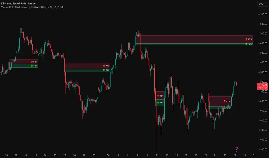
Market Internal TrendMIT - Market Internal Trend
I've developed what I consider to be the best market internals, market breadth indicator on Trading View to date :)
Market internals (sometimes referred to as Market Breadth) are built-in indicators of the market, there are the following main indicators:
TICK - Uptick or downtick transaction of market (NYSE/NASDAQ)
ADD - Advancing or declining issues/stocks of the market
VOLD - Up volume or down volume of the issues/stocks of the market
TRIN - Trend of market based on ADD and VOLD
VIX - Volatility of the market
PCN - Options market puts vs calls
What makes this different?
This single compact indicator delivers an "eyes on glass" style presentation to detail extreme movements of TICK, sentiment analysis of ADD and VOLD as well as their trends and report when the market is most likely balanced or an in imbalance. No need to study multiple clouds and amassing a ton of different charts all with similar indicator setups and candle analysis in the heat of the moment.
Use this to determine the overall initial trend at open, watching for imbalance and extreme movement on TICK as a signal to prepare for potential trades. The metrics table is useful to see where potential rejections/bounces may occur on the volatility index.
Extreme tick closures (see below) can provide excellent trim or exit signals for existing trades depending on the market structure of the day (trending or ranging).
How To Use
The main histogram represents the highs and lows of TICK, anything within the +/- $500 region is most likely normal movement while anything outside of that will brighten in color and indicates potential larger reactions. Extreme highs and lows will be represented by white diamonds by default, closures are indicated by bright colored crosses at $0. Price levels should be noted on the securities being traded during TICK extreme movement, these usually act as dynamic support and resistance from my observations but your results may vary (please share in comments your experiences!).
There is a smoothed trend line over the histogram, by default it's white in color, and this represents simply a trend of TICK closures - when it's trending down the market should be following in kind and vice versa; adjust the smoothing length in settings to suit your trading style.
The center line will have colored dots, by default yellow for balanced markets or white for imbalanced markets. When the market is in an imbalance that's when trending moves have been observed and balanced markets are usually choppy with sideways price action not suitable for quick scalp type trading styles.
The upper colored band represents the market overall advancing or declining issues/stocks within the market, by default green tones are bullish for a advancing market and red tones represent bearish market - the brighter the tone the strong the sentiment. There are triangles at all times above this band and that represents a smoothed trend status as compared to the current amount of stocks in advance or decline, if the smoothed trend is above then it's potentially a signal of reversal (red triangles over green band would be bearish reversal and vice versa).
The lower colored band works the exact same as the upper band but it tracks the up and down volume of the issues/stocks within the market, it utilizes the same color and triangle logics as the upper band.
Markets
Currently this will present internals data for NYSE and NASDAQ, I'm still researching other markets internals and their particulars.
The signals on this indicator will best apply to SPY, QQQ, ES, NQ or highly liquid ETFs largely affected by NYSE or NASDAQ - individual stocks may have mixed results depending on how they're moving with major indexes so keep that in mind when watching for sympathy moves with the indicator.
Usage Conditions
All of the market internals are fantastic indicators when day trading, I've had great success on 1-15 minute and even higher for scalps or intra-day swings. Observing the middle dots will save those of you that struggle in choppy markets from being too aggressive when opportunities don't exist.
Use the triangles, diamonds, dots and crosses to your advantage to manage your scalps and intra-day swings, or gain an edge in preparation for entering trades!
I hope this indicator is a benefit to all for day trading, provide any feedback or feature requests in the comments.

Realtime FootprintThe purpose of this script is to gain a better understanding of the order flow by the footprint. To that end, i have added unusual features in addition to the standard features.
I use "Real Time 5D Profile by LucF" main engine to create basic footprint(profile type) and added some popular features and my favorites.
This script can only be used in realtime, because tradingview doesn't provide historical Bid/Ask date.
Bid/Ask date used this script are up/down ticks.
This script can only be used by time based chart (1m, 5m , 60m and daily etc)
This script use many labels and these are limited max 500, so you can't display many bars.
If you want to display foot print bars longer, turn off the unused sub-display function.
Default setting is footprint is 25 labels, IB count is 1, COT high and Ratio high is 1, COT low and Ratio low is 1 and Delta Box Ratio Volume is 1 , total 29.
plus UA , IB stripes , ladder fading mark use several labels.
///////// General Setting ///////////
Resets on Volume / Range bar
: If you want to use simple time based Resets on, please set Total Volume is 0.
Your timeframe is always the first condition. So if you set Total Volume is 1000, both conditions(Volume >= 1000 and your timeframe start next bar) must be met. (that is, new footprint bar doesn't start at when total volume = exactly 1000).
Ticks per row and Maximum row of Bar
: 1 is minimum size(tick). "Maximum row of Bar" decide the number of rows used in one footprint. 1 row is created from 1 label, so you need to reduce this number to display many footprints (Max label is 500).
Volume Filter and For Calculation and Display
: "Volume Filter" decide minimum size of using volume for this script.
"For Calculation and Display" is used to convert volume to an integer.
This script only use integer to make profile look better (I contained Bid number and Ask number in one row( one label) to saving labels. This require to make no difference in width by the number of digits and this script corresponds integers from 0 to 3 digits).
ex) Symbol average volume size is from 0.0001 to 0.001. You decide only use Volume >= 0.0005 by "Volume Filter".
Next, you convert volume to integer, by setting "For Calculation and Display" is 1000 (0.0005 * 1000 = 5).
If 0.00052 → 5.2 → 5, 0.00058 → 5.8 → 6 (Decimal numbers are rounded off)
This integer is used to all calculation in this script.
//////// Main Display ///////
Footprint, Total, Row Delta, Diagonal Delta and Profile
: "Footprint" display Ask and Bid per row. "Total" display Ask + Bid per row.
"Row Delta" display Ask - Bid per row. "Diagonal Delta" display Ask(row N) - Bid(row N -1) per row.
Profile display Total Volume(Ask + Bid) per row by using Block. Profile Block coloring are decided by Row Delta value(default: positive Row Delta (Ask > Bid) is greenish colors and negative Row Delta (Ask < Bid) is reddish colors.)
Volume per Profile Block, Row Imbalance Ratio and Delta Bull/Bear/Neutral Colors
: "Volume per Profile Block" decide one block contain how many total volume.
ex) When you set 20, Total volume 70 display 3 block.
The maximum number of blocks that can be used per low is 20.
So if you set 20, Total volume 400 is 20 blocks. total volume 800 is 20 blocks too.
"Row Imbalance Ratio" decide block coloring. The row imbalance is that the difference between Ask and Bid (row delta) is large.
default is x3, x2 and x1. The larger the difference, the brighter the color.
ex) Ask 30 Bid 10 is light green. Ask 20 Bid 10 is green. Ask 11 Bid 10 is dark green.
Ask 0 Bid 1 is light red. Ask 1 Bid 2 is red. ask 30 Bid 59 is dark green.
Ask 10 Bid 10 is neutral color(gray)
profile coloring is reflected same row's other elements(Ask, Bid, Total and Delta) too.
It's because one label can only use one text color.
/////// Sub Display ///////
Delta, total and Commitment of Traders
: "Delta" is total Ask - total Bid in one footprint bar. Total is total Ask + total Bid in one footprint bar.
"Commitment of traders" is variation of "Delta". COT High is reset to 0 when current highest is touched. COT Low is opposite.
Basic concept of Delta is to compare price with Delta. Ordinary, when price move up, delta is positive. Price move down is negative delta.
This is because market orders move price and market orders are counted by Delta (although this description is not exactly correct).
But, sometimes prices do not move even though many market orders are putting pressure on price , or conversely, price move strongly without many market orders.
This is key point. Big player absorb market orders by iceberg order(Subdivide large orders and pretend to be small limit orders.
Small limit orders look weak in the order book, but they are added each time you fill, so they are more powerful than they look.), so price don't move.
On the other hand, when the price is moving easily, smart players may be aiming to attract and counterattack to a better price for them.
It's more of a sport than science, and there's always no right response. Pay attention to the relationship between price, volume and delta.
ex) If COT Low is large negative value, it means many sell market orders is coming, but iceberg order is absorbing their attack at limit order.
you should not do buy entry, only this clue. but this is one of the hints.
"Delta, Box Ratio and Total texts is contained same label and its color are "Delta" coloring. Positive Delta is Delta Bull color(green),Negative Delta is Delta Bear Color
and Delta = 0 is Neutral Color(gray). When Delta direction and price direction are opposite is Delta Divergence Color(yellow).
I didn't add the cumulative volume delta because I prefer to display the CVD line on the price chart rather than the number.
Box Ratio , Box Ratio Divisor and Heavy Box Ratio Ratio
: This is not ordinary footprint features, but I like this concept so I added.
Box Ratio by Richard W. Arms is simple but useful tool. calculation is "total volume (one bar) divided by Bar range (highest - lowest)."
When Bull and bear are fighting fiercely this number become large, and then important price move happen.
I made average BR from something like 5 SMA and if current BR exceeds average BR x (Heavy Box Ratio Ratio), BR box mark will be filled.
Box Ratio Divisor is used to good looking display(BR multiplied by Box Ratio Divisor is rounded off and displayed as an integer)
Diagonal Imbalance Count , D IB Mark and D IB Stripes
: Diagonal Imbalance is defined by "Diagonal Imbalance Ratio".
ex) You set 2. When Ask(row N) 30 Bid(row N -1)10, it's 30 > 10*2, so positive Diagonal Imbalance.
When Ask(row N) 4 Bid(row N -1)9, it's 4*2 < 9, so negative Diagonal Imbalance.
This calculation does not use equals to avoid Ask(row N) 0 Bid(row N -1)0 became Diagonal Imbalance.
Ask(row N) 0 Bid(row N -1)0, it's 0 = 0*2, not Diagonal Imbalance. Ask(row N) 10 Bid(row N -1)5, it's 10 = 5*2, not Diagonal Imbalance.
"D IB Mark" emphasize Ask or Bid number which is dominant side(Winner of Diagonal Imbalance calculation), by under line.
"Diagonal Imbalance Count" compare Ask side D IB Mark to Bid side D IB Mark in one footprint.
Coloring depend on which is more aggressive side (it has many IB Mark) and When Aggressive direction and price direction are opposite is Delta Divergence Color(yellow).
"D IB Stripes" is a function that further emphasizes with an arrow Mark, when a DIB mark is added on the same side for three consecutive row. Three consecutive arrow is added at third row.
Unfinished Auction, Ratio Bounds and Ladder fading Mark
: "Unfinished Auction" emphasize highest or lowest row which has both Ask and Bid, by Delta Divergence Color(yellow) XXXXXX mark.
Unfinished Auction sometimes has magnet effect, price may touch and breakout at UA side in the future.
This concept is famous as profit taking target than entry decision.
But, I'm interested in the case that Big player make fake breakout at UA side and trapped retail traders, and then do reversal with retail traders stop-loss hunt.
Anyway, it's not stand alone signal.
"Ratio Bounds" gauge decrease of pressure at extreme price. Ratio Bounds High is number which second highest ask is divided by highest ask.
Ratio Bounds Low is number which second lowest bid is divided by lowest bid. The larger the number, the less momentum the price has.
ex)first footprint bar has Ratio Bounds Low 2, second footprint bar has RBL 4, third footprint bar has RBL 20.
This indicates that the bear's power is gradually diminishing.
"Ladder fading mark" emphasizes the decrease of the value in 3 consecutive row at extreme price. I added two type Marks.
Ask/Bid type(triangle Mark) is Ask/Bid values are decreasing of three consecutive row at extreme price.
Row Imbalance type(Diamond Mark) are row Imbalance values are decreasing of three consecutive row at extreme price.
ex)Third lowest Bid 40, second lowest Bid 10 and lowest Bid 5 have triangle up Mark. That is bear's power is gradually diminishing.
(This Mark only check Bid value at lowest price and Ask value at highest price).
Third highest row delta + 60, second highest row delta + 5, highest delta - 20 have diamond Mark. That is Bull's power is gradually diminishing.
Sub display use Delta colors at bottom of Sub display section.
////// Candle & POC /////////
candle and POC
: Ordinary, "POC" Point of Control is row of largest total volume, but this script'POC is volume weighted average.
This is because the regular POC was visually displayed by the profile ,and I was influenced LucF's ideas.
POC coloring is decided in relation to the previous POC. When current POC is higher than previous POC, color is UP Bar Color(green).
In the opposite case, Down Bar color is used.
POC Divergence Color is used when Current POC is up but current bar close is lower than open (Down price Bar),or in the opposite case.
POC coloring has option also highlight background by Delta Divergence Color(yellow). but bg color is displayed at your time frame current price bar not current footprint bar.
The basic explanation is over.
I add some image to promote understanding basic ideas.

AR–CISD-Market Shift-FVGAR–CISD-Market Shift-FVG is a precision price-action indicator that combines three core ideas in one tool:
• Shift → market structure breaks (internal + major) using a wick→body confirmation model.
• CISD → Change in State of Delivery, where one-sided orderflow is decisively wiped out.
• FVG → cleaned-up, ATR-filtered Fair Value Gaps that only highlight meaningful imbalances.
It’s built to give you structure, delivery and imbalance on a single chart without turning everything into spaghetti.
________________________________________
What it plots
1. Shift (structure breaks)
• Detects both internal and major structural breaks from user-defined pivots.
• Uses a wick→body close (no zigzags, no candle-by-candle stepping).
• Optional displacement gating (ATR-aware): the break candle must have
o a minimum body size vs ATR,
o decent body/range ratio,
o close near the bar’s extreme,
o and close beyond the broken level by a fraction of ATR.
• Internal and major breaks that occur at (almost) the same price are merged into a single “Shift” line, so you see one clean level instead of two overlapping labels.
2. CISD (Change in State of Delivery)
• Looks for a run of one-sided candles (e.g. a series of reds) that is taken out by the opposite side.
• Uses strict validation to avoid random noise:
o Opposite run must be longer / more meaningful than the wipe run (Opp ÷ Cur ratio).
o Wipe bar must show real displacement (body vs ATR + body/range).
o Opposite run must span a minimum price range vs ATR and contain at least one non-doji candle.
o Optional EMA baseline and de-dup (time + ATR-scaled price radius) to prevent spam.
• When valid, it draws a wick→body horizontal line with inline CISD text, rendered as
---- CISD ---- in bull or bear color.
3. FVG (Fair Value Gaps)
• Detects 3-bar FVGs only when the gap exceeds a minimum ATR-scaled size, so tiny micro-gaps are ignored.
• Boxes project forward for N bars and are automatically removed on fill.
• Labels are small and slightly dim, so they support structure/CISD rather than overpower them.
(If you enabled it in the inputs, you’ll also see optional VI (Volume Imbalance) hints as tiny horizontal tags when a body gap clears the prior body band with elevated volume.)
________________________________________
Inputs & usage tips
• Shift block – control pivot sensitivity (L/R & Li/Ri), displacement rules, equality tolerance, and whether to extend lines right.
• CISD block – adjust min opposite bars, max wipers, strict filters (ATR, body/range, range vs ATR), EMA context, and de-dup radius.
• FVG block – set the minimum FVG size (×ATR), right extension, how many to track, and label style.
• If you see too many lines, first tighten CISD strictness and Shift displacement, or increase pivot lengths, before touching anything else.
• On your execution timeframe, look for Shift + CISD + FVG lining up in the same leg or zone – that’s where the indicator is telling a strong, consistent story about structure, delivery, and imbalance.
________________________________________
Disclaimer
For educational and chart-marking purposes only. Not financial advice. Always forward-test and adapt parameters to your instrument, timeframe, and personal risk tolerance.

[Yorsh] BJN HTF Delivery v1.01. Executive Summary
The BJN HTF Delivery v1.0 is a precision-engineered utility for TradingView designed to solve one of the biggest challenges for low-timeframe (LTF) traders: understanding and tracking the real-time interaction of price with Higher Timeframe (HTF) imbalances.
Unlike typical MTF indicators that plot static, clunky boxes, this tool features a dynamic, real-time mitigation engine. It visually represents how HTF Fair Value Gaps (FVGs) are being "delivered" and consumed by LTF price action. Its primary competitive advantage is its ability to provide this crucial context through lightweight, intelligent markers instead of persistent boxes, resulting in an exceptionally clean and responsive chart, optimized for scalpers and day traders.
2. Core Features Overview
This indicator is built around a sophisticated engine that tracks the lifecycle of a single, user-defined HTF FVG from its creation to its final invalidation.
A. Focused Higher Timeframe (HTF) FVG Projection
Singular Timeframe Analysis: The indicator focuses on plotting FVGs from one critical higher timeframe of your choice (e.g., 15-minute FVGs on a 1-minute chart). This provides clear, unambiguous context without the clutter of multiple MTF levels.
Initial State: A newly formed, untouched HTF FVG is drawn as a complete, semi-transparent box, representing a "full" zone of imbalance.
B. The Real-Time Mitigation & Resizing Engine
This is the indicator's core innovation. As price on your LTF chart interacts with the projected HTF FVG, the indicator provides instant feedback:
Dynamic Resizing: When price wicks into the FVG, the indicator doesn't just sit there. It instantly resizes the FVG box in real-time, shrinking it to show only the remaining, unmitigated portion. This gives you a precise, constantly updated view of how much of the imbalance is left.
Intelligent Mitigation Markers: As the box is resized, the indicator places a small, clean arrow marker (▲ for bullish, ▼ for bearish) at the point of the wick. This provides a crystal-clear historical footprint showing exactly where price mitigated the zone. This marker remains even after the box is fully consumed, serving as a permanent reference point without cluttering the chart.
C. Advanced Invalidation Logic for a Clean Chart
The indicator's most powerful feature is how it handles the potential invalidation of an FVG, keeping your chart exceptionally clean.
Box Deletion on Full Wick-Through: The moment price wicks entirely through an HTF FVG, the large, colored box is immediately deleted. This is the primary mechanism for noise reduction. Instead of leaving a useless box on the screen, the indicator removes it.
"Pending Invalidation" Markers: Upon deleting the box, the indicator places a special, subtle marker (e.g., 'X', diamond) at the tip of the invalidating wick. This signifies that the FVG is "on life support"—it has been violated on the LTF but is awaiting a candle close on the HTF for official confirmation of its death.
Trailing Marker Logic: This "pending" marker isn't static. If subsequent LTF candles continue to push past the FVG, the marker will trail the extreme wick, providing a dynamic visual of the ongoing price struggle.
True Invalidation & Cleanup: The pending marker is only removed once the FVG is truly invalidated, either by a confirmed HTF candle close beyond it or by price wicking its protective structural point. This completes the FVG's lifecycle, leaving behind only the essential, lightweight mitigation markers.
3. The Performance & Cleanliness Advantage
This indicator is built for traders who demand a pristine and responsive trading environment. It achieves this through a philosophy of "information, not clutter."
Replacing Boxes with Markers: The fundamental advantage is the script's logic of replacing large, screen-hogging boxes with small, precise markers at the earliest opportunity. The box only exists while the FVG is untouched. The moment it's mitigated, the focus shifts to a lightweight marker, preserving chart visibility.
Optimized HTF Data Calls: The script is engineered for peak efficiency. It fetches all the necessary HTF data—FVG conditions, structural points, and the critical HTF close price—in a single, consolidated data request. This drastically reduces server load and ensures the indicator has no discernible impact on platform performance.
Strict History Limit: By processing only a recent number of days (e.g., 7 days by default), the indicator avoids the performance trap of analyzing and drawing thousands of irrelevant historical objects, ensuring a fast and smooth experience.
The result is a tool that delivers more actionable, real-time information than its competitors while simultaneously creating a cleaner, more readable chart.
4. Ideal User Profile
This indicator is a mission-critical tool for:
Low-Timeframe Scalpers and Day Traders: Who execute on charts like the 1-minute or 15-second and need instant feedback on how their price action is interacting with dominant HTF levels.
SMC / ICT Traders: Who deeply understand the concepts of liquidity delivery, mitigation, and FVG invalidation. This tool automates the visual tracking of these precise concepts.
Minimalist Traders: Anyone who values a clean workspace and believes that an indicator should add clarity, not visual noise.
5. Conclusion
The BJN HTF Delivery v1.0 is not just another FVG plotter; it is a sophisticated delivery analysis tool. It brilliantly visualizes the dynamic relationship between different timeframes, showing how HTF zones of imbalance are consumed in real-time. By prioritizing a "marker-first" philosophy and intelligent object management, it offers a uniquely clean, fast, and powerful way to keep HTF context at the forefront of your LTF trading without ever sacrificing chart clarity or performance.
FVG Range Filter0x278's FVG Range Filter
Overview
The FVG Range Filter is a TradingView indicator designed to identify and display Fair Value Gaps (FVGs) on your chart. FVGs are areas of price imbalance that often act as significant zones for potential price retracement or reversal. This indicator filters out irrelevant gaps, showing only those that are within a specified price range and time frame, making it easier to focus on high-probability trading opportunities.
This guide is crafted to help both novice and experienced traders understand how to use this indicator effectively, even if you're new to the concept of FVG trading. We'll cover what FVGs are, how the indicator works, how to interpret its visual elements, and how to apply it in various trading scenarios.
What are Fair Value Gaps (FVGs)?
Fair Value Gaps occur when the price of an asset moves so quickly in one direction that it leaves a 'gap' or 'void' on the chart where no trading activity occurred. These gaps represent areas of imbalance between supply and demand, often created by strong buying or selling pressure. Traders use FVGs to identify potential areas where price might return to 'fill' the gap, offering opportunities for entries or exits.
Bullish FVG : This happens when price jumps upward, leaving a gap below. It suggests strong buying pressure and often acts as a support zone when price retraces.
Bearish FVG : This occurs when price drops sharply, leaving a gap above. It indicates strong selling pressure and often acts as a resistance zone when price retraces.
How the FVG Range Filter Works
The FVG Range Filter indicator automatically detects these gaps based on a specific three-bar pattern that identifies significant price imbalances. It then applies filters to ensure only relevant FVGs are displayed:
Range Filter : Only shows FVGs whose midpoint is within a user-defined percentage of the current price. This keeps the focus on gaps that are close enough to be actionable.
Time Filter : Only displays FVGs that are younger than a specified number of bars, ensuring you're looking at recent and relevant price action.
Invalidation : Once the price trades through the midpoint of an FVG, the gap is considered 'filled' or invalidated, and it is removed from the chart.
This filtering mechanism declutters your chart, highlighting only the most pertinent FVGs for your trading decisions.
Indicator Settings
The FVG Range Filter offers customizable inputs to tailor its behavior to your trading style:
Display Range (%) : This sets the percentage range from the current price within which FVGs are shown. A lower value (e.g., 1.0%) shows only gaps very close to the current price, while a higher value (e.g., 5.0%) includes gaps further away. Default is 1.0%.
Look-back Bars : This determines how far back in time the indicator looks for FVGs. It also limits how long a gap remains visible if it hasn't been invalidated. Default is 1000 bars.
Show Bullish FVGs : Toggle to display bullish FVGs (green boxes by default). Default is enabled.
Show Bearish FVGs : Toggle to display bearish FVGs (red boxes by default). Default is enabled.
Box Opacity (0-100) : Adjusts the transparency of the FVG boxes on the chart. A value of 0 is fully transparent (invisible), while 100 is fully opaque. Default is 33 for a subtle appearance.
Visual Elements and Interpretation
The indicator draws rectangular boxes on your chart to represent FVGs. Understanding these visual elements is key to using the indicator effectively:
Green Boxes : Represent bullish FVGs. These are areas where price gapped upward, suggesting potential support zones. If price retraces to this area, it might bounce off as buyers step in to defend the level.
Red Boxes : Represent bearish FVGs. These are areas where price gapped downward, indicating potential resistance zones. If price retraces to this area, it might face selling pressure and reverse downward.
Box Position and Extension : Each box starts at the bar where the FVG was detected and extends to the right, updating dynamically as new bars form. This extension helps maintain visibility until the gap is either invalidated or falls out of the look-back period.
Disappearance of Boxes : A box disappears from the chart in two scenarios:
Price Moves Away : If the midpoint of the FVG moves outside the specified display range percentage from the current price, or if the FVG becomes older than the look-back bars limit, the box is removed (though the gap data persists in memory for potential re-display if conditions are met again).
Invalidation : If price trades through the midpoint of the FVG (i.e., the low of a candle goes below the midpoint for a bullish FVG, or the high goes above the midpoint for a bearish FVG), the gap is considered filled, and the box is permanently removed from the chart.
Trading Scenarios with FVG Range Filter
Below are detailed trading scenarios to help you understand how to use the FVG Range Filter in practical situations. These scenarios assume you're trading with the trend or looking for reversals at key levels.
Scenario 1: Bullish FVG as Support for Long Entry
Setup : You're trading a stock in an uptrend on a 15-minute chart. The FVG Range Filter displays a green box (bullish FVG) after a sharp upward move earlier in the day.
Interpretation : This green box indicates a zone of imbalance where price gapped up, likely due to strong buying interest. Since it's still within the display range and look-back period, it's a relevant support zone.
Action : Wait for price to retrace back to the top edge of the green box. Look for confirmation of support, such as a bullish candlestick pattern (e.g., hammer or engulfing) or increased volume, indicating buyers are stepping in.
Entry : Enter a long position near the top of the FVG box, setting a stop-loss just below the bottom of the box to protect against a breakdown.
Target : Aim for the next resistance level or a predefined risk-reward ratio (e.g., 1:2). If another bullish FVG forms above, consider that as a potential target.
Exit : Exit the trade if price breaks below the bottom of the FVG (invalidation), or if the box disappears due to price trading through the midpoint, signaling the gap is filled.
Scenario 2: Bearish FVG as Resistance for Short Entry
Setup : You're trading a cryptocurrency on a 1-hour chart during a downtrend. The indicator shows a red box (bearish FVG) after a sharp downward move a few hours ago.
Interpretation : The red box marks a zone where price gapped down, indicating strong selling pressure. As long as it's within the display range and look-back period, it remains a potential resistance zone.
Action : Wait for price to rally back to the bottom edge of the red box. Look for signs of rejection, such as a bearish candlestick pattern (e.g., shooting star or engulfing) or decreasing volume, suggesting sellers are defending this level.
Entry : Enter a short position near the bottom of the FVG box, placing a stop-loss just above the top of the box to guard against a breakout.
Target : Target the next support level or a favorable risk-reward ratio. If a new bearish FVG appears below, it could serve as a potential target.
Exit : Exit if price breaks above the top of the FVG (invalidation), or if the box disappears because price has traded through the midpoint, indicating the gap is no longer relevant.
Scenario 3: Filtering Out Irrelevant FVGs During Choppy Markets
Setup : You're trading forex on a 5-minute chart during a period of consolidation with no clear trend. The chart shows frequent small price jumps, but the FVG Range Filter displays very few boxes.
Interpretation : The indicator is filtering out FVGs that are either too far from the current price (outside the display range percentage) or too old (beyond the look-back bars). This helps avoid false signals in a non-trending market.
Action : Recognize that the absence of FVGs on the chart suggests no high-probability setups at the moment. Avoid forcing trades based on minor price movements that don't meet the filter criteria.
Entry : Wait for a clear trend to emerge and for new FVGs to appear within the filter parameters before considering any trades.
Target/Exit : Follow the trend direction once FVGs are displayed, using the edges of the boxes as potential entry or exit zones as described in the previous scenarios.
Scenario 4: Using FVGs for Risk Management
Setup : You're already in a long position on an index futures contract on a 30-minute chart, and the FVG Range Filter shows a green box below your entry point.
Interpretation : The green box represents a bullish FVG that could act as a support zone. Since price hasn't yet reached the midpoint (which would invalidate the FVG), it remains a valid reference point for managing risk.
Action : Adjust your stop-loss to just below the bottom of the green box. This placement uses the FVG as a logical invalidation level, assuming that a break below this support zone negates the bullish premise of your trade.
Entry : No new entry is needed since you're already in the trade.
Target/Exit : Keep your original target unless a new bearish FVG forms above, which might indicate resistance. Exit if price breaks below the FVG or if the box disappears due to invalidation.
Tips for Using the FVG Range Filter
Combine with Trend Analysis : FVGs are most effective when traded in the direction of the prevailing trend. Use higher timeframe analysis or other indicators to confirm the overall market direction before acting on FVGs.
Adjust Settings for Market Conditions : In volatile markets (like cryptocurrencies), you might increase the display range percentage to capture more FVGs. In less volatile markets (like certain stocks), a tighter range might be more appropriate.
Timeframe Selection : The indicator works on all timeframes, but lower timeframes (1-15 minutes) might show more frequent FVGs for scalping, while higher timeframes (1-4 hours) are better for swing trading with larger, more significant gaps.
Confirmation Tools : Don't rely solely on FVGs for entries. Use additional confirmation from price action (candlestick patterns), volume, or other indicators to increase the probability of success.
Monitor Invalidation : If an FVG box disappears from the chart due to price trading through its midpoint, consider it a signal that the gap is no longer relevant. Adjust your strategy accordingly.
Limitations
Not a Standalone System : The FVG Range Filter identifies potential zones of interest but does not provide entry signals, stop-loss, or take-profit levels on its own. It should be used as part of a broader trading strategy.
Market Conditions : FVGs may be less effective in strongly trending markets where price doesn't retrace to fill gaps, or in very choppy markets where too many small gaps are filtered out.
Lag in Detection : Since FVGs are based on a three-bar pattern, there is a slight delay in identifying them after the price movement has occurred.
Good Luck!
The FVG Range Filter is a powerful tool for traders looking to capitalize on price imbalances in the market. By focusing only on relevant Fair Value Gaps within a specified range and time frame, it helps declutter your chart and highlights high-probability zones for potential trades. Whether you're new to FVG trading or an experienced trader, this indicator can enhance your analysis by visually identifying key areas of support and resistance based on market inefficiencies.
Experiment with the settings to match your trading style and market conditions, and always combine the indicator's insights with other forms of analysis for the best results. Happy trading!

Injected Volume Footprint (IVF)Reading volume footprints to interpret buying and selling pressure involves examining the intensity and timing of buy/sell activity within each candle. Although this IVF indicator does not directly show the sequence of buying and selling events within a single candle (as a true footprint chart would), here’s how you can interpret the volume data presented by IVF to get insights on market pressure:
Step 1: Identifying Strong Pressure
Check Color Intensity:
Darker shades represent higher intensity for both buy and sell volumes.
Look for dark green shades for strong buying pressure and dark red or orange shades for strong selling pressure. This helps you quickly spot candles with a high level of activity on one or both sides.
Check Volume Stacking:
Since buy volumes are above the zero line and sell volumes are below, large differences between the two suggest dominance by one side.
If buy volume is significantly higher (e.g., tall green bar with a small red/yellow bar underneath), buying pressure is dominant. Conversely, if sell volume is larger (tall red/yellow bar with a small green bar above), selling pressure dominates.
Step 2: Interpreting Both Buy and Sell Activity
Simultaneous Pressure:
If you see strong green (buy) and red/yellow (sell) volumes within the same candle, it indicates that there was active trading on both sides during that period.
This scenario might suggest a battle between buyers and sellers—often seen near critical support or resistance levels where both sides are actively defending their positions.
Balance vs. Imbalance:
Balanced Pressure: When buy and sell volumes are similar in size, it indicates a period of indecision or a potential consolidation. This usually happens when neither buyers nor sellers have a clear upper hand.
Imbalanced Pressure: If one side has a much larger volume than the other, it shows a clear dominance. For instance, if green buy volume dominates, it means buyers were willing to absorb sell orders aggressively, suggesting a possible uptrend.
Step 3: Estimating Sequence (Hypothetical)
Although IVF doesn’t provide a direct sequence, you can make educated guesses based on context:
Price Action Context:
If the candle opens and initially moves down but then closes higher (bullish candle), it might indicate that selling pressure came first and buying pressure followed, pushing the price up.
Conversely, if the candle opens and moves up first but closes lower (bearish candle), buying might have started first but was overtaken by selling pressure.
Volume Reaction to Price Levels:
At support levels, if you see strong buy volumes with some sell volumes, it might mean initial selling pressure was absorbed by buyers defending the level.
At resistance levels, if sell volume increases with some buy activity, it may indicate initial buying was met by aggressive selling, potentially reversing the price.
Trend Context:
In an uptrend, strong sell volume within an otherwise bullish candle may indicate profit-taking or the start of a pullback, as sellers try to cap further gains.
In a downtrend, strong buy volume in a bearish candle may indicate potential accumulation or buyers attempting to slow the decline, signaling a possible reversal if the trend weakens.
Conclusion
The IVF indicator doesn’t provide the exact sequence of events within each candle like true footprint data would, but by analyzing the intensity, balance, and context within the price action, you can get a reasonable sense of which side was more aggressive and how both buying and selling pressures interacted.

RT-Liquidation Engine-DeltaIntroduction
The RT-Liquidation Engine-Levels is a liquidity mapping tool designed to highlight where leveraged long and short positions may be vulnerable to liquidation. It plots projected Liquidation Levels above and below price, grouped by leverage tiers, so traders can see where the algorithm estimates clustered liquidation zones might sit relative to current price. The RT-Liquidation Engine-Levels indicator is intended to be used in conjunction with the RT-Liquidation Engine-Delta indicator. This writeup will cover both indicators in depth and explain how they work together.
Liquidity Theory – What This Tool Is Looking At
Liquidity levels are a data point that advanced traders study to understand the price levels where positions may be forced out of the market. While exchanges can show open orders in an order book, they do not publish where traders will be liquidated. However, market participants who can estimate those zones often pay close attention to them, because a single wick can be enough to trigger liquidations and force positions to close into the market.
The RT-Liquidation Engine is built around this concept. It uses on-chart information and volume to approximate where these potential liquidation areas may be and displays them directly on the price chart so traders can see the projected levels they may want to monitor.
How It Works
Because real Liquidation Levels are not published by exchanges, the indicator cannot read them directly. Instead, it uses an internal algorithm that studies current prices, direction, and volume to estimate where common leveraged positions might be at risk.
Conceptually, the algorithm: Uses the visible data on the chart to approximate where typical leveraged long and short positions may be clustered.
Projects those estimates as horizontal levels above and below current price.
Keeps those projected levels on the chart until price action trades into them and the level is considered “touched.” The result is a set of dynamic levels that act as an estimated map of where liquidation events might be more likely, based on the chart’s own history and current structure. Trader Math And Leverage Levels
Traders using perpetual futures often use different leverage levels for their positions. The higher the leverage, the more vulnerable those positions are to being liquidated by relatively small moves in price.
While the exact leverage of individual traders is unknown, the Liquidation Engine focuses on four commonly referenced leverage tiers: 5x Leverage
10x Leverage
25x Leverage
50x Leverage Each tier can be displayed as its own set of projected Liquidation Levels on the chart so traders can see a structured view of where different leverage groups may be sensitive.
The Liquidation Levels can be displayed with Multi Color options or in Red/Green depending on the trader's preference.
The above chart shows the Liquidation Levels being displayed with Multi Colors. The above chart shows the Liquidation Levels being displayed in Red/Green.
Reading The Levels
Above and below the candles you will see projected Liquidation Levels. These levels appear at the prices where the algorithm estimates that leveraged positions for each tier could be vulnerable, and they remain drawn until price has traded through them.
In the default view: Thickness of the level – Indicates the estimated size of the position. Thicker lines represent larger projected positions.
Color of the level – Indicates which leverage group the level belongs to (5x, 10x, 25x, or 50x).
Length of the level – Indicates how long the estimated leveraged position has been open according to the algorithm.
This combination provides a visual profile of which zones have more concentrated projected liquidation interest and which have been standing in the market for longer.
Tuning Options
The Liquidation Engine includes a focused set of tuning options so traders can adjust how much information is plotted and how it appears on their charts. Custom Tuning Options Include: Sensitivity Filter – Adjusts the overall threshold the algorithm uses when estimating positions. Increasing this value reduces the number of plotted levels and focuses on larger estimated positions. Decreasing it allows smaller estimated positions to be considered, increasing the number of displayed levels.
Leverage Level Toggles – Individual toggles for each leverage group (5x, 10x, 25x, 50x).
These allow traders to show or hide specific tiers depending on which groups they want to monitor.
Color Settings – Controls the colors and transparency of the levels.
Traders can adjust these settings to match their chart theme and highlight or soften specific leverage groups.
Summary Table Options – Controls the on-chart table that tracks the estimated number of Long versus Short positions. Table On/Off – Toggles the table on or off.
Table Position – Moves the table to different corners of the chart.
Table Background Color / Table Text Color – Customizes the table’s appearance.
Liquidation Engine – Delta
In addition to plotting projected Liquidation Levels, the RT-Liquidation Engine-Levels Indicator is to be used in conjunction with the RT-Liquidation Engine-Delta Indicator. This tool displays the Liquidation Delta data that the algorithm estimates on the imbalance between long and short exposure. Conceptually, the RT-Liquidation Engine-Delta Indicator computes the following items:
Aggregates the estimated long and short positions from the projected Liquidation Levels.
Calculates a net difference (delta) between those two estimates.
Displays that difference so traders can see when the projected open interest appears skewed to one side. When the estimated order book is heavily skewed in one direction, the market may sometimes move in the opposite direction as conditions rebalance. The delta view is designed to provide context for those potential rebalancing moves, not to predict exact turning points.
Tuning options for the RT-Liquidation Engine-Delta Indicator are aligned with the RT-Liquidation Engine-Levels Indicator settings. If you change filters, toggles, or colors in the Levels tool, it is recommended to mirror those settings in the Delta tool so both views remain synchronized.
Best Practices
Some common usage patterns include:
Timeframes – Many traders prefer to use Liquidation Engine on intraday timeframes under 60 minutes. Timeframes such as 30-minute candles or smaller are often used when monitoring leveraged flows.
Load Times – The algorithm performs a significant amount of calculations to project these Liquidation Levels and Deltas. On some symbols and timeframes, this can take noticeable time to load the chart. When changing settings, keep an eye on the loading indicator in the chart header to confirm calculations are still running. In normal conditions, these calculations are completed in less than 30 seconds.
Market Sessions And Levels Out Of Range – If projected levels appear far from current price or do not align with visible action, check the chart’s session settings in the bottom-left of the chart (for example, ETH vs RTH sessions). Ensuring the correct session is active can help keep the displayed levels in a more relevant range.
These guidelines are intended to make the tool easier to work with and to keep expectations realistic when interpreting the projections.
What Makes This Tool Different
While many indicators focus on price alone, the Liquidation Engine Levels and Delta tools are designed specifically around estimated liquidation behavior: It concentrates on where leveraged positions may be at risk, rather than only where price has been in the past.
It segments projected levels by leverage tier so traders can distinguish between different risk profiles on the chart.
It includes both a level-mapping view and a delta view, providing context for both where levels sit and how imbalanced the estimated positioning might be.
Important Note
The RT-Liquidation Engine-Levels and RT-Liquidation Engine-Delta tools provide an approximation of where leveraged positions might be vulnerable based solely on chart data. They do not access actual exchange liquidation feeds, does not reveal real trader positions, and cannot guarantee that a projected level will cause price to react.
This indicator is intended to provide additional context around potential liquidation zones and positioning imbalances. It is not a standalone signal generator and should always be used together with your own analysis, testing, and risk management. Historical interactions with projected Liquidation Levels, including any illustrative examples, do not guarantee future results.
🐋 Tight lines and happy trading!

RT-Liquidation Engine-LevelsIntroduction
The RT-Liquidation Engine-Levels is a liquidity mapping tool designed to highlight where leveraged long and short positions may be vulnerable to liquidation. It plots projected Liquidation Levels above and below price, grouped by leverage tiers, so traders can see where the algorithm estimates clustered liquidation zones might sit relative to current price. The RT-Liquidation Engine-Levels indicator is intended to be used in conjunction with the RT-Liquidation Engine-Delta indicator. This writeup will cover both indicators in depth and explain how they work together.
Liquidity Theory – What This Tool Is Looking At
Liquidity levels are a data point that advanced traders study to understand the price levels where positions may be forced out of the market. While exchanges can show open orders in an order book, they do not publish where traders will be liquidated. However, market participants who can estimate those zones often pay close attention to them, because a single wick can be enough to trigger liquidations and force positions to close into the market.
The RT-Liquidation Engine is built around this concept. It uses on-chart information and volume to approximate where these potential liquidation areas may be and displays them directly on the price chart so traders can see the projected levels they may want to monitor.
How It Works
Because real Liquidation Levels are not published by exchanges, the indicator cannot read them directly. Instead, it uses an internal algorithm that studies current prices, direction, and volume to estimate where common leveraged positions might be at risk.
Conceptually, the algorithm: Uses the visible data on the chart to approximate where typical leveraged long and short positions may be clustered.
Projects those estimates as horizontal levels above and below current price.
Keeps those projected levels on the chart until price action trades into them and the level is considered “touched.” The result is a set of dynamic levels that act as an estimated map of where liquidation events might be more likely, based on the chart’s own history and current structure. Trader Math And Leverage Levels
Traders using perpetual futures often use different leverage levels for their positions. The higher the leverage, the more vulnerable those positions are to being liquidated by relatively small moves in price.
While the exact leverage of individual traders is unknown, the Liquidation Engine focuses on four commonly referenced leverage tiers: 5x Leverage
10x Leverage
25x Leverage
50x Leverage Each tier can be displayed as its own set of projected Liquidation Levels on the chart so traders can see a structured view of where different leverage groups may be sensitive.
The Liquidation Levels can be displayed with Multi Color options or in Red/Green depending on the trader's preference.
The above chart shows the Liquidation Levels being displayed with Multi Colors. The above chart shows the Liquidation Levels being displayed in Red/Green.
Reading The Levels
Above and below the candles you will see projected Liquidation Levels. These levels appear at the prices where the algorithm estimates that leveraged positions for each tier could be vulnerable, and they remain drawn until price has traded through them.
In the default view: Thickness of the level – Indicates the estimated size of the position. Thicker lines represent larger projected positions.
Color of the level – Indicates which leverage group the level belongs to (5x, 10x, 25x, or 50x).
Length of the level – Indicates how long the estimated leveraged position has been open according to the algorithm.
This combination provides a visual profile of which zones have more concentrated projected liquidation interest and which have been standing in the market for longer.
Tuning Options
The Liquidation Engine includes a focused set of tuning options so traders can adjust how much information is plotted and how it appears on their charts. Custom Tuning Options Include: Sensitivity Filter – Adjusts the overall threshold the algorithm uses when estimating positions. Increasing this value reduces the number of plotted levels and focuses on larger estimated positions. Decreasing it allows smaller estimated positions to be considered, increasing the number of displayed levels.
Leverage Level Toggles – Individual toggles for each leverage group (5x, 10x, 25x, 50x).
These allow traders to show or hide specific tiers depending on which groups they want to monitor.
Color Settings – Controls the colors and transparency of the levels.
Traders can adjust these settings to match their chart theme and highlight or soften specific leverage groups.
Summary Table Options – Controls the on-chart table that tracks the estimated number of Long versus Short positions. Table On/Off – Toggles the table on or off.
Table Position – Moves the table to different corners of the chart.
Table Background Color / Table Text Color – Customizes the table’s appearance.
Liquidation Engine – Delta
In addition to plotting projected Liquidation Levels, the RT-Liquidation Engine-Levels Indicator is to be used in conjunction with the RT-Liquidation Engine-Delta Indicator. This tool displays the Liquidation Delta data that the algorithm estimates on the imbalance between long and short exposure. Conceptually, the RT-Liquidation Engine-Delta Indicator computes the following items:
Aggregates the estimated long and short positions from the projected Liquidation Levels.
Calculates a net difference (delta) between those two estimates.
Displays that difference so traders can see when the projected open interest appears skewed to one side. When the estimated order book is heavily skewed in one direction, the market may sometimes move in the opposite direction as conditions rebalance. The delta view is designed to provide context for those potential rebalancing moves, not to predict exact turning points.
Tuning options for the RT-Liquidation Engine-Delta Indicator are aligned with the RT-Liquidation Engine-Levels Indicator settings. If you change filters, toggles, or colors in the Levels tool, it is recommended to mirror those settings in the Delta tool so both views remain synchronized.
Best Practices
Some common usage patterns include:
Timeframes – Many traders prefer to use Liquidation Engine on intraday timeframes under 60 minutes. Timeframes such as 30-minute candles or smaller are often used when monitoring leveraged flows.
Load Times – The algorithm performs a significant amount of calculations to project these Liquidation Levels and Deltas. On some symbols and timeframes, this can take noticeable time to load the chart. When changing settings, keep an eye on the loading indicator in the chart header to confirm calculations are still running. In normal conditions, these calculations are completed in less than 30 seconds.
Market Sessions And Levels Out Of Range – If projected levels appear far from current price or do not align with visible action, check the chart’s session settings in the bottom-left of the chart (for example, ETH vs RTH sessions). Ensuring the correct session is active can help keep the displayed levels in a more relevant range.
These guidelines are intended to make the tool easier to work with and to keep expectations realistic when interpreting the projections.
What Makes This Tool Different
While many indicators focus on price alone, the Liquidation Engine Levels and Delta tools are designed specifically around estimated liquidation behavior: It concentrates on where leveraged positions may be at risk, rather than only where price has been in the past.
It segments projected levels by leverage tier so traders can distinguish between different risk profiles on the chart.
It includes both a level-mapping view and a delta view, providing context for both where levels sit and how imbalanced the estimated positioning might be.
Important Note
The RT-Liquidation Engine-Levels and RT-Liquidation Engine-Delta tools provide an approximation of where leveraged positions might be vulnerable based solely on chart data. They do not access actual exchange liquidation feeds, does not reveal real trader positions, and cannot guarantee that a projected level will cause price to react.
This indicator is intended to provide additional context around potential liquidation zones and positioning imbalances. It is not a standalone signal generator and should always be used together with your own analysis, testing, and risk management. Historical interactions with projected Liquidation Levels, including any illustrative examples, do not guarantee future results.
🐋 Tight lines and happy trading!
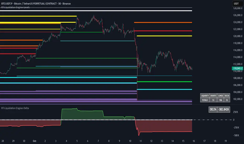
Dynamic FVG & Trap Zones📘 Dynamic FVG & Trap Zones (DFTZ)
A Hybrid Model Combining Imbalance Mapping, Volume Behavior, and Trap Detection
Concept Overview
“Dynamic FVG & Trap Zones” is built to visualize real-time Fair Value Gaps (FVGs) and identify liquidity trap events inside those gaps using adaptive volume filters and wick-based logic.
Traditional FVG indicators merely mark imbalance zones between consecutive candles, but this model goes further — it measures how volume reaction and price penetration inside those zones reveal potential f alse moves or trap formations by smart money.
⚙️ How It Works
1. FVG Detection
• A Bullish FVG is detected when low > high , showing a price void left by aggressive buying.
• A Bearish FVG forms when high < low , implying a selling imbalance.
• These zones are automatically drawn as semi-transparent boxes that extend forward for 10 bars and decay once they exceed the configurable lookback window.
2. Volume Normalization & Grading
• Every bar’s volume is compared against a dynamic SMA( volLookback ) average to calculate a Volume Grade = current vol / avg vol.
• Only bars exceeding the Min Volume Grade threshold are eligible to generate valid FVG zones, ensuring that low-participation moves are ignored.
• The Trap Volume Threshold sets how quiet the reaction bar must be (relative to average volume) to qualify as a trap event.
3. Trap Detection Logic
• Each active FVG zone monitors incoming candles.
• A potential trap is triggered when price re-enters the zone (body or wick depending on settings) but fails to expand with confirming volume.
• If the event occurs inside a Bullish FVG, it marks a Bear Trap (green zone turned red).
If it happens inside a Bearish FVG, it flags a Bull Trap (red zone turned green).
• This reversal in zone color visually conveys trapped liquidity and potential directional fade.
4. Exclusivity and Cooldown Control
• To avoid signal clustering, you can choose exclusivity modes:
Allow Both, Bear over Bull, or Bull over Bear.
• A built-in per-signal cooldown timer prevents back-to-back plots of the same type, enhancing signal clarity during rapid price action.
5. Adaptive Visualization
• Wick-based vs body-based trap detection (toggleable).
• Optional cooldown filtering on shapes ensures the chart only displays validated events.
• Old FVG boxes are pruned automatically beyond the chosen lookback horizon.
🧠 Why It’s Different
Unlike static FVG detectors or simple liquidity sweep tools, DFTZ blends:
• Volume context (Smart Volume Grade filtering)
• Behavioral trap detection within imbalance zones
• Dynamic cooldown mechanics that control over-signaling
• Forward-propagating zones that self-expire gracefully
This synergy makes it a compact yet powerful tool for visualizing imbalances + liquidity traps in one framework — ideal for discretionary traders combining SMC concepts with volume analytics.
📈 How to Use
• Primary Context: Use on 15 min to 1 h charts to spot active FVG zones forming after impulsive moves.
• Trap Signal Interpretation:
• 🔴 “Trap” below bar → Bullish reversal (Bear Trap).
• 🟢 “Trap” above bar → Bearish reversal (Bull Trap).
• Combine With: Market structure breaks, VWAP, or delta volume tools to confirm true reversal intent.
• Alerts: All major events (FVG creation & trap confirmation) trigger ready-to-use alerts for automation or back-testing.
🧩 Customization
Setting Function
Max FVG Lookback Controls how long old zones remain active.
Volume SMA Period Defines the baseline for volume grading.
Min Volume Grade & Trap Volume Threshold Tune the sensitivity of trap confirmation.
Wick-Based Trap Detection Enable to capture wick rejections inside zones.
Signal Cooldown Prevents rapid multiple plots on successive bars.
⚠️ Disclaimer
This tool is designed for educational and analytical purposes only. It does not constitute financial advice or guarantee trading performance. Always conduct your own analysis and risk management before entering a position.
Advanced Volume Profile Pro Delta + POC + VAH/VAL# Advanced Volume Profile Pro - Delta + POC + VAH/VAL Analysis System
## WHAT THIS SCRIPT DOES
This script creates a comprehensive volume profile analysis system that combines traditional volume-at-price distribution with delta volume calculations, Point of Control (POC) identification, and Value Area (VAH/VAL) analysis. Unlike standard volume indicators that show only total volume over time, this script analyzes volume distribution across price levels and estimates buying vs selling pressure using multiple calculation methods to provide deeper market structure insights.
## WHY THIS COMBINATION IS ORIGINAL AND USEFUL
**The Problem Solved:** Traditional volume indicators show when volume occurs but not where price finds acceptance or rejection. Standalone volume profiles lack directional bias information, while basic delta calculations don't provide structural context. Traders need to understand both volume distribution AND directional sentiment at key price levels.
**The Solution:** This script implements an integrated approach that:
- Maps volume distribution across price levels using configurable row density
- Estimates delta (buying vs selling pressure) using three different methodologies
- Identifies Point of Control (highest volume price level) for key support/resistance
- Calculates Value Area boundaries where 70% of volume traded
- Provides real-time alerts for key level interactions and volume imbalances
**Unique Features:**
1. **Developing POC Visualization**: Real-time tracking of Point of Control migration throughout the session via blue dotted trail, revealing institutional accumulation/distribution patterns before they complete
2. **Multi-Method Delta Calculation**: Price Action-based, Bid/Ask estimation, and Cumulative methods for different market conditions
3. **Adaptive Timeframe System**: Auto-adjusts calculation parameters based on chart timeframe for optimal performance
4. **Flexible Profile Types**: N Bars Back (precise control), Days Back (calendar-based), and Session-based analysis modes
5. **Advanced Imbalance Detection**: Identifies and highlights significant buying/selling imbalances with configurable thresholds
6. **Comprehensive Alert System**: Monitors POC touches, Value Area entry/exit, and major volume imbalances
## HOW THE SCRIPT WORKS TECHNICALLY
### Core Volume Profile Methodology:
**1. Price Level Distribution:**
- Divides price range into user-defined rows (10-50 configurable)
- Calculates row height: `(Highest Price - Lowest Price) / Number of Rows`
- Distributes each bar's volume across price levels it touched proportionally
**2. Delta Volume Calculation Methods:**
**Price Action Method:**
```
Price Range = High - Low
Buy Pressure = (Close - Low) / Price Range
Sell Pressure = (High - Close) / Price Range
Buy Volume = Total Volume × Buy Pressure
Sell Volume = Total Volume × Sell Pressure
Delta = Buy Volume - Sell Volume
```
**Bid/Ask Estimation Method:**
```
Average Price = (High + Low + Close) / 3
Buy Volume = Close > Average ? Volume × 0.6 : Volume × 0.4
Sell Volume = Total Volume - Buy Volume
```
**Cumulative Method:**
```
Buy Volume = Close > Open ? Volume : Volume × 0.3
Sell Volume = Close ≤ Open ? Volume : Volume × 0.3
```
**3. Point of Control (POC) Identification:**
- Scans all price levels to find maximum volume concentration
- POC represents the price level with highest trading activity
- Acts as significant support/resistance level
- **Developing POC Feature**: Tracks POC evolution in real-time via blue dotted trail, showing how institutional interest migrates throughout the session. Upward POC migration indicates accumulation patterns, downward migration suggests distribution, providing early trend signals before price confirmation.
**4. Value Area Calculation:**
- Starts from POC and expands up/down to encompass 70% of total volume
- VAH (Value Area High): Upper boundary of value area
- VAL (Value Area Low): Lower boundary of value area
- Expansion algorithm prioritizes direction with higher volume
**5. Adaptive Range Selection:**
Based on profile type and timeframe optimization:
- **N Bars Back**: Fixed lookback period with performance optimization (20-500 bars)
- **Days Back**: Calendar-based analysis with automatic timeframe adjustment (1-365 days)
- **Session**: Current trading session or custom session times
### Performance Optimization Features:
- **Sampling Algorithm**: Reduces calculation load on large datasets while maintaining accuracy
- **Memory Management**: Clears previous drawings to prevent performance degradation
- **Safety Constraints**: Prevents excessive memory usage with configurable limits
## HOW TO USE THIS SCRIPT
### Initial Setup:
1. **Profile Configuration**: Select profile type based on trading style:
- N Bars Back: Precise control over data range
- Days Back: Intuitive calendar-based analysis
- Session: Real-time session development
2. **Row Density**: Set number of rows (30 default) - more rows = higher resolution, slower performance
3. **Delta Method**: Choose calculation method based on market type:
- Price Action: Best for trending markets
- Bid/Ask Estimate: Good for ranging markets
- Cumulative: Smoothed approach for volatile markets
4. **Visual Settings**: Configure colors, position (left/right), and display options
### Reading the Profile:
**Volume Bars:**
- **Length**: Represents relative volume at that price level
- **Color**: Green = net buying pressure, Red = net selling pressure
- **Intensity**: Darker colors indicate volume imbalances above threshold
**Key Levels:**
- **POC (Blue Line)**: Highest volume price - major support/resistance
- **VAH (Purple Dashed)**: Value Area High - upper boundary of fair value
- **VAL (Orange Dashed)**: Value Area Low - lower boundary of fair value
- **Value Area Fill**: Shaded region showing main trading range
**Developing POC Trail:**
- **Blue Dotted Lines**: Show real-time POC evolution throughout the session
- **Migration Patterns**: Upward trail indicates bullish accumulation, downward trail suggests bearish distribution
- **Early Signals**: POC movement often precedes price movement, providing advance warning of institutional activity
- **Institutional Footprints**: Reveals where smart money concentrated volume before final POC establishment
### Trading Applications:
**Support/Resistance Analysis:**
- POC acts as magnetic price level - expect reactions
- VAH/VAL provide intermediate support/resistance levels
- Profile edges show areas of low volume acceptance
**Developing POC Analysis:**
- **Upward Migration**: POC moving higher = institutional accumulation, bullish bias
- **Downward Migration**: POC moving lower = institutional distribution, bearish bias
- **Stable POC**: Tight clustering = balanced market, range-bound conditions
- **Early Trend Detection**: POC direction change often precedes price breakouts
**Entry Strategies:**
- Buy at VAL with POC as target (in uptrends)
- Sell at VAH with POC as target (in downtrends)
- Breakout plays above/below profile extremes
**Volume Imbalance Trading:**
- Strong buying imbalance (>60% threshold) suggests continued upward pressure
- Strong selling imbalance suggests continued downward pressure
- Imbalances near key levels provide high-probability setups
**Multi-Timeframe Context:**
- Use higher timeframe profiles for major levels
- Lower timeframe profiles for precise entries
- Session profiles for intraday trading structure
## SCRIPT SETTINGS EXPLANATION
### Volume Profile Settings:
- **Profile Type**: Determines data range for calculation
- N Bars Back: Exact number of bars (20-500 range)
- Days Back: Calendar days with timeframe adaptation (1-365 days)
- Session: Trading session-based (intraday focus)
- **Number of Rows**: Profile resolution (10-50 range)
- **Profile Width**: Visual width as chart percentage (10-50%)
- **Value Area %**: Volume percentage for VA calculation (50-90%, 70% standard)
- **Auto-Adjust**: Automatically optimizes for different timeframes
### Delta Volume Settings:
- **Show Delta Volume**: Enable/disable delta calculations
- **Delta Calculation Method**: Choose methodology based on market conditions
- **Highlight Imbalances**: Visual emphasis for significant volume imbalances
- **Imbalance Threshold**: Percentage for imbalance detection (50-90%)
### Session Settings:
- **Session Type**: Daily, Weekly, Monthly, or Custom periods
- **Custom Session Time**: Define specific trading hours
- **Previous Sessions**: Number of historical sessions to display
### Days Back Settings:
- **Lookback Days**: Number of calendar days to analyze (1-365)
- **Automatic Calculation**: Script automatically converts days to bars based on timeframe:
- Intraday: Accounts for 6.5 trading hours per day
- Daily: 1 bar per day
- Weekly/Monthly: Proportional adjustment
### N Bars Back Settings:
- **Lookback Bars**: Exact number of bars to analyze (20-500)
- **Precise Control**: Best for systematic analysis and backtesting
### Visual Customization:
- **Colors**: Bullish (green), Bearish (red), and level colors
- **Profile Position**: Left or Right side of chart
- **Profile Offset**: Distance from current price action
- **Labels**: Show/hide level labels and values
- **Smooth Profile Bars**: Enhanced visual appearance
### Alert Configuration:
- **POC Touch**: Alerts when price interacts with Point of Control
- **VA Entry/Exit**: Alerts for Value Area boundary interactions
- **Major Imbalance**: Alerts for significant volume imbalances
## VISUAL FEATURES
### Profile Display:
- **Horizontal Bars**: Volume distribution across price levels
- **Color Coding**: Delta-based coloring for directional bias
- **Smooth Rendering**: Optional smoothing for cleaner appearance
- **Transparency**: Configurable opacity for chart readability
### Level Lines:
- **POC**: Solid blue line with optional label
- **VAH/VAL**: Dashed colored lines with value displays
- **Extension**: Lines extend across relevant time periods
- **Value Area Fill**: Optional shaded region between VAH/VAL
### Information Table:
- **Current Values**: Real-time POC, VAH, VAL prices
- **VA Range**: Value Area width calculation
- **Positioning**: Multiple table positions available
- **Text Sizing**: Adjustable for different screen sizes
## IMPORTANT USAGE NOTES
**Realistic Expectations:**
- Volume profile analysis provides structural context, not trading signals
- Delta calculations are estimations based on price action, not actual order flow
- Past volume distribution does not guarantee future price behavior
- Combine with other analysis methods for comprehensive market view
**Best Practices:**
- Use appropriate profile types for your trading style:
- Day Trading: Session or Days Back (1-5 days)
- Swing Trading: Days Back (10-30 days) or N Bars Back
- Position Trading: Days Back (60-180 days)
- Consider market context (trending vs ranging conditions)
- Verify key levels with additional technical analysis
- Monitor profile development for changing market structure
**Performance Considerations:**
- Higher row counts increase calculation complexity
- Large lookback periods may affect chart performance
- Auto-adjust feature optimizes for most use cases
- Consider using session profiles for intraday efficiency
**Limitations:**
- Delta calculations are estimations, not actual transaction data
- Profile accuracy depends on available price/volume history
- Effectiveness varies across different instruments and market conditions
- Requires understanding of volume profile concepts for optimal use
**Data Requirements:**
- Requires volume data for accurate calculations
- Works best on liquid instruments with consistent volume
- May be less effective on very low volume or exotic instruments
This script serves as a comprehensive volume analysis tool for traders who need detailed market structure information with integrated directional bias analysis and real-time POC development tracking for informed trading decisions.

Market Push Meter - CoffeeStyleMarket Push Meter - CoffeeKiller Indicator Guide
Welcome traders! This guide will walk you through the Market Push Meter indicator, a sophisticated volume analysis tool developed by CoffeeKiller with the help and assistance of FindBetterTrades that measures and visualizes the ongoing battle between buyers and sellers through volume pressure analysis.
🔔 **Warning: This Is Not a Standard Volume Indicator** 🔔 This indicator analyzes volume pressure in a unique way, combining directional volume with price action to identify market imbalances between buyers and sellers. All credit for the core logic for this indicator goes to FindBetterTrades and his/hers Volume Pressure Histogram (Normalized) (this is my adaptation and style added to that core logic, thus the CoffeeStyle name was added).
Core Concept: Volume Pressure Analysis
The foundation of this indicator lies in measuring the imbalance between buying and selling volume, providing insights into which market participants are exerting more pressure on price movements.
Volume Pressure Columns: Buying vs Selling Force
- Positive Green Columns: Net buying pressure
- Negative Red Columns: Net selling pressure
- Color intensity varies based on pressure strength
- Special coloring for new high/low boundaries
Marker Lines: Dynamic Support/Resistance
- High Marker Line (Magenta): Tracks the highest point reached during buying phases
- Low Marker Line (Cyan): Tracks the lowest point reached during selling phases
- Creates visual boundaries showing pressure extremes
Peak Detection System:
- Triangular markers identify significant local maxima and minima
- Background highlighting shows important pressure peaks
- Helps identify potential reversal points and pressure exhaustion
Reference Lines:
- Overbought Level: Threshold for extreme selling pressure
- Oversold Level: Threshold for extreme buying pressure
- Used to identify potential reversal zones
Core Components
1. Volume Pressure Calculation
- Separation of up-volume and down-volume
- Calculation of net volume pressure
- Smoothing for consistent visualization
- Normalization against total volume for percentage scaling
2. Boundary Tracking System
- Automatic detection of highest values in buying phases
- Automatic detection of lowest values in selling phases
- Step-line visualization of boundaries
- Color-coded for easy identification
3. Peak Detection System
- Identification of local maxima and minima
- Background highlighting of significant peaks
- Triangle markers for peak visualization
- Zero-line cross detection for trend changes
4. Threshold Settings
- Extreme threshold multiplier for identifying significant pressure
- Overbought/oversold levels for potential reversals
- Dynamic color coding based on pressure intensity
- Alert conditions for key pressure levels
Main Features
Volume Analysis Settings
- Customizable volume MA length
- Signal smoothing for clearer readings
- Optional log scale for handling wide range variations
- Adjustable threshold multiplier for sensitivity
Visual Elements
- Color-coded columns showing pressure direction and strength
- Dynamic marker lines for pressure boundaries
- Peak triangles for significant turning points
- Background highlighting for peak identification
- Overbought/oversold reference lines
Signal Generation
- Zero-line crosses for trend change signals
- Boundary breaks for pressure strength
- Peak formation for potential reversals
- Color changes for pressure direction and intensity
- Alert conditions for extreme pressure levels
Customization Options
- Volume analysis parameters
- Marker line visibility and colors
- Peak marker display options
- Log scale toggle for handling various markets
- Overbought/oversold threshold adjustments
Trading Applications
1. Trend Identification
- Volume pressure crossing above zero: buying pressure emerging
- Volume pressure crossing below zero: selling pressure emerging
- Column color: indicates pressure direction
- Column height: indicates pressure strength
- Signal line: confirms overall trend direction
2. Reversal Detection
- Peak triangles after extended trend: potential exhaustion
- Background highlighting: significant reversal points
- Volume pressure approaching marker lines: potential trend change
- Color shifts from bright to muted: decreasing pressure
- Readings beyond overbought/oversold levels: potential reversal zones
3. Pressure Analysis
- Breaking above previous high boundary: accelerating buying pressure
- Breaking below previous low boundary: accelerating selling pressure
- Special coloring (magenta/cyan): boundary breaks indicating strength
- Extreme readings: potential climactic buying/selling
4. Market Structure Assessment
- Consecutive higher peaks: strengthening buying structure
- Consecutive lower troughs: strengthening selling structure
- Peak comparisons: relative strength of pressure phases
- Boundary line steps: market structure levels
Optimization Guide
1. Volume Analysis Settings
- Volume MA Length: Default 25 provides balanced signals
- Lower values (10-15): More responsive, potentially noisier
- Higher values (30-50): Smoother, fewer false signals
- Signal Smoothing Length: Default 8 provides good balance
- Lower values: More responsive to pressure changes
- Higher values: Smoother trend identification
2. Threshold Settings
- Extreme Threshold Multiplier: Default 20.0
- Lower values: More signals, potentially more noise
- Higher values: Fewer signals, but more significant
- Overbought/Oversold Levels: Defaults at 20/-20
- Adjust based on instrument volatility
- Wider settings for more volatile instruments
3. Visual Customization
- Marker Line Colors: Adjust for visibility on your chart
- Peak Marker Color: Default yellow provides good contrast
- Enable/disable background highlights based on preference
- Consider log scale for instruments with wide volume ranges
4. Alert Settings
- Configure alerts for high buying pressure
- Configure alerts for high selling pressure
- Set additional alerts for zero-line crosses
- Consider timeframe when setting alert sensitivity
Best Practices
1. Signal Confirmation
- Wait for zero-line crosses to confirm pressure changes
- Look for peak formations to identify potential reversals
- Check for boundary breaks to confirm strong pressure
- Use with price action for entry/exit precision
- Consider extreme threshold crossings as significant signals
2. Timeframe Selection
- Lower timeframes: more signals, potential noise
- Higher timeframes: cleaner signals, less frequent
- Multiple timeframes: confirm signals across time horizons
- Match to your trading style and holding period
3. Market Context
- Strong buying phase: positive columns breaking above marker line
- Strong selling phase: negative columns breaking below marker line
- Columns approaching zero: potential pressure shift
- Columns beyond overbought/oversold: extreme conditions, potential reversal
4. Combining with Other Indicators
- Use with trend indicators for confirmation
- Pair with price action oscillators for divergence detection
- Combine with traditional volume indicators for validation
- Consider support/resistance levels with boundary lines
Advanced Trading Strategies
1. Boundary Break Strategy
- Enter long when volume pressure breaks above previous high marker line
- Enter short when volume pressure breaks below previous low marker line
- Use zero-line as initial stop-loss reference
- Take profits at formation of opposing peaks
2. Peak Trading Strategy
- Identify significant peaks with triangular markers
- Look for consecutive lower peaks in buying phases for shorting opportunities
- Look for consecutive higher troughs in selling phases for buying opportunities
- Use zero-line crosses as confirmation
3. Extreme Reading Strategy
- Look for volume pressure beyond overbought/oversold levels
- Watch for color changes and peak formations
- Enter counter-trend positions after confirmed peaks
- Use tight stops due to extreme market conditions
4. Volume Color Strategy
- Enter long when columns turn bright green (increasing buying pressure)
- Enter short when columns turn bright red (increasing selling pressure)
- Exit when color intensity fades (decreasing pressure)
- Use marker lines as dynamic support/resistance
Practical Analysis Examples
Bullish Market Scenario
- Volume pressure crosses above zero line
- Green columns grow in height and intensity
- High marker line forms steps upward
- Peak triangles appear at local maxima
- Background highlights appear at significant buying pressure peaks
Bearish Market Scenario
- Volume pressure crosses below zero line
- Red columns grow in depth and intensity
- Low marker line forms steps downward
- Peak triangles appear at local minima
- Background highlights appear at significant selling pressure troughs
Consolidation Scenario
- Volume pressure oscillates around zero line
- Column colors alternate frequently
- Marker lines remain relatively flat
- Few or no new peak highlights appear
- Pressure values remain small
Understanding Market Dynamics Through Market Push Meter
At its core, this indicator provides a unique lens to visualize market pressure through volume analysis:
1. Volume Imbalance: By separating and comparing buying volume (up candles) from selling volume (down candles), the indicator provides insights into which side is exerting more pressure in the market.
2. Normalized Pressure: The indicator normalizes volume pressure as a percentage of total volume, making it more comparable across different market conditions and instruments.
3. Dynamic Boundaries: The marker lines create a visual representation of the "high water marks" of pressure in both directions, helping to identify when markets are making new pressure extremes.
4. Exhaustion Signals: The peak detection system highlights moments where pressure has reached a local maximum or minimum, often precursors to reversals or consolidations.
Remember:
- Combine signals from volume pressure, marker lines, and peak formations
- Use appropriate timeframe settings for your trading style
- Customize the indicator to match your visual preferences and market
- Consider overall market conditions and correlate with price action
This indicator works best when:
- Used as part of a comprehensive trading system
- Combined with proper risk management
- Applied with an understanding of current market conditions
- Signals are confirmed by price action and other indicators
DISCLAIMER: This indicator and its signals are intended solely for educational and informational purposes. They do not constitute financial advice. Trading involves significant risk of loss. Always conduct your own analysis and consult with financial professionals before making trading decisions.
