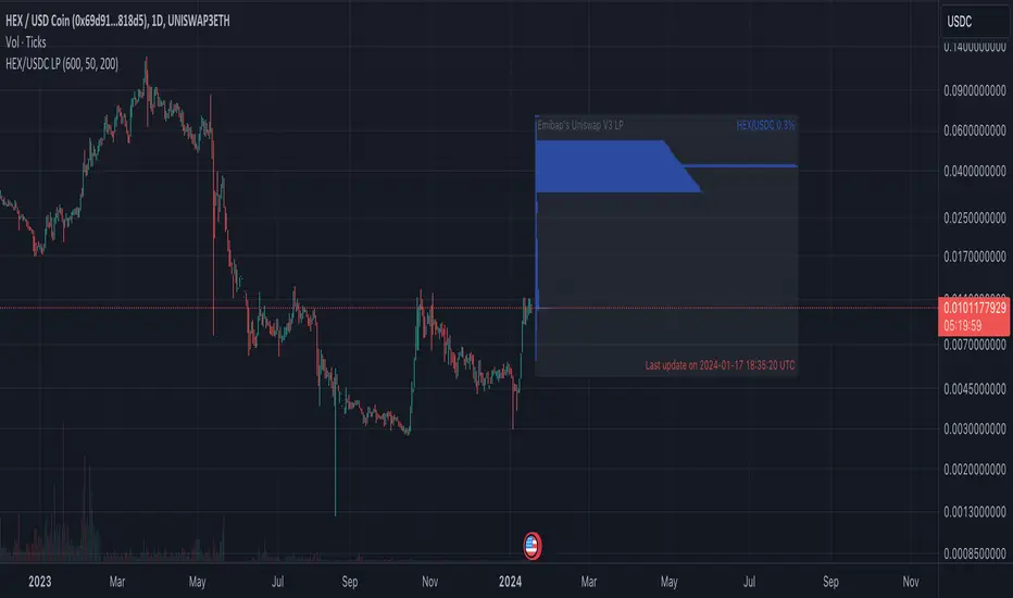
Emibap's Uniswap V3 HEX/WETH 0.3% Liquidity PoolThis script will display a histogram of the Uniswap V3 HEX / WETH 3% liquidity pool.
Similar to what you can see in the liquidity section of the Uniswap pool page but conveniently rendered alongside your chart.
It's meant to be used on a HEX / WETH chart only. The price should be expressed in WETH for it to work.
One of the main motivations for using this in your chart is to get an idea of the current sentiment: If most of the volume is below the price it might be an indication of an upcoming move up, for instance.
I'll try to update the liquidity regularly.
Using the 4h, daily, or weekly time frames is highly recommended.
The options are straightforward:
Histogram bars color. Default is blue
Histogram background color. Default is black at 20% opacity
Upper price limit of the diagram: Visible upper bound price limit for the histogram, based on the current price. I.E: 200%: If the price is 1, the histogram will show 3 as the upper bound
Lower price limit of the diagram. Visible lower bound price limit for the histogram, based on the current price. I.E: 99%: If the price is 1, the histogram will show 0. 01 as the upper bound
Width of the widest bar: Width (in bars) for the widest bar of the histogram. The more the higher resolution you'll get
Cari dalam skrip untuk "liquidity"

Support & Resistance/Supply & Demand/Liquidity/Trendlines (Expo)Real-Time Support & Resistance/Supply & Demand/Liquidity Zones /Trendlines / Key Levels
This trading tool automatically identifies real-time Support/Resistance, Supply and Demand, Liquidity Zones, Key levels, and Trendlines.
FEATURES
This indicator includes all necessary features for traditional technical analysis, such as Trendlines, Support/Resistance, Supply/Demand, and Liquidity Zones. In addition to that, we have added key market levels.
Support/Resistance: Identifies areas in real-time where the price finds support and resistance.
Supply/Demand: The indicator analyzes the market structure in real-time and maps out key supply and demand zones. The user gets an instant understanding of the current market structure.
Liquidity Zones: Liquidity zones are displayed where there is a significant level of trading activity and when there is both high supply and demand for an asset, security, or contract.
TrendLines: Trendlines help traders determine the current direction of market prices. A trendline is displayed when a price action trend is detected.
Key Levels: Key levels are psychological levels that are under the attention of many traders. There is a lot of buying or selling pressure at these levels. At these key levels, price decides its direction, either to go bearish or bullish.
HOW TO USE
Use the indicator to identify several important and commonly used levels and zones. All zones work as a future reference where the price has a higher likelihood to react at, bounce off from, or reverse.
-----------------
Disclaimer
Copyright by Zeiierman.
The information contained in my Scripts/Indicators/Ideas/Algos/Systems does not constitute financial advice or a solicitation to buy or sell any securities of any type. I will not accept liability for any loss or damage, including without limitation any loss of profit, which may arise directly or indirectly from the use of or reliance on such information.
All investments involve risk, and the past performance of a security, industry, sector, market, financial product, trading strategy, backtest, or individual’s trading does not guarantee future results or returns. Investors are fully responsible for any investment decisions they make. Such decisions should be based solely on an evaluation of their financial circumstances, investment objectives, risk tolerance, and liquidity needs.
My Scripts/Indicators/Ideas/Algos/Systems are only for educational purposes!
Skrip berbayar

NY Open Breakout Strategy - High Liquidity & Favorable RRR Pine Description:
The NY Open Breakout Strategy is an advanced Pine Script indicator tailored for the TradingView platform. This strategy is specifically designed to exploit the high liquidity found during the New York session opening in the Forex market. Its primary goal is to provide traders with an opportunity to engage in positions with lower risk and higher potential profits, thereby ensuring an advantageous risk-to-reward ratio (RRR).
Core Objectives:
Leveraging High Liquidity: Capitalizes on the significant market movements at the New York session opening, known for its high liquidity, to identify strong breakout signals.
Achieving Favorable RRR: By setting strategic stop-loss and take-profit levels, the strategy aims for a higher RRR. This approach can lead to overall profitability, even if the win rate is lower than the loss rate.
Functionality:
Dynamic Breakout Identification: Uses the first 15-minute candle’s high and low after NY open as benchmarks for detecting potential breakouts.
Customizable Stop-Loss & Take-Profit: Provides options to configure stop-loss at the last swing or the previous candle’s close. The take-profit levels are determined based on a favorable risk-reward ratio.
Visual Session Indicators: Includes distinct background coloring and vertical lines to mark the New York session for easy visibility.
Methodology:
This strategy hinges on the premise that the opening of the New York session often triggers key price movements due to an influx of trading activity. By focusing on these moments, our indicator aims to capture strong trends and breakout patterns. The carefully calibrated stop-loss and take-profit settings ensure that each trade aims for a higher potential reward compared to the risk undertaken.
Unique Features:
Enhanced Risk Management: With adaptable risk-reward settings, traders can tailor their trading strategies to align with individual risk appetites.
Personalized User Experience: Offers a range of customizable settings for visual elements, allowing traders to adjust the look and feel of the indicator to their preferences.
Usage Guidelines:
Customize the indicator settings, including the stop-loss reference and risk-reward ratio, to match your trading style.
Watch for 'Buy Enter' and 'Sell Enter' signals during the New York session opening.
Utilize the displayed stop-loss and take-profit levels to effectively manage each trade.
This NY Open Breakout Strategy is ideal for traders who prioritize efficient risk management while aiming to capitalize on the high liquidity periods of the Forex market. The strategy is designed to be robust, providing a pathway to profitability even in scenarios where the number of losing trades surpasses winning ones, thanks to its emphasis on a high risk-to-reward ratio.

Emibap's Uniswap V3 HEX/USDC 3% Liquidity PoolThis script will display a histogram of the Uniswap V3 HEX / USDC 3% liquidity pool.
Similar to what you can see in the liquidity section of the Uniswap pool page but conveniently rendered alongside your chart.
It's meant to be used on any HEX / USDC chart only.
One of the main motivations for using this in your HEX / USDC chart is to get an idea of the current sentiment: If most of the volume is below the price it might be an indication of an upcoming move up, for instance.
I'll try to update the liquidity regularly; if possible several times a day.
Using the 4h, daily, or weekly time frames is highly recommended.
The options are straightforward:
Histogram bars color. Default is blue
Histogram background color. Default is black at 20% opacity
Upper price limit of the diagram: Visible upper bound price limit for the histogram, based on the current price. I.E: 200%: If the price is 1, the histogram will show 3 as the upper bound
Lower price limit of the diagram. Visible lower bound price limit for the histogram, based on the current price. I.E: 99%: If the price is 1, the histogram will show 0. 01 as the upper bound
Width of the widest bar: Width (in bars) for the widest bar of the histogram. The more the higher resolution you'll get
Atif's Liquidity Toolkit💎 GENERAL OVERVIEW:
Atif’s Liquidity Toolkit is a price-action-based indicator used to identify Buyside & Sellside Liquidity Levels, Liquidity Sweeps, FVG Sweeps, and Buy/Sell signals, following specific rules from Atif Hussain.
This indicator was developed by Flux Charts in collaboration with Atif Hussain.
🔹Purpose of this indicator:
The purpose of Atif’s Liquidity Toolkit is to help traders understand where liquidity is forming, when it’s being taken, and how momentum shifts immediately afterward. It automates the entire process of identifying buyside & sellside liquidity, detecting liquidity sweeps, and confirming whether displacement followed through a Fair Value Gap. The goal is to give traders a consistent, rule-based framework to interpret market structure.
🎯ATIF’S LIQUIDITY TOOLKIT FEATURES:
Atif’s Liquidity Toolkit indicator includes 6 main features:
Fair Value Gaps
Multi-Timeframe Liquidity Levels
Liquidity Sweeps
Fair Value Gap Sweeps
Buy & Sell Signals with Take-Profit & Stop-Loss Levels
Alerts
1️⃣Fair Value Gaps
🔹What is a Fair Value Gap?:
A Fair Value Gap (FVG) is an area where the market’s perception of fair value suddenly changes. On your chart, it appears as a three-candle pattern: a large candle in the middle, with smaller candles on each side that don’t fully overlap it. A bullish FVG forms when a bullish candle is between two smaller bullish/bearish candles, where the first and third candles’ wicks don’t overlap each other at all. A bearish FVG forms when a bearish candle is between two smaller bullish/bearish candles, where the first and third candles’ wicks don’t overlap each other at all.
Bullish & Bearish FVGs:
In the settings, you can toggle on/off FVGs, choose the invalidation method, adjust the sensitivity, and toggle on FVG Midline & Labels.
🔹Invalidation Method:
The Invalidation Method setting allows traders to choose how an FVG is invalidated. You can choose between Close and Wick.
Close: A candle must close below a bullish FVG or above a bearish FVG to invalidate it.
Wick: A candle’s wick must go below a bullish FVG or above a bearish FVG to invalidate it.
🔹Sensitivity:
The sensitivity setting determines the minimum gap size required for an FVG detection. A higher sensitivity will filter out smaller gaps, while a lower sensitivity will detect more frequent, smaller gaps. Setting the sensitivity to 0 will display all gaps, regardless of their size.
On the left, the sensitivity is 5. On the right, the sensitivity is 0.
🔹Midline:
When enabled, a dashed line is drawn at the center of the FVG.
🔹Labels:
When enabled, a text label will be plotted with the gap, clearly identifying the zone as a FVG.
2️⃣ Multi-Timeframe Liquidity Levels
The indicator automatically detects and plots Buyside Liquidity (BSL) & Sellside Liquidity (SSL) Levels across up to three timeframes simultaneously.
🔹What is Buyside Liquidity?
Buyside Liquidity (BSL) represents price levels where many buy stop orders are sitting, usually from traders holding short positions. When price moves into these areas, those stop-loss orders get triggered and short sellers are forced to buy back their positions. These zones often form above key highs such as the previous day, week, or month. Understanding BSL is important because when price reaches these levels, the sudden wave of buy orders can create sharp reactions or reversals as liquidity is taken from the market.
🔹What is Sellside Liquidity?
Sellside Liquidity (SSL) represents price levels where many sell stop orders are waiting, usually from traders holding long positions. When price drops into these areas, those stop-loss orders are triggered and long traders are forced to sell their positions. These zones often form below key lows such as the previous day, week, or month. Understanding SSL is important because when price reaches these levels, the surge of sell orders can cause sharp reactions or reversals as liquidity is taken from the market.
Atif’s Liquidity Toolkit indicator automatically plots Buyside & Sellside Liquidity levels using the following levels:
Previous Day High (PDH) & Previous Day Low (PDL)
Previous Week High (PWH) & Previous Week Low (PWL)
Previous Month High (PMH) & Previous Month Low (PML)
Asia Session Highs/Lows
London Session Highs/Lows
New York Session Highs/Lows
The session start and end times are not customizable. The following times in EST are used for each session:
Asia Session: 20:00-00:00
London Session: 02:00-05:00
New York Sessions:
NY AM: 09:30-11:00
NY Lunch: 12:00-13:00
NY PM: 14:00-16:00
Users can also plot swing highs/lows using a lookback period and choosing the higher timeframe. Users can choose two custom higher timeframes and also enable swing highs/lows from the current chart’s timeframe.
There are three settings to customize for the current chart’s timeframe and higher timeframes:
Current TF - when toggled on, swing highs/lows will be plotted from the chart’s timeframe using the pivot length input
HTF 1 - when toggled on, swing highs/lows will be plotted from the user-inputted timeframe using the pivot length input
HTF 2 - when toggled on, swing highs/lows will be plotted from the user-inputted timeframe using the pivot length input
The Pivot Length controls how far back the indicator checks to confirm whether a candle’s high or low is a true swing point (also called a “pivot”). When detecting a swing high, the indicator checks if that candle’s high is higher than the highs of the previous X candles and the next X candles. For a swing low, it checks if the candle’s low is lower than the lows of the previous X candles and the next X candles. The number X comes from your Pivot Length setting.
A lower Pivot Length input (for example, 3 or 4) means the indicator only looks at a few candles on each side, so it will detect more swing points, including smaller, less significant ones. A higher Pivot Length input (for example, 20 or 25) makes the indicator look at more candles on each side, so it only marks major turning points that stand out clearly on the chart.
In short:
Low Pivot Length = more frequent, smaller levels (short-term focus)
High Pivot Length = fewer, stronger levels (major swing focus)
The Pivot Length input for each setting (Current TF, HTF 1, and HTF 2) are displayed below in the red boxes:
Each liquidity level is plotted with a text label, making it easy to identify where a level came from. You can turn off the ‘Show Levels’ setting if you don’t want to see the levels on your chart.
Please note: Liquidity Levels play a key role in finding liquidity sweeps, FVG Sweeps, and Buy/Sell signals. Keeping the levels turned off will not stop the indicator from using the levels that are enabled from being used for the other features mentioned.
3️⃣Liquidity Sweeps:
The indicator automatically detects bullish and bearish liquidity sweeps using the liquidity levels you have enabled.
🔹What is a Liquidity Sweep?
A liquidity sweep is a market phenomenon where significant players, such as institutional traders, deliberately drive prices through key levels to trigger clusters of pending buy or sell orders. It’s how the market gathers the liquidity needed for larger participants to enter positions.
Traders often place stop-loss orders around obvious highs and lows, such as the previous day’s, week’s, or month’s levels. When price pushes through one of these areas, it triggers the stops placed there and generates a burst of volume. This often creates a short-term fake-out before the market reverses in the opposite direction.
By detecting these sweeps in real time, traders can identify potential reversal areas or “trap” areas where liquidity has been taken.
🔹Bullish Liquidity Sweep
These occur when price dips below a Sellside Liquidity (SSL) level, taking out the stop-loss orders placed by long traders below that low. The indicator marks a zone around the candle that swept the SSL to highlight where liquidity was removed from the market.
When this happens, it shows that the market just cleared out sell-side liquidity, meaning traders who were long had their stops hit. This is often followed by a reversal or strong reaction upward, because the market no longer has pending liquidity to fill below that level.
🔹Bearish Liquidity Sweep
These occur when price dips above a Buyside Liquidity (BSL) level, taking out the stop-loss orders placed by short seller traders above that high. The indicator marks a zone around the candle that swept the BSL to highlight where liquidity was removed from the market.
When this happens, it shows that the market just cleared out buyside liquidity, meaning short traders had their stops hit. This is often followed by a reversal or strong reaction downward, because the market no longer has pending liquidity to fill above that level.
Under the ‘Liquidity Sweeps’ section in the settings, you can toggle on/off Bullish Regular Sweeps and Bearish Regular Sweeps. You can also customize the line style and color of liquidity levels that have been swept.
🔹How to Use Liquidity Sweeps
Liquidity sweeps are not direct trade signals. They are best used as context when forming a directional bias. A sweep shows that the market has removed liquidity from one side, which can hint at where the next move may develop.
For example:
When Buyside Liquidity (BSL) is swept, it often signals that buy stops have been triggered and the market may be preparing to move lower. Traders may then begin looking for short opportunities.
When Sellside Liquidity (SSL) is swept, it often signals that sell stops have been triggered and the market may be preparing to move higher. Traders may then begin looking for long opportunities.
It’s common practice to use liquidity sweeps as the first step in building a trade idea. Many traders will wait for additional confirmation, such as a fair value gap forming after the sweep, before opening a position.
Under the ‘Liquidity Sweeps’ section in the settings, you can toggle on/off:
Bullish Regular Sweeps - when disabled, Bullish Regular Sweeps won’t appear on your chart.
Bearish Regular Sweeps - when disabled, Bearish Regular Sweeps won’t appear on your chart.
4️⃣Fair Value Gap Sweeps:
The indicator automatically detects bullish and bearish Fair Value Gap sweeps (FVG Sweep) using the liquidity levels you have enabled.
🔹What is a FVG Sweep?
A FVG Sweep is a specific type of liquidity sweep that not only clears liquidity above or below a key level, but also forms a Fair Value Gap (FVG) immediately afterward.
The liquidity sweep shows where stop orders were triggered, areas where the market aggressively took out one side’s liquidity. The formation of a Fair Value Gap right after the sweep confirms that displacement followed. This means that the sweep was not just a stop hunt, but a deliberate move backed by momentum.
In simple terms, a regular liquidity sweep only tells you that liquidity was taken. A FVG Sweep tells you that liquidity was taken and a strong directional move started immediately after, leaving an imbalance in price. That imbalance represents where aggressive buyers or sellers entered the market without enough opposite-side orders to keep price balanced. This combination adds a confirmation and intent behind regular liquidity sweeps.
🔹Bullish FVG Sweep
The indicator automatically detects bullish FVG Sweeps when price takes out a Sellside Liquidity (SSL) level and then forms a bullish FVG within the next few candles. This sequence shows that sellers were stopped out and buyers immediately entered the market with momentum.
🔹Bearish FVG Sweep
The indicator automatically detects bearish FVG Sweeps when price takes out a Buyside Liquidity (BSL) level and then forms a bearish FVG shortly after. This shows that short sellers’ stops were triggered, and new selling pressure entered the market right away.
🔹How to Use FVG Sweeps
Unlike regular liquidity sweeps, FVG Sweeps can be used as trade entries because they confirm both liquidity being cleared and immediate momentum. A regular sweep only shows that stop-losses were triggered, but an FVG Sweep proves that price not only cleared liquidity but also moved away with momentum, leaving behind an imbalance (Fair Value Gap). This shift often marks the start of a new short-term trend.
We’ll cover this in more detail in the Buy and Sell Signal section below, but in short, a bullish FVG Sweep can act as confirmation for a potential long entry after price takes out a low, while a bearish FVG Sweep can confirm a short entry after price takes out a high.
The strongest FVG Sweeps come from extremely sharp reversals. On the chart, they look like a “V” shape for bullish setups or an inverted “V” shape for bearish setups. This shape shows how quickly momentum shifted after liquidity was cleared. When price instantly reverses and leaves a Fair Value Gap behind, it’s a clear sign that buyers or sellers stepped in aggressively and absorbed all available liquidity on the opposite side.
In practice, traders often use FVG Sweeps as a trigger to align their bias. For example, after a bullish FVG Sweep, the focus shifts toward looking for long setups within the new imbalance or during a small retracement into the Fair Value Gap. After a bearish FVG Sweep, traders focus on short setups as price retraces back into the gap before continuing lower. The key takeaway is that FVG Sweeps show conviction.
Under the ‘Liquidity Sweeps’ section in the settings, you can toggle on/off:
Bullish FVG Sweeps - when disabled, Bullish FVG Sweeps won’t appear on your chart.
Bearish FVG Sweeps - when disabled, Bearish FVG Sweeps won’t appear on your chart.
Please Note: the settings you choose to use for Fair Value Gaps, under the ‘Fair Value Gaps’ section, will be used for FVG Sweeps. This is important because if you increase the sensitivity value for FVGs, not all FVG Sweeps will appear if the FVG’s size doesn’t meet the sensitivity threshold.
5️⃣Buy & Sell Signals:
This indicator also plots Buy & Sell signals. These signals follow logic based on Atif Hussain’s FVG trading model. The entry requirements for a Long & Short signal are outlined below.
🔹Buy Signal:
In order for a Buy Signal to generate, the following conditions must occur in order:
Bullish FVG Sweep
Price Retraces to the Bullish FVG
🔹Sell Signal:
In order for a Buy Signal to generate, the following conditions must occur in order:
Bearish FVG Sweep
Price Retraces to the FVG
🔹Require Retracement:
Under the ‘Signals’ section in the settings, you can toggle on/off the ‘Require Retracement’ setting. When disabled, a long/short signal will appear immediately after a Bullish or Bearish FVG Sweep, instead of waiting for price to retrace back to the gap.
Please Note: the liquidity levels you enable under the ‘Liquidity Levels’ section will be the levels used for signals. Thus, if you only have the Previous Day Highs/Lows enabled, then only those levels will be used to generate buy/sell signals. Also, long Signals will only appear if Bullish FVG Sweeps are enabled, and Short Signals will only appear if Bearish FVG Sweeps are enabled.
When a Buy Signal or Sell Signal is plotted, three suggested take-profit levels and one suggested stop-loss level are plotted. There are two different Take-Profit methods you can choose from within the indicator settings: Manual or Auto.
🔹Manual Take-Profit:
If you’re using manual take-profit levels, you can customize the Risk-to-Reward (RR) for Take-Profit 1, 2, and 3 by adjusting the “RR 1”, “RR 2”, and “RR 3” settings. Setting RR 1 to 1 means take-profit 1 is a 1:1 risk-to-reward ratio. The stop-loss will always be placed at the recent low for Buy Signals, and at the recent high for Sell Signals.
🔹Auto Take-Profit:
If you select to use Auto Take-Profit instead of Manual, then Take-Profit 1, 2, and 3 will be automatically determined based on nearby liquidity levels. The stop-loss will be placed at the recent low for Buy Signals, and at the recent high for Sell Signals. Take-Profit Levels 1, 2, and 3 will be placed at the three closest opposite liquidity levels. If the take-profit 2 and take-profit 3 levels are too far away, only one take-profit level will be displayed.
🔹Signal Settings:
Long Signals:
When enabled, long signals are shown. When disabled, long signals will not appear.
Short Signals:
When enabled, short signals are shown. When disabled, short signals will not appear.
Require Retracement:
When enabled, price must retrace to a FVG after a FVG Sweep in order for a signal to be generated.
Take-Profit Levels:
When enabled, take-profit levels (TP 1, TP 2, and TP 3) are shown with long/short signals. When disabled, take-profit levels and their price labels are not displayed.
Take-Profit Labels:
When enabled, take-profit labels are displayed when price reaches one of the three take-profit levels. When disabled, labels won’t appear when price reaches take-profit levels.
Stop-Loss Levels:
When enabled, stop-loss levels are shown for long/short signals. When disabled, the stop-loss level and its price label are not displayed.
Stop-Loss Labels:
When enabled, stop-loss levels are shown for long/short signals. When disabled, a label won’t appear when price reaches the stop-loss level.
6️⃣Alerts:
The indicator supports alerts, so you never miss a key market move. You can choose to receive alerts for each of the following conditions:
Bearish Liquidity Sweep
Bullish Liquidity Sweep
Bearish FVG Sweep
Bullish FVG Sweep
Long Signal
Short Signal
TP 1
TP 2
TP 3
Stop-Loss
‼️Important Notes:
TradingView has limitations when running features on multiple timeframes, such as the liquidity levels, which can result in the following error:
🔹Computation Error:
The computation of using MTF features are very intensive on TradingView. This can sometimes cause calculation timeouts. When this occurs, simply force the recalculation by modifying one indicator’s settings or by removing the indicator and adding it to your chart again.
🚩 UNIQUENESS:
This indicator is unique because it identifies a specific type of liquidity event referred to as FVG Sweeps, where price takes liquidity and then immediately forms a Fair Value Gap in the opposite direction. These FVG Sweeps serve as the foundation of the model, and the script uses them as the required condition for generating Buy and Sell signals. Once an FVG Sweep is confirmed, the indicator automatically produces a fully defined trade idea with a stop-loss and up to three take-profit targets, following a consistent rule-based execution approach.

[DarkTrader] Liquidity Regression MapLinear Regression Function Reference by @RicardoSantos :
Liquidity Regression Map is an advanced indicator designed to assist traders in identifying key liquidity zones, reversals, and potential breakout areas within the market. By visualizing liquidity shifts and regression patterns, this tool provides a powerful visual guide to price movements that often go unnoticed by conventional indicators. The indicator's dynamic and adaptive approach helps traders better navigate complex market environments.
Purpose :
This indicator focuses on analyzing the behavior of liquidity in the market and mapping it out in a visual format on your TradingView charts. It provides a deeper understanding of where large clusters of liquidity exist, helping traders pinpoint potential areas where price is likely to react. It aims to highlight key liquidity zones and assess when price is likely to reverse or continue its trend, providing a comprehensive view of the market's internal structure.
Liquidity Regression Map supports multiple timeframes and multiple assets, providing traders with flexibility to analyze different market conditions. Whether you're analyzing short-term charts for scalping or higher timeframes for swing trades, the indicator adjusts its liquidity and regression calculations accordingly, ensuring accurate insights across all timeframes. Additionally, it is compatible with various asset classes, including stocks, forex, cryptocurrencies, and commodities, allowing you to apply the same powerful liquidity analysis across multiple markets for a unified trading strategy.
How It Works :
The indicator identifies liquidity zones by looking at the highs and lows of recent price action within a user-defined period, known as the lookback period. These zones represent areas where market participants are likely to have placed a significant number of stop orders or large positions, creating pockets of liquidity. The zones are visualized as levels on the chart, showing where the market is likely to react.
Next, the indicator performs a linear regression analysis on the price data. Linear regression helps smooth out the price action and gives an indication of the overall trend within the defined liquidity zone. This analysis is critical for determining the slope and direction of price movement, which provides insights into the market's momentum and strength in these liquidity areas.
A key feature of this indicator is its ability to detect liquidity swipes—sharp moves in price that sweep liquidity levels. When price approaches a liquidity zone and crosses it aggressively, the indicator highlights this as a swipe. Swipes often signal significant price reversals or trend continuation because they indicate that liquidity has been absorbed. The Akastra Liquidity Regression Map highlights these areas, helping traders anticipate where a reversal or continuation may occur.
As new price data comes in, the liquidity zones and regression lines dynamically adjust. This real-time update ensures that traders are always working with the most relevant and up-to-date liquidity information. The indicator recalculates the liquidity levels based on the recent highs and lows and repositions the regression lines accordingly. This makes it adaptive to both short-term volatility and long-term trends.
To make the analysis intuitive and easy to interpret, the liquidity levels are color-coded based on their strength and importance. Liquidity zones are shown using a gradient of colors, from weak liquidity (indicating potential minor reactions) to strong liquidity (where a significant price reaction is more likely). The heatmap visually communicates how liquidity is distributed across different levels and timeframes.
Liquidity Condition Filtering :
Another important aspect of the mechanism is the liquidity condition filtering, which only highlights significant liquidity shifts. The indicator evaluates if price movement meets certain thresholds, such as exceeding a 1.618 threshold for liquidity absorption or rejection . This filtering ensures that only the most relevant and impactful liquidity conditions are displayed, minimizing noise and false signals on the chart.
Finally, the indicator calculates and displays liquidity levels across multiple timeframes simultaneously, providing a more comprehensive view. For example, liquidity from a higher timeframe may interact with liquidity from a lower timeframe, providing traders with an overlapping view of where significant liquidity is concentrated. This multi-layer analysis helps to confirm trading setups and increases the probability of successful trades.

Expected LiquiditySimple but effective script that displays Liquidity Premium/Discount areas in an adaptive way based on key Fibonacci levels.
You can increase or decrease the 'Period' value in the Settings to adjust the gap between the lines as you see fit.
By default the value is '46' which should suit most markets.
- The script contains Alerts which are triggered when a liquidity line is crossed by the price.
Good trading to all and don't forget, risk management remains the most important!
Time-Decay Liquidity Zones [BackQuant]Time-Decay Liquidity Zones
A dynamic liquidity map that turns single-bar exhaustion events into fading, color-graded zones, so you can see where trapped traders and unfinished business still matter, and when those areas have finally stopped pulling price.
What this is
This indicator detects unusually strong impulsive moves into wicks, converts them into supply or demand “zones,” then lets those zones decay over time. Each zone carries a strength score that fades bar by bar. Zones that stop attracting or rejecting price are gradually de-emphasized and eventually removed, while the most relevant areas stay bright and obvious.
Instead of static rectangles that live forever, you get a living liquidity map where:
Zones are born from objective criteria: volatility, wick size, and optional volume spikes.
Zones “age” using a configurable decay factor and maximum lifetime.
Zone color and opacity reflect current relative strength on a unified clear → green → red gradient.
Zones freeze when broken, so you can distinguish “active reaction areas” from “historical levels that have already given way”.
Conceptual idea
Large wicks with strong volatility often mark areas where aggressive orders met hidden liquidity and got absorbed. Price may revisit these areas to test leftover interest or to relieve trapped positions. However, not every wick matters for long. As time passes and more bars print, the market “forgets” some areas.
Time-Decay Liquidity Zones turns that idea into a rule-based system:
Find bars that likely reflect strong aggressive flows into liquidity.
Mark a zone around the wick using ATR-based thickness.
Assign a strength score of 1.0 at birth.
Each bar, reduce that score by a decay factor and remove zones that fall below a threshold or live too long.
Color all surviving zones from weak to strong using a single gradient scale and a visual legend.
How events are detected
Detection lives in the Event Detection group. The script combines range, wick size, and optional volume filters into simple rules.
Volatility filter
ATR Length — computes a rolling ATR over your chosen window. This is the volatility baseline.
Min range in ATRs — bar range (High–Low) must exceed this multiple of ATR for an event to be considered. This avoids tiny bars triggering zones.
Wick filters
For each bar, the script splits the candle into body and wicks:
Upper wick = High minus the max(Open, Close).
Lower wick = min(Open, Close) minus Low.
Then it tests:
Upper wick condition — upper wick must be larger than Min wick size in ATRs × ATR.
Lower wick condition — lower wick must be larger than Min wick size in ATRs × ATR.
Only bars with a sufficiently long wick relative to volatility qualify as candidate “liquidity events”.
Volume filter
Optionally, the script requires a volume spike:
Use volume filter — if enabled, volume must exceed a rolling volume SMA by a configurable multiplier.
Volume SMA length — period for the volume average.
Volume spike multiplier — how many times above the SMA current volume needs to be.
This lets you focus only on “heavy” tests of liquidity and ignore quiet bars.
Event types
Putting it together:
Upper event (potential supply / long liquidation, etc.)
Occurs when:
Upper wick is large in ATR terms.
Full bar range is large in ATR terms.
Volume is above the spike threshold (if enabled).
Lower event (potential demand / short liquidation, etc.)
Symmetric conditions using the lower wick.
How zones are constructed
Zone geometry lives in Zone Geometry .
When an event is detected, the script builds a rectangular box that anchors to the wick and extends in the appropriate direction by an ATR-based thickness.
For upper (supply-type) zones
Bottom of the zone = event bar high.
Top of the zone = event bar high + Zone thickness in ATRs × ATR.
The zone initially spans only the event bar on the x-axis, but is extended to the right as new bars appear while the zone is active.
For lower (demand-type) zones
Top of the zone = event bar low.
Bottom of the zone = event bar low − Zone thickness in ATRs × ATR.
Same extension logic: box starts on the event bar and grows rightward while alive.
The result is a band around the wick that scales with volatility. On high-ATR charts, zones are thicker. On calm charts, they are narrower and more precise.
Zone lifecycle, decay, and removal
All lifecycle logic is controlled by the Decay & Lifetime group.
Each zone carries:
Score — a floating-point “importance” measure, starting at 1.0 when created.
Direction — +1 for upper zones, −1 for lower zones.
Birth index — bar index at creation time.
Active flag — whether the zone is still considered unbroken and extendable.
1) Active vs broken
Each confirmed bar, the script checks:
For an upper zone , the zone is counted as “broken” when the close moves above the top of the zone.
For a lower zone , the zone is counted as “broken” when the close moves below the bottom of the zone.
When a zone breaks:
Its right edge is frozen at the previous bar (no further extension).
The zone remains on the chart, but is no longer updated by price interaction. It still decays in score until removal.
This lets you see where a major level was overrun, while naturally fading its influence over time.
2) Time decay
At each confirmed bar:
Score := Score × Score decay per bar .
A decay value close to 1.0 means very slow decay and long-lived zones.
Lower values (closer to 0.9) mean faster forgetting and more current-focused zones.
You are controlling how quickly the market “forgets” past events.
3) Age and score-based removal
Zones are removed when either:
Age in bars exceeds Max bars a zone can live .
This is a hard lifetime cap.
Score falls below Minimum score before removal .
This trims zones that have decayed into irrelevance even if their age is still within bounds.
When a zone is removed, its box is deleted and all associated state is freed to keep performance and visuals clean.
Unified gradient and color logic
Color control lives in Gradient & Color . The indicator uses a single continuous gradient for all zones, above and below price, so you can read strength at a glance without guessing what palette means what.
Base colors
You set:
Mid strength color (green) — used for mid-level strength zones and as the “anchor” in the gradient.
High strength color (red) — used for the strongest zones.
Max opacity — the maximum visual opacity for the solid part of the gradient. Lower values here mean more solid; higher values mean more transparent.
The script then defines three internal points:
Clear end — same as mid color, but with a high alpha (close to transparent).
Mid end — mid color at the strongest allowed opacity.
High end — high color at the strongest allowed opacity.
Strength normalization
Within each update:
The script finds the maximum score among all existing zones.
Each zone’s strength is computed as its score divided by this maximum.
Strength is clamped into .
This means a zone with strength 1.0 is currently the strongest zone on the chart. Other zones are colored relative to that.
Piecewise gradient
Color is assigned in two stages:
For strength between 0.0 and 0.5: interpolate from “clear” green to solid green.
Weak zones are barely visible, mid-strength zones appear as solid green.
For strength between 0.5 and 1.0: interpolate from solid green to solid red.
The strongest zones shift toward the red anchor, clearly separating them from everything else.
Strength scale legend
To make the gradient readable, the indicator draws a vertical legend on the right side of the chart:
About 15 cells from top (Strong) to bottom (Weak).
Each cell uses the same gradient function as the zones themselves.
Top cell is labeled “Strong”; bottom cell is labeled “Weak”.
This legend acts as a fixed reference so you can instantly map a zone’s color to its approximate strength rank.
What it plots
At a glance, the indicator produces:
Upper liquidity zones above price, built from large upper wick events.
Lower liquidity zones below price, built from large lower wick events.
All zones colored by relative strength using the same gradient.
Zones that freeze when price breaks them, then fade out via decay and removal.
A strength scale legend on the right to interpret the gradient.
There are no extra lines, labels, or clutter. The focus is the evolving structure of liquidity zones and their visual strength.
How to read the zones
Bright red / bright green zones
These are your current “major” liquidity areas. They have high scores relative to other zones and have not yet decayed. Expect meaningful reactions, absorption attempts, or spillover moves when price interacts with them.
Faded zones
Pale, nearly transparent zones are either old, decayed, or minor. They can still matter, but priority is lower. If these are in the middle of a long consolidation, they often become background noise.
Broken but still visible zones
Zones whose extension has stopped have been overrun by closing price. They show where a key level gave way. You can use them as context for regime shifts or failed attempts.
Absence of zones
A chart with few or no zones means that, under your current thresholds, there have not been strong enough liquidity events recently. Either tighten the filters or accept that recent price action has been relatively balanced.
Use cases
1) Intraday liquidity hunting
Run the indicator on lower timeframes (e.g., 1–15 minute) with moderately fast decay.
Use the upper zones as potential sell reaction areas, the lower zones as potential buy reaction areas.
Combine with order flow, CVD, or footprint tools to see whether price is absorbing or rejecting at each zone.
2) Swing trading context
Increase ATR length and range/wick multipliers to focus only on major spikes.
Set slower decay and higher max lifetime so zones persist across multiple sessions.
Use these zones as swing inflection areas for larger setups, for example anticipating re-tests after breakouts.
3) Stop placement and invalidation
For longs, place invalidation beyond a decaying lower zone rather than in the middle of noise.
For shorts, place invalidation beyond strong upper zones.
If price closes through a strong zone and it freezes, treat that as additional evidence your prior bias may be wrong.
4) Identifying trapped flows
Upper zones formed after violent spikes up that quickly fail can mark trapped longs.
Lower zones formed after violent spikes down that quickly reverse can mark trapped shorts.
Watching how price behaves on the next touch of those zones can hint at whether those participants are being rescued or squeezed.
Settings overview
Event Detection
Use volume filter — enable or disable the volume spike requirement.
Volume SMA length — rolling window for average volume.
Volume spike multiplier — how aggressive the volume spike filter is.
ATR length — period for ATR, used in all size comparisons.
Min wick size in ATRs — minimum wick size threshold.
Min range in ATRs — minimum bar range threshold.
Zone Geometry
Zone thickness in ATRs — vertical size of each liquidity zone, scaled by ATR.
Decay & Lifetime
Score decay per bar — multiplicative decay factor for each zone score per bar.
Max bars a zone can live — hard cap on lifetime.
Minimum score before removal — score cut-off at which zones are deleted.
Gradient & Color
Mid strength color (green) — base color for mid-level zones and the lower half of the gradient.
High strength color (red) — target color for the strongest zones.
Max opacity — controls the most solid end of the gradient (0 = fully solid, 100 = fully invisible).
Tuning guidance
Fast, session-only liquidity
Shorter ATR length (e.g., 20–50).
Higher wick and range multipliers to focus only on extreme events.
Decay per bar closer to 0.95–0.98 and moderate max lifetime.
Volume filter enabled with a decent multiplier (e.g., 1.5–2.0).
Slow, structural zones
Longer ATR length (e.g., 100+).
Moderate wick and range thresholds.
Decay per bar very close to 1.0 for slow fading.
Higher max lifetime and slightly higher min score threshold so only very weak zones disappear.
Noisy, high-volatility instruments
Increase wick and range ATR multipliers to avoid over-triggering.
Consider enabling the volume filter with stronger settings.
Keep decay moderate to avoid the chart getting overloaded with old zones.
Notes
This is a structural and contextual tool, not a complete trading system. It does not account for transaction costs, execution slippage, or your specific strategy rules. Use it to:
Highlight where liquidity has recently been tested hard.
Rank these areas by decaying strength.
Guide your attention when layering in separate entry signals, risk management, and higher-timeframe context.
Time-Decay Liquidity Zones is designed to keep your chart focused on where the market has most recently “cared” about price, and to gradually forget what no longer matters. Adjust the detection, geometry, decay, and gradient to fit your product and timeframe, and let the zones show you which parts of the tape still have unfinished business.

Liquidity Sweep & Reversal MapLiquidity Sweep & Reversal Map (LSRM) is a visual tool designed to help traders study how price interacts with key liquidity areas such as daily highs, daily lows, previous-day levels, and potential sweep zones. Its purpose is to map structure, highlight volatility around major reference points, and visualize how price behaves after taking liquidity.
This indicator does not attempt to predict market direction. It simply identifies conditions where price has interacted with a known reference level and marks that interaction for user analysis.
🔍 What This Indicator Shows
1. Key Liquidity Reference Levels
The script automatically draws and updates the following levels:
TH — Today’s High
TL — Today’s Low
PDH — Previous Day High
PDL — Previous Day Low
These levels are widely monitored by many traders and can be helpful when studying liquidity behavior and intraday volatility.
2. Liquidity Sweeps
A liquidity sweep occurs when:
Price briefly moves beyond a major high or low
And then closes back within the prior range
The indicator marks detected sweep interactions with:
BS (Bullish Sweep) when liquidity is taken below a low
SS (Bearish Sweep) when liquidity is taken above a high
A sweep only appears after the bar has closed, helping users analyze completed price structure.
3. Optional Sweep Zones
When enabled, the tool draws a shaded zone between:
The swept wick
The reference level
This can help highlight areas where liquidity was taken.
4. Volume & Candle Filters
The indicator includes optional filters such as:
Relative volume spikes
Strong candle body requirement
These filters are provided only to refine the visual highlight of sweeps; they do not constitute trading signals.
🎛 Customization
Users can configure:
Instrument presets
Sweep buffers
Volume sensitivity
Line visibility and thickness
Label display
Zone visibility
All settings are optional and intended for chart annotation only.
⚠️ Important Notes
This tool is not a trading system, signal generator, or strategy.
It does not provide buy/sell advice or predict future price movement.
All markings are visual aids for chart study and structural analysis only.
Users should rely on their own judgment and independent analysis when making trading decisions.

AEON | Liquidity HunterA visual tool for identifying high-probability liquidity zones across multiple timeframes and sessions.
Overview
Liquidity Hunter is a multi-timeframe, all market tool designed to help traders visualise areas where price may be drawn in search of resting liquidity. These liquidity zones often align with swing highs and lows, session extremes, or significant higher-time-frame reference points.
Rather than producing entry or exit signals, this indicator aims to support market behaviour analysis and contextual awareness.
Core Functions
The indicator identifies potential liquidity areas using four optional methods:
1. Current Time Frame Analysis – Automatically locates swing highs and lows based on a customisable setting for sensitivity and lookback depth.
2. Higher Time Frame Analysis – Uses the same logic as above, but projects liquidity zones from a selected higher time frame (HTF).
3. Session Highs & Lows – Highlights the Asian, London, New York, or user-defined session extremes where liquidity commonly pools.
4. Time-Based Highs & Lows – Marks the final bar of any higher time frame (for example, the last H4 or D1 candle) to show potential liquidity reference points.
Each method can be enabled or disabled independently and visually customised, allowing traders to tailor the display to their preferred style and time frame.
How to Use
When applied, the indicator plots horizontal levels representing potential liquidity pools. These levels persist until price engages with or mitigates them, at which point users can opt to modify their visual style or delete them as preferred.
Adjusting the sensitivity of the current and higher time frame levels may reflect the market's likelihood of treating them as targets or reversal points.
Many traders combine these levels with concepts such as market structure shifts, displacement, or fair-value gaps to build a narrative around price behaviour.
Disclaimer
This indicator is provided for educational and informational purposes only. It does not constitute financial advice or a trade signal. Past performance or visual confluence does not guarantee future results.
---
About the Author
Created by a passionate developer focused on algorithmic and quantitative concepts.
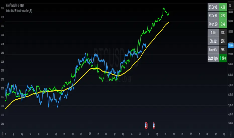
Durdens Global M2 Liquidity Tracker🧠 Durdens Global M2 Liquidity Tracker | Bitcoin vs Liquidity, Visualized
If you’re not watching global liquidity, you’re not really trading macro.
This indicator tracks FX-adjusted M2 money supply across 20+ countries, aggregated into a single global liquidity signal. It can then be used to overlay against Bitcoin for timing macro shifts with precision.
🔍 Core Features:
🌐 USD-adjusted M2 from the US, China, Eurozone, UK, Japan, and more
📊 Normalization modes: None (raw), Index (Based to 100), Z-Score
⏳ Offset input to shift liquidity data forward — aligns with Bitcoin's delayed reaction (84–107 days common)
🧠 BTC correlation matrix: 30D, 90D, 365D correlation values
🧪 Top 3 M2 delta signals: Tracks 90-day % change for US, China, EU
🧮 Fibonacci SMAs: 13 / 34 / 89 for structural macro context
🟢🔴 Liquidity regime engine: EMA 89 defines "Risk-On" vs "Risk-Off" states
🧩 How It Works:
Each country’s M2 is multiplied by its FX rate (to USD) and summed into a single global M2 line. This ensures comparability across nations. The user can choose to:
Normalize the output (raw, indexed, or z-scored)
Shift the global M2 forward in time (offset), simulating the lag effect liquidity has on Bitcoin
Visualize macro risk conditions using EMA 89 as a liquidity regime filter
Analyze BTC correlation across 3 windows and track key regions’ M2 delta
❓ FAQ:
Why does this matter?
M2 is the monetary fuel behind asset bubbles. When liquidity rises, Bitcoin follows; with a delay. This tracker helps you front-run macro flows before they hit the chart.
Why use Index or Z-Score modes?
Raw values skew long-term visual analysis. Index mode rebases data for comparative trend tracking. Z-Score shows when liquidity is overheated or suppressed (mean reversion).
What does the offset input do?
Liquidity doesn’t hit Bitcoin instantly. Many traders use an 84–107 day forward shift to align M2 changes with BTC price action. The offset helps you visualize this.
Why track top 3 M2 regions?
US, China, and Eurozone are the heavyweights in global liquidity. Tracking their offset-day % change gives immediate insight into capital expansion or contraction.
Can I use this to trade?
Absolutely; but it’s best used as a macro filter. Combine with price structure, funding, or on-chain data to optimize timing and conviction.
⚡ Use Cases:
Spot early pivots in liquidity regimes (Risk-Off to Risk-On)
Quantify macro backdrop for Bitcoin or altcoin cycles
Understand when the Fed or PBOC are tightening or easing
Ditch the hopium. Trade with context.
—
Built by: @DurdensBitcoinLedger
Follow for updates — future upgrades include:
• Regional toggles
• Custom M2 baskets
• Alert conditions
• Continued revisions & updates
Stay liquid, not wrecked.
Korea M2 Liquidity Index💡 Korea M2 Liquidity Index
- This indicator visualizes Korea's M2 liquidity trends, designed to help both domestic and global investors easily understand the overall money supply situation in the Korean economy.
- In particular, by comparing it with the KOSPI index, investors can assess the equity market level relative to liquidity, allowing for a more precise valuation analysis to determine whether the Korean stock market is overvalued or undervalued.
✅ What is M2?
- M2 is a broad measure of money supply, which includes cash, demand deposits, savings deposits, and certain financial products.
- It serves as a crucial macroeconomic indicator that reflects the overall liquidity and capital supply in the Korean economy.
💰 KRW and USD display options
- KRW basis: Displays the total M2 amount in Korean won (in trillion units).
- USD basis: Converts the total M2 amount into US dollars using the KRW/USD exchange rate(KRW/USD) making it useful for global investors or those analyzing in USD terms.
📊 Display style and interpretation
- Users can freely choose to display Korea’s M2 and liquidity index and turn them on or off as needed.
- The index is simplified and displayed in trillion won units, allowing for an intuitive view of long-term trends and structural changes.
- The Offset (days) feature enables temporal adjustments, making it easier to compare this indicator with other economic or financial data series.
🌏 Example use cases
- Domestic policy analysis: Analyze the correlation between Bank of Korea's monetary policy changes (base rates, liquidity injections, etc.) and M2 growth.
- FX and global capital flow analysis: Understand the relationship between KRW/USD exchange rate fluctuations and changes in domestic liquidity.
- Leading indicator for asset markets: Use it as a forward-looking signal for stock, real estate, and bond markets.
- Comparison with KOSPI index: Identify gaps between liquidity and market levels to support strategic investment decisions and evaluate market capitalization levels more precisely.
copyright @invest_hedgeway
============================================================
💡 Korea M2 Liquidity Index
- 이 지표는 대한민국의 M2 유동성 흐름을 시각화하여, 국내 및 글로벌 투자자들이 한국 경제의 자금 공급 상태를 한눈에 파악할 수 있도록 설계되었습니다.
- 특히 코스피 지수와 비교 분석함으로써 유동성 대비 주가지수 수준을 평가하고, 한국 증시의 상대적 고평가·저평가 여부를 판단해 보다 정교한 밸류에이션 분석에 활용할 수 있습니다.
✅ M2란?
- M2는 광의통화 지표로, 현금 + 요구불 예금 + 저축성 예금 + 금융상품(일부) 등을 포함하는 총 유동성을 의미합니다. 이는 한국 경제의 자금 공급 상태를 나타내는 중요한 거시경제 지표로 활용됩니다.
💰 KRW 및 USD 표시 선택
- KRW(원화) 기준: 한국 원화 기준으로 M2 총액(조 단위)을 나타냅니다.
- USD 기준: M2 총액을 환율(KRW/USD) 기준으로 달러화 환산 후 표시하여, 글로벌 투자자나 달러화 기준 평가 시 활용 가능합니다.
📊 표시 방식과 해석
- 사용자는 한국의 M2와 유동성지수를 자유롭게 선택해 원하는 방식으로 켜거나 끌 수 있습니다.
- 지표는 조원(Trillion won) 단위로 단순화해 표시되며, 장기 흐름과 추세 변화를 시각적으로 확인할 수 있습니다.
- Offset (days) 기능을 통해 시리즈를 시차 조정할 수 있어, 다른 경제 지표와의 비교 분석에 유용합니다.
🌏 활용 예시
- 국내 정책 분석: 한국은행의 통화정책 변화(기준금리, 유동성 공급 등)와 M2 증가율 간 상관성 분석.
- 환율 및 글로벌 자금 흐름 분석: 원/달러 환율 변동과 유동성 간 상관관계 파악.
- 주식, 부동산, 채권 등 자산시장 선행 지표로서 활용.
- 코스피 지수와의 비교 분석: 시장 유동성과 지수의 괴리를 파악하여 전략적 투자 판단과 시가총액 수준에 대한 평가에 활용.
copyright @invest_hedgeway

Liquidity Rush:VSMarkettrend Liquidity Rush (LR) Indicator – Market Move Detector
🔍 What is Liquidity Rush?
The Liquidity Rush (LR) indicator detects the flow of big money (institutional or high-volume traders) into a stock over a selected time frame. It visually represents the net liquidity inflow/outflow and compares it with the stock's total market capitalization (MC) to give you a contextual view of its significance.
📊 Indicator Output:
You’ll see a label like:
250.07 Cr / 0.23%MC
250.07 Cr → Liquidity change (buy/sell impact) in the selected timeframe.
0.23%MC → This liquidity is 0.23% of the stock’s market cap.
This helps you judge:
Whether the move is impactful or just noise.
If smart money is likely entering or exiting.
⚠️ Why % of Market Cap?
Volume or liquidity alone doesn't tell the full story. 100 Cr inflow in a 5,000 Cr company is significant (2%), but the same in a 50,000 Cr company is not impactful (0.2%). That’s why this indicator shows LR as a % of MC — to give you contextual importance.
🟢 When is it Powerful?
If LR % > 2% of market cap consistently → Strong entry signals likely from big players.
If LR jumps suddenly after a dull phase → Watch for breakout or reversal.
🎨 Color Coding (Based on Liquidity Amount):
<10 Cr → Low (likely retail-driven)
>10–20 Cr → Moderate (watchful)
>20–100 Cr → Heating up
>100 Cr → High liquidity activity (possible institutional move)
📅 Best Timeframes:
Use it on Daily, Weekly for quick flow detection.
Combine with price action or volume for confirmation.
Use Cases:
Identify breakouts with backing.
Filter fake moves with weak liquidity.
Spot smart money entry before price jumps.
Note : It does not means that stock with low LR are bad and not move, many stock move with low LR also, This indicator need not to be used in isolation.

Liquidity Levels (Smart Swing Lows)Liquidity Levels — Smart Swing Low Detection
Efficient Liquidity Sweep Visualization for Smart Money Traders
This script automatically identifies and plots liquidity-rich swing lows based on pivot logic, filters them to remove redundant levels, and overlays daily highs/lows for added context — giving Smart Money Concept (SMC) traders a clean, actionable map of liquidity.
It’s designed to be minimal yet powerful: perfect for spotting potential liquidity grabs, mitigation zones, and sweep targets with zero chart clutter.
🔍 What This Script Does:
Detects Smart Swing Lows
Uses fixed pivot detection (left = 3, right = customizable) to identify structurally significant swing lows.
Filters out swing lows that are too close together using a percentage-based spacing threshold to reduce noise.
Mitigation Cleanup Logic
Tracks whether recent price action breaches past swing lows.
If breached, the swing level is automatically removed, keeping only relevant, unmitigated liquidity levels on your chart.
Plots Daily Highs and Lows
Each new trading day, horizontal rays mark the prior day’s high and low — useful for identifying resting liquidity and possible sweep zones.
Labeling and Style Customization
Optional labels for swing lows.
Full control over label size, color, and visibility to match any chart aesthetic.
Timeframe Filtering
Runs exclusively on 5m, 10m, and 15m charts to ensure optimal reliability and signal clarity.
⚙️ Customization Features:
Pivot sensitivity (Right side control)
Minimum distance between swing lows (in %)
Label visibility, size, and color
Line width and colors for both swing levels and daily highs/lows
Mitigation cleanup lookback length
💡 How to Use:
Add the script to a qualifying intraday chart (5–15m).
Use the swing low levels to monitor liquidity-rich zones.
Combine with your personal strategy to identify liquidity grabs, potential reversal zones, or entry points following a sweep.
Let the built-in cleanup logic remove any already-mitigated levels so you can focus on active targets.
🚀 What Makes It Unique:
This isn’t just another pivot plotter — it’s a smart, self-cleaning SMC tool designed for modern liquidity-based trading strategies.
A must-have for traders using concepts like liquidity grabs, mitigation blocks, or sweep-to-reverse trade models.
🔗 Best used in combination with:
✅ First FVG — Opening Range Fair Value Gap Detector: Pinpoint the day’s first imbalance zone for intraday setups.
✅ ICT SMC Liquidity Grabs + OB + Fibonacci OTE Levels: Confluence-based entries powered by liquidity logic, order blocks, and premium/discount zones.
Used together, these scripts form a complete Smart Money toolkit — helping you build high-probability setups with confidence, clarity, and clean charts.
[TTI] Fed Net Liquidity Indicator📜 ––––HISTORY & CREDITS
The Fed Net Liquidity Indicator is a tool developed after reading Max Anderson's twitter thread. This indicator is based on the calculation of the Fed's balance sheet, the Treasury General checking account, and what banks are parking at the overnight repo window at the Fed. The net of these three components gives us the net liquidity available to the markets, which is considered the fuel behind market moves.
🎯 ––––WHAT IT DOES
The Fed Net Liquidity Indicator provides a visual representation of the net liquidity levels in the market. It plots the SPX along with blue shading that represents the net liquidity levels. It also includes risk on/risk off signals and a fair value line that measures whether the market is overbought or oversold compared to the net liquidity readings.
The indicator also includes two levels for overbought and oversold conditions. The "short/hedge" level indicates that the market is becoming overbought and it's time to reduce risk-on positions. The "euphoric" level indicates extreme overbought conditions and it's time to actively short the market or exit. On the other side, the "bounce" line indicates oversold conditions and a potential short-term pop, while the "capitulation" level indicates extreme oversold conditions and a potential for a significant bounce.
🛠️ ––––HOW TO USE IT
To use the Fed Net Liquidity Indicator, you first need to set it up on your chart. Once set up, you can use it to guide your trading decisions based on the net liquidity levels, risk on/risk off signals, and the fair value line.
👉Follow the net liquidity levels: The market generally follows the net liquidity. If the liquidity is increasing, the market tends to go up, and if the liquidity is decreasing, the market tends to go down.
👉Pay attention to risk on/risk off signals: These signals can help you understand the market environment and adjust your positions accordingly. A risk-on signal indicates a good time to expose yourself to the market and go long on risk assets like stocks and crypto. A risk-off signal indicates that it's time to exit the market, hedge your positions, or go short.
👉Use the fair value line: This line can help you determine whether the market is overbought or oversold compared to the net liquidity readings. If the market is rising steeply but the liquidity is not confirming that, it could indicate overbought conditions. Conversely, if the market is falling but the liquidity is not confirming that, it could indicate oversold conditions.
👉Consider the overbought and oversold levels: These levels can help you identify potential tops and bottoms in the market. If the market reaches the short/hedge level, it's time to reduce risk-on positions. If it reaches the euphoric level, it's time to actively short the market or exit. On the other side, if the market reaches the bounce line, it could indicate a potential short-term pop. If it reaches the capitulation level, it could indicate a potential for a significant bounce.

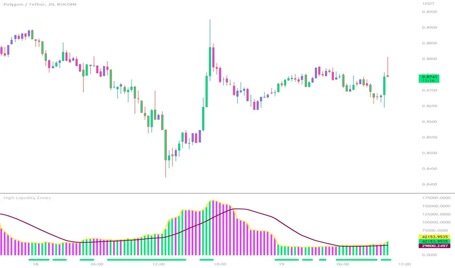
High Liquidity Zones and Threshold VolumeThe High Liquidity Zones indicator is designed to identify areas of significant liquidity in the market. It helps traders recognize regions where trading volume is notably higher, indicating potential areas of increased market activity and interest.
The indicator calculates the average volume over a specified lookback period, which can be customized according to individual preferences. This average volume acts as a reference point to determine the threshold volume level. The threshold percentage input allows users to set the sensitivity of the indicator, defining the minimum volume required for an area to be considered a high liquidity zone.
When the current volume surpasses the threshold volume level, the indicator highlights these areas as high liquidity zones. This visual representation allows traders to quickly identify and focus on periods of heightened trading activity. The high liquidity zones are marked with square shapes below the histogram, providing a clear visual indication on the chart.
The first plot line represents the threshold volume level as a histogram, showing the volume levels in relation to the threshold. This histogram helps traders assess the magnitude of the volume in the identified high liquidity zones.
The second plot line represents the threshold volume's simple moving average (SMA) over the lookback period. The SMA acts as a reference line, smoothing out fluctuations in the threshold volume and providing a more stable measure of high liquidity zones. Traders can use this line to better understand the overall trend and dynamics of liquidity.
The High Liquidity Zones indicator offers flexibility, allowing traders to adapt it to their preferred trading style and timeframe. By adjusting the lookback period and threshold percentage, users can fine-tune the sensitivity of the indicator based on their trading strategies and market conditions.
Furthermore, traders can combine the High Liquidity Zones indicator with other technical analysis tools to confirm trading signals or identify areas of potential support and resistance. It can help them locate price levels where market participants have a substantial presence and where significant buying or selling pressure may occur.
Overall, the High Liquidity Zones indicator is a valuable tool for traders seeking to gain insights into market liquidity dynamics. By highlighting areas of intense trading activity, it assists in making informed trading decisions and identifying opportunities within the market.
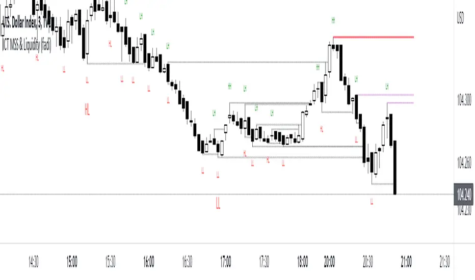
ICT MSS & Liquidity (fadi)ICT MSS & Liquidity indicator calculates two pivot points and the most likely location of the liquidity. The two pivot points are called Major and Internal. Both can be configured and adjusted separately to suit the instrument being traded and how the trader prefers to trade.
Major Trend
Major Trend is usually a better indicator of the trend direction. This is because it encapsulates longer period and allows for price fluctuation reducing the number of false Market Structure Shifts (MSS).
There is no set numeric value for the Pivot Length (number of bars used to calculate the high and low points). The pivot length is a judgement call by the trader and can be adjusted to what the trader feels comfortable with.
In the image above, a trader can see that the Major trend is making lower low move where it has swept liquidity (dotted line) and has the potential to reverse direction, if higher timeframe provides supporting evidence.
Internal Trend
Internal Trend is usually used to identify an internal shift in market structure that may, but not guaranteed, indicates that the Major Trend's current leg movement is about to reverse direction. It is not an indicator in itself that the overall Major trend is about to make major change in direction.
For example, if the Major trend is showing Lower Lows and Lower Highs, a higher high on the Internal Trend could simply mean that the Major Trend is done with a Lower Low move and about to make a lower high move and not sweep the liquidity above the previous lower high. If, however, the larger picture indicates that the Major Trend has reached a potential reversal point, the Internal Trend could be used to corroborate that thesis by forming the higher high.
In the image above, the internal trend provides an indication that a market structure shift is probably under way and, if proper analysis performed, a position can be entered.
Liquidity
Liquidity rests above highs and lows on both Major and Internal trends. The indicator will draw both open and claimed liquidity lines. Price tends to move towards liquidity and, if enabled, the indicator provides an easy way to identify potential targets. Liquidity could be drawn on both Major and Internal Trends.
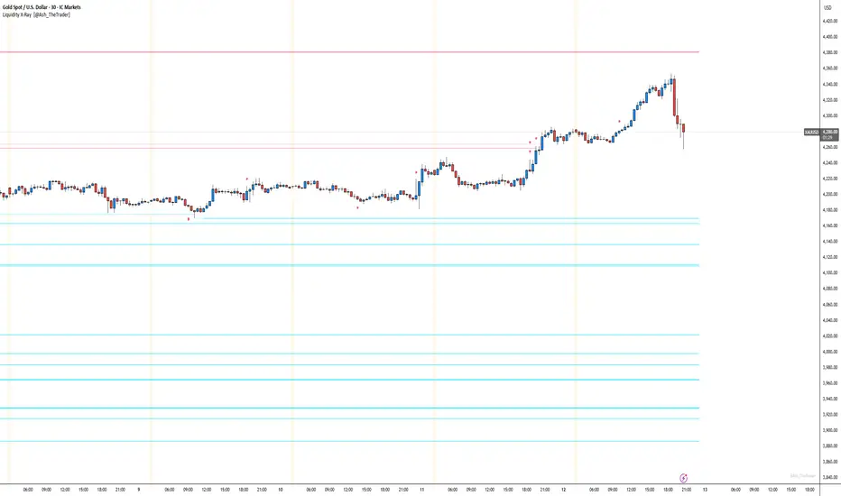
See Where The Banks Are Hunting: Liquidity X-Ray[@Ash_TheTrader]# 🛑 Stop Being "Liquidity." Start Seeing the Trap.
### Introducing: **Liquidity X-Ray **
How many times have you placed your stop-loss just below a perfect support level, only to watch a single candle wick down, trigger your stop, and immediately reverse toward your original target?
You weren't unlucky. You were targeted.
Welcome to the world of Smart Money Concepts (SMC). In the institutional game, your stop loss isn't protection—it's fuel. The market makers need liquidity to fill huge orders, and they find it clustered at obvious swing highs and lows.
I developed the **Liquidity X-Ray** to stop guessing where these traps are laid. This isn't just another support and resistance tool; it’s a dynamic, living heatmap of market psychology.
---
### 🧠 The Philosophy: The "Time-Decay" Algorithm
Standard indicators draw static lines that clutter your chart. The **Liquidity X-Ray** is different. It understands that *time* is a crucial factor in building liquidity pressure.
I have engineered a unique **Time-Decay Intensity** feature into this script. It visualizes the density of resting orders based on how long a level has remained untouched.
#### The Visual Language:
* **👻 The Ghosts (New Zones):** When a new swing high or low forms, a faint, transparent zone appears. It’s watching.
* **💡 The Neon Traps (Mature Zones):** As time passes and price fails to revisit that level, the zone solidifies. It becomes brighter, more opaque, and intensely neon. **This is your signal.** A bright neon zone means a massive pile of retail stop-losses has accumulated there. The Banks *need* to visit it.
* **💥 The Sweep Explosion:** When price finally pushes into a mature zone, the script detects the "Liquidity Grab." The box flashes bright white, cuts off immediately, and prints a **💥 LIQ GRAB** label on your chart. The trap has been sprung.
---
### ⚙️ Key Features & Cyberpunk Aesthetics
This tool is designed to look incredible on dark charts while providing institutional-grade data.
* **Dynamic Buyside/Sellside Heatmaps:** Clear visual distinction between where shorts are trapped (Neon Red/Pink) and where longs are trapped (Neon Cyan).
* **Smart Memory Management:** The script intelligently manages old zones to ensure your chart *never* lags, regardless of the timeframe.
* **Volume Filtering (Optional):** You can choose to only plot zones formed on high-volume pivot points, ensuring you are only watching significant market structures.
* **Instant Alerts:** Set alerts for the "Sweep Explosion" so you never miss a major reversal setup.
---
### 🎯 How to Trade the X-Ray
**Do NOT trade the breakout of these zones.** These are traps.
1. **Identify the Target:** Look for the oldest, brightest, most solid neon zones on your timeframe (H1 and H4 are powerful).
2. **Wait for the Hunt:** Be patient. Let price aggressively move toward the zone.
3. **The Explosion:** Wait for the candle to wick into the zone and trigger the **💥 LIQ GRAB** visual.
4. **The Reversal Entry:** Once the liquidity is taken, look for lower timeframe confirmation (like a Change of Character or engulfing candle) in the *opposite* direction. You are now trading *with* the smart money recovery, not *against* their stop hunt.
---
### Author's Note
Trading is about information asymmetry. The institutions have seen your stops for decades. It’s time you started seeing where they are hunting.
Trade smart, stay safe.
— **@Ash_TheTrader**
Fed Net Liquidity [Premium] [by Golman Armi]This indicator visualizes the USD Net Liquidity injected into the financial system by the Federal Reserve.
It is a fundamental macro-economic tool essential for understanding the underlying "fuel" driving risk assets such as the S&P 500 (SPX), Nasdaq (NDX), and Bitcoin (BTC).
Unlike many other liquidity scripts that incorrectly use Commercial Bank Assets (USCBBS), this script uses the Federal Reserve Total Assets (WALCL) to provide a mathematically accurate representation of Central Bank liquidity.
How It Works (The Formula)
Net Liquidity represents the actual cash available to the banking system for investment after government liabilities are subtracted. The formula used is:
NetLiquidity=WALCL−TGA−RRP
Where:
WALCL (Fed Balance Sheet): The total assets held by the Federal Reserve (The source of money printing).
TGA (Treasury General Account - WTREGEN): The checking account of the US Government. When the TGA goes up, money is removed from the economy; when it goes down, money is spent into the economy.
RRP (Reverse Repo - RRPONTTLD): Cash parked by banks and money market funds at the Fed overnight. A rise in RRP removes liquidity from the markets.
Features
Accurate Data Sourcing: Pulls daily data directly from FRED (Federal Reserve Economic Data).
Unit Correction: Automatically adjusts conflicting units (Millions vs Billions) from TradingView data feeds to output a correct value in Trillions of Dollars.
Trend Cloud: Features a smoothing EMA (Exponential Moving Average) with a color-coded cloud to easily identify the macro trend (Green for expansion, Red for contraction).
How to Use
Trend Correlation:
Rising Line (Green): Liquidity is expanding. Historically, this supports bullish trends in stocks and crypto.
Falling Line (Red): Liquidity is being drained (QT or TGA refill). This often leads to volatility or bearish trends in risk assets.
Divergences (The most powerful signal):
If the S&P 500 or Bitcoin makes a New High, but Net Liquidity makes a Lower High, it indicates a "hollow rally" lacking fundamental support, often preceding a correction.
Disclaimer
This tool is for educational purposes and macro-economic analysis only. It is not financial advice.

Zero Lag Liquidity [AlgoAlpha]🟠 OVERVIEW
This script plots liquidity zones with zero lag using lower-timeframe wick profiles and high-volume wicks to mark key price reactions. It’s called Zero Lag Liquidity because it captures significant liquidity imbalances in real time by processing lower-TF price-volume distributions directly inside the wick of abnormal candles. The tool builds a volume histogram inside long upper/lower wicks, then calculates a local Point of Control (POC) to mark the price where most volume occurred. These levels act as visual liquidity zones, which can trigger labels, break signals, and trend detection depending on price interaction.
🟠 CONCEPTS
The core concept relies on identifying high-volume candles with unusually long wicks—often a sign of opposing liquidity. When a large upper or lower wick appears with a strong volume spike, the script builds a histogram of lower-timeframe closes and volumes inside that wick. It bins the wick into segments, sums volume per bin, and finds the POC. This POC becomes the liquidity level. The script then dynamically tracks whether price breaks above or rejects off these levels, adjusts the active trend regime accordingly, and highlights bars to help users spot continuation or reversal behavior. The logic avoids repainting or subjective interpretation by using fixed thresholds and lower-TF price action.
🟠 FEATURES
Dynamic liquidity levels rendered at POC of significant wicks, colored by bullish/bearish direction.
Break detection that removes levels once price decisively crosses them twice in the same direction.
Rejection detection that plots ▲/▼ markers when price bounces off levels intrabar.
Volume labels for each level, shown either as raw volume or percentage of total level volume.
Candle coloring based on trend direction (break-dominant).
🟠 USAGE
Use this indicator to track where liquidity has most likely entered the market via abnormal wick events. When a long wick forms with high volume, the script looks inside it (using your chosen lower timeframe) and marks the most traded price within it. These levels can serve as expected reversal or breakout zones. Rejections are marked with small arrows, while breaks trigger trend shifts and remove the level. You can toggle trend coloring to see directional bias after a breakout. Use the wick multiplier to control how selective the detector is (higher = stricter). Alerts and label modes help customize the signal for different asset types and chart styles.
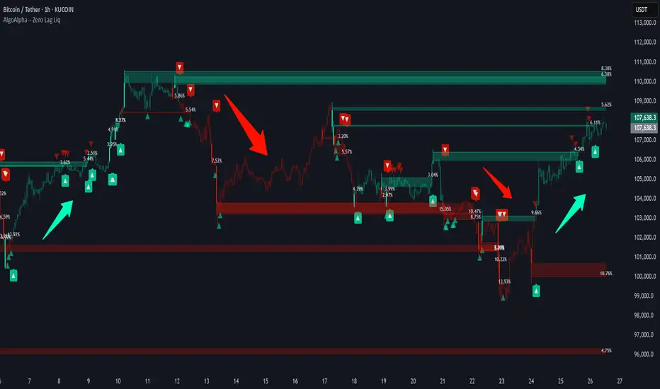
Liquidity Zones Alerts"Liquidity Zones Alerts" is a powerful smart-money-based indicator designed to detect key liquidity grabs and provide high-probability reversal signals using a combination of market structure, volume, volatility, and candlestick confirmation.
🧠 How It Works
The core logic of this indicator is built around the Smart Money Concepts:
🔺 Liquidity Sweeps: Detects when price takes out previous daily or weekly highs/lows, suggesting stop hunts or engineered liquidity moves by institutional players.
📈 Volume Filter: Ensures signals only appear during above-average volume, filtering out noise and low-interest moves.
⚡ Volatility Filter: Flags high-range candles relative to the average, catching flash crashes/spikes that often precede strong reversals.
🔄 Engulfing Candle Confirmation: Confirms entry with a bullish or bearish engulfing pattern after liquidity is taken — increasing signal reliability.
🧭 Premium/Discount Zone Logic: Trades are filtered to ensure longs are only taken in discount zones, and shorts in premium zones, using a 20-period market range for context.
📌 Features
✅ Daily & Weekly liquidity zones toggle
✅ Visual signals with clean 🔻(short) & 🔺(long) arrows
✅ Auto-detection of flash crashes
✅ Alerts on both long and short setups
✅ Optional previous high/low level plotting for context
✅ Background highlighting of valid signal candles
✅ Multi-timeframe friendly and compatible with any asset
🛠️ Use Case
Whether you're a scalper or a swing trader, this tool helps you spot institutional entry zones before the move happens. It works especially well when combined with your existing bias or supply/demand zones.
💬 “Price doesn't move randomly — it hunts liquidity. This indicator shows you where and when it happens.”
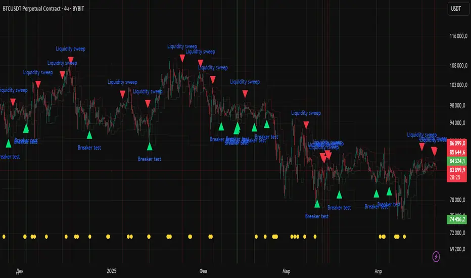
itradesize /\ Previous Liquidity x ICTI’d like to introduce a clean and simple RTH gap and liquidity levels indicator with additional Asian and London ranges, along with standard deviation levels and many customizable options.
Previous D/W/M highs and lows are areas where liquidity tends to accumulate. This is because many traders place stop-loss orders around these levels, creating a concentration of buy stops above the previous day's high and sell stops below the previous day's low. High-frequency trading algorithms and institutional traders often target these areas to capture liquidity.
What the indicator could show in summary?
- Regular trading hours gap with deviations
- Asia with deviations (lines or boxes)
- London with deviations (lines or boxes)
- Weekdays on chart
- 3 AM candle marker
- Previous D/W/M levels
- Important opening times (08:00, 09:30, 10:00, 14:00, 00:00, 18:00)
- Daily separators
By marking out the previous day's highs and lows, traders can create a framework for their trading day. This helps in identifying potential setups and understanding where significant price action might occur. It also aids in filtering out noise and focusing on the most relevant price levels.
These levels can also act as potential reversal points. When the market reaches a previous high or low, it might reverse direction, especially if it has raided the liquidity resting there. This concept is part of a strategy where traders look for the market to raid these levels and then reverse, providing trading opportunities
The indicator shows previous liquidity levels on a daily, weekly, and monthly basis. It also displays opening times at 8:30, 9:30-10:00, 14:00-00:00, and 18:00. Opening times are crucial in trading because they help define specific periods when market activity is expected to be higher, which can lead to better trading opportunities. The script has been made mostly for indices.
You can create various entry and exit strategies based on the indicator. Please remember, that adequate knowledge of ICT is necessary for this to be beneficial.
You might wonder why only these times are shown. This is because these are the times when the futures market is active or should be active. It's important to note that opening times can vary between different asset classes.
18:00 A new daily candle open
00:00 Midnight open
02:00 New 4-hour candle open
08:30 High-impact news
09:30 NY Equities open
10:00 New 4-hour candle open
The concept of "Asian Killzone Standard Deviations" involves using the Asian trading session's price range to project potential price movements during subsequent trading sessions, such as the London or New York sessions. This is done by calculating standard deviations from the Asian range, which can help traders identify potential support and resistance levels.
You can create a complete model by exclusively focusing on the Asian time zone. Deviations within this zone may have varying impacts on future price movements, and the Interbank Price Delivery Agreement (IPDA) often reflects Asia's high, close, and low prices.
A similar approach can be taken with the London time zone. The standard deviation levels within each zone could potentially serve as support or indicate reversals, including liquidity hunts. It's important to backtest these ideas to gain reliable insights into when and where to apply them.
* Asian Range: This is the price range established during the Asian trading session. It serves as a reference point for calculating standard deviations.
* London Range: The same applies to the London range as well. Combine standard deviation projections with other technical analysis tools, such as order blocks or fair value gaps, to enhance accuracy.
* Standard Deviations: These are statistical measures that indicate the amount of variation or dispersion from the average. In trading, they are used to project potential price levels beyond the current range.
You can also use regular trading hours gap as a standalone model. The 4 STDV and 2.5 STDV levels are important for determining the high or low of the current price action.
The RTH gap is created when there is a difference between the closing price of a market at the end of one trading day and the opening price at the start of the next trading day. This gap can be upward (gap higher), downward (gap lower), or unchanged. It is significant because it often indicates market sentiment and can create inefficiencies that traders look to exploit.
Alternatively, you can combine these elements to create a complete strategy for different scenarios.
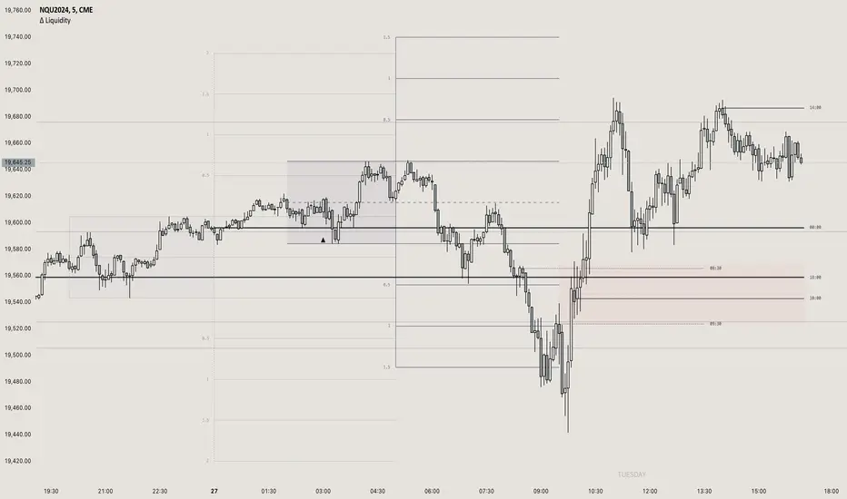
[WRx450] FED net liquidityThis indicator show the net liquidity of the FED.
Net liquidity = Fed balance sheet (total asset) - Treasury General Account - Reverse Repo
All sources can be select otherwise in parameter.
It is possible to show only the weekly changes in Net liquidity.
Net liquidity and Net liquidity changes are shown only on wednesday because Total asset and TGA reports are updated only on Wednesday. (updating the Net liquidity on a daily basis would be inacurate)