Momentum CloudThis is a modified Ichimoku Cloud:
-The default Lookback-Length and Displacement settings have been modified to operate optimally on 24/7 markets - which is popular among Crypto analysts.
-The Lagging Span, Base Line, and Conversion Line have been removed - leaving just the bare cloud.
-Additionally, the Cloud's color will shift blue when it is compressed. (More specifically - when Leading Span A retreats to Leading Span B, the color changes.)
This allows the user to easily identify when the Cloud is "thinning", either to the upside, or the downside.
Being that the "spread" or "width" of an Ichimoku Cloud generally gauges it's efficacy as potential Support or Resistance, this tool is particularly useful for highlighting when momentum is weakening.
*This script will be updated in the future to allow the user to view the Momentum Cloud of alternate time-frames! (e.g, Viewing the 1D Momentum Cloud on the 1H timeframe)
Cari dalam skrip untuk "momentum"

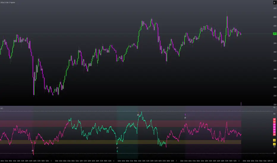
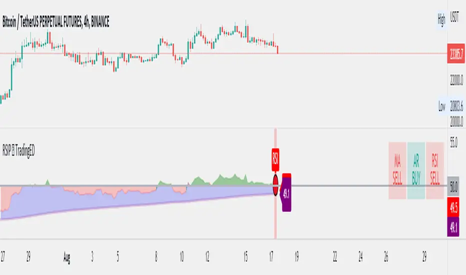
RSI Performance - TradingEDThis case study is based on a previous RSI study, but with three different counts to compare different trends. The use of this indicator is restricted to private use, and it can be used only by invitation. Different functionalities have been added to the original code, such as alerts and signals that seek to make trading much easier to interpret by any type of trading operator of any experience level, from beginner to intermediate and advanced .
Key components of the original indicator:
● The Relative Strength Index ( RSI ) is a popular momentum oscillator developed in 1978.
● The RSI provides technical traders signals about bullish and bearish price momentum, and it is often plotted beneath the graph of an asset's price.
● An asset is usually considered overbought when the RSI is above 70% and oversold when it is below 30%.
It is a momentum indicator used in technical analysis that measures the magnitude of recent price changes to assess overbought or oversold conditions in the price of an asset. The RSI is displayed as an oscillator (a line chart moving between two extremes) and can read from 0 to 100. Overbought does not necessarily mean that the price will reverse lower, just as oversold does not mean that the price will reverse higher. Rather, the overbought and oversold conditions simply alert traders that the RSI is near the extremes of its recent readings.
Main functions of this modified indicator:
1) The SOURCE for the counts can be determined by the trader (close, open, etc).
2) You can select the type of MOVING AVERAGE, among many available options ( SMA , EMA , DEMA , HMA , etc.)
3) The MEASURE can be based on a CANDLES count if you are trading OHLC Charts from 1D onwards, or if your trading is intraday, you can also select counts by MINUTES, HOURS or DAYS, depending on your trading style.
4) LENGTH, by default it will be loaded as in the STRATEGY, but considering the previous point, you can modify it according to your convenience.
5) You have the option to hide or show a LABEL at the top of the chart, with respect to the signals: BULLISH green, BEARISH red.
Main performance functions of this modified indicator:
I) In the case of the PERFORMANCE that appears at the right of the chart, you have the option to adjust the WIDTH of each box.
II) The TEXT of the PERFORMANCE is not modifiable, but you can customize the default color. *
III) The BACKGROUND of the PERFORMANCE, you can customize the default color. *
IV) You have the option to hide or show a PERFORMANCE that appears at the right of the chart.
Main functions to customize the style of this indicator:
a) You can select the color for the ADJUSTED LEVEL and for the MOVING AVERAGE, with the colors that best suit you.
b) The CROSSOVER/CROSSUNDER signal between the MOVING AVERAGE and the ADJUSTED LEVEL can also be customized. *
c) For any type of SIGNAL, it is painted as a VERTICAL LINE in the graph, you can change the color that comes by default. *
d) In the case of the LABEL that appear at the top, the text is not modifiable, but you can customize both the type of label and change the default color. *
e) You can select the color for OVERVALUED and for UNDERVALUED levels, with the colors that best suit you.
f) You can select the colors for the BACKGROUND of the indicator according to the trend, whether it is BEARISH or BULLISH, with the colors that best suit you. *
* By default, they are marked as red for downtrends and green for uptrends.
Momentum Trader + Trinity LinesThis is an updated version of the 'Momentum Trader' by user ProfitProgrammers + the 'Bollinger Bands %b & RSI & Stochastic Smoothed Indicator & Alert' by the user Zamboniman.
Links to those original scripts are below:
script/7S49kLWh-Bollinger-Bands-b-RSI-Stochastic-Smoothed-Indicator-Alert/
script/OMULR9es-Momentum-Trader/
The only real updates are so that it works on Version 4 of pinescript and some color and visual updates that makes these two scripts work well together. This must be used on normal candles and not HA or any other types or you can get misleading entry / exit points.
Here is some info about this indicator and the moving parts within it:
Chande Momentum Oscillator:
-Measures trend strength, with higher absolute values meaning greater strength.
-Also tracks divergence. When price increases, but is not accompanied by an increase in Chande Momentum Oscillator values, it signifies bearish divergence and a reversal is likely to follow.
-Shown as the teal and pink histogram.
Percentage Price Oscillator:
-Similar to the MACD , except that it expresses the difference between the two moving averages in terms of a percentage. This makes it a little easier to visualize.
-PPO values greater than zero indicate an uptrend, as that means the fast EMA is greater than the slow (and vice versa).
Trinity Lines:
-These 3 colored lines at the top are RSI + normalized Bollinger Band &b + normalized smoothed Stochastic.
-A confirmation entry for a long is when the lines are in the order from top to bottom of Green Yellow Red.
Entry and Exit Conditions:
Enter When:
1) Chande Momentum crosses over zero from negative to positive territory. AND
2) Chande Momentum is rising(positive slope). AND
3) Trinity lines are Green, Yellow, Red (Top to bottom)
Exit When:
1) Chande Momentum is greater than the upper line. AND
2) PPO has a negative slope. AND
3) Trinity lines are Red, Yellow, Green (Top to bottom)

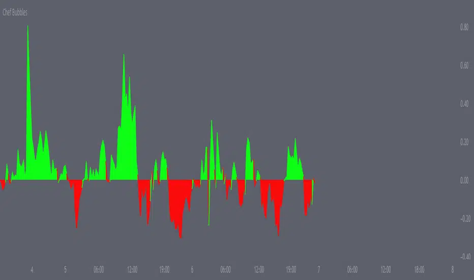
Chef BubblesThis is an enhanced version of Momentum indication Ways that shows 2 ways to calculate momentum and display each one along with their combined average value.
Essentially I've matched the momentum from the lower time frames together to determine when we are getting a push, amazing for scalps, I use it for everything.
Alongside this, I also made sure to add the currency's strength pretty much embedded within the momentum indicator , thus giving you the best momentum indication you can get a good entry point majority of the time if used right. I recommend matching this with my moving average crossover pair.
Effective Divergence Indicator
What is EffDI?
Effective Divergence Indicator(EffDI) is a modified Momentum indicator designed to detect divergences in stocks, futures, forex, and crypto, just to name a few.
How does it work?
It uses the EMA of daily velocity.
Isn't this the same as Momentum
No. Momentum compares the price x days ago, while this takes the EMA of the daily velocity.
Why is it better than momentum in detecting divergence?
Because it uses an EMA, an EMA gives weight to the latest prices. I don't know how to explain the logic behind this, but it works :)
ok,ok, I get it, but how do I use it to buy, sell, and get a ton of profits?
Refer to the diagram below.
Steps:
Step 1: Locate the divergence(marked A,B,C and D): no divergence, no trade.
Step 2: Locate the last EffDI high. Mark that E.
Step 3(entry): Buy when price goes above E. For shorts, Short Sell when price goes below E.
Step 4(exit): Exit position when another divergence is detected,
OR
When A new Lower Low is formed.
As you can see, if you follow the steps, there is a good chance the profits will come to you. Cheers!
DO YOU WANT MORE GOOD INDICATORS LIKE THESE TO IMPROVE YOUR TRADING? Then, make sure to follow @Trader_ph (or i will eat all of your cookies)
Feel free to use my code below, BUT make sure to credit me if you make any modifications. :)

Trend Oscillator (Expo)Trend Oscillator (Expo) measures the overall trend strength and how strong the current price move/momentum is. The indicator is leading since it can signal a possible trend change that is yet to start. The color of the histogram and its value helps to gauge the strength and momentum of the trend.
The user can enable Bar Color that coloring the candlesticks based on the trend strength.
The user can choose between different trend calculations, such as smoothed trend, volume-weighted trend, a non-lagging trend, to mentions a few.
DIVERGENCES
All types of oscillators produce divergences and so does Trend Oscillator (Expo). Divergences occur when the oscillator deviates from the trending price action. Bullish divergence is then when the trending price makes a lower low but the oscillator makes a higher low. Bearish divergence is then when the trending price makes a higher high but the oscillator makes a lower high.
HOW TO USE
Identify the trend strength and direction
Identify current momentum
Identify potential trend reversals
Identify Overbought and Oversold areas
INDICATOR IN ACTION
1 min chart
I hope you find this indicator useful , and please comment or contact me if you like the script or have any questions/suggestions for future improvements. Thanks!
I will continually work on this indicator, so please share your experience and feedback as it will enable me to make even better improvements. Thanks to everyone that has already contacted me regarding my scripts. Your feedback is valuable for future developments!
-----------------
Disclaimer
Copyright by Zeiierman.
The information contained in my scripts/indicators/ideas does not constitute financial advice or a solicitation to buy or sell any securities of any type. I will not accept liability for any loss or damage, including without limitation any loss of profit, which may arise directly or indirectly from the use of or reliance on such information.
All investments involve risk, and the past performance of a security, industry, sector, market, financial product, trading strategy, or individual’s trading does not guarantee future results or returns. Investors are fully responsible for any investment decisions they make. Such decisions should be based solely on an evaluation of their financial circumstances, investment objectives, risk tolerance, and liquidity needs.
My scripts/indicators/strategies/ideas are only for educational purposes!
ACCESS THE INDICATOR
• Contact me on TradingView or use the links below

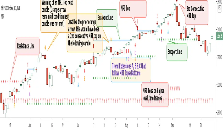
Momentum Reversal Indicator (MRI)This is the Beta release of the Momentum Reversal Indicator (MRI), expect an update by the end of year.
The Momentum Reversal Indicator (MRI) is an advanced script for professional traders who have taken the time to learn all its functions. It is a time based indicator that anticipates the ending of trends based on the momentum in price movement. As an important secondary element, MRI also suggests when a trend might be starting or continuing, which a trader can certainly take advantage of. It is useful across all assets and all time frames but is ideal in more liquid assets on Daily & Weekly time frames.
Since this is an Invite Only Script, I will not be making the code public nor explain the math logic of the code here in TradingView. TradingView also limits any external links, but those interested in details or access should be resourceful enough to find all the information they need on my website. However, I will try and explain the usefulness of the MRI indicator with the following images.
MRI will display a downwards red arrow above the candle when the bullish trend is ending and an upwards green arrow above the candle when the bearish trend is ending. The candle before the MRI top/bottom is marked by an orange arrow warning you that the trend might be ending on the next candle. (It's common that the trend ends on the candle before or after this MRI signal, I personally like to use single candlestick reversals for confirmation like Shooting Stars, Hammers and Doji). The orange arrow will disappear if a green or red arrow shows up, but will remain on the chart if on the following candle, the conditions needed to make the MRI signal are not met. See NYSE:UBER chart below:
When the number above the arrow is something other than a 1, it indicates a strong trend and the number represents consecutive instances of hitting that MRI extreme condition. These consecutive instances have been known to cause major changes in trend and the larger the number, the bigger the move might be. Here is a recent example of the daily chart hitting a 3 on the MRI, with the market falling 6.5% in the following 3 days and 10% over the next 3 weeks (you can see this in the image used to publish this script)
The biggest number I have seen is a 5, this occurred on the weekly chart of AMEX:CBOE as it was followed by a 30% correction over the next two weeks.
Following an MRI Top/Bottom there are three different Extensions of trend if the price continues to move in the same direction and does not reverse with the MRI. It’s up to the trader to decide which of the three they find most relevant, for me it’s B & C, and there are settings you can use to remove what you don't care for from display. They have a different but similar rule set which is explained to those serious about the indicator and purchase access, which comes with full explanations in a video. Here is a recent chart of NASDAQ:AMZN for an example:
And here is a weekly chart of NYSE:GM topping on Extension C with the MRI warning (Orange Arrow). Extensions A & B also provided good profit takes after a big run up
These Extensions are particularly useful when they occur on (or right around) an MRI Top/Bottom. Here is an example where it timed the 2018 stock market SPCFD:SPX top perfectly leading directly into an MRI Bottom two weeks later (Also notice how we can show multiple timeframes hitting MRI levels)
In addition to Extensions, an MRI Top/Bottom generates a Resistance/Support line (dotted) and a Breakout Line (solid). The Support/Resistance not only has a tendency to reverse the price but also increases the probability of the MRI leading to a full reversal if the line is not broken. By breaking this dotted line, you increase the probability of entering the Extension of Trend. The Breakout line tends to notify the trader that the trend is very strong and continuing. As an example of Support line, here is a recent 1 hour BITSTAMP:BTCUSD chart
Here is FX_IDC:EURUSD as of today on a daily chart which shows the Extension of trends once these critical support/resistance and breakout lines are taken out.
The indicator also shows you if the MRI is hitting critical levels on higher level time frames. We have set the defaults to Hourly (H), Daily (D), Weekly (W), Monthly (M) and Yearly (Y). You can turn these off in settings and you can also add up to 3 additional custom timeframes of your choice to the display list. When MRI lines up across several time frames it has a history of causing significant moves, here is an example of NSE:TITAN which fell 25% after aligning with the Daily, Weekly and Monthly timeframes for a top.
The recent top in TVC:GOLD came on a Friday which had a Daily Extension B & C top. The following Monday kicked off a weekly MRI Top and a week later was the start of September, which happens to be a Monthly MRI Top. Gold is still trending lower as of today and is down 11% since this top less than 2 months ago.
One final note on the multi-timeframe is that if you have the Hourly (H) set to display on a chart that only has end of day data, the Indicator will not work so make sure to uncheck all timeframes that can't be identified in the settings.
Here are additional charts that show the power of MRI including cryptocurrencies:
Recent 25% crash in BINANCE:BNBBTC
Of course we have to mention BITSTAMP:BTCUSD here is how MRI called the time period around the big crash in March 2020. There was a very timely MRI Top several weeks prior and once the Support line broke, it went right down into a nice MRI Bottom.
Volatility Index Weekly & Daily as of today CBOE:VIX
Here is the current look at the weekly USD chart TVC:DXY you can see how it tops on Extension C in March and seems to have bottomed with the MRI in late August.
One more look at a stock chart, here we have the Weekly NASDAQ:SBUX as of today, it perfectly oscillates between the MRI calls the last two years.
Disclaimer : Trading is risky and using MRI (like any other indicator) does not guarantee positive returns. It does not blindly provide Buy/Sell/Short calls and the trader will need to evaluate every alert.
“The average man doesn’t wish to be told that it is a bull or a bear market. What he desires is to be told specifically which particular stock to buy or sell. He wants to get something for nothing. He does not wish to work. He doesn’t even wish to have to think.” - Jesse Livermore
Personal Note: I would like to credit the following people that all lead to the knowledge needed to build the MRI: Larry Williams, Tom DeMark, Tyler Jenks, Martin Armstrong & Kevin O’Dowd (most of whom I have met or interacted with)
Thank you everyone, if this indicator interests you, you know what to do...
Good Luck Trader,
Tone Vays
Neglected Volume by DGTVolume is one piece of information that is often neglected, however, learning to interpret volume brings many advantages and could be of tremendous help when it comes to analyzing the markets. In addition to technicians, fundamental investors also take notice of the numbers of shares traded for a given security.
What is Volume?
The volume represents all the recorded trades for a security that occurs in a given time interval. It is a measurement of the participation, enthusiasm, and interest in a given security. Think of volume as the force that drives the market. Volume substantiates, energizes, and empowers price. When volume increases, it confirms price direction; when volume decreases, it contradicts price direction.
In theory, increases in volume generally precede significant price movements. However, If the price is rising in an uptrend but the volume is reducing or unchanged, it may show that there’s little interest in the security, and the price may reverse.
A high volume usually indicates more interest in the security and the presence of institutional traders. However, a rapidly rising price in an uptrend accompanied by a huge volume may be a sign of exhaustion.
Traders usually look for breaks of support and resistance to enter positions. When security break critical levels without volume, you should consider the breakout suspect and prime for a reversal off the highs/lows
Volume spikes are often the result of news-driven events. Volume spike will often lead to sharp reversals since the moves are unsustainable due to the imbalance of supply and demand
note : there’s no centralized exchange where trades are recorded, so the volume data represents what happens at a particular exchange only
In most charting platforms, the volume indicator is presented as color-coded bars, green if the security closes up and red if the security closed lower, where the height of the bars show the amount of the recorded trades
Within this study, Relative Volume , Volume Weighted Bars and Volume Moving Average are presented, where Relative Volume relates current trading volume to past trading volume over long period, Volume Weighted Bars presents price bars colored based on short period past trading volume average, and Volume Moving Average is average of volume over shot period
Relative Volume is presented as color-coded bars similar to regular Volume indicator but uses four color codes instead two. Notable increases of volume are presented in green and red while average values with back and gray, hence adding ability to emphasis notable increases in the volume. It is kind of a like a radar for how "in-play" a security is. Users are allowed to change the threshold, default value is set to Fibonacci golden ration standard deviation away from its moving average.
Volume Weighted Bars, a study of Kıvanç Özbilgiç, aims to present if price movements are supported by Volume. Volume Weighted Bars are calculated based on shot period volume moving average which will reflect more recent changes in volume. Price actions with high volume will be displayed with darker colors, average volume values will remain as they are and low volume values will be indicated with lighter colors.
Volume Moving Average, Is short period volume moving average, aims to display visually the volume changes. Please not that Relative Volume bars are calculated based on standard deviation of long volume moving average.
What Else?
Apart from the volume itself, your ability to assess what volume is telling you in conjunction with price action can be a key factor in your ability to turn a profit in the market. It makes little sense to analyze the volume alone. To correctly interpret the volume data, it shall be seen in the light of what the price is doing. there are a lot of other indicators that are based on the volume data as well as price action. Analysing those volume indicators has always helped traders and investors to better understand what is happening in the market.
Here are the ones adapted with this study. Some of them used as a source for our aim, some adapted as they are with slight changes to fit visually to this study and please note that the numerical presentation may differ from their regular use
• On Balance Volume
• Divergence Indicator
• Correlation Coefficient
• Chaikin Money Flow
Shortly;
On Balance Volume
The On Balance Volume indicator, is a technical analysis indicator that relates volume flow to changes in a security’s price. It uses a cumulative total of positive and negative trading volume to predict the direction of price. The OBV is a volume-based momentum oscillator, so it is a leading indicator — it changes direction before the price
Granville, creator of OBV, proposed the theory that changes in volume precede price movements in a measurable way. He believed that volume was the main force behind major market moves and thought of OBV’s prediction of price changes as a compressed spring that expands rapidly when released.
It is believed that the OBV shows the interactions between the institutional and retail traders in the market
If the price makes a new high, the OBV should also make a new high. If the OBV makes a lower high when the price makes a higher high, there’s a classical bearish divergence — indicating that only the retail traders are buying. Another type of bearish divergence occurs when the price remains relatively quiet and fails to make a higher high but the OBV soars higher than the previous high — indicating that the institutional traders are accumulating short positions. On the other hand, if the price makes a lower low and the OBV makes a higher low, there is a classical bullish divergence, showing that the institutional traders don’t believe in that move
With this study, Momentum and Acceleration (optional) of OBV is calculated and presented, where momentum is most commonly referred to as a rate and measures the acceleration of the price and/or volume of a security. It is also referred to as a technical analysis indicator and oscillator that is able to determine market trends.
Additionally, smoothing functionality with Least Squares Method is added
Divergences especially, should always be noted as a possible reversal in the current trend, so the divergence indicator is adapted with this study where the Momentum of OBV is assumed as Oscillator with similar usages as to RSI. Divergence is most often used to track and analyze the momentum in an asset’s price and the odds of a price reversal within the current trend. The divergence indicator warns traders and technical analysts of changes in a price/volume trend, oftentimes that it is weakening or changing direction.
Correlation Coefficient
The correlation coefficient is a statistical measure of the strength of the relationship between the relative movements of two variables. A correlation of -1.0 shows a perfect negative correlation, while a correlation of 1.0 shows a perfect positive correlation. A correlation of 0.0 shows no linear relationship between the movement of the two variables. In other words, the closer the Correlation Coefficient is to 1.0, indicates the instruments will move up and down together as it is mostly expected with volume and price. So the Correlation Coefficient Indicator aims to display when the price and volume (on balance volume) is in correlation and when not. With this study blue represent positive correlation while orange negative correlation. The strength of the correlation is determined by the width of the bands, to emphasis the effect horizontal lines are drawn with values set to 0.5 and -0.5. the values above 0.5 (or below -0.5) shows stronger correlation.
Chaikin Money Flow , provide optionally as a companion indicator
The Chaikin money flow indicator (CMF) is a volume indicator that measures the money flow volume over a chosen period. The money flow volume is a measure of the volume and where the price closed relative to the trading session’s range. It comes from the idea that buying pressure is indicated by a rising volume and recurrent closes in the upper part of the session’s price range while selling pressure is demonstrated by an increasing volume and repeated closes in the lower part of the price range.
Both buying and selling pressures are accompanied by an increase in volume, but the location of the closing prices are in accordance with the direction of price
Special thanks to @InvestCHK and @hjsjshs , who have enormously contributed while preparing this study
related studies:
Disclaimer:
Trading success is all about following your trading strategy and the indicators should fit within your trading strategy, and not to be traded upon solely
The script is for informational and educational purposes only. Use of the script does not constitute professional and/or financial advice. You alone have the sole responsibility of evaluating the script output and risks associated with the use of the script. In exchange for using the script, you agree not to hold dgtrd TradingView user liable for any possible claim for damages arising from any decision you make based on use of the script

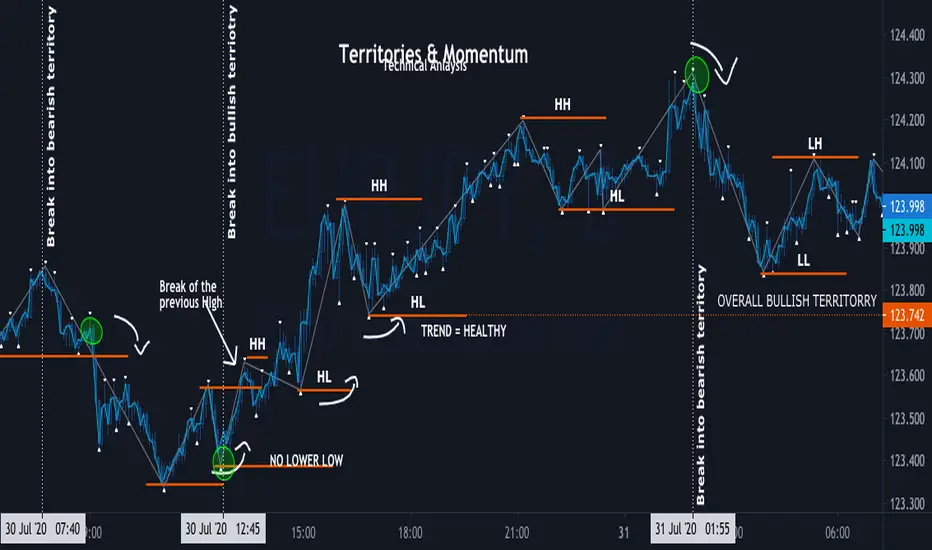
Momentum ZigZag Territories & Momentum
Territories:overall Bullish , overall Bearish, minor Bullish , minor Bearish
Definition of trend:
BULL - consecutive HIGHER HIGH and HIGHER LOW, once NO NEW HIGHER HIGHS is formed, doesn't mean its automatically BEARISH; Once HIGHER LOW is BROKEN and PRICE forms LOWER LOW and LOWE HIGH bellow previous HIGHER LOW its officially BEAR TREND
BEAR - consecutive LOWR LOW and LOWER LOW, once NO NEW LOWER LOW is formed, doesn't mean its automatically BULLISH ; Once LOWER HIGH is BROKEN and PRICE forms HIGHER HIGH above previous HIGH its officially BULL TREND
Minor territory is shorter trend within overall trend: as Long as overall trend is not broken , it is bound to continue once minor territory gets broken
MOMENTUM - its is the motion of trend, and character of condition
Momentum is not Strategy alone, it is part of technical analysis
momentum is used to determent : current conditions (trend , range , channel ) heath and strength
Momentum DivergenceTrading Divergence based on Momentum (Indicator below), If you want to make this a strategy i would use all those indicators above for extra confirmation.
"Momentum Divergence" indicator includes the following:
-"Momentum Waves" (blue waves)
-"Stochastic RSI" color change (green/red lines)
-"RSI" (purple line)
-"Money Flow Index" (green/red bar below)
-"Volume Weighted Average Price" ( (yellow/red areas ) (not included yet, but i will include it soon))
Green/Red circles added for possible trend Reversals
Alerts can be set on those Green/Red circles
How to Trade:
Draw Divergence between waves as shown on the chart for LONG/SHORT position (From a Big Wave to a small Wave ... The big Wave MUST be above Blue line in order to draw a divergence line (60 Threshold))
When to Sell:
There is no specific way to exit but with support/resistance zones will help to exit position AND the other indicators will help too (DONT GET GREEDY)
More info:
Since this is a combination of oscillators it should work in any time frame.
-MUST use Heikin Ashi candles.
Coming updates:
-Include VWAP
-Automatic draws divergence between HH HL LH LL waves with pine script version @4

Momentum TraderThis study combines two versatile momentum indicators :
Chande Momentum Oscillator:
-Measures trend strength, with higher absolute values meaning greater strength.
-Also tracks divergence. When price increases, but is not accompanied by an increase in Chande Momentum Oscillator values, it signifies bearish divergence and a reversal is likely to follow.
-Shown as the teal and pink histogram.
Percentage Price Oscillator:
-Similar to the MACD, except that it expresses the difference between the two moving averages in terms of a percentage. This makes it a little easier to visualize.
-PPO values greater than zero indicate an uptrend, as that means the fast EMA is greater than the slow (and vice versa).
Entry and Exit Conditions:
Enter When:
1) Chande Momentum crosses over zero from negative to positive territory. AND
2) It has been less than 3 bars since Chande Momentum was less than the lower green line. AND
3) Chande Momentum is rising(positive slope).
Exit When:
1) Chande Momentum is greater than the upper line. AND
2) It has been less than 6 bars since the PPO value was greater than the upper bound. AND
3) PPO is less than 5 (meaning the difference between the two EMA's is less than 5%). AND
4)PPO has a negative slope.
This study comes with alert conditions for long entries and exits.
~Happy Trading~

MPT - MEDIAN PRICE TRADING - custom forex indicator
MPT is a unique custom indicator i created to enter a trade with the right timing
This indicator catches the momentum of a Forex pair and tells you when to enter
It's based on the idea that when the median price in the current timeframe is crossing the median price of the higher timeframe, the momentum is changing and that is an opportunity to trade
red line is median line of current timeframe (default is 1D)
aqua line is projection of past median line on higher timeframe (default is 1W)
white crosses can be used as a trail stop values to follow a trend
when red cross aqua up the background is green and so momentum of the pair is up
when red cross aqua down no background color and momentum down
You can try this indicator for a limited period, just ask for access in comments
If you want unlimited access you can PM me
Trading is a risky business, use it at your own risk. I'm not responsible for any profit or loss

Relative Value & Risk Analytics DashboardThis is your risk-adjusted alpha analysis tool - exactly what hedge fund and insurance company clients want to see.
Attractiveness Score | Composite score combining RV and Risk (0-100)
Relative Performance | vs Benchmark (SET/SPY), RS Ratio Trend, 52W Position, Spread Z-Score
Risk Metrics | Beta, Alpha, Sharpe, Sortino, Information Ratio, Volatility
Correlation | Benchmark Correlation, R-Squared, Regime Change Detection
Pair Trade | Peer Correlation, Pair Z-Score, Long/Short Signals
Factor Exposure | Momentum (1/3/6M), Mean Reversion Signal, Distance from SMA50
Drawdown | Current DD, Max DD, Recovery Needed, Ulcer Index, Calmar, VaR
Key Features:
Benchmark-Relative Analysis: Compare any stock vs SET Index or any other benchmark
Pair Trade Signals: Automatically generates long/short signals based on Z-score
Risk-Adjusted Returns: Sharpe, Sortino, Information Ratio - what your clients actually care about
Regime Change Detection: Alert when correlation dynamics shift
Drawdown Risk: VaR, Ulcer Index, Calmar Ratio for risk-conscious clients

Momentum Permission + Pivot Entry (v1.4 CLEAN ENTRY)//@version=5
indicator("Momentum Permission + Pivot Entry (v1.4 CLEAN ENTRY)", overlay=true)
// ─────────── INPUTS ───────────
pivotLookback = input.int(3, "Pivot Lookback")
smaLen = input.int(50, "SMA Length")
relVolTh = input.float(1.3, "RelVol Threshold")
// ─────────── TREND + MOMENTUM — BASICS ───────────
vwapLine = ta.vwap
smaLine = ta.sma(close, smaLen)
relVol = volume / ta.sma(volume, 10)
pivotLow = ta.lowest(low, pivotLookback) == low
trendUp = close > smaLine
aboveVWAP = close > vwapLine
greenCandle = close > open
// ─────────── PERMISSION (Context Only) ───────────
permitSignal = trendUp and (relVol > relVolTh)
// ─────────── ENTRY LOGIC — ONE CLEAN SIGNAL ───────────
rawEntry = permitSignal and aboveVWAP and pivotLow and greenCandle
// Anti-spam: only first signal in a move
entrySignal = rawEntry and not rawEntry
// ─────────── VISUAL SHAPES (Clean) ───────────
plotshape(permitSignal, style=shape.triangleup, color=color.lime, size=size.tiny, location=location.bottom, text="PERMIT")
plotshape(entrySignal, style=shape.triangleup, color=color.aqua, size=size.small, text="ENTRY")
// ─────────── TREND VISUALS ───────────
plot(vwapLine, "VWAP", color=color.blue, linewidth=2)
plot(smaLine, "SMA50", color=color.orange, linewidth=2)

Momentum Permission + Pivot Entry + Exit (v1.4)//@version=5
indicator("Momentum Permission + Pivot Entry + Exit (v1.4)", overlay=true)
// ──────────────────────────────────────────────
// Inputs
// ──────────────────────────────────────────────
smaLength = input.int(50, "SMA Length")
relVolThresh = input.float(1.3, "Relative Volume Threshold")
pivotLookback = input.int(3, "Pivot Break Lookback")
// ──────────────────────────────────────────────
// Core Calculations
// ──────────────────────────────────────────────
sma50 = ta.sma(close, smaLength)
vwap = ta.vwap(close)
relVol = volume / ta.sma(volume, 10)
crossUp = ta.crossover(close, sma50)
aboveSMA = close > sma50
aboveVWAP = close > vwap
relStrong = relVol > relVolThresh
greenCandle = close > open
// ──────────────────────────────────────────────
// One-Time Daily Trend Permission
// ──────────────────────────────────────────────
var bool permission = false
if ta.change(time("D"))
permission := false
trendStart = crossUp and aboveVWAP and relStrong and not permission
if trendStart
permission := true
// ──────────────────────────────────────────────
// Pullback Pivot Breakout Entry (Continuation Long)
// ──────────────────────────────────────────────
pivotHighBreak = close > ta.highest(high , pivotLookback)
entryTrigger = (
permission and
aboveSMA and
aboveVWAP and
relStrong and
greenCandle and
pivotHighBreak
)
// ──────────────────────────────────────────────
// EXIT Signal (Trend Exhaustion)
// ──────────────────────────────────────────────
smaChange = sma50 - sma50
exitSignal = (
permission and // only after trend started
close < vwap and // VWAP breakdown
close < open and // red candle body
relVol > relVolThresh and // volume spike on selling
smaChange < 0 // SMA turning down / flattening
)
// ──────────────────────────────────────────────
// Plots
// ──────────────────────────────────────────────
plot(sma50, title="SMA50", color=color.orange, linewidth=2)
plot(vwap, title="VWAP", color=color.new(color.blue, 0), linewidth=2)
// Permission marker (1 per day)
plotshape(
trendStart,
title="Trend Permission",
style=shape.triangleup,
location=location.belowbar,
color=color.new(color.green, 0),
size=size.large,
text="PERMIT"
)
// Entry trigger markers
plotshape(
entryTrigger,
title="Entry Trigger",
style=shape.triangleup,
location=location.abovebar,
color=color.new(color.aqua, 0),
size=size.normal,
text="ENTRY"
)
// EXIT marker (trend exhaustion)
plotshape(
exitSignal,
title="Exit Signal",
style=shape.triangledown,
location=location.abovebar,
color=color.new(color.red, 0),
size=size.large,
text="EXIT"
)

Momentum Permission + VWAP + RelVol (Clean)//@version=5
indicator("Momentum Permission + VWAP + RelVol (Clean)", overlay=true)
// ──────────────────────────────────────────────
// Inputs
// ──────────────────────────────────────────────
smaLength = input.int(50, "SMA Length")
relVolThresh = input.float(1.3, "Relative Volume Threshold")
// ──────────────────────────────────────────────
// Core Calculations
// ──────────────────────────────────────────────
sma50 = ta.sma(close, smaLength)
vwap = ta.vwap(close)
relVol = volume / ta.sma(volume, 10)
crossUp = ta.crossover(close, sma50)
// Trend conditions
aboveSMA = close > sma50
aboveVWAP = close > vwap
relStrong = relVol > relVolThresh
// ──────────────────────────────────────────────
// One-Time Daily Trend Permission Logic
// ──────────────────────────────────────────────
var bool permission = false
// Reset permission at start of each session
if ta.change(time("D"))
permission := false
trendStart = crossUp and aboveVWAP and relStrong and not permission
if trendStart
permission := true
// ──────────────────────────────────────────────
// Entry Trigger Logic (Breakout Continuation)
// ──────────────────────────────────────────────
entryTrigger = (
permission and
aboveSMA and
aboveVWAP and
relStrong and
close > high // breakout of prior candle high
)
// ──────────────────────────────────────────────
// Plots
// ──────────────────────────────────────────────
// Trend filters
plot(sma50, title="SMA50", color=color.orange, linewidth=2)
plot(vwap, title="VWAP", color=color.new(color.blue, 0), linewidth=2)
// Permission (one-time trend start)
plotshape(
trendStart,
title="Trend Permission",
style=shape.triangleup,
location=location.belowbar,
color=color.new(color.green, 0),
size=size.large,
text="PERMIT"
)
// Entry trigger (continuation entry)
plotshape(
entryTrigger,
title="Entry Trigger",
style=shape.triangleup,
location=location.abovebar,
color=color.new(color.aqua, 0),
size=size.normal,
text="ENTRY"
)

Price FX Indicator v1📈 Price FX Indicator - Multi-Framework Trend & Continuation Model
This indicator is designed to support traders who work with structured, rule-based trend continuation techniques. Rather than relying on a single signal or timeframe, it blends several types of commonly used technical behaviour into a unified framework. The goal is to simplify multi-step analysis that traders often perform manually when identifying continuation opportunities inside established directional moves.
Unlike a traditional mashup, this script does not simply combine indicators.
Its logic is built around the relationship between trend behaviour across multiple timeframes, the structure of pullbacks during directional moves, and the interaction of local momentum shifts with dynamic support/resistance areas. These components work together to highlight moments where conditions across different analytical layers align.
🧩 What the Indicator Does
This tool evaluates:
- The direction and consistency of trend behaviour across several timeframes
- The structure of local retracements relative to dynamic averages
- The transition of momentum during corrective phases
- The interaction between price and commonly monitored moving average zones
- Confluence between higher-timeframe context and lower-timeframe continuation behaviour
When these elements meet internally defined criteria, the indicator highlights potential continuation setups using on-chart labels.
The aim is not to predict reversals, but to identify conditions where higher-timeframe trend behaviour and short-term continuation structure are in agreement, something many traders typically assess manually by checking several charts and indicators.
🔍 How to Use It
The script is designed for traders who:
- Prefer trading in the direction of broader trend behaviour
- Use pullback-continuation structures in their workflow
- Monitor moving-average dynamics as part of trend filtering
- Want a single tool to reduce chart clutter and manual cross-checking
Signals appear only when internal conditions align.
These are not stand-alone trading signals; they are informational markers that correspond to a specific style of continuation analysis.
⚠️ Disclaimer
This indicator is for educational and informational purposes only. Nothing contained within this script, its alerts, its outputs, or any associated material should be interpreted as financial advice, investment advice, trading advice, or a recommendation to buy or sell any financial instrument.
By using this indicator, you acknowledge and agree to the following:
- Trading involves risk, including the potential loss of your entire investment.
- Past performance does not guarantee future results. Historical signals shown by this indicator are not a reliable guide to future outcomes.
- The indicator does not guarantee accuracy, profitability, consistency, or any form of successful trading results.
- All trading decisions you make are entirely your own responsibility.
- The creator of this indicator is not liable for any financial losses, missed opportunities, or negative outcomes that may occur through the use of this tool.
- No part of this indicator should be considered a signal service, automated trading system, or financial product.
- The indicator does not account for your personal financial situation, trading experience, risk tolerance, or investment objectives.
- Market conditions can change rapidly, and even high-confluence setups can fail without warning.
- Alerts, drawings, signals, or interpretations generated by this indicator can repaint, be delayed, or behave unexpectedly depending on market volatility, user chart settings, or TradingView data feed limitations.
- You should always verify signals independently and use proper risk management, stop-loss placement, and capital protection practices.
- This tool is provided “as is,” with no warranties or guarantees of any kind. Use at your own risk.
If you choose to trade using information derived from this indicator, you accept full responsibility for all consequences.

Momentum Breakout Signal//@version=5
indicator("Momentum Breakout Signal", overlay=true)
// === Breakout Logic ===
length = 20 // Lookback for recent high
recentHigh = ta.highest(high, length)
// === Breakout Condition: Close > prior high
priceBreakout = close > recentHigh
// === Volume Spike Confirmation ===
volumeSMA = ta.sma(volume, 20)
volumeSpike = volume > volumeSMA * 1.3 // Customize sensitivity
// === Optional: Filter for strong candles only
isGreen = close > open
decentRange = (high - low) > (close * 0.003)
// === Final Signal Logic ===
signal = priceBreakout and volumeSpike and isGreen and decentRange
plotshape(signal, title="Breakout Signal", location=location.abovebar, color=color.orange, style=shape.triangleup, size=size.small)
alertcondition(signal, title="Momentum Breakout Alert", message="🚀 {{ticker}} breakout confirmed at {{close}}")

Smart Accumulation Pro – US SmallCap Edition v2
Smart Accumulation Pro v2 — US SmallCap Edition
Institutional Footprint and Structural Behavior Engine
Overview
Smart Accumulation Pro v2 detects structural behavior, internal liquidity shifts, and multi-phase accumulation footprints that are not visible through momentum or volatility indicators. The engine focuses on underlying institutional habits rather than reacting to price alone.
ULTRA — High-Threshold Structural Trigger
ULTRA appears only when multiple internal phases align simultaneously. It is not a momentum spike or volume anomaly. It represents compression pressure, phase readiness, and structural alignment. ULTRA does not repaint. When this signal appears, internal liquidity has already transitioned into an acceleration phase.
PRE — Early Structural Drift (Not a Buy Signal)
PRE should not be interpreted as a buy signal. It indicates gradual accumulation or controlled liquidity positioning. PRE usually appears during stable or quiet phases but rarely appears during panic drops or disorderly downtrends.
ACC — Transitional Footprint Signal
ACC identifies late-stage structural footprints. It is not intended as a standalone buy trigger. ACC highlights that structural preparation is underway, but direction and timing require user validation. ACC often precedes larger institutional behavior.
Philosophy
This engine does not attempt to cover every market pattern. It focuses on the highest-probability institutional habits. Exit timing, risk management, and execution remain user responsibility. The tool minimizes noise and emphasizes rare, high-impact structural zones.
Preset Modes
1) Conservative
For ETFs or stable large-cap instruments. Minimal noise and lower signal frequency.
2) Normal
Optimized for US mid-cap and small-cap behavior. Balanced and recommended as the default mode.
3) Aggressive
For volatile or thematic instruments. Higher frequency, higher risk.
Usage Notes
This indicator does not provide financial advice. It highlights structural conditions that often precede institutional movement. Execution and risk decisions depend on the user.
License Notice
Unauthorized copying, redistribution, or sharing is prohibited. Invite-Only access requires your TradingView username. One purchase equals one user license.
------------------------------------------------------------
Korean Summary (한국어 요약본)
------------------------------------------------------------
Smart Accumulation Pro v2는 세력의 습관, 유동성 이동, 압축 단계 등의 “보이지 않는 내부 구조”를 추적하는 지표다. 기존 모멘텀 기반 지표로는 포착되지 않는 패턴을 분석한다.
ULTRA 신호는 여러 내부 단계가 동시에 정렬될 때만 등장하는 극히 희귀한 트리거다. 페인팅이 없으며, 신호가 뜰 때 이미 내부 구조는 가속 단계에 진입한 상태다.
PRE는 매수 신호가 아니다. 세력이 서서히 움직이기 시작하거나 유동성을 재정렬할 때 나타나는 미세한 초기 흔적이다.
ACC는 본격 움직임 전에 나타나는 마지막 흔적이다. 단독 매수 신호가 아니며, 이후 더 큰 구조적 변화로 이어질 가능성을 나타내는 정도로 해석해야 한다.
이 지표는 모든 패턴을 잡지 않는다. 세력이 반복적으로 사용해 온 고확률 구조만 좁게 추적한다. 출구 전략과 리스크 관리는 사용자의 몫이다.
프리셋은 Conservative, Normal, Aggressive의 3가지 모드로 구성되며, 각각 안정형·균형형·변동성형 종목에 맞춰 설계되었다.
본 지표는 금융 조언을 제공하지 않으며, 무단 공유 또는 재배포는 금지된다. Invite-Only 기반이며 1인 1라이선스 방식이다.

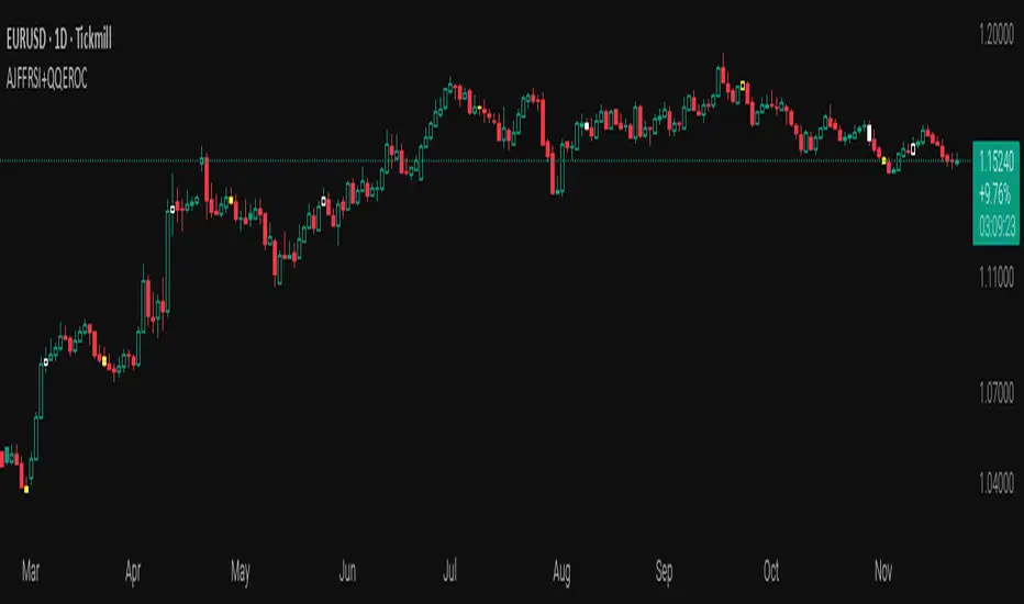
AJFFRSI+QQEROC Uses Jurik RSI for smooth, responsive momentum measurement
Incorporates QQE features for trend strength and dynamic trailing stop signals
Designed for clearer, more reliable overbought/oversold and reversal signals on TradingView
Suitable for intraday, swing, and longer-term analysis
Not a financial advice. DYOR
Universal Sentiment Score — V3 Bottom DetectorThe Universal Sentiment Score (USS) condenses a wide range of market conditions into one easy-to-read oscillator. Instead of relying on a single signal, USS blends multiple forms of trend strength, momentum behavior, volatility shifts, and reversal conditions to generate a unified sentiment metric.

RSI PriceThe relative strength index (RSI) is a momentum indicator used in technical analysis. RSI measures the speed and magnitude of a security's recent price changes to detect overbought or oversold conditions in the price of that security. The RSI is displayed as an oscillator (a line graph) on a scale of 0 to 100.
Traditionally, an RSI reading of 70 or above indicates an overbought condition. A reading of 30 or below indicates an oversold condition. In addition to identifying overbought and oversold securities, the RSI can also indicate securities that may be primed for a trend reversal or a corrective pullback in price.

MILLION MEN - Zone Scanner ProWhat it is
MILLION MEN - Zone Scanner is a context-driven momentum tool that visualizes trend regimes (bullish / bearish) and highlights the first-touch opportunity within each regime’s reactive zones. It’s designed to help traders identify pullbacks inside an existing bias rather than chasing breakouts.
How it works
Uses a custom RSI-style momentum meter calculated from RMA of up/down moves.
When the meter > upper threshold → Green Regime.
When the meter < lower threshold → Red Regime.
Defines LONG Zone (34 – 40) and SHORT Zone (60 – 70) for mean-reversion touches.
Prints L FT or S FT on the first confirmed touch after a regime turns on.
Optional candle-color filter (green bar for LONG / red bar for SHORT).
Exit signals trigger once the meter revisits the regime boundary.
Optional Neon Glow styling improves visual clarity without clutter.
How to use
Identify regime direction (green = bullish bias, red = bearish bias).
Wait for the first touch into the relevant zone.
Confirm with higher-time-frame structure or volume context.
Manage position or exit once the meter retests its regime limit.
Use it as a context tool, not an auto-entry system.
Originality & Value
This script enforces discipline by allowing only one signal per regime, reducing over-trading and noise. The zone visualization and glow layers offer a clean, cinematic UI consistent with the MILLION MEN visual standard.
Limitations & Transparency
Works best on standard candlesticks and normal-time frames (tested on BTC, ETH, XRP, BNB, XAUUSD).
No look-ahead or future data.
Signals are bar-close confirmed (barstate.isconfirmed).
Educational tool — not financial advice.
for educational use under the MILLION MEN framework. Core logic is protected to maintain script integrity.