Cari dalam skrip untuk "mtf"


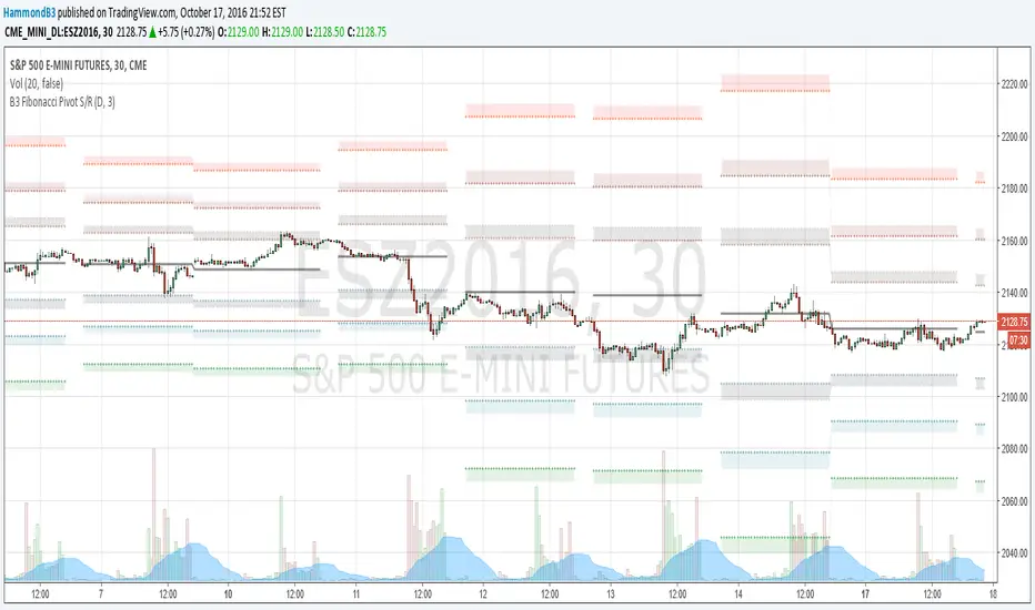
B3 Fibonacci Pivot S/RFor my second share, I give you some levels I look at everyday for the ES minis. HLC/3 of the MTF (multi-time-frame) inputs = mean and Fib-levels formed as support and resistance zones. There are some websites that will show you 20 ways to figure out a pivot for the day's intraday workings, and this one always rang true for me. I keep it set at Res=D and Len=3or5 and use on hourly charts. This indicator is capable of doing like a Res=60m Len=8 for a 5m chart or something of that nature if you wish to test it out.
I haven't tested it out for tick charts and I have noticed that this is good on index and commodity futures, and not so much other things.
Uncanny to me how well this works as reversal awareness for ES. Doesn't mean that one will happen, or if it does that it will have trade-able juice, though it is very important awareness never-the-less.
screencast.com
Stochastic CCI MTF w/ UP/DOWN colours - squattterStoch CCI has a nicer divergence than Stoch RSI.
Enjoy!
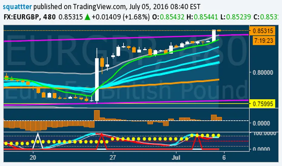
Stochastic CCI MTF w/ UP/DOWN colours - squattterStoch CCI has nicer divergences than Stoch RSI.
Enjoy.

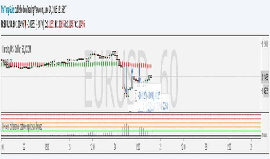
Percent Difference Between VWAP and Price MTFShows the difference between vwap and price in percent.
You can can choose between multiple timeframe vwap. Default is normal daily.
The levels on the indicator can be changed to whatever you want to.
In the chart above we can see eurusd reverting up at 3% below monthly vwap, after the brexit dip, It then turns down again at 1% from monthly and lastly it turns up again at 2% from monthly.
Script is a small modification of this:
VWAP MTF (Multi Timeframe)VWAP that can be be plotted from different timeframes.
Ex if you chose 60 min, it will plot a new vwap line at the start of every hour.
Intraday:
Used code from SandroTurriate to create this.

EMA bullish/bearish dashboard - MTFThis is a good reminder for which way you should be placing orders.
It's best to not ignore these signals!!!
lime = full bull - 100ema above 200ema and price is above 200ema
green = hallf bull - price now below 200ema but 100ema is still above the 200
maroon = full bear - opposite of full bull
red = half bear - opposite of half bull
Also with multi timeframe option - so I guess you could stack several of these on a single framed chart if you wanted.
[RS]MTF Intraday Dayly Range V0calculation to display a dayly donchian channel at any intraday timeframe.

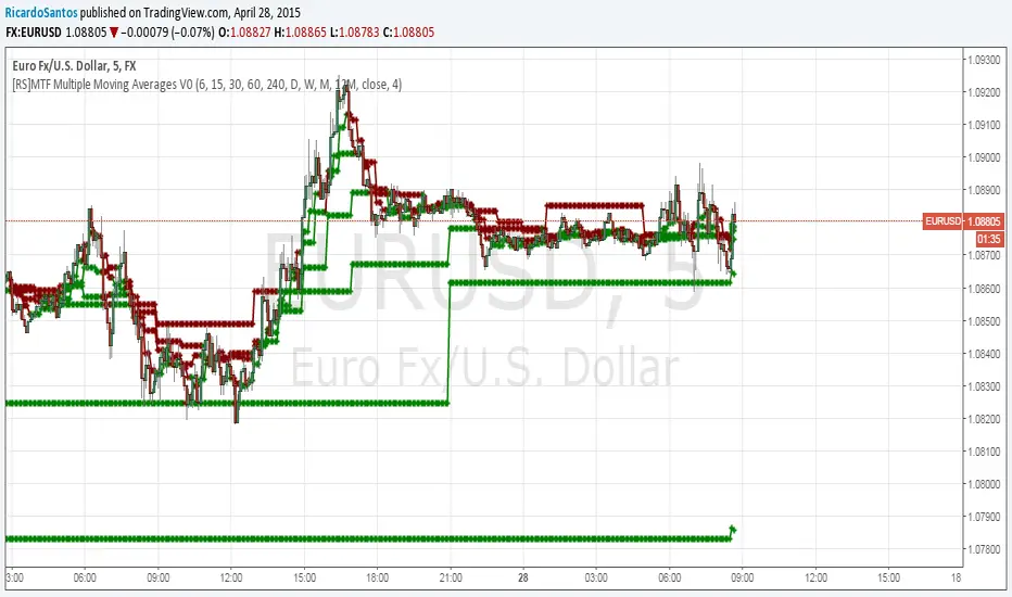
[RS]MTF Multiple Moving Averages V0Multiple moving averages with same interval in candle bar smoothness over multiple time frames.
option to show/hide the level of resolution for the mtf's default shows 1 ma can go up to 8th resolution.
option for manual input timeframes and configure ma.
Multi-Functional Fisher Transform MTF with MACDL TRIGGERWhat this indicator gives you is a true signal when price is exhausted and ready for a fast turnaround. Fisher Transform is set for multi-time frame and also allows the user to change the length. This way a user can compare two or more time spans and lengths to look for these MACDL divergent triggers after a Fisher exhaustion. With so many indicators, it's probably best to merge these indicators and change the Fisher and Trigger colors so you can still have a look at price action (remember to scale right after merger). I've noticed from time to time when you have Fisher 34 100 and 300 up and running on two different time frames such as 5 and 15 min charts, with MACDL triggers on the 100/300 or 34/100 you get a high probability trade trigger. However, there are rare exceptions such as when price moves in a parabolic state up or down for a long period where this indication does not work. Ideally this indicator works best in a sideways market or slow rising/descending moving market.
This indicator was worked on by Glaz, nmike and myself
LazyBear also introduced the MACDL indicator

TrendDetectorLibLibrary "TrendDetector_Lib"
method formatTF(timeframe)
Namespace types: series string, simple string, input string, const string
Parameters:
timeframe (string) : (string) The timeframe to convert (e.g., "15", "60", "240").
Returns: (string) The formatted timeframe (e.g., "15M", "1H", "4H").
f_ma(type, src, len)
Computes a Moving Average value based on type and length.
Parameters:
type (simple string) : (string) One of: "SMA", "EMA", "RMA", "WMA", "VWMA".
src (float) : (series float) Source series for MA (e.g., close).
len (simple int) : (simple int) Length of the MA.
Returns: (float) The computed MA series.
render(tbl, trendDetectorSwitch, frameColor, frameWidth, borderColor, borderWidth, textColor, ma1ShowTrendData, ma1Timeframe, ma1Value, ma2ShowTrendData, ma2Timeframe, ma2Value, ma3ShowTrendData, ma3Timeframe, ma3Value)
Fills the provided table with Trend Detector contents.
@desc This renderer does NOT plot and does NOT create tables; call from indicator after your table exists.
Parameters:
tbl (table) : (table) Existing table to render into.
trendDetectorSwitch (bool) : (bool) Master toggle to draw the table content.
frameColor (color) : (color) Table frame color.
frameWidth (int) : (int) Table frame width (0–5).
borderColor (color) : (color) Table border color.
borderWidth (int) : (int) Table border width (0–5).
textColor (color) : (color) Table text color.
ma1ShowTrendData (bool) : (bool) Show MA #1 in table.
ma1Timeframe (simple string) : (string) MA #1 timeframe.
ma1Value (float)
ma2ShowTrendData (bool) : (bool) Show MA #2 in table.
ma2Timeframe (simple string) : (string) MA #2 timeframe.
ma2Value (float)
ma3ShowTrendData (bool) : (bool) Show MA #3 in table.
ma3Timeframe (simple string) : (string) MA #3 timeframe.
ma3Value (float)

MTFDataLibrary "MTFData"
Functions to store multi timeframe candle data and swing points.
getCandleData(timeframe, openArray, highArray, lowArray, closeArray, timeArray, olcLookback, alltfs_olcLookback, tfIndex)
Stores current or higher timeframe candle data in arrays.
Parameters:
timeframe (string) : The timeframe, for example "240" for 4h
openArray (array) : An array to store the candle open price
highArray (array) : An array to store the candle high price
lowArray (array) : An array to store the candle low price
closeArray (array) : An array to store the candle close price
timeArray (array) : An array to store the candle time
olcLookback (int) : The history reference of the lookback limiting candle
alltfs_olcLookback (array) : An array holding the candle time of olcLookback candles ago, which can be used for limiting lookbacks
tfIndex (int) : The timeframe's index in the alltfs_olcLookback array
Returns: true if the timeframe changed
trackHiLo(tfchange, timeframe, openArray, highArray, lowArray, closeArray, timeArray, highWickArray, highBodyArray, highTimeArray, lowWickArray, lowBodyArray, lowTimeArray, alltfs_olcLookback, tfIndex)
Stores current or higher timeframe swingpoint data into arrays.
Parameters:
tfchange (bool) : Must be true when the timeframe has changed (a new candle has opened)
timeframe (string) : The timeframe, for example "240" for 4h
openArray (array) : An array that stores the timeframe's candle open price
highArray (array) : An array that stores the timeframe's candle high price
lowArray (array) : An array that stores the timeframe's candle low price
closeArray (array) : An array that stores the timeframe's candle close price
timeArray (array) : An array that stores the timeframe's candle time
highWickArray (array) : An array to store the swing high price
highBodyArray (array) : An array to store the swing high's highest body price
highTimeArray (array) : An array to store the swing high candle's time
lowWickArray (array) : An array to store the swing low price
lowBodyArray (array) : An array to store the swing low's lowest body price
lowTimeArray (array) : An array to store the swing high candle's time
alltfs_olcLookback (array) : An array holding the time of the max allowed swing point age
tfIndex (int) : The timeframe's index in the alltfs_olcLookback array
Returns: Nothing. The array handling happens inside the function.
tfReadable(tfInSec)
Converts a timeframe string ("240") into a more readable string ("4h").
Parameters:
tfInSec (int) : The timeframe that should be converted, as timeframe.in_seconds()
Returns: A more readable timeframe string


MTF EMA + MACD Single Signal Line (Enhanced)zerodha intraday trading strategy with 3 inbuilt indicators like ema, macd. 25 ema in 1 hour timeframe and 25 ema in 5 min timeframe and 15 min macd for better direction forecast

MTF Dual Supertrend with Bands and PivotSUPERTREND WITH UPPER AND LOWER BANDS + PIVOT POINTS + MULTI-TIMEFRAME - INDICATOR DESCRIPTION
OVERVIEW:
This Pine Script indicator combines the SuperTrend technical analysis tool with visible upper and lower bands, standard daily pivot points, AND a second SuperTrend from a different timeframe. SuperTrend is a trend-following indicator that helps traders identify the current market direction and potential entry/exit points, while pivot points provide key support and resistance levels. The multi-timeframe feature allows you to see trends from different time perspectives simultaneously.
HOW IT WORKS:
The indicator uses the Average True Range (ATR) to calculate dynamic support and resistance bands around the price:
1. BASIC BANDS CALCULATION:
- Upper Band = HL2 + (ATR × Multiplier)
- Lower Band = HL2 - (ATR × Multiplier)
- HL2 = (High + Low) / 2
2. FINAL BANDS ADJUSTMENT:
- Bands are adjusted based on price movement to create a trailing stop mechanism
- Upper band only moves down or stays flat when price is above it
- Lower band only moves up or stays flat when price is below it
3. SUPERTREND LINE:
- Switches between upper and lower bands based on price crossovers
- When price is above the SuperTrend line = UPTREND (green)
- When price is below the SuperTrend line = DOWNTREND (red)
4. STANDARD PIVOT POINTS:
- Calculated based on previous day's High, Low, and Close
- Pivot Point (PP) = (High + Low + Close) / 3
- Resistance levels: R1, R2, R3 (calculated above PP)
- Support levels: S1, S2, S3 (calculated below PP)
- These levels act as potential support/resistance zones
5. SECOND SUPERTREND (MULTI-TIMEFRAME):
- Displays a second SuperTrend from a different timeframe (default: 60 minutes/1 hour)
- Customizable timeframe - choose from 1min, 5min, 15min, 30min, 60min, 240min, Daily, Weekly, etc.
- Independent ATR period and multiplier settings
- Shows its own upper and lower bands (purple color)
- Color-coded SuperTrend line (lime for uptrend, orange for downtrend)
- Helps identify alignment between different timeframes
- Can be enabled/disabled via settings
- Bands can be toggled separately
KEY FEATURES:
✓ Visual upper and lower bands showing the ATR-based zones (blue)
✓ Color-coded SuperTrend line (green for uptrend, red for downtrend)
✓ Second SuperTrend from custom timeframe with its own bands (purple)
✓ Second SuperTrend line (lime/orange colors)
✓ Buy/Sell signals when trend changes
✓ Optional signals for second SuperTrend (small triangles)
✓ Daily Pivot Points with 3 resistance and 3 support levels
✓ Customizable ATR period and multiplier for both SuperTrends
✓ Background color indication of current trend
✓ Built-in alerts for both SuperTrend trend changes
✓ Toggle options for all bands, signals, pivot lines, and second SuperTrend
DEFAULT PARAMETERS:
- ATR Period: 10
- ATR Multiplier: 3.0
- Second SuperTrend: Enabled
- Second SuperTrend Timeframe: 60 minutes (1 hour)
- Second SuperTrend ATR Period: 10
- Second SuperTrend ATR Multiplier: 3.0
USAGE:
- Lower multiplier (1.5-2.5) = More sensitive, more signals, more noise
- Higher multiplier (3.5-5.0) = Less sensitive, fewer signals, filters noise
- Use pivot points as additional confirmation for entries/exits
- When price approaches R1/R2/R3, expect potential resistance
- When price approaches S1/S2/S3, expect potential support
- MULTI-TIMEFRAME STRATEGY: Best signals occur when both SuperTrends align
* Both green (uptrend) = Strong bullish confirmation
* Both red (downtrend) = Strong bearish confirmation
* Conflicting trends = Caution, potential consolidation or reversal
- Combine SuperTrend signals with pivot levels for high-probability trades
- Best suited for trending markets
TRADING SIGNALS:
- BUY: When price closes above the upper band (trend changes from down to up)
* Extra confirmation if near a support level (S1, S2, S3)
* STRONGEST SIGNAL: When both SuperTrends are green AND price is above PP
- SELL: When price closes below the lower band (trend changes from up to down)
* Extra confirmation if near a resistance level (R1, R2, R3)
* STRONGEST SIGNAL: When both SuperTrends are red AND price is below PP
MULTI-TIMEFRAME EXAMPLES:
- Chart timeframe: 5min, Second SuperTrend: 1 hour
* Enter long when 5min shows buy signal AND 1hr is already in uptrend
* This filters out counter-trend trades
- Chart timeframe: 15min, Second SuperTrend: 4 hour
* Higher timeframe provides overall trend direction
* Lower timeframe provides precise entry timing
- Recommended combinations:
* Scalping: 1min chart + 15min second ST
* Day trading: 5min chart + 1hr second ST
* Swing trading: 1hr chart + Daily second ST
PIVOT POINT STRATEGY:
- PP (Pivot Point) = Main level, acts as support in uptrend, resistance in downtrend
- Price above PP = Bullish bias, look for longs near S1/S2
- Price below PP = Bearish bias, look for shorts near R1/R2
- Breakout of R3 or S3 indicates strong momentum
Note: This indicator is based on the classic SuperTrend algorithm and should be used as part of a comprehensive trading strategy, not as a standalone signal.

MTF Confluence Reporter - Trend & Momentum AlignmentThis indicator is a multi-timeframe confluence dashboard designed to answer one question clearly:
“Across my key timeframes, is the market leaning Bullish, Bearish, or Mixed—and how strong is that lean?”
It combines two separate “votes” per timeframe:
4MA Direction (trend alignment / slope bias)
StochRSI State (momentum bias)
Those votes are then blended into a single Confluence result, shown as a clean readout with a 0–100 Strength score, plus hysteresis to reduce flicker near the decision boundary.
What you see in the table
1) 4MA
This is the trend component. It summarizes whether the selected timeframes are generally Bull or Bear based on the moving-average direction logic (your 4MA engine).
2) Stoch
This is the momentum component. It summarizes whether StochRSI across the selected timeframes is leaning Bull or Bear.
3) Qualified (YES/NO)
A safety gate. “Qualified = YES” means the internal conditions required for a valid confluence read are met (i.e., enough alignment/consistency to treat the output as actionable).
If it’s NO, treat the market as mixed / transitional and tighten risk.
4) Strength (0–100)
Your blended score (trend + momentum).
Higher = stronger agreement across timeframes.
A simple way to interpret it:
80–100: Strong alignment (clean regime)
60–79: Moderate alignment (tradable, but expect chop)
50–59: Weak / transitioning (be cautious)
< 50: Bearish side of the regime logic (or mixed turning down)
5) Strength Bar
A visual “battery meter” for the Strength score. This is meant to be read at a glance during fast decision-making.
6) Confluence (BULL/BEAR)
The actual regime output. This is the “final answer” based on the Strength score and hysteresis rules.
7) Hysteresis (Enter / Exit thresholds)
This is the anti-flicker system.
Example shown on the chart:
Enter > 60
Exit < 50
Meaning:
The script only “flips ON” a Bull regime when strength becomes convincingly Bullish (above 60).
It won’t “flip OFF” until strength meaningfully weakens (below 50).
This reduces rapid flipping during 50/50 conditions.
How to use it (practical workflow)
Step 1 — Use Confluence as your “market mode”
BULL: Favor longs, trend-following entries, buying pullbacks.
BEAR: Favor defense, shorts/hedges (if you trade them), or wait for reset.
Qualified = NO: Reduce size, tighten stops, or wait—conditions are not clean.
Step 2 — Use Strength to time aggressiveness
Strength rising: Momentum is joining trend → entries tend to have better follow-through.
Strength falling: Alignment is fading → take profit quicker or tighten risk.
Step 3 — Use hysteresis as your “noise filter”
If you’re a swing trader, hysteresis is your friend:
Don’t overreact to a single bar change.
Let the regime confirm and stay confirmed.
Best use-cases
Swing trading / position bias (daily/weekly context)
Hedge decisions (when alignment flips and stays flipped)
Filtering entries from other tools (only take signals that match the regime)
Settings notes:
This script is designed to be flexible:
You can choose which timeframes matter most to you (commonly 1H / 4H / 1D / 1W / 1M).
If your version includes weighting, you can tune weights to match your trading style (short-term vs swing).
Thresholds (Enter/Exit) can be tightened for faster flips or widened for smoother regimes.
Important notes / disclaimer (TradingView-safe)
This tool is an informational confluence dashboard, not financial advice. No indicator can predict the future. Always confirm with market structure, risk management, and your own plan. Past behavior on a chart does not guarantee future results.
How I Use This Indicator (Example Workflow)
I use this tool primarily as a market-bias and risk-filter, not as a standalone entry signal.
Establish the regime first
I start by checking the Confluence row:
BULL: I focus on long-side ideas and bullish continuation setups.
BEAR: I become defensive, avoid counter-trend trades, or look for short/hedge opportunities where applicable.
Qualified = NO: I treat the market as transitional and reduce risk.
Use Strength to adjust aggressiveness
When Strength is elevated and rising, I am more comfortable holding positions and allowing trades more room to develop.
When Strength is declining, I tighten stops, reduce position size, or manage trades more actively.
Let hysteresis do the work
I do not react to every minor fluctuation near the midpoint.
The built-in hysteresis thresholds help me stay aligned with the prevailing regime instead of over-trading during indecision.
Entries come from other tools
Actual entries are taken using price structure, support/resistance, or other indicators.
This dashboard simply tells me whether the broader environment supports that idea or not.
In short, I treat this indicator as a context and confirmation layer—it helps answer when to be aggressive, cautious, or patient.

MTF Indicator DashboardMulti-Timeframe Indicator Dashboard
A comprehensive multi-timeframe dashboard that displays the status of key technical indicators across 8 different timeframes in a compact, color-coded table.
Features:
Monitors 8 timeframes simultaneously: 3m, 5m, 15m, 30m, 1H, 2H, 4H, and Daily
Tracks 5 key indicators:
RSI (2-period with 6-period smoothing): Green when above 50, Red when below 50
ADX/DI (2-period): Green when +DI > 20 and dominant, Red when -DI > 20 and dominant
MACD (2, 3, 6): Green when MACD line above signal line, Red when below
EMAs (9, 20, 50, 100, 200, 400): Green when price above all EMAs, Red when below all EMAs
Overall: Combined signal requiring 2+ indicators to agree for bullish/bearish confirmation
Display:
Clean, compact table positioned in top-right corner
Color-coded boxes: Green (bullish), Red (bearish), Gray (neutral)
Minimal visual clutter for quick analysis
Updates in real-time
Use Case:
Perfect for traders who want to quickly identify timeframe alignment and confluence across multiple technical indicators. Ideal for scalping, day trading, and swing trading to spot high-probability setups when multiple timeframes align.
Settings:
All indicator parameters match the calculations used and can be viewed in the source code.

MTF MACD( TF0 cross 0 ) MULTI TIMEFRAME MACD Checking with OSMA TF+1 Momentum check
and TF+2 Trend Check to clarify the clean signal

MTF Volume Weighted Average PriceSame Orignal VWAP
Now you can set it to any Time Frame, and see it on that Time Frame While on your current Time Frame.

MTF Dynamic MA TrackerThis indicator allows you to track the behavior of price relative to a key Moving Average across up to 9 different timeframes simultaneously.
The idea behind this tool is to see what your favourite MA is doing at various TFs while solving the problem of "chart clutter." Plotting 9 different Moving Averages on a single chart usually results in a messy interface that is hard to read. This script solves that using Dynamic Dimming.
Default Settings:
By default, the script is configured to track the EMA 200 (Exponential Moving Average). However, this is for illustration purposes only. You can fully customize the indicator to track your preferred Moving Average Type (EMA, SMA, HMA, WMA, or RMA) and your preferred Length (e.g., 50, 100, 200) in the settings menu.
Key Features:
Multi-Timeframe Tracking:
Monitor your chosen Moving Average across 9 user-defined timeframes (e.g., 1m, 5m, 15m, 1H, 4H, Daily, etc.) directly on your current chart.
Dynamic Visibility (Dimming):
By default, the MA lines remain transparent (dimmed) to keep your chart clean.
The lines automatically brighten (light up) only when the price comes within a specific proximity of the MA. This highlights immediate Support or Resistance levels without visual noise.
You can customize the "Proximity Method" using either a Percentage of price or an ATR multiplier.
Tag Detection & Alerts:
The script detects "Tags"—moments where price interacts with a Moving Average (e.g., wicks into it and closes back above/below).
Bull Tag (Support): Price dips into the MA but closes above it.
Bear Tag (Resistance): Price spikes into the MA but closes below it.
You can set alerts to trigger whenever these interactions occur on any monitored timeframe.
Dashboard (Nexus):
A status table displays "Clusters" (when price is near multiple MAs simultaneously) and lists any active Bull/Bear tags occurring on the current bar.
Customization:
MA Type: Choose between EMA, SMA, HMA, WMA, or RMA.
MA Length: Input any length (Default: 200).
Timeframes: Individually enable/disable and select up to 9 specific timeframes.
Dimming: Adjust the transparency for "dimmed" vs "bright" states.

libSchedulerTLDR: This is a lightweight, easy-to-use way to throttle sections of Pinescript v6 scripts, the same as you'd use barstate.isconfirmed or barstate.islast. You can use this for enormous efficiency gains, provided you design your script to handle updates on differing intervals rather than computing everything on each cycle. Usage is easy:
```
import showmethegrail/libScheduler/1 as libScheduler
i_tf_fetch = input.enum(libScheduler.Timeframes.C, "Fetch Interval",
tooltip="Do things just once every interval, default=once per chart timeframe.")
var scheduler = libScheduler.Scheduler.new().init()
if scheduler.every(i_tf_fetch)
// Do stuff
```
That's it. If you need to know more, the code is well-commented.
Combine this with sensible caching, and you can right-size the compute-heavy sections of your script, for better stability and managed use of Pinescript compute quotas. You'll need to know the proper use of var and varip to make the most of this, but I found this effectively replaced a lot of boilerplate in throttling my own scripts.
Sound software engineering, made Pinescript-level easy. That's all.

MTF EMAs: 200 EMA (1hr & 15m), 8 EMA (5m)Using the 200 ema on 1hr and 15 min timeframe to ID entry points for scalping.
