Meander Indicator + fibo MTFI made Meander Indicator with fibo.
It also has MTF.
I haven't made the actual strategy yet, but it reacts quite well to short term, hourly or more.
Have a good day :)
Cari dalam skrip untuk "mtf"

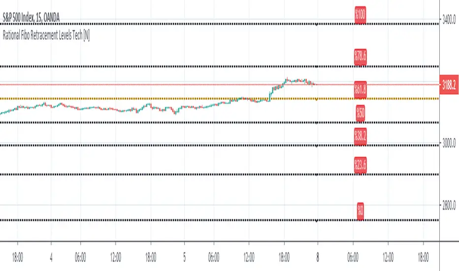
Rational MTF Auto - Fibonacci Retracement Levels Hello, this script automatically draws rational Support - Resistance Levels as multi time frame. (MTF)
In this way, we see reasonable levels ahead of us.
As of the date of birth: The first year after Lehmann Brother's fall was determined after January 1, 2009.
One feature of this script (which I deliberately left this way) :
If the security and support-resistance levels are equal, it will show you NA value and say wait.
Because it is based on a weekly basis for region selection, I think that it should enter a region and support-resistance levels should be drawn accordingly.
That's why I left it this way.
NOTE :
This script was inspired by the following publication :
Regards.
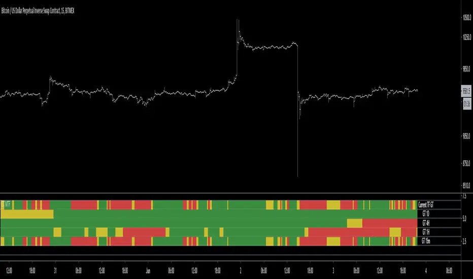
Gator Trend MTF HeatmapThe Gator Trend MTF heatmap checks multiple timeframes to the current trend based on a derivative of Bill William's Alligator.
Green = Bullish Trend
Red = Bearish Trend
Yellow = Sleeping (No Trend)
Use the link below to obtain access to this indicator
security free MTF example - JDThis script is not intended for trading purposes but gives some examples how you can get values
from previous candles in other timeframes, without using security calls.
NOTE: the "open", "high" and "low" values are calculated "on the fly", as the bar progresses,
the "close" is determined at the end of the timeframe, so it's only know at the first bar of the next time period
JD.
#NotTradingAdvice #DYOR
Disclaimer.
I AM NOT A FINANCIAL ADVISOR.
THESE IDEAS ARE NOT ADVICE AND ARE FOR EDUCATION PURPOSES ONLY.
ALWAYS DO YOUR OWN RESEARCH!

DiNapoli MACD MTFSimple oscillator, based on formula from Joe Dinapoli for MACD oscillator. Simply it's analysing current timeframe (bottom row) and 2 higher timeframes.

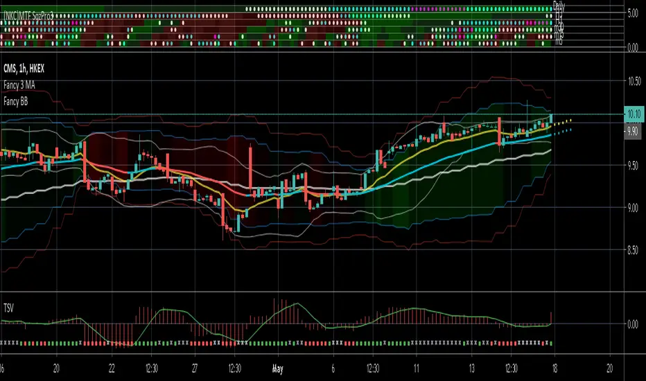
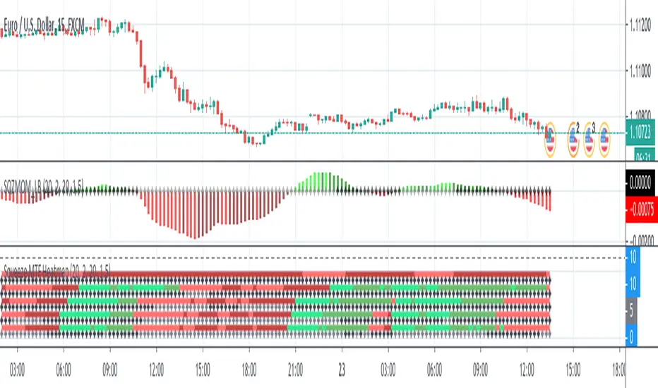
(NKC) MTF Squeeze Pro MultiTimeframe Squeeze Momentum Pro
Dots indicate squeeze
Fills indicate momentum
swing high low extension multi time frame MTFThis is the Multi time frame MTF version of our swing high low extension indicator.
Now you can use this indicator to plot the swing high low extension lines from higher time frames on current chart.
For example, if you input 60 as the Timeframe and your current chart timeframe is 5 minute, it will plot 60 minutes swing high low extension lines on the 5 minute chart.
Features and inputs:
Using different input value for swing high strength and swing low strength.
Input higher time frame by number as minute, such as 120 means 2 hours. You can also use 35, 100 or 48.
Set different type of alerts:
Close crosses below the swing low.
Close crosses above the swing high.
Close is above the swing high.
Close is below the swing low.
Please purchase the indicator access from our website.

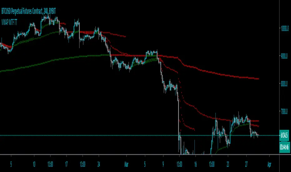
VWAP MTF TT by Chill00rThis is an "Volume-weighted Average Price" Indicator for Multi Timeframe.
VWAP color is trend-based
Different settings are available (some are off by default):
"Show Daily VWAP"
"Show Weekly VWAP"
"Show Monthly VWAP"
"Show Quarterly VWAP"
"Show Yearly VWAP"
"Show previous VWAP close"
Hit the Like Button
Percent Change MtFThis plots the selected resolution's percent change from open to close. Easy way to check the previous period's range with less noise. Note the latest period is calculating on a bar that hasn't closed so it won't update unless you refresh/change timeframes to prevent incorrect reporting.

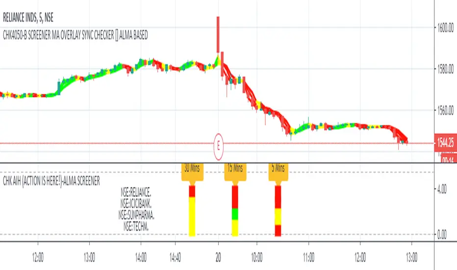
CHK AIH (ACTION IS HERE!)-ALMA SCREENERWe do not like to stare at the screen whole day, instead we like to jump where the
action is.... The Screener was written with this in mind
CHK AIH (ACTION IS HERE!)-ALMA BASED SCREENER
FEATURES
User can enter 3 Resolutions of his/her choice
User can select 3 Mov Avg Length of his her choice, which would be identical for all the three timeframes
User can enter stock basis his/her region's stock exchange
User can shift the screener left or right if not visible in a Multiscreen mode
Uses ALMA (Arnaud Legoux Mov Avg) as it smooth and reactive
Code is also provided below of MTF ALMA Moving Average OVERLAY on which this screener is based
LOGIC
For a particular timeframe If all the Moving Average are calibrated in one direction, it will show the requisite color.
For Example in an ideal scenario for a bull trend ALMA(5)> ALMA(13) > ALMA(21), once such a situation is identified, the screener will show green.
Yellow means lack of Calibration.
When 3 timeframes are calibrated, it becomes a high Probability Trade
BUGS
It is not allowing to enter the D/W/M timeframes, timeframe in numbers ...5/15/60 is working fine. If somebody can fix it
it would be great
LIMITATIONS
Because of TV's limitations only 4 scrips can be entered, however one add the indicator again with new scrips
//////////// CREDITS ////////////////////////////////////////////////////////////////////////////////////
//// hxxps://www.tradingview.com/script/rwdgyEZe/
/// Thank You Inno14 for graciously sharing your work. Your work has helped immensely !!!
////////////////////////////////////////////////////////////////////////////////////////////////////////
ICICIBANK
TECHMAHINDRA
YESBANK
Ichimoku Kinkō hyō Keizen 改MTF善The script is not finnished yet and show's an other interpretation of how it could be scripted
Step -1 is complete... Basic Ichimoku with asjutable length and editable lines colors and visibilities.
Step -2 in progress... Adding ability to une multiple Spans, sens and Kumo on higher and lower timeframe.
Your Step : Like and Share ;) have a good year 2020 !
2020-01-06 /--------/ -R.V.
Jan 06
Release Notes: The script is not finnished yet and show's an other interpretation of how it could be scripted
Step -1 is complete... Basic Ichimoku with asjutable length and editable lines colors and visibilities.
Step -2 in progress... Adding ability to une multiple Spans, sens and Kumo on higher and lower timeframe.
Your Step : Like and Share ;) have a good year 2020 !
2020-01-06 /--------/ -R.V.
Jan 07
Jan 13
Release Notes: MTF Ichimoku is on it's way !!
Jan 17
Release Notes: The script is not finnished yet and show's an interpretation of how it could be scripted
Step -1 is complete... Basic Ichimoku with asjutable length and editable lines colors and visibilities.
Step -2 in complete... Adding ability to use multiple Spans, sens and Kumo on higher timeframe.
Step -3 in progress... Creating a UNIX based function to framgments actual chart periods in subcandles or "Subprices/periods" to plot multiple Spans, sens and Kumo on LOWER timeframe.
Your Step : Like and Share ;) have a good year 2020 !
/--------Coder--------/ -R.V.

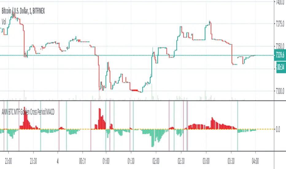
ANN BTC MTF Golden Cross Period MACDHi, this is the MACD version of the ANN BTC Multi Timeframe Script.
The MACD Periods were approximated to the Golden Cross values.
MACD Lengths :
Signal Length = 25
Fast Length = 50
Slow Length = 200
Regards.
ANN BTC MTF CM Sling Shot SystemHi all, this script was created as a result of ANN training in all time frames of bitcoin data.
Trained data is built on Chris Moody's Sling Shot system.
CM Sling Shot System :
This system automatically generates the ANN output for all time periods.
Therefore, it has multi-time-frame feature.
Artificial Neural Networks training details:
Average Errors
1 minute = 0.005570
3 minutes = 0.006674
5 minutes = 0.007067
15 minutes = 0.010000
30 minutes = 0.009398
45 minutes = 0.010000
1 Hour = 0.006848
2 Hours = 0.006901
3 Hours = 0.009608
4 Hours = 0.009774
1 Day = 0.010000
1 Week = 0.010000
The results look good (All Average Error <= 0.01 ), the Sling Shot Method is also good, but you can also refer to historically slower period averages to filter these arrows a bit more. I leave the decision to you.
Best regards.

Squeeze MTF HeatmapHere is a multi-timeframe heat map using one of the most apreciated indicators in Tradingview: Squeeze Momentum Indicator by LazyBear.
Study shall be added to 15min chart.
It indicates squeeze and momentum at: 15 min, 30 min, 60 min, 240 min and 1 Day.
Thanks to © azimuthdynamics for inspiration and portion of code
Thanks to Lazy Bear for coding Squeeze Momentum Indicator
PpSignal RSI MTF 3.19This Rsi oscillator have a donichian channel en middle move average included.
have got a QQE or atr move average.
Show new high and new low according to the pivot point.
Show Rsi divergence.
MTF option.

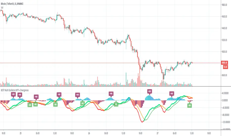
Indicator Panel MTF (MACD, RSI, Momentum, Stoch, CCI)This script shows the values of MACD, RSI, Momentum, Stoch, CCI for current and higher time frames in a panel. if higher time frame is equal or smaller than current time frame and it doesn't show the values for HTF.
And also it shows if their values are increasing, decreasing or equal to last value with "▲", "▼", "="
The signal length for all indicators is 9 and used EMA.
histogram value is indicator value - it's signal value. with this value you can see that indicator and its signal getting closer or not. you may think it's as momentum.
Some functions and idea is used from following scripts:
Thanks to Lucf for the following script:
Thanks to Ricardo Santos for the following script:


[ALL-IN-ONE] OSCILLATORS MTFHi everyone
I. 💎 SCRIPTS ACCESS 💎
1. My website URL is in this script signature at the very bottom (you'll have to scroll down a bit and going past the long description) and in my profile status available here : Daveatt
Due to the new scripts publishing house rules, I won't mention the URL here directly. As I value my partnership with TradingView very much, I prefer showing you the way for finding them :)
2. You obviously can contact me directly for more information
II. 🔎 ALL-IN-ONE OSCILLATORS MTF 🔎
This indicator offers to display many oscillators with a multi-timeframe option
The available oscillators so far are:
1. MACD
2. MACD ZERO LAG
3. RSI
4. DMI/ADX
5. ATR
6. STOCHASTIC RSI
7. TRUE STRENGTH INDEX
8. CHANDLE MOMENTUM OSCILLATOR
9. VORTEX INDICATOR
10. COMMODITY CHANNEL INDEX
11. RATE OF CHANGE
III - 📊 FEATURES 📊
3.1- 🔔 Alerts 🔔
LONG/SHORT alerts available for all oscillators.
You'll find only two events GoLong or GoShort because I simplified it a lot.
Let's assume the user wants to create alerts on a MACD first, and in a second time on an RSI.
All he/she has to do is :
1) to select the MACD parameter in the indicator and then activating the events GoLong and/or GoShort.
2) once done, select RSI filter in the indicator and then activate the events GoLong and/or GoShort.
3.2- 🔌&🕹️ (Plug and Play)
This feature is optional but very cool regardless.
Compatible with any of my Plug&Play trading tools.
You'll get instant results by connecting the ALL-IN-ONE to another Plug and Play compatible system.
Feel free to send a request my way if you want more details on that
3.3 - ⏱️ Use current chart resolution or any available timeframe
The Multi-timeframes component will expand your analytics capabilities even more.
IV - Use Cases
The use cases are maybe limitless
- an H4 oscillator combined with your indicator Plug&Play applied on an H1 chart.
- an RSI reversal signal used with your Backtest system.
- a 30-minutes True Strength Index plugged to a 5-minute indicator- itself combined into a Backtest system. #mind #blown
- ...
-------------------------------------------------------------------------------------------------------------------------------------
If you have any doubts or questions, please hit me up directly or ask in the comments section of this script.
I'll never claim I have the best trading methodology or indicators.
You only will judge and I'll appreciate all the questions and feedback you're sending my way.
They helped me a ton for developing indicators based on all the requests I received.
Kind regards,
Dave
Multi MA MTFMulti MA MTF
The moving averages are generally used as dynamic supports and resistances as well as to determine the trend,
so if the price is above its average it is called an uptrend and otherwise a downtrend.
The crossing of MA if used to confirm a trend and not as a signal
because the moving averages react slowly depending on the type of MA and the periods we are analyzing.
Indicator Functions:
- It allows to display 4 MA at the same time.
- You can use several types of moving averages: SMA, EMA, DEMA, WMA, VWMA, HullMA, TMA, SSMA, SMMA.
- Shows the crossing points of the MA's.
- Multimeframe: so you can visualize the behavior of MA's in different timeframes without changing timeframe.
- Alerts for when crosses occur.
Same chart with 1 week timeframe MA enable

PpSignal Elder Fisher Transform MTF On the chartelder fisher transforms on the chart with alarm and background.
It is the tool to complete the previously published script
Buy when the background is aqua, sell when the background is orange.
Enjoy it

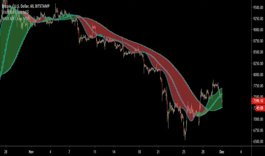
CL MTF Double Bollinger Bands2 Bollinger bands on MTF, good for when you need to use 5-15 min charts with the BBs on 1 or 4 hours.
